Creative Squad

Creative Squad: In the City – Maura Hibbitts

Hello from my Creative Squad! Today we have a really fun project from Maura Hibbitts using some of my rubber stamps and the Water Tower mini cardboard model. This month’s theme is: In the City – Although we aren’t traveling much these days, let’s reminisce about a time we traveled to another town or city. Think about the flavor of the place and let that guide your color and design choices.

I will admit, I am a country girl…I love the mountains and forests and wide open spaces…but every once in awhile I head to the city. I may have an appointment, or go to a museum or a show, but it seems there is always something that draws me there from time to time. I live in an area with small cities, and these have a lot to offer too, that’s where I go to the Asian and Indian markets, to Trader Joe’s, the art store, to the co-op to get the roasted coffee beans I love, to photograph buildings and people and rusty structures. I am a train ride and a few hours away from New York City, and have taken 150 middle school students to explore the city (yep, a few gray hairs from those trips), met my sister for a few days on her business trip and explored Central Park, attended and presented at conferences for education, enjoyed a wonderful high tea with my sisters at a ritzy hotel…truly memories that will be with me forever. No matter if the city near you is small, or a metropolis, go out and explore and see what it has to offer.

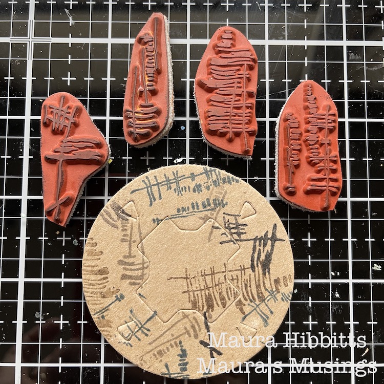
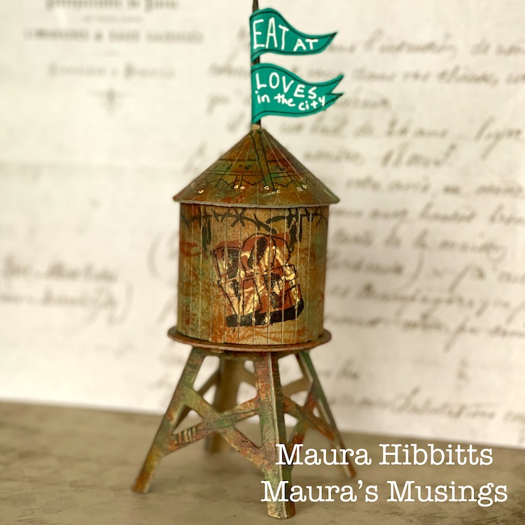
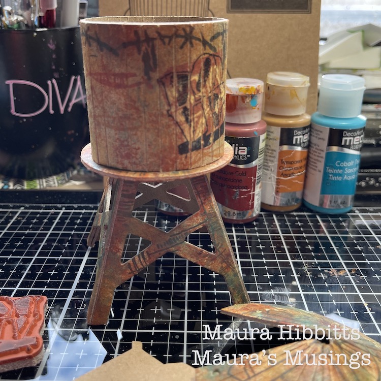
We received these cool models from Nat for this month’s project from a company called Boundless Brooklyn, and mine is a replica of real water tower in the city…I may just have to visit and try to find it. I took everything out of the folder, laid it out, and thought of ideas. I wanted a grungy look, so I started by stamping the bases with the Wabi Sabi stamps – gnarly, funky, jazzed, and far out, and a variety of archival inks in brown, black, grey and blue. I kept the pieces flat for the stamping.
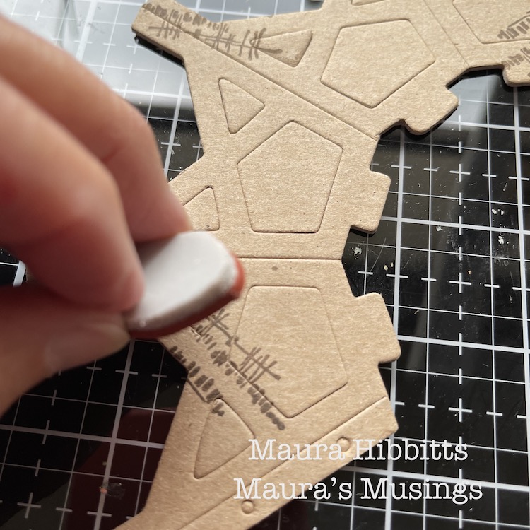
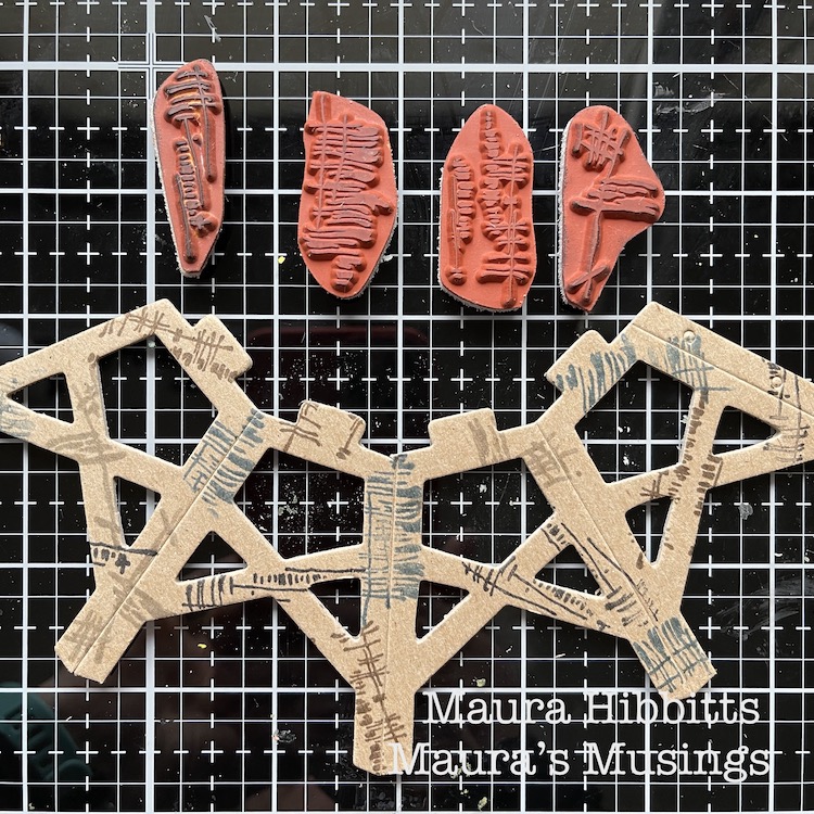
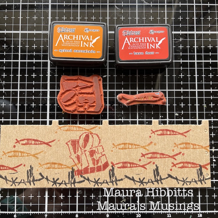
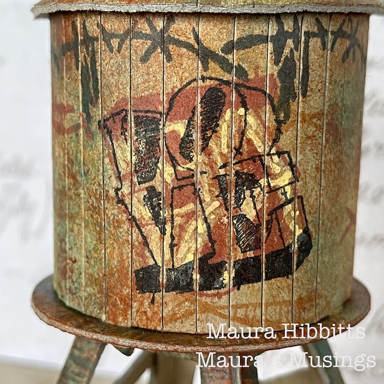
I stamped the walls using the Wabi Sabi stamps, groovy and neato, using archival red, black and orange inks. I also wanted to add a graffiti-like image, so added the Love stamp. I was happy with my design, it looked like fish swimming around the tank. 
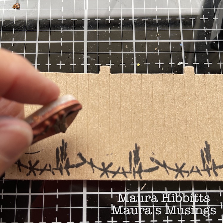
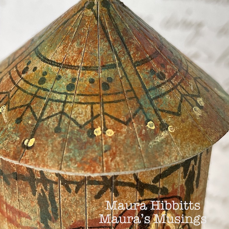
I decided to pretty up the roof too, after all if you were looking down from a higher building, it would be nice to see. I stamped around the piece using the Jugendstil stamp from the Mini Motifs set and black ink.
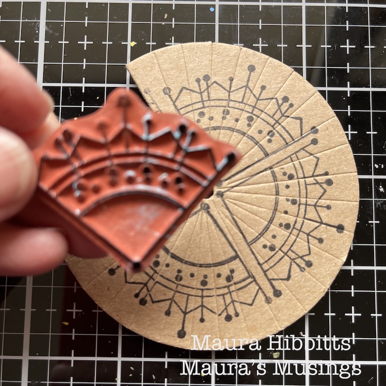
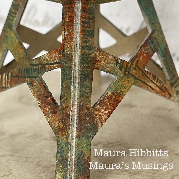
Now, it’s time to add the paint. I used fluid acrylics so that my stamped images would show through. I started with Transparent Yellow Ochre and an old brush, and pounced the paint randomly onto the pieces. I repeated this step with Burnt Sienna and Quinacridone Gold. It created a rusty appearance to age the water tower.
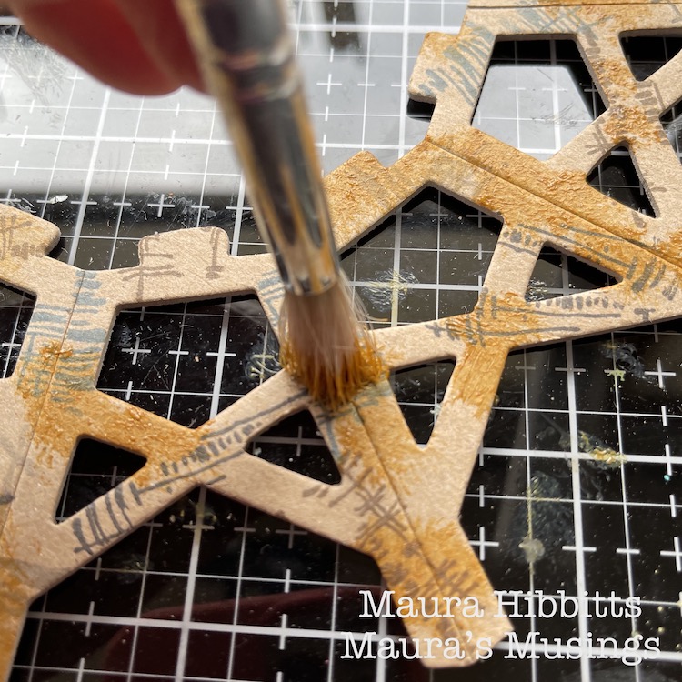
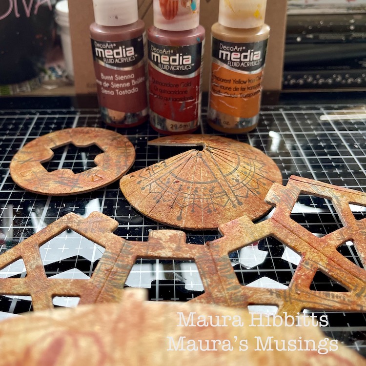
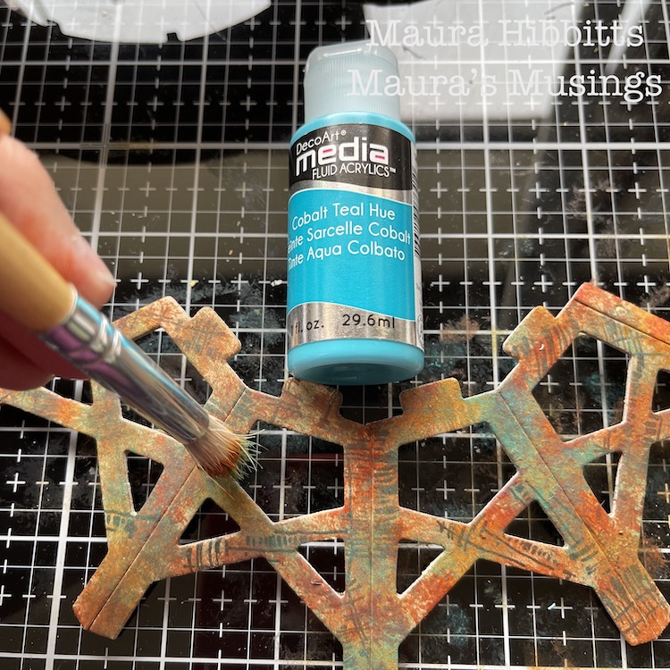
To add more depth to the painting of the tower and a patina effect, I went in and pounced on Cobalt Teal Hue. I felt this would allude to the water tower being constructed of metal.
I added a bit of detail to the Love stamp and roof with a light orange Posca pen.
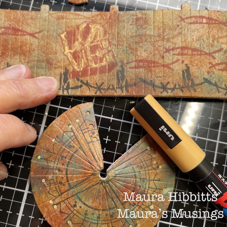
Then I just followed the kit’s directions to assemble the water tower…and that is when I discovered I had stamped the walls upside down…darn it! I thought I was being so careful in laying out all the pieces before I began. So, in order to save my idea, I stamped Love again, upside-down over the first one. Luckily, I had stamped the first one in red, so the second one in black took over.
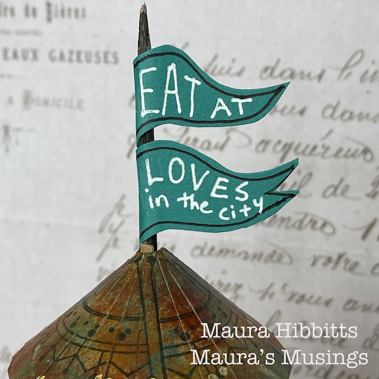
I thought about how structures in the city often advertise businesses in the area, so I made a flag using a skewer and teal paper and added “Eat at Loves in the city”.
What a great little model, and so fun to alter and assemble! You can create a lot of texture and age with stamped images and the right paint colors. I admit, I do love finding rusty structures and photographing them, and the city is a great place to find them.
Find out what makes the city near you unique and different, and go explore. I learned the small cities in my area are known historically for glove making, horse racing, and carpets. I found a small local railway line, which is now a bike path. I’ve learned about the role the Erie Canal played in developing my region. Discover who first settled the city and learn about them, like I found out how many areas near me were settled by the Dutch, and when you look closely, you can find the clues in place names and architecture. Enjoy learning about your city! – Maura


Thanks Maura – love the feeling of age and patina that you were able to create with rubber stamps and paint – this really looks like you could find it in real life. Now… I wonder how the menu is at Love’s :)

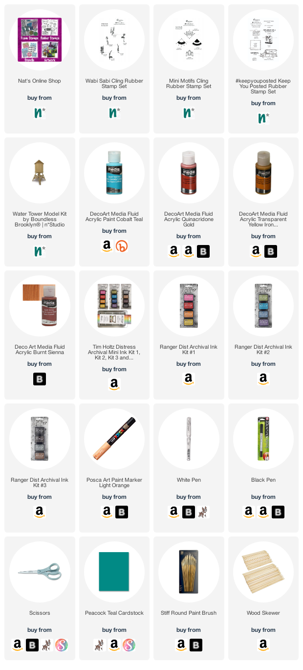
Give it a try: you can find all my Rubber Stamps and those cool Cardboard Models in my Online Shop and here are some of the supplies Maura used:
Follow Nat’s Creative Squad on Instagram too: Each week we post projects, ideas, and inspiration for mixed media art.

Comments (1)

  • Sue Clarke

    |

    Maura, I love the color that you created. It looks so real.

    Reply

Leave a comment

Creative Squad: Another Door Opens – Jordan Hill

Hello from my Creative Squad! Today we have an art journal page with a bonus mini page from Jordan Hill. She is using my Triple Play stamps and our theme: Another Door Opens – There is this saying, “when one door closes, another door opens” that basically is an optimistic way of looking at change in your life. Create an art journal page with this in mind, however you’d like to express it, however the idea inspires you to create!


Hello everyone! I’m super excited to be back with my project for April 2021; I had a lot of fun with this month’s products and theme, so I hope you all enjoy following the process as much as I enjoyed creating this page!

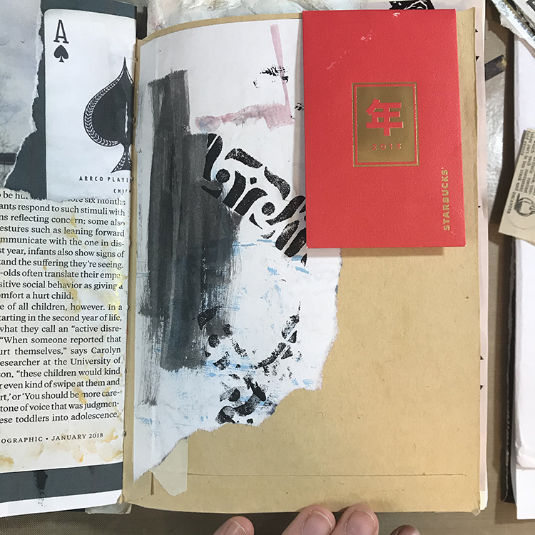
I decided to begin this month’s page with a piece of collage. When I create journal pages, I tend to end up with a lot of excess paint, either on my palette or my paintbrushes. In order to make sure none of this excess paint goes to waste, I use scraps of paper to clean it up.

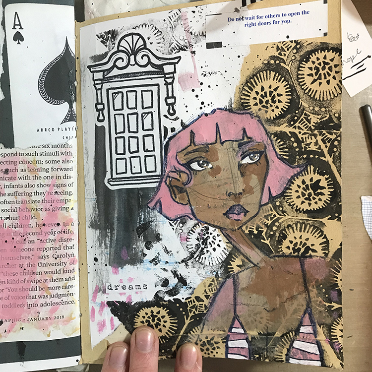
In addition, I had been playing around with one of the stamps from the Triple Play Foam Stamp Set on another page in my journal. The excess from that page had ended up on this scrap of paper, so it seemed like the perfect start point! I tore off a chunk and glued it down. I also glued a coin envelope to the upper right hand corner of the page, as I felt that the idea of a pocket was in line with this month’s theme of “Another Door Opens”.

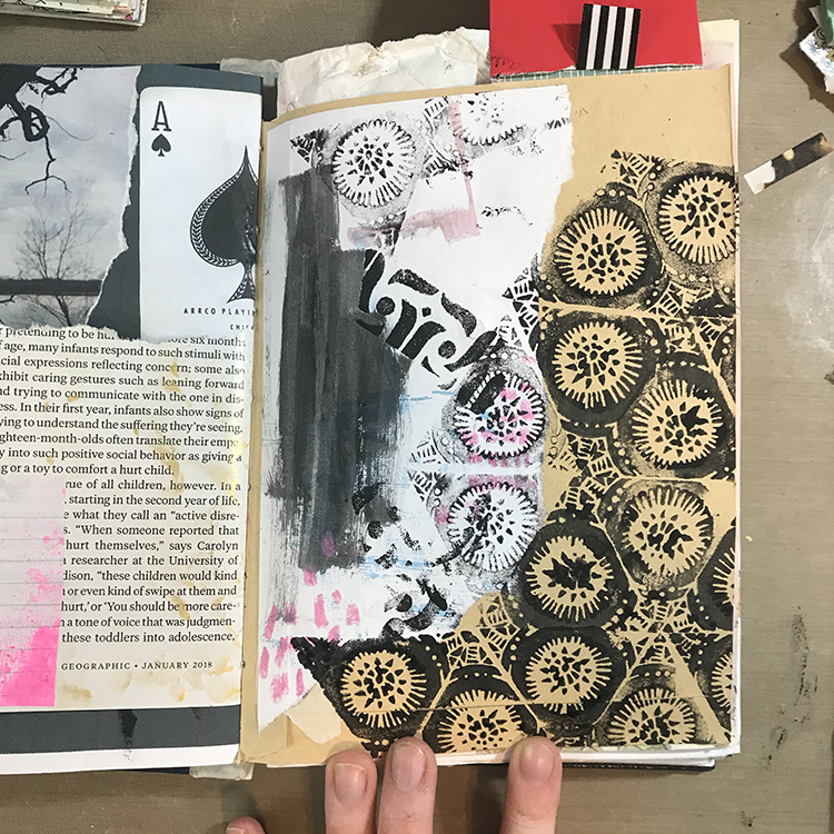
Next up, I used a second stamp from the Triple Play Foam Stamp Set along with some slightly watered down black acrylic paint to almost completely cover the lower right hand corner of my page. I made sure to overlap my background stamping with the collage piece in order to incorporate it into the page. I also used this same stamp in the upper left corner.

Since there was already some pink on my collage piece, I decided to push that a bit further and used a pink oil pastel to do a bit of mark-making in a few different places on my page.

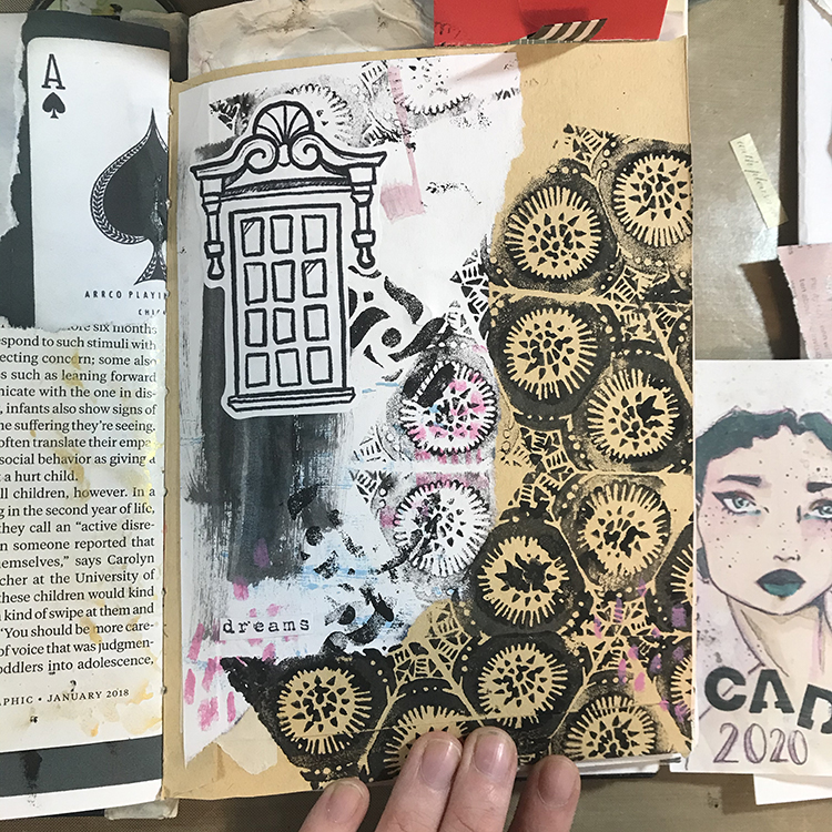
I then incorporated a few more pieces of collage. A while back, I drew a bunch of windows with the intention of using them as collage material for my journals. I felt as though this tied into the April theme, so I glued one in. I also glued down a tiny found word clipping in the lower left hand corner of the page.

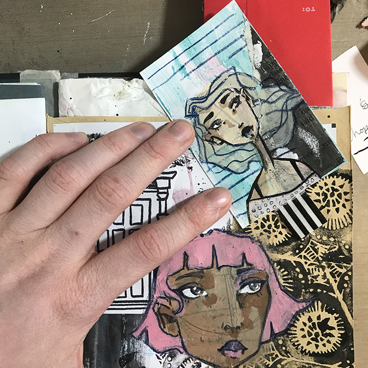
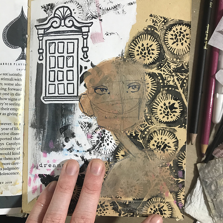
It was then time to start working on the focal point! As usual, I knew I wanted to incorporate a face, so I started things out by using some acrylic paint to block in the basic shapes. Then, using an indigo colored pencil, I started to sketch in the facial features.

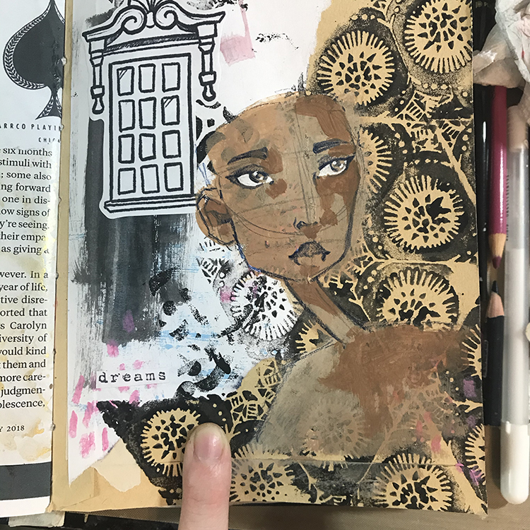
When it comes to shading faces in my journals, I don’t always add shadows. Often it depends on the size of the face that I’m drawing. Because this particular face was on the larger side (and seemed a bit flat), I decided I did want to add shadows. I used a slightly darker color of paint than the base skin tone and started blocking in my shadows.

I don’t usually overthink it when it comes to adding shadows to my faces, but a good tip for knowing where to put them is to have an imaginary light source. For this particular face, my ‘light source’ was in the upper left, so I added shading to the right side of the face.

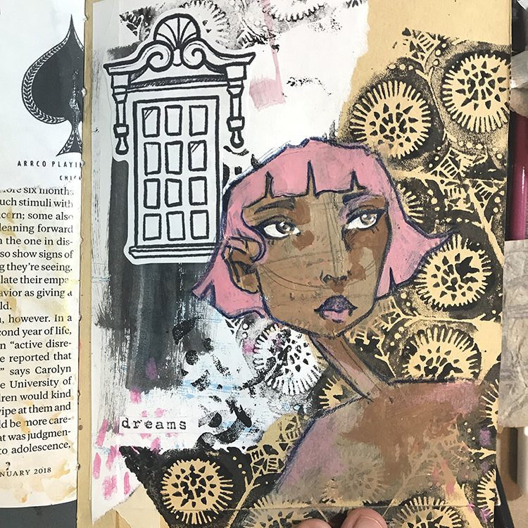
Next it was time to add the hair. Since the majority of the color that already existed in this page was pink, I decided to go with that as the hair color! I sketched out the basic shape of the hair with my colored pencil, before using acrylic paint to add the color.

I also used this same pink in the lips, cheeks and shoulders to warm up the skin tone and tie the face together with the hair.

It was then time for the finishing touches! I added a shirt, used some watered down black acrylic paint to flick some splatters across the page, and found a fortune from a fortune cookie laying on my desk that was perfectly in line with the theme!

As one last little bonus element for this page, I also slipped a card inside of the coin envelope I glued down in step one, and created a little mini page on top of it. To me, the idea of this hidden page is yet another nod to the theme of “Another Door Opens”.

I hope you enjoyed following this process and possibly try some of the ideas for yourself!


Thank you Jordan, I just love the intriguing backgound you created with the stamps and collage!

Give it a try: you can find all my Foam Stamps in my Online Shop and in addition to collage papers, here are some of the supplies Jordan used:

For more projects and ideas, check out Nat’s Creative Squad on Instagram too: Each week we post projects, ideas, and inspiration for mixed media art.

Comments (1)

  • Diane Tignor

    |

    Love the message of this art journal page. Striking w the imagery.

    Reply

Leave a comment

Creative Squad: Another Door Opens – Robin Seiz

Hello from my Creative Squad! Today we have a beautiful little journal from Robin Seiz, sharing with us her experiences over the past year, and using my Triple Play stamp set and our theme: Another Door Opens – There is this saying, “when one door closes, another door opens” that basically is an optimistic way of looking at change in your life. Create an art journal page with this in mind, however you’d like to express it, however the idea inspires you to create!


This month’s theme was about emerging. When one door closes, another one opens. I am a strong believer in this saying.

I haven’t journaled or written much about the pandemic, yet I feel like I have “processed it” in the daily moments as the days and months have unfolded. It’s been a year of ups and downs for me. It felt really scary in March, 2020; it was a dark time. I really missed seeing family and friends, especially my children and grandchildren. As the months went on, I got into a rhythm; a pandemic pace, if you will. I spent enormous amounts of time in my studio creating. One day rolled into another; I wasn’t sure how a week had flown by. We developed our pandemic pod and learned how to see a very few friends in a socially distanced way.

By June, I was feeling better. We had learned how to get what we needed, we had our systems down, we were zooming with friends and family with the warmer weather, we could get outside.

By the fall when we were moving indoors, it felt disheartening. I really couldn’t fathom the thought that our long standing Christmas traditions had to be put on hold. We managed to quarantine and test and could at least have my children and grandchildren in for a gathering. We did everything we could to mitigate the risks. My partner and I made our own new traditions, which we have decided we will keep. A silver lining!

By January, I was feeling like this pandemic would never end. I was still enjoying the studio and vowed to get out everyday for a walk, even in the cold. And then the spring came, vaccines were on the horizon and it seemed like there was a glimmer of hope.

If I think about the doors closing — for me that included an over-scheduled life; all wonderful things, but just too many of them. I have come to really appreciate the “pandemic pace” and it’s opened the doors for a different way to think about family gatherings, what I add to my plate, and how I spend my time post-pandemic in a way that brings me joy everyday.

I used Nathalie’s new Triple Play Foam Stamp to illustrate what I just verbalized.

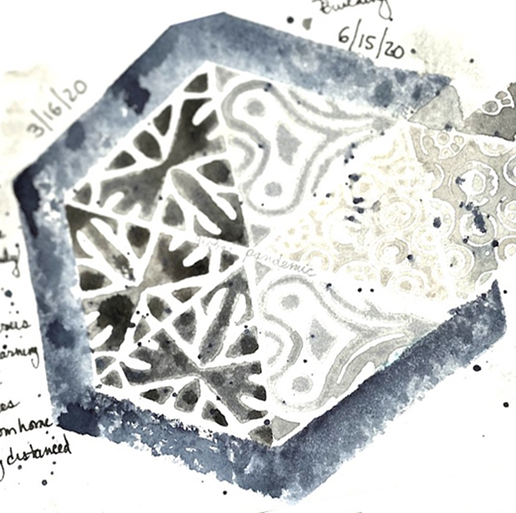
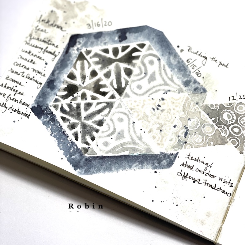
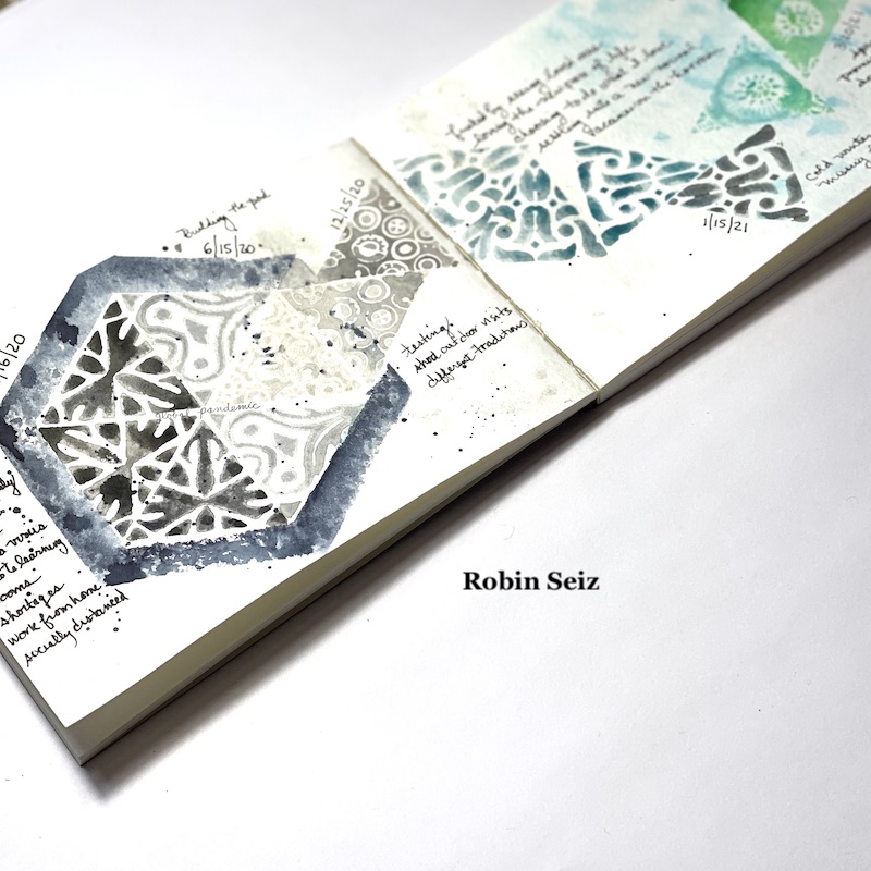
I started with an 8 x 5 Strathmore watercolor journal. I spritz it with water and lightly added some Quor watercolors to the pages, just so I wouldn’t have a blank page. I used grays and blues. Then I splattered black paint on the left page to represent this dark time. Next, I put black water color on all but one side of the hexagon. I wanted the one side open so the triangles could emerge from the opening.

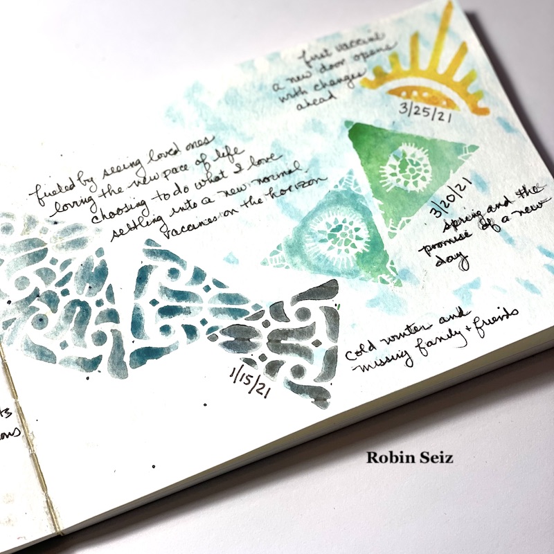
On the left page, I stamped the same triangle in black signifying those first few dark months. and how I felt. Then I used more grays and a different triangle to show how I settled into a routine of sorts. By Christmas, the triangles are emerging, but it’s a little scary.

On the right side, the page becomes more hopeful, but as January arrives, it’s sad again and it seems like it will be a long winter. As the months go on and spring arrives, the news of vaccines is better, my colors are more hopeful. The last stamp, the sun, ends with the day I received my first vaccine. We can do so much with color to select feelings. It can tell a story on its’ own. I was also selective about which triangles I used to tell my story. The tulips and other spring looking triangles were used at the end. And finally, the sun, always a symbol of a new beginning to me. 

The message for me in all of this is to hold on to the things that have given me joy during the pandemic, to cherish every moment of being with those we love, and to honor this time as a a moment when the world slowed down. 


Thank you Robin for sharing such a thoughtful page – there are so many familiar emotions and ideas here that I know will ring true for almost all of us. What a beautiful representation of them!

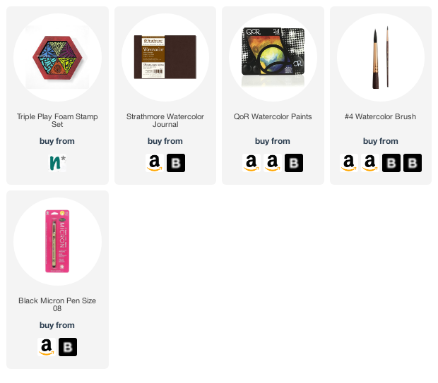
Give it a try: you can find all my Foam Stamps in my Online Shop and here are some of the supplies Robin used:

Don’t forget to check out Nat’s Creative Squad on Instagram too: Each week we post projects, ideas, and inspiration for mixed media art.
Leave a comment

Creative Squad: Another Door Opens – Riikka Kovasin

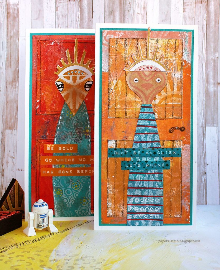
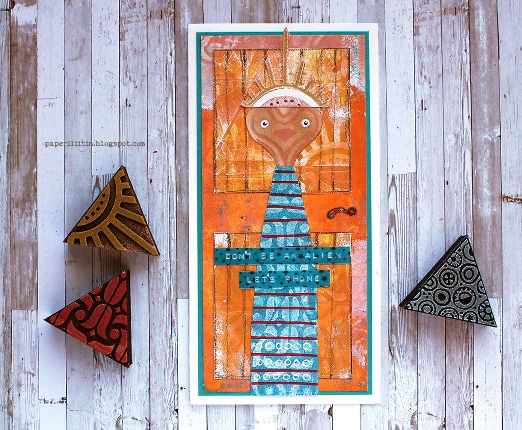
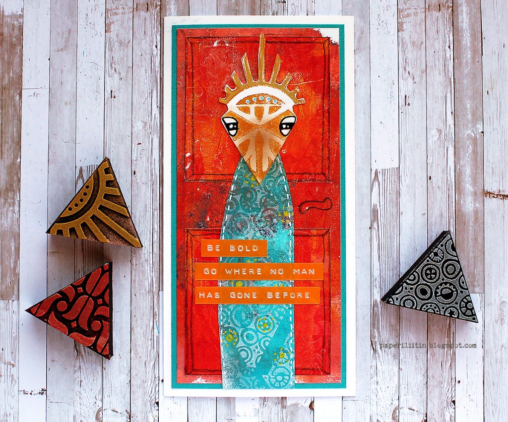
Hello from my Creative Squad! Today we have the debut of new Squad member Riikka Kovasin – a video showing how she creates some super cool whimsical characters created using my new Triple Play foam stamps and our theme: Another Door Opens – There is this saying, “when one door closes, another door opens” that basically is an optimistic way of looking at change in your life. Create an art journal page with this in mind, however you’d like to express it, however the idea inspires you to create!


Hi there! It’s Riikka here today with my very first Creative Squad post! The theme of the month was “Another Door Opens” and I was feeling outwordly as my first idea was to turn the patterns of the great “Triple Play” foam stamp set into whimsical characters.

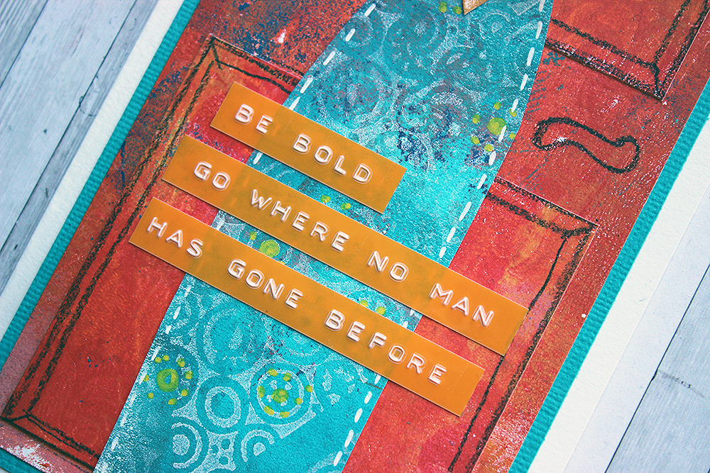
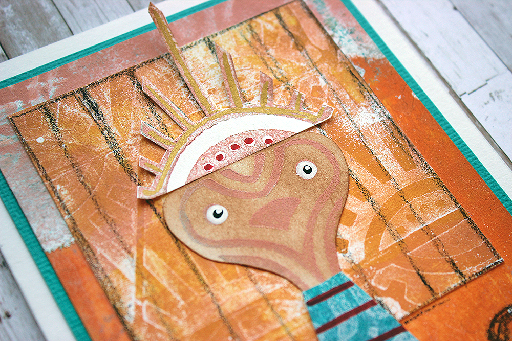
I interpret the theme like children’s peek-a-book – what might be behind the door? At first, I was thinking of doing the cards or an art journal page as a peek-a-book, first showing just the door and then you could open it to reveal the character. In the end I then chose to add the character on top of the door so that it had already come through it. I saw the heart-styled shape as a face immediately but when I used a peachy tone to stamp it, I realized it was ET! So, even if I had been thinking about whimsical character all along, now I would have a more precise theme. I paired the characters with greetings (hopefully) fitting to the stargazing theme.

As you see from the video a bit further below, I started by making patterned papers using acrylic paints and a gelatin printing plate. I made two sheets using similar color scheme and then one with a contrasting one. The first two I then cut to make the door (actual door and panels on it) and the third one became the robes of the character. The contrast between the two elements ensures that the character just pops out of the background.

Like I said earlier, I also used the patterns of the “Triple Play” foam stamp set to make the face and a headdress of sorts for the characters. I hope this inspires you to see the stamps from another angel. You don’t always have to use the whole stamped piece or build a bigger pattern. Collaging different little elements might just be the thing the doctor ordered!

Now, if you want to see how I made the cards, please see the video below. It shows me making the ET one, but I made the other one with similar steps. The only thing that differs is the stamps I used and I changed the color scheme a little, too. But the steps are the same!

Thank you for stopping by today! I hope you were inspired by the characters to see the stamps in another way! 


Thank you Riikka – these are such intriguing characters and I just love how you used all those Triple Play patterns in there!

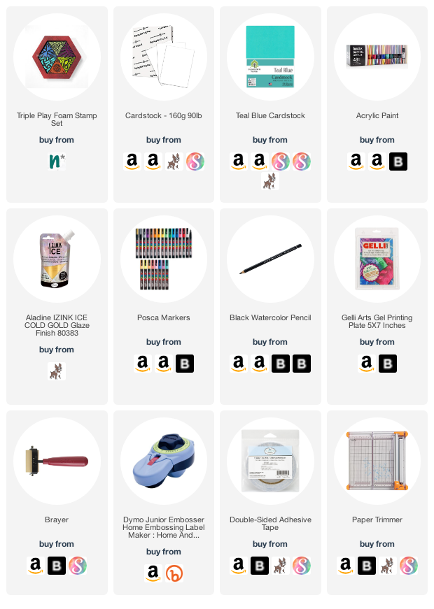
Give it a try: you can find all my Foam Stamps in my Online Shop and here are some of the supplies Riikka used:

Don’t forget to check out Nat’s Creative Squad on Instagram too: Each week we post projects, ideas, and inspiration for mixed media art.
Leave a comment

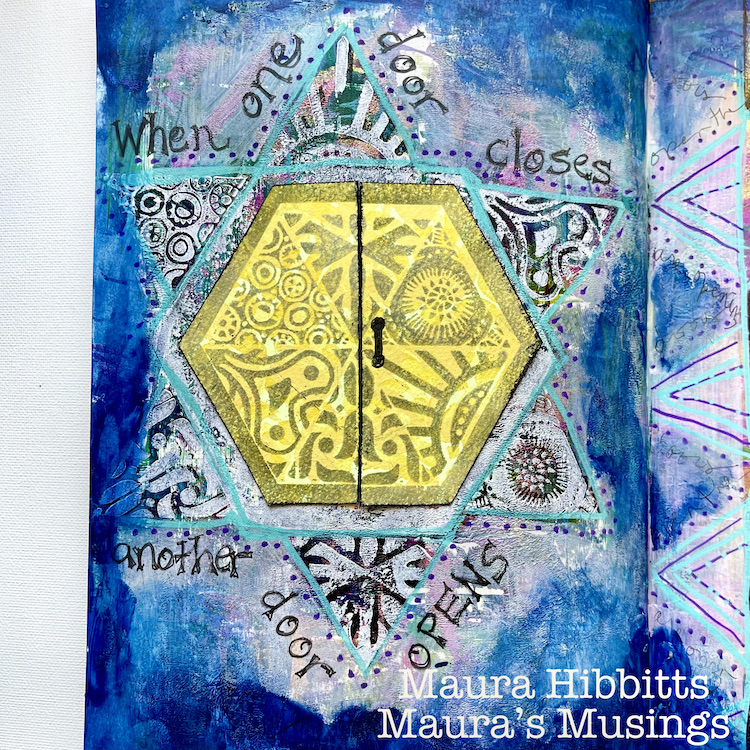
Creative Squad: Another Door Opens – Maura Hibbitts

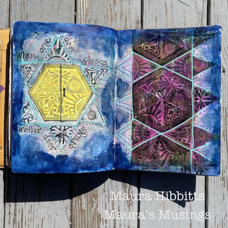
Hello from my Creative Squad! Today we have an art journal page from Maura Hibbitts that presents a really cool way to look at life’s challenges and changing circumstances. She’s using my new Triple Play foam stamp set and this month’s theme: Another Door Opens – There is this saying, “when one door closes, another door opens” that basically is an optimistic way of looking at change in your life. Create an art journal page with this in mind, however you’d like to express it, however the idea inspires you to create!


I have always been a firm believer in the adage “When one door closes, another door opens.” Maybe it is a part of my optimism, and maybe I have been lucky in this life, but even in the times I have struggled the most, whether physically, emotionally, or financially, new opportunities arose that led me forward. During my teaching career, I worked at opening doors for my students, so they could follow the path they chose. It has always been a joy to hear how they are doing, and which doors they have opened. Keep yourself open to the possibility of doors!

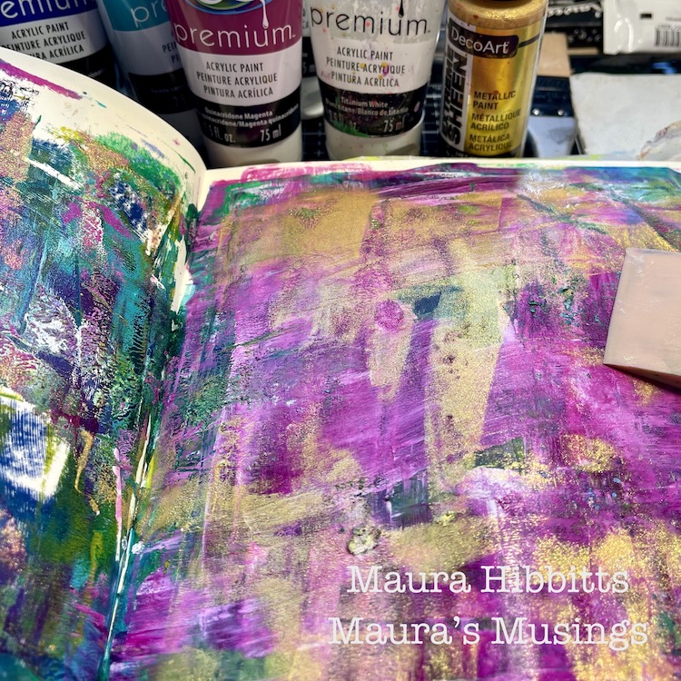
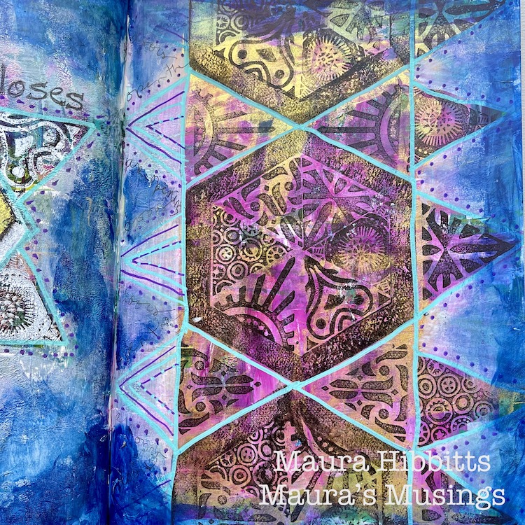
I started in my large art journal, layering paints. I started with my darkest green and blue, Prussian Blue Hue and Phthalo Green Yellow, and scraped the paint across in broad swathes with a silicon brush. I painted only on the right page, then closed the pages to spread to the other side. I repeated this step with Green Gold and Primary Cyan, then another layer with Turquoise Hue and Quinacridone Magenta. Final layer was more Magenta along with Titanium White and Gold.

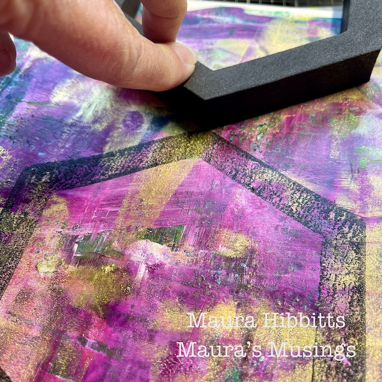
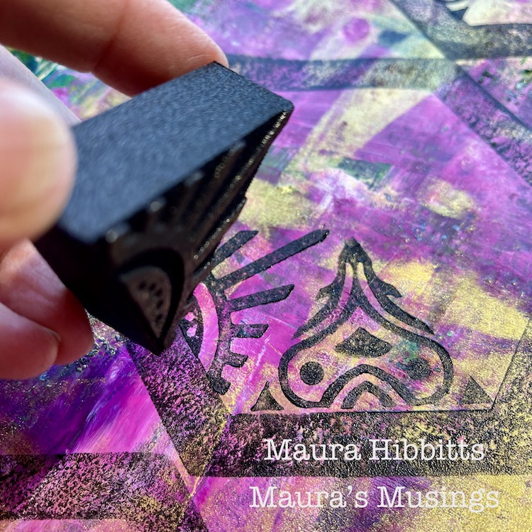
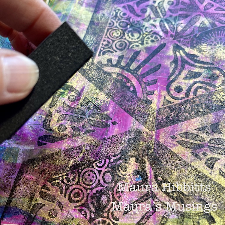
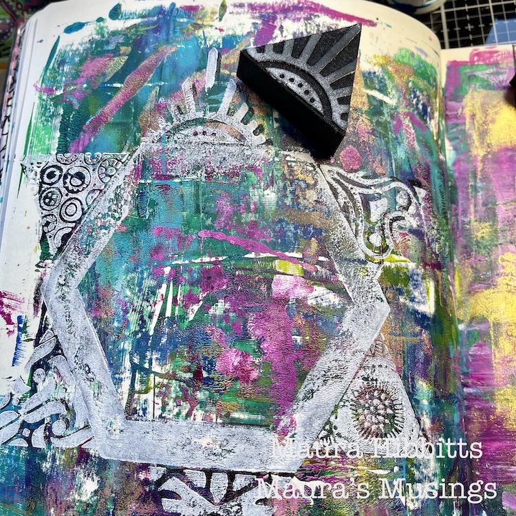
After I heat set the painted layers, it was time to stamp with the oh, so awesome, Triple Play Art Foamies stamp set. I like to use my gel plate and a brayer when I am using foam stamps, it acts like a giant ink pad, and gives a nice layer of paint on the stamps. On the right side, I repeated the stamped pattern several times.

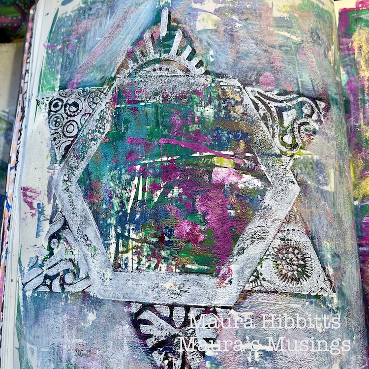
On the left side, I stamped the hexagon and the triangles on the outside this time. I first did it in black paint, but it didn’t show up well, so I went over it with white paint. Again, I added paint to the gel plate and smoothed it out with the brayer, then stamped into it, to transfer a nice image to the paper.

To create more of a focal point on the left side, I added some water to the white paint left on the gel plate, mixed it to create a whitewash, and brushed it around the design. Now it stands out more.

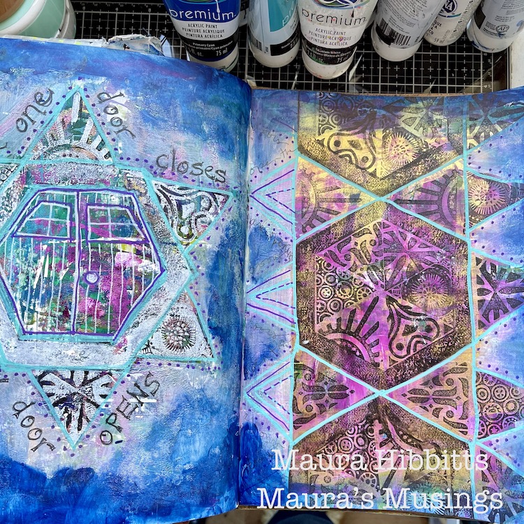
I also whitewashed around the design on the right, dried it completely, then added doodles and details with Posca paint pens. I also doodled a door, and added the words around the image on the right – “When one door closes, another door opens.” I also smudged Prussian Blue with fingers and a baby wipe around the edges of both pages to tie them together. I thought I was done.

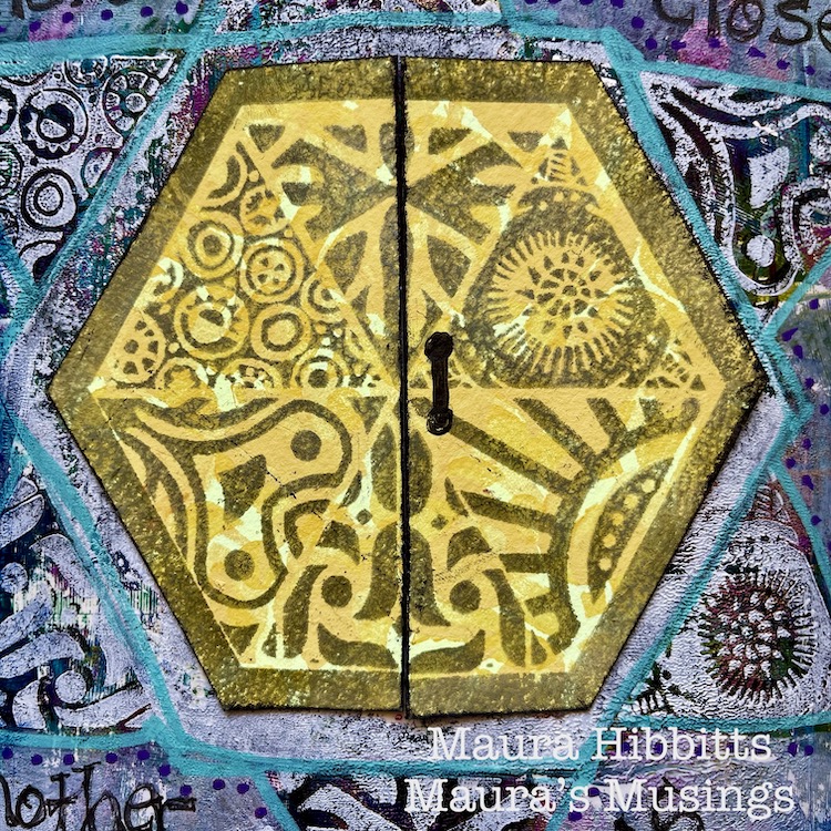
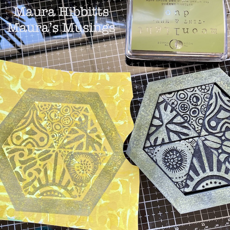
I slept on it, and decided to make a different door for the left page, so I pulled out some leftover paper from last month’s project, and stamped the entire Triple Play with Moonlight Duo ink. I cut it out, cut it in half, drew on a door handle, and inked the edges with black ink. My original idea was to have the door open, but with the hexagon shape and the orientation I had, I decided against it and adhered it with adhesive tape.

All of those background colors pop through the designs, even in the whitewashed areas. I think sometimes toning down areas makes the rest of the page pop.

I realized at the end what I had been working toward on my pages…pulling out memories of beautiful and colorful doors I had seen in India. I remember ones with colorful columns of tiles, like the right page, and others with intricate mosaic-like designs, like the left page. Isn’t it interesting when you are creating that your muse knows where to take you, even when your brain does not? This year, I also feel that we think very differently about doors opening…waiting for the reopening of our special places once again. Be safe, stay healthy and open the doors!

– Maura


Thank you Maura – loved learning your process and how you came back to the page to add that amazing door. Beautiful spread and beautiful ideas to keep in mind :)

Give it a try: you can find all my Foam Stamps in my Online Shop and here are some of the supplies Maura used:

Don’t forget to check out Nat’s Creative Squad on Instagram too: Each week we post projects, ideas, and inspiration for mixed media art.
Comments (1)

Leave a comment

Nat’s Creative Squad – Introducing Riikka Kovasin

Hello my friends – today we have some exciting news: we have a new Creative Squad member! Riikka Kovasin is joining our team of talented artists and we are so happy to welcome her to the group.

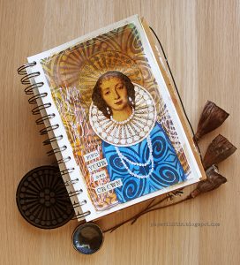
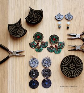
You may know Riikka from her lesson on Creative JumpStart this year (and in past years), and also her recent Guest Posts here on the blog like her Henrietta Maria Art Journal Page and her Shrink Film Earrings


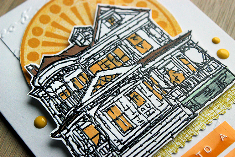
Also her lovely Sunny Home Card post too:

Well now we are honored to call her a member of the Creative Squad and see some more of her creativity in action.

Here is a little bit about Riikka: “Heippa! My name is Riikka Kovasin and I am a mixed media crafter from Finland. I live in Helsinki with my darling husband and our two sweet daughters. Creating is my passion and a way of self-care. Besides family and crafts, my weeks are filled with a full-time job.

I have been doing all sorts of crafts my whole life. I really got into papercrafts after I found scrapbooking when my older daughter was about 6 months old – that’s over 10 years ago. Since then my style has evolved to more and more mixed media direction and nowadays, I tend to go dimensional and do more altered and mixed media pieces than regular layouts.

I absolutely adore getting my hands into paints and mediums! To me the process of creating is equally important than the finished project.”

Nat’s Creative Squad

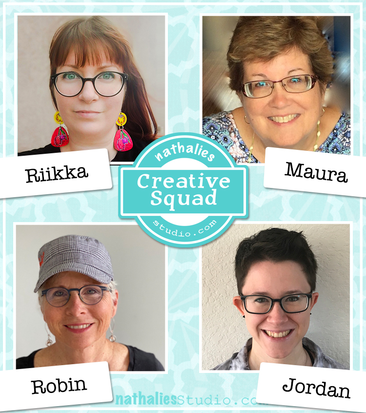
Learn about all our Creative Squad members (current and past) on the Creative Squad page here. You can read their bios, check out their links, and see every project they have created so far as squad members. Here is the current squad:


Also be sure to follow the Creative Squad on Instagram. We post a few times a week: current projects, technique tips, and inspiring peeks at the squad members’ methods and style. It’s a lot of fun to see what this talented group is up to!

Leave a comment

Creative Squad: Life in Bloom – Judi Kauffman

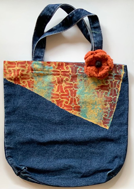
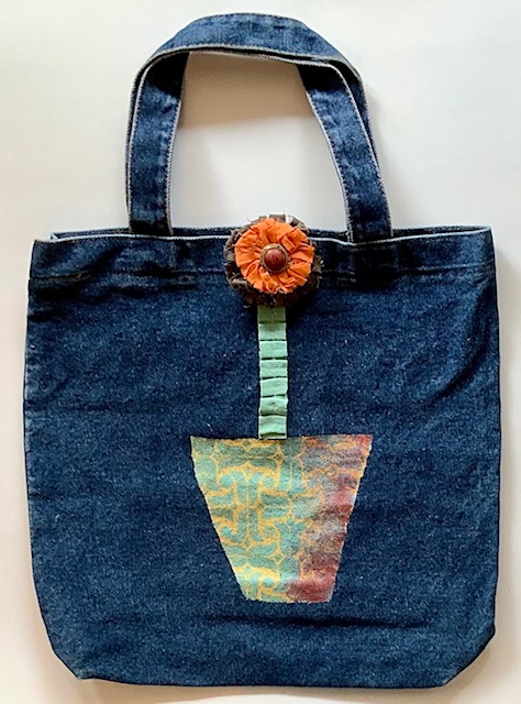
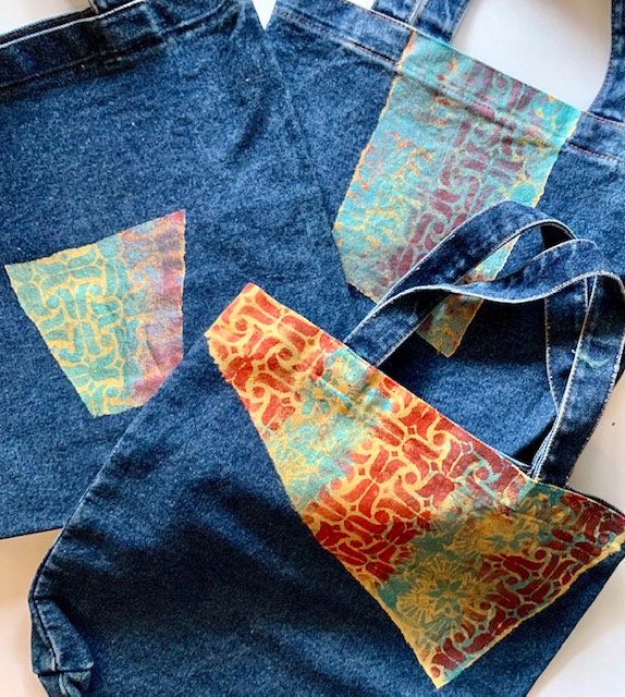
Hello from my Creative Squad! Today we have some gorgeous tote bags from Judi Kauffman using my Amsterdam and Hamilton stencils and this month’s theme: Life in Bloom – It’s been a long winter where we are and I’m dreaming of flowers and gardens and spring. Indulge us all in a project that focuses on one of Mother Nature’s most exuberant symbols of life: flowers flowers flowers!


I completed my “Life In Bloom” theme projects in late February, a week after getting my first covid vaccine shot. I will have been home for a full year as of March 18, but by the time you read these words I will have had my second shot and will be able to double-mask and head back out into the world – just in time to greet the new season. Spring!

I can’t wait… I can’t wait to see the iris, peonies, begonias, and other hearty perennials peeking up, ready to put in an appearance. And I can’t wait to go to Costco to buy some annuals to fill in the empty spaces. And a rotisserie chicken for dinner…I can almost smell the aroma of that aisle. Gee, I think I missed those trips to Costco more than almost anything else during my time at home.

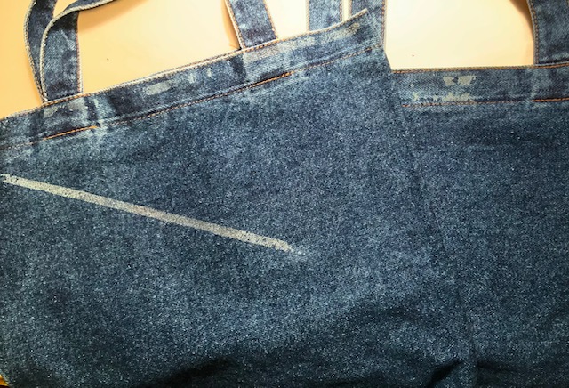
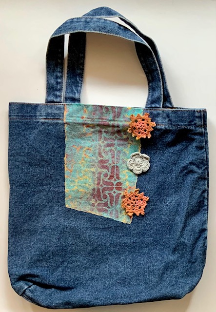
Meanwhile, like many of you I have spent many hours cleaning closets and going through supplies. I found a trio of simple denim totes, two with flawed spots, and thought they’d be a great surface for a stencils-only project. Here’s how they looked when I started:

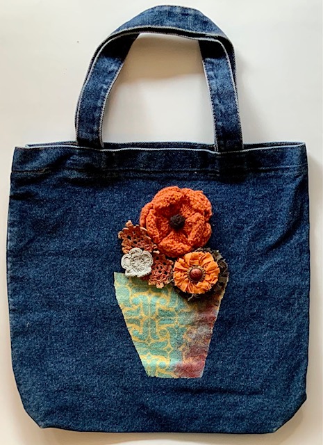
My concept was to create a flower pot/vase on one of the totes for a literal interpretation of the theme but stenciling the other two with more wonky shapes for a more abstract approach.

INSTRUCTIONS:

Using torn strips of newsprint, mask around the areas earmarked for painting and stenciling.

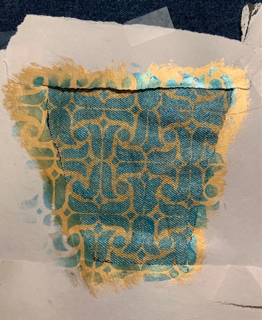
Using gold metallic or other light color acrylic paint and a wide brush fill the area to be stenciled. Optional: Mix paint with fabric medium.

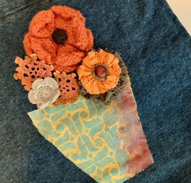
Using a mix of stencils (I used Nat’s Amsterdam and Hamilton stencils) and two darker paints (shown: red and metallic teal) add pattern to the gold areas. Overlap stencils here and there. Allow paint to dry for distinct patterns, work wet-on-wet for less distinct designs (smudge paint at edges to add dimension – note right side of flower pot).

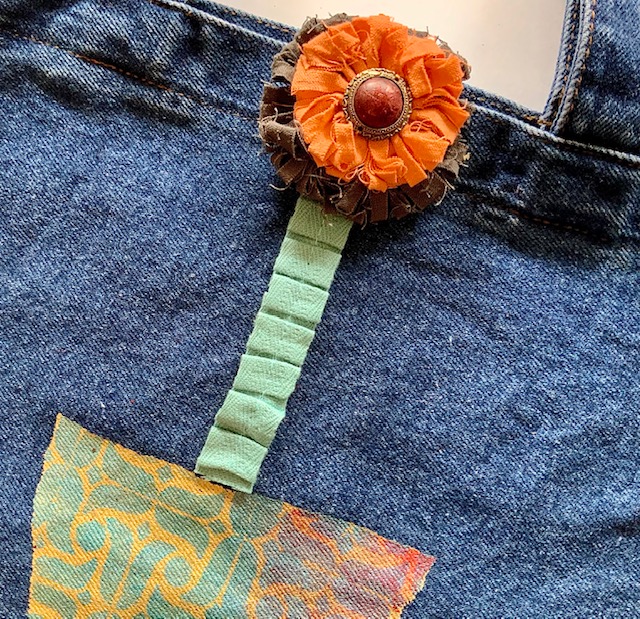
Embellish stenciled totes with knitted, crocheted, and/or frayed fabric flowers. Pleated hem tape makes an interesting stem for a single blossom. Sew in place or use fabric glue to adhere.  

NOTE: Embellishments shown are positioned for photography and are being ‘auditioned’ – nothing finalized yet! I plan on adding beads, embroidery, charms and more.


Thank you Judi – absolutely love the idea of bringing these totes to the farmer’s market or garden center!

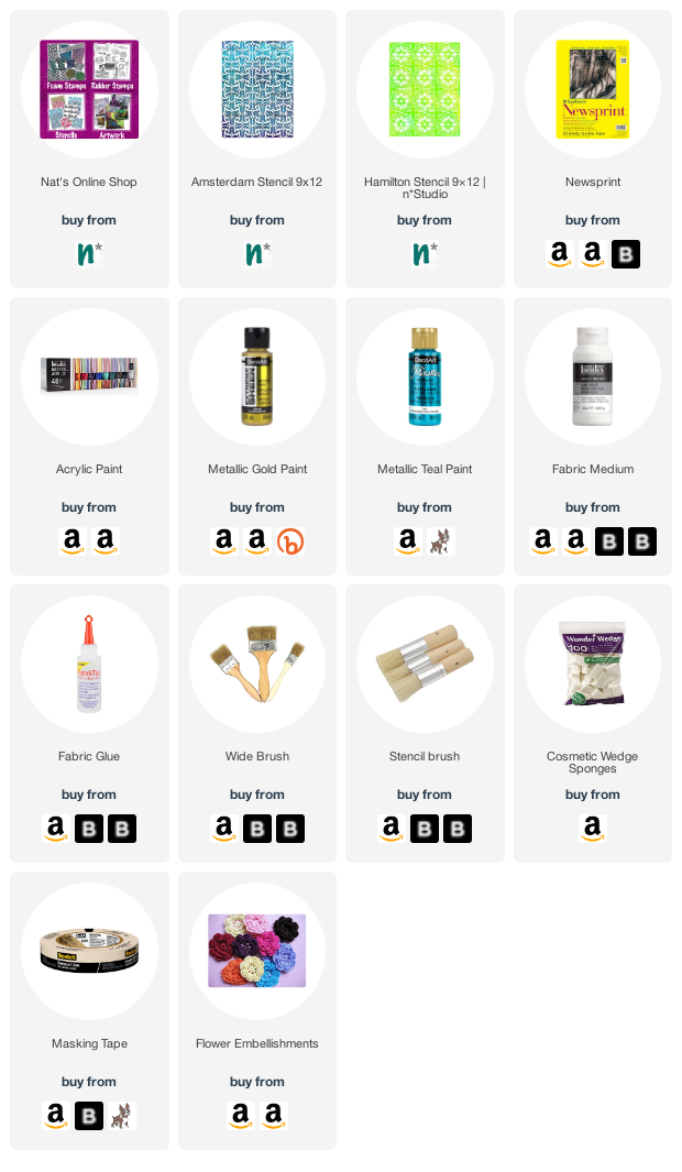
Give it a try: you can find all my Stencils in my Online Shop and in addition to various beads and embellishments, here are some of the supplies Judi used:

Don’t forget to check out Nat’s Creative Squad on Instagram too: Each week we post projects, ideas, and inspiration for mixed media art.
Comments (1)

Leave a comment

Creative Squad: Life in Bloom – Jordan Hill

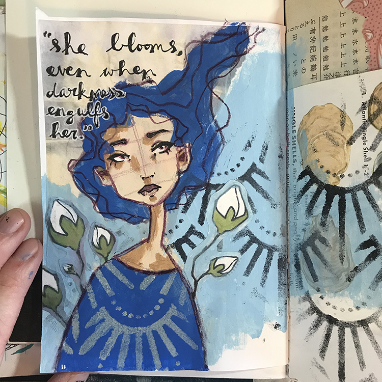
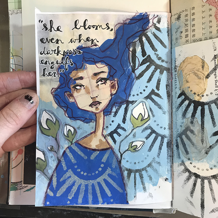
Hello from my Creative Squad! Today we have a post from Jordan Hill, who is sharing an art journal page that is uplifting and so appropriate. Jordan is using my Art Deco Empire stencil and this month’s theme: Life in Bloom – It’s been a long winter where we are and I’m dreaming of flowers and gardens and spring. Indulge us all in a project that focuses on one of Mother Nature’s most exuberant symbols of life: flowers flowers flowers!


Hello everyone, I hope you’re all doing well! For this month’s theme of Life in Bloom, I knew I wanted to try incorporating it in several different ways. In the end, I’m quite happy with the way it turned out and I hope you enjoy following the process!

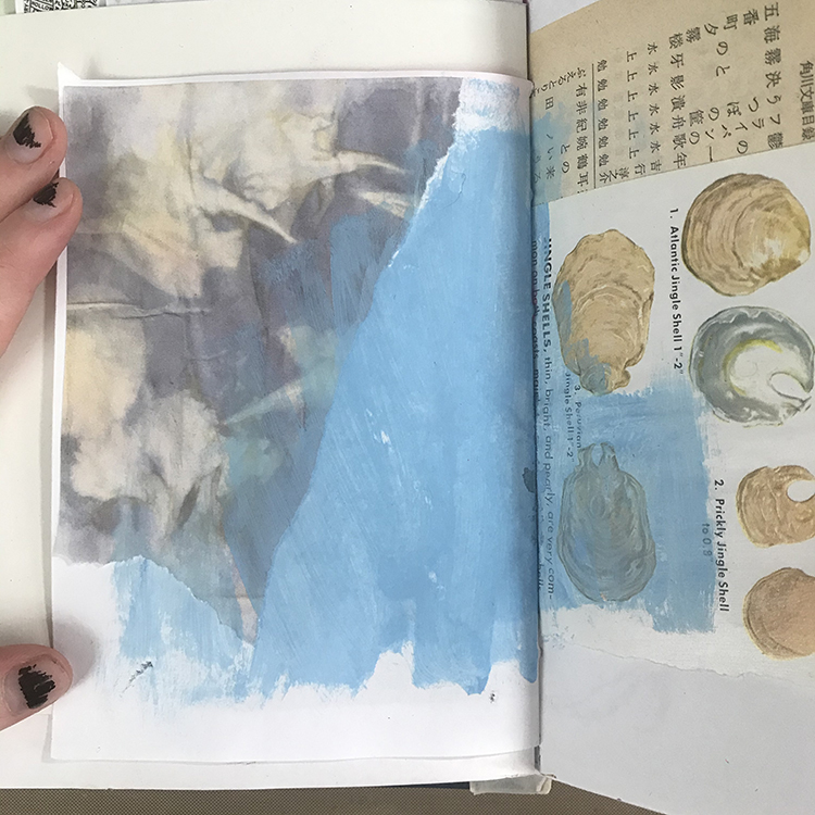
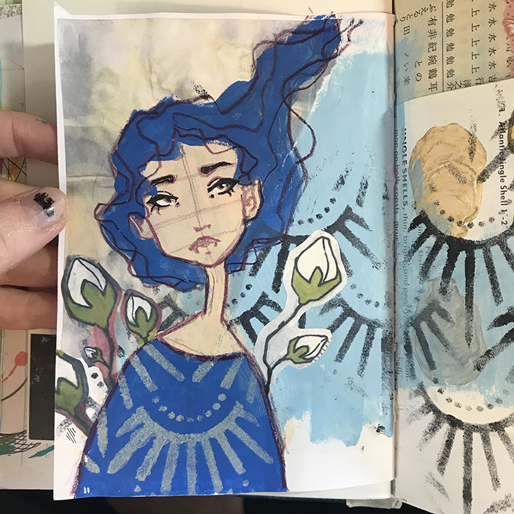
The first step in creating this month’s page was gluing down a piece of collage. I then blended it into the background with a light blue acrylic paint by slightly overlapping the paper with the paint. I chose a piece of paper that I felt fit in with this month’s theme of Life in Bloom; this particular paper is a scan of an eco dyed paper I did a while back.

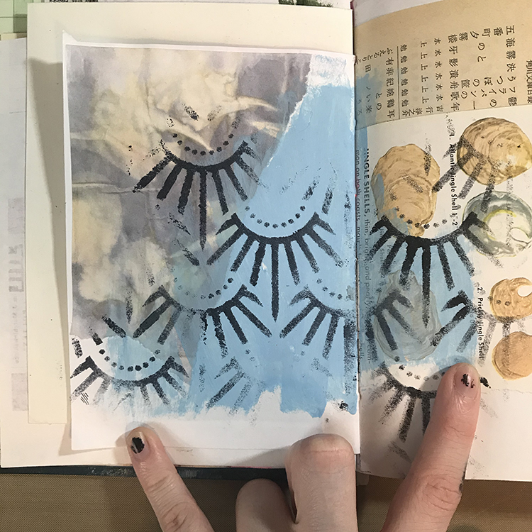
Next it was time to add some pattern! I used Nathalie’s Art Deco Empire Stencil, some black acrylic paint and a makeup sponge to fill the background with interest. For this particular spread, I knew that I wanted the stencil to stand out. Since my background was such a light blue, black seemed like the natural choice!

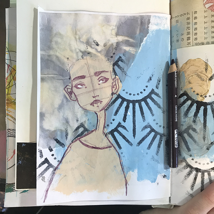
This is where I decided it was time to add a face. Using some acrylic paint in a vague face shape as a base, I started sketching over the top with my trusty Prismacolor colored pencil in the color Black Cherry. This is one of my favorites for sketching, as it isn’t as basic as a black or gray, but is still dark enough for the lines to be clearly defined.

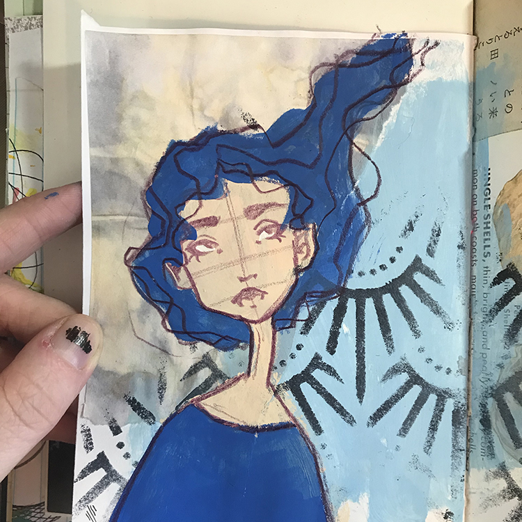
Next, I chose a supporting color of acrylic paint (I decided to go with primary blue for this spread) and started blocking in the shapes of the hair and shirt. I find that using the same color for these two elements is a good way to make your page (and character) feel cohesive. After I had blocked in the color, I then went back in with my colored pencil and reinforced the lines that I had lost when I added the paint. At this point, I also added a few extra lines in the hair to represent flowing strands.

Around this time, I was starting to feel as though the Life in Bloom theme wasn’t strong enough. In order to resolve this, I decided to use a piece of collage (another scan of some previous artwork of mine) to add various blooms around this character’s shoulders. I wanted the buds to look like they were growing from behind her, so I cut up the collage piece (which used to be one large stem) and added them in a way that was more fitting.

During this step I also used Nathalie’s Art Deco Empire Stencil again, this time with a cream colored paint, in order to add some patterning to this character’s shirt.

Then it was time to detail! This is one of my favorite parts of creating journal pages; it’s where everything seems to come together and starts looking a bit more finished. For the details on this particular spread, there were a few things I did. First of all, I added some shadows to the figure’s face using a slightly darker tone of paint, then I added some black line work to the facial features using an ink pen.

I also used the same color of blue I had used for the background to paint around my floral elements, further cementing them into the spread. Additionally, I added a quote in the upper left hand corner that I felt related to the theme of Life in Bloom.

Finally, for the last step, I reached for the Art Deco Empire Stencil one more time in order to add to the stenciling in the background. After adding the figure I felt as though I had lost a lot of the patterning, so I simply lined it up and filled in the rest of the background.

In the end, I think this spread fits the theme of Life in Bloom in the way that I hoped that it would, and I had a lot of fun playing around with the stencil in particular. I hope you enjoyed following the process!


Thank you Jordan – I love that quote and how you pulled your page together. Your character’s style – blue hair and how you used the Art Deco Empire stencil for her top is so cool!

Give it a try: you can find all my Stencils in my Online Shop and in addition to some collage pieces, here are some of the supplies Jordan used:

Don’t forget to check out Nat’s Creative Squad on Instagram too: Each week we post projects, ideas, and inspiration for mixed media art.
Comments (1)

  • Sue Clarke

    |

    I love this page Jordan! Thanks for sharing your process.

    Reply

Leave a comment

Creative Squad: Life in Bloom – Robin Seiz

Hello from my Creative Squad! Today we have a super unique project from Robin Seiz – a birthday book to help her keep on top of those special days for friends and family. She’s using 12 different stencils, one for each month of the year: Art Nouveau Wallpaper, Ornament Wallpaper, Flower Maze, Art Deco Fairview, Santiago, Star Struck, Art Deco Summit, Signals, Hamilton, Mesa Verde, Manhattan, and Downtown stencils and our theme: Life in Bloom – It’s been a long winter where we are and I’m dreaming of flowers and gardens and spring. Indulge us all in a project that focuses on one of Mother Nature’s most exuberant symbols of life: flowers flowers flowers!


Hello friends, This month’s theme is flowers. We are still under a few inches of snow here in New Hope, PA, so this project was exactly what I needed to get me thinking about more mild temperatures and flowers popping up.

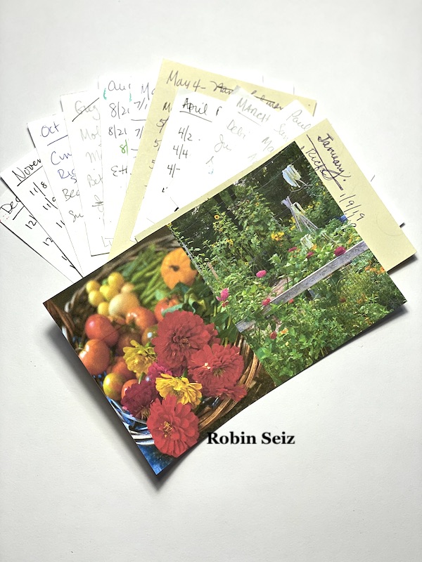
I decided to combine the theme of flowers with a project that I have been longing to do. I love sending happy mail, cards of all types, especially birthday cards. My list of people and their birthdays is housed on sticky notes in my studio.

Birthdays are also in my phone of course, but I like to have an “at-a-glance” look at all the birthdays for the month. When the spirit moves me, I make cards in advance. I have wanted a place to keep a list of the birthdays by month and a corresponding pocket for the cards I make in advance. So basically, I wanted to create a Birthday Book! Old fashion you might say, but it will work really well for me.

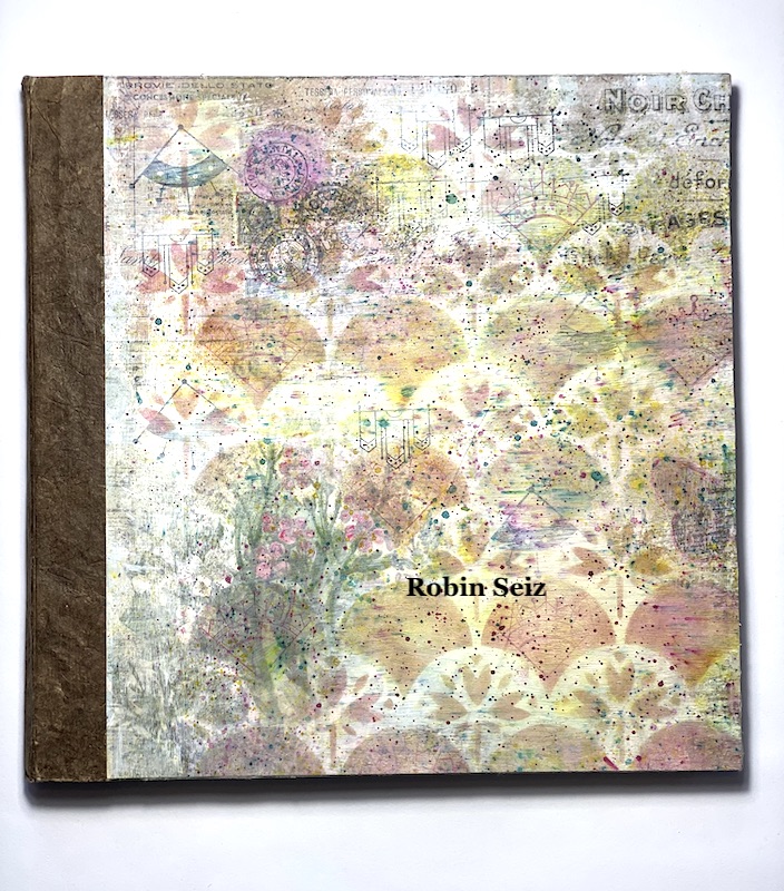
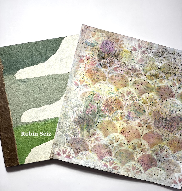
Last month, for my blog submission, I made a piece of layered paper. When it was finished, I wasn’t sure how I would use it, but I knew the right project would speak to me.

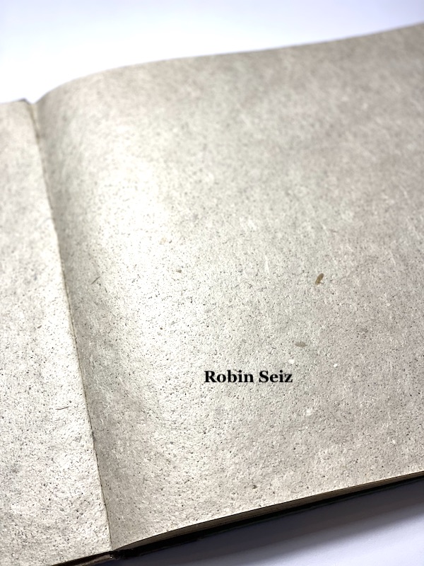
This months theme created the perfect opportunity. I found a book on my shelf that was made in the foothills of the Himalayas of Nepal by local craftsmen. It’s a gorgeous book with beautiful textured paper and the cover was lovely in it’s own right, but I decided the layered paper from last month would make the perfect cover.

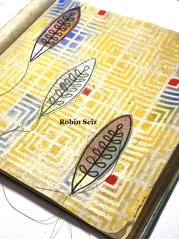
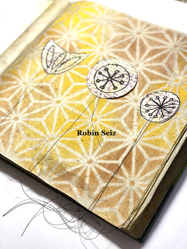
As I looked at all of Nathalie’s beautiful stencils, I chose to use them as a background for my flowers, but I wanted the right balance of letting the stencils shine and highlighting the flowers. I found the best way to do this was to make the flowers simple, mid-century modern designs, and only include a few on each page. And some pages, just spoke for themselves without the flowers.

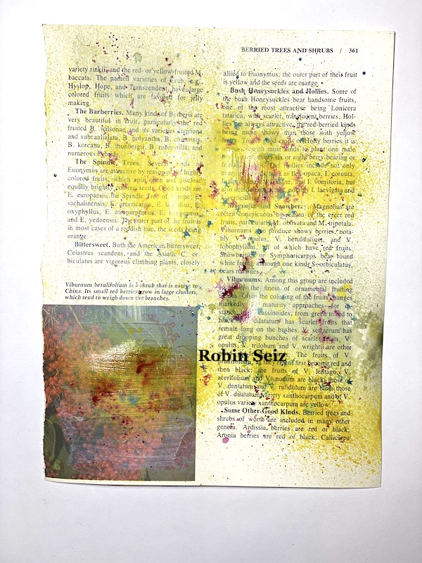
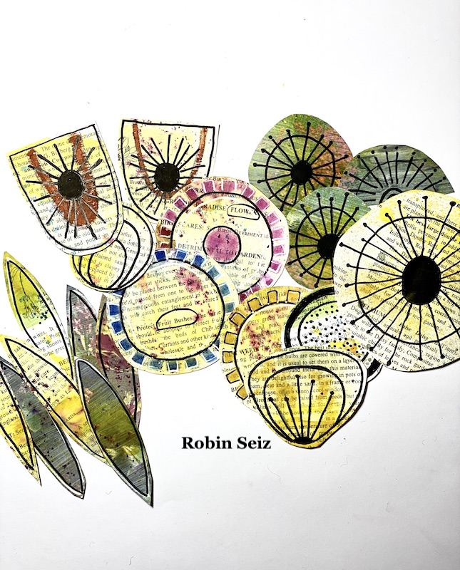
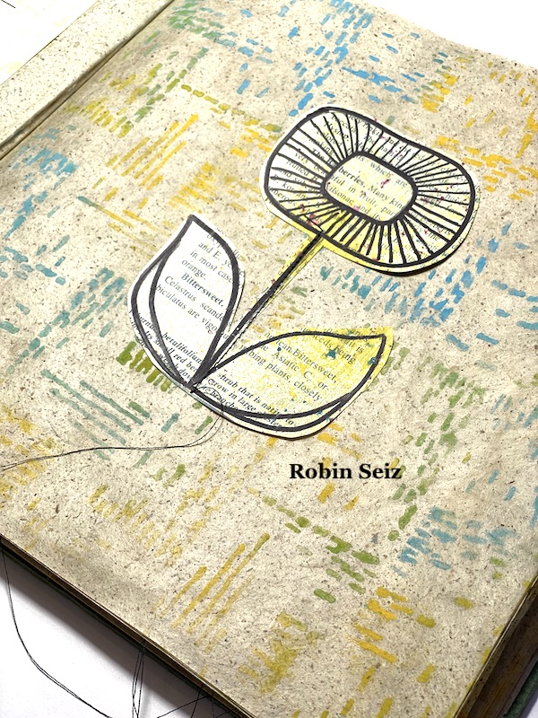
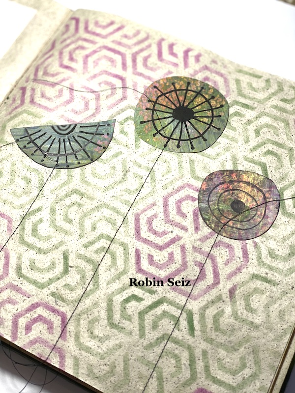
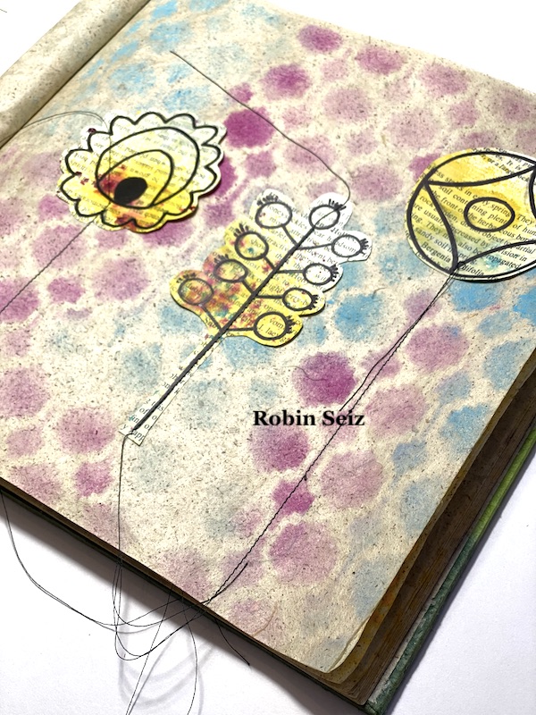
To go with the theme, I chose an old garden book, removed pages, and applied a small amount of gesso with an old brush just to give the page a little more strength. Once they were dry, I sprayed Distress Ink Stain in Old Paper, Mustard Yellow, and Festive Berries. Next I drew the mid-century modern flower designs on these pages using Black and White Posca Pens and embellished as needed. I cut out the flowers; some were the whole flower, some were just the heads since I knew I was going to attach them to the page with my sewing machine.

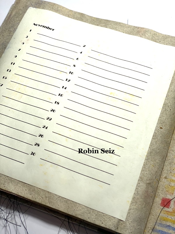
I created a template for each month of the year, printed it on card stock, and attached it with Matt Medium to the left-side of the spread.

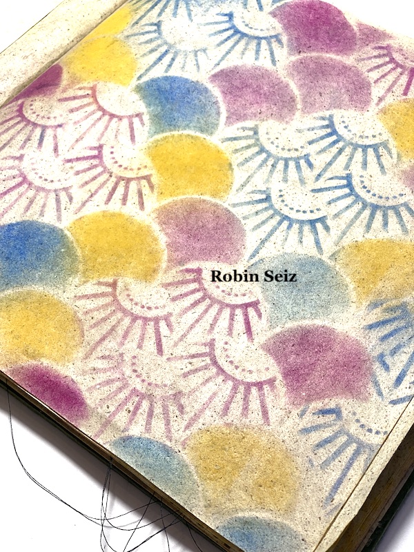
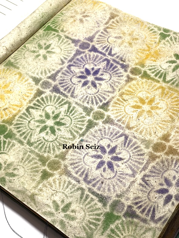
Now it was time to use Nat’s stencils. I tried a variety of different mediums, but in the end, I chose Pan Pastels because the effect matched the organic feel of the pages. The only thing about Pan Pastels is they smudge easily and bleed onto the adjacent pages. It would have been difficult to apply a fixative to these pages because of their weight and textural nature. This messiness doesn’t bother me; as you all know by now, I’m not about perfection! If I were giving this as a gift, I would need to figure something out to eliminate this issue. (I would love to hear your ideas for this.)

I used a makeup sponge to apply the Pan Pastels to Nathalie’s stencils on the right side of the spread. (1 stencil for each month of the year) Throughout the book, I used the colors from the cover to make sure the book had a consistent look and feel. Here are Nat’s Art Deco Summit and Hamilton stencils used.

Next, I sewed on the flowers with the sewing machine. (which honestly, wasn’t all that easy since I was working in a bound book) I like to leave the long strings attached — I just love that look, but of course you can cut them if you like. If you don’t have access to a sewing machine, you could use the Matt Medium to attach the flowers and draw the stems with Posca Pens or whatever mark making tool you have in your stash.

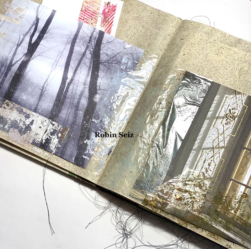
After each spread, I skipped two pages (1 full spread) so that I could attach pockets to keep the cards that I make in advance. I love to recycle and reuse. I receive several Stampington Magazines every quarter. I love going through the pages; the pictures are beautiful, the weight of the pages is perfect, and of course there are lots of good ideas. The issues are hard to part with, but I pulled out some pages with pictures that spoke to me and attached them with packing tape to the pages where I was going to keep the cards. So basically, I created a pocket for the cards.

Just a note about the packing tape: I sometimes use packing tape to pull paint off my gel plate. I often get wonderful bits of grunge and I save the grungy packing tape. (who wouldn’t!) It has all kinds of uses. Again, I wanted an organic, textural feel to this book and so this grungy packing tape was just perfect, not only to keep the pockets in place, but to enhance the organic feel of the book.

I now have a place to keep track of all my birthdays and the corresponding cards as I make them. This makes me so happy!

Thanks so much for reading this blog and for walking with me on my mixed media journey. If you aren’t already following me on instagram and facebook, please consider doing so. I love keeping in touch with each of you.


Thank you Robin – what a fabulous way to organize everyone’s birthdays!

Give it a try: you can find all my Stencils in my Online Shop and in addition to a journal, magazine pages, a sewing machine and a printer, here are some of the supplies Robin used:

Don’t forget to check out Nat’s Creative Squad on Instagram too: Each week we post projects, ideas, and inspiration for mixed media art.
Leave a comment