Creative Squad

Rise & Shine – Nicole Watson

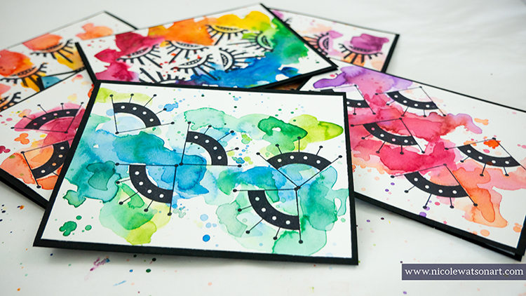
Hello from my Creative Squad! Today we have a colorful suite of cards and a video from Nicole Watson. Check out her process below using my new Mini Motifs and Triangle Love stamp sets and this month’s theme: Rise & Shine – Sometimes it is inspiring to think of each new day as an opportunity to do something good – to shine. Create something that will encourage others to do the same and let’s all bring a little more light into this world!

If you’re like me, you’ve probably spent some extra time during these stay at home days browsing Instagram and admiring all the creativity that is flowing from so many artists. Maybe, much like me, that creativity just isn’t flowing for you. It’s ok! You’re not alone!

Honestly, I struggled a bit with the theme this month. Sometimes it’s hard to shine and encourage others when you are feeling a bit blah yourself. Last month I shared that I’ve been focusing my time outside and in our garden planting flowers. This has brought me so much joy! The simplicity of planting flowers, caring for them, and watching them flourish has helped me cope with staying home (except for my trips to explore local nurseries and for groceries!).

I’ve noticed I’m not alone in the need to DO something creative and with one’s hands! While some are creating art, others are baking or gardening and yet others are returning to pen pals and sending snail mail. I wanted to send some mail to brighten some days this last week and realized my blank card stash was getting low… and that’s when this project came together!

Watch my video:

Here’s how:

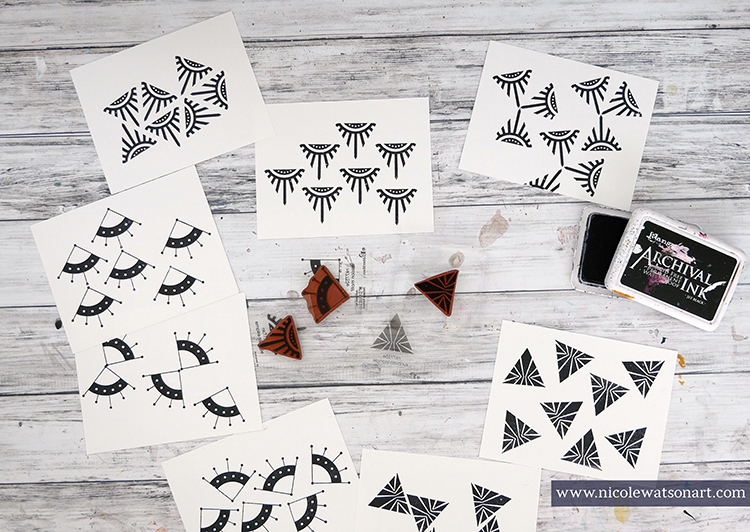
Grab some hot press watercolor paper and stamp on it with Nat’s Mini Motifs and Triangle Love stamps using black archival ink. Have fun! 
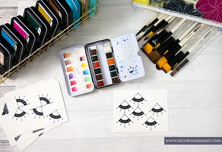
I enjoyed this process of creative stamping, all wonky, not perfect. Archival ink is important as it will not bleed or run with the watercolor in the next step. 
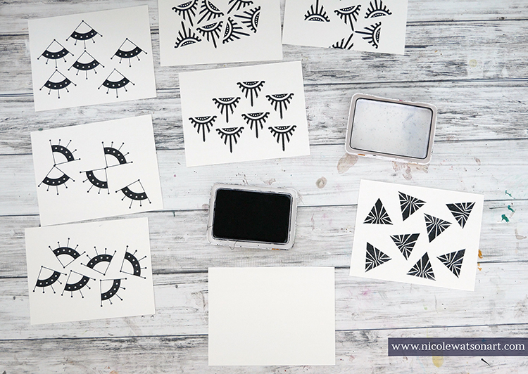
And, hot press paper is smoother for stamping. You can use cold press, but your stamped images will not turn out as clear (Note: I pre-cut my watercolor paper into card fronts (4.25×5.5) and will trim them down again to mount on the cards.)
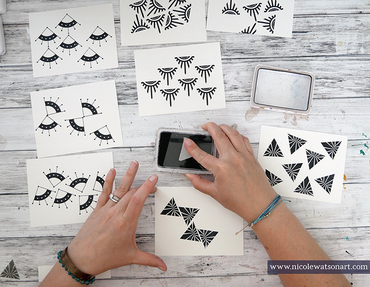
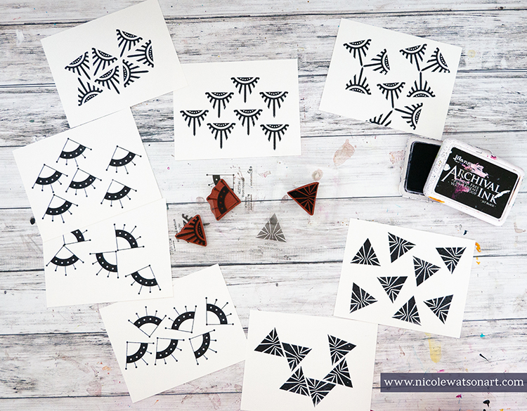
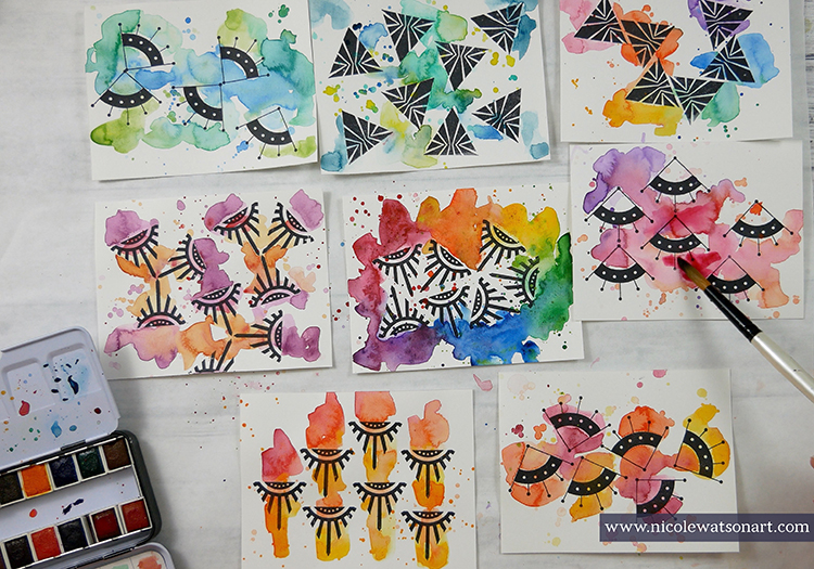
Let the ink thoroughly dry and then watercolor. Again, have fun! The only thing to keep in mind while you are water coloring is how colors blend. I stayed with palettes of warm colors or cool colors and then also a couple full rainbow palettes. Add some splatters and lots of puddles of color around the stamped images. 
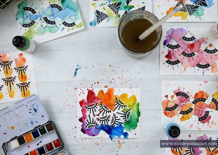
Let your fronts dry completely. Once they are dry, if there are areas that didn’t turn out dark enough or exactly how you’d like, go ahead and add some more color and splatters. And, of course, let dry.
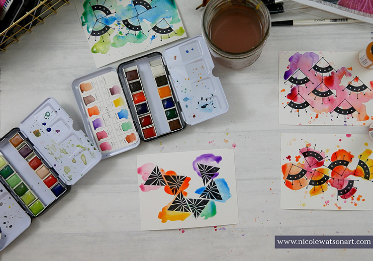
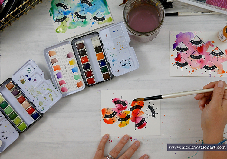
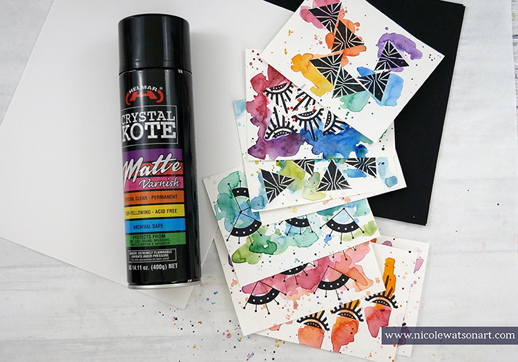
The next step is personal preference. I like to spray my watercolor cards with a clear matte varnish to protect them in case they become wet or damp in the mail. Be sure you follow the instructions on your spray.
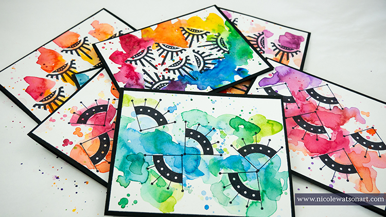
Once they are dry (again!), trim your cardstock bases and liners for your cards. Then, if you want a border around your artwork, trim your art a bit (to 4×5.25). Even though I knew I’d be trimming them when I started, I like to allow this option so I can trim off a funny area or help center the design if I didn’t stamp it quite right.  Then, fold your cards and stick the liners inside and your art on the front.
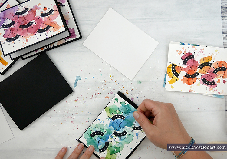
Final step? Mail them! These bright, cheery cards are perfect to shine, encourage someone, and do something good.

I did not want to stop painting these card fronts. Had I not run out of watercolor paper, I would have made many more. (Note to self, order more watercolor paper!) I cannot wait to send these in the mail, and I’d love to send out a couple to YOU as well. Find me on Instagram, and look for the post about this tutorial to see how to receive one in the mail. I can’t wait to see what you create with Nat’s stamps and watercolor.
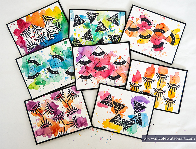
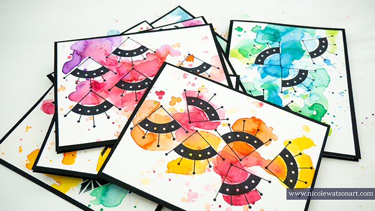
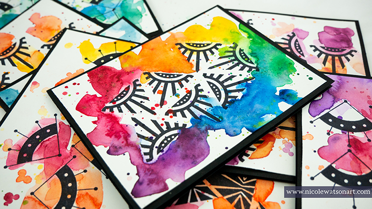
Thank you Nicole! Love the brilliant colors here and super appealing color combinations. What a treat to see.

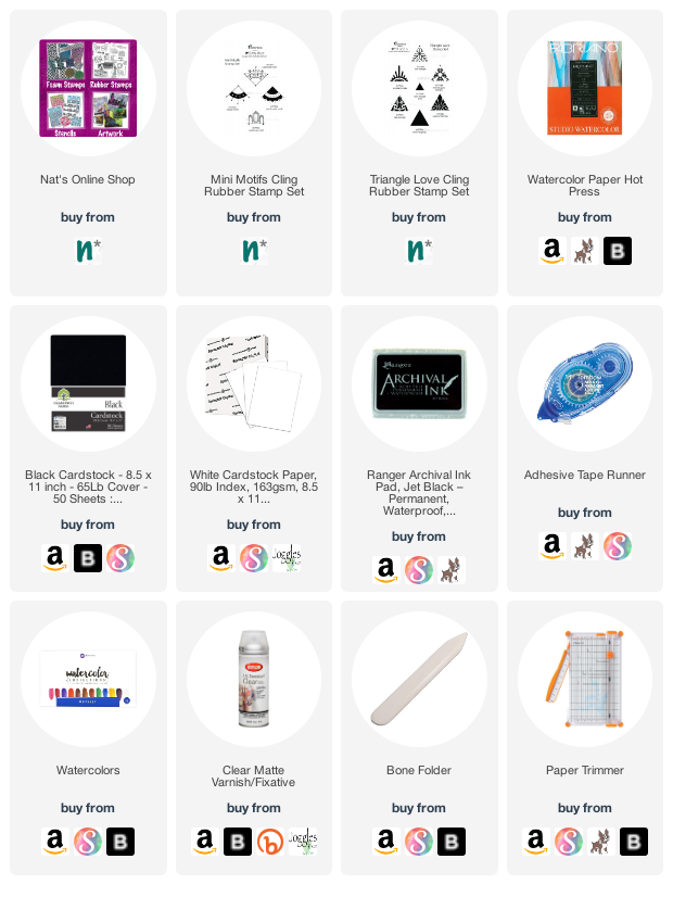
Give it a try: you can find all my Rubber Stamps in my Online Shop and here are some of the other supplies Nicole used:
Feel inspired? Working on something yourself that you’d like to share?  I love to see how you interpret our monthly themes. Email me how you used my stencils and stamps with the theme and email me an image – I would love to share your projects in my next  “n*Spiration From Around the Globe“.

Comments (1)

  • Sue Clarke

    |

    Nicole, those are gorgeous cards! I especially like the crisp, clear stamp image that you got on the paper, and the cheery colors you chose.

    Reply

Leave a comment

Rise & Shine – Maura Hibbitts

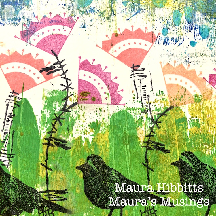
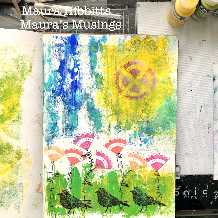
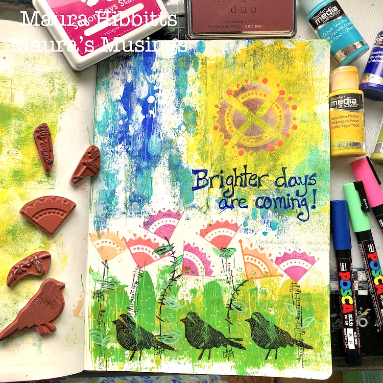
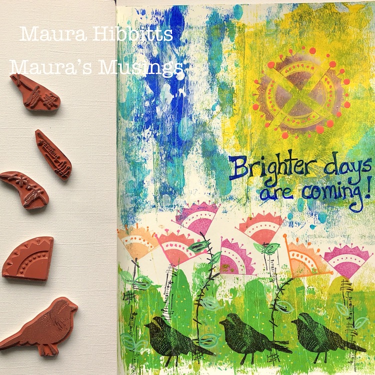
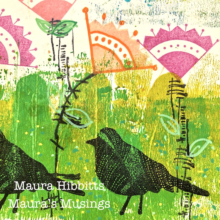
Hello from my Creative Squad! Today we have an art journal page from Maura Hibbitts to lift you up a bit. Maura is using my new Mini Motifs, Nightingale, and Wabi Sabi rubber stamps with this month’s theme: Rise & Shine – Sometimes it is inspiring to think of each new day as an opportunity to do something good – to shine. Create something that will encourage others to do the same and let’s all bring a little more light into this world!


“Rise and Shine” bring back strong childhood memories of my mother using these exact words to get me out of bed in the morning and off to school. Some days I can remember grumbling to myself, “what is there to shine about today?” Those were the days I was so cozy and snug, I just did not want to get up. Today, I am thinking about these words a little differently. Right now, we need things to look forward to in our daily lives, things that shine brighter. Perhaps it is a beautiful sunny day, or the flowers starting to bloom (at least here in upstate NY) that bring some joy to us, so we want to rise and start our day. I am also hopeful that there are brighter days ahead for all of us!

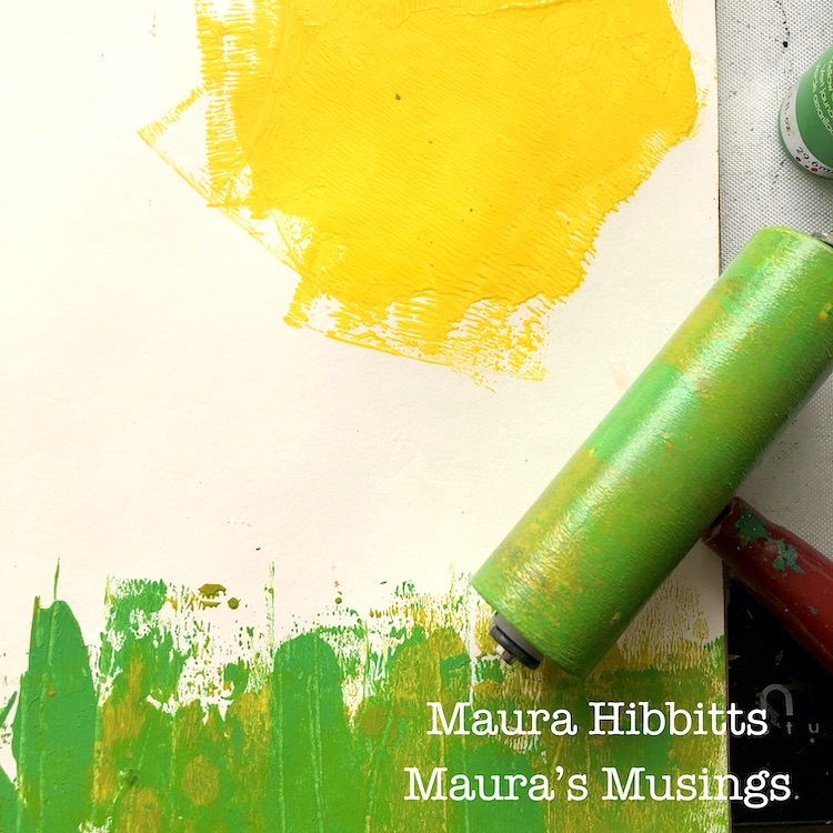
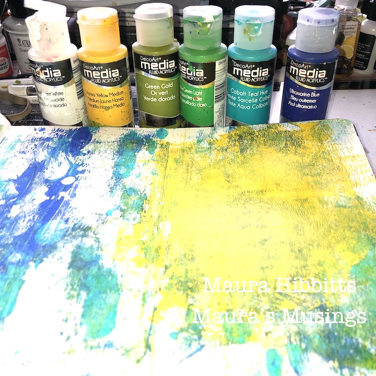
I started off in one of my large art journals with fluid acrylics and a brayer. I began at the top with a good squirt of Hansa Yellow Medium, and rolled the brayer in several directions, to create an area for my sun. Next, I added some drops of Ultramarine blue and Cobalt Teal Hue for my sky area, and rolled the brayer vertically to blend a bit. I also went in and added a bit of Translucent White. I repeated the same vertical strokes with the brayer and Yellow Green Light and Green Gold at the bottom of the page for the grass area. Any extra paint, I just rolled onto the page next to this one, no use wasting any of it.

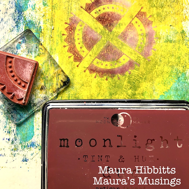
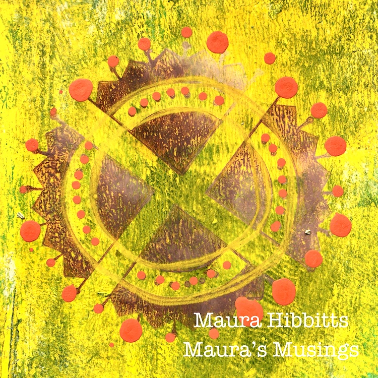
Once the paint was completely dry, I began to stamp the sun. I did this with the Arts and Crafts Motif stamp in a repeating pattern, and used the Moonlight Duo Nebula Rust ink.

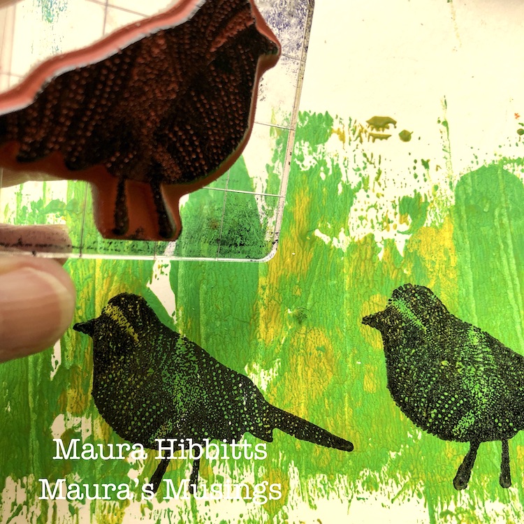
I stamped three Nightingale images in the grassy area with black ink. One great tip I have learned over the years, is to use an uneven number of objects. One bird didn’t feel like enough. Remember that saying, the early bird gets the worm? (another rise and shine moment) Well, my trio of birds is out early looking for them!

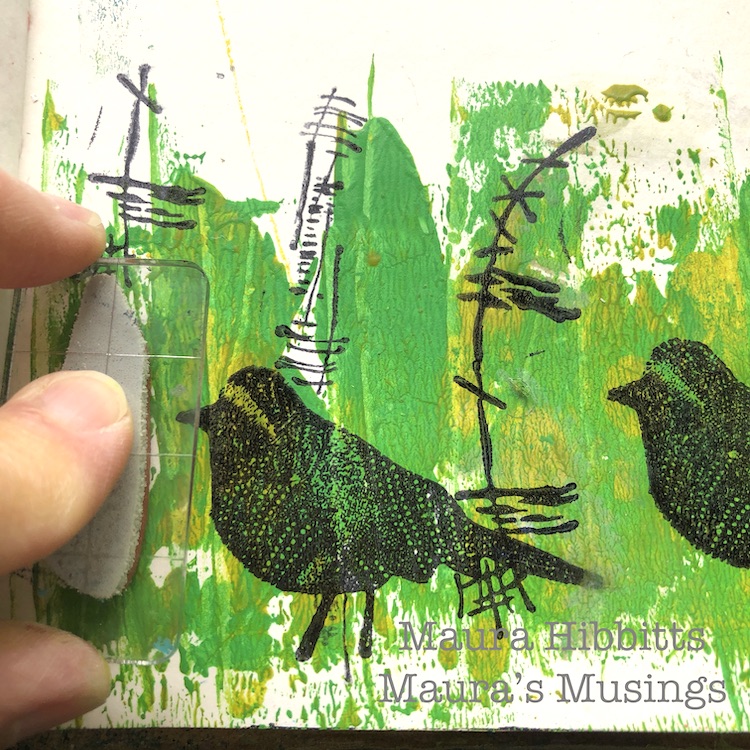
Next, I stamped a variety of “flower stems” with the Wabi Sabi stamps – Jazzed, Groovy and Gnarly and black ink.

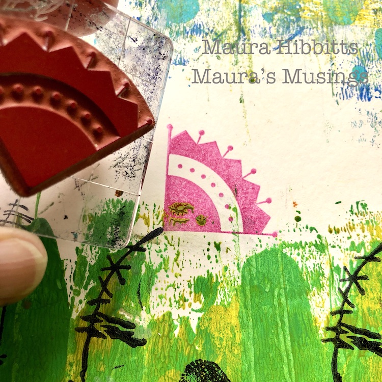
I turned the Arts and Craft Motif stamp into flowers, and stamped them with bright inks, using pinks and oranges, on the end of the stems. I don’t know about you, but colorful flowers always make me smile.

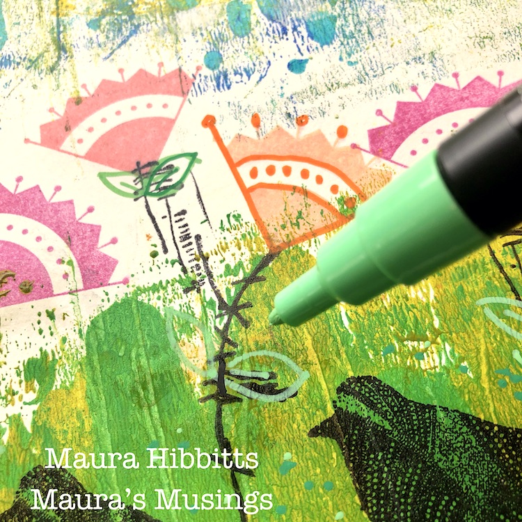
Next, I took several colors of Posca paint pens to add in a bit of detail on the sun and flowers. I also drew in a few leaves for the stems, and added some dots into the grass.

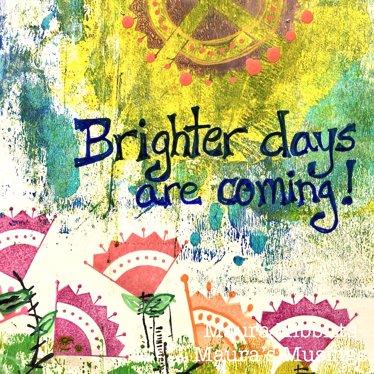
Final step was to hand letter “Brighter days are coming!” with a Posca pen.

I try to live my life in a positive and optimistic way, and even when times are really difficult like now, I have to believe bright days will be here again. Creating a cheerful art journal page helps uplift my mood.

What helps you to Rise and Shine each day? Children, grandchildren, spouse, friend, pet? A sunny day, your garden, art, birds singing outside your window? Look for the special joys in your life to help lift your spirits. I wish you the best! – Maura


Thank you Maura! We are definitely ready for some brighter days ahead :)

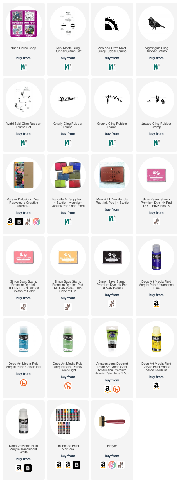
Want to give Maura’s project a try? You can find all my Rubber Stamps in my Online Shop. Here are some of the other supplies Maura used:

Feel inspired? Working on something yourself that you’d like to share?  I love to see how you interpret our monthly themes. Email me how you used my stencils and stamps with the theme and email me an image – I would love to share your projects in my next  “n*Spiration From Around the Globe“.
Leave a comment

Rise & Shine – Jennifer Gallagher

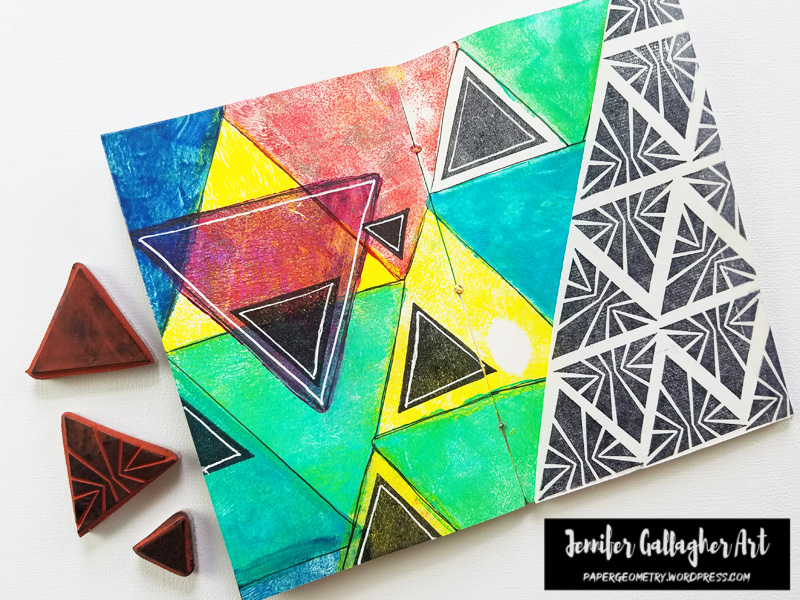
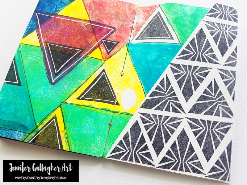
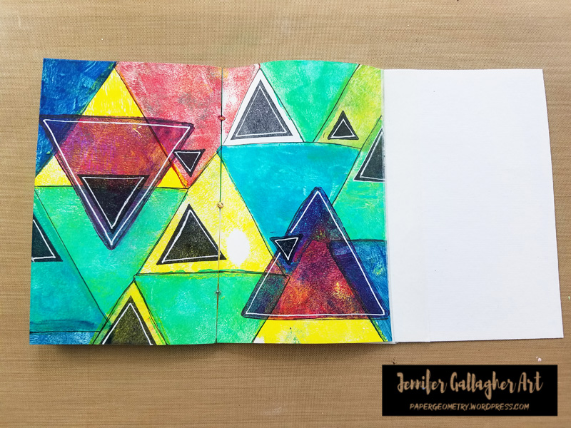
Hello from my wonderful Creative Squad! Today we have an art journal spread from Jennifer Gallagher to lift you up and inspire you. Jennifer is using my Triangle Love rubber stamps and this month’s theme: Rise & Shine – Sometimes it is inspiring to think of each new day as an opportunity to do something good – to shine. Create something that will encourage others to do the same and let’s all bring a little more light into this world!


Living in a pandemic, many people are experiencing difficult times. We are quarantined and separated from our neighbors, family, and friends. Now, more than ever, we need some positive vibes and things to take our minds off of it. The Creative Squad is looking ahead this month to a happier time. We shall rise and SHINE! With that in mind, I have created an art journal spread that makes me very happy and has a hidden message inside. One of my greatest artistic joys is a geometric shape or a repeating pattern. So I’ve combined my favorite things into this spread. Let’s get started.

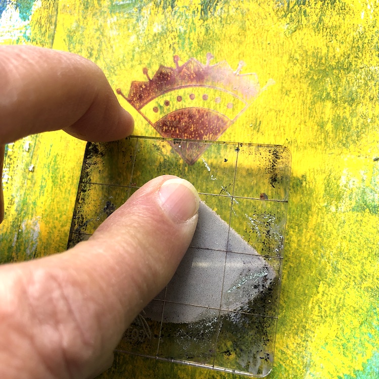
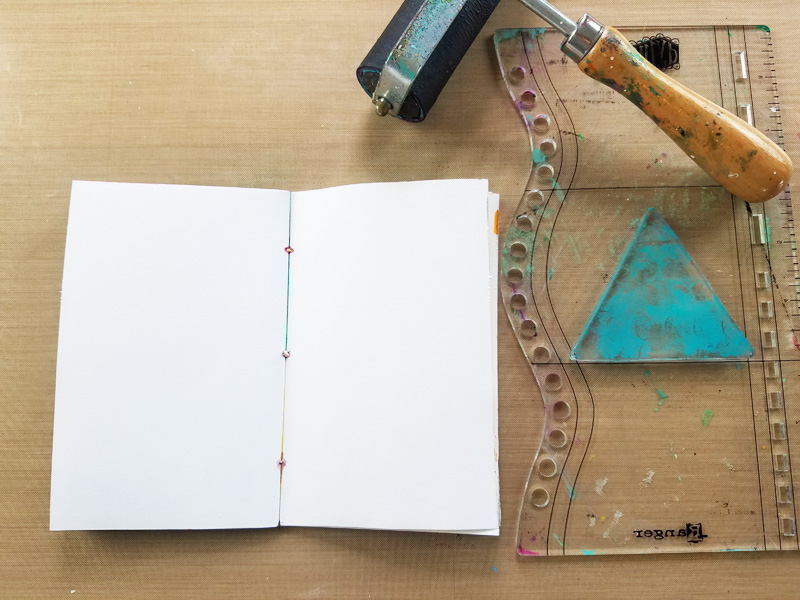
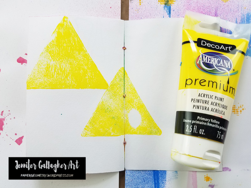
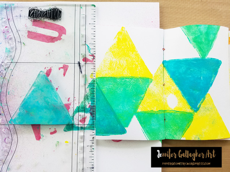
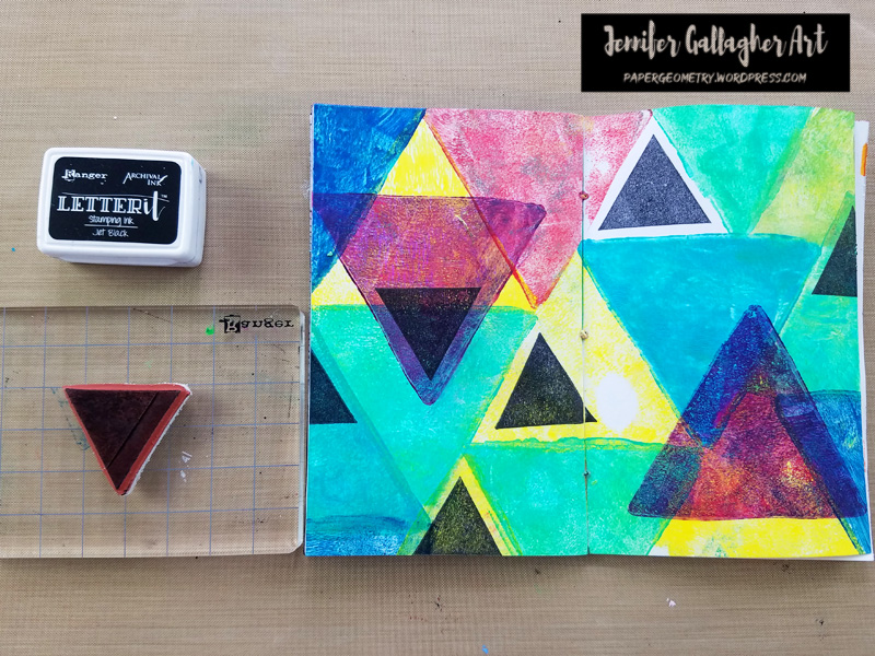
I pulled out a mixed media journal in a field size. I pulled out my three inch triangular gel plate and brayered primary yellow onto it. I pressed the gel plate onto the field journal in a few places.

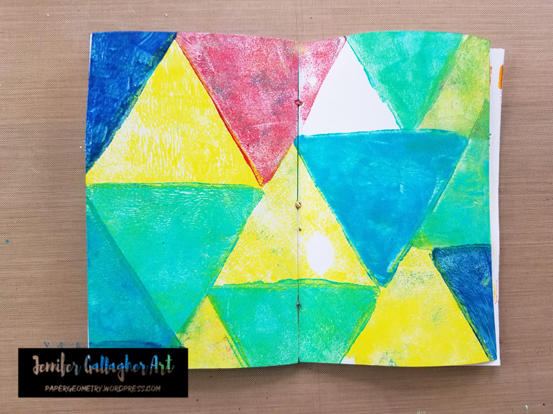
I added a few more gel press triangles in bright aqua green and cobalt teal hue.

I added more gel press triangles in Pyrrole Red and Phthalo Blue.

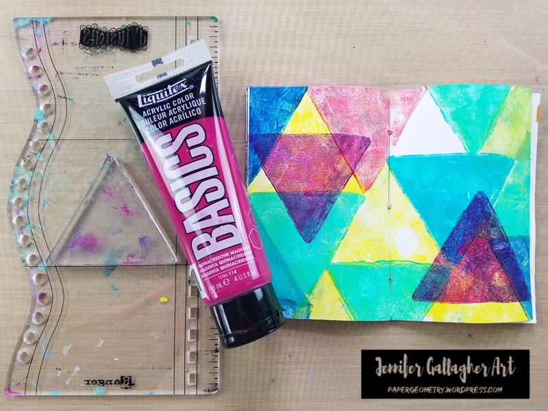
I added two last triangles in Quinacridone Magenta in spots where they would overlap several colors. Notice I left one small white triangular area.

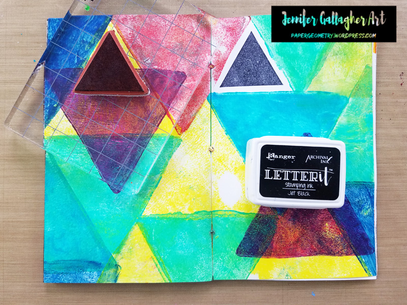
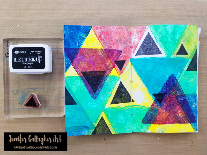
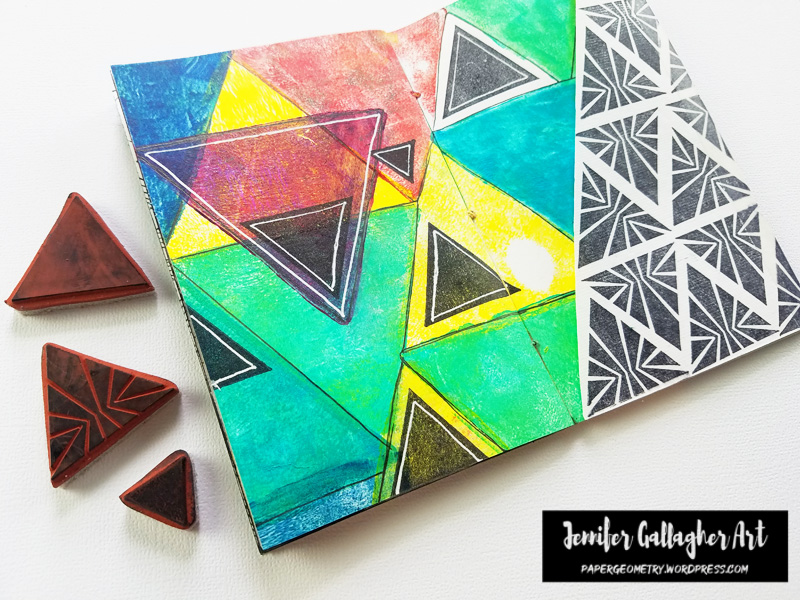
In the open white triangular area, I stamped Nat’s solid large triangle from the Triangle Love set in black archival ink.

I added additional black solid large triangles throughout the page.

I additional additional black solid small triangles throughout the page.

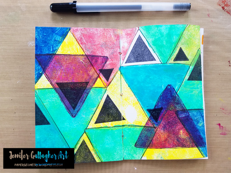
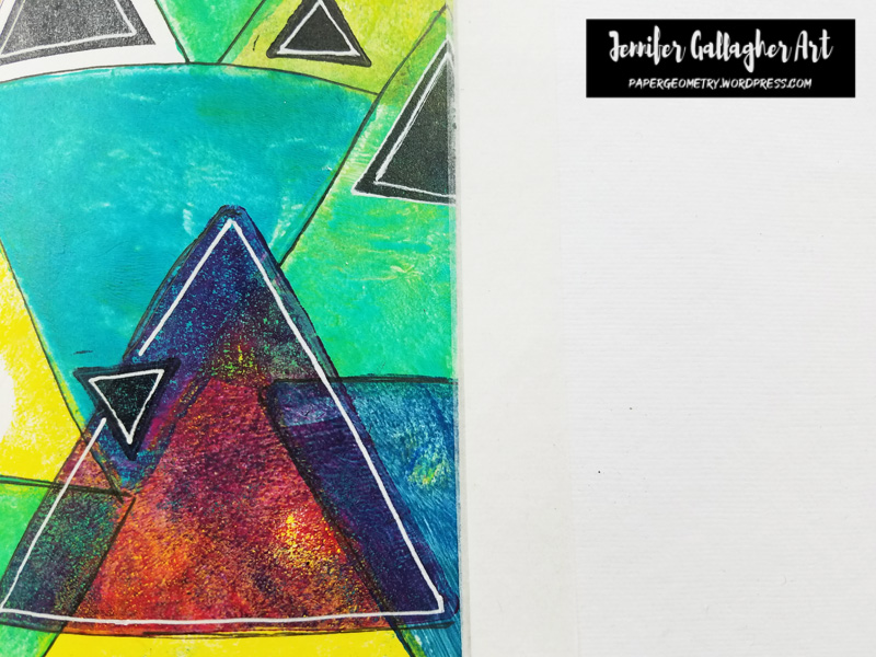
With a black gelly roll pen, I went through and outlined all of the triangle shapes.

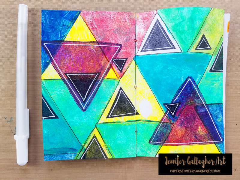
Next, with a white gelly roll pen, I went through and added some white outlines as well.

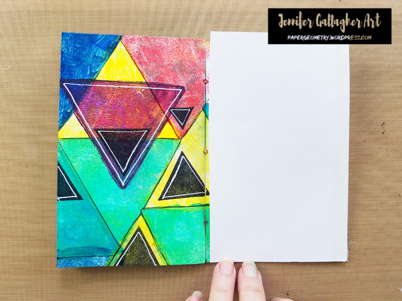
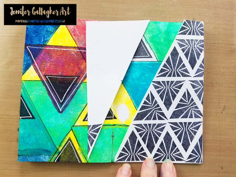
I cut a scrap piece of Dina Wakley Media cotton rag paper into the same size as my journal pages. Using Dina Wakley Media media tape, I attached the sheet to the right hand page by applying tape to both sides.

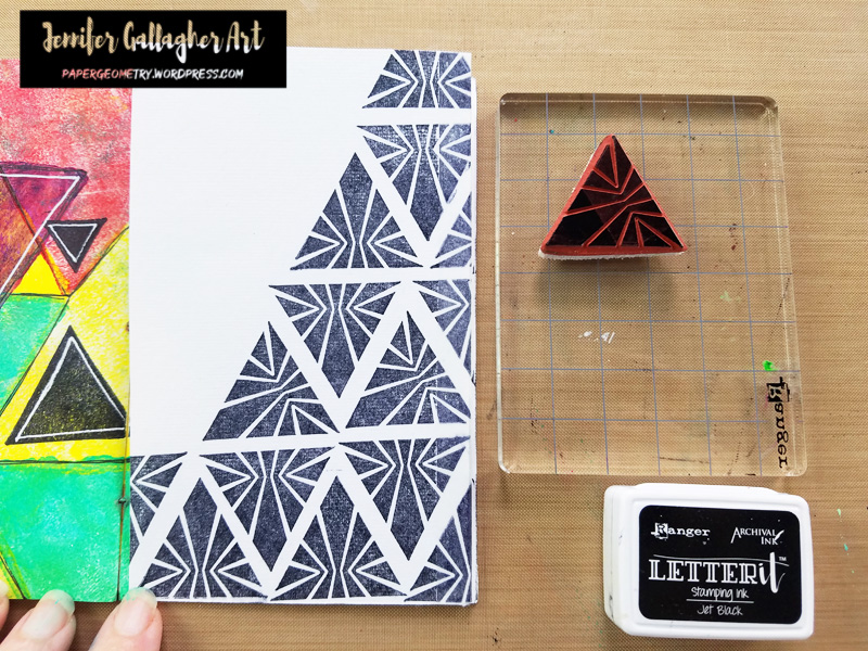
Next, I stamped in black archival ink with nat’s sunburst triangle from Triangle Love.

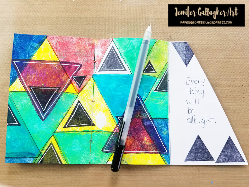
I cut a piece off of the cotton rag to mimic the triangular shape. Then, on the inside of the cotton rag paper, I stamped a few solid triangles and wrote a message in black ink.

I hope you have enjoyed this tutorial. If you try out one of our creative squad ideas, please share with us. Take care!


Thank you Jennifer for giving us some hope in these difficult times.

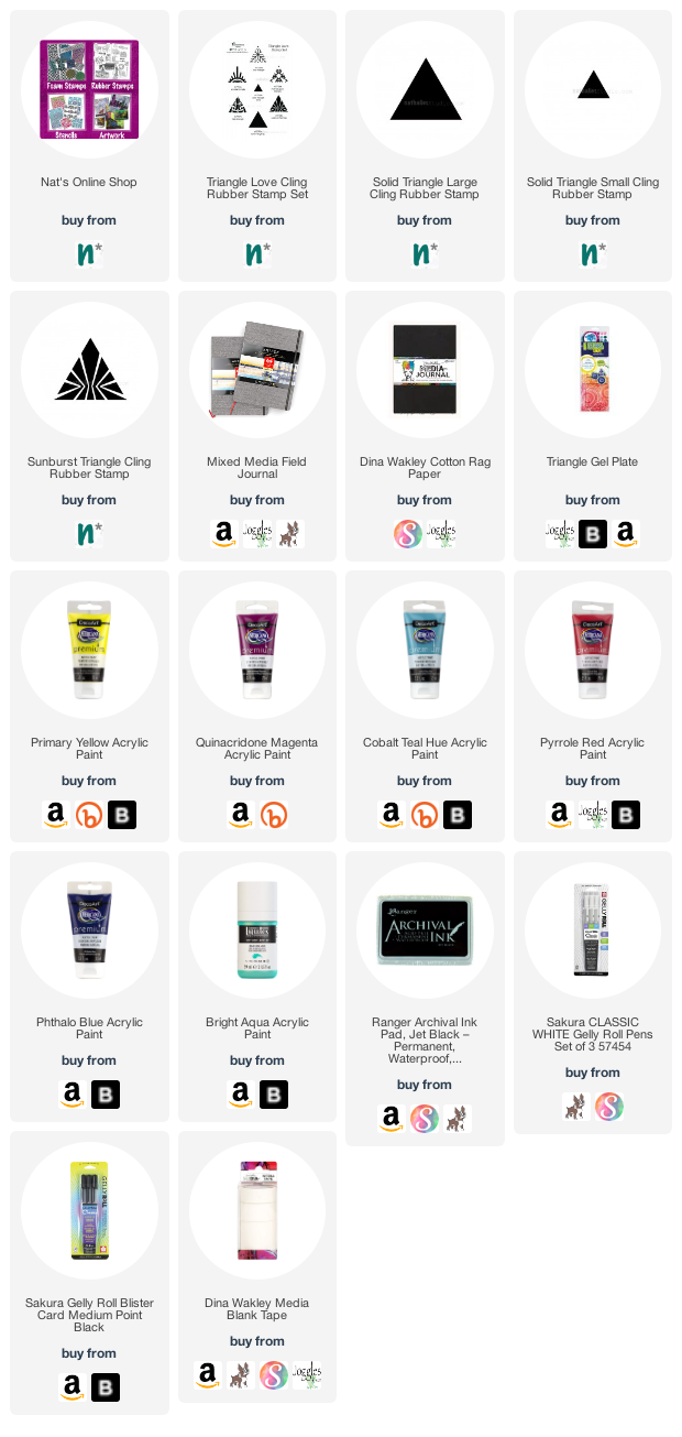
Give it a try: you can find all my Rubber Stamps in my Online Shop and here are some of the other supplies Jennifer used:

Feel inspired? Working on something yourself that you’d like to share?  I love to see how you interpret our monthly themes. Email me how you used my stencils and stamps with the theme and email me an image – I would love to share your projects in my next  “n*Spiration From Around the Globe“.
Leave a comment

Weather Report – Emilie Murphy

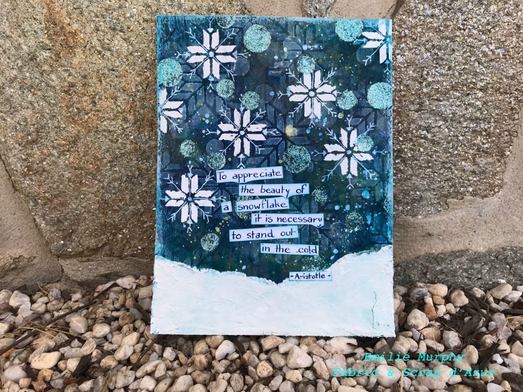
Hello from my Creative Squad and a BIG welcome to our newest member Emilie Murphy! Today is her first project with us and we are very excited to share this art journal page with you. Emilie is using my Santiago, Space Age Modern, and Exchange Place stencils and this month’s theme: Weather Report – Let’s talk about the weather! Do you love thunderstorms? The crisp air of Autumn? A good snowstorm? Are you a fan of endless sunshine? Create something inspired by that go-to topic of small talk – the weather!


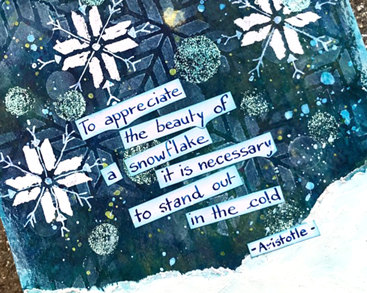
“To appreciate the Beauty of a snowflake, it is necessary to stand out in the cold.” – Aristotle

Hi everyone! This is my very first project for the Creative Squad this month. I’m so happy to be a part of Nathalie’s Design Team.

I have to say that Spring is probably my favorite season of the year, but as I didn’t get any snow this year, at least where I live in Maryland, I decided to make an art journal page about snowstorms to illustrate our “Weather Report” theme this month.

Let me guide you on how I made my journal page!

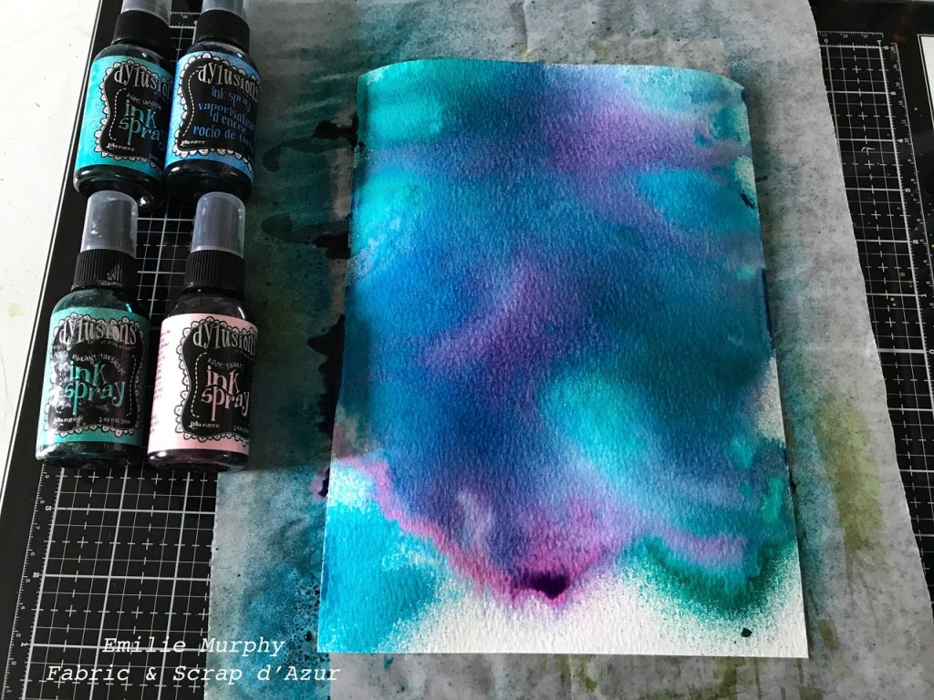
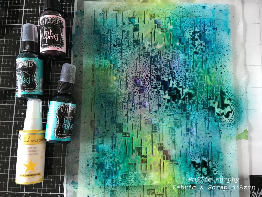
I started to spray some Dylusions ink on a 140lb. piece of watercolor paper until I was happy with the result.

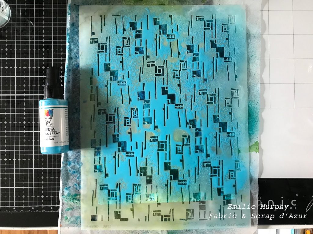
Then, to add some texture, I sprayed over the “Space Age Modern” stencil with the same dylusions inks. Let it dry.

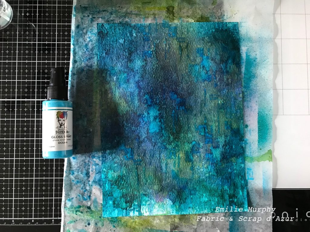
Then I sprayed again through the same stencil with some ocean glossy acrylic (new product of Dina Wakley) and let it dry.

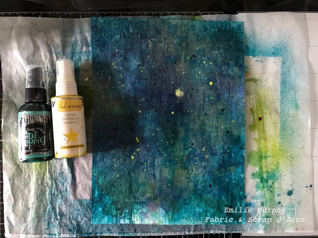
One thing that I like to do, in almost all of my journal pages is to add some splatters.

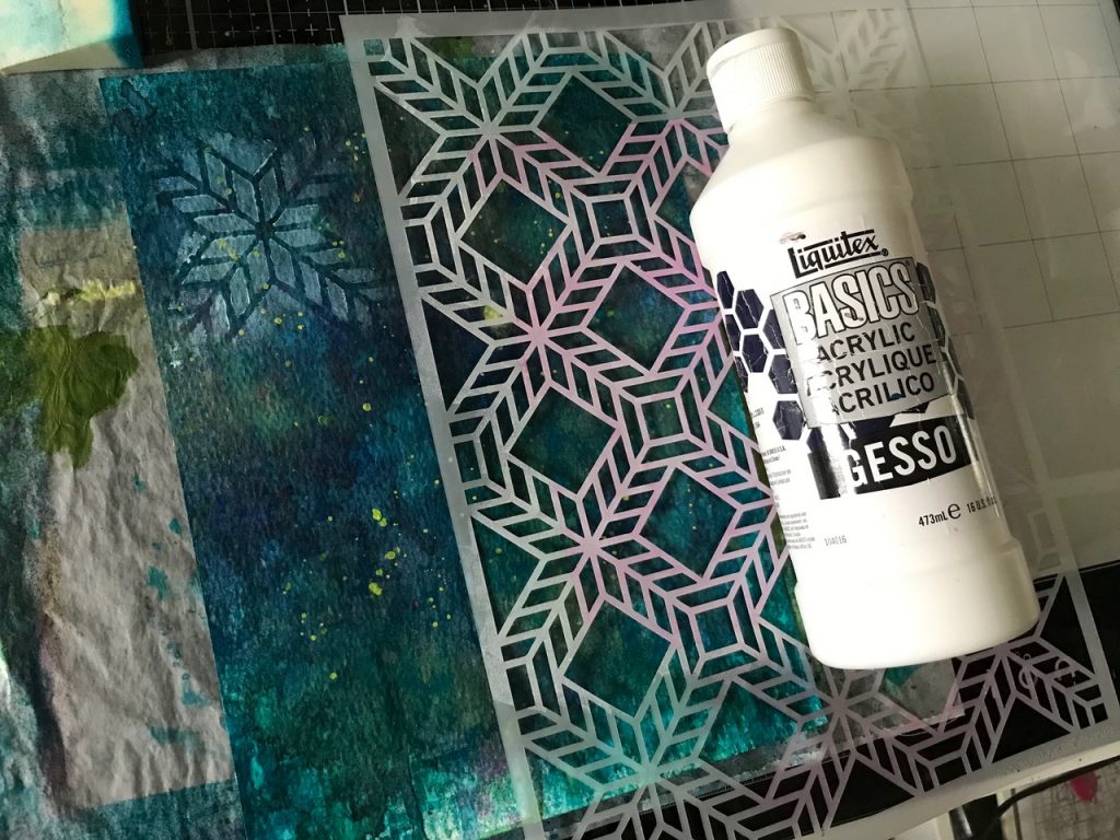
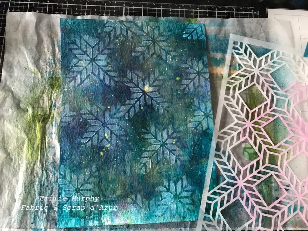
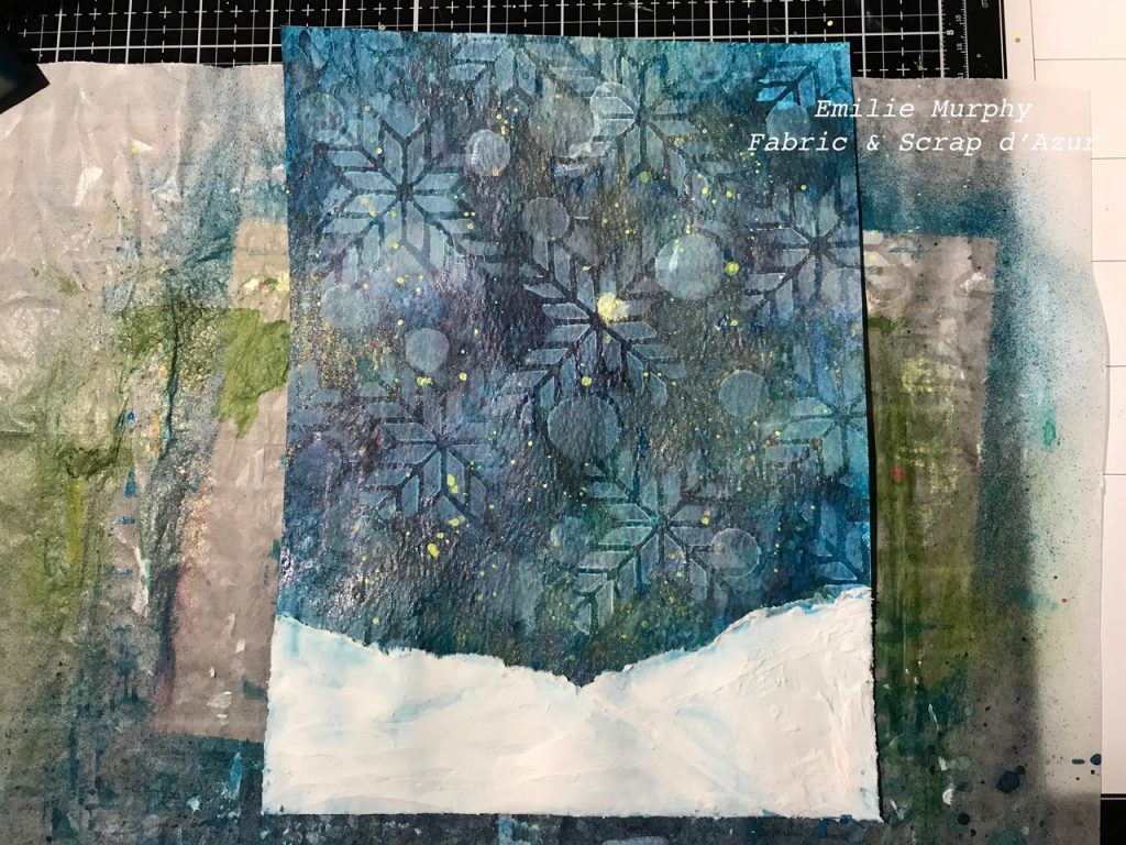
Next, I laid down the “Santiago” stencil and applied a thin coat of acrylic gesso with a sponge through only the portion of the stencil that looks like a cross. I saw Nathalie using it that way for one card of her “Deck of Cards” challenge last November 2019. What an awesome idea! Love this coat of gesso that stays transparent and gives a dreamy look to my background. That’s exactly the effect I wanted.

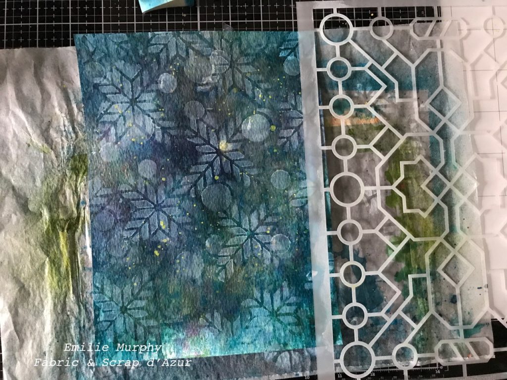
I repeated the same thing adding some circles from the “Exchange Place” stencil.

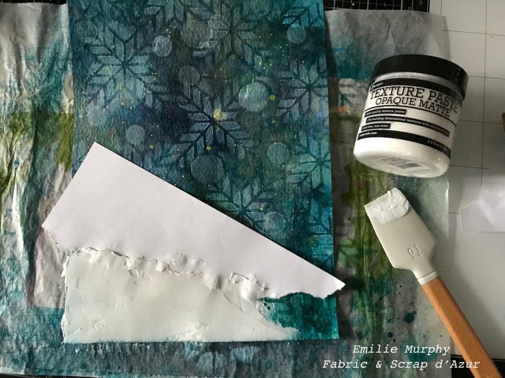
At that point, as I was satisfied with the background, I added a thick layer of texture paste to create some snow covering the ground. After I let it dry, I noticed that the ink stained my texture paste too much, so I kept adding some of this paste (about 3 coats) until I was satisfied with the sort of slight bluish whiteness of my snow.

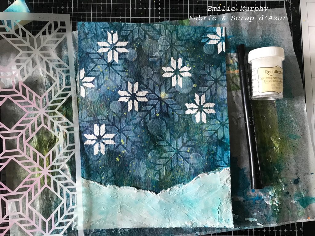
Again, I used the “Santiago” stencil to apply some white embossing powder. I used a VersaMarker watermark pen so that I got a more precise crossed shape from the stencil.

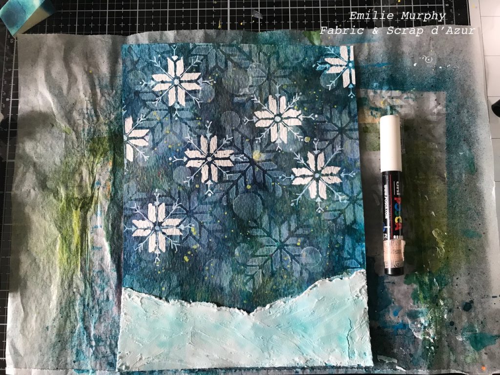
With a white Posca pen, I drew some details to complete the crossed shapes into some snowflakes. Adding some details is my favorite part.

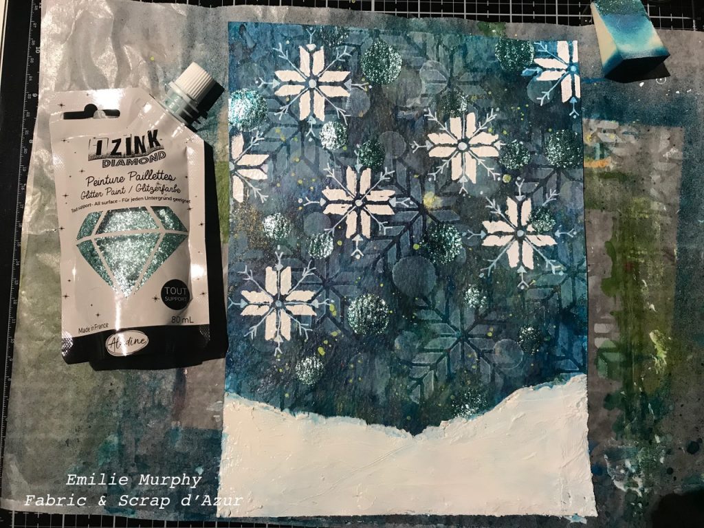
At that stage my journal page was looking nice, but staring at it a little bit longer, I thought that something was missing. I expected you to see the movement of the snow falling on the ground with a feel of cold and/or chill.  Therefore, I applied some IZINK Diamond glitter paint with my finger through the circles of the “Exchange Place” stencil, which again, to give me that feel. Hope I succeeded and gave you the exact same feeling!

Also, I added a final coat of white gesso over my texture paste because even with the 3 coats I had applied, the ink was still tinting it too much and I didn’t like the look of it.

To finish my art journal page, I rubbed my finger with some white gesso around the edges of my paper, added more splatters with the white glossy acrylic, and then added this beautiful winter quote from Aristotle: “To appreciate the beauty of a snowflake, it is necessary to stand out in the cold”.

I hope you have enjoyed my process in making this journal page about snowstorms and perhaps you have been inspired to make your own.

Have a great day and see you next month! – Emilie


Thank you Emilie! What a magical representation of snow :)

Want to give Emilie’s project a try? You can find all my Stencils in my Online Shop. Here are some of the other supplies she used:

Comments (1)

Leave a comment

Weather Report – Nicole Watson

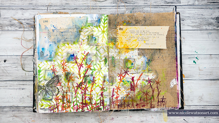
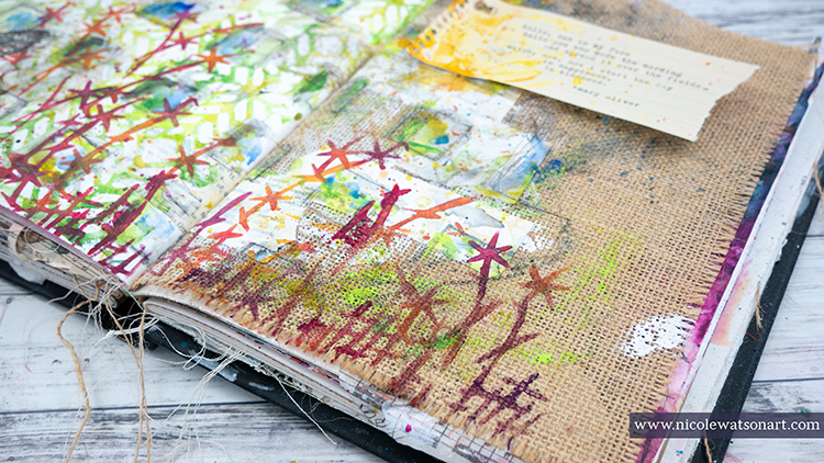
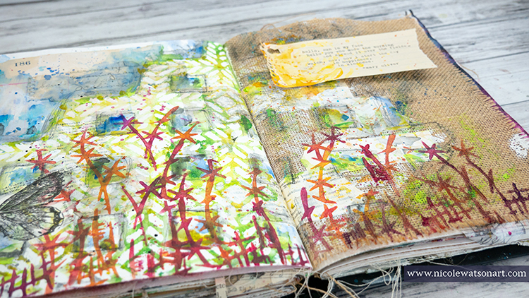
Hello from my Creative Squad! Today we have an art journal page (and how-to video so you can watch it come together) from Nicole Watson that is a really lovely celebration of spring :) She is using my Santiago 9×12 and Kyoto stencils with this month’s theme: Weather Report – Let’s talk about the weather! Do you love thunderstorms? The crisp air of Autumn? A good snowstorm? Are you a fan of endless sunshine? Create something inspired by that go-to topic of small talk – the weather!


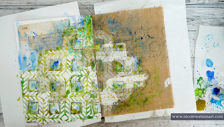
Spring in Texas is probably my favorite season. The weather is beautiful, the sun is warm but not too hot, and the wildflowers are blooming everywhere! I’m almost afraid to admit that I have spent more time outside working in my garden and photographing nature than in my studio. So, I decided to bring that weather and nature inside to my studio with these journal pages.

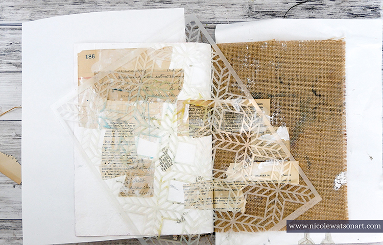
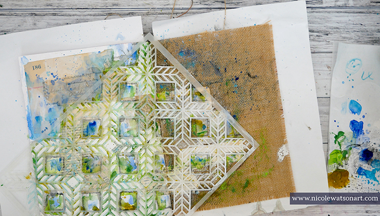
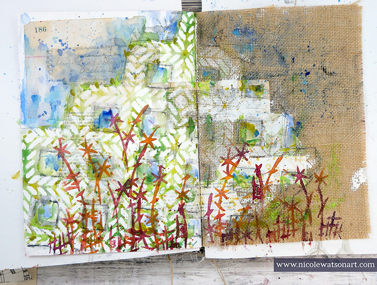
Nat challenged us this month to use only her stencils. I love challenges like this as it forces me to think outside the box and use supplies in a new way. Looking over my stencils, I decided that her Santiago stencil reminded me of garden lattice or a trellis and that I could potentially turn the images from her Kyoto stencil into flowers.


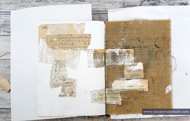
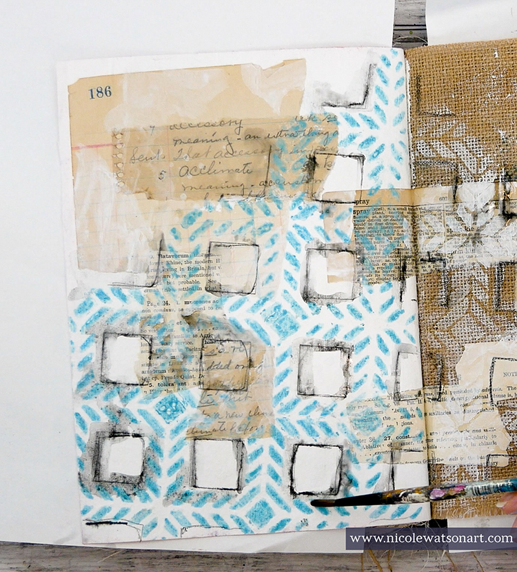
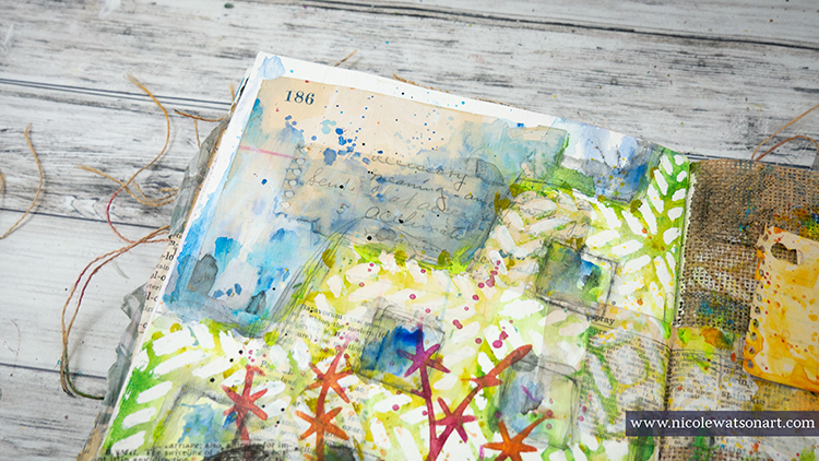
First, I gessoed my page and stuck down some ephemera with matte medium. I put the ephemera on the gessoed page and also the burlap page. Then, I added some bits of gesso on top the ephemera. 

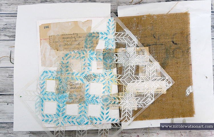
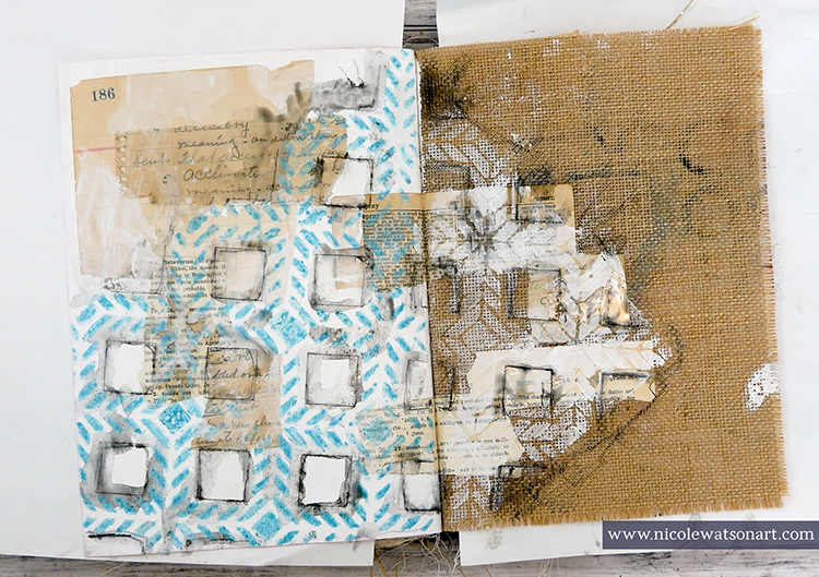
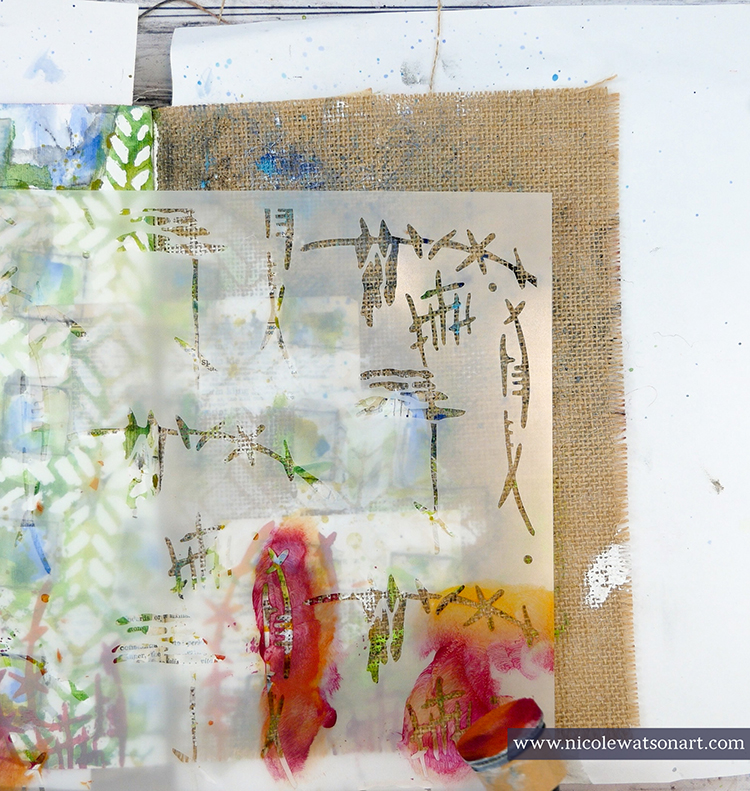
I wanted the lattice to remain white and have a watercolor effect so I decided to use a masking fluid pen inside the stencil shapes. I didn’t necessarily want it to be perfect, so I didn’t trace the insides perfectly. On the burlap side, I sponged some gesso through the stencil. Several times throughout the process of creating the pages, I touched up the masking fluid to make it thicker or define places a bit more.

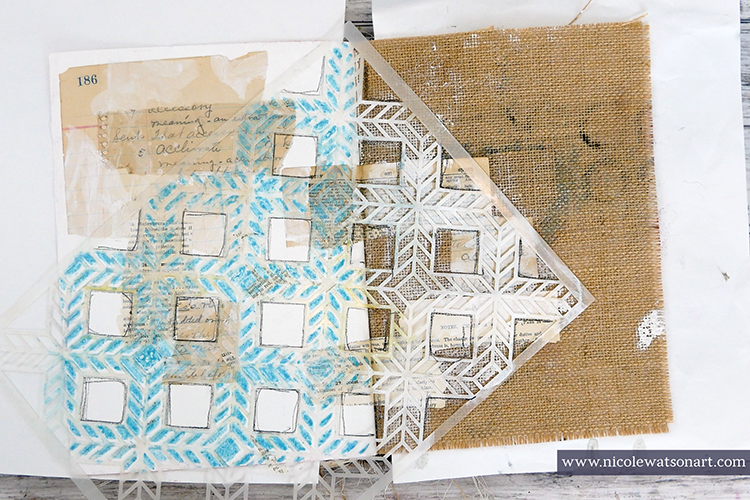
Next, I wanted to add some shadowing around my lattice and grabbed my stabilo all pencils to trace around the entire image and inside the squares that I didn’t use the masking fluid. I placed the stencil back on my pages to make it easier to trace. After activating the stabilo with water, I began the process of adding color.

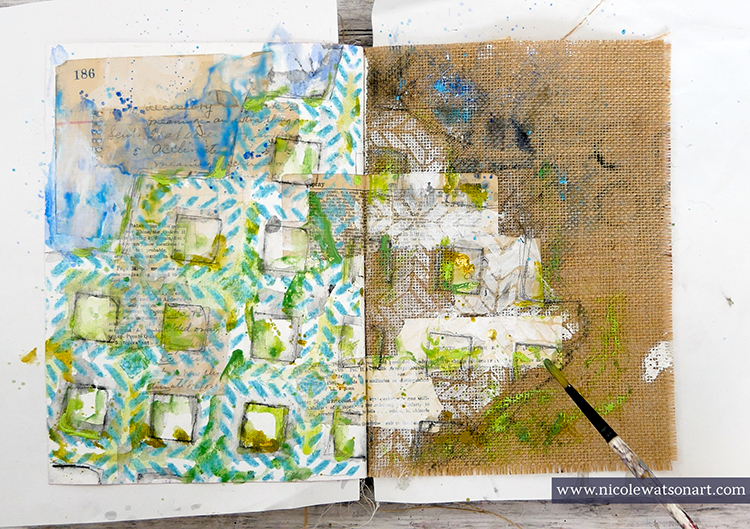
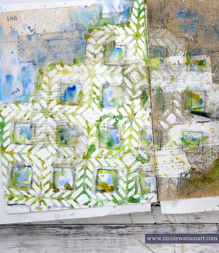
Loosely painting with watered-down acrylic, I added blues on top the stenciled area and inside the large squares (for sky) and greens in the stencil. I did this process in a couple layers to build the color. I wanted the areas to be free, loose, and “watercolory” looking. I also added color to the burlap side.

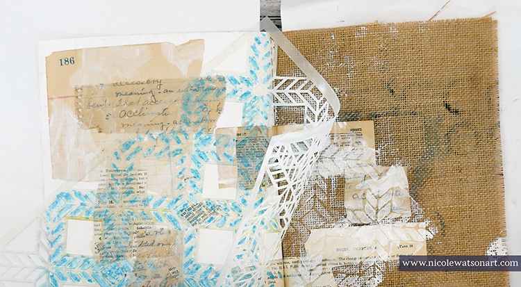
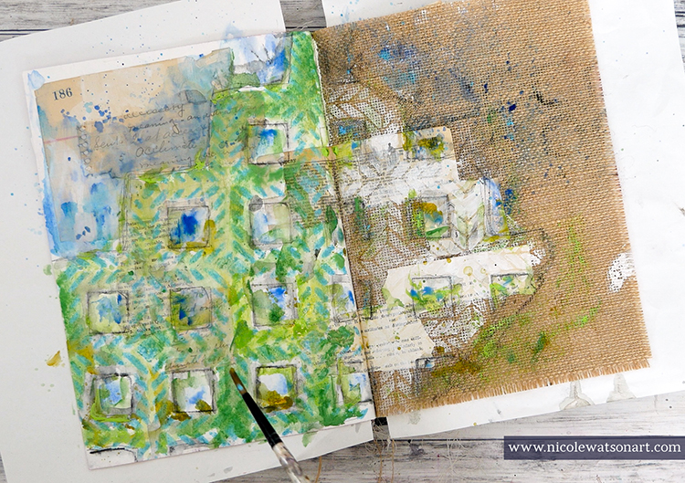
When I was done adding layers and the paint was completely dry, I began removing the masking fluid. You can use your fingers to do this, but a rubber cement eraser makes the process so much easier!

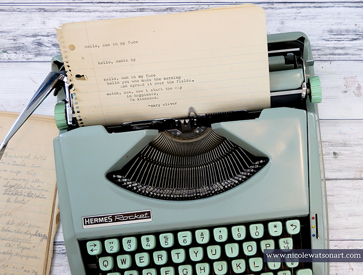
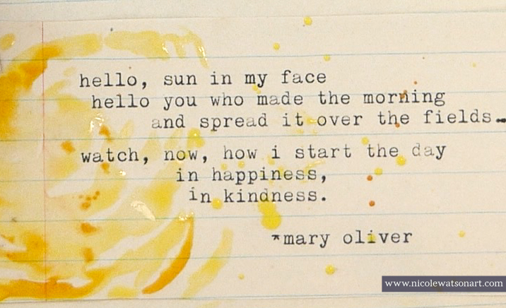
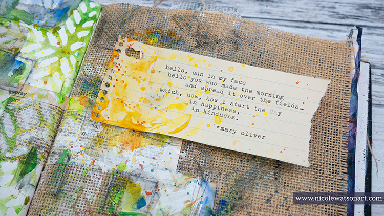
I noticed that the places where I had ephemera under the masking fluid didn’t really stand out, so I placed the Santiago stencil back in the original position and painted in some of these areas with watery gesso. I also touched up the burlap gesso a bit as well.  While I waited for the gesso to dry, I typed up a little poem by Mary Oliver to put on the pages.

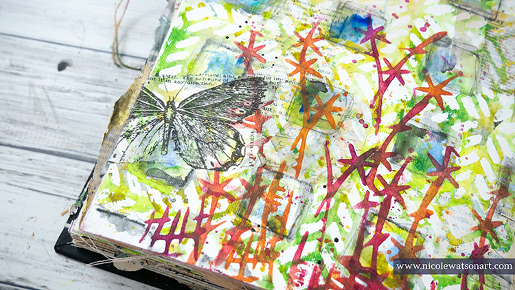
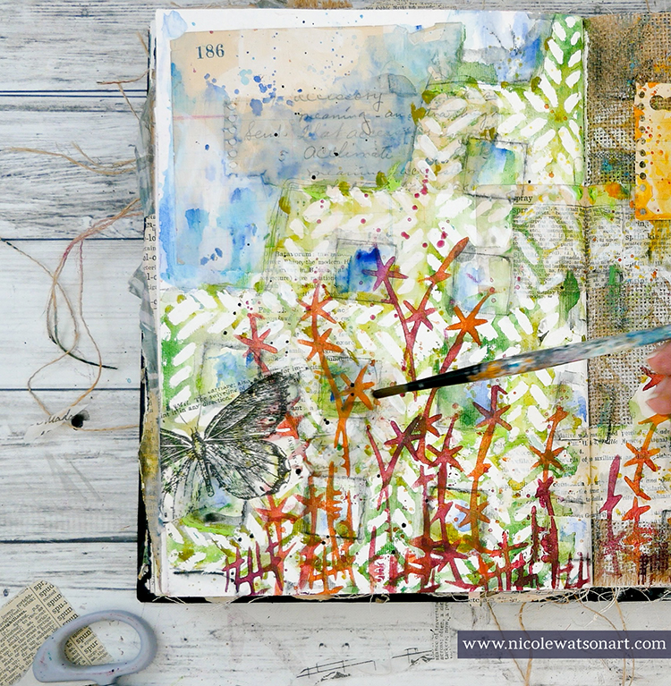
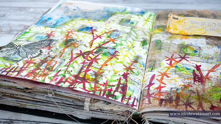
Finally, it was time to add some flowers to my page. I used my sponge applicator through the Kyoto stencil to create whimsical flowers in shades of red, orange, and purple.

To finish the page, I added a butterfly, a little sunshine on my poem, and a bit of shading with some stabilo.

Life is definitely not what we expected it to be right now! Spending time outside in the sunshine, in my studio, going on walks, taking photos, and enjoying the weather help bring focus to what is important. They, like Mary Oliver’s poem, bring happiness and kindness to my days.


Thank you Nicole – I love how you interpreted the Kyoto stencil as a floral element! Thank you so much for bringing some sunshine to our day!!!

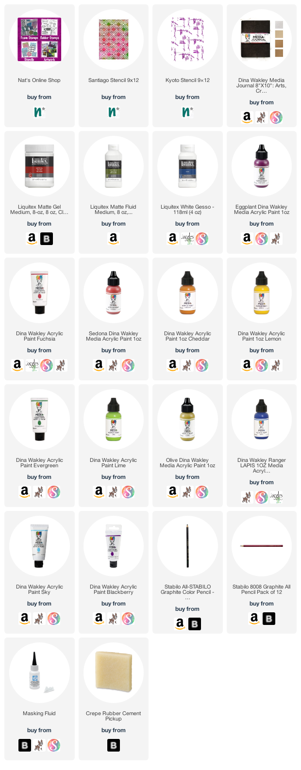
Want to give Nicole’s project a try? You can find all my Stencils in my Online Shop. In addition to her cool vintage typewriter, here are some of the other supplies Nicole used:

Leave a comment

Rubber Stamp Inspiration from my Creative Squad

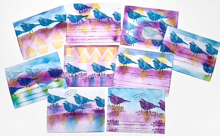
Today I have some lovely cards, envelopes and a tag to share with you from Creative Squad member Judi Kauffman. When Judi received her rubber stamps in the mail, her super creative mind went right to work and I just love the results!


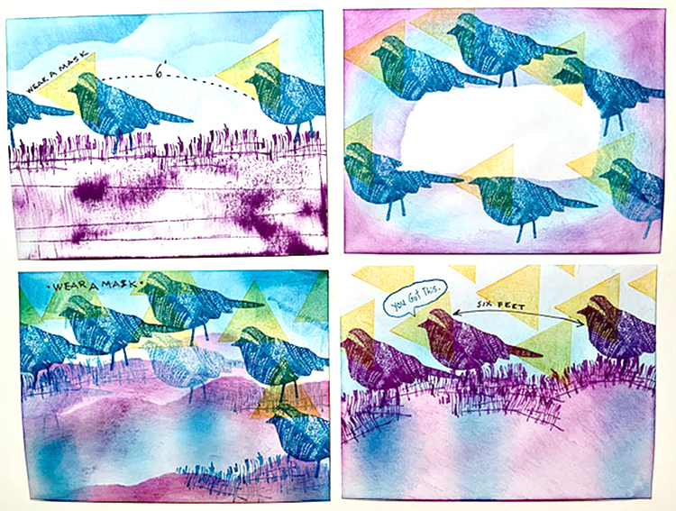
What a treat to get Nathalie’s new stamps in the mail – her signature style in a petite and very versatile size! I reached for a stack of envelopes, my go-to with all new stamps, got out some colorful inks, and when I looked at the finished batch I was shocked to see how my worry about covid-19 had taken over. The triangles I’d stamped on and around the Nightingale looked like masks and on most of the envelopes the birds looked like they were practicing social distancing.

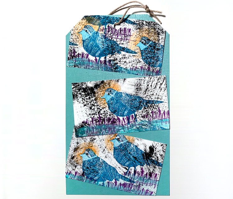
I stamped three business cards for the tag, this time using white ink to paint tight-fitting masks on the birds. It really is scary how our subconscious takes over. I set out to make something spring-like and happy! But the cosmos had other ideas.

I love ‘Far Out’! In fact, I love all of them. It’s a new thing to have the petite size and I think that’s a feature worthy of attention.


Thank you Judi! It is funny how what is pressing in our minds can come through in our artwork. Regardless, these are a wonderful abstract use of the stamps and in any other time would just be really awesome compositions!

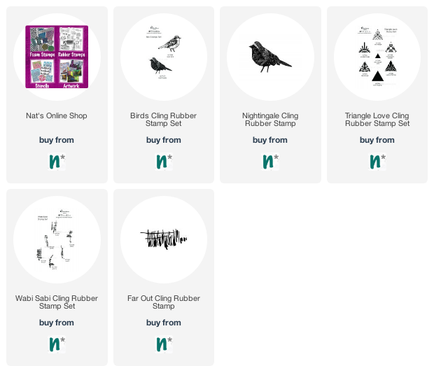
Here are some of the supplies Judi used:

Comments (3)

  • Marilyn

    |

    Love the designs. I am one of the lucky friends of Judi to receive her “bird” envelop. She always amazes me with her creativity and now more so using her subconscious thoughts. I am a firm believer that our actions are a result of our inner thoughts.
    Kudos to Judi!

    Reply

  • Kimberly O.

    |

    I love the combination of the stamps you used! The bird stamps are awesome!!

    Reply

  • Denise M. Krueger

    |

    Love these!! So much vibrant color and the birds are awesome stamps.

    Reply

Leave a comment

Weather Report – Maura Hibbitts

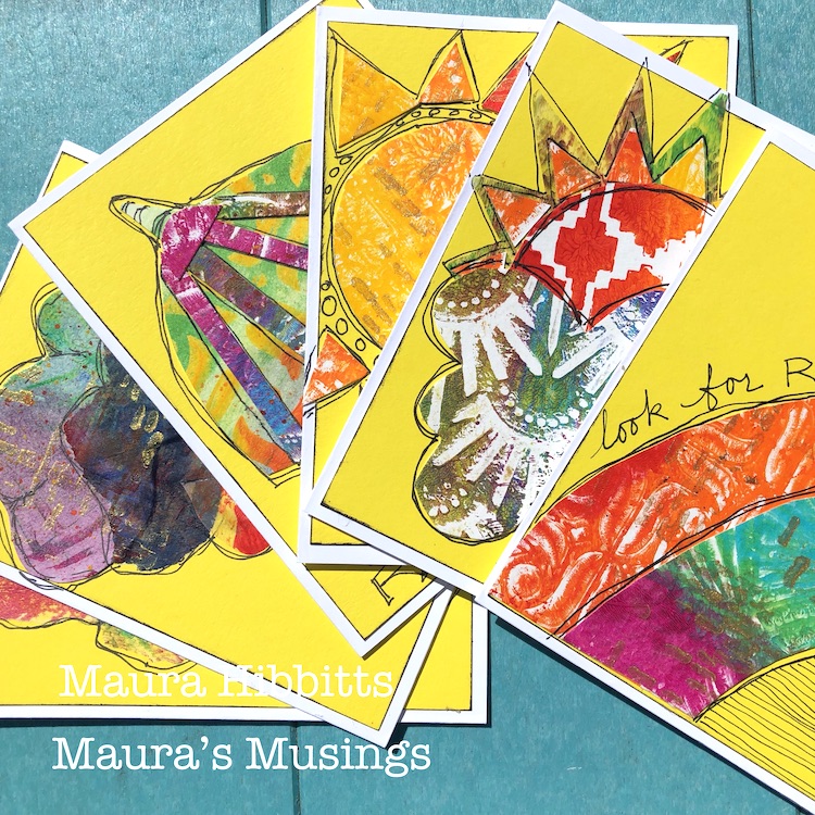
Hello from my Creative Squad! Today we have a series of cards from Maura Hibbitts that are sure to brighten your day even in these difficult times. Maura is using my Amsterdam 6×6, Mesa Verde, Art Deco Wallpaper, Signals, and Art Deco Empire stencils. The theme this month is: Weather Report – Let’s talk about the weather! Do you love thunderstorms? The crisp air of Autumn? A good snowstorm? Are you a fan of endless sunshine? Create something inspired by that go-to topic of small talk – the weather!


April certainly is a month of changeable weather! One day it can feel like a beautiful spring day full of sunshine and warmth (and I certainly want more of these kind of days!). The next can bring in snow and cold, but luckily these storms don’t last too long and the snow melts away quickly. And of course, there is the saying about April showers bringing May flowers, but be sure to check for rainbows too! So, check the weather report before you head out!

I’ve been making and sending out cards to let people know I am thinking about them during these difficult times, so I knew I wanted to use this month’s theme to make some more cards.

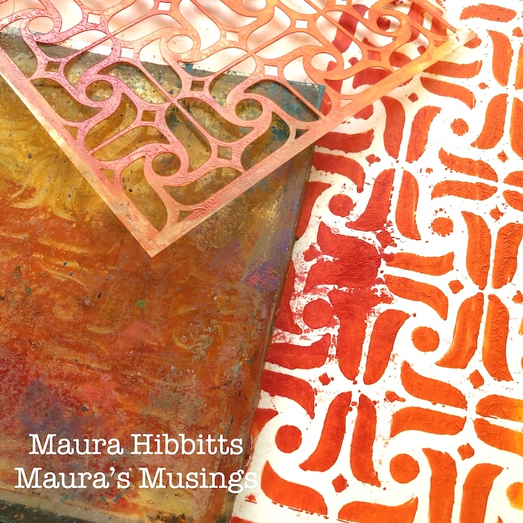
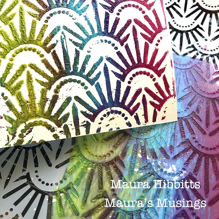
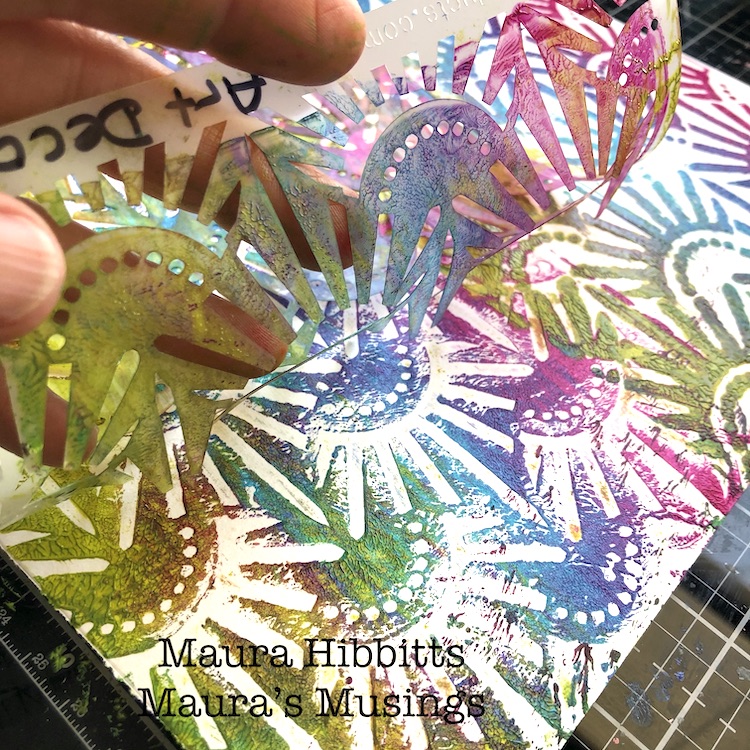
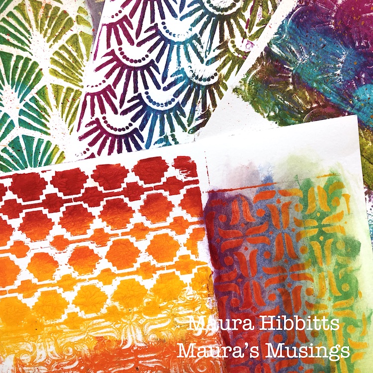
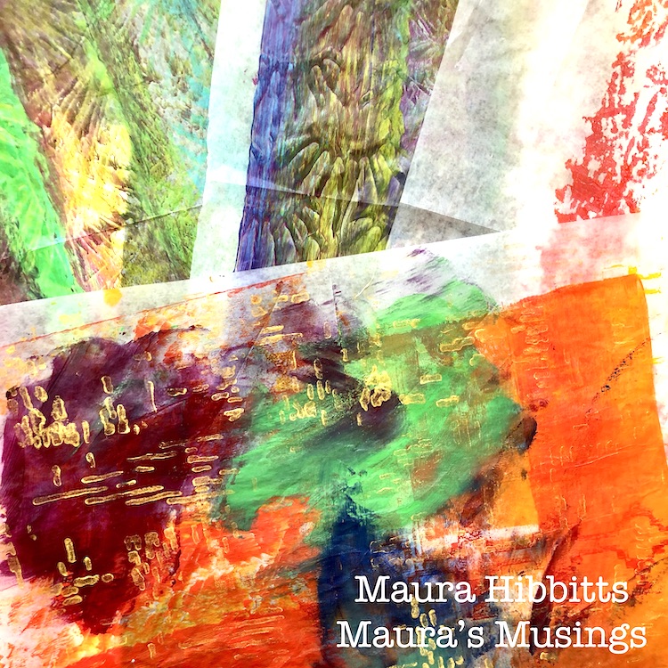
 I started off with an array of rainbow colors, my gel plate, and several of Nathalie’s stencils to create some papers to use for the project. I used a brayer and a mix of red, orange and yellow along with a stencil, like the Amsterdam stencil here. First time the stencil goes on the plate and the paper on top; then put the painty stencil on paper, and third take another print off the plate. I used watercolor paper to do this.

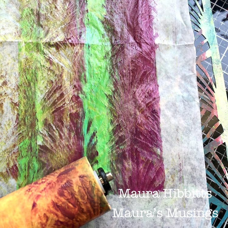
I also keep some deli paper handy when I am printing to use for excess paint. Quite by accident, I happened to have the deli paper sitting on a stencil, and when I rolled the brayer over it, it picked up the pattern.

I repeated the printing process with the green, blue and purple blend on watercolor paper and deli paper. First print here is off the plate with the Art Deco Empire stencil, and the second is printing with the stencil.

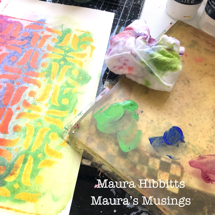
I decided to add in more color with a rainbow mixture of fluid acrylics. Here, I blended in the opposite group of colors with a baby wipe. Since the heavy body acrylic was dry, it acted like a resist, so all colors now show.

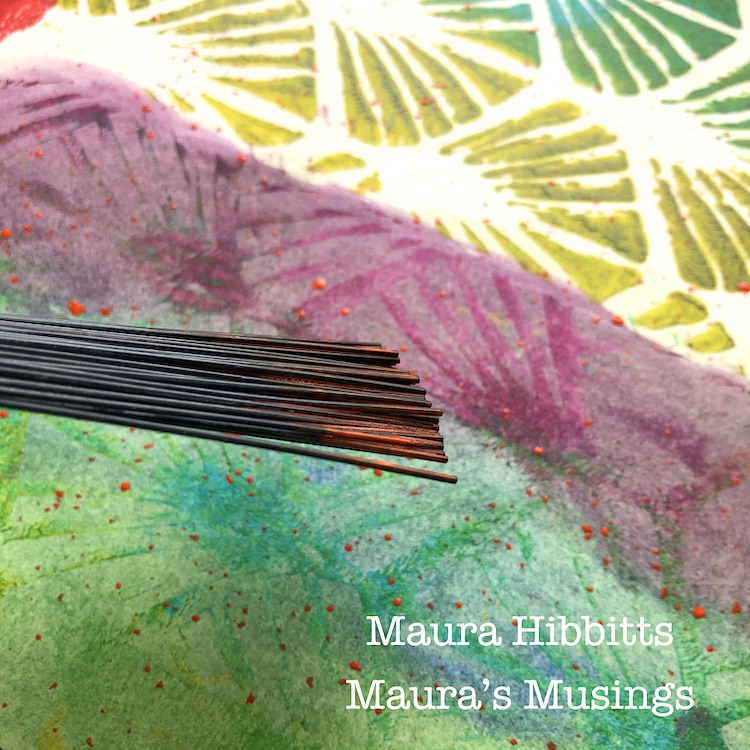
On some of the printed papers, I used a splatter brush and fluid acrylics to add a subtle layer of color.

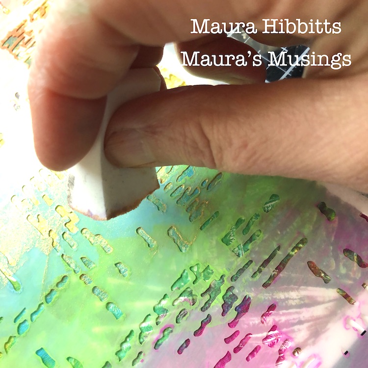
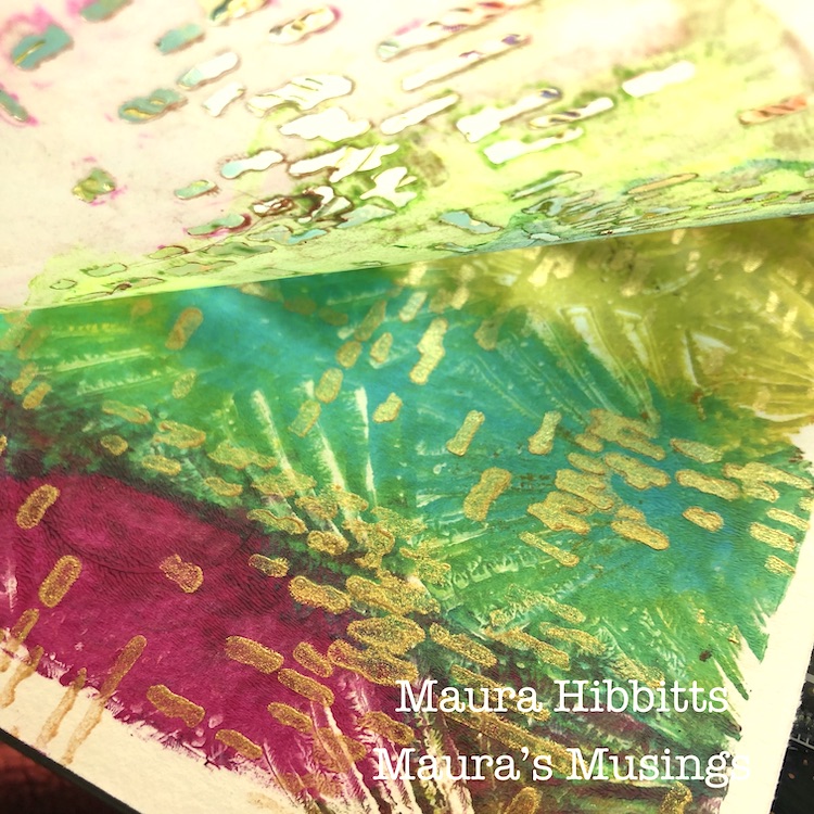
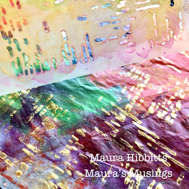
Gold accents always take it up a notch, so I used the Signals stencil with gold paint to add a shimmery layer to some printed papers.

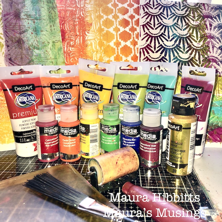
Now I have a mix of rainbow painted watercolor sheets and deli papers to use for my cards. Plus, a quick look at some of the rainbow assortment of supplies I used.

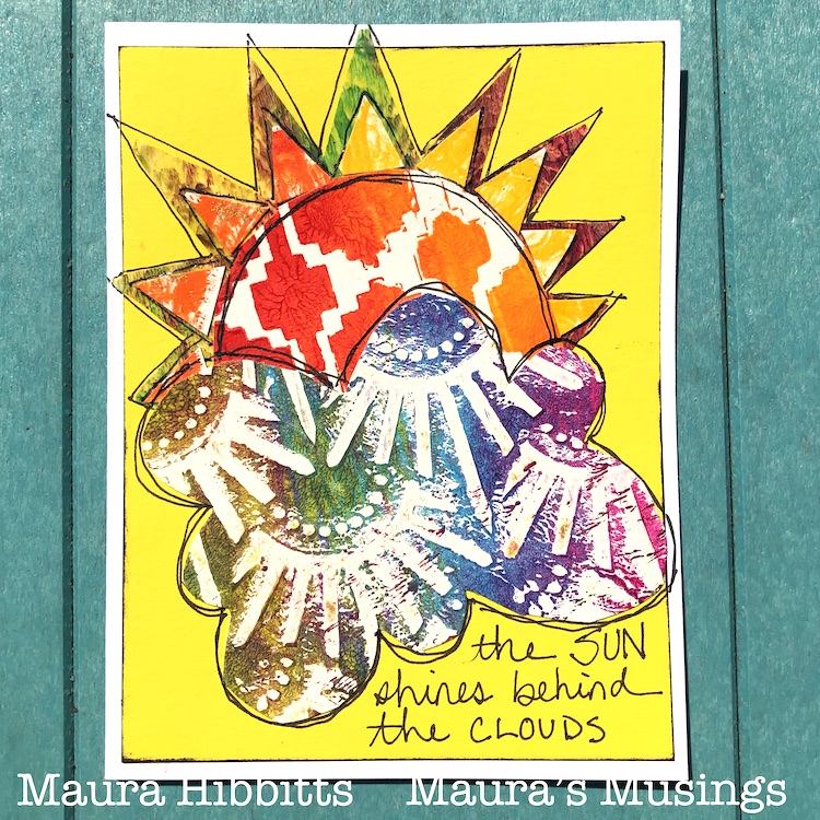
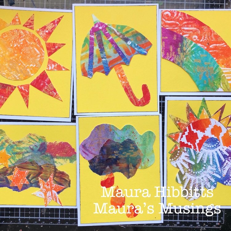
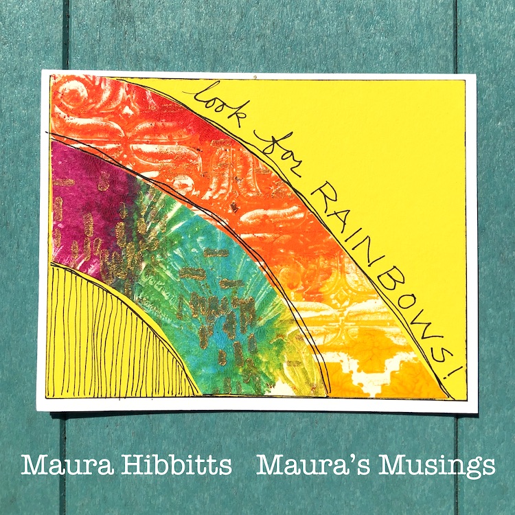
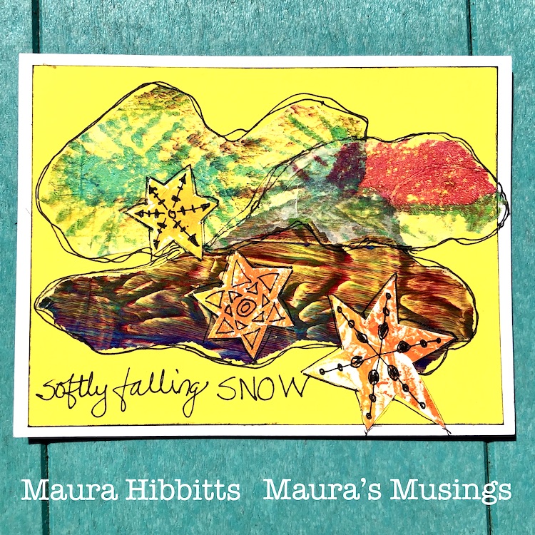
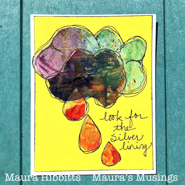
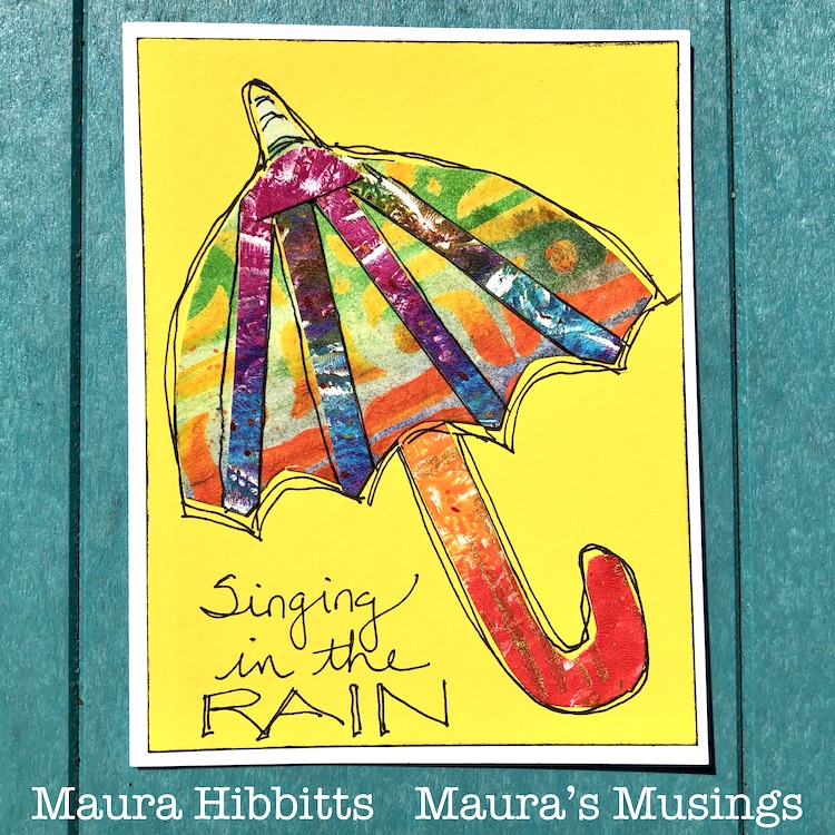
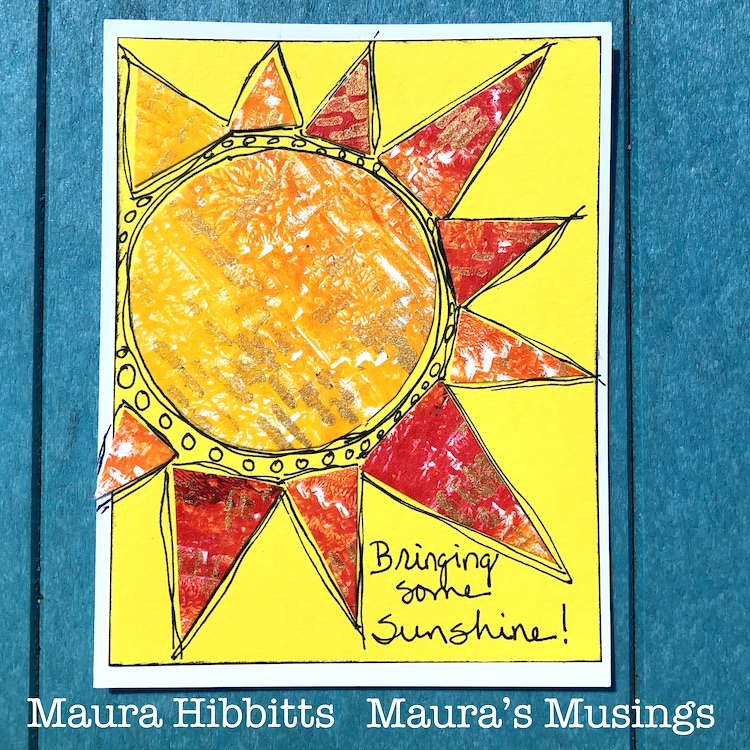
Now, the fun begins! I cut out all kinds of shapes related to weather and pieced them together to make my images….sun, clouds, an umbrella, snowflakes, raindrops, and a rainbow. I did use a pencil to sketch out a few. I adhered the heavier paper with tacky glue, and the deli paper with matte gel medium. Oh, and I had previously used the paper trimmer to cut white card stock for the base, and yellow for the background, which I edged with black ink. 

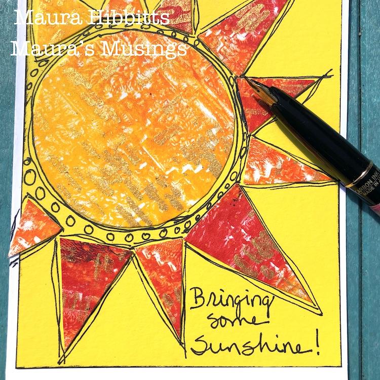
Once the cards were dry, since it was such a beautiful day, I headed out to the deck to do the doodling on the cards. I am using a carbon ink pen, but any black permanent pen will work. I also added in thoughts about the weather.

Softly falling snow (well, I hope not, lol!)…The sun shines behind the clouds…Singing in the rain…Look for the Silver lining…Bringing some sunshine…and Look for rainbows! I hope these thoughts and the rainbow colored cards will bring some much needed encouragement into our lives right now. Be well, be healthy, and find joy in April’s weather! – Maura


Thank you Maura for lifting our spirits today!!! These cards are so happy and beautiful.

Want to give Maura’s project a try? You can find all my Stencils in my Online Shop. Here are some of the other supplies Maura used:

Feel inspired? Working on something yourself that you’d like to share?  I love to see how you interpret our monthly themes. Email me how you used my stencils and stamps with the theme and email me an image – I would love to share your projects in my next  “n*Spiration From Around the Globe“.
Leave a comment

Do you know my Creative Squad? We have a NEW Member!

Hello my friends – today we have some very nice news to share with you. We have been waiting anxiously to let you know and now is the time: We have a new Creative Squad member to welcome to the team and introduce today!!!

Do you know my Creative Squad? They are my amazing design team of artists who bring you their creations each month. I give them a theme as a way to get their creative juices flowing, and then they make a project using some of my stamp and stencil designs. You can check out their projects each week on Tuesdays, right HERE on the blog.  It is always inspiring to see what they come up with!

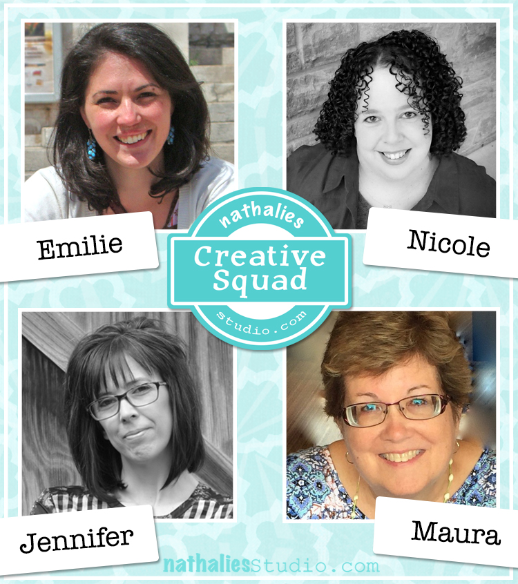
So without further ado, here is the Creative Squad:

First, a BIG welcome to Emilie Murphy, our newest member! We have been following Emilie for months on social media and knew we wanted to invite her when a place opened up on the Squad. Emilie brings her joyful and colorful style to inspire us each month :)

Here’s a little more about Emilie, and a reintroduction to the rest of the awesome squad too :)  You can also explore squad members current and past on the Creative Squad page.


Emilie is a French scientist living in Maryland and you can check her out on her website here. And here is a little bio from her:

Emilie Murphy – Emilie has always been passionate about making all kinds of different things since her childhood. Ten years ago she started on a scrapbooking journey and since 2016, this has also evolved into card making and mixed media. She loves anything handmade, which seems to always spark her curiosity and enthusiasm to experiment with new techniques. Her favorite things to make are art books/journals; where she can play with stamps, stencils, inks, paints, mix papers, and fabrics. Making artistic kinds of things became vital for her well-being and provides an escape from her daily life routine. She can’t thank Nathalie enough for giving her the opportunity to be a part of her Creative Squad!

Jennifer from West Virginia has been with the squad for over 2 years and you can learn all about her here on her website. Her bio is:

Jennifer Gallagher is an artist and art instructor currently living in West Virginia with her husband and two sons. She has been involved in the arts her entire life in one way or another. After studying fashion in college, Jennifer found herself drawn to new art forms and techniques. She now enjoys painting, collage, art journaling, and mixed media. Geometric shapes and patterns are her greatest source of inspiration and joy.

Maura from Upstate New York has been with us since January 2018 and you can check her out more here on her website. Here is her bio:

Maura Hibbitts – “I’ve joyously jumped to the right side of my brain to play with color and work in mixed media, sometimes with a steampunk twist, since retiring from teaching science. I’m back to being that kid that sat under the backyard tree and drew for hours. I enjoy life with my family in the Adirondack region of New York, love to travel, read, garden and still find myself fascinated by clouds and rocks from my years of teaching earth science.”

Nicole has been a squad member since 2019 and comes from Texas, you can check out her here on her website. Here is her bio:

Hi! I’m Nicole Watson, a Midwest girl who married a Southern boy now living in Austin, Texas. Art has always been part of me … from collecting random bits of paper at a young age, to selling my first painting in high school, then discovering mixed media while studying art and design in college. Other stops along my art journey include scrapbooking, card making, freelance photography, and layout/graphic design. Creating in my studio and sharing my work with others gives me life, purpose, and is healing to my soul.

And finally Judi Kauffman – our part time squad member who comes to us from Maryland. Judi likes to fly a little below the radar so you can learn all about her here on my blog post interview with her.

Please check out our Creative Squad posts each Tuesday for fun projects and inspiring techniques – there is always something new from this amazing gang and we are so happy to have them!

Leave a comment

Weather Report – Jennifer Gallagher

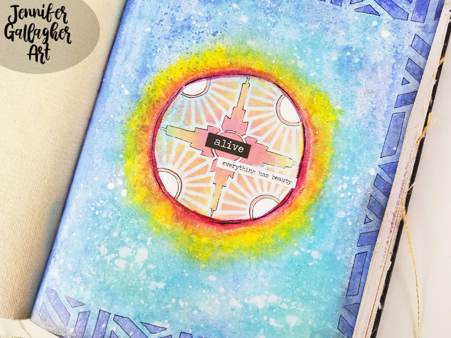
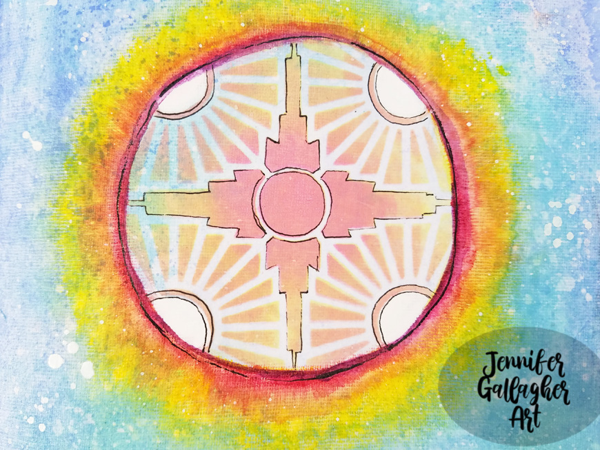
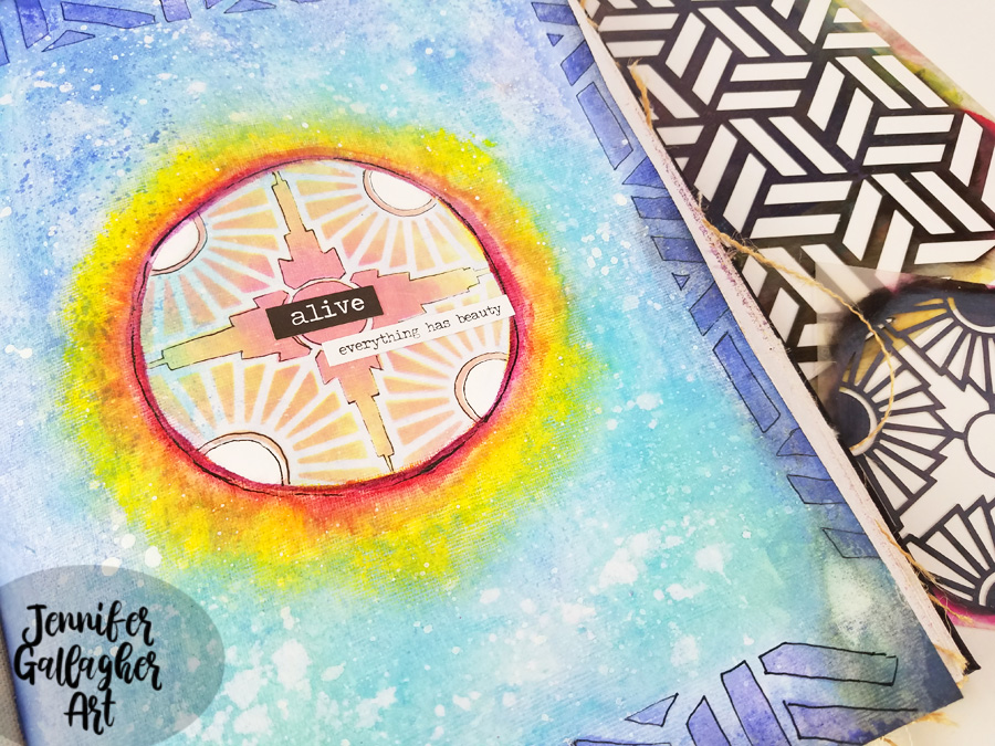
Hello from my Creative Squad! Today we have a beautiful art journal page celebrating the beginning of Spring from Jennifer Gallagher who is using my Kassel and Broadway 4×4 stencils. The theme this month is: Weather Report – Let’s talk about the weather! Do you love thunderstorms? The crisp air of Autumn? A good snowstorm? Are you a fan of endless sunshine? Create something inspired by that go-to topic of small talk – the weather!


Jennifer here again this month with the weather report. Spring has officially sprung. The cold, snowy days of Winter have begun to give way to birds chirping, spring rain showers, and the beginnings of green busting through the soil.  It almost feels like we are drudging along in the dreary winter and then all of a sudden that first little sign of spring comes out of nowhere. I love Spring! There is something so hopeful about the awakening of the Earth and the budding of new plants. We could all use that hopefulness now. With that in mind, I have created a very simple art journal page that is a visual representation of that burst of color and life amidst the darkness of winter. Let’s get started.

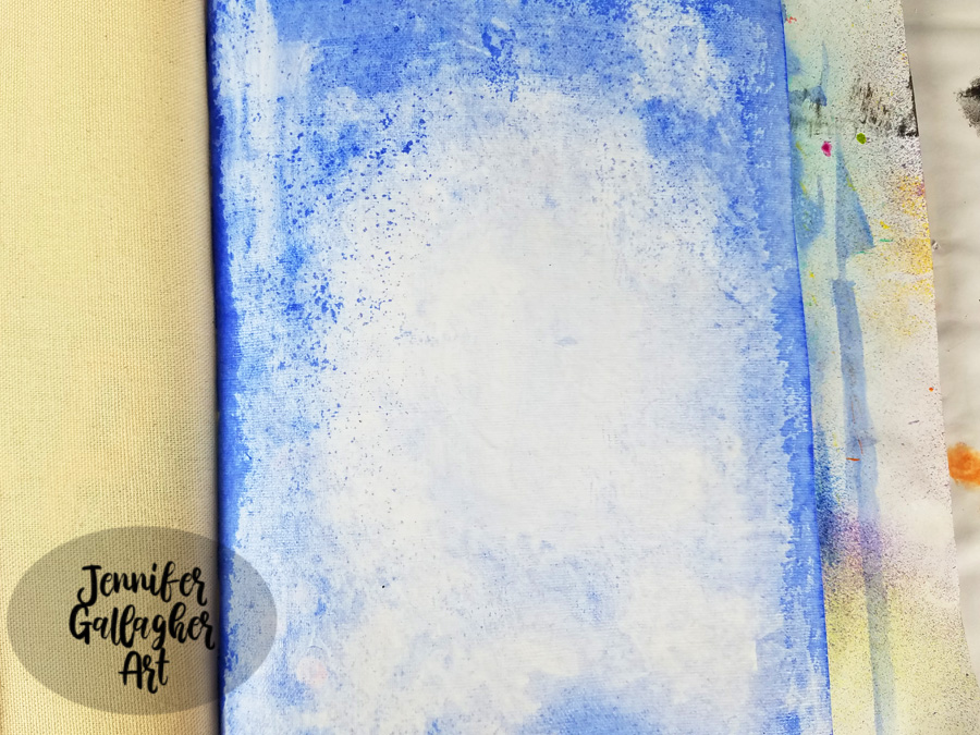
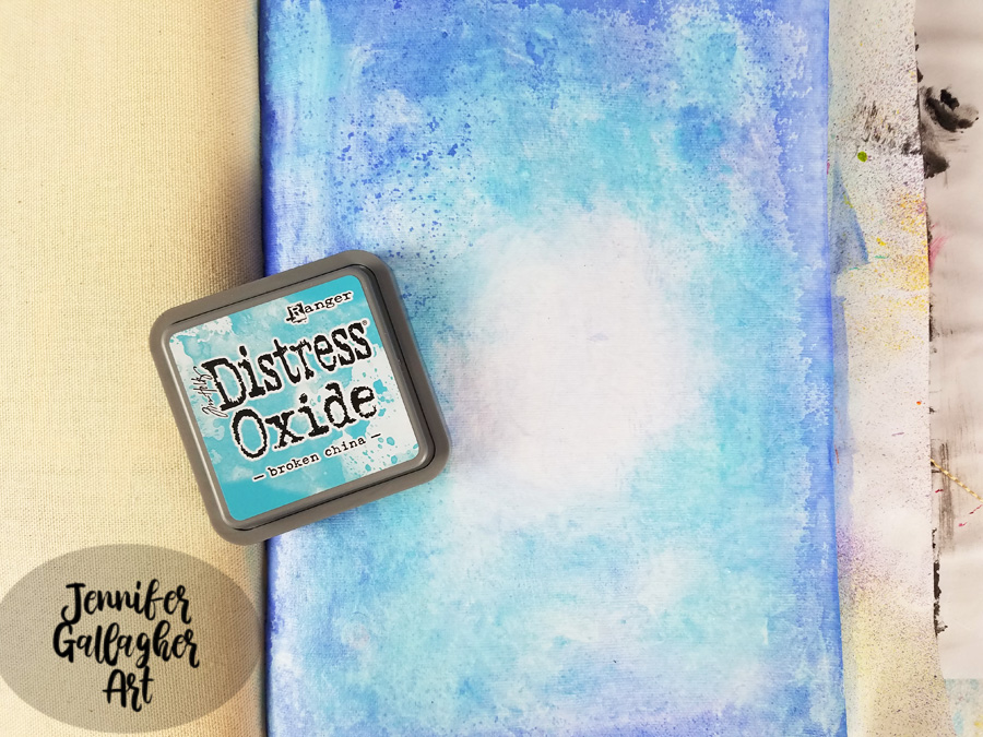
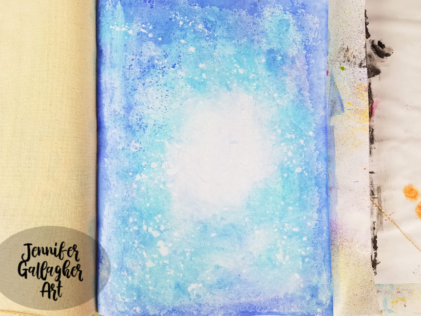
I began by putting a coat of clear gesso down to prepare my page. I am working on the cotton rag paper in my Dina Wakley Media Journal. After the gesso dried, using a large flat brush, I brushed on a thin amount of water across the page, leaving a small circle in the center totally dry. Then I dipped my brush into Marabu Aqua Ink in ultramarine blue. I applied the color and blotted here and there with a towel.

With a mini-blending tool, I applied Distress Oxide in mermaid lagoon around in the same places, leaving the center center alone. 

I spritzed a fine mist of water across the page, let it sit for a few seconds, and then dabbed it up with a paper towel.

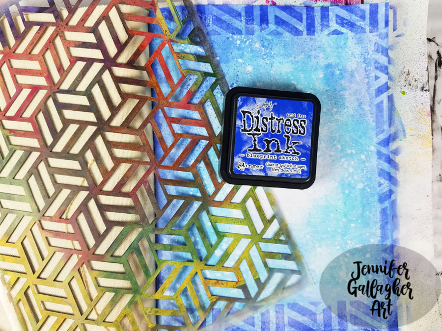
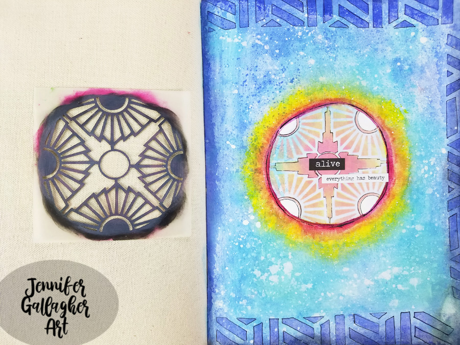
Next, I laid Nat’s Kassel stencil down and applied Distress Ink in blueprint sketch through it to create a border on three sides.

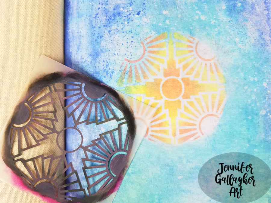
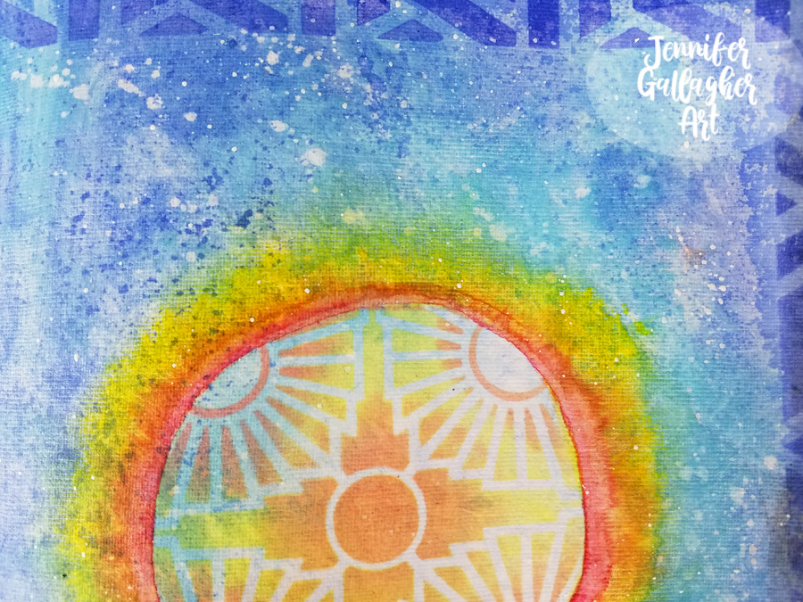
After placing Nat’s Broadway 4×4 stencil in the center of the page, I applied Distress Oxides in twisted citron and worn lipstick through it.

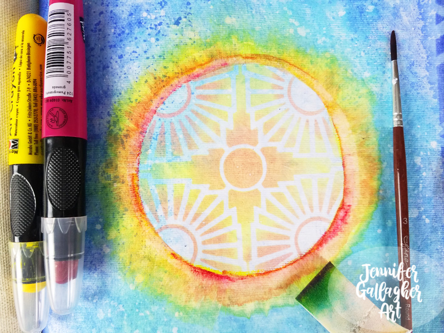
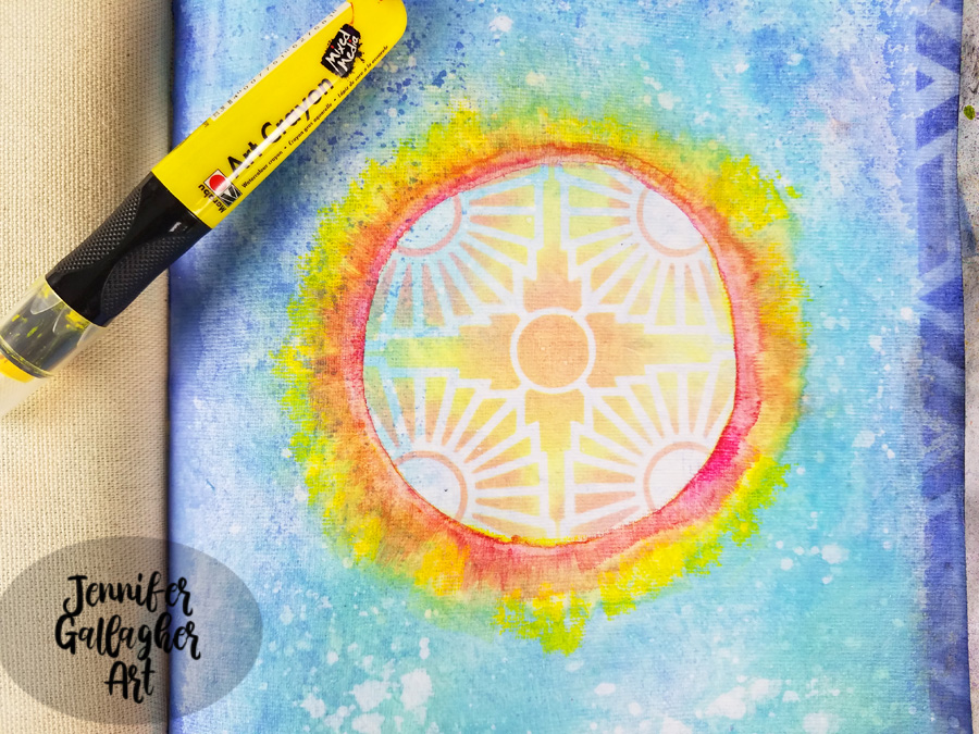
Holding the Marabu art crayon in sunshine yellow like a pencil, I drew a thin line of color around the outside of the circle. I dipped a very small brush into water, ran the brush across that line, and then took a dry cosmetic sponge and with a gentle touch pulled the color in a downward motion. I would pick up the sponge and move to the next section and pull. I repeated this motion all across the circle. Then I repeated the process with the pomegranate art crayon. You can go back and add as much as you like.

I unscrewed the top off of my Distress Spray Stain in picket fence and dipped a small paintbrush into the liquid. I used it to create white splatter on my page.  

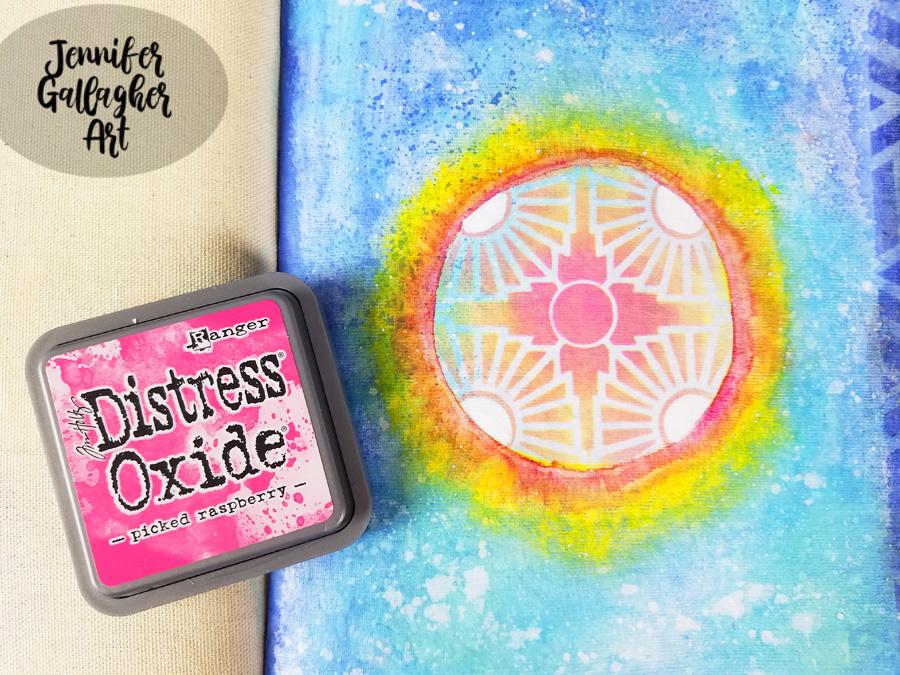
I laid the stencil back down and added Distress Oxide in picked raspberry into the center of the stencil to brighten the center.

Using a black gelly roll pen, I doodled around all of the stenciled designs. I also lightened the four circular areas with a white posca pen.

I added some word stickers from Tim Holtz Big Chat and Small Talk sets. I added “alive” and “everything has beauty”. 

I hope you have enjoyed this tutorial. Art can be a great way to keep ourselves busy during difficult times. I am wishing the best for you, your families, and your communities. If you get the chance to try this tutorial, please share your creations with us.


Thank you Jennifer for such an uplifting page!

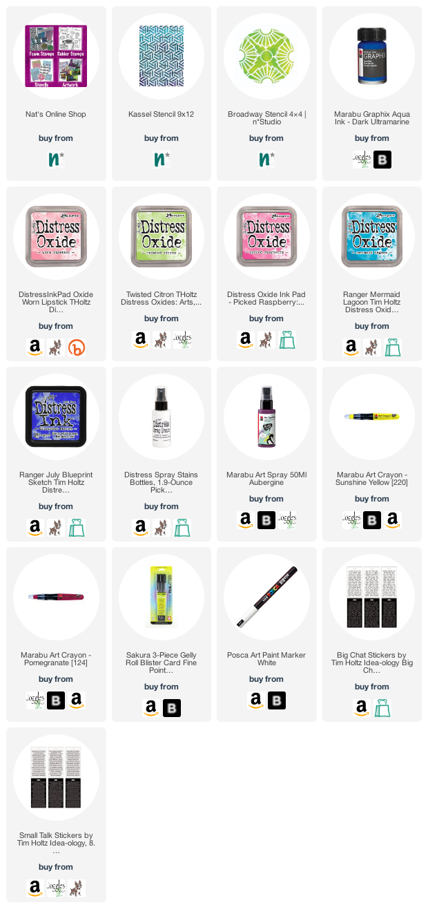
Give it a try: you can find all my Stencils in my Online Shop and here are some of the other supplies Jennifer used:

Feel inspired? Working on something yourself that you’d like to share?  I love to see how you interpret our monthly themes. Email me how you used my stencils and stamps with the theme and email me an image – I would love to share your projects in my next  “n*Spiration From Around the Globe“.
Leave a comment