Creative Squad

Creative Squad: Favorite Art – My Way – Robin Seiz

Hello from my Creative Squad. Today we have a post from Robin Seiz who is sharing her beautiful and final project with us today! We have been so lucky to have Robin with us on the Squad and have always appreciated her thoughtful takes on our themes and also her skill at combining colors and elements within her compositions. She will be missed and we wish her all the best as she continues on her art journey!

Today she shares a repurposed bag project with us, using my Star Struck, Central Ave, Grove Street, and Park Blvd stencils and our theme: Favorite Art – My Way – Look at a favorite work of art and create something inspired by it, drawing from the colors, shapes, subject matter, feeling etc. that strikes you most when you look at it.


Hello friends. This month’s theme is Favorite Art – My Way. My partner gave me a painting on canvas for an engagement present. It’s a realistic painting of glass jars in the most beautiful shades of blue. By far, it’s my most favorite piece of art in our home. This painting was what I thought about when I started this project. While I didn’t use shades of blue, I did start with teal as the basis for my project this month. 

My studio is being renovated, as is much of our home. I have a tiny little space right now to create with most of my supplies packed up in boxes in the basement, so using recycled materials seems to make sense right now. I recently got a shipment of art supplies in glassine bags and decided to use one of those bags for my substrate. This finished bag will make a terrific hostess gift bag. 

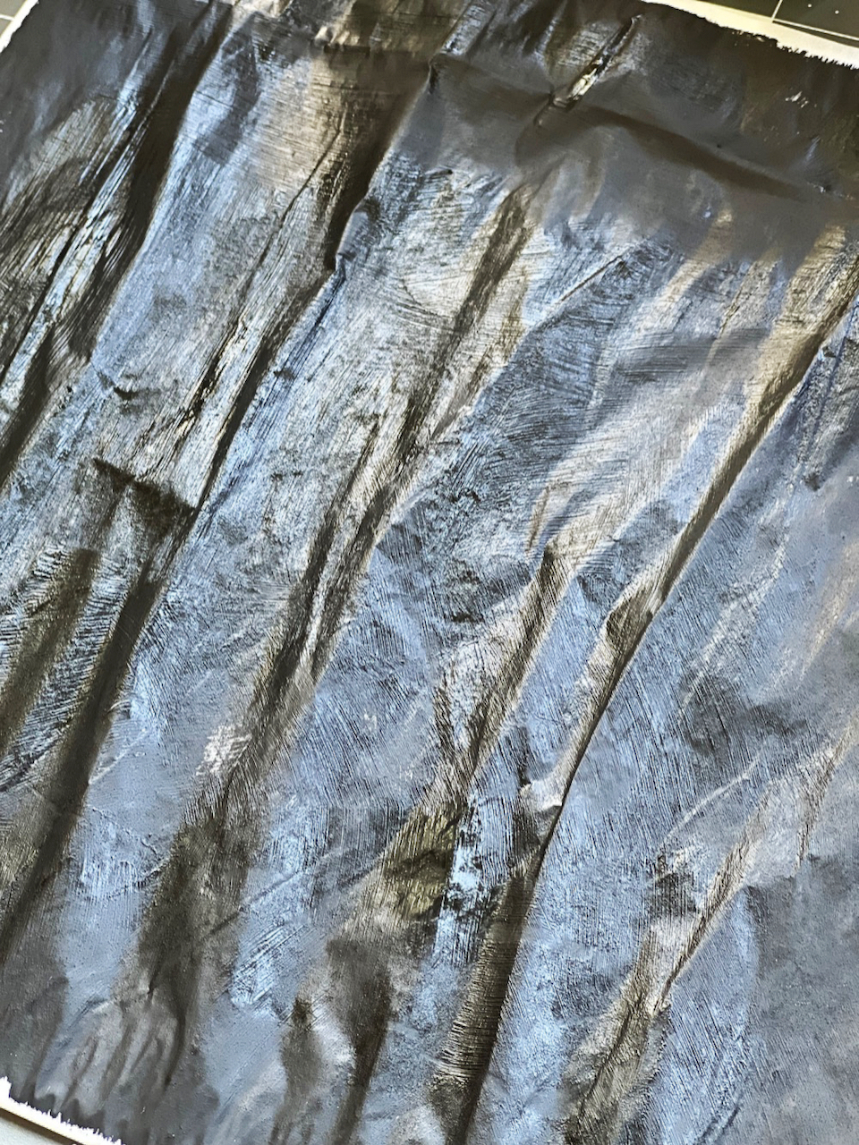
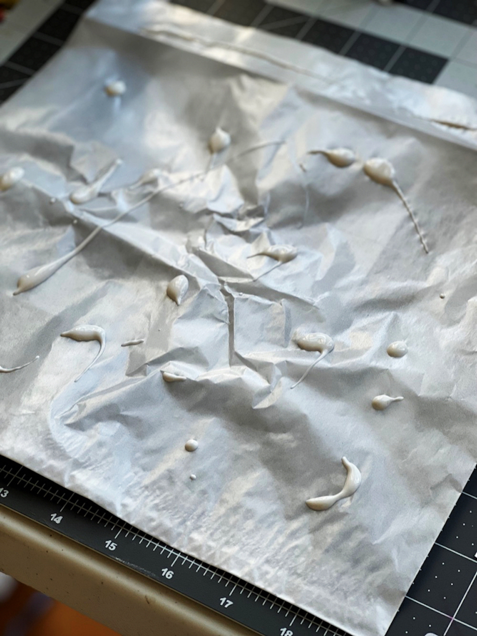
Since the glassine bags are quite shiny and smooth, I started by adding a layer of white gesso to give it some tooth. Once the gesso was on, I realized the teal paint would look better on a black background; so I put down a layer of black gesso. (One of the things I love about  mixed media is more layers often make the piece more interesting).
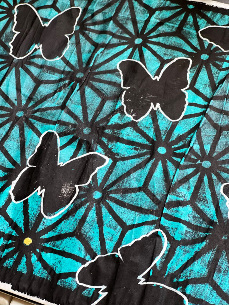
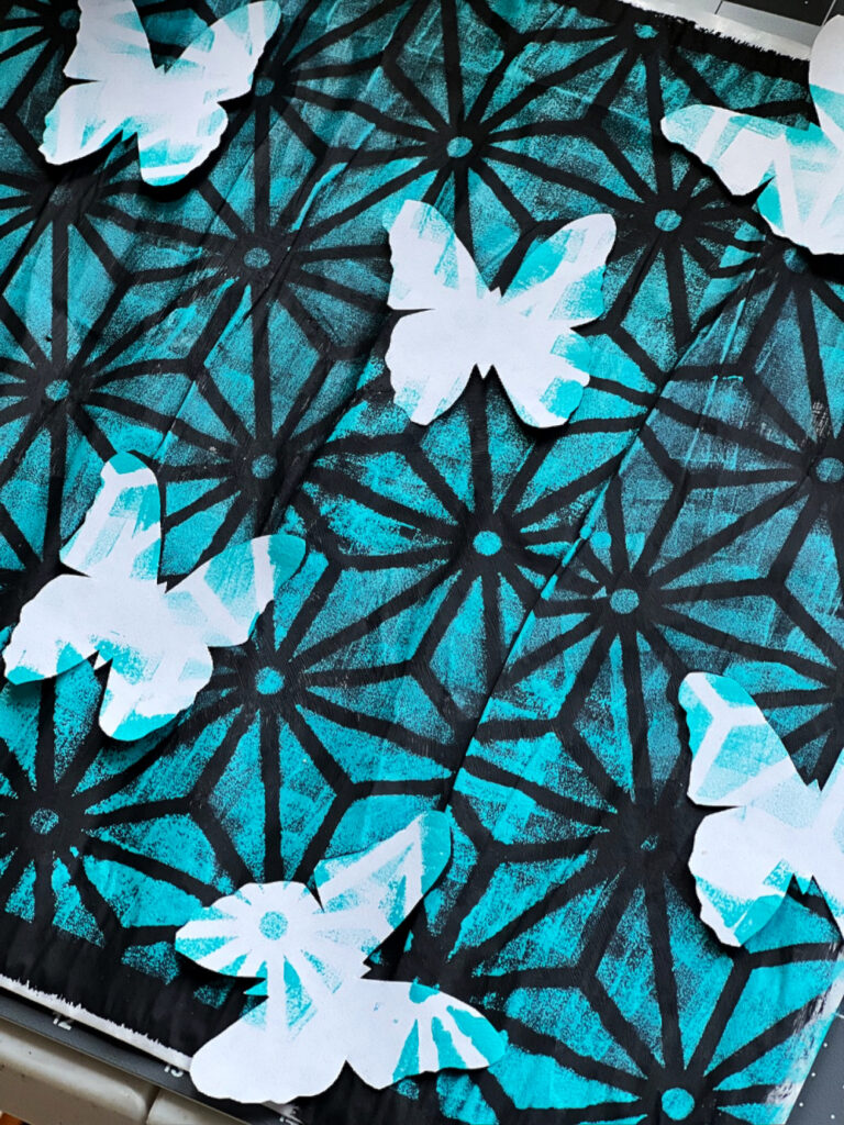
Next I drew a butterfly on a post-it note and cut it out. Once I was satisfied with it, I cut out 8 more butterflies. I placed these down on the black glassine to act as masks before I put down Nathalie’s Star Struck stencil. I used Golden Teal paint with a sponge and “pounced” the paint through the stencil. I removed the stencil and the masks which left black butterflies on the page. I thought I wanted to make the butterflies stand out, so I used a white Posca Pen to outline each butterfly.  

I wanted some “Bling” on the page. With a small paint brush, I applied gold gesso to the dots in the Star Struck stencil. See the lower left bottom corner to see how I filled in the gold dots. 
Next I used Natalie’s Grove Street stencil, Central Ave Stencil, and Park Blvd stencil and a makeup sponge to lay down a design on each butterfly. 
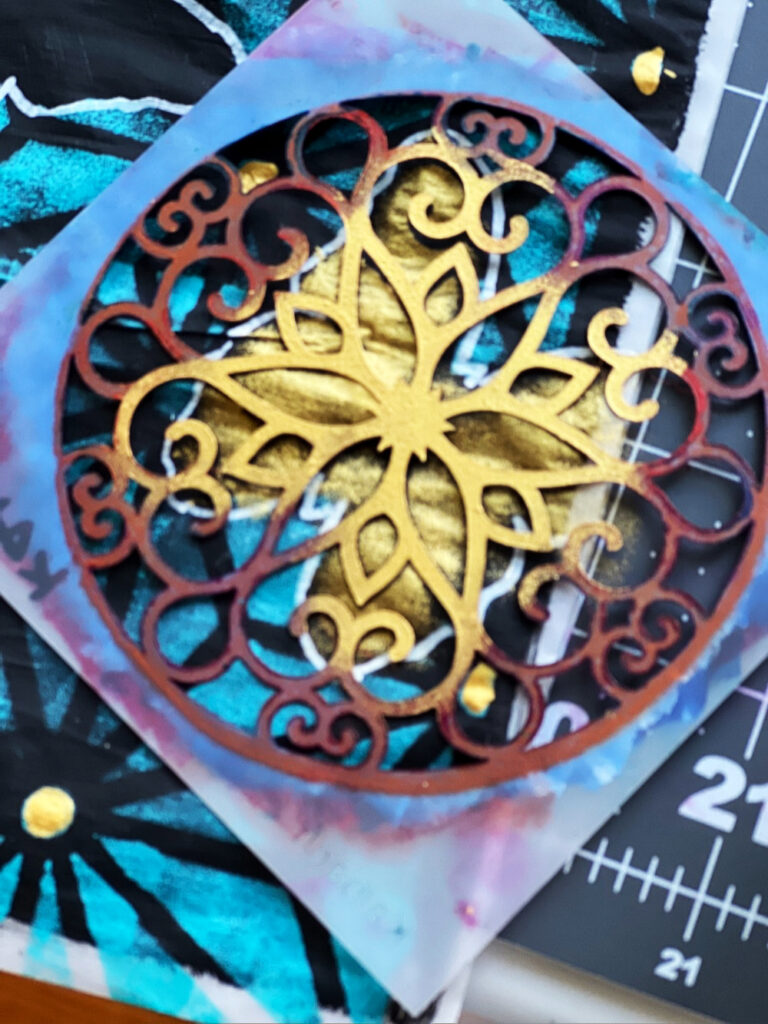
After the designs were on each butterfly, I realized I didn’t like the white outline, so I covered it up with gold paint and then applied a black micron #8 to outline the gold providing more depth to the butterflies. 
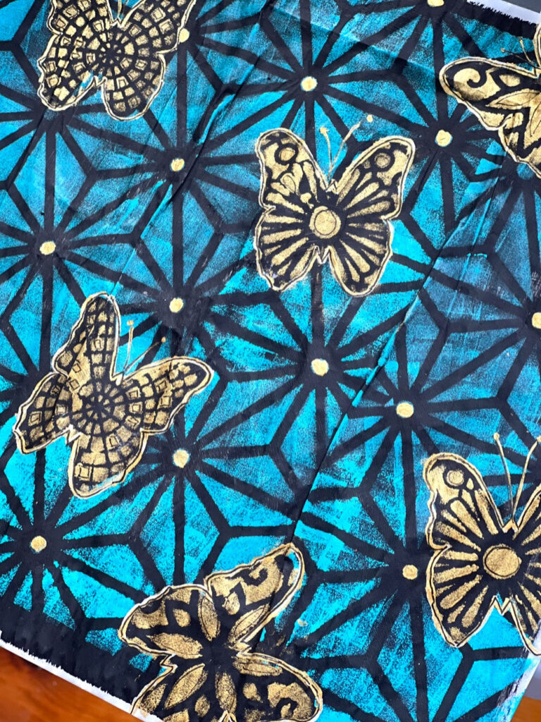

Thank you Robin for this fun project idea that could be used to repurpose lots of different types of bags! Also thank you for participating in the Creative Squad for the past 2 years – it has been a pleasure working with you!

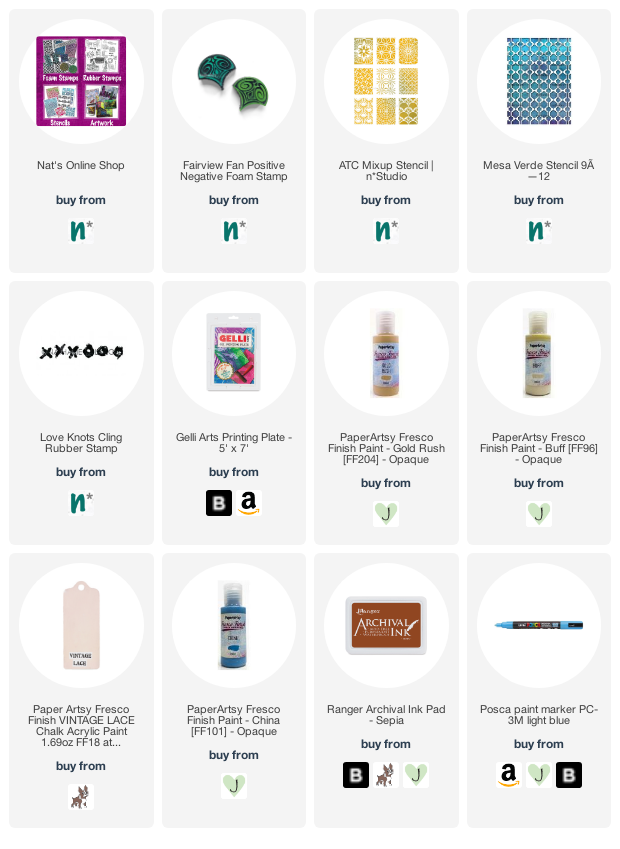
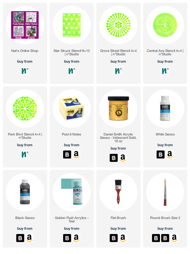
Give it a try: you can find all my Stencils in my Online Shop and in addition to her upcycled glassine bag, here are some of the supplies Robin used:
Looking for more projects? Follow the Creative Squad on Instagram here.


Leave a comment

Creative Squad: Favorite Art – My Way – Riikka Kovasin

Hello from my Creative Squad! Today we have a post and video from Riikka Kovasin who is sharing an art journal page that takes an artwork and subject matter and makes them all her own with my Fairview Fan foam stamps, ATC Mixup stencil, and Mesa Verde stencil. Our theme: Favorite Art – My Way – Look at a favorite work of art and create something inspired by it, drawing from the colors, shapes, subject matter, feeling etc. that strikes you most when you look at it.


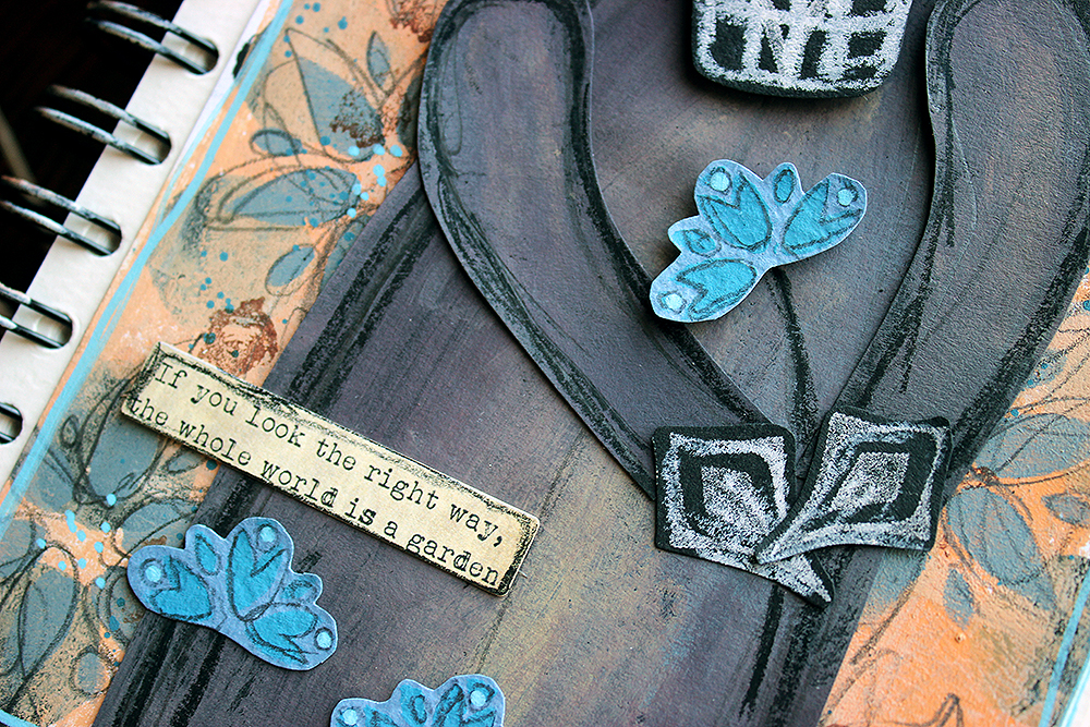
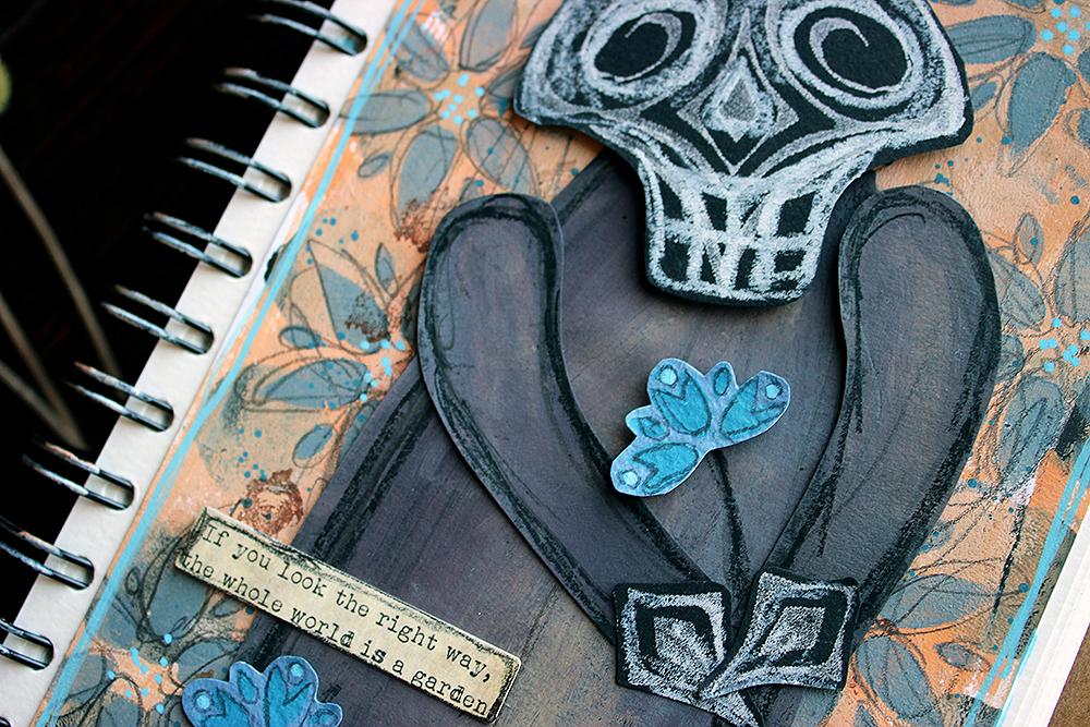
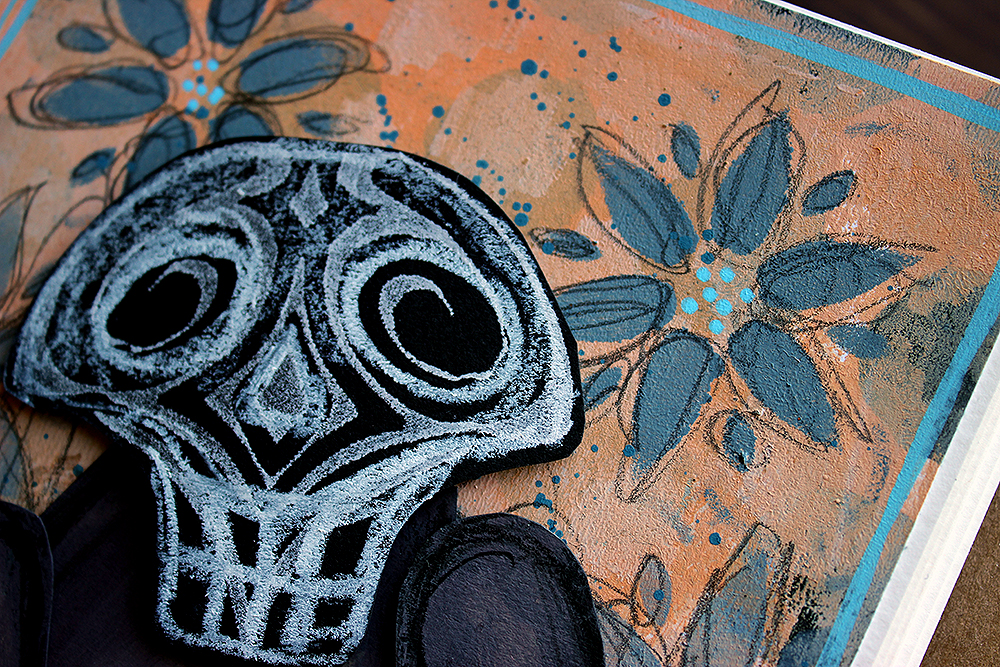
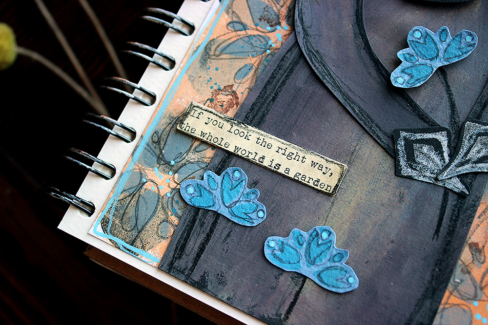
The Whole World is a Garden

Heippa! It’s Riikka Kovasin here today to share my take on the “Favourite art – my way” theme. Like I say in the video, I again struggled a bit in the beginning. This time the trouble was to narrow down the options!

Choosing a Finnish artist was a must for me. At first, I thought about a female artist, but didn’t want to go with Helene Schjerfbeck. For one, I wanted to highlight someone maybe not as known and secondly, I’ve already used her art to inspire me a couple of times (check out an example here). My second choice was a lady, who’s photo is always on my craft table, Ellen Thesleff. I love her work, but none of the pieces really jumped up to me this time and was like “me, redo me!”. The reason for this might also be that I’ve used her art before as well here. Back to the drawing board it was!

I then decided to take a totally different approach to the subject and let a tool do the deciding for me. Like I say in the video, since I got the “Fairview Fan” foam stamp set, I’ve seen the other stamp as a skull. I have been eyeing it before, thinking about a Halloween card, but had not yet jumped to the idea. So, now was the perfect time! After deciding on the skull, it was then easy to pick up the artist and artwork.

Death, as a personification, is a re-occurring character in the works of Hugo Simberg. He’s not a scary character but more a bit lost and an outsider. In some ways he reminds me of the Death in the Discworld series, not quite getting the ways of men. My favorite piece with Simberg’s death character is a painting called “Kuoleman puutarha”. The subject was so dear to the artist himself that he did several versions of the piece. What I used as my reference here, is made in 1896, a small gouache and watercolor work. You can read more about the piece here (link) and about the artist here (link).

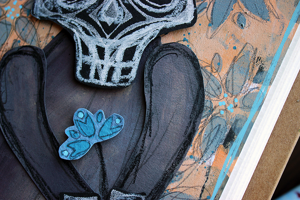
In the painting, there’s three death characters caring for the plants in their garden. While my favorite of the three is the one on the left, leaning on the workbench, watering the plants, I chose to make a version of the second character, the one in the center. He’s the one who usually gets pointed out as the posture of the character is so tender, almost fragile. My character doesn’t have the same fineness of the posture, but I hope the atmosphere still comes across!

If you’d like to see, how I made the page, please see the video below. If you want to jump directly to the making process and avoid the introduction, the process starts at 1:08.

What I used in my piece, besides the obvious character, was the warm honey toned color scheme. Like I said earlier, Hugo Simberg did several versions of the subject, but as they are mostly black and white, they are missing the warmth of the watercolor piece that inspired me. Another colored version of the “Kuoleman puutarha” is at Tampere Cathedral. The colors are a bit different in it as well, as it’s a fresco, painted on the cathedral wall.

While the original artwork has an abundance of strange plants, I depicted those in my take more uniformly. The background flowers represent the other plants in the garden, while I highlighted the bluebell-styled flora as it’s the one the character is holding.

I hope you don’t get frightened by this character but rather find him endearing! Thank you for stopping by today!

Xoxo Riikka


Thank you Riikka for sharing your brainstorming process and also your beautiful take on a subject that is not often represented in such a tender way!

Give it a try: you can find all my Foam Stamps, Stencils and Rubber Stamps in my Online Shop and here are some of the supplies Riikka used:

Looking for more projects? Follow the Creative Squad on Instagram here.
Leave a comment

Color Update with Judi – Creative Squad

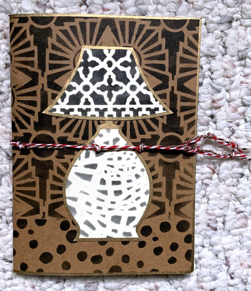
Last month our Creative Squad member Judi Kauffman shared her lovely little stenciled lamp journal with us (check out the full post here) and in the process, caught the eye of a friend. Sometimes you create something and at that moment the project is complete… until you decide that you could take it further LOL. Well, that’s just what happened here and we thought it would be fun to share the update with you.

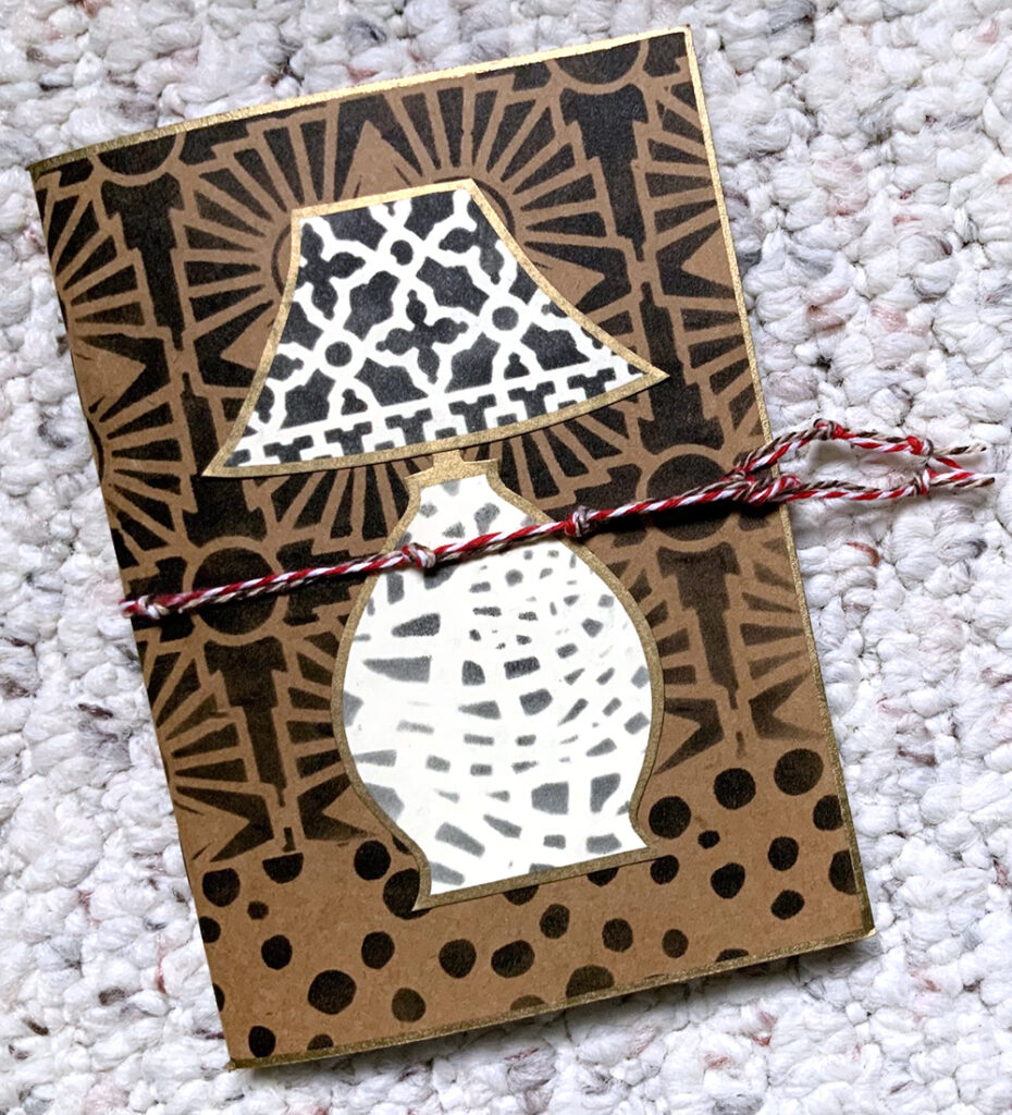
First let’s look at that sweet project from last month:

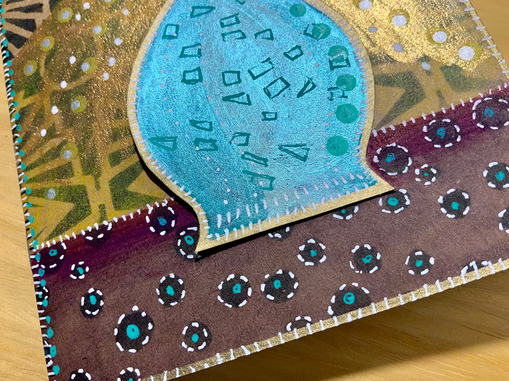
Love how she used my Hamilton, What’s the Point, Crackle, and ATC Mixup stencils to give the scene dimension, a setting, and lots of interest.

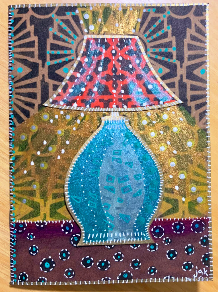
And then…

W O W !!! Look at allll that color! Here is what inspired the update:

“My friend in California whose birthday is coming up fell in love with it, but said I had to do “more” to it because she thought it should have COLOR…”

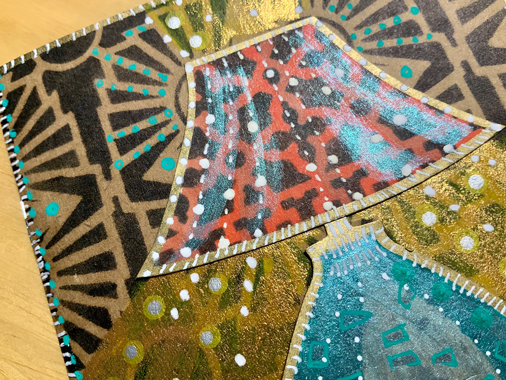
We love it Judi! The lamp light is glowing, the details enhancing the sparkle, and the color palette is very Mid Century cool!!!

Thank you Judi for sharing your color update with us!

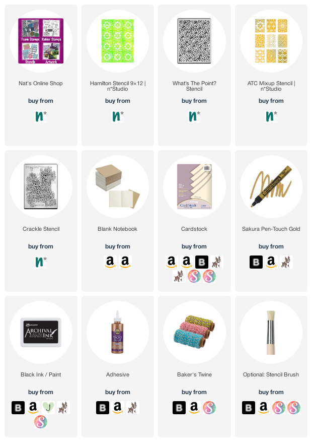
Here are some of the supplies Judi used:

Leave a comment

Creative Squad: Favorite Art – My Way – Maura Hibbitts

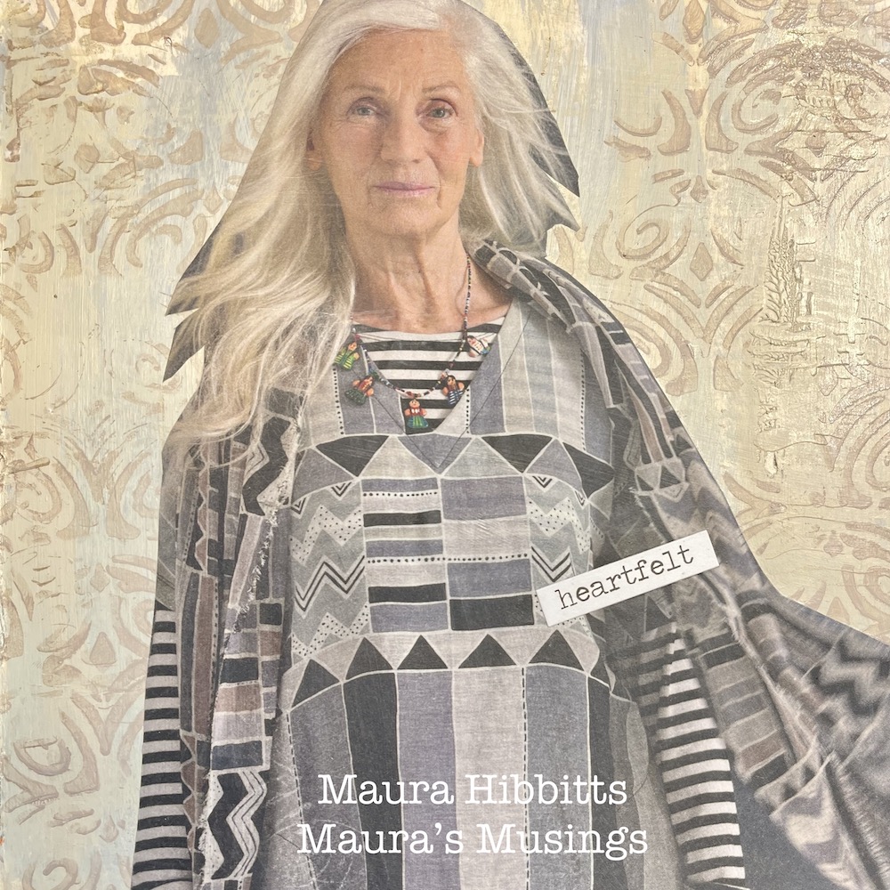
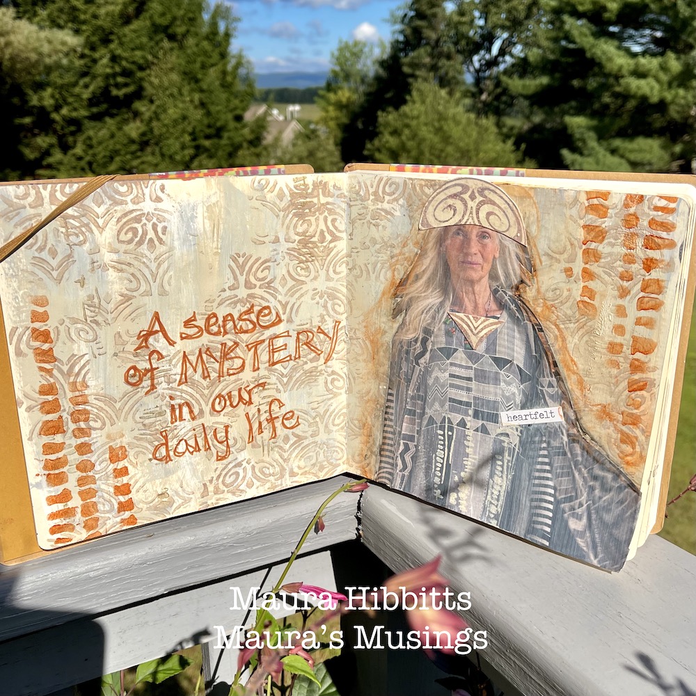
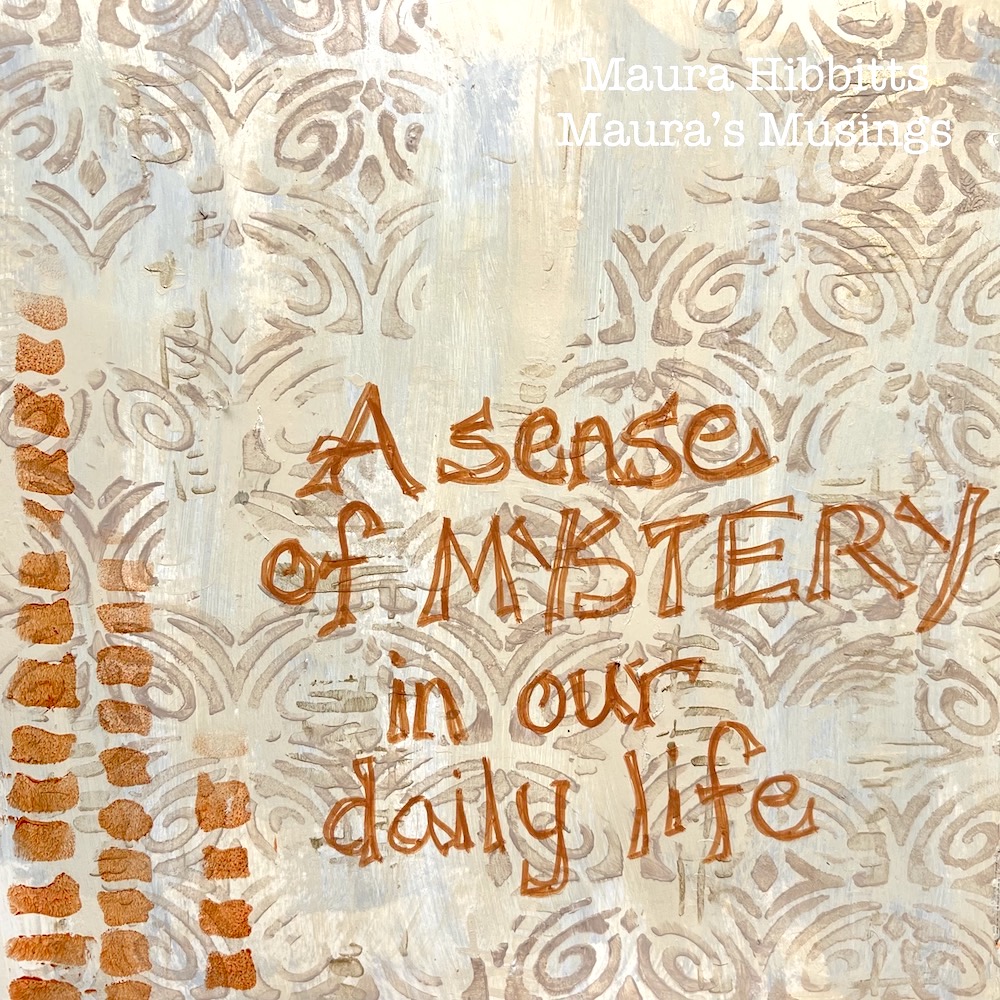
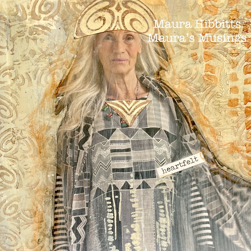
Hello from my Creative Squad! Today we have a mysterious and serene art journal spread from Maura Hibbitts using my Art Deco Fairview, Batik, and Tokyo stencils and my Fairview Fan rubber stamp for our new theme: Favorite Art – My Way – Look at a favorite work of art and create something inspired by it, drawing from the colors, shapes, subject matter, feeling etc. that strikes you most when you look at it.


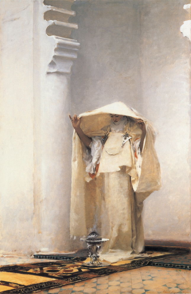
For reasons I don’t completely understand, I’ve been drawn to “Smoke of Ambergris” by John Singer Sargent, since I first saw this painting in a museum. Usually, bright colors call to me, but this painting is soaked in neutrals. Maybe it’s the hints of far off lands seen in the echo of architecture and floor tile. Maybe it’s the feeling of serenity as the woman lifts her veil over the brazier. There is a mystery here that is both simple and complex, an insight into another time and place, that intrigues me.

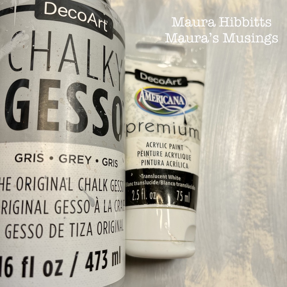
I began by brushing chalky grey gesso up and down my art journal pages, leaving some open areas. Next, I added a layer of translucent white paint, again using vertical strokes, to mimic the vertical lines in the painting. I also felt like this created the hint of shadows.

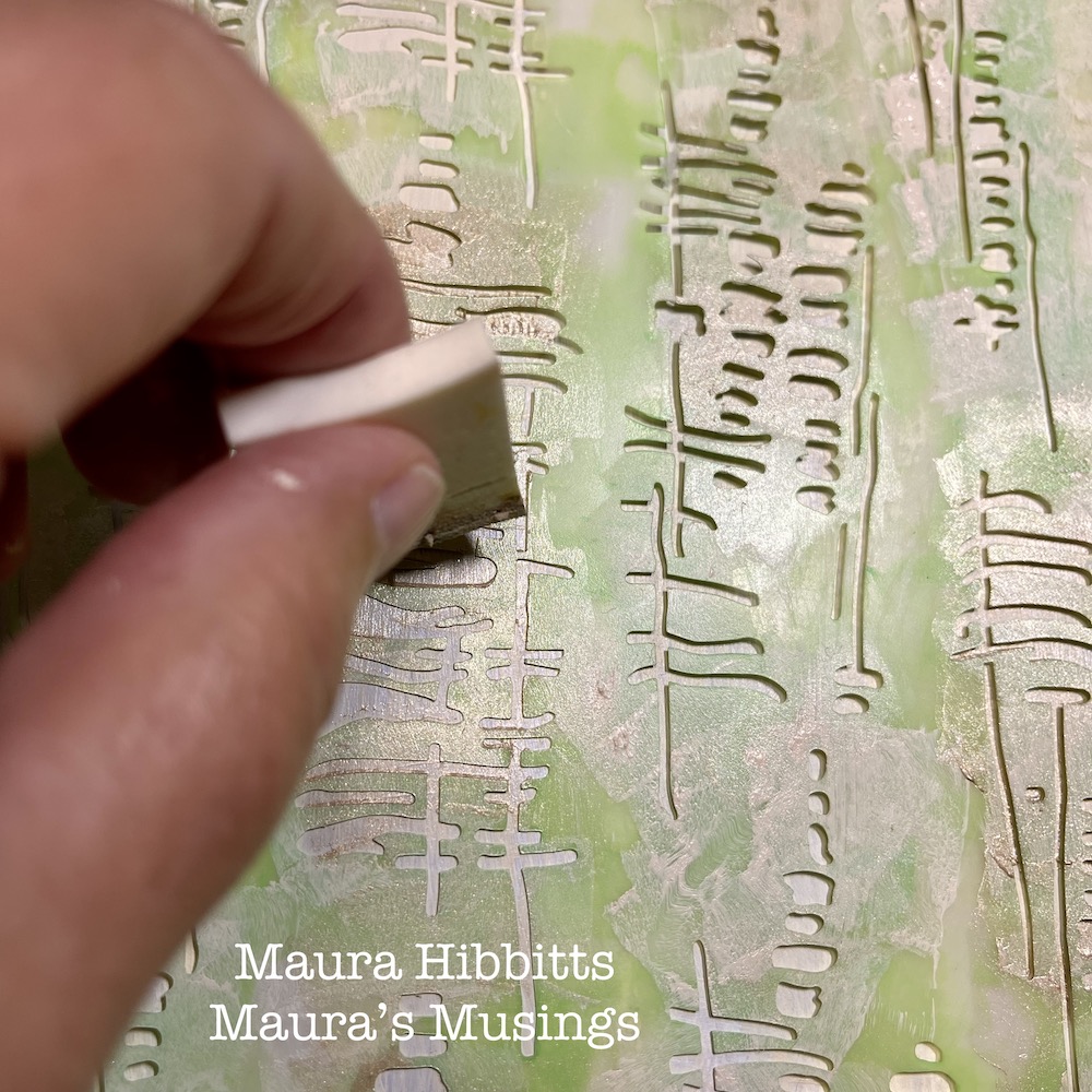
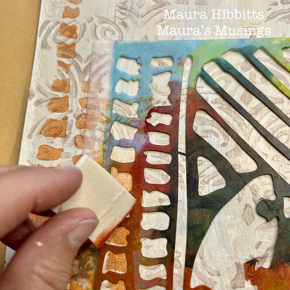
I added a stenciled layer to the dry background using Nat’s Tokyo stencil and pale gold paint.  I like to use a cosmetic sponge for this step, and you always want to use a light touch with the paint to keep the design crisp.

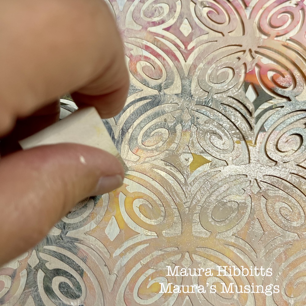
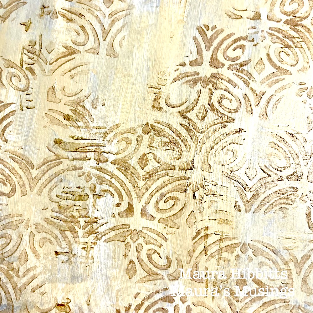
Next up, another stenciled layer. This time, I used Nat’s Art Deco Fairview stencil and a blend of titan buff and burnt umber paints. The layers are building…

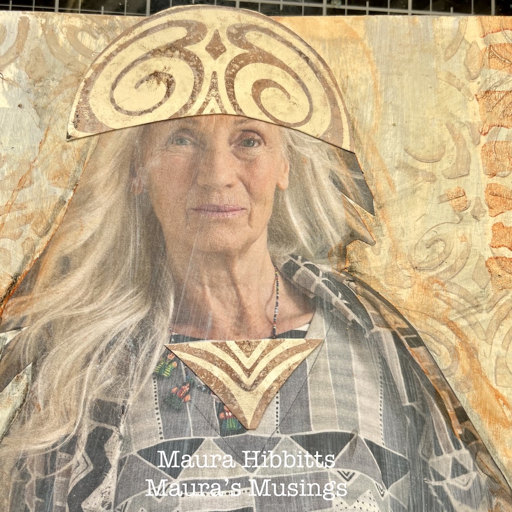
Cut a figure out of a magazine or catalog and adhere to the page using collage medium. I added a word sticker over a label on the clothing. I chose this particular figure for the neutral clothing.

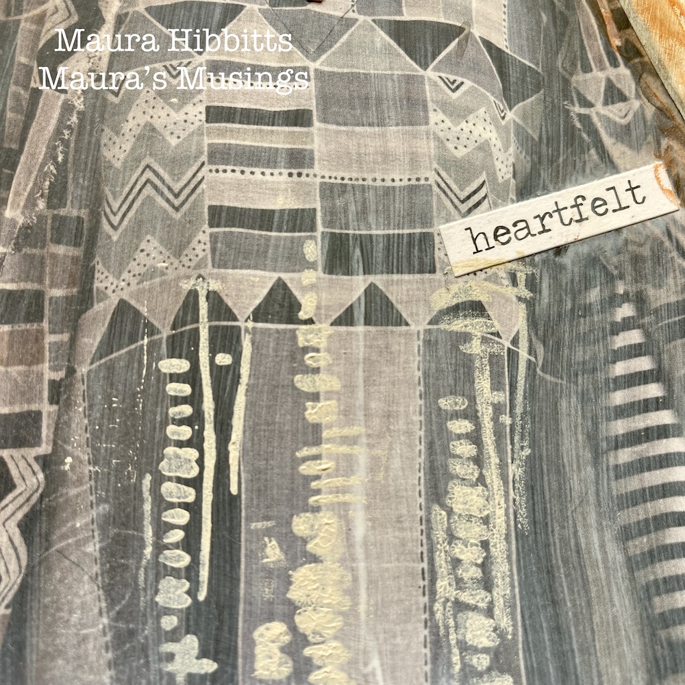
I added a bit of stenciling to the dress using Nat’s Tokyo stencil and titan buff paint.

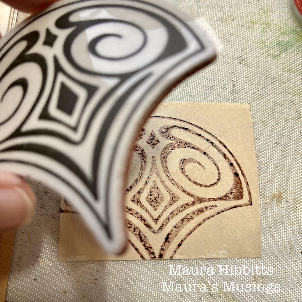
On a piece of watercolor paper, paint it with titan buff and let dry. Next, stamp Nat’s Fairview Fan stamp onto it, using ground espresso distress ink (or any brown ink).

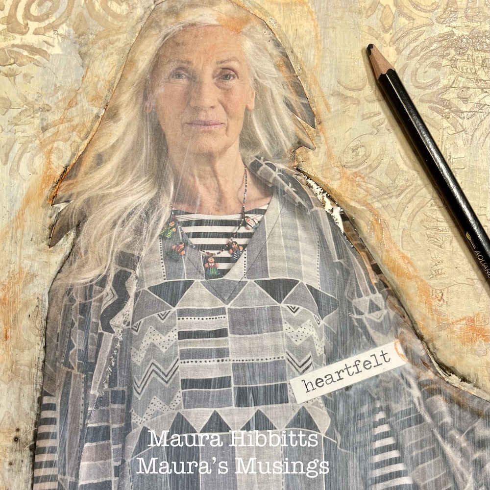
Smudge quinacridone gold paint around the figure and let dry. Edge the figure with a graphite pencil, then use a water brush to create a shadow.

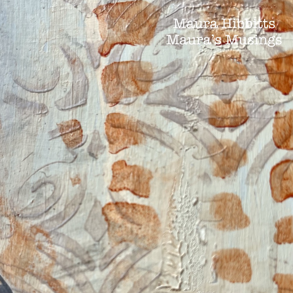
Add three vertical stripes on the opposing corners of the pages with Nat’s Batik stencil and quinacridone gold paint.

Cut the stamped image into a hat to represent the veil in the painting. Also add a portion to the dress.

Hand letter some words to the open page with a brown Posca pen. I chose the words “A sense of mystery in our daily life.” I feel the mystery in the painting “Smoke of Ambergris”, but also sense this is a ritual for the woman in the painting. I wanted to echo the neutral tones of the painting and vertical lines, as well as bringing in a hint of the east into my art journal. Get inspired by a favorite piece of art and create! Maura


Thank you Maura! I love that painting too and how you interpreted the color palette and elements is very pleasing to the eye :)

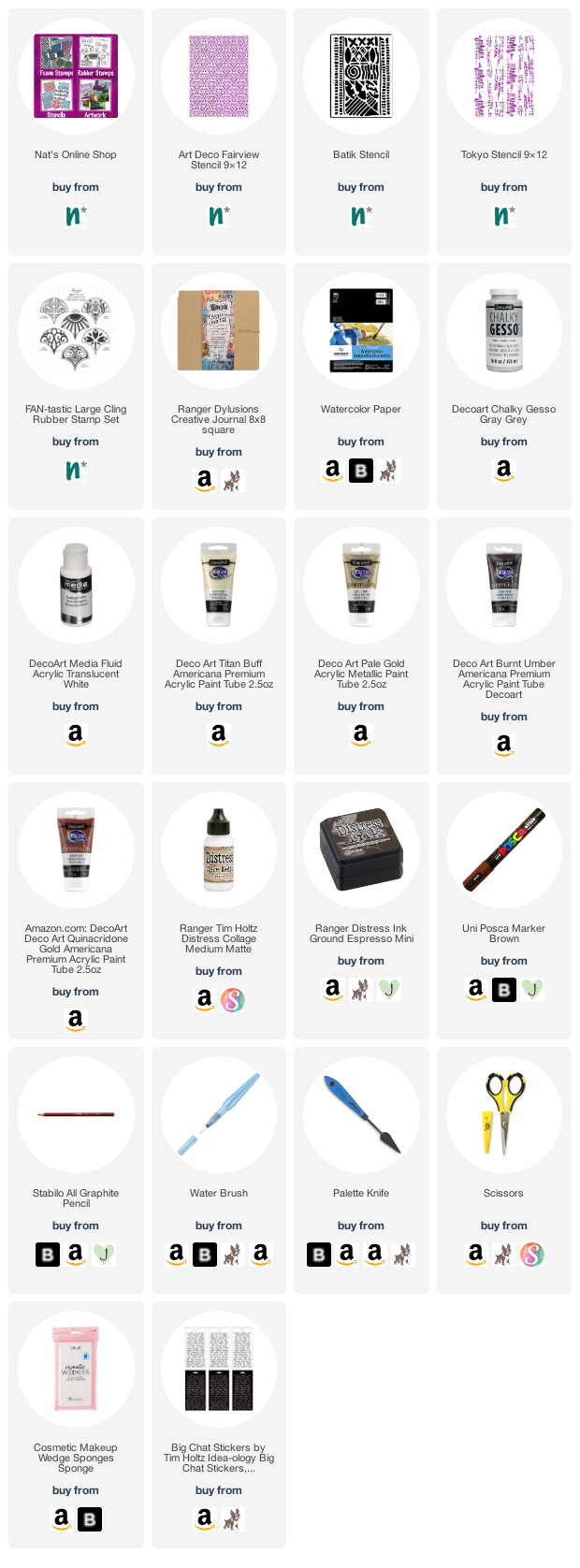
Give it a try: you can find all my Stencils and Rubber Stamps in my Online Shop and in addition to her magazine image, here are some of the supplies Maura used:

Looking for more projects? Follow the Creative Squad on Instagram here.
Comments (2)

  • Sue Clarke

    |

    Love love love this Maura!
    The original is peaceful and you’ve captured the feeling perfectly and made it modern.
    This gives me some ideas.

    Reply

    • Maura

      |

      Thanks so much Sue! I am so glad you enjoyed this, and it gave you some creative ideas. Have fun creating! Maura

      Reply

Leave a comment

Creative Squad: Goodnight Art Journal – Judi Kauffman

Hello from my Creative Squad! Today we have a post from Judi Kauffman who is sharing a creative way to personalize a notebook cover using my ATC Mixup, Crackle, Hamilton, and What’s the Point stencils and inspired by our theme: Goodnight, Art Journal – Think about the colors, sounds, rituals of night – any aspect of it – and use that as your catalyst to create! 


LAMP LIGHT by Judi Kauffman

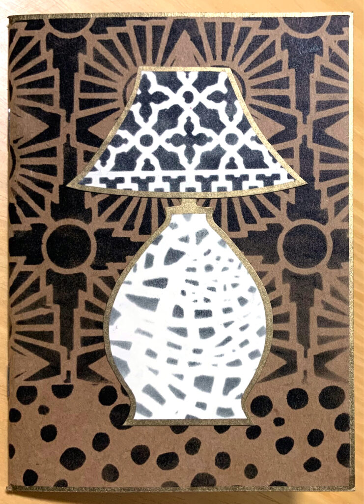
I don’t keep an art journal – just an over-stuffed Traveler’s Notebook – so my project deviates from this month’s assignment. We’re tasked with using Nathalie’s stencils to create an art journal page inspired by night time. I took a more literal approach to nighttime, the wonderful, lazy part of my day when I am most often in a comfy chair reading by lamp light.

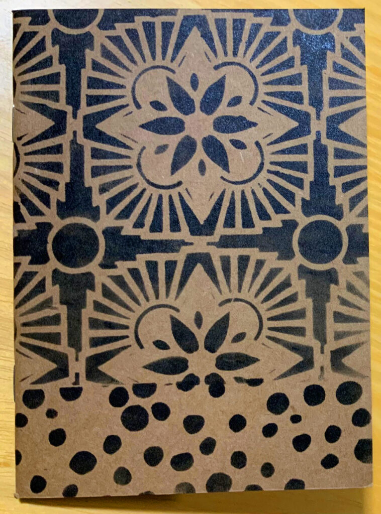
The project itself started with a 4” x 6” blank book with a Kraft brown cover, small enough to sit next to the chair or tuck into a tote. I can record what I’m reading, make shopping lists for books I want to buy or pick up at the library, jot down recommendations from friends. I plan to glue in book reviews from newspapers and magazines, and – of course – I’ll doodle.

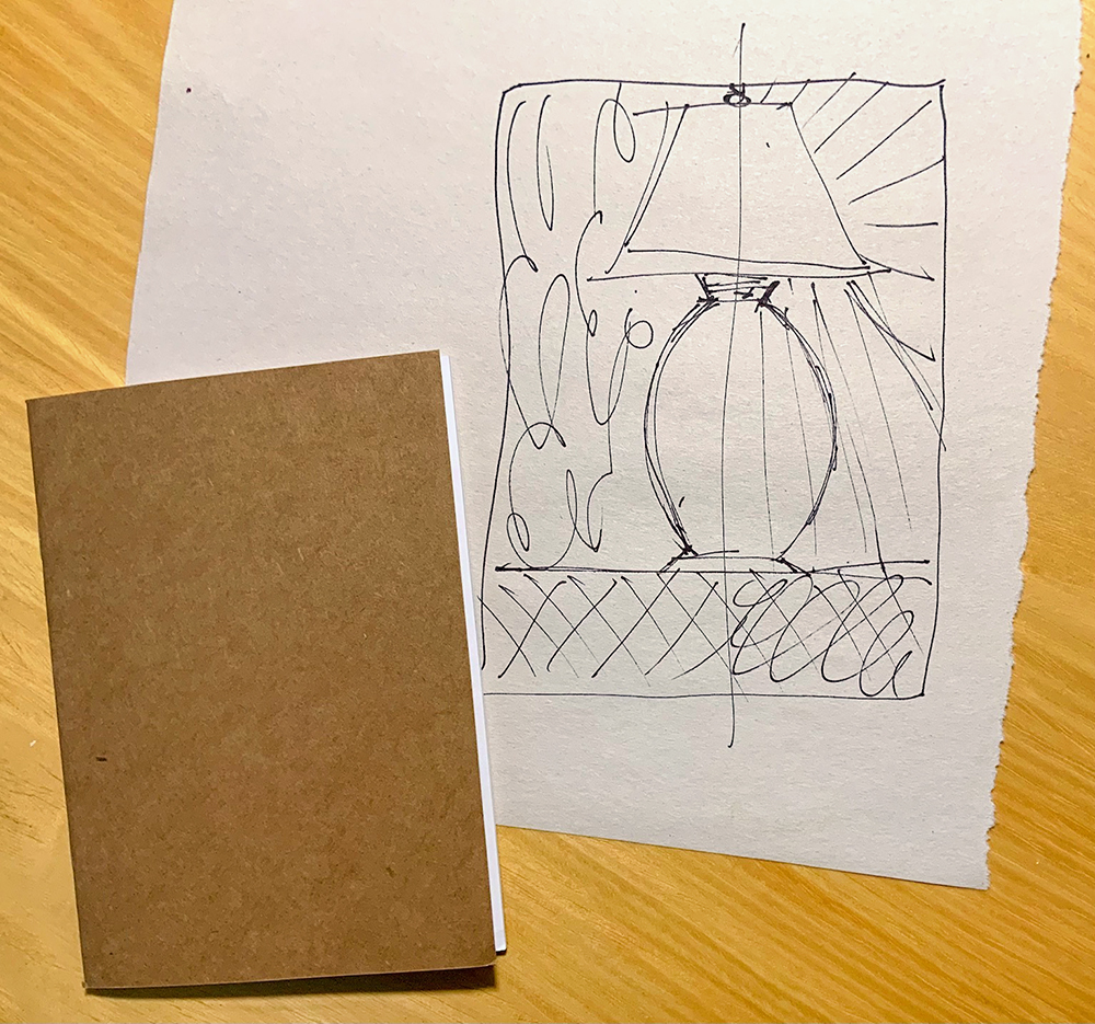
My original idea, shown in the sketch above, was a lamp on a table, divided so that one half was daytime and the other was nighttime – rays at the right showing the nighttime illumination. I knew I wanted a very graphic design with very simple shapes so the stencils would take the starring role.

When I spread out Nathalie’s stencils I took a slightly different approach, a simple lamp sitting on a table with one stencil pattern for the tabletop and another stencil for the wallpaper behind the lamp, a third stencil for the lamp shade and a fourth for the base. A nice bonus: the stencil I chose for the wallpaper (Hamilton) also looks like rays of light in a subtle way! Feel free to use this sketch if you prefer that approach to the one I ended up using.

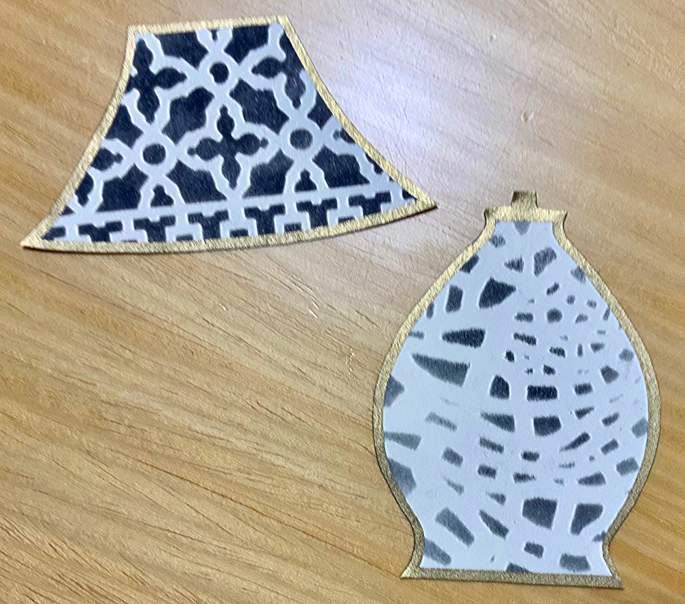
Using black ink or paint or color(s) of choice: Stencil the designs for the wallpaper (here I used Hamilton) and table top (here I used What’s the Point) onto the book cover. Stencil designs for the lamp shade and base onto ivory cardstock (I used the Crackle and ATC Mixup stencils). You’ll only need a few inches of stenciled cardstock for the shade and base.

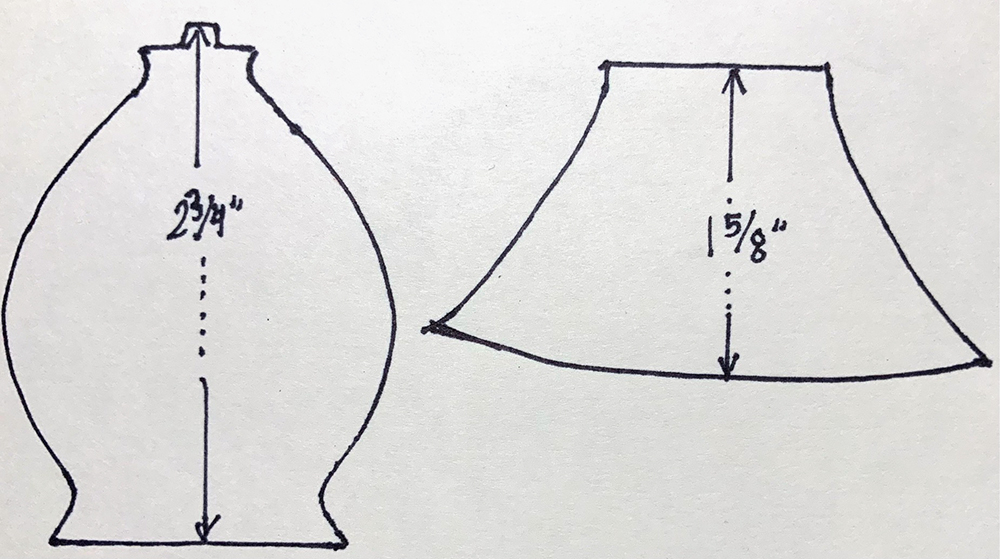
Create cutting patterns for the lamp shade and base by using my drawings or your own preferred lamp as inspiration. Lots of options for free designs on the internet. Cut out the patterns.

Position the cutting patterns onto the stenciled ivory cardstock. Draw around the patterns; cut out the shapes. Design strategy to note: I picked a portion of the crackle pattern for the lamp base that has a rounded look to add dimension to the otherwise flat shape. I carefully centered the pattern on the lamp shade.

Edge the book cover, lamp shade and base with gold paint pen. Glue the shade and base to the cover.

Optional: For a pop of color create a belly band with knotted baker’s twine, ribbon, elastic, or yarn. Make sure the band is loose enough to easily slip on and off or easy to untie and re-tie. (Baker’s twine is tedious so my belly band will remain knotted.)

More Options:
*Start with a photo of your own lamp as the source for the cutting patterns.
*Use a mix of colors instead of only black.
*Make a batch of stenciled cards – this is a very fast and easy project to do ‘assembly line’ style since the shapes are so simple.
*Stencil onto patterned paper instead of solid colors.
*If the finished look is too minimalist for your taste, embellish with pen doodling; add collage or develop dimension with colored pencils.


Thank you Judi! Love the thoughtful positioning of the stencils to suggest light and form!

Give it a try: you can find all my Stencils in my Online Shop and here are some of the supplies Judi used:

Looking for more projects? Follow the Creative Squad on Instagram here.
Leave a comment

Creative Squad: Goodnight Art Journal – Jordan Hill

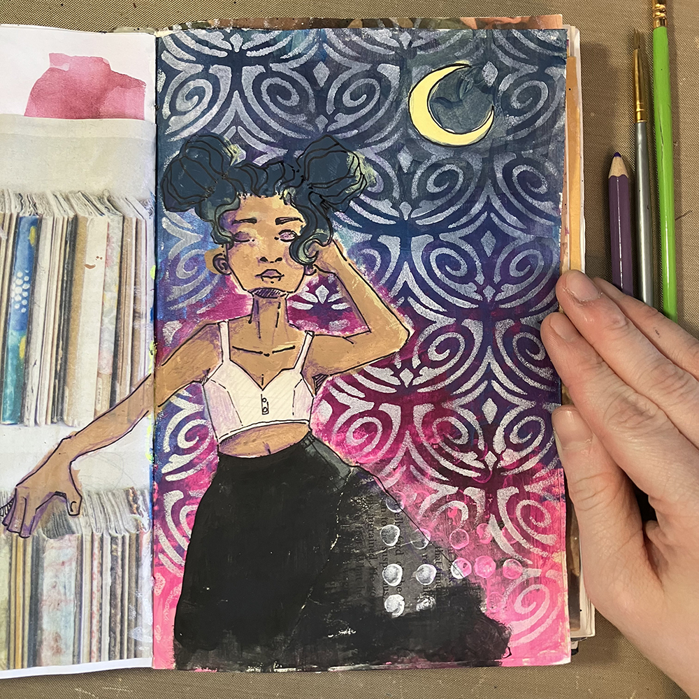
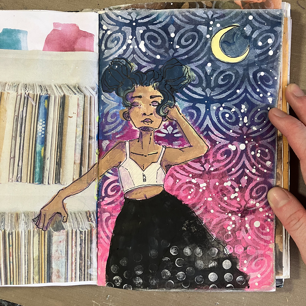
Hello from my Creative Squad! Today we have a post from Jordan Hill who is sharing an art journal page with a beautiful night sky and one of her illustrated figures too. She is using my Art Deco Fairview stencil and our theme: Goodnight, Art Journal – Think about the colors, sounds, rituals of night – any aspect of it – and use that as your catalyst to create! 


Hello everyone, I’m very happy to be back with you all again for the month of August. I was very excited to hear that this month’s theme was ‘Goodnight, Art Journal’ because galaxies and night skies are some of my favorite things to incorporate into my work. Let’s jump into this month’s spread!

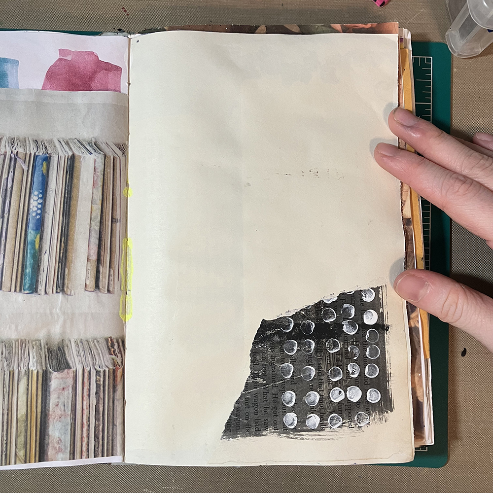
First things first, I needed to choose a page to work on top of. I knew that I wanted a white (or off white) page for the idea I had, so I selected this one that had a small scrap of black and white paper already adhered to it. I felt as though it already fit this month’s theme of ‘Goodnight, Art Journal’, since it vaguely reminded me of a night sky.

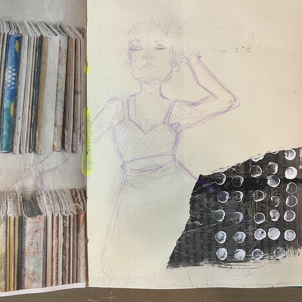
Typically I would work on the background next, but this month I wanted to experiment with sketching my focal point first. I used a Lavender Col-Erase pencil to sketch this figure directly onto my page. If you don’t feel like drawing your focal point, collaging an image down will have a similar effect.

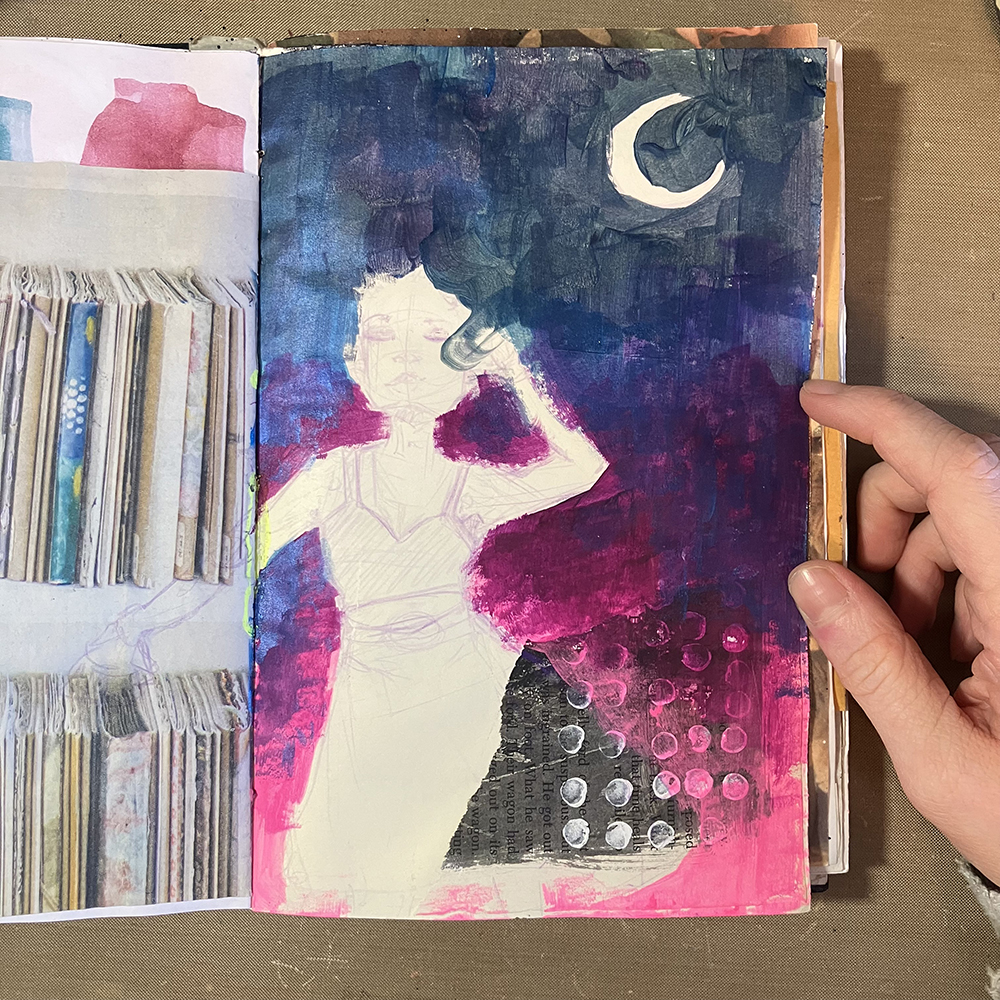
I then wanted to add in the background. Using a variety of different paints in pinks, purples and blues (with a hint of black), I created a gradient. I added the paints directly to the page and blended the colors together as I worked.

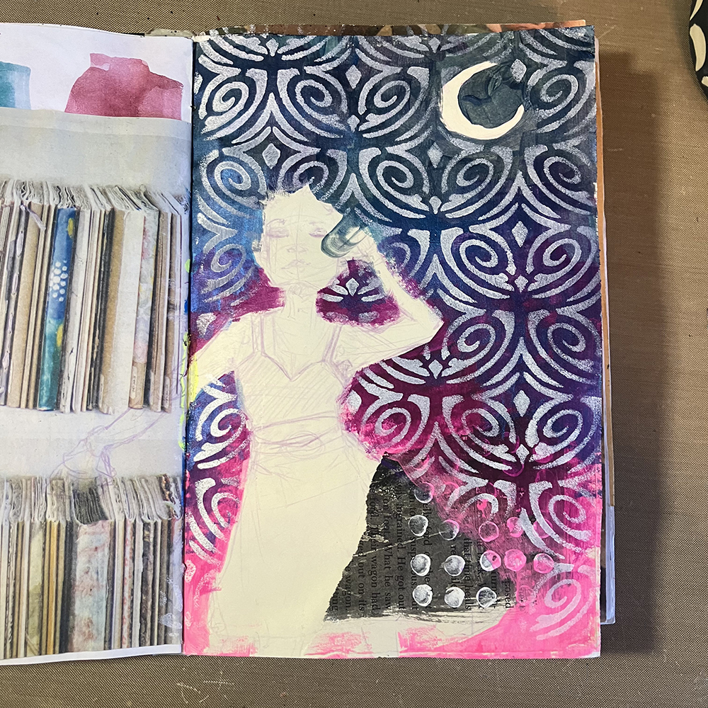
Next, I used Nathalie’s Art Deco Fairview Stencil and a makeup sponge to apply some white acrylic paint over the entirety of the background. I was trying to create an effect reminiscent of a night sky, with stars and galaxies swirling together.

It was then time to add color to the figure. I used a variety of acrylic paints to do this, and used my Lavender Col-Erase pencil to shade the skin. I added some highlights in the same yellow color I used for the moon to create some additional interest. Somewhere in between the sketch and finished render, this figure also ended up looking in a completely different direction. I guess that’s what happens when you cover your sketch with acrylic paint.

To add the finishing touches to this page, I toned down the brightness of the stenciling ever so slightly by applying washes of the same gradient colors over the top. I splattered some white paint over the background, added a few more dots along the bottom hem of the skirt with the tip of my finger, and I was ready to call it complete!

I hope you enjoyed following along with this month’s art journal page!


Thank you Jordan! I love how your sketch turned out and that gorgeous celestial background!

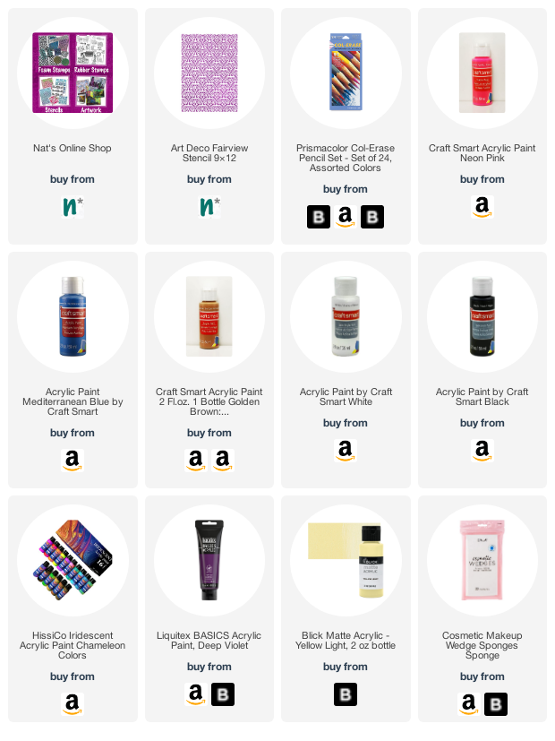
Give it a try: you can find all my Stencils in my Online Shop and in addition to collage material, here are some of the supplies Jordan used:

Looking for more projects? Follow the Creative Squad on Instagram here.
Leave a comment

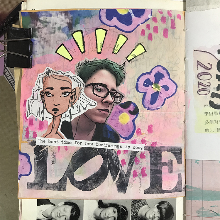
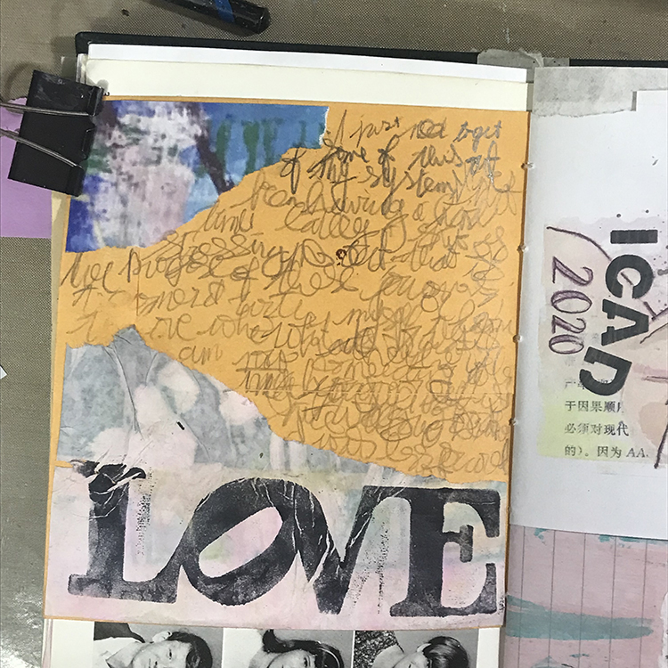
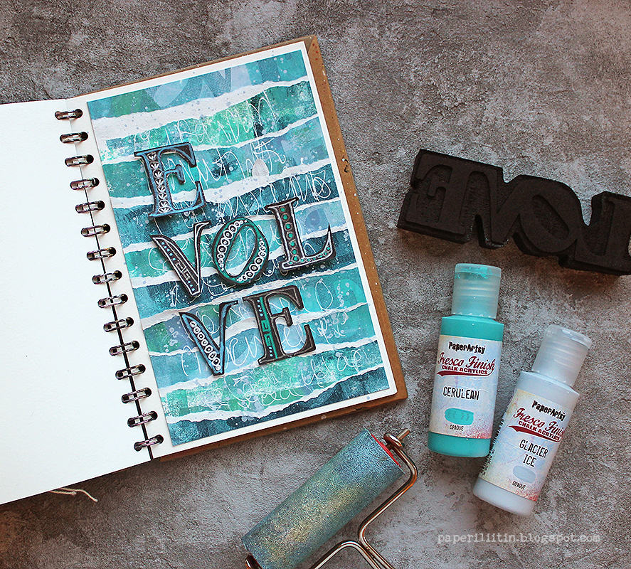
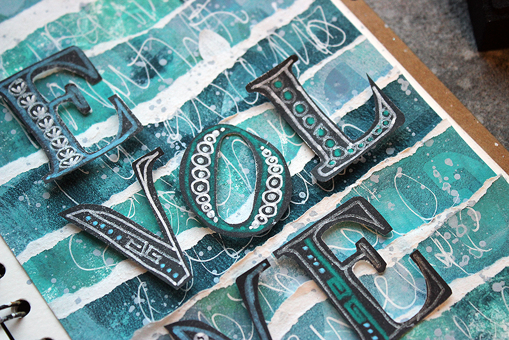
Some Creative Squad LOVE

I call my design team the Creative Squad and I love seeing their projects come in each week, inspired by our monthly themes. Right now we have 5 members, each with their own artistic styles and each with a unique way of using my stamps and stencils and interpreting our themes. It is always a surprise to open my inbox and find a new Creative Squad project in there.

So it’s time for a little Creative Squad LOVE :)

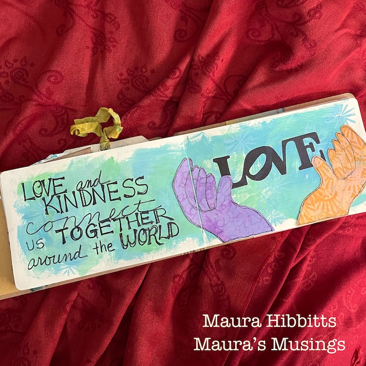
Maura kicks off our new theme each month with her imaginative take. Her love of nature and beautiful vibrant colors gives us a good dose of optimism and joy and is the perfect way to start off a new theme.

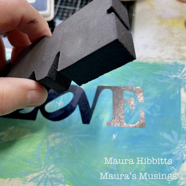
I love the message in her art journal spread above: “Love and kindness connect us together around the world.” And the hands coming together around my LOVE foam stamp is a world view that I wish was more prevalent.

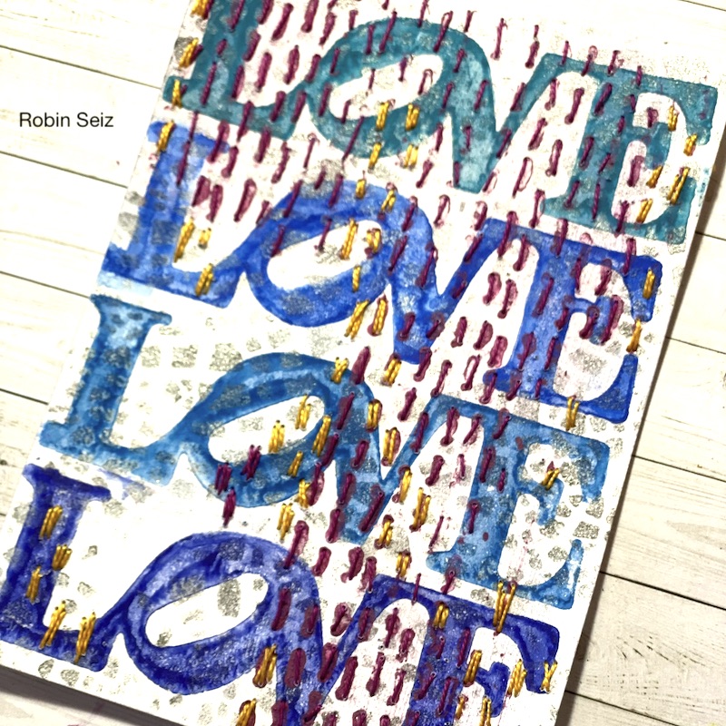
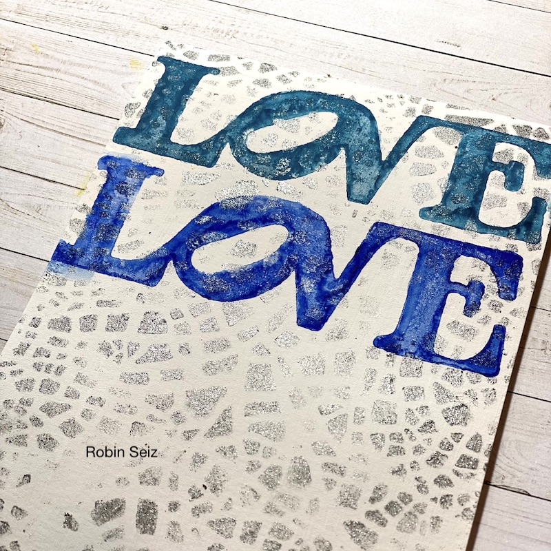
Robin brings a thoughtful edge to her projects, and details that always make us stop to think and appreciate the subtlety of the design.

I love the combination of actual stitching and my Running rubber stamp in the above card. You might not notice it right away but spend a little time and you are rewarded by cool details like this.

Jordan has a very hip illustration style to her art journaling that makes us think about how we can sketch and mix things up with collage, stamping, stenciling, and other mixed media techniques. Her combinations of colors and patterns always keep our eyes moving around her compositions.

In the above page I love how she layers different types of collage material but ties them together with mark making and colors.

Riikka has a moody style and a mastery of atmospheric layering that is beautiful. She often draws inspiration from stories, legends, and her own imagination so you never know what to expect until it shows up in your inbox.

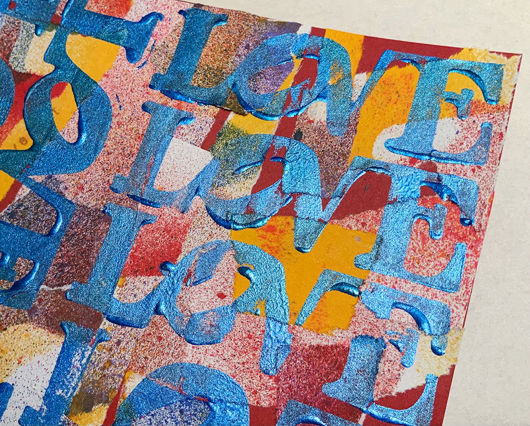
The above page was such a one-of-a-kind take on using my LOVE foam stamp. Riikka knows how to let an idea percolate and evolve until it is her own.

Judi comes from a background that is deep with mixed media, art, and industry knowledge. When she tackles a project we always get to see how her mind explores it in nearly every direction, through materials and iterations.

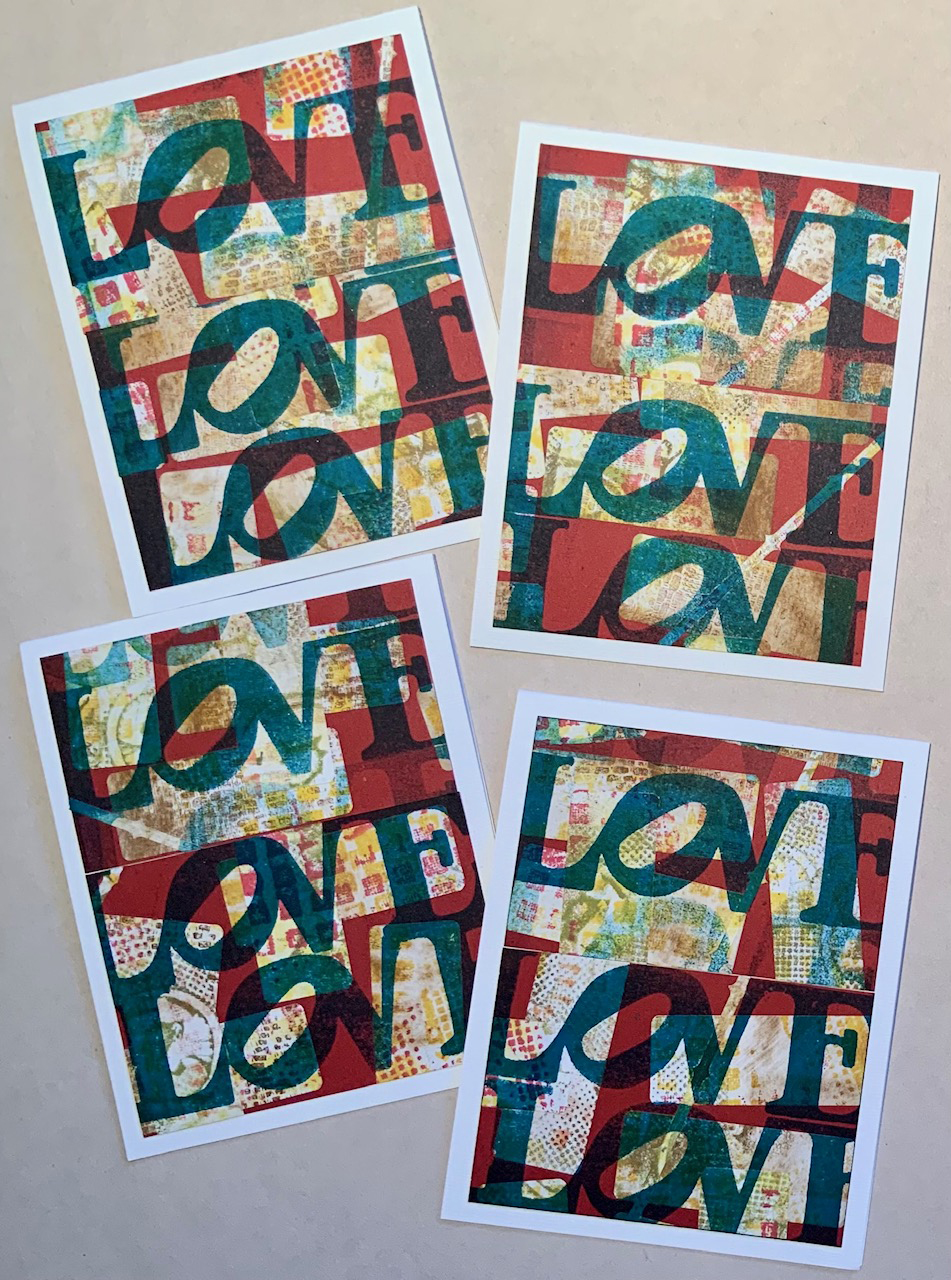
The above is just a taste of how Judi decided to use the LOVE stamp. A range of color palettes and layering techniques yielded a magnificent harvest of creativity.

Each week is like this with the Creative Squad. They bring it. It’s fun to see AND it inspires me too because their minds all work a little differently. I feel pretty lucky to have them and you can glean from them too! Check out all their awesome work on their Instagram page HERE or head over to the Creative Squad page and read their bios and see an overview of their work.

Wanna spread the LOVE? Here are some of the supplies used in these projects:

Comments (1)

  • Robin Seiz

    |

    Nathalie you and Kim make our work so easy. I always love the themes and your stamps and stencils are such great tools that it hard not to create something beautiful. Thanks for all you do for the squad. It’s such a privilege to be a part of it.

    Reply

Leave a comment

Creative Squad: Goodnight Art Journal – Riikka Kovasin

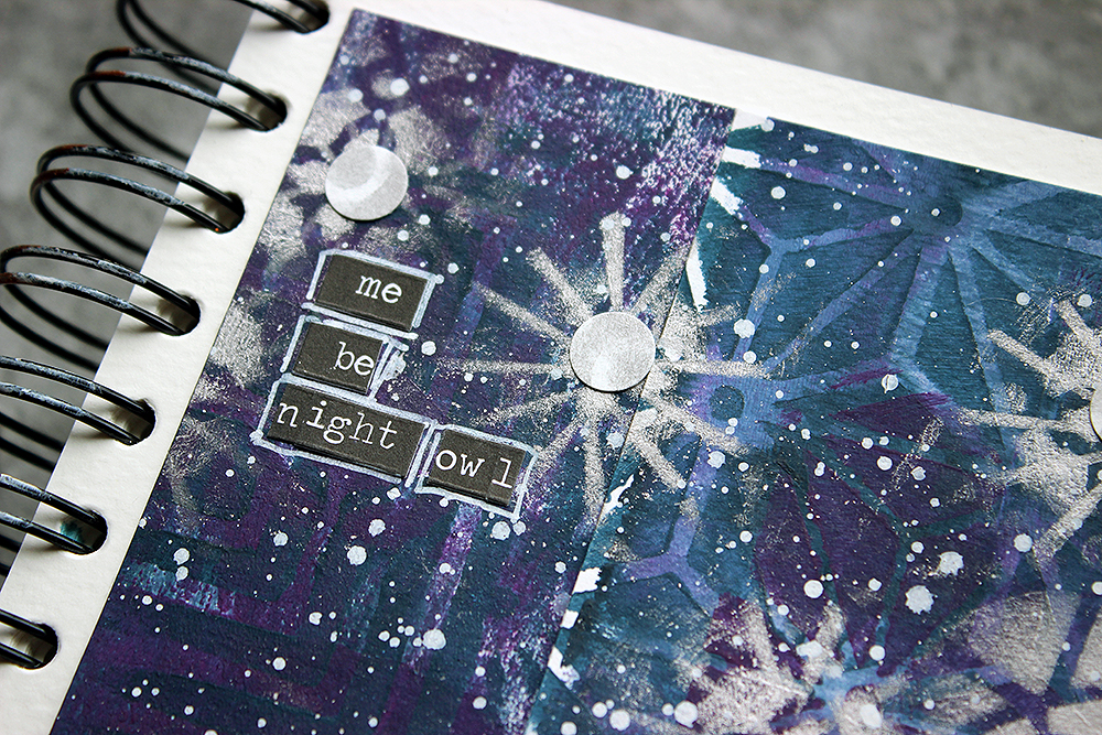
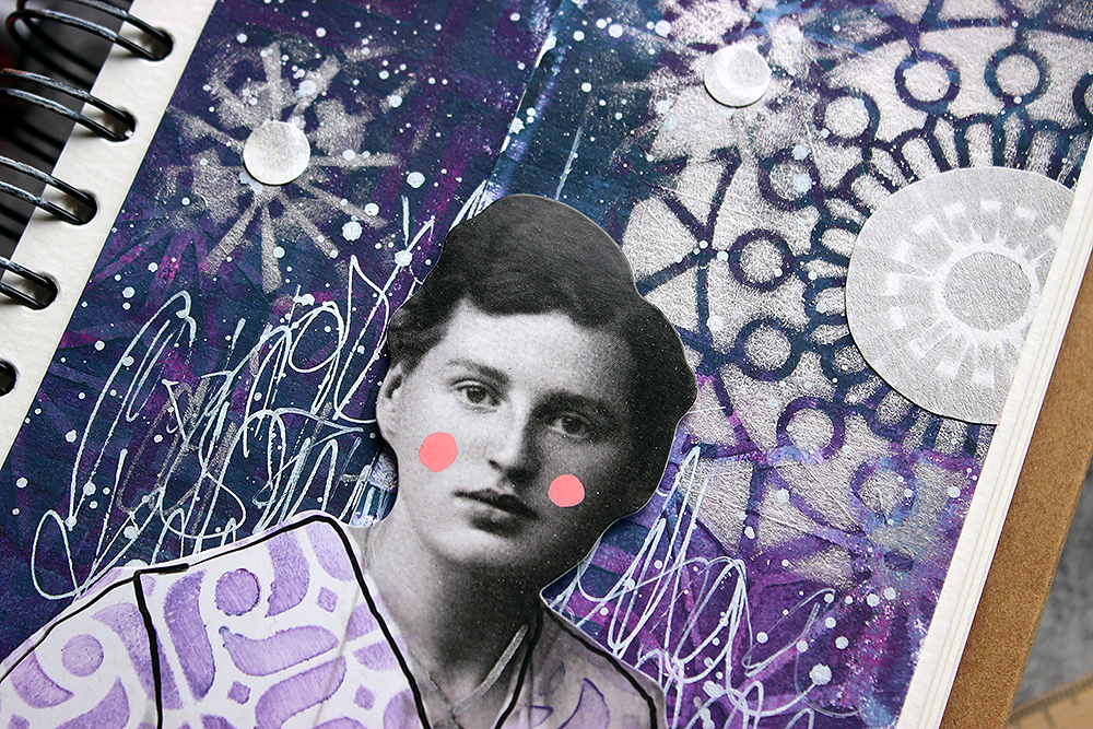
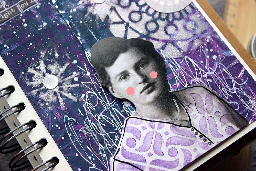
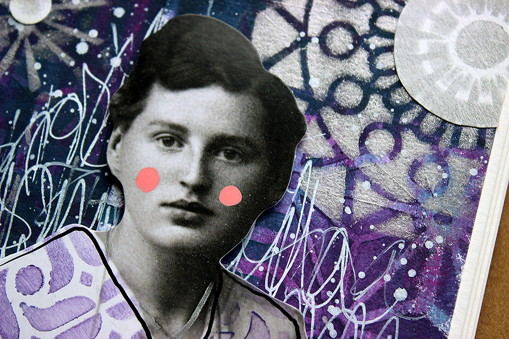
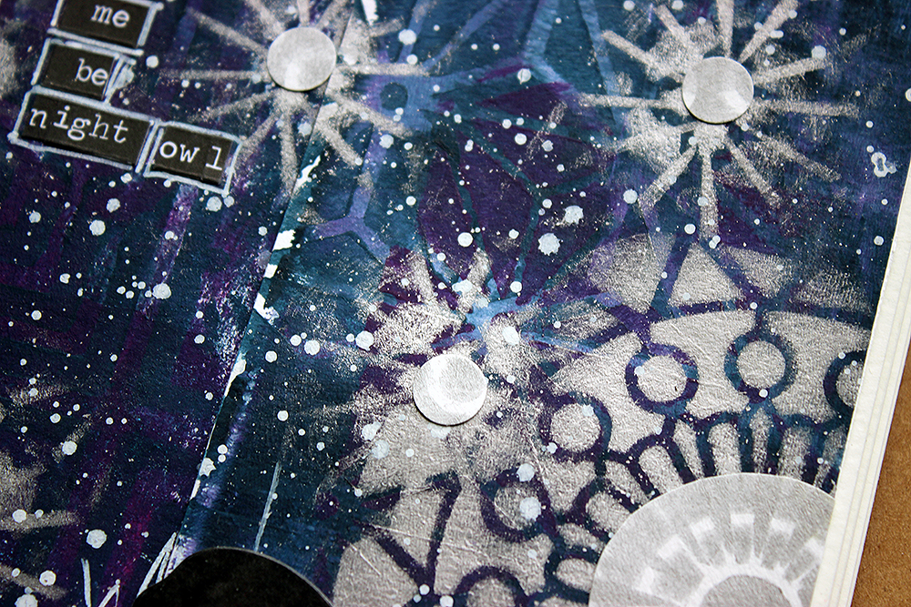
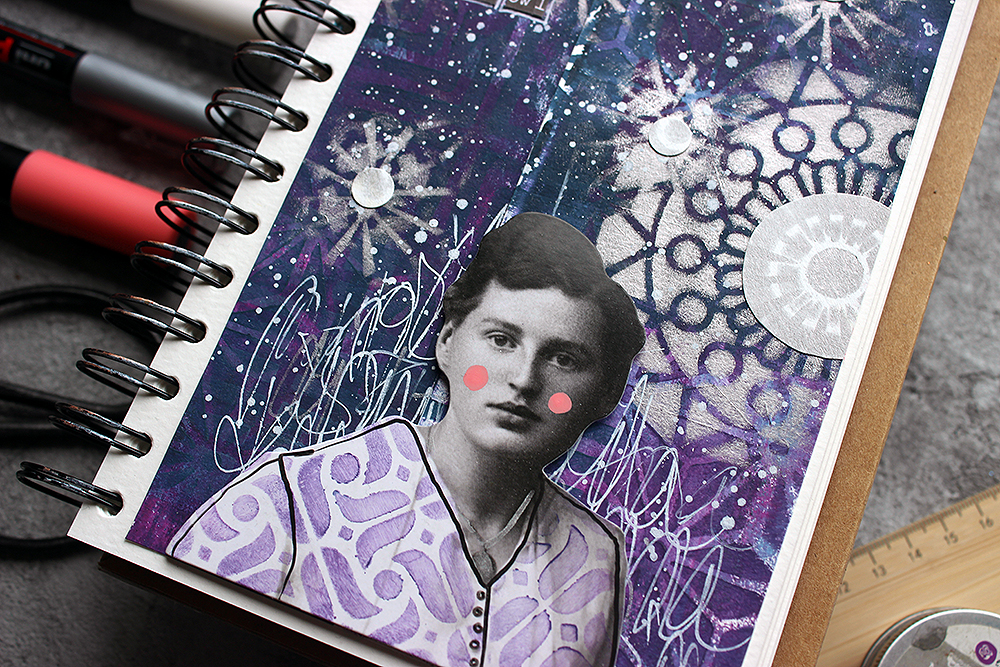
Hello from my Creative Squad! Today we have a post and video from Riikka Kovasin who is sharing an art journal page using my ATC Mixup and Manhattan stencils and our theme: Goodnight, Art Journal – Create an art journal page inspired by nighttime. Think about the colors, sounds, rituals of night – any aspect of it – and use that as your catalyst to create! 


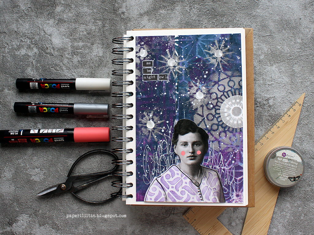
Me be night owl

Hi there! It’s Riikka Kovasin here today to share my take on the month’s theme! Like I say in the process video, first I got a bit puzzled as not so long ago I did a nighttime inspired art journal page for the team. I say, “not so long”, but actually it was almost a year ago! Time does fly. You can see that page here.

Why I’m bringing this up was that I didn’t want to repeat myself! Although there’s similar elements in my page now, there’s also something new, so I call that mission accomplished! Because like I say in the earlier post, I would love to be a night owl. In everyday life my current work and family life doesn’t allow me to follow my natural rhythm, but if I had the possibility I’d work until midnight and then sleep in. I seem to have a new productive sequence in between 9-11 pm!

I first tried to think what to do, but then gave in and just started doing, going with the flow. And I really like how the page turned out! I first colored two strips of paper using gel printing, then added patterns on top using stencils and lastly a flurry of stars and a moon. Why two strips of paper, you might ask. Well, they just happened to be there when I was reaching out to get a background piece. I thought it would be fun to start with those, to use “left-overs”. If you want to see how the page came into being, please see the video below:

As you could see from the video, I used two Nathalie’s stencils in my make. Why I chose these two? Well, the reason for the ATC Mixup is kind of obvious, I think. It’s because of the multitude of patterns in one stencil! I didn’t have to settle to just one or two patterns but could use an abundance! And as you can move the stencil and continue the pattern, the smaller size doesn’t matter, either. I did want to add another stencil to the mix, to have a bigger pattern. For that I chose Manhattan. Its angular design complimented the curvier, softer patterns of the ATC Mixup nicely.

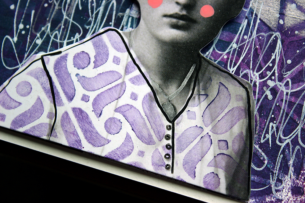
I went through several Tim Holtz paper dolls when searching for the right one. This lady had the right air about her, and she somehow reminded me about Edith Södergran, a Finnish poet. One of the first poems I read from her was titled “Stars”. But when I was checking the placement, her white shirt looked too pale, and it had such a big contrast between the inky blue background it was stealing the attention too much. Luckily, I had an easy solution! You could see that from the video, too, I just added a pattern on top.

To keep the project cohesive color-wise, I used one of the colors I had used in the background as well. The patterning hid some of the details of the garment, so I then drew those in. You can probably see my hesitation in the video. I was afraid that the black Posca marker might be too much, but luckily it was just what the doctor ordered! Her hair balances the dark marks nicely.

Thank you for stopping by today! I can’t wait to see what the teamies have made for this topic!

Xoxo Riikka


Thank you Riikka – love the night sky you’ve created with the layered stencils and splatters – great sense of depth in there!

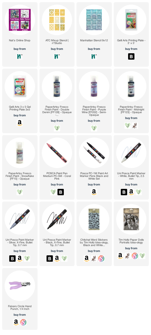
Give it a try: you can find all my Stencils in my Online Shop and here are some of the supplies Riikka used:

Looking for more projects? Follow the Creative Squad on Instagram here.
Comments (1)

  • Sue Clarke

    |

    I love the page from a year ago and I also like this one! I especially like how you stamped the pattern on her blouse.
    Thanks for the inspiration Riikka!

    Reply

Leave a comment

Creative Squad: Goodnight Art Journal – Maura Hibbitts

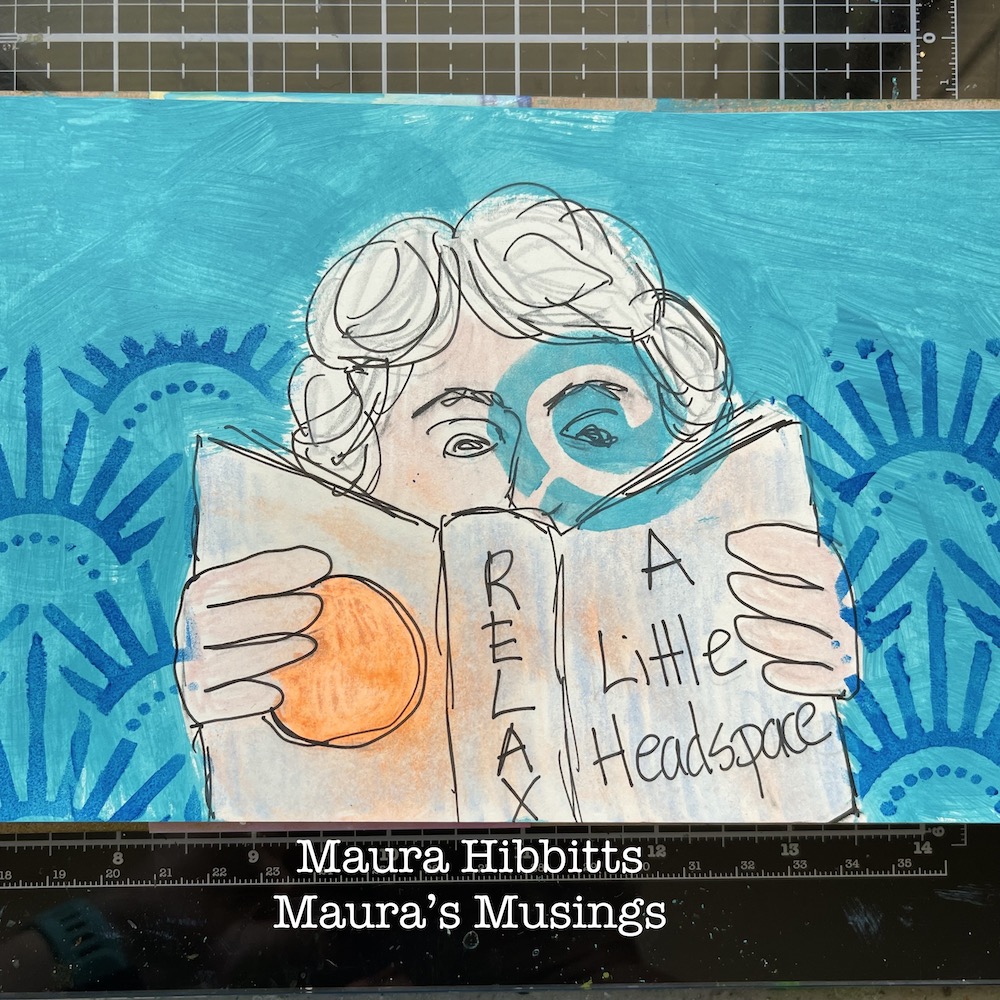
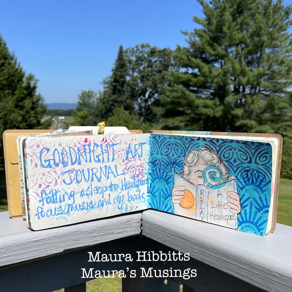
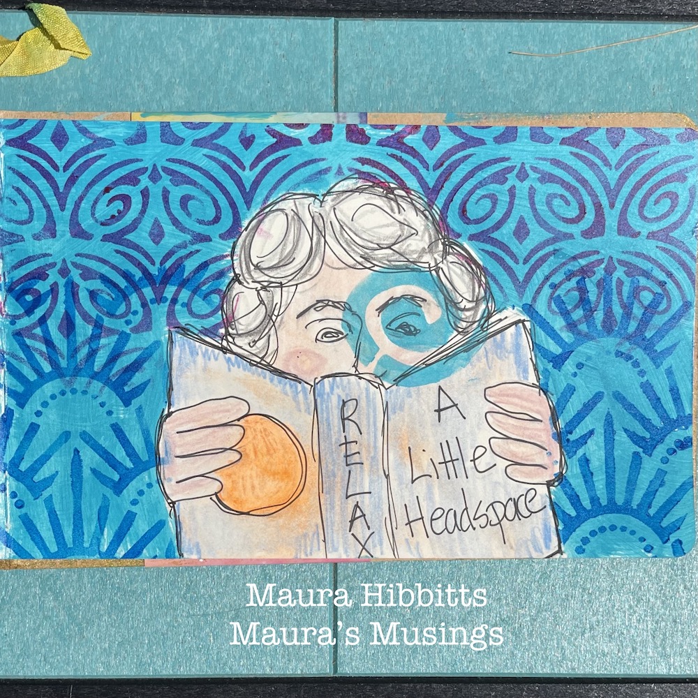
Hello from my Creative Squad! Today we have an art journal spread from Maura Hibbitts sharing her bedtime routine with us. She’s using my Batik, Art Deco Empire, and Art Deco Fairview stencils and our new monthly theme: Goodnight, Art Journal – Create an art journal page inspired by nighttime. Think about the colors, sounds, rituals of night – any aspect of it – and use that as your catalyst to create! 


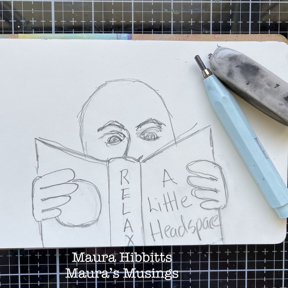
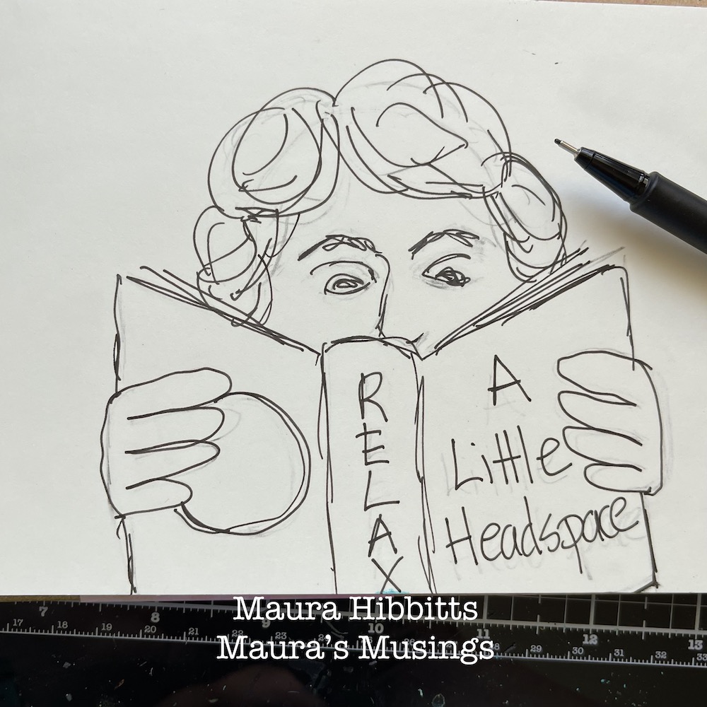
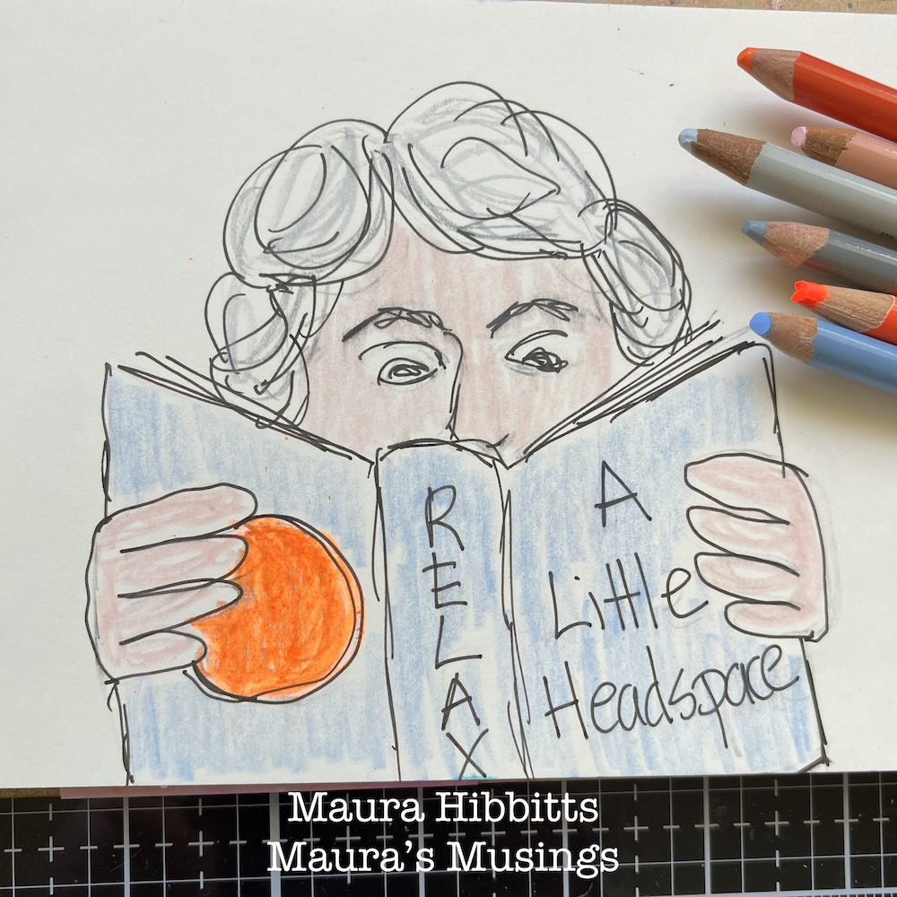
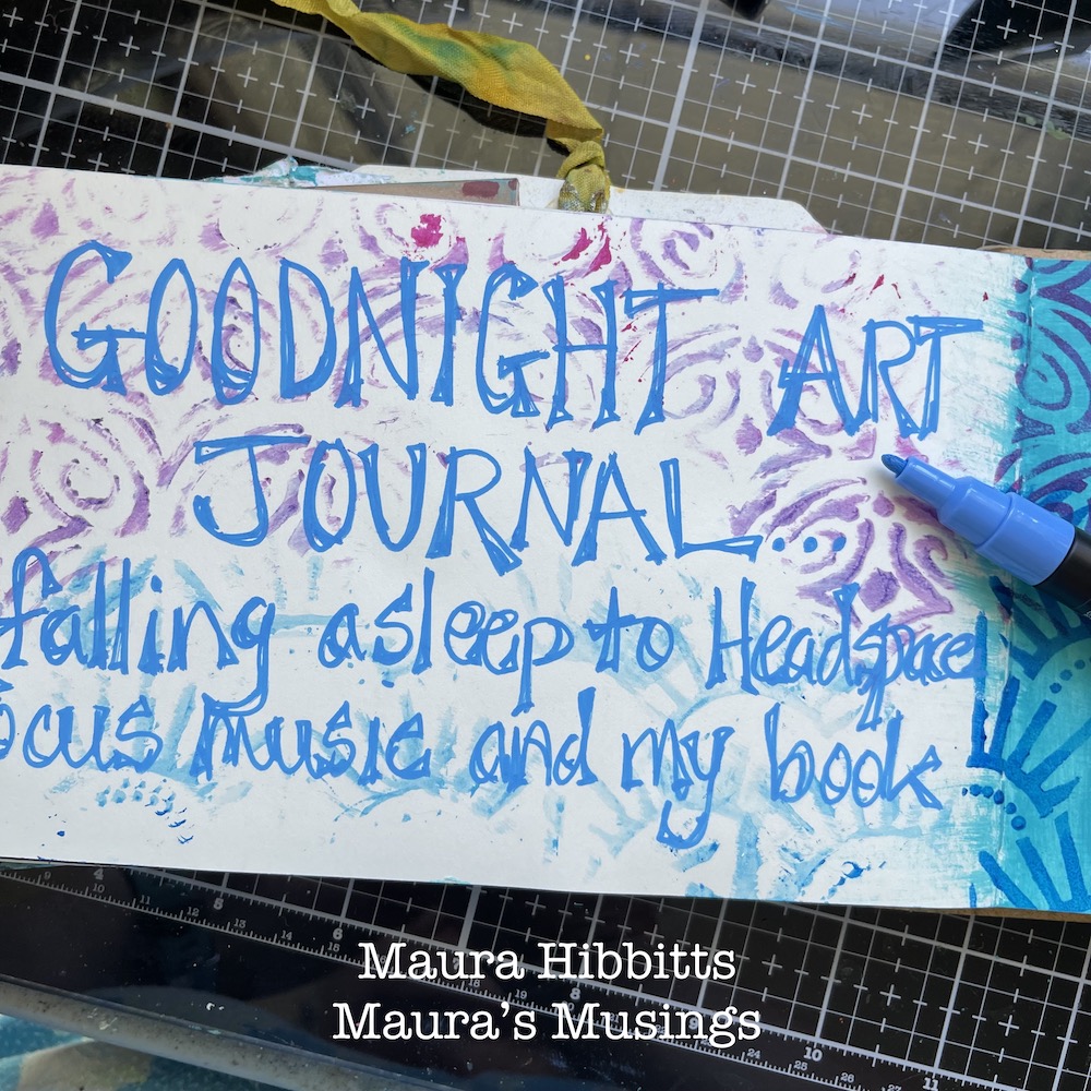
So, I immediately thought of the book “Good Night Moon” when I saw this month’s theme, and books are part of my art journal spread too. Do you have certain routines you follow to help you get to sleep at night? I like to wind down by listening to Headspace focus music (usually jazz) and reading a book. Nowadays, my books are on my Kindle so I can enlarge the print to read it, but I love to read, no matter the format.

I began my project by sketching the image of myself reading with pencil.

Next, I went over my sketch with an archival black pen, let it dry, then erased the pencil lines. I was thinking about all the mediums I could use, and decided on colored pencils, since I haven’t used these for awhile. It’s always good to pull out an old art supply to play with.

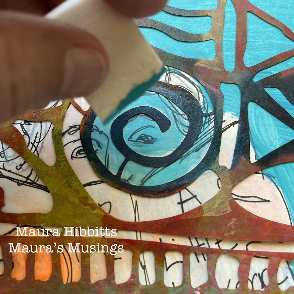
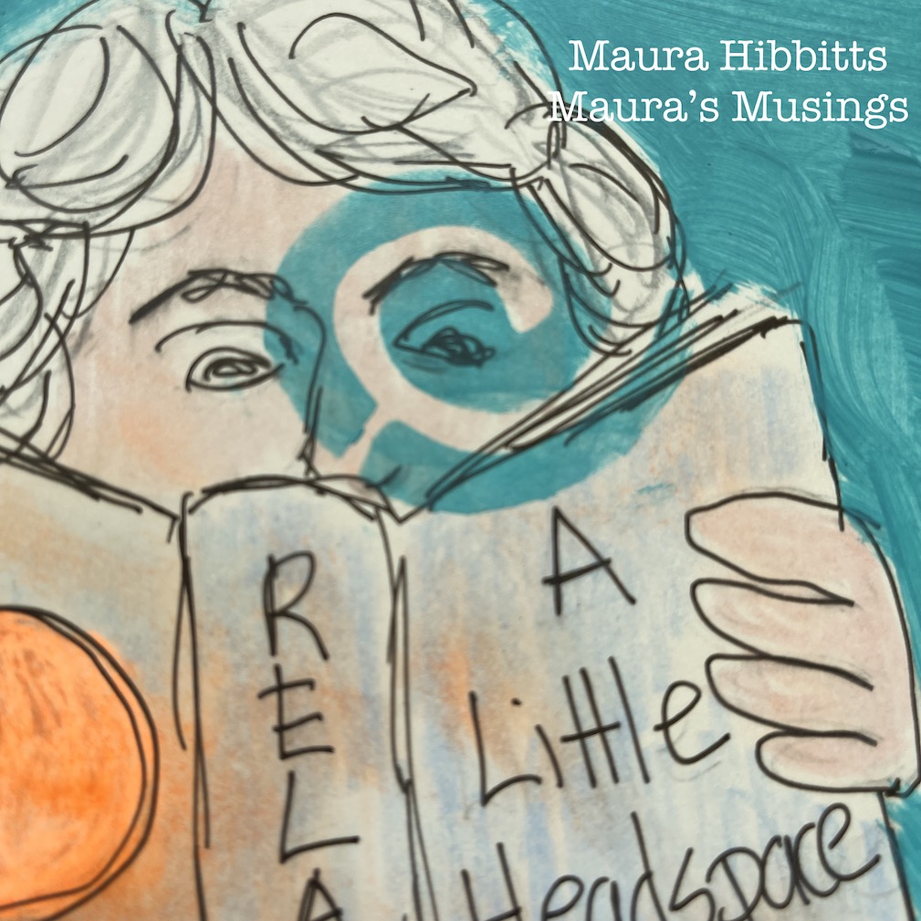
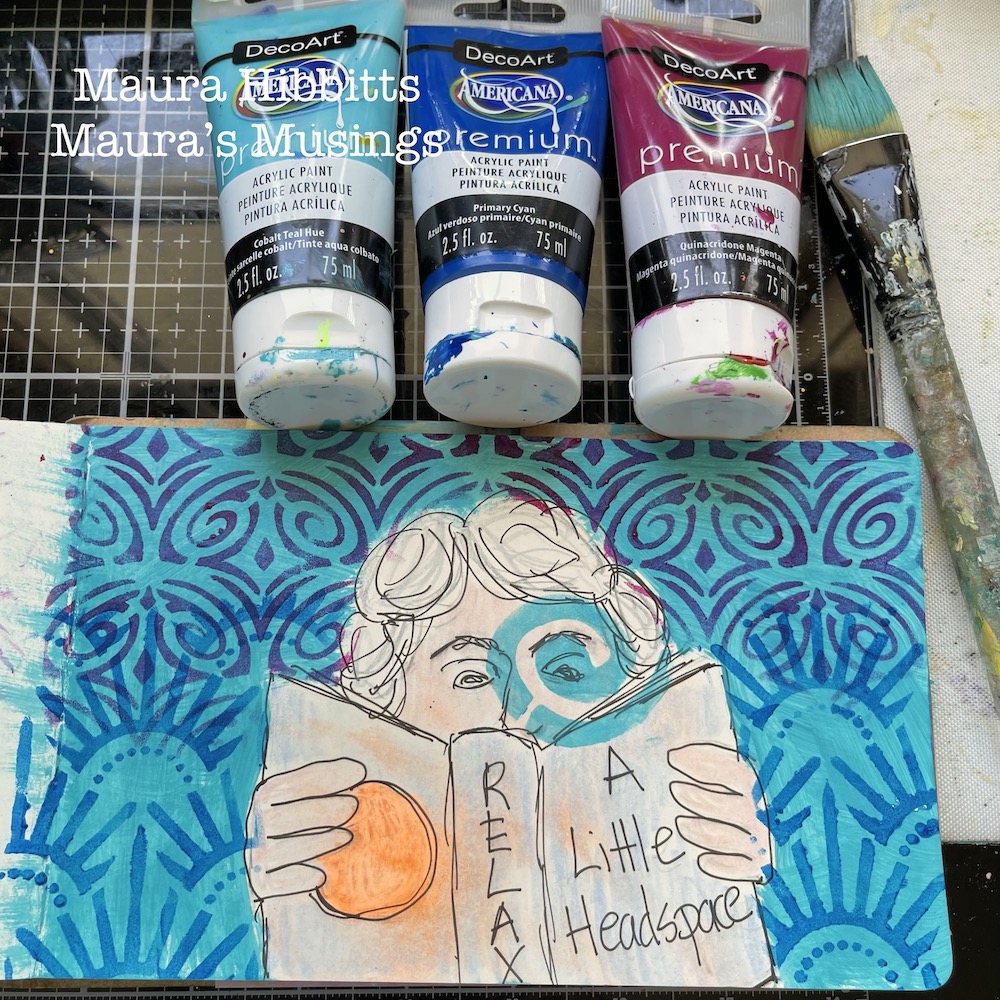
I painted a layer of cobalt teal around my image on the page. To add to my theme, I took Nathalie’s Batik stencil (a favorite of mine) and added a swirl of cobalt teal paint over one eye to emphasize my focus on reading and music as I unwind for sleep. I have to say, if I get too far off my nighttime routine for awhile, I get kind of grumpy.

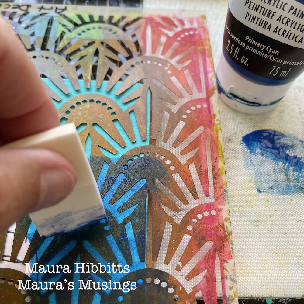
Now, it’s time for more stencil play. I chose Nathalie’s Art Deco Empire stencil for the lower portion of the page. I like to use cosmetic sponges to blend the paint into the stencil with a light touch, and here I used primary cyan. I decided to lay the used stencil on the opposite page and wipe the paint off onto the page with a baby wipe. It’s almost like getting a ghost image.

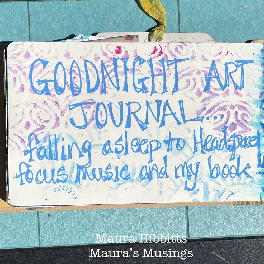
For the upper portion of the page, repeat the process using Nathalie’s Art Deco Fairview stencil and quinacridone magenta paint. Again, wipe the stencil off onto the opposite page.

Final step is to add some journaling. I used a Posca paint pen and hand lettered my words over the page where I wiped off the stencils. I like that bit of pattern in the background.

Music and reading relax me as I unwind for sleep. What are some of your favorite ways of winding down? I hope you have a good night!


Thank you Maura! Love your cute drawing and how the stenciled background came together!

Give it a try: you can find all my Stencils in my Online Shop and here are some of the supplies Maura used:

Looking for more projects? Follow the Creative Squad on Instagram here.
Comments (1)

  • Sue Clarke

    |

    What a fun play on Goodnight Moon!
    Nice creation Maura.
    Reply

Leave a comment