It has become a tradition of mine and other blogger friends to wind down the year with some Top “insert number”- Lists of work , posts and photos, before the year ends. It makes me go back and look at what I have done and accomplished and it also makes me dwell in memories. Too often we forget about the things we did and accomplished throughout the year- often just bashing ourselves for not fulfilling all the wonderful new year’s resolutions from last year. Maybe this makes you wanna do it too – if so – share 
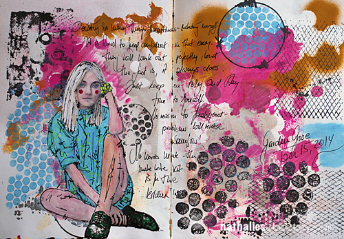
I did a huge amount of Art Journaling Pages this year. –
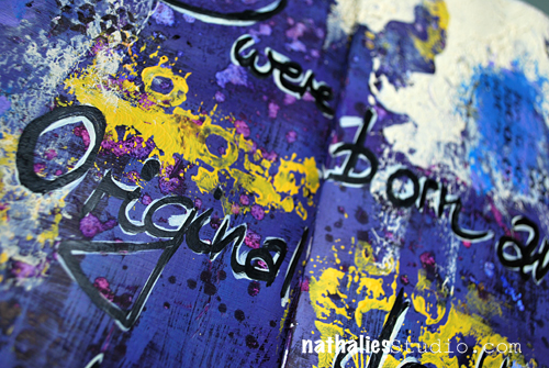
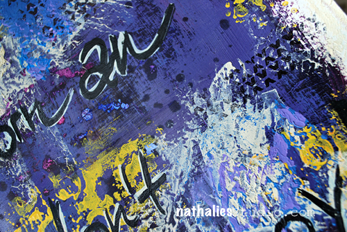
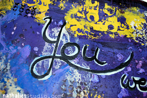
In no particular order here my personal faves.
1. Snake Bite
I played more or less with my Stampendous stamp sets and stencils on this page but I do like color combination and how the journaling is part of the background design.
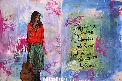
2. The Picture in Our Head
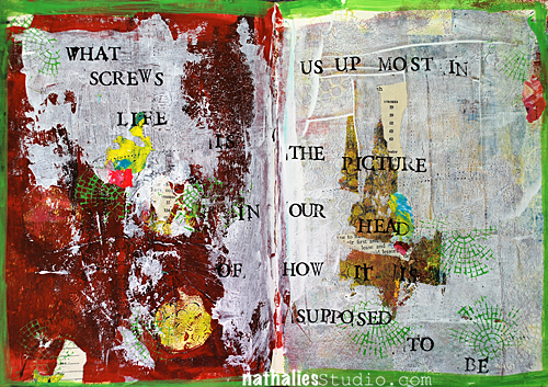
I love the quote and it actually states quite well the process I was going through while I was creating the page. I played a bit with acrylic paint skins here- and I love the out come.
3. Without Art..
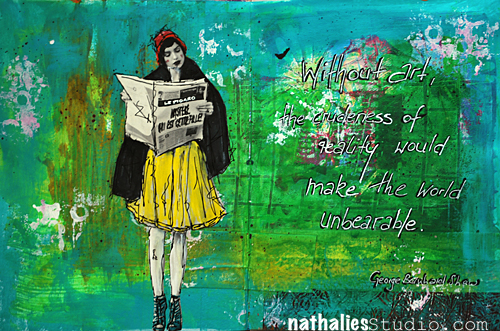
I love the texture I created on this page with gesso and paint – some parts and areas are definitely something I want to embrace a bit more on canvas. I also like the bits of pink in the sea of green – not something I had in mind as a color combo- but it speaks to me with the yellow- needs to be more explored :)
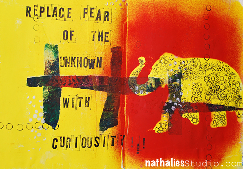
4. Melvin was Outraged
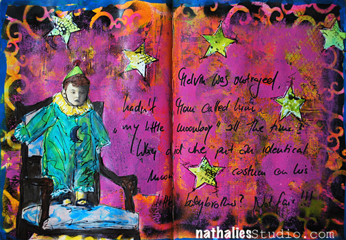
I just had fun playing with this vintage photo and making up a story – it is quite dark and actually not much going on texture wise- but still there are a lot of layers – I like it.
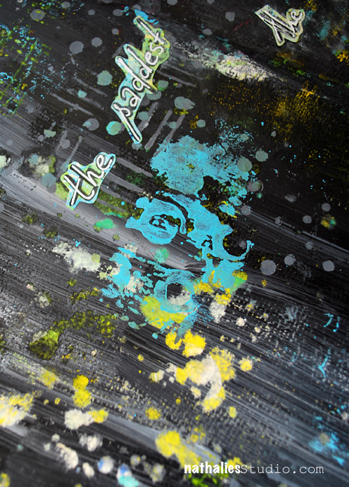
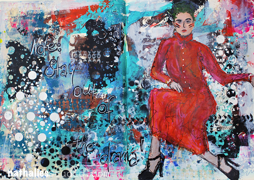
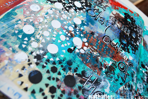
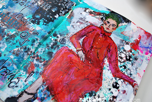
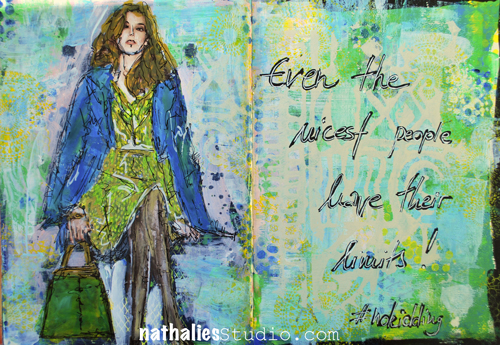
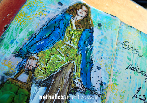
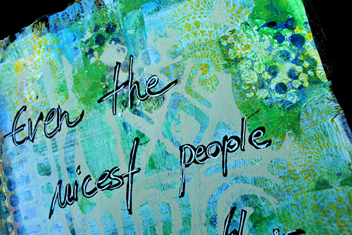
5. She became dangerous
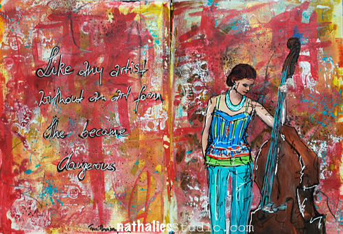
I played with brush strokes and colors – very loosely and besides a tiny bit of stamping that is all that there is in the background- I was surprised how much I like it and how freeing this felt. Another way of creating a background I would like to explore a bit more on a bigger substrate.
6. If Not Now
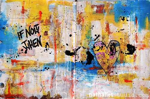
Here I played with dry and wet brush strokes and also texture- and I love the quote. I like simplicity of it …I mean…in the process- hahahaha ;)
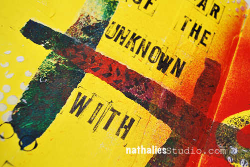
7. When the Why is Clear
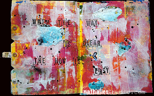
Another page where I played with brush strokes and acrylic skins. I love the black acrylic paint dots – they tie everything together.
8. Intelligence
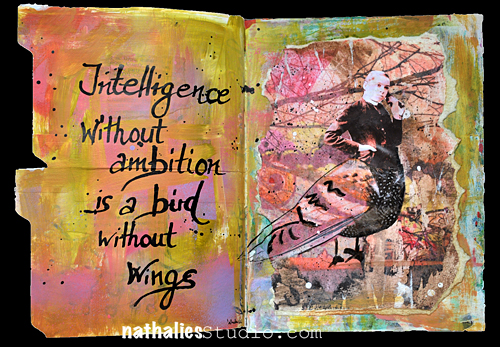
this one is a another sample of trying out a color combination which I would have not thought would really work and I totally dig it :) I like this page also because of the texture, the transfer techniques I explored and the materials I used. Again something I would like to explore more on a bigger substrate- but actually this makes me think of a shadowbox.
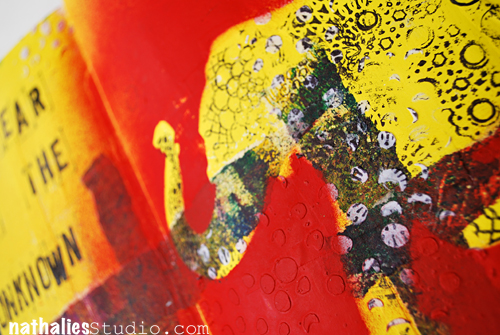
9. No ONE Way to Art
and yet another page with an unusual color combination for me – I also like how I used the brush to create textured elements- another element I would like to explore a bit more.
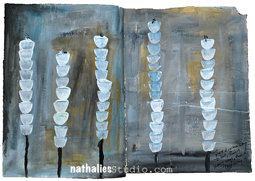
10. Not a Battle
I do like the texture and the depth I created in this page playing with the translucency of different acrylic colors – again something that I will explore more in the future.
—-
What I learned:
I really embraced art journaling as a way of creating something that doesn’t require an awful lot of time, a creative push in the morning, and trying out techniques, materials and color combinations. I used it a lot to explore things that I have seen in paintings at MoMA or other museum and that interested me. I also learned a lot about brush strokes, and exploring different opacity/translucencies of acrylic paints.
My goal for 2015:
I want to take out some of the things I learned and explore them more on different substrates. I need to take the time to embrace the things more. I also want to play more with unusual color combinations – it felt good to step away from my usual color culprits ;)
Hope you enjoyed this little art journal journey – and …just a little heads up :) If you want to learn how I do the magazine and photo images, and also see more about how I build up Art Journal Pages– you can see and learn that in Creative JumpStart 2015 – so sign up , if you haven’t yet!
have a gorgeous day


Comments (6)
Leadonna Kimmel
| #
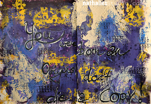
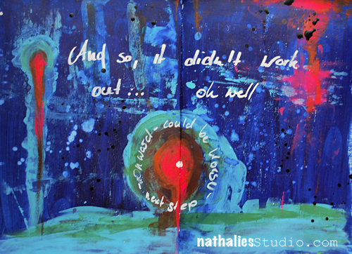
Nat, she may be gone in body, but her spirit and love live on in you, sweet friend. It really is amazing how much comfort creating brings to the soul. As always, your work is stunning and this journal spread is particularly poignant. Love and hugs! xx
Reply
Joi@RR
| #
❤ Big hug. j
Reply
Sue Clarke
| #
The colors go with the feelings.
Yes, working in one’s art journal can help deal with feelings for sure.
Reply
andrene
| #
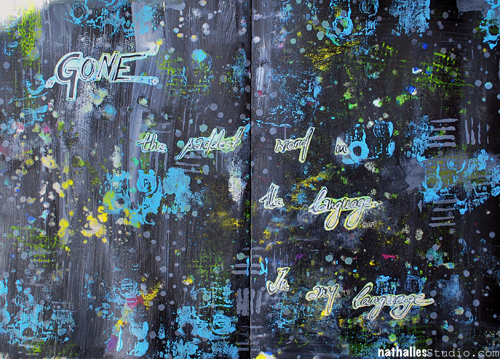
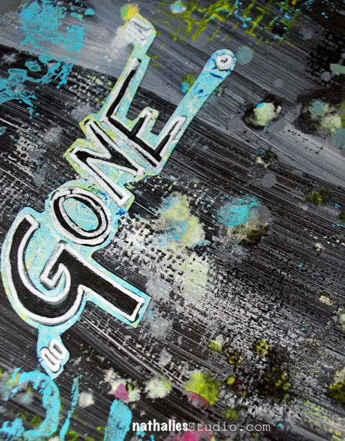
Beautiful page, Nat! Lately I am so drawn to black backgrounds…wonder what that means (something ominous I’m sure!)
Reply
nurse-ratchet
| #
It is an infinite word! Perhaps you could journal ” Gone but not forgotten”
Reply
Nancy Keslin
| #
hugs…..this is lovely and what a wonderful way to express your feelings.
Reply