Creative Squad

Weather Report – Nicole Watson

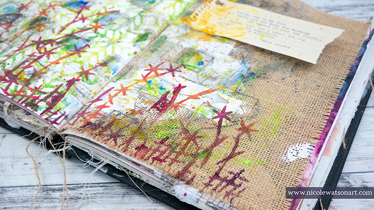
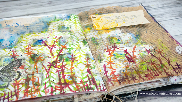
Hello from my Creative Squad! Today we have an art journal page (and how-to video so you can watch it come together) from Nicole Watson that is a really lovely celebration of spring :) She is using my Santiago 9×12 and Kyoto stencils with this month’s theme: Weather Report – Let’s talk about the weather! Do you love thunderstorms? The crisp air of Autumn? A good snowstorm? Are you a fan of endless sunshine? Create something inspired by that go-to topic of small talk – the weather!
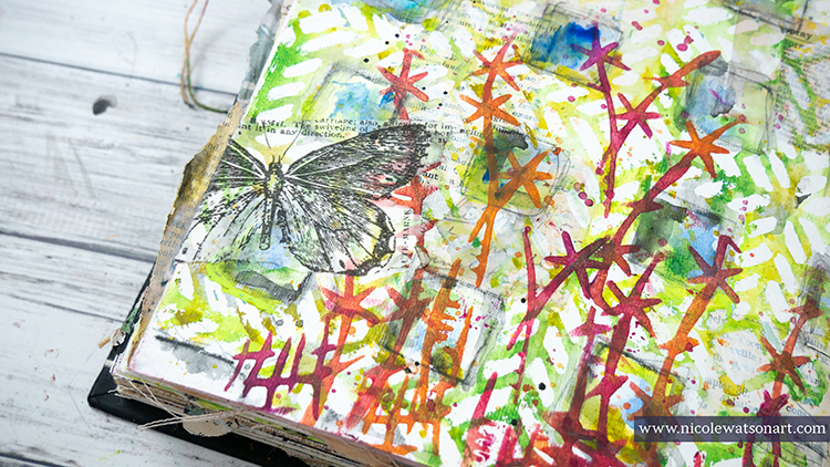

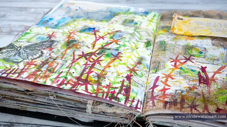
Spring in Texas is probably my favorite season. The weather is beautiful, the sun is warm but not too hot, and the wildflowers are blooming everywhere! I’m almost afraid to admit that I have spent more time outside working in my garden and photographing nature than in my studio. So, I decided to bring that weather and nature inside to my studio with these journal pages.

Nat challenged us this month to use only her stencils. I love challenges like this as it forces me to think outside the box and use supplies in a new way. Looking over my stencils, I decided that her Santiago stencil reminded me of garden lattice or a trellis and that I could potentially turn the images from her Kyoto stencil into flowers.


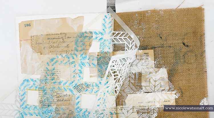
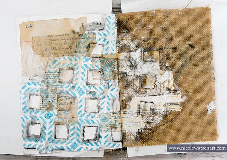
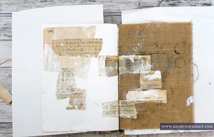
First, I gessoed my page and stuck down some ephemera with matte medium. I put the ephemera on the gessoed page and also the burlap page. Then, I added some bits of gesso on top the ephemera. 
I wanted the lattice to remain white and have a watercolor effect so I decided to use a masking fluid pen inside the stencil shapes. I didn’t necessarily want it to be perfect, so I didn’t trace the insides perfectly. On the burlap side, I sponged some gesso through the stencil. Several times throughout the process of creating the pages, I touched up the masking fluid to make it thicker or define places a bit more.
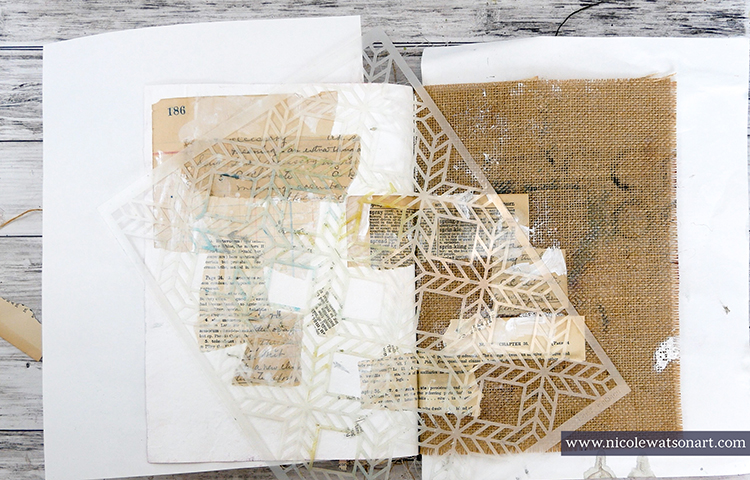
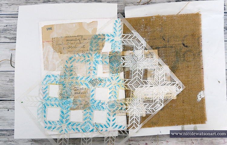
Next, I wanted to add some shadowing around my lattice and grabbed my stabilo all pencils to trace around the entire image and inside the squares that I didn’t use the masking fluid. I placed the stencil back on my pages to make it easier to trace. After activating the stabilo with water, I began the process of adding color.
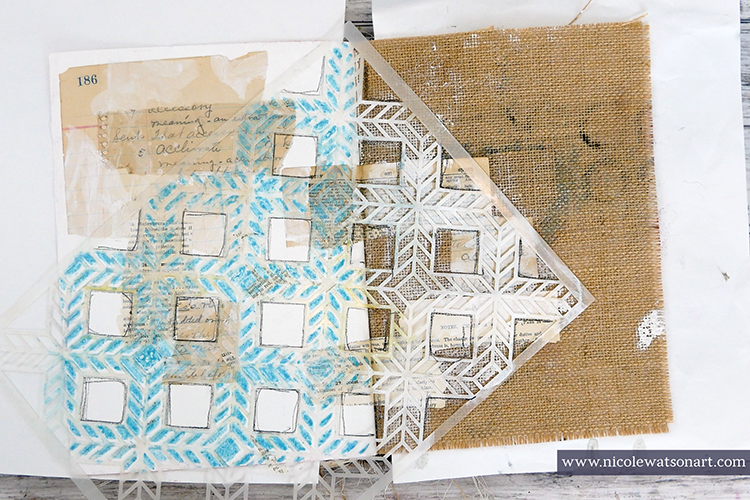
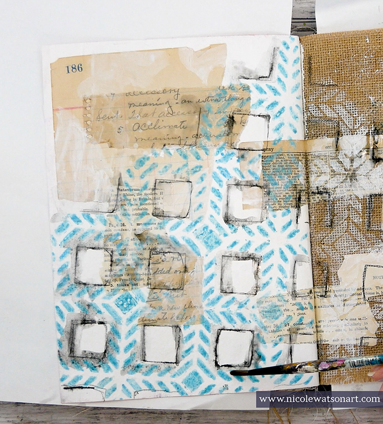
Loosely painting with watered-down acrylic, I added blues on top the stenciled area and inside the large squares (for sky) and greens in the stencil. I did this process in a couple layers to build the color. I wanted the areas to be free, loose, and “watercolory” looking. I also added color to the burlap side.
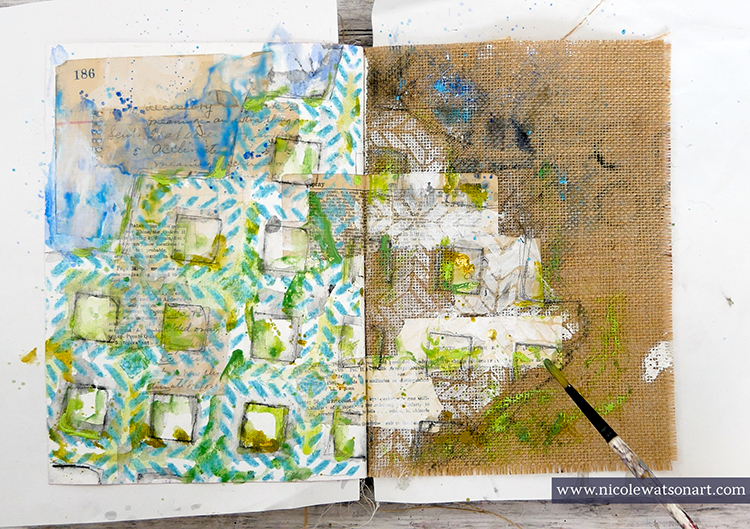
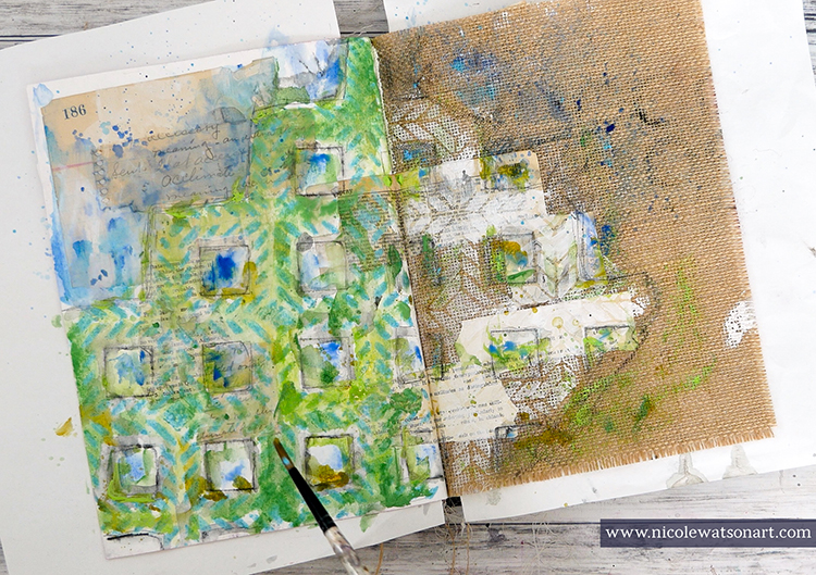
When I was done adding layers and the paint was completely dry, I began removing the masking fluid. You can use your fingers to do this, but a rubber cement eraser makes the process so much easier!
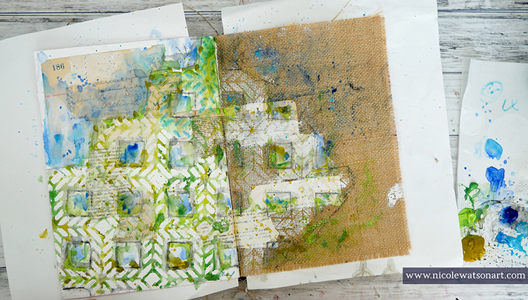
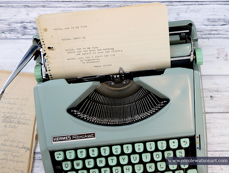
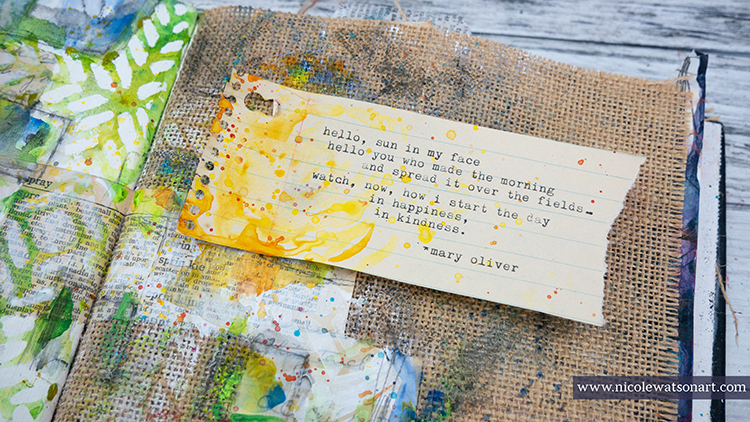
I noticed that the places where I had ephemera under the masking fluid didn’t really stand out, so I placed the Santiago stencil back in the original position and painted in some of these areas with watery gesso. I also touched up the burlap gesso a bit as well.  While I waited for the gesso to dry, I typed up a little poem by Mary Oliver to put on the pages.
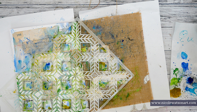
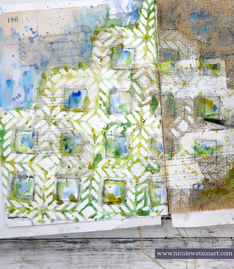
Finally, it was time to add some flowers to my page. I used my sponge applicator through the Kyoto stencil to create whimsical flowers in shades of red, orange, and purple.
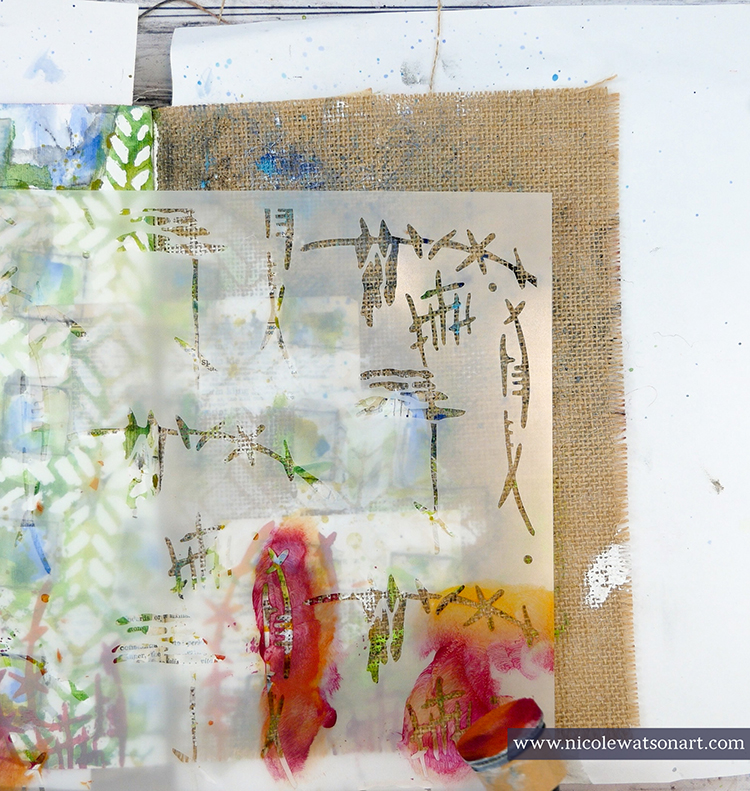
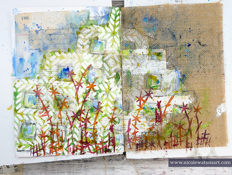
To finish the page, I added a butterfly, a little sunshine on my poem, and a bit of shading with some stabilo.
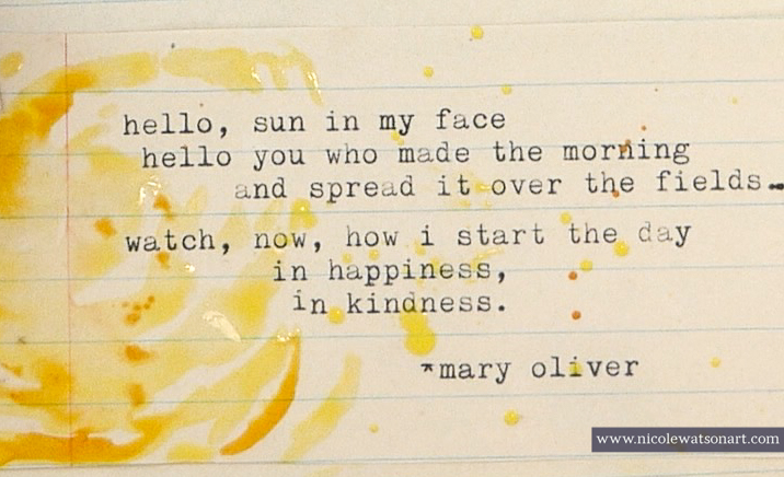
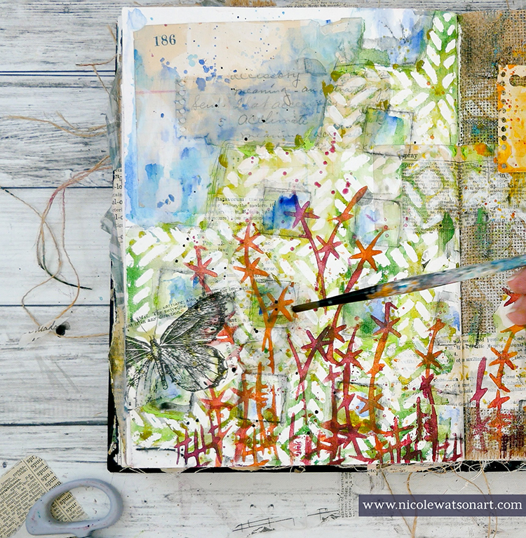
Life is definitely not what we expected it to be right now! Spending time outside in the sunshine, in my studio, going on walks, taking photos, and enjoying the weather help bring focus to what is important. They, like Mary Oliver’s poem, bring happiness and kindness to my days.
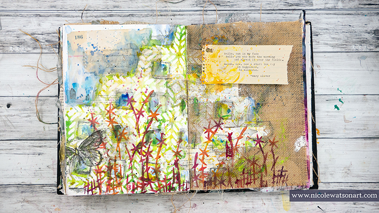
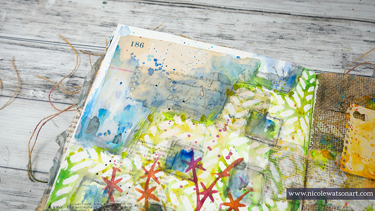
Thank you Nicole – I love how you interpreted the Kyoto stencil as a floral element! Thank you so much for bringing some sunshine to our day!!!

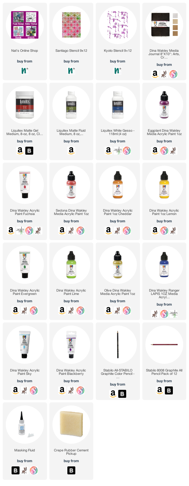
Want to give Nicole’s project a try? You can find all my Stencils in my Online Shop. In addition to her cool vintage typewriter, here are some of the other supplies Nicole used:
Leave a comment

Rubber Stamp Inspiration from my Creative Squad

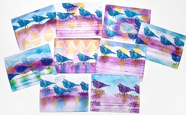
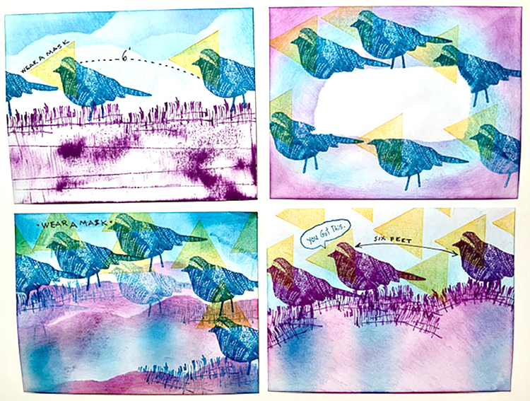
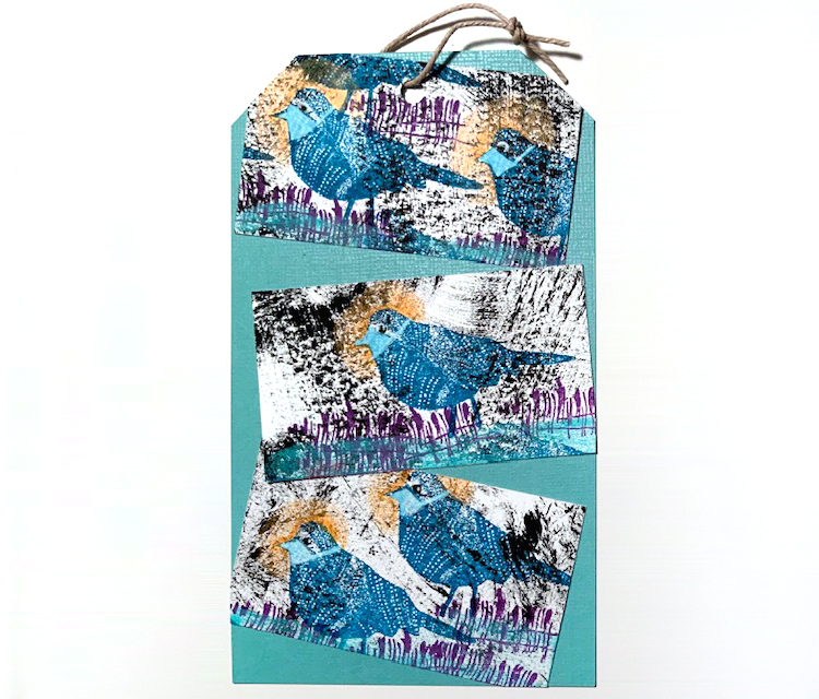
Today I have some lovely cards, envelopes and a tag to share with you from Creative Squad member Judi Kauffman. When Judi received her rubber stamps in the mail, her super creative mind went right to work and I just love the results!


What a treat to get Nathalie’s new stamps in the mail – her signature style in a petite and very versatile size! I reached for a stack of envelopes, my go-to with all new stamps, got out some colorful inks, and when I looked at the finished batch I was shocked to see how my worry about covid-19 had taken over. The triangles I’d stamped on and around the Nightingale looked like masks and on most of the envelopes the birds looked like they were practicing social distancing.

I stamped three business cards for the tag, this time using white ink to paint tight-fitting masks on the birds. It really is scary how our subconscious takes over. I set out to make something spring-like and happy! But the cosmos had other ideas.

I love ‘Far Out’! In fact, I love all of them. It’s a new thing to have the petite size and I think that’s a feature worthy of attention.


Thank you Judi! It is funny how what is pressing in our minds can come through in our artwork. Regardless, these are a wonderful abstract use of the stamps and in any other time would just be really awesome compositions!

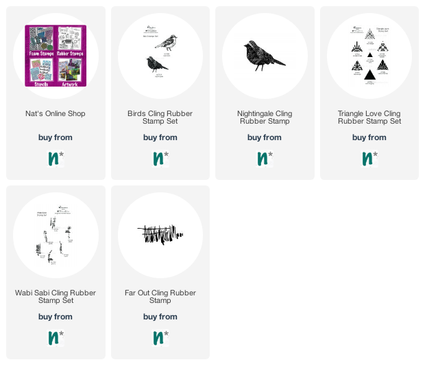
Here are some of the supplies Judi used:

Comments (3)

  • Marilyn

    |

    Love the designs. I am one of the lucky friends of Judi to receive her “bird” envelop. She always amazes me with her creativity and now more so using her subconscious thoughts. I am a firm believer that our actions are a result of our inner thoughts.
    Kudos to Judi!

    Reply

  • Kimberly O.

    |

    I love the combination of the stamps you used! The bird stamps are awesome!!

    Reply

  • Denise M. Krueger

    |

    Love these!! So much vibrant color and the birds are awesome stamps.

    Reply

Leave a comment

Weather Report – Maura Hibbitts

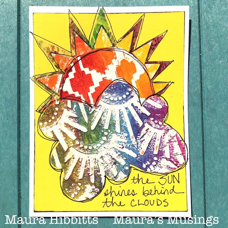
Hello from my Creative Squad! Today we have a series of cards from Maura Hibbitts that are sure to brighten your day even in these difficult times. Maura is using my Amsterdam 6×6, Mesa Verde, Art Deco Wallpaper, Signals, and Art Deco Empire stencils. The theme this month is: Weather Report – Let’s talk about the weather! Do you love thunderstorms? The crisp air of Autumn? A good snowstorm? Are you a fan of endless sunshine? Create something inspired by that go-to topic of small talk – the weather!


April certainly is a month of changeable weather! One day it can feel like a beautiful spring day full of sunshine and warmth (and I certainly want more of these kind of days!). The next can bring in snow and cold, but luckily these storms don’t last too long and the snow melts away quickly. And of course, there is the saying about April showers bringing May flowers, but be sure to check for rainbows too! So, check the weather report before you head out!

I’ve been making and sending out cards to let people know I am thinking about them during these difficult times, so I knew I wanted to use this month’s theme to make some more cards.

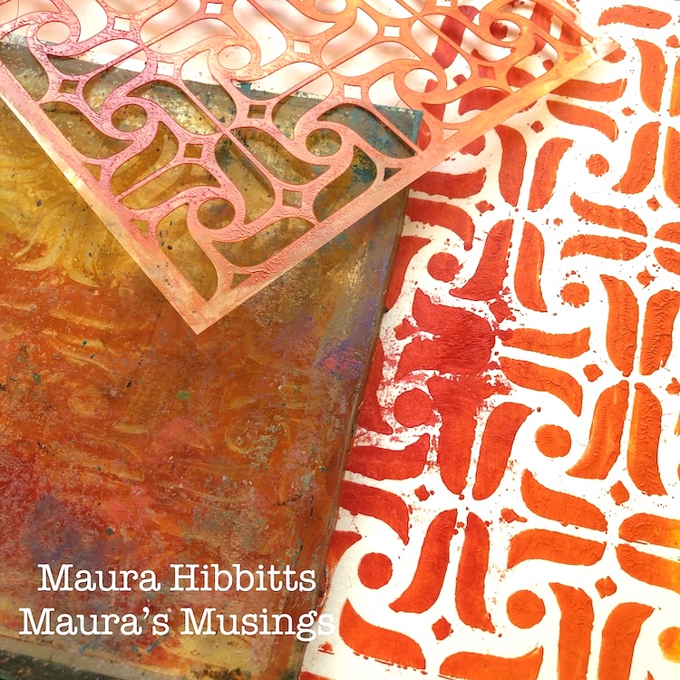
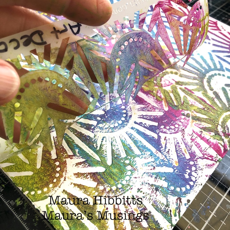
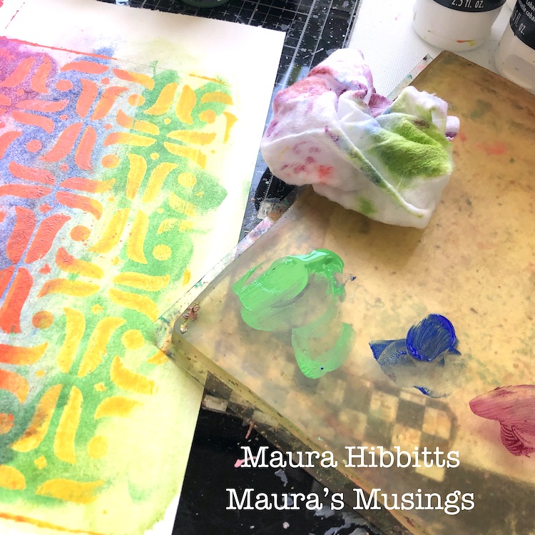
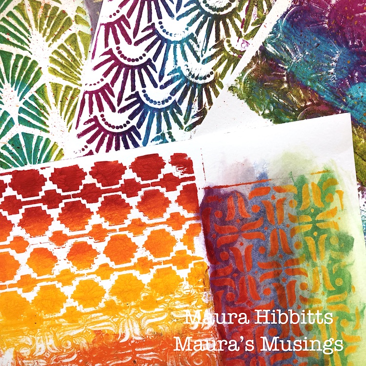
 I started off with an array of rainbow colors, my gel plate, and several of Nathalie’s stencils to create some papers to use for the project. I used a brayer and a mix of red, orange and yellow along with a stencil, like the Amsterdam stencil here. First time the stencil goes on the plate and the paper on top; then put the painty stencil on paper, and third take another print off the plate. I used watercolor paper to do this.

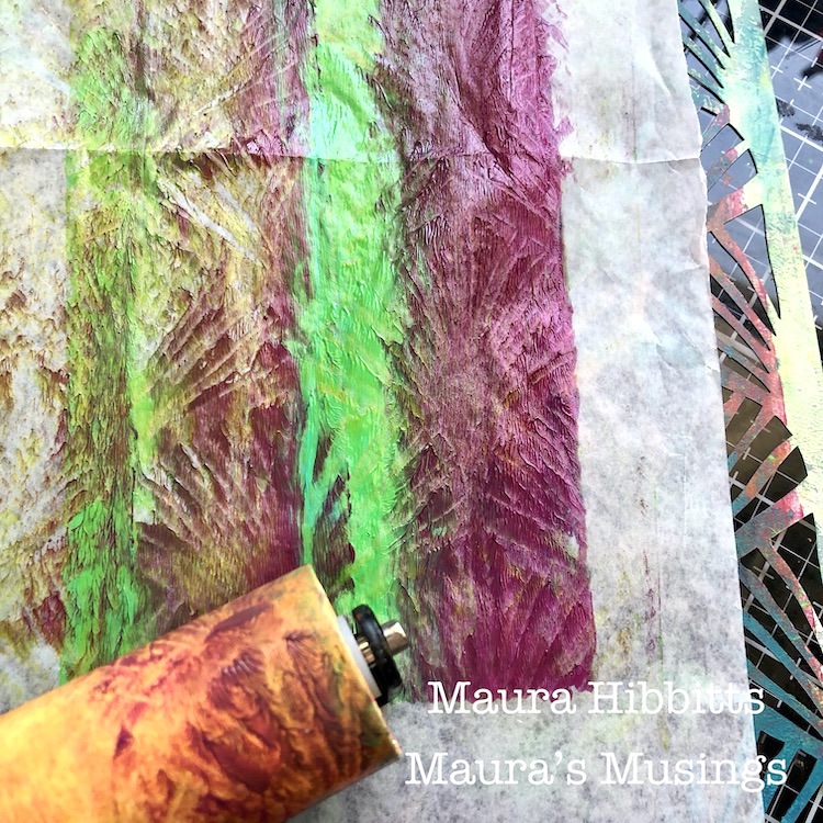
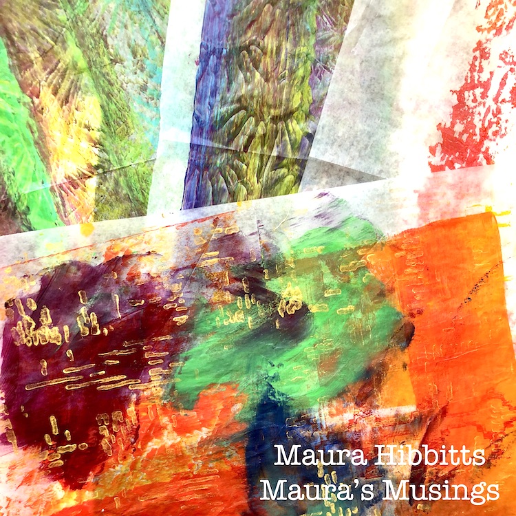
I also keep some deli paper handy when I am printing to use for excess paint. Quite by accident, I happened to have the deli paper sitting on a stencil, and when I rolled the brayer over it, it picked up the pattern.

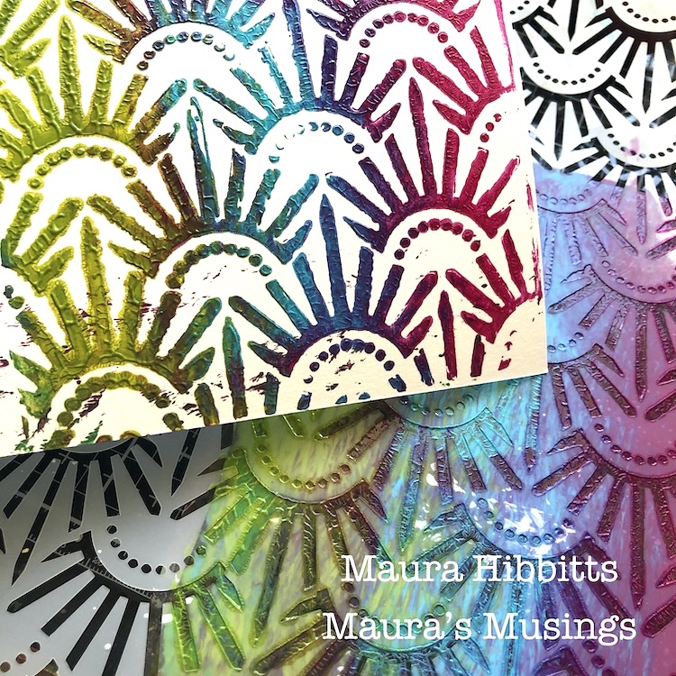
I repeated the printing process with the green, blue and purple blend on watercolor paper and deli paper. First print here is off the plate with the Art Deco Empire stencil, and the second is printing with the stencil.

I decided to add in more color with a rainbow mixture of fluid acrylics. Here, I blended in the opposite group of colors with a baby wipe. Since the heavy body acrylic was dry, it acted like a resist, so all colors now show.

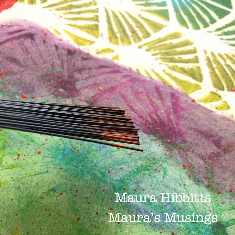
On some of the printed papers, I used a splatter brush and fluid acrylics to add a subtle layer of color.

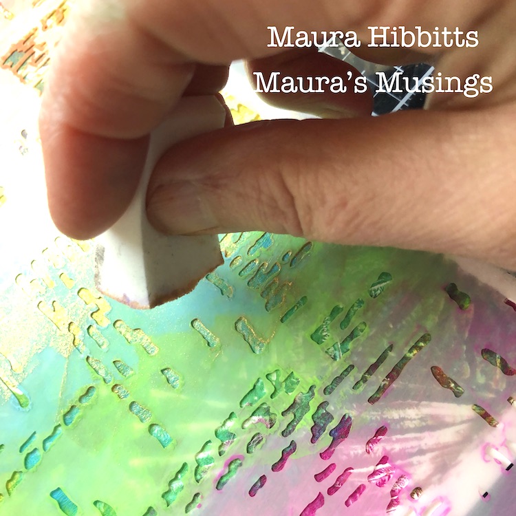
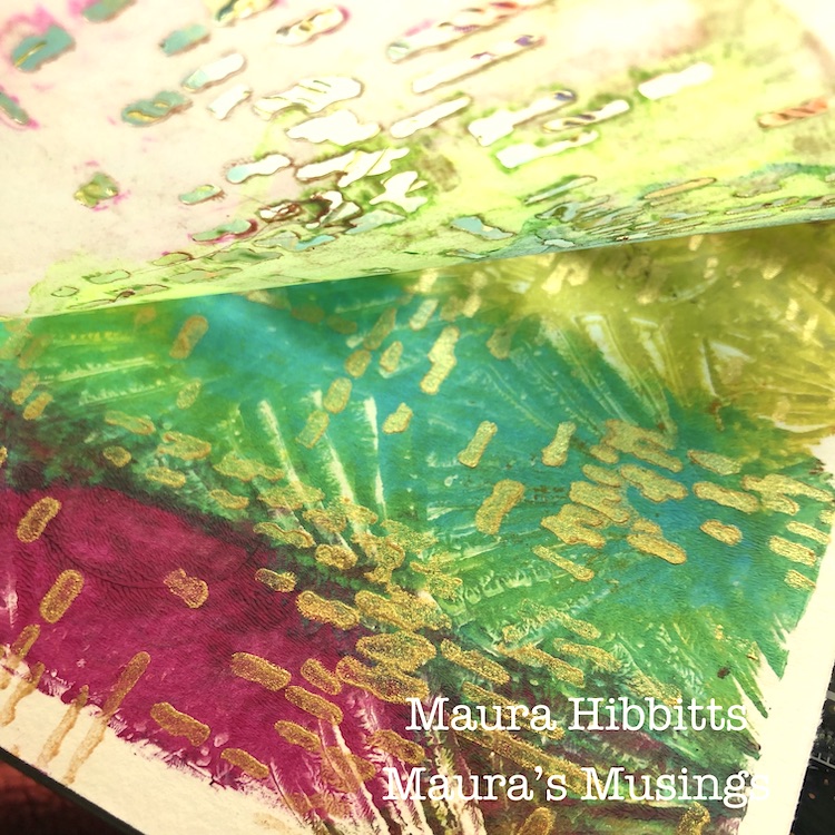
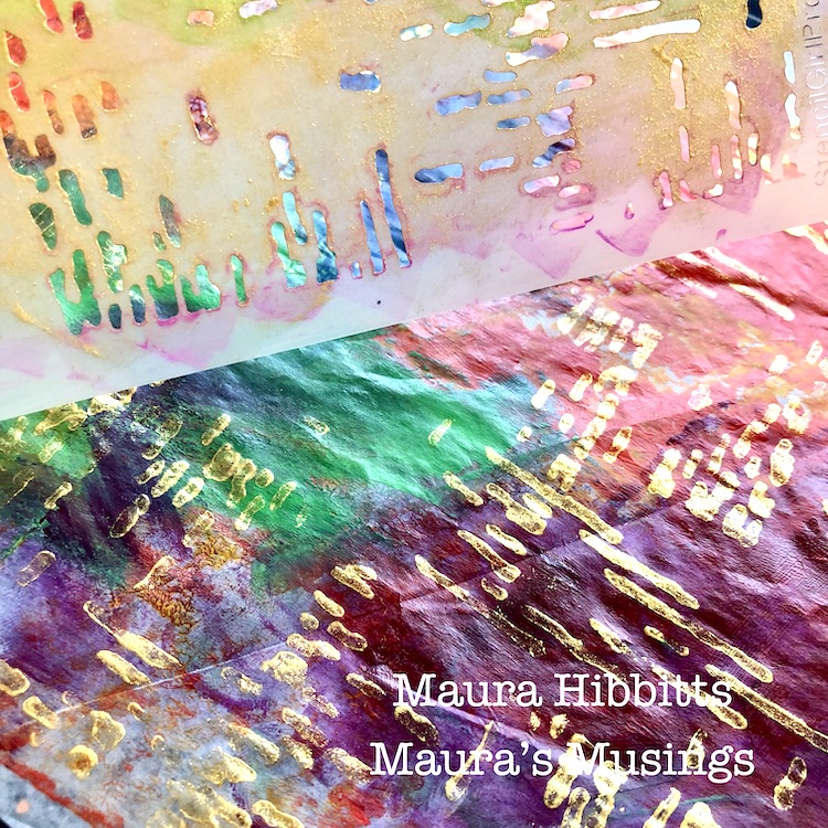
Gold accents always take it up a notch, so I used the Signals stencil with gold paint to add a shimmery layer to some printed papers.

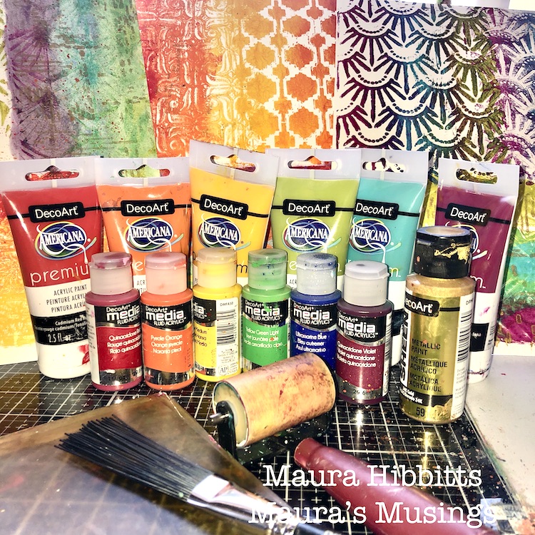
Now I have a mix of rainbow painted watercolor sheets and deli papers to use for my cards. Plus, a quick look at some of the rainbow assortment of supplies I used.

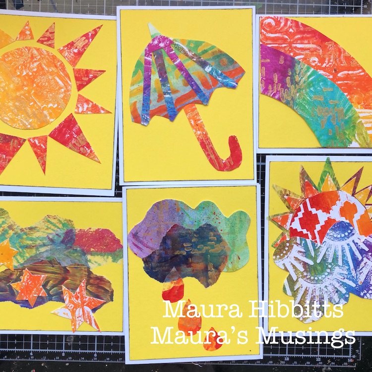
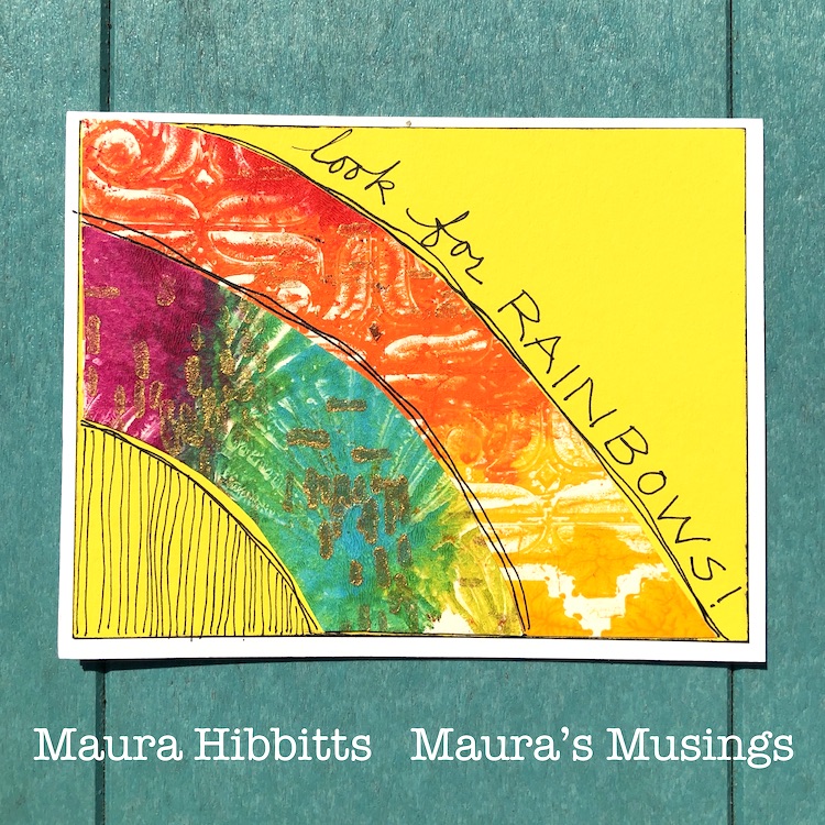
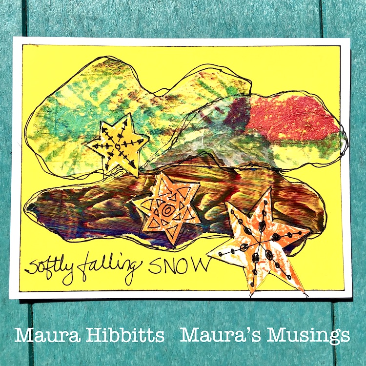
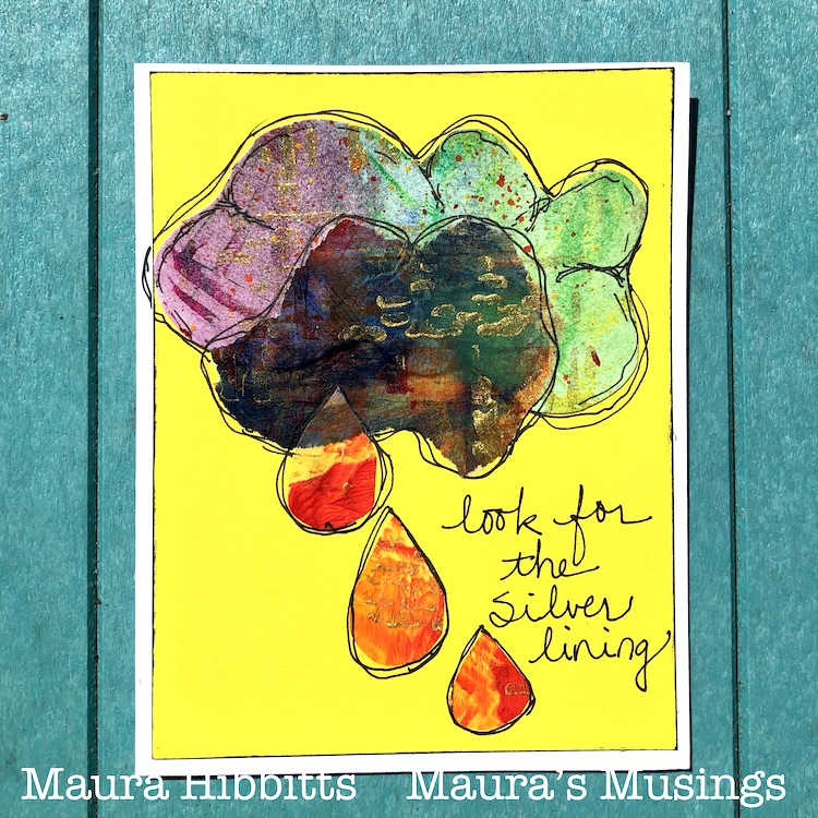
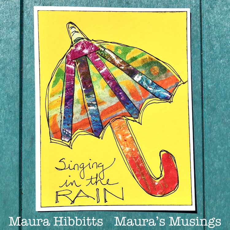
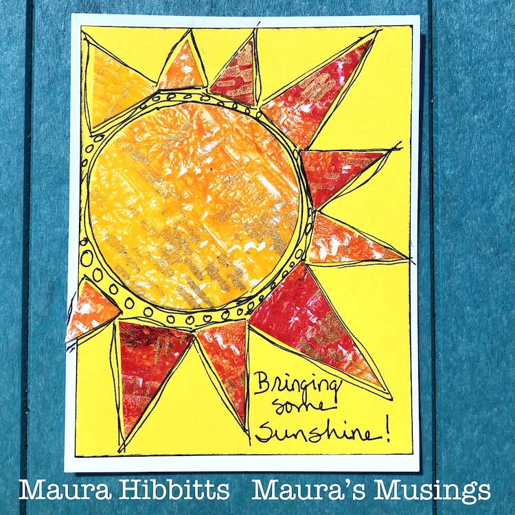
Now, the fun begins! I cut out all kinds of shapes related to weather and pieced them together to make my images….sun, clouds, an umbrella, snowflakes, raindrops, and a rainbow. I did use a pencil to sketch out a few. I adhered the heavier paper with tacky glue, and the deli paper with matte gel medium. Oh, and I had previously used the paper trimmer to cut white card stock for the base, and yellow for the background, which I edged with black ink. 

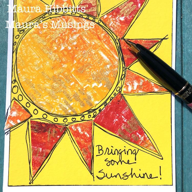
Once the cards were dry, since it was such a beautiful day, I headed out to the deck to do the doodling on the cards. I am using a carbon ink pen, but any black permanent pen will work. I also added in thoughts about the weather.

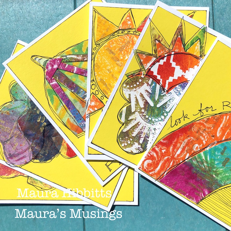
Softly falling snow (well, I hope not, lol!)…The sun shines behind the clouds…Singing in the rain…Look for the Silver lining…Bringing some sunshine…and Look for rainbows! I hope these thoughts and the rainbow colored cards will bring some much needed encouragement into our lives right now. Be well, be healthy, and find joy in April’s weather! – Maura


Thank you Maura for lifting our spirits today!!! These cards are so happy and beautiful.

Want to give Maura’s project a try? You can find all my Stencils in my Online Shop. Here are some of the other supplies Maura used:

Feel inspired? Working on something yourself that you’d like to share?  I love to see how you interpret our monthly themes. Email me how you used my stencils and stamps with the theme and email me an image – I would love to share your projects in my next  “n*Spiration From Around the Globe“.

Leave a comment

Do you know my Creative Squad? We have a NEW Member!

Hello my friends – today we have some very nice news to share with you. We have been waiting anxiously to let you know and now is the time: We have a new Creative Squad member to welcome to the team and introduce today!!!

Do you know my Creative Squad? They are my amazing design team of artists who bring you their creations each month. I give them a theme as a way to get their creative juices flowing, and then they make a project using some of my stamp and stencil designs. You can check out their projects each week on Tuesdays, right HERE on the blog.  It is always inspiring to see what they come up with!

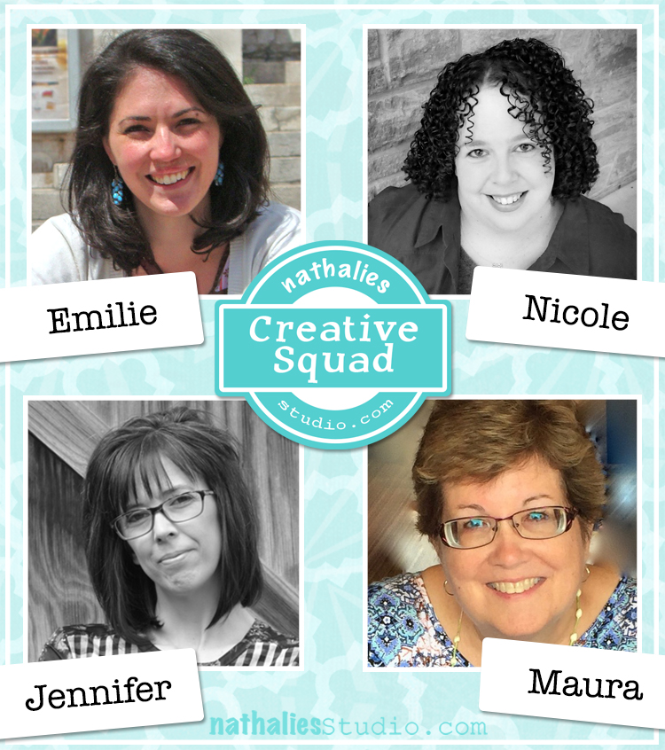
So without further ado, here is the Creative Squad:

First, a BIG welcome to Emilie Murphy, our newest member! We have been following Emilie for months on social media and knew we wanted to invite her when a place opened up on the Squad. Emilie brings her joyful and colorful style to inspire us each month :)

Here’s a little more about Emilie, and a reintroduction to the rest of the awesome squad too :)  You can also explore squad members current and past on the Creative Squad page.


Emilie is a French scientist living in Maryland and you can check her out on her website here. And here is a little bio from her:

Emilie Murphy – Emilie has always been passionate about making all kinds of different things since her childhood. Ten years ago she started on a scrapbooking journey and since 2016, this has also evolved into card making and mixed media. She loves anything handmade, which seems to always spark her curiosity and enthusiasm to experiment with new techniques. Her favorite things to make are art books/journals; where she can play with stamps, stencils, inks, paints, mix papers, and fabrics. Making artistic kinds of things became vital for her well-being and provides an escape from her daily life routine. She can’t thank Nathalie enough for giving her the opportunity to be a part of her Creative Squad!

Jennifer from West Virginia has been with the squad for over 2 years and you can learn all about her here on her website. Her bio is:

Jennifer Gallagher is an artist and art instructor currently living in West Virginia with her husband and two sons. She has been involved in the arts her entire life in one way or another. After studying fashion in college, Jennifer found herself drawn to new art forms and techniques. She now enjoys painting, collage, art journaling, and mixed media. Geometric shapes and patterns are her greatest source of inspiration and joy.

Maura from Upstate New York has been with us since January 2018 and you can check her out more here on her website. Here is her bio:

Maura Hibbitts – “I’ve joyously jumped to the right side of my brain to play with color and work in mixed media, sometimes with a steampunk twist, since retiring from teaching science. I’m back to being that kid that sat under the backyard tree and drew for hours. I enjoy life with my family in the Adirondack region of New York, love to travel, read, garden and still find myself fascinated by clouds and rocks from my years of teaching earth science.”

Nicole has been a squad member since 2019 and comes from Texas, you can check out her here on her website. Here is her bio:

Hi! I’m Nicole Watson, a Midwest girl who married a Southern boy now living in Austin, Texas. Art has always been part of me … from collecting random bits of paper at a young age, to selling my first painting in high school, then discovering mixed media while studying art and design in college. Other stops along my art journey include scrapbooking, card making, freelance photography, and layout/graphic design. Creating in my studio and sharing my work with others gives me life, purpose, and is healing to my soul.

And finally Judi Kauffman – our part time squad member who comes to us from Maryland. Judi likes to fly a little below the radar so you can learn all about her here on my blog post interview with her.

Please check out our Creative Squad posts each Tuesday for fun projects and inspiring techniques – there is always something new from this amazing gang and we are so happy to have them!

Leave a comment

Weather Report – Jennifer Gallagher

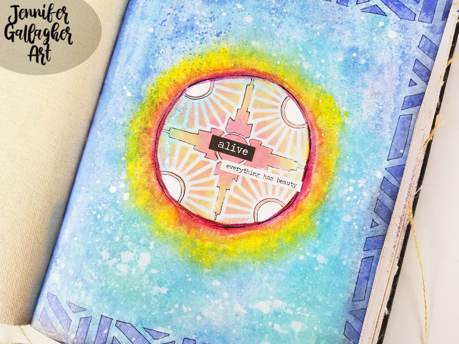
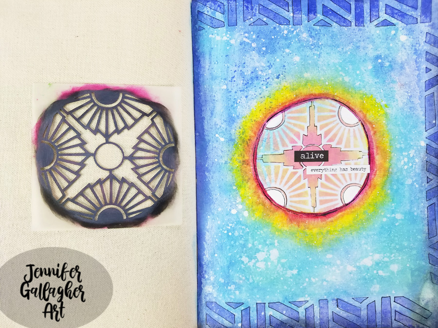
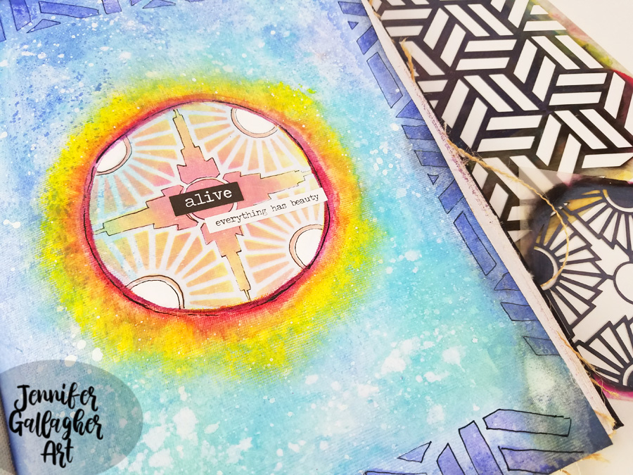
Hello from my Creative Squad! Today we have a beautiful art journal page celebrating the beginning of Spring from Jennifer Gallagher who is using my Kassel and Broadway 4×4 stencils. The theme this month is: Weather Report – Let’s talk about the weather! Do you love thunderstorms? The crisp air of Autumn? A good snowstorm? Are you a fan of endless sunshine? Create something inspired by that go-to topic of small talk – the weather!


Jennifer here again this month with the weather report. Spring has officially sprung. The cold, snowy days of Winter have begun to give way to birds chirping, spring rain showers, and the beginnings of green busting through the soil.  It almost feels like we are drudging along in the dreary winter and then all of a sudden that first little sign of spring comes out of nowhere. I love Spring! There is something so hopeful about the awakening of the Earth and the budding of new plants. We could all use that hopefulness now. With that in mind, I have created a very simple art journal page that is a visual representation of that burst of color and life amidst the darkness of winter. Let’s get started.

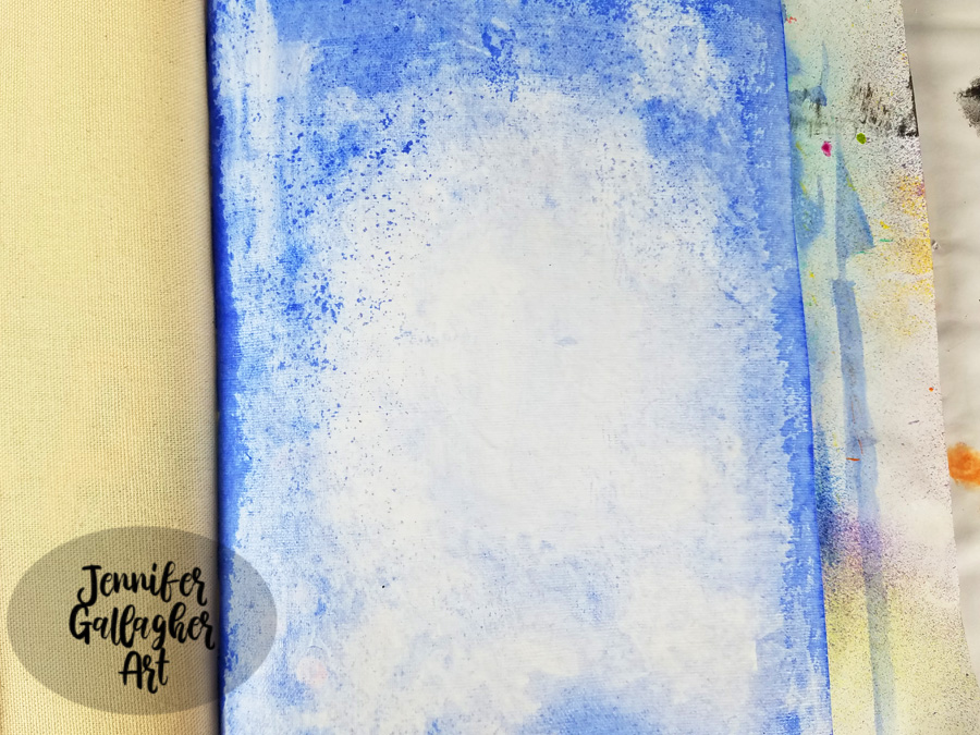
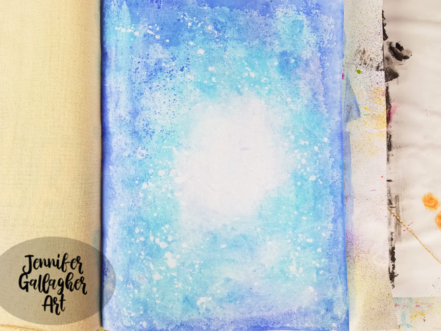
I began by putting a coat of clear gesso down to prepare my page. I am working on the cotton rag paper in my Dina Wakley Media Journal. After the gesso dried, using a large flat brush, I brushed on a thin amount of water across the page, leaving a small circle in the center totally dry. Then I dipped my brush into Marabu Aqua Ink in ultramarine blue. I applied the color and blotted here and there with a towel.

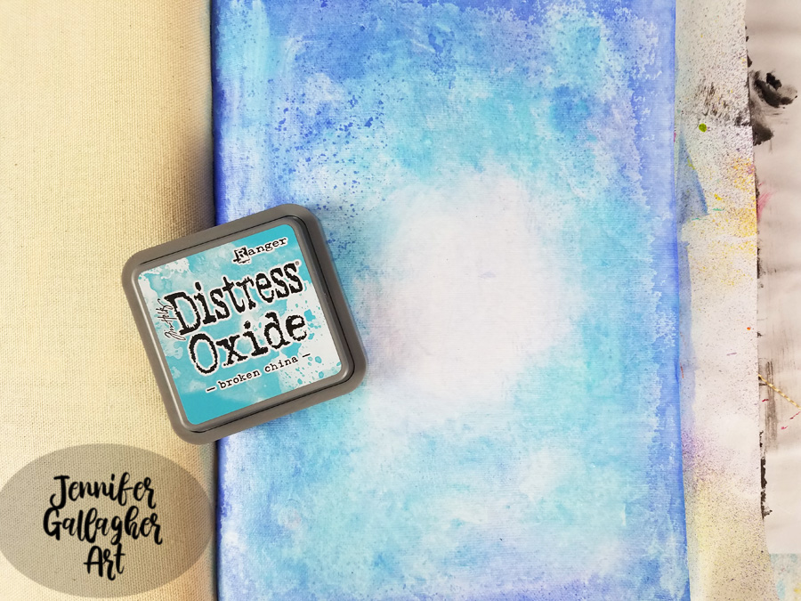
With a mini-blending tool, I applied Distress Oxide in mermaid lagoon around in the same places, leaving the center center alone. 

I spritzed a fine mist of water across the page, let it sit for a few seconds, and then dabbed it up with a paper towel.

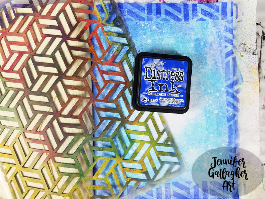
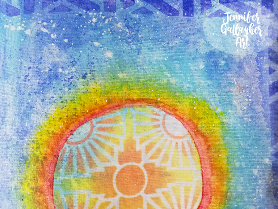
Next, I laid Nat’s Kassel stencil down and applied Distress Ink in blueprint sketch through it to create a border on three sides.

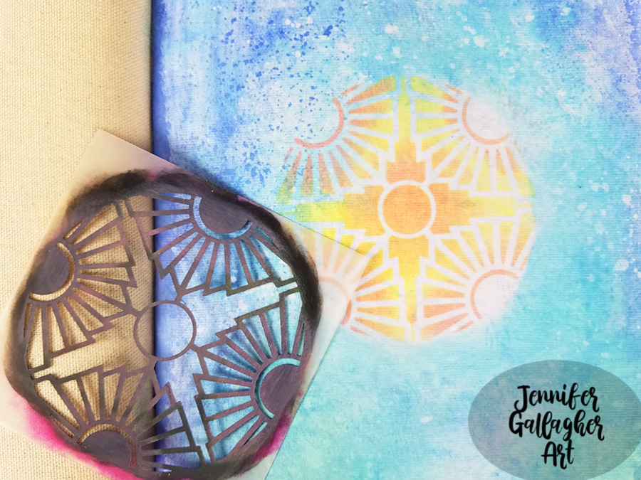
After placing Nat’s Broadway 4×4 stencil in the center of the page, I applied Distress Oxides in twisted citron and worn lipstick through it.

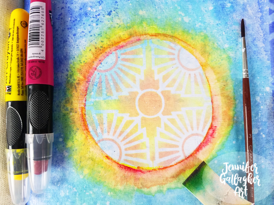
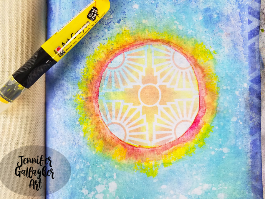
Holding the Marabu art crayon in sunshine yellow like a pencil, I drew a thin line of color around the outside of the circle. I dipped a very small brush into water, ran the brush across that line, and then took a dry cosmetic sponge and with a gentle touch pulled the color in a downward motion. I would pick up the sponge and move to the next section and pull. I repeated this motion all across the circle. Then I repeated the process with the pomegranate art crayon. You can go back and add as much as you like.

I unscrewed the top off of my Distress Spray Stain in picket fence and dipped a small paintbrush into the liquid. I used it to create white splatter on my page.  

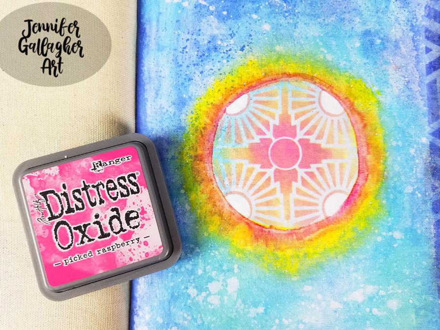
I laid the stencil back down and added Distress Oxide in picked raspberry into the center of the stencil to brighten the center.

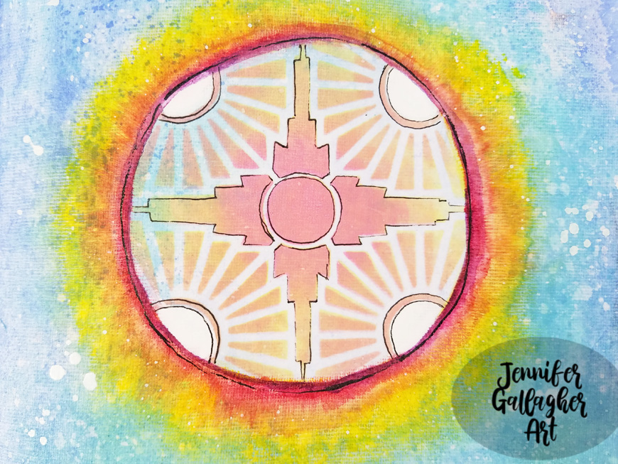
Using a black gelly roll pen, I doodled around all of the stenciled designs. I also lightened the four circular areas with a white posca pen.

I added some word stickers from Tim Holtz Big Chat and Small Talk sets. I added “alive” and “everything has beauty”. 

I hope you have enjoyed this tutorial. Art can be a great way to keep ourselves busy during difficult times. I am wishing the best for you, your families, and your communities. If you get the chance to try this tutorial, please share your creations with us.


Thank you Jennifer for such an uplifting page!

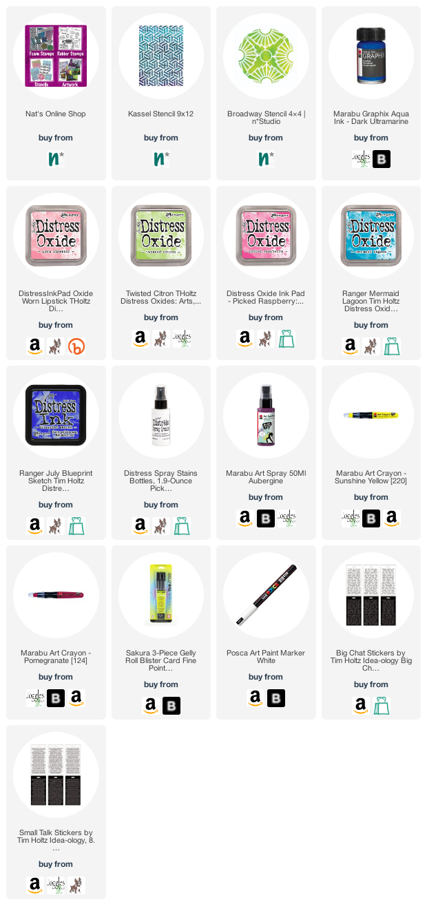
Give it a try: you can find all my Stencils in my Online Shop and here are some of the other supplies Jennifer used:

Feel inspired? Working on something yourself that you’d like to share?  I love to see how you interpret our monthly themes. Email me how you used my stencils and stamps with the theme and email me an image – I would love to share your projects in my next  “n*Spiration From Around the Globe“.

Leave a comment

Motivated in March – Judi Kauffman

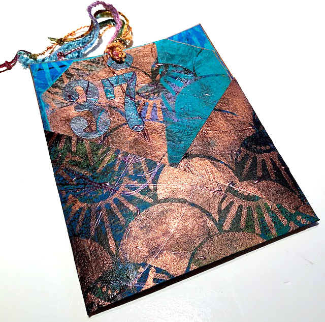
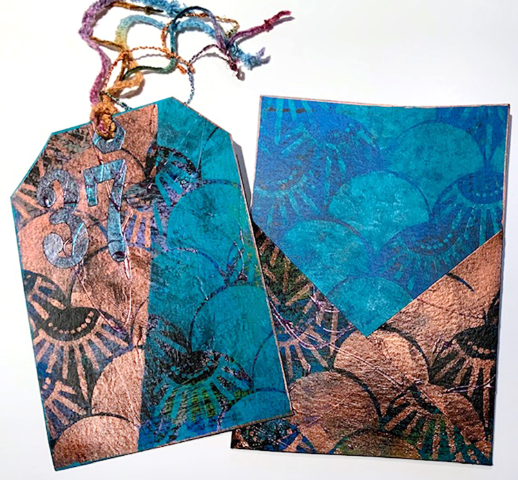
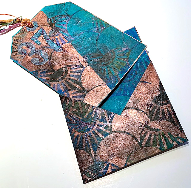
Hello from my Creative Squad! Today we have a tag and envelope project from Judi Kauffman using my Art Deco Summit stencil and this month’s theme: Motivated in March – What keeps you motivated to create? Is it a certain material? Your favorite colors that you can’t get enough of? Maybe you get motivated when you see artwork in a museum or out and about? Share with us your creative motivation and then create something inspired by it.


I love this month’s theme; “Motivated in March” really resonated. I thought a lot about what motivates me as well as parts of my life where more motivation is needed. To that end, I picked what I’m calling a “Magic Number” for the month: 37! And I designed a tag in a pocket to help me remember and focus on the number.

I’m going to spend 37 minutes a day on the treadmill.
I’m going to help my neighbor register 37 new voters!
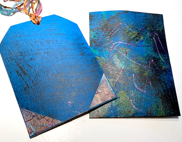
I’m going to do 37 different creative projects during the month and will document them on the back of the tag and in my Traveler’s Notebook.
…And I’m going to imagine that I’m only 37 to keep myself feeling younger.

YOUR TURN – A CHALLENGE

Before we get into the how-to portion of this tutorial I’m issuing a challenge: 
Pick your own “Magic Number”!
Write down at least 3 things that it represents.
Make a tag with a pocket like mine or start with an envelope, folder or box. Add the number to the tag, envelope, folder or box.
Document your intentions for the number and then chronicle how the month plays out!

INSTRUCTIONS

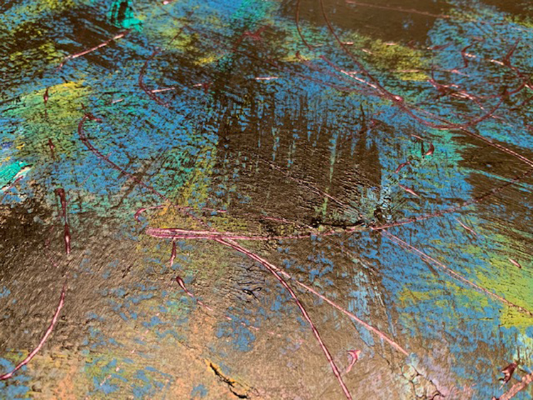
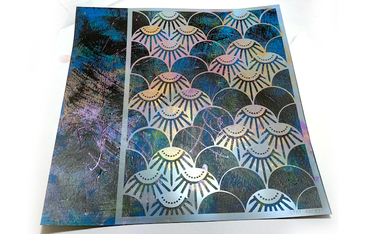
1. Dry-brush a sheet of royal blue cardstock (or a color of your choice) with two or more acrylic paints. Shown: Black, teal, medium blue. When dry, randomly scribble with dimensional paint in one or more coordinating, equally dark colors. Allow to dry.

2. Dry-brush the reverse side of the cardstock with black.

3. Die cut the pocket shape.

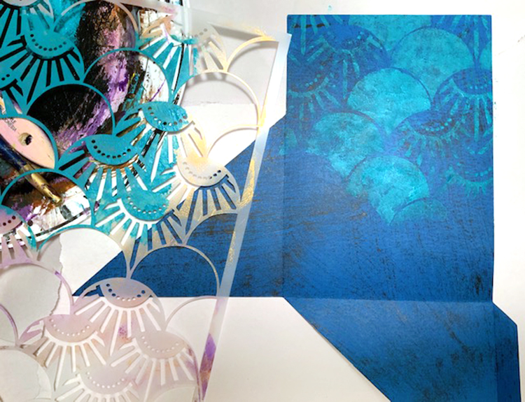
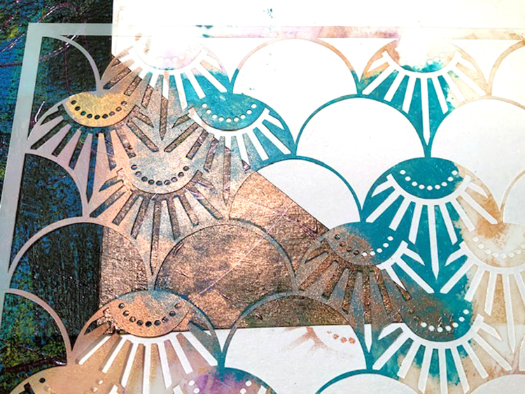
4. Using teal paint, stencil Art Deco Summit pattern on the portion of the inside of the pocket that will show when it’s folded. Allow to dry.

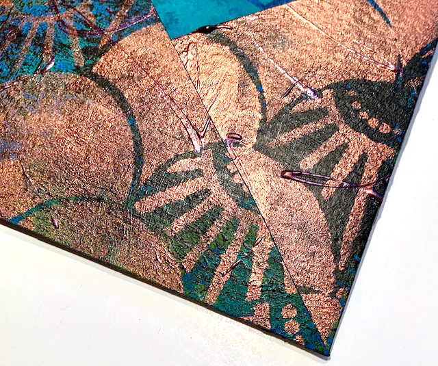
5. On the right side of the pocket use copper metallic paint to stencil Art Deco Summit pattern on the two angled sections. Use newsprint to mask the areas where you don’t want any stenciling.

6. Fold on score lines, assemble the pocket.

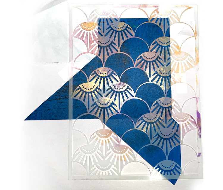
7. Cut a 4.75” x 6.75” rectangle from scrap portion of 12×12 cardstock. Stencil Art Deco Summit pattern in two colors at an angle, masking between colors – copper metallic on one side, teal on the other. Trim corners and punch a hole to make a tag.

8. Edge the pocket and the tag with paint.

9. Hand- or die-cut the “Magic Number” and a hole reinforcement from another scrap portion of the 12×12 cardstock. Adhere to the tag. Add fibers in coordinating colors.


Thank you Judi – what a nice idea of activities that we can do now that we are all spending more time at home.

Want to give Judi’s project a try? You can find all my Stencils in my Online Shop and here are some of the other supplies she used:

Feel inspired? Working on something yourself that you’d like to share?  I love to see how you interpret our monthly themes. Email me how you used my stencils and stamps with the theme and email me an image – I would love to share your projects in my next  “n*Spiration From Around the Globe“.

Comments (1)

  • Jean Marmo

    |

    Judi – this is so inspiring! I love the idea and you have created such a gorgeous tag!!

    Reply

Leave a comment

Easter Inspiration from my Creative Squad

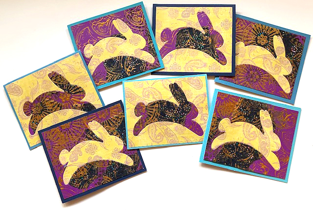
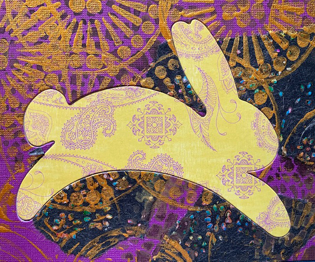
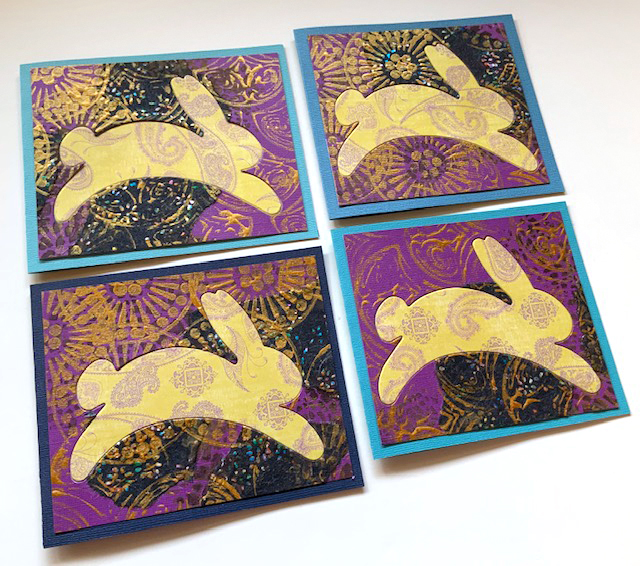
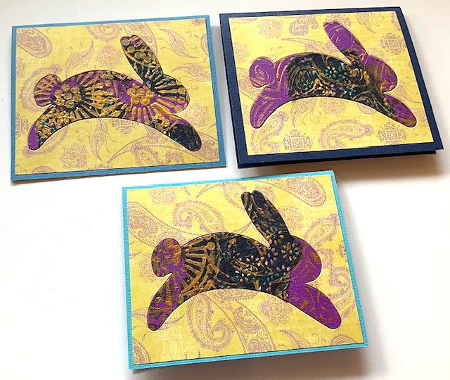
Today I have some very cute Easter cards to share with you today from Creative Squad member Judi Kauffman.  Judi is on a roll revamping her calendar pages into new projects. Remember back in December she created a monthly calendar, with the goal of reusing the pages once the month was passed? Well here we have the February page, turned into some sweet bunny cards, and a couple other items too.

From Judi:

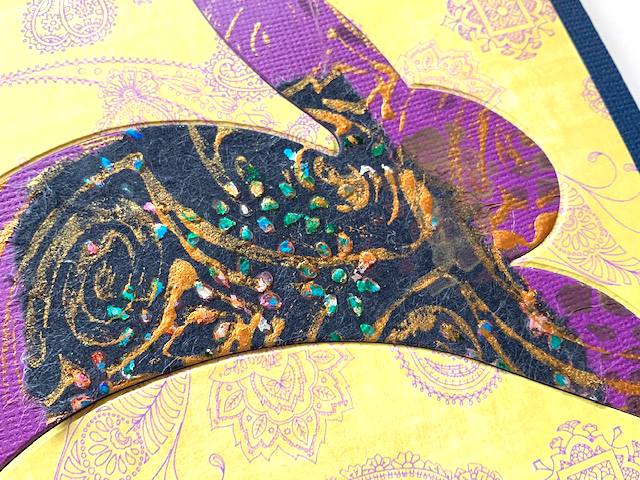
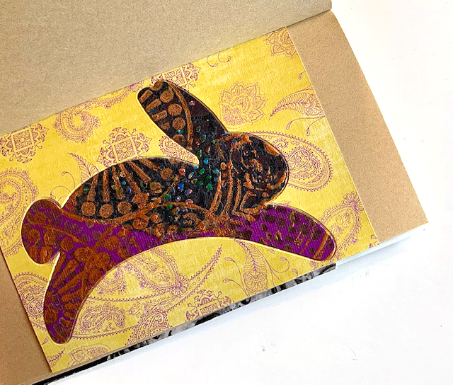
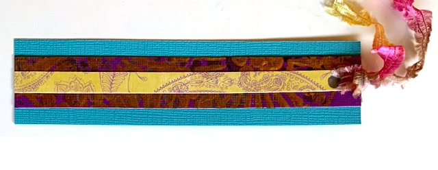
“I used my inlay technique* to turn the February calendar page into seven Easter cards, one Traveler’s Notebook page, and used a remaining scrap for a bookmark. I considered simple egg shapes, but couldn’t resist the bunny. (Die from AccuCut)”

*Judi Kauffman’s Inlay Technique: Die cut a simple shape from two or more coordinating sheets of stenciled/stamped paper and purchased patterned paper. Make sure there will be good contrast. Inlay the positive image (shown: a bunny) so it fits into the opening on a contrasting background. Glue both pieces in place on a piece of board, a card front, into an art journal, or on mat and frame.

Thank you for sharing Judi!

Here are some of the supplies Judi used:


And I hope to see you tomorrow, March 27th at 2pm on Facebook for a Live chat. I would love to hear from you and learn about how you are doing these days. Please join me and say HI!

Leave a comment

Motivated in March – Linda Edkins Wyatt

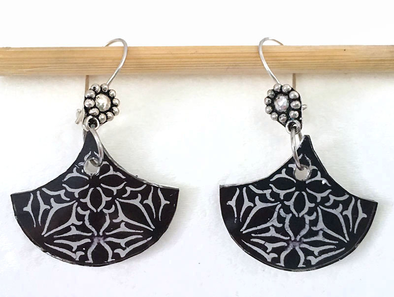
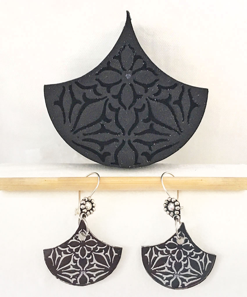
Hello from my Creative Squad! Today we have a post from Linda Edkins Wyatt, and it is extra special because this will be her final one with us and we thank her so much for her amazing creativity and contributions to our little group! She leaves us with some awesome earrings, using my Van Vorst Fan foam stamp set and this month’s theme: Motivated in March – What keeps you motivated to create? Is it a certain material? Your favorite colors that you can’t get enough of? Maybe you get motivated when you see artwork in a museum or out and about? Share with us your creative motivation and then create something inspired by it.


What keeps me motivated to create art? New products!

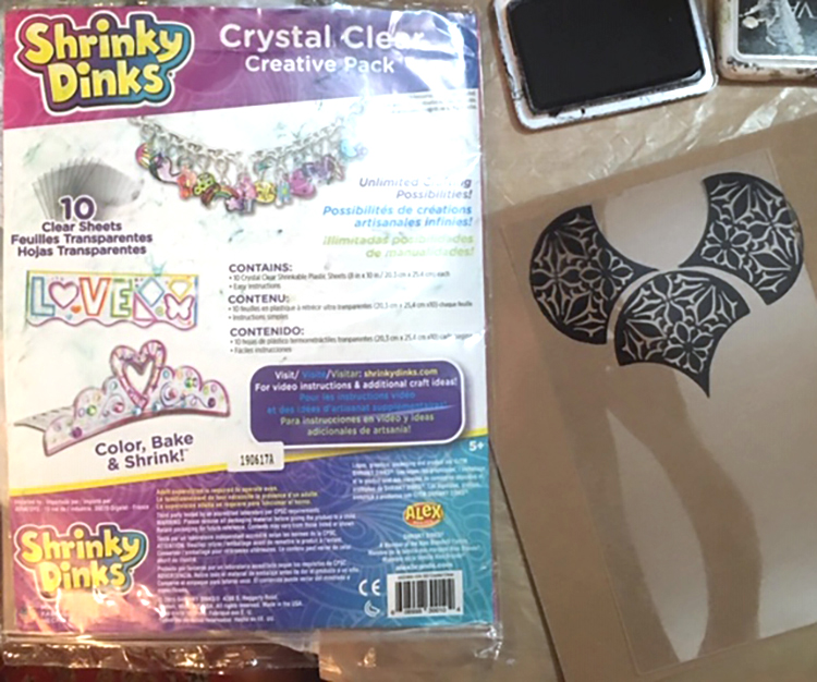
For March, Nat asked us to think about what motivates us. I’m motivated by sooooo much: a shadow on the sidewalk, a pretty leaf changing colors, buds beginning to grow, architectural details on my daily walk, and advertising I see on a billboard or in a magazine. But, one thing that really gets me percolating with ideas is discovering a new product. Often, it’s a new stencil or stamp. But my latest discovery is something I totally missed in my childhood: shrinky dinks! One of my artist friends included a few sheets in a recent package, and I have to say, I’m addicted. It is so magical to watch it suddenly start to shrivel and buckle and turn into a miniature piece of art in minutes.

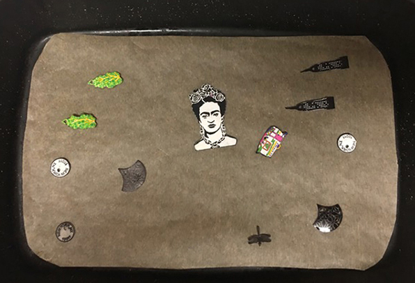
When I got the shrinky dink film, I thought, “Let me test that beautiful fan-shaped Van Vorst art foamie and see what happens.” It printed beautifully on the film using black Archival ink. I also tested a few stamps and stencils with both ink and acrylic paint.

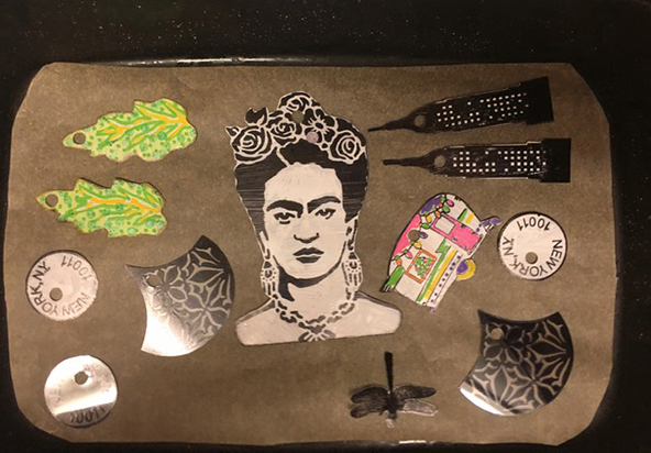
I punched holes in the top center of all the stamped, stenciled and painted pieces with the idea of using them in the future to make jewelry. I heated the oven, put in my shrinky dinks, and waited for the magic.

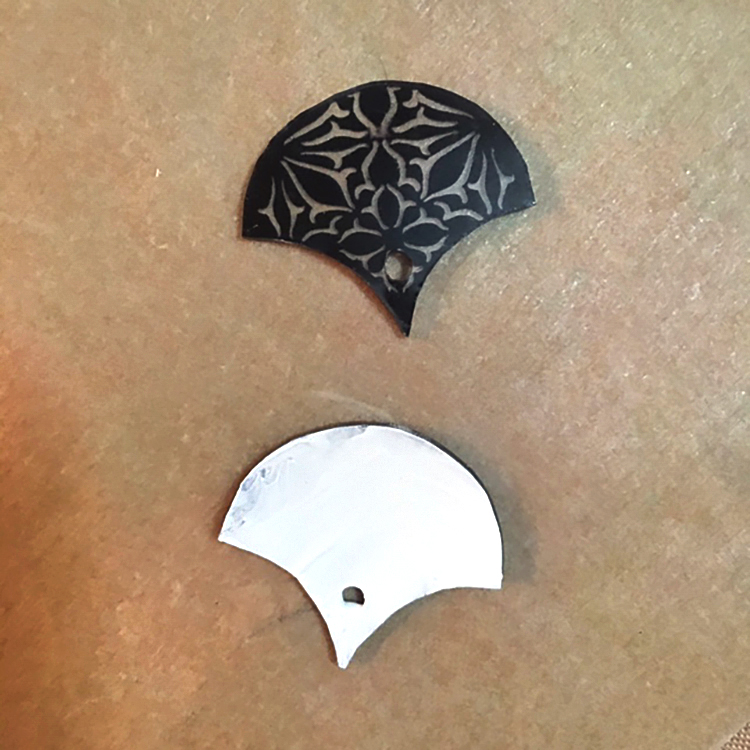
Once the stamped film had shrunk, flattened, and cooled I painted the back of the shrunken Van Vorst pieces with white acrylic. It looked fine without painting the back, but I wanted to make the design pop a little more.

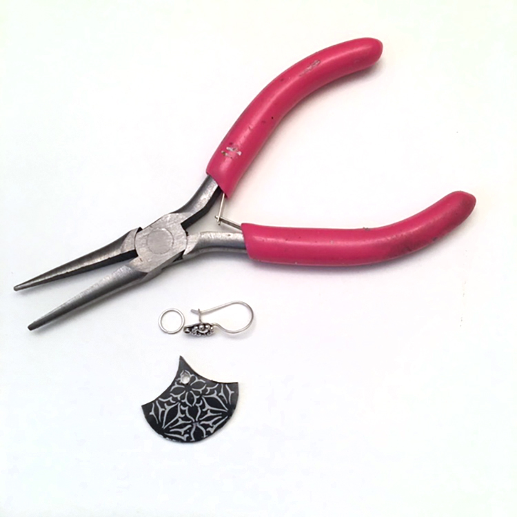
I got out my jewelry-making components and tools and rummaged around in my containers to find some earring wires that would work with the stamped design. I also selected a small silver ring to connect the fan design to the earring wire.

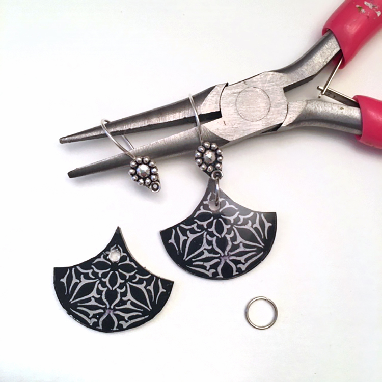
Carefully, I opened the small, round ring and threaded it through the fan and the hole on the earring wire, then closed it with my jewelry pliers.

Take a look at the final earrings with the art foamies fan stamp for comparison. The design shrunk to about one quarter to one third of its original size, and also got much thicker. The details of the design were even more crisp and clear.

Here’s the “how-to” steps:

1-carefully stamp the chosen design onto the shrink film. Press carefully, being careful not to slide the stamp. Lift the stamp straight up to avoid smearing.

2-cut the shape out with scissors. I cut close to the design edge, but you can also leave a little border.

3-punch a ¼” round hole near the top of the earring so that you can attach the earring wire or a jump-ring loop. (It will look way too big but once it shrinks the hole will be just the perfect size.)

NOTE: Be very careful when you cut and punch so that the ink does not smear. Hold the stamped design by the edges only.

4-bake in the oven or a toaster oven according to the directions on the shrink film package until the design shrinks. It will cool quickly. If your piece looks curved or buckled, quickly flatten with a spatula. Once it is fully cooled you cannot reheat to take out any curve or buckle.

5-attach earring components to shrinky dink artwork and, viola! You’re done.

You can also use the shrink film to make necklaces or pins—the possibilities are endless!


Thank you Linda – always love working with shrink film and watching the designs transform to miniature wonders :)

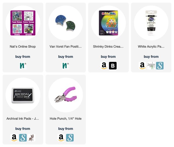
Want to give Linda’s project a try? You can find all my Foam Stamps in my Online Shop and here are some of the other supplies she used:

Feel inspired? Working on something yourself that you’d like to share?  I love to see how you interpret our monthly themes. Email me how you used my stencils and stamps with the theme and email me an image – I would love to share your projects in my next  “n*Spiration From Around the Globe“.

Comments (1)

  • Deb

    |

    Such a creative fun idea. Thanks for the inspiration and clear instructions.
    Deb

    Reply

Leave a comment

Motivated in March – Nicole Watson

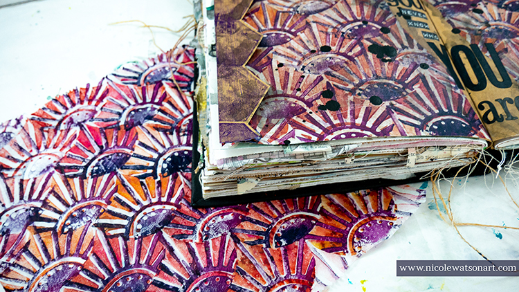
Hello from my Creative Squad! Today we have a stunning art journal page from Nicole Watson to help motivate you to create and maybe even in life :) Nicole is using my Broadway Fan Pos Neg set, my Solid Hex Large rubber stamp, and this month’s theme: Motivated in March – What keeps you motivated to create? Is it a certain material? Your favorite colors that you can’t get enough of? Maybe you get motivated when you see artwork in a museum or out and about? Share with us your creative motivation and then create something inspired by it.


There are several things that motivate me to create. This list includes color palettes, new supplies, a visit to the museum, a random photo or advertisement, an Instagram hashtag challenge such as the hundred-day project, or a design team prompt like this one. One of my favorite parts about majoring in art were the assignments or challenges to solve with my supplies and creativity. However, lately, one of my biggest motivations is YOU!  Comments on my tutorials or other social media posts mean the world to me. I absolutely love inspiring other people to create and sharing tips and tricks along the way.

Recently, I received a beautiful message from someone thanking me for my inspiration. Through a random search after purchasing an art journal, she found my tutorials during her cancer fight. She used her art journal as a way to cope and understand her story. This beautiful lady was not expected to make it through her fight, but she did. This page is for her, as she has also inspired me.

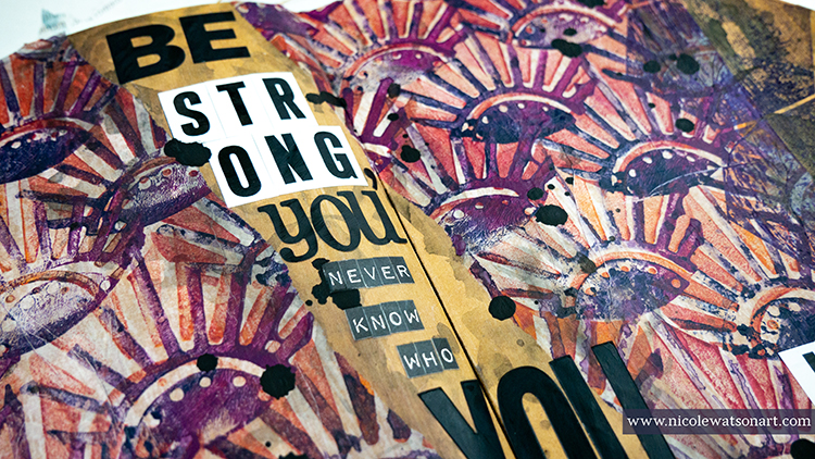
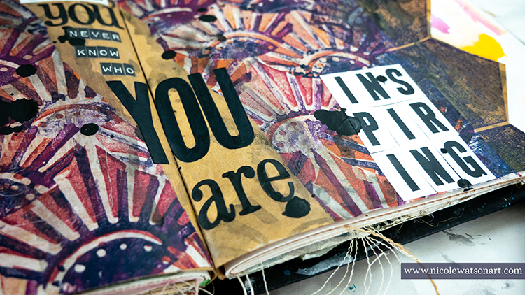
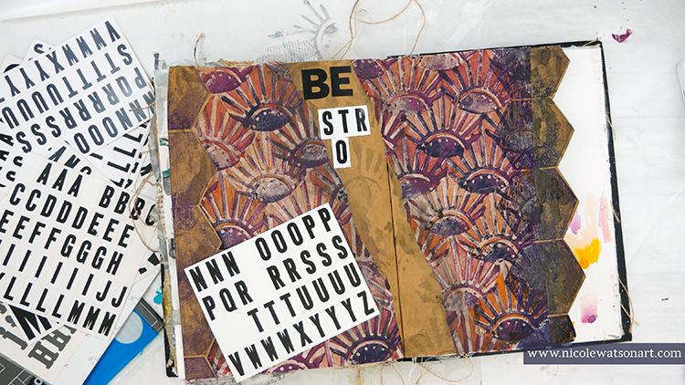
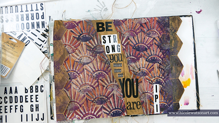
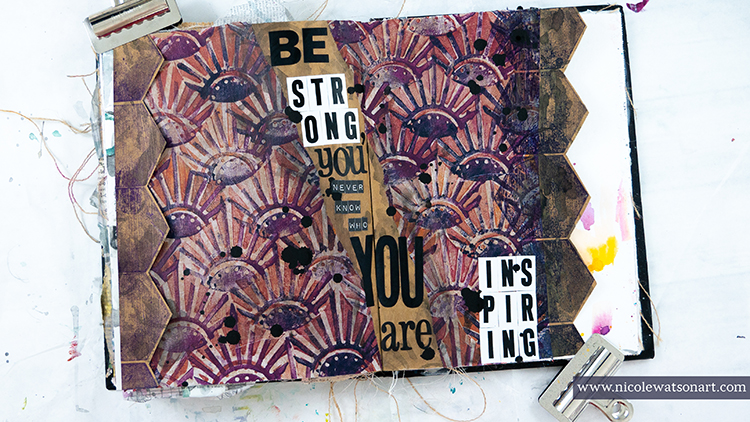
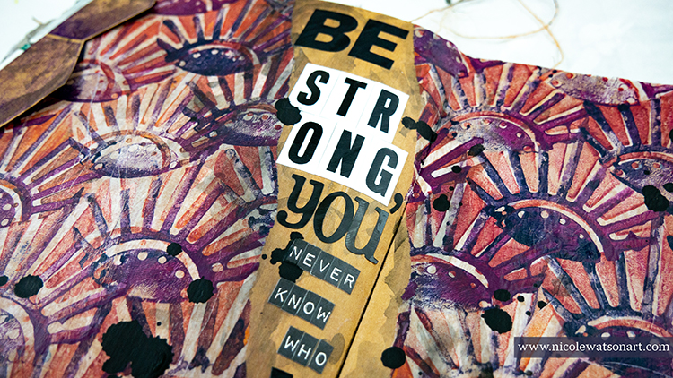
“Be strong, you never know who you are inspiring.”

When I ran across this quote on Pinterest, I knew I wanted to use it on a simple journal page to showcase the message and as a reminder to myself to be strong, even in my own weaknesses.

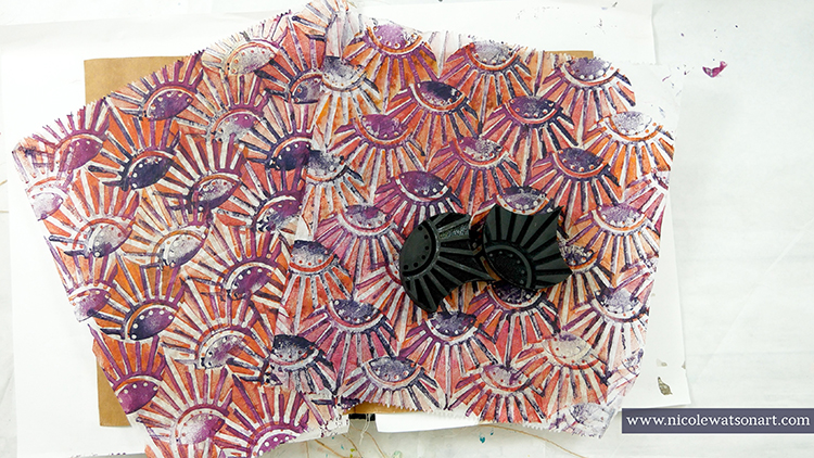
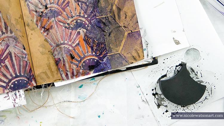
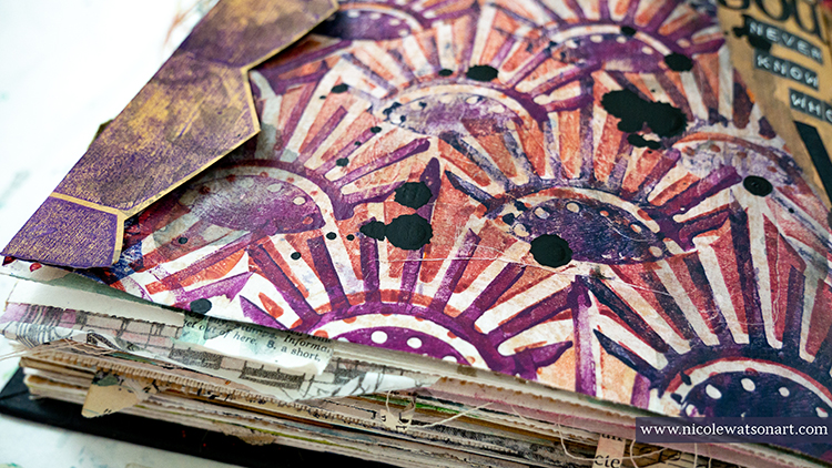
So, I grabbed some deli paper that I had previously stamped with Nat’s Broadway Fan Positive Negative ArtFoamies. I loved how it had turned out, and was waiting for the perfect occasion! I simply stamped the negative stamp first all over the deli paper in a mixture of warm colors plus a little umber to tone them down and then stamped the positive image with a mixture of navy and eggplant. I wanted a variation in the colors throughout the paper.

Here’s a quick video of how I stamped with the ArtFoamies on deli paper:

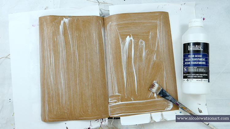
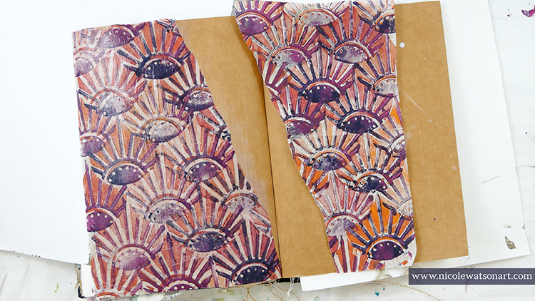
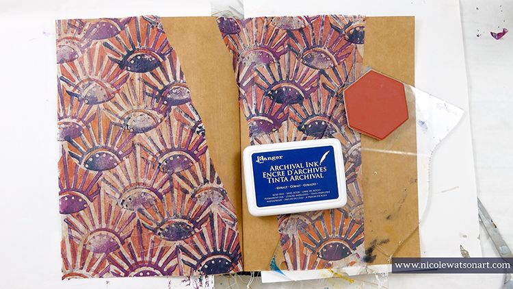
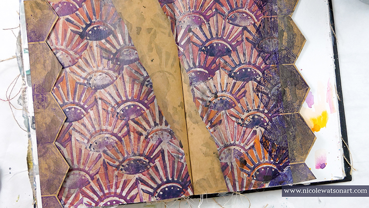
I thought this paper would look amazing on the kraft paper, so I spread clear gesso over the kraft paper spread in my art journal and then ripped the deli paper in half and adhered it to the page with matte medium. I left a gap between the two sides for my quote and also a large space on the right side.

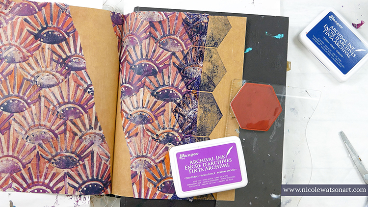
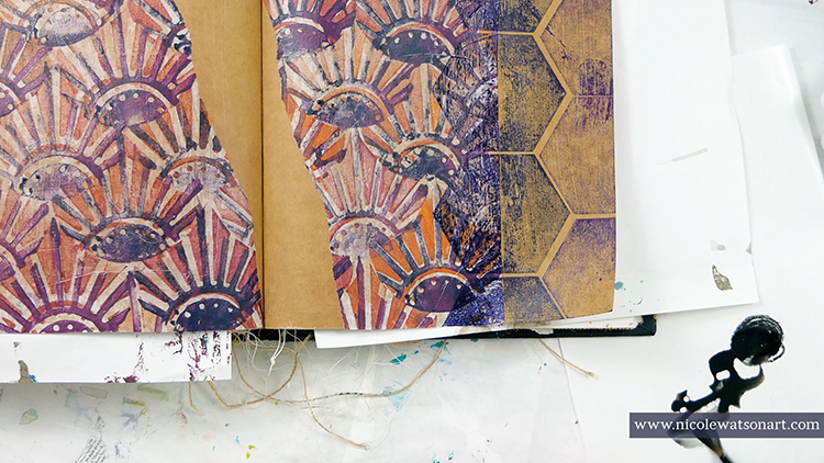
Wanting to add more interest and another graphic element, I grabbed Nat’s Solid Hex Large stamp and stamped the right side with cobalt archival ink. My first thought was to then cut around those hexagons, but I experimented with stamping another line of hexagons with deep purple ink. Then I stamped the same navy hexagons over to the left side.

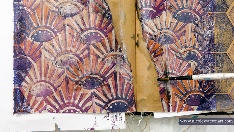
The pages seemed a little flat to me, so I grabbed my stabilo all pencil and created a puddle. (Scribble the stabilo on a piece of palette paper and activate it with water.) I used this as watercolor paint and spread it around the page on the stamped hexagons for shadowing and on the torn edges. Then, I stamped the ArtFoamie into the puddle and stamped some shadowed Broadway fans in the gap and over the hexagons.

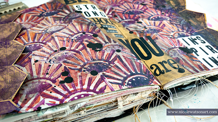
Looking at my pages for several minutes, I decided to go back to my original idea and cut the purple hexagons off the page! I’m so glad I experimented first, because then I had this awesome line or purple hexagons to adhere to the left side! I stuck it down with one strip from a tape runner, because I liked the dimension created from not sticking it down all the way to the page.

Finally, it was time to add the quote. I grabbed a bunch of different black and white stickers to spell out the quote and then went over them with matte medium to make sure they would stick.  I felt the page needed one more element to tie in the black, so I grabbed my Bombay India ink for a few ink drops.

The perfect reminder in the middle of my art journal to motivate me. It is truly a gift and a huge motivation to inspire you. I’ve often heard it say that art heals, and I sincerely believe it’s one amazing tool we have to care for our body, mind, and spirit.


Thank you Nicole and what a touching story about the power that art can have in our lives!

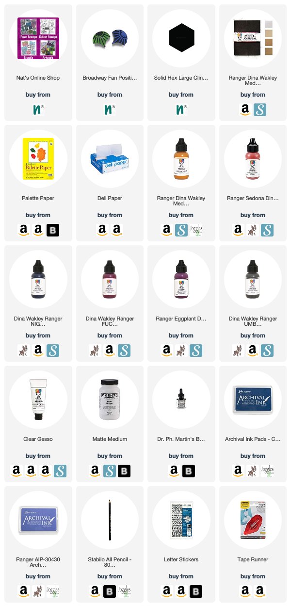
Want to give Nicole’s project a try? You can find all my Foam Stamps and Rubber Stamps in my Online Shop and here are some of the other supplies Nicole used:

Feel inspired? Working on something yourself that you’d like to share?  I love to see how you interpret our monthly themes. Email me how you used my stencils and stamps with the theme and email me an image – I would love to share your projects in my next  “n*Spiration From Around the Globe“.

Leave a comment