Creative Squad

Endless Summer – Judi Kauffman

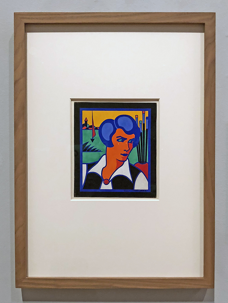
Today we have a very special Creative Squad post from Judi Kauffman, an honorary Creative Squad member and dear friend! Judi will be joining us from time to time with some awesome projects of her own, working with our monthly themes. (You can learn more about Judi from our Nice to Meet You blog post featuring her creative story and artwork.) This time Judi brings us two projects, using my Amsterdam stencil and my Grove Street foam stamps, inspired by our theme: Endless Summer – The days are long, the sun is shining, the air is soft… it must be summer! Let’s take a stroll down memory lane and save a summertime memory forever.


This month’s Creative Squad challenge theme – Endless Summer – conjures up long days at the beach, vacations in exotic places, away from work and the usual routine. In other words: Good times! For me, it’s the opposite. Endless Summer – yuck! I can’t think of anything worse than summer lasting an instant longer than it already does. Spring is lovely, I adore fall and can’t wait for winter. I’d be happy to skip summer altogether. It’s too hot, too humid. If I’m promised a lobster roll or fried clams, I’m willing to venture onto the sand, but only if I can leave the beach before nine in the morning or start the visit at sunset. And only if the seafood is followed by ice cream…

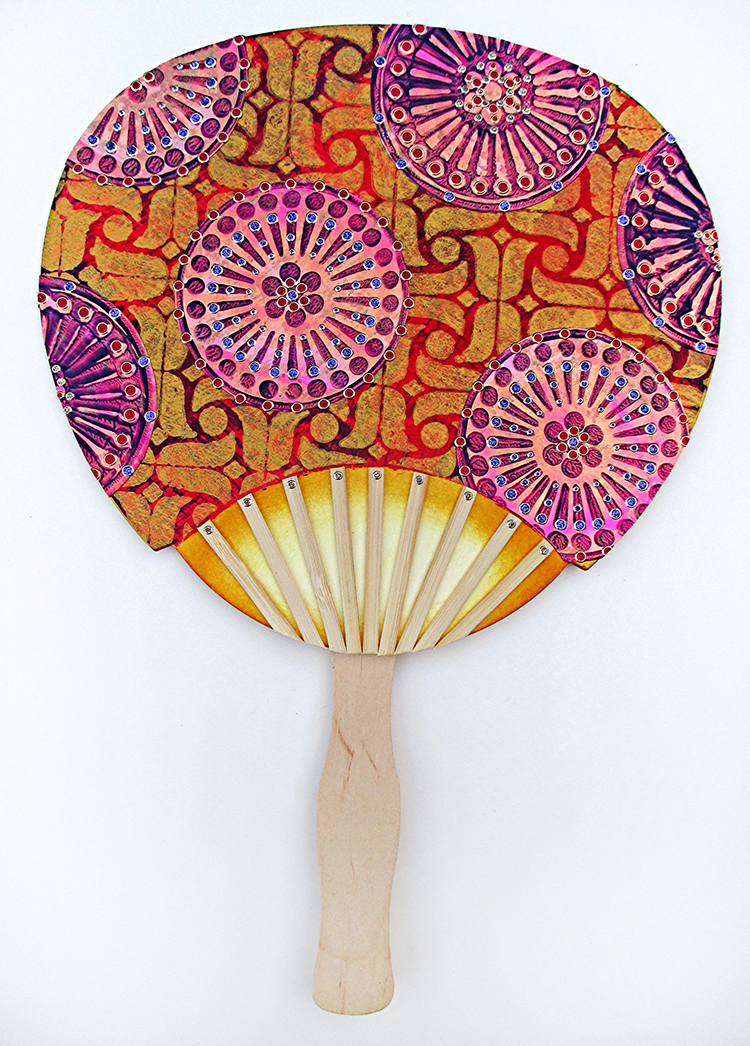
My take on the theme is about keeping summer at bay: A FAN! And about staying indoors to make a big batch of cards. Now that’s my idea of a good time.

Instructions: If you have a lot of experience with stencils and stamps, scroll through the photos and head straight to the supply list. If you’re a beginner,I’m providing complete instructions. (A lot to read, but worth it, I hope…)

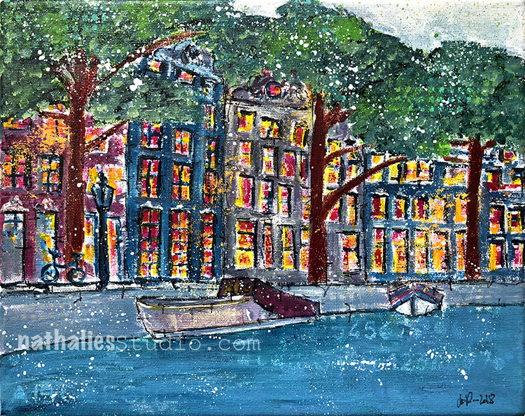
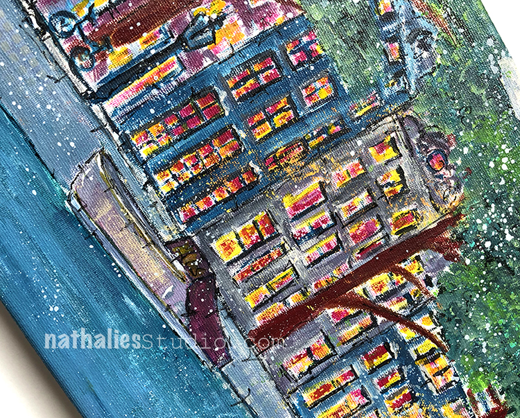
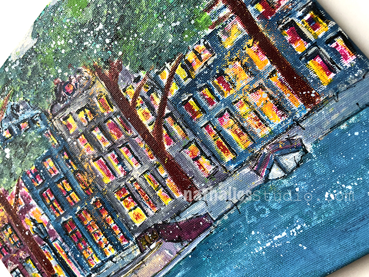
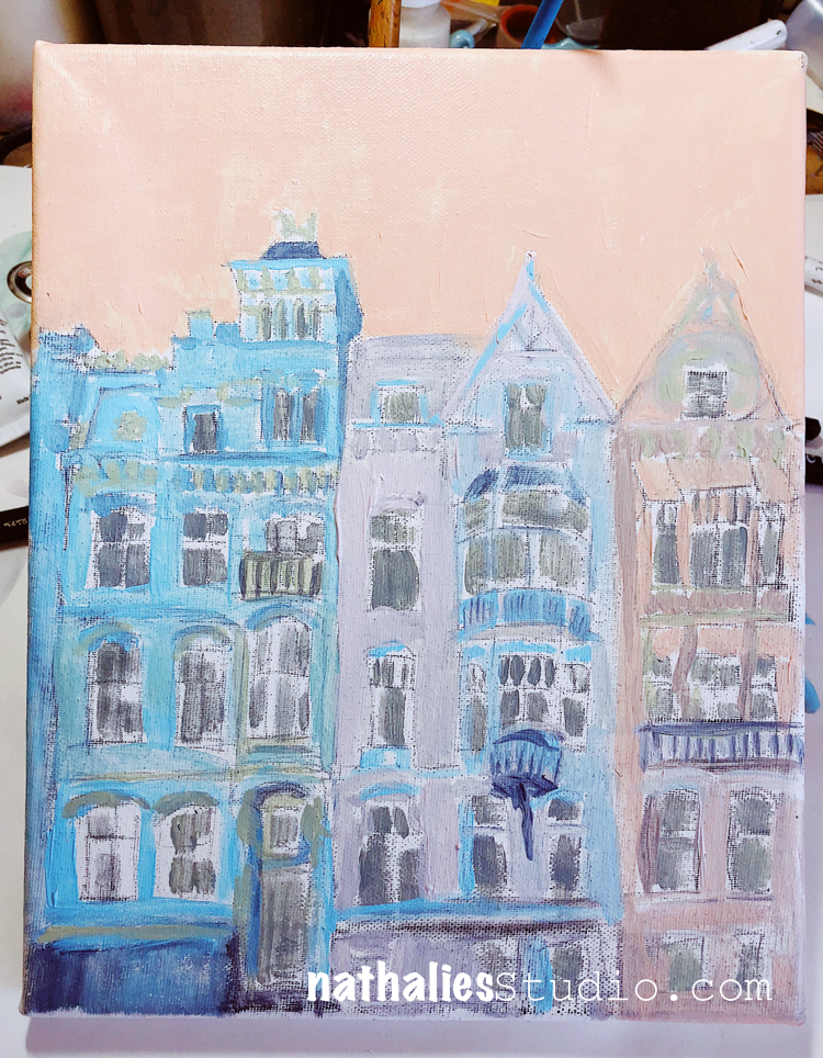
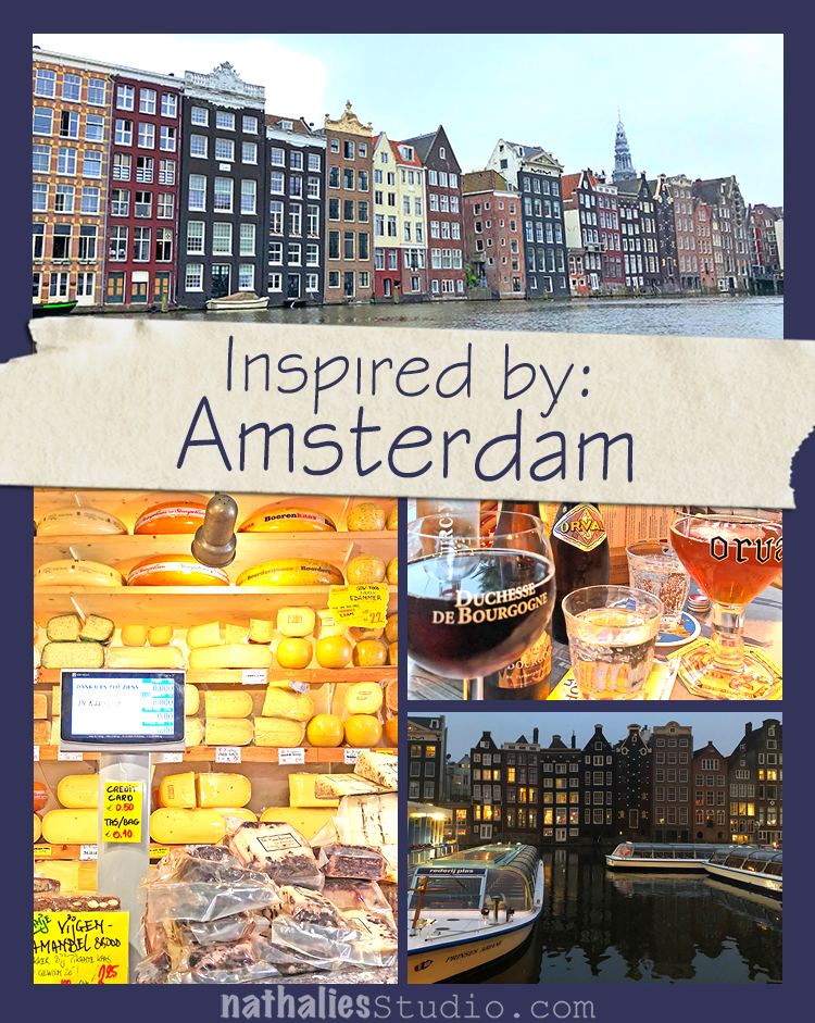
Trace an existing fan (import stores offer many options), draw your own original fan shape, or find a template online. Choose a stencil (I chose Nat’s Amsterdam stencil) and two or more foam stamps (I’m using Nat’s Grove Street set) that your eye tells you would make a good combination. A fan handle and some flat wooden sticks are also needed. A stir stick from the paint store and thin stir sticks from a coffee shop are good alternatives.

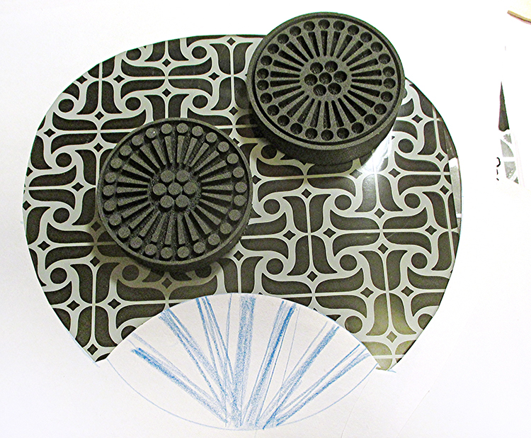
Cut a window opening in newsprint or other lightweight paper, place it over the stencil, and move it around until the position of the stencil looks good within the fan shape. Position the foam stamps over the stencil to get a sense of the scale and proportions. This is the planning stage where it’s easy to change your mind and customize the project. And it lets you in on the design process – showing exactly how I created my fan.


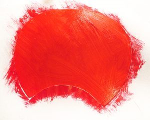
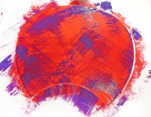
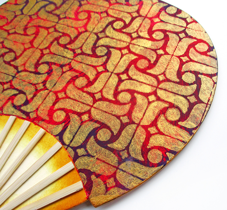
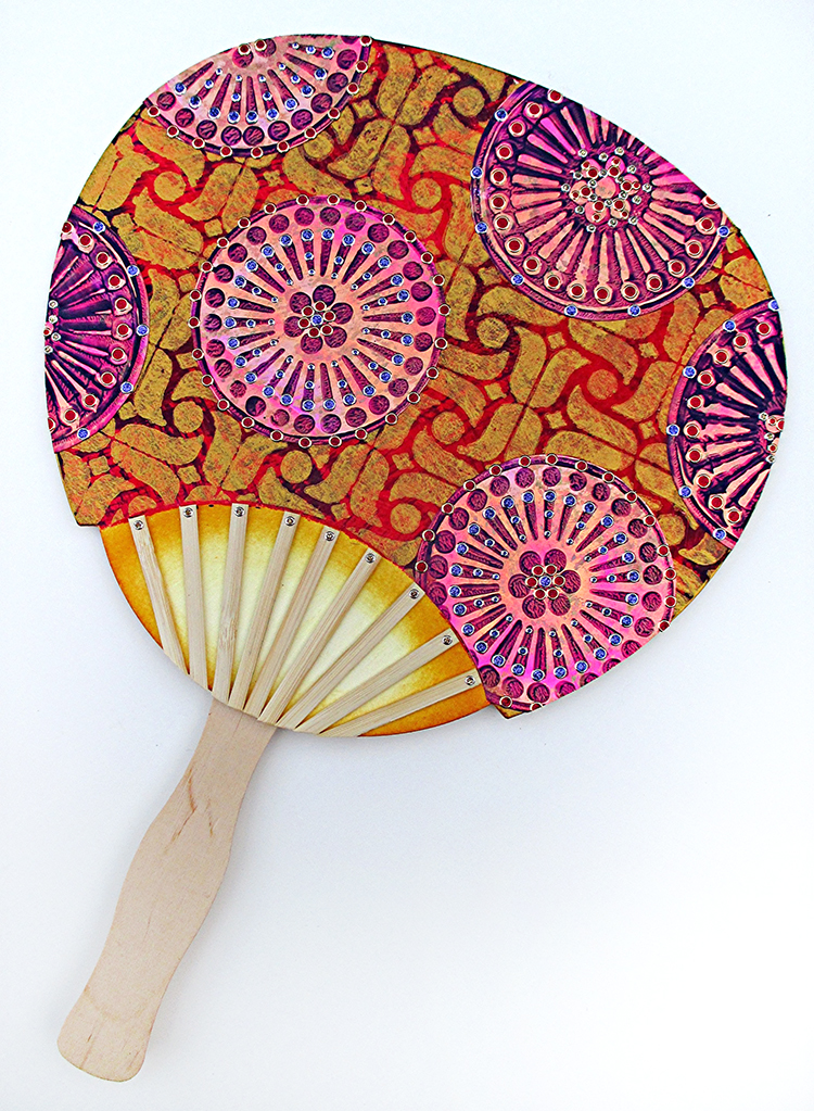
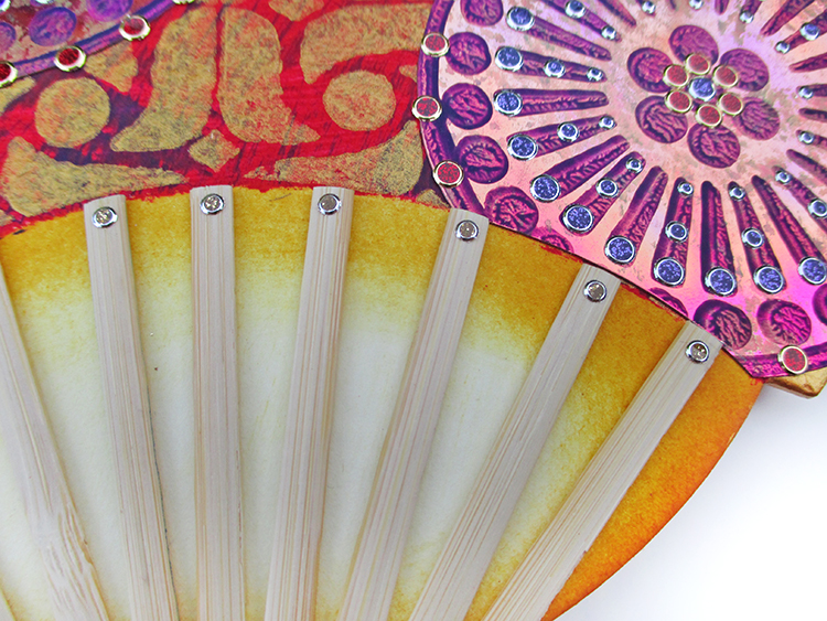
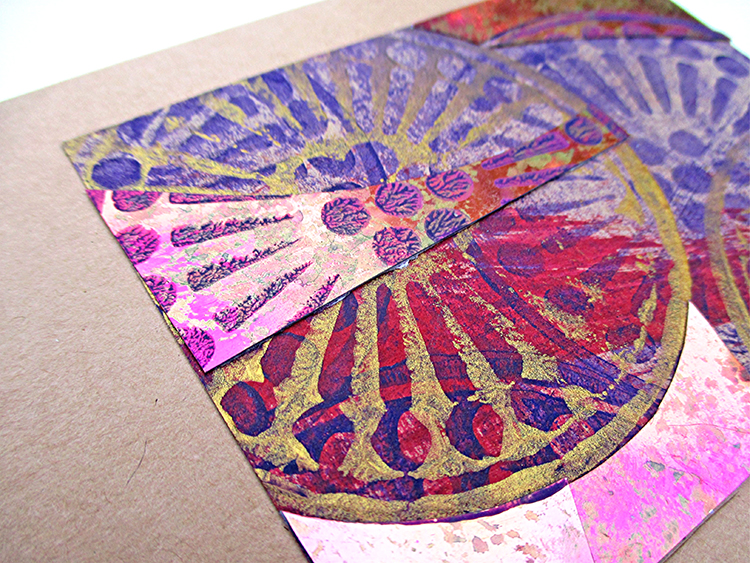
Use the template to trace and cut a fan shape from light color heavyweight watercolor paper, cardstock, mat board or chipboard. (Use mixed media shears that cut heavy materials or a craft knife and self-healing cutting mat.) Cut a curved mask from newsprint to cover the bottom area of the fan. Tape the mask in place. Use a wide brush and random strokes to paint the surface with red paint. When dry, use a wide brush and very little paint to stroke on purple paint. Remove the mask. Let the paint dry. While you’re at it, brush excess paint onto pieces of tan cardstock and newsprint scraps. Set them aside.

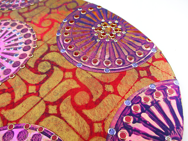
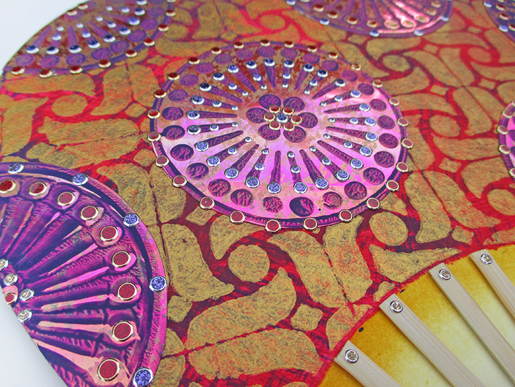
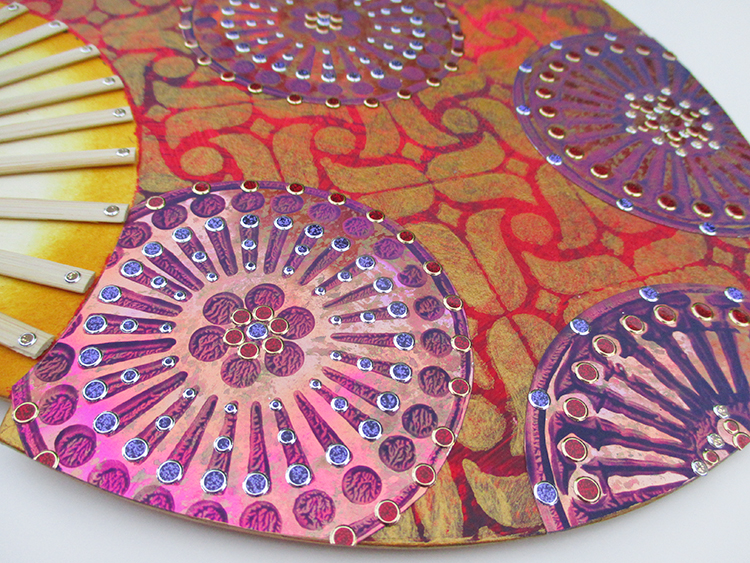
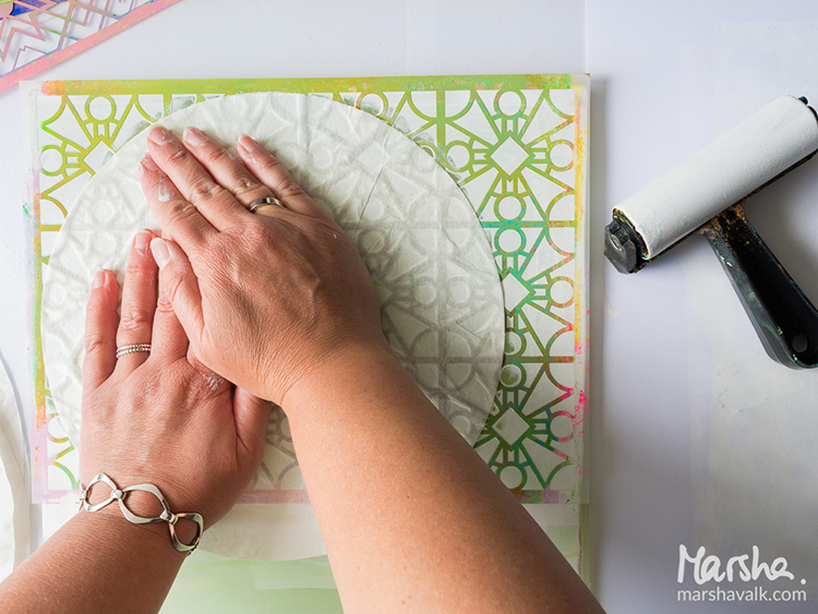
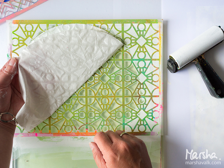
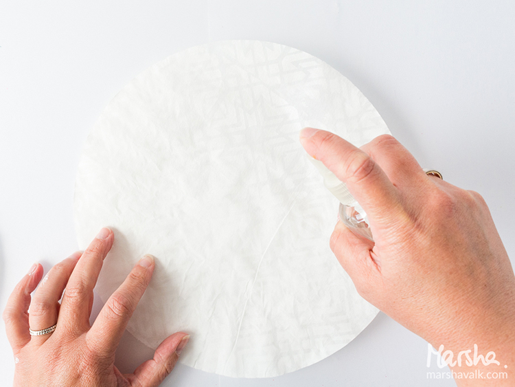
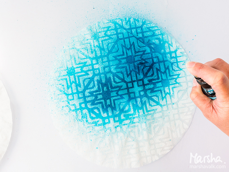
Cut a clean mask to again cover the bottom area of the fan. Stencil the allover pattern using a stencil brush and gold paint. (Hold the brush upright, use very little paint as you go – work slowly and take care to keep the pattern as pristine as possible – there are lots of thin lines in the Amsterdam stencil and if you use too much paint it will seep under the stencil.)

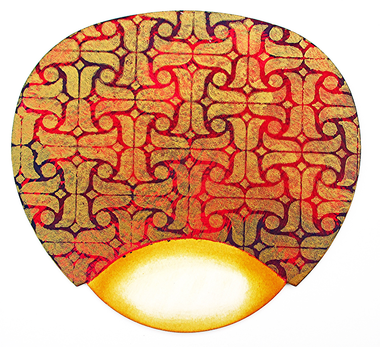
Remove the mask. Cut another mask, this time to cover the stenciled area of the fan. Use a craft sponge to apply ink to shade the edges of the almond shape at the bottom of the fan. Use very little ink and a light touch so the effect is softly shaded.

If you like the look of the fan with no further embellishment, this is the last step. Cut pieces from the flat sticks and glue them to the almond shape; glue the top portion of the handle to the back of the fan and you’re ready to face the summer heat! (Or survive a hot flash in mid-winter…)

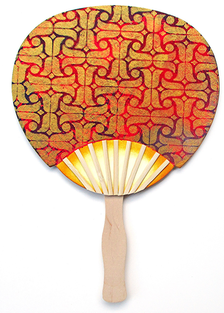
If you like more embellishment, keep going as follows:

Alter a 5” x 12” piece of Shimmer Sheetz with gold metallic alcohol ink. Shown: Ruby Gemstone SS dabbed with an ink applicator tool and Ranger Metallic Mixatives. Back the SS with double-sided adhesive sheet.

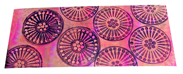
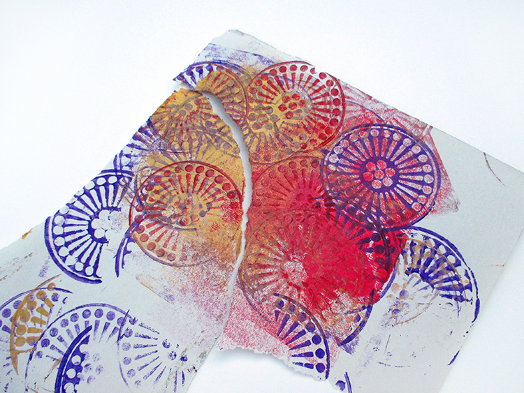
Using the same purple paint that was previously used, stamp the altered SS with the two foam stamps, alternating positive and negative images to fill the space (four complete and four partial circles. Shimmer Sheetz is a nonporous surface. Lift the stamp straight up to avoid smudges, but don’t worry if the images are not perfect. Paint that is pulled just a bit adds dimension and interest.

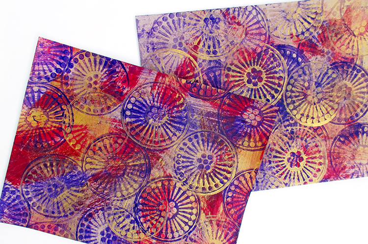
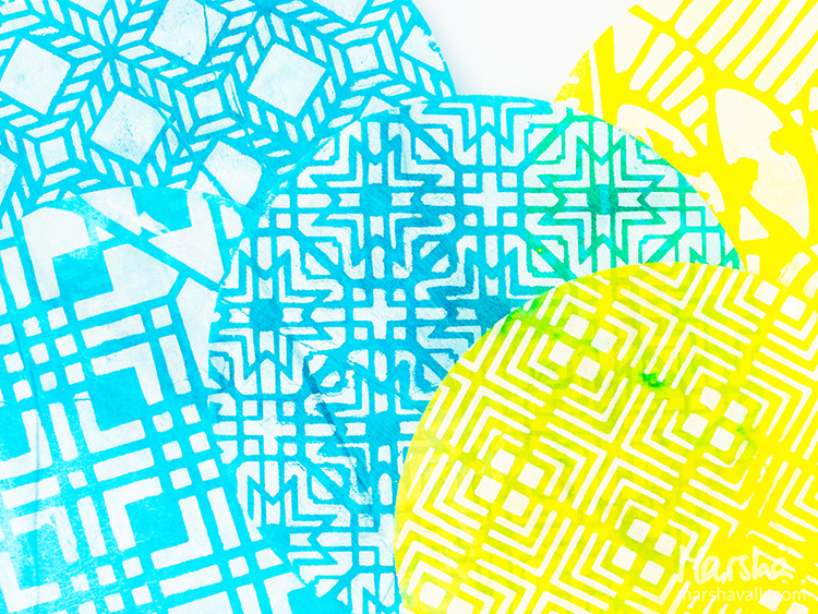
While you’re at it, stamp the circles with purple and Emperor’s Gold paint onto the cardstock and newsprint scraps set aside above.

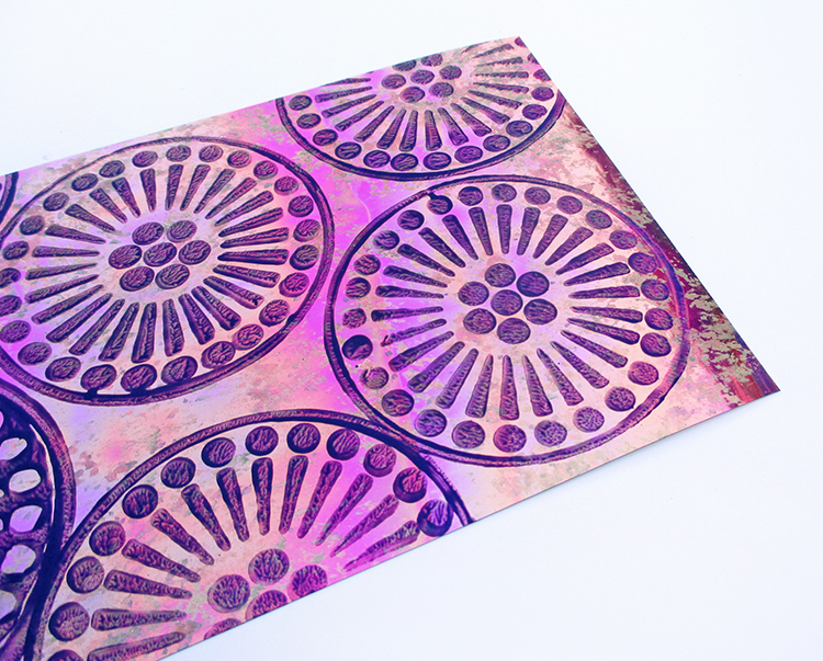
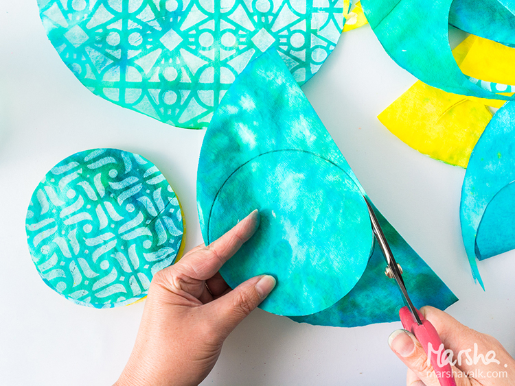
Cut out the circles and the partial circles. Also cut out one lightweight paper circle. Trim the lightweight paper circle to use as a template when cutting the Shimmer Sheetz circle that fits near the almond shape at the bottom right of the fan. Position a full circle toward the left. Then arrange and adhere all other circles as shown, trimming at the edges of the fan after they are in position.

Hold onto the scraps from the circles, returning them to the release sheet to keep the adhesive from sticking to anything on the work table – they’re going to be part of the bonus card projects coming up…

Arrange Red/Gold glitter dots peel-offs around the edges of some of the Shimmer Sheetz circles. If you like dimensional gems, add them as well. In the photo below, I ‘auditioned’ flat-backed faceted gems to show as an option, but I did not glue them in place.

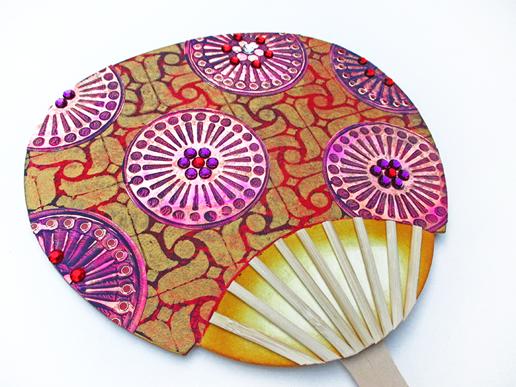
Instead of gems, keep going with LOTS of glitter dots in Violet/Silver, Gold/Silver, and more of the Red/Gold. Be sure to add a tiny one to the top of each of the flat sticks! (To order the dots – The color name is listed first, the metal rim is designated second.)

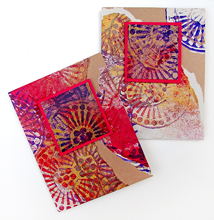
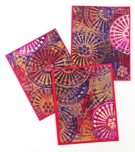
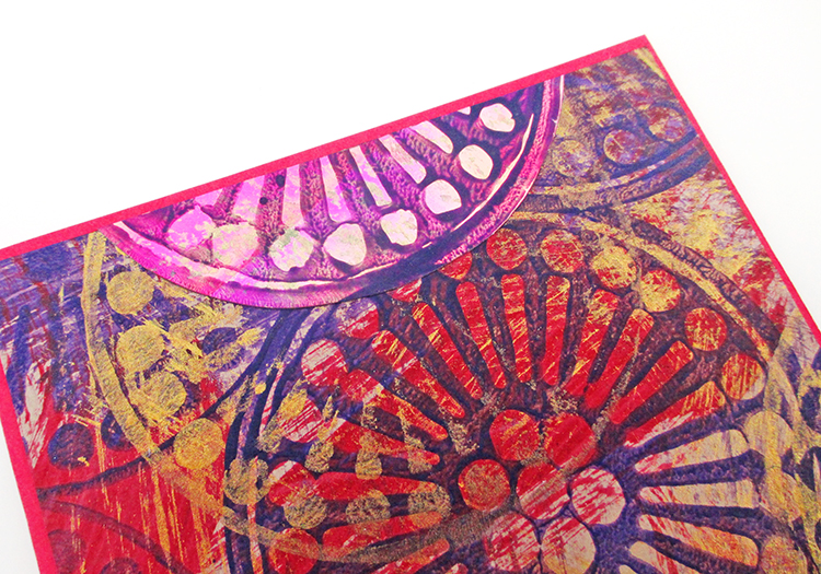
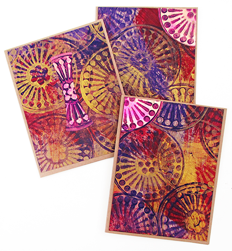
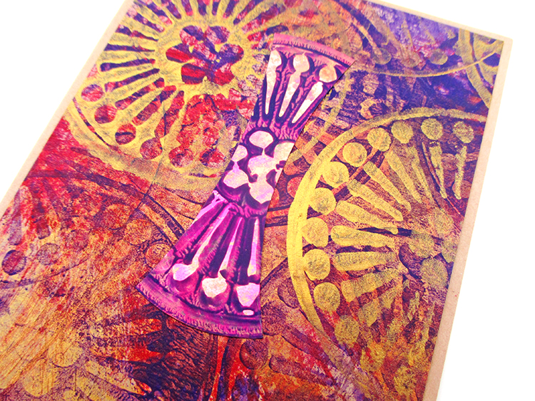
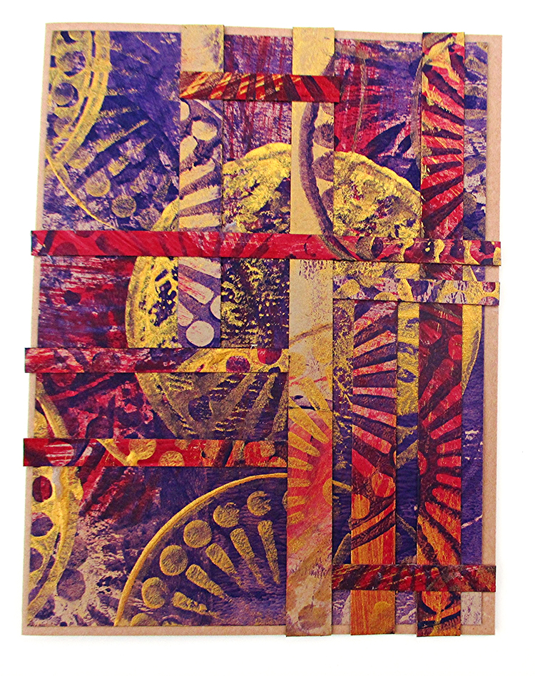
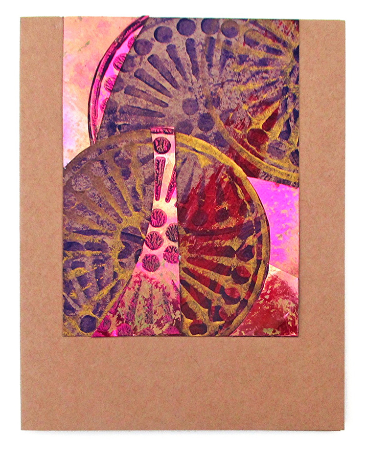
BONUS PROJECT – Use the stamped cardstock and newsprint pieces, plus the leftovers from the stamped Shimmer Sheetz (partial circles as well as surrounding areas) to create a series of collage-style cards! Shown: A2 size, 4.5” x 5.5”, cardstock in red and Kraft brown.

The photo gallery that follows is for inspiration only since it would be impossible to precisely duplicate the randomly stamped cardstock and newsprint.


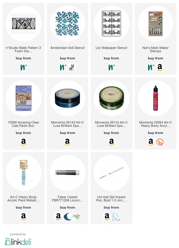
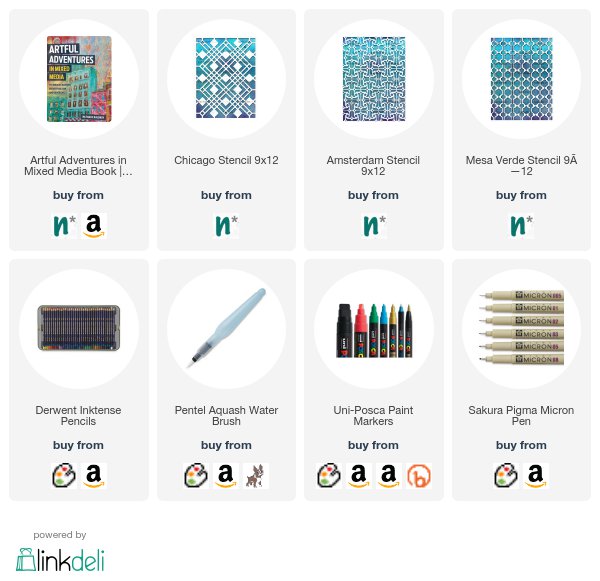
Thank you Judi – love your rich colors and all the different ways to use the stamps and stencil that you’ve shared with us. Just gorgeous! In addition to a fan template and some chipboard or heavy cardstock, here are some of the supplies that Judi used:


Do you feel inspired? I’d love to see what you’re working on with my stamps and stencils. I post projects almost every month in my Inspiration From Around the Globe posts!

SaveSave

SaveSave

SaveSave

SaveSave

SaveSave

Comments (1)

  • Jean Marmo

    |

    I am a big “fan” of Judi’s work. This is just spectacular! Love the many layers and finishing details! Wonderful cards! Thanks for the inspiration!

    Reply

Leave a comment

Art Stroll: 1600 – 1700 Rijksmuseum, Amsterdam

Last month I was lucky enough to go to Amsterdam for a couple days and here is a second Art Stroll from the visit of the Rijksmuseum – this time about the Art from 1600 – 1700

I find a lot of humor in some of the artwork – almost worth making up some memes :)


Militia Company of District II under the Command of Captain Frans Banninck Cocq, Known as the ‘Night Watch’, Rembrandt van Rijn, 1642
The only way to take a photo without plugging through other visitors or being obnoxious with a camera. I always try to be very quick and the least distracting for other visitors in a museum when I take a photo after taking the artwork in.

Now- I have no idea why this the triptych below hung in the hall of 1600-1700 – as it is actually an earlier piece- but ..I will show it since it is stunning


It is the end of the world. The dead emerge from their tombs and are judged by Christ, seated on a rainbow in the sky. He consigns the wicked to hell (right), where perpetual fire and terrifying demons await them. The righteous souls may go to heaven (left): a place of color and light. Peter and Paul, the patron saints of Leiden, are set before a grand imaginary landscape on the outer wings of this altarpiece.Triptych with the Last Judgement outer wings: Saints Peter and Paul, Lucas van Leyden, 1526 – 1527

Beautiful window in the hall


Portrait of a Couple, Probably Isaac Abrahamsz Massa and Beatrix van der Laen, Frans Hals, c. 1622

This happy, smiling pair sits comfortably close to each other. Posing a couple together in this way was highly unusual at the time. It may have been prompted by the sitters’ friendship with the painter and the occasion for the commission – their marriage in April 1622. The painting thus contains references to love and devotion, such as the garden of love at right, and at left an eryngium thistle, known in Dutch as ‘mannentrouw’, or male fidelity.I love the expressions on their faces – you see the painter clearly loved them.

Children Teaching a Cat to Dance, Known as “The Dancing Lesson” Jan Havicksz Steen, 1660-1679, oil on panel

Aweee- poor kitty – I do really hope there was no long posing involved for the poor cat

The Feast of St. Nicholas, Jan Havicksz Steen, 1665-1668, oil on canvas

well …guess the boy on the left wasn’t that lucky for St. Nicolas. You usually get a piece of coal and dry twigs if you weren’t good of a kid  …guess why I know ? ;)

The Drunken Couple, Jan Havicksz Steen, 1655-1665

Of course the cat is just watching the thieves taking their belongings ….LOL

A Mother Delousing her Child’s Hair, Known as “A Mother’s Duty”, Pieter de Hooch, c. 1658-1660, oil on canvas

Oh the joy of being a mother …;)

The Threatened Swan, Jan Asselijn, ca. 1650 – oil on canvas

a swan fiercely defends its nest against a dog. In later centuries this scuffle was interpreted as a political allegory; the white swan was thought to symbolize the Dutch statesman Johan de Witt (assassinated in 1672) protecting the country from its enemies. This was the meaning attached to the painting when it became the very fist acquisition the Nationale Kunstgalerij (the forerunner of the Rijksmuseum) in 1880

The Windmill at Wijk bij Duurstede, Jacon Isaacksz van Ruisdael, c. 1660 – 1670, oil on canvas

Self-Portrait, Ferdinand Bol , 1653, oil on canvas

Ferdinand Bol was a scholar of Rembrandt. Ever thought about the urge of artists of taking a selfie throughout the centuries? I find it funny that people are so upset that people take selfies with a camera – it is not new, just the tools are different and who actually is capable of doing it.


Comments (4)

  • Laura Weed

    |

    I was blessed to visit the Rijksmuseum in the 1980’s (while the rest of my tour did Anne Frank’s House which was just too much for me) and I was absolutely blown away at the size of some of those paintings I had only ever seen in books before. What an immersive experience. Rembrandt is one of my favorites, and I love looking at the expressions on the faces of the people in the backgrounds. So glad you’re sharing this amazing place!

    Reply

    • nathalie-kalbach

      |

      It is a gorgeous museum and I am glad we went back again – there is just so much to see :)

      Reply

  • Sue Clarke

    |

    Portrait of a Couple is just delightful and so unusual for that time period.
    I don’t believe for a minute that you got coal. LOL
    The frame around the Swan is gorgeous.

    Reply

Leave a comment

Art Stroll: Modern Art at the Rijksmuseum, Amsterdam

Last month I spend a lovely weekend in Amsterdam and since we haven’t been at the Rijksmuseum for a while we decided to go :) Now usually the Rijksmuseum is not really what you connect with Modern Art …the more the reason for us to check out the small collection a kind of hidden floor :)

Standing Figure, Karel Appel, 1949 – wood, paint, metal

Shortly after the Second World War a new generation of young artists stepped into the limelight. With their unpolished and improvised painting  and sculptures they celebrated their regained freedom after years of German occupation. Karel Appel looked at artifacts from Africa and Oceania. He thought they were exemplary models of the unspoiled creativity and drive that should form the basis fo art in a free society.

Below two paintings by Karel Appel

Child with Donkey (Kind met ezel), Karel Appel, 1949 – oil on canvas

In 1949 the smoldering eyes of Appel’s figures of children caused a great deal of discomfort among the public, The silent reproach of their gazes even led to his wall painting Questioning Children in the Amsterdam city hall being covered over. Appel began painting children after a  trip through post-war Germany. The misery of the often orphaned, hungry, and begging war children made indelible impression on him.

La Ville Noyèe (The Sunken City), Constant, 1956, oil on canvas

the title of this painting may refer to Atlantis, a beautiful and prosperous legendary island that was engulfed by the sea, according to Greek mythology. When Constant made this painting he was devising his own imaginary society: a city for the people of the future that he christened New Babylon.

Artist Looking at Herself, Marlene Dumas 1983, gouache, acrylic paint, chalk, on paper

Eroticism and her role as a female artist are recurring themes in Dumas’ work. This portrait presents a paintress but whether it is Dumas herself is not clear. We see a women looking through spread legs into  mirror under her. She olds a paintbrush in her left hand, as though she is painting the pictures at this very moment.

Four Virigitns (1-4), Marlene Dumas, 1993- gouache, indian ink

No identification is given for the four women portrayed here by Marlene Dumas. Can they be recognized as famous models, or are the randomly photographed women? That they are virgins is emphatically indicated in the title. Whether this definition applies solely to the women’s virginal stat or refers to their virtuousness is left up to the beholder by Dumas.

Dish Relief, Jan Schoonhooven, paper, cardboard, paint, wood

Like his 17th-century predecessor and fellow Delft artist Johannes Vermeer, Jan Schoonhoven was fascinated by light. His brilliant white reliefs are composed of a few basic forms, whose irregular surfaces make light visible. Here Schoonhoven pasted pieces of cardboard on top of each other to create a design of light and dark lines, which resembles light playing through a cobweb.

Mondrian Dress, Yves Saint Laurent, 1963, wool, silk lining

The abstract geometric visual language of De Stijl in the 1920s inspired a new generation of artists forty years later. The French couturier Yves Saint Laurent won international success with dresses inspired by the paintings of Piet Mondrian. This is the most elementary model of the six variants presented by Yves Saint Laurent in 1965.

Space Circus, Constant, 1956 – 1961, soldred wire

This is not just a sculpture in its own right, but also the model of a meters-high construction that Constant wished to install on the Museumplein in Amsterdam. The small ladders indicate that it was meant to be climbed. This giant climbing frame was part of New Babylon, Constant’s imaginary metropolis of the future populated by homo ludens, or man the player.

Man and Machine, Marinus Johannes Hack, c. 1913, sandstone

This statue stood at the entrance of the Amsterdam office of a company that exported machines to Dutch businesses in the former Dutch East Indies. The Javanese man, nude and sitting cross-legged, symbolizes the colony. The modern diesel engine in his lap alludes to the company’s trading activities, as well as to the progress that the Netherlands hoped to bring to Indonesia.

….mhhhh….

Portrait of Marie Jeanette de Lange, Jan Toorop, 1900, oil on canvas

Marie Jeanette de Lange chaired the Vereeniging voor Verbetering van Vrouwenkleding (Association for the Improvement of Women’s Clothing), which championed hygienic, loose-fitting, natural clothing that allowed women greater freedom of movement. In February 1900 she posed at home, dressed comfortably, for Jan Toorop. Using tiny dots of colourful paint, he created a sparkling portrait of a modern woman on the threshold of a new century.

Road through the Woods, Jan Sluijters, 1910, oil on canvas

Self Portrait, Edgar Fernhout, 1945, oil on canvas

Edgar Fernhout often painted himself by way of practice, coolly and objectively as though he  were an object. However this is not the case of this self portrait done in the last year of the Second world War; Five years of German occupation and a famine, the so called Hunger Winter 44-45, show in his gaze and gaunt face. After the war he abandoned realism and painted mostly abstract landscapes.

Mercedes de Barcelona, Pyke Koch, 1930, oil on canvas

the playing cards in this picture suggest that this woman is a fortune teller. Her large unreal eyes, too, seem to suggest some mysterious fate. In 1930-31 Koch painted three women of “questionable virtue”; in addition to the fortune teller, he portrayed a street girl and a fairground woman. He gave all three the facial features of the Danish film star Asta Nielsen, whom he so admired, with a broad mouth and high arched eyebrows.

Composition, Bart van der Leck, 1918, oil on canvas

Bart van der Leck, one of the first artists to become involved with De Stijl magazine, limited his palette to primary colours – red, yellow and blue – along with neutral white, black and grey. He always took a recognisable design as his starting point, reducing this to a Composition of pure, geometrical forms. He described what he tried to achieve as ‘monumental clarity

Composition, Jozef Peeters, 1921, oil on canvas

As editor of the cultural magazine Het Overzicht Jozef Peters maintained  close contact with other pioneers of Abstract art, such as the Dutch artists affiliated with De Stijl journal as well as up-and-coming talents including Carel Willink. Although Peeters championed pure Abstract art divorced from reality, his daughter later wrote that the Paris Underground was the inspiration for this Composition

Composition Liebe (Love) Carel Willink, 1923, oil on canvas

In Berlin of the 1920s the disillusionment of a lost war (1914-1918) was drowned in drink, lust, and love. However, art and culture also flourished as never before. In this melting pot the young art student Carel Willink soaked up the influences of Italian Futurists, Russian Constructivists, French Cubists and German Dadaists like a sponge. All of these styles reverberate in this painting, in which figures merge in the lamplight of the metropolis.

Self Portrait , Elly Tamminga, ca. 1920-55

Elly Tamminga peers at the subject she is painting outside the picture plane. The paintbrushes in the vase are her tools. The sailing boat of the silhouetted village with a church tower on the embankment behind her are small and therefore farther away in the distance. Atmospheric perspective is avoided, however and volume is suggested only by the two shades of red in her face and blue in her hair.

It was a really interesting art stroll through Modern Art – and I loved getting introduced to some new to me but well known Dutch Artists as well. Hope you enjoyed this Art Stroll as well :)


And if you missed my Summer Sizzler sale, don’t worry you can still save $$ on my stencils over at the big Mary Beth Birthday sale at StencilGirl! Use the coupon code MBS14 to save 14% off, now through July 8th at 11:59pm CST.

Receive 14% OFF all my StencilGirl stencil designs HERE!
Use code:  MBS14
$100+ orders** CHOOSE 1 FREE Large STENCIL***
***You MUST put the L### in the comment box at checkout. Sorry, no exceptions.
**6 of the same size 10% discount is applied first! $100+ orders post-discount.
*Sale does not apply to wholesale accounts or StencilClub membership.
The stencil sale begins July 6th and ends July 8th at 11:59 p.m. CST

SaveSave

Comments (1)

  • Janene

    |

    There are so many things to comment on:

    The Yves St. Laurent dress: I wish it was hanging in my closet. It’s still classically beautiful even though it’s 55 years old.
    The Elly Tamminga work: love the colors and the strength she exudes.
    The “Portrait of Marie Jeanette de Lange” by Jan Toorop: all those tiny dots! I wonder if there’s an underpainting to help guide the color placement. I’m in awe.
    The “Man and Machine” sculpture: I’m not sure I would interpret it as “modern diesel engine in his lap alludes to the company’s trading activities”. I think it says something else entirely.
    And there are no words for the brilliant placement of the nails in “Standing Figure” by Karel Appel.

    Thanks for the amazing virtual visit to the Rijksmuseum.

    Reply

Leave a comment

Rondvaart – Painting

This is a small painting I made after I came back from a trip to Amsterdam.

After a canal boat tour I knew I wanted to capture the scenery.

The painting measures 10″x8″ created with acrylic paint, ink, marker and spraypaint on canvas and …it would love to find a new loving home :)

Also :) Don’t forget:

Today is the last day of our huge Summer Sizzler Birthday July 4th Happy Summer SALE! (Yep I’m celebrating a lot of stuff lol) Just use the coupon code HAPPY20 when you check out to save 20% off ALL physical products in nathaliesstudio.com/shop including rubber stamp sets, NEW ArtFoamies stamps, stencils, my book, my original paintings and prints, mugs with my artwork on them and lots more  The sale ends July 5th and quantities are limited so stop in today.

Leave a comment

Currently Digging – July 2018 AIT

Once in a while I thought I would share with you some nifty finds – like an Artist who’s work caught my eye…, some Inspiration or the what, when and where that caught my eye and got my creative juices flowing, and Tools & Techniques I am currently digging like a new way to use a material or an application that I’m taking away. Hope you enjoy this.

Here we go for this month:

HuskMitNavn – yep …not a typo. I love his artwork! He is Danish, he is from Copenhagen and I found him on Instagram and ever since I am looking forward to his posts.

They are witty, they are fun , they make me smile and they are so good!

Go and follow him on instagram!!!

Traveling is such an inspiration – recently I have been to Amsterdam and walking around, taking pictures and just embracing everything that is different from what you know inspires me. As you might know I am a big advertiser of this kind of inspiration – and …shameless reminder – LOL- I wrote a book about it ;) Artful Adventures in Mixed Media. So when I came back from my trip I made sure to start painting right away. Below is the work in progress of a painting – only the underpainting is applied.

I am excited that I went to the studio right away and cannot wait to share with you some time the finished painting. BTW- am I the only one who sometimes finds the underpainting quite striking (or is this just procrastination talking out of me- hahahaha)

Ever since I took a denim mending course last year at the Textile Institute and also released my Embroidery Stamps – I am hooked on embroidery :) It is one of my favorite things now to do in the evening.

I love that you do not need much – some fabric, some pretty embroidery thread or simple thread, some scissors (mine are foldable -best gift EVER- thanks Val!), a hoop  and a needle– bang there you go :) I am not really good at it and every person who is good in embroidery will shake their head, but who cares. I have fun and this is not something I do to have as a heirloom forever. I have a couple fun ideas planned for the next couple weeks and will show you soon – maybe I get you hooked up on this as well !

Hope you found the things I am currently digging interesting and see you soon again with some new finds!

SaveSave

Leave a comment

Inspired by: Amsterdam

A couple weeks ago my husband and I spent a couple days in Amsterdam. Amsterdam will always hold a special place in my heart, because that is the city my husband and I actually got together :)

We stayed in an Airbnb apartment which was amazing and in a house from the 15hundreds – the top photo is the view out of the bedroom window – pretty cool

Of course we went straight to a cheese store ..well we had to do some grocery shopping and that includes getting good cheese …Oh man, heaven!

We also took a little Canal tour – for the hundreds time- but it never gets old. Look at those pretty houseboats

and houses

and bridge corners

and did I say houses?


It was a bit of a gloomy day but still nice enough for the tour

I already started painting some of the views – just so beautiful!

We also walked a lot and that requires some refreshment and people watching at one of our favorite bars for that .

And everything looks even prettier when it gets dark

I fell in Love with the houses below while waiting for the tram close to the Rijksmuseum.

All the details- swoon.

And we went back to the one windmill in Amsterdam – which houses the Brewery I’TIJ’ which we have been visiting for 20 years and has changed and hasn’t :)

we spent a lovely afternoon there with drinks, cheese with celery salt etc. and some friends. It was a really good short trip. I do miss the possibility of going to a different country by train or plane in just a couple hours, so I am glad we were able to sneak this little trip in when taking care of some matters in Germany :)


Comments (2)

  • Jean Goza

    |

    Loved the photos. Amsterdam has been on my bucket list for awhile. I agree about travel in Europe. I love the ability to hop on a train or plane and be in another country so quickly. Very cool!

    Reply

    • nathalie-kalbach

      |

      Jean – you would love it or sure! Amsterdam is awesome!

      Reply

Leave a comment

Reduce, Reuse, Recycle with Marsha Valk


Hello again from the Creative Squad! Today we have a gorgeous gift wrapping project from Marsha Valk that is sure to send you running to your kitchen for some coffee filters :) Marsha used a whole slew of my stencils on this one (so be sure to check the materials list at the bottom) to rock the theme: Reduce, Reuse, Recycle – Let’s do Mother Earth a favor this month and use what we already have.  Maybe we’ll dip into our stash of leftovers from other creative projects or maybe we’ll repurpose something unexpected.  This month we’re thinking about how artmaking can impact the environment and we’re trying to make our footprint just a little bit smaller.


Reduce, Reuse, Recycle – that’s a topic that has been on my mind a lot lately. I have a lot of different craft supplies. I like to donate any excess supplies I have, but I still have plenty left that I’m reluctant to get rid of because I don’t want to waste it and it may come in handy someday…

The upside to this is that I’m never short on stuff when it comes to gift wrapping!

Paper flowers make fun and easy gift toppers, so I for this month’s prompt I decided to make coffee filter flowers.

I’ve shared how to create similar flowers on the Gelli Arts® blog before:

Using brand new (bleached) coffee filters for a craft project probably isn’t the greenest choice you can make. If you are looking for an environmentally friendlier option, you can recycle used coffee filters.

Unfortunately I don’t have access to a coffee maker that uses filters like these, so I haven’t tested it for you, but I believe you can rinse and dry them. They will be stained, but that will actually add interest to the paper (and the flowers).

Step 1: Monoprint a couple of coffee filters with your Gelli Arts® printing plate using stencils and (white) acrylic paint. Here I’m using Nat’s Buenos Aires stencil.

Step 2: Stain the monoprinted coffee filters with spray inks.

Wet the coffee filter with a spray bottle of water before you spray on the spray ink. The water will help the spray ink spread across the coffee filter, this one has Nat’s Toledo stencil pattern on it.

You can stack the coffee filters you want to have the same colour while spraying. Each new filter will absorb the excess ink from the already sprayed ones!

Leave the coffee filters to dry completely.

Step 3: Cut two smaller circles out of each coffee filter. I folded each coffee filter in half and used a jar to trace a circle shape onto them to get a uniform size.

Step 4: Fold the circles into eighths (or more) and cut leaf shapes. Make sure to cut some larger and some smaller.

Step 5: Unfold the coffee filter flowers and stack two or three on top of each other. Secure them by sewing one or two buttons in the middle of each stacked flower.

Fluff the petals until you are happy with the result.

Step 6: Use a glue dot or double-sided tape to adhere the flowers to your gifts!


I love this Marsha – such a great way to dress up a gift! In addition to buttons and ribbon, Marsha used the following supplies (some are affiliate links):


Play along with us too: I love to see how you interpret our monthly themes. Email me how you used my stencils and stamps with the theme and email me an image – I would love to share your projects in my next  “n*Spiration From Around the Globe“.

Leave a comment

Reduce, Reuse, Recycle with Tina Walker


Hello my friends! It’s Tuesday and time for a project from my Creative Squad. Today we have a beautiful and clever book created by Tina Walker who reused two old projects and gave them a new life :)  Tina used my Batik Pattern 3 foam stamp, my Amsterdam 6×6 and Lily Wallpaper stencils, and my Marks stamp set to help her with this month’s theme: Reduce, Reuse, Recycle – Let’s do Mother Earth a favor this month and use what we already have.  Maybe we’ll dip into our stash of leftovers from other creative projects or maybe we’ll repurpose something unexpected.  This month we’re thinking about how artmaking can impact the environment and we’re trying to make our footprint just a little bit smaller.


Hi! Tina Walker here today with a new month and a new theme and…… my last Creative Squad post. :(  I have SO enjoyed my time as part of Nat’s Creative Squad family and will truly miss this part of MY monthly creative process. But don’t despair, I will still be around and will see y’all in cyber-land. Thank you again Nat! And thank you to this wonderfully creative community.

September’s theme is Reduce, Reuse, Recycle. These three (little) words have such a strong, powerful meaning in today’s world and have a very special meaning for me. I am hosting a year long project called, The Sustainable Souls Project, where a group of like-minded artists are creating awareness about sustainability topics and how we impact the world and the environment. Our very own Nat was a Guest Artist for two months and we thoroughly enjoyed her vision. For today’s project, I expanded the idea of repurposing, to include my art. I will show how I recycled two past, uninspiring projects into one new project that I am happy to share.

Several months ago, I created these two projects, ironically as part of a Creative Squad post. I never shared them and created something else, so how perfect to repurpose them into something new for this month’s theme?

Here’s a peek at my two (previously) created projects.


Using part of both projects, I created a larger mini journal, that can be functionally used or displayed. Let’s take a look.

I deconstructed the book and home décor hanging, removing the embellishments, ribbons, and papers. Using the papers as the base for my new book, I repeated the same Batik Pattern 3 foam stamp for a cohesive look.

Next, I repeated the same Lily Wallpaper stencil for more cohesiveness and added stamps from Nat’s Marks stamp set.

Using one of the paper pages, I created a binding for the entire journal and added it to the inside of the previous mini book covers.

Since the previous mini book was narrow, I wanted my new cover to extend the width of the folded-out pages. I machine-stitched the home décor hanging piece to the new cover. I used the Amsterdam stencil here for the background. I also added a piece of string, a button, and the metal hanging embellishment from the previous projects to my new cover. It went from drab to fab in a quick minute.

Just a few last details and my new book is ready for assembling. Here’s a peek at several of the inside pages.

I am so happy with the ‘new’ result and I am glad for the challenge.

Do you re-purpose old, unwanted projects? Yes? We would love to see them.

I hope you enjoyed my project today. Have a great day!


Thank you Tina for your (re)creation!  :)  In addition to vintage papers, jewelry findings, buttons, and twine, Tina used the following supplies (some are affiliate links):


Play along with us too: I love to see how you interpret our monthly themes. Email me how you used my stencils and stamps with the theme and email me an image – I would love to share your projects in my next  “n*Spiration From Around the Globe“.

Comments (4)

  • Karen Bearse

    |

    Love how you combined 2 projects to make this hip, funky original arr journal. Very inspiring!

    Reply

  • Sue Clarke

    |

    Clever, pretty, green and gorgeous Tina!

    Reply

Leave a comment

Artful Adventures – Marsha Valk


Hello my friends! Today we have a post from Marsha Valk from the Creative Squad. She is sharing an art journal page from a journal that she created just for taking Artful Adventures :)  She uses my Amsterdam, Chicago, and Mesa Verde stencils, and this month’s theme: Artful Adventures. Are you planning an Artful Adventure this summer? Whether it’s a day at the beach or a full blown International Vacation, don’t forget to take the time to soak up the uniqueness of your new surroundings and gather some inspiration for future artmaking. This month we’re turning to Nat’s new book Artful Adventures in Mixed Media, to help us find inspiration as we travel. We’ll be noticing color, shape, texture and more and then we’ll be taking that to the studio to help inspire some mixed media projects. Join us in the adventure!


I’m not going away on vacation this Summer. We were planning to, but it just didn’t happen. And that’s OK because when you read Nat’s new book ‘Artful Adventures in Mixed Media’, you quickly realize that you don’t have to go far to experience an artful adventure!

I was set on taking inspiration from the city I live in, and the photos I had taken during the Artful Adventures Stroll Through The Hood Challenge leading up to the release of the book. You can see the photos I took during the challenge here.

But when it came down to creating I took one look at my Wanderlust stencils and changed my mind!

The Chicago stencil reminded me of the floor of the place in Amsterdam we had lunch recently. And the Amsterdam stencil reminded me of the logo of the ice cream place we went to after that. And the Mesa Verde stencil…

All these stencils combined told another story: the story of a beautiful day in Amsterdam. Not Amersfoort. Amsterdam!

So I took my art-on-the-go kit into the yard and explored what this day in Amsterdam would have looked like in a travel journal (a regular Midori sketchbook), had I been on vacation.

I even did the Observation exercise from the book to remind myself of what I saw and felt that day. I also went online to collect images of things I hadn’t photographed or wasn’t allowed to take photos of at the time (museum).

My art-on-the-go kit doesn’t include Inktense watercolour pencils, but I decided to use these with the stencils instead of my regular watercolours.

Watercolour pencils are a great addition to an art-on-the-go kit though, because you can use them as a regular coloured pencil as well as activate them with a waterbrush: I used a warm red Inktense pencil without water to colour in the openings of the Mesa Verde stencil.

The Chicago and Amsterdam stencil designs were first traced with the pencils before I used a waterbrush to pick up the pigment from the same pencil and coloured inside the lines.

The red watercolour background is created with regular watercolours, and I used Posca markers to draw and colour the black tree.

It was super relaxing to create like this, with limited supplies, having to pause to wait until the watercolour was dry. And I especially love that I have this particular day recorded in a journal now!


Thank you Marsha for sharing your vision of an Artful Adventure in Amsterdam! In addition to her sketchbook, Marsha used the following supplies (some are affiliate links):


Play along with us too: I love to see how you interpret our monthly themes. Email me how you used my stencils and stamps with the theme and email me an image – I would love to share your projects in my “n*Spiration From Around the Globe“.

Leave a comment