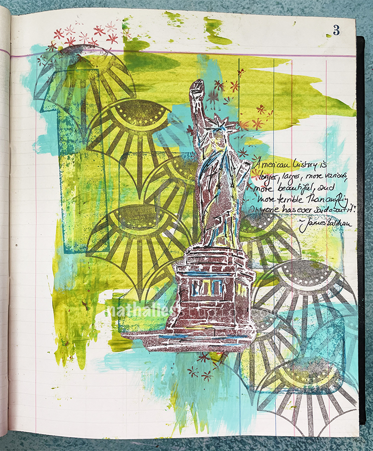
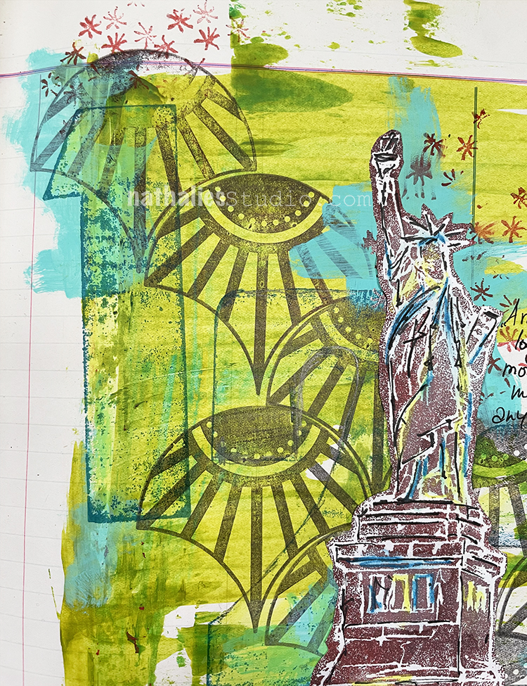
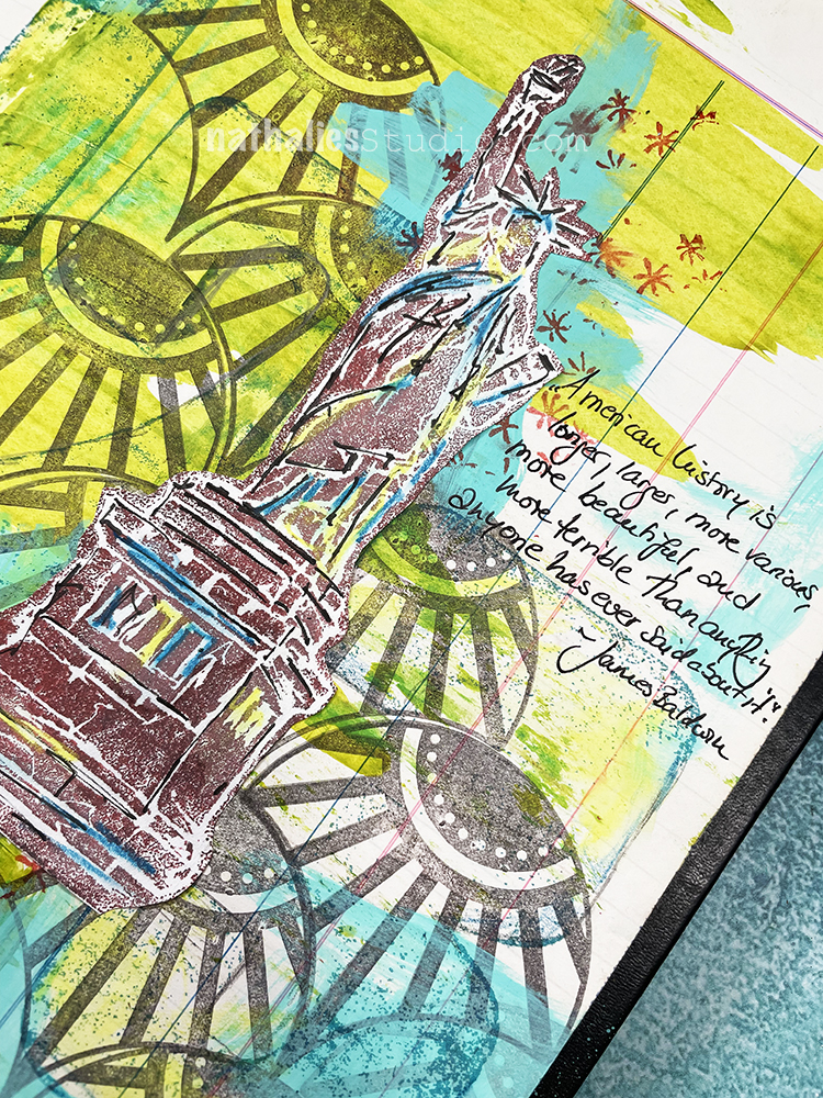
“American history is longer, larger, more various, more beautiful, and more terrible than anything anyone has ever said about it.” – James Baldwin
I used a credit card to spread some acrylic paint and gouache onto the ledger page over my Fan-tastic stamp. Next I inked up wooden number blocks and pressed them onto the page – as they were wood the image is not very prominent without a press, so I enhanced and outlined a little bit by tracing and coloring on with aquarelle pencils. I left that partly as is, and partly spread it around with water.
I stamped some stars using my Star Fish rubber stamp as a complementary color in red to the green background. I also stamped my Lady Liberty foam stamp with Versafine ink onto a piece of paper, added some marks with Aquarelle Pencils and a journaling pen, then adhered it to the background as well. I finished it up with my journaling.
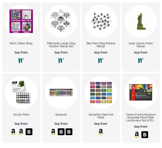
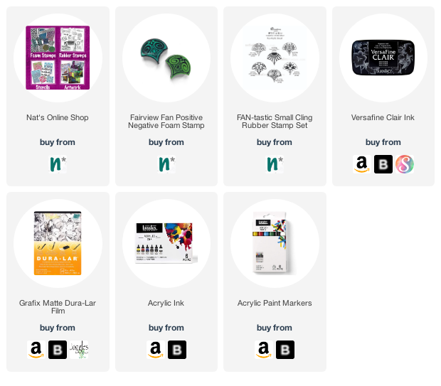
In addition to my large letterpress wood numbers, here are some of the supplies I used:
Happy Monday and welcome to another pattern in my big vintage ledger! Today I’m using a couple rubber stamps that just work great together for making fun patterns. The stamps from my Circle Jumble Large and Fantastic Large sets all fit nicely together and offer a bunch of options for different combinations. Here is one:
Take a look at the finished pattern and the stamps I used:
Happy Monday my friends – time for another pattern in my big vintage ledger! For this one I used my Solid Fan Large, Fan-Tastic Large, and Mini Motifs rubber stamps. I kept this one simple and bold with that solid fan. Check it out in the following video:
Here is a look at the finished pattern and the stamps I used:
Happy Monday everyone – time for another pattern in my big vintage ledger! For this one I used my Floral Tile Large, Fan-Tastic Large, and Fan-fare rubber stamps. I like the way this turned out – it always surprises me what you can do with a few stamps and 2 colors. Check it out in the following video:
Here is a look at the finished pattern and the stamps I used:
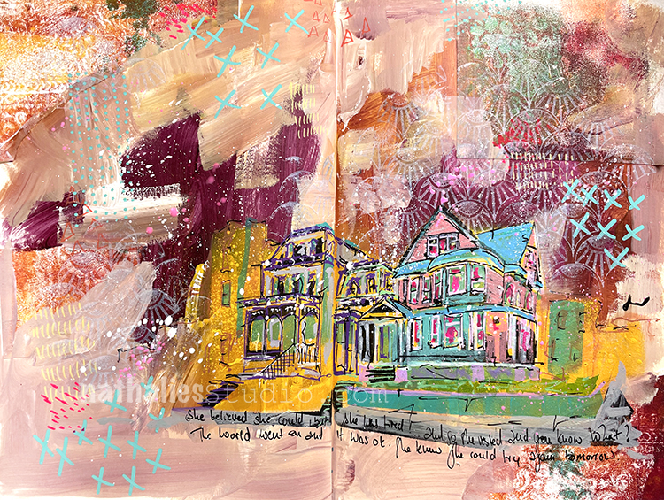
“She believed she could but she was tired…so she rested and you know what? The world went on and it was ok. She knew she could try again tomorrow.”
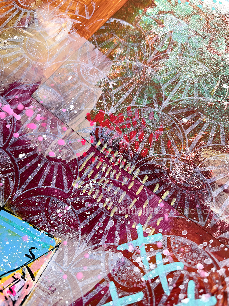
I created my page using gelli printed collage paper (actually from the bag from Sarah in ArtCollab Episode 2 – I used it as a texture tool with a gelli plate), Posca and Liquitex markers, gesso, my Fan-Tastic rubber stamps and the new white Moonlight ink pad. I am really happy with how the layers and color palette came together.
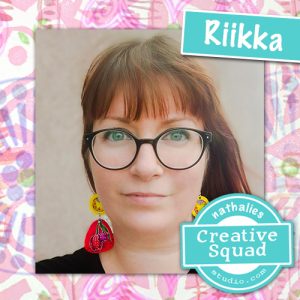
Hello from my Creative Squad! Today we have a really lovely post and video from Riikka Kovasin who is sharing some of her travel memories with us in her mini billboard project, using my Fan-tastic Small stamps and our theme: In the City – Although we aren’t traveling much these days, let’s reminisce about a time we traveled to another town or city. Think about the flavor of the place and let that guide your color and design choices.
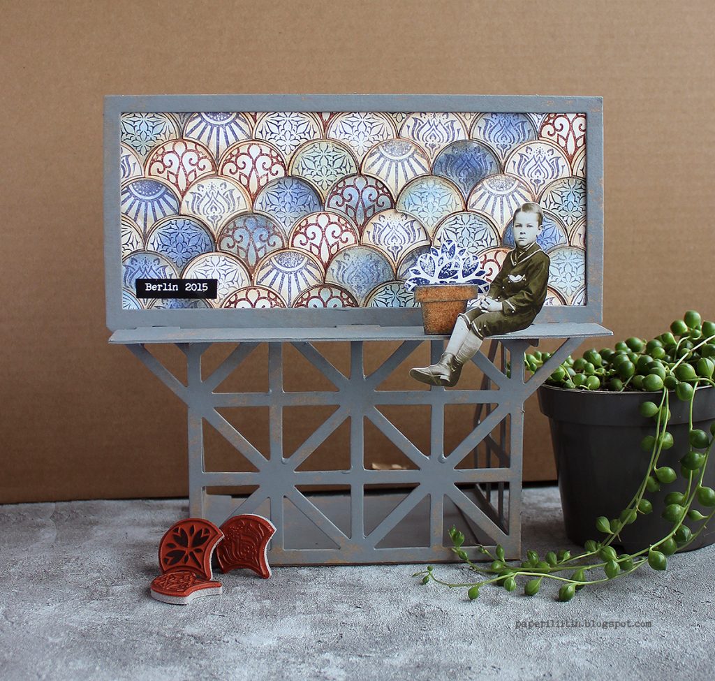
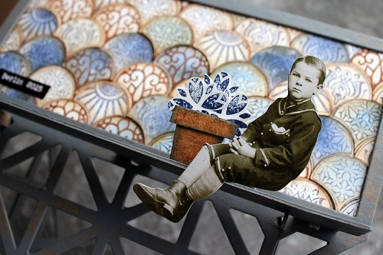
Moikka! It’s Riikka here today sharing my May project with you! I was excited to get this Billboard Model Kit to play with. I drew inspiration from a couple of different cities or travels.
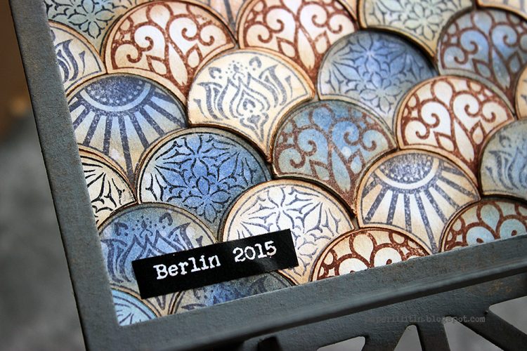
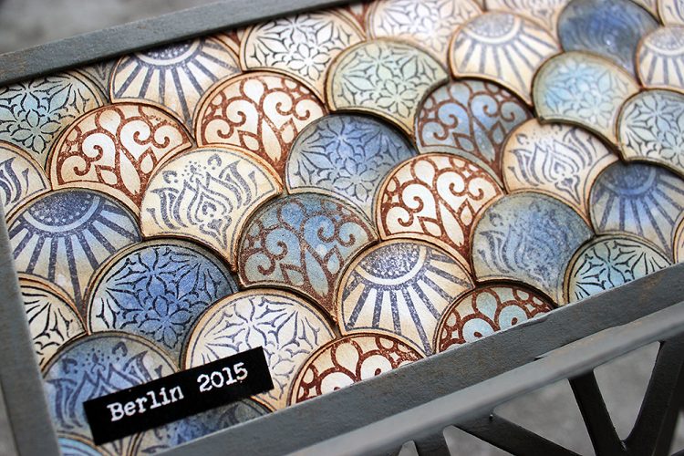
The biggest influence was Berlin where we traveled for a family vacation back in 2015. There was a lot to take in but somehow the most vibrant mental images are of grungy surfaces and tiles. We had a room in a hotel/hostel that was built inside an old apartment building. The staircase of the place was just amazing – it screamed history with the polished wooden handrail, ironwork columns for the handrail, painted walls with decorative motifs and a tile laid floor just behind of the massive front door. I can’t remember the actual patterns of the tiles, but I remember feeling a little sad each morning when we left to go about the town as a couple of the tiles were missing and there were gaps in the beautifully decorated floor.
I chose the Fan-tastic Small stamp set to represent the tiles and their patterns. I used three different stamp inks to stamp the patterns and colored some of the tiles blue in a later stage of creating. I’m pretty sure the Berlin tile floor was in the colors of browns and cream, but still I went with blue as the accent. Even though I brought a lot of the brown to the piece by inking the edges of the tiles, I guess the blue has its origin on another trip and city. The blue takes me to 2013, to Amsterdam, Utrecht and especially Amersfoort. The blue is related to a tile Marsha Valk showed me when visiting her beautiful home.
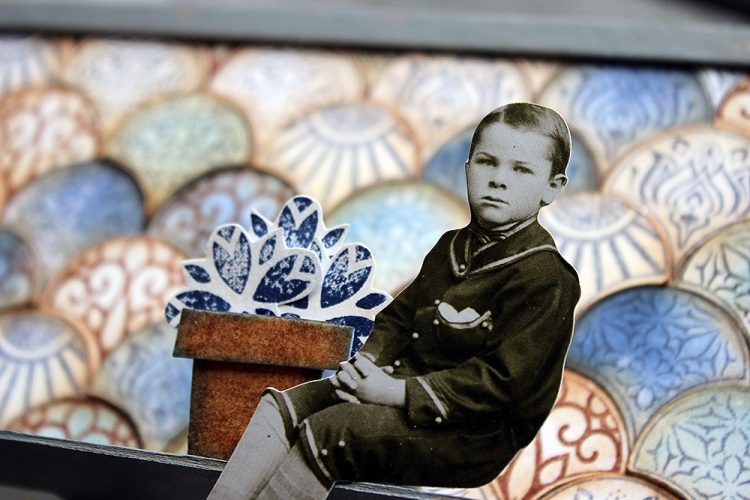
But besides Berlin and Amersfoort, there’s still one more city that inspired a detail to this piece. That’s Ischia. The colors are all wrong for that but coming off the ferry from mainland Italy to the island, there was a flowerpot with vibrant red geranium on a windowsill of one bright white building. Sunny day made the colors so vibrant, it felt like saturation was up by 100. The window with the flower was the only window on that side of the house and the flowerpot got etched into my brain vividly. So, while my piece has tulips and they are blue, the idea of this detail came from that mental image.
I recorded a little video while working with the billboard. The camera angle is a bit off in the end as I assembled the piece before adding the finishing details, but I hope you can still see my process.
Thank you for stopping by today! Wishing you a lovely week and great travels though the different memories!
Thank you Riikka – was so nice to hear the travel inspiration behind the color and pattern choices that you made and to see how you incorporated that into the piece.
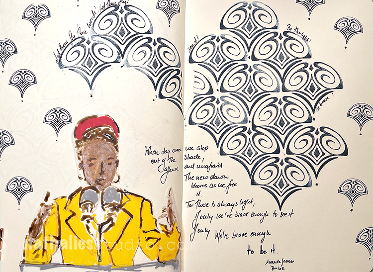
When day comes we step out of the shade, aflame and unafraid The new dawn blooms as we free it For there is always light, if only we’re brave enough to see it If only we’re brave enough to be it
-Amanda Gorman
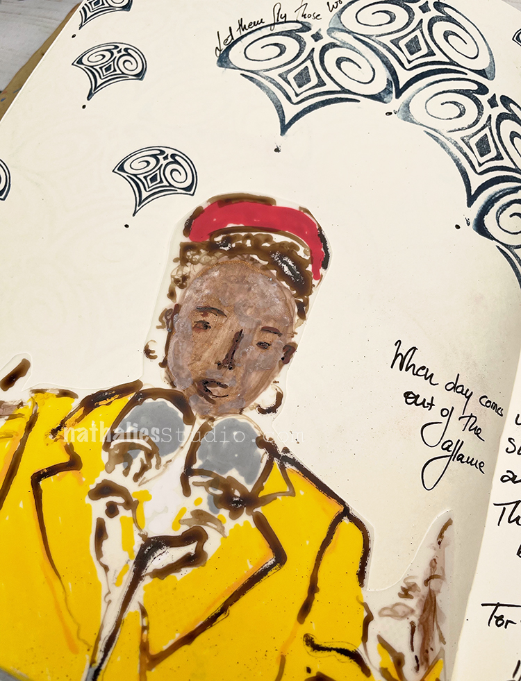
I was so inspired by Amanda Gorman’s poem from the presidential inauguration, and particularly the final lines.
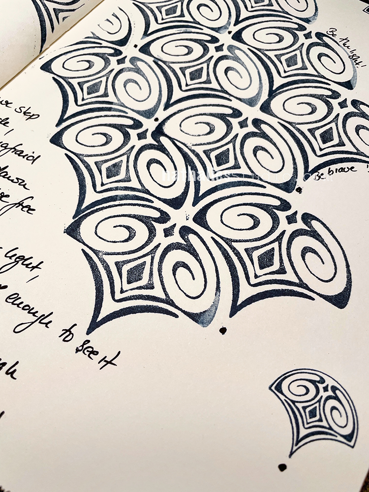
For my background I used my Fairview Fan foam stamp and also the Fairview rubber stamp from my Fan-tastic Small set. I added little dots under some stamps to make them look like exclamation marks – words fly…
I sketched Amanda on Dur-a-lar matte with acrylic ink and paint markers.
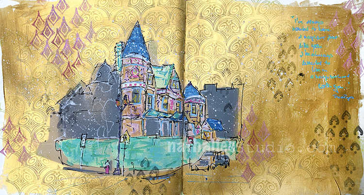
“I have always wanted to have a neighbor just like you, I’ve always wanted to live in a neighborhood with you.” – Fred Rogers. We didn’t have this program in Germany when I was a kid but I’ve come to know of it now that I live here in the US. Definitely gives you warm fuzzy feelings :)
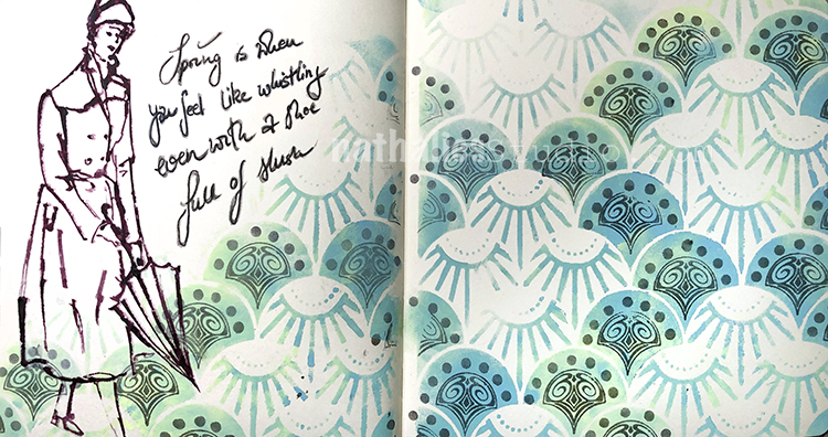
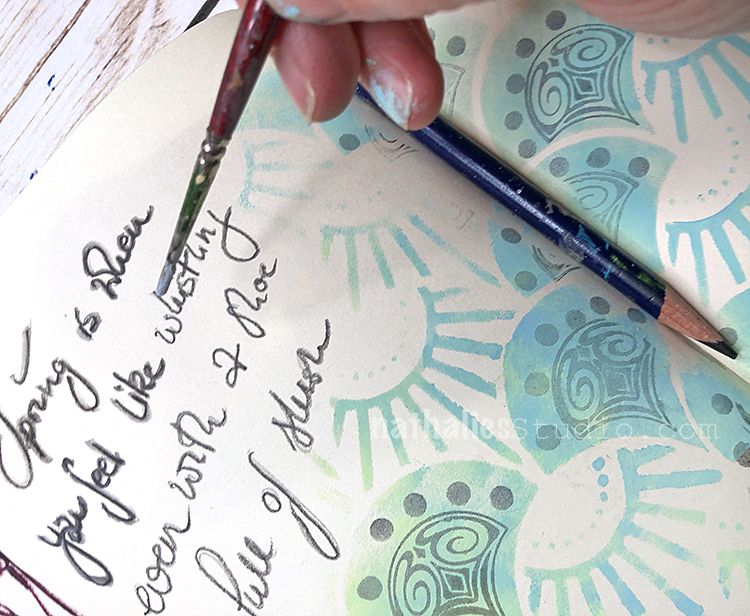
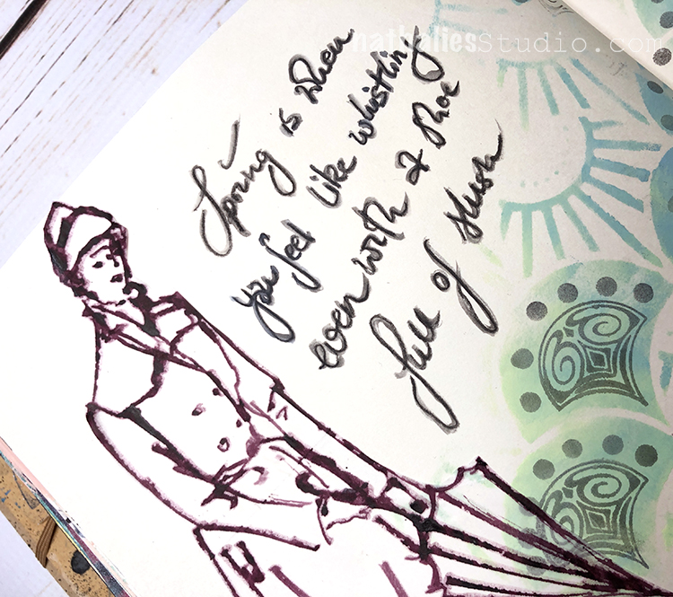
“Spring is when you feel like whistling even with a shoe full of slush!” It hasn’t been much of a winter yet here but I am always more excited for warm Spring weather than the cold :)
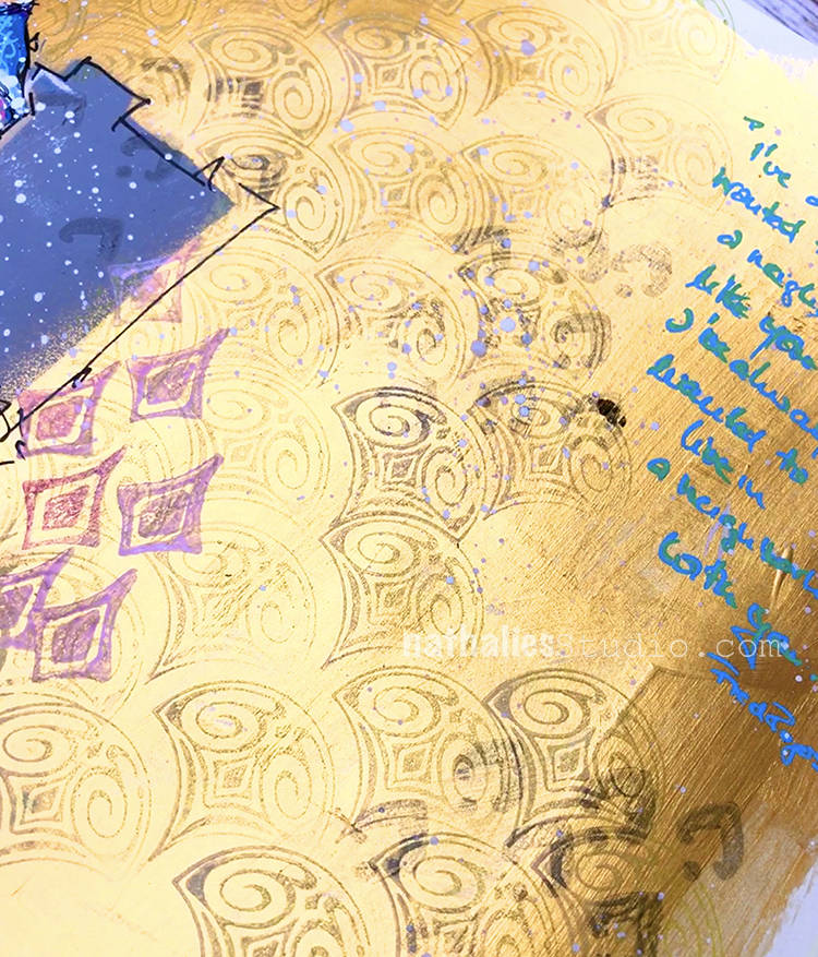
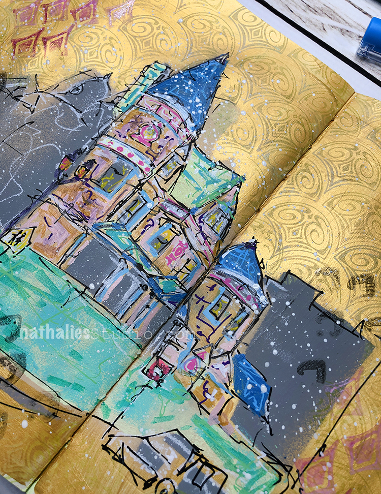
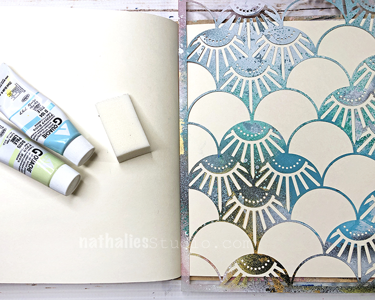
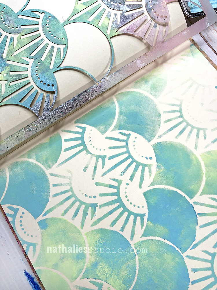
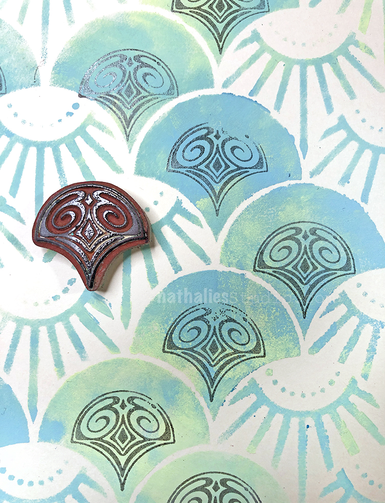
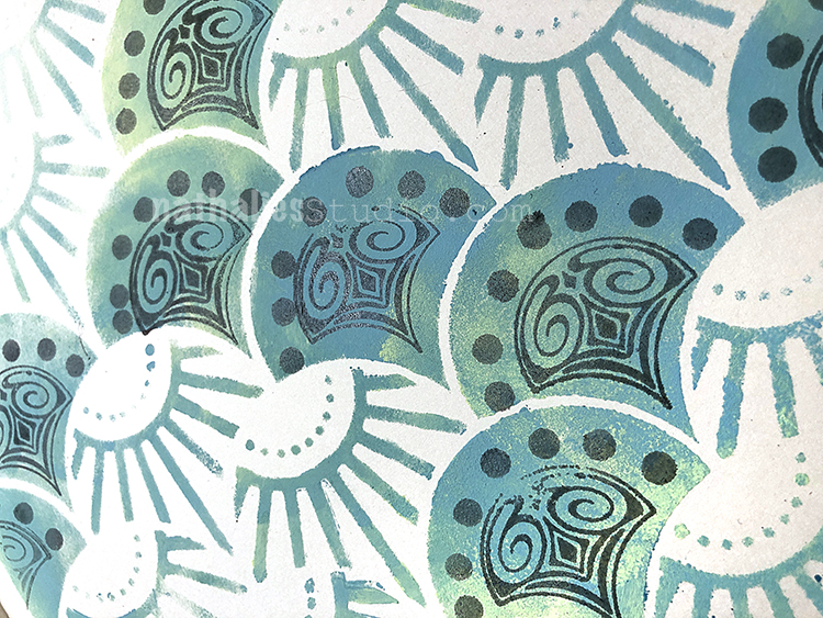
For my background I used gouache paint and a cosmetic sponge with my Art Deco Summit stencil.
I went back and forth with the two colors. I like this stencil because it combines some fine detail with larger areas of color.
My Fan-tastic rubber stamps fit in there quite nicely. Here I used one of the small Fairview stamps.
For my quote I used a Derwent watersoluable pencil and then went in with a wet brush to oomph up the lettering.


Comments (1)
Robin
| #
I love the combination of colors, stamps and lady liberty! This page is so beautiful!
Reply