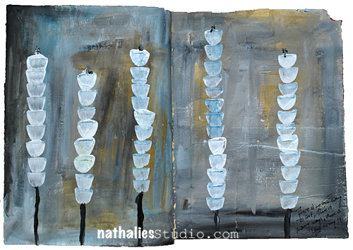
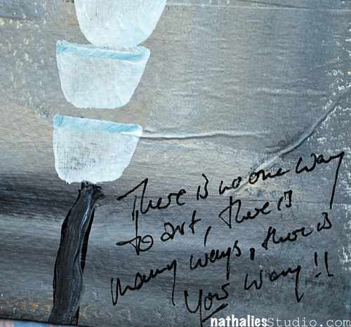
There is no one way to art, there is many ways, there is YOUR way!
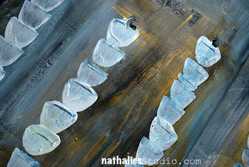
I was experimenting a bit with a different color combination here and I really like the outcome.
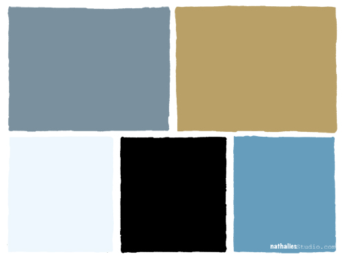
I used Liquitex Soft Body Paints: Titanium White and Mars Black to mix a grey, and mixed the Bright Blue with the Titanium White to mix a lighter blue. I also added Iridescent Bright Gold to the page. I love how it came out.
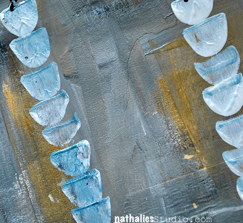
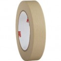
I did sculpt the plants a bit with the brush – most of the background texture however comes from the masking tape that was layered to the paper.
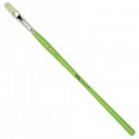
Here is the supply list

I am using grey a lot lately- is that a color that you often use?
Nat


Comments (12)
Lisa Flaherty
| #
I bet this is really striking in real life with that gold iridescence! Great color combo and texture. I love grey. I wear it all the time, but don’t find myself creating with it too often. That needs to change!
Reply
nathalie-kalbach
| #
Glad I made you think about using grey in your creative projects ;) have a wonderful week!
Reply
Kim
| #
Love the handling of the background! Now you have to go check out the Cy Twombly piece on display in the Morgan Library: Treatise on the Veil. It’s 33 feet of delicately worked gray. And when you’re finished taking in all the gray, they have a lovely sun drenched cafe area :)
Reply
nathalie-kalbach
| #
Awesome tip- Kim! I will put this down as a NYC on the bucket list must :) have a great day!
Reply
nathalie-kalbach
| #
sounds like you like grey a lot- I am sure it will find it’s way soon on a layout too :))) thank you for leaving a comment, nat
Reply
Miae
| #
Just breezing through blogs and this totally caught my eye! I’m so attracted to the background colors with the pops of white….do I use grey? Not very much on my layouts but I love it elsewhere. My whole livingroom is painted a warm grey against white….yum!
Reply
Sue Clarke
| #
This page is so different for you and I love it.
I never use grey and I love these colors together.
Thanks for the reminder to try something completely different!
Reply
nathalie-kalbach
| #
Thank you Sue!
Reply
Laura S
| #
I too thought you were using a stencil. I love how this page turned out!! It’s really beautiful. I love the colors especially that pop of gold. I am going to have to play with this palette!! I think you need to lay this one down on canvas :)
Reply
nathalie-kalbach
| #
mmmhhhh- on canvas- that is a really good idea I think I will try this soon. Thanks for triggering that idea, Laura ;)
Reply
muriel
| #
Aaah, love love love! At first I thought you’d been using a stencil for your plants! The colour combo is so great! I hardly ever use grey or if I do I often end covering it with more intense colours. I’m sure you had a great time doing this.
Reply
nathalie-kalbach
| #
Thanks muriel– LOL- nope no stencils used. And yes, as you I usually tend to be drawn to the more intense colors- but this was fun!
Reply