nathalie-kalbach

"Sprout" and a Picnic in the Park

I picked up my Cocoa Daisy April Kit and I have such a fun time working with it- it is such an awesome spring kit…just the opposite of what I’m seeing through  my window out there (it is freezing here) .

Let me first tell you about the upcoming crop at the end of the month (April 27-29,2012) – weehee –

Pack your picnic basket (or crop bag) with lots of yummy eats (or scrappy supplies) get out that old comfy blanket (or jammies), and bone up on your heckling skills (hey, it’s BINGO), and don’t forget your sunscreen. You are cordially invited to join us at the park for our Spring Crop, Picnics in the Park, April 27-29th. Everything is set, now we just need you!

But first let’s talk about the April kit :)

Cocoa Daisy is happy to bring you papers in the colors of spring from Basic Grey, Echo Park, My Mind’s Eye, and Crate. They have added embellishments from Maya Road, Prima, Queen & Co., and a pack of exclusive-to-Cocoa Daisy flair from shopEvalicious.com sporting a spring theme. Sprout shouts spring even louder with our exclusive stamp this month, a 5″ stem and leaf.

And the add ons:
Bloom

Polka Dot Wellies

April Embellishment Pack

Make sure to check out the what the Design Team did with this months kit! The International Design Team Reveal comes in a couple days, heading back to the studio to work on it …. :)

Nat

Comments (2)

  • Susan

    |

    Hi Nat Love this month’s kit that you’ve shown here. Those flowers and little buttons are so beautiful.
    Thank you for your lovely comment on my Second Challenge blog post.

    Reply

  • Riikka

    |

    What an inspiring kit! Love it!

    Reply

Leave a comment

Über*Media – Acrylic Paint is here

So excited about this new Über*Media online class – it is yet my biggest and most elaborate one – sign ups starting today – check the trailer video out

[youtube=https://www.youtube.com/watch?v=4Kx5UxCPTho]

If you are interested and want to know more about the class go here for the full information and sign up

Have an amazing day :)

Huge hugs

nat

Comments (4)

  • Sue Clarke

    |

    The excitement of the video is just like looking forward to a movie but much better. Having taken one online workshop from you I know how awesome they are.
    Full/fun version here I come!!!

    Reply

  • Milagros

    |

    Hi Nat!
    Be delighted with your course panpastel, so now I also point to the acrylic course, I personally love working with acrylic but I love to learn more techniques of your hand.
    a hug
    Mila

    Reply

  • Dottie

    |

    wow!! Nice trailer. Love the music and truly makes me want to do the class!! Great stuff!!

    Reply

Leave a comment

Happy Easter und Frohe Ostern

to those of you who celebrate!

Nat

Comments (6)

  • Irene in Vegas

    |

    Happy Easter Nathalie!

    Reply

  • Claudi

    |

    Ich wünsch dir auch noch schöne Ostern.

    Reply

  • Sue Clarke

    |

    I wish you a Happy Easter as well Nat…enjoy.

    Reply

Leave a comment

n*Lab Tales – Today featuring Derwent Artbars

I had another play date in the n*Lab, this time with Derwent products.

I am a huge fan of their products – be it the Inktense Blocks or their pencils or I just bought sketch pencils- all I can say is love love love. Derwent Artbars are triangular-shaped water-soluble wax bars. So when I heard of Derwent coming out with the Artbar – I was hooked to get them ….and so here they are -in my studio and they were the perfect candidates for some n*Lab Time.

Let me tell a bit about them in this Video – what you can do with them and what I actually did on the canvas (no tutorial just blah blah!):


[youtube=https://www.youtube.com/watch?v=jQ9Xlls5V7U&feature=youtu.be]

I showed you the play sheet already in an earlier post:

Here is the progress of the Canvas – layering as I talked about in the video:

So my favorite features of the Derwent Artbars are:

  • Light and thick stripes possible with the bar
  • Wonderful mixability with a wet finger
  • Layering and covering other Artbar colors and then adding texture (squeeeeelllll!)
  • Printing with the Artbar – love the possibilities due to the shape
  • Awesome bright colors – highly pigmented
  • Love the possibility of making your own thick paint out of the ArtBar
  • There are so many other possibilities out there to use them on and with – makes my head spin :)

Here is the Canvas now finished:

supplies: Derwent: Artbars, Shave ‘n Save, Scraper, Waterbrush – 7Dots Dreamer Paper and Stickers, 7Gypsies Tissue Paper and Chipboard Letters, Crafter’s Workshop Template

I hope you had fun joining me in my n*Lab day….already thinking of what to do next and when :)

Have a gorgeous day

Nat

Comments (10)

  • France papillon

    |

    Be inspired? Well you sure got me inspired! Thank you for that!
    But darn Nath! How am i going to explain to mu hubby that after my brend new box of inktense blocks and some sennelier oil pastels (which by the way are sooooo yummi) and my neocolors II i absolutely need these artbars??? Because let’s face it, you present them in such a way they become… Irresitible!

    Ps: love the idea of n*Lab !!!

    Reply

    • nathalie-kalbach

      |

      LOL…ahem- do not send him my way ;) He might be angry. Huge hugs hon!

      Reply

  • Lisa Flaherty

    |

    Haha, Cuchy–Nathalie is such a temptress! Nat, these Artbars are so cool! Your final canvas is lovely, and the paper with the leafy shapes you were playing with is WOW!!!

    Reply

  • Martha Richardson

    |

    Agree with Cuchy…why do you do this to me…these look FBA! Love the canvas ;)

    Reply

  • Sue Clarke

    |

    Cuchy, trying before buying has saved me much scrappy money.
    Nat, I love your colorful creation but could not see the video for some reason (error message).

    Reply

  • M. Carmen - Cuchy

    |

    Why, why, why do you do this to meeee??????
    “don’t look at my blog, don’t look at my blog”… hey, you know. Just prohibit me to do something, and I’ll do it!!! You’re soooo bad LOL
    Jokes apart. Cool description. But it makes me need them right now!!
    What’s the main difference with inktenses apart from the wax? texture? colors? opacity?
    Inquiry minds want to know. I learnt a lesson from a teacher a had once “do not buy it before try it” LOL does this make sense to you.? :)
    Thanks!! Besos

    Reply

    • nathalie-kalbach

      |

      LOL- sorry Hon- but I know you are as excited as me about new art supplies ;)
      Inktense are Inks – and they get permanent once heatset – the Artbars are wax with pigment . That is the main difference.
      Who was that weird teacher telling such stuff???? LOL

      Reply

      • M. Carmen - Cuchy

        |

        I can’t remember her name… I thing it started with N* something… LOL
        Thanks!!!

        Reply

Leave a comment

Second Floor Challenge #2: Use Something New

Today is the second Second Floor Challenge. Julie and I are so amazed by the response and the awesome things you showed us wether officially in the link list or in the private Flickr Group!

This time the challenge was to use a supply from your room you never used before. Whatever that means to you or however it inspires you.  The prompt is simply meant to get you started.  The level of challenge you aim for is entirely internal and up to you.

Click here to see what Julie did.

So I first was looking around in my craft room and one of the supplies that I snapped right away were my Letraset Aquamarkers.

Aquamarkers are water based markers and I have to admit I have them for over a year and not even unpacked them – it was about time!

First of all I unpacked them…and actually tried them on some different surfaced papers …well that is not really even getting into the first floor…that is more like taking something out of your mailbox and sniffing in the envelope before you actually enter the front door.

After playing around a bit I finally took out a Mistable Paper – a paper by Pink Paislee that is coated with a Resist and to which I know the Aquamarkers as a water based color medium would work on. I applied different colors and blended them with a brush.
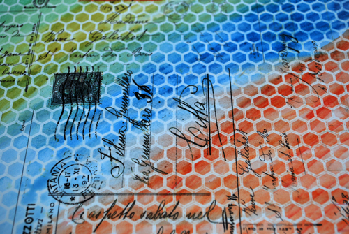
mhhh – ok…fine…..it worked, but it wasn’t really pushing me out of my slippers…so time to take it up to the second floor.

I used a Crafter’s Workshop Template over the background and sprayed it with Ranger’s Color Wash, then stamped it, applied a paper stencil on top which I had also unused and forever in my stash and put some white gesso over it.

After it dried I applied some of the water markers to a craft sheet and with a wet brush I picked up the paint and painted the gesso areas…BOY….that was UGLY…I totally disliked the result and I was about to give up and cheat…yep. Not lying here…I was thinking, if I would just pick another supply I haven’t used yet, you might never know…LOL. But ok…if you put yourself out there- you’d better be honest…so ….ok…I fell down a couple stairs, but let’s try to get going. TACKLE those stairs….

So I applied the markers directly to the gesso and AHA- better with the outcome of the paints- but boy….STILL UGLY!

I started to get a bit annoyed…and angry…with myself…I felt a bit like Anette Bening in American Beauty where she starts crazily cleaning the window repeating “I will sell this house today” besides I was mumbling through my teeth “I will tackle those markers today” Take a look here to imagine how I felt:

[youtube=https://www.youtube.com/watch?v=s-78hfZOu_s]

I applied a stamp over…mmmhh- that tied it a bit together and actually I started to like SOME parts of it.

Wait a second….some parts….mmmhhh – ok – so I just cut some circles free hand out.

And I remembered that I actually liked the look of the Aquamarkers on the watercolor paper – so decided to do a background which I later on applied to my artjournal.
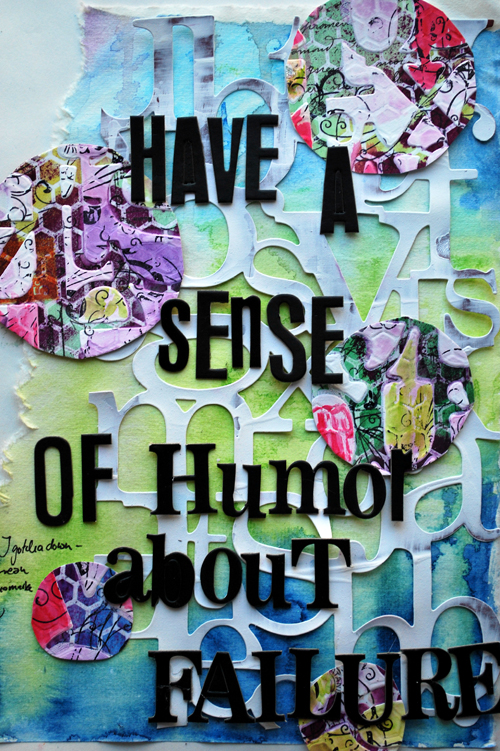
I actually like my journal page…LOL- especially since I …and now you…know the story behind it ;)

What I learned from this challenge

  1. I do not like the fact that I, the person who loves paint media has unused paint media in the studio– what a waste. This will not happen again ;)
  2. I realized though that there is paint media that I get only luke warm with.
  3. The darker colors spread nicer over porous surfaces then the lighter colors
  4. Although water based, sprayed with something else water based, doesn’t reactivate in a huge capacity as other water based reactivated media.
  5. When I applied white gesso on top, the gesso picked up some of the Ranger Colorwash but it didn’t pick up the Aquamarkers.
  6. I was never able to really put my finger on it, but now I know for sure I do not like muted colors too much.
  7. I also learned – or better finally I know for sure- that I do not like harsh marker lines– I like it blended.
  8. If something doesn’t work as a whole …try to break it down…cut it in pieces.
  9. Keep going…the outcome might be still fun…especially because you remember the  process itself.
  10. While just playing, even if it doesn’t go the way you think, you might have some other cool ideas for different projects.
  11. I really love watercolor paper ripped and with the watercolor effect – I think I will use this again!

Wow…actually not too bad what I learned…I hope  you enjoyed it. I can’t wait to see what you come up with too.

If you decide to play along with our Second Floor challenge (we’d love to have you) please leave a link to your blog or wherever you decide to share your project!  Of course, I would love it if you’d share a line or two in your blog post or flickr photo comment about something you learned from the project.  (If Julie and I have done this linky list correctly, when you leave a link on Julie’s blog it should show up on this blog and vice versa.)

If you’ve made something for the Second Floor “Use Something New” challenge, leave a link!



If you’re not up for sharing 100% publicly, we have set up a totally private flickr group.  It’s a way of sharing within a safe space. If you want to join the flickr group, you will need to e-mail us at (secondfloorchallenge AT gmail DOT com) and we’ll send you an invitation.

have a wonderful day

hugs

Nat

Comments (25)

  • Eniko Farkas DeLisle

    |

    Nathalie, I loved that you cut out the pieces that you liked and re-purposed them, and I really appreciate that you explained the whole process you went through so beautifully! I really felt your frustration as well as your satisfaction when you “figured it out”. For my 2nd Floor Challenge, I decided to scrapbook with some really busy prints from Graphic 45…the ones I usually just look at for inspiration & then put back in my paper stash. Thanks for the inspiration!

    Reply

  • Mona Pendleton

    |

    Thanks so much for the fun challenge :) So happy to put those Neocolor 11 crayons to good use!

    Reply

  • Dolores

    |

    Love the outcome of your page at the end although there were some parts that I liked in between. Can’t wait to get out some of those supplies that I had to have but then they don’t get used.

    Reply

  • Miae

    |

    This challenge inspires me! I love how your project turned out! I can only hope…but I plan on having a go:)

    Reply

  • zoegakatten

    |

    I am soooo inspired by this…! I love that you and Julie put this together and I love your journal page!

    Reply

  • zoegakatten

    |

    This inspires me so much…!!! I love that you and Julie put this together and I love your journal page!

    Reply

  • lynnmcmvt

    |

    Thanks to you and Julie for reminding me that PATIENCE and being open to possibilities can make something I hate work for me! I like how you each let us in on the parts you hated and how you didn’t just start over and pretend nothing happened. :)

    Reply

  • lynnmcmvt

    |

    Both your challenge and Julie’s remind me that patience with what we’re doing is the key! SO often I do something and say ugh, I hate this, and then just walk away or paint over it completely, when there may be something that can be done to make the piece (or pieces!) something I like! Thanks for sticking with the process and showing us the whole thing!

    Reply

  • Violet

    |

    I love how you changed a failure into a HUGE success. Love the final page!

    Reply

  • Riikka

    |

    I just love the outcome but also how the stages look! Nice!

    Reply

  • Marsha.

    |

    Oooh, not bad at all!!!

    Funny thing (because you know I always have one :-p): My mom bought a set of Aquamarkers at a local (cheap) bookstore. The fact they sold them there should have made me suspicious! I tried them anyway, on ordinary watercolor paper and I didn’t like the way the water muted the colors :-). Honestly: I’ve had better results with my really cheap no brand watercolor pencils! So what’s the deal with these? I’m wondering if I did something wrong… Does Letraset recommend a special kind of paper for them? The results on the mistable paper look better to me…

    Reply

    • nathalie-kalbach

      |

      mmmhh- that was the only thing I would not find with my aquamarkers- the color were not super vibrant but not too muted either- I think there are different packs though with color range- I have a very light color set, so maybe that is why?

      Reply

      • Marsha.

        |

        Yeah… I that’s what I thought too. I’ve looked at packages with the new Flexmarkers and the colours in there don’t appel to me either… But I know there are loose Flexmarkers available that I do like. There is another thing that occured to me when I went to look: almost all tutorials on the net are about colouring in (Magnolia type) stamped images. If that’s what the Aquamarkers are most used for, I can understand the need for muted colours :-).

        Reply

        • Marsha.

          |

          Appel = appeal…
          I’m sure there are loose Aquamarkers too, with more vibrant colours. Just not in the sets.

          Reply

  • S Mellows

    |

    Referring to your #7: By coincidence, I was working with markers last night on ATCs. I was laying down different colors in stripes; separate stripes and layered on top stripes. I didn’t like how they were not blending. I used a white prisma color pencil over the top of the stripes which both blended and slightly muted the colors. I liked the effect. The white disappeared and the colored stripes looked like a foggy landscape which I liked. Never know until you try something! Thanks for your blog!

    Reply

    • nathalie-kalbach

      |

      Nice advice of using the white prisma color pencil – I have to give that a try next time :) Thank you!

      Reply

  • Lisa Flaherty

    |

    A great lesson to just…keep…pushing! How else would we ever reach the second floor?? You’ve proved that the sum of the parts can be greater than the whole. I love those circles! Thank you for sharing your process and being an inspiration to me!

    Reply

  • Sue Clarke

    |

    I will sell this house today…LOL…love that movie.
    Interesting to see what you learned and glad that you stuck with it Nat.

    Reply

  • Carolyn Dube

    |

    Thank you for such generosity in sharing your process. I read and reread your post today because it has so many parts that spoke to me!

    Reply

  • Nancy Sapp

    |

    Nathalie – GORGEOUS lay-out! I LOVE, LOVE those watercolors that you used & then cut the circles!
    Awesome.

    Reply

  • Eliza

    |

    I was really looking forward to your next Second Floor challenge and this one is sooo exciting!
    I keep having this conversation over and over again – people buy wonderful tools and supplies and then…put them on their shelves and just look at them. but really…this is JUST paper and JUST paints (or whatever). they are there to have fun with! aren’t they?
    I totally love what you created today! and the advice about cutting pieces that didn’t quite work out – brilliant!

    Reply

    • nathalie-kalbach

      |

      yep- LOL- I tell my students all the time that they should either try it before they buy it or if they buy it – use it- but sometimes I do not live up to my own words ;) You know the old water-wine thing ;)

      Reply

Leave a comment

Tired of being a People Pleaser – Layout

It’s been a while, since I have created a layout – and it was so much fun to play with the wonderful paper by Anna Dabrowska for 7DotsStudio, which I had for a while now.

Sorry- taken down


The idea to this layout came while reading  one of my favorite columnists – Harald Martenstein – he always makes me laugh. He writes with pointed remarks and often brings simple lifestyle problems to the point. This week the column for DIE ZEIT was titled: Many are suffering from making it right for everyone (freely translated) – here is the German article


one of the paragraphs that made me laugh the most was:

…You have to force yourself to be unfriendly. This is true in all areas of life. Lot’s of people are suffering because they wish to make it right for everyone. That is just something deep inside of you. Maybe it is education. In my opinion this is an unknown widespread desease. Doctors usually diagnose it with “Burn-Out-Syndrom” “Depressive Mood” or “Gastritis”. In reality though this is just caused by wishing to make it right for everyone. ….


Of course that is not, what causes Burn-Out-Syndroms etc. – but it made me think of how tired I am to be always the people pleaser and make it right for everyone- you just can’t , right? Even if you just stay in bed and do nothing, you make someone upset.  So this is a bit of a tongue-in-cheek layout… ;)

And please, please….No worries- I won’t be unfriendly from now on…probably tomorrow again just trying to make it right for everyone as always – LOL ;)


Supplies: 7Dots Studio Dream Paper, 7Gypsies Tissue Paper, Gesso, Heidi Swapp chipboard letters, Adornit tiny letters, old watch, Structure paste, PanPastels, Derwent Inktense Blocks, Flearmarketfinds, Eco Green Crafts Stamp, Maya Mist


Do you sometimes get inspired by articles or books for a layout or art journal page too?

Have a gorgeous day

Nat

Comments (22)

  • Mona Pendleton

    |

    Fabulous layout! So creative and love the story behind it! Thanks for sharing!

    Reply

  • magandscrap

    |

    Very creative layout ! So many details ! Love the colors !

    Reply

  • Peg Hewitt

    |

    Amazing page, I totally LOVE it!

    Reply

  • Sue Clarke

    |

    Love the LO and it took me several major depressions to decide not to be a people- pleaser. It’s hard to unlearn.

    Reply

  • pAULA fLÁVIA

    |

    Such a great LO Nath, specially cause your feelings are poping up from your eyes on the photo.
    Nice week

    Reply

  • misty

    |

    This is gorgeous! I am definitely a people pleaser and it has really worn on me this month! Awesome layout!

    Reply

  • Diana

    |

    i am so in love with this layout and the message!!!!! thanks for sharing it with us!
    you so inspire me!

    Reply

  • Martha Richardson

    |

    Oh my Nat – this is one incredible LO…so much to look at, thought provoking…I think is my favorite LO!

    Reply

  • Czekoczyna

    |

    great! so many details – love it.

    Reply

  • inkyminxy

    |

    Absolutely love the layout and the the story behind it, I think we all feel a little like this from time to time, i know i sure do xxx

    Reply

  • marianne/skorpionen

    |

    Oh yeah, I totally agree with you and I’m often having the same feeling. That’s why I love my AJ, cause the only person I hear when I’m doing that is myselv!
    Loooove your layout with the gorgeous papers from 7dots and Finnabair. And those amazing findings from fleemarked. Altso love the structure paste!
    Have a lovely sunday and don’t get fooled :D

    Reply

  • Jane Henningsen

    |

    ohhh you´re so right Nat… I really think the disease is going round… and so many people are stressed out. Love the LO.. especially the little scissor and the splattertechnique… wish I was that kind of an artsy-girl…
    Have a nice day…

    Reply

  • Riikka

    |

    Cool, inspirational layout!

    And so true, you simply can’t do it right to everyone. If you bow to someone you’ll end up showing… you know :D

    Reply

  • Michelle LaPoint Rydell

    |

    Oh Nat this is GREAT!!! I especially love the scissors stabbing the heart! I suffer from this disease too – so I can relate!!!

    Reply

  • The Rock Chic

    |

    Yeah,I hear you. I have started saying “no” to many things over the last year and it feels great. The first couple of times you think about how you may have let someone down but you what? That feeling passes quickly because you start feeling so good yourself.
    I am in the happiest place ever now, since I started to stop pleasing other people and if that makes me unfriendly, well so be it :)

    Reply

  • ulrikamacgregor

    |

    Love, love, love this layout! Wonderful colours and structure, and a good message too ;) Thanks for sharing!

    Reply

  • Mary Bennetts

    |

    Such a cool layout Nat, love it. Love the colours, love everything about this

    Cheers
    Mary

    Reply

Leave a comment

Play Time in the Studio or how I missed it

Four weeks in a row where I stay at home…and I tell you…I absolutely cherish my four weeks :) It has been hard the first days to not just give in ….aka procrastinate …and take off. I actually make an effort to be at 8am at my studio and have a calendar in which every minute of the day is planned out. BORING….? No, not really – LOL.

I do have some little slots in there like…Play and then remember…that is why I love my job so much…part of it is play time too :) Right now I’m working on a couple pretty big projects – one of it is this – which will be coming VERY soon ;)

and then some other hush hush projects, but those will be revealed soon too . Oh and of course next week Julie and I will show you our next challenge of our Second Floor Challenge – Can’t wait for you to see that one -that one really pushed me over the edge this time…eh…to the second floor. Just for your information – we do have a loose “every three weeks on a tuesday” plan, but we promised ourselves to be gentle if the workload is just too much. I think though it will be regularly- I actually look forward to my time to take it to the second floor :)

If you have time and want to see something cool – check this Stop Movie “Fresh Guacamole” by PES out that I stumbled over this morning- AWESOME !

[youtube=https://www.youtube.com/watch?v=FQMO6vjmkyI]

And now…let me go back rocking…it is 8:05 am here and my calendar send me a gentle reminder …pffffff ;)

Huge hugs

Nat

Comments (10)

  • Eniko Farkas DeLisle

    |

    Nathalie, it is so great of you to visit the blogs of your “loyal subjects”! I love your work & followed your Jump-Start Challenge in January. You truly are fabulous & I can’t wait to see what you have in store for us in the next Second Floor Challenge! (Thank you for that wonderful Guacamole Short! I needed that laugh!) xo

    Reply

  • marjiekemper

    |

    Oh, Nat…. love the gorgeous colors and texture in your painting. Life’s on speed over here and I’ve missed coming by more often. Happy you have time home and to create! That video was wonderful…. loved it. Have a great weekend!

    Reply

  • Sue Clarke

    |

    Cute video. Fun to see the little houses and dice come out!

    Reply

  • Bev W.

    |

    love the painting nat!! if that’s another workshop coming….sure hope i can sign up for this one:) the video is super cool….lots of little surprises in it:) Tfs!

    Reply

  • Martha Richardson

    |

    Yes…yes…yes…to all of the above! Loving your painting ;)

    Reply

  • misty

    |

    great painting…and that video was so cool!

    Reply

  • tesa

    |

    Awesome!. The painting and the video.
    I am waiting for this new Über Media, I liked very much the first one.
    I love acrylic paint.
    Have a good day!

    Reply

  • jerseytjej

    |

    That is an adorable film! It made me smile and that is always good! :) What are the little sprinkles of color on your canvas? They look lovely there.

    Reply

Leave a comment

Creative Jump Start Video: Fight Resistance

I wanted to show you my second video that I had done for the Creative Jump Start 2012  – if you missed the Street Art Video – check it out here.

FIGHT RESISTANCE 

[wpvideo M4jca1kW]

For those of you, who have problems watching the wordpress version – here is another option:

password is: fightresistance

[vimeo http://vimeo.com/34775529]

Here are some pictures of the canvas book. Or Rug book (in the video also referred to as the Rock book- LOL ;) )

And now back into my studio and doing things ;) – I do have to remind myself still constantly to life up to my own words, procrastination is such an evil friend…actually procrastination is just pretending to be my friend…LOL.

What do you like to procrastinate?

Have a gorgeous day

nat


Comments (4)

  • Conny

    |

    ach gott ich hol mir immer wieder gern nathalie ins wohnzimmer ;-)

    Reply

  • Marsha.

    |

    Yep, that’s why I’m here… procrastinating away…

    Reply

    • nathalie-kalbach

      |

      LOL ;) And that’s why I respond…also still procrastination ;)

      Reply

Leave a comment

Art of Layers Blog Hop Winner

Congratulations Aiga- please email me your address !

Have a wonderful day!

Nat


Comments (2)

  • Vicki Chrisman

    |

    Waving HELLO to you my friend!

    Reply

  • Aiga

    |

    Juchu! Hüpf!! Freu!!! Ich hab noch nie was gewonnen…
    Danke! Danke! Danke!
    Ich freu mich gaaaaaaaaaaaaaaanz doll und bin schon gespannt auf das Buch.

    Liebe Grüße
    Aiga

    Yippee !!!! Jump !!!! Laugh!!! I´ve never won anything…
    Many, many, many thanks.
    I´m realy happy! I´m looking forward to the book.

    Greetings
    Aiga

    Reply

Leave a comment