
Creative Squad

My Home is My Castle – Jennifer Gallagher


Hello from the Creative Squad! Today we have a super charming little project from Jennifer Gallagher that will definitely inspire you and warm your heart :) She is using my Stroll Around the Block and My Home is My Castle stamp sets and this month’s theme: My Home is My Castle – Home means many different things depending on who you ask and where you are in the world. This month we’re thankful to have a place to call home, a place where we can rule and be King – or Queen :) – of the castle!
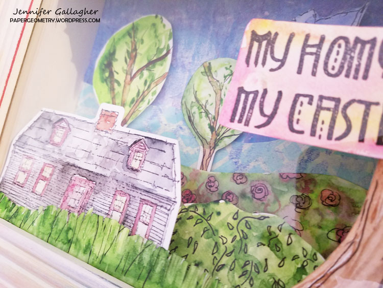

With the beginning of each new year, it is normal to think back over the past and assess where you are and what is important to you. What is most important to me is family. My husband and I often talk about how much we love it at home. Not necessarily the structure itself, but the time spent with each other and the memories we have made here. This month the creative squad will be sharing inspiring projects that reflect on just that. Using Nat’s new Rubbermoon stamp collections, Stroll Around the Block Sets 1 & 2, we hope to inspire you and share with you what home means to each of us.

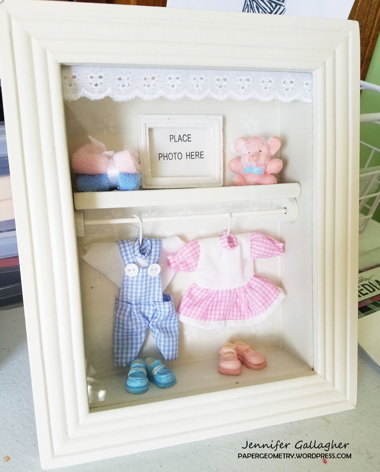
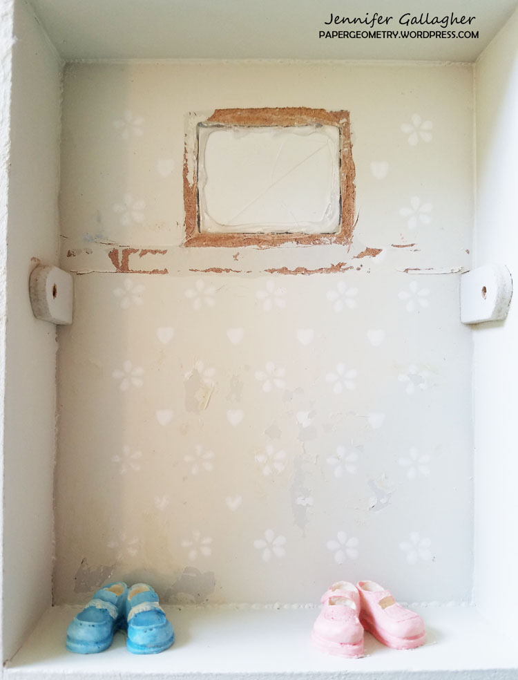
Back in the Summer, I acquired several of these shadow boxes at a yard sale. I wasn’t sure exactly what I was going to do with them but I knew they would come in handy. You can purchase shadow boxes at your local hobby and craft store or create your own with recycled materials. I started by removing the frame and glass from the front and emptying the box of all the decorations. I sanded down the frame to give it a distressed feel. Then with a baby wipe, I smeared some Tim Holtz distress stains on the frame and let it dry.
  

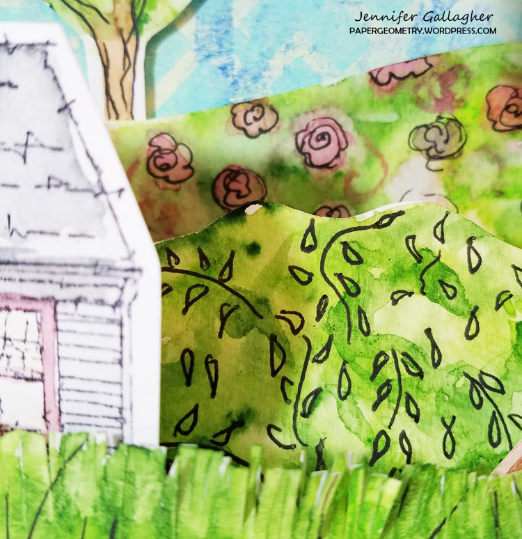
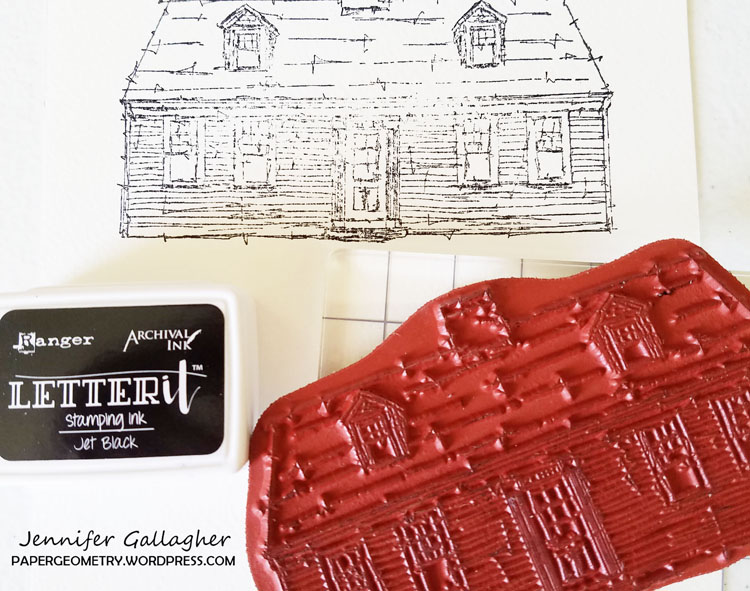
I knew that I wanted to create a little scene in the shadow box to represent my home. I decided to keep with the artistic and sketch-like feel of Nat’s stamps and I felt watercolors would compliment that. I chose the Cape Cod stamp because it most resembles my ranch style home. I stamped the image onto watercolor paper with archival blank ink and then used my watercolors to match the colors of my house.
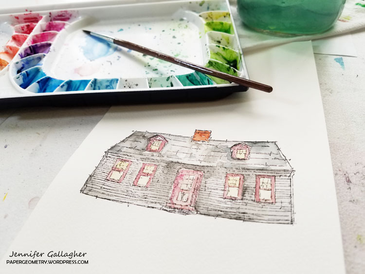
I decided on where I wanted the house to sit in the box and then designed the other pieces around it. I decided to add a large tree, a flower garden, bushes, a bird, smaller trees in the background and grass. This is where your creativity can really shine. Is this an exact replica of my home? No. But it does relay the feeling I have about home to my audience. Keep that in mind when designing your piece.

I started by choosing a blue and green gelli print from my stash. The blue to represent sky and the green as grass in my background. I used double sided tape to fix those to the shadow box. I then started painting my trees. I used my gelly roll pen to add sketchy lines to each element.
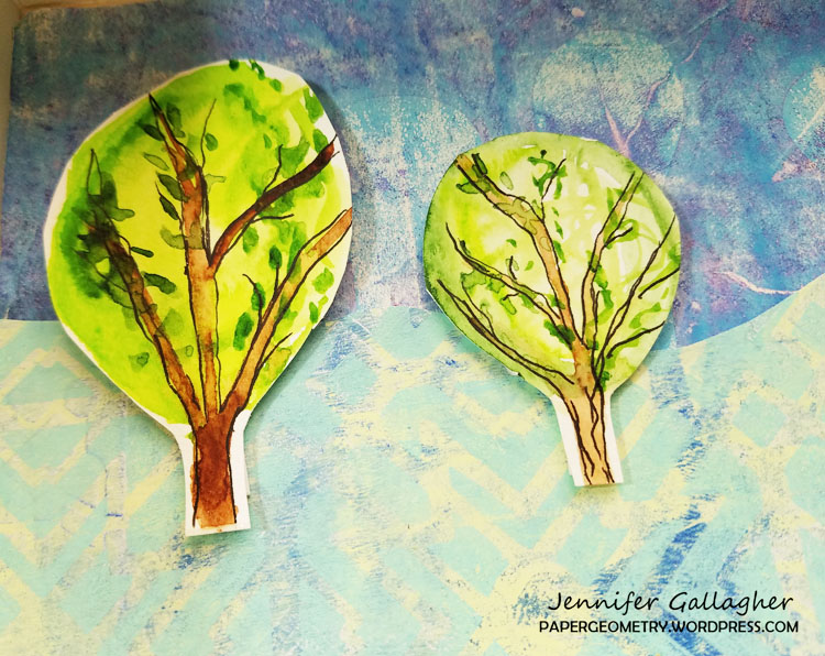
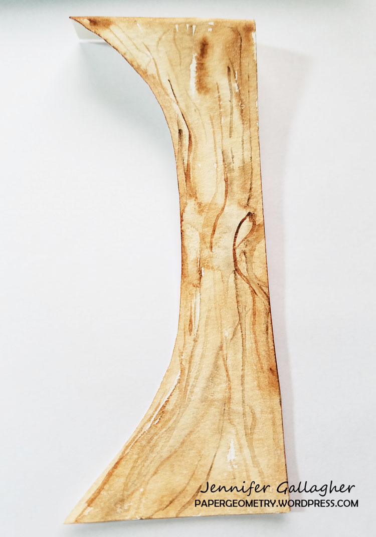
Starting on the background, I fixed each element with scor-tape. The bird and background trees were added with mounting tape to give it a little lift off the background. As I moved closer to the foreground, I fixed the elements with paper tabs like you would in a pop-up book. Mix up the levels throughout the box, giving your piece lots of dimension and interest.
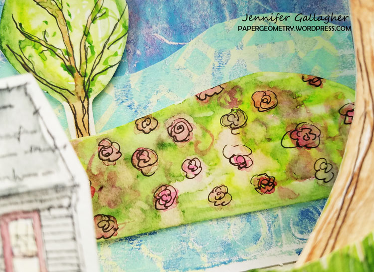
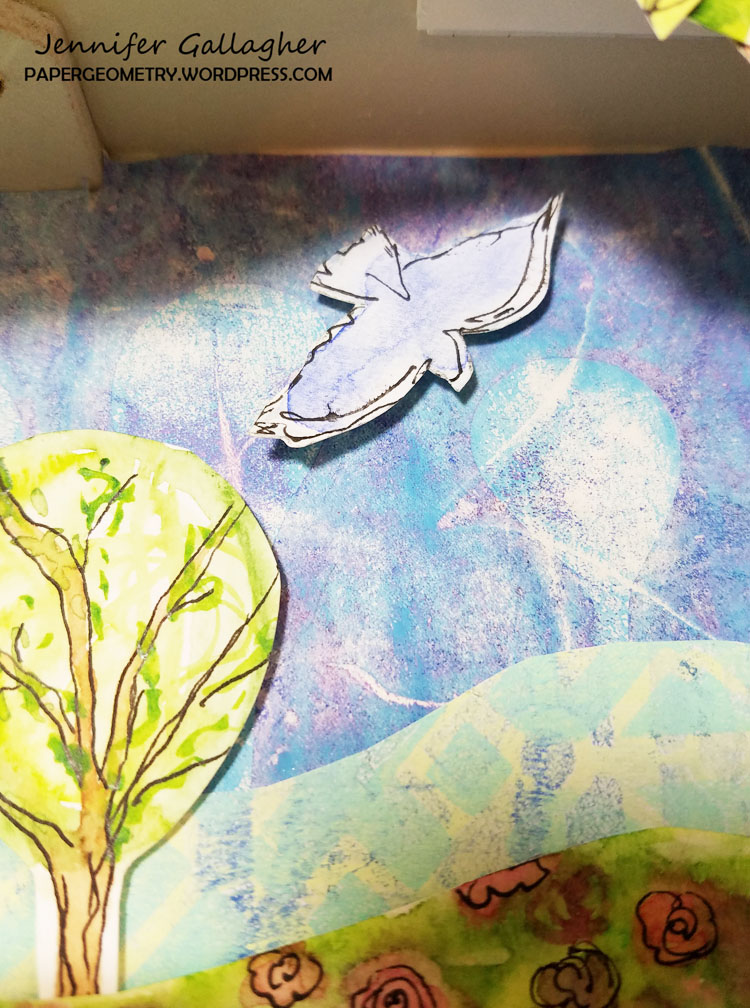
The finishing touch was to stamp the sentiment, My Home is My Castle, onto watercolor paper with archival ink and add a pop of color to it. Once added, I was able to put the glass and frame back on my shadow box.
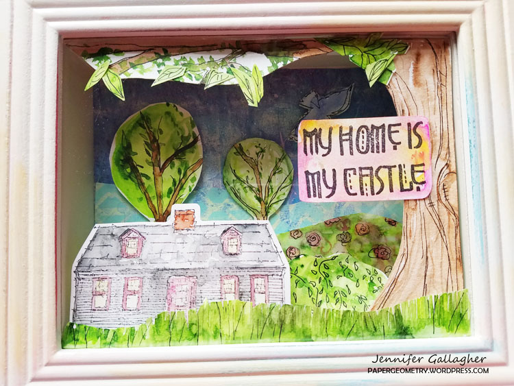
To me, this piece expresses how I feel about my home. It’s a happy and peaceful place. It is truly my favorite place on Earth. I hope that this piece inspires you to step out of the box this year in your artful adventures. I am wishing you all a wonderful year filled with art, happiness, and creativity.


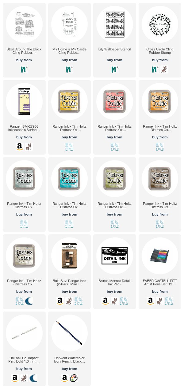
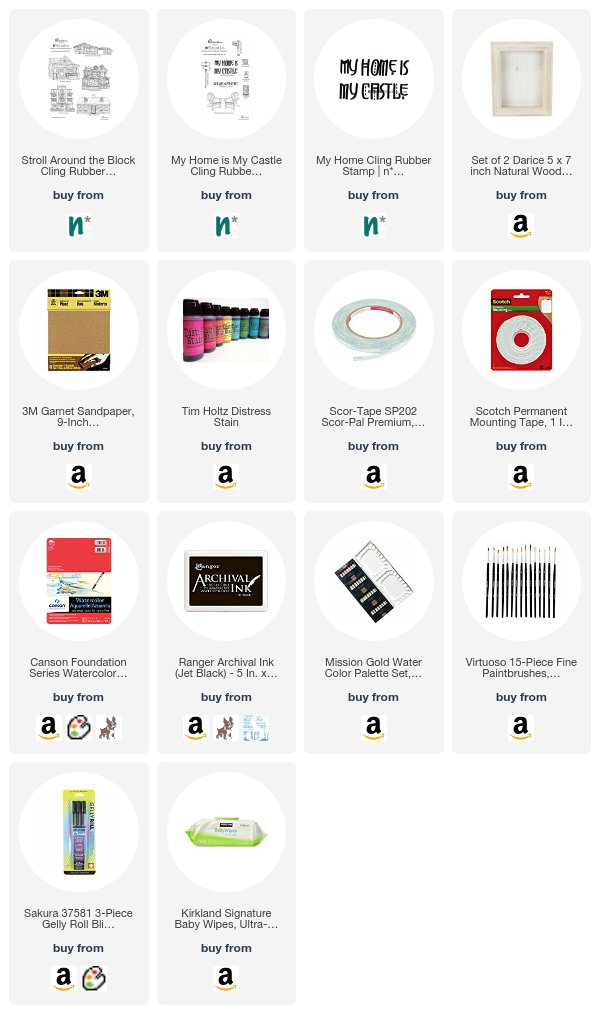
Thank you Jennifer for this awesome way to use a shadow box! In addition to gelli printed papers, Jennifer used the following supplies:


Play along with us too: I love to see how you interpret our monthly themes. Email me how you used my stencils and stamps with the theme and email me an image – I would love to share your projects in my next  “n*Spiration From Around the Globe“.

Leave a comment

My Home is My Castle – Josefine Fouarge


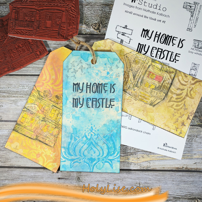
Hello my friends and welcome to a project from the Creative Squad! Today we have some fun tags created by Josefine Fourage using my new RubberMoon stamps from the Stroll Around the Block and My Home is My Castle sets: Craftsman, Queen Anne, and My Home is My Castle. This month’s theme is: My Home is My Castle – Home means many different things depending on who you ask and where you are in the world. This month we’re thankful to have a place to call home, a place where we can rule and be King – or Queen :) – of the castle!


Hi and welcome to 2018. In the new year we get to play with Nathalie’s new stamps. Have you seen them yet?

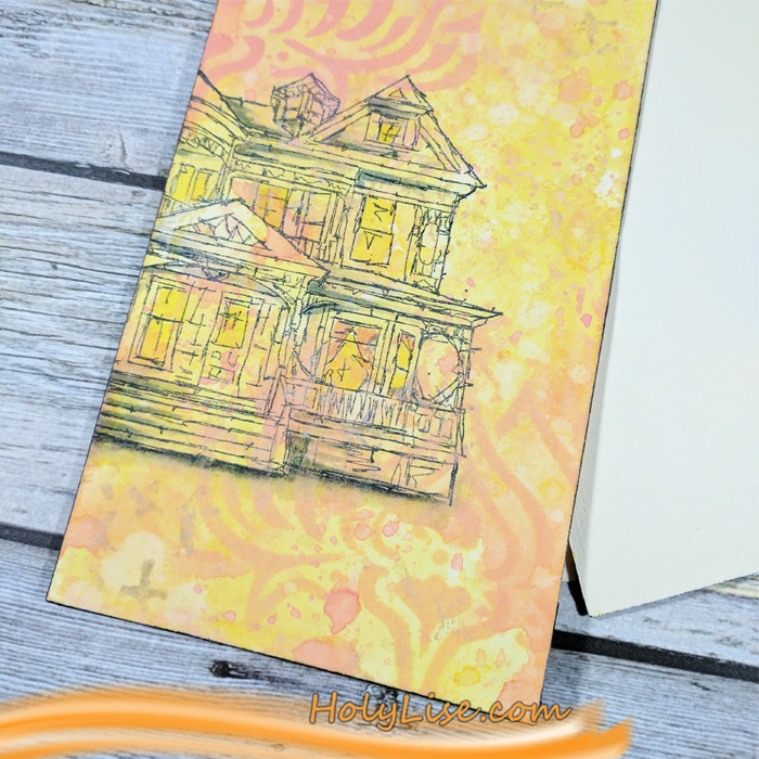
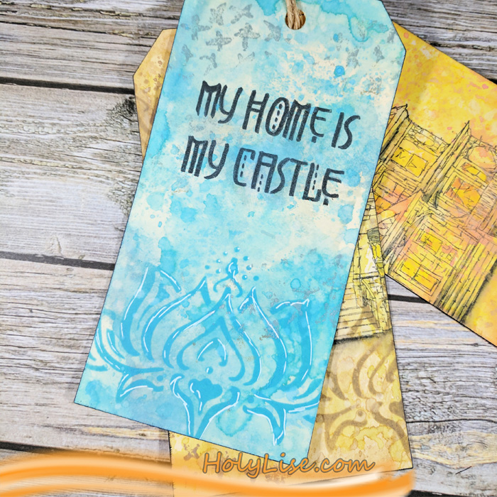
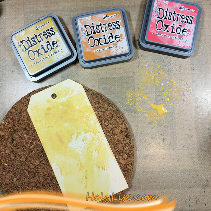
I was in the mood for some Distress Oxide fun, so I grabbed three tags and started coloring them in. My favorite technique is ink smooshing. For that I used three colors of Distress Oxide from the same color family and smooshed one after another onto my craft mat. Then I spritzed a little water on top and dragged the tag through the ink, one color at the time. Between every color I heat set the ink. This way I always get an interesting and random background.

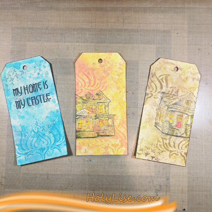
I colored all three tags in different color combinations, one in shiny yellow and orange, one in different blue shades and the third in a grungy green/ brown.

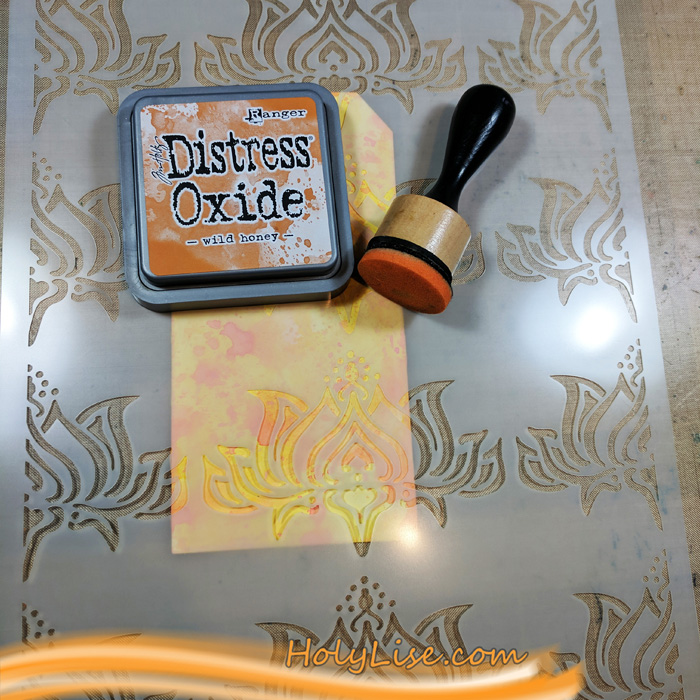
The next layer is using Distress Oxide again. This time I blended them with the Blending Tool through Nat’s Lily Wallpaper stencil. I used the same colors that I used for the ink smooshing so the flowers stay in the background.

Next up, I stamped some marks with parts of Nat’s Cross Circle stamp, again using the same colors for every tag.

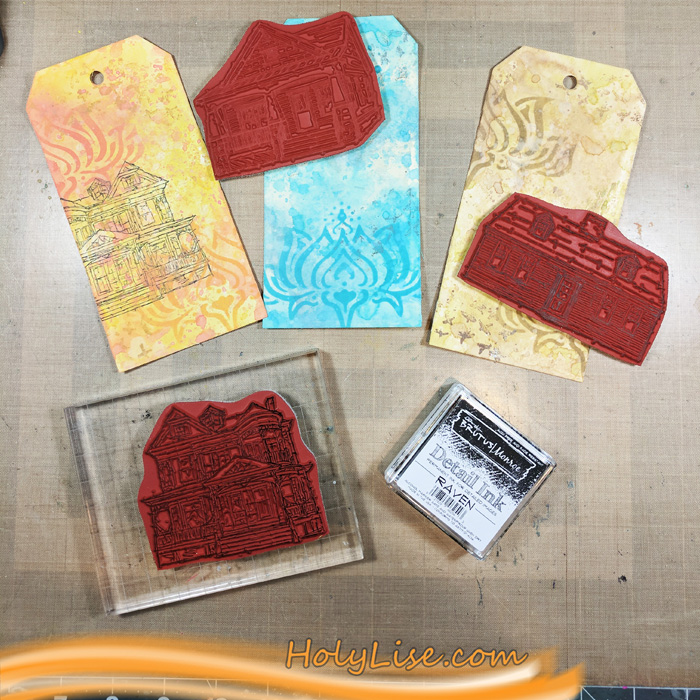
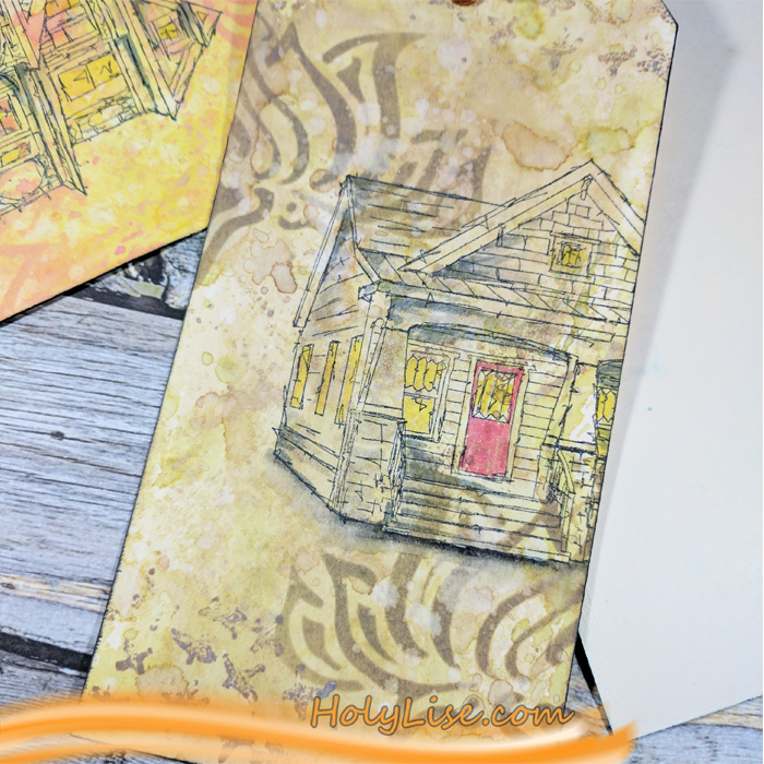
I picked three of the houses, but ended up using just two of them. They are wider than the tags, so I stamped them a little off. The Queen Anne house fit perfectly to the yellow/ orange tag and the Craftsman to the grungy green tag. I decided to use the sentiment stamp “My Home is my Castle” for the blue tag.

At the end, I colored some areas of the houses with Faber Castell Pitt Pens. Mainly some shadows, but also light behind the windows and red for the door of the Craftsman. To add a shadow underneath the house (for a little more dimension), I used a black water color pencil. I also added a few white gel pen outlines here and there and then tied all the tags together.

Here is the finished piece.

Thanks for stopping by! Don’t forget to check out the new stamps, they are so much fun to play with!


Thank you Josefine! I love how you worked into the stamps to really give them dimension. Here are the supplies that Josefine used (some are affiliate links):


Play along with us too: I love to see how you interpret our monthly themes. Email me how you used my stencils and stamps with the theme and email me an image – I would love to share your projects in my next  “n*Spiration From Around the Globe“.
Comments (1)

  • maura

    |

    Great tags, Josefine! I love your term ink smooshing – I do that, but now I have a new name for it :). The lily stencil looks awesome with the houses. Maura

    Reply

Leave a comment

My Home is My Castle – Marsha Valk


Happy New Year from the Creative Squad! We’re kicking off a new theme here but first we would like to say a big hello and welcome to new squad member Maura Hibbitts! We are so happy to have Maura and her super creative style on the team so stay tuned for her first project later this month :) And now we have a lovely project from Marsha Valk, who explores a technique by artist Max Ernst using my new Stroll Around the Block and My Home is my Castle stamp sets. Our theme this month is My Home is My Castle – Home means many different things depending on who you ask and where you are in the world. This month we’re thankful to have a place to call home, a place where we can rule and be King – or Queen :) – of the castle!


Happy 2018!

Oh, how I wish I could have a home like the ones in Nat’s new Stroll Around The Block stamp set!

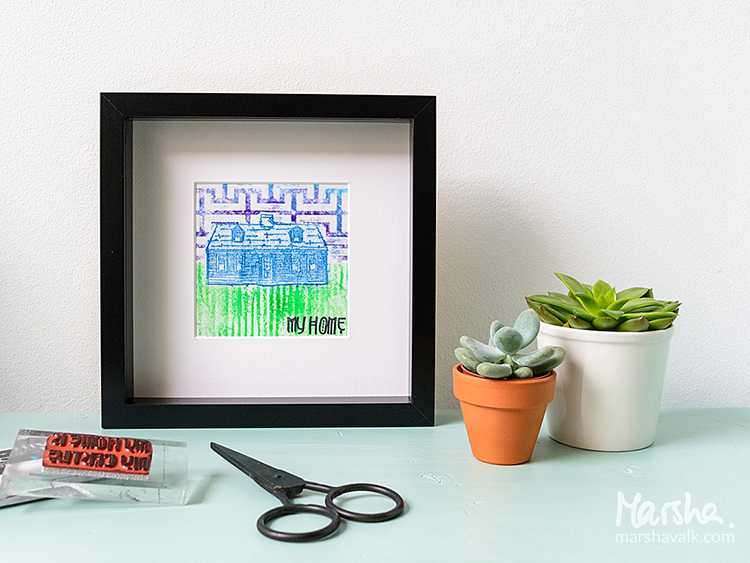
My own home isn’t anything like that, but remarkably enough, there is one stamp in the set that reminds me of something I have in my house. It’s a screen print of an American house similar to the Craftsman house, and I decided to start with that stamp.

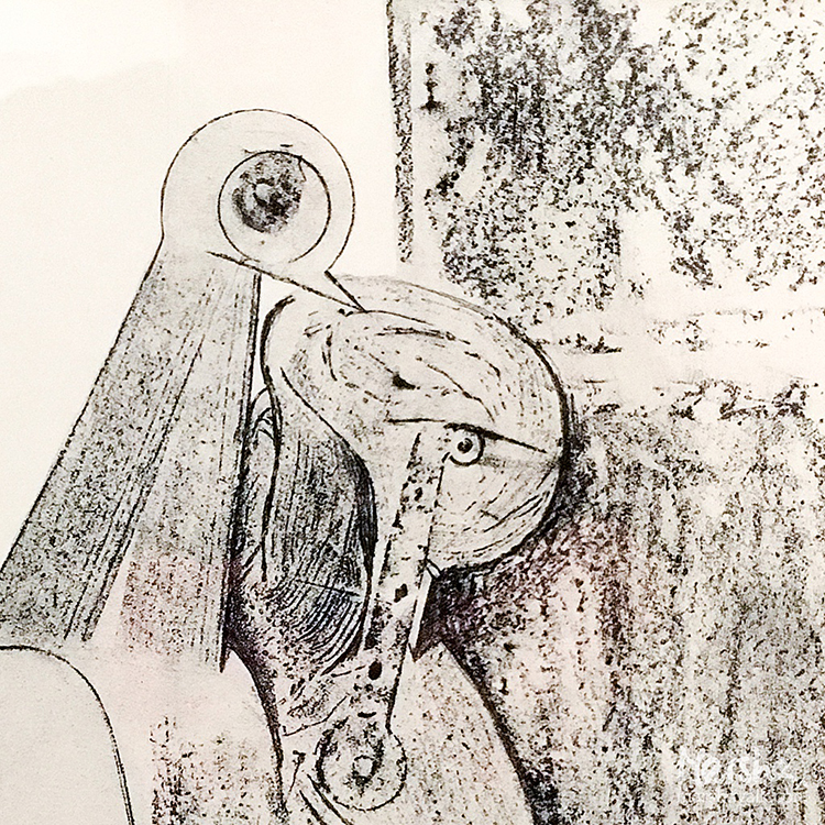
Of course, I could have just stamped with it, but I recently went to the Max Ernst Museum in Brühl, Germany and there I saw Ernst’s fascinating work composed of pencil rubbings of wood and other materials. Max Ernst invented this technique in 1925 en he called it ‘frottage’.

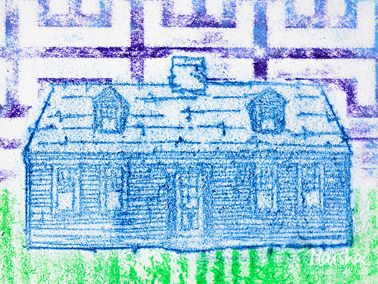
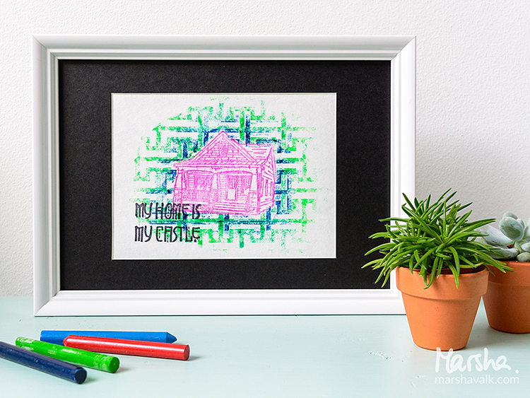
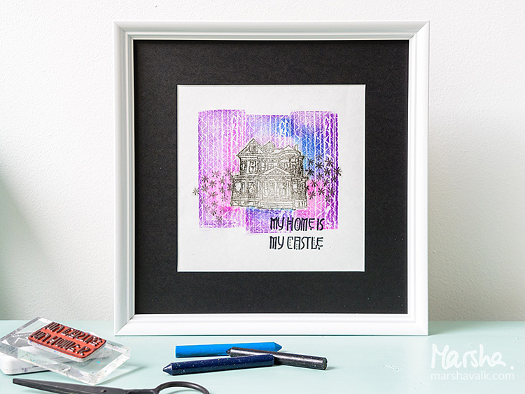
I wanted to try if frottage works with rubber stamps too. And… it does!

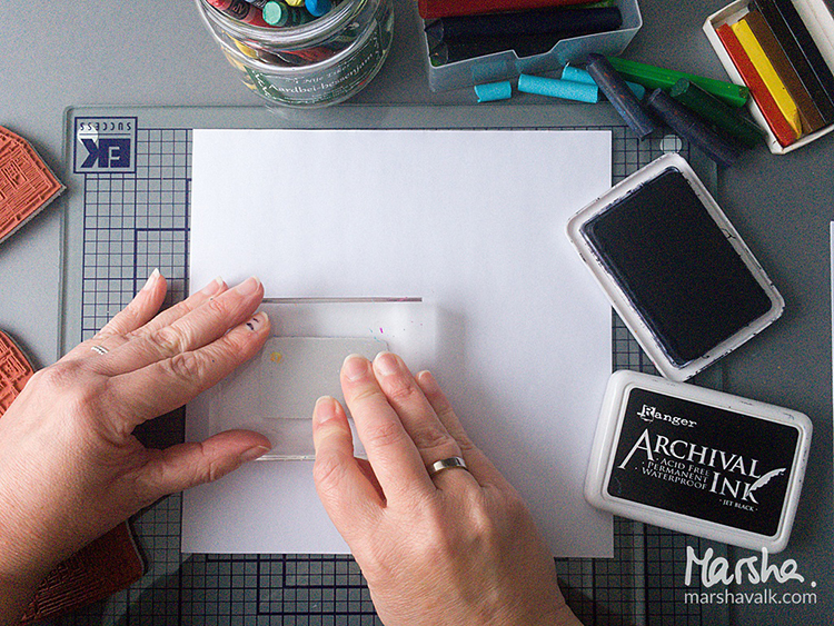
I used wax crayons, but you can also use coloured or graphite pencil and charcoal instead.

As for paper: a thin paper works best, so use printer paper or look for something of a similar weight and smoothness.

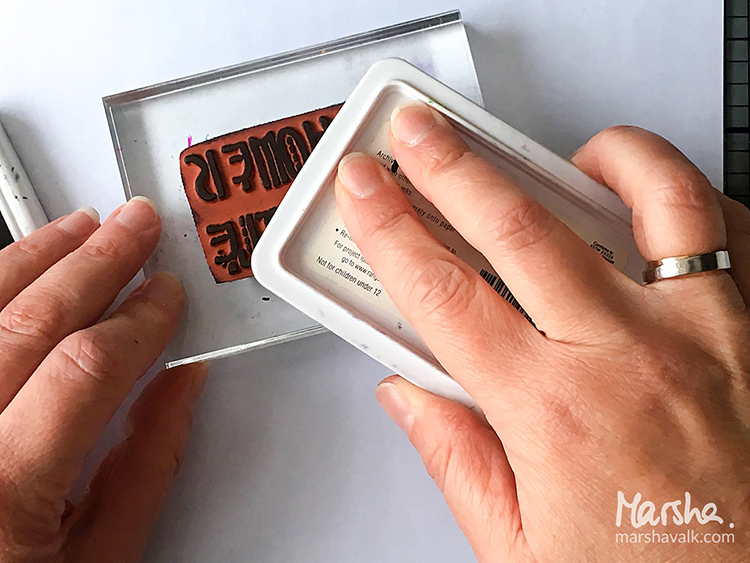
You have the option to stamp the My Home Is My Castle text first before applying the wax crayon.

Or, if you’d rather stamp the text later on, then I suggest testing if your stamping ink stays put on the wax crayon rubbing first.

I had no trouble stamping over my rubbings with Archival ink, but a combination of other brands/materials may have different results.

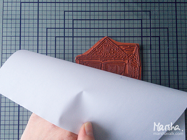
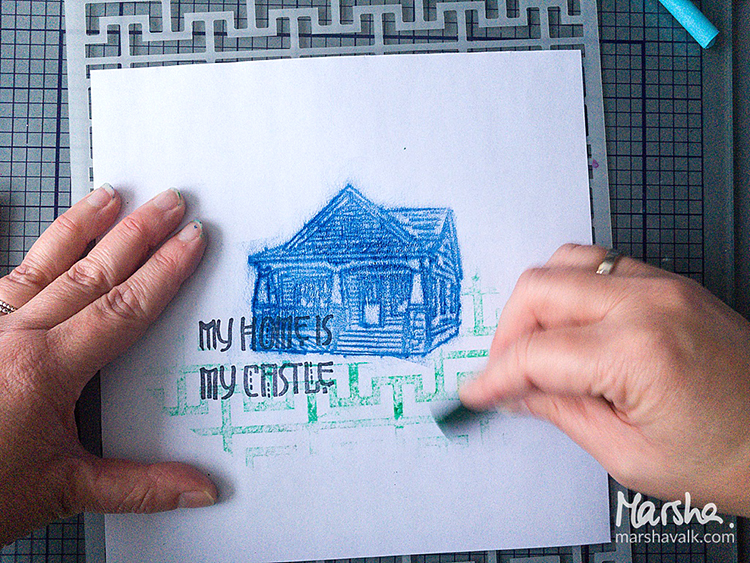
Position the stamp of the Craftsman house under the paper, image side up, and start rubbing over it with a wax crayon.

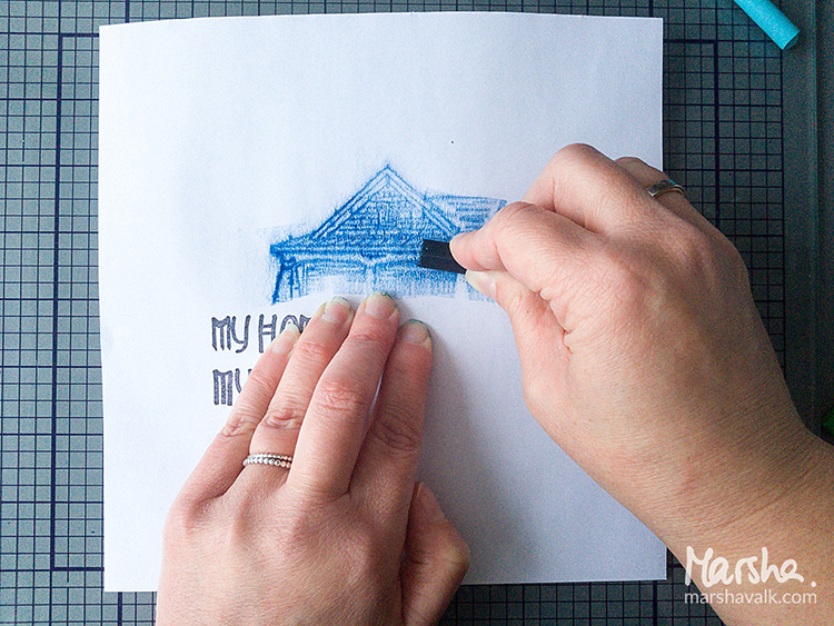
Rubbing with the long side of the crayon works best!

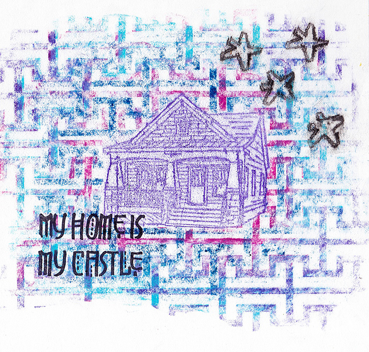
Create a landscape or background by placing background stamps or stencils under the paper and rubbing more wax crayon in different colours right next to the image of the house.

Also, try adding layers of different colours and textures on top of each other. Just have fun with it and see what you can come up with!


Thank you Marsha for sharing this super cool technique with us – what awesome results too! In addition to computer paper, Marsha used the following supplies (some are affiliate links):


Play along with us too: I love to see how you interpret our monthly themes. Email me how you used my stencils and stamps with the theme and email me an image – I would love to share your projects in my next  “n*Spiration From Around the Globe“.
Comments (3)

  • maura

    |

    Marsha, I love how you did this as a rubbing and were inspired by your museum trip! Maura

    Reply

    • marshavalk

      |

      Thank you Maura! Museums are the best: you never know what catches your eye!

      Reply

      • marshavalk

        |

        Or what’s going to catch your eye (but you know what I mean ;-)).

        Reply

Leave a comment

My Fire Burns Bright – Shilpa Nagaonkar


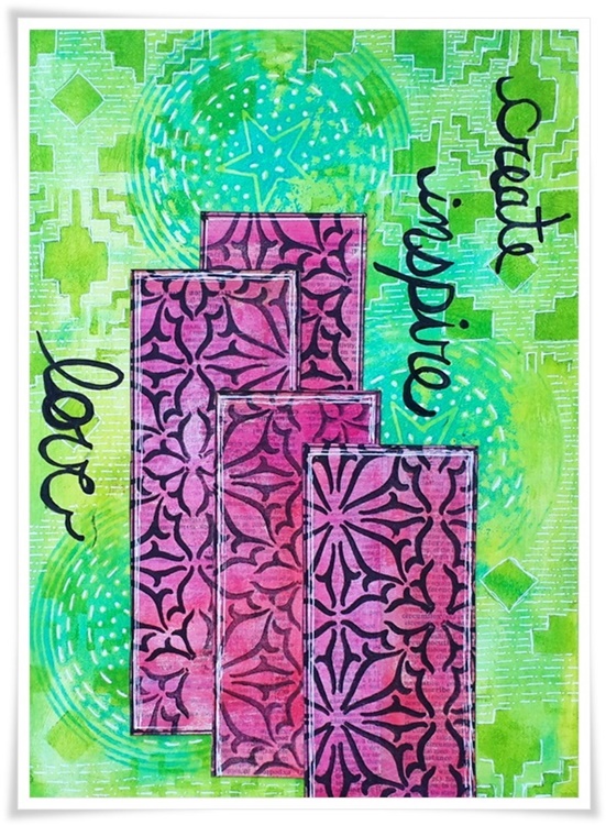
Hello my friends during this busy holiday season! Today we have a lovely art journal spread from Creative Squad member Shilpa Nagaonkar. This will be Shilpa’s final project with the squad and we thank her for her brilliant work and we wish her all the best in 2018 and beyond! Today, Shilpa is using my Circle Drive and Van Vorst ArtFoamies and my Santa Fe stencil, along with this month’s theme – My Fire Burns Bright – Creativity is a passion that can come from deep within the heart and soul of the maker. Sometimes this fire gets ignited by an event or an influential person in our lives, and other times it can be ignited by a love for a material or just simply the enjoyment that comes from making. What makes your creative fire burn bright?


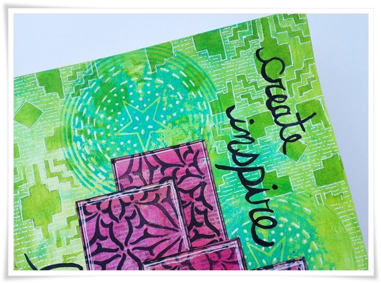
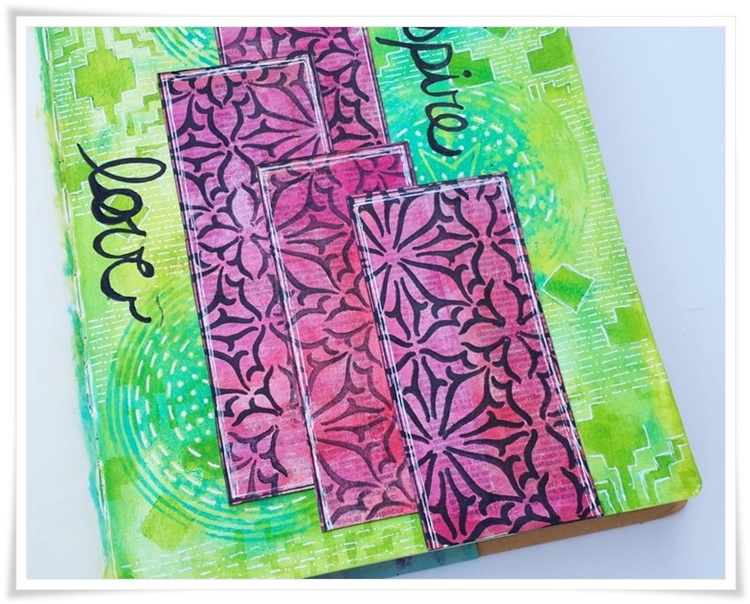
Hello Everyone,  Hope you are enjoying the beautiful art by the Creative Squad this month, we are making with the theme – “My Fire burns Bright”.  My everyday life has great impact on my creative journey. … and that keeps my fire bright. I have a journal page to share with you today, in which I have created an abstract city scape as I was thinking about my previous home. .. so here we go…

Here was my process:

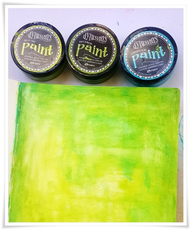
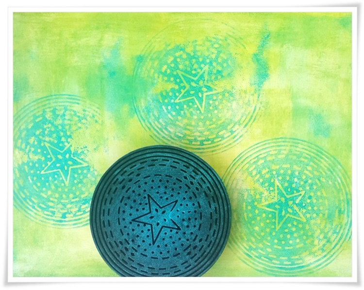
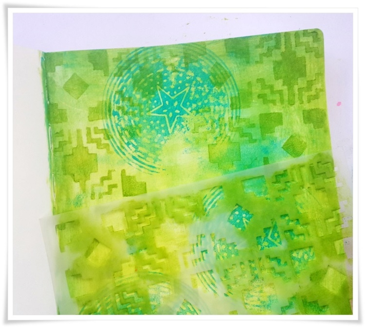
To start with I applied various layers of acrylic paints in greens and blues.. I have used Dylusion paints here.

I stamped beautiful texture using Nathallie’s Circle Drive stamp set and blue acrylic paint, randomly on the surface.

Further I created stencil texture with Nathallie’s Santa Fe stencil and paints.

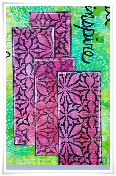
For creating my imaginary buildings, I adhered dictionary papers on card stock and colored them in pink and red acrylic colors. I stamped the beautiful Van Vorst design on it using Black Archival ink. Next I cut them into building shapes and adhered them on the page.

I used a white Gelli roll pen to add more details, I also wrote create, inspire and love with black pens to finish my journal page.

Thank you so much for stopping by.


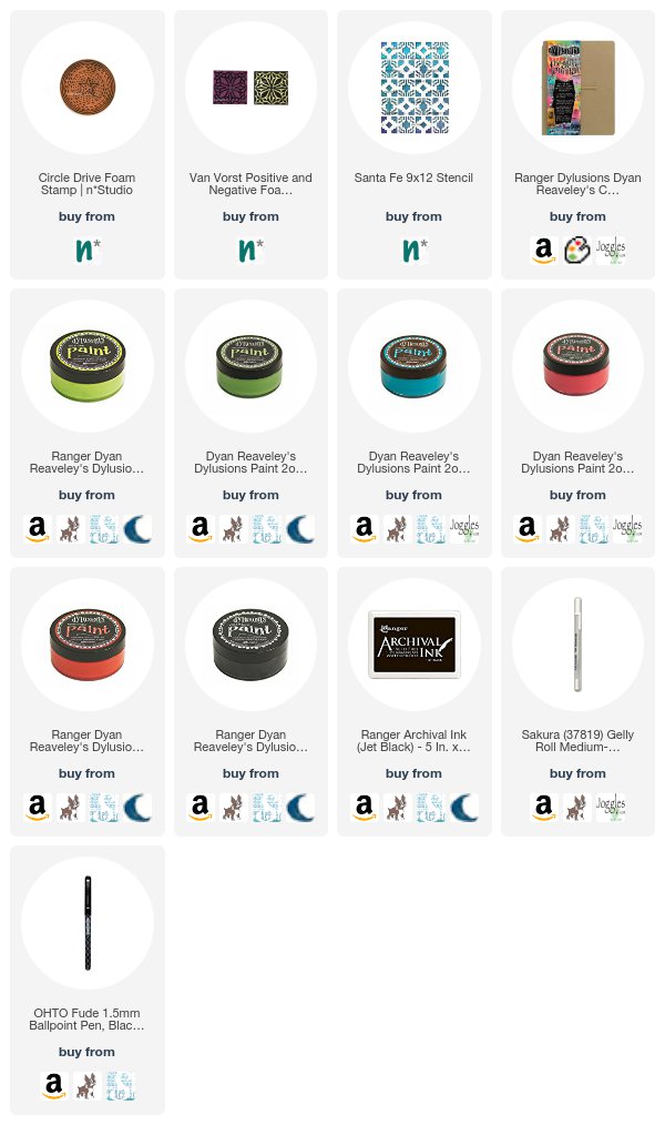
Thank you Shilpa – I just love this happy color combination and the mix of patterns! In addition to dictionary paper, Shilpa used the following supplies (some are affiliate links):


Play along with us too: I love to see how you interpret our monthly themes. Email me how you used my stencils and stamps with the theme and email me an image – I would love to share your projects in my next  “n*Spiration From Around the Globe“.
SaveSave

Comments (1)

  • Sue Clarke

    |

    Thank you for the step by step tut Shilpa.
    Great and inspiring colors as well.

    Reply

Leave a comment

My Fire Burns Bright – Jennifer Gallagher


Happy Tuesday and Happy Holiday Season from the Creative Squad! Today we have a beautiful art journal spread from Jennifer Gallagher to lift us up and brighten our day. Jennifer is using my Exchange Place and Valley Road foam stamps and this month’s theme: My Fire Burns Bright – Creativity is a passion that can come from deep within the heart and soul of the maker. Sometimes this fire gets ignited by an event or an influential person in our lives, and other times it can be ignited by a love for a material or just simply the enjoyment that comes from making. What makes your creative fire burn bright?


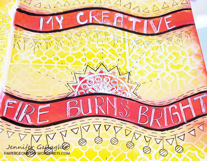
Creativity is one of those things that can burn brightly or die down occasionally. We all need to be inspired and recharge our artistic batteries now and again. New ideas and a fresh perspective can be all it takes to start a really exciting artful adventure. So this month our creative squad members are all taking a look at what keeps their creative fires burning. For me, it really is multiple things. First, I find that creating just for the fun of it is key. As a working artist, I often lose track of this. But finding time in my schedule to make things for myself, or just for the heck of it, really keeps me balanced. One way I do this is through art journaling. My art journal is a place for artistic experimentation and self-expression. Second, I find that seeking out new ideas and inspiration from my fellow artists is what really keeps me going. One artist in particular, for me, brings both of these ideas together. Recently I have been very inspired by Tina Walker. Tina’s art journal spreads are bright, bold, and fearless. I really admire her work. I had her in mind when I created this journal page.

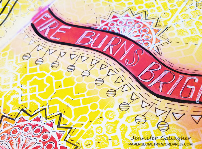
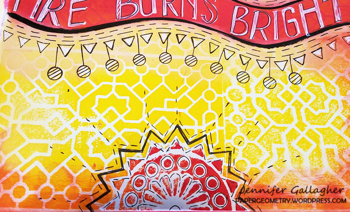
I do not journal per se, but I do use quotes and phrases to express myself. I find it hard to find the words to add to my pages so quotes or lyrics really tend to fit the bill. On this spread, I used our creative squad theme to literally say it for me. Just between us, I struggle with hand-lettering. I tend to avoid it at all costs! However, one of my goals this year has been to write in my journal and be at peace with the quality, or lack thereof, in the hand-lettering. On this page, I just went for it!

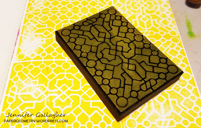
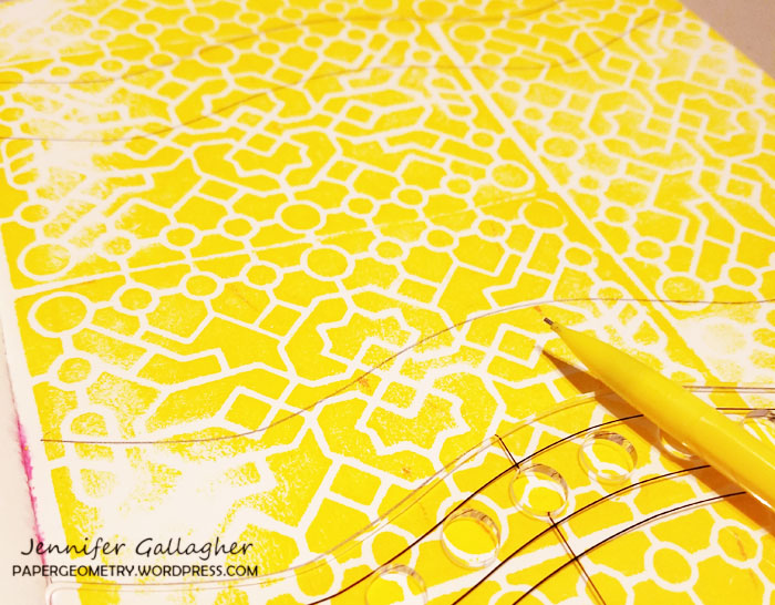
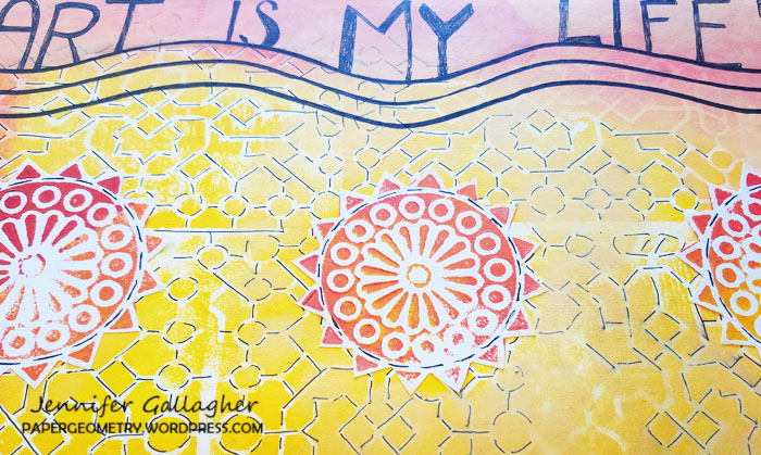
I started by brayering out the yellow paint on my gelly plate to use it as a stamp buddy for my artfoamies. I used Nat’s Exchange Place Artfoamie, pressed it into the paint, and applied it onto my art journal pages for a cool background.

After the paint dried I used my Dylusions large journal block to pencil in a few places that I would later add my text.

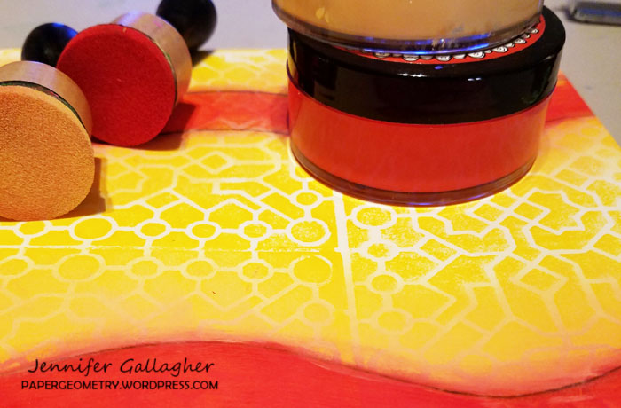
I used my mini-blending tools to apply my red dylusions paint to those penciled in spaces. I then did the same with the vanilla custard around the edges to get a nice blurred edge look to the red sections.

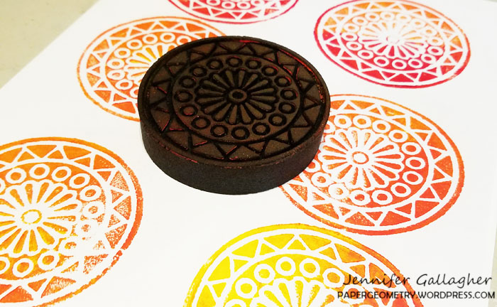
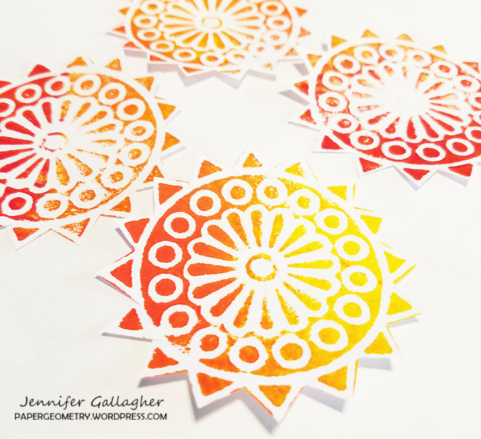
While that paint was drying, I used Nat’s Valley Road ArtFoamies to stamp out what will become several suns I will place on my journal pages. I stamped several of them onto a large sheet of white paper. I then cut around the edges of the shapes, revealing a sun shape.

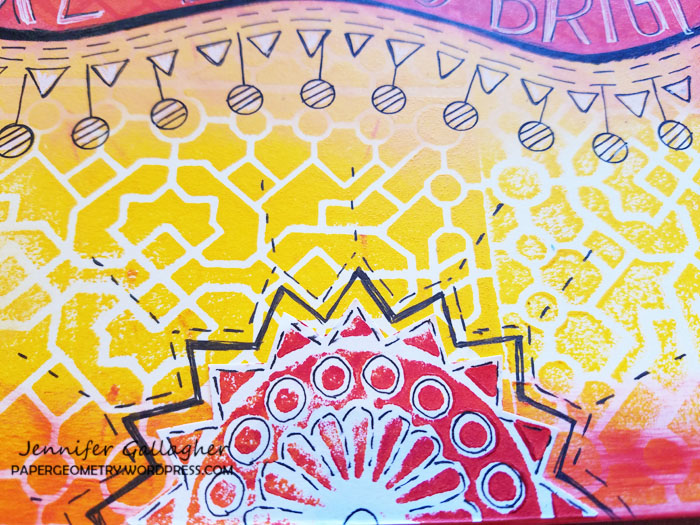
I applied the cut paper suns, did a lot of doodling, and wrote in my saying.

I love this journal spread. I hope you will find it as a source of inspiration for your own creativity.


Thank you Jennifer – I love your thoughts on inspiration and sometimes just letting loose and having fun with artmaking. So true! Jennifer used the following supplies:


Play along with us too: I love to see how you interpret our monthly themes. Email me how you used my stencils and stamps with the theme and email me an image – I would love to share your projects in my next  “n*Spiration From Around the Globe“.
Comments (1)

  • Sue Clarke

    |

    Jennifer, the perfect colors for an inspiring message!
    Happy Holidays,
    Sue

    Reply

Leave a comment

My Fire Burns Bright – Josefine Fouarge


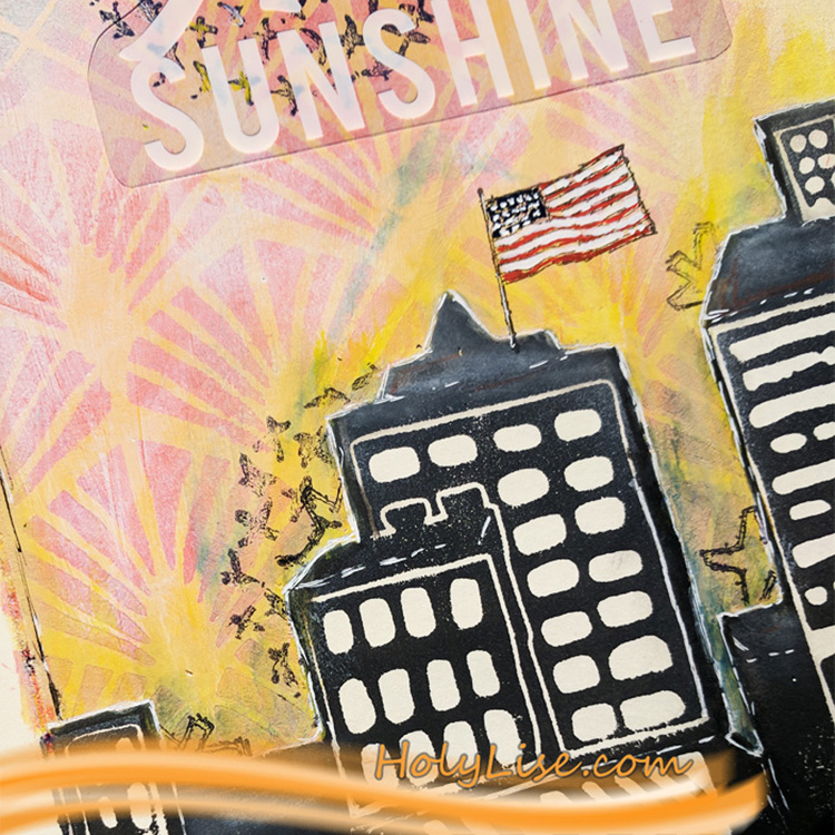
It’s Tuesday and time for a post from my Creative Squad.  Today we have a beautiful art journal page from Josefine Fouarge that shows how sometimes you just gotta go with your gut and create! Josefine is using my Midtown Foam Stamp Set, Toledo 9×12 stencil, Art Deco Wallpaper stencil, and a few of my cling rubber stamps along with this month’s theme: My Fire Burns Bright – Creativity is a passion that can come from deep within the heart and soul of the maker. Sometimes this fire gets ignited by an event or an influential person in our lives, and other times it can be ignited by a love for a material or just simply the enjoyment that comes from making. What makes your creative fire burn bright?


Welcome to the December Creative Squad topic “My fire burns bright”.

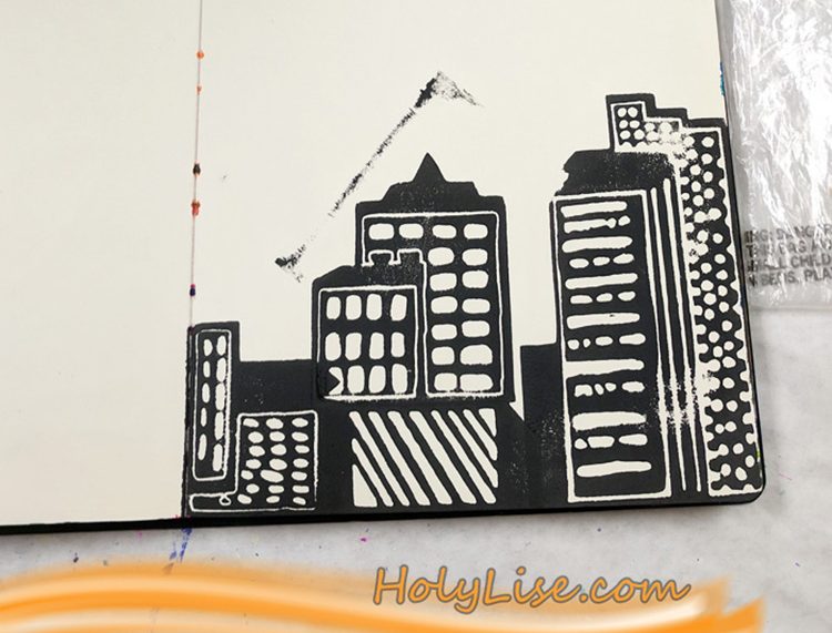
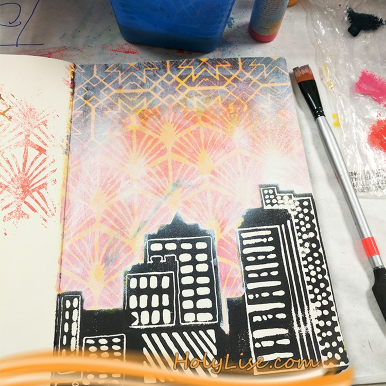
I don’t know why, but my first thought when I read this theme was sunrise. Instead of trying to analyze it, I decided to just go with it and create a scene using the Midtown foam stamps. I stamped three of them onto my art journal page. One of them is actually supposed to be standing up, but I think it works out pretty well laying down.

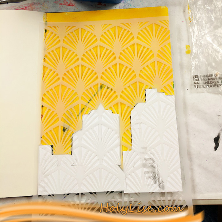
Next up I created some simple masks for the houses to cover them while I was working on the background. I used a yellow paint for the first layer. Then I added some texture using the Art Deco Wallpaper stencil. In order to blend the orange colors in, I used my brush in a dapping motion. I mixed the paint with water, so it was a little easier to blend them as well.

For the night sky I decided to use the Toledo stencil and a few darker shades of red and blue. After I was done, I felt that the background was too bright, so I sprayed gesso over it. That helped blend the two areas together a little more and made the skyline pop again.

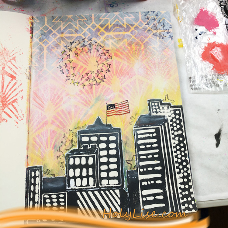
Now on to the finishing touches. I started by stamping Nat’s Star Tag stamp and Cross Circle stamp all over the page. I added more dimension by “hiding” them behind the skyline. For that effect, I covered the house with my mask and stamped over it. When I removed the mask only the partially stamped image stayed on the page.

To make the sun even brighter, I outlined the skyline with two different shades of yellow using my Liquitex ink pens and blended the ink out with my finger. My scene was all set, it just missed a little extra – the U.S flag stamp on top of one of the skyscrapers.

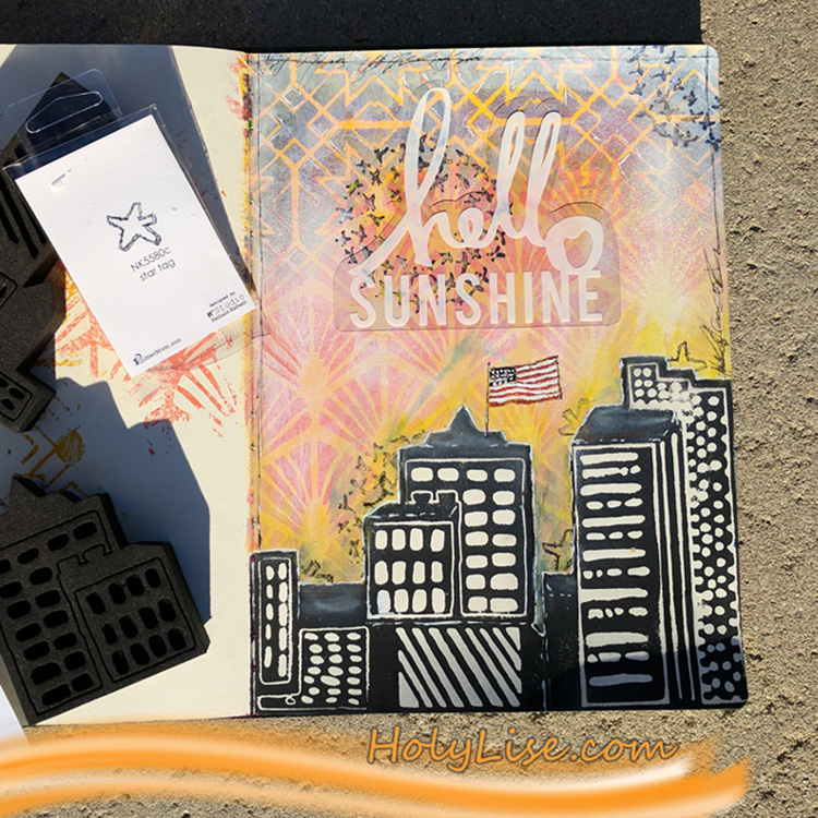
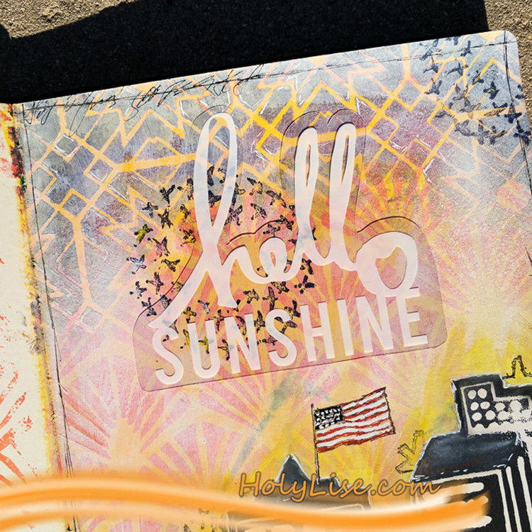
At the end the page needed a frame and a sentiment. I started with adhering the “hello sunshine” acetate piece to the middle of the page. Then I drew in a scribbled border and some random text.

The fires are now burning bright on this page, introducing a new day for whomever lives in that city J


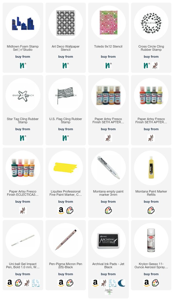
Thank you Josefine! In addition to her art journal, Josefine used the following (some are affiliate links):


Play along with us too: I love to see how you interpret our monthly themes. Email me how you used my stencils and stamps with the theme and email me an image – I would love to share your projects in my next  “n*Spiration From Around the Globe“.
SaveSave

Leave a comment

My Fire Burns Bright – Marsha Valk


Welcome to December and a new post from my Creative Squad! Today we have a series of gorgeously layered pieces from Marsha Valk. To create such lovely backgrounds, she used my Downtown foam stamp set, my Amsterdam stencil, and a variety of my cling rubber stamps. This month the squad is using a new theme for inspiration: My Fire Burns Bright – Creativity is a passion that can come from deep within the heart and soul of the maker. Sometimes this fire gets ignited by an event or an influential person in our lives, and other times it can be ignited by a love for a material or just simply the enjoyment that comes from making. What makes your creative fire burn bright?


My creative fire ebbs and flows like I’m sure yours ebbs and flows too. We all need new input now and then, to spark creativity, get new ideas and to try new supplies or old supplies in a new way.

Nat’s Creative JumpStart always hugely ignites my creativity. And by that, I mean not only the event in January, but also the brainstorm and preparations I get to do as one of the featured artists(!). It’s so much fun creating something extra special just for CJS!

In January I attend the online event and watch all of the videos together with all of you. I always find new artists to follow (or take classes from), and I take notes of what supplies, techniques or ideas I want to try myself later in the year.

One artist that inspired me in particular during Creative JumpStart 2017 was Mystele Kirkeeng. It wasn’t until recently though that I purchased a couple of her Wonder Paint episodes. In these recorded studio sessions you get a chance to look over Mystele’s shoulder while she paints, explores and plays. Mystele uses all kinds of supplies in her beautiful art, and that lead me to unearth stuff from my stash that I usually never use.

She prompts me to ask myself questions about what attracts me to specific art or supplies and reminds me that it’s OK to work on loose scraps and sheets of paper just for the sake of creating, layer after layer after layer.

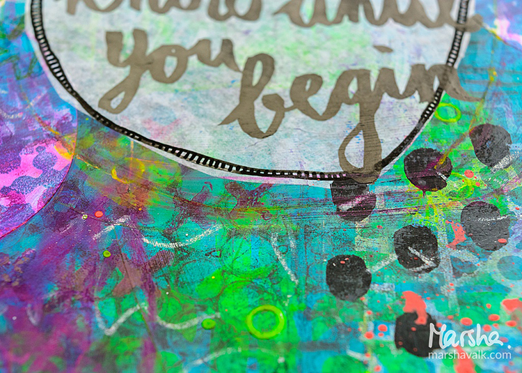
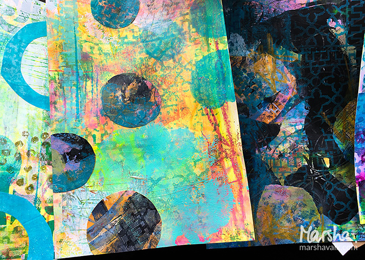
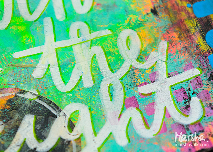
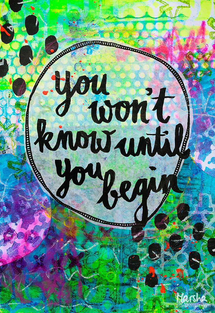
Two of these ‘loose sheets of paper’ started out as Gelli Prints, the other two are cut from paper I used to clean my brayers and brushes. On top I scribbled, stamped, heat embossed, collaged, painted, scraped, sprayed, splattered, made marks and doodled and I pretty much used anything that was within reach.

The results are super messy, colourful and highly textured pieces of paper that I immensely enjoyed making!

If you want Mystele to ignite your creative fire too, then you are in luck because she’s one of the 31 featured artists for Creative JumpStart 2018!

I cannot wait to see what she has cooked up for this edition of CJS. Join us and register for Creative JumpStart 2018 here!

Happy December!


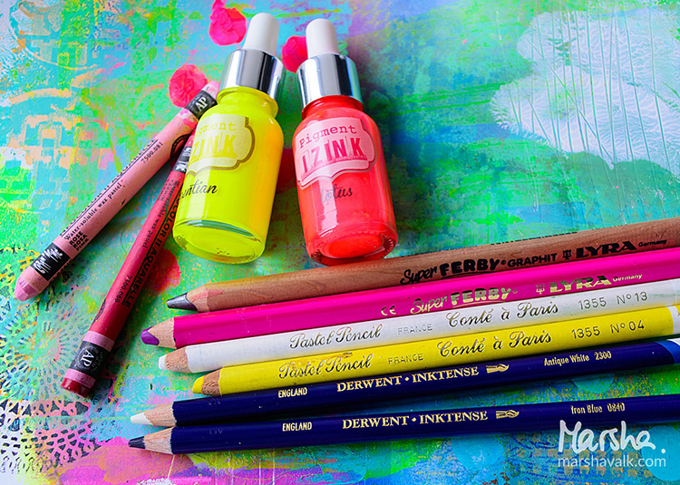
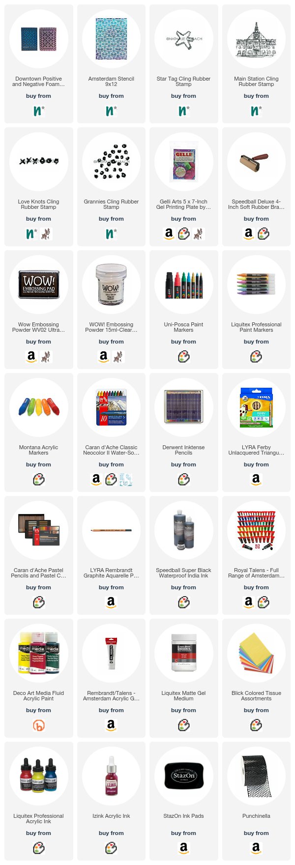
Thank you Marsha! It’s not only a pleasure to see this super juicy series of yours, but it also makes me grin to know that CJS is doing what I always hoped it would: inspire artists of all levels to feel a renewed sense of creativity :)  Marsha used the following supplies (some are affiliate links):


Play along with us too: I love to see how you interpret our monthly themes. Email me how you used my stencils and stamps with the theme and email me an image – I would love to share your projects in my next  “n*Spiration From Around the Globe“.
SaveSave

Leave a comment

Each Day is a New Adventure – Shilpa Nagaonkar


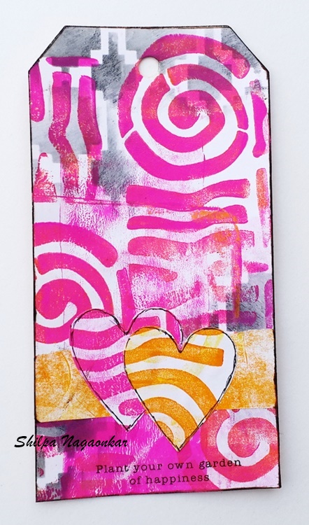
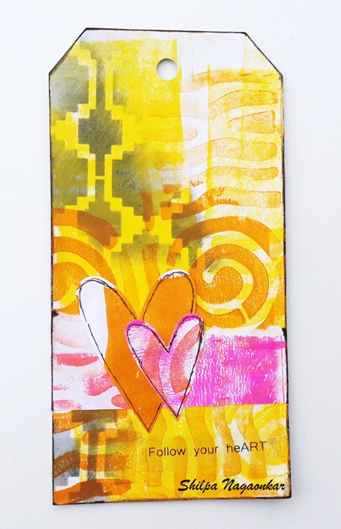
Hello and welcome to a post from the Creative Squad! Today we have some super colorful tags from Shilpa Nagaonkar to brighten your day. Shilpa used my Mini Batik Pattern 2 foam stamp and my Mesa Verde stencil for lots of layered pattern goodness. This month the Squad is working with the theme: Each Day is a New Adventure – Be adventurous this month and try something new in your art-making! Use a new tool, medium, or technique that you’ve been meaning to try for too long now. Go on a new adventure TODAY!


Hello Everyone! My teamies have shared beautiful projects with this month’s theme – “Each Day is new Adventure” and now it’s my turn today. I love to try new techniques in my mixed media work. I am using Nat’s beautiful stamps for the first time these days, and that itself is an adventure for me… but today I’m going further and using a Gelli Plate for the first time…

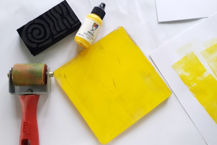
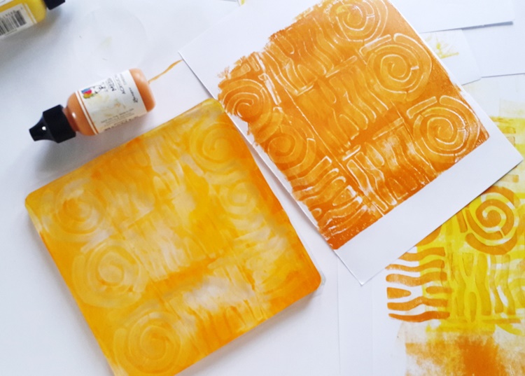
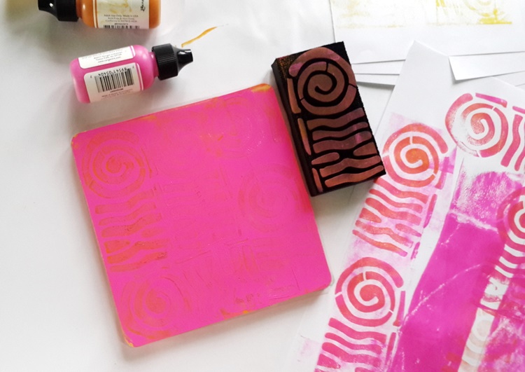
Here is what I did: I applied acrylic paint to the Gelli plate using a brayer.

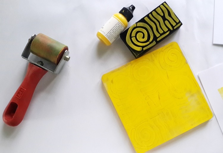
I stamped on the Gelli plate several times with the Mini Batik Pattern 2 stamp.

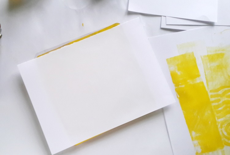
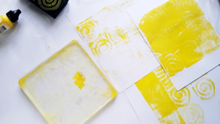
Then I pressed copy paper onto it and I got my monoprint/ Gelli print.

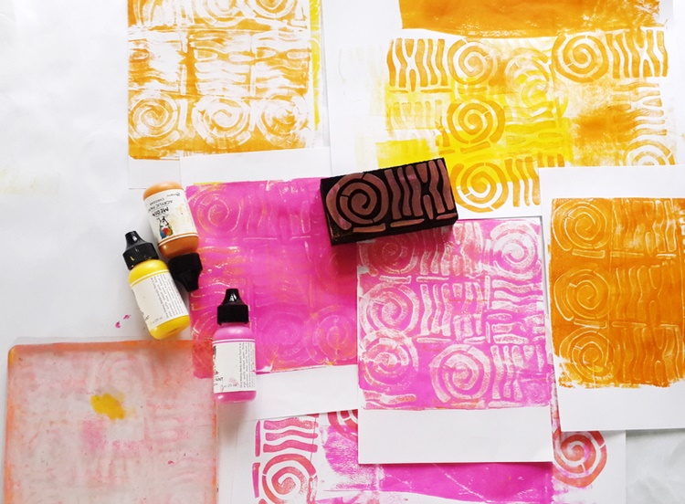
I did this same procedure using 3 different colors – Lemon, Cheddar and Magenta.

You will find in the pictures, I got several backgrounds.

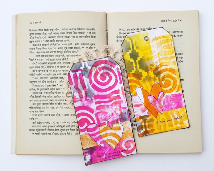
After that, I cut out tags from the gelli printed papers and adhered them on white card tags. For my next layer, I applied blacksoot distress ink through Nat’s Mesa Verde Stencil randomly on the tag.

I also cut out hearts from the same gelli prints and adhered them on the tag. and they are ready :)

Nat’s ArtFoamies and Gelli plate are a perfect match! I am sure going to make more monoprints with them…

Thanks so much for stopping by.


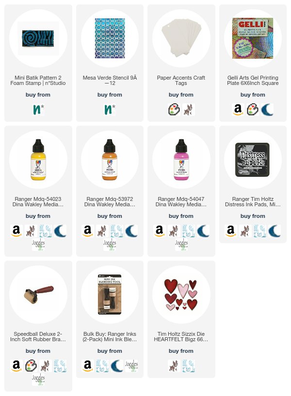
Thank you Shilpa for a fun combination of color and pattern! In addition to some white copy paper and glue, Shilpa used the following supplies (some are affiliate links):


Play along with us too: I love to see how you interpret our monthly themes. Email me how you used my stencils and stamps with the theme and email me an image – I would love to share your projects in my next  “n*Spiration From Around the Globe“.

And join me tomorrow, Wednesday November 29th for a little gossip from my studio! I’ll be on Facebook Live chatting about all sorts of fun NEW stuff. You’ll have to join us to see what all the excitement is about ;)


SaveSave

SaveSave

SaveSave

SaveSave

Comments (1)

  • Deleted User

    |

    These are beautiful, Shilpa!

    Reply

Leave a comment

Each Day is a New Adventure – Jennifer Gallagher


Hello from the Creative Squad this fine Tuesday! Today we have a super creative way to dress up some storage boxes with Jennifer Gallagher. Jennifer is using my Mini Batik Pattern 1 foam stamp and my Batik stencil, as well as this month’s theme: Each Day is a New Adventure – Be adventurous this month and try something new in your art-making! Use a new tool, medium, or technique that you’ve been meaning to try for too long now. Go on a new adventure TODAY!


I am so excited to be back with you again this month for another creative squad post. This month our team is focusing on new artistic adventures. Each day really is a new adventure! Keeping that theme in mind, I decided to try something I have always wanted to try. I have always wanted to decorate a few pre-made paper mache boxes for some decorative storage. I figured this was the perfect time.

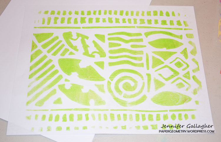
I began this project on my 8×10 inch gelli printing plate. After selecting several shades of blues, greens, and oranges, I decided to go with a Batik design. (Color list: Sunbeam, Nectarine, Laguna, Key West, Cool Blue, Parakeet, Black) Lucky for me, Nat has a great Batik stencil and set of Batik foam stamps. I used my 9×12 inch Batik stencil and gelli printed multiple pages on white paper.

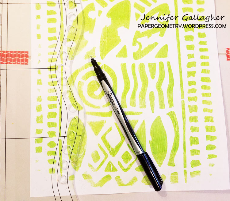
I picked through my gelli-printed papers and chose my favorites. I then used my large Dylusions journal block and a black fine tip sharpie and drew alongside the outside edge of the journal block. I saved a few sheets of batik paper for another step.

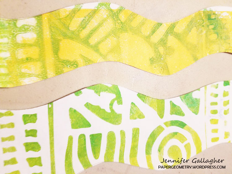
Then I cut along the drawn lines. These strips will eventually be glued down the paper mache box in alternating strips.

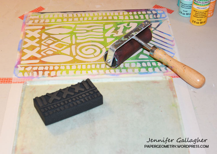
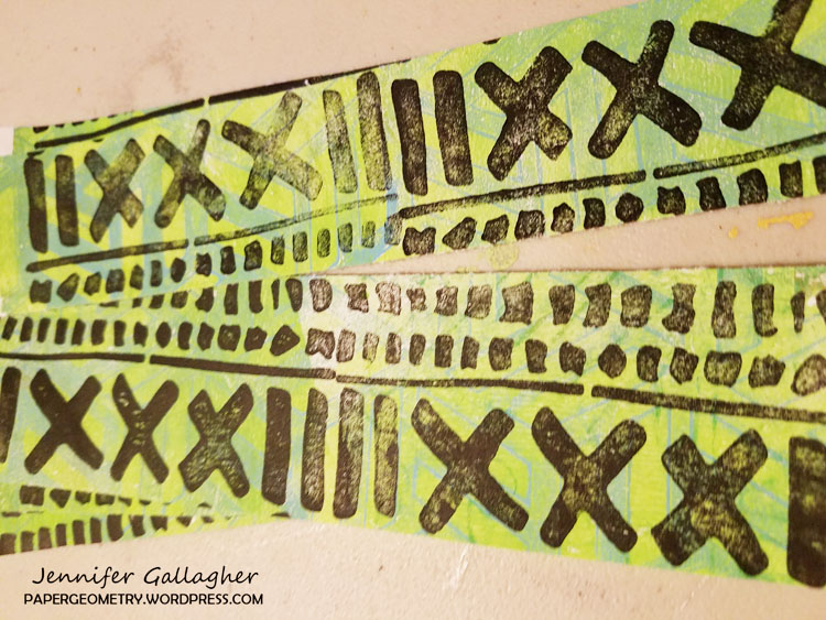
While I had my gelli plate out, I thought it would be quicker to use it instead of a stamp buddy. I brayered the black paint out in a small spot. I then pressed my Mini Batik Pattern 1 foam stamp onto the black paint and pressed the design on the paper I had reserved earlier. I continued this design all along the paper. I then cut the papers into strips.

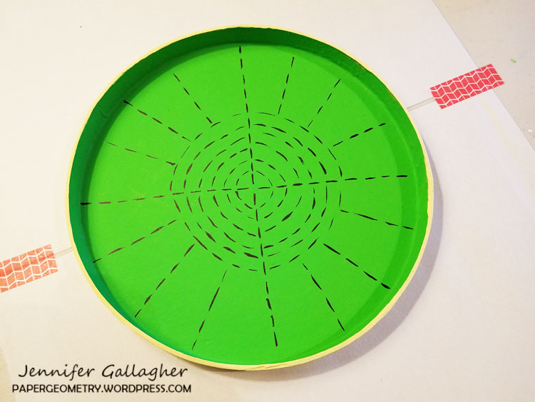
I painted the inside of both containers and their lids with Dylusions paint. One box I painted with cut grass and the other with vanilla custard. Let the acrylic paint dry before moving on.

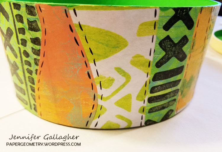
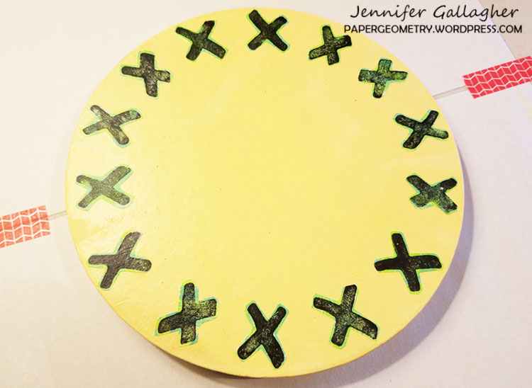
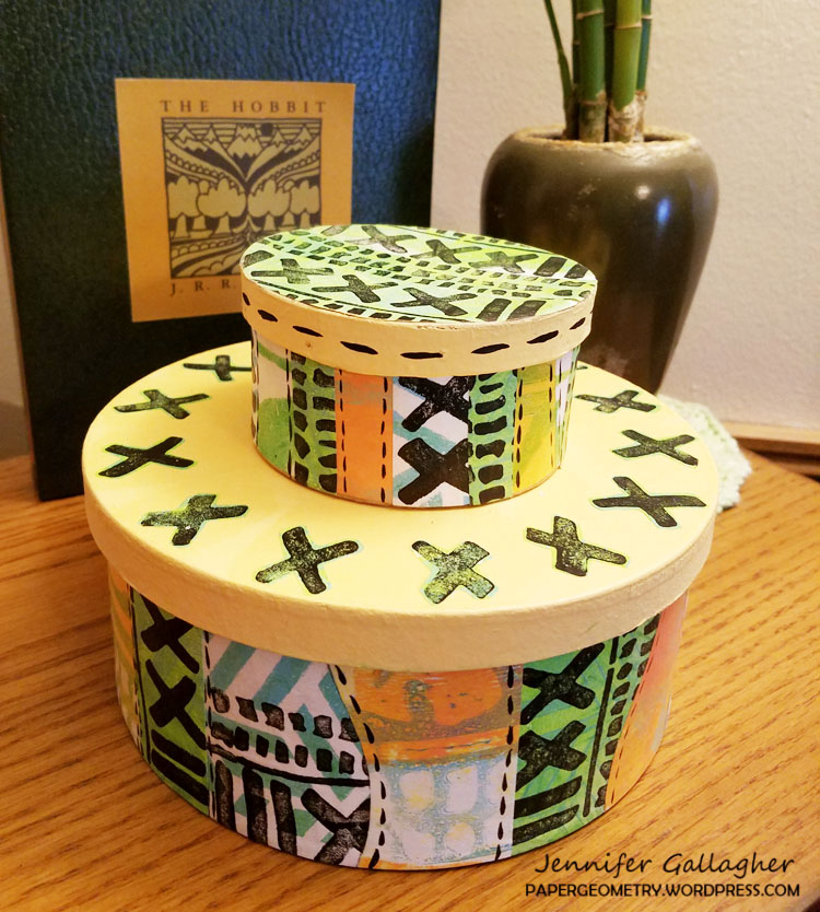
Using matte finish mod podge, I glued the strips down to both of my boxes while alternating the colors and patterns. Patience during this step is the key to a nice finished piece. Do not try to glue too many at once and allow sections to dry before moving on. I also glued down strips to the top of the small box. Using the leftover paper, I cut out all of the x’s. I then arranged them on top of the large box top. Once I had them arranged how I wanted, I glued them down too.

After gluing down all of the strips to the containers and their lids, and allowing them to thoroughly dry, I decided to add some final details. Using black Dylusions paint I added some fun designs to the interior of each container. I also did some dashed lines alongside the strips on the outside.

I hope this post has inspired you to try something new. I am very happy that I did! Be sure to comment and let us know how you intend to try something new. See you next time.


Thank you Jennifer – I love your colors! In addition to white paper, Jennifer used the following supplies (some are affiliate links):


Play along with us too: I love to see how you interpret our monthly themes. Email me how you used my stencils and stamps with the theme and email me an image – I would love to share your projects in my next  “n*Spiration From Around the Globe“.
Leave a comment