Creative Squad

Creative Squad: Masquerade Party – Robin Seiz

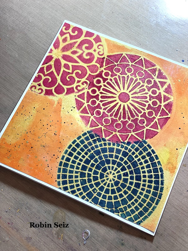
Hello from my Creative Squad! Today we have some fantastic cards from Robin Seiz who is using my Grove Street, Central Avenue, Valley Road, and Park Blvd stencils and our theme: Masquerade Party – Let’s play with disguises, the technique of masking, or maybe creating a bit of mystery this month. Not everything is what it seems, and it can be an interesting artistic trick to obscure or reveal in your artwork.


Hi friends, This month’s theme is Masquerade Party. I’m not a big fan of Halloween (I know I must be the only person in the US) LOL So I decided to interpret this theme in the broadest sense of the word. (One of the many great things about being on this Creative Squad is that we have license to do this! )  I thought about what the word Masquerade means — to conceal something  — and I decided to use the mixed media “masking” technique for my project. 

I find “masking” a bit challenging, both in terms of the layers of paint and really thinking through and planning in advance the results that I want. I am more of a “put it down and see what happens” artist typically, but that doesn’t really work with masking. How about you? Do you find masking easy or challenging?

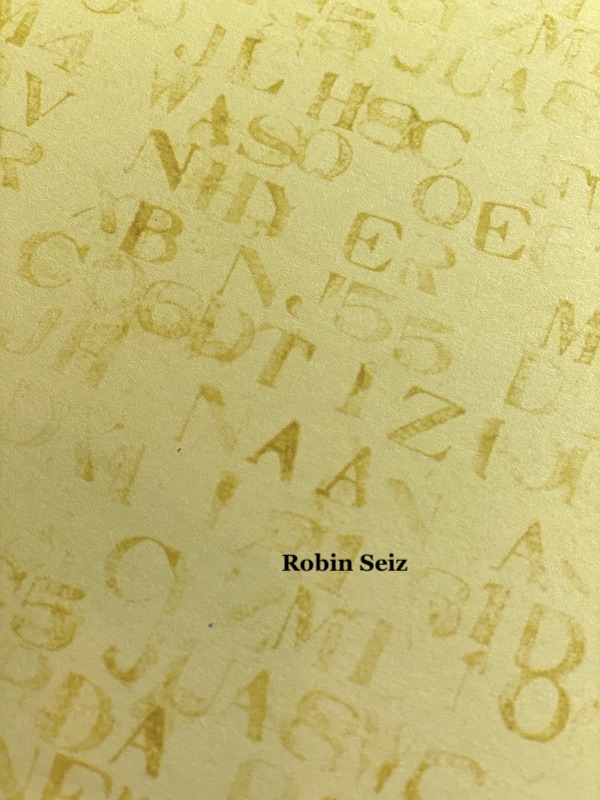
I am committed to working with supplies that I have in my studio rather than buying new things. As a result, I decided to use the paper from a 12×12 paper pad that I had on my shelf. I love using patterned paper for Gelli printing. The paper I chose dictated the size of the Gelli plate — 12×14. 

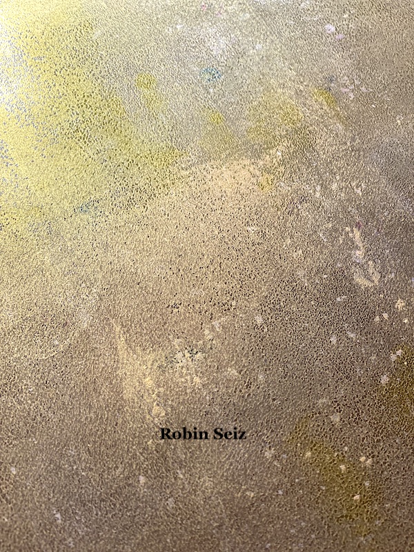
If you have read my recent blogs for the Creative Squad, you know that I have been loving Gold Gesso. I believe gold adds so much to a piece of art. I began this project by putting gold gesso down on the Gelli Plate and pulling a print. I wanted enough paint to have good coverage, but I also wanted the pattern to show through.

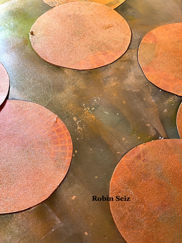
I cut out nine circles the same size as the patterns of the 4×4 stencils I planned to use (Grove Street, Central Avenue, Valley Road, and Park Blvd) These became my masks. Next I placed them down on the Gelli Plate, remembering that the pattern would be reversed when I printed it. Sometimes taking a “practice print” at this point is good. You can rearrange the masks if you don’t like how they turn out when printed. Once I was satisfied with the arrangement, I spread orange and yellow paint with a brayer over the masks. 
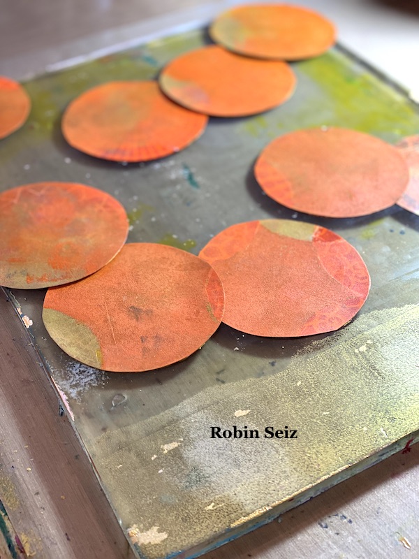
Next I removed the masks and now gold circles were visible where the masks had been. These circles were my guide to where I wanted the stencils and provided a lovely gold background for each stencil. 
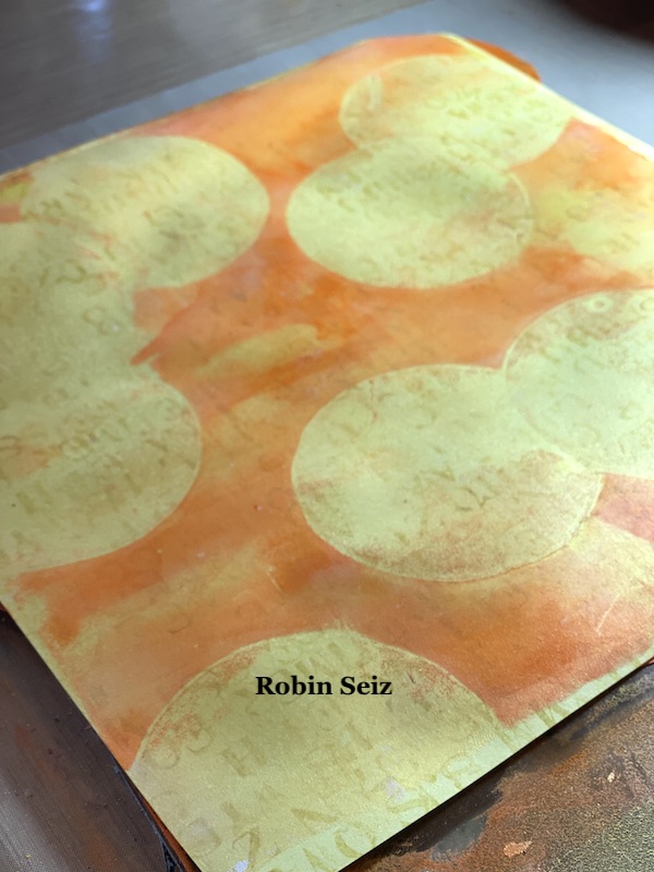
The next step is the one I find most challenging — determining which stencils to put down first. The rule of thumb in masking is to complete all the pieces in the foreground first. Once you do that, and your stencil is dry, you can then place the mask back over what you just stenciled to move on to the next piece that will be concealed. On my page, I started in the upper left hand corner with the blue Valley Road stencil.
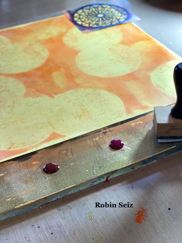
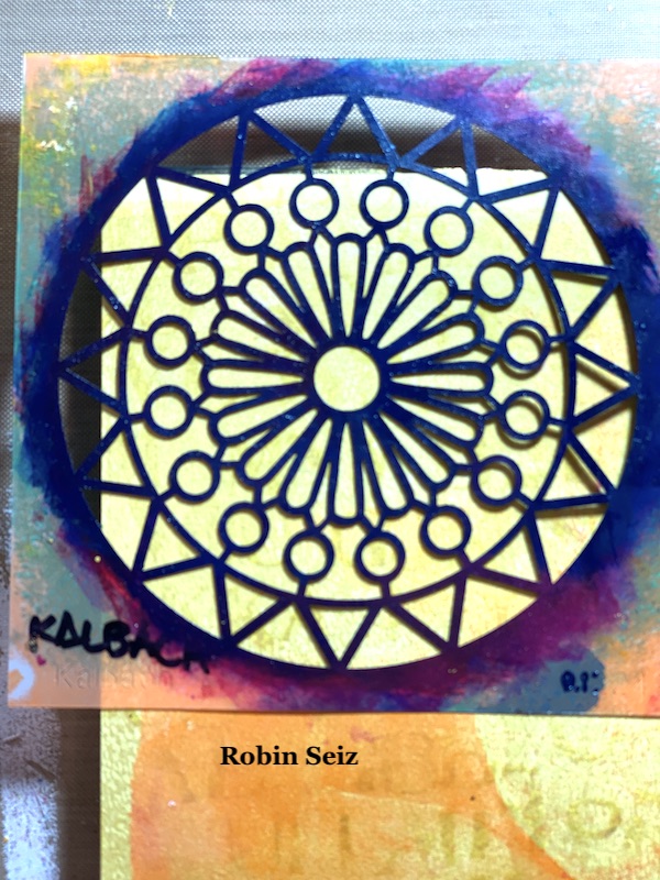
Then I did the Magenta Park Blvd stencil on the right middle and then the brown Central Ave stencil on in the lower left hand corner because all of these were going to be in the foreground. Once these were dry, I could move on to masking each one and stenciling the ones next to them that would be concealed. (In this case the two Quinacridone Magenta Grove Street circles on the right middle and upper left and the Quinacridone Magenta Valley Road Stencil in the lower left).
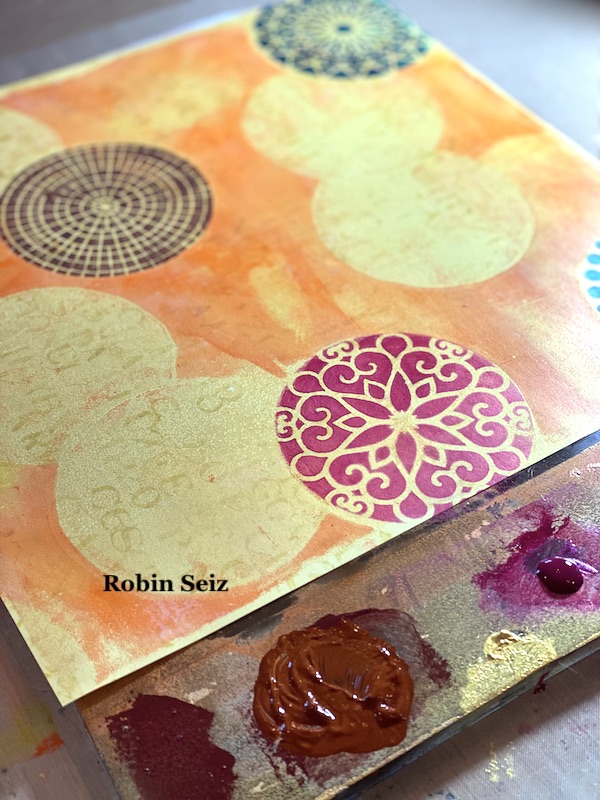
The most important thing to remember when you move to your second piece (or the piece that will be concealed) is to place the mask about 1/8” inside the first stencil — so 1/8” of the masked stencil  is showing outside the mask. If you don’t do this, you will get a gap and the conceal won’t look natural. You will have white space (or in this case gold space) between the two pieces. I used washi tape to place the mask on the page. 
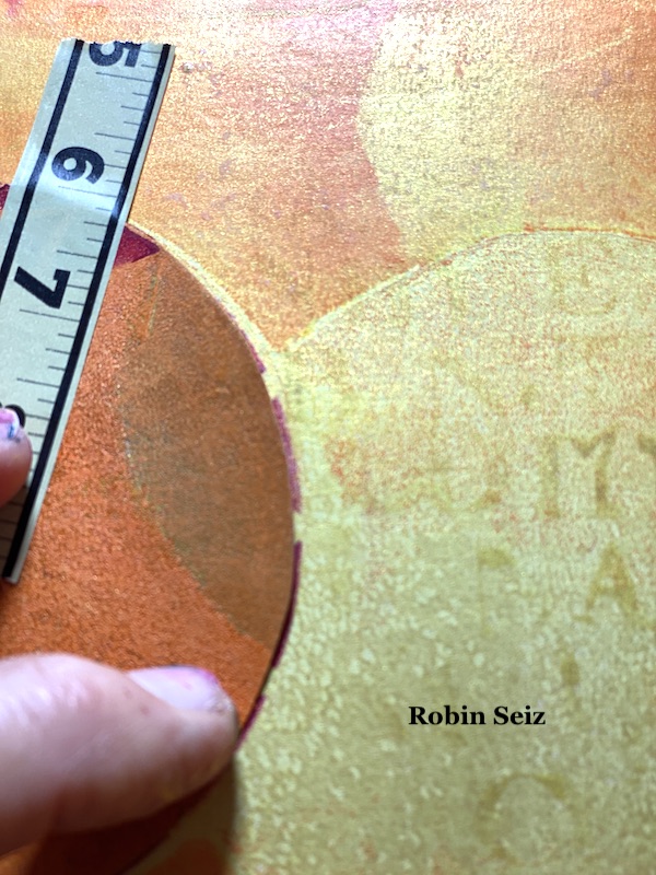
Just a note about applying paint to the stencils. I first tried a makeup sponge, but found that I am too heavy handed and the paint tended  to glob up. I used one of my Tim Holtz applicators that are made for distressed inks or alcohol inks. I found rubbing the paint over the stencil worked best for me and gave me a clearer image. You may be skilled at the make up sponge, but I’m a heavy paint user!!!! LOL

I repeated this technique, masking the second stencil so that the third would be concealed. (see the middle center three.) 

I’m realizing this is a hard process to describe in words. I hope it’s clear. Just send me a note if you have questions.
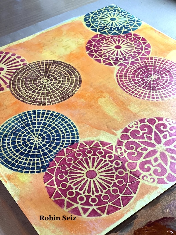
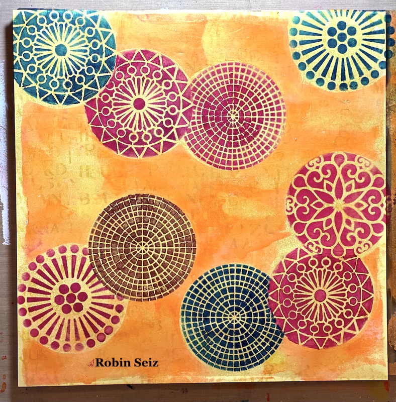
When I was finished with all the masking, the page looked like it needed a little something else. I laid down some black and gold splatter on the  page. This always gives a piece a finished look.
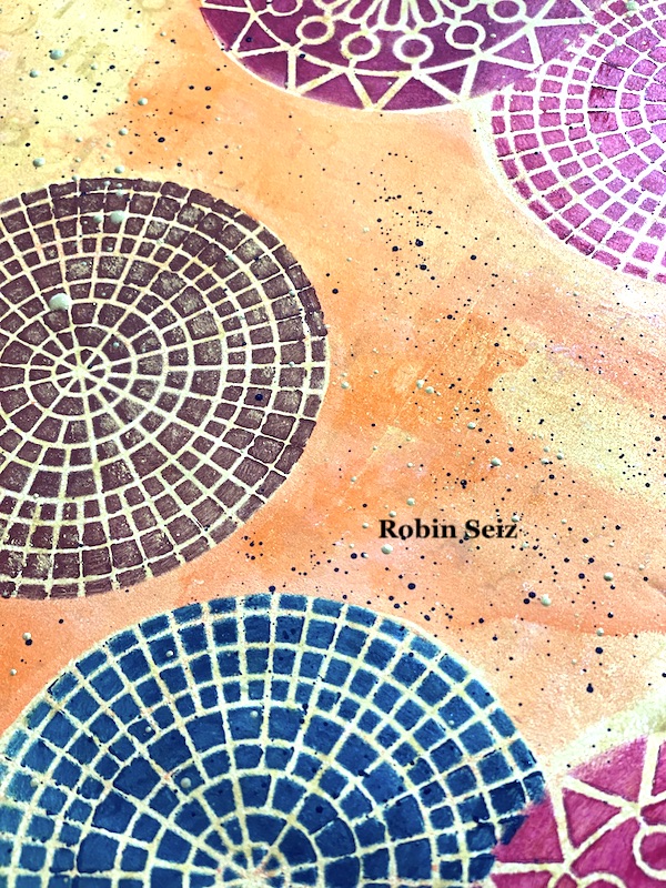
This page, since it’s large, could be used as a journal page, gift wrap, emphemera (if you cut out the stenciled pieces), or greeting cards. I chose to cut the paper into 4 sections and make  6×6 greeting cards. I love the size and how vibrant they turned out. I sometimes like my work more when I cut it into smaller pieces. Don’t be afraid to try this! You might be surprised at the results. 
I hope you try this Masquerading project. Please post your projects. I can’t wait to see them! 


Thank you Robin and I love that you chose the more abstract interpretation of this theme and showed us a masking technique!

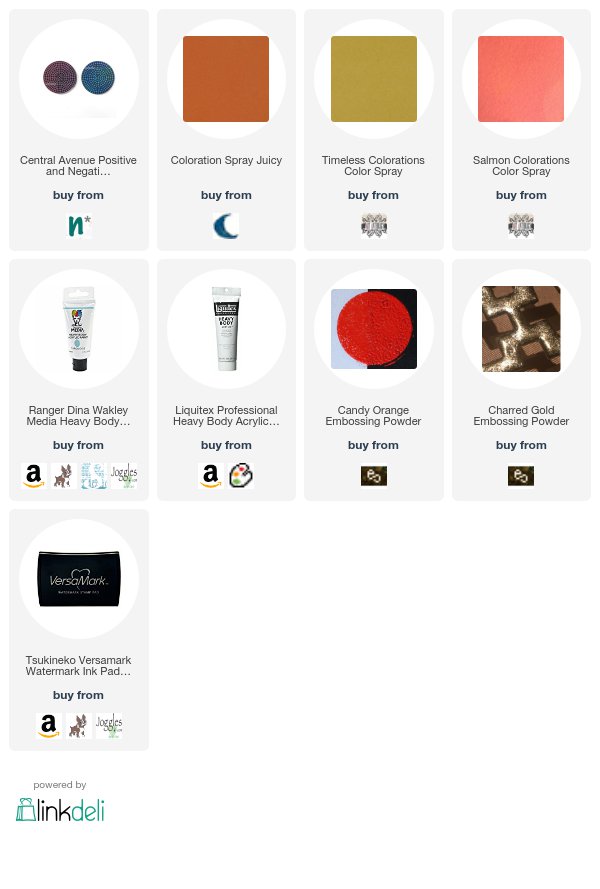
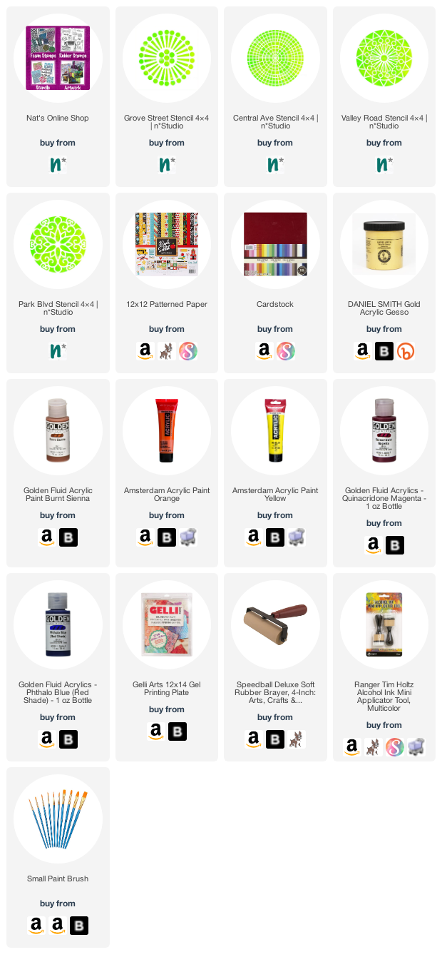
Give it a try: you can find all my Stencils in my Online Shop and here are some of the supplies Robin used:
Follow the Creative Squad on Instagram for weekly posts, artwork, and inspiration.
Leave a comment

Creative Squad: Primary Colors – Robin Seiz

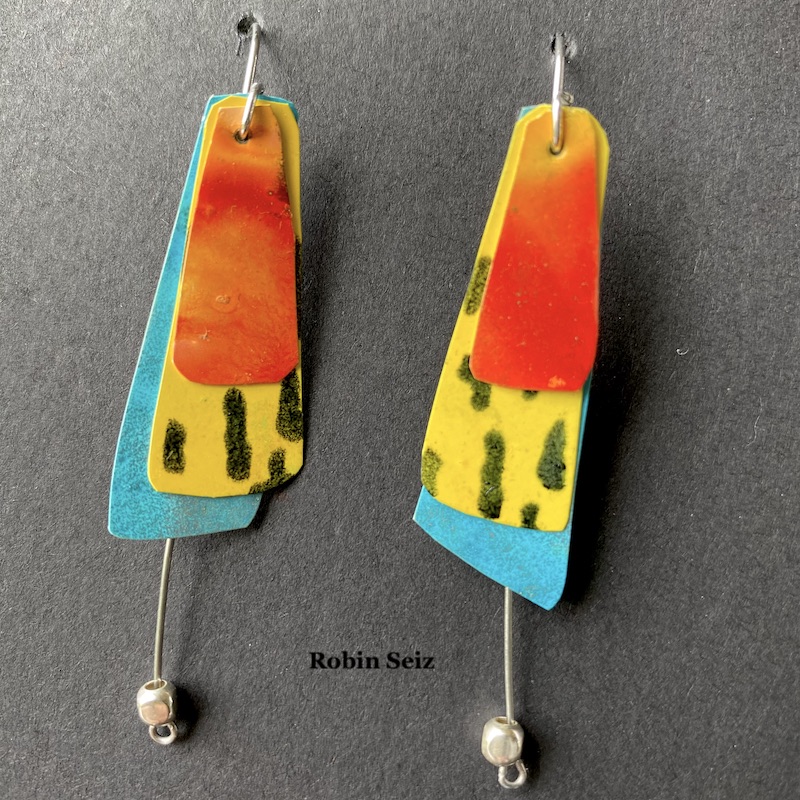
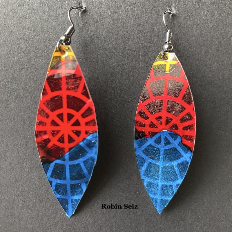
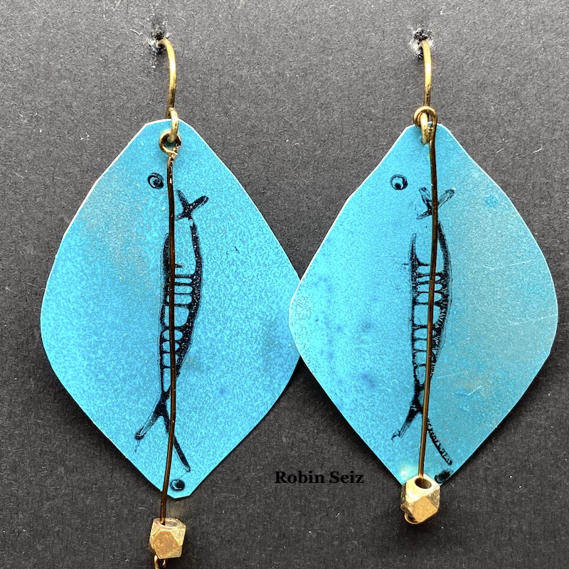
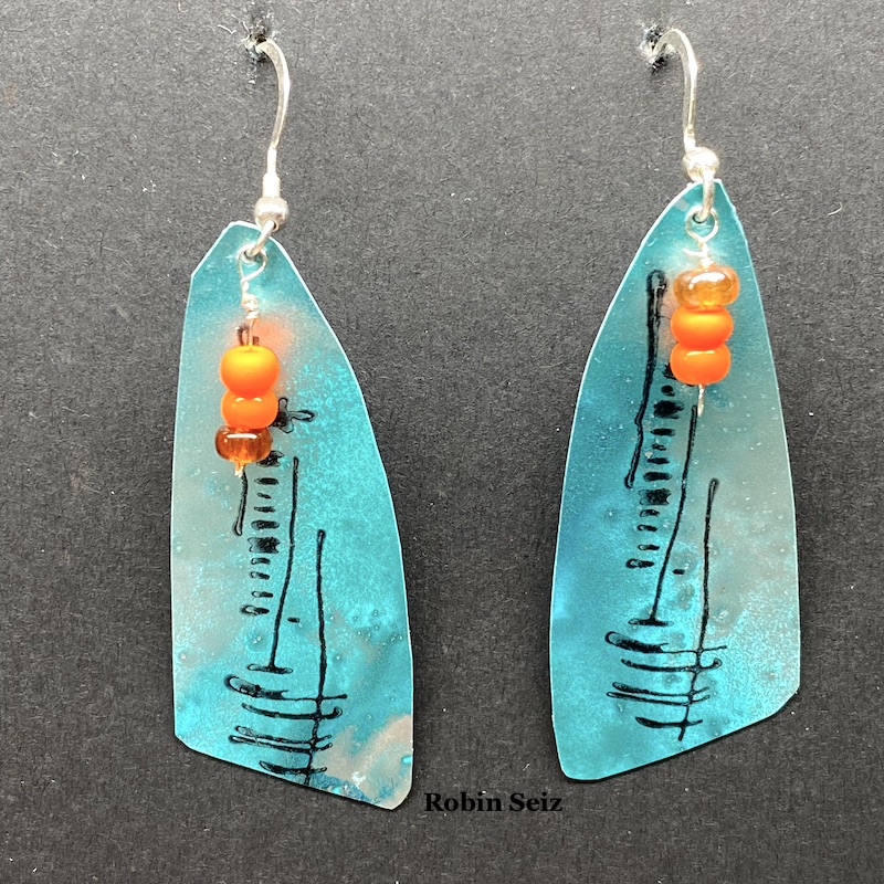
Hello from my Creative Squad! Today we have some seriously awesome earrings from Robin Seiz using my Central Ave 4×4 and Signals stencils and my Wabi Sabi rubber stamps. This month’s theme is: Primary Colors: Red, Blue, and Yellow it’s your time to shine. Let’s get back to the basics of color and light and play with primary colors. It’s elementary my friend! This month we are also pleased to be partnering with Grafix who supplied the squad with some cool products to try out. Read on:


Hi Friends,

This month was about using primary colors, Grafix Products and of course, incorporating Nathalie’s wonderful products. Primary colors are so happy; they remind me of summer, but I must admit that I don’t use them often. It was good for me to reflect on why they aren’t my “go to” colors. The reason I suspected was amplified in this project. I’m a messy multi-media artist. What I mean by that is, I’m always mixing colors. Primary colors by their nature make a host of other colors, so once I put them down on paper, I always end up with something else; they rarely end up in their pure form. For example, the “red” in the earrings I created is really orange, because once the yellow and red mixed…. well, it’s no longer red and yellow. :)

I hadn’t been introduced to Grafix products prior to this month, but I loved working with the opaque craft plastic. I’m excited to work with some of the other products as well. This opaque craft plastic works really well with alcohol inks. It seems to hold the ink in place a little better than Yupo, for example. This produces even more vibrancy than you normally get with alcohol inks.

My mixed media journey started with scrapbooking and then went to jewelry and then exploded to all kinds of other mediums and substrates. As result of my early days, I still have a lot of jewelry making supplies. Sometimes, I get the urge to combine my mixed media work with making jewelry. For this month, that meant earrings.

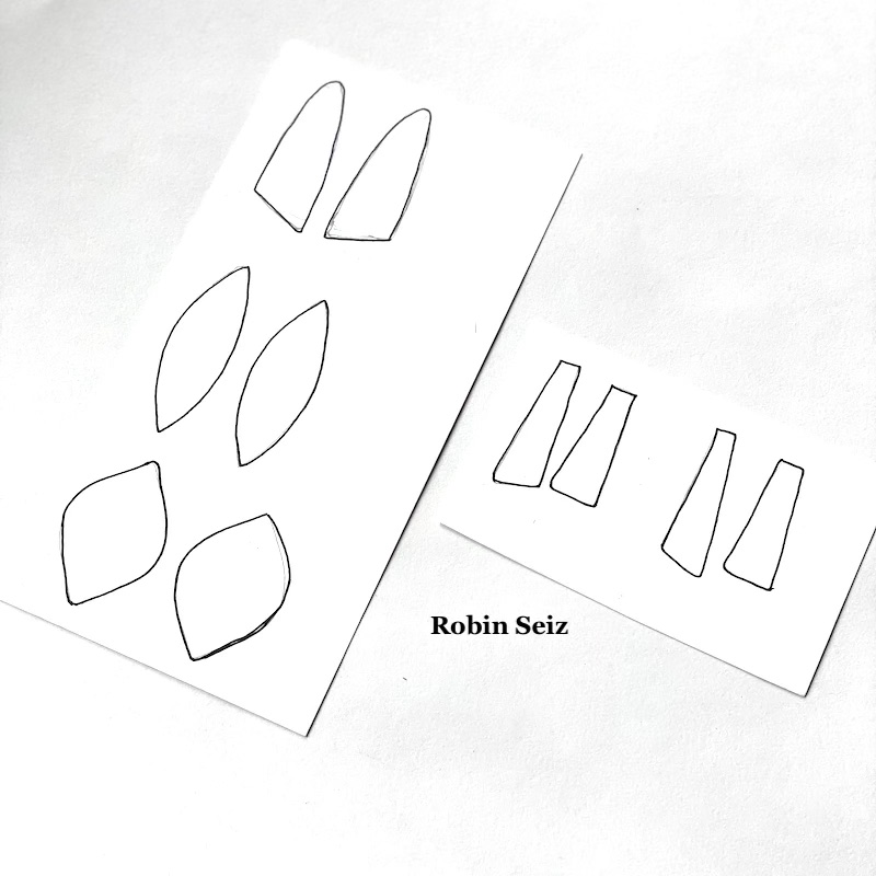
I started the project by drawing the shapes for the earrings on card stock. I chose shapes I like. If you try this project, you could use any shape you like. Next, I cut out the shapes and put them aside.

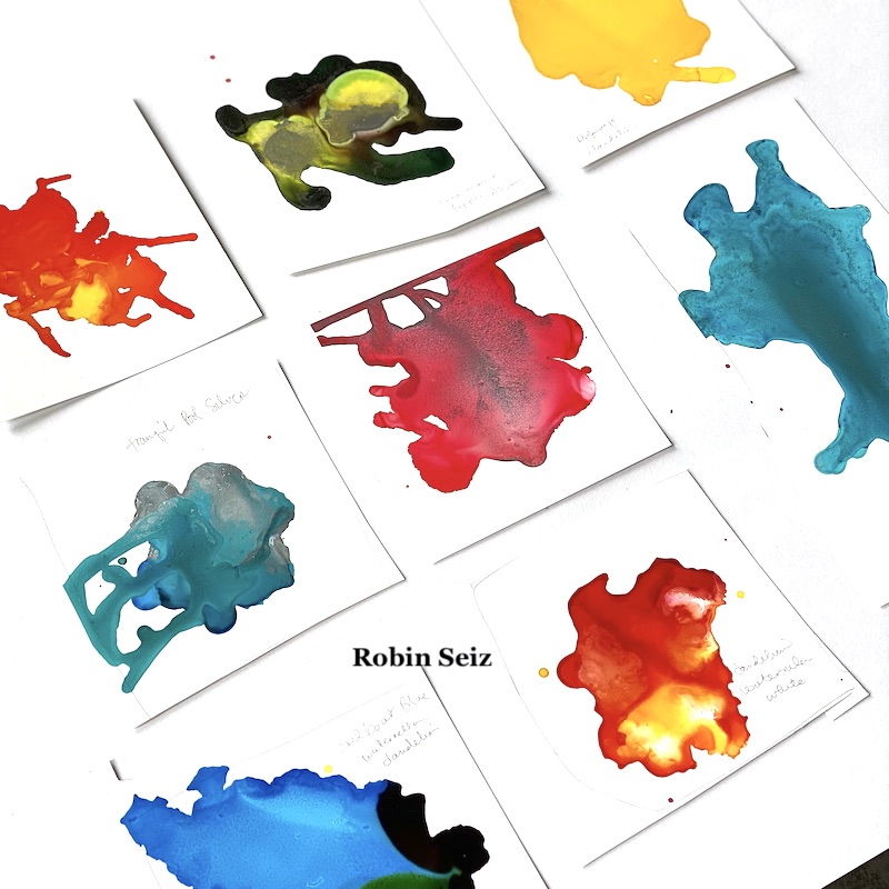
Step 2 was the most fun! I tested various alcohol ink colors on the opaque craft plastic. I could have done this all day; just watching alcohol ink flow is so relaxing and organic. The results are always a surprise. This is the part where the colors often run into each other and make a different color than is intended, but I just go with it.

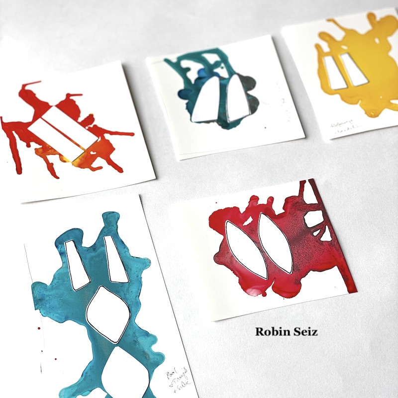
I chose color patches  I liked the most, and the ones which were in the primary color family (at least kind of). I laid out the blank cut out shapes on the opaque craft plastic. This can be a tricky process if you are someone who wants both earrings to look exactly the same. I don’t really care about that; I like to know they were made by hand rather than manufactured to be identical, but if it bothers you to have them slightly different, then you can take that into account when you lay them out. Additionally, you may want to use solids rather than several colors on a sheet to get more a more consistent look. 

Once they were laid out, I carefully cut them out with a small pair of scissors. The craft plastic is easy to cut. If you are comfortable with a craft knife, you could also use that.

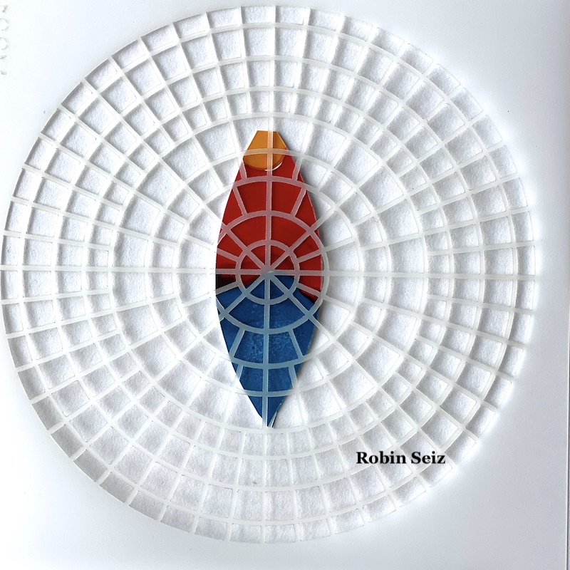
Once cut out, I applied Nathalie’s Wabi Sabi rubber stamps and Central Ave and Signals stencils to the earrings with a permanent black ink. This added so much dimension and interest to each piece.

I took some of my jewelry components, small beads and wire, nothing really fancy, and added it to the earrings. Again, it added more dimension and interest.

The final process, which is important especially if you are going to sell your earrings or want them to last for a long time, is to spray Krylon Varnish and UV protection to them. Alcohol inks dull quickly and this will protect both the color and the inks from smearing. Make sure to do this in a well ventilated area and hold the can pretty far away from the earrings, otherwise, they will smear.

Summer is here, it’s always fun to have a new pair of earrings! I hope you try out this project.


Thank you Robin! I absolutely love these and could totally imagine donning them to liven up an outfit with some artsy style!

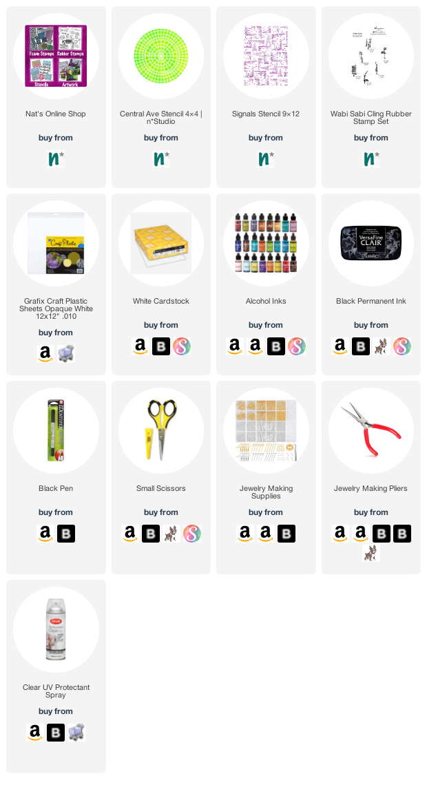
Give it a try: you can find all my Rubber Stamps and my Stencils in my Online Shop and here are some of the supplies Robin used:


Like what you see? Follow the Creative Squad on Instagram for weekly posts, artwork, and inspiration.

Leave a comment

Wild and Free – Emilie Murphy

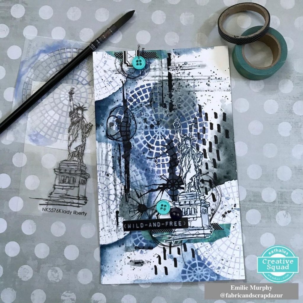
Hello from my Creative Squad! Today we have Emilie Murphy with us using my Lady Liberty stamp and my Central Ave 4×4 stencil and sharing her fresh and funky take on our theme: Wild and Free – After so many months of careful living, it’s time to go Wild and Free… In our Art! Go a little crazy in there and live it up with bright colors, exuberant mark making, bold colors – however you want to go a bit bananas. It’s time to let loose!


Hi there! Hope you are doing well and enjoying the summer so far.

My first thought of “Wild and Free” theme was to use Nathalie’s stamp “Lady Liberty“, well known symbol of Liberty and emblem of New York City. Lately, I got nostalgic about my trip there, already ten years ago. I had spent such a great week in this fantastic and energetic city.

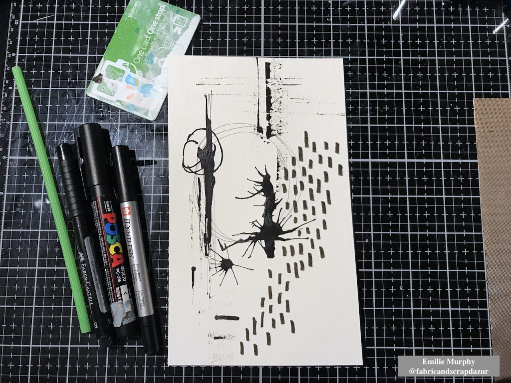
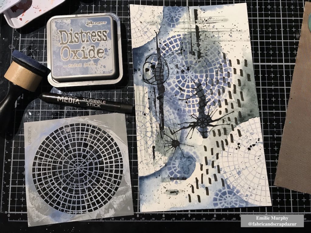
I started my page making some marks with permanent black pens on watercolor paper. I used a Posca pen to make blobs of black paint that I spread with a plastic card and straw.  I let it dry completely.

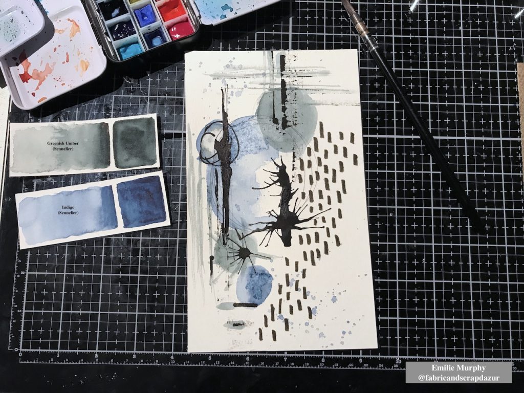
Then I applied some watercolor and limited my colors to two ones with kind of neutral tone. I slightly sprinkled a little bit of salt in some wet area because I love the effect when it dries.

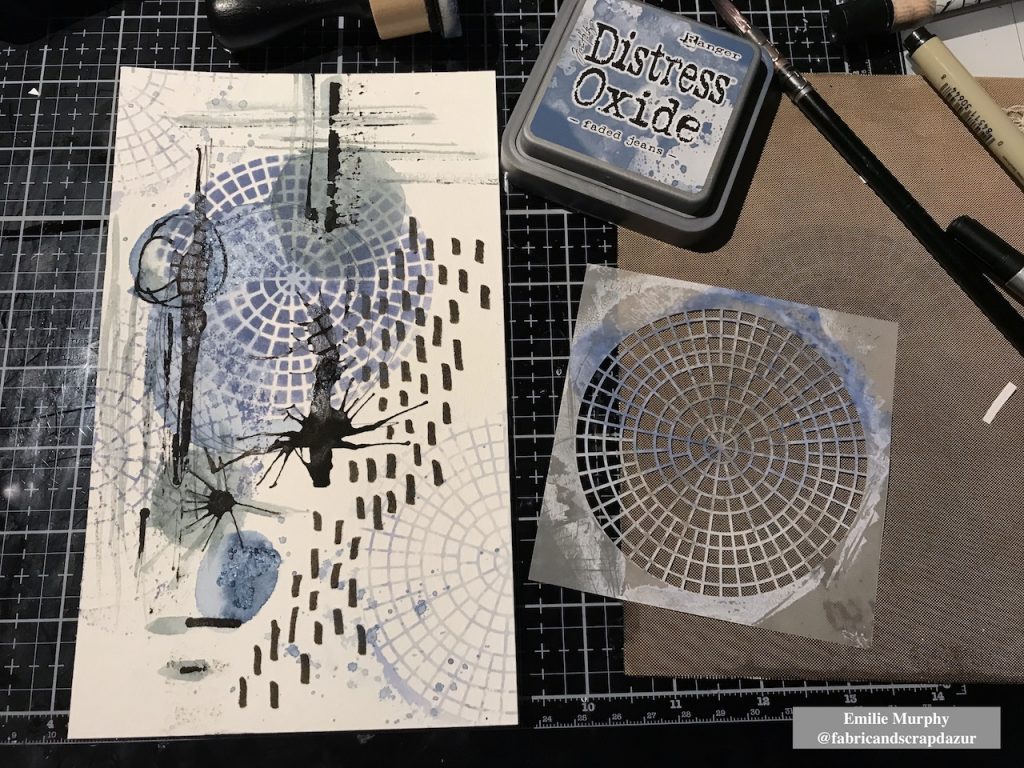
I decided to work on my background with the “Central Ave” 4×4 stencil. I first laid down my stencil and applied distress oxide ink directly through the stencil with a foam tool. Then, as I wanted to keep some blank less busy areas, I applied distress oxide ink on my stencil and spritzed a mist of water then laid down my stencil on the paper. I let the stencil down few seconds before removing it. As a result the paper absorbs the ink and you get a light negative print of your stencil. That is a cool effect giving a kind of ghost print.

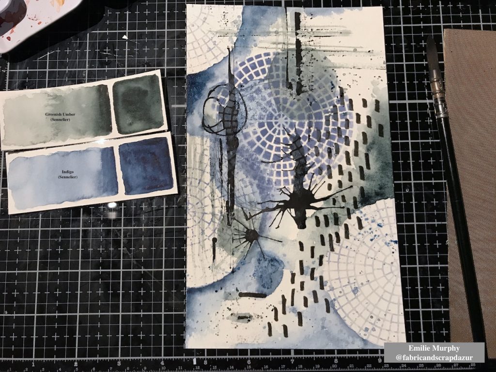
In order to unify all together the different areas of my background, I added more watercolor in order to make pop the stencil pattern out and get some circles.

I introduced smaller circle shapes made only with the central part of the stencil. I think it brings an interesting dynamic to the background having different sizes of circles. It’s amazing what we can do with this simple stencil. I also added some black splatters with a water-soluble crayon. I can’t help myself… I love splatters!

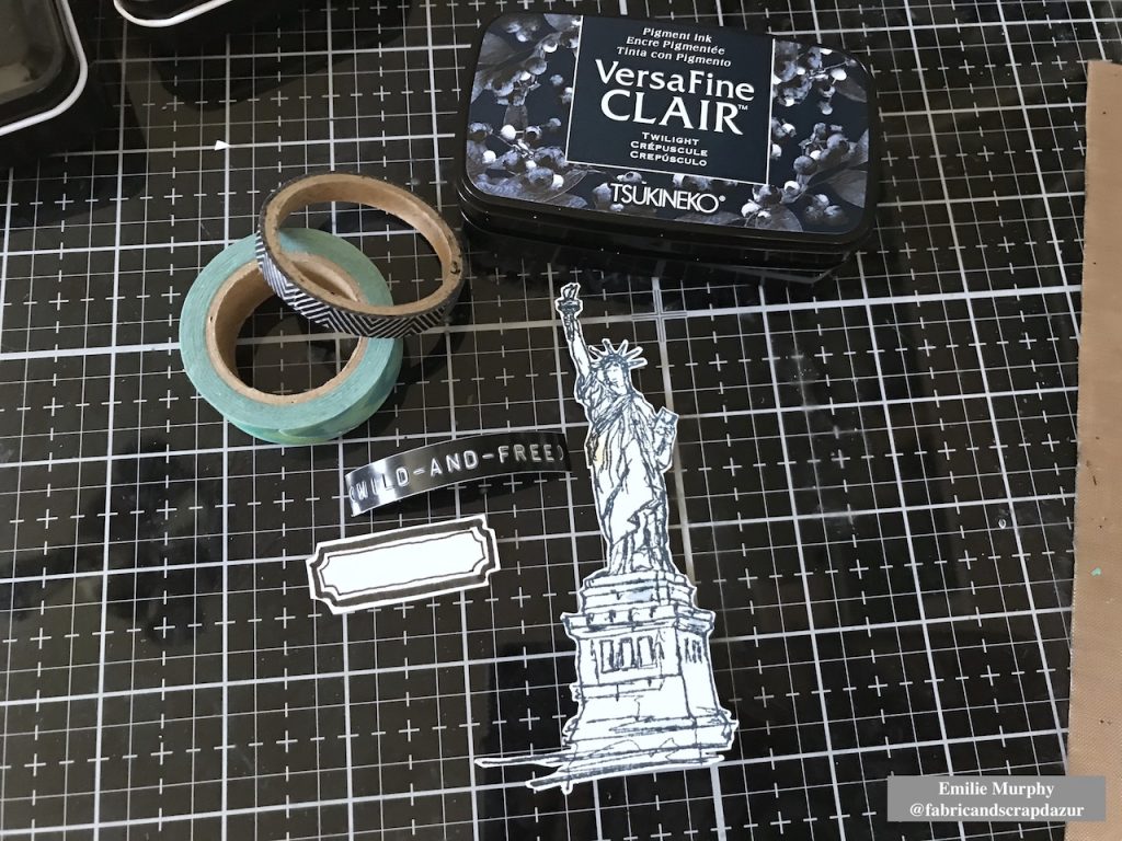
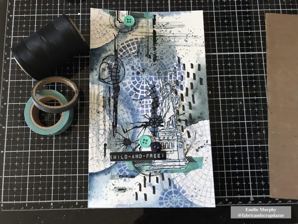
Then I prepared my focal image. I stamped the “Lady Liberty” stamp with VersaFine Clair ink. It is just a matter of preference. I could have used also archival ink. I gathered few other elements with coordinated colors that I wanted to add like a handmade label, a couple of Washi tapes, black thread and buttons. The “wild and free” sentiment has been made with a hand-label tool.

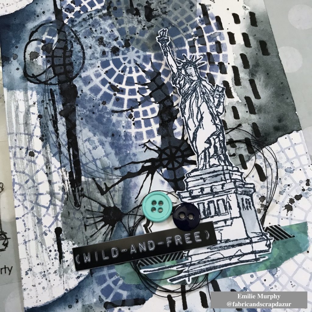
Finally, I assembled all the elements the way I wanted to finish my page.

Hope you have enjoyed this easy and pretty quick tutorial. I made the choice of doing a journal page but this could have been also great as a card.

Have a good rest of the week and see you next month!


Thank you Emilie – love how you tied everything together with the splatters, colors, and mark making!

Give it a try: you can find all my Rubber Stamps and Stencils in my Online Shop and here are some of the other supplies Emilie used:

Play along with our monthly themes and weekly projects! Working on something yourself that you’d like to share?  Email me how you used my stencils and stamps with the theme and email me an image – I would love to share your projects in my next  “n*Spiration From Around the Globe“.

Leave a comment

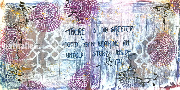
Untold Story – Art Journal

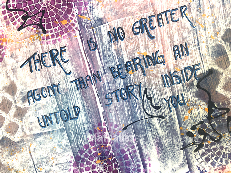
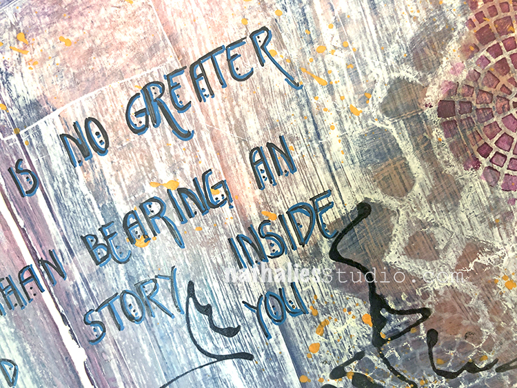
“There is no greater agony than bearing an untold story inside you.”

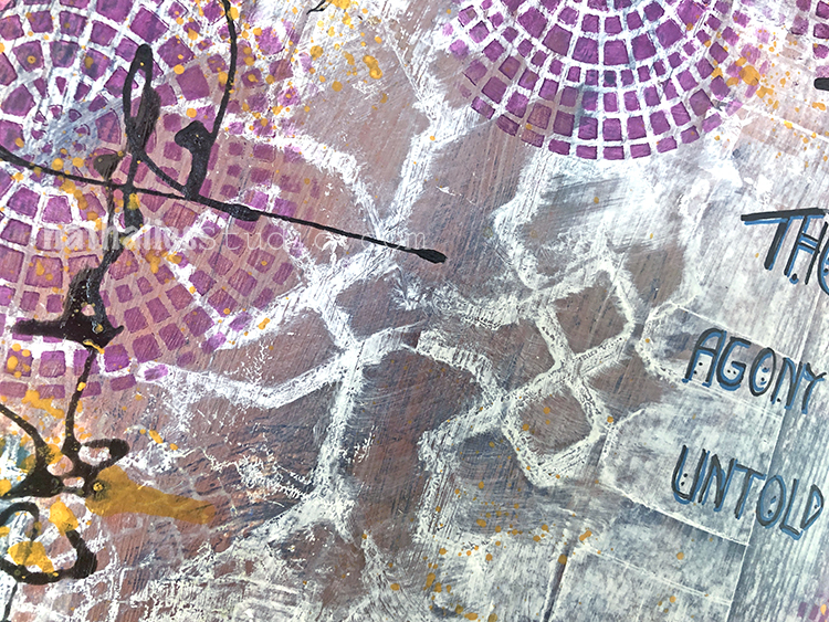
In this art journal page I made an effort to only use almost empty colors of acrylic paints right before our move – – it was a fun way to get a bit out of the comfort zone with lots of brown colors.

I also used my Exchange Place stencil and my Central Ave stencil, journaled with fine liners and added some extra color with Derwent Graphik Line painters.

Here are some of the supplies I used:

Leave a comment

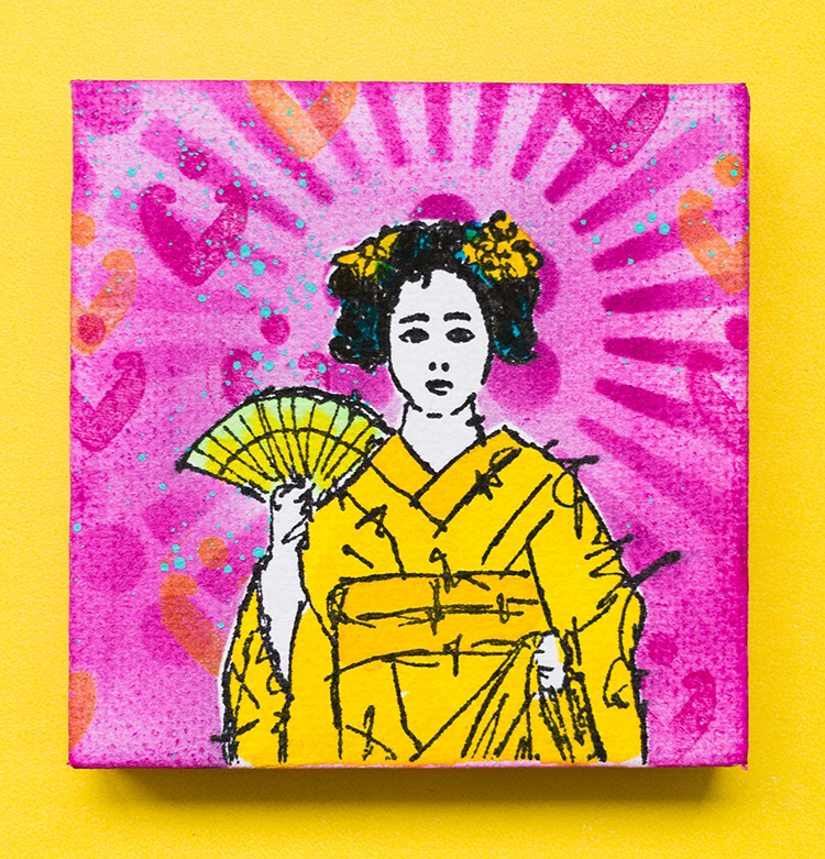
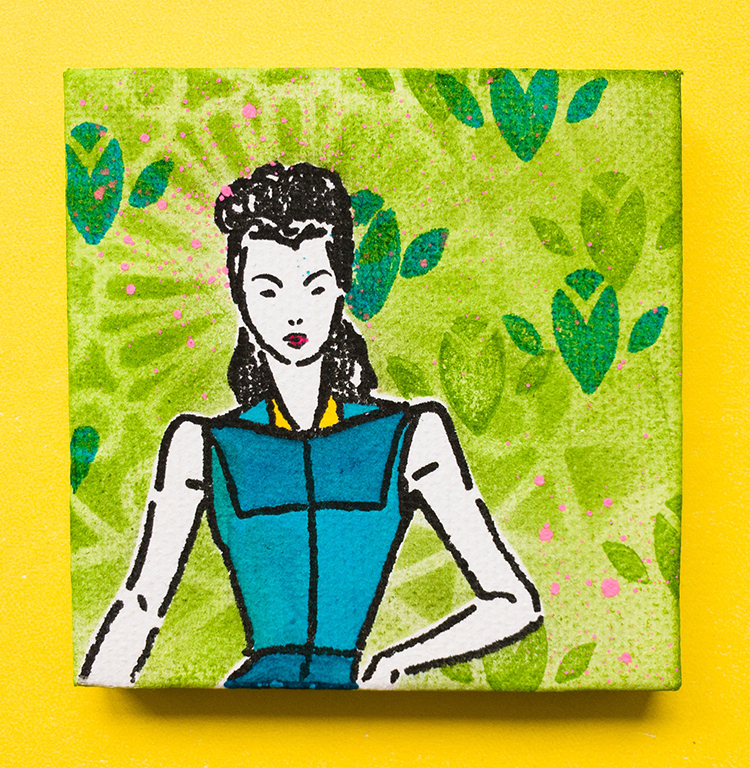
Little Wonder – Marsha Valk

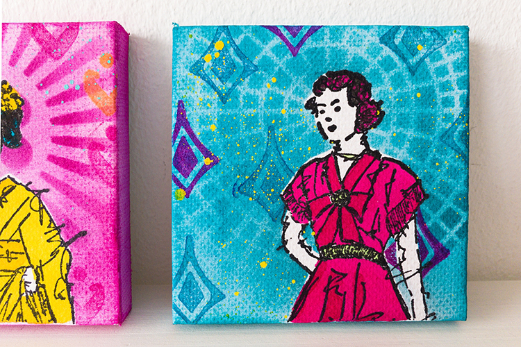
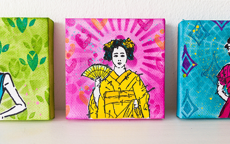
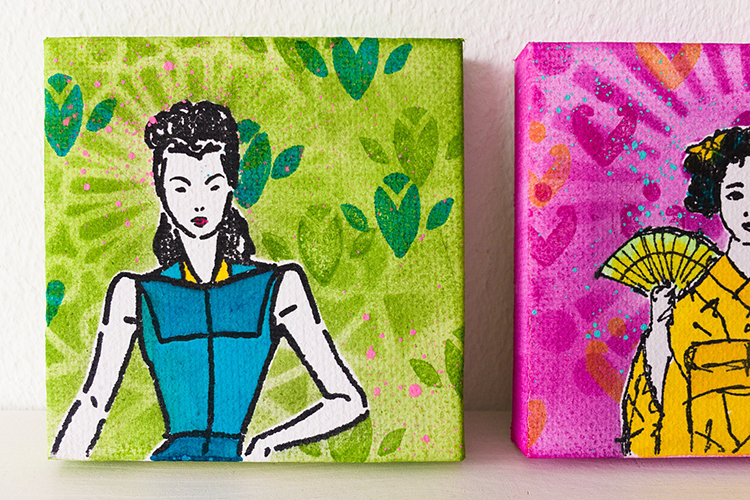
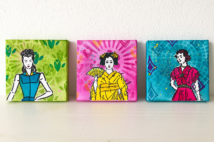
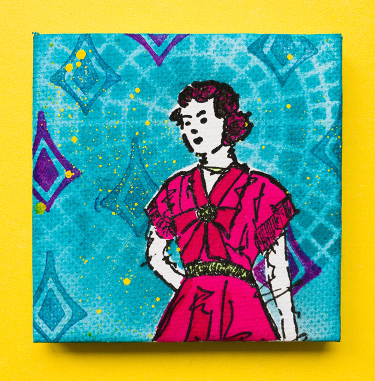
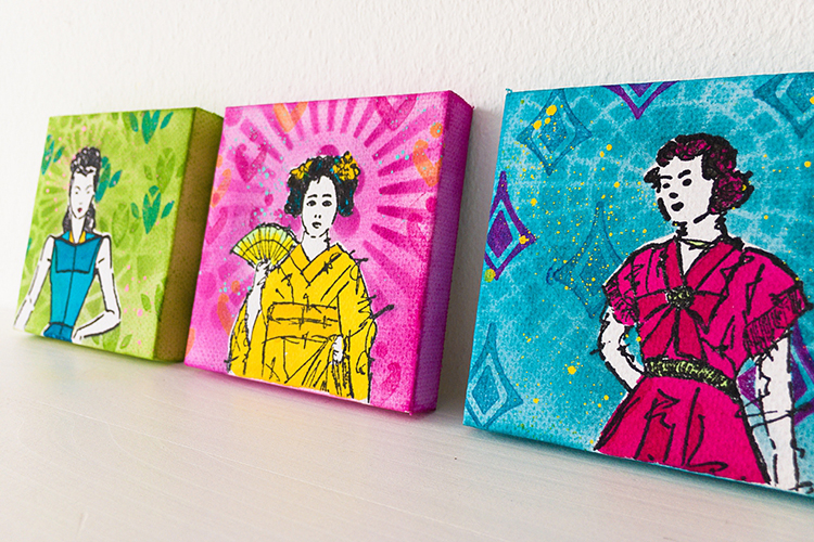
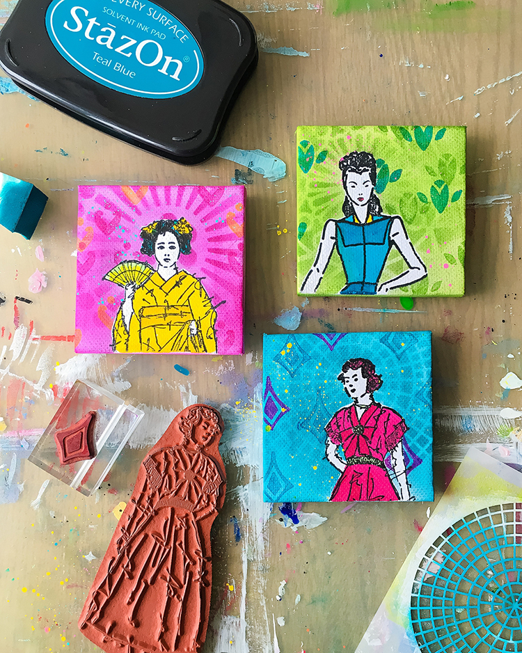
Hello from the Creative Squad and today we have another farewell post – this one from the super talented Marsha Valk! Marsha has been a joy to have on the squad and we will miss her but of course we will still be watching what she’s up to online :) Today Marsha brings us a lovely little trio of mixed media canvases and a how-to video. She’s using my Actually I Can and Fanfare rubber stamp sets and my Central Ave stencil. This month’s theme is: Little Wonder – We’re thinking small this month and focusing in on a tiny scale, exploring the delicate details, and creating something that is petite and precious.


“Wie wat bewaard, die heeft wat” is a saying in Dutch. It translates into: Someone who saves things has something.

On the lookout for ideas for this month’s prompt, I found a pack of four mini canvases while rummaging in my studio cabinet. I have no recollection of buying them, or why. I’m sure I thought they would come in handy one day. And they did!

Our mission this month is to use a small rubber stamp that we haven’t used before and a stencil.

There is no chance of me not having used a stamp in my n*Studio collection. However, I’ve been dying to do a project with the ladies from the Actually I Can Cling Rubber Stamp Set. And, for this special occasion, they will be joined by the Fashion Dame, an old friend from one of Nat’s earliest stamp releases.
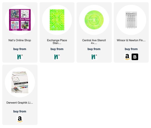
Watch the step-by-step video to see how I combined the Millie Cling Rubber stamp with the tiniest set of stamps in n*Studio collection and one of Nat’s 4”x4” stencils.

Wishing you lots of little wonders!

Marsha.


Thank you Marsha! These little canvases just make us smile :) And what a great way to end your time with us here – it has been so much fun sharing your unique creative vision with our readers!

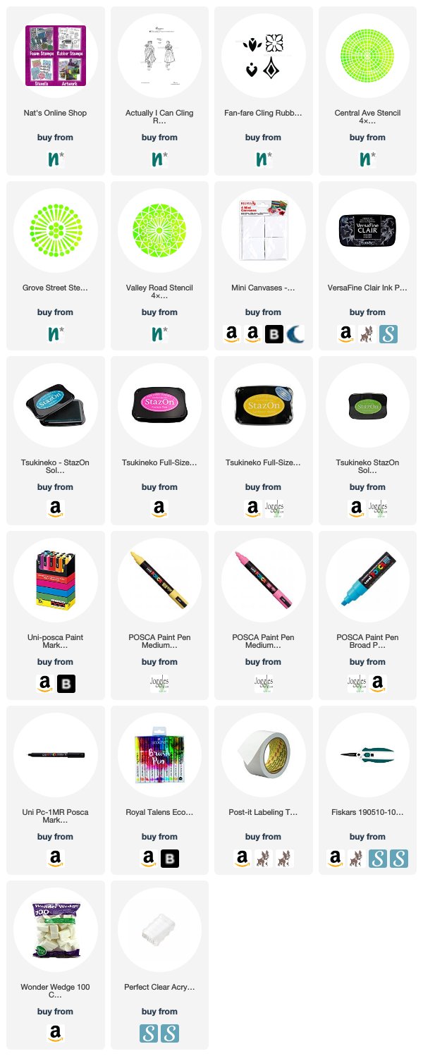
Want to try some mini canvases like Marsha has here? You can find all my Rubber Stamps and Stencils in my Online Shop and here are some of the other products she used:

Feel inspired? Working on something yourself that you’d like to share?  I love to see how you interpret our monthly themes. Email me how you used my stencils and stamps with the theme and email me an image – I would love to share your projects in my next  “n*Spiration From Around the Globe“.

Leave a comment

True Blue – Judi Kauffman

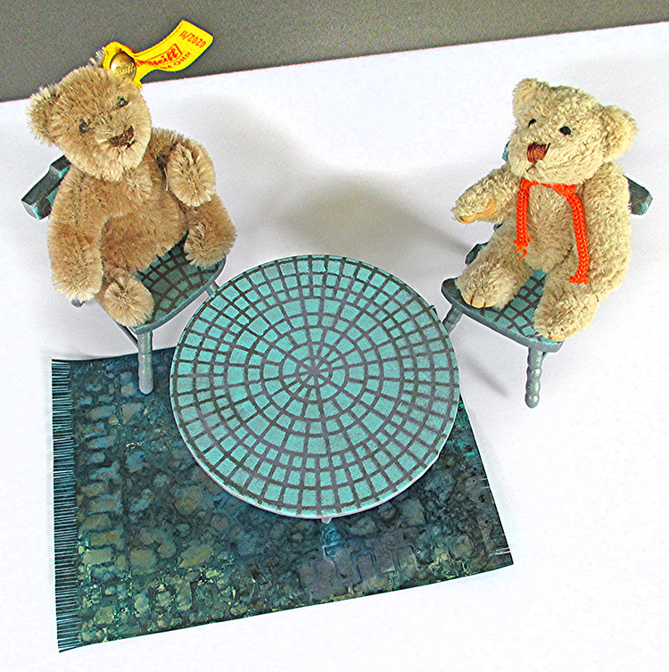
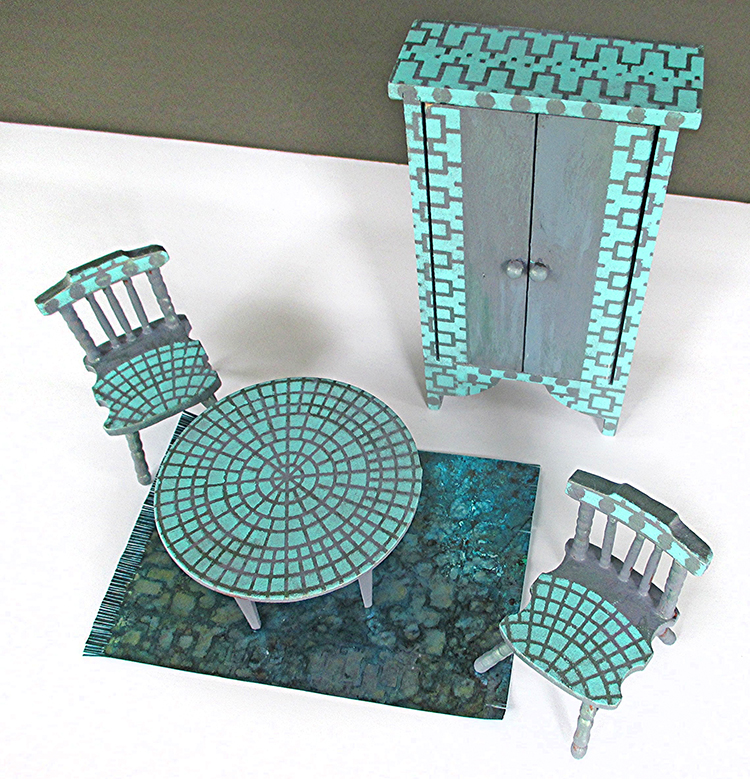
Today we have a special Creative Squad post from the super talented Judi Kauffman, an honorary member. You can learn more about Judi from our Nice to Meet You blog post featuring her creative story and artwork. This time Judi is presenting some delightful and definitely inspiring miniature decor items that will surely put a smile on your face! She worked with my Downtown and Central Ave stencils and this month’s theme: True Blue – Blue is the color of honesty and serenity. It’s calming and has even been shown to promote healing. It reminds us of the water and the sky. Let’s slow things down this month and bask in the tranquility of the color blue.


I received two stencils to use for this month’s Creative Squad theme: True Blue. Though I didn’t pick them, I was so happy when Downtown and Central Ave arrived! They are two of my favorites from Nathalie’s new release.

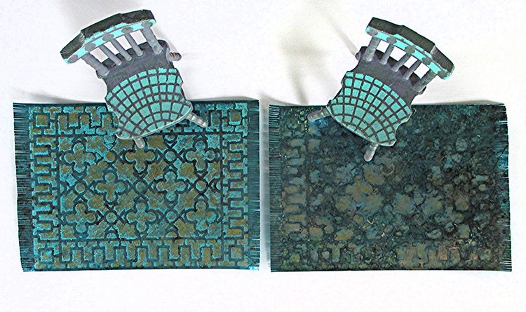
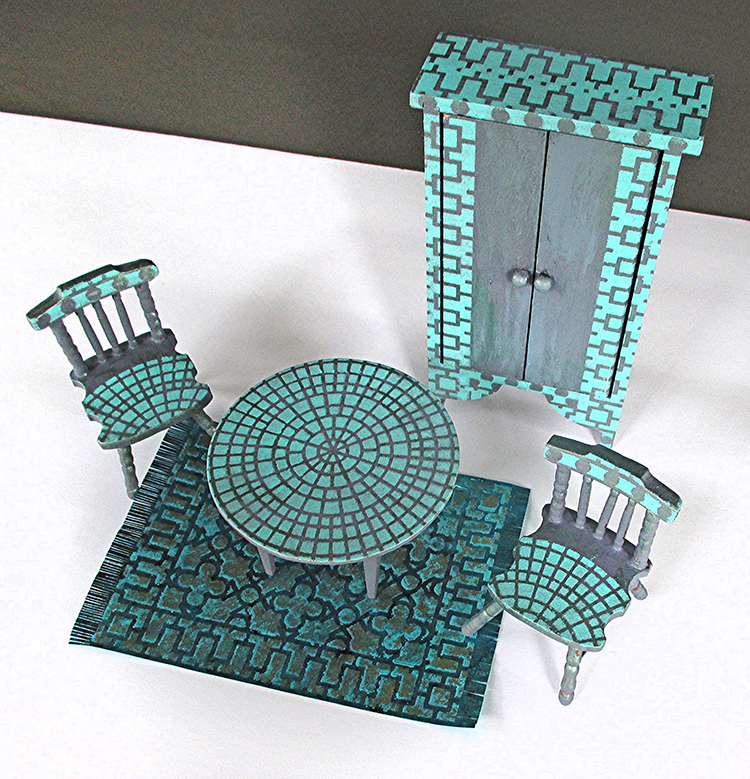
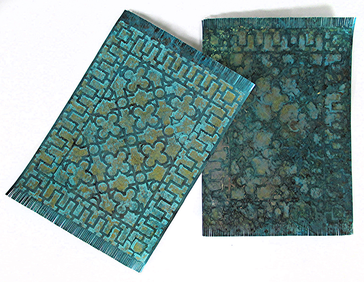
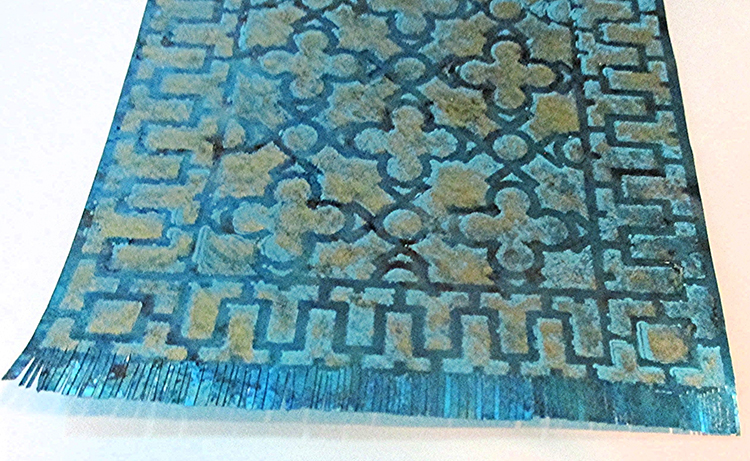
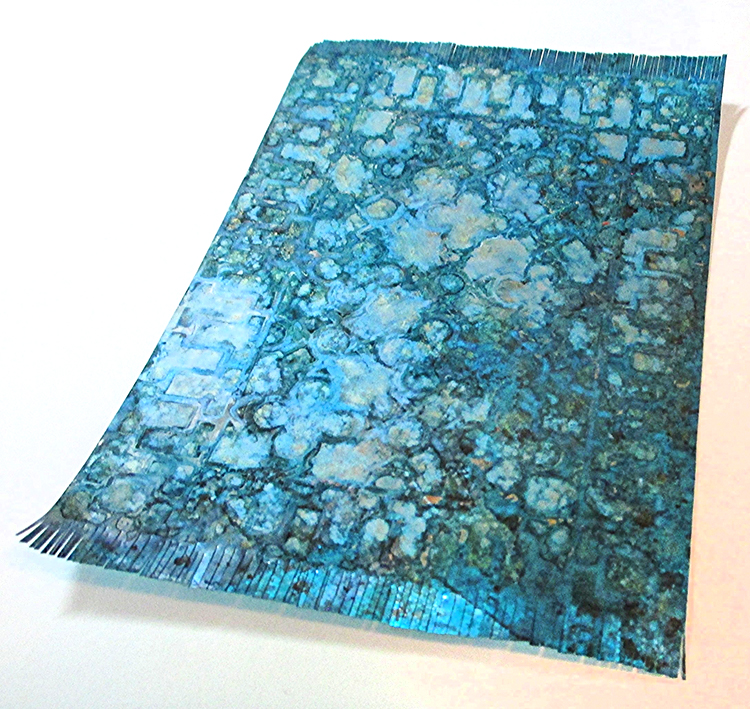
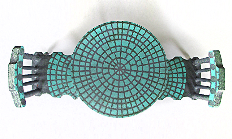
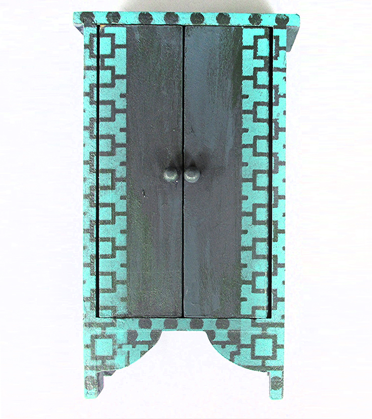
Right from the get-go Downtown looked like a rug and Central Ave evoked a mosaic table top. I’m going to stencil Downtown onto a piece of 18 count needlepoint canvas and stitch a miniature Oriental rug, but that’ll take me weeks and weeks, so meanwhile I created two stenciled Shimmer Sheetz rugs (Shimmer Sheetz is 5 x 12 so one sheet is enough for two rugs). And I stenciled some doll house furniture, sticking to a palette of blues that includes blue-gray, light teal, periwinkle, turquoise, and dark navy.

This project is fast and easy – VERY fast and easy. And it can be customized in so many ways. With the holidays fast approaching, I hope the design strategies in this tutorial will spark some fun.
The rug uses only one quarter of the 9” x 12” stencil, but it could be repeated to up-size the design. Stenciled canvas with a durable sealer would be great for a table runner or even a floor cloth.
If doll house furniture isn’t your thing, stenciled Shimmer Sheetz rugs could star on the front of a card congratulating a friend who has moved to a new home or could be sliced into strips for durable and elegant bookmarks! Instead of a 3D cabinet, stencil the front of a gate-fold card and use brads for the knobs. Instead of a table top, stencil mosaic-style chipboard Artist Trading Coins, adding collage elements. Or make flat, easy to mail holiday ornaments. (You get the idea…)

INSTRUCTIONS:

  1. For each rug – Alter the surface of a 5” x 6” piece of Shimmer Sheetz with alcohol inks in shades of blue. Allow to dry. Option A: Stencil with acrylic paint. Allow to dry. Stencil again, slightly offset, with alcohol inks in a light hue plus gold metallic. Option B: Use only alcohol inks for stenciling. For both rugs, use a craft knife, straight edge and cutting mat to trim the long sides, leaving a scant eighth-inch border. Trim the short ends, leaving three-eighths of an inch. Use sharp scissors to ‘fringe’ the short ends.

  1. For table and chairs – Base coat with a mix of French Blue Gray and Black Plum acrylic paint. Allow to dry. Using a wide, stiff almost-dry brush, add streaks of Dark Patina and French Blue Gray. Using Sea Breeze paint and a stencil brush, stencil top of table and seat on chairs with Central Ave. Stencil dot pattern from Downtown on the top of the chair back.

  1. Using the same paint and stencil brush, stencil the cabinet with portions of Downtown.


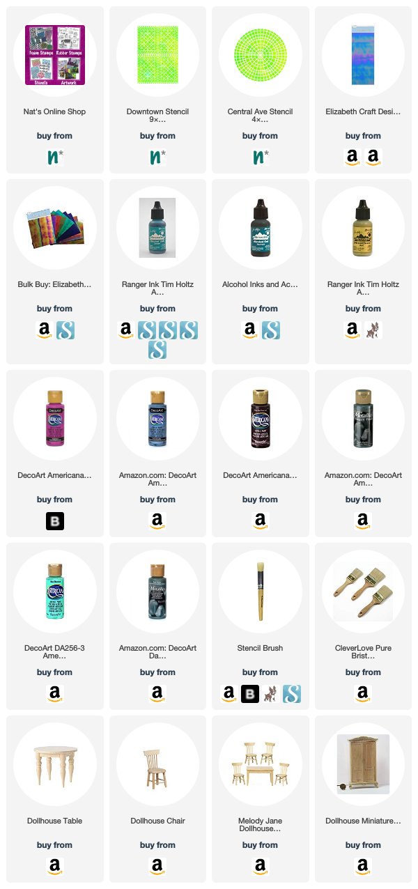
Thank you Judi! This is such a fun and unique project and it definitely brings back many happy memories from childhood, puttering around in the tiny world of the doll house :) You can find all my stencils in my Online Shop. In addition to the Dollhouse Furniture that Judi had on hand, here are some suggestions for the other supplies that Judi used:


Do you feel inspired? I’d love to see what you’re working on with my stamps and stencils. I post projects almost every month in my Inspiration From Around the Globe posts!

Comments (1)

  • Sue Clarke

    |

    Judi, that is the cutest set ever and I wish that I knew someone who would appreciate it as a gift.
    I love it and wonder if I could do that with a full size end table?

    Reply

Leave a comment

Inspiration from Around the Globe

Ready for some inspiration? Today we have some projects from around the globe. It’s always fun to see how you’re using my stamps and stencils and I am so happy to share some examples today. So let me know if you’re doing something cool with my products, and you might see yours on the next Inspiration from Around the Globe!


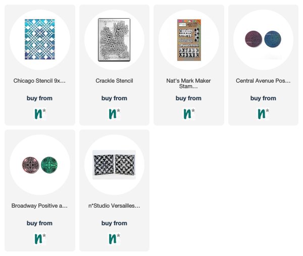
First is Ellen Captijn from the Netherlands and a stunning art journal spread using my Chicago stencil for that patterned background. Definitely follow the link to see the entire thing!

Debi Adams from the US found a great way to add texture with my Crackle stencil in this gorgeous mixed media piece.

Here is a bright piece from Kate Crane in the UK that uses my Marks stamps for those red and black hash marks. So fun!

Here is Barbaree King from the US with my Central Ave ArtFoamies for those circular patterns in the background – such a beautiful art journal spread!

And finally here is Linda Edkins Wyatt from the US using my Broadway and my Versailles foam stamps for an active background in this art journal page. Love all the patterns mixing together :)


I feel pretty inspired after that lineup! If you’d like to give some of these ideas a try, here are the stamps and stencils that these talented artists used:


Don’t forget to tag my when you post your projects! I’d love to include your work in my next Inspiration FromAround the Globe post!

SaveSave

Leave a comment

Colors Are My Friends – Josefine Fouarge


Hello my friends and welcome to a post from new Creative Squad member Josefine Fouarge! Josefine brings us a gorgeous art journal page that shows off how well complimentary colors play together. She also rocks my new Central Avenue Positive Negative foam stamp set and this month’s theme: Colors Are My Friends – Let’s kick off the new Creative Squad with a celebration of color! What are your favorite, go-to signature hues? Let’s go bold and bright this month and  use color to ring in a new season of inspiring projects!


Colors are my friends, definitely! My favorite one depends on my mood, but usually I tend to pick orange or green tones. Today I wanted to use my favorite color combination though, which is orange and blue. These are complimentary colors, which means they naturally work well together.

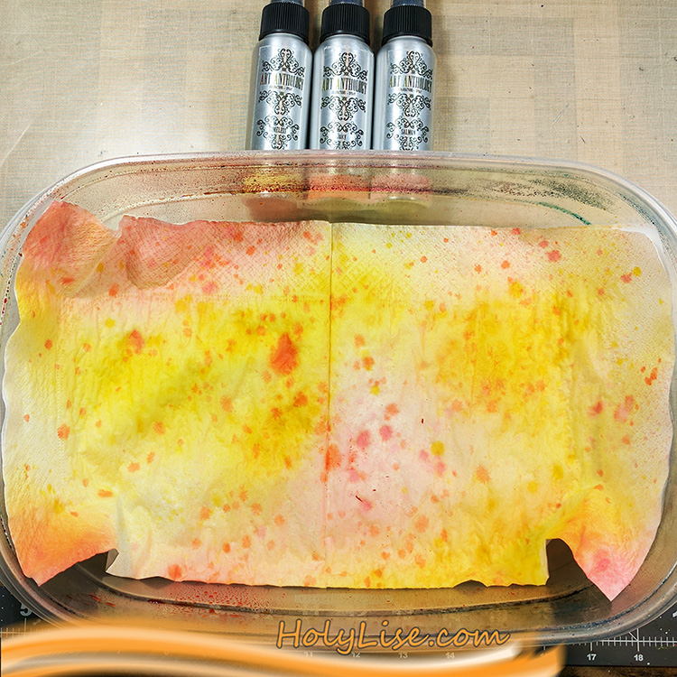
Since today I have something with flowers in my head, I wanted to use the new circle foam stamps to create a flower in my art journal. I started by spraying some color onto a few napkins and letting them dry for a few minutes.

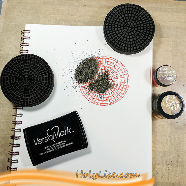
While I was waiting for the napkins to dry, I worked on the background of my art journal page. I started with the focal point, so I stamped the outline of the Central Avenue stamp using Versamark ink and heat embossed it using bright orange embossing powder. Then I stamped the inside of the stamp also with Versamark ink and heat embossed it with a gold embossing powder.

This stamp is rather easy to align, even though it’s a round shape. You can see where the main line goes through the middle and you just need to ensure that the little squares of the negative stamp match the squares on the paper. If you look at the stamp from the side while trying to position it on the paper, you’ll know what I mean.

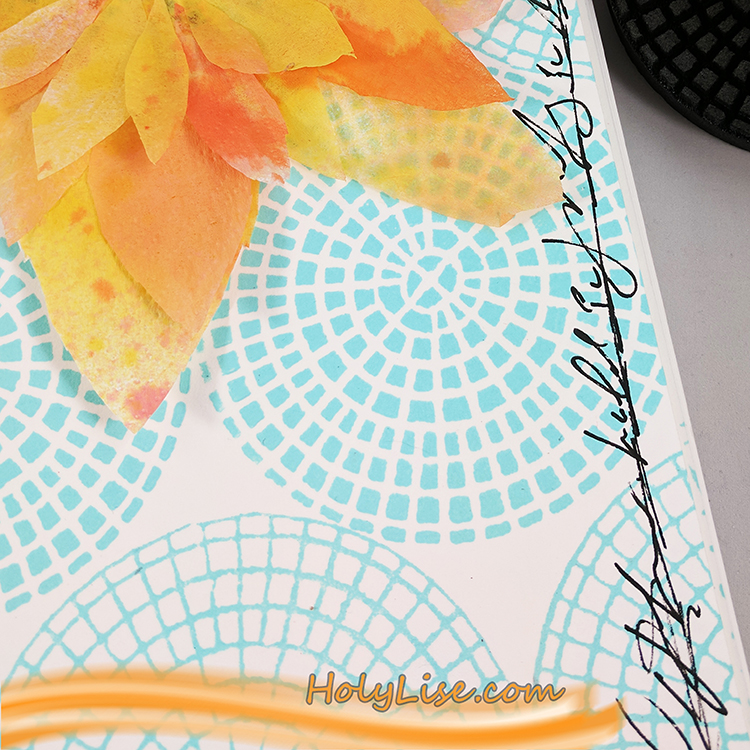
After heat setting the focal point, I chose a turquoise acrylic paint and mixed it with some white to make it even lighter. After adding the paint to the foam stamp using a brayer, I stamped the outline to the left and right of my focal point. Next, I stamped the inside in a row below and above the first row and switched again for the next row – and so on till the paper was full of circles.

Now I outlined the page with a black acrylic pen and scribbled following poem around it, as messy as I could:

To see the world in a grain of sand

and heaven in a wildflower,

hold infinity in the palm of your hand

and eternity in an hour.

-William Blake-

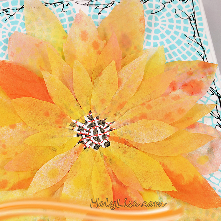
To finish up my flower, I cut several petals from my napkin and adhered them carefully around the focal point circle.

If you look closely, you’ll see that I adhered just one layer of the napkin to the page, so the embossing powder shimmers through the paper.

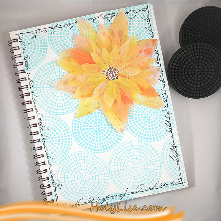
Here is the entire page. I just love the contrast of orange and blue and can’t get enough of it! Yummy!


Thank you Josefine for such a lovely page and for sharing the poem too! In addition to her art journal and some paper napkins and glue, Josefine used the following supplies (some are affiliate links):


Play along with us too: I love to see how you interpret our monthly themes. Email me how you used my stencils and stamps with the theme and email me an image – I would love to share your projects in my next  “n*Spiration From Around the Globe“.

Comments (2)

Leave a comment