
Creative Squad

Colors Are My Friends – Jennifer Gallagher


Hello my friends and welcome to a post from my Creative Squad! Today we have a beautiful canvas from new member Jennifer Gallagher. The layering and colors she used are gorgeous and make this a really cool piece for her home. She is using my new ArtFoamies Grove Street stamps, the Kassel Stencil and the theme: Colors Are My Friends – Let’s kick off the new Creative Squad with a celebration of color! What are your favorite, go-to signature hues? Let’s go bold and bright this month and  use color to ring in a new season of inspiring projects!


Colors are my friends! No one loves color more than I do. Personally, I have a very difficult time choosing just one to call my favorite. However, I do tend to have a few must have colors that I cannot live without. Pink and Turquoise are two of those colors.

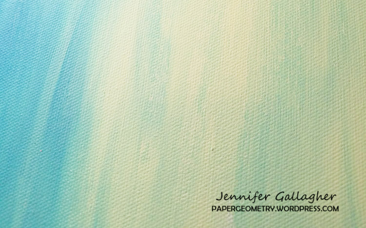
My husband and I have been doing a little work around the house and I now have several bare walls just screaming out for some bold new artwork. So, I started with a twelve inch by twelve inch canvas. I chose two colors of acrylic paint to blend into a lovely, subdued background. I chose Daler Rowney Pistachio Green and Daler Rowney Phthalo Turquoise.
After the background had thoroughly dried I used one of Nat’s stencils, Kassel, and some white acrylic paint from the Dylusions line to overlay a fun geometric print. I did this pretty lightly as I just wanted a hint of the design peeking through. Try using a Tim Holtz mini-blending tool to apply your Dylusions paint. It works great!
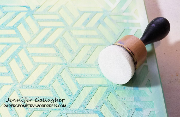
I pulled out my six inch square Gelli Arts Gel Printing Plate. Using the same stencil, I created a series of papers to use on my canvas. I continued using acrylics in Pistacio, Phthalo Turquoise, and also added Anita’s Craft paint in Island Green and Apple Barrel Acrylic in Wintergreen. After creating several papers using the Kassel stencil, I used my gelli plate as a palette to wet my ArtFoamies Grove Street Postive and Negative foam stamp in paint and applied the foam stamp design to the background papers using even pressure. At this point I introduced a new color of paint, Daler Rowney Acrylic in Permanent Rose. The fun thing about the positive and negative stamp sets is you can use them individually, line them up and stamp one over another, or do what I did and mix it up with multiple techniques.
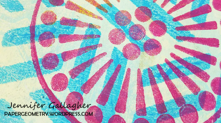
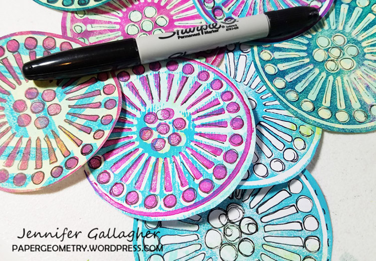
I cut each of the circles out so they could be applied to my canvas. I had about fifteen different circles to choose from. One of my favorite things to do to my art is black line doodling. With a basic fine tip black sharpie, I went over the shapes of the Grove Street stamp to add interest to each circle.


I laid my circles out on the canvas until I was satisfied with the amount and the placement. I then fixed them to the canvas with Mod Podge (the version specifically for paper) in a matte finish. Glue both sides of the paper circles to ensure they stick well onto your canvas. Be sure to let this dry thoroughly before moving on.
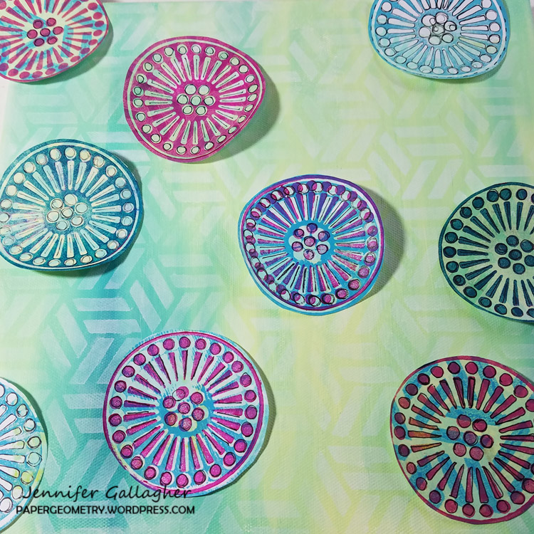
Lastly, I used a Dina Wakley Media scribble stick in black to make outlines around each circle. If you don’t have scribble sticks a black paint marker would also work.
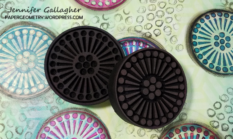
I am really happy with how this turned out. I hope you enjoyed this project as much as I enjoyed sharing it with you.
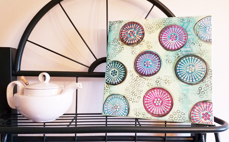
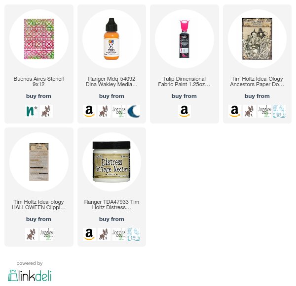
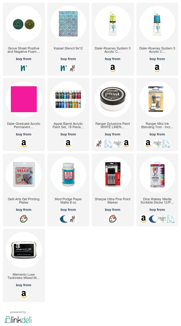
Thank you Jennifer for sharing this lovely canvas and your layering techniques with us! Jennifer used besides a 12×12 canvas the following supplies (some are affiliate links):


Play along with us too: I love to see how you interpret our monthly themes. Email me how you used my stencils and stamps with the theme and email me an image – I would love to share your projects in my next  “n*Spiration From Around the Globe“.

Comments (5)

  • Josefine Fouarge

    |

    Wow, your canvas is really pretty. I love all the colors :)

    Reply

  • Jennifer Gallagher

    |

    I hope all of your readers try this out for themselves. It was a fun project and I cannot wait to try my n*Studio Art Foamies on lots of other upcoming projects. Enjoy!

    Reply

  • n*Studio Creative Squad – Paper Geometry

    |

    […] this link, http://nathaliesstudio.com/creative-squad/colors-are-my-friends-jennifer-gallagher/ , and read all about my painted canvas project for Colors are My Friend month. Then stick around […]

    Reply

  • Steph

    |

    Great article, Jennifer. And your canvas turned out beautiful!!

    Reply

Leave a comment

Colors Are My Friends – Josefine Fouarge


Hello my friends and welcome to a post from new Creative Squad member Josefine Fouarge! Josefine brings us a gorgeous art journal page that shows off how well complimentary colors play together. She also rocks my new Central Avenue Positive Negative foam stamp set and this month’s theme: Colors Are My Friends – Let’s kick off the new Creative Squad with a celebration of color! What are your favorite, go-to signature hues? Let’s go bold and bright this month and  use color to ring in a new season of inspiring projects!


Colors are my friends, definitely! My favorite one depends on my mood, but usually I tend to pick orange or green tones. Today I wanted to use my favorite color combination though, which is orange and blue. These are complimentary colors, which means they naturally work well together.

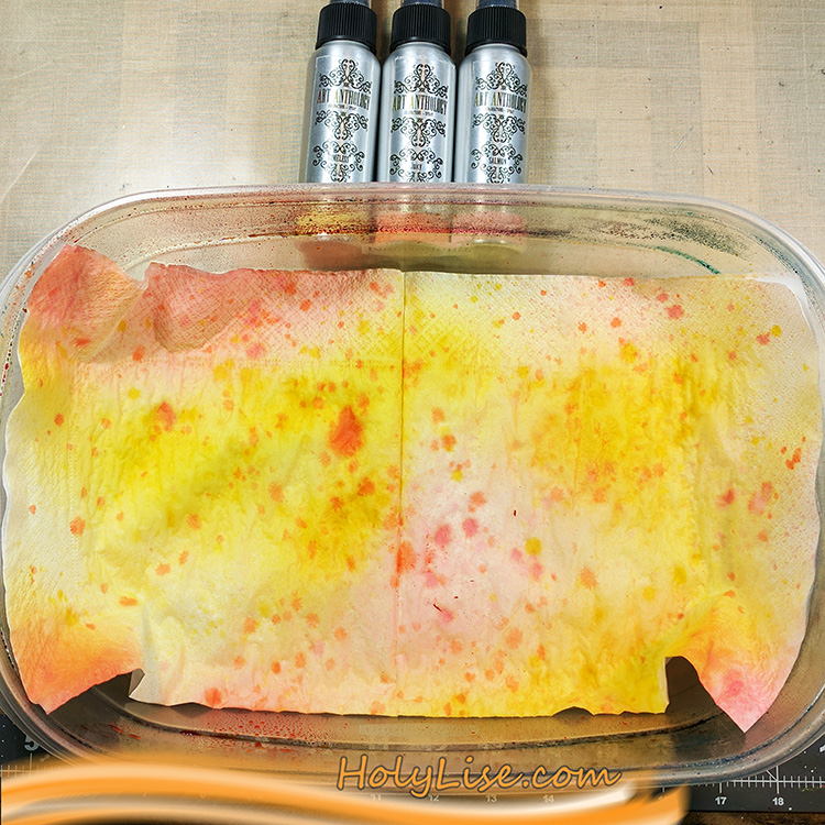
Since today I have something with flowers in my head, I wanted to use the new circle foam stamps to create a flower in my art journal. I started by spraying some color onto a few napkins and letting them dry for a few minutes.

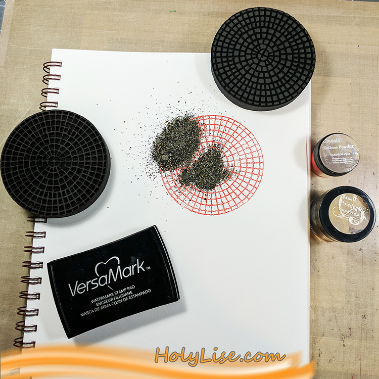
While I was waiting for the napkins to dry, I worked on the background of my art journal page. I started with the focal point, so I stamped the outline of the Central Avenue stamp using Versamark ink and heat embossed it using bright orange embossing powder. Then I stamped the inside of the stamp also with Versamark ink and heat embossed it with a gold embossing powder.

This stamp is rather easy to align, even though it’s a round shape. You can see where the main line goes through the middle and you just need to ensure that the little squares of the negative stamp match the squares on the paper. If you look at the stamp from the side while trying to position it on the paper, you’ll know what I mean.

After heat setting the focal point, I chose a turquoise acrylic paint and mixed it with some white to make it even lighter. After adding the paint to the foam stamp using a brayer, I stamped the outline to the left and right of my focal point. Next, I stamped the inside in a row below and above the first row and switched again for the next row – and so on till the paper was full of circles.

Now I outlined the page with a black acrylic pen and scribbled following poem around it, as messy as I could:

To see the world in a grain of sand

and heaven in a wildflower,

hold infinity in the palm of your hand

and eternity in an hour.

-William Blake-

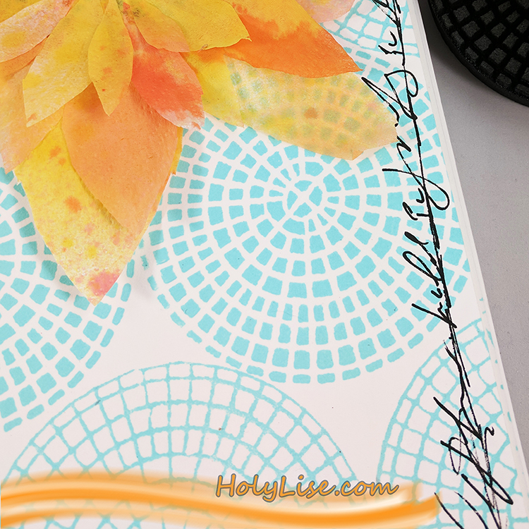
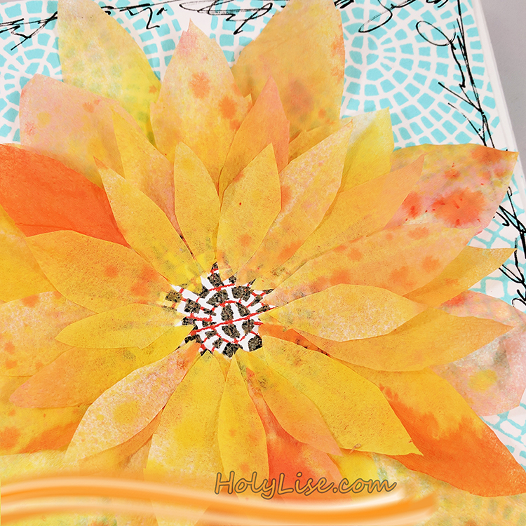
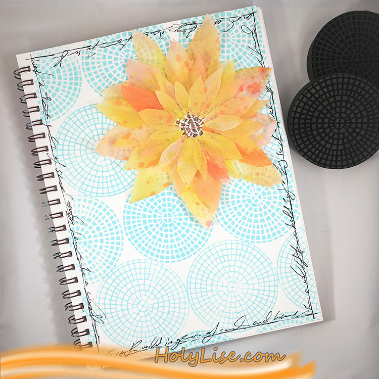
To finish up my flower, I cut several petals from my napkin and adhered them carefully around the focal point circle.

If you look closely, you’ll see that I adhered just one layer of the napkin to the page, so the embossing powder shimmers through the paper.

Here is the entire page. I just love the contrast of orange and blue and can’t get enough of it! Yummy!


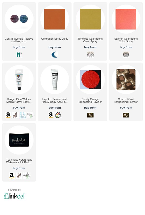
Thank you Josefine for such a lovely page and for sharing the poem too! In addition to her art journal and some paper napkins and glue, Josefine used the following supplies (some are affiliate links):


Play along with us too: I love to see how you interpret our monthly themes. Email me how you used my stencils and stamps with the theme and email me an image – I would love to share your projects in my next  “n*Spiration From Around the Globe“.
Comments (2)

Leave a comment

Colors Are My Friends – Marsha Valk


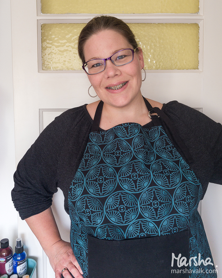
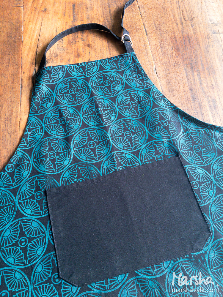
Hello from the latest edition of the Creative Squad! Today we have a post from veteran member Marsha Valk, who makes excellent use of my new Broadway Positive Negative foam stamp to dress up an apron. We hope you’ll join us in creating with this month’s theme: Colors Are My Friends – Let’s kick off the new Creative Squad with a celebration of color! What are your favorite, go-to signature hues? Let’s go bold and bright this month and  use color to ring in a new season of inspiring projects!


Colours really are my friends. I love them all dearly, and I could never, ever pick just one favourite! But as much as I love the entire rainbow, it doesn’t mean all my friends have to come out to play every single time. It’s OK to pick just one for a heart to heart now and then.

I invited a couple of my fabric paint colours for a playdate. I couldn’t find a light, neutral coloured apron to print on, so I got a black one instead. During a short test run on paper, Yellow saw that the black background would shine through and cancelled on me.

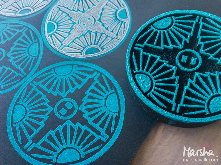
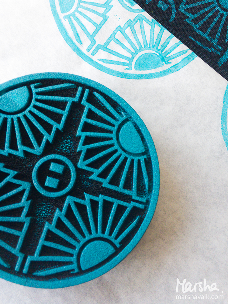
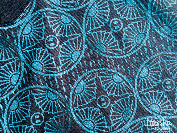
I mixed Teal with a bit of White fabric paint and applied it to a StampBuddy. It acts as a stamp pad: gently dab the foam stamp into the foam of the StampBuddy to get an even distribution of paint on the stamp.

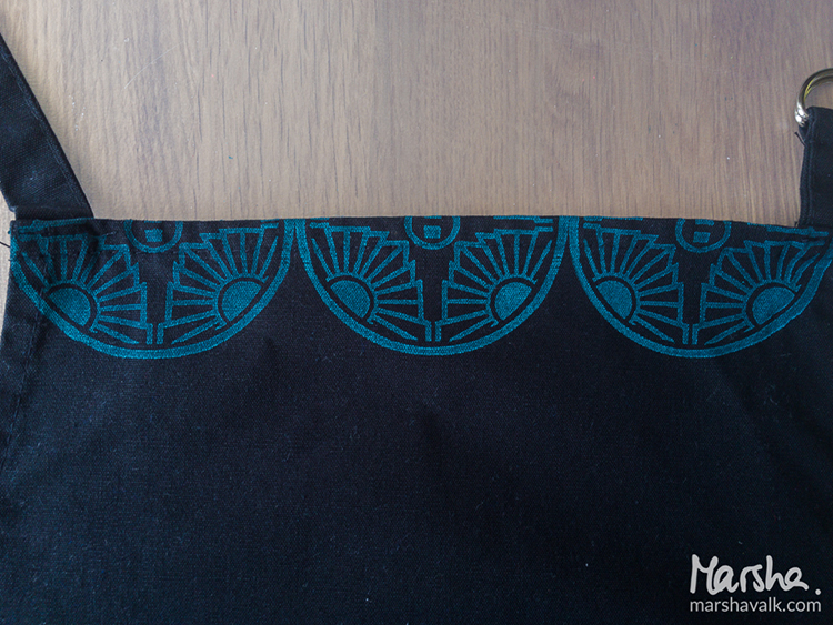
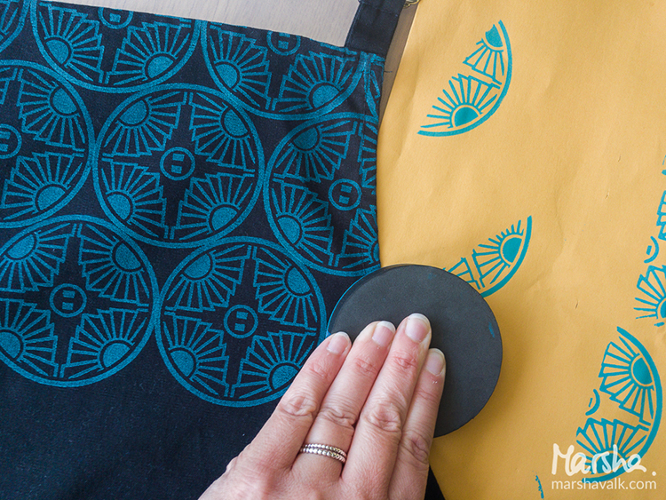
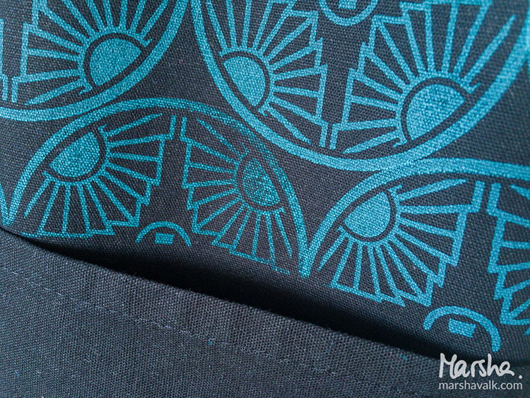
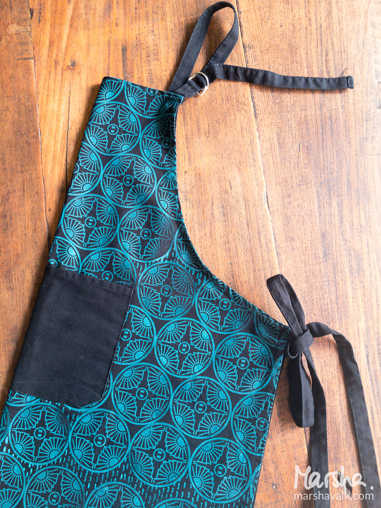
Then I started stamping a pattern with Nat’s Broadway foam stamp onto my pre-washed black 100% cotton apron. I liked what I saw!

Pink was waiting to have a go too, but once we saw the denim-like look of the Teal/White prints, we agreed not to interfere.

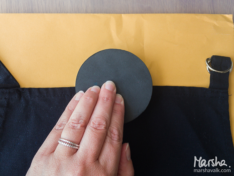
I covered the pocket with deli paper to prevent the paint from seeping through while I stamped around it. The plan was to make it look like the pattern continued behind the pocket. It didn’t prevent me from making the stamped design go a bit askew here.

I decided to leave it as it was and once the whole apron was stamped, I filled some of the open spaces with another pattern with the Running stamp from Nat’s Embroidery Cling Rubber Stamp Set.

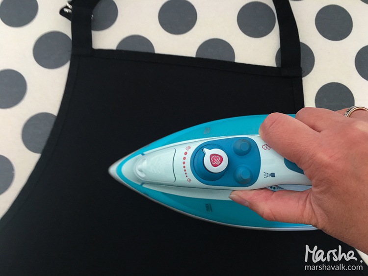
Most fabric paints have to be fixated to make it (machine) washable. The paint I used had to dry for 30 minutes before I could fixate it by ironing the fabric with an iron on medium heat.


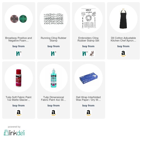
OMG Marsha this is the coolest apron EVER! I want one :) In addition to a StampBuddy, Marsha used the following supplies (some are affiliate links):


Play along with us too: I love to see how you interpret our monthly themes. Email me how you used my stencils and stamps with the theme and email me an image – I would love to share your projects in my next  “n*Spiration From Around the Globe“.
Leave a comment

Meet the NEW Creative Squad!

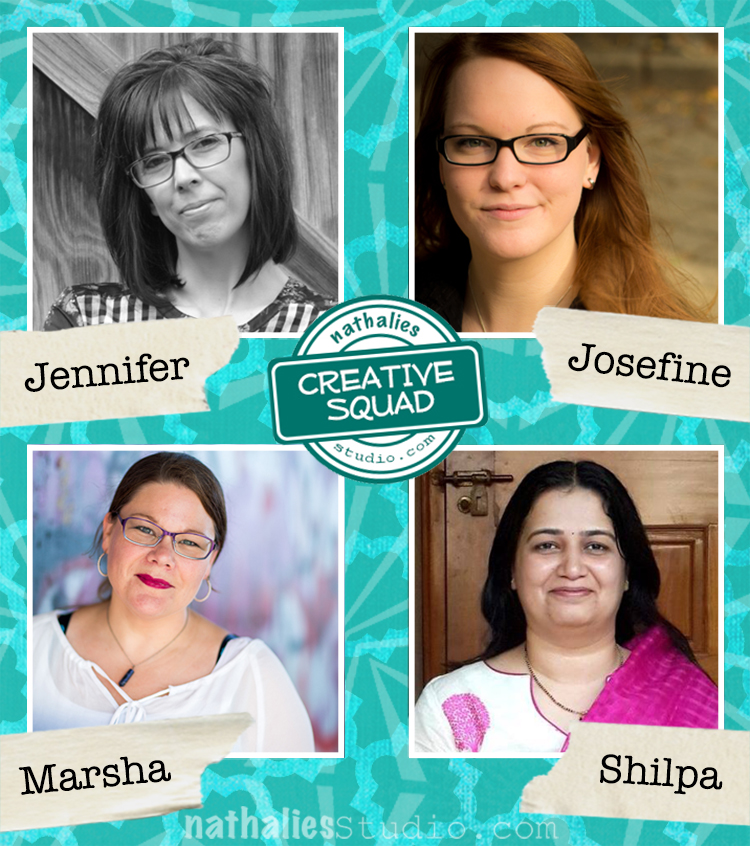
I am thrilled today to introduce you to the latest Creative Squad! After receiving a huge response to my call for members back in the summer, we were able to put together a Squad that I am proud to reveal today. Welcome to Jennifer Gallagher, Josefine Fouarge, Shilpa Nagaonkar, and welcome back to Marsha Valk!  We cannot wait to see the projects that you will bring to us and we are super happy to have assembled a Squad from all over the US and the world.  Please stop back every Tuesday for posts from the Creative Squad, sharing with us a diverse global perspective on Mixed Media, Paper Crafting, Art Journaling, Card Making, and more.  To learn more about each of these artists, check out our Creative Squad page for bios and links :)

And of course we are very sad to say goodbye to our Squad members Cheiron Brandon, Michelle Rydell, and Tina Walker.  Here is a big THANK YOU to all your hard work and to your dedication. It was always amazing to see your creative responses to our monthly themes.  We have been very lucky to have found such inventive and inspiring artists :)

Leave a comment

Reduce, Reuse, Recycle with Michelle Rydell


Happy Tuesday everyone and welcome to a project from Creative Squad member Michelle Rydell! Michelle brought together a bunch of different items from her stash to create a beautiful little book with a message that is just perfect. She used my Mini Batik Pattern 2 stamp and my Batik, Lily Wallpaper, and What’s the Point stencils to help her with this month’s theme: Reduce, Reuse, Recycle – Let’s do Mother Earth a favor this month and use what we already have.  Maybe we’ll dip into our stash of leftovers from other creative projects or maybe we’ll repurpose something unexpected.  This month we’re thinking about how artmaking can impact the environment and we’re trying to make our footprint just a little bit smaller.


About five years ago, I found a bunch of old S&H Green Stamp books at an antique store, and I thought they were so cute I just had to buy them.  Remember green stamps?  Well, they have been just waiting for the right project, and this month’s Reduce, Reuse, Recycle fit the bill perfectly!

I decided to make one into a mini-journal.  Here’s how I did it…

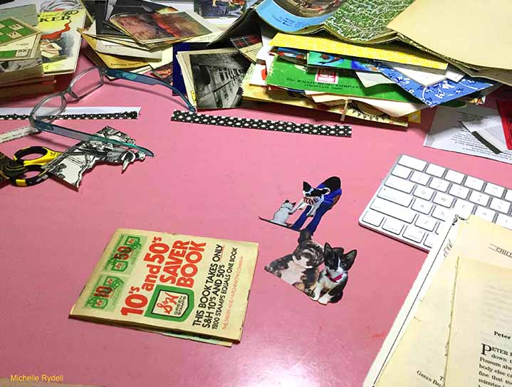
I combed thru my stash of vintage ephemera and picked out a pile of things that I thought had possibilities – mostly because they matched the color scheme of the green stamps…

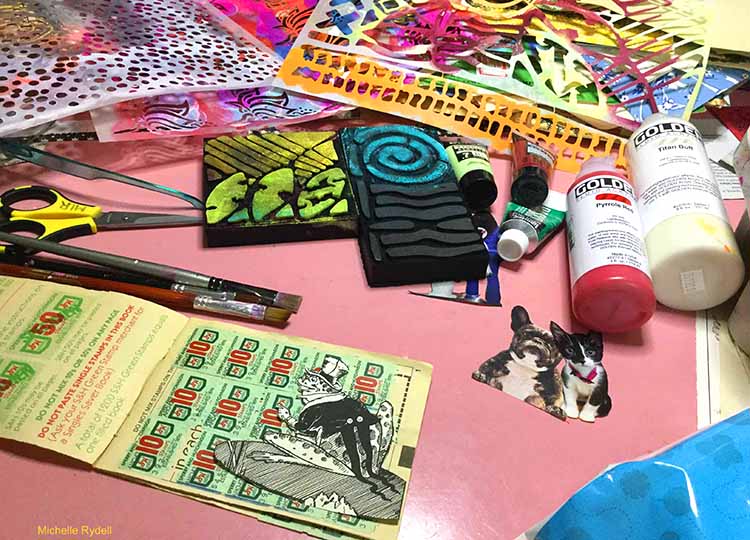
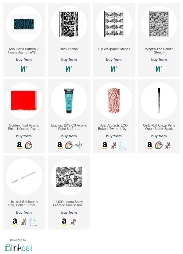
I decided on a theme for the book, and then combed thru my stamps and stencils designed by Nat, and picked out some that I thought would work great for the project.  The ones I ended up using were: Mini Batik Pattern 2 Foam Stamp, and three stencils: Batik, Lily Wallpaper and What’s the Point?

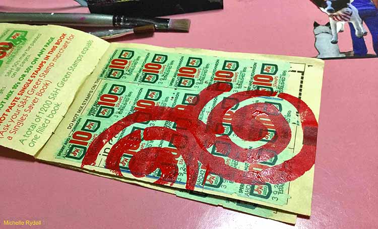
The toad I wanted to put on the first page needed a background to rest on, so I pulled out the foam stamp and added a couple of swirls to start things off.

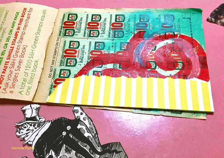
Then a little paint and a bit of patterned paper…

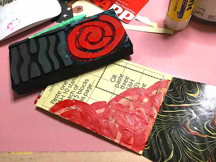
To create some consistency, I flipped to the back page and did something similar with the background.

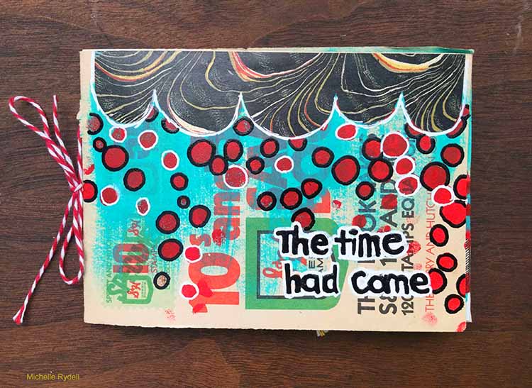
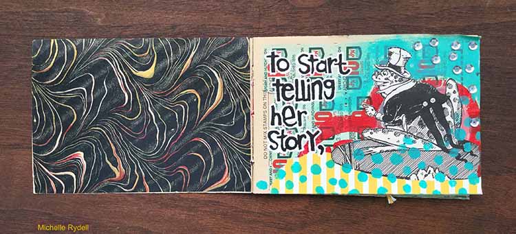
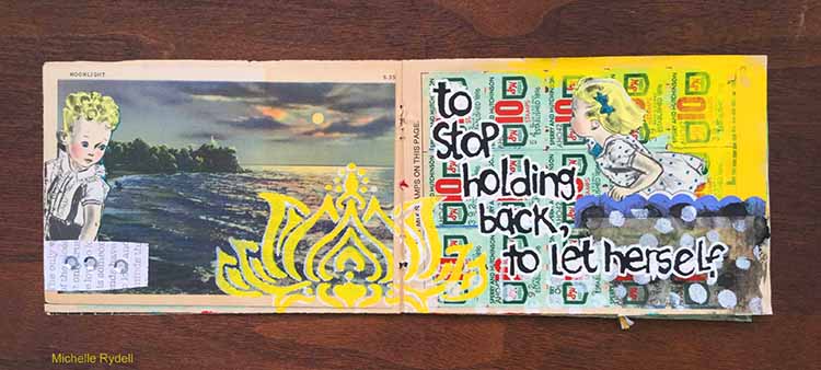
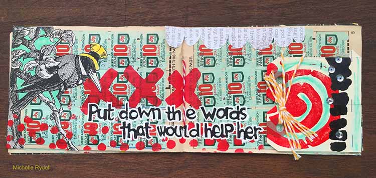
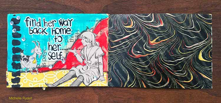
From there I was off and running, adding stamps and stencils, paint and bits of paper to each page.  I also took out the rusty old staples and changed the binding to bakers twine. The dots here are made with the What’s The Point stencil. At the end I added a favorite quote to pull it all together.  Here’s how it turned out…


Thank you Michelle for this inspiring little book! In addition to various vintage papers, Michelle used the following:


Play along with us too: I love to see how you interpret our monthly themes. Email me how you used my stencils and stamps with the theme and email me an image – I would love to share your projects in my next  “n*Spiration From Around the Globe“.
Comments (6)

  • datatar

    |

    Amazing album! I just love everything about it. Thanks for the inspiration!

    Reply

  • Deb

    |

    What a FUN idea!!!
    I too remember the green stamps and going with my Mom to the redemption store!

    Reply

    • Michelle Rydell

      |

      Thanks so much Deb! I’m glad it brought back memories for you!

      Reply

  • Julie Tucker

    |

    I do remember those green stamp books!!! I loveeeeeeeeeeeee this!! FABULOUS!!!!!!!!!

    Reply

    • Michelle Rydell

      |

      Thank you so much Julie! I appreciate your kind words!!!

      Reply

Leave a comment

Reduce, Reuse, Recycle with Cheiron Brandon


Hello from the Creative Squad! Today we have a spooky card from Cheiron Brandon to get you thinking about Halloween :)  She uses my Buenos Aires stencil to help her pull together this month’s theme: Reduce, Reuse, Recycle – Let’s do Mother Earth a favor this month and use what we already have.  Maybe we’ll dip into our stash of leftovers from other creative projects or maybe we’ll repurpose something unexpected.  This month we’re thinking about how artmaking can impact the environment and we’re trying to make our footprint just a little bit smaller.


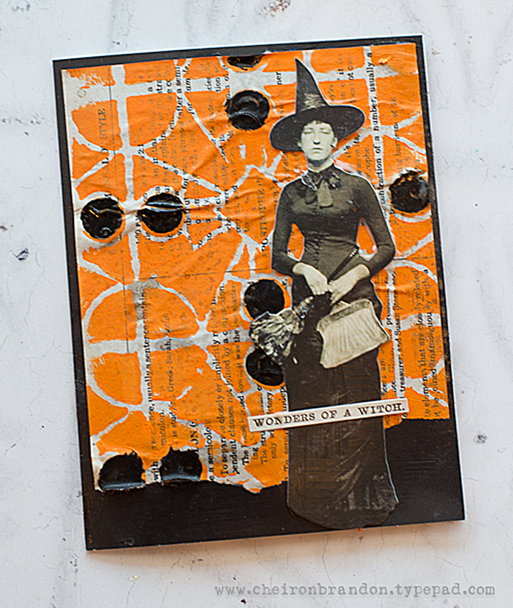
Hi there, it’s Cheiron here with my September post. This month we are using the theme Reduce, Reuse, Recycle and I thought it would be fun to challenge myself just to use all the leftover paper bits that were on my desk. The easiest way for me to do this was to make a card. 

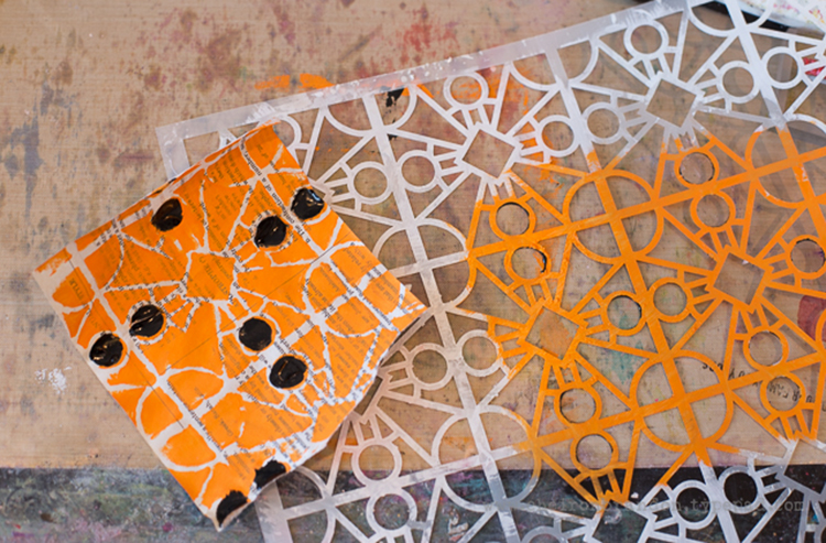
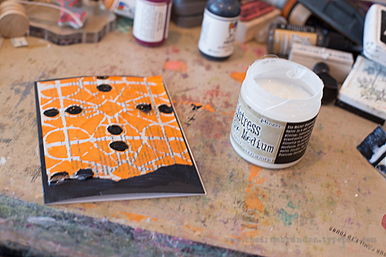
I took a scrap of book paper and applied some Tangerine paint through the Buenos Aries stencil. I used some black slick paint to fill in the dots. I thought this color combo would be perfect for Halloween, as I have a ton of Halloween bits and pieces on my table right now.

Once the paper was dry, I collaged it to a blank note card. I love using painted and stenciled papers as backgrounds on my cards. I had some parts of paper dolls that I had cut out, so I used this fun witch and added a simple sentiment. I love the handmade, whimsical look of cards like this and its so easy to incorporate all those scraps that we tend to save!

Hope you enjoyed this fun and simple way to recycle your scraps into new creations :)


Thank you Cheiron for showing us a great way to incorporate some leftovers into seasonal cards! In addition to some leftover papers, Cheiron used the following supplies (some are affiliate links):


Play along with us too: I love to see how you interpret our monthly themes. Email me how you used my stencils and stamps with the theme and email me an image – I would love to share your projects in my next  “n*Spiration From Around the Globe“.
Comments (2)

  • Karen Bearse

    |

    Spooky!! Love the art journal look.

    Reply

  • Stephanie

    |

    So cool!

    Reply

Leave a comment

Reduce, Reuse, Recycle with Tina Walker


Hello my friends! It’s Tuesday and time for a project from my Creative Squad. Today we have a beautiful and clever book created by Tina Walker who reused two old projects and gave them a new life :)  Tina used my Batik Pattern 3 foam stamp, my Amsterdam 6×6 and Lily Wallpaper stencils, and my Marks stamp set to help her with this month’s theme: Reduce, Reuse, Recycle – Let’s do Mother Earth a favor this month and use what we already have.  Maybe we’ll dip into our stash of leftovers from other creative projects or maybe we’ll repurpose something unexpected.  This month we’re thinking about how artmaking can impact the environment and we’re trying to make our footprint just a little bit smaller.


Hi! Tina Walker here today with a new month and a new theme and…… my last Creative Squad post. :(  I have SO enjoyed my time as part of Nat’s Creative Squad family and will truly miss this part of MY monthly creative process. But don’t despair, I will still be around and will see y’all in cyber-land. Thank you again Nat! And thank you to this wonderfully creative community.

September’s theme is Reduce, Reuse, Recycle. These three (little) words have such a strong, powerful meaning in today’s world and have a very special meaning for me. I am hosting a year long project called, The Sustainable Souls Project, where a group of like-minded artists are creating awareness about sustainability topics and how we impact the world and the environment. Our very own Nat was a Guest Artist for two months and we thoroughly enjoyed her vision. For today’s project, I expanded the idea of repurposing, to include my art. I will show how I recycled two past, uninspiring projects into one new project that I am happy to share.

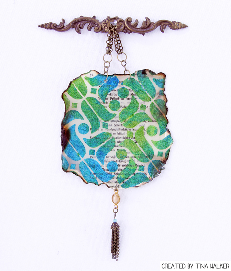
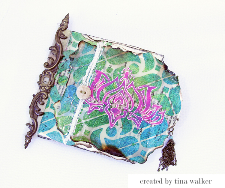
Several months ago, I created these two projects, ironically as part of a Creative Squad post. I never shared them and created something else, so how perfect to repurpose them into something new for this month’s theme?

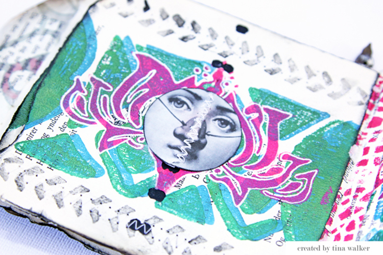
Here’s a peek at my two (previously) created projects.


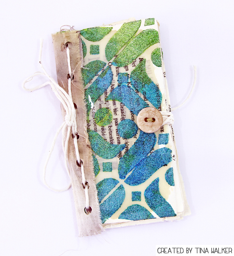
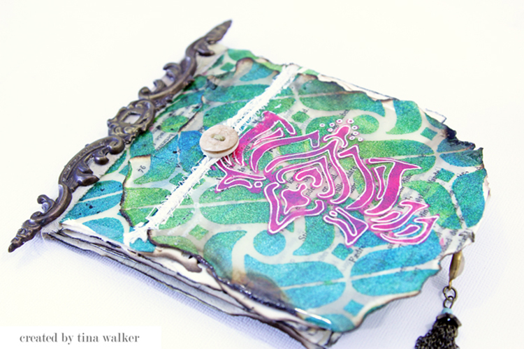
Using part of both projects, I created a larger mini journal, that can be functionally used or displayed. Let’s take a look.

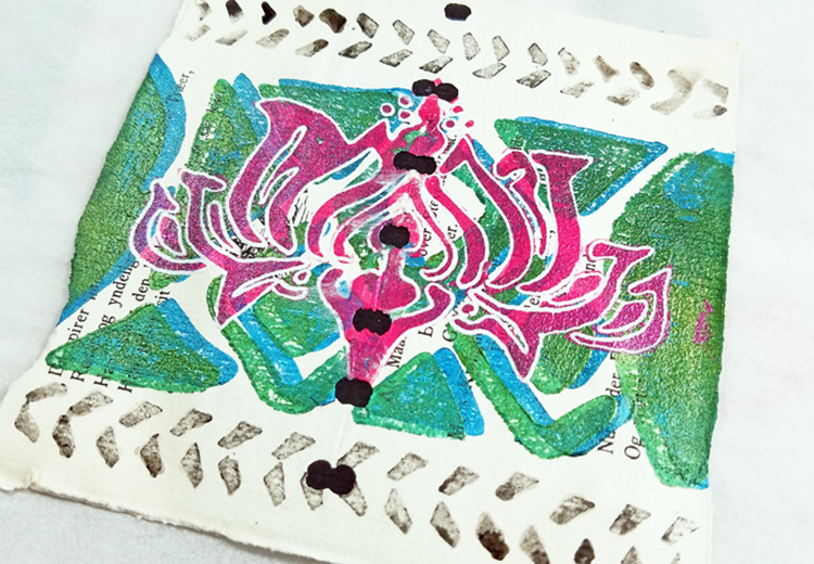
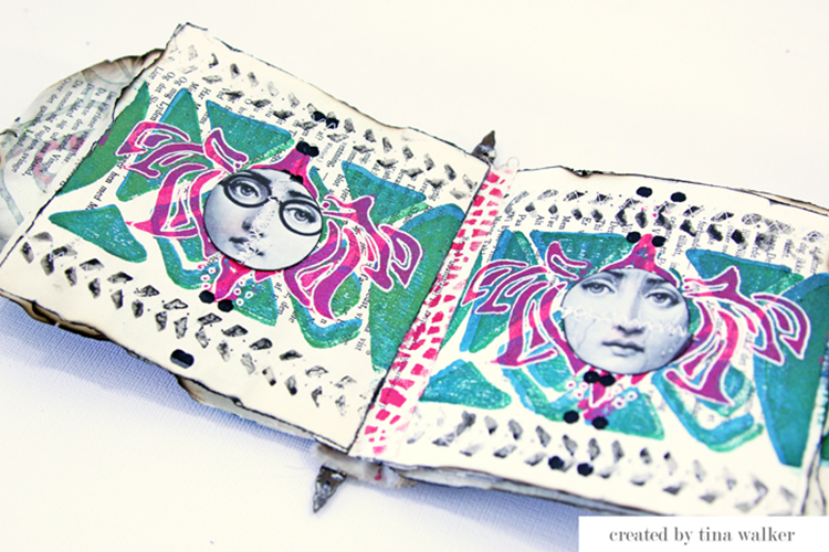
I deconstructed the book and home décor hanging, removing the embellishments, ribbons, and papers. Using the papers as the base for my new book, I repeated the same Batik Pattern 3 foam stamp for a cohesive look.

Next, I repeated the same Lily Wallpaper stencil for more cohesiveness and added stamps from Nat’s Marks stamp set.

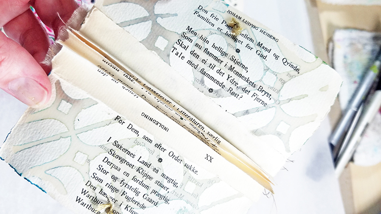
Using one of the paper pages, I created a binding for the entire journal and added it to the inside of the previous mini book covers.

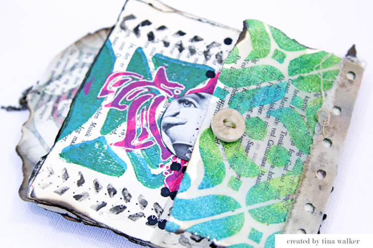
Since the previous mini book was narrow, I wanted my new cover to extend the width of the folded-out pages. I machine-stitched the home décor hanging piece to the new cover. I used the Amsterdam stencil here for the background. I also added a piece of string, a button, and the metal hanging embellishment from the previous projects to my new cover. It went from drab to fab in a quick minute.

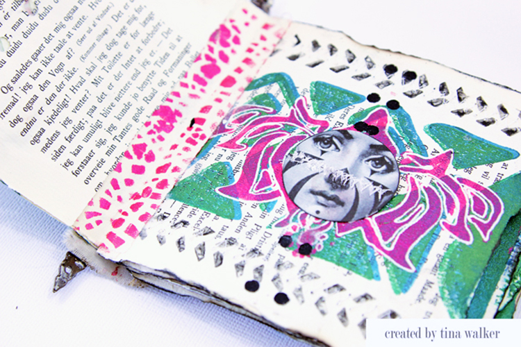
Just a few last details and my new book is ready for assembling. Here’s a peek at several of the inside pages.

I am so happy with the ‘new’ result and I am glad for the challenge.

Do you re-purpose old, unwanted projects? Yes? We would love to see them.

I hope you enjoyed my project today. Have a great day!


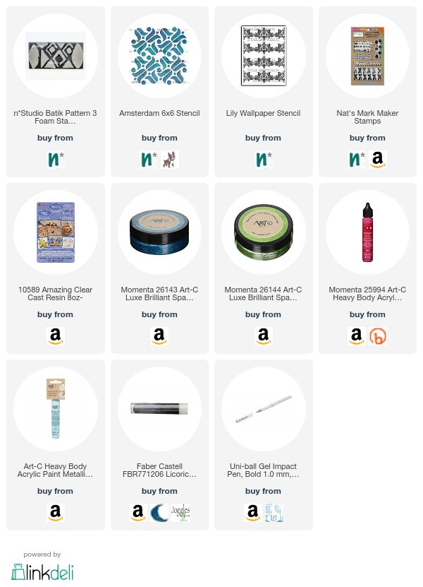
Thank you Tina for your (re)creation!  :)  In addition to vintage papers, jewelry findings, buttons, and twine, Tina used the following supplies (some are affiliate links):


Play along with us too: I love to see how you interpret our monthly themes. Email me how you used my stencils and stamps with the theme and email me an image – I would love to share your projects in my next  “n*Spiration From Around the Globe“.
Comments (4)

  • Karen Bearse

    |

    Love how you combined 2 projects to make this hip, funky original arr journal. Very inspiring!

    Reply

  • Sue Clarke

    |

    Clever, pretty, green and gorgeous Tina!

    Reply

Leave a comment

Artful Adventures – Michelle Rydell


Hello from the Creative Squad! Today we have a post from Michelle Rydell sharing an art journal that she created for taking on some weekly Artful Adventures. She used my Hamburg stencil, and this month’s theme: Artful Adventures. Are you planning an Artful Adventure this summer? Whether it’s a day at the beach or a full blown International Vacation, don’t forget to take the time to soak up the uniqueness of your new surroundings and gather some inspiration for future artmaking. This month we’re turning to Nat’s new book Artful Adventures in Mixed Media, to help us find inspiration as we travel. We’ll be noticing color, shape, texture and more and then we’ll be taking that to the studio to help inspire some mixed media projects. Join us in the adventure!


I have to say that I was very inspired by Nat’s “Artful Adventures” book!  (and I am not just saying that because this is her blog – ha). I’m a color enthusiast and Artful Adventures is a visual feast of color!  The chapter about gathering inspiration from books and movies got me thinking about that, and I knew I wanted to take inspiration from her book in some way.

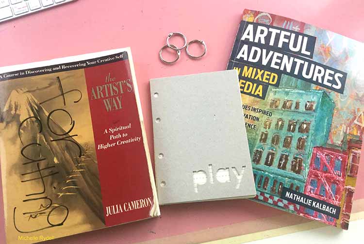
I decided to combine that with another book that has really inspired me, called  “The Artist’s Way,” by Julia Cameron.  It’s a book about rediscovering your creative self, and it really helped me do just that. One of the tools that the book suggests, is that you take yourself on a weekly artist date; which is an excursion alone, to do something that feeds your creative soul.  It can be anything from a long walk in nature, to visiting a junk store, to going to a movie. I’m telling you this, because it’s one thing from the book that I rarely make time to do, even though I really want to; and Nat’s book gave me an idea. What if I use my weekly artist dates as a springboard for my art journaling?  That would inspire me to actually do them! I’m going to make a special journal for recording my artist’s dates!

So, my project for today is inspired by both books –  “Artful Adventures,” and “The Artist’s Way.”

Here’s how I made my little book…

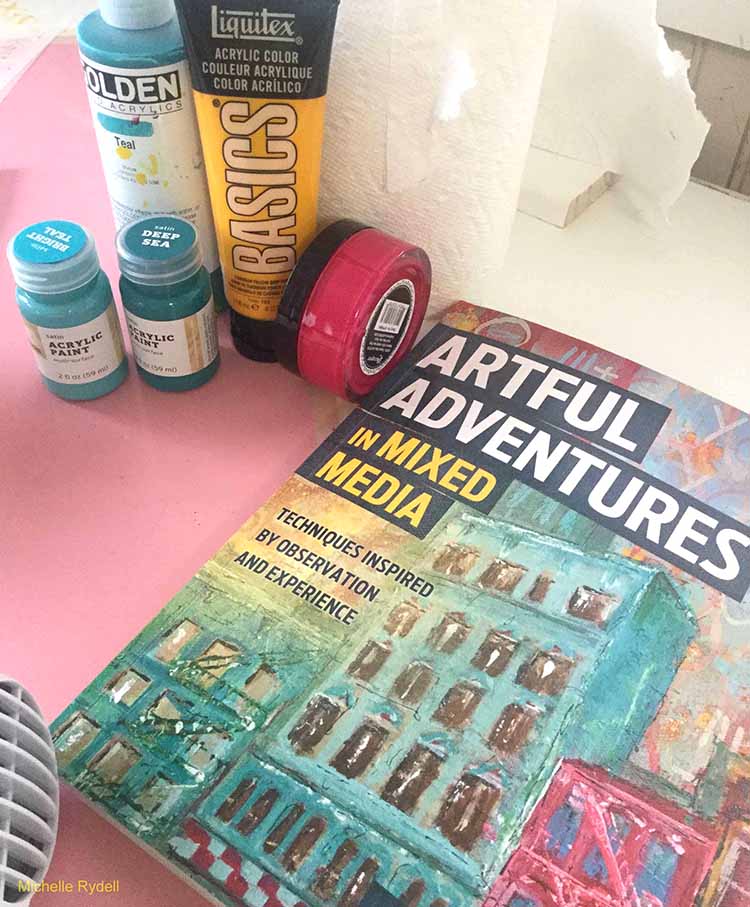
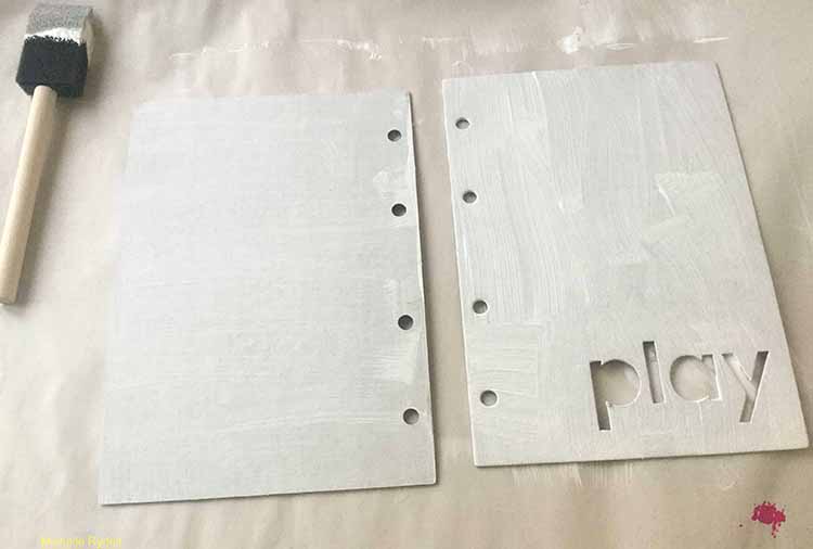
I happened to have an old October Afternoon chipboard mini-book cover lying around, so I decided to use that as my substrate. It’s 5 x 7 – just the right size for recording my adventures.  You could use any piece of chipboard or even heavy cardboard instead. I wanted to use the gorgeous colors from the Nat’s painting on the Artful Adventures cover as inspiration, so I gathered up some paints that matched as closely as possible…

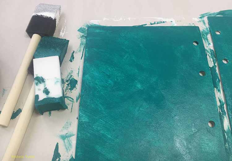
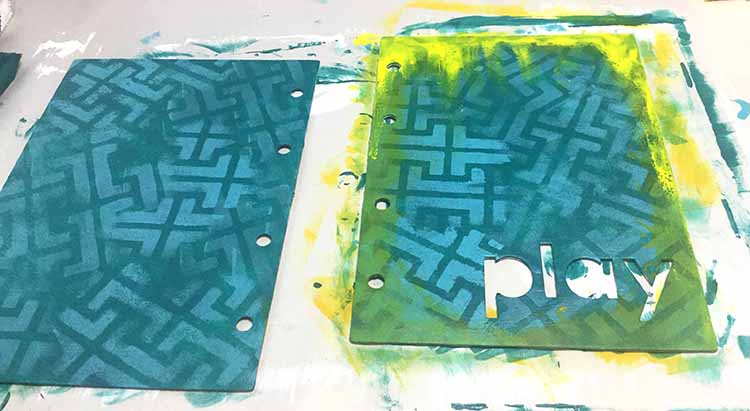
I gessoed the chipboard first, so the paint wouldn’t soak into the chipboard, keeping the colors brighter.  Then I added a couple of coats of a dark teal color as a base.


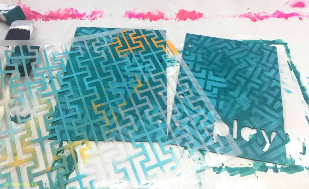
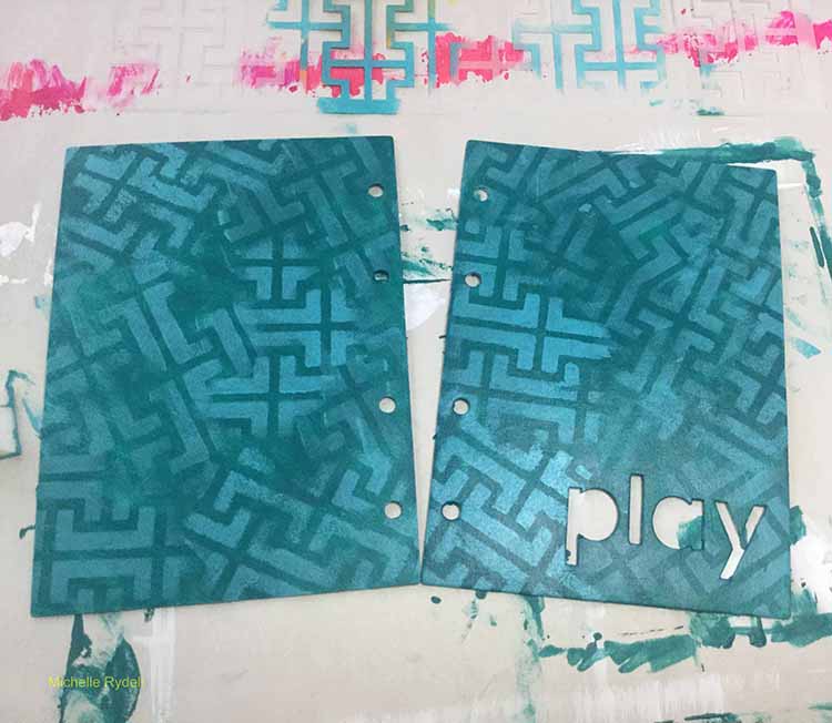
I used the Hamburg stencil to add interest to the background. I sponged small areas at a time with a lighter teal, while twisting and turning the stencil to create movement and texture.

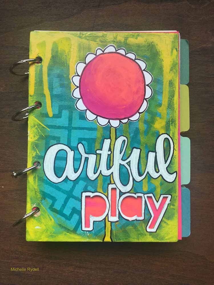
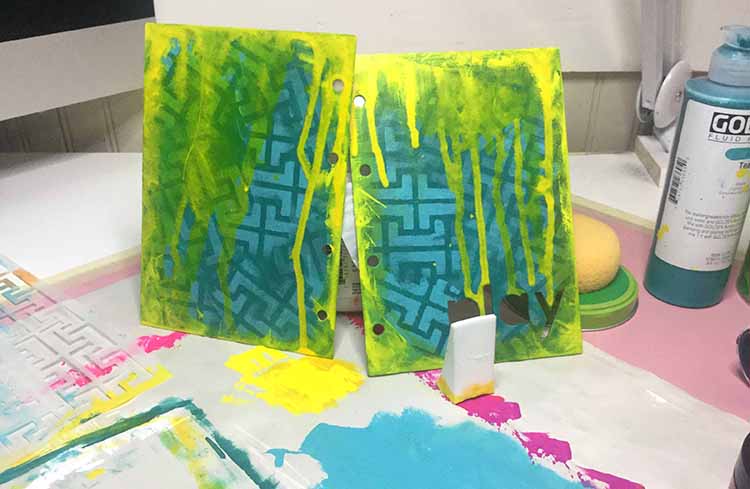
I love the beautiful green on Nat’s painting, so I attempted to mimic that by adding yellow over the teal –  as a border, and also dripping it across the top.  At first it wasn’t showing the green, so I sprayed some water on the drips to make them more transparent, and then it mixed with the teal to create green – yeayyy!  I hope I did it justice!

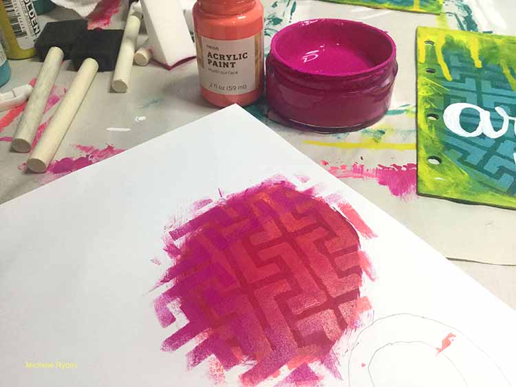
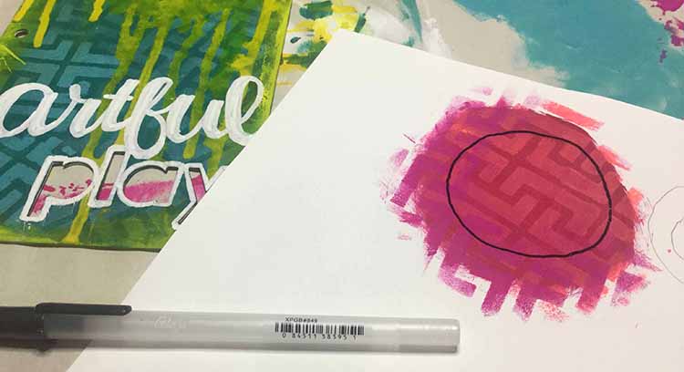
I wanted to add some contrast so I decided to add a pink flower to the cover.  I painted the center on copy paper, and then added the Hamburg stencil pattern again, with a subtle color change.

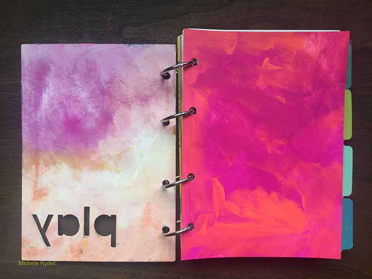
I pasted the pink flower middle onto another layer of white copy paper, and drew the petals for the flower.  Then glued it onto the front of the cover.  One of the drips looked like a stem to me, so I outlined it in black. Then I finished it off by adding a title with a white poster paint pen. Here’s the finished book-

And one last photo so you can see the pink and coral title page I painted, so the word “play” would show thru the cover in pink.  I plan to put a quote about Artist’s Dates here. The inside of the front cover was created by adding a layer of gesso to the same bright pinks and corals, then rubbing some of it off with a dry paper towel.

My plan is to add to this book each time I go on an artist date, by writing my thoughts and creating a little art piece inspired by the experience.  I hope you like it, and maybe you will try making one too!


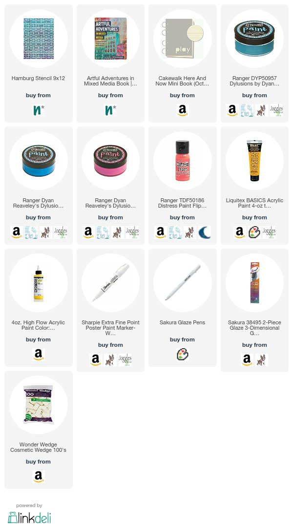
Thank you Michelle! We hope you have many happy art dates!!! Michelle used the following (some are affiliate links):


Play along with us too and share your Artful Adventures with us: I love to see how you interpret our monthly themes. Email me how you used my stencils and stamps with the theme and email me an image – I would love to share your projects in my “n*Spiration From Around the Globe“.
Comments (4)

  • Sue Clarke

    |

    Thank you for your detailed instructions and that teal is gorgeous Michelle.

    Reply

    • Michelle Rydell

      |

      thank you Sue! I’m so glad you liked the tutorial!

      Reply

  • Julie Tucker

    |

    This is gorgeous! LOVING the colors!!!!!!!!

    Reply

Leave a comment

Artful Adventures – Marsha Valk


Hello my friends! Today we have a post from Marsha Valk from the Creative Squad. She is sharing an art journal page from a journal that she created just for taking Artful Adventures :)  She uses my Amsterdam, Chicago, and Mesa Verde stencils, and this month’s theme: Artful Adventures. Are you planning an Artful Adventure this summer? Whether it’s a day at the beach or a full blown International Vacation, don’t forget to take the time to soak up the uniqueness of your new surroundings and gather some inspiration for future artmaking. This month we’re turning to Nat’s new book Artful Adventures in Mixed Media, to help us find inspiration as we travel. We’ll be noticing color, shape, texture and more and then we’ll be taking that to the studio to help inspire some mixed media projects. Join us in the adventure!


I’m not going away on vacation this Summer. We were planning to, but it just didn’t happen. And that’s OK because when you read Nat’s new book ‘Artful Adventures in Mixed Media’, you quickly realize that you don’t have to go far to experience an artful adventure!

I was set on taking inspiration from the city I live in, and the photos I had taken during the Artful Adventures Stroll Through The Hood Challenge leading up to the release of the book. You can see the photos I took during the challenge here.

But when it came down to creating I took one look at my Wanderlust stencils and changed my mind!

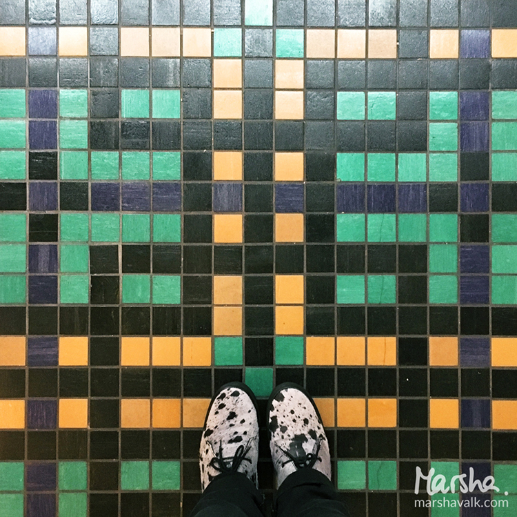
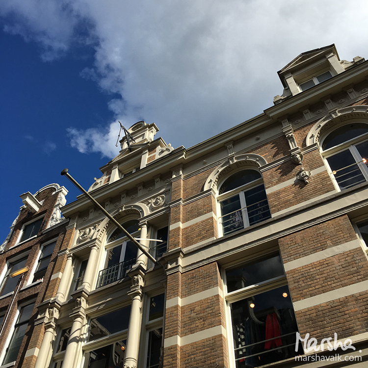
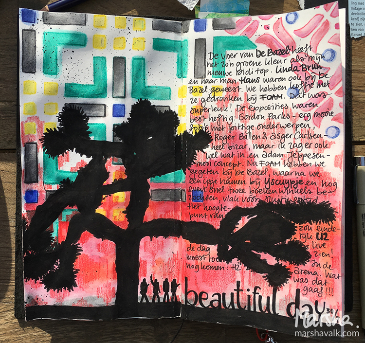
The Chicago stencil reminded me of the floor of the place in Amsterdam we had lunch recently. And the Amsterdam stencil reminded me of the logo of the ice cream place we went to after that. And the Mesa Verde stencil…

All these stencils combined told another story: the story of a beautiful day in Amsterdam. Not Amersfoort. Amsterdam!

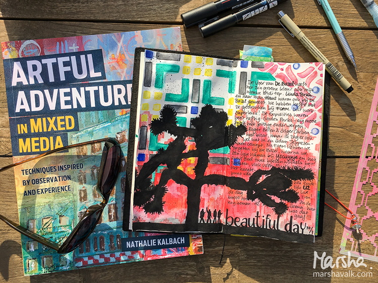
So I took my art-on-the-go kit into the yard and explored what this day in Amsterdam would have looked like in a travel journal (a regular Midori sketchbook), had I been on vacation.

I even did the Observation exercise from the book to remind myself of what I saw and felt that day. I also went online to collect images of things I hadn’t photographed or wasn’t allowed to take photos of at the time (museum).

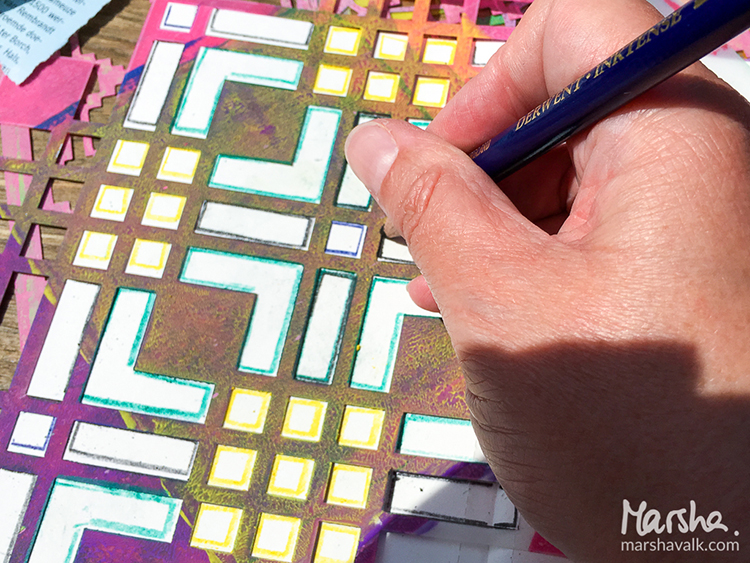
My art-on-the-go kit doesn’t include Inktense watercolour pencils, but I decided to use these with the stencils instead of my regular watercolours.

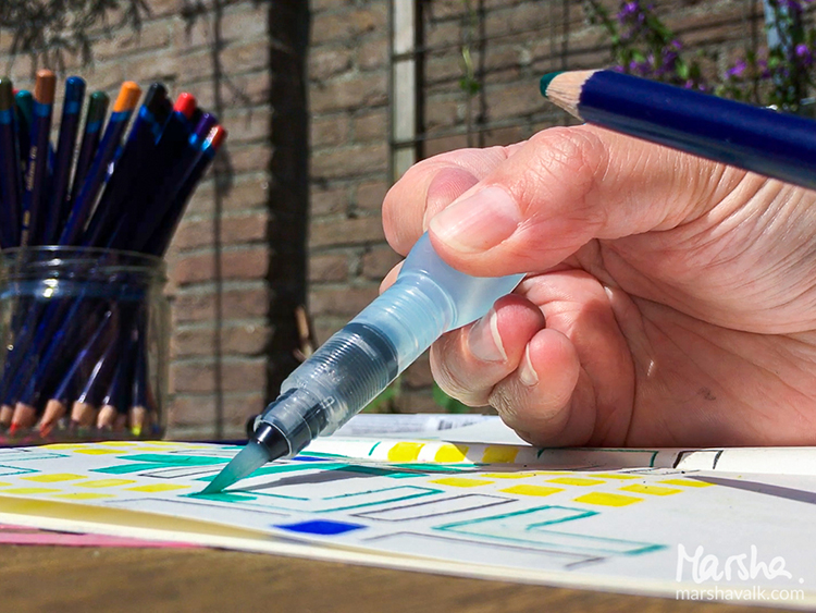
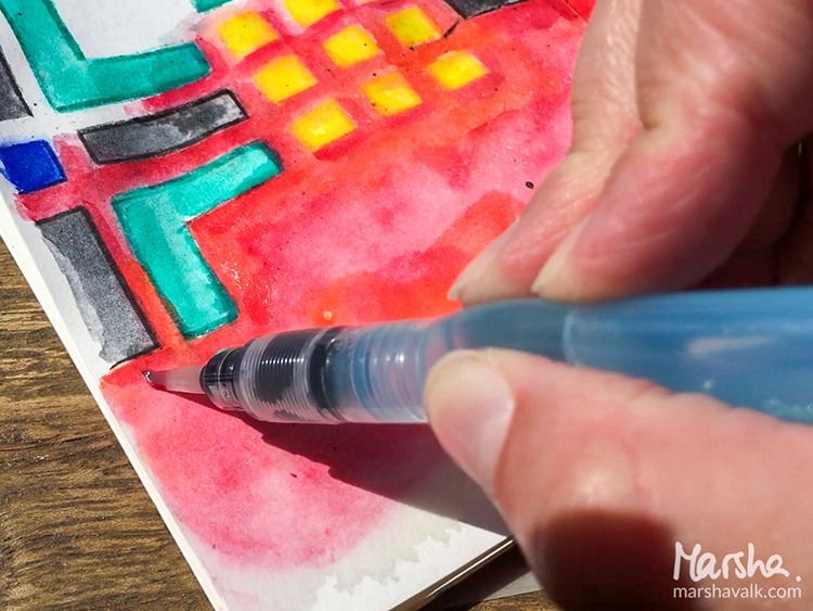
Watercolour pencils are a great addition to an art-on-the-go kit though, because you can use them as a regular coloured pencil as well as activate them with a waterbrush: I used a warm red Inktense pencil without water to colour in the openings of the Mesa Verde stencil.

The Chicago and Amsterdam stencil designs were first traced with the pencils before I used a waterbrush to pick up the pigment from the same pencil and coloured inside the lines.

The red watercolour background is created with regular watercolours, and I used Posca markers to draw and colour the black tree.

It was super relaxing to create like this, with limited supplies, having to pause to wait until the watercolour was dry. And I especially love that I have this particular day recorded in a journal now!


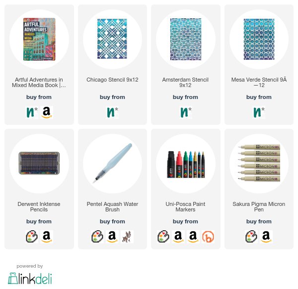
Thank you Marsha for sharing your vision of an Artful Adventure in Amsterdam! In addition to her sketchbook, Marsha used the following supplies (some are affiliate links):


Play along with us too: I love to see how you interpret our monthly themes. Email me how you used my stencils and stamps with the theme and email me an image – I would love to share your projects in my “n*Spiration From Around the Globe“.
Leave a comment