Creative Squad

Creative Squad: The Great Outdoors – Riikka Kovasin

Hello from my Creative Squad! Today we have a post and video from Riikka Kovasin who is sharing a batch of ATCs using a unique found tool to create them, as well as my Fan-tastic Small stamp set and our theme: Great Outdoors – The experts agree that getting outside for activity each day is a super healthy thing you can do for your mind and body. Let’s get outside and seek artistic inspiration out there. Find something that catches your eye and then when it’s time to come back in, use that inspo to create.


Hello there! It’s Riikka here today with my take on the monthly theme of “The Great Outdoors”. 

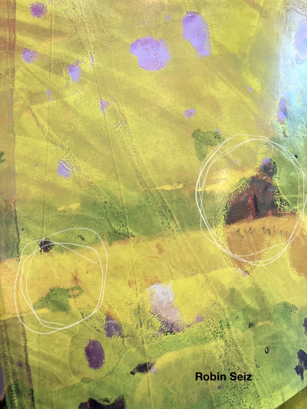
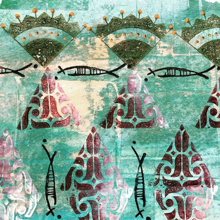
While I did go outside to get some inspiration for my project, I stuck with my first idea when I started to think about outdoors in Finland. While we have over 150,000 lakes (if the small ones are calculated as well) and mainland has over 6,300 km of shoreline, I started immediately to think about the forests! And I’ve lived in coastal cities my whole life! But I recall Finland being called “the land of green gold” as well, meaning the vast area of forests that cover over 75% of the land. While the old Finnish films usually always depict birch trees, to me the old coniferous forests are the type that scream Finland. Those murky fir tree forests with lush green moss and thin lines of sunlight seeping through from the gaps in the thick canopy. 

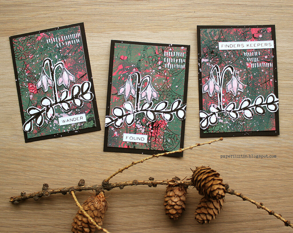
In such a forest you can find a delicate flower during the height of summer. In the dim lit forest floor, you see these little dots of the palest pink that seem to radiate in the dark like tiny stars. The flower was also Carl von Linné’s favourite, that’s why the plant carries his name – Linnaea Borealis. Linnaea is after his original last name, Linnaeus and ‘borealis’ meaning ‘northern’. The plant is found in the Northern parts of America, Asia, and Europe.

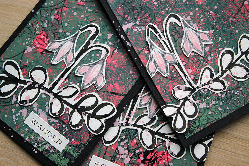
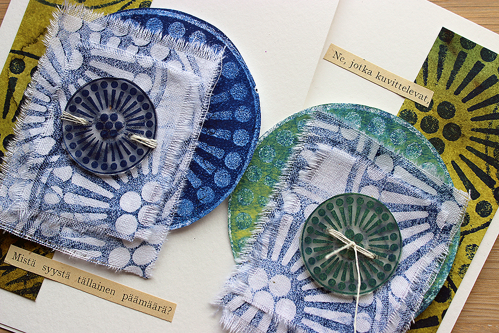
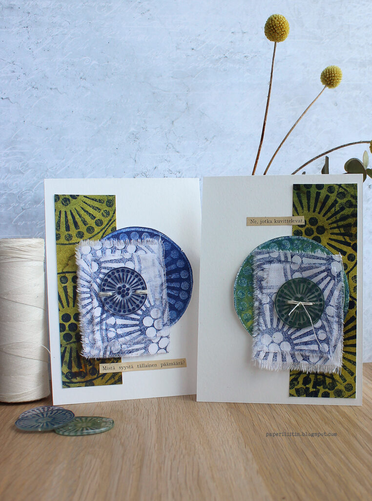
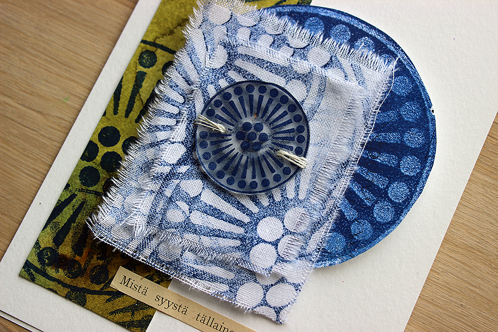
When I was roaming about in an old forest, looking for further inspiration, I came across some fir tree branches that had fallen to the ground as there had been strong winds the previous day. I packed some with me and ended up using them as a brush and as a patterning tool. They bring that forest aspect to my ATCs depicting the delicate flower. 

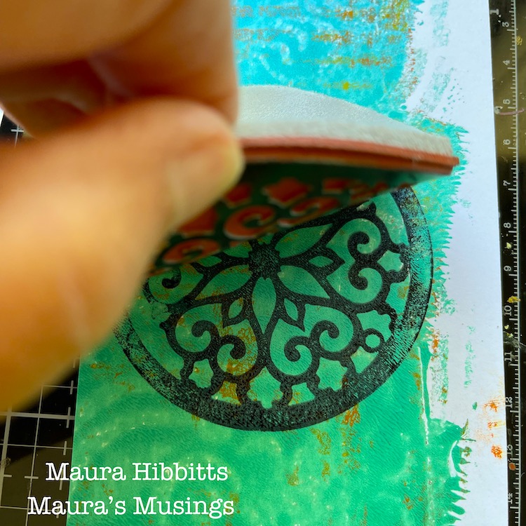
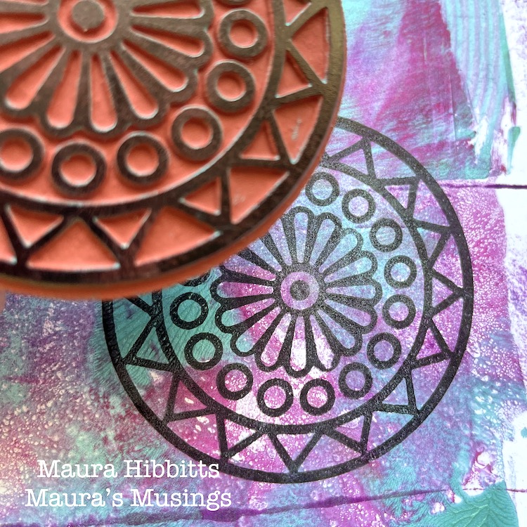
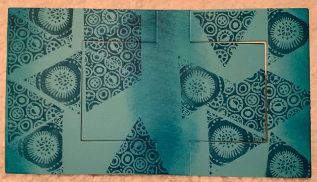
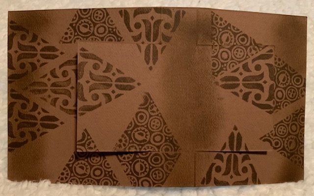
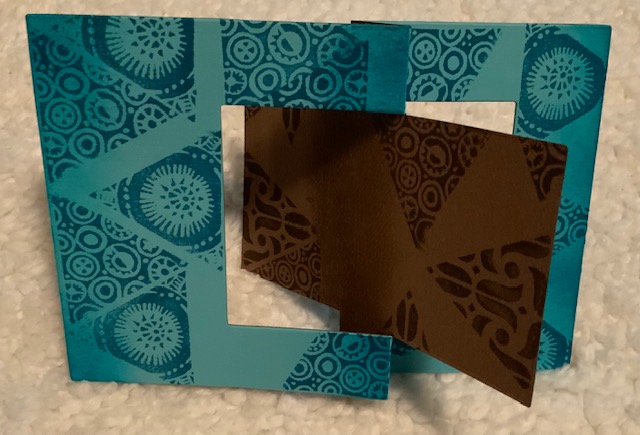
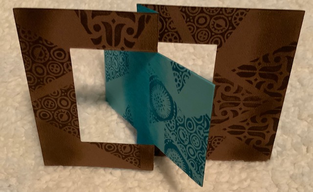
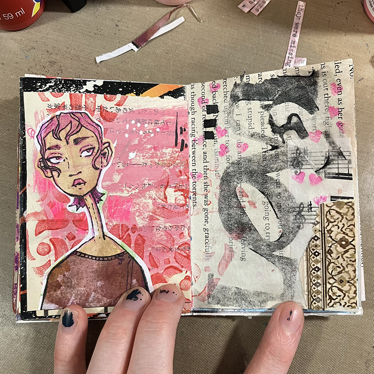
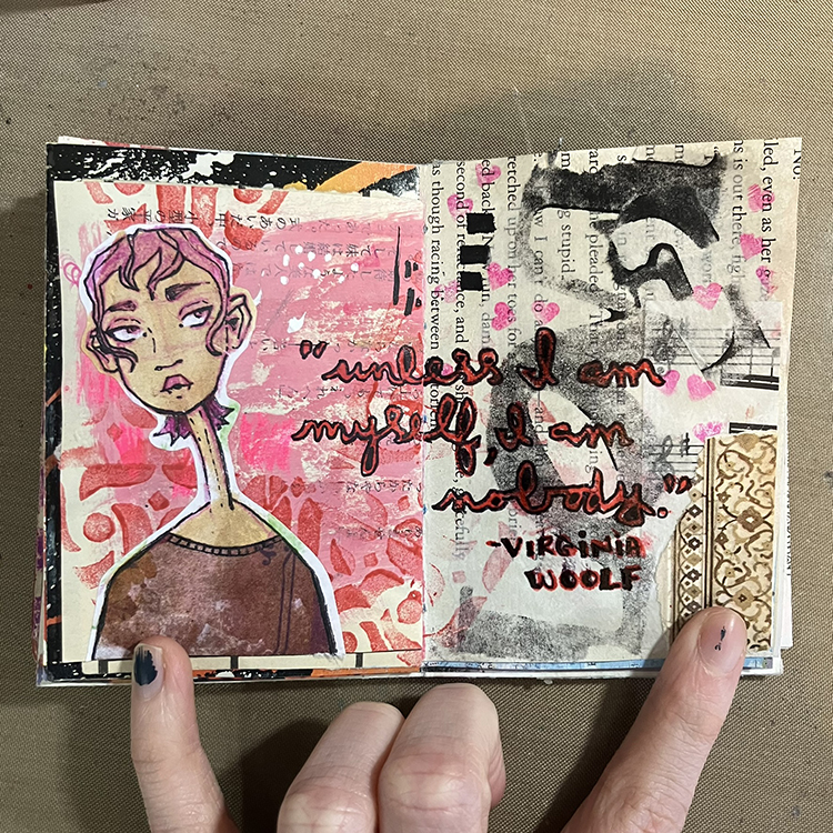
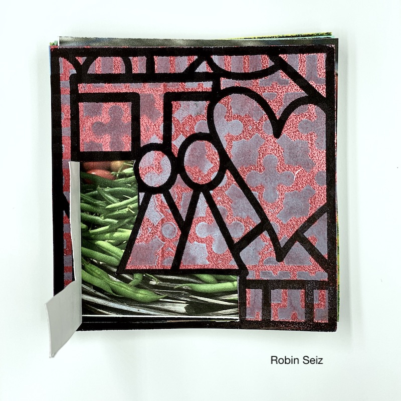
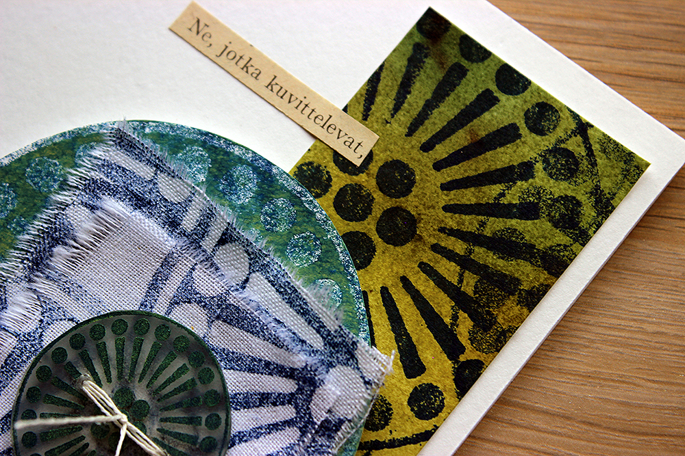
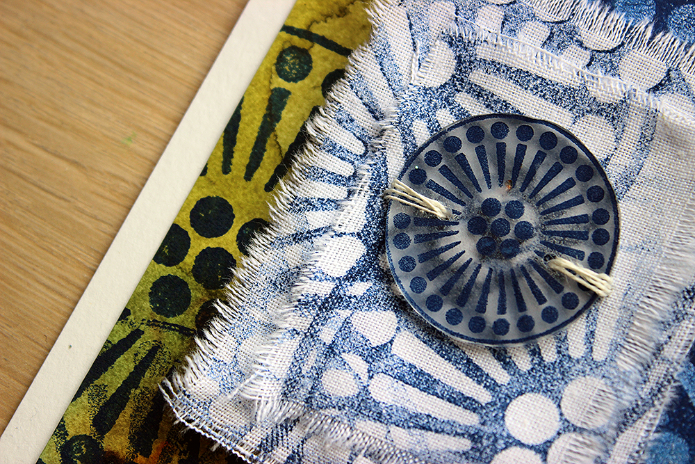
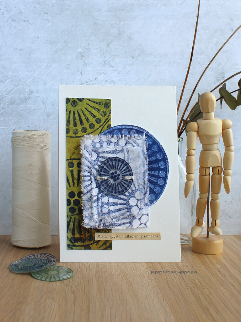
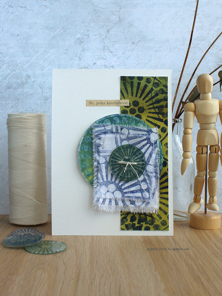
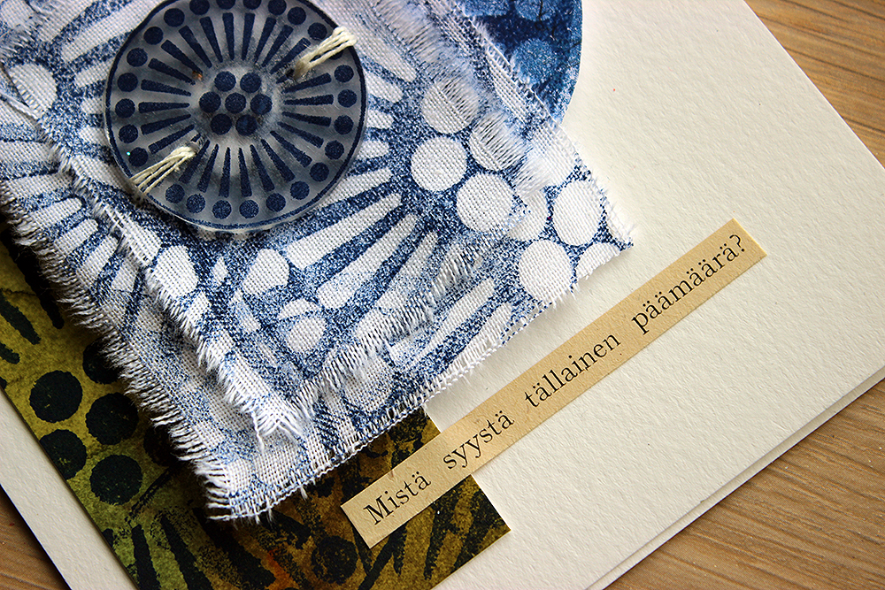
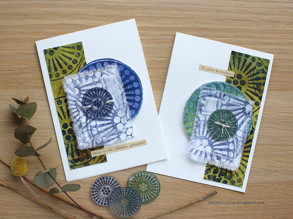
Now I had my topic and some of the means to create it, but I was still pondering about HOW to create the flower. I ended up deciding to use one of the FAN-tastic stamps to make the flower but didn’t look them thoroughly through before I was making the cards. My original thought was to stamp the fan shape and twist it into a dimensional little cone, but I found something even better. When I then was choosing the stamp to be used for the delicate bell-shaped bloom, I couldn’t believe my eyes as I saw one in the stamps! I couldn’t have drawn or found a better way to depict the flower! The “Park Ave” stamp had a linnaea borealis in it! I’m happy that you can only see my hands in the video so you can’t see my stunned face!

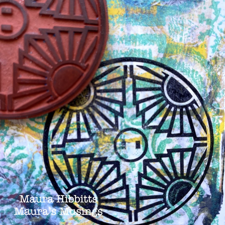
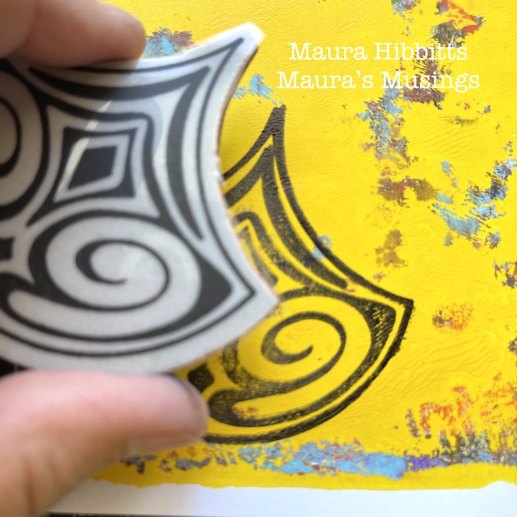
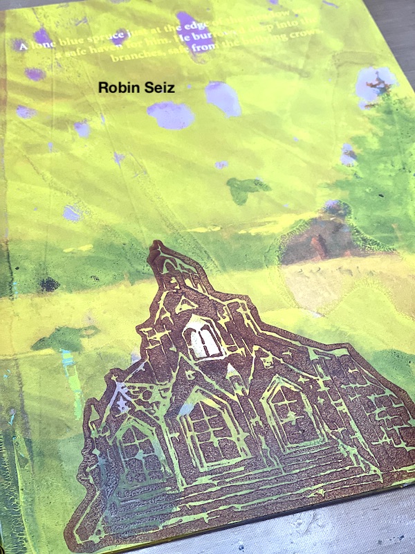
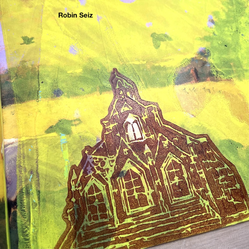
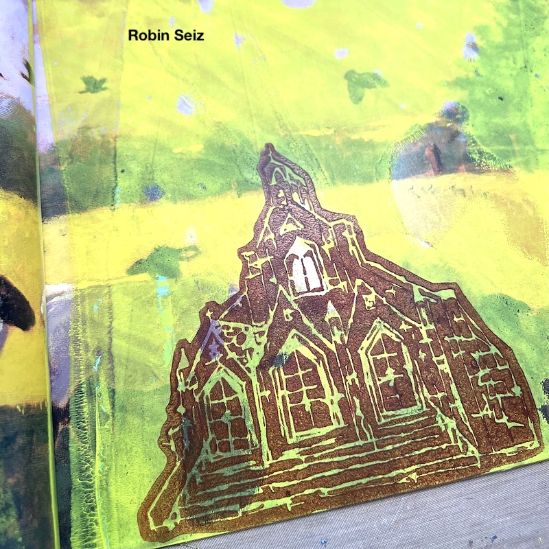
As you could see from the video, I used the FAN-tastic stamps also for another purpose. I added some highly stylized fir trees to the background before adding the plants in place. I picked the “Van Vorst” stamp as it’s thin line patterning reminded me of fir tree needles.

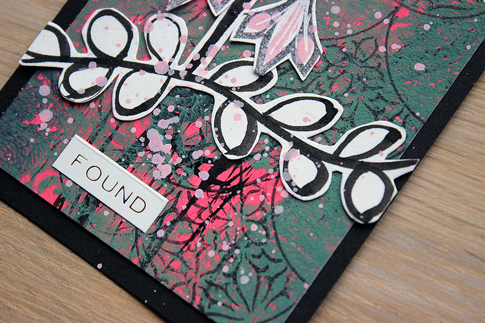
Now you may ask if the flower is called linnaea borealis why my project is named Linnea. There are two reasons for that – first that I misspelled it and second, probably why I misspelled it in the first place, that one my other daughter’s names is Linnea, after her great grandmother. If you want to read more about the flower, here’s a link to Wikipedia

Thank you for stopping by! Have a great time exploring the outdoors for inspiration! You never know what you may find!

Xoxo Riikka


Thank you Riikka – I love the story behind your project and that serendipitous moment of finding the flower in the Fan-tastic stamp – how cool is that?!

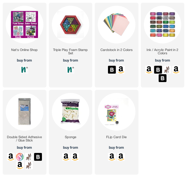
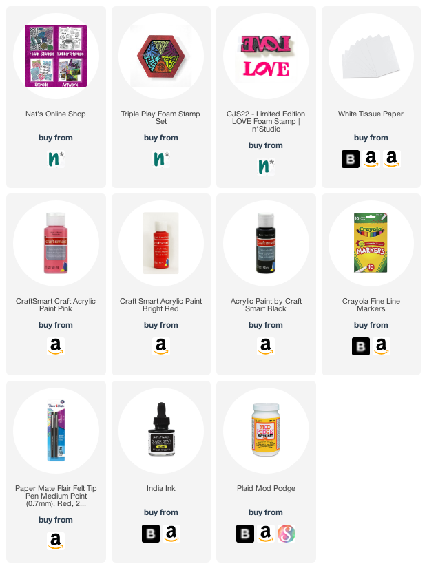
Give it a try: you can find all my Rubber Stamps in my Online Shop and in addition to her fir tree “brush”, here are some of the supplies Riikka used:

Looking for more projects? Follow the Creative Squad on Instagram

Leave a comment

Creative Squad: The Great Outdoors – Maura Hibbitts

Hello from my Creative Squad! Today we have a gorgeous post from Maura Hibbitts using my Large Circle Jumble, Fan-tastic Large, and Hex Set Large rubber stamp sets and our new June theme: The Great Outdoors – The experts agree that getting outside for activity each day is a super healthy thing you can do for your mind and body. Let’s get outside and seek artistic inspiration out there. Find something that catches your eye and then when it’s time to come back in, use that inspo to create.


What a perfect time to celebrate the great outdoors! It’s a time of year when people love to get out in nature and play. Camping, hiking, boating, gardening…and the list goes on. I have always been drawn to the woods. As a child, you could find me playing out there almost every day. This year, I closely observed the leafing out of the trees, and celebrated their return to glory.

I began in my Media Journal with a watercolor background. I decided to use non-traditional colors on my spread. I used a #12 brush to swipe color across the pages.

While the background dried, I stamped onto gel prints (any collage paper would work) I had in my stash using a black dye ink. I used Park Boulevard, Broadway and Valley Road stamps from the Circle Jumble large set…

…and the Lily and Fairview stamps from the large Fan-Tastic set by Nathalie.

Next step is to cut out the stamped shapes to use as the trees.

Run adhesive over the area of the tree trunk and layer ribbon down. I used some hand-dyed ribbon I had in my stash, but any ribbon will work.  Pleat it a bit to get some texture. Add foam tape to the stamped image and use as the tree canopy. Note – split the center image and space far enough apart so the book will close.

Use the Beacon Positive stamp from the large Hex set, and black dye ink to create grass and flower stems along the bottom of the page.

To finish the pages, I hand lettered “ A walk in the woods” and added dots to make flowers, using Posca markers.

Popping up the tree tops with foam tape, and scrunching the ribbon adds some lovely texture that you can see in the sunlight. Many days, I just observe the trees  from my deck and that brings me peace. It is a special day when I can get out to the woods for a walk or picnic. I wish you many opportunities to enjoy the great outdoors this summer! – Maura


Thank you Maura for this colorful and fun celebration of the outdoors! Love the idea of using all the stamps to create different trees :)

Give it a try: you can find all my Rubber Stamps in my Online Shop and in addition to gelli printed papers from her stash, here are some of the supplies Maura used:

Looking for more projects? Follow the Creative Squad on Instagram here.

Comments (2)

  • Rebeccab

    |

    A great way to interpret trees!

    Reply

  • Robin

    |

    Maura, beautiful bright piece of work! I love the texture you created too!

    Reply

Leave a comment

Batik Pattern 1 – “X” Marks the Spot!

One of my favorite things about all of my Batik foam stamp designs is that every stamp has a few things going on. You can use the whole thing, but you can also just use one element if you need some interesting patterns or marks. My Batik Pattern 1 stamps are no exception, whether you reach for the full sized Batik Pattern 1 or the Mini Batik Pattern 1 version. Sometimes I need some border elements and the bottom half of the stamp is a go to. Other times I want a bold statement and I need some X’s to “mark the spot” so to speak.

Above all else, I reach for the stamp because it’s so versatile for mark making. Especially if you don’t stamp the full stamp perfectly, and you weave it into your layers, you can suggest all sorts of stuff like maybe it is hinting at hash marks, tallying, or keeping some sort of record.

Even though it looks bold at first glance, Batik Pattern 1 doesn’t have to be the focal point. Use a mellow color and it can blend in with layers and add to the complexity of your image without stealing the show.

It layers up nicely with other foam stamps or in keeping with a love theme, my Love Tag and Love Knots rubber stamps. The abstract marks of the pattern can blend in with backgrounds.

But if you do want to call attention to the design, I totally recommend adding some embroidery to highlight it. Whether you follow the design exactly…

Or maybe just use it as a jumping off point.

So grab your Batik Pattern 1 foam stamp or the cute Mini version, and get stamping – on fabric, in your art journal, or somewhere else that calls to you.

Here are some of the supplies used in these projects:

Leave a comment

Creative Squad: A Tale of Two Colors – Judi Kauffman

Hello from my Creative Squad! Today we have a post from Judi Kauffman who is sharing a fun flip card using my Triple Play foam stamp set and our theme: A Tale of Two Colors – Think about two different colors, one you love using and one you find more of a challenge to work with. Use them together in a project and see what happens.


When I heard this month’s theme I knew right away that I’d be using brown as the more challenging color and teal as the favorite. Even though I love chocolate (brown) and trees (brown trunks) and my brown suede boots (UGGS) it’s just not a color I turn to in the studio. If it weren’t for the fact that brown is usually included in assortments I probably wouldn’t have more than one or two sheets.

The project: A flip card that began as brown on one side and teal on the other. As it happens, those two colors are fabulous together – something that is revealed right away with a flip card. And I soon decided that I’d use some of each on BOTH sides! To finish things off I added some collage, found poetry made with words and phrases cut from a damaged book.

Instructions:

Using double-sided adhesive sheet or a glue stick, adhere 2 sheets of cardstock back to back. Hand- or die-cut a flip card base.

Using the ink that is in the same color family as the cardstock, stamp both sides of the card base with triangle shapes from Nathalie’s Triple Play ArtFoamies set. Using a craft sponge, smudge on a bit of ink on each side. 

Stamp leftover strips of cardstock, mixing the colors and smudging with additional ink in both colors. Tip: Don’t wash the sponge for this step. Let the colors blend!

Cut the stamped leftover strips into pieces (rectangles and triangles) and adhere to both sides of the card base.

Complete the project by adding found poetry as shown, other kinds of collage elements, more stamping, or whatever you want!


Thank you Judi! We agree – the teal and brown work beautifully together, especially with the coordinating ink colors!

Give it a try: you can find all my Foam Stamps in my Online Shop and in addition to pages from an old book, here are some of the supplies Judi used:

Leave a comment

Creative Squad: A Tale of Two Colors – Jordan Hill

Hello from my Creative Squad! Today we have a post from Jordan Hill who is sharing an art journal spread where she pushes her color comfort zone and uses my Triple Play and LOVE foam stamps for our theme: A Tale of Two Colors – Think about two different colors, one you love using and one you find more of a challenge to work with. Use them together in a project and see what happens.


Hello everyone! I’m excited to be back with a brand new project for May! This month’s concept of using a color I tend to avoid really pushed me creatively; there are a few colors I shy away from in my artwork, simply because I find them difficult. Red is one of these colors. For this month’s spread I decided to pair the red with pink, since I use pink a lot more and find it a lot easier to manage.

I started things off by selecting a page that I wanted to work on. This particular page already had quite a lot of pink on it from where I had cleaned off my paintbrush after working on a different page. Next up, I used one of the stamps from Nathalie’s Triple Play Foam Stamp Set with some red acrylic craft paint to create a pattern over the background of the page.

I then wanted to add some texture to the right hand page, so I stamped Nathalie’s CJS22 Limited Edition Foam Stamp onto a piece of white tissue paper. I tore it into a couple of pieces, then used Mod Podge to adhere it to the page. I like how this technique makes it appear as though there are letters on the page, but not necessarily words. 

Next, I incorporated a couple of collage pieces. This is where I added the small piece of pattern in the lower right hand corner of the spread, and the face on the left hand side. I also used a pink marker to add a few scattered hearts across both pages; I incorporated these hearts into both halves of the spread in an attempt to make them feel more uniform.

It was then time to add the words. I used a Crayola Fine Line Marker in red to write out my quote, making sure to go across both pages. I then outlined the red with a Paper Mate Flair Felt Tip Pen in Black in order to make sure it stood out against the background.

To finish off the spread, I loaded some India Ink onto a small paintbrush and flicked it in the direction of my page to create some splatters for bonus texture. With that, I was ready to call this spread done! I hope you enjoyed following along with the process!


Thank you Jordan – love that color combination of pink and red!

Give it a try: you can find all my Foam Stamps in my Online Shop and in addition to collage elements, here are some of the supplies Jordan used:

Leave a comment

Robin’s “Free-Flowing yet Intentional” Style – Creative Squad Interview

How well do you know our Creative Squad? Each week one of our talented design team members shares a project with us and we have come to know and love each of their individual artistic styles. BUT we realized that maybe we could learn a bit more about what makes each of these lovely artists tick. So, we decided to do a quick interview with each. Read on and stay tuned for a new interview each month :)


Welcome Robin Seiz today! Robin has been with the Creative Squad since 2020 and comes to us from the beautiful artist community of New Hope, PA in the US. Robin’s style is influenced by nature, her garden, her materials, and the artists and mixed media creatives she connects with. Let’s learn more!

1. How old were you when you first started making art? What is an early artmaking memory?

I don’t remember making art as a child. I do remember seeing both of my grandmothers sew, but I didn’t learn until I was an adult. As a teenager, I loved everything fashion; my first job was in a clothing store and then I went on to manage a large women’s apparel store during and after college. To this day, I love clothes, I love shopping and my friends and family would say that I always have that little bit of bling. (well at least pre-covid :o) Now we are all in sweats most of the time!

I would say that my mixed media artistic journey started when my children were young. I began scrapbooking as a way to capture the photos and a lasting memory of my children and our family. That led me to jewelry making. I feel like mixed media combines all those earlier experiences, building to this moment in my artistic journey.

2. If you are an art journaler, when did you start your first art journal?

I would say that journaling has been sporadic in my life. Until recently, my journals were only text. While I started art journaling in the last few years, I don’t do it often. I tend to art journal if there is something that I really need to work out in my life or if I want to try a new technique. Here are a few examples of art journal pages I have created. The first was done during the pandemic. I combined text and art journaling to capture my emotional ups and downs during this time.

The second art journal page is something that I created recently for one of Nat’s Creative Squad blogs; I was telling a story about a book I had read. 

3. What is one technique you just rediscovered or learned that you are now using all the time again?

I have been really enjoying hand stitch which I see as an extension of mixed media. I started making small pieces during the pandemic when we were in the house so much and I needed a calming influence. Creating these was a way to be be present in the moment; they were truly meditative moments. I just kept creating them; I couldn’t stop! I recently put all the pieces in a fabric book. I love that I have a body of work from the pandemic time. I also created some small collages using hand stitch, paper and tea bags. I matted the collages. I will soon embark on a #100dayproject which will combine hand stitch with dyed fabric, photographs, and found objects. (Stay tuned on instagram for that).

4. Describe your artistic style in 3 words.

My artistic style is free-flowing yet intentional. It is often inspired by nature, both in the color pallet and the one-of a kind unique pieces. I use lots of layers and like balance in my work.

5. What are some of the biggest influences on your art?

Most of my influences are other mixed media artists I see on social media. It’s a wonderful community of people and I love watching their videos and feeds to see what they are creating; not to copy their work, but to get new techniques and incorporate these into my own work. 

I am also influenced by nature. Just walking in nature or working in my garden always grounds me and brings me closer to myself. It’s from this place that I am able to create truly unique work.

6. Favorite color 5 years ago? Favorite color now?

I’m honestly not sure what my favorite color was 5 years ago. I rarely have a “favorite” color. I truly love most colors!!! I was very attracted to vintage items so the muted colors of tans, and tea dyes, and rust were appealing to me. I still like muted tones, but am trying to push myself to use bolder colors. I have been using red and teal quite a bit. I love those two colors together.

7. Show us where you create.

I am so grateful to have my own studio in our home where I create. It’s a lovely light space with lots of windows. As big as it is, I have outgrown the space. (creating requires so much stuff!) We are starting a house renovation and as part of the project, I am doubling the size of my studio. How lucky am I… wow!!!! Here is the current studio, stay tuned late summer for pictures of the new studio.

8. What are your 3 favorite Creative Squad projects that you’ve created?

The first project that I really loved was using Nat’s foam stamp from CJS21. I love this stamp! I told a story about my garden by cutting out pieces of the stamped piece. It was the first time that I truly felt that I could tell a story with my art! So exciting.

The second project was a journal cover. I really liked this project because I had an idea, but it was difficult to execute. I needed to keep layering and rethinking the project. It was one of those projects that did not come together easily. I kept adding layers until I liked the end result. I tried new techniques with this project as well. In the end, I was happy with the result, but it took lots of patience and experimentation.

The third project was a project where we created Artist Trading Cards and then swapped them with other Creative Squad members. I love working small, so these cards were a joy to do. I used materials that I had on hand and combined sewing with paper — something I love! I loved swapping them with other artists as well.

9. Describe the perfect artistic day for you.

My perfect artistic day is when I can start my day with tea or coffee and a walk through nature, either my garden or somewhere close to home. After a few hours, I return to my studio inspired by something I thought about or have seen and set out creating without a purpose, just enjoying the process. I may stop for lunch, visit with my spouse, and return to the studio. I keep creating until I look up and it’s dark outside and time for dinner. I rarely return to my studio at night, my creative energy tends to happen during the day. I do hand stitch at night as a quiet meditative process… so I’m really always creating.


Thank you Robin!

Learn more about all our Creative Squad artists here on our website and on the Creative Squad Instagram page.

Comments (1)

  • ARHuelsenbeck

    |

    Thank you, Robin, for sharing your work, your journey, and your workspace. I found all fascinating.

    Reply

Leave a comment

Creative Squad: A Tale of Two Colors – Robin Seiz

Hello from my Creative Squad! Today we have a post from Robin Seiz who is sharing an art journal page with a focus on nature, using my Church and Funky foam stamps, and inspired by our theme: A Tale of Two Colors – Think about two different colors, one you love using and one you find more of a challenge to work with. Use them together in a project and see what happens.


Hello friends, Our theme this month is “A Tale of Two Colors”. We were asked to pick two colors; one we love working with and one we find more challenging to work with. One of the wonderful things about being on the Creative Squad is that I always set out to follow the theme and often learn something about myself in the process. I began with yellow, (one of my go to colors because of it’s transparency and the sunny emotion it portrays) and realized that while I use yellow quite a bit in my art, I have almost nothing yellow in my everyday life. I don’t buy yellow clothes, don’t have yellow accents in home decor, (except for my studio walls, which I really don’t like and am changing) and rarely use yellow except when creating. Hmmmm…. And conversely, I chose brown as the color I find more challenging to work with. I often find it too bold for the art that I create; I tend more to colors of nature or more vibrant colors in my art; yet, in my everyday life, our home has shades of brown in the furniture wood, the a fairly neutral pallet with shades of brown or tan. So interesting! I may need to find more ways to incorporate yellow into my life! 

I decided to create an art journal page this month. My go-to book to create in is a children’s story book with magnificent illistrations  on each page. I love to use parts of the pictures and incorporate them into my page. I started out with a picture of an owl and a happy accident happened. 

I laid down yellow acrylic paint on my gelli plate. I knew that I would be able to see some of the picture and words beneath because of the transparency of yellow. When I pulled the page up, the paint had not made contact with the owls’ eye. Happy accident! As cool as this is, I actually decided to use a different page for my project. (but wanted to show this to you) I’ll definitely come back to this page later for a different project.

Unfortunately, I forgot to take a picture of the original page I did end up using, but you will see below the reason I chose it and what I love that peeks through. I knew I wanted to use the Church foam stamp, so having something with the country side in the background was calling to me. I have drawn a white circle around a few things that made me decide on this page so you can see what drew me here. To me, the green layers were the country side. On the left hand side, you can see just the head of a sheep popping over the hill. I love that! And the right white circle shows the hay stack barn in the distance. It’s so fun when I can use these little surprise elements to tell a story. 

Next I used Burnt Sienna acrylic paint on the Church Foam stamp and pressed it down. As I frequently find brown, it was too bold and too prominent on the page. You will see I take care of this later. 

In order to add some interest to the church, I used some gold leaf on the two windows in the upper middle. I love that little pop of sparkly that it added. I also added some extra yellow (in the white spaces of the stamp) with a  yellow Posca Pen. It makes the church look like it’s glowing. I used a small brush and Ranger ink to bring out the color of the sheep and make it a little more prominent.

The church, while the focal image, was still too prominent. I masked the church and added the Funky foam stamp to the background to add some interest and take some of the focus off the church. I also added white gesso around the church to make it stand out a little from the background and the page. I went a little heavy with the gesso (which I have a tendency to do) and wiped it back a little with a baby wipe. I also added back a little yellow. 

For the final step I drew some black lines on the church to give it more dimension and to write my thoughts along the side. This page really is a good representation of who I am; when in nature, I feel  feel closest to myself and the world around me. 

What colors do you like to work with? What ones do you find challenging? Try them together you might have a happy surprise. What makes you feel connected to yourself and the world at large? Let me know in the comments or visit me on facebook or instagram. 


Thank you for sharing your process with us Robin! Love how you toned down some things and emphasized others to create your finished page.

Give it a try: you can find all my Foam Stamps in my Online Shop and in addition to an old book, here are some of the supplies Robin used:

Looking for more projects? Follow the Creative Squad on Instagram.

Leave a comment

Creative Squad: A Tale of Two Colors – Riikka Kovasin

Hello from my Creative Squad! Today we have a post and video from Riikka Kovasin who is sharing her project for our new monthly theme: A Tale of Two Colors – Think about two different colors, one you love using and one you find more of a challenge to work with. Use them together in a project and see what happens. Riikka is using my Grove Street foam stamps in her project today.


Those, Who Imagine 

Hello there! It’s Riikka here today with my take on the month’s theme about colours. My current favourite was an easy task, but the other colour took me by surprise!

My “go-to” colour scheme is and has probably always been blues, teals, and turquoises. Those warmer blue tones, like summer sea. When I’m taking a class, I usually tend to use those colours as they are my safe zone. I used to dislike pink a lot but since my two girls were born, it started appearing to my projects and has stayed since then. Well, I did dress them in pale blue or other colours as babies, but when they were old enough to make their own choices, the colour started to please my eyes, too. Teals and turquoises are my usual “go-to”, like I said earlier, but lately I’ve been using more and more of a sapphire blue colour. Partly because of that, and partly to give myself a bit more challenge, I picked that as my current favourite. 

When I was thinking about what colour I don’t use, I would have normally said bright red or yellow, but this year has been a bit strange as I’ve done projects using both! So, to see what colour I haven’t been using lately, I took to Instagram. By skimming through my profile, I realized that at least a yellow green, a lime colour was missing. So, I picked that for the other colour and like that I had my combo chosen!

I’m not actually totally sure how the idea of the pair of cards was born. Probably I was pondering what to do with the colour combo and Nat’s Grove Street foam stamps. But I actually draw a little sketch of the card for myself at some point. At that stage I was thinking of using an old button as the focal point, picked from my inherited stash, but when I then pulled the other materials to the work table, I realized I could make my own buttons!

This project was so much fun as I’d never have picked this colour combo otherwise! I did use quite a lot of white to make the end project airy as the colour combo is quite intense. I also wanted to use the stamps on different surfaces, to bring extra interest to the project with just two colours, so that’s why I picked not only paper for this project but also white cotton. For the buttons I used the shrink plastic as I could then use the Grove Street foam stamp in two sizes in a way. If you want to see how I made the cards, please see the video below.

I had more materials made but ended up doing just two cards – kind of mirror images of each other. The “left-overs” I then put in my stash and can use those later for a journal or another card project. So, don’t be surprised if you see a button like this in another project or a piece of that green and blue patterned piece I created as the first step! I often make more collage material than I use in the project I created it for. That makes creating another project then faster as I have the mixed media papers and embellishments already done! 

As you could see from the video, I finished the cards with lines from an old book. This does bring a new color to the mix, but I thought it to be so neutral and such a small detail, that it’s ok. And it goes nicely to the warm green. I often do my projects in English, but I’ve been using more of my mother tongue lately. The other card reads “What’s the reason for this cause” or “Why such a goal” and the other “Those, who imagine”. I picked the latter also for the title of the video, because we all need to imagine to create. 

Thank you for stopping by today! Wishing you a sweet May!  Xoxo Riikka


Thank you Riikka – such a sophisticated combination of colors and I love how you repeated the Grove Street stamps in different ways.

Give it a try: you can find all my Foam Stamps in my Online Shop and in addition to old book pages, here are some of the supplies Riikka used:

Looking for more projects? Follow the Creative Squad on Instagram

Leave a comment

Creative Squad: Extracurricular Activities

Hello from my Creative Squad! Today we have a special roundup of Creative Squad Extracurricular Activities that I’d like to highlight for you. My Squad is awesome as you know – so much talent and creativity – they always blow me away with their projects each week!!!

Let’s have a looksie at some of the extracurricular projects that caught my eye.

First up we have a super cool card from Robin Seiz who has some major texture going on with a collaged background and one of the patterns from my ATC Mixup stencil. Super touchable, dontcha think???

Next is an art journal spread from Jordan Hill who is sharing her signature character over collage, this time using one of the Triple Play triangle foam stamps for her eye-catching background pattern.

Speaking of patterns, how about this one from Maura Hibbitts using my Wabi Sabi, Triangle Love, and Mini Motifs rubber stamps? We love to see unexpected combinations of all of these – so fun!!!

Finally we have an art journal spread from Riikka Kovasin, inspired by my lesson for Creative JumpStart 2022 and using my Art Deco Empire and Amsterdam stencils for her colorful background, and my Row Houses and Brownstone foam stamps for her subject. Love the hot hot hot color combo and that Riikka is still enjoying and posting work from CJS22. Fun fact: Riikka is also one of our CJS22 teachers :)

I hope you enjoyed this roundup of Creative Squad Extracurricular Activities! Please follow our team (their links are above) and also be sure to follow Nat’s Creative Squad on Instagram for weekly content from this stellar group of artists!

Here are the supplies they used:

Leave a comment