Amazing video by orge R. Canedo Estrada – so inspiring:
[vimeo 1157974 w=400 h=300]
What is your Thing?
hugs
Nat

Nat

Amazing video by orge R. Canedo Estrada – so inspiring:
[vimeo 1157974 w=400 h=300]
What is your Thing?
hugs
Nat
Want a little sneak of the new kit…I love it already- so can’t wait playing with it :)
Nat

I”m excited for this kit to arrive on my mailbox as I have been having sun with the office supply look. I always have had a thing for school/office supplies!
Yummy goodness!

Are you ready to take the second floor this time? If you have no clue what I am talking about- read all about it here ![]() The Second Floor Challenge
The Second Floor Challenge
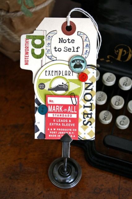
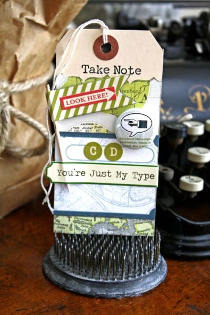
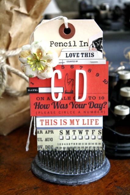
So today is our 6th Second Floor Challenge: Pencil
Click here to see what Julie did
Whatever that means to you or however it inspires you. The prompt is simply meant to get you started. The level of challenge you aim for is entirely internal and up to you.
So we decided this challenge should be to use a pencil. And I have to say I was really looking forward to this. I just recently purchased a Sketching set of pencils by Derwent because….I remembered how much I love pencils – although I can’t sketch at all ;)


If you’d like to leave a link showing off what you did in response to this challenge, here’s the linky list:
add your own creations inspired by our 2nd Floor Challenge: Pencil

have a wonderful day
hugs
Nat
Thank you as always for making us push our limits!
Totally awesome!
grtz, Mazina
Hi Nathalie! You’ve inspired me to use pencil more, especially when it comes to journaling! As for your creative piece, I like it! It has “Nathalie” written all over it!
I love the sound of a graphite pencil on paper, especially when writing text–the random staccato of start/stop, T’s being crossed and i’s being dotted. But I haven’t had success or liked what I’ve done with pencil in my art journal, and I think it is because I think of pencil as impermanent, and I am uncomfortable leaving it vulnerable. Weird! Maybe I will apply fixative to my 2nd floor pencil challenge. Love that picture of Julie, and that you fussy cut around her–really makes for a fun layout. And I do like the green/blue shading effect around your cool frame, too.
Nathalie–I love what you did here, even though you are not that happy with it. The part I love the most is the humor in it! It is really a cool piece.
Ahh was für eine geniale Idee mit dem Transparent Papier! Da hätt ich auch drauf kommen können! *augenroll*
Dein Bild gefällt mir sehr! Ja, vielleicht probier ich das auch mal… Stifte würden hier ja genug rumliegen… ;-)))
xo Maria
The ;photo of Julie is fun on this LO and I too enjoy using just pencil sometimes (especially in a notebook that I carry in my purse).
Hi Nathalie. I love your honesty about your work. Not to be disappointed when it’s not what you had in mind. Even when you have a few materials to work with it still feeds your art soul.. Thank you for sharing your art and thoughts with us. Huge hugs, Tineke/TeedeJee
It was such a short but amazing trip. Thursday I flew to Madrid, Spain for Cuchy and my Art Mesa 2012 event.

We still had some preparation to do – not much as Cuchy rocked the house with her organization – but we had decided I would come a day earlier to have some sightseeing this time in Madrid.

Our first stop was the Reina Sofia – AMAZING collection of 20th Century Art.
Here is the metronome called Object of Destruction (1932) by Man Ray (the original was destroyed ;) )

Wonderful work to see by Pablo Picasso – The Guernica – no photo allowed – BREATHTAKING! Salvador Dali, Joan Miro and many many many more…

Next we took a nice stroll to the Prado

Wow- you need to go there several times- it is HUGE and the collection is unbelievable. We went to a special exhibition of Raphael – his way of painting light has always stunned me! But of course we saw also some permanent paintings – like The Three Graces by Rubens

or the Las Meninas by Velázquez. There is a nice video for the google earth project where you can see a little more details of the museum and on google earth some close-ups of the paintings. But seeing them in real life is the real deal of course ;)
[youtube=https://www.youtube.com/watch?v=D1EOJr11bvo]
Cuchy took me to Casa Lucio an awesome restaurant in Madrid which is famous for Huevos Estrellados – Eggs with potatoes- soooo good. Speaking of food…oh my goodness…I ate so much…I just put it out here- LOL

We then had to set up the room for ArtMesa, then watch the rest of the Greece vs. Germany Soccer European Championship game – wheeee ;) (sorry my greek friends!):

and then finally the day of our workshop event arrived :)

It was such a fun day- it was hot hot hot too

We started with my Mixed Media Pillow. The students were so sweet and fun – I had so much fun with them! Thank you Cuchy for all your translations!


I especially liked the creative extras added by my students to the drying line …bwwahahaha- you girls are so funny ;) Thanks for my Malaga students who made me laugh extra :)

Loved the different results as always – here are a couple finished ones


then it was Cuchy’s turn. She did a beautiful class- with lots of techniques and media ! Loved the results and process


Thank you so much for this amazing day to our students- you were awesome! It was so amazing to see some of you for the second time and it was wonderful how much some of you traveled and thank you all for keeping up with my non existing spanish ;) You rock!
A special thank you also to Cuchy- for organizing all this and her gorgeous way to make me feel more than home (I almost moved in ;) ) – love you girl . And to Alicia – you are the sweetest- thank you for all your help and the awesome aprons you made- you ROCK! And to Marta our beautiful photographer and helper!
BTW- those pictures were all taken with my phone, I was too lazy to take the big camera with me as I usually do not take a lot of pictures anyway during events.
Sunday before the flight we headed out to surprise Lisa Mitchell at an art book fair in the library – it was so good to see her!

Her Books were amazing- loved her exhibition. I hope I see you soon again, Lisa!
Now this is what I call the coolest university library in the world- The ruins of the Escuela Pias, now converted to a university library.

The exhibition was also so cool and inspiring


And then it was unfortunately time to head back and say goodbye to Cuchy and her family :( I wish they lived closer!
Thank you all for this wonderful experience and all I can say is me encanta España
Besos :)
Nat
Hi Nat, here I am trying to redo the pillow (with the extra you gave me) and was wondering if we could substitute the Extra heavy gel/molding paste with another gel medium (preferably Liquitex as this seems to be the brand of choice for French stockists…) I ordered the Golden one we used with you from my usual stockist, BUT, I just found out as I opened the box containing my order that they are out of stock. I’ve spent hours today looking at Fine Art Stockists with a webstore and none of them seem to carry the brand… except for 1 and he carry THAT gel medium… So silly, because the website I buy my fine arts supplies from in Spain carries all the GOLDEN range!
xoxo
Hi Isabel you can use any gel Medium – I would use a heavier one and the Liquitex is wonderful for this – to do the transfer :) So no worries :) Burnish it well and let it dry overnight to make sure it is all good :) Wishing you lot’s of success! Hugs nat
Wow! That was fast (I didn’t realise you were back from overseas, so wasn’t expecting an answer today)! Thanks, will definetely get the liquitex one (I’ll also go ahead and get their cleat gesso too) ;)
XOXO
I am a bit jealous of those who got to go. Sounds like a fun and interesting time.
Looks like you had a wonderful time!! The pillow project is awesome – so very creative. Thanks for sharing the photos. I love love love the skeleton pages (did I mention that I love it? :)
Hi Nat, so happy to met you again, besos :)
wow That’s a review! I do want to live closer.
It’s been an amazing long weekend with you, the girls and the awesome workshops. Thank you girl! Loves
This was a lovely post. Thanks for sharing with us.
Thank you very much for everything, for your smile, your love, and I hope we meet again soon.
Looks like you & Cuchy had a fabulous time, food and classes! TFS your trip and how cool is the library;)
PS: You may want to change the copyright date on this blog. It stills reads 2011 as best I can see on my computer. You work hard for your art and I want it protected for you.
thanks hon :) changed!
LOVE LOVE LOVE your posts when you share your travels. I feel like I got to a piece of Spain for the morning. That video was cool and the details using the computers is brilliant. The library is beautiful and classic and your skirt is so you/colorful/pretty. Thanks for sharing:-)
Hi! This is Aída a colleague from Cuchy’s “school”!! I am sure Picasso would envy this art explosion you’ve created last WE! .. ehh.. and Lucio’s huevos estrellados! :) Congrats!!! :)
New Canvas on the wall- yeah -since it is summer, right?

So much texture here- my husband said it actually looks like it moves

I had lot’s of fun creating it and it made me all warm and fuzzy …as it was raining and pretty cold outside when I did it ;)


This canvas is part of my Über*Media Acrylic Paint Workshop where I show you amongst a huge amount of techniques, how to create this mixed media canvas (full version only). You can still join the class if you want :)

Hugs
Nat
This is so beautiful. I love it!
This was one of my favorites from your class (which was awesome). Think the eggshell idea was off the charts!! Beautiful canvas.
Beautiful canvas! Great texture and colors. I love the depth you got using the stamped and cut out flowers.
What a beautiful piece…..amazing technique with gorgeous color and texture! I shy away from paints and inks because I am just not patient enough for the mess, but I admire the results a lot!!
Your canvas says Summer but also has the wonderful FEEL of summer! TFS!
The texture is so thick that I can almost “taste” it!
It’s beautiful, I love those colors together I carry to the sea, sun and poppies in the cornfields.
hugs
Beautiful, Nat! Love your bright colors and all that yummy texture.
Gorgeous! <3

Last but not least I show you the little minialbum I created for my guest design spot at Maya Road.

The photos were all taken at our recent road trip in Januar in California- I loved working on this project, as it brought back so many fun memories!

This Mini album uses a mix of the Maya Road Canvas Flag Banner and the Maya Road Chipboard Flag Banner Album as its base.

A variety of Maya Mist adorn the pages of this mini album.

A great feature of the Maya Road Canvas albums is that the canvas doesn’t bleed.

You can spray lots of mist on one side and the other side will remain blank until you are ready to alter it.

Using a stencil and Maya Mists I created both negative and positive images on my pages.

I love the way the chipboard takes the Maya Mist

I used a black marker to trace the stencil by Crafter’s Workshop an give it more definition. Fun

What was the last Mini Album about you created?
hugs
Nat
Lovely and colourful!
Great colours! The last mini I’ve finished was the one I made for ColorConspira, I think. It was the best one I’ve created so far.
I’d never made a mini album before last month! They just didn’t appeal to me. But, I was assigned to do one as a new member of the design team at my local scrapbook store. While I turned it into a COLOSSAL project (with the supplies I was given, I decided to chronicle the 22 years with my husband!), I am thrilled with the results, and I am a mini album fan! I love what you’ve done with the Maya Road goodies-those mists are so vibrant! So cool that you tinted your photos to coordinate with each page. Luscious!
Fun colors as always Ms. Nat and my last mini-album was about my puppy Jessie (now just over one year old).
So colorful! I am almost finished with an album of all my kid’s graduation photos from Kindergarten on up. It is not as colorful as this though!
YOWZA- can you believe summer starts tomorrow. I can’t ! And I actually love this time when it is light out here in Hamburg till 10pm – crazy…:) And Summer is my FAVORITE time of the year..but oh wait…let’s celebrate spring real quick ;)
Spring

I don’t really think I have mentioned yet that this is my favorite color combination at the moment (liar, liar, pants on fire ;) )

Spring means planting flowers, eating more salad, first BBQ and siting outside for lunch dates.

Supplies: 7Dots Paper, Acrylic Paints, Ceramic Stucco, Maya Road Butterflies, American Crafts Thickers, Scrapbook Adhesives by 3L 3D Foam Pads and MyStik Permanent, Crafter’s Workshop Stencil
What does spring mean to you?
hugs
Nat
Spring means flowers, warm days, sunlight, boat rides, picnics and happiness.
Great color combo on this gorgeous LO! RE-BIRTH & REVITALIZATION. What is ceramic stucco?
Spring for mi is the colors explosion.
The colors in this LO scream spring to me Nat!
Spring to me is walking the dog in the rain and feeling hopeful with all the lush green that is growing around me.
LOVE this sun!! Spring means pretty new growth!
Thrilled that Prima asked me again to stay on the Educator team for 2012-2013. I have been with them since 2007 – Love it!!! :)

Here is to another wonderful year filled with yummy Prima goodies in my Mixed Media classes :)
Speaking of classes – I am heading out to Art Mesa in Madrid, Spain this Thursday to teach and the next stop will be in Toronto, Canada in July at Bizzy B’s.
I look forward seeing some of you hopefully at either place – I am so excited!!!
Have an amazing day and lot’s of sunshine
Huge hugs
Nat
Related Posts: Check out my Online Workshops
Congrats!! They are lucky to have you!!
Congratulations Nat — very well deserved. You are an amazing artist and designer — whoohoo for you!
Congrats.
Biggest CONGRATS, Nat :)
Well, no surprise there cause you’re awesome (and your work too :-) XXX
Congratulations Nathalie! So happy for you!
Woot-woot! Congratulations! How fabulous to have such a long term relationship with them! Prima is a very smart company! You know, I never thought Prima was “my style”, but seeing your projects and the way you include and alter their products in your delicious style converted me! Cheers to you, and happy and safe travels!
Congratulations Nathalie!
Congrats Nathalie!!

In case you missed the other posts of this series- I collected them all on this page here.
We are still discussing:

and with this last post in the series I wanted to show you which color combinations I love and where I find inspiration for those color combinations :)
So where do I find inspiration for color combos? I would say there are four main categories for me:
I usually have my cell phone which has a camera with me anyway and as soon as I see something that I think will inspire me later for some color combination I take a photo for later. If I’m stuck or want to get out of my usual color routine I just scroll through my photos. Here are some that I have taken the last couple weeks just for that purpose with my phone.
1. Nature
Nature is an amazing source of color combinations- flowers especially- like this one:

See the colors that are in this flowers

2. Street Art
Often times graffiti or street art has some amazing color combos too – like this one

Love those colors together

3. Art Work
When I go to a museum or exhibition I also love looking for amazing color combinations- Like this painting by Neo Rauch – he rocks color combinations that are unusual in my opinion

I would have never thought by myself using those colors together

4. Catalogues or Magazines
I do not read a lot of fashion or gossip magazines but if I get one I usually just look for color combinations :) and then …well…as you are looking you might as well just read the stories- right – LOL

these colors make me happy together

Here are some projects I created using some of my favorite color combinations at the moment :)

Here are the colors:
![]()
here is another one

and the colors:

And my beloved jewel tones

here is the color palette

And one last one :)

and the color palette

It is so much fun to be friends with Colors. After a while you do not even have to think much with which ones you want to hang around and which ones you want to bring together- I promise you – with just the little color theory we talked about in the past posts, you will instantly grab the right ones and make them sing in an amazing choir :)
I hope you enjoyed the “Colors Are Your Friends”- Series- you will find the complete post here
Nat
Love, love your color combinations!!!!
I love your colourful post and WOWZAH, that Neo Rauch painting is fabulous!
love all your color theory post! you could easily write a book on it! =)
Great ideas! And I love how you pulled the colors from each of your examples to show the palette–works well with my one-dimensional mind! And, perhaps I was on to something; yesterday I cut part of a clothing catalog that had a stack of T-shirts to show all the colors they are available in. I felt it could be useful somehow. Now I know how! :)
Hey there Nat, Was thinking about ya this morning. Hope you are doing well and although I know you are super busy, perhaps at CHA, we can meet for coffee. Hugs to you.
This series has helped me to see color in a different way. The color combos that you posted are not ones that I would come up with naturally so it’s fun to see how they inspired you to make your colorful art Nat.
Great color examples! Color’s are my friend also as that usually is how I see everything :]
Comments (3)
Sue Clarke
| #
You find the best inspiring short videos to share with us. I don’t usually take time to surf the web for things like this but I always enjoy the ones you post…thanks for sharing what inspires you Nat!
Reply
Mary Werner
| #
thank you so much for this video. You never know when some little thing you do will be meaningful to another but in my life right now, this video is VERY important and came on just the right day and moment. To top it off? Einstein quotes are my favorite!
Reply
Michelle LaPoint Rydell
| #
awesome! I love it Nat – very inspiring!
Reply