A Look Back – Today I’m revisiting a topic I covered once before: how you can play with lettering in your art journal or mixed media projects. You don’t have to have amazing handwriting skills to mix things up and create some impact with your lettering. Below are 5 ways to do it whether you are John Hancock (US history reference lol) or not :) ENJOY!!!
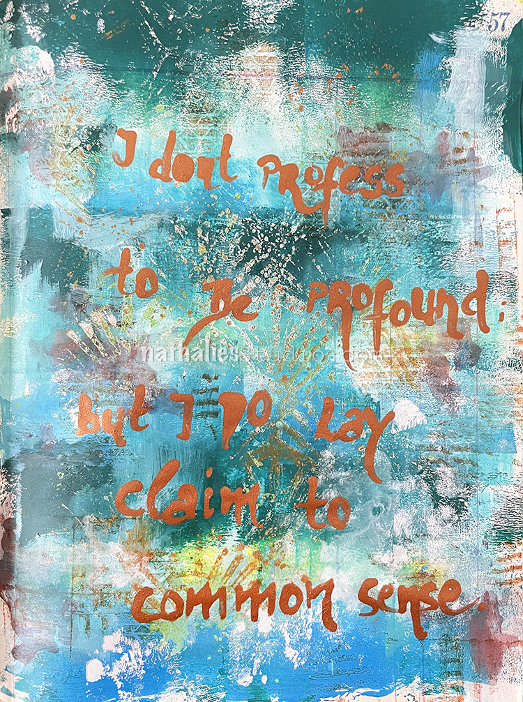
Sometimes it is as simple as just choosing the right medium to do your lettering. I got big juicy results from using Liquitex acrylic ink in a metallic copper here in this art journal. The metallic inks have some body to them from all the flake in there so I got nice bold letters without needing to work very hard. Some inks are thicker than others and will work in this way. Try some out and experiment!
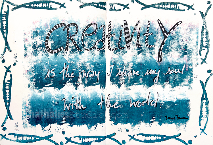
If you want a bit more character to your writing, try another layer – use a contrasting colored acrylic marker to add dots, stripes, squiggles and more. In this art journal page I used a big white sharpie over black acrylic paint. I had already varied the letters in the word so I chose to vary the additional marks too. Sometimes more is more and the way to go.
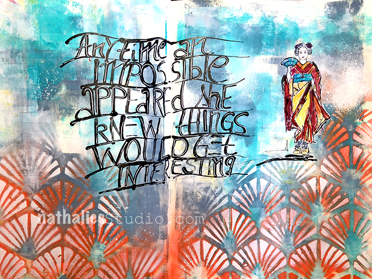
Do you struggle with keeping your writing straight and all neat and tidy? Throw your ruler out the window and embrace movement! Draw a series of gently wavy lines as I have in this spread, then eyeball the spacing between them and don’t stress – they can be even or totally different. Then use those lines as your guides for writing. Now your undulating text is a design element and intentional. Play with how you space your lines, how wavy they are, and how angled they are. Push the limits and have fun!
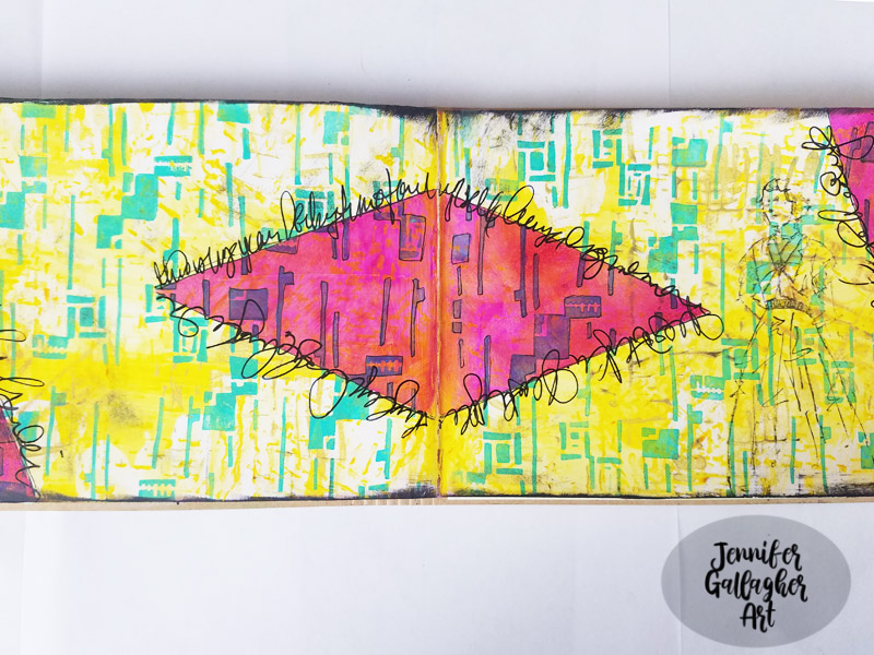
Another way to create a guide for writing is to follow a design element in your page. I love how Creative Squad alum Jennifer uses the diamond shape to journal around in this spread. It emphasizes the shape and her writing isn’t meant to be read so it almost looks like a frilly edge around the shape.
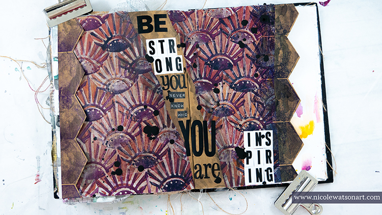
Creative Squad alum Nicole has a couple more cool ideas in this spread. Where should your journaling go? Work in the space between two design elements – here she tore a piece of collage paper, glued it down with a gap in between the two pieces, and did her journaling in the chasm. Also this is a great reminder to consider the impact that letter stickers can have instead of handwriting. This application is bold but there are so many options out there these days that they can fit almost any style.
I hope you enjoyed our Look Back today and have some ideas for lettering in your projects. It’s a great way to mix things up!
A Look Back is a blog series to show you some projects and posts that you may have missed – sometimes going WAY back in the archive. I think it will be fun to revisit a few ideas that we haven’t seen for a while. I’m excited to see how a little look back might inspire something new in the future :)
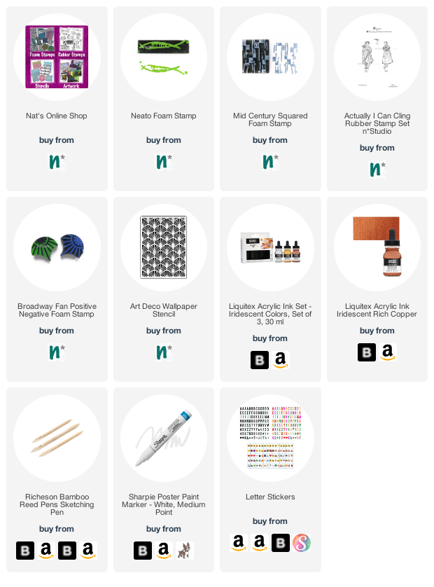
Here are some of the supplies used in these projects: