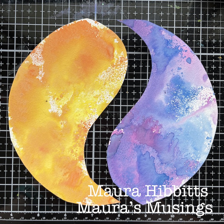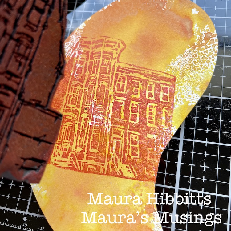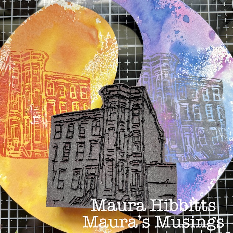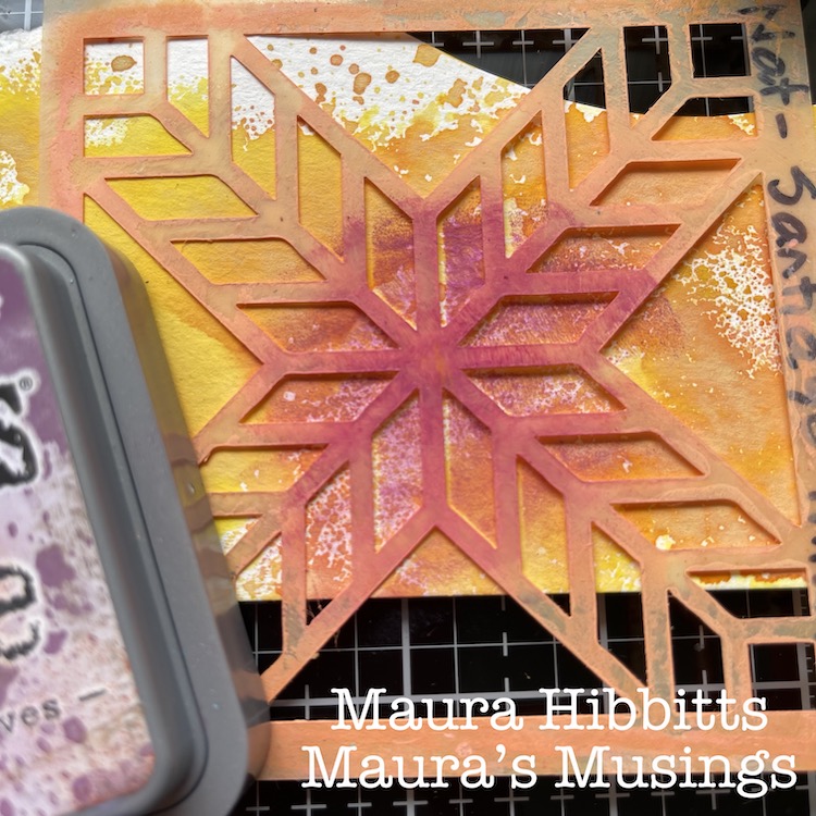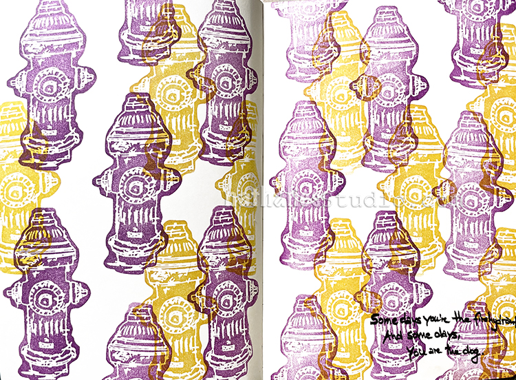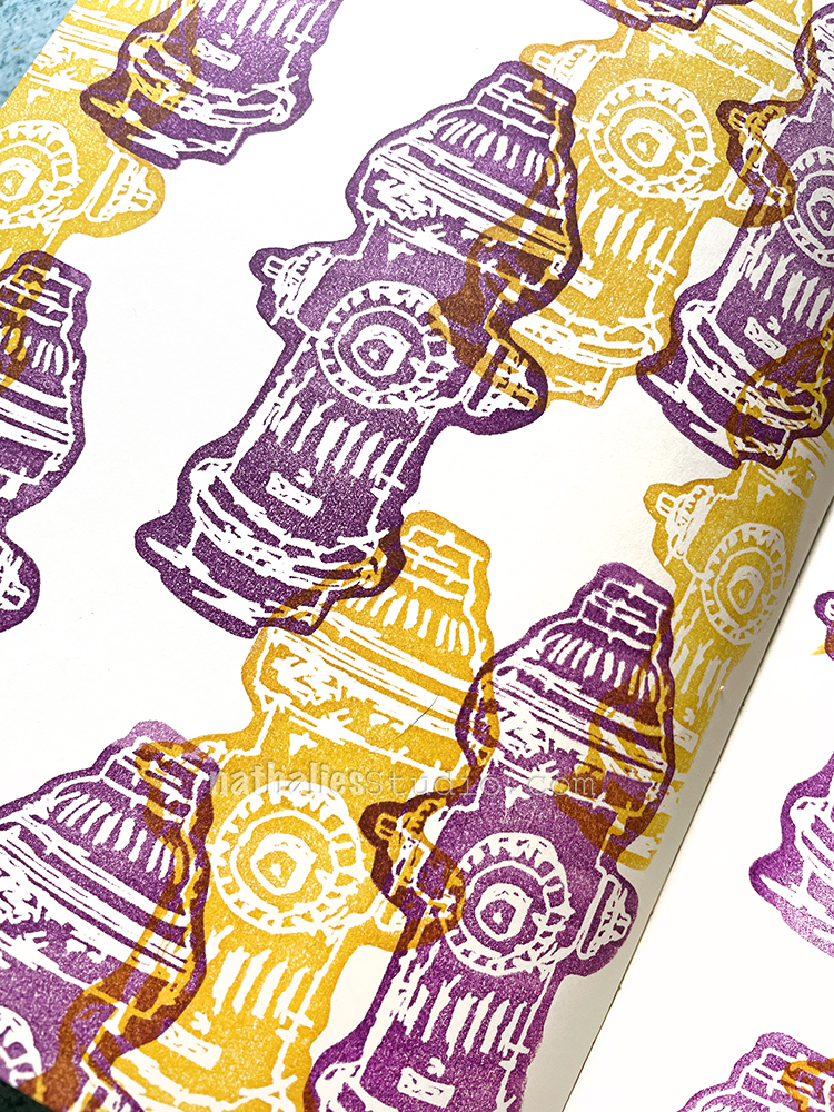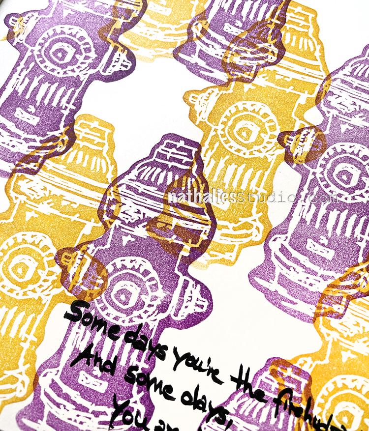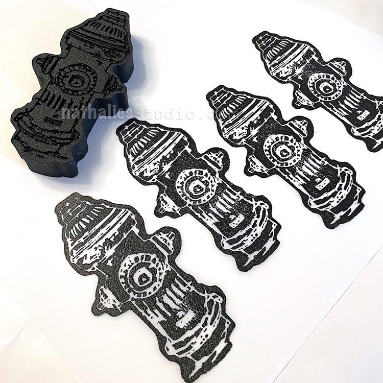
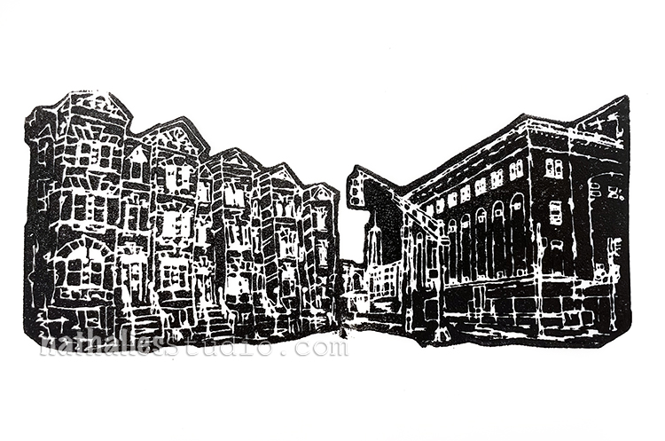
Happy Monday and welcome to another pattern in my big vintage ledger! Today I’m using one of my newest foam stamps – Hydrant! I kept it simple and stamped the front and back – sometimes the back of the stamp is an interesting shape on its own.
Here is a look at the finished pattern and the Hydrant stamp that I used:
The next episode of ArtCollab is Tuesday August 3rd and this time Sarah and I are speaking with our special guest Rachel Juanita Bellamy! Register here to attend the ZoomCast.
Here is what we have planned:
Episode 6: Pass the Brush
In this episode Sarah and Nat are meeting with Pass the Brush organizer Rachel Juanita Bellamy. In 2020 the Pass the Brush event paired up Sarah and Nat and it prompted them to get to know each other better. Pretty soon they had forged a lovely new friendship and jumped into several creative projects together (including these ArtCollab zoomcasts). They will chat with Rachel about the benefits of artistic collaboration, the importance of elevating others, what has changed since the Pass the Brush event last year, and what challenges remain. Tune in to join us and contribute to the conversation with Questions and in the Chat.
ArtCollab is a monthly zoomcast with artists Sarah Matthews and Nathalie Kalbach (and occasionally other special guests too).
Each episode Sarah and Nat get together, collaborate on all sorts of unique artsy projects, share their process and offer updates and sneak peeks along the way, and of course they chat about all stuff art-related and topics that go way beyond that too.
ArtCollab is a real life look into the process of creating, collaborating, and the ins and outs of living an artistic life that is touched by others.
Join in for an entertaining and inspiring interlude into the world of two artists who are working together in conversation and practice.
New zoomcasts will be live and happen every first Tuesday of the month.
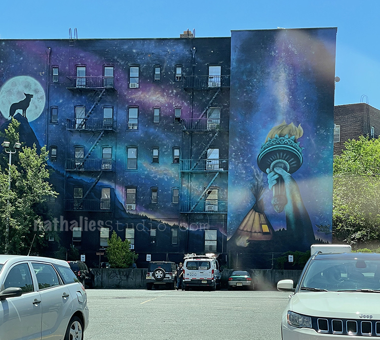
Strolls through my hood get me out of my studio, they help me get unstuck and often I get inspired by what I see and get new ideas to create something. It is part of my philosophy about Artful Adventures in Mixed Media – which is the subject of my book. Here are some photos that I gathered in the last couple weeks.
Loving this mural on this building – the blue is mesmerizing …which is good…because usually when I see the mural…I sit in traffic LOL
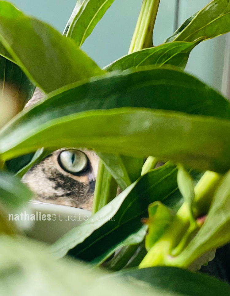
Silly little guy looking at me through the flowers
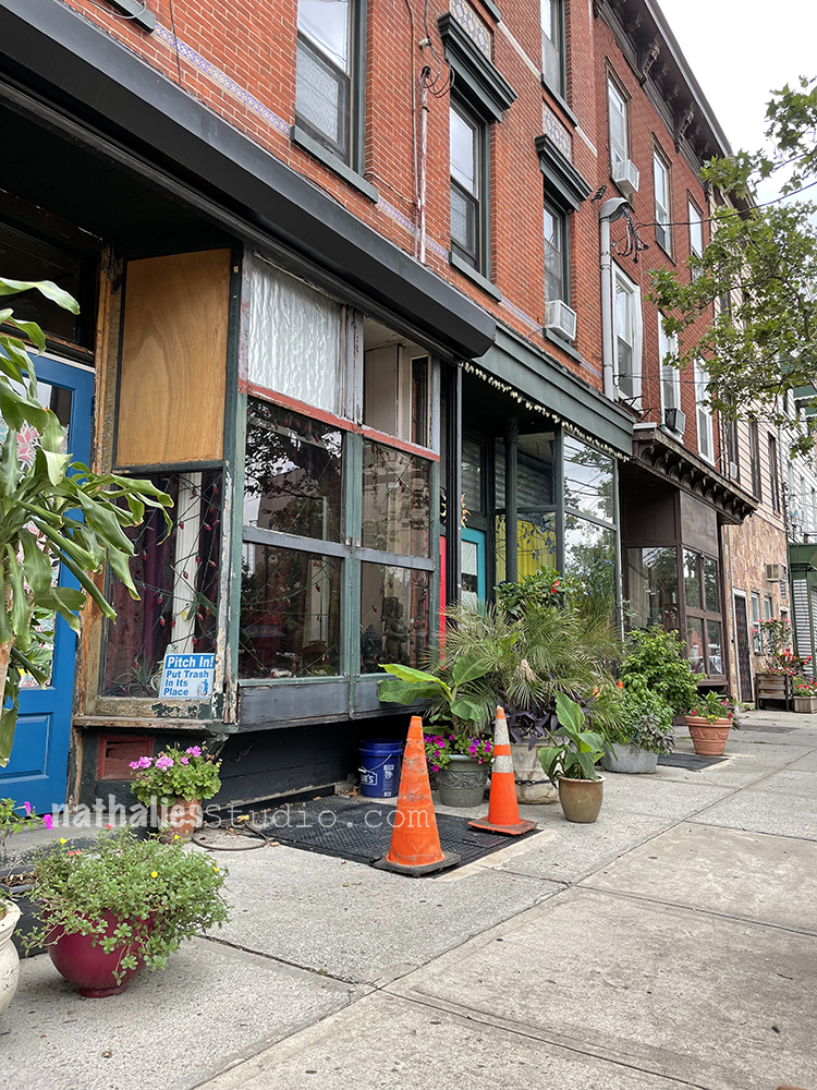
I always love when people put flower pots out in front of their apartments onto the sidewalk – it just makes me happy to see some green. Those are all old storefronts that at some point became apartments.
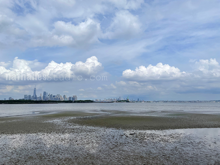
Low tide at the Hudson River – after all those years the view of Lady Liberty and Manhattan never gets dull.
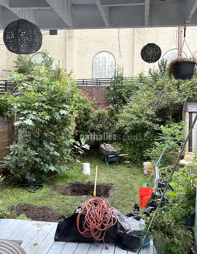
Massive work in our garden, we put a new fence in and also a dry well. I will show new pix once the grass came back – it looks really good now but picture hurt me a bit .
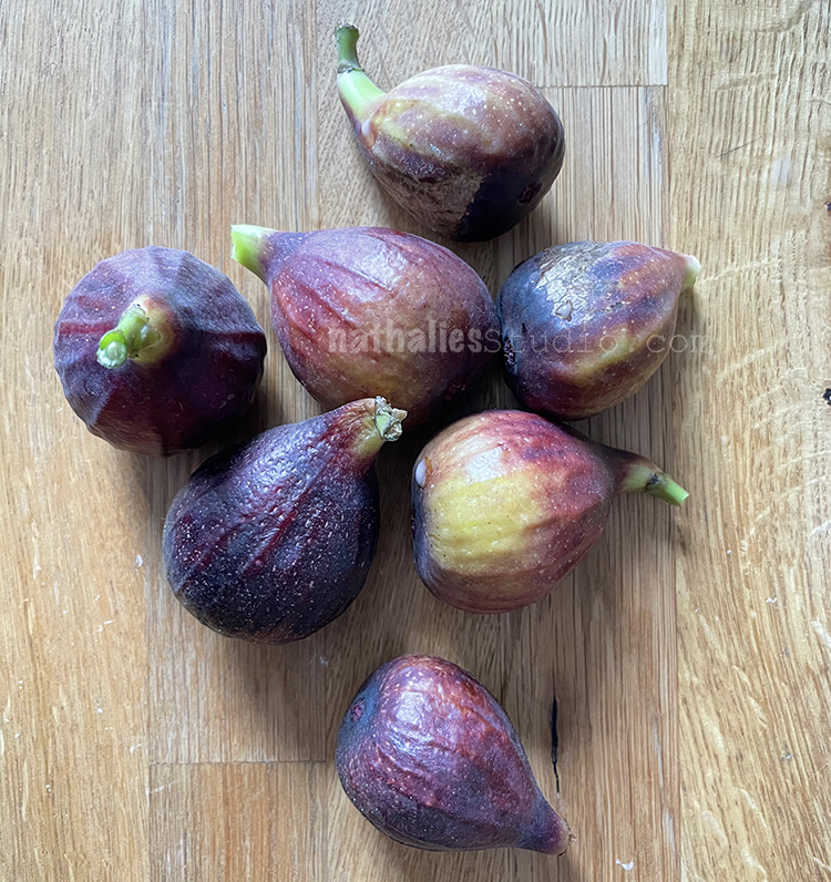
Oh and this is the first year we are actually harvesting figs from our fig tree- this was the first bunch but so far we had about 20-30 figs and they keep on coming. yum yum yum
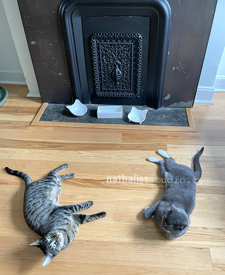
Two silly boys waiting for their food …they start this process about 1 -2 hours before their feeding time …
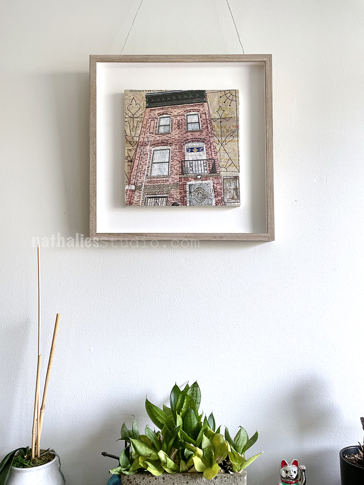
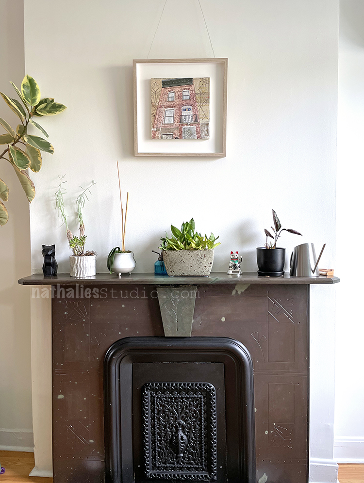
Which reminds me – this is a wonderful piece by Natalya Khorover of our house. She printed some historic maps on dryer sheets, stitched and embroidered – it is so special and wonderful. The picture cannot even do this piece justice. And some of the elements she stitched onto the piece are the same you see carved into our fireplace below
And …she also embroidered the two silly cats to the piece …so of course this has to hang above this fireplace and the cat’s feeding spot :) And that was it – a bit of a home stroll . Until next time! Hope you guys are enjoying summer as much as I do.
People having apartments in old store fronts is pretty wild!
Love your garden in the city Nat.
What a wonderful piece of art to hang over your fireplace.
Thanks once again for wonderful inspiration and eye candy.
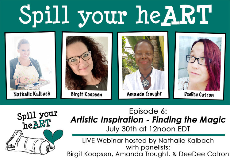
I hope you will join us tomorrow July 30th at 12noon EDT for our next Spill your heART webinar: Artistic Inspiration – Finding the Magic.
I will have panelists Birgit Koopsen, Amanda Trought, and DeeDee Catron on to discuss our episode 6 topic: Artistic Inspiration. We will share practical tips for finding and energizing your artistic mojo and discuss how to encourage it when it gets sluggish or goes missing. Our goal is to help you find the magic so that you can stay in your artistic groove. Register HERE to join the live webinar.
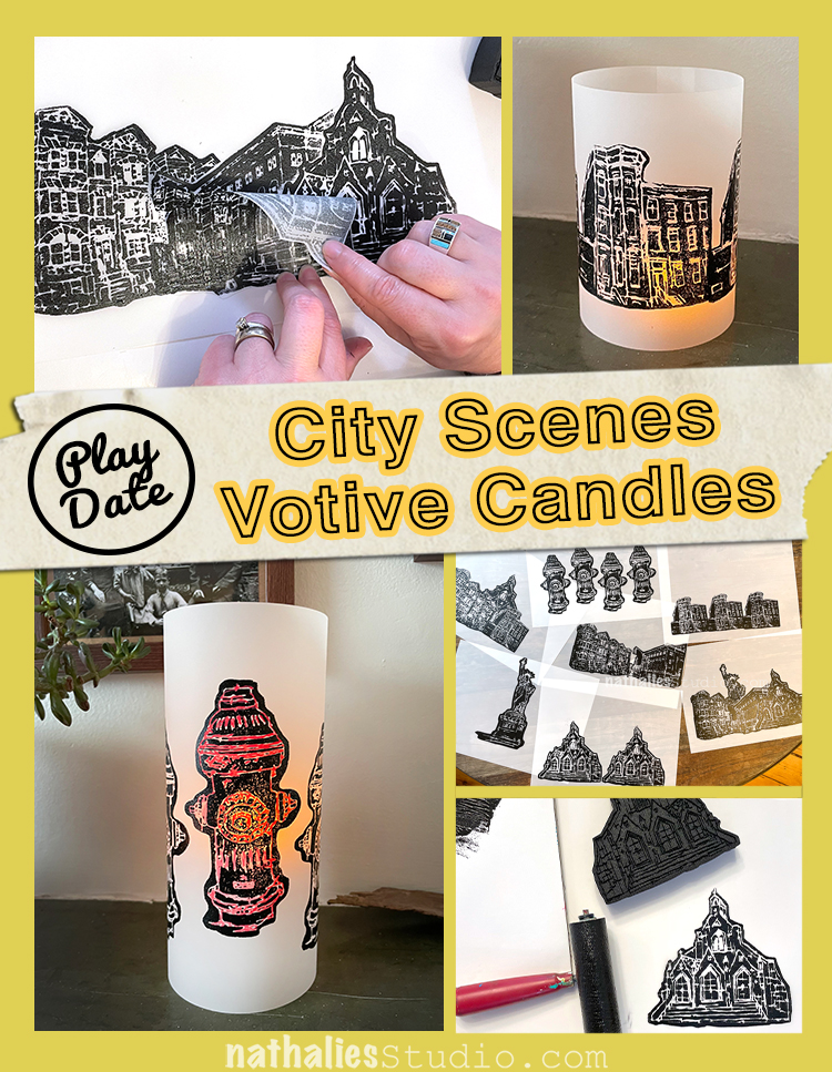
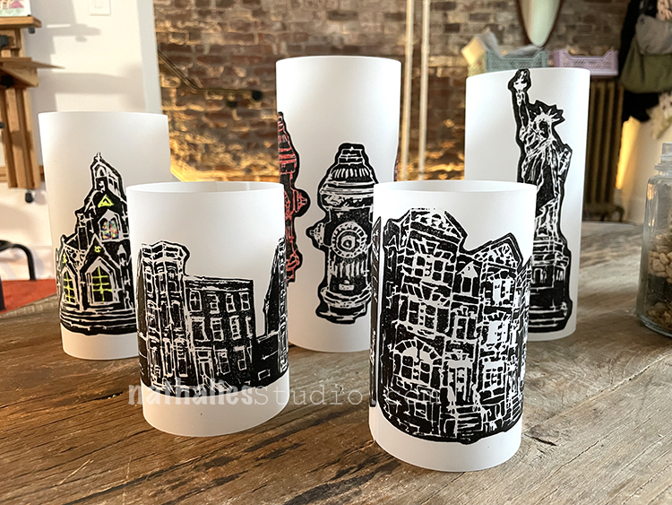
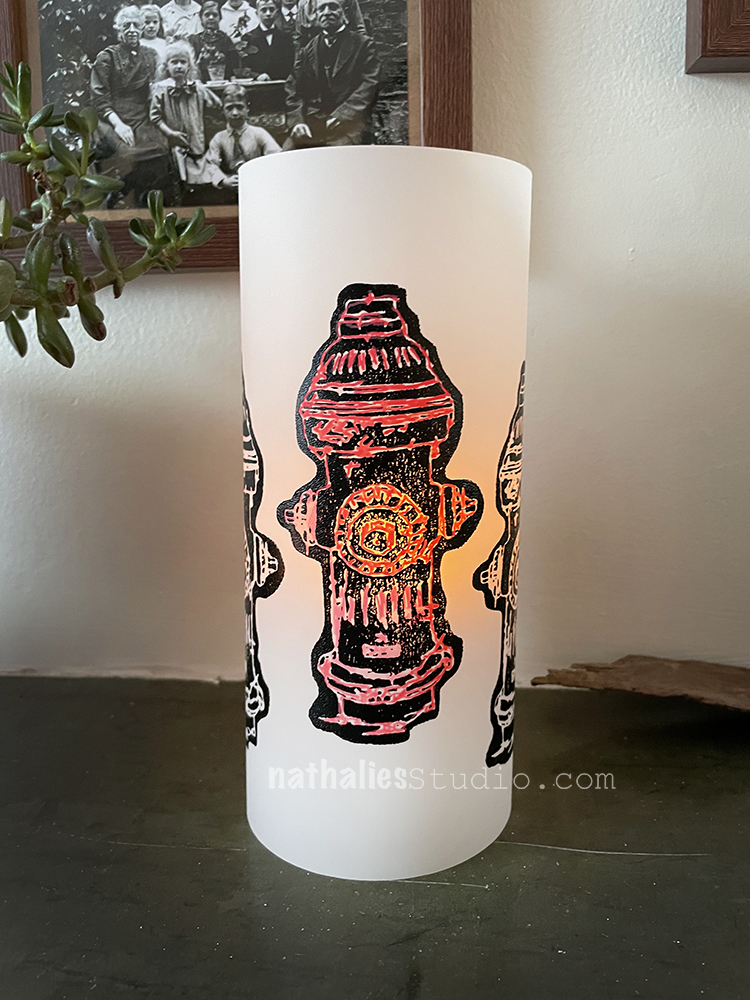
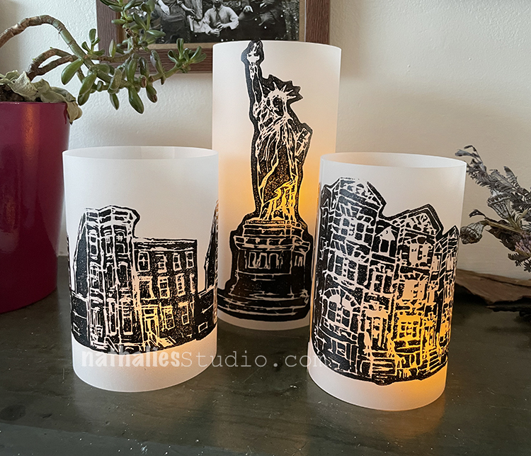
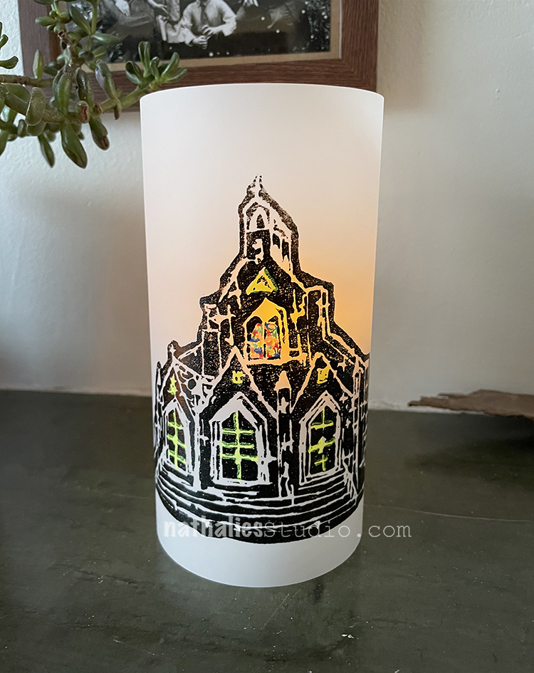
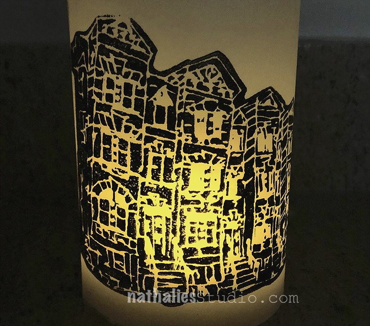
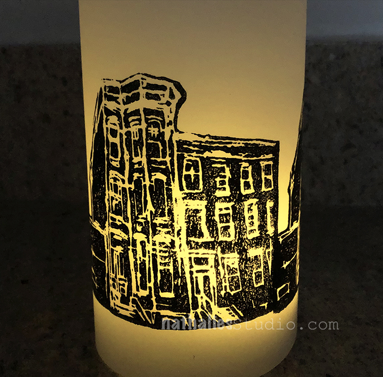
Last week Kim and I got together for the first time since 2019 for one of our epic Play Dates!!! We had such a nice time gabbing and making art and just enjoying the experience of creating together. Our project? Votive candles using my NEW foam stamp designs! It was an easy peasy project to get us back in the groove and the results are very nice. Here’s how we did it:
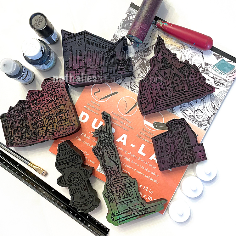
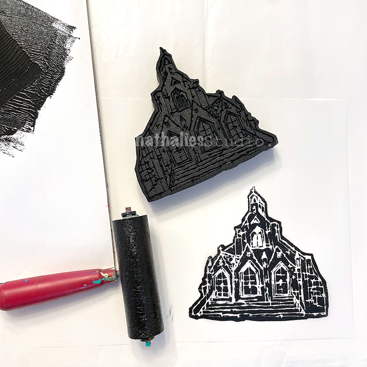
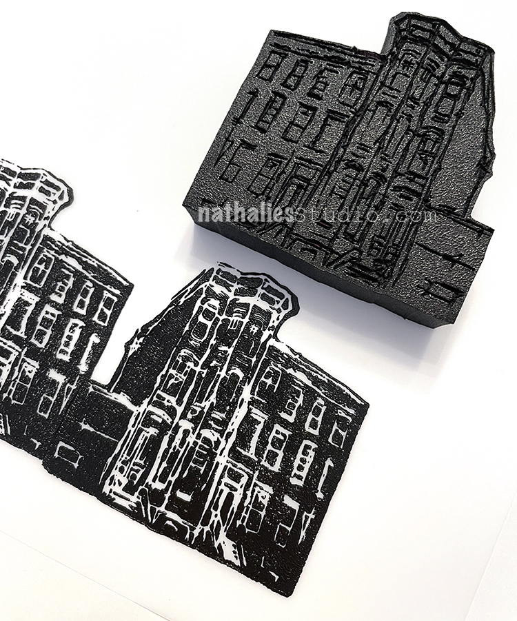
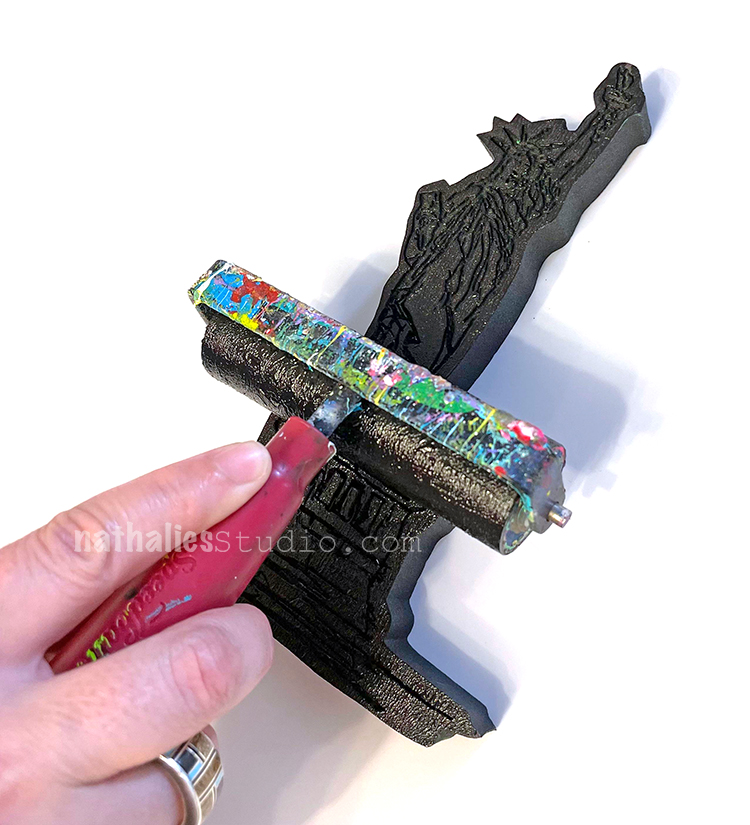
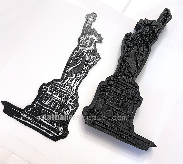
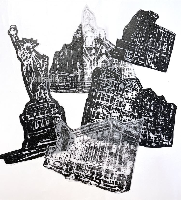
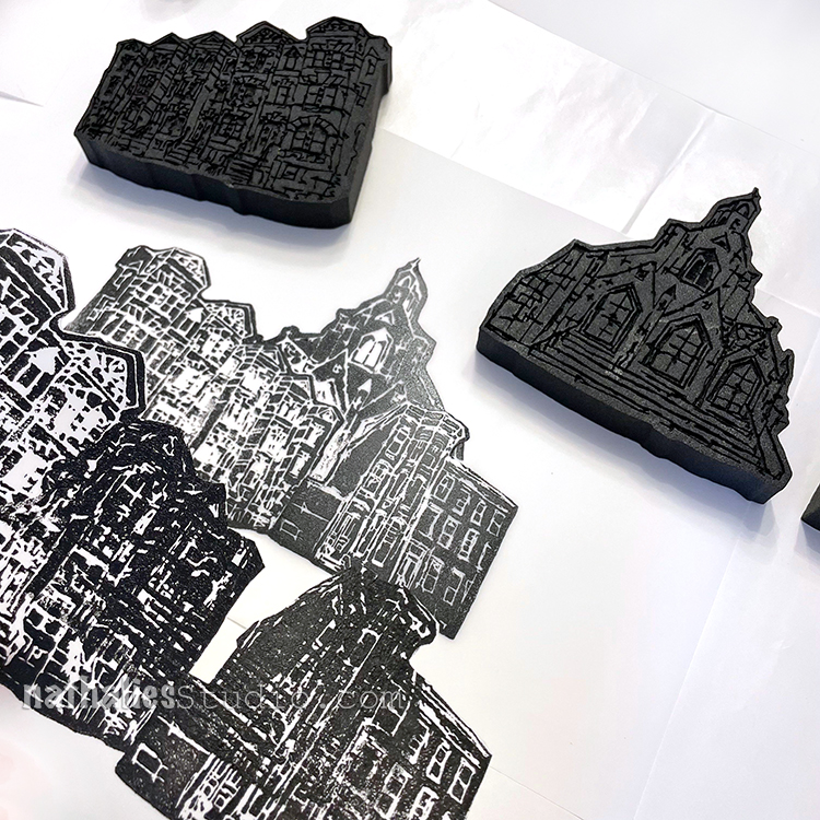
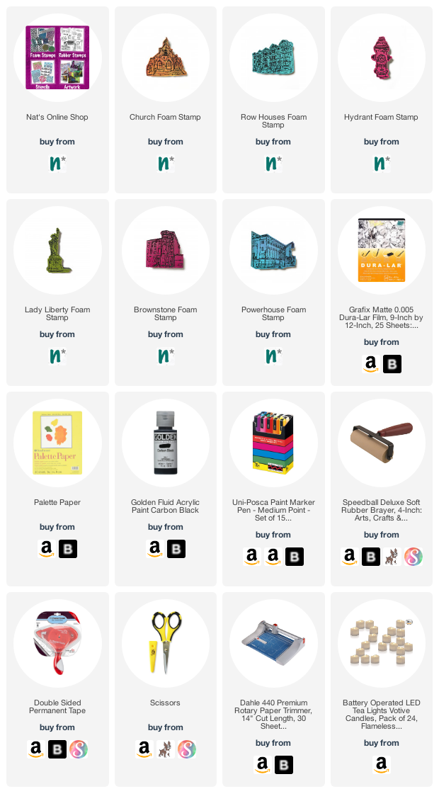
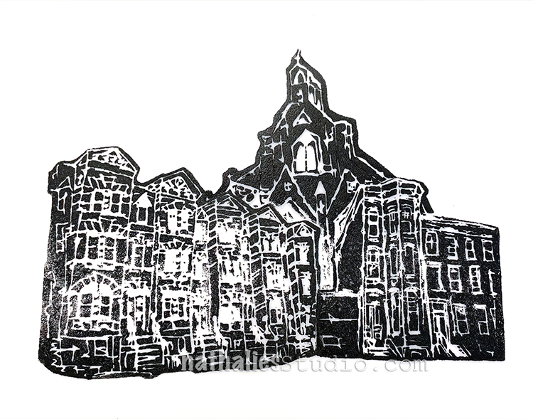
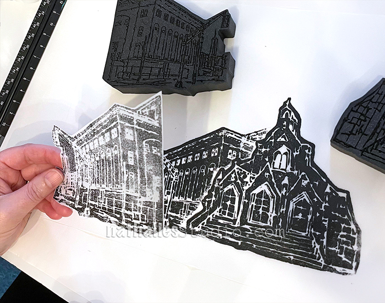
The supplies are simple: my new foam stamps (Clockwise from the top they are Powerhouse, Church, Brownstone, Lady Liberty, Hydrant, and Row Houses), Grafix Dura-Lar matte film, black acrylic paint, brayer, double stick tape, LED votives, and scissors or a paper trimmer. We also dressed some up with Posca markers, but more on that in a bit ;) The whole idea was to have the buildings and such silhouetted so that the light shines through all the details. Read on!
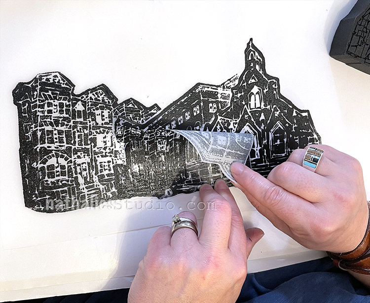
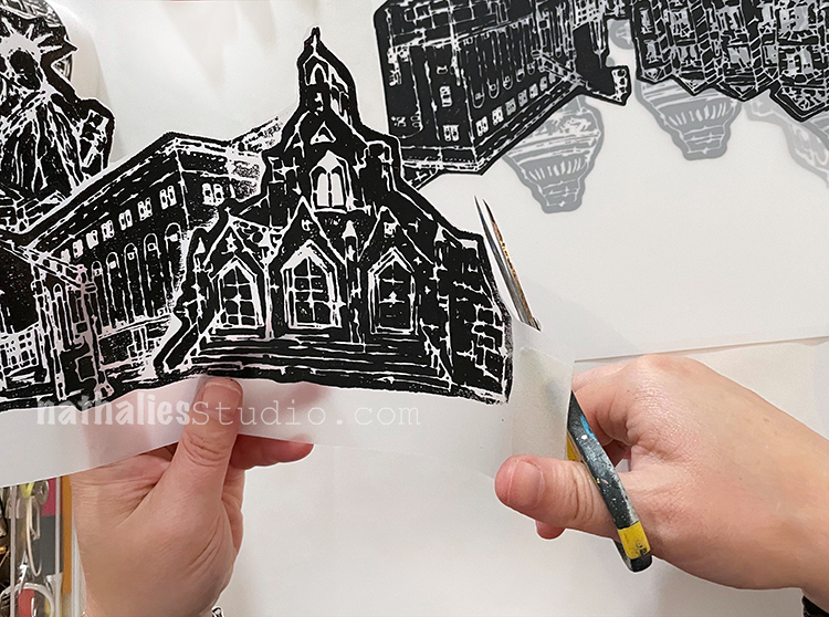
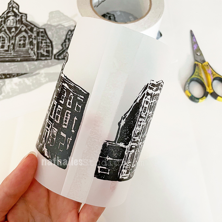
We started out by rolling black acrylic paint out on palette paper with a brayer. We both liked Carbon Black Golden Fluid Acrylic paint for this – a nice opaque black. Then we rolled it on the stamp (in this case, the Church stamp) and stamped it on the Grafix Dura-Lar matte plastic sheet – a matte white plastic that is kinda translucent with light behind it. You could also use a StampBuddy here too to ink up your stamps.
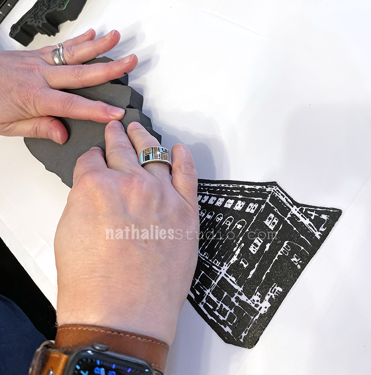
We left some room at the bottom of the film and stamped across the width, leaving room on either side to eventually tape the ends together. In this one I am stamping the Brownstone foam stamp.
Keep in mind that when stamping on plastic film the surface is slick and the stamps can slide if you aren’t careful.
The Row Houses on the left turned out fine but I slipped a bit with Powerhouse on the right. We each had a couple misfires so plan on having some extra sheets of plastic just in case.
With some of the mistakes, we created masks to use in building up more complex, layered scenes – a great way to use those.
Kim stamped Row Houses and Brownstone and then used the masks to add Church to the background for a little streetscape.
Looks pretty neat all together like that.
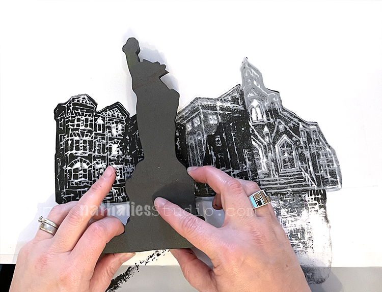
I first stamped Church, then added Powerhouse, and then…
…I added Row Houses to the left…
And then I finished with Lady Liberty!
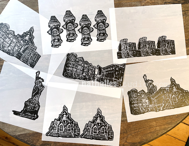
We created a variety of sheets to move on to the next step:
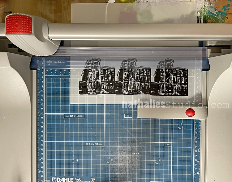
I broke out my new Dahle trimmer and we cut things down to size. We experimented with trimming some with a margin around the image – room for tape and a little lift off the ground.
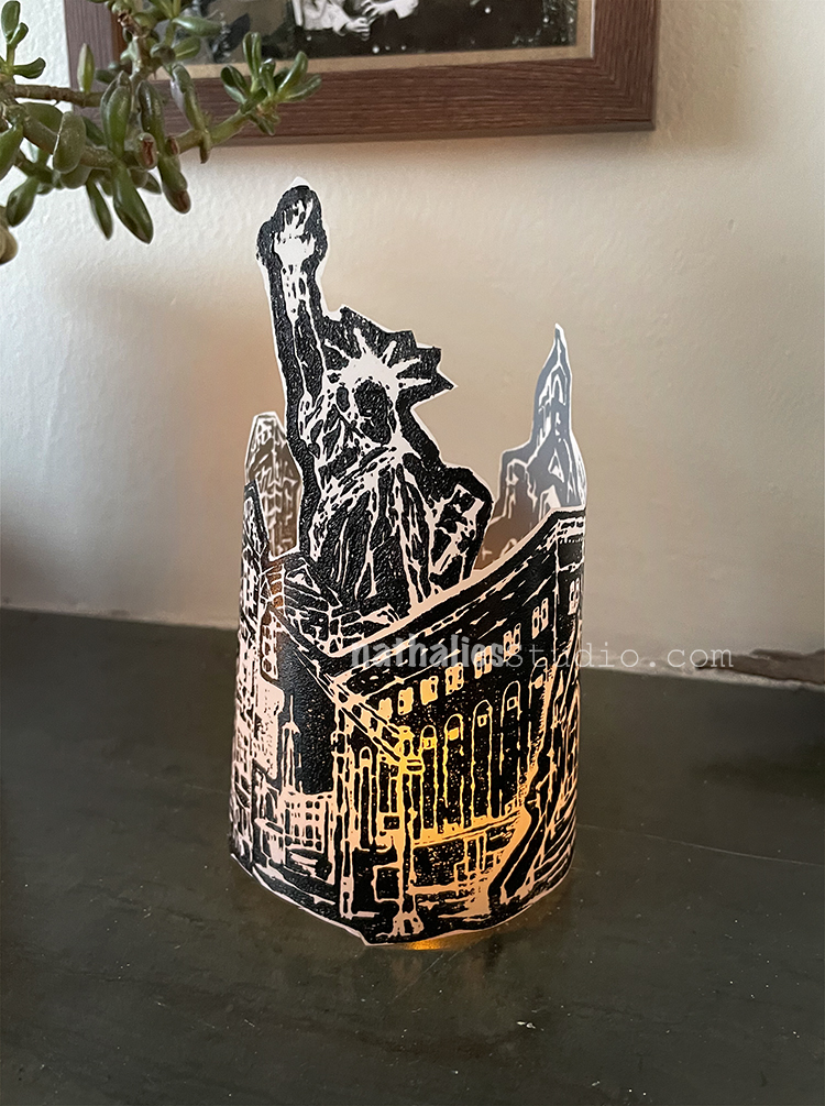
We also fussy cut some for a different effect!
Looking pretty good there Lady Liberty! The choice is yours on how you want to trim them.
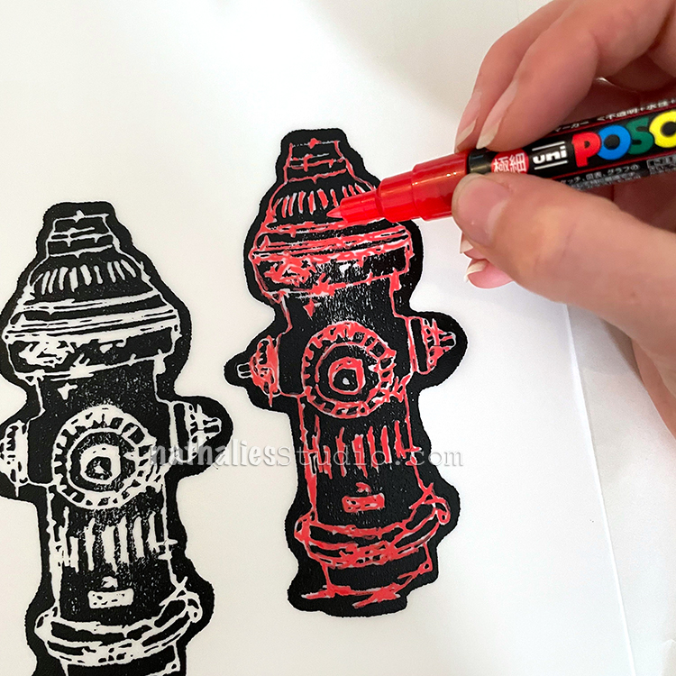
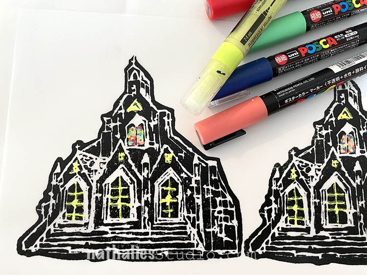
We also tried coloring some in with acrylic markers.
Here are some details in those stained glass windows.
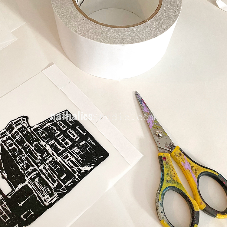
Using double sided clear tape we got ready for the final assembly.
Coming together and holding tight with permanent tape.
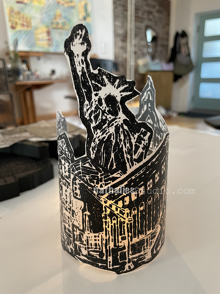
Here are our City Scenes votives ready for illumination – LED lights must be used with these to be safe.
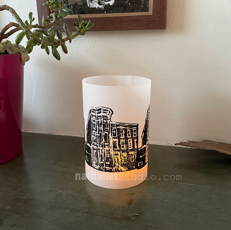
Let’s light them up!!!
For the taller ones you may want to use a taller LED votive or stack the votive on something inside the sheath.
Love this one that I fussy cut!!!
And now after dark…
I hope you enjoyed this little tutorial and maybe you’re feeling inspired to make some foam stamped votives of your own. Please do!!! And I hope you join us back here for our next Play Date :)
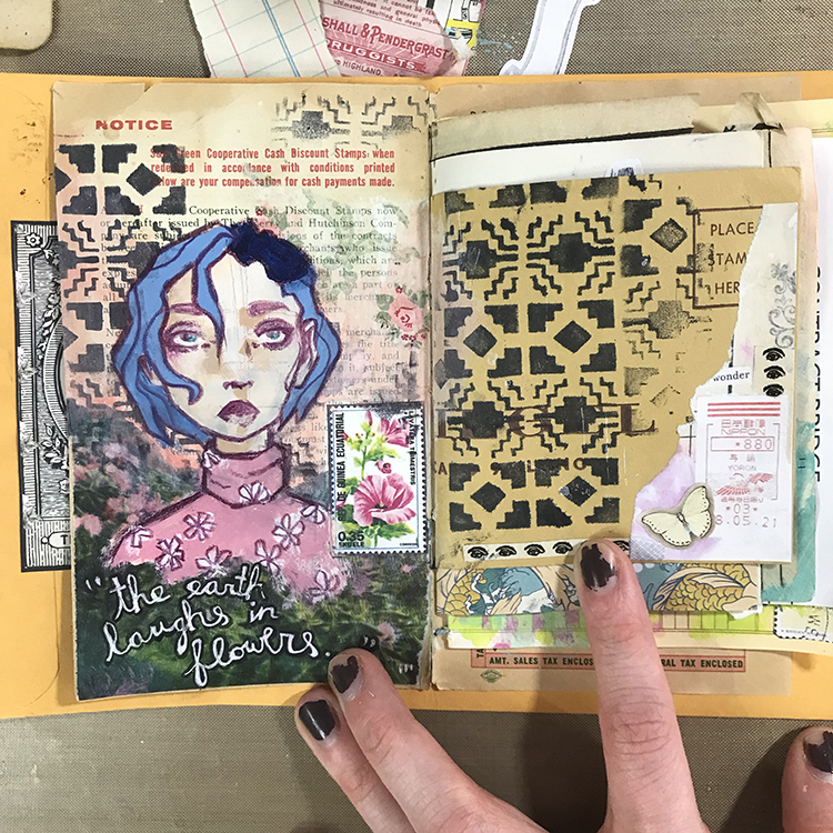
Hello from my Creative Squad! Today we have a journal spread from Jordan Hill working in a junk journal and using my Mini Santa Fe Foam Stamp and our theme: Dear Mother Earth – Our planet Earth is an amazing and beautiful gift to all of us. Let’s write her a letter, telling her just how we feel. This could be an actual letter/mail art, an art journal page, or some other mixed media project.
Hello, everyone! I’m very excited to be back with my project for July! This month’s theme of “Dear Mother Earth” resonated with me quite strongly, since I tend to draw a lot of inspiration from nature for my artwork. I hope you enjoy following the process!
For this month’s project, I decided to work in a new little journal I made semi-recently; this is actually the first official finished spread.
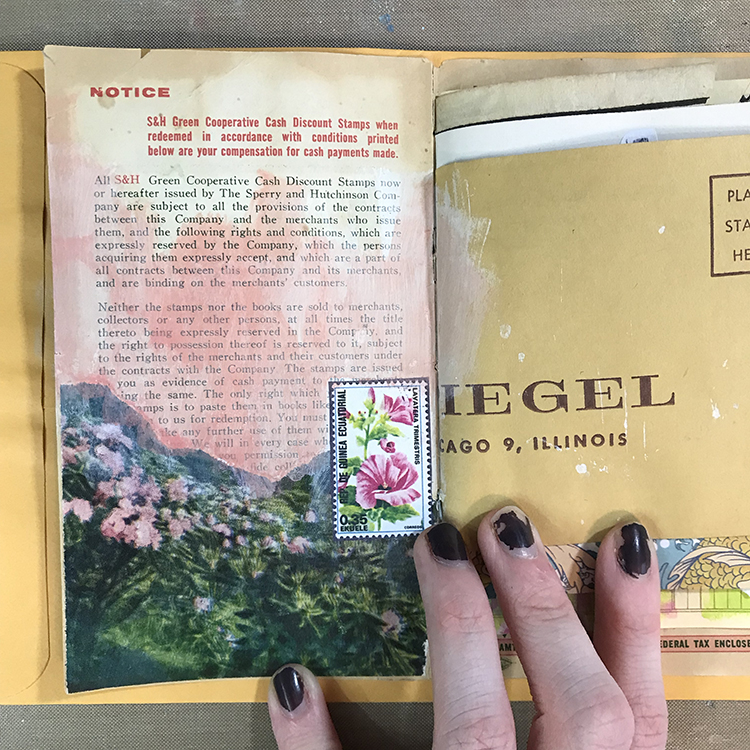
I started things off by prepping my background. I selected a photograph from an old book, consisting of some beautiful pink flowers, which reminded me of this month’s theme of “Dear Mother Earth”. After tearing that photograph to size and gluing it down, I added some CraftSmart acrylic paint in Coral Pink and White (to create a color reminiscent of the flowers) and a printed image of a postage stamp that also featured pink flowers.
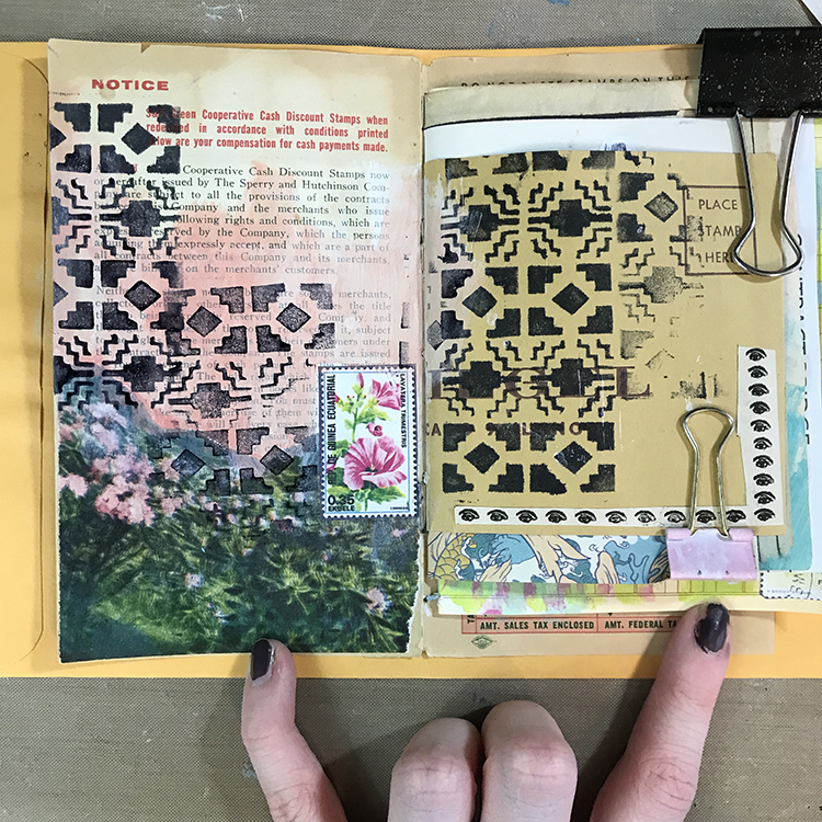
Next, I reached for Nathalie’s Mini Santa Fe Foam Stamp and some black ink, adding it over most of my spread. I’ve tried several different methods of applying ink and paint to these foam stamps in the past, but for this project I wanted to experiment with a stamp pad re-inker. I wasn’t sure if this would work or not, but the roll-on nature of the re-inker actually made it quite simple to cover most of the stamp and get a good, solid impression. I also found that the effect of using this type of ink was different than if I had simply used an ink pad.
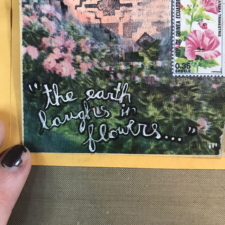
Usually, words are the last thing that I add to my art journal spreads, but for this month’s project, I got the urge to add them in earlier. I wanted to incorporate this quote (which again, reminded me of this month’s theme) in white gel pen over the photograph. However, because of the glossy finish of the photograph, the pen didn’t really want to adhere. In order to mend this issue, I used some clear gesso to paint over the photograph. The pen was a lot more willing to cooperate with me after that.
In addition to the white gel pen, I also outlined the words with some black ink to help it stand out that extra little bit.
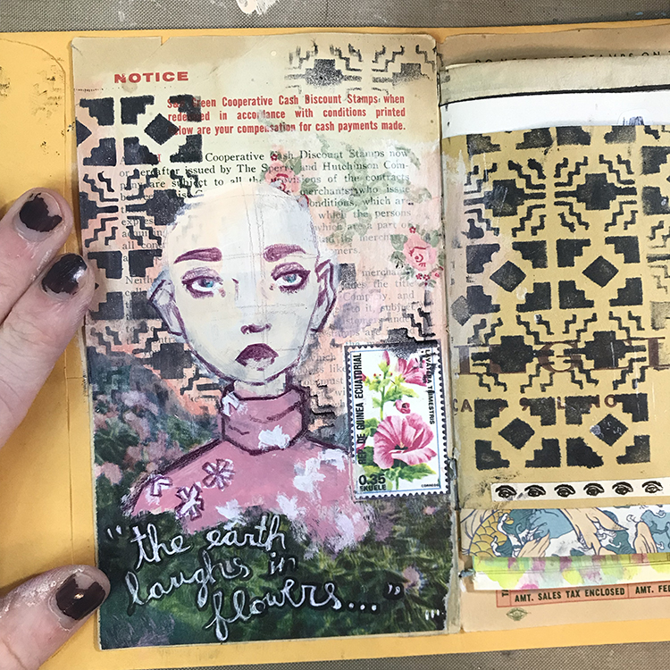
At this point, I was ready to add my focal point. I started out drawing a face, but I found myself wanting to spice up the clothing a bit. Instead of the tank top style shirts I typically dress my figures in, I used a turtleneck style for this character. After painting the top pink, I then added some little patches of white, which I later drew petals on top of, in order to give the shirt a pattern!
I also used a small piece of a paper napkin and some Mod Podge to collage another little interesting element into the background.
In order to finish off this spread, I gave the character some hair (which I’m actually quite fond of, and would love to have myself) using Liquitex Soft Body Acrylic in Prussian Blue Hue mixed with white, and added a small little collage cluster in the lower right hand corner of the page. When creating this collage cluster, I took care to choose colors and imagery that I felt fit with the left hand page, in order to tie the two together.
Overall, I’m very happy with the way this spread turned out, and I definitely think I’m going to be reaching for my stamp pad re-inker for use with my foam stamps again in the future!
Thank you Jordan – love that you worked in a junk journal for this one – great way to repurpose scrap papers!!!
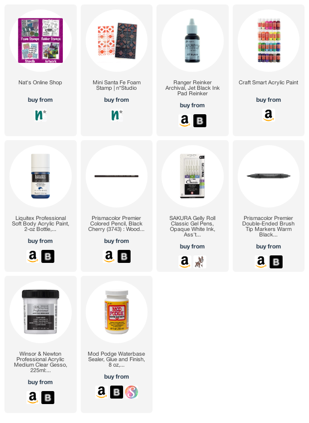
Give it a try: you can find all my Foam Stamps in my Online Shop and in addition to some collage elements, here are some of the supplies Jordan used:
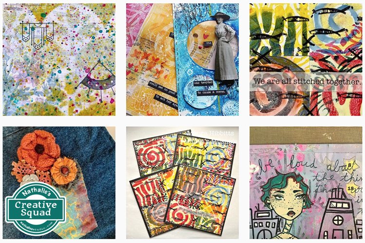
For more from the Creative Squad check out Nat’s Creative Squad on Instagram too: Each week we post projects, ideas, and inspiration for mixed media art.
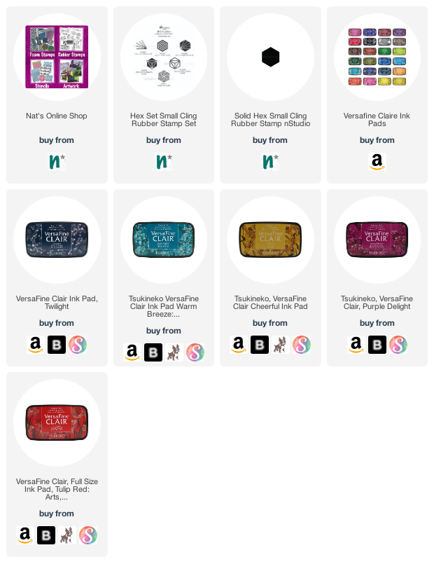
Happy Monday my friends – time for another pattern in my big vintage ledger! For this one I used my Hex Set Small and Solid Hex Small rubber stamps. Check it out in the following video:
Here is a look at the finished pattern and the stamps I used:
“It is in your hands to create a better world for all who live in it.” – Nelson Mandela
… Use your damn hands!
I used my new Lady Liberty foam stamp – a nice big stamp with the oomph that I wanted for this page. To get my color I rolled out two acrylic paints with a brayer – soft acrylic paints in teal and green – and then stamped. I wanted the look of some patina – like the statue itself.
This is such a great topic! I love when I can collaborate with other artists. I hope I can join!
Reply