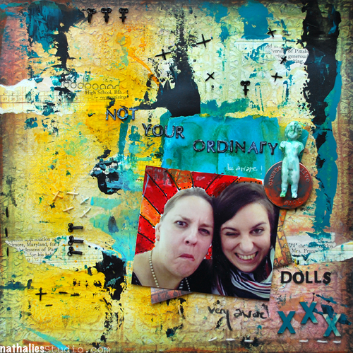
CHA and Paperworld left me with a couple of things to play – nothing more fun then putting some of those things together- including a really bad quality – nevertheless-cracking-me-up-photo of Anna and me.
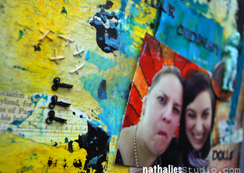
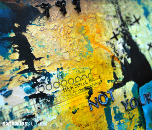
I wanted the background look like an old club/poster wall – grungy and all :) …I think I succeeded LOL
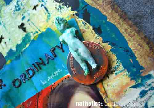
The Dresden Doll is actually my first mold with Resin – I do have to redo the mold as there is a slight crease right on the face- but I wanted to use the first one anyway and I like it a lot. I had saved my little Dresden Doll FOREVER hoarding it for the best possible occasion and now…HARHAR – I just make more ….insert evil scientist laugh.
So that’s it…I got my grunge on :)
Other than that- working on a brand new Über*Media Online Workshop right now- actually two :) So stay tuned.
Have an awesome day!
Nat
![]()


Comments (24)
Sandi McLean
| #
The button/blinkie is terrific!!
Reply
Finnabair
| #
awwwwwwwwwwwwwwwwwwwwwwwww!!!!! this is crazy, i love the peeled paint effect you got! and photo..yeah, priceless!
Reply
Laura
| #
Awesome layout!
Reply
piekielnaowca
| #
HI there !!!
Amazing work love this old wall look. And for sure no one can say you girls are ordinary ;))
thx for banner i will proudly put it on my blog it was such fun
hugs !
Reply
muriel
| #
Great background, just what I love! And funny photo.
Reply
frutselke
| #
hilarious!!! you definitely got that poster look right. great inspiration. and thanks for the banner.
Reply
Carrie
| #
LoL that picture is priceless! Love what you did with the whole thing, though. The old club wall look really works! It’s really like you cut out a piece of a wall that had decades of layers of posters and paint and more posters – it must’ve taken you ages to build all that up!
Reply
Vicki r.
| #
Love the grunge artwork! Thanks for the blinkie too! I am off to add it to my blog….
Reply
mjmarmo
| #
So cool and interesting to look at look!
Reply
Sue Clarke
| #
Love it and I was a jumper but alas I don not have a blog…I will have to secretly look at the banner and pretend that I’ve posted it for the world to see;-)
Reply
Miae
| #
Fabulous art! You most certainly pulled off the old poster page look! Thanks again for CJS Nathalie!!
Reply
Piarom
| #
What an amazing grungy madness ;) can´t get my eyes off of it! and your doll looks wonderful and fits real nice!
Reply
Jeannette van Dongen
| #
Hi Natalie, I was just wondering. Is it correct that I haven’t received alink yet to a newsletter from Creative Jump Start 2013 in which all the winners from the giveaway are mentioned ? Hope to hear from you !
Reply
Nathalie Kalbach
| #
as that is correct- as I said in the last video- it will take me some time. so please be patient! Thank you
Reply
Lori Batronis
| #
This has been truly wonderful. I still have not made it thru all of the videos, but that is ok. It has been a hectic month. The ones I did see were very awe inspiring. Thank you.
Reply
Nurse Ratchet
| #
Now I would love to be in that club with you two,having a beer or two! Your piece is wonderful….so much to discover!!
Reply
Tabbatha S
| #
Ooh, fantastic banners! That page is absolutely fantastic too – so inky and silly. :D
Reply
Laura S
| #
Just like Kathy P commented, I too am saving the blinkie for when I get my Blog. I have been dreaming about a Bog for a long time. Now that I’ve accomplished creating my art journal, starting a Blog is my next goal. Thank you very much, Nat! My hero ;)
Reply
Lisa Flaherty
| #
Just….whoa. That background is incredible, Nat. The colors, the textures, the stitches, the grunginess. Whoa! Your Dresden doll is perfect, as is the color and fun you’ve added around your faces, reminiscent of Finn’s Jumpstart! True love at first sight!!
Reply
Nathalie Kalbach
| #
LOL- I might add that I have been doing photo manipulation for many years…but I loved Finn’s ;)
Reply
Louison
| #
Beautiful and so funny!! I love it!!!
Thanks for the blinkie!!! :)
Reply
Milagros
| #
Ese fondo te ha quedado perfecto me encanta super-grunge , la superposición de capas y los vibrantes colores. Artistazas
Reply
Kathy P
| #
What a fun page…love all the texture and color! And since BOTH of you are being silly, that is a great photo!!! LOL…..
Thanks for the blinkie….I am saving it for when I FINALLY get my own blog going!
Reply
Charlotte
| #
This is fabulous! I love it :) I think you totally nailed it with the club/poster grungy wall look – I thought that before I read the line where you said that’s what you were going for :)
Reply