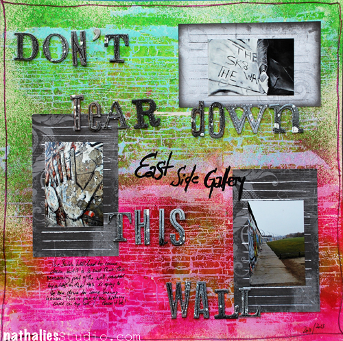
Pretty stoked to be the guest designer for Viva Las Vegas Stamps this month. This layout was posted last week and there is another one on next week :)
I used the Charred Wood Back Ground Stamp to create my own background for a grungy layout. The layout is about the East Side Gallery – a tiny remaining bit of the Berlin Wall that was painted by different artists in 1990 and now unfortunately is supposed to be torn down to make room for some luxury flats. Some of you might remember some of my photos from this blog post here- where I had visited Berlin with my friend Julie.
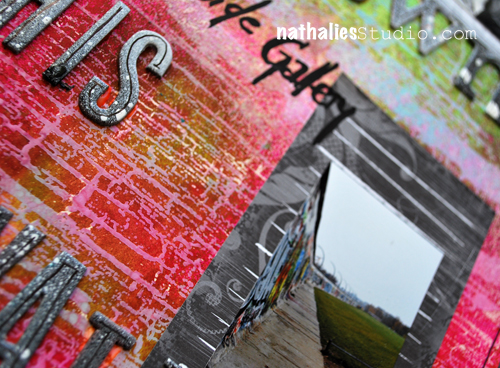
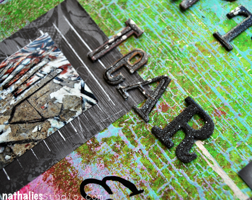
I love to create my own backgrounds using stamps to emphasize photos or the feelings and emotions that go along with photos. For this background I had stamped the background with the awesome Charred Wood Back Ground Stamp and embossing powder and then used Wow Bonding Powder and Foil on top. This created a kind of resist. So when I sprayed some Dylusion spray inks over the stamp image and texture of it got fully revealed.
Other Suppliess used: White Cardstock, WOW Bonding Powder, WOW Foil, Versamark, Ranger’s Dylusions Spray Inks, Liquitex Professional Spray Paints, Heidi Swapp Chipboard Letters, Rose Moka Journaling Cards, Posca Marker, Zig Journaling Pen
Have a wonderful day
nat


Comments (6)
Cindi
| #
Congrats on designing for Viva Las Vegas! Nice layout. I love the background and also the way you framed your photos.
Reply
Nurse Ratchet
| #
Great work, Nat..that stamp is awesome too. Hmmmm red and green together……it can work!!
Reply
Jean Marmo
| #
Oh my – this hits so close to home. I lived in Berlin as an exchange student my last year in high school. It was 1970 -1971. The wall was very much there as was check point charlie. I have vivid memories of the wall, museums, etc. I did manage to take a few trips into East Berlin which was so very different from West Berlin. I actually still have a small piece of the wall that I took from the ground. I hope they do not take this down!
Reply
Sue Clarke
| #
I had to go back and study the LO to see that the stamp was the background!
Love the look…kinda like making your own pp. BTW, anything in the works for another paper line designed by you? You know that I would buy it!
Reply
Nathalie Kalbach
| #
I wish Sue ;) Not right now…
Reply
Jackie
| #
Hi Nat- Cool layouts! The background is totally awesome, and as always, I love your color selections!
okay on the wall,you mean to tell me that “they” can’t find some way to build around or incorporate the wall into their new “Luxury” plan? The wall is such an important part of history- and the way the art has grown on it makes it even more special !
Society today- not just in your country but ours- Make way – we’re coming through: tearing down, clearing out,wiping out what was, expanding and ever expanding-
well, guess you know how I feel about that! LOL sorry for the rant-
have a great creative weekend!
Reply