Creative Squad

Endless Summer – Jennifer Gallagher


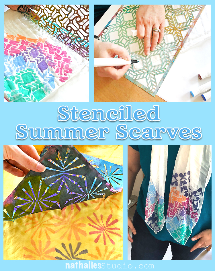
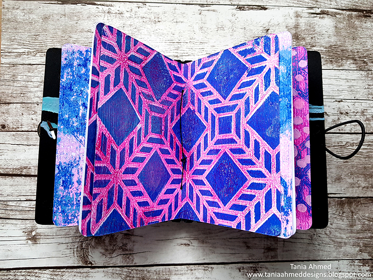
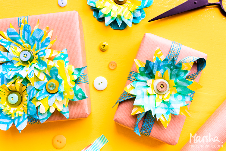
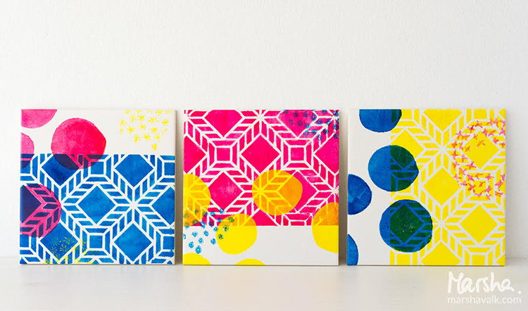
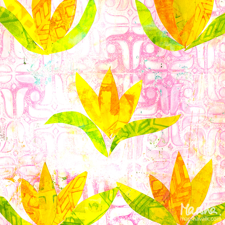
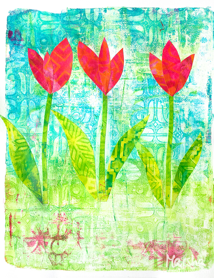
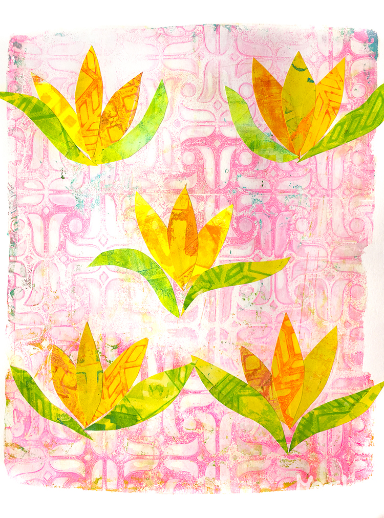
Welcome to a post from the Creative Squad! Today we have Jennifer Gallagher sharing a really fun art journal page with her take on summer. I have been loving the projects this month because it has prompted the squad to share a little more about themselves and it is always fun to learn about the people behind the art :) This time Jennifer mixes it up by pairing my Window rubber stamp with my Santiago stencil for our theme: Endless Summer – The days are long, the sun is shining, the air is soft… it must be summer! Let’s take a stroll down memory lane and save a summertime memory forever.


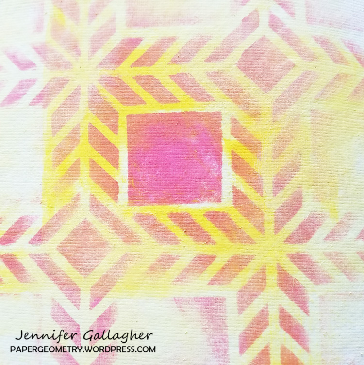
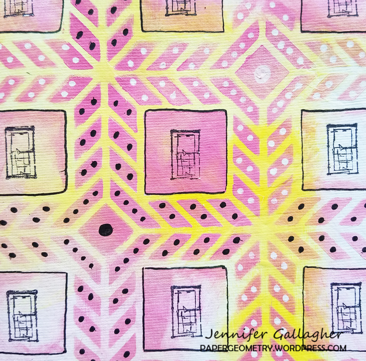
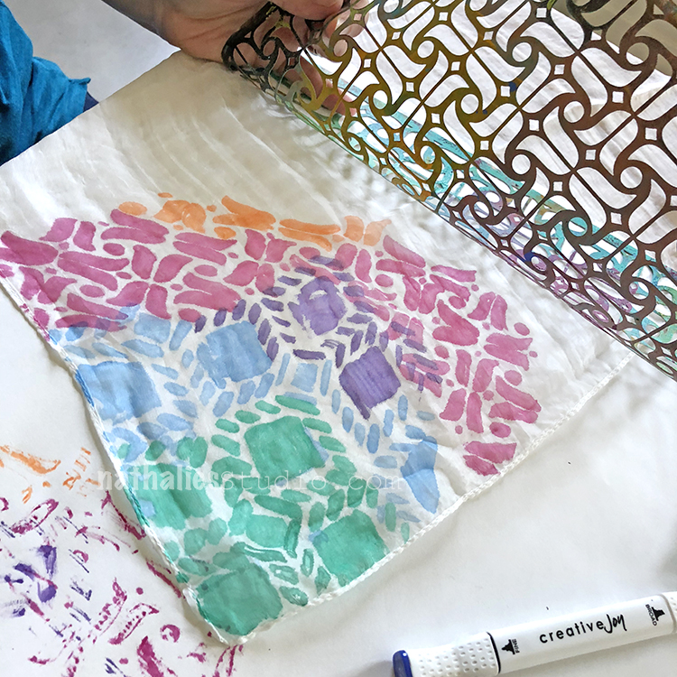
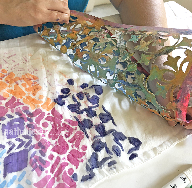
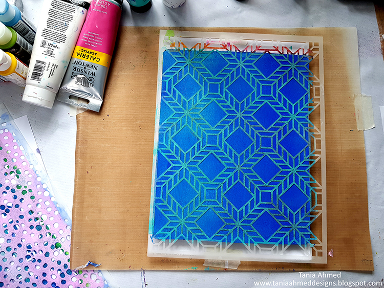
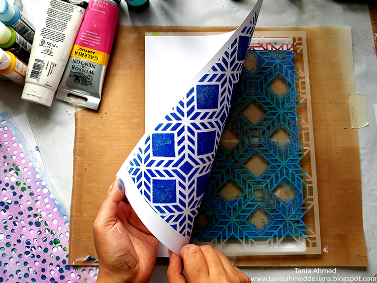
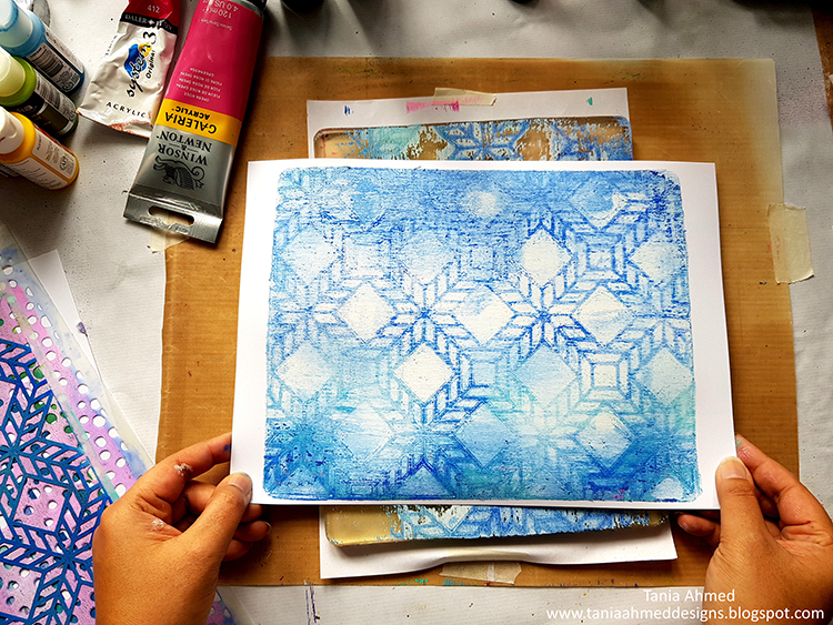
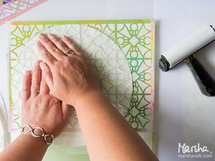
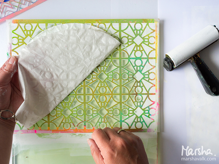
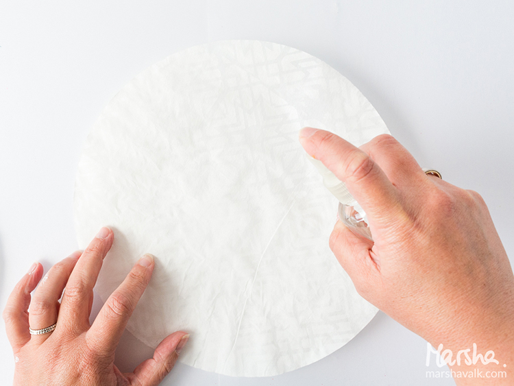
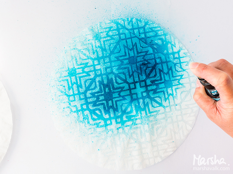
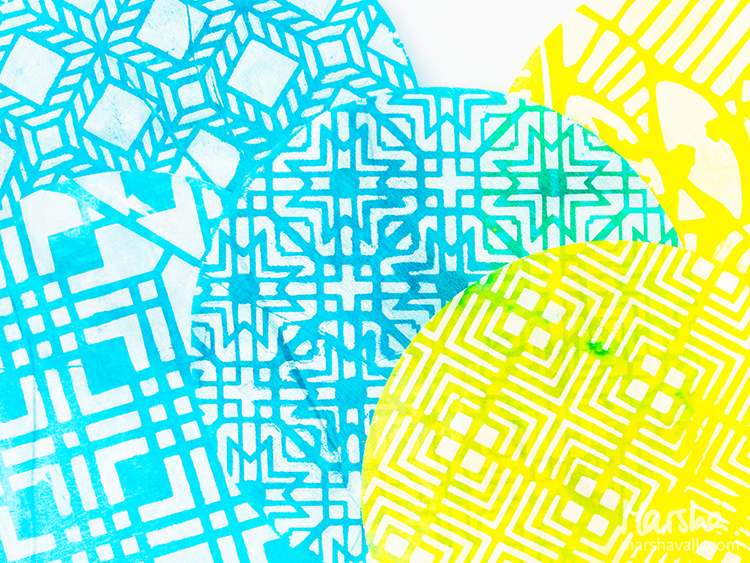
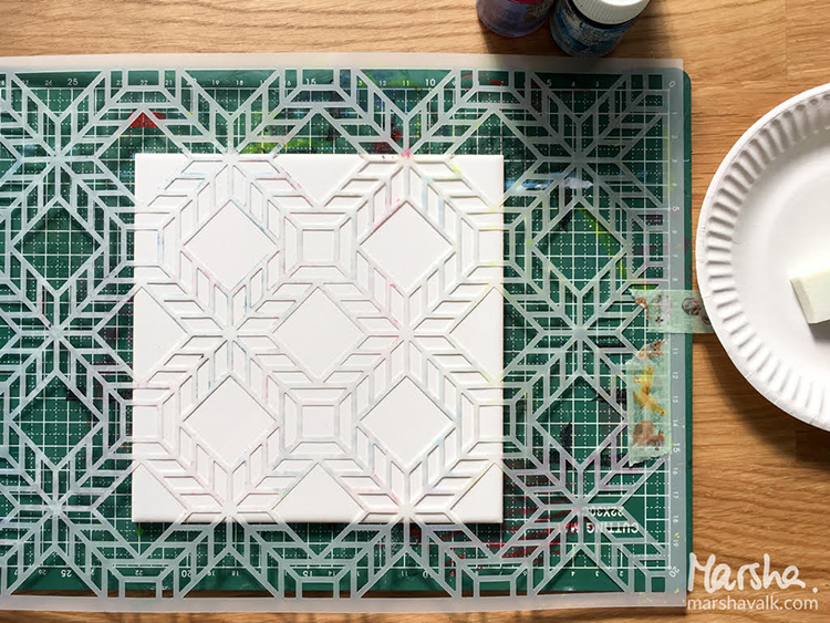
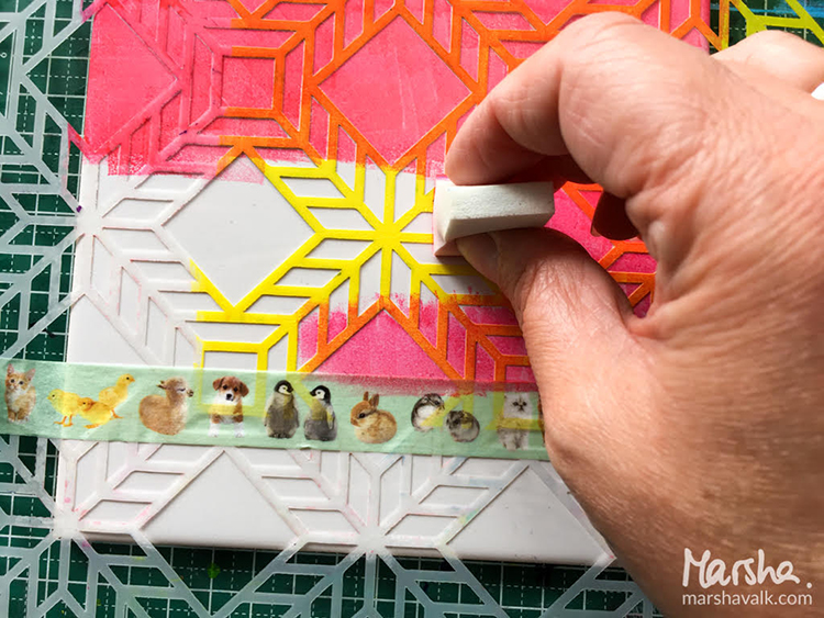
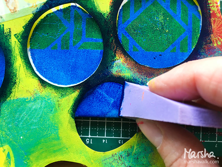
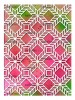
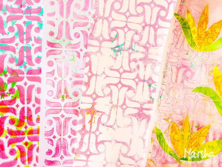
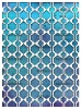
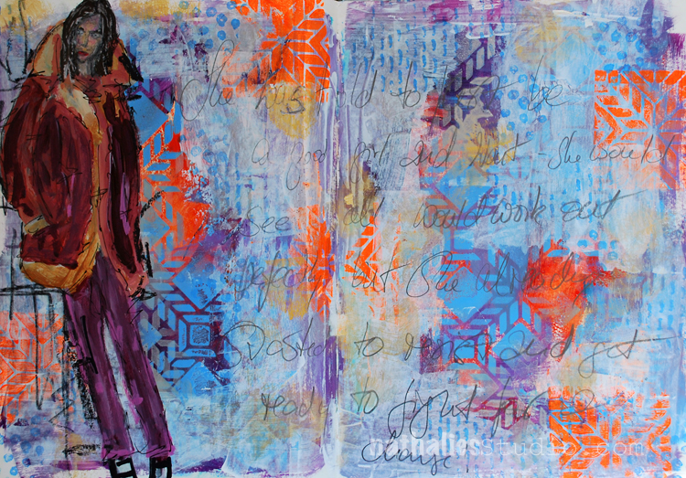
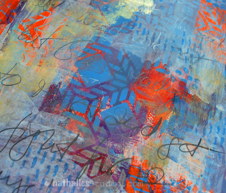
Summer is my favorite time of year. While working on this month’s creative squad post we were experiencing a heat wave. I was sitting at my window watching the hummingbirds at my feeder outside when I was inspired to create this art journal page. I started by turning Nat’s Santiago stencil to create squares on the art journal page. Using a mini blending tool, I applied acrylic paint through the stencil.

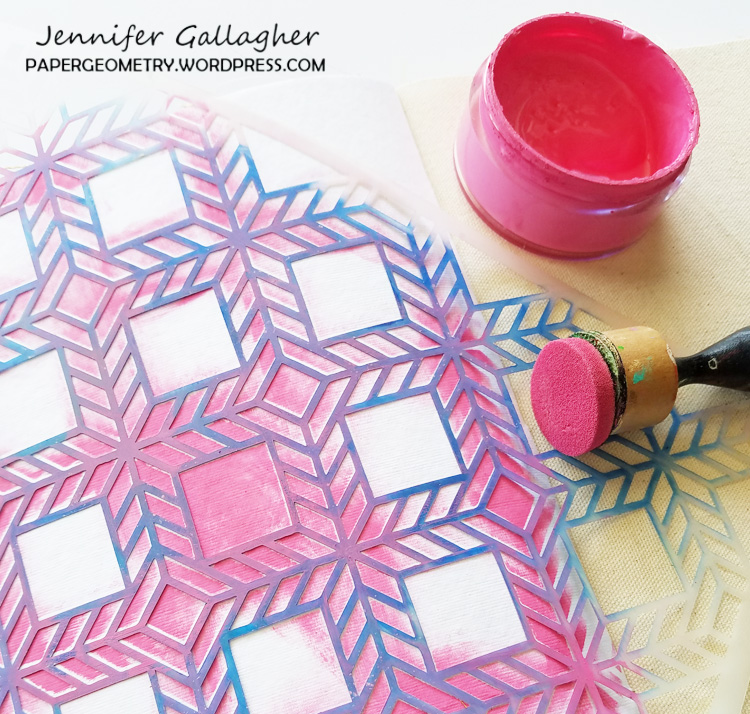
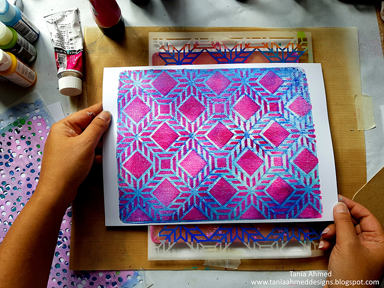
Then following the lines of the stencil, I applied yellow acrylic paint to create an interesting line for your eye to follow.

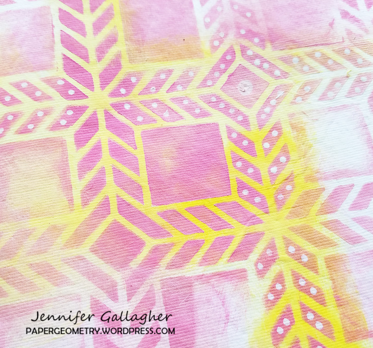
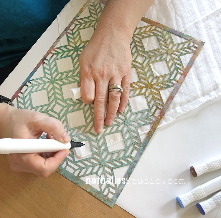
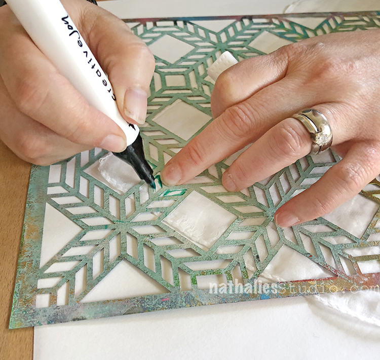
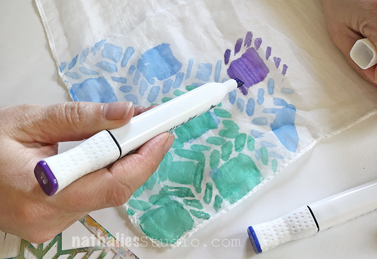
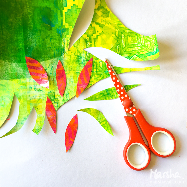
I really wanted to play with my stencils and push what can be achieved by changing it up a bit. I used my white posca paint pens to add additional patterns and details to the stencil design.

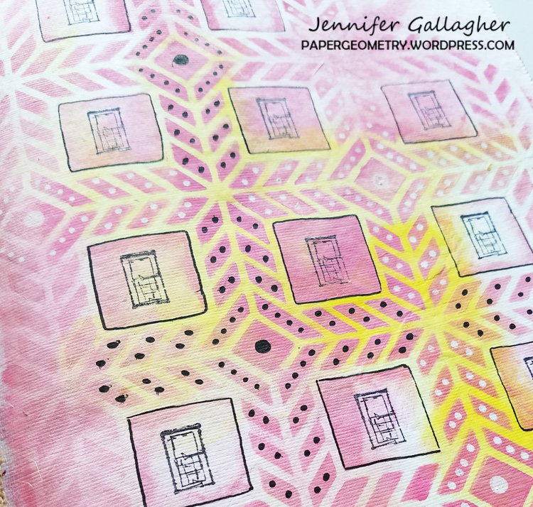
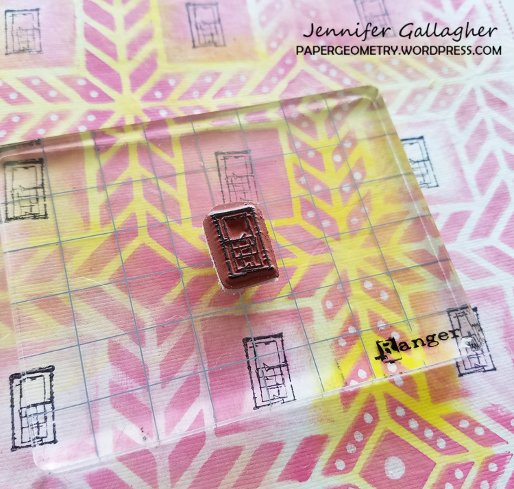
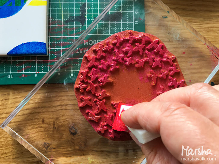
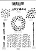
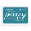
Next, using archival black ink, I stamped the window stamp from Nat’s My Home is My Castle set into the squares on the journal page.

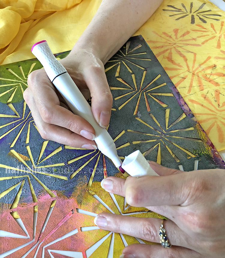
At this point I decided to add more additional pattern work with my black posca pen.

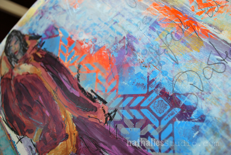
Lastly, I added a quote that felt appropriate for this particular day and this particular page.

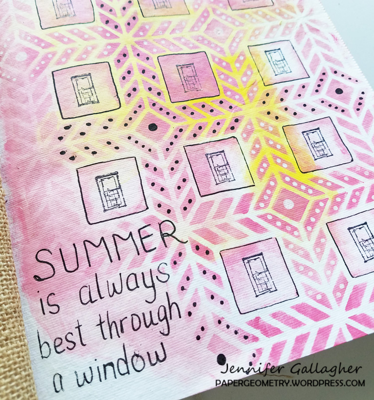
Although I found the quote humorous, I would encourage you to get outside and enjoy the Summer. Inspiration is everywhere! Be sure to share your n*Studio projects with us.


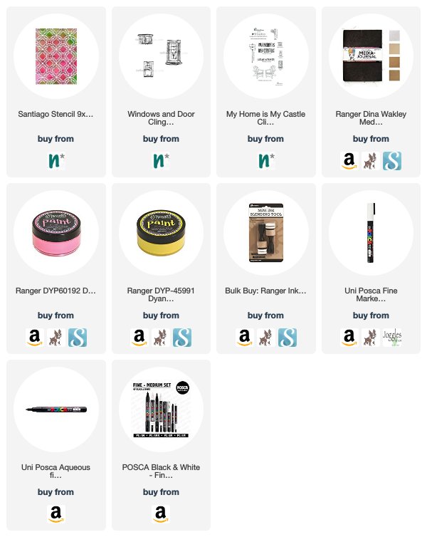
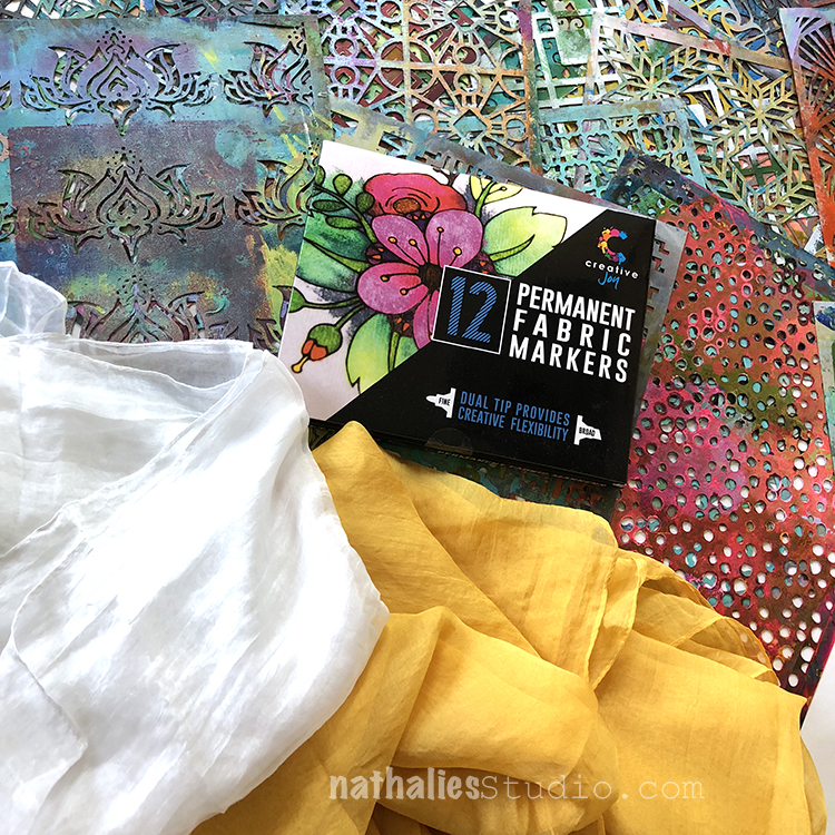
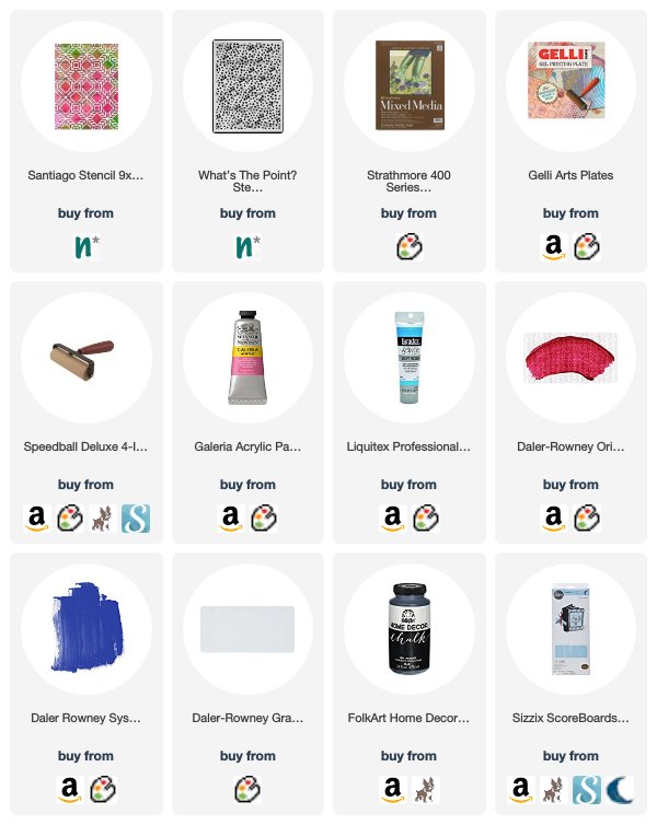
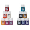
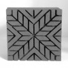
We couldn’t agree more with Jennifer – get out and find inspiration for your artmaking! And of course when it’s a heatwave, enjoy the view from the window :) Here are some of the supplies that Jennifer used:


Be sure to check out all the Creative Squad projects on the Creative Squad webpage and if you feel inspired, share your projects with us! We love to see what you’re working on. I post projects almost every month in my Inspiration From Around the Globe posts!

SaveSave

Leave a comment

Stenciled Summer Scarves Tutorial

Last week Kim and I got together for a little stenciling playdate. We had already done some things with fabric paint but this time I was wanting to try fabric markers.

I found this nice set of non-toxic permanent fabric markers with both a fine and a broad tip ends and some silk scarves online. I chose a white scarf as my backdrop and Kim went for yellow. We gathered all my stencils to decide what patterns we might like.

I jumped right in with my Santiago stencil – trying to decide how best to line it up. These are large square scarves so we decided to decorate the corners so you can see the design as it’s wrapped around your neck.

The fine tip end worked nicely with the stencil and the colors were pretty and bright – especially on the white scarf. The thin and smooth silk fabric was a bit tricky to hold down and we found you had to really hold the stencil and fabric in place to keep the pattern lined up. Another trick on thin silk – use very little pressure with the marker – it doesn’t take much ink to make a mark.

The ink spreads and gives a watercolor look to the design. This is maybe not a project for the very fussy – the silk and markers produce a more hand-painted look than precise line. I found the broad end of the marker worked well for filling in large areas of the design. As you can see, I switched colors several times with the same stencil.

Another tip: make sure you have paper or some protective surface underneath the scarf to catch the pigment that bleeds through. I added another stencil here: Amsterdam, and a few more of the marker colors. My tactic was “more is more”.

And finally I added a bit of the Versailles stencil and one final color. You can see that this scarf is thin and translucent (those marks near the orange pattern are actually on the paper underneath) and the markers are transparent too.

Kim chose to use only the Beacon stencil on her yellow scarf.

The designs look like flowers and she stayed with pinks, orange, and purple colors. Again, she worked on the corners of the scarf.

Here is her field of flowers when she was done. You can see the markers bleed on the thin silk, but it gives a pretty painted look.

My scarf is a colorful collection of patterns and so unique!

And here is the final result for Kim, a one-of-a-kind scarf for summer! This was a fun and easy project and just took an hour or so. I also really liked the color selection of the marker set so I’m definitely going to try them on some other things too. I hope you try it and share your results with me!

Here are some of the supplies we used for this project:


Comments (1)

  • stephanie

    |

    What a fun project! Both scarves are lovely

    Reply

Leave a comment

Layers of Love – Tania Ahmed


Today is a special Creative Squad day because we are welcoming the very talented Tania Ahmed to the team! Tania’s fresh style will be a great addition to our lovely little group :) You can read more about Tania in this Nice to Meet You post from last week. Today she brings us a beautiful little book that totally rocks my Santiago and What’s the Point stencils. She’s working from our new theme: Layers of Love – We love layers and all the juicy yummy goodness they bring to mixed media. This month we’re layering it up and letting viewers discover all the different strata of our artistic mark making.


Hi Everyone, this is my first post as part of the Creative Squad! Thank you to dear Nathalie and Kim for inviting me to join the team, I am so pleased, thrilled and honoured! I am so excited to be kicking off this month’s challenge: the theme is Layers of Love and there’s nothing better to demonstrate this than Stencils!

I adore stencils and love to incorporate them into my work. There are so many ways to use them, you can sponge paint or medium through them, stamp with them, use mists with, the list is endless. At the moment I am really obsessed with gel plate printing and I thought what better way to demonstrate layering than with monoprinting!

I created a variety of prints and I started by centring my Gelli Arts plate on a piece of A4 sized paper. This will help you create a register for your print so that you can line up the pattern stencils each time you pull a print.

I started by spreading Permanent Light Blue and Cobalt Blue acrylic paint with a brayer on my gel printing plate. I lined the 9 x 12 Santiago Stencil with the paper under my gel plate along the bottom left corner. This will be my register every time I place either my stencil or my paper:

I then pulled a print:

I removed my stencil let the paint dry on my gel plate. I then brayered white acrylic paint all over the plate and pulled another print with new paper. This will be my ghost print:

I cleaned my gel plate off and then applied Process Magena and Opera Rose acrylic paint with my brayer and lined up the stencil again and pulled a print on the ghost printed paper. I made sure to line up my print with the paper under the gel plate!

I removed the stencil and quickly pulled another print using the first gel printed paper, making sure to line it up with the paper under the plate:

I repeat this using the same colours with other stencils until I had a few prints to choose from.

I then die cut some mount board (or you can use light chipboard sheets) using the Eileen Hull’s Passport Sizzix Die, and added my printed papers to the cover. I painted the spine with black chalk acrylic paint. I also die cut some pages for the journal using the same die. I assembled the journal, added some beads to the spine, elastic and a brad for the closure. I am really looking forward to filling this little mini album with photos and journaling!

Thank you so much for stopping by, I had a blast making this project :)


Thank YOU Tania! So glad to have you and absolutely loving this first project from you! Here are some of the supplies that Tania used:


Feel inspired? Working on something yourself that you’d like to share?  I love to see how you interpret our monthly themes. Email me how you used my stencils and stamps with the theme and email me an image – I would love to share your projects in my next  “n*Spiration From Around the Globe“.

Leave a comment

Reduce, Reuse, Recycle with Marsha Valk


Hello again from the Creative Squad! Today we have a gorgeous gift wrapping project from Marsha Valk that is sure to send you running to your kitchen for some coffee filters :) Marsha used a whole slew of my stencils on this one (so be sure to check the materials list at the bottom) to rock the theme: Reduce, Reuse, Recycle – Let’s do Mother Earth a favor this month and use what we already have.  Maybe we’ll dip into our stash of leftovers from other creative projects or maybe we’ll repurpose something unexpected.  This month we’re thinking about how artmaking can impact the environment and we’re trying to make our footprint just a little bit smaller.


Reduce, Reuse, Recycle – that’s a topic that has been on my mind a lot lately. I have a lot of different craft supplies. I like to donate any excess supplies I have, but I still have plenty left that I’m reluctant to get rid of because I don’t want to waste it and it may come in handy someday…

The upside to this is that I’m never short on stuff when it comes to gift wrapping!

Paper flowers make fun and easy gift toppers, so I for this month’s prompt I decided to make coffee filter flowers.

I’ve shared how to create similar flowers on the Gelli Arts® blog before:

Using brand new (bleached) coffee filters for a craft project probably isn’t the greenest choice you can make. If you are looking for an environmentally friendlier option, you can recycle used coffee filters.

Unfortunately I don’t have access to a coffee maker that uses filters like these, so I haven’t tested it for you, but I believe you can rinse and dry them. They will be stained, but that will actually add interest to the paper (and the flowers).

Step 1: Monoprint a couple of coffee filters with your Gelli Arts® printing plate using stencils and (white) acrylic paint. Here I’m using Nat’s Buenos Aires stencil.

Step 2: Stain the monoprinted coffee filters with spray inks.

Wet the coffee filter with a spray bottle of water before you spray on the spray ink. The water will help the spray ink spread across the coffee filter, this one has Nat’s Toledo stencil pattern on it.

You can stack the coffee filters you want to have the same colour while spraying. Each new filter will absorb the excess ink from the already sprayed ones!

Leave the coffee filters to dry completely.

Step 3: Cut two smaller circles out of each coffee filter. I folded each coffee filter in half and used a jar to trace a circle shape onto them to get a uniform size.

Step 4: Fold the circles into eighths (or more) and cut leaf shapes. Make sure to cut some larger and some smaller.

Step 5: Unfold the coffee filter flowers and stack two or three on top of each other. Secure them by sewing one or two buttons in the middle of each stacked flower.

Fluff the petals until you are happy with the result.

Step 6: Use a glue dot or double-sided tape to adhere the flowers to your gifts!


I love this Marsha – such a great way to dress up a gift! In addition to buttons and ribbon, Marsha used the following supplies (some are affiliate links):


Play along with us too: I love to see how you interpret our monthly themes. Email me how you used my stencils and stamps with the theme and email me an image – I would love to share your projects in my next  “n*Spiration From Around the Globe“.

Leave a comment

Pattern Lovers – Marsha Valk


Happy Tuesday from the Creative Squad! Today Marsha Valk brings us a fresh and colorful set of tiles for the home using my  Santiago stencil and my Embroidery stamp set. This month’s theme is: Pattern Lovers Love Patterns: We admit it – sometimes we go a little crazy over cool patterns. We see them everywhere and whether it’s in the human-made stuff all around us or in the designs by Mother Nature, we love them all. So this month we’re playing with pattern and giving it the attention it deserves!


I love patterns! I’m especially drawn to clear, graphic designs and that’s why I love Nat’s stencil designs so much!

We’re in the middle of painting our living room and I’ve been dying to add a splash of fresh colour to our home decor. So that’s why I decided to decorate a couple of plain white ceramic tiles, that I plan on using as coasters or to put plant pots on.

Here are the steps I took: First clean the tiles before you start. They need to be dry and free of grease.

Place the Santiago stencil on top of the tile. Use tape to keep the stencil in place. You can also use washi or masking tape to block off parts of the tile you want to keep white.

Use a cosmetic sponge to dab porcelain paint through the stencil onto the tile. Dab the cosmetic sponge in the paint and dab the excess paint off before applying it to the tile. Keep the sponge as dry as possible to prevent the paint from seeping under the stencil.

I used a hand-cut stencil to apply the circles onto the tiles.

Dab paint onto one of the stamps from the Embroidery set (in this case the Cross Circle stamp) using a cosmetic sponge and stamp the image onto the tile.

Let the paint dry and then let it harden following the instructions on the porcelain paint you are using. To become wash resistant, the porcelain paint I used needed to harden in an oven at 300F/150ºC for 45 minutes.


Thank you Marsha – these are a great project for the home! Marsha used the following supplies (some are affiliate links):


Play along with us too! I love to see how you interpret our monthly themes. Email me how you used my stencils and stamps with the theme and email me an image – I would love to share your projects in my “n*Spiration From Around the Globe“.

Leave a comment

Live Like It’s Spring – Marsha Valk


Hello from the Creative Squad! Today Marsha Valk is officially ushering in spring with a collection of gorgeous collages using a whole bunch of my stencils and the monthly theme Live Like it’s Spring – Springtime is when Mother Nature kicks it into high gear. It’s the time to wake up and approach life with renewed energy.  Let’s join Mother Nature in this reawakening and create some things in the Spirit of Spring!


When it’s Spring again I’ll bring again… Tulips from Amsterdam! They’re actually from my craft room about 50 km east of Amsterdam… but that’s near enough I think ;-).

I started with mono printing a bunch of greenish, reddish and yellow/orangey prints on copy paper with my Gelli plate and Nathalie’s Buenos Aires, Manhattan, Mesa Verde, Santiago, and Toledo stencils. Once dry I cut them up into tulip leaves and stems.

I wanted to use Nat’s ‘Amsterdam’ stencil, with the tulip pattern, for the background. To achieve a softer ‘ghost’ print, I had to pull four prints: I applied paint onto the Gelli plate, layered the stencil on top and pulled two prints to remove most of the paint.

Then I removed the stencil and pulled another print to remove even more paint. And then for the final print I applied white paint onto the Gelli plate and pulled a last ghost print. And this last print is what I used for the background.

The last step was to collage the tulip parts onto the Gelli printed backgrounds.


Thank you Marsha! I love how you combined all those different stencil patterns with those gorgeous spring colors. In addition to some white copy paper, Marsha used these supplies – some links are affiliate links:


Play along with us! I love to see how you interpret our monthly themes. Email me how you used my stencils and stamps with the theme and email me an image – I would love to share your projects in my “n*Spiration From Around the Globe“.

Leave a comment

Resist – Art Journal Spread

Some of my thoughts on how sometimes women are told to behave in a certain way and be a good girl and how this actually never really resonated with me :)

The background was painted in a very bright orange and purple and layered the Santiago Stencil on top and sprayed with a blue spray paint over it. I applied some light yellow and white gesso in a think layer here and there to tone it down.

I stamped with the Grannies and Running  Stamps and archival ink for some marks. Next I picked up the orange again stamping with the Santiago Foam Stamp on top of some areas.

I used a pencil for the journaling.

Here are some of the supplies I used- some links are affiliate links:


Have an amazing day my friends!

Comments (2)

  • Sherry Canino

    |

    Beautiful art journal spread and message ❤❤❤

    Reply

Leave a comment