nathalie-kalbach

Colors Are Your Friends or let’s talk a bit of “my” Color Theory II

If you missed the first part of this series – you might want to check out this post first, so you know what me crazy girl is talking about ;)

So I introduced you to my friends Yellow, Blue and Red…let’s see who else is there.
My buddy Orange  is pretty social and communicative. Most of my friends like Orange. Orange also makes other friends stand out, Orange pushes them, but in a good way. Orange is warm and fun.
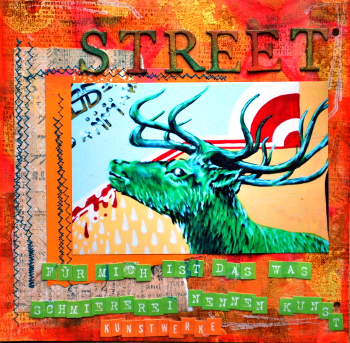
Next up is

Green is actually one of my very best and oldest friends. It is variable and contradictory at times. Green likes to blend in with my other friends, which makes it very easy to get along with green. Green doesn’t like conflicts and it is a good mentor to ease things. Green stabilizes. It is my most constant partner :)

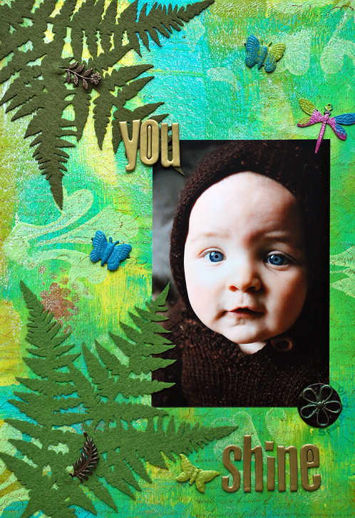
Now next

I know, I know…some evil tongues say Black is not a friend aka color. Pah…that is bullying! Black is an awesome friend. It is all friends! Black is serious, and sometimes a bit humorless, but Black can be such a great supporter if you do not take Black to serious. Black also has this amazing ability to make other friends shine. Black in doses is awesome….but if you are around Black too much it might make you depressive so you have to pick your time with Black wisely ;)

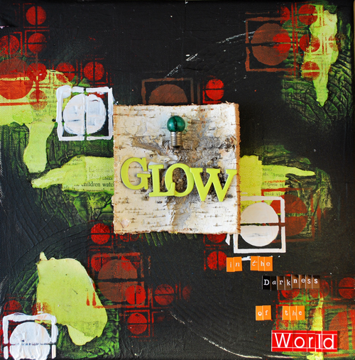
Well…now that I introduced you to my friends- I will be talking about mixing and matching in the next “Colors are Your Friends” Post. Hope you enjoyed the first two parts :)

Now…is there a color I didn’t introduce that you think has a certain personality?

Nat

 

Comments (12)

  • marjiekemper

    |

    What a fantastic post! I have been ‘saving as new’ about 14 of your posts as life got in the way and I didn’t want to miss one, hoping I could catch up. I was tempted over the last month to just clean out my inbox and chalk it up but I am SO glad I didn’t. Have totally enjoyed the last hour and change browsing, ogling, smiling, inhaling your art.

    This one is stunning with the way you’ve colored in the letters on STREET as one of about a dozen details that just pulls me in. Thanks for sharing, Nat – you are such an inspiration and you know if one person says it, there’s a ton more out there feeling it. Have a great weekend!

    Reply

    • nathalie-kalbach

      |

      ahhhh Marjie!!! Thank you for your sweet words- you comment just made my sunday morning. Thank you so much! Huge hugs to you and have a wonderful relaxed sunday!

      Reply

  • Lisa Flaherty

    |

    This is a great series! Your descriptions are perfectly metaphorical! I feel like I KNOW these friends! P.S. I am very drawn to that green elk with the orange framing him. Love it!

    Reply

  • Marja Seidemo

    |

    you know me – where´s turqouise?? But i know it´s not really a color, it´s a mix but anyway, it´s so vibrant, calling my name…and maybe yours ;-)

    Reply

  • Sue Clarke

    |

    Purple…so royal and yet playful! Love the last two posts Nat.

    Reply

  • Irma

    |

    Danke, das hat wieder Spaß gemacht zu lesen…genau ich dachte auch sofort an lila…und an weiß (wenn du eh schon schwarz dabei hast ;-))
    LG – Irma

    Reply

  • Dottie

    |

    Loved your posts on color! Made me think that black and white are sort of like the adults. All the other color children are running around on the canvas displaying all their glory and exuberence in their own personality and style, The adults come in to offer a little containment and accent. Thanks for making color so fun!

    Reply

  • Milagros

    |

    I love how you describe the colors ………. is fabulous, and looking forward to receiving the next post.
    hugs

    Reply

  • france papillon

    |

    and that my colorfull friend, is how YOU convert people to color. :)

    (not many words, but lot’s of meaning in this comment)
    bereknuffel!
    france

    Reply

  • Marianne Johansson

    |

    once again, love your talk about colors and the way YOU think about colors. Makes me smile :)

    Reply

  • Caroline

    |

    This is a great idea.
    you could do white, even if it is a bit the same as black some people say it’s not a color. But there are a lot of other voices that are saying that white is the color that means pure, hope, innocence, clean, …

    Then there is pink that is totally “think pink”

    Red the color off passion and warmth

    Every color has it own personality I think.

    Reply

  • Birgit Kunte

    |

    Wieder ein genialer Post. Wie wäre es mit lila, grau?? Liebe Grüße Birgit

    Reply

Leave a comment

Colors Are Your Friends or let's talk a bit of "my" Color Theory I

What I hear most often about my work…and sometimes I am not sure if it is meant as a compliment- hahahaha- is that my color combinations strike as unusual. Sometimes I get asked how I thought of putting those colors together. Truth is…I do not think that much about it anymore…but …I came a long way experimenting and trying things ;) So I thought I would share with you my philosophy of colors in a couple blog posts and also refresh some color theory stuff.

My philosophy which I often share in my classes is:

If you want to work with paint media- wether it be acrylic paints or others – you have to treat colors as if they are your friends. They have different personalities and there is a different time and a different place where you want to spent time with a certain friend. I could also say – Colors are LIKE my friends, but hey…I don’t want to start explaining which friend of mine reminds me of which color- LOL. I wanna keep my friends ;)

So before I go into the whole lot of color theory, color wheel and mixing …let’s look at those colors lightly first…let me introduce my friends to you, meaning the colors that I tend to meet often.

Yellow is a pretty new friend of mine, I am still a bit cautious with Yellow…I am never sure where yellow is heading to with my other friends. Yellow is light and a very positive friend. Yellow is kind of extrovert…boy…yellow is really really loud sometimes. Yellow is always intruding but mostly in a happy way. Yellow is my outspoken friend. My friend yellow can be pretty negative too though…sometimes jalous and sometimes a coward.

Here are some samples where I used yellow prominently:

As you can see I use yellow to make statements a lot.

Blue is an old friend of mine. Blue is a bit passive, calming and refreshing. What I like about Blue is, that Blue is open to everything. I like that I can bring blue in with most of my other friends and that Blue is never really overpowering. Blue makes me also sad sometimes…but Blue is a good sport…

Ah Blue….

Red is a handful! Red is so passionate and polarizing. Pretty much a drama queen when with others, sometimes also aggressive. Red is always overpowering, always wants to be in the foreground. Can’t be quiet…can’t be in the background too much. But Red is warm and it is so much fun to be around Red…it is sometimes the life of a party ;)

My first round of friends – more of my close friends will come tomorrow.

What are your favorite colors that you tend to use the most often?

Nat

Comments (18)

  • Micki

    |

    I love pretty much all colors but tend to love the bold ones. Red is definitely one of my favs. :-).

    Reply

  • suzannebouchard

    |

    I love to use all the colors at once but a combination of blues and greens is a favorite. Thanks for the articles on color.

    Reply

  • Nydia Dominguez

    |

    I am a colorist! I love colors, bright and bold. My favorite combinations are yellow, lime green and pink. Sometimes I swap the lime green and pink for turquoise and/or orange but always keep some yellow. My thoughts are to keep ME happy and full of SUNshine/light. That’s not to say that I don’t use any of the other colors. My latest Art Solo Exhibit was titled Visions of Color at the Stanley-Whitman House in Farmington, CT.

    Reply

  • Lisa Flaherty

    |

    Colors personified–love it! Green has been my favorite color since forever! I find myself using every shade of turquoise and orange in the last few months, however. In my art journal I try to vary my starting/background colors; I begin every spread by trying something in a completely different color scheme than the spread before. Yesterday I started a spread with brown and purple. Today, blue and green.

    Reply

    • nathalie-kalbach

      |

      What a great idea with the spreads…and now you have me longing to create something with brown and purple- yum yum!

      Reply

  • Anne Porretta

    |

    Nathalie, I loved this colourful post! In my home, I decorate in shades of pale sanctuary green, I paint in golds, plums, aquas, and cranberry reds, and quilt in all the colours of fall. It’s a complex way of loving all the colours of the rainbow. (By the way, I love the posts in German–it’s fun seeing how much I can figure out after so many years!)

    Reply

    • nathalie-kalbach

      |

      That sounds like you have a lovely decorated home Anne- love your color choices!

      Reply

  • Dottie

    |

    Thanks for your thoughts on color. I love the yellow, turquoise, and orange layout!!

    Reply

  • Milagros

    |

    I love the blues, turquoises and earth colors.

    Reply

  • Sue Clarke

    |

    Blue and rust/earth tones are my usual. You may have inspired me to try more though.

    Reply

  • pearlmaple

    |

    Well done, a great visual explanation of how to make friends with colour

    Reply

  • Riikka

    |

    It seems I have colour periods – when I have a brown period every LO seem to have brown and when yellow is the thing, Lo’s turn into yellow. But I think pink, turquoise and yellow are the colours I use the most. I hardly ever use purple.

    Reply

  • Irma

    |

    Das ist wirklich mal interessant. Bis vor 1-2 Jahre habe ich gelb als Farbe gehasst…inzwischen kann ich die beim Werkeln mit Farbe kaum noch wegdenken…und am Liebsten in Kombination mit türkis…aber anderseits nervt es mich auch, dass ich so hingezogen bin zu diesen Farben…ich habe das Gefühl dass alles gleich ausseiht…
    Ich freue mich auf die folgende Runde – Irma

    Reply

    • nathalie-kalbach

      |

      Ja – aber das ist ja immer phasenweise- Deine nächste ist bestimmt schon im Kommen ;) Liebe Grüße
      nat

      Reply

  • Marianne Johansson

    |

    Love to read about your friends ehhh…colors! And your gorgeous work! Must say, the yellow one on top.. wow!!!!
    I love colors, more and more but my all time favourite must be turqoise I think.

    Reply

  • Birgit Kunte

    |

    Danke für die super genial geschriebene Vorstellung deiner Freunde, ich liebe deine Posts. Und ich habe keine Lieblingsfarben, weil alle Farben auch meine Freunde sind und ich es einfach bunt mag. Liebe Grüße, bin schon gespannt auf die nächste Vorstellungsrunde, Birgit

    Reply

    • nathalie-kalbach

      |

      Es ist halt gut viele Freunde zu haben, ne? ;) LOL- sei gedrückt, Süße
      Nat

      Reply

    • Martha Richardson

      |

      I love color…all colors but I love the blue ranges…sea, ocean…space…calm!

      Reply

Leave a comment

Lullaby Canvas or I better post this later in the day ;)

Some very good friends of mine have a new addition to their family  – I am sooo excited for and with them :)

For the little one I made this Lullaby Canvas – truly hoping they will like it…cause …I am sure the little one will not start throwing its rattle against it…or maybe it will? LOL

The canvas was inspired by the amazing Sue Pelletier and an old German Lullaby song “Weißt Du wieviel Sternlein stehen?” which means translated “Do You Know How Many Stars There Are?”

Here is the song for you…please do not listen to it before you finished your day tasks- LOL- remember it is a Lullaby song and I don’t wanna be responsible for your head falling down onto the keyboard…;)

weisst_du_wie_viel_sternlein_stehen

ah …you know…I better make this post an evening post ;) …oh wait…evening in which part of the world? ….LOL

I used heaps of paint media – eager as always seeing how they work together ;)

PaintMedia: Liquitex Gesso, Derwent Inktense Blocks and Derwent ArtBars, Liquitex Acrylic Inks, Liquitex Heavy Gel Medium, Liquitex Super Heavy Body Paint  – FUN!

It was fun to work a bit more with burlap – I love that material and a new material for me: paper clay- which is what Sue Pelletier is very well-known for. Love the possibilities of this. The rest is old news…some tissue paper, metal pieces, wire, ephemera, fabric, canvas fabric and yet putting it all together and getting excited each day as a project evolves is fun. And my fave is thinking I make this for friends I love during the process. This canvas is full of fun memories of times I spent with the amazing parents of the little one. I so miss them here! Now hope they don’t read my blog- LOL- because the package is still traveling overseas.

Speaking of Lullabies…which comes to your mind?

Wishing you sweet dreams tonight :)

Nat


Comments (19)

  • sue pelletier

    |

    hey art chica…..it looks wonderful! thanks for the shout out. would love to pick up some international art girls with on line classes.

    love your work and your spirit!
    xx
    sue pelletier

    Reply

    • nathalie-kalbach

      |

      oh how sweet- love it- thanks for sharing Peg! huge hugs to Australia!Nat

      Reply

  • Bev W.

    |

    Love the eye candy when I visit!! What a fun canvas!

    Reply

  • Sue Clarke

    |

    I just woke up so I won’t listen to the song yet, but that is such a wonderfully bright and textured gift!

    Reply

  • Milagros

    |

    I love the colors so vivid and so many together and all the texture that you have given of course that will have a very sweet little sueños.Gracias to you I discovered the Derwent and are fabulous.
    a hug

    Reply

    • nathalie-kalbach

      |

      Mila- so glad you like the Derwent- they are awesome – you will have lot’s of fun with them!

      Reply

  • Kathy Gledsdale

    |

    It is a really lovely present. I adore all the texture and colour!

    Reply

  • Birgit Kunte

    |

    Sooo schön geworden, die Farben einfach der Hammer. Was bitte ist Paper Clay? Lullaby: Lalilu … natürlich! Liebe Grüße Birgit

    Reply

    • nathalie-kalbach

      |

      Danke schön :) Bei uns -lufttrocknende Tonmasse- super cooles zeuch :) Schönen Sonntag Abend noch :) Nat

      Reply

  • Lisa Flaherty

    |

    Such great texture and color! My mom is from Germany (Kassel) and would sing “Guten Abend, Gute Nacht” to my sister and I. We also had a little pull-string music box with a Hummel painting on it that played the same. :)

    Reply

    • nathalie-kalbach

      |

      Oh how fun – Kassel – I went to school there for some time when I started working at the law office. Kassel is the “party” city of my youth ;) Love Guten Abend, Gute Nacht!

      Reply

      • Lisa Flaherty

        |

        Ha! That’s great! Sounds like some good memories (and stories!) you have of Kassel!

        Reply

  • jjsobey

    |

    You have me looking around for scraps of burlap to ’embed’ in things now. You are an enabler in the best possible way.

    I love this canvas – perfect for a little boy!

    Reply

  • Riikka

    |

    Gorgeous!
    I have always sung “Pieni tytön tylleröinen” to my daughters as a lullaby.

    Reply

  • M. Carmen - Cuchy

    |

    awesome colours! and the texture… yummy. Love the canvas. I’m sure the little one will have sweet dreams having it hanging on the wall.

    Reply

Leave a comment

Upcoming workshop in June: ArtMesa 2012 in Madrid, Spain

Only one more month and the second edition of Art Mesa in Madrid, Spain is happening. Carmen Sanchez and I will teach two workshops on June 23rd and it sure is going to be lot’s of fun :)

There are only a couple spots free – if you are thinking of coming…let me show you this video created by Carmen about last year’s ArtMesa

[youtube=https://www.youtube.com/watch?feature=player_embedded&v=zJb0OzmxcKg]

Check out the Mixed Media Workshops we are teaching here

Looking forward seeing you :)

Besos

Nat

Leave a comment

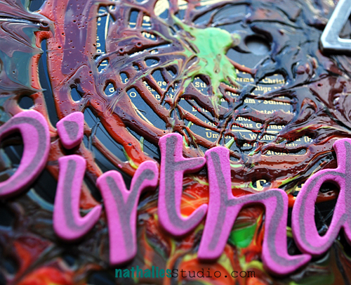
Spinning, Pouring, Stringing or…How to turn an LP into a Birthday Card

Lot’s of birthdays of dear friends are coming up the next couple weeks finally to celebrate the big 40 was my friend M.

Well – while playing and showing possibilities with some paint media for some Bonus Techniques for Lesson 7 of the Über*Media Acrylic Paint Online Workshop I created this LP Birthday Card for him

This photo is cracking me up at the party – funky M. on the left and funny crazy S. on the right- LOL ;) BTW- that was not the reaction to the birthday card – snigger ;) I think I said something stupid…LOL

It was a fun party…just a bit too cold outside …but we are true Hamburgers…if it says it’s May on the calendar it is time for BBQ outside, no matter how the weather turns out and even if it is a chilling 8 C (46 Fahrenheit) ;)

Here are some details of the LP

It was fun working with Liquitex Acrylic Paints, Inks, String Gel and Pouring Medium – and there are so many fun things you can create with it.

What was the most “unusual” material you ever created a birthday card with?

Have a gorgeous day

hugs

Nat


Comments (6)

  • Sue Clarke

    |

    Rock’in b-day card for sure Nat. I used b-day candles on a card once. Not unusual per say but I usually put them on the cake (not the card).

    Reply

  • Bev W.

    |

    This is totally cool! Looks like a lot of fun! I think you have me beat as far as the most unusual..lol! Love it Nat:)

    Reply

  • Riikka

    |

    Great card – love the texture of it!

    Reply

  • Marja Seidemo

    |

    well, it wasn´t really a birthday card, more a Hello-card to a friend but years ago i filled a vintage glove with plaster and before it had set i put a letter in a roll with a satin ribbon around it, in the glove/hand. It was sooo heavy and very expensive to ship..It was worth it though, he got very happy:-) I think he kept it for all these years..

    Reply

    • nathalie-kalbach

      |

      How cool Marja! I am sure that was REALLY heavy- lol- but the idea is so cool – think about putting it on a canvas!

      Reply

Leave a comment

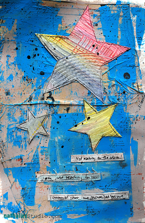
Keep your Eyes on the Stars…or/and Your Feet on the Ground

Theodor Roosevelt said this…well- without the “or” in between – smart man  ;)

I had some awesome opportunities coming up this year…and sometimes they would just vanish, or they would just be not as awesome at the second glance or they would be just under ridiculous conditions or they would be just not doable. It is always a crashing experience…because from the high feeling of YEAH-double-fist-up-in-the-air comes the bad fall to reality that hurts a lot.


But ….I start to realize that it is awesome that the opportunities were even showing up…even if they weren’t really opportunities in retrospective LOL – because you know what? There will be always some opportunities coming and some will be just the right ones for me. Actually an awesome opportunity just showed up and it might be really really cool :)

With each of those shattered opportunities I learned something…I learned something about myself ….I learned what I want and what I don’t want…and that is pretty cool… Without those shattered opportunities I wouldn’t know myself that much and hey….I spent most of my time with me….hahahahah- so better know this person, don’t you think? LOL

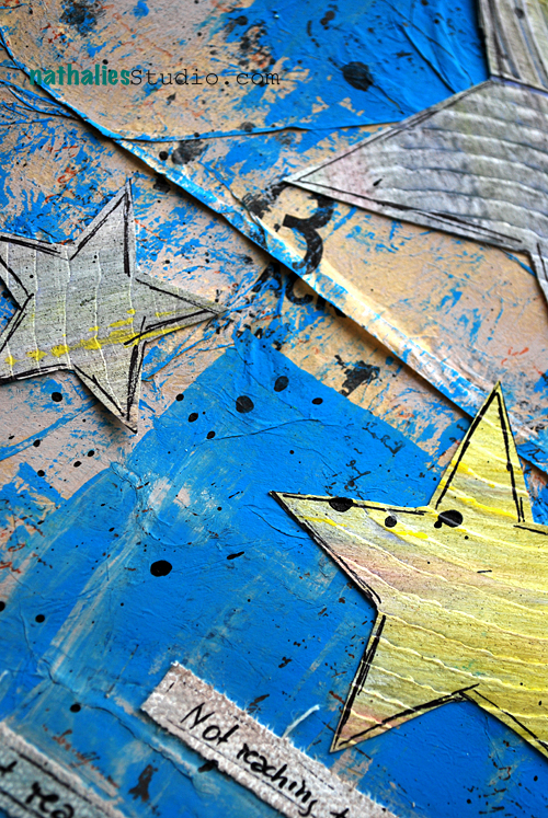
I am not reaching for the stars. I am just reaching for mine. There is one personal star out there shining for just for me…and one just for you, and you and you!

Hope you star is shining bright for you today!

huge hugs

Nat


Comments (16)

  • Julie Short

    |

    What a beautiful and thoughtful post Natalie! Your art piece amalgamtes with your thoughts so well.

    Reply

  • mjmarmo

    |

    I love this!! I would also love to use this quote! Wonderful page!!

    Reply

  • Lisa Flaherty

    |

    Such Wisdom, Nat! Thank you! It’s good for me to hear this, and also to realize that not everyone wants the same star, or has the same dreams. Love the strips that you have written on. Are they canvas? Your writing is so clear, it doesn’t look like it is on fabric, and yet, the little bit of fray tells me it is!

    Reply

    • nathalie-kalbach

      |

      Hi Lisa, it is canvas fabric but coated on one side with gesso- that is why the writing works so well :) Huge hugs!

      Reply

      • Lisa Flaherty

        |

        Thank you! I definitely need to give this a try! :)

        Reply

  • jjsobey

    |

    yummy yummy texture on this.

    I hope that this new opportunity is really awesome – I look forward to watching your exploits!

    Keeping my eyes open for my star too – it’s a sneaky little bugger. :)

    Reply

    • nathalie-kalbach

      |

      hahahaha- jj- you made me laugh. Mine seems always turn into a shooting star crumbling down the earth ;)

      Reply

  • Bev W.

    |

    Oooops….forgot to tell ya…LOVE your page!!! All the texture and lovely color:)

    Reply

  • Bev W.

    |

    Your so encouraging!! It’s ok to be me:))) Thanks Nat!! Have a super day!

    Reply

    • nathalie-kalbach

      |

      Thank you so much Bev! Have a gorgeous day too :) huge hugs Nat

      Reply

  • Dottie

    |

    Hmm, you are right. We can’t reach for all those stars, can we. I will keep my eye looking for my star as well. Love the thought and the images. Thanks for sharing.

    Reply

  • Debbie Page Harris

    |

    Thank you for posting this…..it was a real “eye-opener”….LOVEEEEE your art!…you are an awesome inspiration!

    Reply

  • Mary Bennetts

    |

    Love your page and quote and the way you think of it. Me I would just love some opportunities , maybe they are there and I just don’t see them

    Cheers
    Mary x

    Reply

  • france papillon

    |

    I love your train of thoughts on this topic and the awesome art journal page it inspired you. All that texture is just yummi!
    My thought on this: ‘aim for the moon, even if you miss you’ll land among the stars’ by W Clement Stone ;)

    Reply

      • nathalie-kalbach

        |

        LOL- sure- if that is a good quote ;) – said by the infamous Nat Kalbach ;)

        Reply

Leave a comment

Default Earworm or Lost in Translation

A catchy tune in German is called an Earworm – literally translated. Meaning you can’t stop singing the song in your head. I actually like the word – you say Ohrwurm :)

Such an Ohrwurm I shared in my Über*Media Acrylic Paint Online Workshop in the 3rd lesson published monday (you can sign up anytime – but right now you join in real-time over the next weeks).

It is by Django Django and called Default – a song I can’t get out of my head and I love the video!

[vimeo http://vimeo.com/35527420]

What’s your Ohrwurm right now?

Have a wonderful catchy tuned day ;)

Nat


Comments (11)

  • jjsobey

    |

    My current earworms (and yes – I use that term too!) are “Somebody that I Used to Know” by Gotye, “I’m the One that’s Cool” by The Guild, and “I’m an Imagineer” by The Imagineers.

    Reply

    • jjsobey

      |

      PS – I rather like the music choices you pick for your videos – I get to hear music that is new to me.

      Reply

      • nathalie-kalbach

        |

        LOL- I am glad you like it- I have a weird music taste sometimes ;)

        Reply

  • Sue Clarke

    |

    Luck of the Draw by Bonnie Raitt but it changes daily depending on what song my hubby or son “puts” into my head before they walk out the door. LOL

    Reply

  • Caroline

    |

    Today it is Jennifer Lopez ft Pittbull – On the floor.

    Very catchy and summery song.

    Reply

  • Katja

    |

    Die Ärzte: Sohn der Leere.
    Oh yeah! Habe die Ehre. Ich bin der Sohn der absoluten Leere.
    Am singing it nonstop since yesterday.

    Reply

  • Marsha.

    |

    Hadn’t seen the video before… Cool! Great Ohrwurm too, mine usually are the songs you rather not have in your head :-s

    Reply

Leave a comment

Second Floor Challenge #4: Circles

Are you ready to take the second floor this time? If you have no clue what I am talking about- read all about it here :) The Second Floor Challenge

So today is our fourth Second Floor Challenge: Circles

Click here to see what Julie did

Whatever that means to you or however it inspires you.  The prompt is simply meant to get you started.  The level of challenge you aim for is entirely internal and up to you.

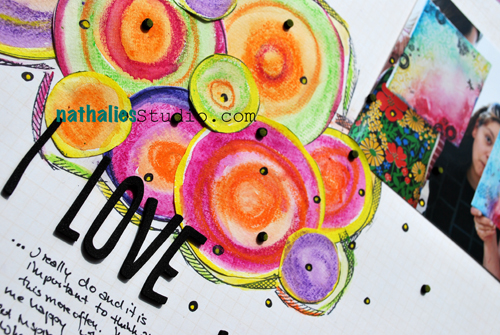
Circles…I love circles…Circles are a big part of my creating ….I use them often…hand drawn, cut out of paper, made with markers. Circles are just such an amazing form to tie elements on a layout or project together. And so I decided I would this time just start with circles, instead of adding them later to my work and see where those circles would lead me to.

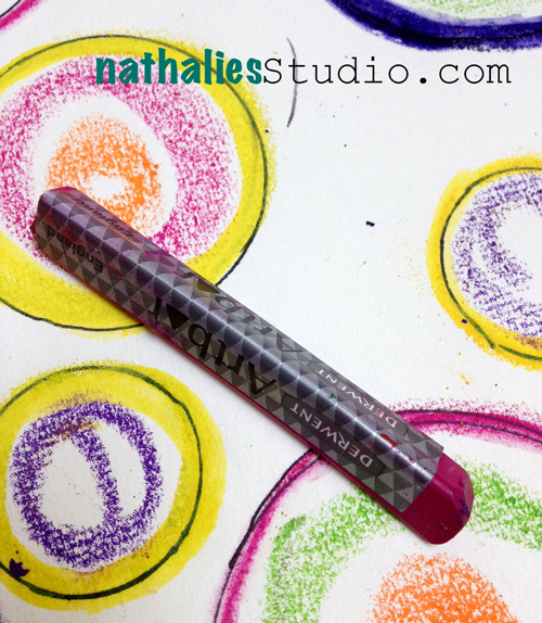
I started out on some water-color paper, drawing circles and adding some Derwent Inktense Blocks to it. Then I grabbed my Derwent ArtBars and added some more colors to the circles- simply just playing.

I liked the outcome but what to do with it?

So I decided to take those circles to the 2nd Floor. I chose a paper- a Pink Paislee Mistable Paper – which I would usually transform, as this is what they are made for. Those papers are giving you permission to play with water based paint media on top to change the color of the background to your liking and reveal through a resist some nice patterns on the paper. But I decided to let the background be as it is….and added the circles.

I added some marker circles and then I decided to actually go also a different design route. I wanted to place the photo in a for me unusual way – so I placed it in the right corner and I also wanted the circles to be part of the focal point even thought I kind of clustered them. So I formed my visual triangle, that leads the eye including the circles as a part forming the triangle.

(photo credit: helene larsson)

I really love this – although it is a bit different from what I usually do

What I learned from this challenge:

  1. Circles are a great starting point to warm up and then do something new with them.
  2. I like hand cut circles more than perfect cirlces…I think it just fits better with my style
  3. It is fine to leave a paper that is made for changing the color as it is
  4. Breaking habits on where to place stuff is fun – it lead me to something I really like
  5. I like how the Derwent ArtBars and Derwent Inktense Blocks work together
  6. playing with watercolor paper and including that into my projects is a new passion of mine- there is just something about this paper that makes me think “you deserve to be used more often because you are beautiful!”
  7. This challenge also lead me to thinking how much I love what I do – how happy it makes me to teach and see students be inspired and that inspires me….the circle closes…..

If you’d like to show off your response to this Second Floor challenge, leave a link!


have a wonderful day

hugs

Nat

Comments (16)

  • lenna young andrews

    |

    Nathalie, I’m not sure if my earlier comment went through . . . but wanted to say thanks so much for visiting my blog to see what I did through the circle challenge hosted by you & julie. It was my first Second Floor challenge and I enjoyed. Love your colorful circles!!

    Reply

    • nathalie-kalbach

      |

      Thank you Lenna- we love seeing what you all also do with the challenge – it is so inspiring. The next one is going up on tuesday :) Huge hugs and have a wonderful weekend!Nat

      Reply

  • lenna young andrews

    |

    I really love your bright circles, Nathalie. thanks so much for visiting my blog and seeing what I have done for this challenge! I really appreciate You & Julie hosting & inspiring. Lenna

    Reply

  • Clare

    |

    Love the circle you have created using inktense blocks and fab finished page too. x

    Reply

  • msmathey

    |

    Your handcut circles are fabulous and I love the doodling around them!!

    Reply

  • Yvonne

    |

    Das sieht genial aus!
    LG Yvonne

    Reply

  • Alice

    |

    really beautiful! i like how your circles look 3-D!

    Reply

  • Dolores

    |

    Love the different take you did with your circles. About midway through your pictures I thought they would make neat flowers but love them clustered as circles also.

    Reply

  • Lisa Flaherty

    |

    Gorgeous, Nat! I love all those in(k)tense colors and the way you clustered the hand cut circles. Perhaps this is not your usual style, BUT I think it is completely YOU! A fave, fo’ sho’!

    Reply

  • misty

    |

    I love the way you used those circles! This looks fantastic!

    Reply

  • jjsobey

    |

    I does look different for you – but I like it! I kinda want to play with watercolour paper now.

    Reply

  • Martha Richardson

    |

    Oh man…I haven’t had the chance to start #3 and now #4…I {heart} circles…always have…going to be fun. Of course this may not happen for awhile…

    Reply

  • MiaKL

    |

    What a lovely challange, this I will hop on to. And look at the other challanges as well.

    Reply

  • Jessica

    |

    so nice and colorful, love it

    Reply

  • Louisa Dubois

    |

    Beautiful Nathalie and I love your layout!

    Reply

  • Sue Clarke

    |

    I really like this LO and it is different from your usual, but funny enough, it reminds me of something Julie would make. :-)

    Reply

Leave a comment

Of Spiders and Exhausted Heroes or How I indulged in a Me-Day

A couple of months ago, knowing that this would be a weekend without traveling and actually without my sweet other half (this time he was traveling)…I had signed up for a Collage workshop at the Hamburger Kunsthalle (art museum here in Hamburg). When the day approached I was almost ready to skip it…so much stuff to do – wouldn’t it be rather smart to stay home and just work?

Nope…I decided in the morning, after I had a nice breakfast…NOPE….I will go and enjoy this day!

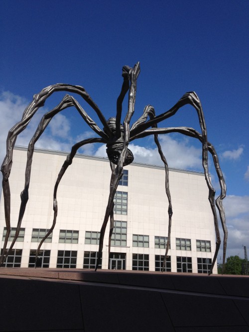
Now, I can see beauty in this spider (my Australian mates may remember my fear of spiders ;) ) – this Maman by Louise Bourgeois ! What an amazing installation. Gotta go back before that exhibitions ends. Later in the day there was a couple dancing tango under the spider. It was a wonderful sight and very romantic.

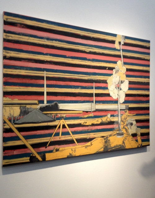
Before the workshop started we all went through the museum and looked at the Exhibition which was called Exhausted Heroes. It featured the work of Ferdinand Hostler, Aleksandr Dejneka and Neo Rauch. The painting above- and no those cell phone pictures do no justice to those paintings, you have to see them in real live- is by Neo Rauch – love his work and color combinations.

We mostly looked at Neo Rauch’s Work as it is very figurative and it goes into collage painting. This above painting of him was the last we looked at and really inspired we made our way back to the museum’s workshop rooms.

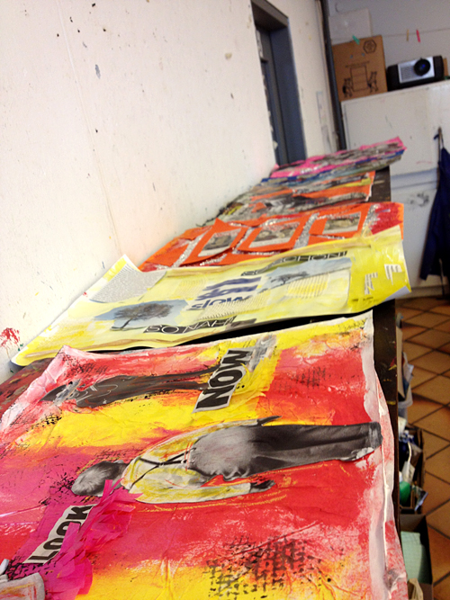
It was amazing- there was no explanation needed on what to do, we had simply looked at those paintings, were totally inspired, nobody talked and we all just grabbed magazines and paints – and started working. Look at the first row of work….can you see how the last painting inspired most of us in the color choices?

It was fun to be in a total different place with different materials and just use what was there.

It was also very interesting to work on a totally different scale – this is appr. 12 x 17 inches.

We always talked about our work afterwards and it was interesting to see what the others had created and what they thoughts were. It was so inspiring and amazing.

For the last piece I forced myself to choose a different color combination from my usual ones…

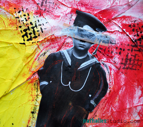
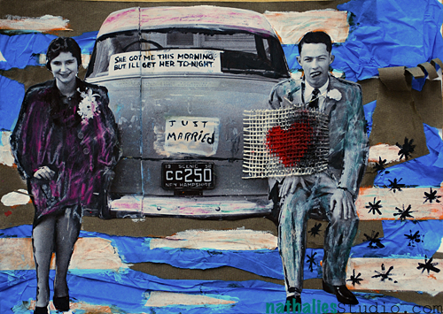
And…shocking…hold on to your seats now…I love this one….yes I do …it makes me smile and I enjoyed creating it a lot. I call it “The American Dream” .Your interpretation to think why I chose this title- LOL.

And the moral of this story? Well…sometimes you need a ME-Day, relax, have a scrumptious breakfast, go out into the air, meet new people and do what you love in a different environment. I was in such a friendly happy mood when I came home – ahhhhh!!!! And it made working on sunday so much easier…I got twice as much stuff done then usual…so the “lost day” was actually well invested ;)

Looking forward to the next ME-day I penciled into my calendar.

What would you do if you had a Me-Day?

Nat

Comments (12)

  • france papillon

    |

    looks like you had an amazing time, love the pieces you made! but the spider… with or without dancers… yuk!
    i have lots of me-days lately, wish i could give some away to peeps in need! ;)
    have a happy week, bereknuf!

    Reply

  • Dolores

    |

    You created some wonderful art. I’m glad you got a day away to play differently and be inspired. I think everyone needs to do that occasionally.

    Reply

  • Rebecca

    |

    Super work, glad you enjoyed yourself…and I know just what you mean about the ME-DAY we don’t dop it often enough. I went to a craft fair on Saturday and spent a couple hours yesterday (whilst my boy/men folk watched the football) playing with my new stash and felt a whole lot better for it :)
    Happy Craftin
    Rebecca

    Reply

  • Martha Richardson

    |

    FAb work…never skip a day when you can learn… I’ll let you know when I get a ME day…it’s coming soon!

    Reply

  • Marsha.

    |

    Love, love, love the yellow, teal, white circles! I’m hoping for a me-day (in another city) next week. I actually made an appointment to visit someone at the end of that day, as that will force me to go through with it :-).

    Reply

  • M. Carmen - Cuchy

    |

    such a great idea to attend that workshop. Love the last collage.
    My Me-day? mmmmm alone at home??? I droll over only visualizing it!! :)

    Reply

  • Bev W.

    |

    Nice work Nat!! I would find myself an artsy retreat that would take me out of my comfort zone. Always want to learn new ways to play:)

    Reply

  • Birgit Kunte

    |

    Ich liebe deine Sachen, aber das letzte Projekt ist der Knaller auch von den “anderen” Farben her. Mhh, mal sehen, an einem Me-Day, aufstehen, joggen gehen, dann Yoga, dann Frühstück, dann an meinen Scraptisch mit möglichst vielen netten Mitscrapperinnen. Abends ein feines leichtes essen und irgendwann in der “Früh” ins Bett fallen. :-) Liebe Grüße und eine schöne Woche, Birgit

    Reply

    • nathalie-kalbach

      |

      oh das klingt nach einem sehr schönen-Me-Day :) Auch Dir eine schöne Woche – knuddel – Nat

      Reply

Leave a comment