Creative Squad

Creative Squad: On Repeat – Jordan Hill

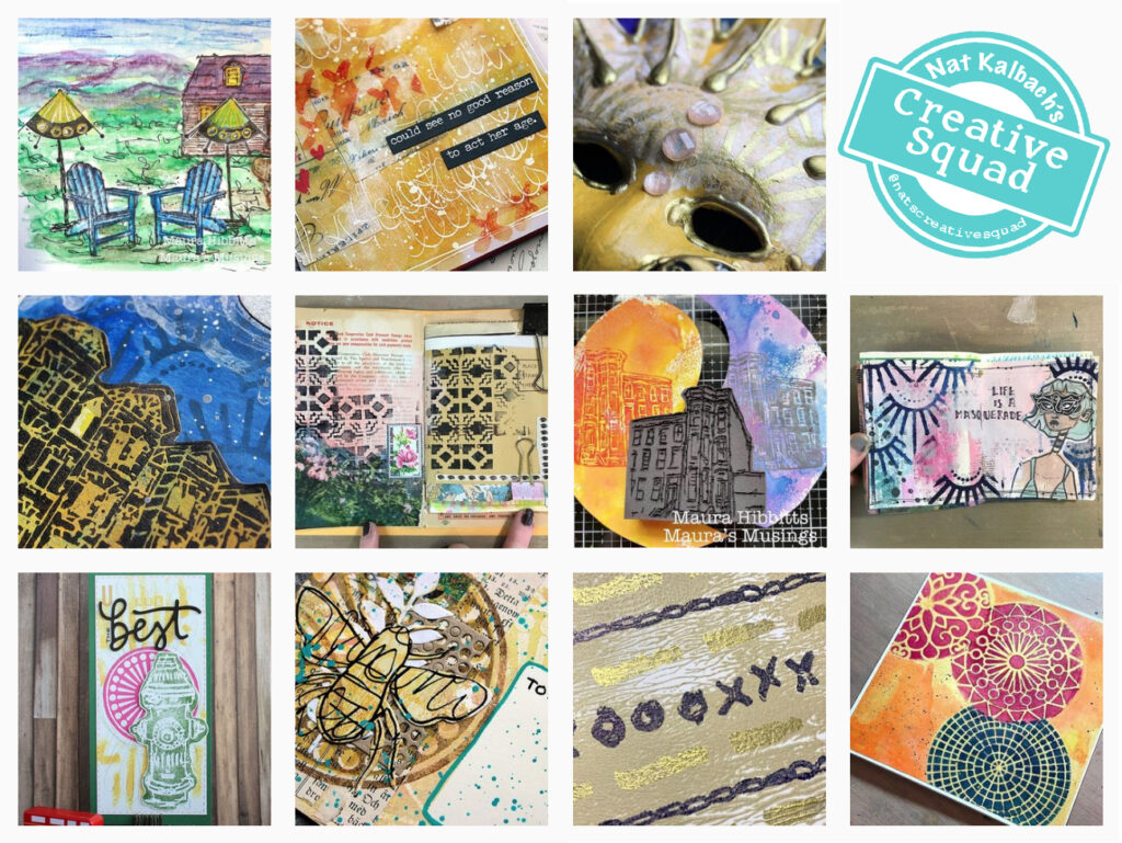
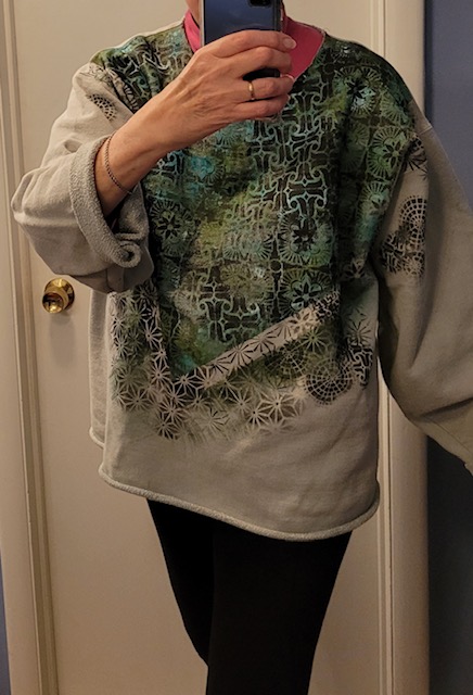
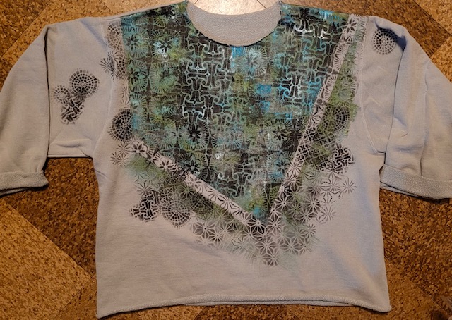
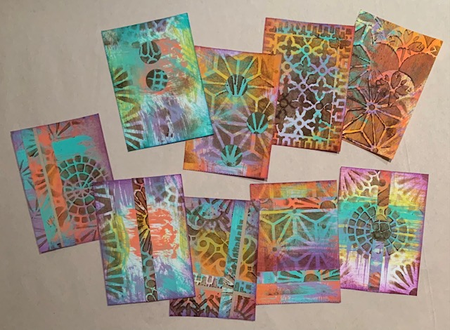
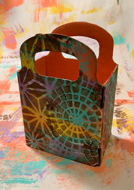
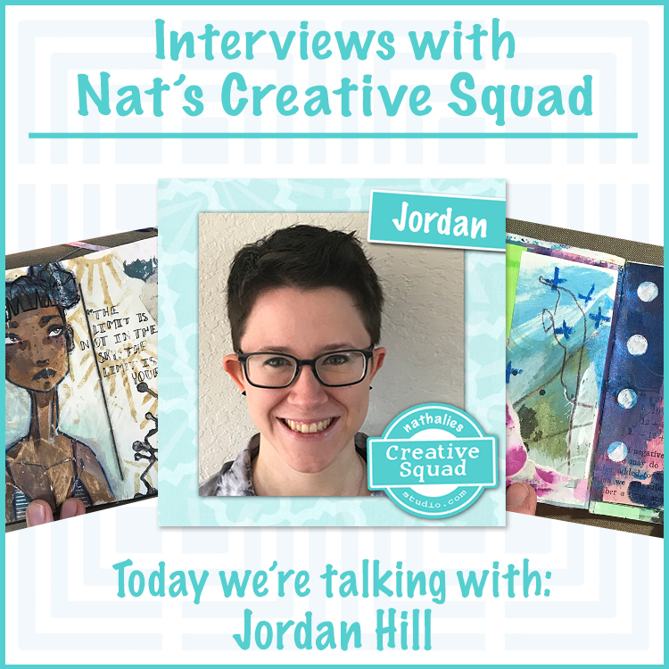
Hello from my Creative Squad! Today we have a post from Jordan Hill who is using my Mini Hex foam stamp set in her take on our monthly theme: On Repeat – Let’s play with patterns! Repeat a design motif or shape to create a pattern-inspired project of your choosing.


Hello everyone! I’m excited to be back with a brand new project for July! I’ve been at a bit of a turning point with my artwork recently, so for this month’s theme of “On Repeat”, I tried to combine some of the illustration work I’ve been doing with my more typical art journal style. I had a lot of fun using this project as a bit of a self challenge and I hope you enjoy following along with the process.

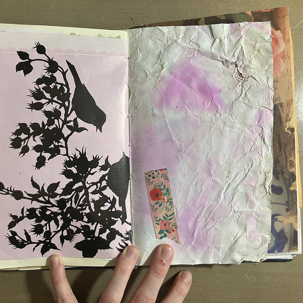
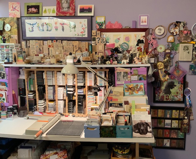
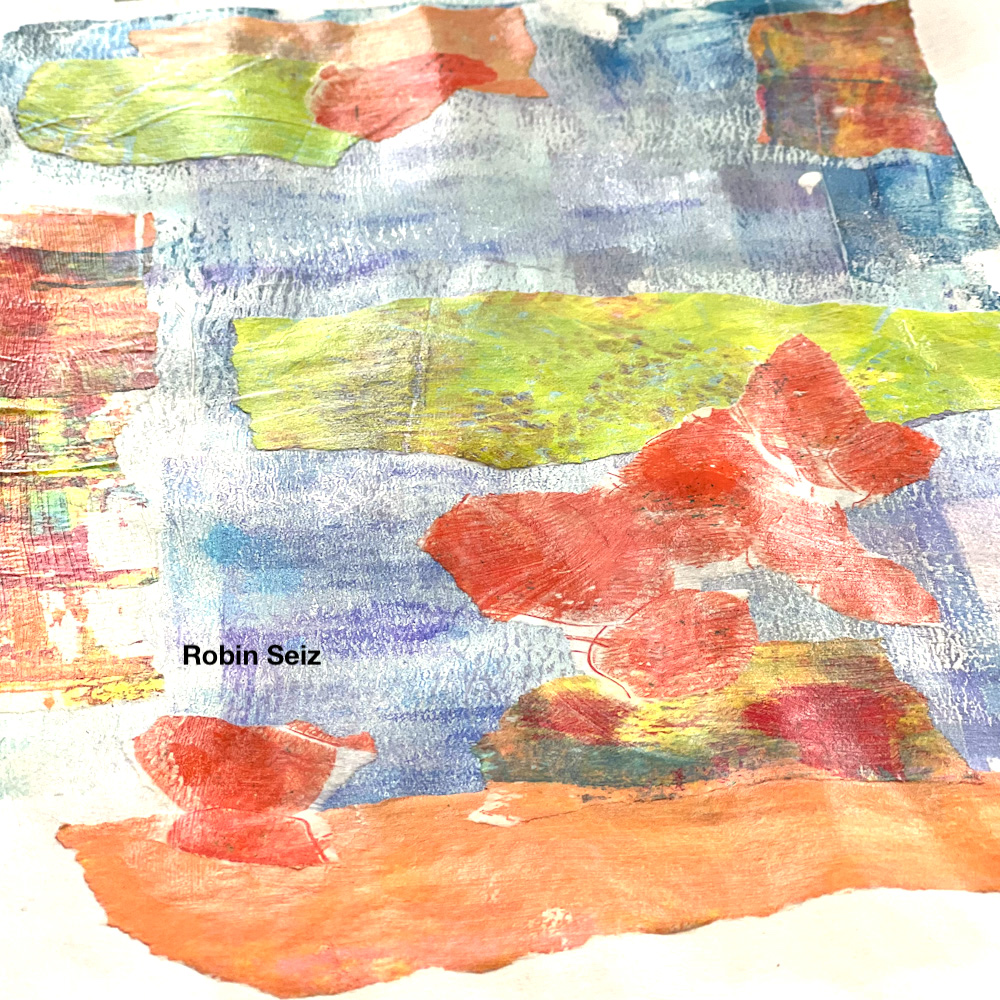
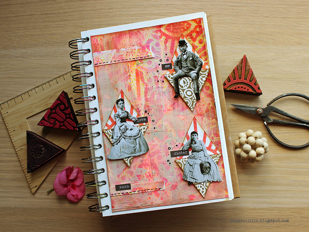
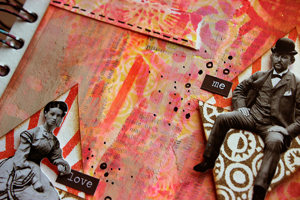
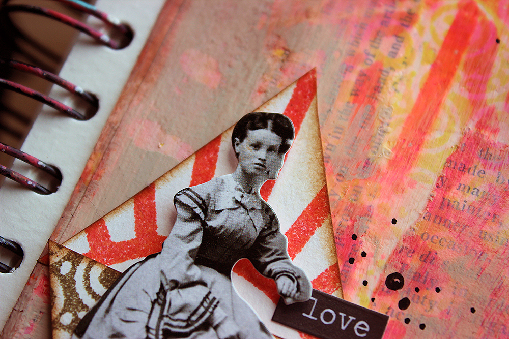
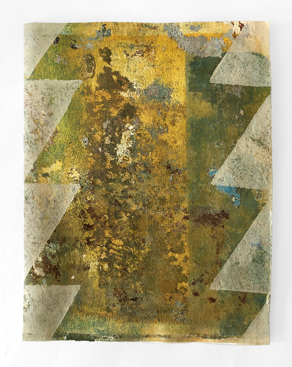
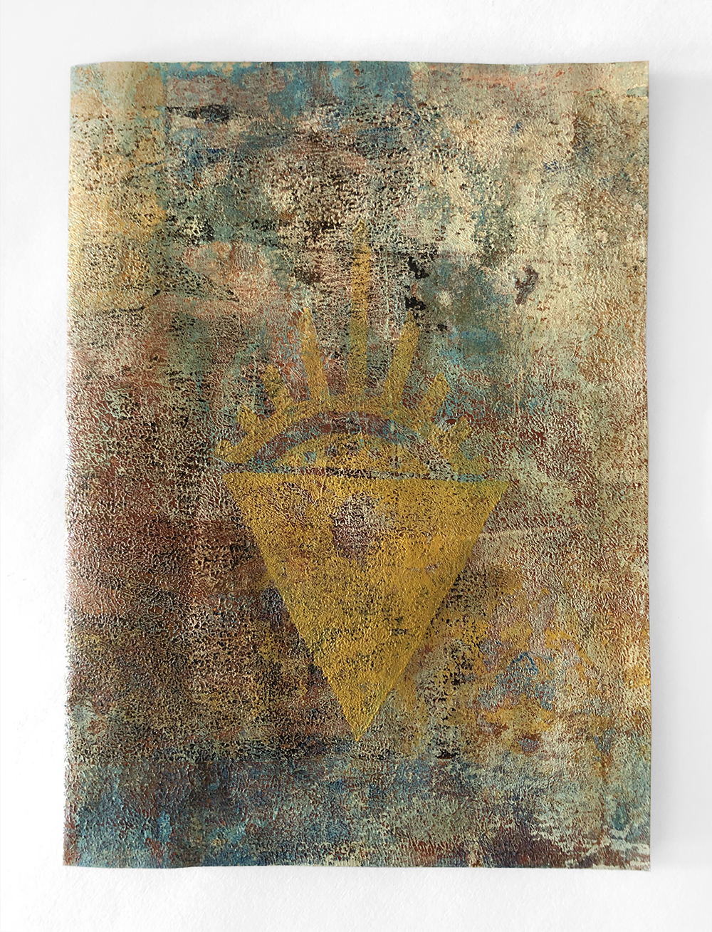
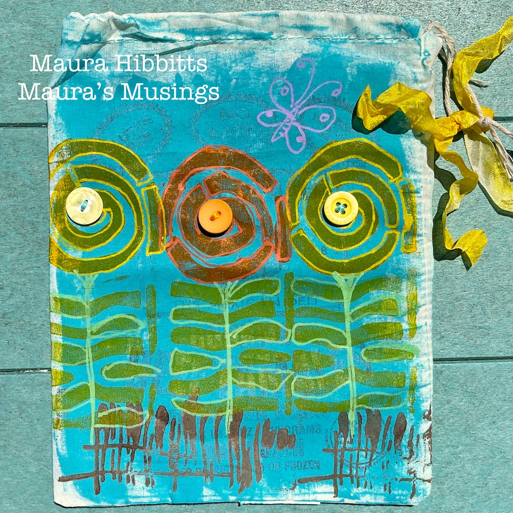
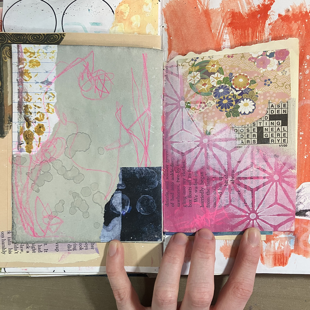
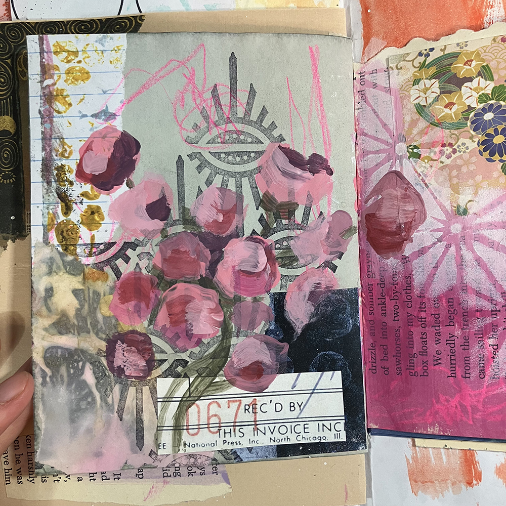
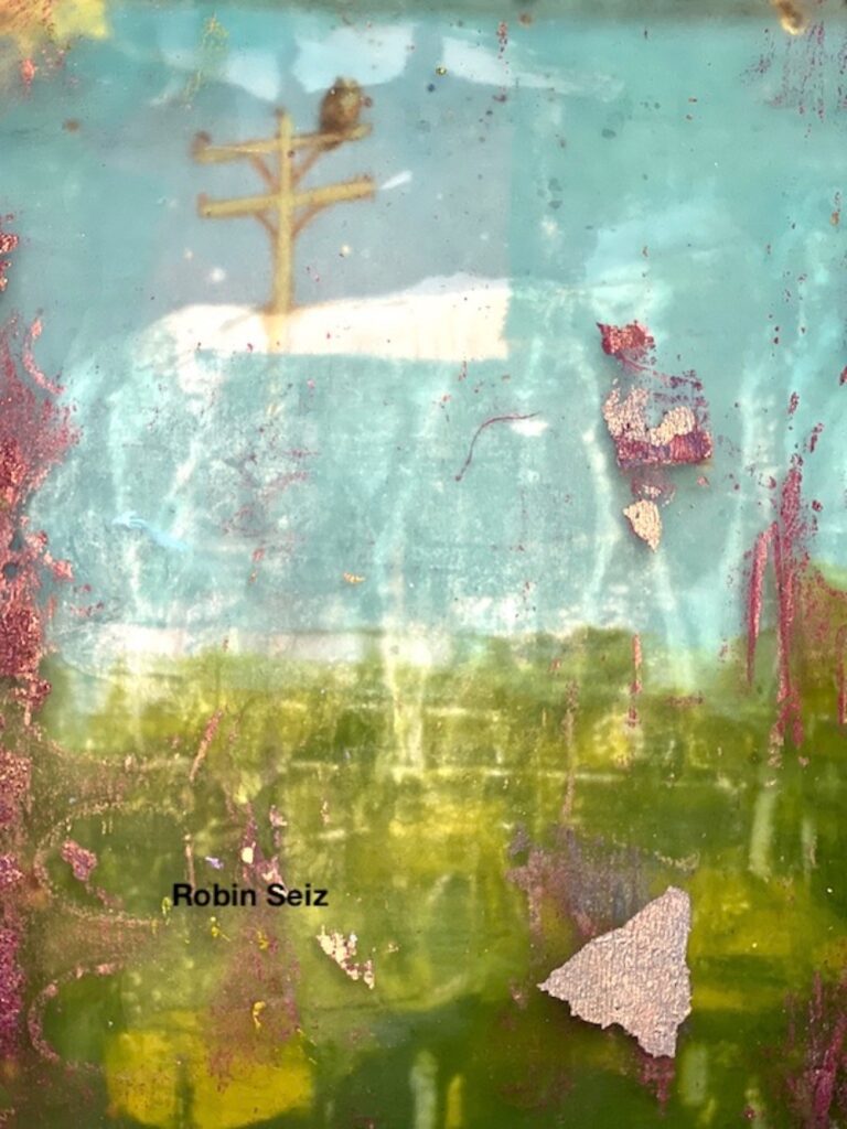
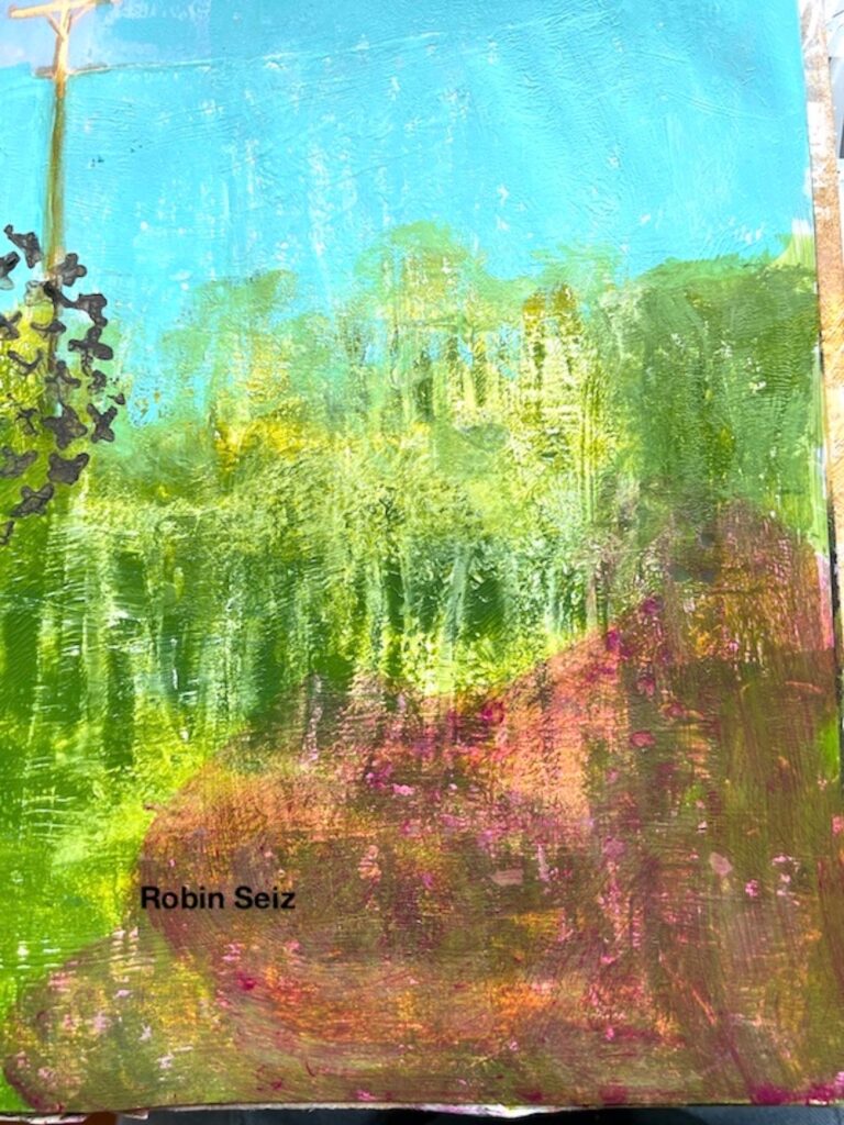
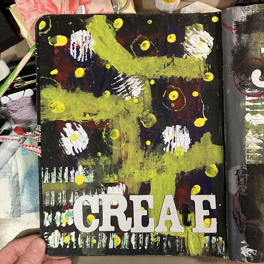
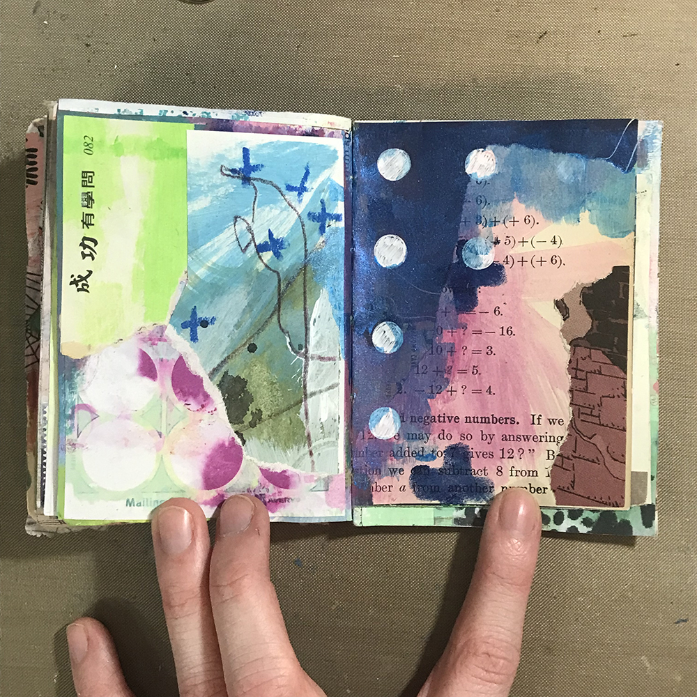
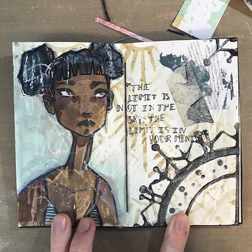
First things first, I selected a page to work on. I decided to use a base that was a bit larger than I typically work, since I had an idea that I knew would benefit from a little more space. This particular background was a piece of eco dyed paper, which means that it has a lot of wrinkles and texture. I had also previously applied a scrap of washi tape to this page, so I simply decided to work over the top.

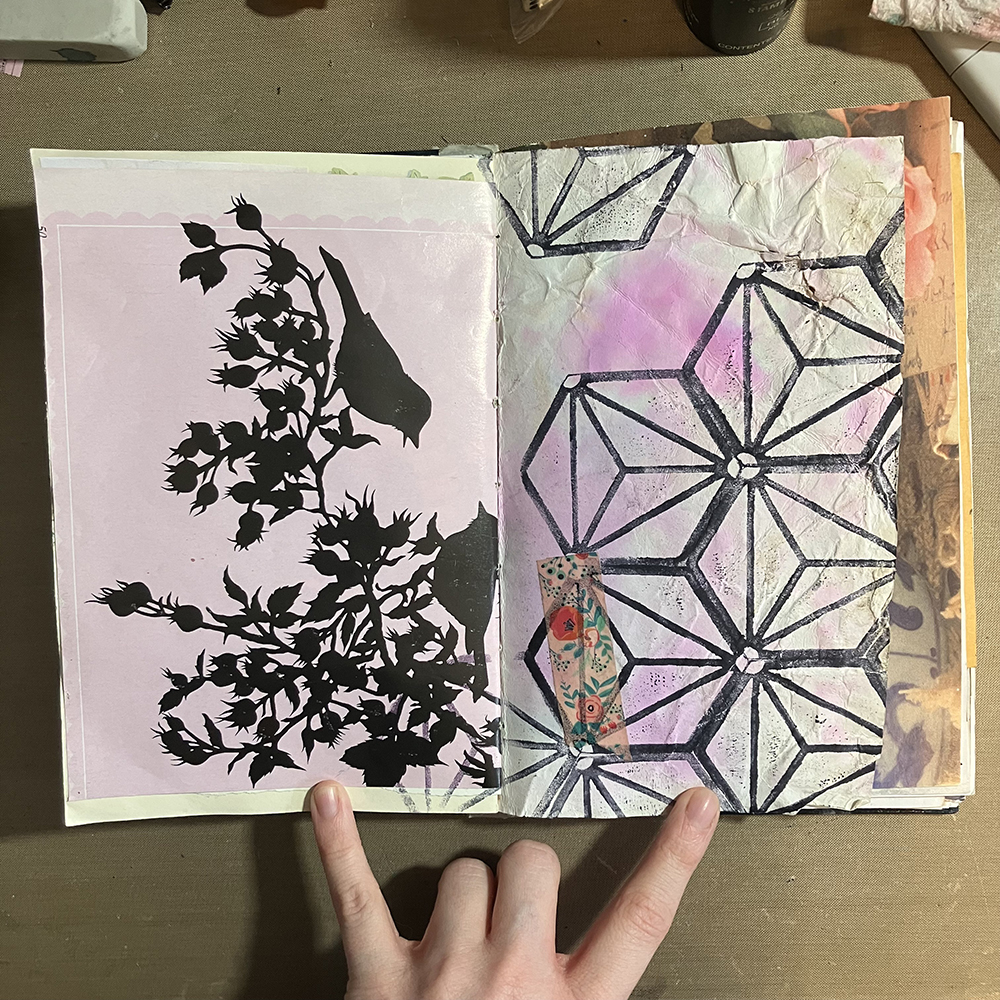
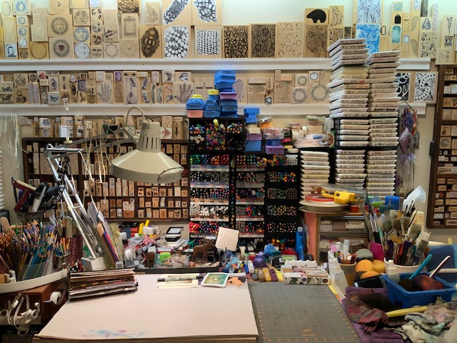
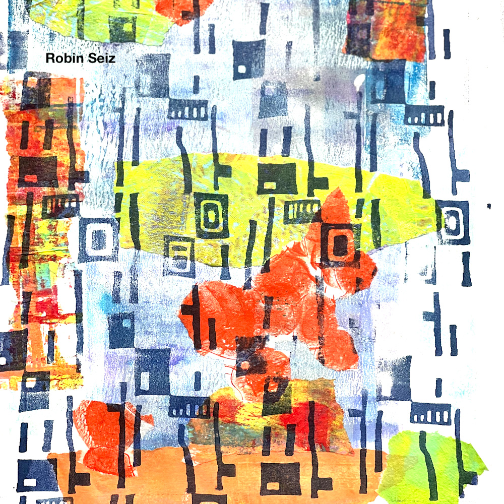
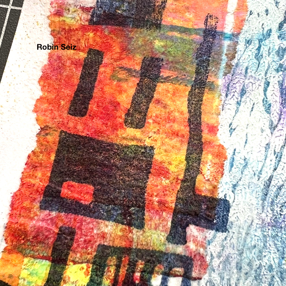
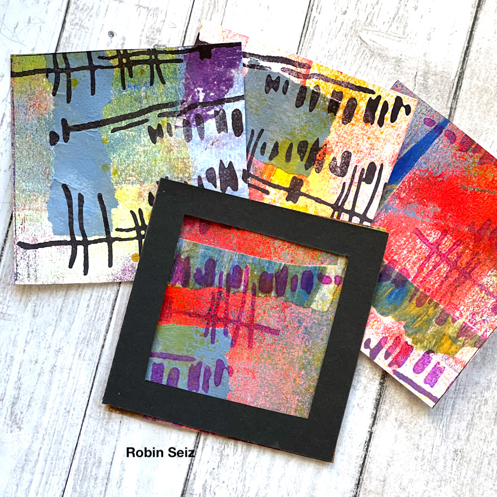
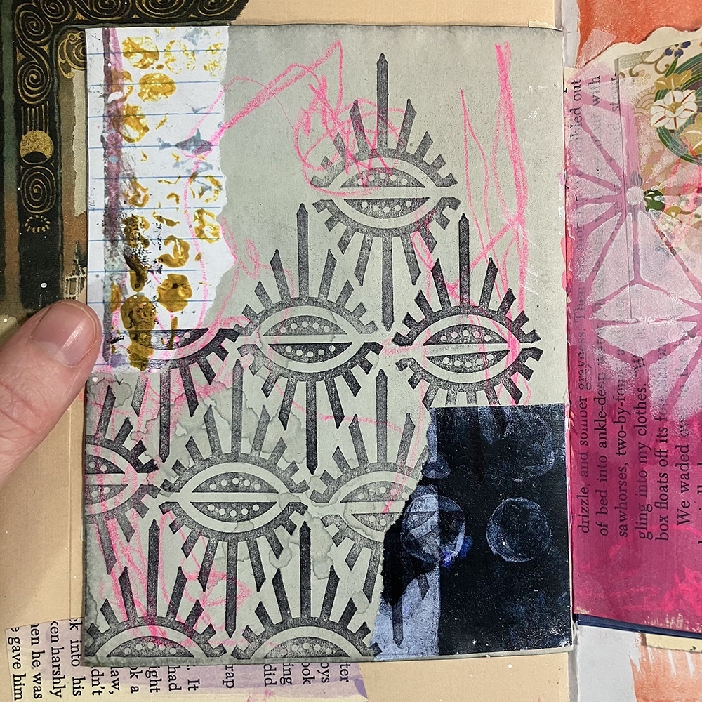
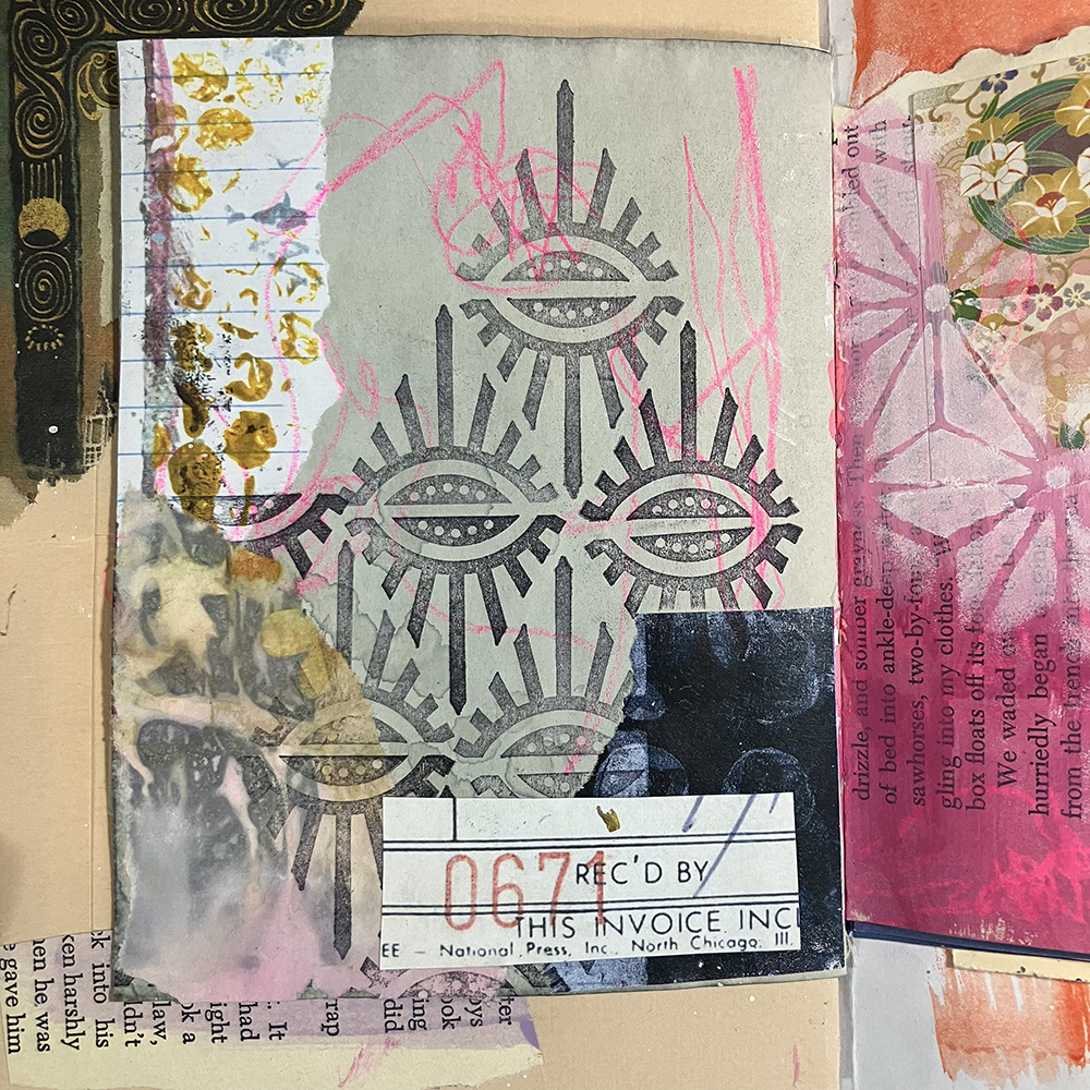
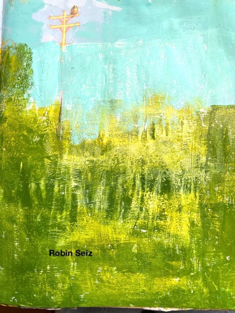
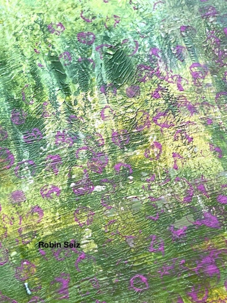
To get things started, I used one of the stamps from Nathalie’s Mini Hex Foam Stamp Set to create an all over pattern across a good portion of the page. I applied ink to the foam stamp using a roll on ink pad re-inker, which is one of the ways I’ve found to be most effective at applying ink to the stamps. You don’t have to fuss around with a brush, and getting an even layer is fairly simple, as you only have to roll it over the surface.

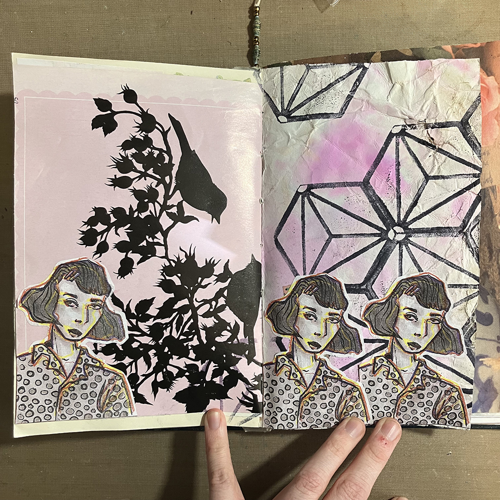
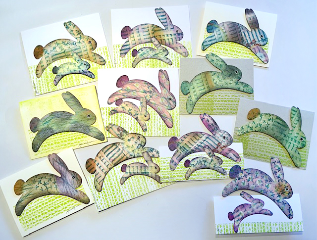
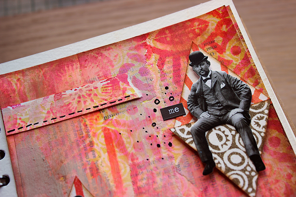
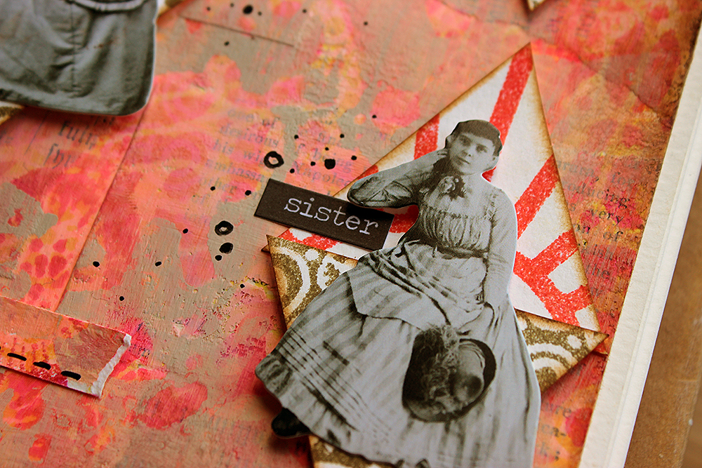
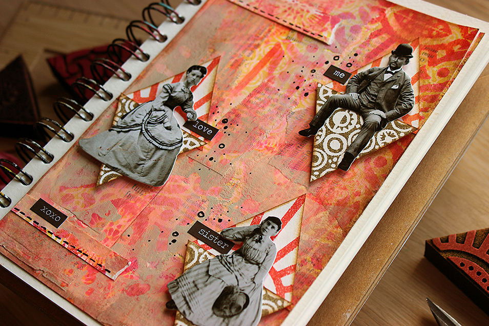
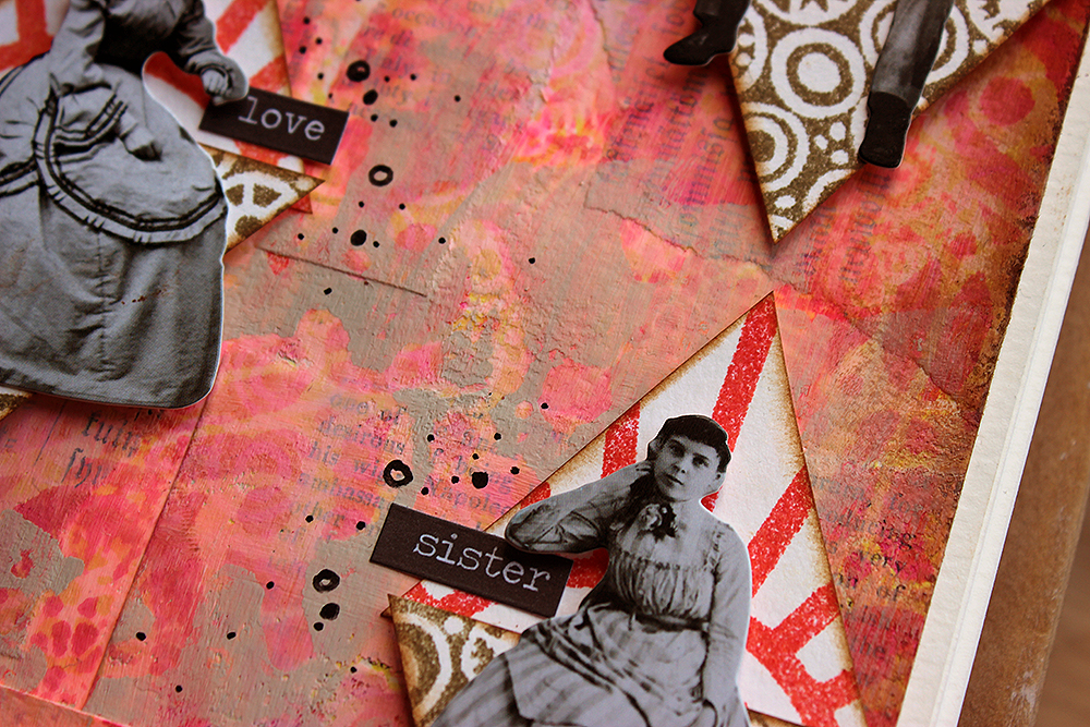
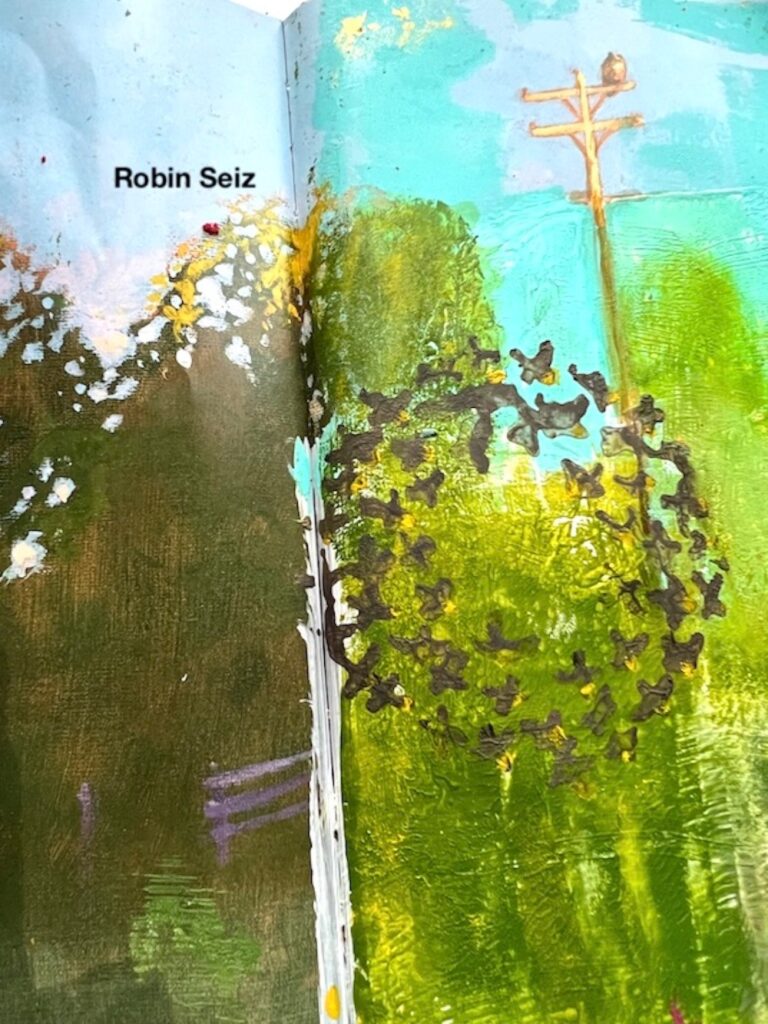
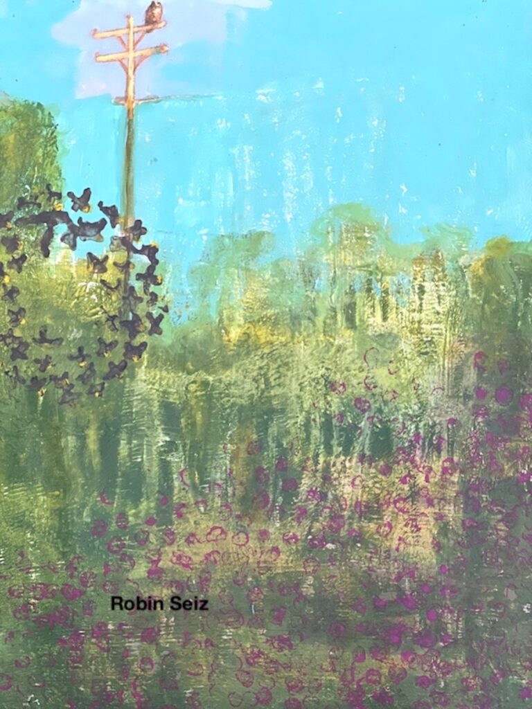
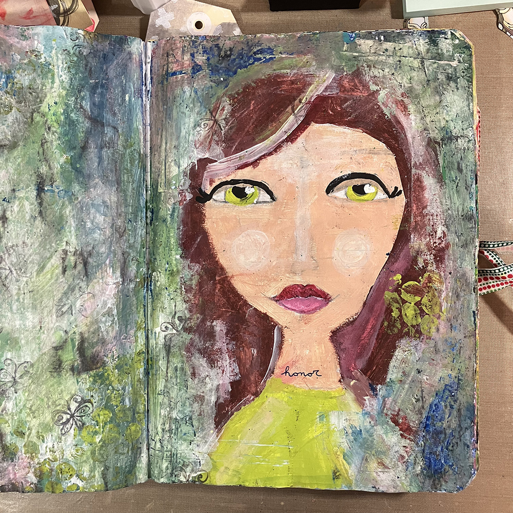
Once I had the background in place, I made a few copies of an illustration I did on an index card and painted with ink washes. I cut three of these copies out, and then placed them along the bottom of the spread. Even though I was mainly working on the right side of this spread, I also added one to the left hand page to try to tie the two together. I thought the use of the same image in multiple iterations fit the theme of “On Repeat” quite well.

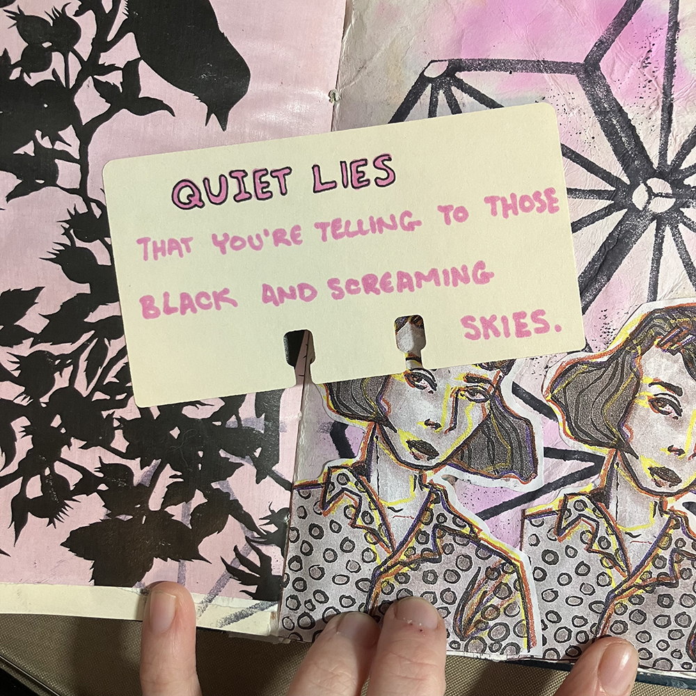
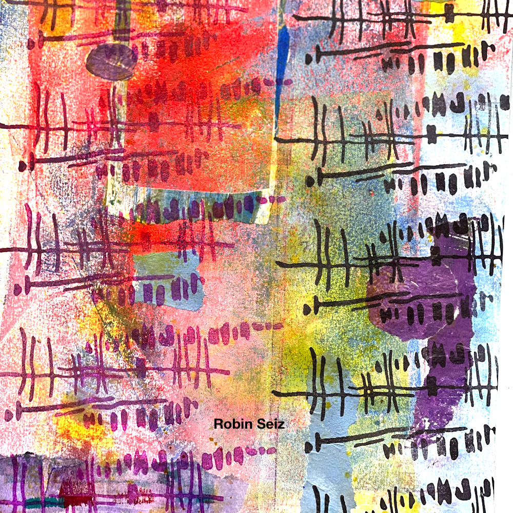
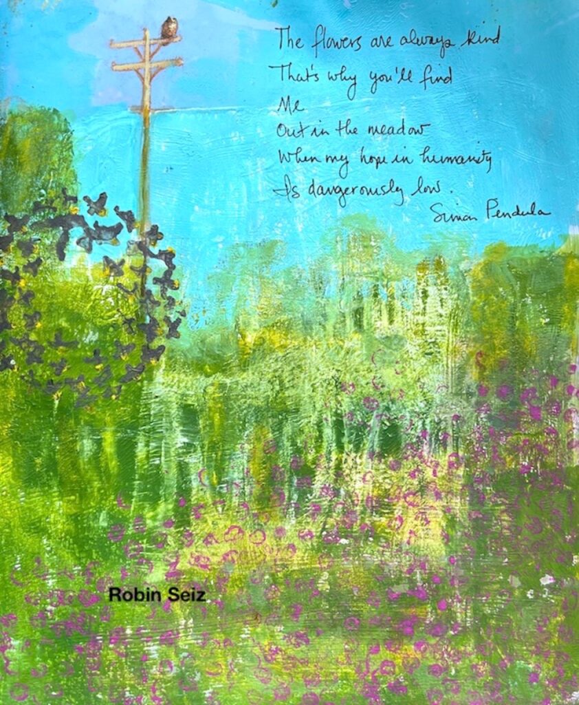
Next, I prepared the words I would be adding to this page. The quote I chose was a few lyrics from the song Smokey Eyes by Lincoln, which is a song I’ve been playing on repeat lately, so it felt on theme. I used a spare index card as a base and wrote my quote using a Bic marker in Flamingo Pink. I then outlined the marker with a thinner black pen in order to give them a bit more definition and make them feel more stylized.

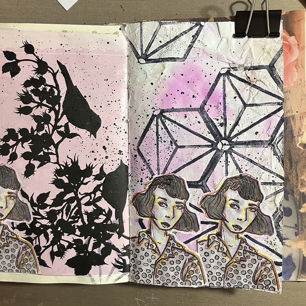
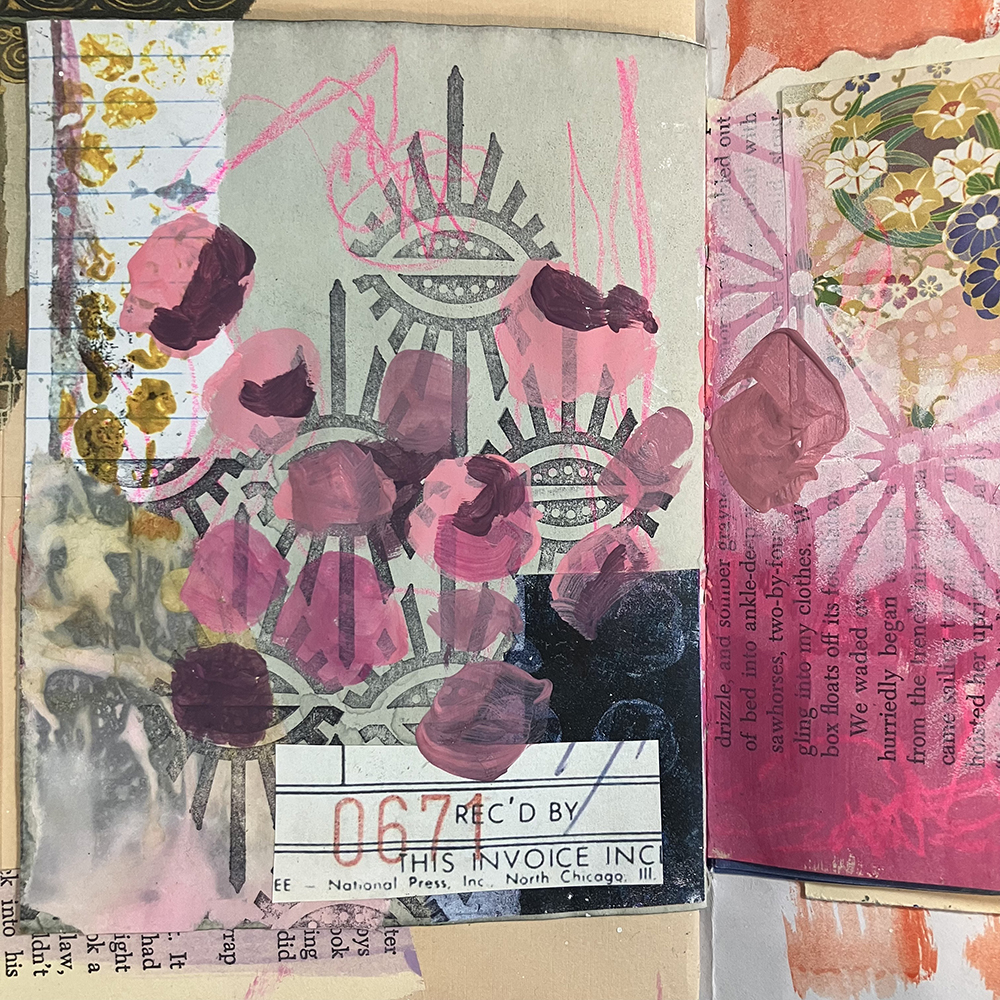
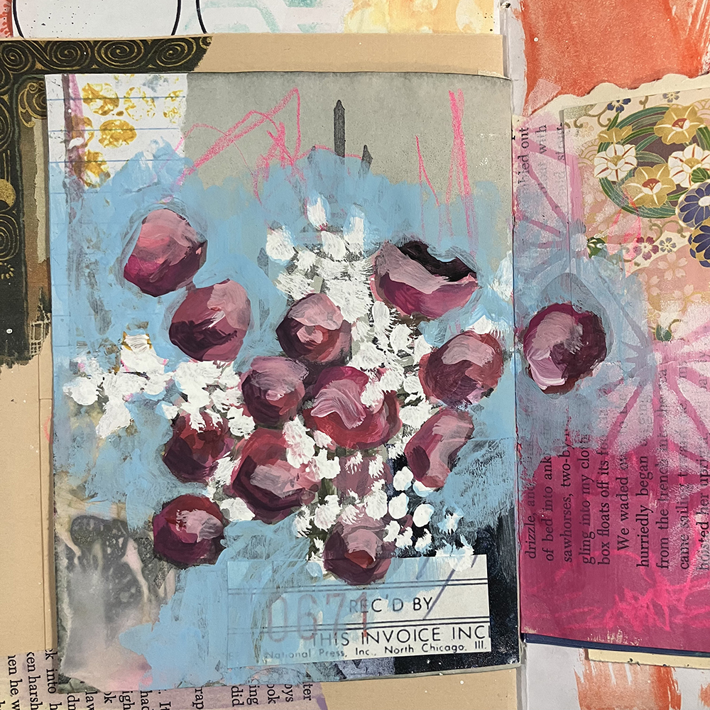
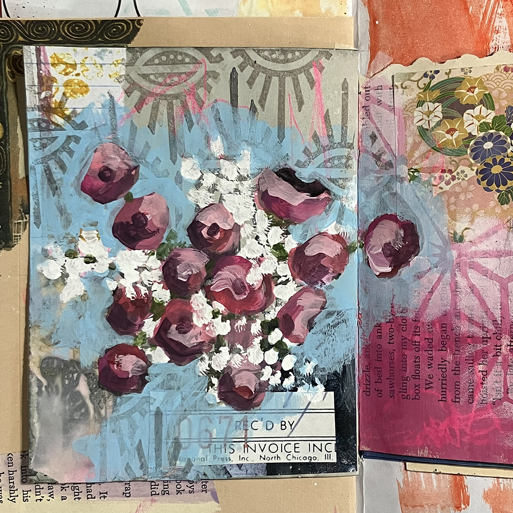
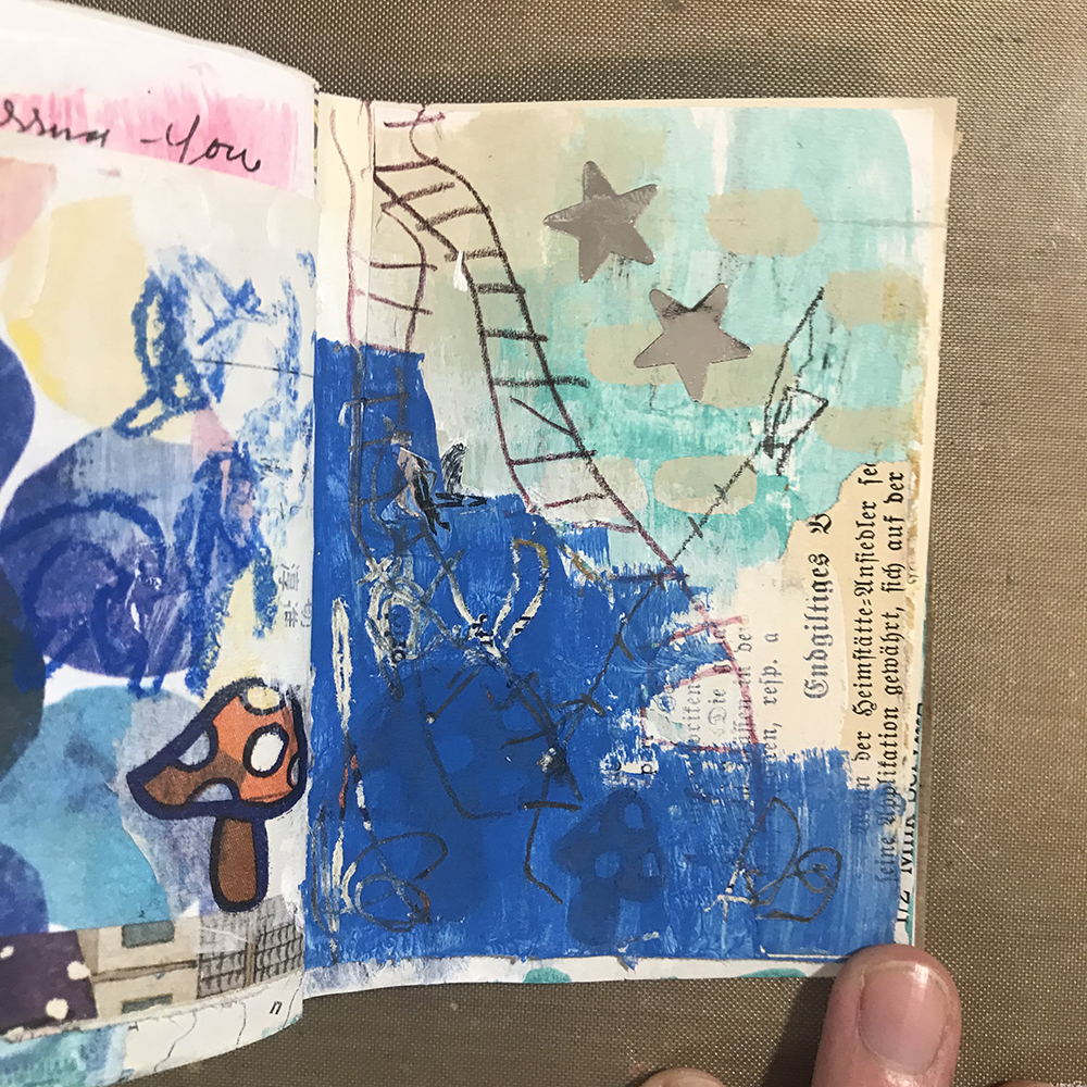
At this point, I was feeling as though the background was a bit plain. Using some Black India Ink and a paintbrush, I splattered some ink over the blank areas of the page. I covered up my illustrations with scrap paper to protect them while I was doing this in order to keep them from being destroyed by stray ink.

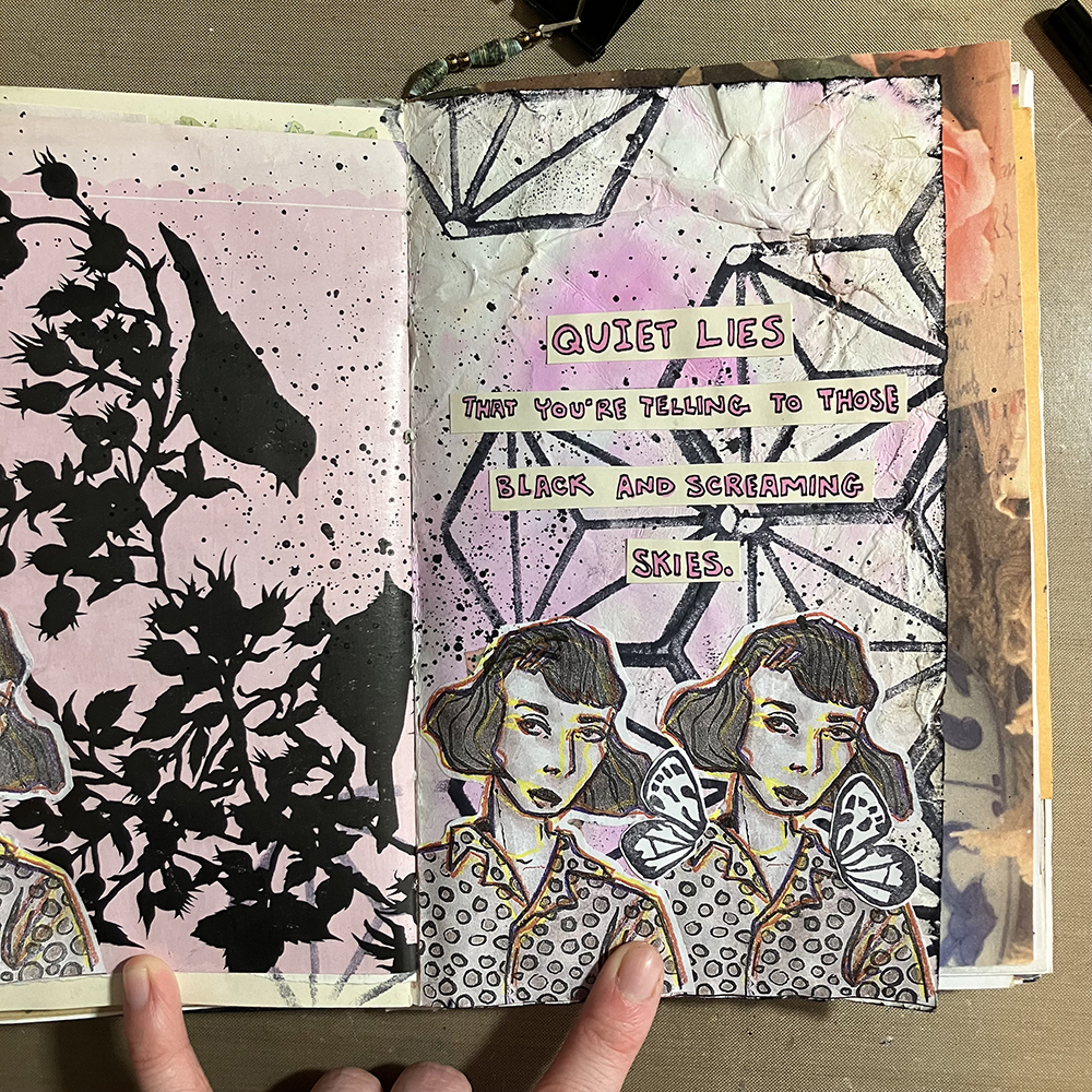
It was then time to add the finishing touches. I cut out the words that I had prepared previously into strips, and glued them to my page. I also drew some butterfly wings onto a piece of scrap paper, cut them out, and added them onto one of the illustrations to give the page a bit of a focal point. I then used a Black Archival Ink Pad, rubbed it around the edges of my page to give it a quick border, and was ready to call it done!


Thank you Jordan! Love your tips on creating stylized lettering and also on using splatters to add a finishing touch to a page.

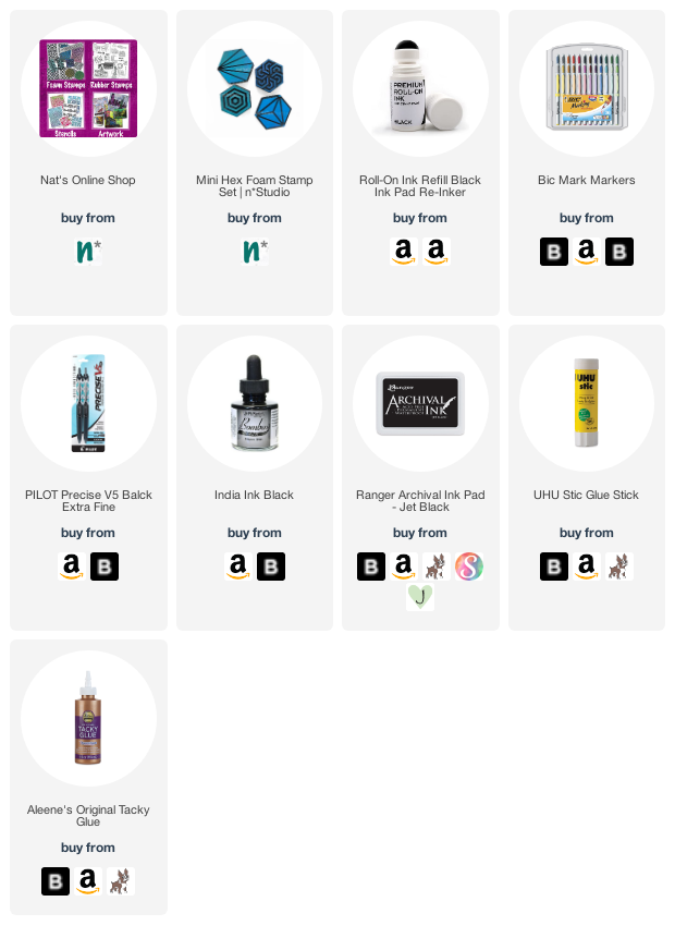
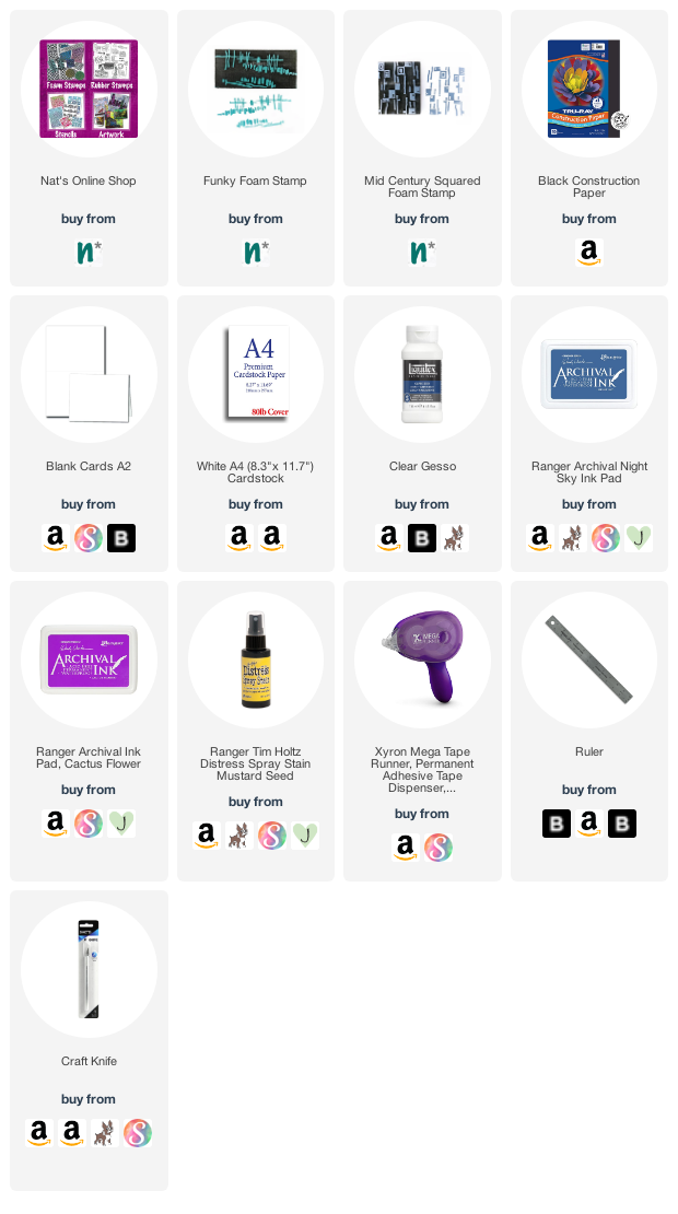
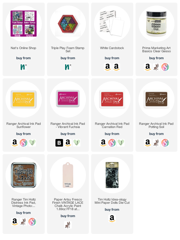
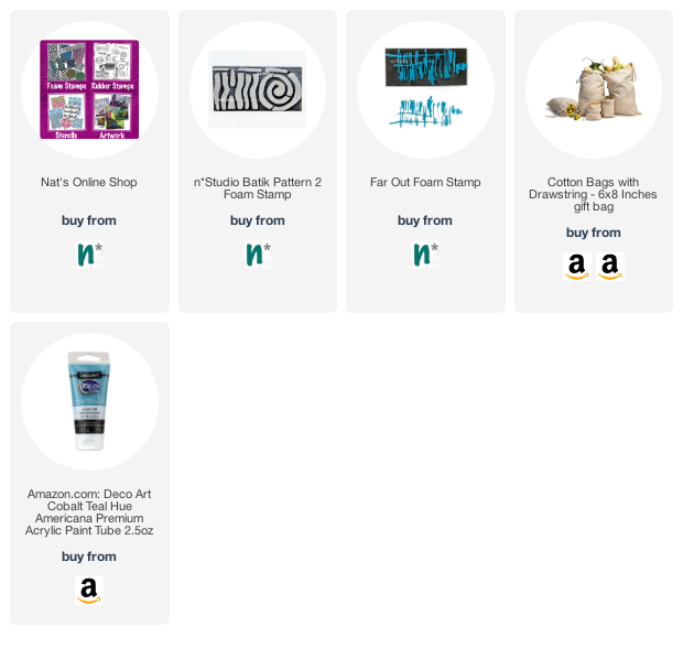
Give it a try: you can find all my Foam Stamps in my Online Shop and in addition to drawn and copied collage elements, here are some of the supplies Jordan used:

Looking for more projects? Follow the Creative Squad on Instagram here.

Leave a comment

“Quirky. Graphic. Whimsical.” – an Interview with Judi Kauffman

How well do you know our Creative Squad? Each week one of our talented design team members shares a project with us and we have come to know and love each of their individual artistic styles. BUT we realized that maybe we could learn a bit more about what makes each of these lovely artists tick. So, we decided to do a quick interview with each. Read on and stay tuned for a new interview each month :)


Welcome Judi Kauffman! Judi has been with the Creative Squad since 2018 and comes to us from Maryland. Judi has been in the paper crafting and mixed media industry for many years and her knowledge of tools and techniques is truly encyclopedic. Let’s hear what she has to say :)

1. How old were you when you first started making art? What is an early artmaking memory?

My parents were both artists so there was never a time when I wasn’t making ‘art’! They put butcher paper on the walls in my room from the time I could hold a crayon so I could draw on really big paper. By the time I was seven I had my first carving tools and linoleum blocks. My dad and I got the last bits of ink in cans  from a commercial printer whose business was across the street from his, so I started early with real tools and professional-level supplies. I was hard-wired to be a printmaker and to this day I’m happiest when my hands are ink-y!

2. If you are an art journaler, when did you start your first art journal?

I’m not an art journaler. My preference is to fill insert after insert for my Traveler’s Notebook with things that I add onto the pages – sometimes stenciling, stamping, or drawing directly, but more often using a glue stick or double-sided adhesive tape to adhere bits and pieces. It’s more like a scrapbook in that regard. And I stack things into 12x12x6 ArtBin Super Satchel Double Deep boxes that I think of as a ‘journal box’ rather than a journal [book].

3. What is one technique you just rediscovered or learned that you are now using all the time again?

I never entirely abandon it, though the amount of time I spend on it varies: Doodling is one of my favorite techniques and lately I’ve been doing a LOT of it, adding stickers to the hand-drawn imaginary flowers and animals that show up in many of the pieces. I’m channeling Gustav Klimt (gold, lots of pattern) and have let the surrealists sneak in just a bit. I start with dark red confetti cardstock and then it’s a mix of gold paint pens, black pens in various nib sizes, and white gel pens. Now and then I mix in some opaque turquoise. Needlepoint and stitchery are the two other techniques that disappear and then reappear.

4. Describe your artistic style in 3 words.

Quirky. Graphic. Whimsical.

5. What are some of the biggest influences on your art?

My parents and grandparents were my biggest influences. One grandfather was a tailor, the other a blacksmith, both grandmothers were phenomenal bakers, so using one’s eye and hands and heart together to create something that had not existed before was a very big part of my life. I grew up going to art galleries so I inhaled paintings, prints, quilts, wall hangings, and sculptures and couldn’t even begin to pick favorites or say who influenced me most, though I am very drawn to textiles, especially Asian.

6. Favorite color 5 years ago? Favorite color now?

My favorite colors as a child as well as five years ago were red and turquoise. Now it’s turquoise and red. I can’t choose just one!

7. Show us where you create.

8. What are your 3 favorite Creative Squad projects that you’ve created?

My favorite Creative Squad project is always the most recent one so right now it’s the stamped Batch of Bunnies (cards), but looking back I am also fond of the sweatshirt where I stenciled over stains (it gets tons of wear) and I love the little stenciled box/bag that holds stenciled ATCs.

9. Describe the perfect artistic day for you.

My perfect art day would be room service breakfast with fresh squeezed orange juice and a few too many pieces of bacon, followed by a chauffeur-driven trip to a museum, followed by a slice of chocolate cake, a Coca Cola, and then the rest of the day into the wee hours in my studio. There would be die cutting and stenciling involved.


Thank you Judi!

Learn more about all our Creative Squad artists here on our website and on the Creative Squad Instagram page.

Comments (4)

  • Marilyn Lojek

    |

    Great interview with a talented artist! Her thoughtful answers reveal an artist being true to her passion. Thanks for sharing the interview with all of us artists.

    Reply

  • Jean Marmo

    |

    Hi Judi! This was such a fun read! I love hearing about your background and love seeing where you create! I agree with your favorite projects! You are very talented!

    Reply

  • Sue Clarke

    |

    I love the sweatshirt and your perfect artsy day!

    Reply

    • judi kauffman

      |

      Thank you! I love to stencil over stains (sweatshirts, t-shirts, and the occasional blue jeans) and to cover the logos on tote bags, too. It really does give a whole new life and look to an item that would otherwise get tossed.

      Reply

Leave a comment

Creative Squad: On Repeat – Robin Seiz

Hello from my Creative Squad! Today we have a post from Robin Seiz who is sharing a project with us beginning with one of her favorite creative techniques – working from a master board. She’s also using my Funky and Mid Century Squared foam stamps and our monthly theme: On Repeat – Let’s play with patterns! Repeat a design motif or shape to create a pattern-inspired project of your choosing.


Dear Friends, I’m not exactly sure where June went, but here we are in July already. This month’s theme is patterns, created with foam stamps. I love foam stamps so it’s always fun for me to use them. I also consider myself “earth friendly” composting,  recycling, and reusing things. To start this project I grabbed some clean-up papers (a few that I used to clean off my brayer while gelli printing) They make the perfect beginnings for master boards, my project this month. 

The next thing I did was tear up some colorful deli paper scraps and randomly apply them with clear gesso. This creates a wonderful texture to the paper. You can cover the whole page, or as much or little as you like.

I then used Ranger Archival Ink and Nathalie’s foam stamps ( Funky Foam Stamp and Mid Century Squared) and stamped over the textured paper. I especially love the areas where the ink goes over the deli paper. It creates an imperfect stamp. I love this variation. I sprayed some Distress Spray Stain in Mustard Seed on the finished pieces. It made them pop more.

Waiting for the paper to dry (it does take several hours) is the hardest part of this project. Since I knew that I wanted to make some cards and a few little pieces of mini-framed art from this master board, I took the time to cut the little frames with a craft knife using black construction paper.  Once cut, it made it easy to audition the pieces I wanted from the master board. 

Once the paper was dry, I cut out the pieces and applied them with my Xyron Mega Tape Runner to the black frames and to the card.

Creating a master board allows for so many options. I love having a few of them around for those moments when I don’t have a lot of inspiration or time. They make it easy to create something quickly. It’s also easy to do several of them at one time. Make a day out of making master boards. I can’t wait to see what you create! 


Thank you Robin – love seeing how you build up the colorful master boards and then tie the image together with the repeating foam stamp patterns.

Give it a try: you can find all my Foam Stamps in my Online Shop and in addition to collage papers from her stash, here are some of the supplies Robin used:

Looking for more projects? Follow the Creative Squad on Instagram.

Comments (1)

  • Sue Clarke

    |

    Love these colors and the idea of having some on hand to use as needed.

    Reply

Leave a comment

Creative Squad: On Repeat – Riikka Kovasin

Hello from my Creative Squad! Today we have a post and video from Riikka Kovasin who is sharing an art journal page with a clever way of toning things down while still letting them peek through. She is using my Triple Play foam stamps and our theme: On Repeat – Let’s play with patterns! Repeat a design motif or shape to create a pattern-inspired project of your choosing.


Fiery Love Triangle

Hi there! It’s Riikka here today sharing my take on the “On Repeat” theme. I chose a triangle as my shape and repeated it in my background as well as topic and focal points. 

I was leaning towards circle, but I have used the “Grove Street” set so much that I wanted to do something else instead. So, I took a look at my foam stamps and the other shape that was present was the triangle in the form of the “Triple Play” stamp set. It was a perfect choice as that gave me a bunch of different patterns to play with, too!

I admire the gorgeous geometrical patterns that Nathalie does to her journals. So, my original idea was to mimic one by using different colors and patterns and layer the stamps. I started a pattern, but it didn’t look pleasing to my eye. And it also didn’t look “me”. So, I started over. Instead of building the background by stamping on a piece of white cardstock, I started instead with some collaging. Even though the book pages I added to the sheet first can’t really be seen in the finished piece, I felt it was “my” way to go. Those old book page hues also played a role on the color palette of the page!

If you want to see how the page came into being, please see the video below. I have to apologize, though, because the video is a bit fuzzy in the beginning. It does get sharper, promise!

As you could see from the video, the bold pattern in the background freaked me out! I guess it’s partly the red color as well, as I seldom use that. But luckily there was a way to make it more subtle. It’s now like fire burning inside, hidden from the prying eyes – the strong reds and pinks underneath a beige surface.

While I could have chosen pyramids or juice boxes or even pizza slices as my topic with the triangle, the first thing that popped into my head was a love triangle. I blame Poirot for that! Or rather, Pamela Lyall as we had just watched (for the thousand time) “Triangle at Rhodes”. It’s an adaptation of the story by the same name, starring David Suchet, and is a part of the “Poirot” series. My husband and I grew up watching Poirot from TV, and nowadays we have the series in DVDs so we are watching them with our kids. In the episode in question Pamela Lyall states that human beings tend to reproduce certain stereotype patterns and draws a triangle in the sand. By the way, if you haven’t seen or read the story, I recommend it. It has a surprising twist, even when triangles are concerned.

Thank you for stopping by today! Wishing you a lovely day! Xoxo Riikka


Thank you Riikka! What a cool solution to work with a bright background – repeating the triangle with little cutout ledges to perch your figures on!

Give it a try: you can find all my Foam Stamps in my Online Shop and in addition to old book pages, here are some of the supplies Riikka used:

Looking for more projects? Follow the Creative Squad on Instagram here.

Leave a comment

“Gaga for Gelli Plates” – Interview with Squad Coordinator Kim

You probably know our Creative Squad but how about the amazing person organizing stuff behind the scenes? That’s Kim and she’s our Creative Squad Coordinator and very enthusiastic about running the group and supporting the efforts of our artists. After we interviewed all of those talented folks, one of them had the great idea to interview Kim too and we totally agreed. Read on to learn a bit more about her :)

Kim has been with n*Studio since 2016 and in addition to providing graphic design for the website and some administrative services, she manages the Creative Squad – our design team. Each month she creates a new theme for the Squad as a starting point and coordinates the release of these projects on the blog and social media. But beyond these roles, Kim is a practicing artist and has been drawn to the arts her entire life.


1. Kim, you always have such wonderful ideas for our Creative Squad but also for our monthly Play Dates, and it probably comes as no surprise for some of our readers that you also create art and love to craft. How old were you when you first started making art? And what is an early art making memory?

Before there were kits and Pinterest, my mother was a whiz at coming up with art and craft projects for my sister and I. In the summers she would set us up outside on a tiny picnic table in the backyard with something creative that she had dreamed up. It could occupy us for hours and at the end, because in the summer we lived in bathing suits, she would use the garden hose to clean us up. Very early I learned to associate the act of making with joy, comfort, and entertainment. I’m not sure when I started, but it was before I even went to nursery school, so about 3 I guess.

2. When you are not creating for the n*Studio, what are some of the things you love to create and would you share something you made recently with us?

Gosh this is a simple question and yet also a really big one. What exactly AM I doing? I’m working in a lot of different directions at the moment, but overall my art is about the American West. Landscapes, particularly those sweeping dramatic ones in the western US, are my jam these days. 

I also love the mystique of the cowboy. It’s a subject that I’ve been captivated by for a long time and I recently spent a few months sketching paintings by Frederick Remington and Charles Russell to scratch that itch and practice sketching. That part of my work is not so serious, but I can’t deny the appeal of those characters and I don’t think there’s anything wrong with choosing a subject that you just find attractive :)

3. What is a technique you have discovered for yourself since you have been with the n*Studio and play with frequently now? Do you have a project photo to share as an example?

Although I studied printmaking in college, I had never heard of a Gelli Plate until I started working for Nat. During the pandemic I finally ordered one for myself to play with and that was it – I was hooked! I am absolutely gaga for Gelli plates and am in love with what you can create with one. The ability to layer, the history of paint that it collects, the uncertainty of how exactly it will print are all so important to how I like to create and what I am trying to say with my art. And even when I am just playing around, it is a blast to work on and it’s my go-to for card making. I’m big on sending snail mail.

4. Describe your artistic style in 3 words.

Quiet, thoughtful, enigmatic. That’s what I’m going for anyway lol.

5. What are some of the biggest influences on your art?

Nothing has influenced my artwork more than travel and nature. When I go to new places and take in the scenery, I tire myself out by LOOKING. I love the shape of the land and notice the unexpected colors and combinations of colors that Mother Nature uses and it’s so inspiring.

6. Show us where you create.

I share a studio space in an old warehouse in Downtown Jersey City with my husband, who is a sculptor. In our space we both have a work table by big windows. I keep a lot of my tools and supplies in an old metal hardware cabinet. We aren’t always in the space at the same time but when we are, it is nice to have another mind to weigh in on what I’m doing.

7. What are 3 of your favorite Creative Squad projects/Playdates/themes – and no worries we know you love them all ;)

Play dates with Nat are super fun and one of many highlights of working for Nat. One of my favorite play dates was our Faux Cactus Rock Gardens. I have been painting rocks since I was a kid and this project brought back a lot of fond memories. The results were also just so darn cute.

Each week the Creative Squad surprises and delights me with their projects. Our team changes over the years but one thing remains the same: they approach the topics in unexpected ways and teach me something about how ideas and supplies can be used differently. I love all the projects but there are a couple that come to mind:

Maura created cards that said “we are all stitched together” for our Primary Colors theme and not only did that message really resonate with me, but I loved how she layered the primary colors, kept the patterns bold, and cut apart and reassembled her pieces with stitching. Here was the post.

In that same theme (Primary Colors) Robin made earrings that I still to this day just want for myself. They are super cool, modern, and artsy and I would totally want to wear them to an art opening or art fair where I know they’d get the same adoration that I feel for them. Here was her post.

8. Describe the perfect non working day but art related day for you.

My Perfect Artsy Day would begin with a delicious coffee and croissant in a quiet sidewalk cafe, then a museum visit to an exhibition of modern art and definitely a sculpture garden too. After a delicious alfresco lunch I’d be instantly transported to a remote spot in Wyoming or Montana with an endless stack of watercolor paper and my fav Kremer paints to spend the afternoon doing plein air painting. Since this is definitely a bit fantastical, I’ll keep going. The evening would include an art opening with a great crowd and a live rock n roll band. And I’d still somehow manage to be in bed by 11 because I’m not really a night owl.


Thank you Kim – so nice to learn some more about you and see what you are working on!

Learn more about our Creative Squad here on our website and them on the Creative Squad Instagram page.

Comments (2)

  • maura

    |

    Kim, I love this! It’s so good to learn about the woman behind the scenes who keeps us all going. You are super supportive of the squad, and it is very much appreciated. Love seeing your art and learning about your love of the West and cowboys. Thanks for sharing yourself with us! Hugs, Maura

    Reply

  • Natalya

    |

    AWWWW!!! So nice to learn about Kim! How about a video interview now?

    Reply

Leave a comment

Creative Squad: On Repeat – Maura Hibbitts

Hello from my Creative Squad! Today we have a cool upcycled project from Maura Hibbitts using a fabric bag, my Batik 2 and Far Out ArtFoamies stamps, and our new theme: On Repeat – Let’s play with patterns! Repeat a design motif or shape to create a pattern-inspired project of your choosing.


When you look at the natural world, do you see repeating patterns of color and design? How about when you look at a garden? My own gardens tend to be a bit on the wild and untidy side, but when I see a well cared for garden, I notice how the flower colors are repeated throughout. I’ve also noticed how leaf shape and size can be repeated for emphasis. I think you will even observe this in a wildflower meadow, nothing is growing in isolation, but it is “on repeat.” These observations led me to create this gift bag with a flower garden theme.

I began with an upcycled cloth bag (Texas Tamales – yum!) and cut a piece of cardboard to fit inside. This keeps the paint from seeping through to the other side. Use an acrylic brush to paint both sides with Cobalt Teal Hue, and don’t worry if you see some of the print coming through, it will add to your design. Use a heat tool to dry it quickly if you wish. 

Blend Burnt Umber and Translucent White on the gel plate. Using the brayer, or stamping directly onto the gel plate, transfer the paint to the ArtFoamies Far Out stamp. Stamp a repeated image across the base of the bag on both sides, this will represent the ground or soil.

Next, add Green Gold to the clean gel plate. (I use a baby wipe to get the plate clean, or you can wash it.) Use a brayer and apply the paint to the striped section of the Batik 2 ArtFoamie stamp. Now, stamp this in a repeating pattern of three above the Far Out stamped images. Again, repeat this on both sides of the bag.

Now, add Cadmium Orange Hue to the clean gel plate, and use the brayer to apply the orange to the circular area of the Batik 2 ArtFoamie. Stamp this color on the center image. Repeat the process using the Diarylide Yellow to either side. Now you have three images across the bag front and back.

Use Posca Paint pens in coordinating colors and outline the stamped circle images. Draw a stem for the flower, then outline a few leaves in green from the striped area of the Batik 2 images. You can also doodle a butterfly on each side in Lavender if you like. The butterflies have been visiting my garden lately, so I wanted to add some in.

Let the bag dry completely. Sew buttons to the center of the “flower” with embroidery thread, to complete your flower garden gift bag.

Finish the bag by tying on some ribbon. (I used hand dyed ribbon.) You could also add charms or beads. Your handmade bag is a gift in itself, or you could fill it with seed packets, teas, a few crafty supplies…the ideas are endless.

Repetition is all around us – from our daily routine, to architecture, to patterns in the natural world, like our gardens. Enjoy the repeating moments and have fun expressing them in your art! – Maura


Thank you Maura. I absolutely love how you reimagined the Batik 2 stamp as a flower – looks awesome with the Posca details and a button center!

Give it a try: you can find all my Foam Stamps in my Online Shop and in addition to an upcycled fabric bag, here are some of the supplies Maura used:

Looking for more projects? Follow the Creative Squad on Instagram here.

Leave a comment

Creative Squad: The Great Outdoors – Jordan Hill

Hello from my Creative Squad! Today we have a post from Jordan Hill who is sharing a gorgeous floral art journal spread using my Triangle Love rubber stamps and ATC Mixup stencil and our theme: Great Outdoors – The experts agree that getting outside for activity each day is a super healthy thing you can do for your mind and body. Let’s get outside and seek artistic inspiration out there. Find something that catches your eye and then when it’s time to come back in, use that inspo to create.


Hello everyone, I’m happy to be back with another project for June! I was very excited to work with this month’s theme of The Great Outdoors, since nature is very much an inspiration for me and my work. Let’s get started.

First things first, I started by flipping through one of my art journals to find a page that I wanted to work on. I ended up selecting this one, mostly because I liked the colors. Additionally, I had already used Nathalie’s ATC Mixup Stencil on the right hand page, so it just felt fitting.

After selecting a page to work on, I used Nathalie’s Empire Triangle stamp from the Triangle Love Cling Rubber Stamp Set with some black Archival Ink to create an all-over pattern across the left hand page.

Next up, I added a few pieces of collage that I felt fit the colors and general feeling of the page. In the lower left hand corner, I used a piece of eco printed paper that I made a while back, since I felt it matched this month’s theme of The Great Outdoors. I also added a little piece of paper featuring some numbers from one of my collage sheets.

For this month’s page, I wanted to experiment slightly with subject matter when it came to my focal point. In the past, I’ve relied fairly heavily on drawing faces when it comes to my art journals. I still love drawing people, but with this month’s theme of The Great Outdoors, I thought I would experiment with an abstract floral instead. I started off my floral design with a number of acrylic paints in pinks and reds. I then applied the color in small splotches across the page, making sure to vary the lights and darks in each section.

After my first layer of paint had dried, I continued to add more depth to the flowers by adding a few more layers of color. I tried to keep my brushstrokes very loose, as these flowers were still supposed to be fairly abstract, as opposed to fully rendered. I also added some green in between the pinks in order to give the appearance of leaves and stems.

At this point, I felt as though the flowers were not standing out enough, so I made the decision to paint in a new background. I selected a light, bright blue, and added it around the entirety of the flower shapes (which also gained a few more layers of paint and deeper shadows). To finish off my little bouquet, I used some white acrylic paint and a small paintbrush to blot on some smaller shapes to be reminiscent of Baby’s Breath.  

To finish off the page, I wanted to bring back the stamping that I lost during the painting process. However, I wanted the stamping to be more gentle this time around, since stamping in black felt as though it would be too harsh for the aesthetic of the page. I used Tim Holtz Distress Ink in the color Pumice Stone to do my stamping, again using Nathalie’s Empire Triangle stamp.

With that, I was ready to call this page complete! I hope you enjoyed following with the process!


Thank you Jordan! Wow those flowers came together so successfully and the Baby’s Breath is such a fun addition.

Give it a try: you can find all my Rubber Stamps in my Online Shop and in addition to collage material, here are some of the supplies Jordan used:

Looking for more projects? Follow the Creative Squad on Instagram.

Comments (2)

  • Erica Meares

    |

    I just found Nathalie’s Studi. This is the very 1st post on her Blog I had the Honor of reading, & wow, Wow, WOW!!!! I love the way you explained your process & provided pictures of your Work along the way! It was such a great experience to watch this transform from what was already a very pretty page (Due to the types of paper used; As well as the Colors, Marks & Stamping you’d previously applied); …To an absolutely stunning abstract representation of “The Great Outdoors Theme! I think my favorite part was when added splotches of pinks & reds. I’ve gone back & forth looking at each pic; Seeing the green added to resemble leaves & stems, & then even more shades of pink & red being put on the page with loose strokes. What really got me was the final pic where a simple change in backgcolor & adding a few dots of white… The entire spread came together! It was as if those blobs of color magically turned into beautiful flowers from one pic to the next; Using some techniques! I’ll definitely be looking you up soon! ~🙏💙🙏Much Graditude, Erica🙏💙🙏~

    Reply

  • Sue Clarke

    |

    Jordan, this is beautiful! You can create flowers as well as faces.

    Reply

Leave a comment

Creative Squad: The Great Outdoors – Robin Seiz

Hello from my Creative Squad! Today we have a post from Robin Seiz who is sharing a very thoughtful and poignant journal page with us. She’s using my Cross Circle and Grannies rubber stamps and our theme: Great Outdoors – The experts agree that getting outside for activity each day is a super healthy thing you can do for your mind and body. Let’s get outside and seek artistic inspiration out there. Find something that catches your eye and then when it’s time to come back in, use that inspo to create.


Hello friends, I hope you are enjoying the weather wherever you are. It’s spring here in Pennsylvania; one of my favorite times of the year. This months theme is about getting inspiration from nature; that’s an easy one for me. I LOVE being outside. The colors of spring are so enticing, green golds, dark greens, yellows, pinks, purples and so on. 

At my house we are in the middle of a sizable renovation.  I am so fortunate to be expanding my studio and even adding a sink!  The new studio space has 7 windows and, when complete, I’m quite sure I will never want to leave it. In the meantime, I am set up at a tiny little table in our open hearth room and most of my supplies are packed up in the basement. All that to say, this experience has made me realize that we don’t have to have the perfect place to create; sometimes just keeping it simple is good. Not every project we create has to be our best piece of art or gallery worthy.  Sometimes, it’s just enough to sit down, wherever you can, and put a few things on paper. 

This journal page speaks to how I have felt this month. All the gun violence has really upset me. I feel so sad about it all and a bit helpless about what to do about it. 

I began with a children’s book I often use which has fabulous illustrations in it. I frequently keep some part of the illustration and incorporate it into my page. As I sat down to create, I looked out the front window to our meadow; a peaceful pleasant place for me. While I wasn’t trying to create the exact picture, I did want to capture the different shades of green and place some “flowers” in the meadow. 

I started the page using Gesso to cover the bottom portion of the image, leaving the bird on the pole, a few trees on the side, and  the blue sky.  

I wanted to add blue paint over the sky so it would feel consistent as I was going to place paint on the rest of the picture. I  loved the purple hue around the bird, so I knew I wanted to leave some of that color.  

What I know about myself is that I’m not a painter. When I try to “paint” on a page, I’m typically unhappy with the result. Gel plates are how I adhere paint to a surface. I used my 5 x 7 Gel Plate and carefully planned where I wanted the colors to go on the page. I mixed up Golden Teal and White Gesso to get a color that was close to the sky in the picture. I used Golden green gold, Benzimidazolone Yellow Medium, and Golden Chromium Oxide Green, to show the colors of the meadow. I used both a paint brush and roller to adhere paint to the plate making sure I wasn’t going to cover the bird or most of the pole. I turned over the plate and laid it down on the page. Repeating this method until I got the intended texture and coverage I wanted. 

Once I had all the colors on the page, I used Nathalie’s Cross Circle rubber stamp and inked it up with a brown Derwent Intense Block to give the illusion of birds flying. This stamp, while part of the embroidery set, has always reminded me of birds. I added some yellow paint highlights to the birds to give them more depth.

Next, I used a Red Violet Derwent intense block and really saturated the Grannies stamp. In my mind these were to represent flowers in the meadow. Once down, I used a  small brush to fill in each flower, but decided they were too bold. The wonderful thing about mixed media is that mistakes can always be fixed. I used a baby wipe and carefully wiped off all the pink. I had to go back with a little extra of the greens and yellows, but it all worked out fine. 

When the pink was off the page, I re-stamped  the  Grannies in a more subtle pattern because I wanted it to look like the flowers were fading into the meadow. Next I touched up the pole the bird was sitting on, as I wasn’t that careful with the gesso.

The final step was finding and writing the poem that so perfectly captured my feelings this month. 

I don’t often journal, but when I do, it’s to try a new technique or to get my feelings out on a page. This one felt right. So much emotion inside; lots of good and lots of sadness and anger! 
You can find and follow me on Instagram and Facebook. -Robin


Thank you Robin. We love when creating artwork steps in to help process and sort through complicated emotions and your page is such a beautiful example of that. Thank you for sharing!

Give it a try: you can find all my Rubber Stamps in my Online Shop and in addition to a page from an old children’s book, here are some of the supplies Robin used:

Looking for more projects? Follow the Creative Squad on Instagram.

Leave a comment

Jordan’s “Layered, Bright, Meditative” Art – Creative Squad Interview

How well do you know our Creative Squad? Each week one of our talented design team members shares a project with us and we have come to know and love each of their individual artistic styles. BUT we realized that maybe we could learn a bit more about what makes each of these lovely artists tick. So, we decided to do a quick interview with each. Read on and stay tuned for more interviews!


We are happy to welcome Jordan Hill today! Jordan is from the state of Florida in the US and has been on the Squad since October 2020. We always love to see Jordan’s drawing skills in action and her techniques with collage and layering. Let’s learn some more about her:

1. How old were you when you first started making art? What is an early artmaking memory?

It’s a bit of a cliche answer, but there is no real time I can remember that I wasn’t making art of some sort. When I was younger, I did a lot more fiber arts (think quilting, knitting and crocheting), but I also have vivid memories of being around 7 or so and writing and illustrating my own books. According to my mom, when I was still in a high chair, she would put me in it with crayons and I would be occupied for an indefinite period of time; supposedly, I would cry when she took them away so I could eat.

2. If you are an art journaler, when did you start your first art journal?

I started my first art journal when I was 13 years old, which is over 12 years ago at this point. My early journals were done in standard composition notebooks, where I worked primarily with tempera paints and oil pastels. I used to add quotes from my favorite TV shows, and I often used them as a space to vent.

3. What is one technique you just rediscovered or learned that you are now using all the time again?

Recently I have found myself quite drawn to using oil pastels in my work. In my very first journals, I used these on almost every page, but at some point I started to drift away from them. Recently, I pulled them out again and have been having a lot of fun! I use them in a slightly different way than I used to (more for mark making, where I used to use them to outline stenciled patterns), but I’d still call it a rediscovery!

4. Describe your artistic style in 3 words.

Layered, Bright, Meditative.

5. What are some of the biggest influences on your art?

I am inspired by many different things, but nature (particularly flowers and other foliage) is a large influence of mine. I am also quite influenced by my own life and how I am feeling; much as was the case when I first started journaling, my art is often used as a place to vent and get things off my chest. This affects my artwork more often than not.

6. Favorite color 5 years ago? Favorite color now?

My favorite color for as far back as I can remember has always been blue. I do recall selecting that color intentionally when I was young, and I think at this point I’m too attached to give it up. However, I do still tend to go through phases with other colors in my artwork.

7. Show us where you create.

I create in a corner of my bedroom where I have set up a desk as a workspace, alongside a number of shelves and drawers to keep my supplies that I’ve been collecting for 12+ years. It’s a mess, more often than not.

8. What are your 3 favorite Creative Squad projects that you’ve created?

February 2021

July 2021

January 2022

9. Describe the perfect artistic day for you.

For me, the perfect artistic day is one where I have time to create freely, and the art comes naturally and without too much effort. Some days it is harder to make things than others, and I hate the sense of dread that comes from feeling like I have to make something good. My perfect creative day comes with none of this; instead, it’s all about the creative process itself and is less about the outcome! This is a state of mind I’m still learning to perfect.


Thank you for sharing Jordan!

Learn more about all our Creative Squad artists here on our website and on the Creative Squad Instagram page.

Leave a comment