Mixed Media

Über*Media…all the way ;)

Über*Media is my series of online workshops that is dedicated to different kinds of media that cross a variety of materials. These classes are a reference guide for you, showing all kinds of possibilities and techniques using certain paint products etc. with different surfaces and media.

You can work in your own pace, whenever you want….and you have access to a huge amount of fun techniques, tips and tricks, tutorials, projects and art journals for years to come as long as they are online (meaning as long as I am alive and the n*Studio exists)

My new Class starts today:

Acrylic Paint Online Workshop:


Also available for sign ups are those classes – the whole content is already published.

Pan Pastel Online Workshop:

Check it out here

Gesso Online Workshop:

Check it out here

I would be thrilled to have you in any of my classes :)

hugs

Nat

Comments (2)

  • Denise Morrison

    |

    wonderful class ideas Nat. Love seeing your workshop photos as well.

    Reply

  • Lisa Flaherty

    |

    Such a great lineup of classes, Nat! If I weren’t so bogged down in work-related “stuff” (having your own business, you know that the workday NEVER really ends…) and wasn’t already in an online class that I am having to ignore for the moment, I would SOOOOO be in this Acrylics class! That said, it is high on my list, so when I am on the other side of this crazy biz transition, I think an Uber Media class would be an excellent reward for myself!
    Hugs!

    Reply

Leave a comment

n*Lab Tales – Today featuring Derwent Artbars

I had another play date in the n*Lab, this time with Derwent products.

I am a huge fan of their products – be it the Inktense Blocks or their pencils or I just bought sketch pencils- all I can say is love love love. Derwent Artbars are triangular-shaped water-soluble wax bars. So when I heard of Derwent coming out with the Artbar – I was hooked to get them ….and so here they are -in my studio and they were the perfect candidates for some n*Lab Time.

Let me tell a bit about them in this Video – what you can do with them and what I actually did on the canvas (no tutorial just blah blah!):


[youtube=https://www.youtube.com/watch?v=jQ9Xlls5V7U&feature=youtu.be]

I showed you the play sheet already in an earlier post:

Here is the progress of the Canvas – layering as I talked about in the video:

So my favorite features of the Derwent Artbars are:

  • Light and thick stripes possible with the bar
  • Wonderful mixability with a wet finger
  • Layering and covering other Artbar colors and then adding texture (squeeeeelllll!)
  • Printing with the Artbar – love the possibilities due to the shape
  • Awesome bright colors – highly pigmented
  • Love the possibility of making your own thick paint out of the ArtBar
  • There are so many other possibilities out there to use them on and with – makes my head spin :)

Here is the Canvas now finished:

supplies: Derwent: Artbars, Shave ‘n Save, Scraper, Waterbrush – 7Dots Dreamer Paper and Stickers, 7Gypsies Tissue Paper and Chipboard Letters, Crafter’s Workshop Template

I hope you had fun joining me in my n*Lab day….already thinking of what to do next and when :)

Have a gorgeous day

Nat

Comments (10)

  • France papillon

    |

    Be inspired? Well you sure got me inspired! Thank you for that!
    But darn Nath! How am i going to explain to mu hubby that after my brend new box of inktense blocks and some sennelier oil pastels (which by the way are sooooo yummi) and my neocolors II i absolutely need these artbars??? Because let’s face it, you present them in such a way they become… Irresitible!

    Ps: love the idea of n*Lab !!!

    Reply

    • nathalie-kalbach

      |

      LOL…ahem- do not send him my way ;) He might be angry. Huge hugs hon!

      Reply

  • Lisa Flaherty

    |

    Haha, Cuchy–Nathalie is such a temptress! Nat, these Artbars are so cool! Your final canvas is lovely, and the paper with the leafy shapes you were playing with is WOW!!!

    Reply

  • Martha Richardson

    |

    Agree with Cuchy…why do you do this to me…these look FBA! Love the canvas ;)

    Reply

  • Sue Clarke

    |

    Cuchy, trying before buying has saved me much scrappy money.
    Nat, I love your colorful creation but could not see the video for some reason (error message).

    Reply

  • M. Carmen - Cuchy

    |

    Why, why, why do you do this to meeee??????
    “don’t look at my blog, don’t look at my blog”… hey, you know. Just prohibit me to do something, and I’ll do it!!! You’re soooo bad LOL
    Jokes apart. Cool description. But it makes me need them right now!!
    What’s the main difference with inktenses apart from the wax? texture? colors? opacity?
    Inquiry minds want to know. I learnt a lesson from a teacher a had once “do not buy it before try it” LOL does this make sense to you.? :)
    Thanks!! Besos

    Reply

    • nathalie-kalbach

      |

      LOL- sorry Hon- but I know you are as excited as me about new art supplies ;)
      Inktense are Inks – and they get permanent once heatset – the Artbars are wax with pigment . That is the main difference.
      Who was that weird teacher telling such stuff???? LOL

      Reply

      • M. Carmen - Cuchy

        |

        I can’t remember her name… I thing it started with N* something… LOL
        Thanks!!!

        Reply

Leave a comment

Tired of being a People Pleaser – Layout

It’s been a while, since I have created a layout – and it was so much fun to play with the wonderful paper by Anna Dabrowska for 7DotsStudio, which I had for a while now.

Sorry- taken down


The idea to this layout came while reading  one of my favorite columnists – Harald Martenstein – he always makes me laugh. He writes with pointed remarks and often brings simple lifestyle problems to the point. This week the column for DIE ZEIT was titled: Many are suffering from making it right for everyone (freely translated) – here is the German article


one of the paragraphs that made me laugh the most was:

…You have to force yourself to be unfriendly. This is true in all areas of life. Lot’s of people are suffering because they wish to make it right for everyone. That is just something deep inside of you. Maybe it is education. In my opinion this is an unknown widespread desease. Doctors usually diagnose it with “Burn-Out-Syndrom” “Depressive Mood” or “Gastritis”. In reality though this is just caused by wishing to make it right for everyone. ….


Of course that is not, what causes Burn-Out-Syndroms etc. – but it made me think of how tired I am to be always the people pleaser and make it right for everyone- you just can’t , right? Even if you just stay in bed and do nothing, you make someone upset.  So this is a bit of a tongue-in-cheek layout… ;)

And please, please….No worries- I won’t be unfriendly from now on…probably tomorrow again just trying to make it right for everyone as always – LOL ;)


Supplies: 7Dots Studio Dream Paper, 7Gypsies Tissue Paper, Gesso, Heidi Swapp chipboard letters, Adornit tiny letters, old watch, Structure paste, PanPastels, Derwent Inktense Blocks, Flearmarketfinds, Eco Green Crafts Stamp, Maya Mist


Do you sometimes get inspired by articles or books for a layout or art journal page too?

Have a gorgeous day

Nat

Comments (22)

  • Mona Pendleton

    |

    Fabulous layout! So creative and love the story behind it! Thanks for sharing!

    Reply

  • magandscrap

    |

    Very creative layout ! So many details ! Love the colors !

    Reply

  • Peg Hewitt

    |

    Amazing page, I totally LOVE it!

    Reply

  • Sue Clarke

    |

    Love the LO and it took me several major depressions to decide not to be a people- pleaser. It’s hard to unlearn.

    Reply

  • pAULA fLÁVIA

    |

    Such a great LO Nath, specially cause your feelings are poping up from your eyes on the photo.
    Nice week

    Reply

  • misty

    |

    This is gorgeous! I am definitely a people pleaser and it has really worn on me this month! Awesome layout!

    Reply

  • Diana

    |

    i am so in love with this layout and the message!!!!! thanks for sharing it with us!
    you so inspire me!

    Reply

  • Martha Richardson

    |

    Oh my Nat – this is one incredible LO…so much to look at, thought provoking…I think is my favorite LO!

    Reply

  • Czekoczyna

    |

    great! so many details – love it.

    Reply

  • inkyminxy

    |

    Absolutely love the layout and the the story behind it, I think we all feel a little like this from time to time, i know i sure do xxx

    Reply

  • marianne/skorpionen

    |

    Oh yeah, I totally agree with you and I’m often having the same feeling. That’s why I love my AJ, cause the only person I hear when I’m doing that is myselv!
    Loooove your layout with the gorgeous papers from 7dots and Finnabair. And those amazing findings from fleemarked. Altso love the structure paste!
    Have a lovely sunday and don’t get fooled :D

    Reply

  • Jane Henningsen

    |

    ohhh you´re so right Nat… I really think the disease is going round… and so many people are stressed out. Love the LO.. especially the little scissor and the splattertechnique… wish I was that kind of an artsy-girl…
    Have a nice day…

    Reply

  • Riikka

    |

    Cool, inspirational layout!

    And so true, you simply can’t do it right to everyone. If you bow to someone you’ll end up showing… you know :D

    Reply

  • Michelle LaPoint Rydell

    |

    Oh Nat this is GREAT!!! I especially love the scissors stabbing the heart! I suffer from this disease too – so I can relate!!!

    Reply

  • The Rock Chic

    |

    Yeah,I hear you. I have started saying “no” to many things over the last year and it feels great. The first couple of times you think about how you may have let someone down but you what? That feeling passes quickly because you start feeling so good yourself.
    I am in the happiest place ever now, since I started to stop pleasing other people and if that makes me unfriendly, well so be it :)

    Reply

  • ulrikamacgregor

    |

    Love, love, love this layout! Wonderful colours and structure, and a good message too ;) Thanks for sharing!

    Reply

  • Mary Bennetts

    |

    Such a cool layout Nat, love it. Love the colours, love everything about this

    Cheers
    Mary

    Reply

Leave a comment

Creative Jump Start Video: Fight Resistance

I wanted to show you my second video that I had done for the Creative Jump Start 2012  – if you missed the Street Art Video – check it out here.

FIGHT RESISTANCE 

[wpvideo M4jca1kW]

For those of you, who have problems watching the wordpress version – here is another option:

password is: fightresistance

[vimeo http://vimeo.com/34775529]

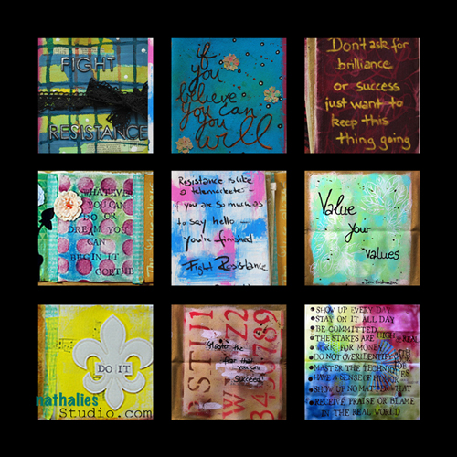
Here are some pictures of the canvas book. Or Rug book (in the video also referred to as the Rock book- LOL ;) )

And now back into my studio and doing things ;) – I do have to remind myself still constantly to life up to my own words, procrastination is such an evil friend…actually procrastination is just pretending to be my friend…LOL.

What do you like to procrastinate?

Have a gorgeous day

nat


Comments (4)

  • Conny

    |

    ach gott ich hol mir immer wieder gern nathalie ins wohnzimmer ;-)

    Reply

  • Marsha.

    |

    Yep, that’s why I’m here… procrastinating away…

    Reply

    • nathalie-kalbach

      |

      LOL ;) And that’s why I respond…also still procrastination ;)

      Reply

Leave a comment

All of Sudden… or How to create a page about grief?

OK- this is a sad topic- but no worries- I keep it still light ;)

I was a while ago asked to create a page about grieving. It wasn’t the easiest part – I have to admit. I mean, Scrapbooking, ArtJournaling- all pretty personal, right and it is all making you vulnerable already…and then to put it out there about grief. mmmpfff…..I have to admit that I was for the first time hesitant to do something I was asked for. But then I thought, I should just give it a go and see – I can still decide to hold it back, right?

I decided to do a layout without picture about my feelings of my loss of my step father.


In short, my father died when I was 20 days old. My stepfather, who came later in my Mom’s and my life, was an amazing man- and a loving father, taking care of me as if I was one of his own children. He died when I was 25.

After a while you do not think every second, every hour, every day, every week, every month about the person you lost. But sometimes it hits you still after all those years without warning- and this is what the journaling is about.

My father for example loved to listen to his music sometimes pretty loud – I think I got my love for loud and heavy music actually from him – LOL. He had quite a big LP collection and we would sometimes in the summer sit together in our garden with open windows, listening to some cool music. Not sure if the neighbors thought it was cool, but he was for sure ranking as the “cool” Dad among my friends ;) We would meet at the same concerts…which was as a teenager a bit strange at times- LOL – because dang it – Dads are supposed to stay home and sleep so you can sneak in late ;) So sometimes if I hear certain songs – it just hits me and I think back and I miss him a lot! It is a weird mixture of sadness and happiness. I guess I don’t have to explain the Sadness – but: Happiness is because I was so fortune to have a person like that in my life and spent time with him to have those memories!

Supplies: Prima Shabby Chic Papers, Prima Vine, old Music sheets, Gesso, Tattered Angels Glimmer Mist and Glam, Pink Paislee Dailee Junque Alphabet, Scrapbook Adhesives by 3L

It was actually quite relieving creating this layout and I am glad I did it. Well – they say art and creating is therapy, huh? I think that is a pretty good excuse for spending all that money in art supplies, what do you think? LOL

Have you ever created a layout or project about grief?

Have a wonderful and happy day!

Nat


Comments (13)

  • Flitters

    |

    Thank you for sharing this with us, Nat. Grief is what got me started on this path of art journaling, yet, ironically, I have not made a single page about my grief. My sweetie passed away three years ago, and yes, sometimes, it just hits me like a tidal wave, as if he just died yesterday. I sooooo terribly miss him, and it is quite a relief to know that I am not alone in this experience.

    Reply

  • Debbie in AZ

    |

    What a wonderful layout!

    After my brother’s best friend committed suicide, I made my brother an album about his friend and their lifelong friendship. I used old photos, momentos and many snippets of memories that my brother told me as the basis for the pages. I also included photos from his wake and a poem my brother read aloud that day that helped him grieve for his friend. I even asked him to help me make a couple of the pages too. After it was finished, he had it professionally copied and bound and gave the bound copy to his friend’s parents. They were very grateful for the good memories of their son and for my brother’s friendship. My brother treasures this album too. In short, we didn’t shy away from the sad and tragic parts but also celebrated the many good memories too.

    Reply

  • Hjørdis Jensen

    |

    Lovely memory about your daddy, I hope we will be the same for our choldren and our grandchilds, I think your father and us her are the same about music and garden party and lovely people seeing each other <3

    Reply

  • Toñy Hernandez Ramos

    |

    Nat, es bueno sacar hacia fuera los sentimientos que nos duelen, y a la vez nos hacen felices, el trabajo es precioso, pero sobre todo el sentimiento que lleva. Un besito muy grande y muchas gracias por compartirlo, en muchas ocasiones me he sentido fustrada, pero no he sido tan valiente como tu.

    Reply

  • M. Carmen - Cuchy

    |

    I don’t understand a word of your page, but it speaks to me. So powerful and beautiful.
    Your stepfather did a great job with you :)

    Reply

  • Lisa

    |

    Nat I love this page. It’s really beautiful. I love how you used the gesso. I’m not so good at the grief stuff, I’ve avoided it. I haven’t really scrapped about my Stepdad or my Grandad.
    If something botheres me I tend to avoid rather than tackle.
    You did good Nat xxx

    Reply

  • Bev W.

    |

    What a nice story…the page is beautiful! Just keep on hanging on to those special memories. No one can take that away from you. Tfs!

    Reply

  • marjiekemper

    |

    What beautiful memories. I love your picture-free page. Even though I cant read it the colors and layout are so calming and evoke the feeling of tribute. I also have done one of these about loss of a loved one. I enjoyed making it and every now and then, looking at it. Life’s not all sunshine and roses, eh? xoxox

    Reply

  • Sue Clarke

    |

    What a beautiful tribute to your Dad as well. Sounds like a fun guy especially with music. I have done at least 3 LO’s about people/pets who have passed and how I feel about it. Each time it was very therapeutic and cheaper than therapy.

    Reply

  • Marianne Johansson

    |

    I also believe that creating is therapy! I made a layout some time ago about my mother, lying in a hospitalbed – dying, but with her first granddaughter in her arms. I cried while doing it, but it felt rather good at the end.
    Your stephfather sounds like a fantastic person and so cool to be around. Good to have so many good memories!
    Hugs

    Reply

  • Julie Short

    |

    I have had quite a lot of loss of family over the past three years. In my brothers circumstances they were both very sudden. My mum’s passing was expected but it hit me like an avalanche when it happened.
    I have created a number of layouts and mixed media pieces for all of them. I have given most of them to my remaining brother and sister. I found it a very personal and even healing way to work through my feelings and my memories.
    Reading your story is special. It is out there and you will never forget the lovely memories you shared. BTW my son and I share a love of loud, crazy music!
    I hope you use the memories that would have surfaced for you when creating this piece to heal and mend!

    Reply

  • Michelle LaPoint Rydell

    |

    Your stepdad sounds like he was a super cool guy. I’m so sorry for your loss Nat. I LOVE that you made a page about it! It’s beautiful and very inspiring!

    Reply

    • Harriet Garrison

      |

      Hi, I think it is beautiful. It’s different (and sometimes hard) to do things that are not the norm but you grow and learn. I think it helps you feel better too. Therapy. I really love this page. It has a perfect balance of softness, happiness and tenderness without the bright celebrating colors, of say, a birthday. My dog just passed a week ago. Even tho it’s not a person, he was very special. Maybe I’ll do a little book for him. Nat, you did a fabulous job and got to remenisce about your step-dad for a time. He’s probably smiling at you and so proud. Thanks for sharing!!

      Reply

Leave a comment

Pier 39 – Cocoa Daisy March Kit Projects

I had lot’ so fun with the March Pier 39 Kit.

I know I did use the title and lyrics of one of my favorite songs already on a layout in 2010 – but the paper in the kit  was soooo fitting, I had to use it again :)

*If the Stars were mine…”

Journaling:

If the stars were mine
I’d tell you what I’d do
I’d put the stars right in a jar and give them all to you

Lyrics by Melanie Gardot

Here is the song in case you want to listen to it

[youtube=https://www.youtube.com/watch?v=DLX-DdxfUKU&feature=related]

I used some PanPastel to paint over a Crafter’s Workshop – Balzer Designs Stencils and then used another Crafter’s Workshop Stencil with Stars to trace the stars.

*Helping Hand*

This Layout was actually a lift of a member layout at the Cocoa Daisy Gallery by Hanna Marie.

Love those Arrow Row Stamps !

Have a gorgeous day :)

Nat

Comments (6)

  • SusanJane

    |

    They broke your YouTube link. But no matter. Great, entertaining layouts!

    Reply

  • Bev W.

    |

    love your layouts….:)

    Reply

  • Sue Clarke

    |

    Love how you journaled in the paper jar and used the twine to give more dimension.
    The paint drips are awesome on the second LO .

    Reply

  • Luciana True Colors

    |

    AMEI !!!
    linda idéia !!
    Beijos coloridos !!
    Luciana
    True Colors

    Reply

Leave a comment

Take the Second Floor Challenge – Golden Acrylic Paint

If you missed yesterday’s post about What the Second Floor Challenge is – here you go :

  • Julie & I have made a one-year commitment to each other and our “Second Floor” project.
  • Every few weeks we will issue a challenge (just something to spark some creativity – sometimes starting without a prompt can be very intimidating).
  • Your assignment is to take that challenge and make some art.
  • Here’s the most important part: at some point you need to “take it to the second floor.”  What does that mean?  It means trying something vastly out of your comfort zone.  Doing something that might not work.  Experimenting with a crazy idea.  It’s all about pushing yourself.  If it works, awesome.  If it doesn’t work, awesome!
  • If you want to participate publicly, we’ll have a linky list for each challenge. If you don’t want to participate publicly, that’s cool too.  It takes a lot of courage to put yourself – not necessarily at your best – out there.
  • We have a private flickr group set up for those of you who want to share sort of publicly but within the safe confines of a private group.  If you want to join the group, you will need to e-mail to secondfloorchallenge(at)googlemail(dot)com we’ll send you an invitation.
So let’s start :)

For our first challenge we decided to go with the Challenge to

“Use Golden Acrylic Paint”

I usually only use golden Acrylic Paint as accents. I use them through a stencil to tie elements together or to paint a frame or the edges, or just a tiny embellishment. So this challenge let me think of actually painting the whole background of my paper golden in order to do something differently.

I gave it some texture by cooking the acrylic paint and also using rub ons before applying the paint. As I had watered down the golden acrylic paint a bit in order to reveal the Rest-Print on the paper and also the rub ons – the paper got a bit wrapped- and to tell you the truth – I do not like that – I do like the cooking though :)

So it could have been done as it was like this- but then decided to take it to the 2nd Floor.

I used twine and rolled it also in golden acrylic paint. I was a bit afraid that the golden acrylic paint would harden the twine too much in order to be still able to twirl it in the forms I want it. But no problems – after it dried I easily applied it in loops to my layout.

And here is the end result:

For me it looks more finished now and I liked using some of the extra golden paint on my twine. The Layout is a bit more shiny as you see it here.

What did I learn from this challenge:

  1. Golden or I would assume any metallic paints painted on big areas are hard to apply because you can see the direction of how the paint was applied and it makes it look messy and uneven. So next time I would definitely use a different tool and try to only paint in one direction.
  2. I like how the Resist Print and Rub-Ons are peaking through and in generell I like the golden color.
  3. Next time I would not water down the paint too much as to avoid the paper to wrap and adding a messy feeling to it.
  4. Although the twine rolled in golden paint was still workable, I do not like the look of it…it looks dirty – I would not do this again…

I used the following supplies for my Remember This Layout:

Not linked: Tattered Angels Paper, Package Twine

Check out Julie’s blog with her result here

If you want to play along with us show us your project here on InLinkz or on the  Second Floor Flickr Group:


Nat

Comments (31)

  • Eniko Farkas DeLisle

    |

    Nat, I took the challenge & wrote about it on my blog…I think it’s a swell idea! Looking forward to the next challenge! xo

    Reply

  • Michelle Hernandez (@willieburgscrap)

    |

    I’m going to try this today- it’s probably too late but I LOVE gold paint and glitter and anything that smacks of gauche fabulousness.
    The final page might not be what you envisioned but I LOVE that second detail shot with the texture and the “Remember” word! I also like the gilded twine- it does look “dirty” but in a fantastically intentional and interesting way. I think the twine, the minimalist photos and the paint should be all that’s on the page- they look analogous and meaningful. What did you mean by cooking- heating up parts of the page while drying or sticking the page in the oven? That probably sounds like the stupidest question ever but I’m dying to try new things and scared of fumes. :) Ok, I will avoid the actual baking of projects. I will be part of this group as well- it’s such a fantastic idea- pushing yourself to the next level with fellow creative types I respect? Yes, please!
    Aha- I just saw an answer to my cooking question- thank you!

    Reply

    • nathalie-kalbach

      |

      Hi Michelle, so fun you are joining us! The cooking refers just to heating the acrylic paint until it starts to bubble. It works actually best with the metallic paints and the fuming is low- as I am pretty sensitive to that too :)

      Reply

  • Michelle Hernandez (@willieburgscrap)

    |

    I’m going to try this today- it’s probably too late but I LOVE gold paint and glitter and anything that smacks of gauche fabulousness.
    The final page might not be what you envisioned but I LOVE that second detail shot with the texture and the “Remember” word! I also like the gilded twine- it does look “dirty” but in a fantastically intentional and interesting way. I think the twine, the minimalist photos and the paint should be all that’s on the page- they look analogous and meaningful. What did you mean by cooking- heating up parts of the page while drying or sticking the page in the oven? That probably sounds like the stupidest question ever but I’m dying to try new things and scared of fumes. :) Ok, I will avoid the actual baking of projects. I will be part of this group as well- it’s such a fantastic idea- pushing yourself to the next level with fellow creative types I respect? Yes, please!

    Reply

  • Andrea Gomoll

    |

    Great challenge – FINALLY used my gold Acrylic Paint which I had in my stash like forever *lol* … can’t wait for the next challenge you come up with :) Hugs …

    Reply

  • Bethany Kolbaba Kartchner

    |

    Love this idea Nat! So playing along. I’ve got some Golden’s at home, but have been too afraid to try them. I’m gonna gather my courage.

    Reply

  • Eliza

    |

    while waiting for my paints to dry I can feel my head spinning.
    I keep thinking about this project and making a mental list of all the things I’m afraid of in my art, of all the limitations I’ve been dreaming to deal with, of all the nasty things my inner critic’s been saying.
    it’s scary. it’s exhilirating.
    I keep repeating the words I saw on Julie’s blog today – “When you discover what you fear most, run towards it.” I think it’s time for me.
    thanks for making me dizzy. ;)
    and perhaps a tiny bit braver.

    Reply

  • Irene

    |

    Nat, that came out wonderfully! I love the idea of these Second Floor challenges! This gold one was just the thing to get me to try something different!
    Thanks to both of you!

    Reply

  • Hilary Frye

    |

    Metallic Gold always make me think of Klimt. He’s one of my favorite artists. The metallic gold has me thinking of making a gilded frame…I recently bought a laser cut wood frame. Gold mixed with some other color or techniques…hmmm..have to see where this goes!

    Reply

  • LindaBrun

    |

    I have some great looking gold acrylic paint tubes, after good advice from you girl ;-)
    Looking forward to play. Does it have to be a layout ?

    Reply

    • nathalie-kalbach

      |

      Not at all, linda, can be a book,altered item, cancas, whatever comes to your mind and you want to play with, Looking forward seeing what you play with Nat

      Reply

  • Terrie -Creative Explorer

    |

    Thanks so much for sharing your experimenting and results – I never use metallics so that would be something new for me to try….

    Reply

  • Lisa

    |

    Bummer about the warping. Maybe pressing it under a stack of books for a couple days would help? I would never have thought to paint the entire background gold! The resist frame looks super cool, and I think the twine twirls add such movement and flow to your layout. My mind is racing! I may trip on the stairs to the 2nd floor, but I am looking forward to the climb!

    Reply

  • Virginia Voigt

    |

    I love using metallic paints in my art work. Everything from Golden brand to craft paint to paint I make myself from dry pearl powders and acrylic medium (sometimes with the addition of some pigmented paint for a boost of color). I very frequently apply the paint to my papers with a brayer. That gives me thin but extensive to complete coverage according to my application. When I do not choose complete coverage, the inconsistencies look very pleasing to me. Warping seems minimal to non-existent. The part of the process I like least is cleaning the brayer when I am done which I do with a baby hair brush. The easiest way to get the brayer clean is to make sure the paint does not dry on it. Sometimes I have to put the brayer in a bowl of water to keep it wet. Then, of course, I have to dry it off to continue. Perhaps some people aren’t as fussy as I am about that. We each have our own style.

    Reply

  • Joanne

    |

    looks great — now I have to get some golden acrylic paint — hope to add something to flickr soon — have to email to get an invite :0)

    Reply

  • Sue Clarke

    |

    Such a different color for a LO for you Nat and I really like the look once you added the twine.

    Reply

  • Martha Richardson

    |

    I have this gold acrylic eco craft paint because of YOU….I love the way your LO came out…and now I know how to cook it…LOL!

    Reply

  • Birgit Koopsen

    |

    Gold Acrylic Paint???? Are you kiddding?? I don’t even think I’ve got such a thing in the house. Wow, this is quite a challenge to start with! Have to go out and find some of that stuff now :) yikkes, I’m pretty confinced that I will have to share something I really don’t like…

    Reply

  • Anne Porretta

    |

    Art can be messy and still look great! Brushstrokes are evidence that “an artist has been here” . . . so I wouldn’t always be looking for smooth in my creations. “Warping”, on the other hand, interferes with a journal page lying flat, so that would probably be something I would try to keep to a minimum if I were making a page. Your creation looks great no matter what . . . and I love the idea of challenge to get the juices flowing!

    Reply

  • Marjie Kemper

    |

    I like the layout a lot…. gives me the feel of a treasure map, and it’s a great capture of the DV experience. Very brave, going All Gold!

    Reply

  • Catherine (scared of gold paint) Scanlon

    |

    Marsha asked my question, cause I had visions of you cooking it over the stove while you cooked your dinner last night, LoL! I love the idea of this challenge and I think yours came out GREAT. I don’t have time to play around this week but next time I hope to have some.

    I like the way the photos look on the gold paint, and the string.

    Reply

    • nathalie-kalbach

      |

      LOL- scared of gold paint? I know you would rock it. BTW- we post the challenges about every three weeks…so there is lot’s of time for your ;) jUst teasing!

      Reply

  • marsha.

    |

    I like it!!! I hardly ever use golden paint… Only in my art journal… The kind I have isn’t opaque, so I see every brush stroke I make with it. Maybe it’s supposed to be more like a golden glaze… Hmmm, have to look into that.
    BTW, stupid question: what do you mean by ‘cooking’ the paint? Making it bubble with the heattool?

    Reply

    • nathalie-kalbach

      |

      Oh – mine is so pigmented- it totally covers. And yes – making bubbles with the heat tool- love doing that – especially with metallic colors :) nat

      Reply

        • Marsha.

          |

          OK… I’ve bought new paint… and it wasn’t one of those cheap ones… And it says ‘opaque’ on the tube… And… it still doesn’t cover things like yours seems to do. And now I’m so very curious about the brand you used! Is is Eco Green Crafts? (Cause I remember I loved painting with the bronze colour at MMC!)
          It’s all OK though: I’m having fun with gold (!) paint and it not turning out like I imagined in my mind was kind of the point of the whole exercise anyway :-D.

          Reply

          • nathalie-kalbach

            |

            Mmhhh – that is not fun – is it fluid? The one I used is Eco Green Crafts and I am biased but i have to say – they metallic paint is the best I have found out there! Thanks for joining us Marsha- you rock!!!

            Reply

            • Marsha.

              |

              It’s not fluid, it’s Liquitex something (let me see…): Liquitex Heavy Body Iridescent Rich Gold. It’s beautiful, but I’m a bit disappointed that I had to use half of the tube on this one canvas… Maybe it had to do with the canvas I used. Or maybe I should have gessoed first. Doesn’t matter… Canvas is finished and (please do not disqualify me…) I’m happy with it :-).

              Reply

Leave a comment

Take it to the Second Floor

As some of you might remember my dear friend Julie Fei Fan Balzer visited me last November for a couple days. We had actually planned her visit around our self organized event Mixed Media Circus  but we also planned that Julie and I were doing a lot of sight seeing and spending time together. We had a lot of brainstorming and ideastorming days :)

One of the things you might have to know is, that I have been in a really really tough time around then and as it turned out, it wasn’t me alone. My business in the art and craft industry started to be very busy, there were a lot of opportunities coming up, some of them as always sounded way better in the beginning as they turned out to be (I can’t tell you the numerous time you get asked to do something too good to be true sounding…and actually most of the time it is too good to be true), some of them were taking lot’s of time with low or no payment, some of them came along with toxic people…and so on. I was exhausted from all the planning, the diplomatic gymnastic exercises and trying to keep up and balancing all the opportunities and a private life too…and it is funny that I write this now…I am in a similiar place right now…BUT….I know now this will be all good in the end ;)

So anyway in this foggy misty weather- and mood like time, Julie came to visit and it was the best time ever. Seriously. We talked constantly about our dreams (!YES- the dreams, don’t forget the dreams and to speak them out!) and the fears to fail, to make the wrong decisions and the disappointments and the flaws and the …and the …and the…

It was so good to have someone to talk to who totally got what I was saying or not saying and what I was feeling. Someone who could relate and had the same things to go through too. Someone who could actually also word the feelings that my mushy head was not able to put in words. Julie’s visit and the awesome event itself were a big highlight and a wonderful eye opening time for me…and I did not only get assured that I have an amazing artsy friend…I gained a real friend for life too! Makes me all teary and happy at the same time….hahahha- so before I start collecting water on my keyboard let’s move ahead ;)

One grey, very rainy November day we sat for hours in a cafe in Berlin near the Hackesche Höfe jotting down various ideas and laughing too. We talked a lot about what we both were missing the most …the reason we actually had both started this adventure: The trying out new things…the eagerness to learn new things …to fail…to not care and still show it….the time to spent doing fun things…out of the box things…sometimes even normal boring things….

We decided to challenge each other forcing us to make time for creative failures and try outs and to actually share this with you…yep…no more hiding the ugly and bad in a trash can…or painting it over without showing it first- LOL

Funny enough…we came up with our name first…yup…no kidding. Before we finally decided on what we would do …we had already decided we would name it Second Floor. And as we came out…we stopped for a moment to put our gloves on…and I kid you not- the sign on the wall said literally translated “up to floor 2″….well… ;)

So anyway- here is the scoop on what you can expect :

  • Julie & I have made a one-year commitment to each other and our “Second Floor” project.
  • Every few weeks we will issue a challenge (just something to spark some creativity – sometimes starting without a prompt can be very intimidating).
  • Your assignment is to take that challenge and make some art.
  • Here’s the most important part: at some point you need to “take it to the second floor.”  What does that mean?  It means trying something vastly out of your comfort zone.  Doing something that might not work.  Experimenting with a crazy idea.  It’s all about pushing yourself.  If it works, awesome.  If it doesn’t work, awesome!
  • If you want to participate publicly, we’ll have a linky list for each challenge .  If you don’t want to participate publicly, that’s cool too.  It takes a lot of courage to put yourself – not necessarily at your best – out there.
  • We have a private flickr group set up for those of you who want to share sort of publicly but within the safe confines of a private group.  If you want to join the group, you will need to e-mail to secondfloorchallenge(at)googlemail(dot)com we’ll send you an invitation.
  • To grab a button for your blog, simply grab the code in the box under the logo:
Second Floor

Maybe this project will inspire you too to take the time to experiment and push yourself a little further. So we hope you will be joining tomorrow and check out what our first challenge will be. It is going to be shiny- that much I can say ;)

Nat

Comments (26)

  • pAULA fLÁVIA

    |

    Nat I need to say thank you to you and Julie, whose work I follow some time just by myself.Fisrt of all tks for sharing your feelings, that make me feel just one more in zilion people, which was very important to me.
    I am an artcrafter for hobby, that make me free to think outside the box, and I´ve been failing for some time, so so the fear of fail is not that big to me, but it´s still something that make my criativity stuck. So thank you very much and I´ll try the second floor.
    PS. I am sharing the same text in both blogs cause it´s so so true.

    Reply

  • wannabecraftygrandma

    |

    I am really looking forward to your challenges. I figure if you guys can post your baddies as well as the goodies, I guess I can too :) I’ll see you on the other side!

    Reply

  • Lisa

    |

    The Dynamic Duo! I love this idea, Nat! You and Julie are so inspiring and full of heart, each in your own right–it is amazing what comes from the two of you together!! Can’t wait to see what the launch of Second Floor looks like tomorrow! Like a kid at Christmas–I feel like going to bed right now so the morning will come faster! Lol! Hugs!

    Reply

  • Hilary Frye

    |

    I’m going to hike to the second floor! So ready for the trip! Thanks for leading this project, Nat and Julie!

    Reply

  • Marsha.

    |

    I’ll be back tomorrow ;-)

    Reply

  • Marsha.

    |

    I’ll be back tomorrow ;-).

    Reply

  • Michelle LaPoint Rydell

    |

    Nat this is a FANTASTIC idea! I’ve been in a creative rut lately, and this will help me greatly! I’m in!!! You and Julie ROCK!!!

    Reply

  • Debbie Page Harris

    |

    I am in!….I just have to figure out ( or rather get my wonderful brainy loverly daughter) how to add the blinky-do to my blog!….I am a failure with techno stuff……I am ready for this “journey”…you and Julie both are such wonderful inspirations!

    Reply

  • Sue Clarke

    |

    You two are so wonderful together and I look forward to the Second Floor challenges.

    Reply

  • tanya

    |

    seeing that i know you both, Julie at Ranger U and Nat numerous times working same events, i know you both rock! i cannot promise to join in, i do have a few surgeries this year ( lol yeah, i get my boob reconstruction lol!) but i will follow you girls!!!
    and hey Nat, if you feel like taking a few days off to come and visit me in belgium, play with some inks and paints and whatever we find…. you know that i will pick you up at any cold train station lol xxx

    Reply

    • nathalie-kalbach

      |

      Hi Sweet girl- wishing you all the best for your surgery!!! Huge hugs to you!!! and he he he-I know you will even await me with some yummie cardboard sandwich :)
      nat

      Reply

  • Lene Neby

    |

    You girls ROCK!!!! (rockin’ on the second floor)
    I’m totally with you !

    Reply

  • Martha Richardson

    |

    I’m in and so excited…going to put this on my blog RIGHT NOW!!!!!

    Reply

  • Birgit Koopsen

    |

    Sounds interesting and exciting, let’s try!! :)

    Reply

  • Marjie Kemper

    |

    I’m loving this idea, and the two of you are a great pair. Very exciting!

    Reply

  • Marianne Johansson

    |

    You are amazing – both of you!! I would love to join in, even though it will be hard, but I love to challange myself!

    Reply

  • MichaelaBM

    |

    sounds great. Leavinf my comfortzone sound scary ;-). I’ll do my very best….

    Reply

  • Diana

    |

    i would love to be a part of this!!!

    Reply

  • Eliza

    |

    and I’m here tempted by Finnabair. :)
    this project sounds really exciting!

    Reply

  • Finnabair

    |

    As i said before – brave girls. I’m with you all my heart.

    Reply

Leave a comment

Sign-Ups for Über*Media Classes Gesso & PanPastel

In case you missed it – I will close the sign ups for the Gesso and the PanPastel Class tomorrow midnight EST.

The last lesson for the Über*Media Gesso was just posted – but you have 4 more months to check it out:


Über*Media Gesso

[wpvideo YjpAQsES]

If you have troubles watching this video in this format – you can also see it here: ( I will always provide two options :) )

[youtube=https://www.youtube.com/watch?v=Wz03eO_S0lg]

I would love to share you some home*art that some of my students created for the class:

Cuchy aka Carmen Sanchez:

I love how the texture draws you into the page- amazing !

Eeva

I love how Eeva used this sweet photocopy of a photo of her baby to do the painting. I love that nobody can see she used a photo- awesome!

I love the background and then Mia’s awesome tissue paper heart and the flower. What a great mixture of all those techniques we used in lesson 1!

 Rebecca:

I love how Rebecca took all the techniques a step further for example on using a straw or sanding the metal after spraying it. That she used a soda can metal is rocking cool!!!

Riikka

These are gorgeous pages by Riikka- I love the weaving of page three and the amazing colors and texture of the first two ones- wonderful!
Ana:
I love the free approach to both of the pages and the awesome edge on the second. How fun that her son did those together with her – this rocks!
—————————————————————
Über* Media PanPastel Class

  • this workshop just started into the second week -yesterday – so you can super easily still join :)

[wpvideo Krr2ksR9]

You can watch the video also here:

[vimeo http://vimeo.com/34656388]

I would love to see you :)

Nat

Leave a comment