Creative Squad

Let’s Jump with the Creative Squad – Judi Kauffman

We’re Jumping with the Creative Squad today with a post from Judi Kauffman. You can learn more about Judi from our Nice to Meet You blog post featuring her creative story and artwork. Judi is transforming some home decor items for us today and wow what a miraculous transformation indeed :) She is using my Downtown and Crackle stencils and this month’s theme: Let’s Jump! – The Creative Squad is joining the fun of Creative JumpStart 2019 this month. They’re creating objects for the home, inspired by the CJS19 theme My Home is My Castle.

I loved the shape, so I bought a rather garish paper-covered trash can with teddy bears all over it. I tucked it under my sewing machine where it has served me well.
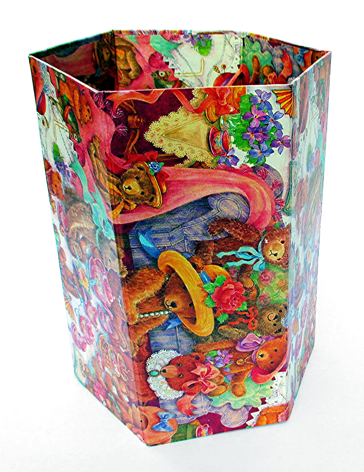
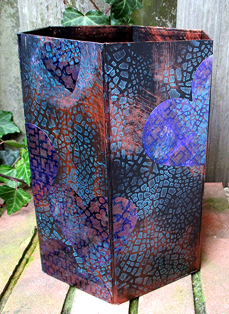
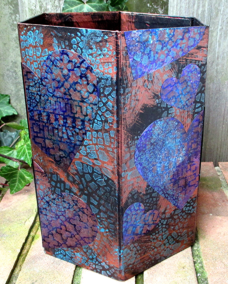
There it sat in all its pink and orange glory until this week, when it was time to start on my Home Décor project for Nathalie’s Creative Squad January Challenge. Bye bye, bears! Hello, Downtown and Crackle stencils!

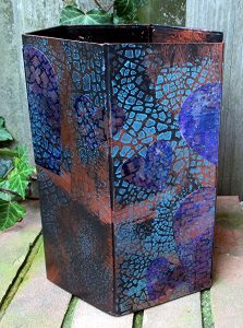
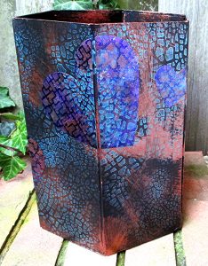
I gave myself a challenge within a challenge – to incorporate hearts, a shape usually thought of for Valentines and weddings, to create an offbeat, upscale, graphic design. Using a deep, rich, unexpected palette and stencils that helped take things to a new level made it easy to accomplish.

The hearts aren’t immediately obvious, the overall effect pleases my eye. I’m almost sorry that the trash can is going right back under the sewing machine. Maybe I should use it for a big bouquet of dried flowers instead!
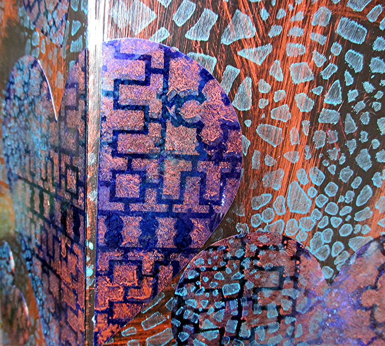
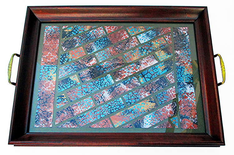
While I was at it, I wiped my brushes onto pieces of cardstock and stenciled on top of the brush marks. That gave me a second project – a mosaic style tray, an extra bonus.
Instructions for Trash Can:

To customize the project, pick a color palette that suits your décor. Alternatively, duplicate the project as shown by using the paints and Shimmer Sheetz that I chose. Either way: You will need two stencils (a graphic pattern plus a crackle pattern), metallic acrylic paint in two colors, black or white gesso, and Shimmer Sheetz that coordinates with the paints and gesso.

Choose a trash can with smooth sides. Base coat with black gesso. Randomly brush with copper metallic acrylic paint, leaving much of the black visible. Randomly stencil with Crackle pattern in teal metallic acrylic paint. Allow to dry. (Choose paints appropriate for the trash can – mine is paper-covered, but yours may be metal.) *Wipe brushes onto quarter sheets of cardstock before washing them. (8.5” x 11” cut into four pieces.)

Freehand or die-cut hearts from Amethyst Gemstone Shimmer Sheetz in assorted sizes. Back the Shimmer Sheetz with double-sided adhesive sheet prior to cutting. Size of hearts is determined by the size and shape of the trash can. Keep the scraps for other projects. Note: I used the AccuCut GrandeMARK machine with standard cutting dies. If you use a Big Shot or other personal-size machine with thin dies, a metal adaptor plate is required– follow Els van de Burgt’s YouTube tutorial for this technique. *While you’re at it, stencil onto the cardstock that was wiped with paint in Step 1. Set aside stenciled cardstock to use for Tray.

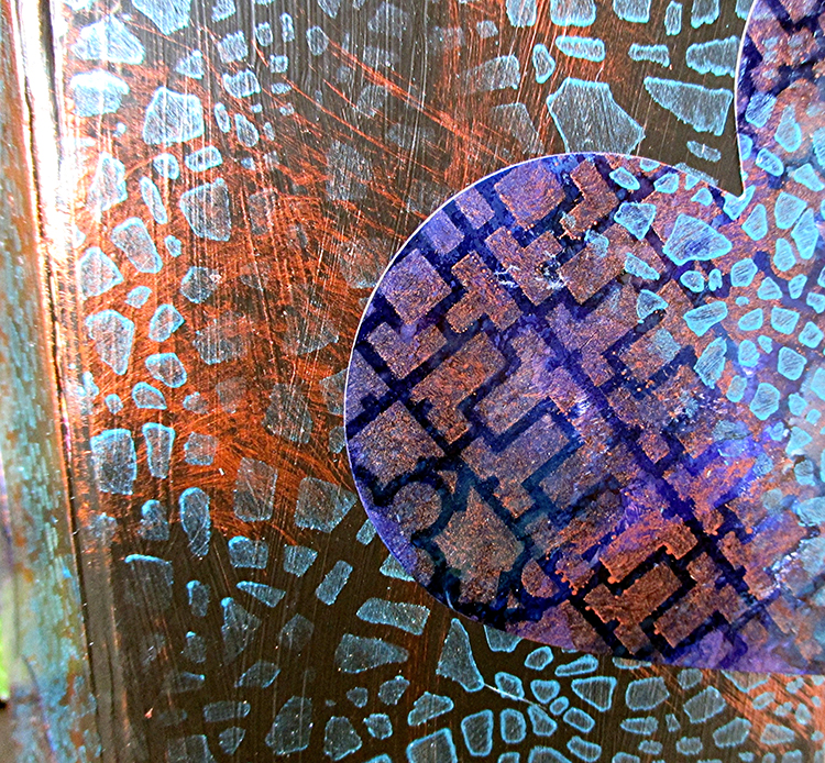
Stencil the hearts with various sections of the Downtown Stencil using copper metallic acrylic paint. Randomly stencil with Crackle pattern in teal metallic acrylic paint. Allow to dry.

Arrange and adhere the hearts as shown or as you prefer. Note that many of the hearts have been cut where they move from one side of the trash can to the adjacent side, and some are cropped so they appear to extend at the top and bottom edges. This will not be necessary if using a round or oval trash can.


Instructions for Tray:

Find a tray with a glass insert or make one with a frame, handles, glass and sturdy backing. (Shown: Tea Tray from Sudberry House). Cut a background for the tray from metallic finish cardstock, carefully piecing together strips if the tray is larger than a single piece of cardstock.
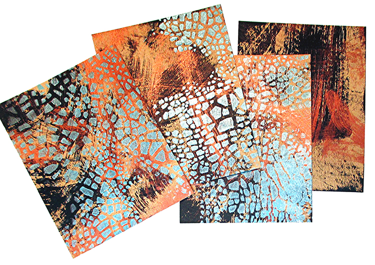
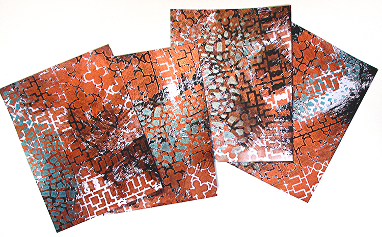
Cut each piece of stenciled cardstock into four 1” x 4.25” strips and one 1.5” x 4.25” piece. Using the project photo below as a reference, piece together and adhere the 1.5” strips at the right and left sides of the tray, close to the handles. (This hides the seam where I joined bands of background cardstock.) Angle and trim the 1” strips to cover the remainder of the tray, leaving space between the strips for a mosaic effect.

Assemble the tray.

Options:

*Instead of simple strips, cut the cardstock into square mosaic ‘tiles’ or randomly cut mosaic pieces.

*Instead of backing the pieces with glue, adhere them to cardstock that has exposed double-sided adhesive sheet on top. Leave very little space between the pieces; use embossing powder and a heat tool to create the effect of textured grout! (This is time-consuming, but fun.)


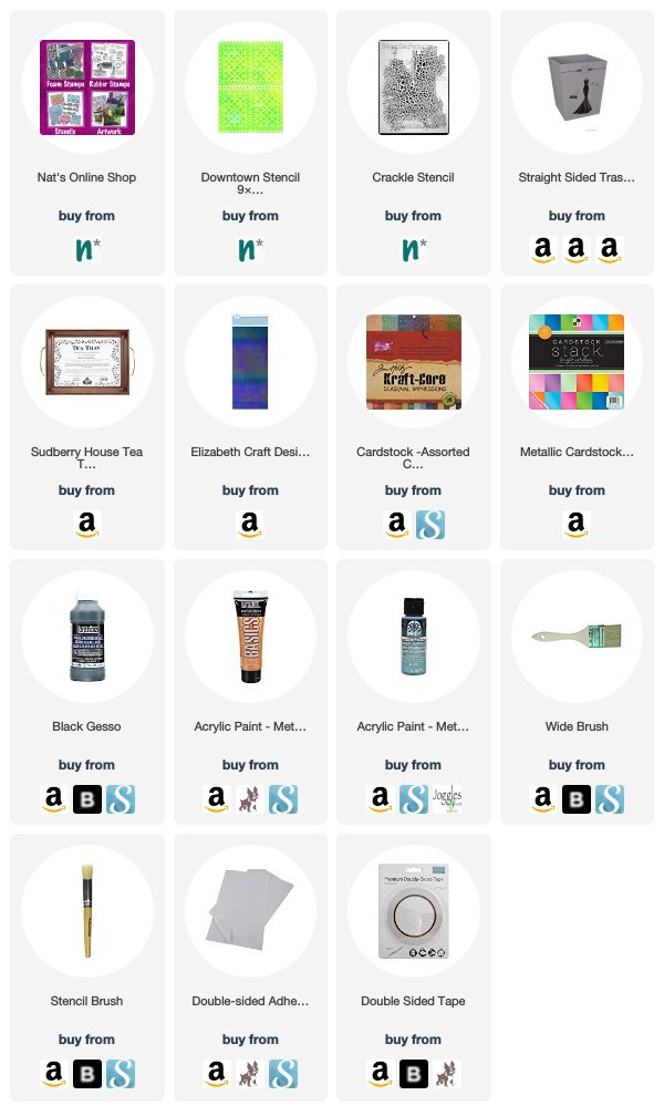
Thanks Judi! You really turned that teddy bear trash can into something great to look at! Feel inspired to try dressing up your own home decor items? You can find all my Stencils in my Online Shop. Here are some of the other supplies that Judi used:


Working on something yourself that you’d like to share?  I love to see how you interpret our monthly themes. Email me how you used my stencils and stamps with the theme and email me an image – I would love to share your projects in my next  “n*Spiration From Around the Globe“.

Leave a comment

The Stencilfied Journal – Prompt 3

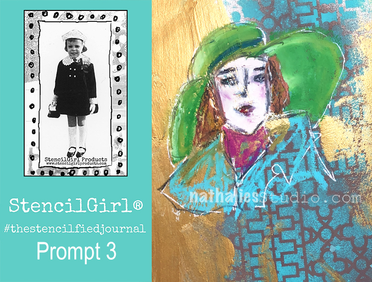
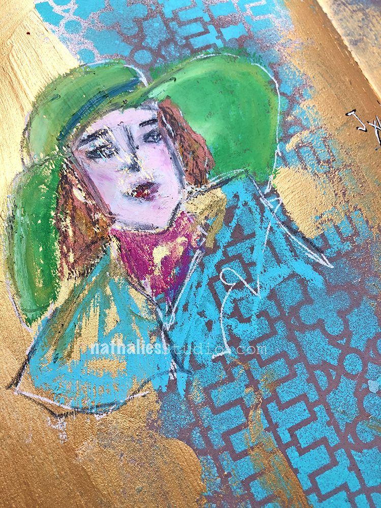
My wonderful friend Tina Walker is at it again – she invited several people to join her Stencilfied Prompts. The prompts are music related and each week she is posting a song. You can be inspired by the lyrics, the video, the album cover or anything related and the only restriction is that you have to use StencilGirl Product Stencils. Here is my take on Prompt 3:
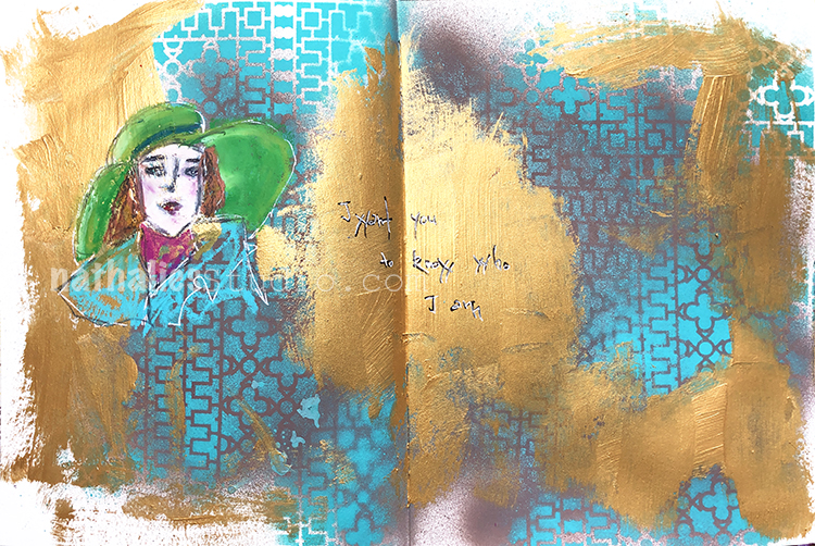
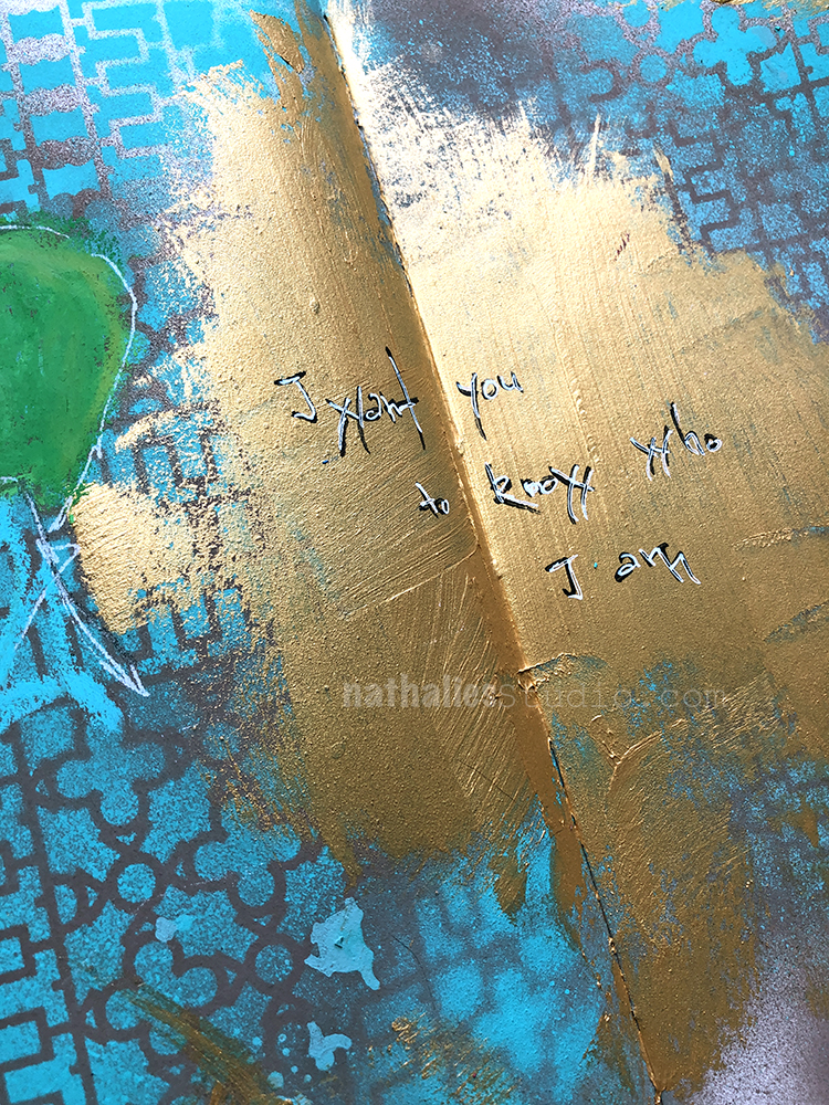
This week’s prompt is “Iris” by the Goo Goo Dolls”   and I love the part of the lyrics which says ” I want you to know who I am”

I used my Downtown Stencil and sprayed with a nice teal color over it. Something about this stencil always screams teal and gold to me and so I also added some gold Gesso here and there and then used Neopastels to paint the face on top.

I love that the gold gesso actually resisted the pastels a bit  I assume because of the texture and that is peaks out here and there in the face -nice happy accident :)

Here are some of the supplies I used besides some acrylic paint:


Leave a comment

Stroll Through the Hood – January 2019

January climbed up in my ranking from least favorite month to one of my favorite months – and the reason is Creative JumpStart. So much fun in the class if yet lots of work. A Stroll through the hood though helps to clear my head and get new ideas. I do have to admit though that the later it gets in January, the more frigid and hard those strolls are in the cold (writing this as it is -12C/10 F) Strolls through my hood get me out of my studio, they help me unstuck and often I get inspired by what I see and to get new ideas to create something. It is part of my philosophy about Artful Adventures in Mixed Media – which is the subject of my book. Here are some photos that I gathered in the last couple weeks.

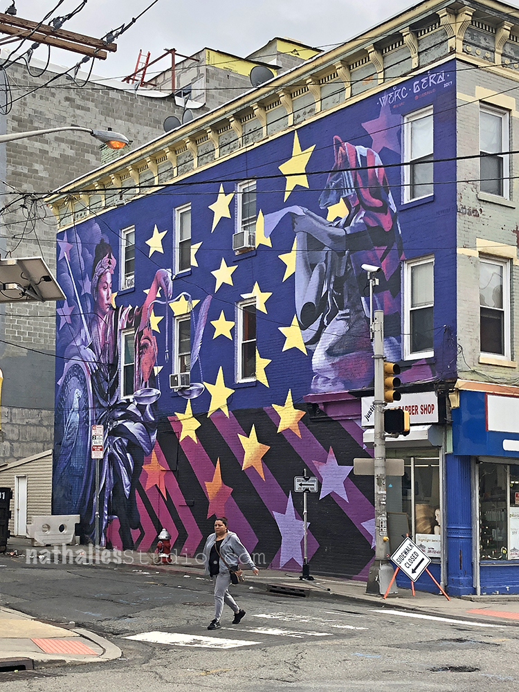
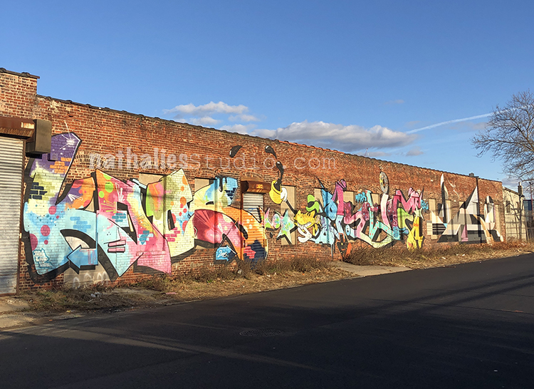
On our search for a house we have branched out to some other areas in the city and it is fun to discover new murals -this one is pretty cool- love the colors and design. (and yes that was a warmer day)

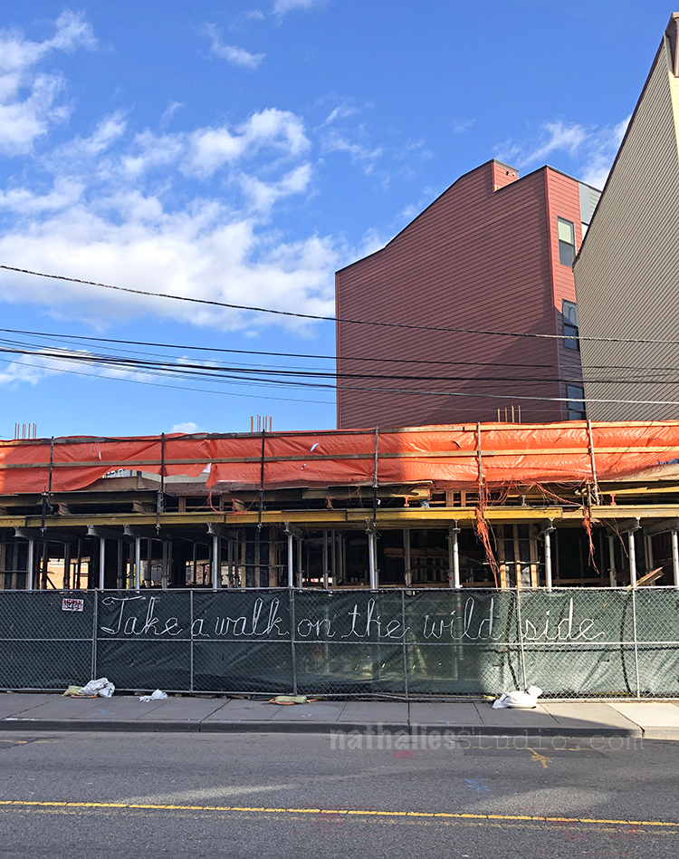
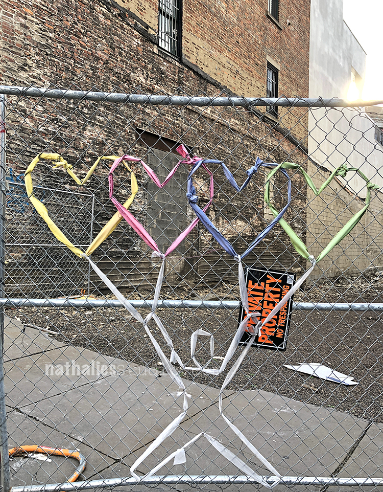
YESSSS- Love it :) Fence art – I assume by Norman Kirby again. Love the ribbon writing and where it is located.

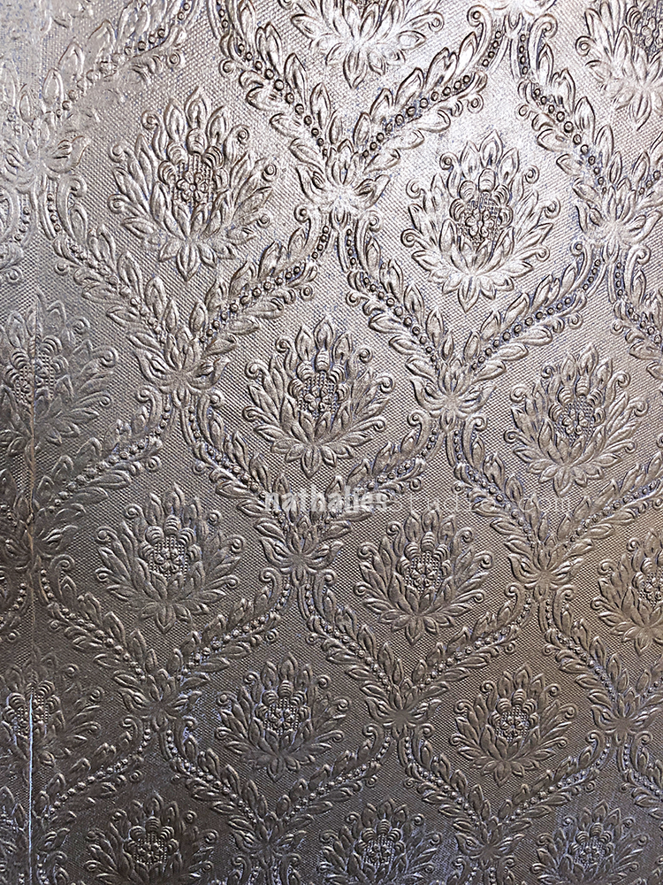
Look at this wallpaper – oh my!!!!

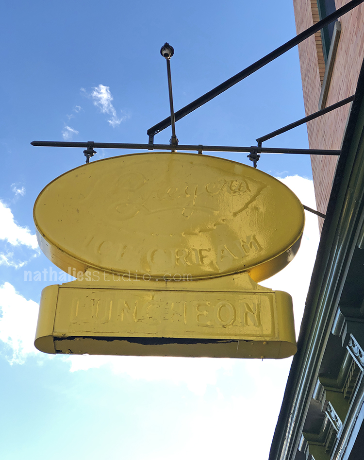
Look at this cool old sign – painted a million times I guess. Love the yellow. The store belonging to the sign is empty but something is happening in there- so I really hope they will keep this cool sign.

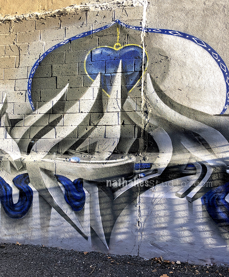
some graffiti  – love the shading – what a great dimensional effect.

And awweee yummie colorful lettering!

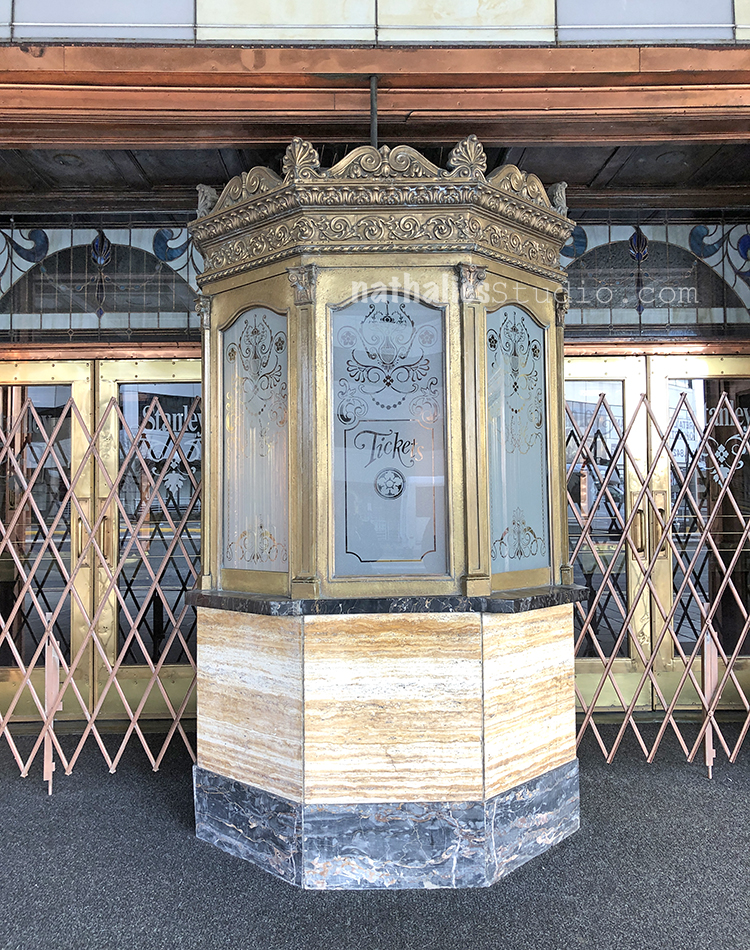
The old Stanley Theater – love those ticket booths – and such an interesting mix of texture and materials all around.

More fence art- how cute is that?

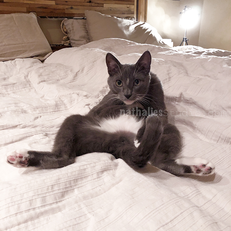
And I am sorry but this was just too funny to pass up …this is what I have to deal with every day at home …no wonder I need to get out hahahahaha- Cuteness- Weirdo- Overload

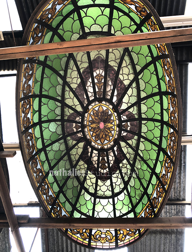
We also went to an architectural salvage place- OMG – those stain glass skylights? I want one- hahahah- for 25,000 Dollars one can be mine …sigh …But pretty amazing!!!

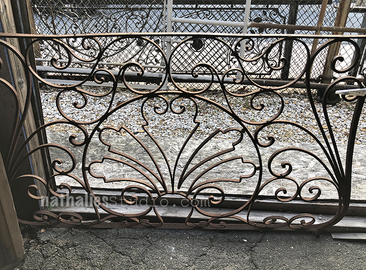
As well as this iron cast fence- I could have spent hours there …but it was soooo cold.

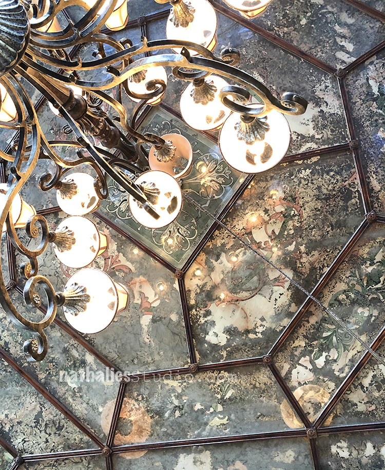
This ceiling in a cafe my friends and I went for lunch was just so interesting – with its texture, color and pattern. It is a reverse painted glass ceiling and because of a fire on the upper floors in the beginning of the last century some of the fire fighting water ran down to the ceiling damaging some of the painted areas which make for this texture now. This gave me an idea for a project I want to do  – I hope to share soon. Actually I am going to do this as soon as I finish this blog post :)

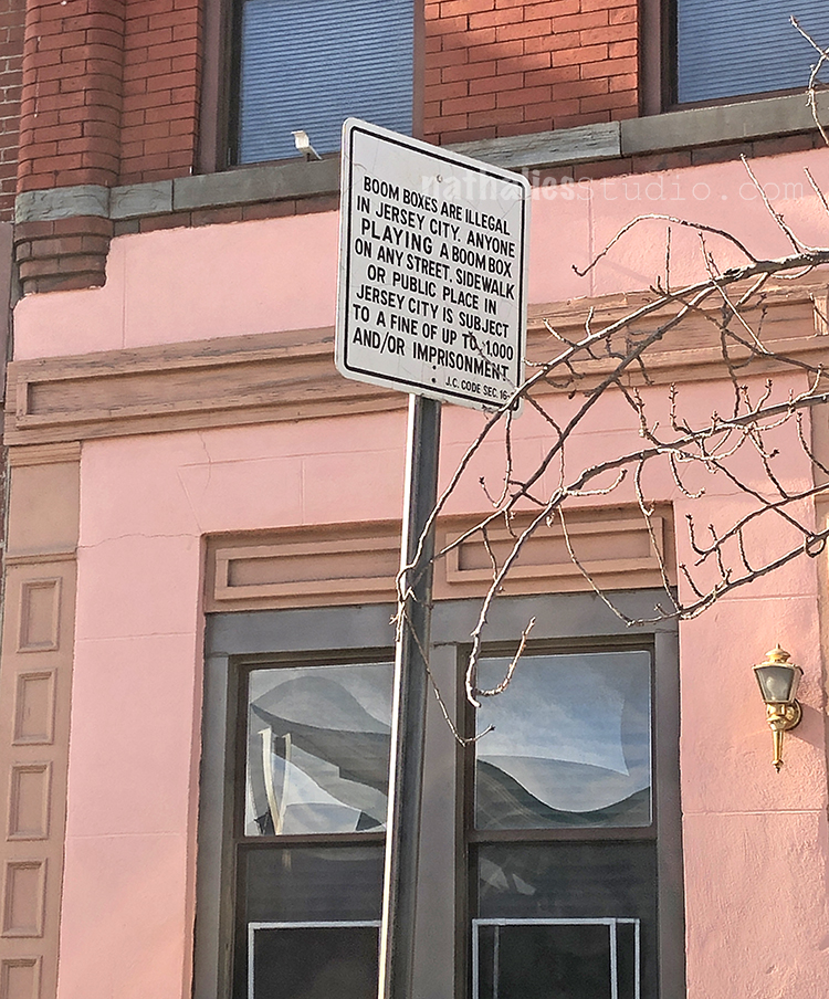
This sign in an area near the Holland Tunnel in a kind of forgotten area of the city always cracks me up…or maybe it is also a bit sad…as if nothing ever happened here again past the 80s. Anyone still owns a boom box????

I hope you enjoyed this stroll through the hood and I hope you join me in February again :) Have a fantastic week

Comments (1)

  • jamcam2022

    |

    Love this post – slices of life…..and Bobby Pretzel- priceless?

    Reply

Leave a comment

Foam Stamp and Shrink Film Earrings – DIY Play Date

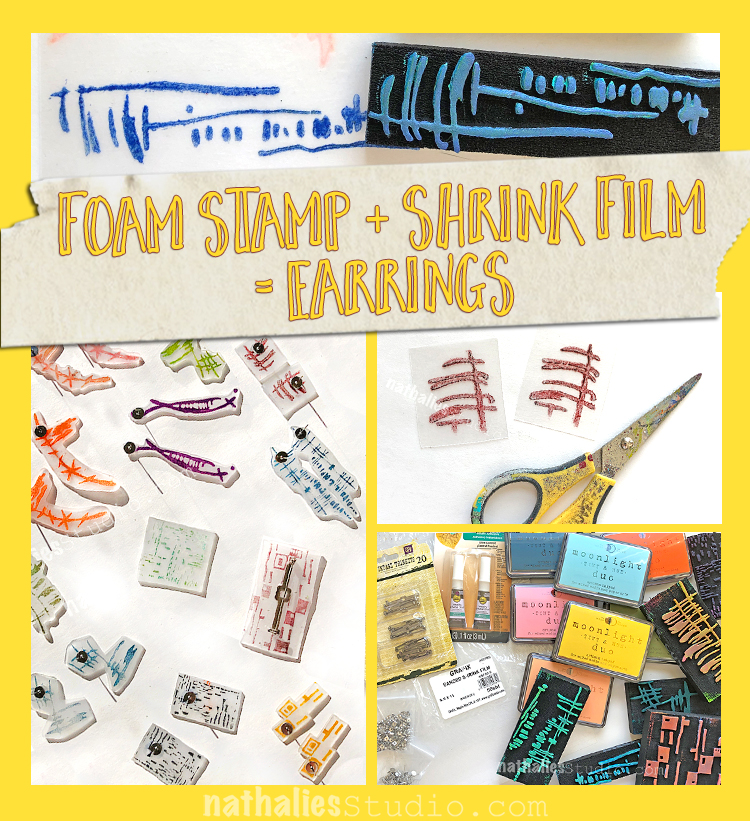
Earlier this week my friend Kim and I got together for a little play date with my new Foam Stamps. This time we made some really nifty shrink film earrings and brooches that I’m excited to wear!

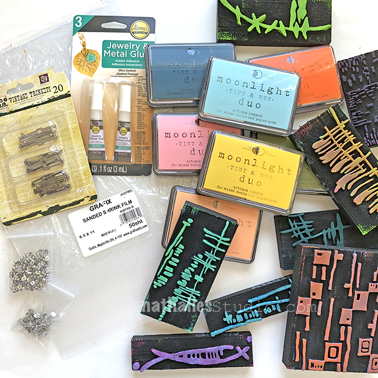
Here are the supplies – we used my new ArtFoamies designs, Moonlight Duo ink pads, shrink film, jewelry adhesive, scissors, a heat tool, and earring and pin backs.

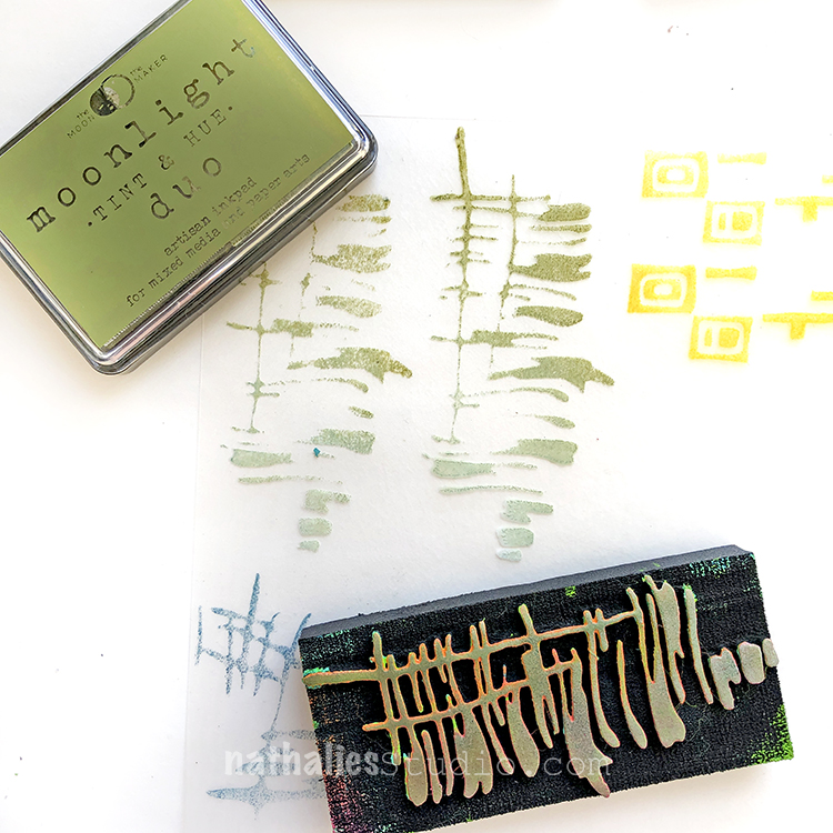
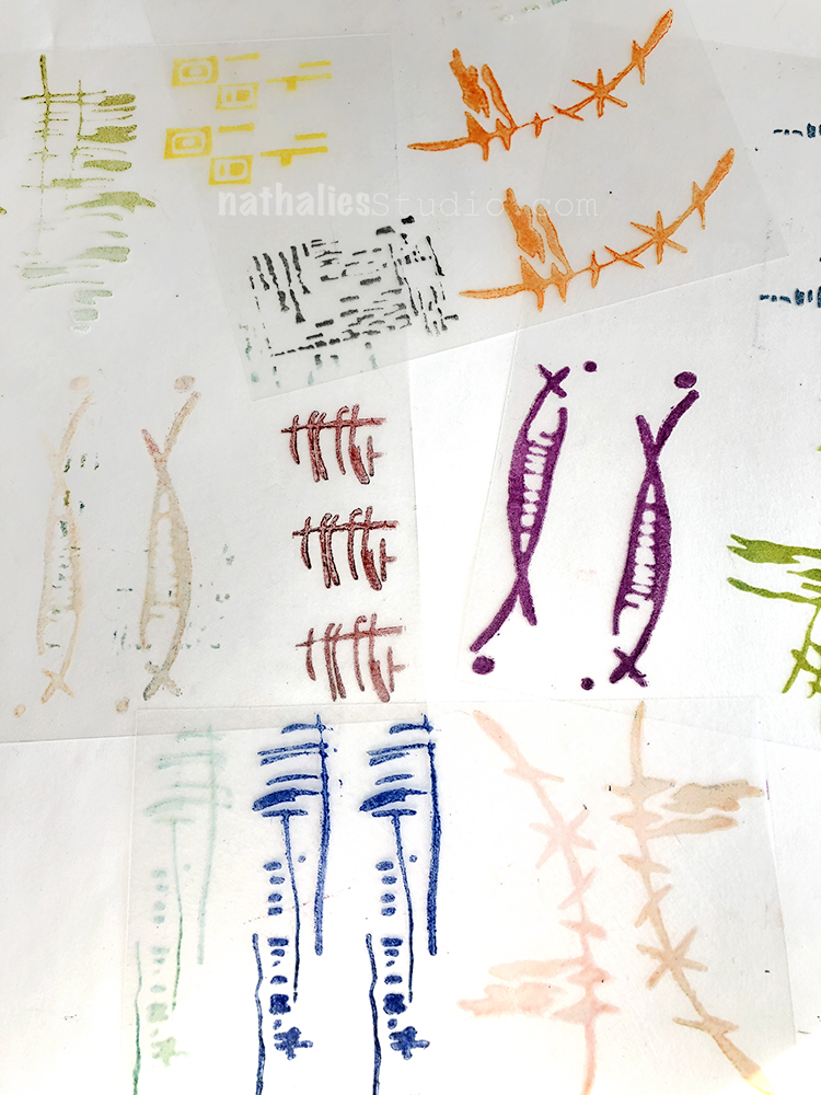
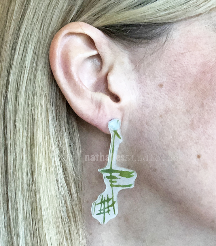
Here Kim stamped on shrink film my Far Out foam stamp in green and just a bit of my Mid Century Squared stamp in yellow.

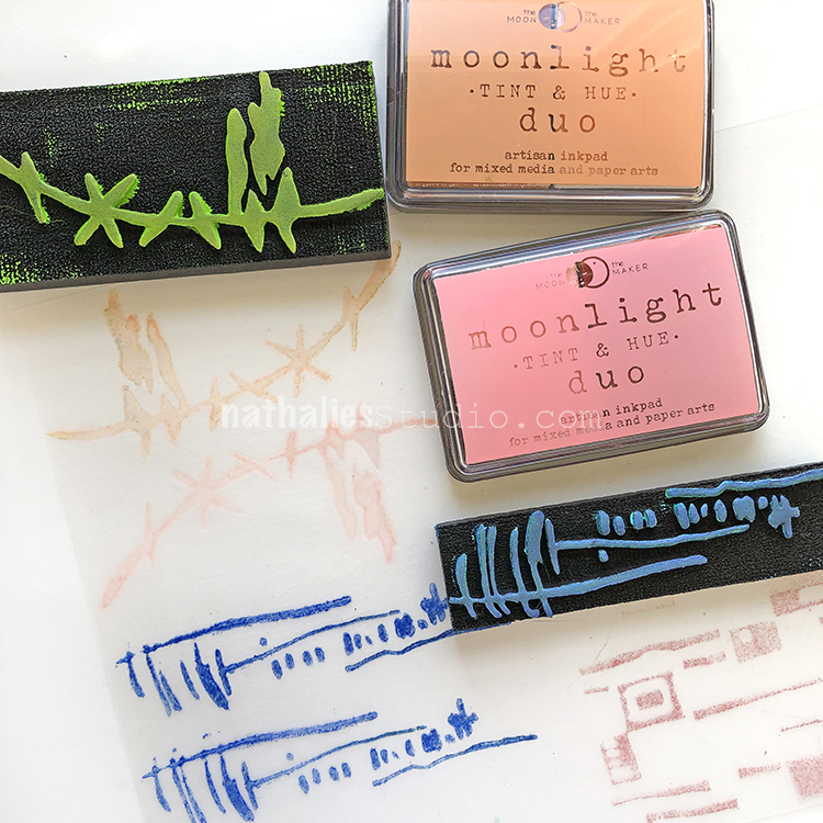
I stamped Groovy in peach, Gnarly in blue, and a bit of the Mid Century Squared in pink.

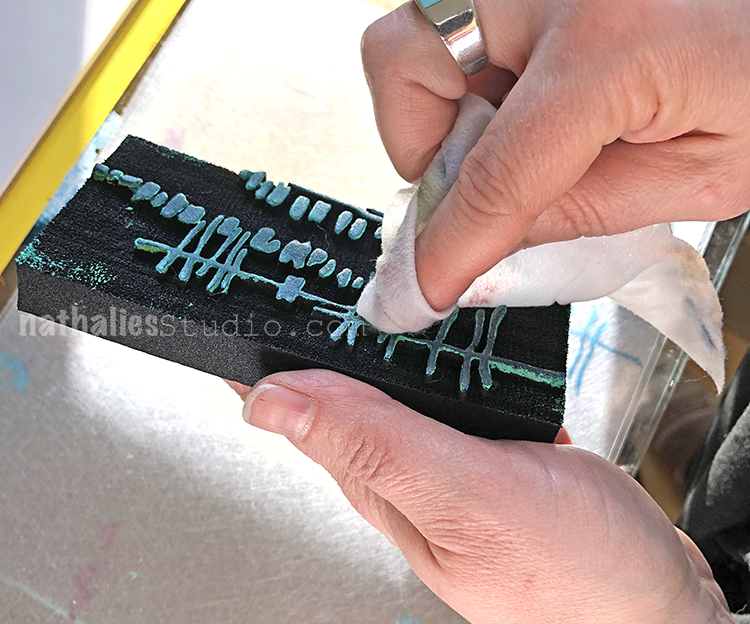
It’s a good idea to gently wipe off your stamps with a baby wipe so you don’t contaminate the ink colors.

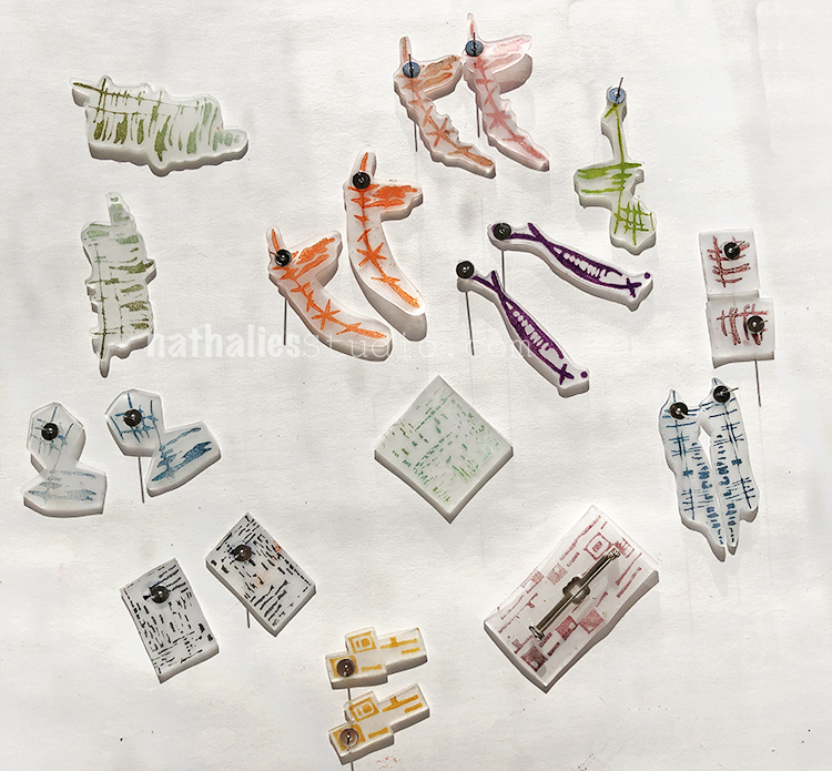
We stamped lots of different pairs onto the shrink film.

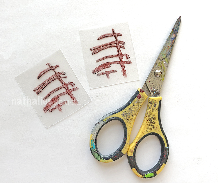
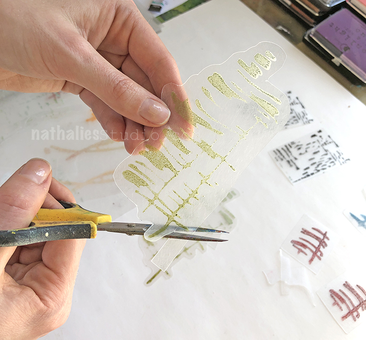
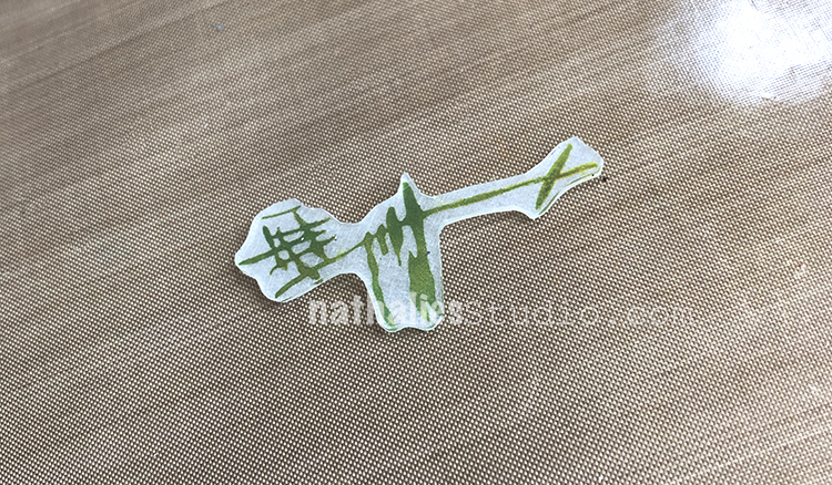
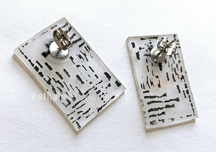
Time to cut out. Here Kim stamped just one end of my Gnarly stamp and cut it into a rectangle.

You can also fussy cut them out. Here is my Far Out stamp.

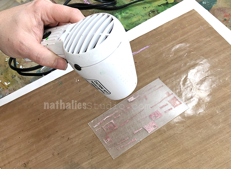
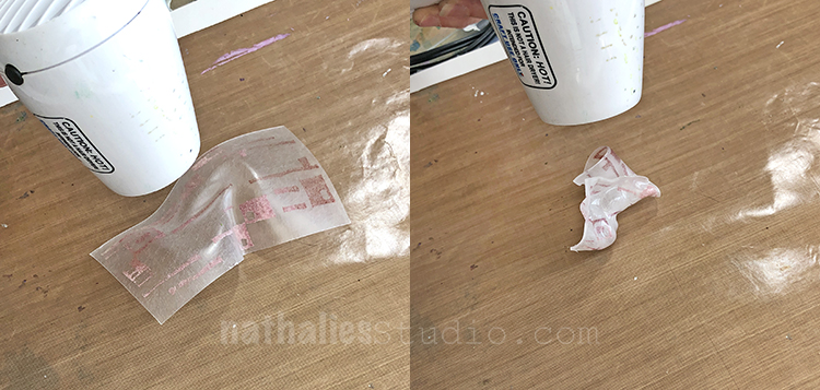
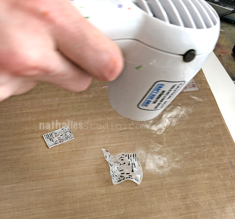
Time to shrink the shrink film :) Work on a clean craft mat over a surface that can get hot. Gently move the heat tool around, evenly heating the film. I started with my Mid Century Squared stamp in pink.

It will start to buckle and curl and can get pretty gnarled up. Move the heat tool around, hitting every side and surface to shrink it evenly. Be careful! It can get hot!

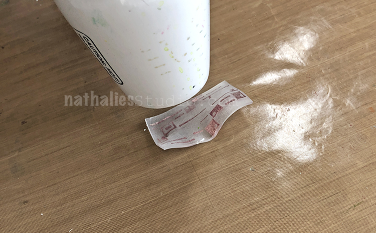
By moving the heat tool around and flipping over the shrink film and heating it evenly, it will start to calm down and flatten.

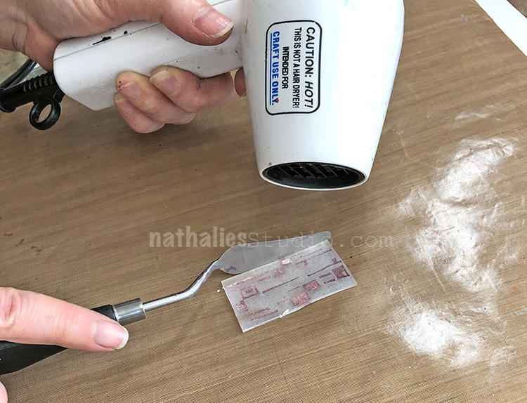
A clean palette knife is useful in flipping the piece over, and gently flattening it out.

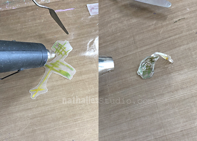
We tried a more powerful heat tool and actually melted and ruined the piece – it was too hard to heat it gently and evenly and it curled up and melted before we could flatten it out. This was the Jazzed design.

We used the lower power heating tool on the second Jazzed piece – so cute!

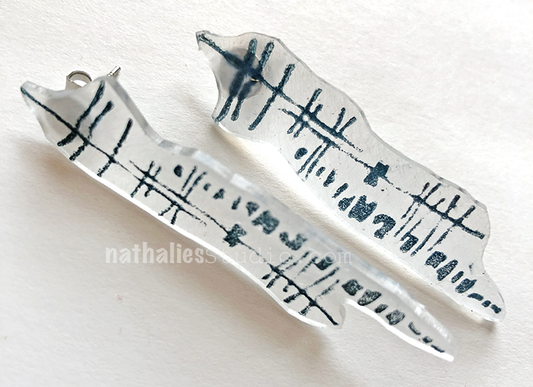
Kim did a pair with just a section of my Signals stamp in black ink.

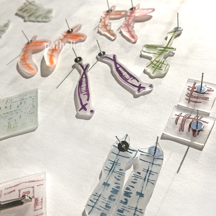
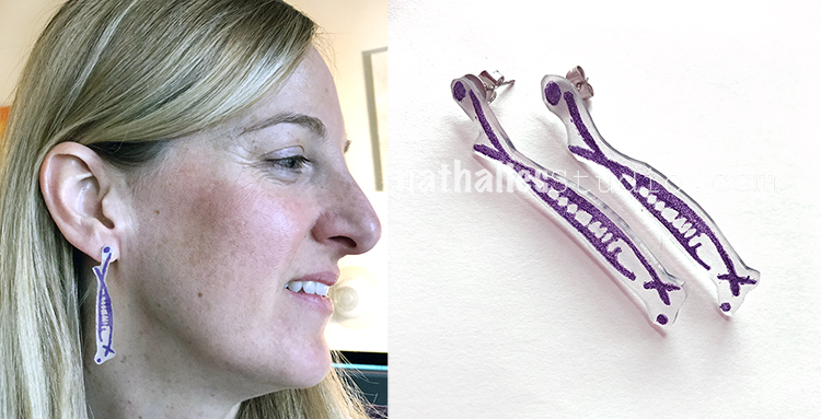
In the end we used the jewelry adhesive and glued them onto the earring post backs and the brooch pin backs.

Here is the Jazzed design in green.

Kim wearing some purple Neato earrings :)

These are part of the Funky stamp – love these in dark blue/green.

Kim’s little black earrings with part of the Signals stamp.

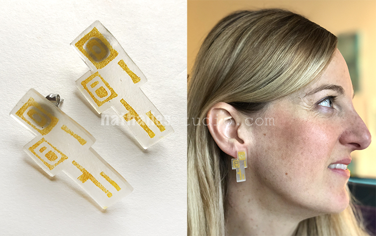
And one of my favorites – part of the Mid Century Squared stamp in yellow.  So in the end we made some pretty cool looking earrings and brooches for us and our friends!

Give it a try! It’s a fun project for a morning or afternoon and you can definitely play around with how you use the patterns.

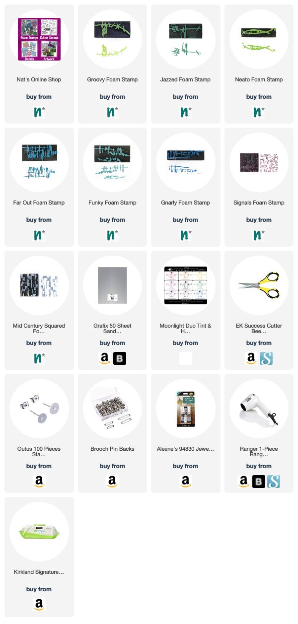
In addition to my Foam Stamps from my Online Shop, here are some of the supplies that we used:


Leave a comment

Discuss Ideas – Art Journal

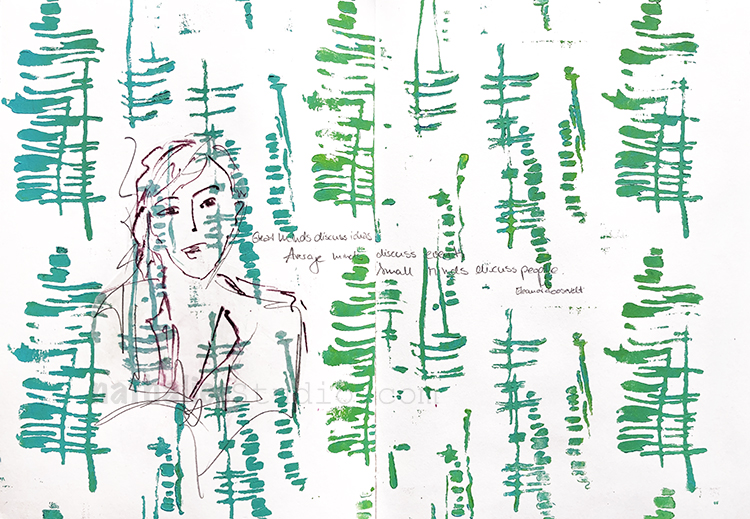
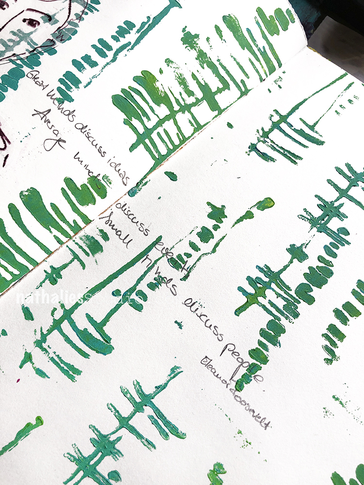
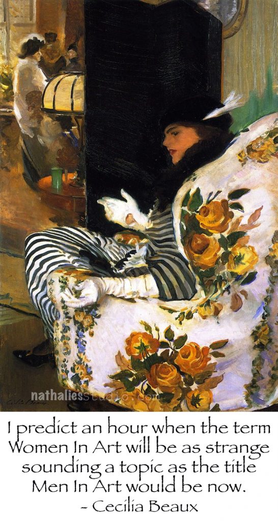
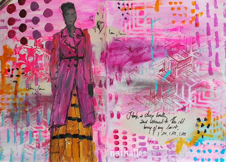
“Great minds discuss ideas. Average minds discuss events. Small minds discuss people. ” Eleanor Roosevelt

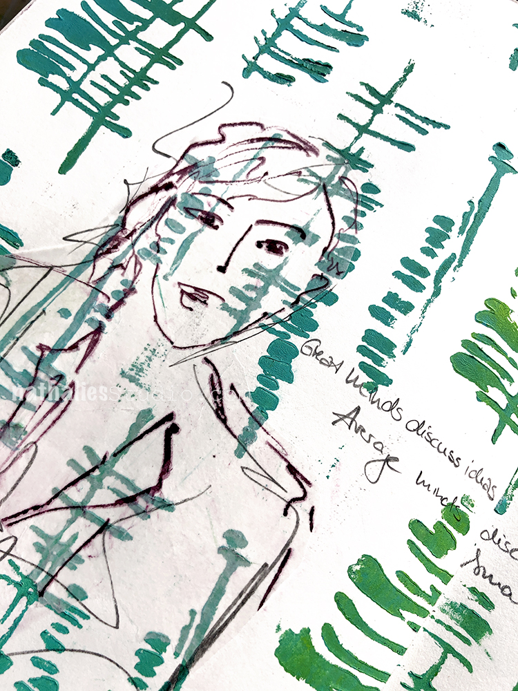
Loved playing with my new ArtFoamies  and creating a pattern using the Far Out, Funky and Gnarly stamps.

I sketched the lady with some acrylic ink on a piece of deli paper and then added it with gel medium to the background.

Here are some of the supplies I used for this spread:


Comments (2)

  • Sue Clarke

    |

    I love the quote and the art work.
    I have your new ArtFoamies on my wish list Nat!

    Reply

Leave a comment

The Stencilfied Journal – Prompt 2

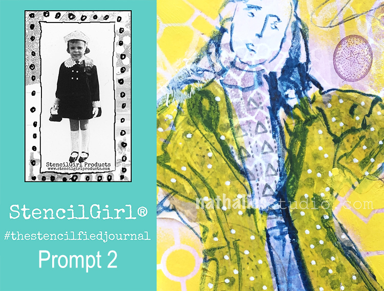
My wonderful friend Tina Walker is at it again – she invited several people to join her Stencilfied Prompts. The prompts are music related and each week she is posting a song. You can be inspired by the lyrics, the video, the album cover or anything related and the only restriction is that you have to use StencilGirl Product Stencils. Here is my take on Prompt 2:

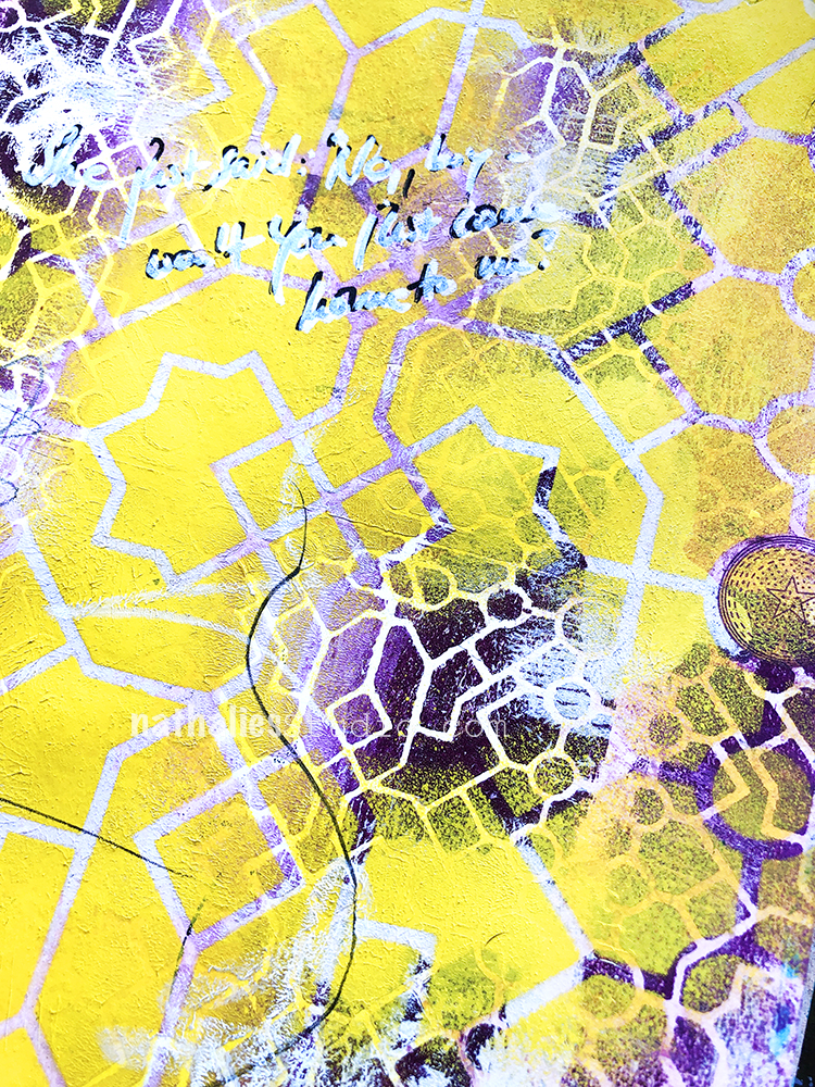
This week’s prompt was ” Please Come to Boston” by David Loggins. I honestly never heard the song before-mhhh? But I liked the lyrics “she just said, no boy – why won’t you just come home to me”

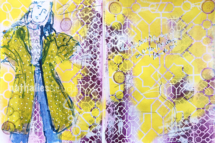
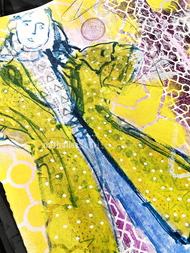
I don’t use yellow a whole lot and with the winter weather here I felt like I should go right into this sunny color and ha- it was great. I used it over my Exchange Place Stencil  with yellow spray paint. I named the stencil after the Path station here in Jersey city, which carries people through the Tunnel to NYC. I love the lines and circles in there and somehow that made it the perfect stencil for me for this quote – traveling – coming home – taking some sort of transportation.

I used my ArtFoamies Exchange Foam Stamp with some acrylic paint underneath- the pattern is smaller then the stencil but it works well together – and I love how the purple and yellow look- nom nom.

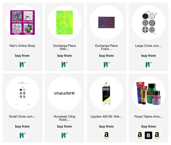
Here are some of the supplies I used for this spread


Leave a comment

Currently Digging – Creative Squad Edition with Jennifer Gallagher

It’s time for a special edition of Currently Digging – with my Creative Squad! Once in a while I like to share with you some nifty finds – like an Artist who’s work caught my eye…, some Inspiration that got my creative juices flowing, and Tools & Techniques I am currently digging. Today we asked Jennifer Gallagher from my Creative Squad what SHE is Currently Digging :) Hope you enjoy this.


Nat often shares with us current inspirations, artists of interest, and new things she has discovered. In that spirit, I am excited to share with you a few things I am currently “digging”.

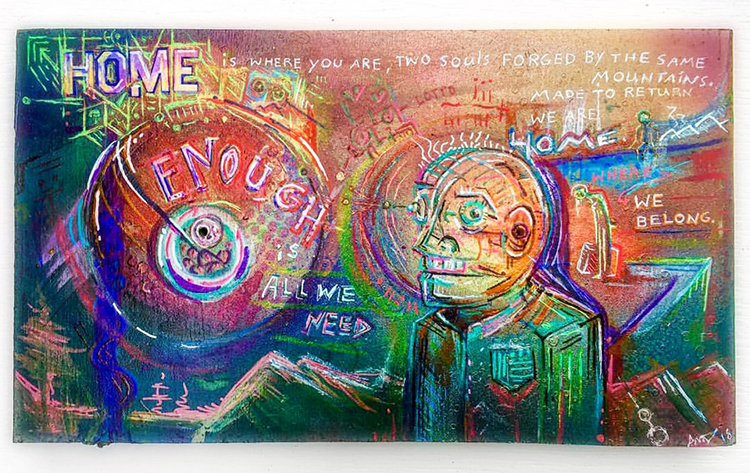
First, I’d like to introduce an artist, local to my community, that I am very inspired by. His name is Aaron Dennison. I recently had the pleasure of meeting Aaron and viewing his work at a local art show. His pieces speak to his passion of creative reuse, many of which include bold and expressive illustrations on wood mountings or upcycled assemblages. Each and every piece tells a compelling story. Visit www.aarondennison.com to see more of his work.

Photo Credit: www.aarondennison.com


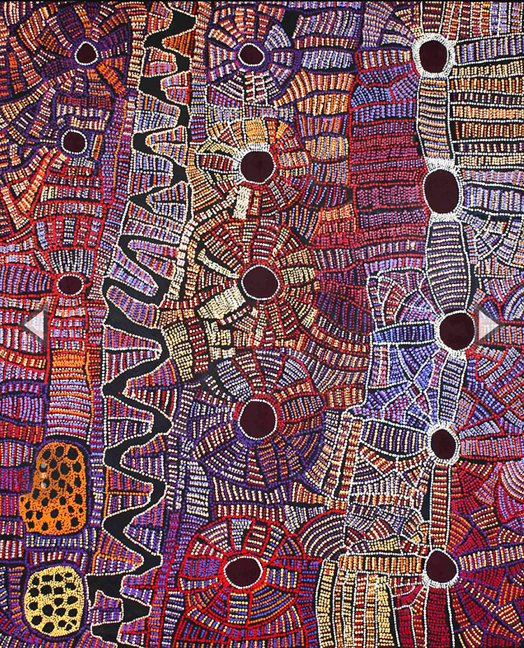
I am a huge fan of indigenous art from cultures around the world. lately, I’ve been very inspired by aboriginal art. It differs in style, depending upon which region of Australia the artist is from, and it is centered around storytelling. Their stories are portrayed by symbols throughout their artwork. There is something about this type of art that speaks to me as an artist. Each painting is telling a story that has been passed down through generations. Visit www.aboriginalart.com.au to learn more.

Photo Credit “Papunya Tjupi Arts” at www.tjupiarts.com.au


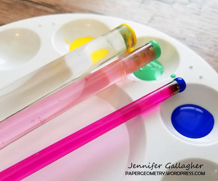
Having been so inspired by the art of the aboriginal people, I recently purchased a set of dotting tools. These acrylic rods, available in a variety of sizes, are perfect for dipping in acrylic paint. Their smooth surface is easy to clean and paints perfect round dots.


Thank you Jennifer! I hope you all enjoyed hearing a bit more about what inspires Jennifer as an artist. Stay tuned for the next Currently Digging Creative Squad edition for more from our other members :)

Leave a comment

A Look Back – Cool Stuff You May Have Missed 01

A Look Back – Today I’m starting a new blog series to show you some projects and posts that you may have missed – sometimes going WAY back in the archive. I think it will be fun to revisit a few ideas that we haven’t seen for a while. I’m excited to see how a little look back might inspire something new in the future :)

This time I’m going to show things related to the theme “Layers”. I am big on layering in my art journal and my mixed media paintings. Layers can do a lot for you when you’re trying to pull a piece together or give a spread a little extra oomph. Here is A Look Back at some ideas. Enjoy!


First is an Art Journal spread way back from 2013 when I was just planning my move to the US! I went a little crazy with layering up the background here with my Circuit and Crackle stencils and all kinds of media. Check out the full post to really see all the deep layering I created.

This is an Art Journal page where I used a stencil as my final layer to resolve a not-so-great background. I had done a lot of stamping and stuff underneath and wasn’t too happy with it. Then I added my Buenos Aires stencil as a final layer and presto! Background resolved and now I love it. You can check out the full spread here.

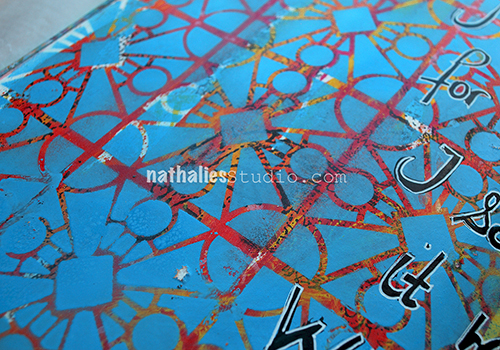
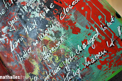
Here’s another Art Journal page from 2013 where I played with spray paints and stencils to build up a really layered background. I still love how grungy it turned out and totally works with the mood of the page.

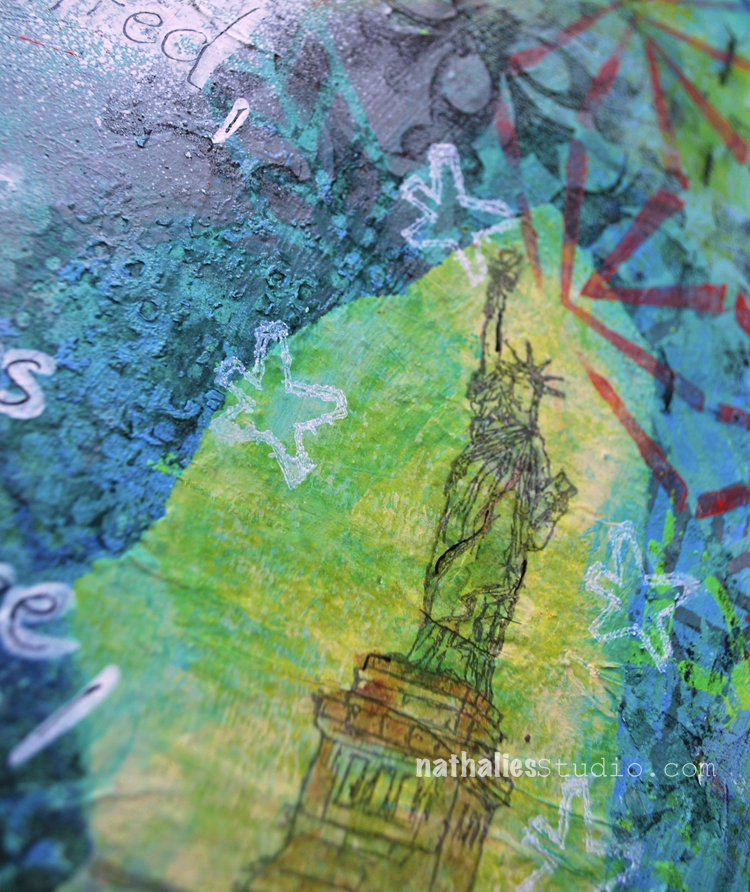
Next I want to talk about choosing a strong focal point in contrast to a layered and complex background. Sometimes you need a place for the eye to rest. Choose wisely – this focal point will be the “focus” of the piece :) Here I used my Lady Liberty stamp to grab your attention. You can see what the page is all about here.

How about layering up a combination of marks – both stamped, stenciled, and by hand? I love to mix it all together to create something that really is fun to make and to look at in the end. This is an art journal spread from 2017 where I’m mixing up my Kassel and Manhattan stencils, my Versailles foam stamp, and my Satin Doll rubber stamp. Lots to look at :)

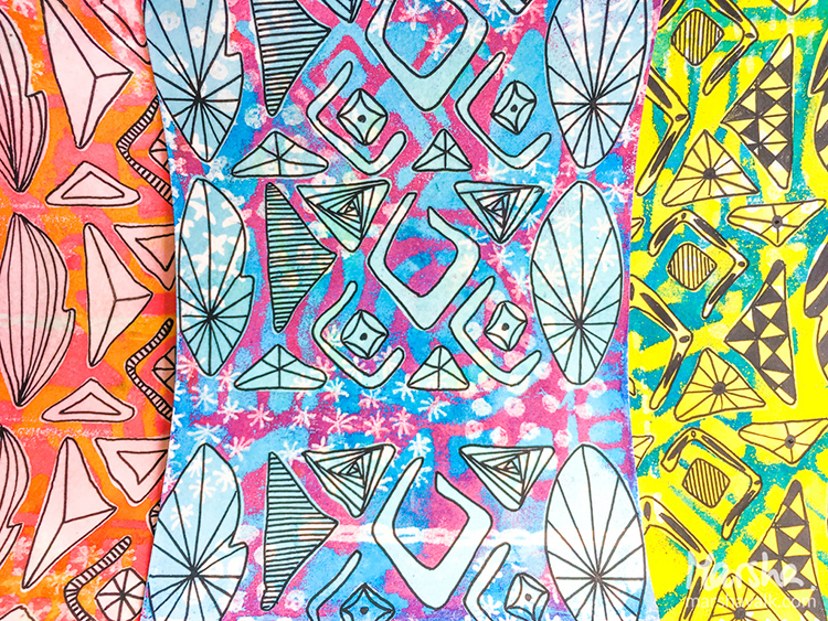
Creative Squad alum Marsha Valk did a wonderful layered project for us back in 2017 involving the use of embossing powders and resist to create these “faux batik” papers with my Batik stencil and Batik 3 foam stamp. You can check out her video in the post – it shows just how she both adds and subtracts layers to make these super fun designs.

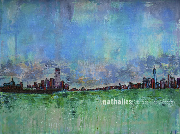
Finally how about a layered landscape I created back in 2015. I call this painting 2 Tallest and it’s the view of the NYC and Jersey City skylines from the perspective of the Statue of Liberty. You can see a little video in my original post of how I layered up paint and stencils to create the mood of the piece. This view never gets old btw! I’ve got some nice Giclee prints of this one still available too :)


I hope you enjoyed A Look Back through my archive and maybe you are inspired to try some of the layering techniques I shared.

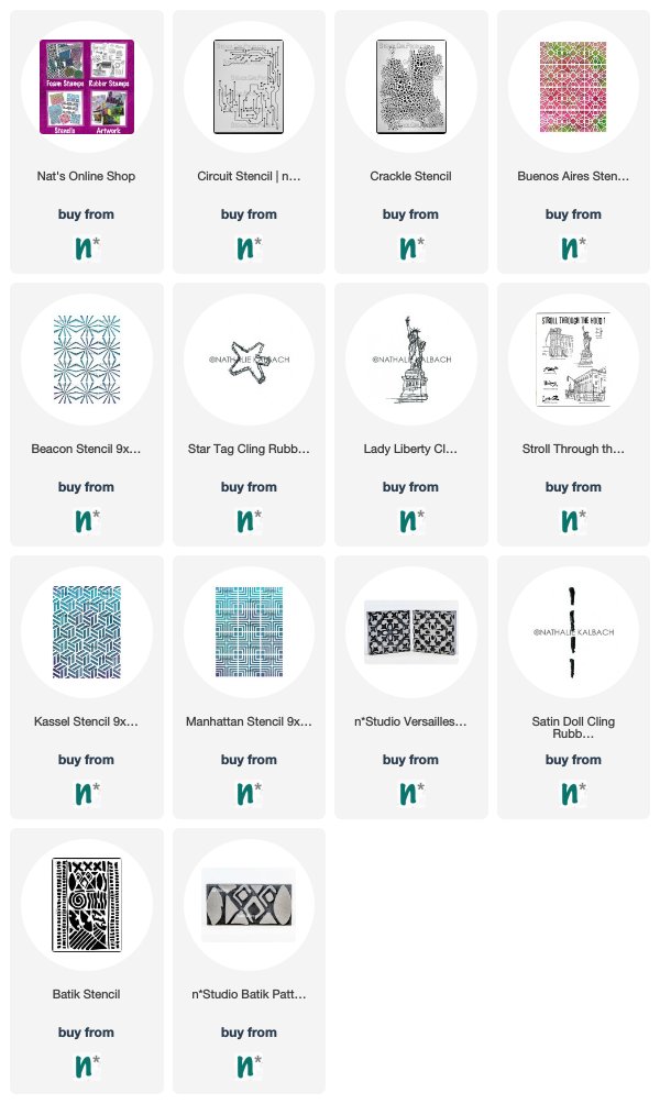
Here are some of the supplies that were used in these pieces:


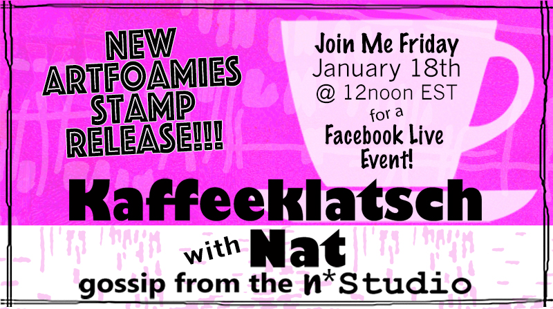
And catch me chatting LIVE today on Facebook at 12 noon EST. I’m showing my NEW ArtFoamies stamps!!!

Leave a comment