Art Stroll: Rauschenberg Among Friends Part 2

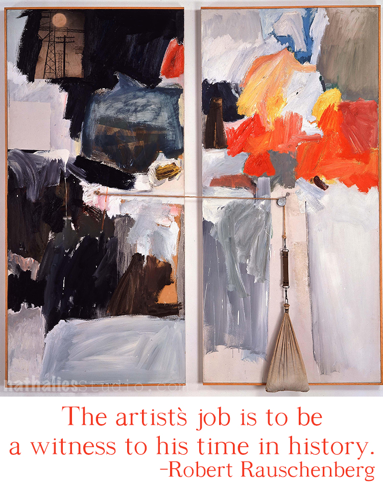
As promised Part 2 of my visit of the Rauschenberg Among Friends Exhibition – you can read about Part 1 here. When you are reading this I have been already back to the show and have scheduled another visit next week …I am obsessed- HELP – LOL

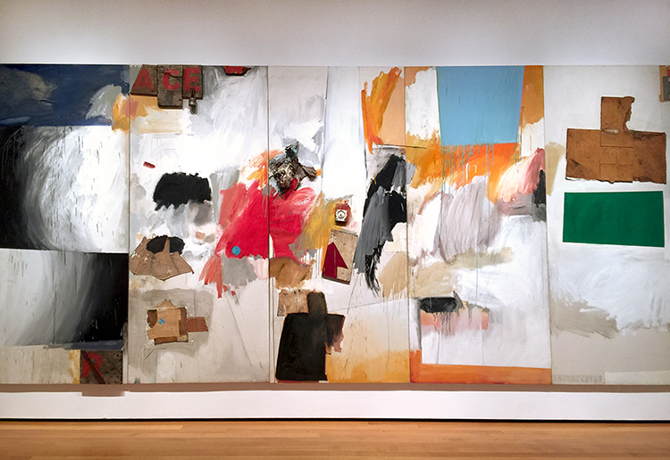
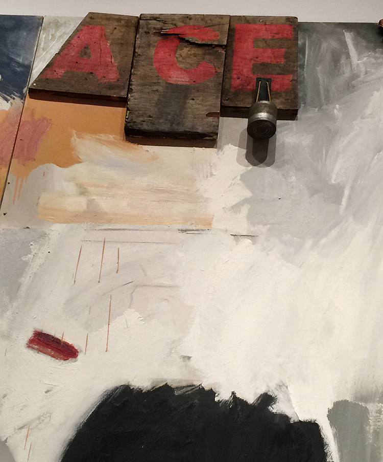
“Ace”(1962) , Oil, paper, cardboard, paint-can label, umbrella, doorknob, fabric, wood, nails, and metal on canvas – on five panels

I love how reading the signage becomes the start of a scavenger hunt trying to find all elements mentioned on the panels.

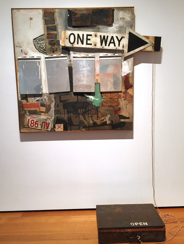
“Black Market” (1961), Oil, watercolor, pencil, paper, fabric, newspaper, printed paper, printed reproductions, wood, metal, tin, street sign, license plate and four metal clipboards on canvas with rope, chain and wood suitcase containing rubber stamps, ink pad and typed instructions regarding objects to be given and taken by viewers

Black Market was first on view in Amsterdam in 1961 and viewers were invited to take out an object from the suitcase and replace it with their own and then make a drawing of their contribution on one of the clipboards. Unfortunately people were mostly just stealing the objects in the suitcase and so Rauschenberg withdrew his invitation. – I just love the concept and thought -so sad it didn’t work out!

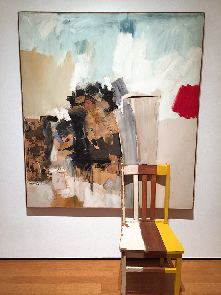
“Pilgrim” (1960), Oil, graphite, printed paper and fabric on canvas with painted wood chair.

If you look closely you can see that Rauschenberg actually used the chair as a painting tool to drag down the paint in the canvas and then attached the chair as an collage element. It looks as if you are invited to take a seat to be part of the painting- but Natalya and I refrained from doing so – LOL.

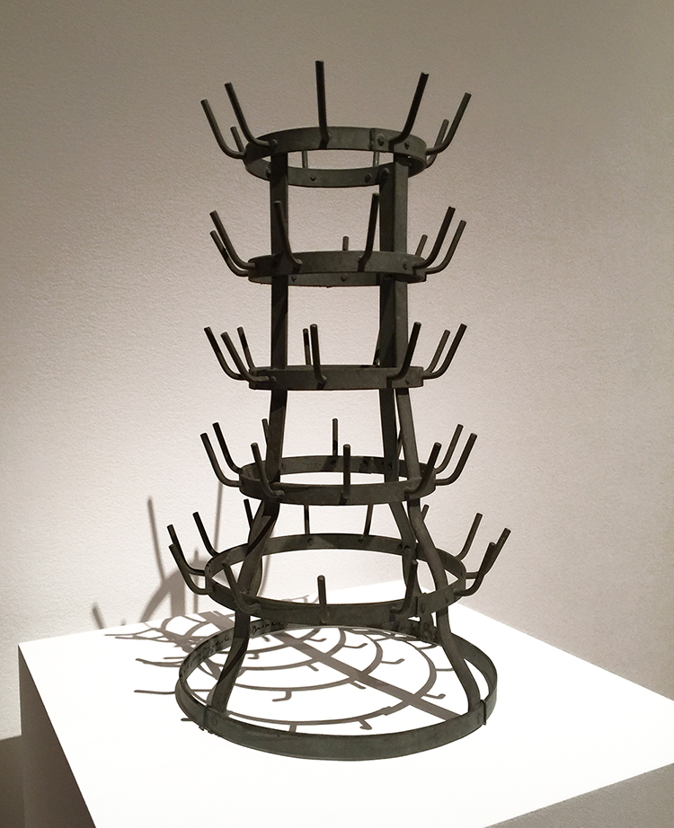
Marcel Duchamp “Bottle Rack” 1960

Rauschenberg purchased this work for three dollars after he saw it in an exhibition, and then asked Duchamp to sign the work. Duchamp agreed and signed and left an inscription saying “Impossible for me to recall the original phrase” . Jokesters- LOL- I wonder how much this readymade art piece is worth nowadays.

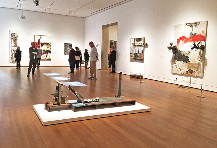
I loved how the exhibition was laid out – and of course early morning hours are the best to ensure a more empty space.

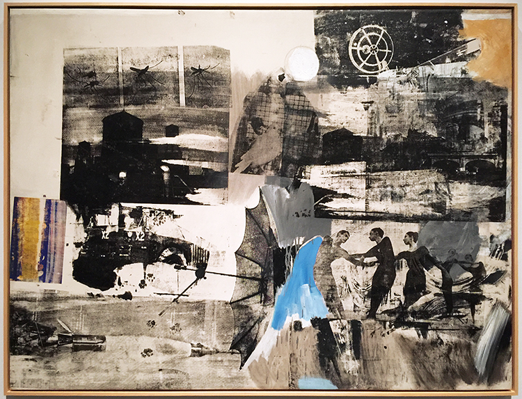
“scanning” (1963) Oil and silkscreen -ink print on canvas

the canvas includes a photo of the Merce Cunningham Dance Company with Steve Paxton how lived with Rauschenberg when the piece was made.

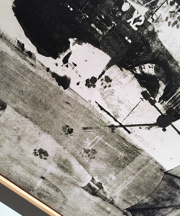
The paw prints here were added by Sweetie, Rauschenberg’s pet kinkajou who strolled across the canvas while Rauschenberg was making it on the floor of his studio. He simply embraced the accident as part of the work. HA YES!

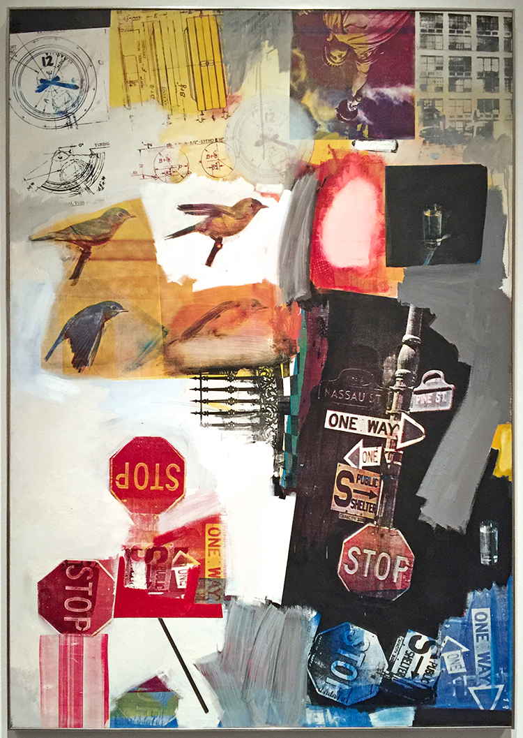
“Overdrive” (1963) Oil and silkscreen -ink print on canvas

I am so in love with this piece and the one below

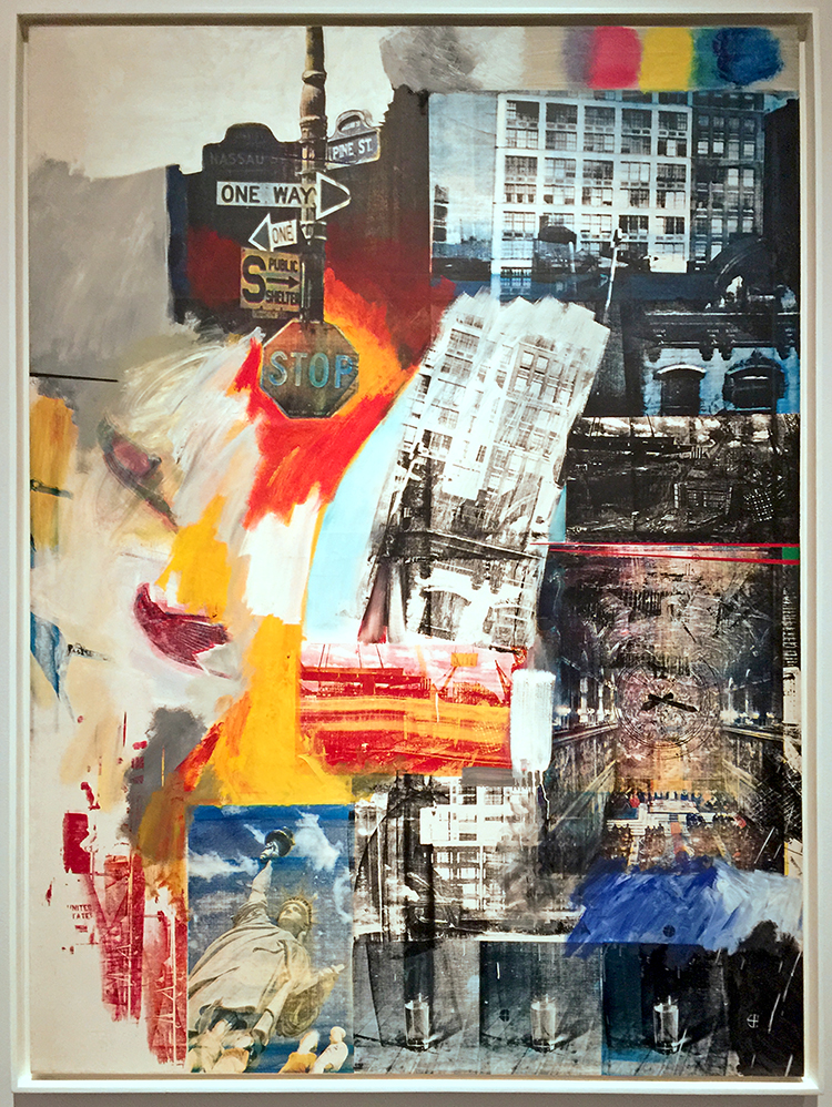
“Estate” (1963) Oil and silkscreen -ink print on canvas

Rauschenberg started in the early 60s to use more and more readymade images into his paintings and visited Andy Warhol in the studio in 1962 to get an intro into the silkscreen technique. He had a friend destroy his stock of screens to avoid the pressure of repeating himself in his artwork.

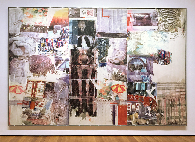
I could look at them forever- and as you can see below the paintings are actually quite big.
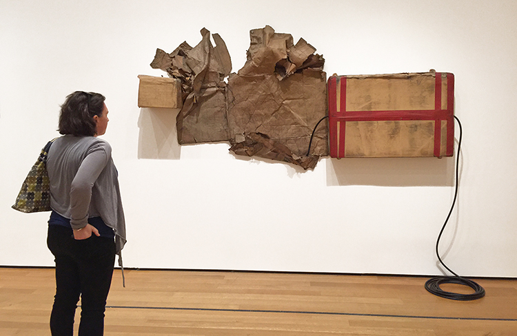
“Volon” (1971)

Come on- admit…this makes you look at your boxes in a whole different way, no?

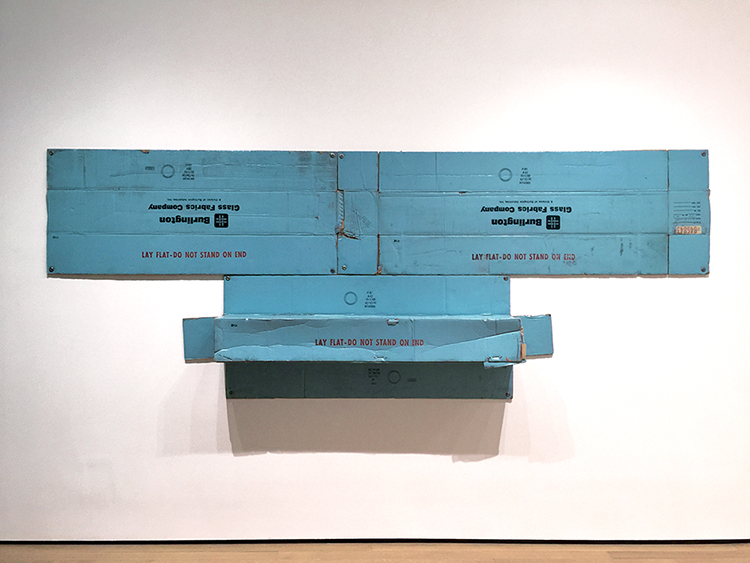
Untitled (1972) – Tape and cardboard boxes with rubber hose.

and so something that some people call trash becomes a piece of artwork – I love it!

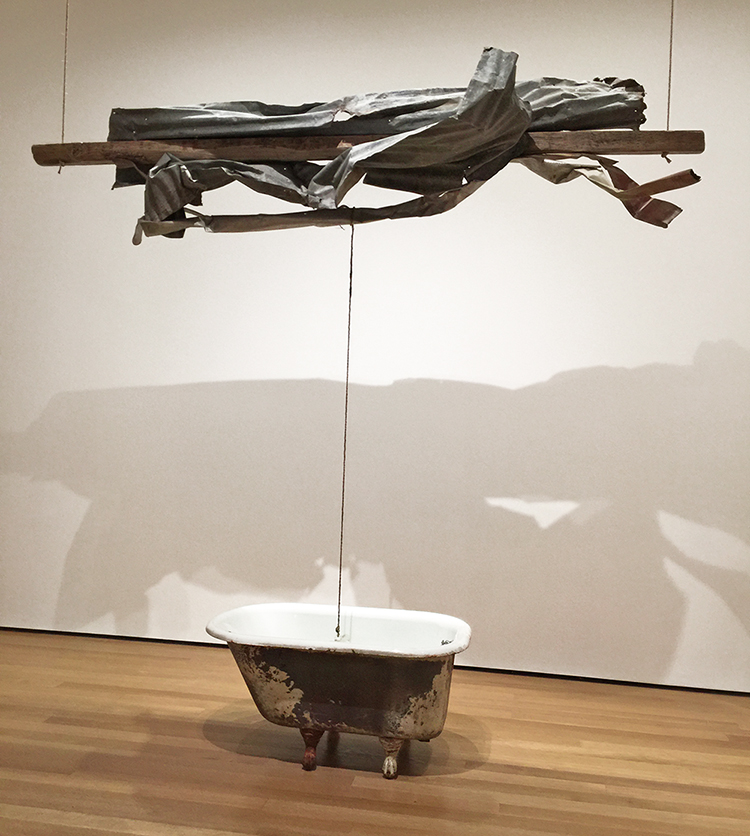
“Sor Aqua” (1973) Wood and metal suspended with rope over water-filled bathtub with glass jug.

Rauschenberg found the inspiration for this piece in Venice – where he gathered found materials for a series of assemblages. The water- filled bathtub evokes the Venetian canals, the suspended tangle of rusted metal refers to aging, deteriorated surfaces throughout the city.

“Mirthday Man” (1997) Water-soluble inkjet dye and pigment transfer on plylaminate

You can find an x-ray of Rauschenberg which he called “self-portrait of inner man” and surrounded it with photographs he had taken over the year. Rauschenberg created this piece in one day on his 72nd birthday.

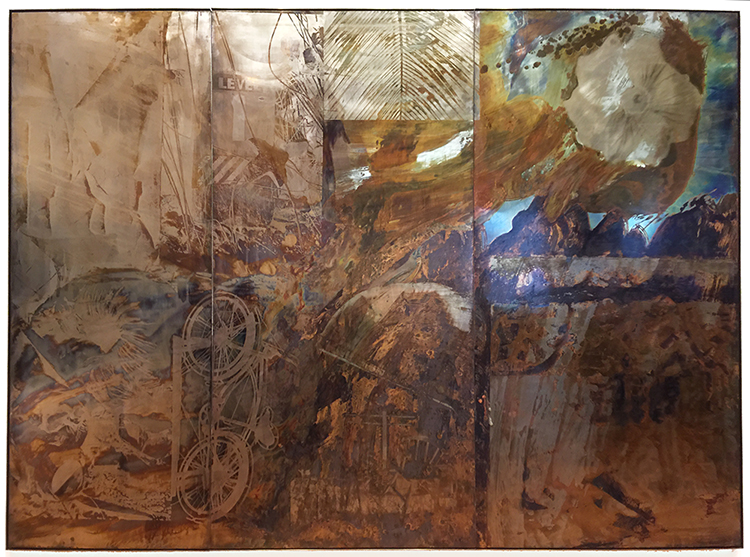
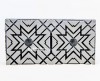
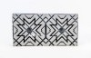
“Bible Bike” (1991) Tarnishes on brass, bronze and copper

The imagery and coloration in the metal painting series, Borealis, was produced through chemical reactions (which Rauschenberg called “corrosions”), sometimes with the addition of acrylic paint. Tarnishing agents, such as acetic acid and ammonium salts, are brushed or silkscreened onto brass, copper, or bronze surfaces, resulting in a muted range of colors: green, brown, or black, depending on the type of metal support. By painting or drawing with a tarnish-resistant medium before applying the tarnishing agent, the artist could create coloristic variations by contrasting the tarnished and untarnished metal.

I hope you enjoyed the Art Stroll- you can find all Art Strolls here on my website. But seriously if you are in NYC visit this exhibition – it is open until September 17, 2017.

Comments (1)

  • Sue Clarke

    |

    I just love “scanning” and the pet paw prints!
    Thanks for all the photos.

    Reply

Leave a comment

Pattern Lovers – Tina Walker


Happy Tuesday from the Creative Squad! Today Tina Walker is starting us off on a new theme for June with a super cool canvas and a fun art journal spread using my Hamburg stencil and my Cardboard stamp set. This month’s theme is: Pattern Lovers Love Patterns: We admit it – sometimes we go a little crazy over cool patterns. We see them everywhere and whether it’s in the human-made stuff all around us or in the designs by Mother Nature, we love them all. So this month we’re playing with pattern and giving it the attention it deserves!


Hi! Tina Walker here today with a new month and a new theme. June’s theme is a theme that I am super excited about – Patterns!

Patterns and repeating images are some of the best ways to create interesting and eye-catching art. I am always looking for patterns in nature and for ways to create patterns out of patterns. My main project this month uses 1 stencil and 1 stamp to create an interesting piece full of pattern on pattern. Not only was it fun to make, it was quick and easy.

Place your favorite Nat StencilGirl stencil over a primed canvas, I used Hamburg. Using spray-mist, acrylic paint, or inks, paint over the entire canvas. I used Marabu Acrylic Art sprays that are permanent. Once they dry, you can layer one spritz over another without creating a muddy brown color. Love!

Randomly stamp canvas. Here I used Pie Top from Nat’s Cardboard stamp set.

Repeat this step, rotating the stencil 90 degrees so that the stenciled image overlaps the previous layer.

Repeat until you have a base that is full of yummy layers and pattern on pattern.

Place several widths of artist or masking tape over your stenciled/stamped canvas to create a pattern. I trimmed the edge for an interesting look.

Make sure the tape is securly adhered to the canvas.

Using your favorite spray paint, spray entire canvas in contrasting or coordinating color, I chose white. Then allow to dry completely. Remove tape.

Reveal the magic of pattern on pattern. This project took approximately 30-45 minutes, from start to finish! My kind of art.

As I was adding my stenciled layers to my canvas, I didn’t want to waste the gorgeous paint on the surface of the Hamburg stencil, so I ‘stamped’ the stencil to an art journal page. Not only did my patterned canvas create a super easy and fun piece, I had an instant background started on an art journal spread.

Here’s the spread I created with ‘stamp off’.

I love it when one project creates another. And pattern on pattern…be still my heart! ♥

I hope you enjoyed my projects today. Have a great day!


Thank you Tina for two projects that definitely celebrate PATTERN! Tina used these supplies – some links are affiliate links:


Play along with us this month and join the 30 day Artful Adventures Stroll Challenge! I love to see how you interpret our monthly themes. Email me how you used my stencils and stamps with the theme and email me an image – I would love to share your projects in my “n*Spiration From Around the Globe“.

Leave a comment

Artful Adventures – Interview with Mark Leibowitz

Mark Leibowitz is part of my book Artful Adventures in Mixed Media and I thought it would be interesting to hear more about him and some of his thoughts. Grab a seat and a cuppa and listen to this interesting conversation which I think you will enjoy. We are talking about things like

  • NYC Urban Sketchers
  • “Anywhere on earth there is a beautiful picture to be found”
  • Sketching People and the Fear of Sketching People
  • The Baggage we bring to creating
  • Why do we create
  • The connection between memory and art

Artful Adventures Interview with Mark Leibowitz from Nathalie Kalbach on Vimeo.

I hope you enjoyed the interview – I sure did – let us know what you think about some of the topics.

————————————————————————————————————————-

BTW if you are in the NYC/NJ area – come to my book signing on Wednesday, June 7th, 2017 at The Ink Pad in NYC !

You can order Artful Adventures in Mixed Media now

Comments (1)

  • Lou

    |

    I am sooo excited about Artful Adventures and I am positive it’s out of this world. I totally adore Nathalie and her kind and playful ways, not to mention her many giftings in mixed media. I think this book will teach and help me with many things, but I am especially excited about learning how to discover and expand on my own creativity. I have been stuck in the rut of merely replicating someone else’s backgrounds and ideas, and am anxious to find my own style in mixed media. Thank you Nathalie for your long awaited for book.

    Reply

Leave a comment

Color Crush Returns! Birgit Koopsen and I in the UK, Oct 13-15

I’m super excited to announce that I will once again be joining with my good friend Birgit Koopsen to teach Color Crush! We will be bringing this 3 day art journaling workshop to Art Workshops in Coventry, England and hope to see you there for a long weekend of all things COLOR: theory, technique, play, and lots of laughs.

Check out the great time we had at Color Crush in Syracuse this past spring:

Join us and learn how to make the most of color in your art Journaling and beyond!


Comments (1)

  • susuko

    |

    I wish I could go to Coventry!

    Reply

Leave a comment

Forward? Collage

1 Step Forward, 2 Steps Back = 2017

A lot of things going through my mind lately- how far have we come …how far do we step back in this time and age?

I created this canvas board based on an inspiration photo I took for the “Stroll Through The Hood Challenge” .

You can see a free video  on how I created the page and my thought process while doing it in the classroom accompanying the challenge if you haven’t yet. You can sign up here

I loved playing with some collage materials that I have had in my drawers for a while and creating texture and fake rust.

I also had the photo for a long time and I was happy to finally use it.


Hope you are well and have a wonderful day!

Comments (2)

  • Sue Clarke

    |

    I love that you used a viewmaster “disc” and the message is appropriate for these days.

    Reply

Leave a comment

Denim Mending at the Textile Arts Center in NYC

A couple weeks ago I took a class at the Textile Arts Center in NYC: Denim Mending.

The TAC is located in Brooklyn but has a great small studio space in Manhattan with tons of classes at different times of the day and since I totally into embroidery for a while now, I thought this would be a perfect class. And it was :)

We got to work with all kinds of fun dyed fabric (they offer a variety of amazing dying classes as well) .

and started out with some basic stitches , applique stitches and back applique (in the picture another student’s practicing samples- I looooveee the polka dot fabric with the blanket stitch so much!)

Later in the class we got a short intro to Shashiko which means little stabs and is a form of Japanese embroidery originating in the Edo period (1615-1868)

These are some samples- – I fell in love instantly …although it does kinda like tell you to do neat and straight stitches – LOL- which you know…is not me ;)

But here is my first try in Shashiko

Not too shabby – I like it and oh man- now I want all kinds of Jeans being ripped so that I can start mending them and I bought all kinds of supplies of course  – and is it bad if I bought some shirts that I just want to do this on?  I am ready LOL

It was a fantastic class by Jennie Maydew -(check out her website with beautiful textiles and artwork too). I learned heaps, and it inspired me and I am full of ideas how to incorporate what I learned into my own artwork – I am so glad I went. A great example yet again how good it is to sometimes take classes that are totally different from what you usually do :) If you are in NYC – check out the TAC – what a gem place to take classes.

Comments (3)

  • Tara

    |

    I made a commitment this year to be more creative. I spent the past few months collecting different products and materials and watching a lot of tutorials online. I find myself gravitating towards collage and mixed media. Your books sounds incredible and would be helpful for me to learn technique. I would love your book to enhance my budding art technique library. Thanks for hosting the giveaway!

    Reply

  • Sue Clarke

    |

    IF you seriously want ripped jeans I can send you some Nat.
    I have one pair with a floral print (lightly in the background).

    Reply

    • nathalie-kalbach

      |

      LOL. thank you Sue for the offer. i will patiently rip my jeans and spice them up I guess …meanwhile I am playing on denim swatches – also fun :)

      Reply

Leave a comment

1…2…3 – Whatevers

A couple years ago my friends Vic Chrisman, Cat Scanlon and I founded The Whatevers, a Creative Storytelling Project. In a nutshell we decided to give old discarded photos we found a new life by telling the story of those shown. The three of us wrote an article for the recent Cloth Paper Scissors Issue – and we decided to revive the Whatevers every Wednesday this May on our blogs :)

Here is my project for this weeks’ photo

“Nothing would make them happier than meeting once a year at their parents house to help with the harvest. It was as if time was standing still and all sorrows were gone.”

Played with the pattern in different sizes of my Toledo Foam Stamps and Stencils – with spray paint and acrylic paint.

Now let’s check out what Vicki and Cat did with the photo and in case you want to play along with us -here is the original photo for you. Share with us what you came up with on the Whatevers Facebook Page or leave a link in the comment section :) This is it for now with the Whatevers – but who knows- maybe we come back some other time :)

Here are the supplies I used for my page – some links are affiliate links:


Comments (1)

  • Cat

    |

    your stamps looks so perfect on this, love the bright and happy colors! I have so enjoyed bringing this project back for the month! Thank you!

    Reply

Leave a comment