Last week Natalya Aikens, who is a wonderful artist, and I met at MoMA to see the Rauschenberg exhibition in the early hours. I have been looking forward to this exhibition for a couple months now since I am a huge admirer of Robert Rauschenberg’s work. That is also noticeable when you read my book Artful Adventures in Mixed Media as I have used some of his work in on of the chapters.
“Grand Black Tie Sperm Glut” (1987)
What I loved particularly about this exhibition was that it reflected the fact that Rauschenberg was a very social person and many of the people he met, artists, friends, lovers shaped his work and he fed off their company.
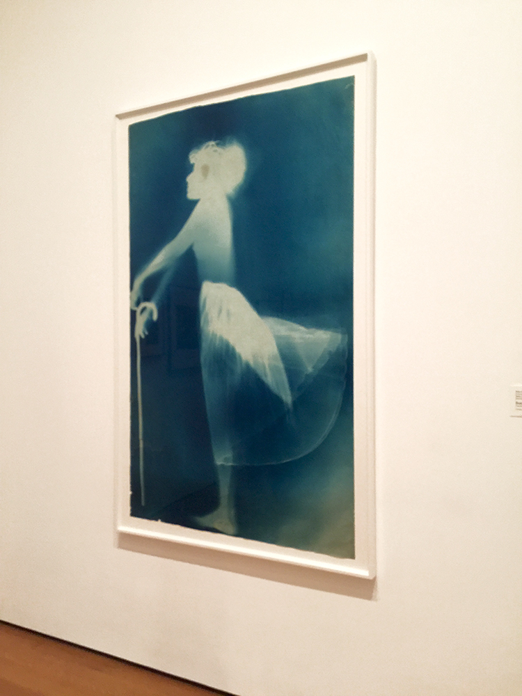
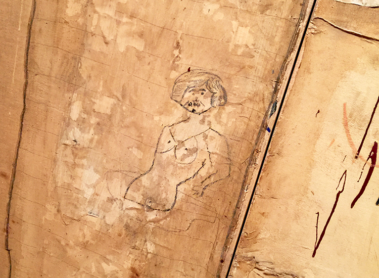
“Sue” (c. 1950), Exposed blueprint paper
The exhibition starts with blueprints created by and with artist Sue Weil, who was for a short while Robert Rauschenberg’s wife. One of them would lie down on a sheet of photo-sensitive paper and the other one would hold the bright lamp for a while to expose the image on the paper.
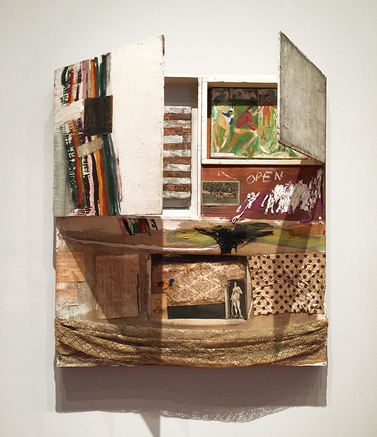
“Short Circuit” (1955), Combine: oil, fabric and paper on wood supports and cabinet with two hinged doors containing a painting by Susan Weil and a reproduction of a Jasper Johns Flag painting by Elaine Sturtevant
Rauschenberg was highly influenced by his teacher Josef Albers and the Bauhaus mentality to consider and focus on readily accessible and ordinary materials and to combine them.
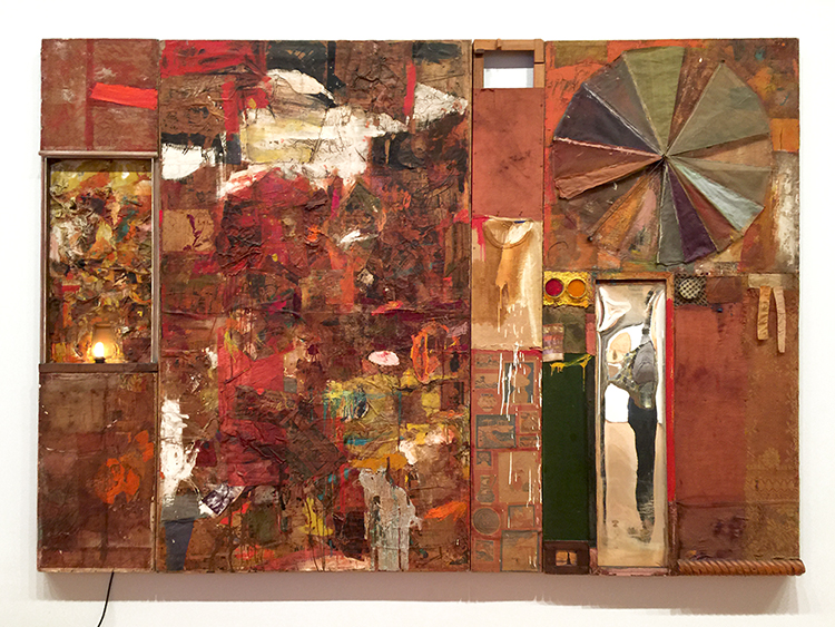
“Charlene”(1954), Combine: oil, charcoal, paper, fabric, newspaper, wood, plastic, mirror, and metal on four Homasote panels, mounted on wood with electric light
Rauschenberg called those readily materials “real objects” – he included a letter from his mother and a man’s undershirt.
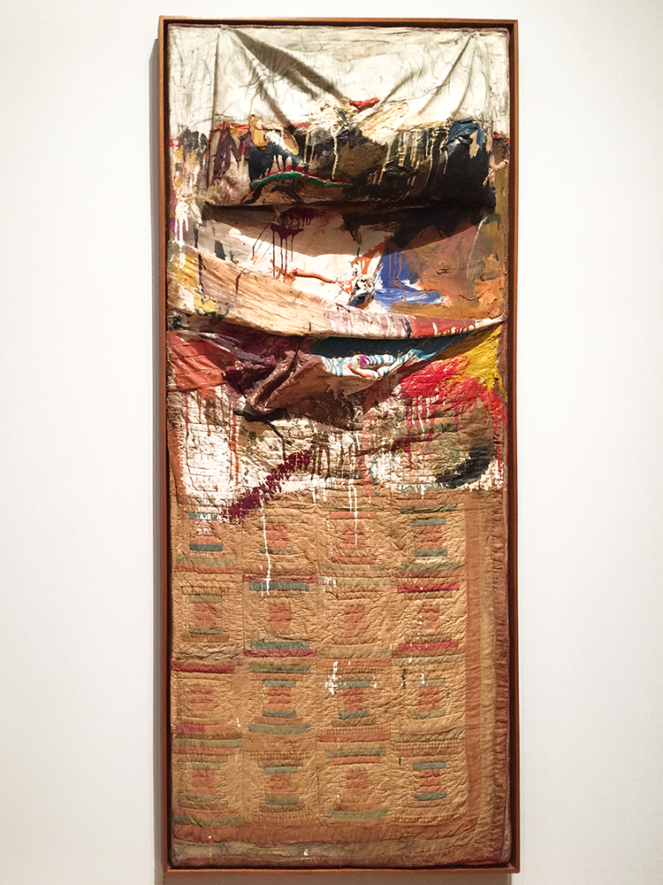
“Bed” (1955), Combine: oil and pencil on pillow, toothpaste, fingernail polish, quilt, and sheet, mounted on wood support
Rauschenberg recalled once that he could not afford to buy a canvas and so he decided to make a painting on a patchwork quilt given to him by the artist Dorothea Rockburne (she btw once said that when she was doing laundry she realized her quilt was missing and saw it later on again in this Piece :) ) . The pencil strokes on top of the pillow are very likely by Cy Twombly. Rauschenberg and Twombly were in a relationship and traveled together, making art.
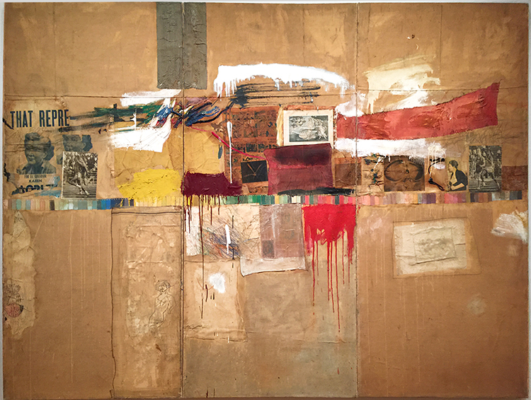
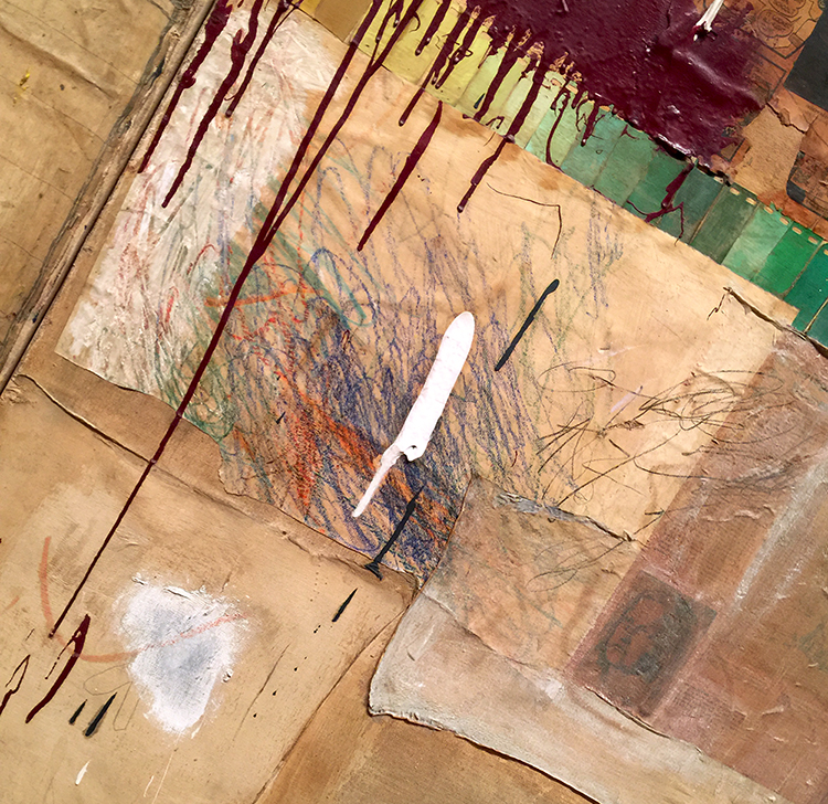
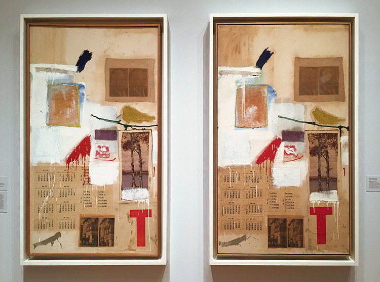
“Rebus” (1955), Combine: oil, synthetic polymer paint, pencil, crayon, pastel, cut-and-pasted printed and painted papers, including a drawing by Cy Twombly, and fabric on canvas mounted and stapled to fabric
Rauschenberg gathered many of the materials in Rebus from and near his studio in Lower Manhattan. He used commercial paint samples, included a piece of a painting by Cy Twombly
and three of the drawings this series were also included in the exhibition
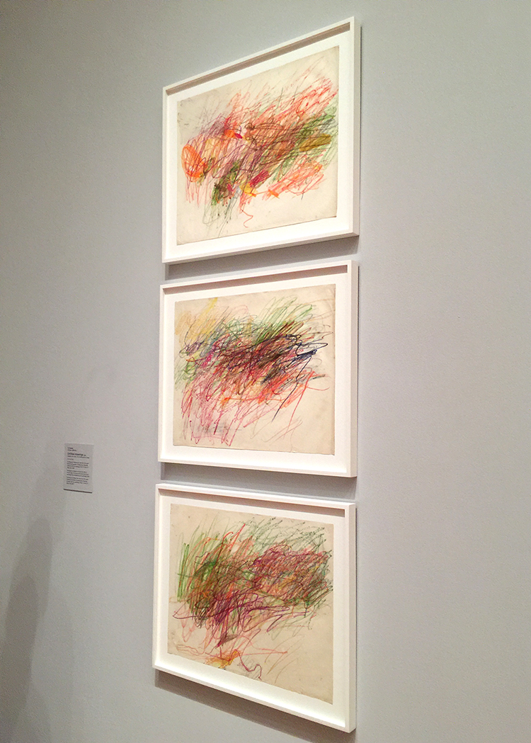
Cy Twombly
I loved seeing all the different materials and you really get a sense of a highly humorous person in Rauschenberg
a person who doesn’t take himself too serious- what a wonderful streak.
“Factum I ” and “Factum II” 1957, Combine: oil, ink, pencil, crayon, paper, fabric, newspaper, printed reproductions, and printed paper on canvas
Rauschenberg created these two paintings, repeating the same falsely spontaneous brush strokes in both. Rauschenberg wanted to show that neither impulsive painting or planned painting alone make an artwork, but that it rather is a mix of intention and chance, impulsive gestures and thought.
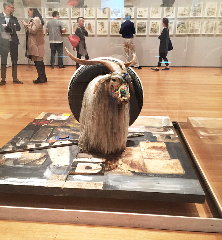
“Monogram” (1957-59), Combine: oil, paper, fabric, printed paper, printed reproductions, metal, wood, rubber shoe heel, and tennis ball on canvas with oil and rubber tire on Angora goat on wood platform mounted on four casters
This mixture of a painting, sculpture and assemblage is probably one of the best known works by Rauschenberg, seeing it in person was definitely a treat as a picture is not really capturing it.
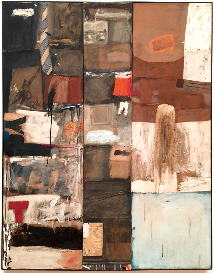
“Summerstorm” (1959) Combine: oil, graphite, paper, printed reproductions, wood, fabric, necktie, and metal zipper on canvas
I loved going to this exhibition with Natalya as she uses a lot of plastic and fabric in her artwork she was looking at all pieces in different ways then I did – and pointed out that the tie was not attached, she wondered if it was meant to be to flap in the wind – and once we saw a tie in this Combine – we saw ties in Rauschenberg’s work everywhere :)
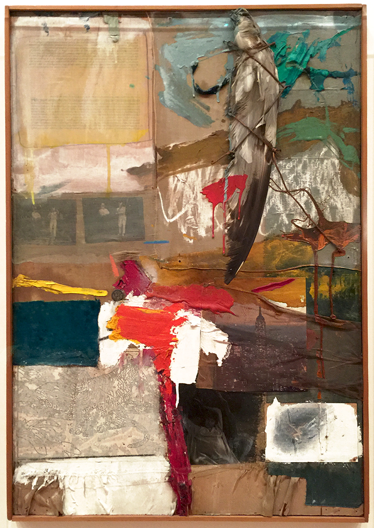
“Painting with Grey Wing” (1959), Combine: oil, printed reproductions, unpainted paint-by-number board, typed print on paper, photographs, fabric, stuffed bird wing, and dime on canvas
This was one of my favorite pieces in the exhibition.
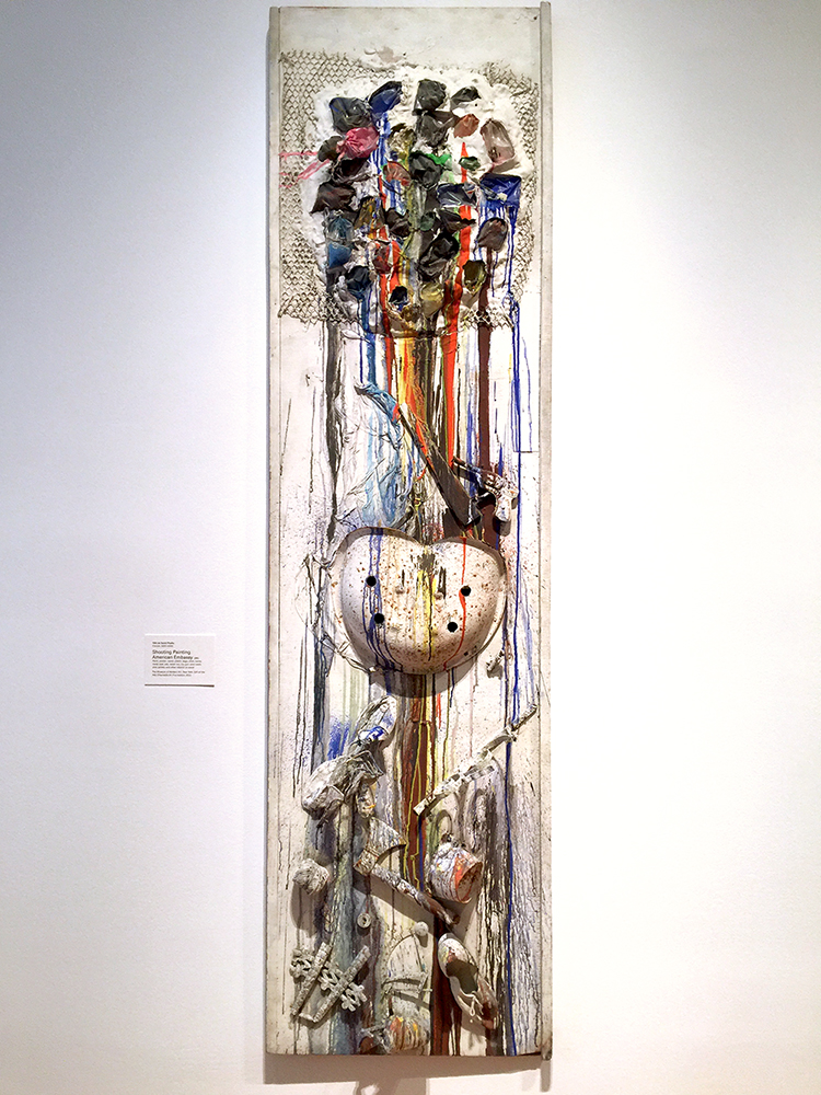
Niki de Saint Phalle “Shooting Painting American Embassy” 1961, Paint plaster, wood, plastic bags, shoe, twine, metal seat, axe, metal can, toy gun, wire mesh, shot pellets and other objects on wood.
“Each of the colours appears to have dripped down the canvas from a hole, which exposes a dark surface beneath the white. Saint Phalle made this work by shooting with a gun at bags of paint that were placed on the canvas. Before the shooting began, the surface was covered with white plaster and pigment to resemble a blank canvas. As the shooting commenced, the bags would be punctured and the coloured paints released to flow and splash.” The piece is part of a series and in which artist would shoot at the pieces as a performance. Robert Rauschenberg as well as Jasper Johns took aim at this painting.
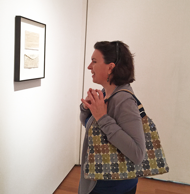
And what is Natalya laughing about here? At a framed letter and the work is called “This Is a Portrait of Iris Clert if I Say So” (1961) Telegram
This telegram was Rauschenberg’s submission to a show of portraits of the Parisian gallerist Iris Clert in 1961. Rauschenberg realized about two works before the show, that he forgot to make the work. And so…he made a conceptual portrait via telegram sending it to Iris Clert, one whose maker shifts depending on the “I” who reads it. – CLEVER guy- LOL. I guess he got away with it ;)
Now there was so much more in the Art Stroll and since I am such a big fan of Rauschenberg I decided to show it in two parts- so another one on this is coming in a week. Hope you enjoyed the Art Stroll so far. If you are anywhere close to NYC go and see this exhibition – seriously! It is open until September 17, 2017.


Comments (5)
Diane T
| #
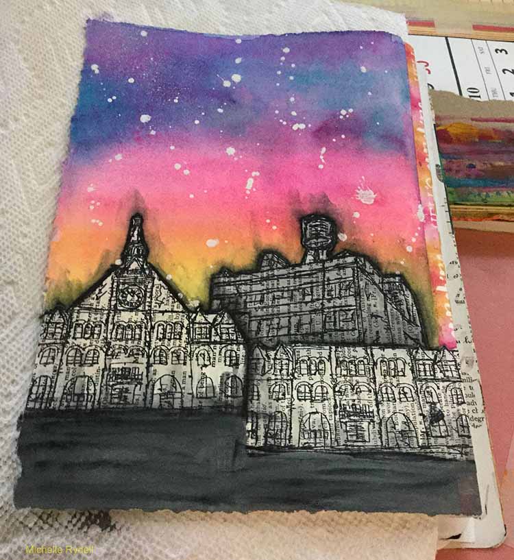
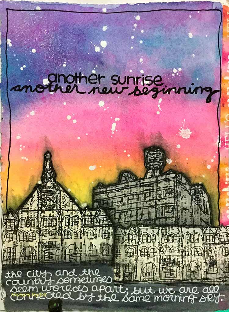
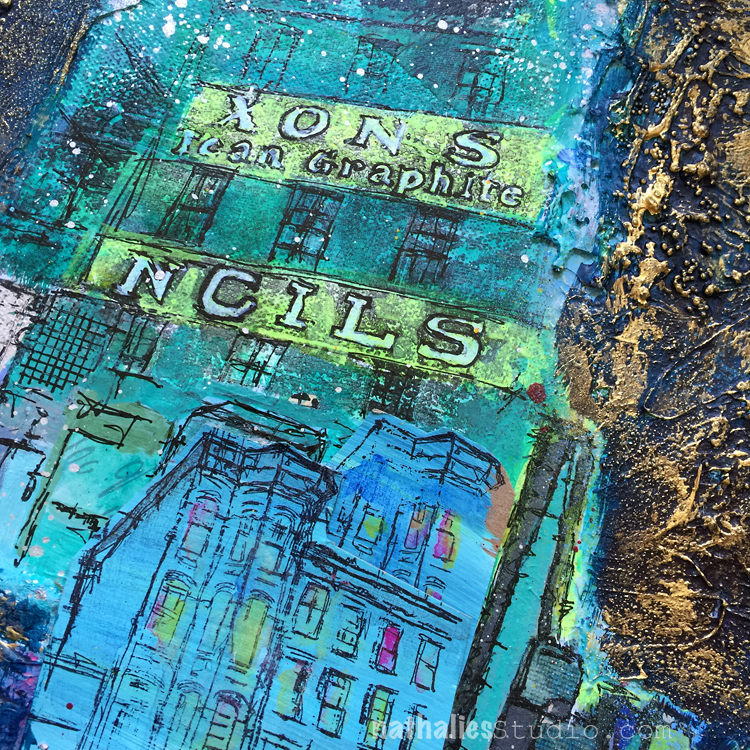
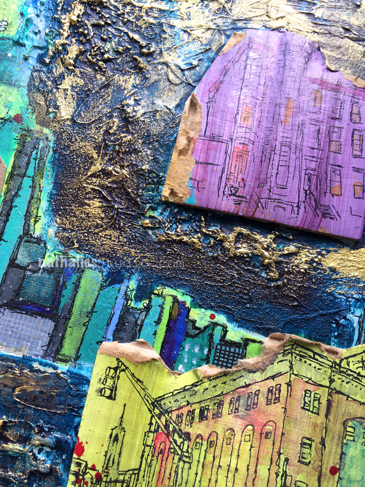
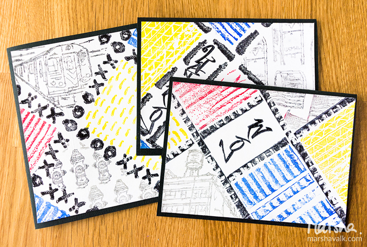
Loved the city/country connection and the quote at the bottom. Great job!
Reply
Sue Clarke
| #
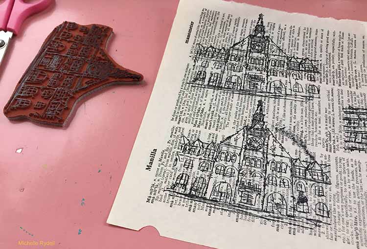
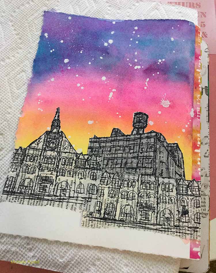
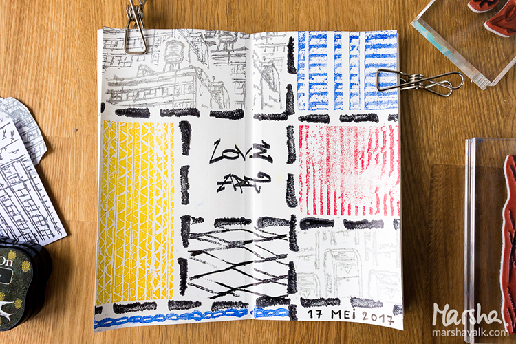
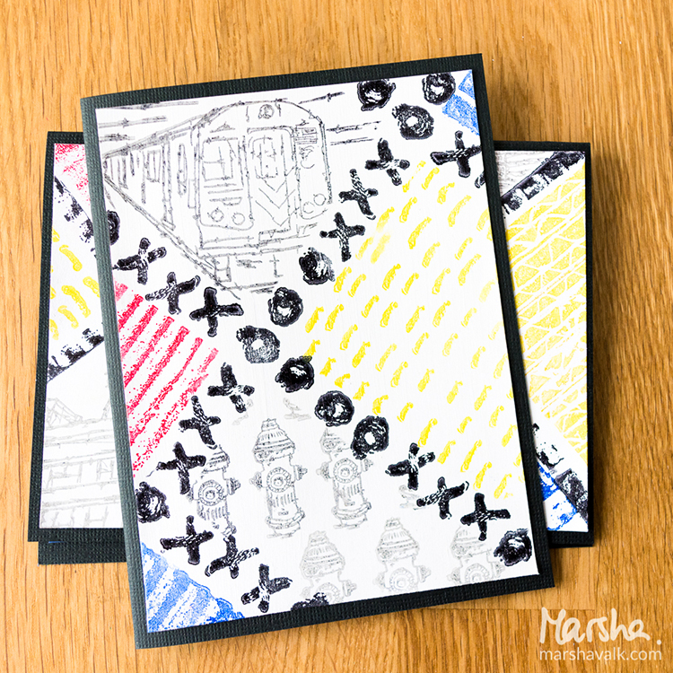
LOVE how you used the stamps and the colors you chose for the page.
Reply
Michelle Rydell
| #
thank you Sue! I appreciate your kind words!
Reply
Julie Tucker
| #
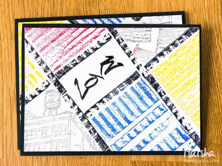
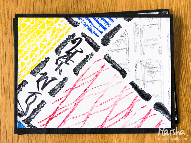
This is gorgeous! LOVING the colors and the buildings!!!!!!!!!!
Reply
Michelle Rydell
| #
Julie – you are so sweet! Thank you very much!
Reply