A Look Back – Lots of times I’ll reach for a stencil when I want a quick background in an art journal or mixed media piece. Pair a stencil with some acrylic spray paint or acrylic paint and a makeup sponge and it’s almost instant success. But then there are times where I want the background to be a bit more complex and I’m not in the mood to start layering in lots of collage papers or stamped impressions. Layering on another stencil is my secret weapon in these cases. Let me show you some examples:
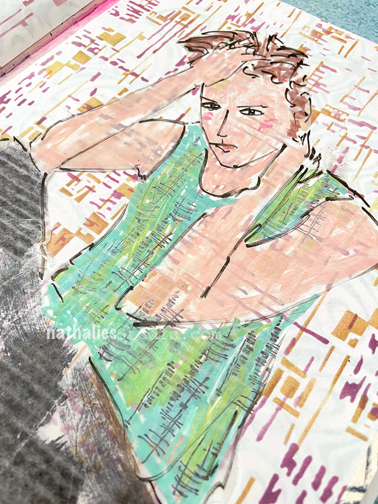
In this art journal page I chose my Signals and Space Age Modern stencils to layer on in warm colors. The scales are similar in terms of the marks and it doesn’t really read as two patterns, but one more complex pattern. I think it’s a nice effect. You can see the entire spread here.
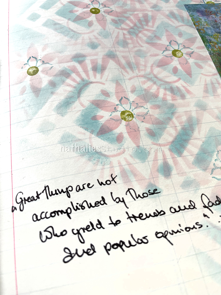
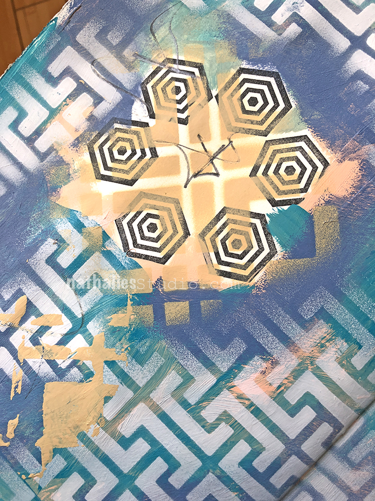
I love finding two patterns that can work together in my stencils and I did that here in this art journal page with my Chicago and ATC Mixup stencils. I first put down the Chicago pattern with a blending tool and one color of Distress Ink, then used one design on the ATC Mixup stencil in the diamond part of the Chicago stencil with another color of ink. Instant complexity. Then I also took it further with one of my Fan-fare rubber stamps and a dot from my eraser.
Two more stencils that seem born to layer? Beacon and Toledo – the patterns just line right up. This is also a cool combination because the Beacon is a delicate design and Toledo so dense. I definitely recommend putting the dense design down first as your base and then the delicate one on top to add details to the layered pattern. Check out the full art journal spread here.
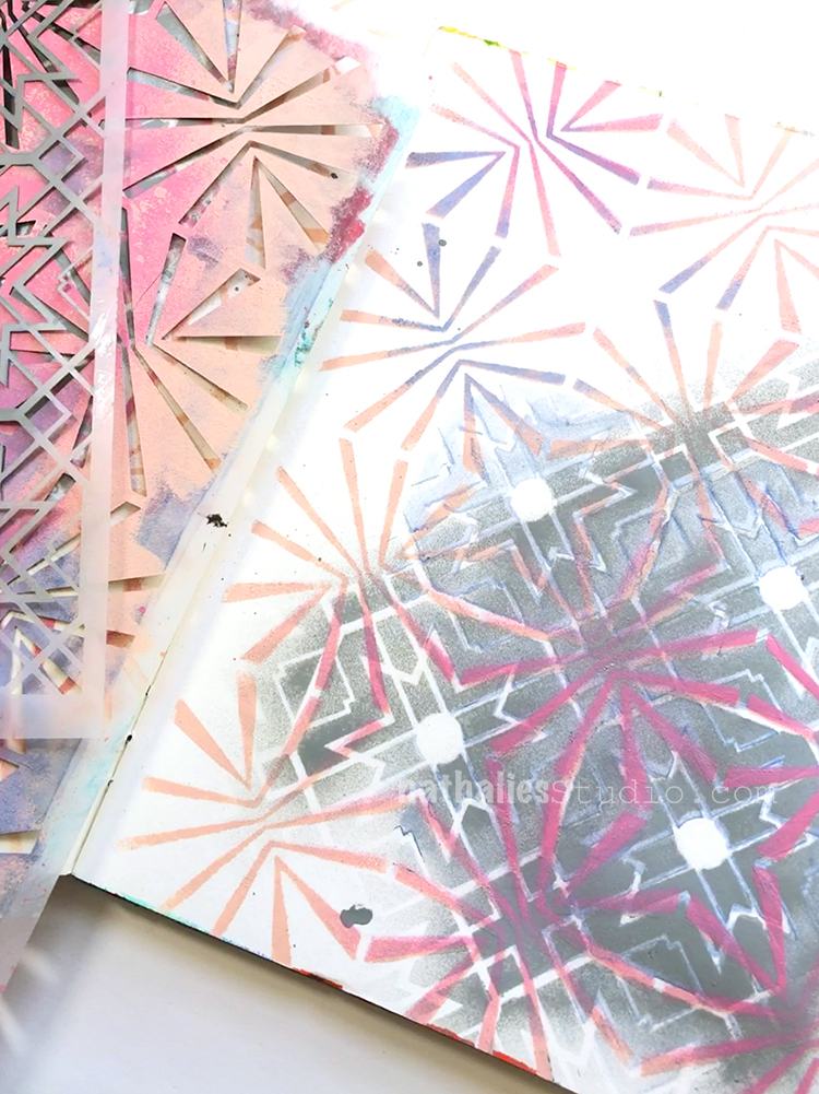
Here I used Hamburg and Chicago and I like how they are similar in line weight and all those right angles, but obviously not the same. The tension between the two stencils totally activates the page. It’s like a hole in the one pattern and a patch job that doesn’t quite match. Here’s the post so you can see the whole spread.
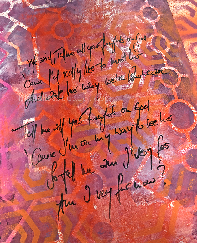
Here’s another example of two layered stencils that also have similar line weights, and it makes for a pretty interesting combination. It gets a bit confusing as to what pattern is what and I like that. For this page I used Flower Maze and Exchange Place, all of it in warm colors. You can see the full spread here in the original post.
So there you go: some ideas on layering stencils for when you want a nice way to oomph up those backgrounds.
A Look Back is a blog series to show you some projects and posts that you may have missed – sometimes going WAY back in the archive. I think it will be fun to revisit a few ideas that we haven’t seen for a while. I’m excited to see how a little look back might inspire something new in the future :)
Here are some of the supplies used in these projects: