A Look Back – Today I’m focusing on how you can play with lettering in your art journal or mixed media projects. Even if you don’t love your handwriting, there are still tricks you can use to create unique lettering – or handmade fonts if you will – in your work. I’ve pulled together some posts from the past that demonstrate 5 ways you can Play with Lettering.
A Look Back is a blog series to show you some projects and posts that you may have missed – sometimes going WAY back in the archive. I think it will be fun to revisit a few ideas that we haven’t seen for a while. I’m excited to see how a little look back might inspire something new in the future :)
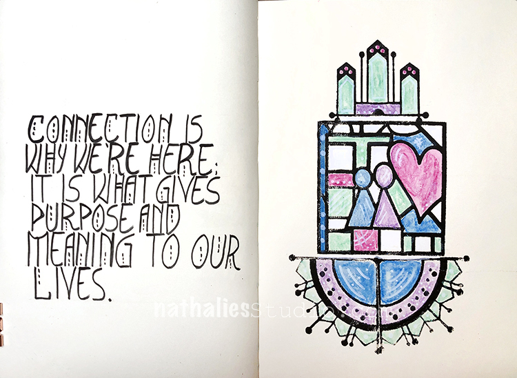
Add Some Dots – One way to create a new font that has some unity and style to it is simply add some dots to a few of the letters. The key is staying consistent and always adding dots to those letters when you use them in the spread, as I’ve done here in this art journal page. It also helps to have a pen or marker that you feel comfortable using. I’m using a Fude pen here – one that just feels good to write with.
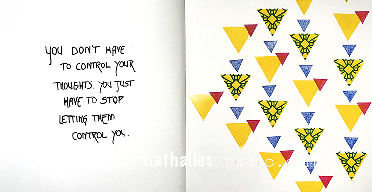
Think About Line – In this art journal page I’ve simply added an extra line to the cross in all the H’s and I’ve extended the length of the tail in the R’s. Simple but consistent alterations like that add a distinctive personality to your lettering style and set it apart from other pages in your journal. It honestly doesn’t take much – if you just look at all the fonts on your computer and you can see how subtle changes can make a big difference. For this one I chose a fine point Posca marker.
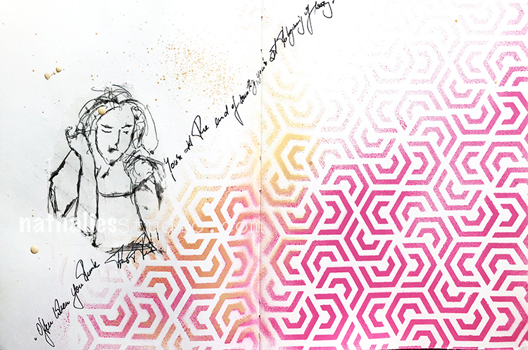
Go With the Flow – Maybe the point is not to have your lettering be so legible… that’s a strategy too! In this journal page I just quickly wrote my thoughts and let them flow with the composition created by the stencil (Flower Maze) and my quick sketch. Here it was all about going with the layout, mood of the page, and staying consistent with the style of my sketch – going with the flow.
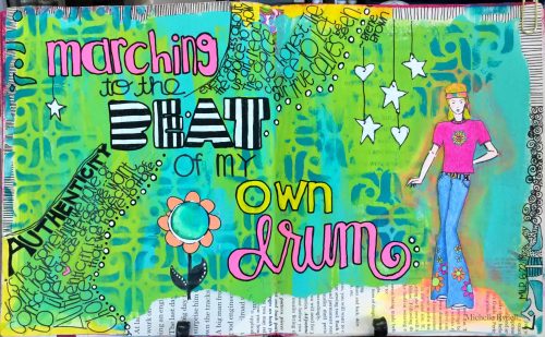
More is More – I love this page from Creative Squad alum Michelle Rydell because she really plays with a lot of different styles of lettering and the effect is super fun! It goes with the theme of the page and even emphasizes that she likes to do her own thing. Try mixing styles up: bold and slender, colored and striped, fancy and blocky, etc. Michelle used black and white Sharpies and colored Molotow paint markers.
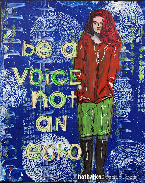
No Stress – If hand lettering isn’t your thing, don’t stress! There are plenty of products out there to help you – stencils, stickers, rub-ons, and even canvas letters as I used here in this post. Use them as they are or dress them up with your own paint splatters and markers. It’s quick and easy and will help you speak your mind without worrying about penmanship.
I hope you enjoyed this look back on some lettering ideas. Here are some of the supplies we used: