Blog: Art Journal

Whatevers Part Three – The Dam Family

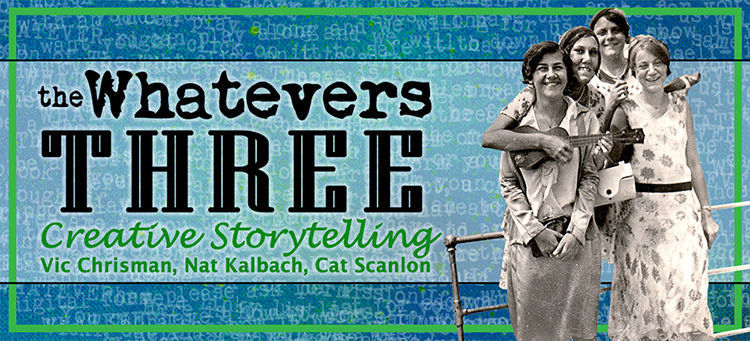
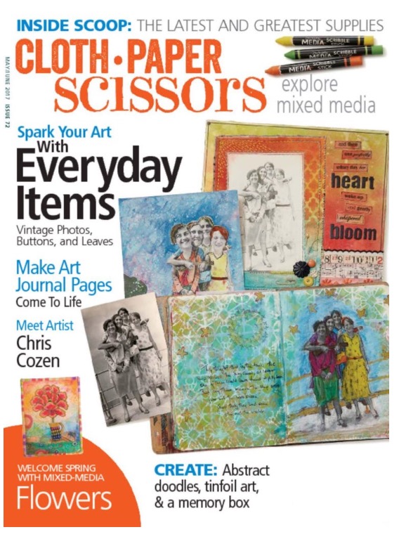
A couple years ago my friends Vic Chrisman, Cat Scanlon and I founded The Whatevers, a Creative Storytelling Project. In a nutshell we decided to give old discarded photos we found a new life by telling the story of those shown. The three of us wrote an article for the recent Cloth Paper Scissors Issue – and we even made the cover :)

So we thought we would celebrate this by doing a monthlong revival of the Whatevers and the three of us a posting our project based on a photo we picked every Wednesday this May . Maybe you will even play along with us. Here is my take for our first pic this month:

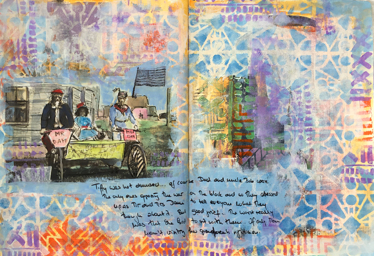
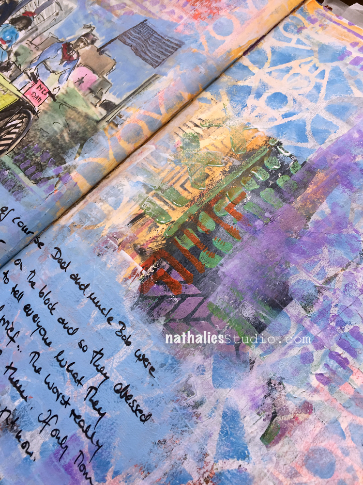
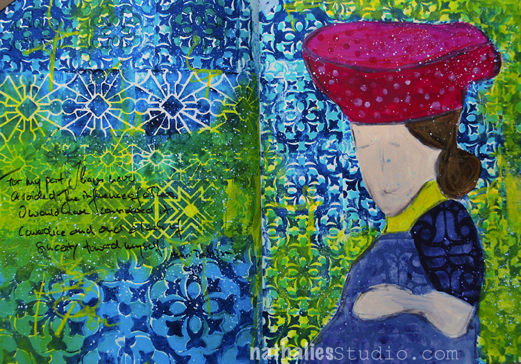
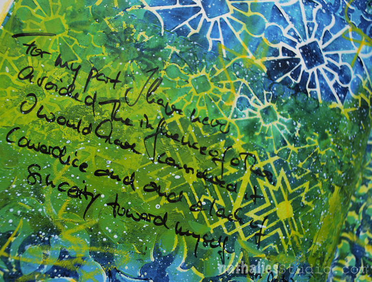
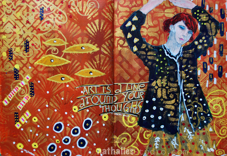
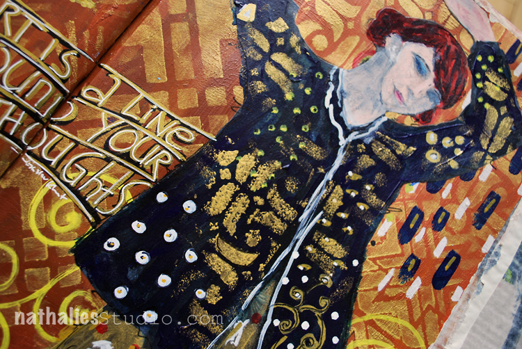
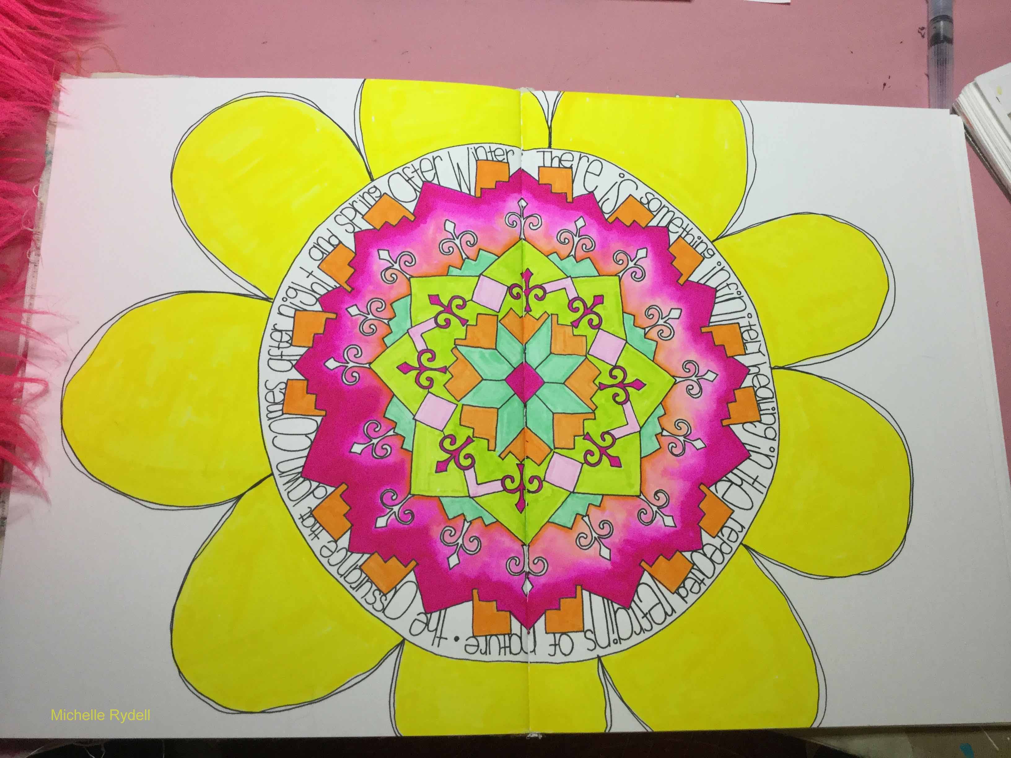
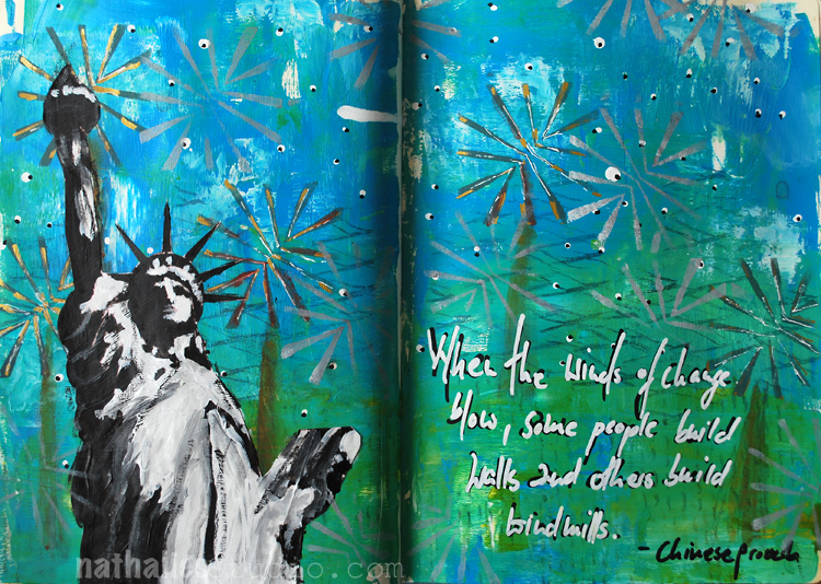
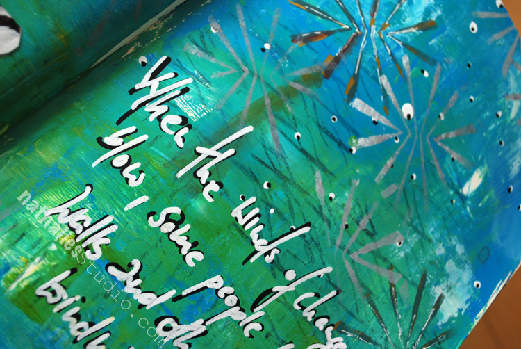
“Tiffy was not amused…of course Dad and uncle Bob were the only ones opposing the war on the block and so they dressed up as Mr. and Mrs. Dam  to tell everyone what they thought about it. But good grief…The worst really was that she had to sit with them. If only Mom wasn’t visiting her grandparents right now. ”

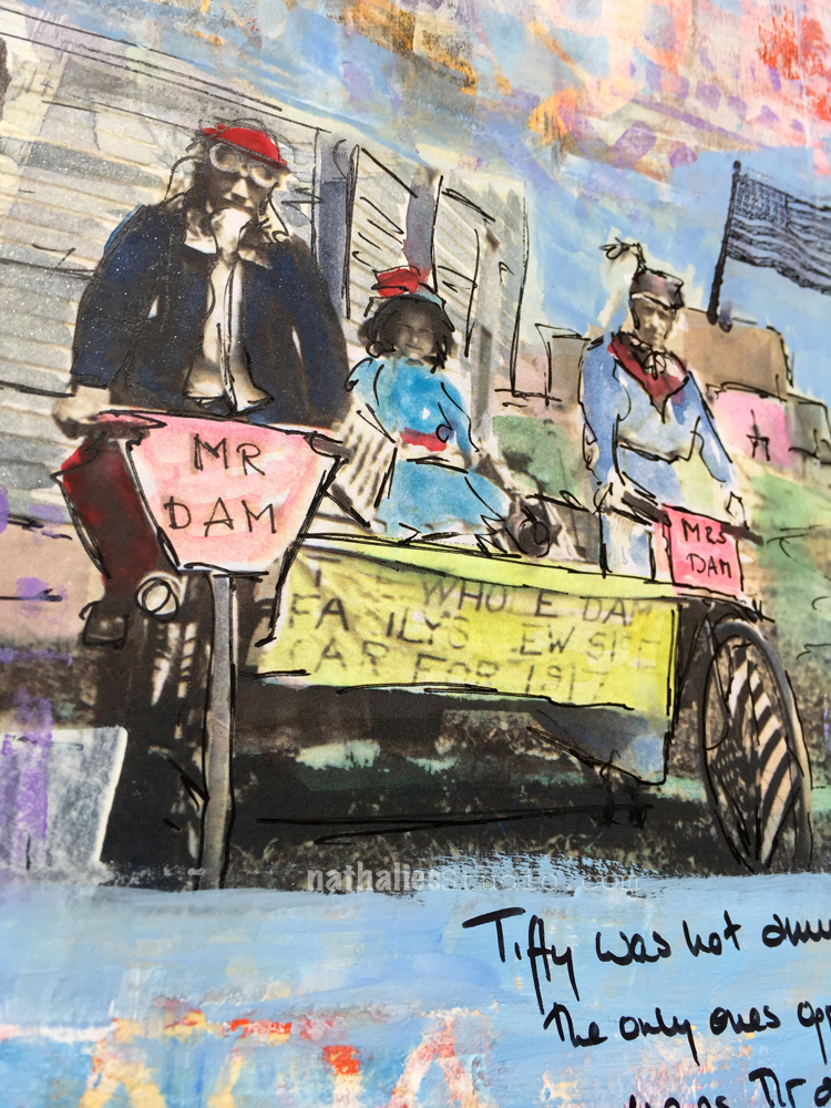
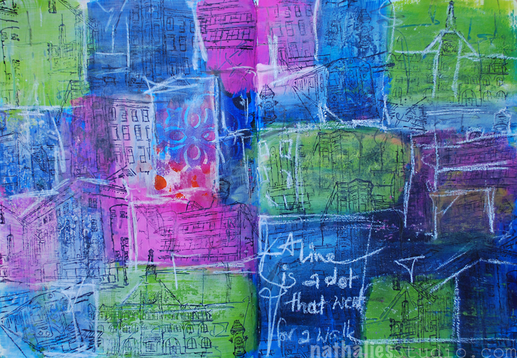
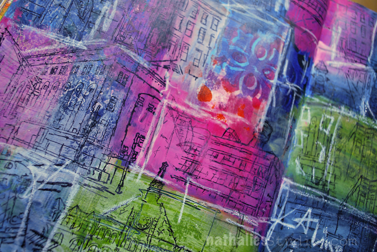
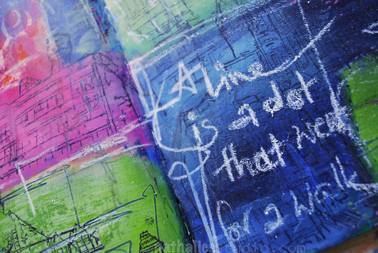
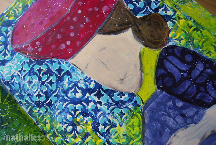
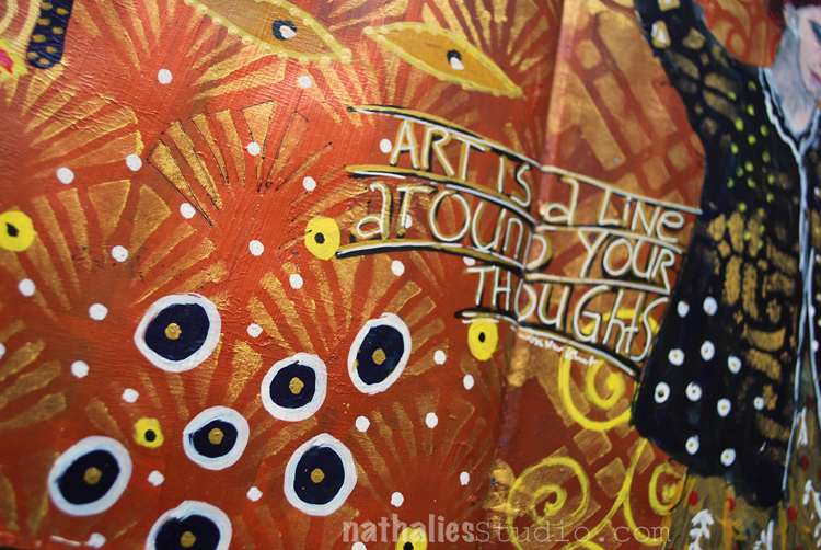
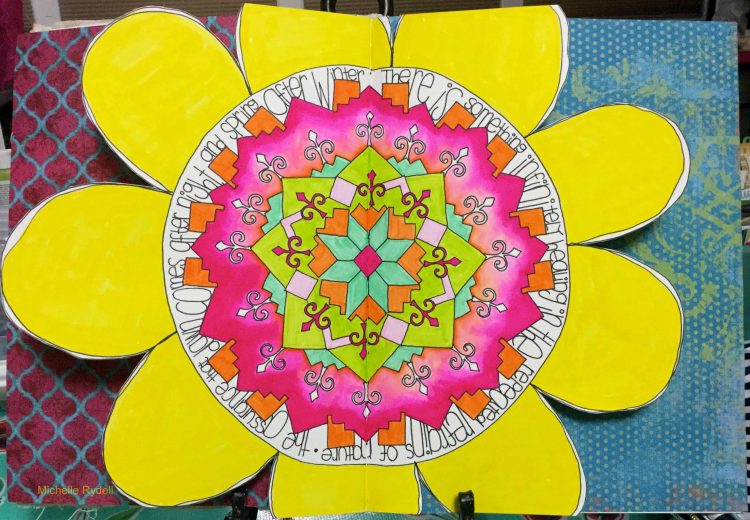
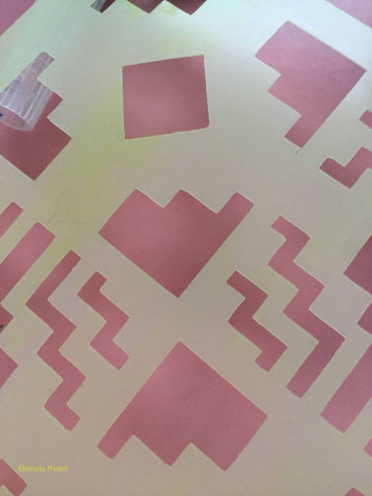
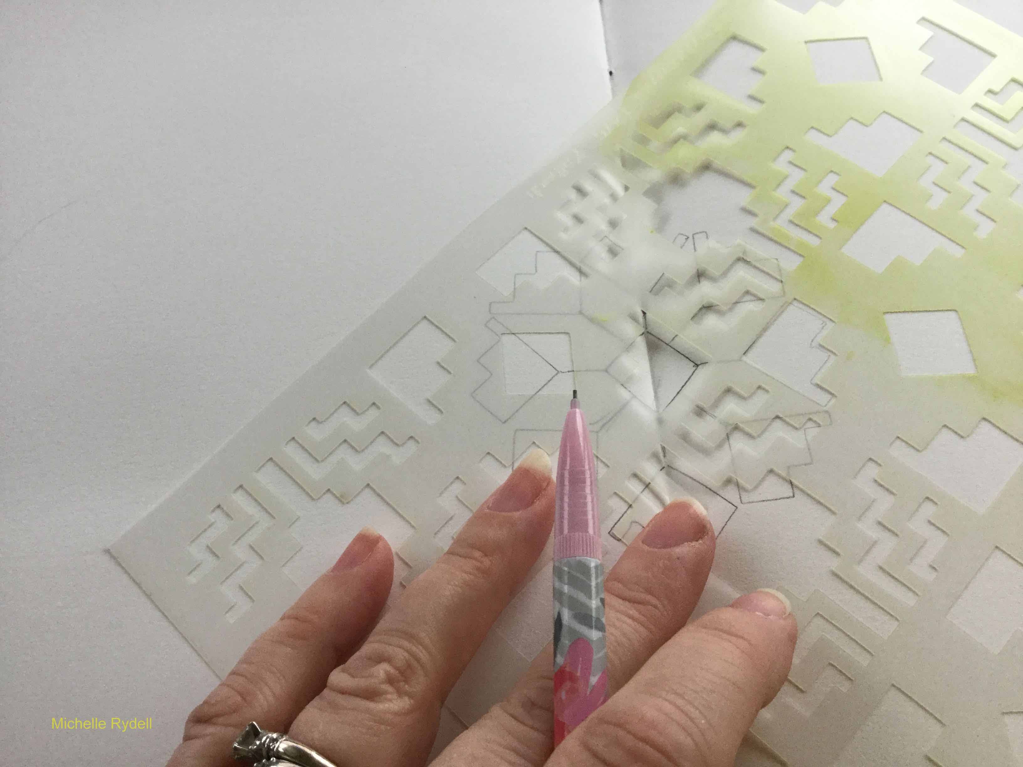
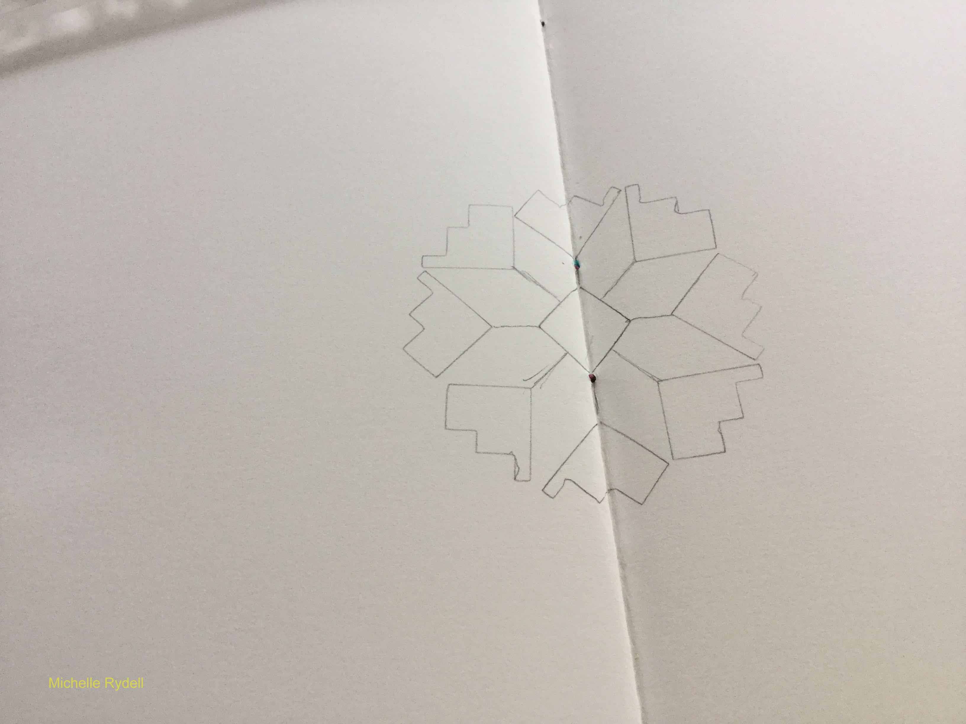
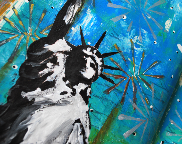
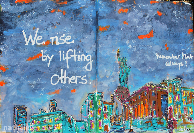
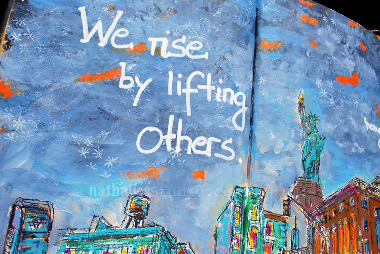
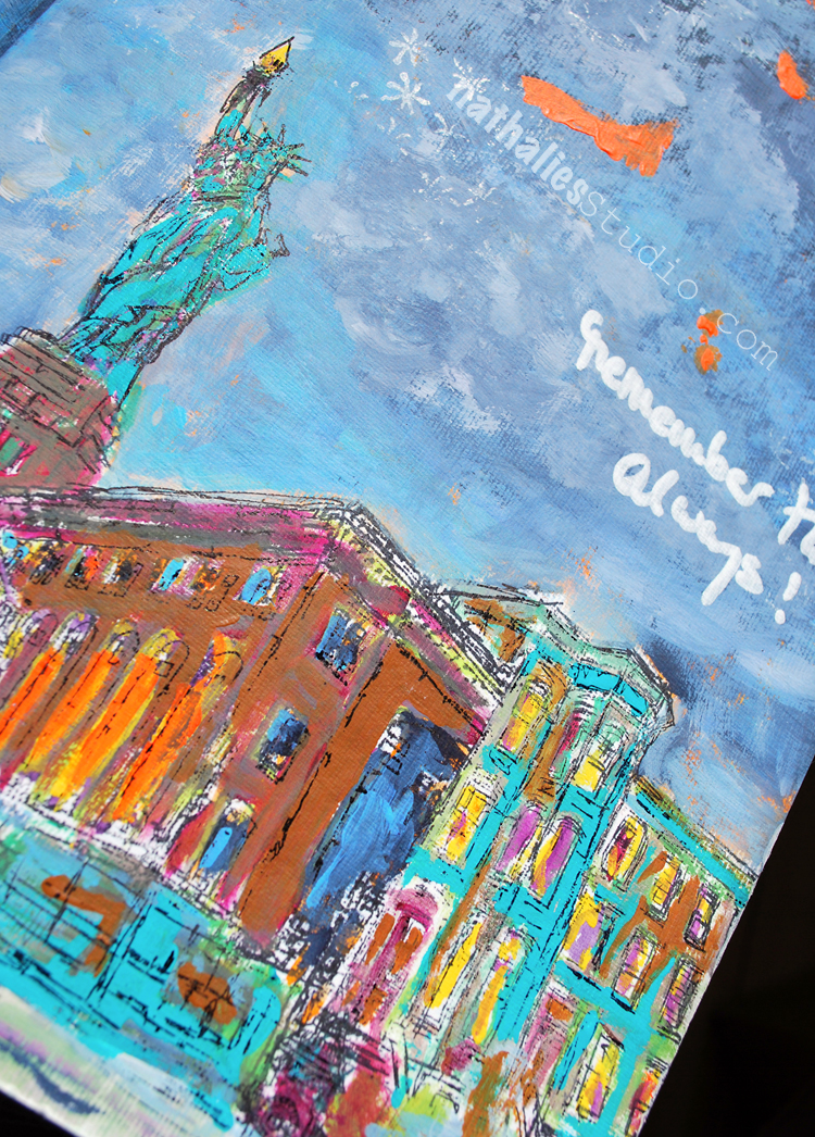
The whole photo is just super interesting. I am assuming it was taken during a 4th of July Parade and so I wanted the background to be colorful and funky. I stamped and stenciled with acrylic paint. I printed the photo out on printing paper, glued it into the journal and painted over it with watercolor.

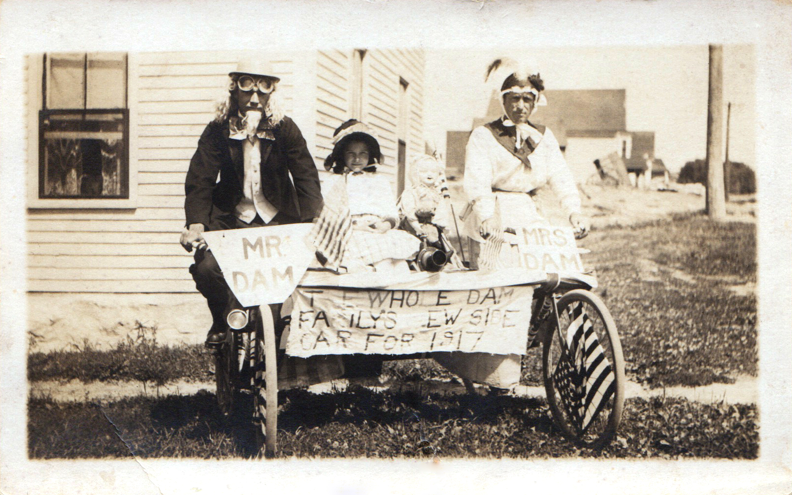
Now let’s check out what Vicki and Cat did with the photo and in case you want to play along with us -here is the original photo for you. Share with us what you came up with on the Whatevers Facebook Page or leave a link in the comment section :)

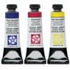
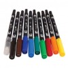
Here are the supplies I used for my page – some links are affiliate links:


Comments (6)

  • Julie B

    |

    You gals had fun with this photo…….

    Reply

    • nathalie-kalbach

      |

      lol, we did! hope you download the photo and play along with us!

      Reply

  • Stephanie

    |

    How fun!

    Reply

    • nathalie-kalbach

      |

      I hope you join in :) Download the photo – and have fun with it :)

      Reply

  • Catherine Matthews Scanlon

    |

    I love how you did the background, it is super interesting with your stamps. Love love love! I think the added flag is the perfect touch. I so much love how we both got the clue that little girl wasn’t happy, she is actually my grandmother, whose name was Cordelia. Can’t wait until next week! Xoxo, so happy for the revival.

    Reply

    • nathalie-kalbach

      |

      Ohhh you didn’t tell us – you need to tell me the real story of this pic if you know :) LOL. Off to check your and Vic’s project :)

      Reply

Leave a comment

A Line is a dot…on a stroll – Art Journal Spread

” A line is a dote that went for a walk” – Paul Klee. A lot of lines in this spread -strolling around.

This was a demo spread which looked a bit sad, so I painted the areas in different colors, stamped with different stamps of my RubberMoon Stroll Through the Hood sets and then added some marks and journaling with a white China Marker. China Markers are great to write on acrylic paint.

Here are some of the supplies I used – some links are affiliate links


Speaking of walks- have you done a walk lately that inspired you?

Comments (2)

  • Sue Clarke

    |

    What great quote and I like your version of it…especially since your strolls are so inspiring.
    I’ve been sick in the house for almost a full week and I can see the buds on the trees starting to bloom.
    So my short walks out to my yard with my dog have inspired me by seeing these buds and my chicks and hens which are growing very well. Peace.

    Reply

    • nathalie-kalbach

      |

      Awe- thank you Sue! I am so sorry to hear you are sick- hope you feel better soon!!! huge hugs, nat

      Reply

Leave a comment

No Reason to Avoid Influence – Art Journal Spread

“For my part I have never avoided the influence of others. I would have considered it cowardice and a lack of sincerity toward myself” Henri Matisse

Some stamping with several of my ArtFoamies Stamps including my new super cute Versailles Positive and Negative Mini Stamps. I used only two colors of the stamping and once I filled up both pages, I painted with some yellow acrylic ink over part, which turned green over the blue and stayed yellow in the white off -set stamped areas.

I like how this spread turned out- it was fun. Here are some of the supplies I used – some of the links are affiliate links:


Have a wonderful creative day!

Comments (2)

  • Julie B

    |

    Love the mix/matching of the various sizes of Versailles stamp with a little Buenos Aires for interest. Thank you again for the inspiration.

    Reply

Leave a comment

Art is a Line Around Your Thoughts

This is an art journal spread entirely inspired by Gustav Klimt- the patterns and colors.

I love breaking up stenciled patterns with hand drawn patterns. I also loved playing with all the different shapes and doodles- it was a very relaxing page to create .

You also see I am still on a little Gold-Hype :) Here are the supplies I used in this spread -some links are affiliate links:

What are your favorite shapes to draw?

Comments (6)

  • Julie B

    |

    EEK! LOVE THIS! Absolutely love the layers, colors, texture, shapes and design. Love how the gold gesso pops the page. Thank you once again for the inspo!

    Reply

    • nathalie-kalbach

      |

      awe thank you so much, Julie! cannot wait to see all your go,d adventures :)

      Reply

  • Shelley Graham Turner

    |

    Loving your gold hype! The mix of gold and orange, with the black and white pops? YUMMY!

    Reply

  • Torsa Saha

    |

    It’s amazing!!

    Reply

Leave a comment

Live Like It’s Spring – Michelle Rydell

Hello from the Creative Squad! The monthly theme is Live Like it’s Spring – Springtime is when Mother Nature kicks it into high gear. It’s the time to wake up and approach life with renewed energy.  Let’s join Mother Nature in this reawakening and create some things in the Spirit of Spring! Today Michelle Rydell is playing with different parts of my stencils  to celebrate spring with a gorgeous mandala. Check out her nifty beautiful idea to use stencils!


When I heard that the theme for this month was about springtime, the first thing I thought of was flowers! Then I took out my Wanderlust stencils to see what I could see. I love looking deeply into Nat’s stencil patterns, because you can see so many patterns within patterns. This time, what I saw was a cute little tulip within the Santa Fe Stencil. Do you see it too?

That gave me the idea to create a springtime mandala with the little tulips as a starting point. I’m creating this spread on watercolor paper in a 9” x 12” journal. The guideline I’m setting for myself is to only use bits and pieces from the following Wanderlust stencils: Santa Fe, New Orleans, and Manhattan. Here’s the step-by-step…

I started with the basic diamond shape (from the Santa Fe) in the middle, tracing it with pencil in the middle of the page. Then I drew a line straight out from each point and side of the diamond. Then added a “tulip” at the end of each line…

From there I just started building outward with various shapes from the stencils; first tracing with pencil, then going over it with pen, once I knew I liked the way it looked.

When I reached this point, I started to see the center of a giant daisy emerging! I found a quote that felt perfect to tie the mandala in with springtime. I drew a circle around the mandala, leaving a little room to add the quote to the inside of the circle. In case it’s hard to read, here’s what it says…

“There is something infinitely healing in the repeated refrains of nature – the assurance that dawn comes after night, and spring after winter.” ~ Rachel Carson

Then I drew the petals, to complete the flower…

Colored it in with tombow markers…

And cut the shape of the flower out, so you can see the journal page before and after behind it.


Wow – I love how all those different parts of the stencils created something new and beautiful – stunning, Michelle! She used these supplies – some links are affiliate links:


Play along with us! I love to see how you interpret our monthly themes. Email me how you used my stencils and stamps with the theme and email me an image – I would love to share your projects in my “n*Spiration From Around the Globe“.

Comments (2)

  • Sue Clarke

    |

    It’s amazing how a crafty person can create such beauty while using different pieces of this stencil.
    Thanks for the ideas Michelle as I tend to create “in the box”.

    Reply

  • Julie Tucker

    |

    This is gorgeous! LOVING how you assembled that flower!!!!!!!!!!!

    Reply

Leave a comment

Living in Color a la Hockney

An unusual color combination for me but inspired by David Hockney – a very straightforward but fun page with some stencil play.

Here are the supplies I used:


I think I want to discover this color combination a bit more. Do you like it?

Comments (2)

  • Sue Clarke

    |

    Since you asked Nat, I must say that I’m not wild about that color combo but I enjoy seeing any thing that you’ve created.

    Reply

    • nathalie-kalbach

      |

      Ha- I understand it is a “weird” combo :) Have a wonderful week Sue!

      Reply

Leave a comment

The Sustainable Souls Project – Alternative Energy

The Sustainable Souls Project is a monthly artist collaboration inspired by sustainability issues, concerns, ideas, and thoughts.  Each month, they pick a sustainability topic and create awareness through art, using the monthly theme as inspiration.  Projects may include art-journaling, mixed media, assemblage and more. The idea is to create awareness around Sustainability through art, one paint stroke at a time! As this is a topic close to my heart I am happy to participate this month.

This month’s theme is

Alternative Energy, Solar, Wind, Water, Biogas- and here is an art journal page I created with the topic in mind:

I found this quote on pinterest a while ago and I remembered it instantly when I saw the topic of this month. “When the winds of change blow, some people build walls and others build windmills.”

To represent the windmills I used part of my Beacon Stencil . Renewable Energy has been a topic in Germany, where I come from, for a very long time – in fact Germany is called ” the world’s first major renewable energy economy”. As of the beginning of 2017 30% of Germany’s power is now generated by renewable sources, with a long-term target of 80% by 2050. This increase of renewable energy has resulted in plummeting energy costs which is a nice side effect even for those that do not believe that our planet has only a certain amount of resources and that there is no Planet B .

Do I find windmills an eye sore? An interesting question which I have been asked before …Not really …I guess as I am used to seeing them especially coming from a flat windy northern part of Germany with loads of those windmills. I find them more attractive, safer and can live better with them than living next to a nuclear power plant…that is for sure. I hope that more countries will explore and invest in renewable energy and make it a goal to mostly use it in the near future. For me it just makes sense, more sense than building a wall.

Comments (6)

  • Sue Clarke

    |

    Better than walls! So true. I don’t mind windmills at all and it only makes sense to use more renewable energy.
    Unfortunately President Trump doesn’t see a need to use alternative energy (oil is just fine)…sorry to start a rant…I like your page very much and the quote too. Have a happy weekend Nat!

    Reply

  • Tina Walker

    |

    Oh Nat! What a beautiful spread and I love your words and story behind the page. I agree, windmills are much more attractive and sustainable! I wish the US would support sustainability more…but hopefully we are creating awareness, one art piece at a time. ♥

    Reply

    • nathalie-kalbach

      |

      Awe- thank you Tina! Love your motto – creating awareness, one art piece at a time

      Reply

  • Sherry Canino

    |

    Wow Nathalie I just love this post. Very moving and inspiring. Your art is breathtaking and as for me I love windmills. I personally think they are beautiful certainly much nicer looking than some smoke stack pumping out black smoke. And the quote you used I totally love. Green in large amounts is my “struggle color” and I love how you used it here !!! Thanks for sharing your art and inspiration with us ❤❤❤

    Reply

    • nathalie-kalbach

      |

      thank you so much Sherry for you wonderful words! I agree on the windmills versus smoke stack pumping out black smoke. Have a gorgeous week!

      Reply

Leave a comment

Creative Ice Breaker – Morning Art Journal Play Video #8

In the mornings I play in my art journal to get myself into the creative groove and break the ice – so to speak- and get ready to paint. I recorded and fast forwarded my morning ritual for this video – and hope you enjoy it. Take it as what it is – a morning art journal play- not a tutorial.

Creative Icebreaker #8, April 2017 from Nathalie Kalbach on Vimeo.

Here is the art journal spread I created in the video

Here are the supplies I have used in my Creative Ice Breaker video above – some links are affiliate links.Please note that my Manhattan Minis will be available soon- some select stores carry them already (The InkPad, Scrapbook Centrale) and I will soon too :) )

I hope you enjoyed the little glimpse into my morning warm up play! Have a wonderful and creative day!

Comments (2)

  • Sherry Canino

    |

    I love your creative ice breakers they are so fun to watch you create!!! Thanks for sharing and such a beautiful page !!! xxoo

    Reply

    • nathalie-kalbach

      |

      Awe- thank you Sherry! have a gorgeous and sunny weekend

      Reply

Leave a comment

Lift Others – Art Journal Spread

Lots of things are going through my mind lately and this quote in my art journal truly resonates with me.

I just received my new Dina Wakley Art Journal yeahh. I was so impatient to finally hold it in my hands ever since I saw it at the AFCI (former CHA) show in January. If you haven’t seen the journal yet, it has different surfaces including burlap, canvas, cotton rag, watercolor paper, and kraft paper. It won’t be my everyday journal, as I love to work in double spreads, but it is a great journal for forcing me out of my box with its fun opportunities and possibilities of paint applications. I am so stoked about it.

This spread was created on a watercolor spread in the book- I love the texture . I also played with some of Dina’s paints. I layered my hood stamps and colored them in.

For the stars in the sky I used my Star Fish stamp with some white ink and finished the spread with the quote written with a white sharpie.

Here are some of the supplies I used for this spread:


I wish you are wonderful day <3

Comments (2)

  • Torsa Saha

    |

    Beautiful page !! ??

    Reply

Leave a comment