Nat

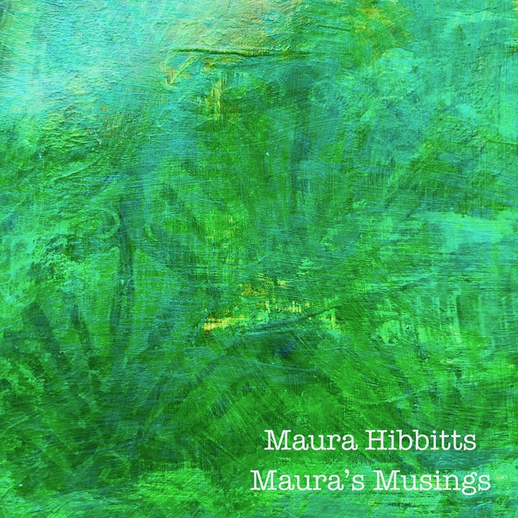
Hello from my Creative Squad! Today we have a post from Maura Hibbitts with a gorgeously layered art journal page using my New Orleans, Crackle, Art Deco, and Batik stencils and my Neato foam stamp. This month’s theme is Feel the Rhythm – We’re thinking about patterns this month and using stamps to create a rhythm of marks. Show us your sense of rhythm!
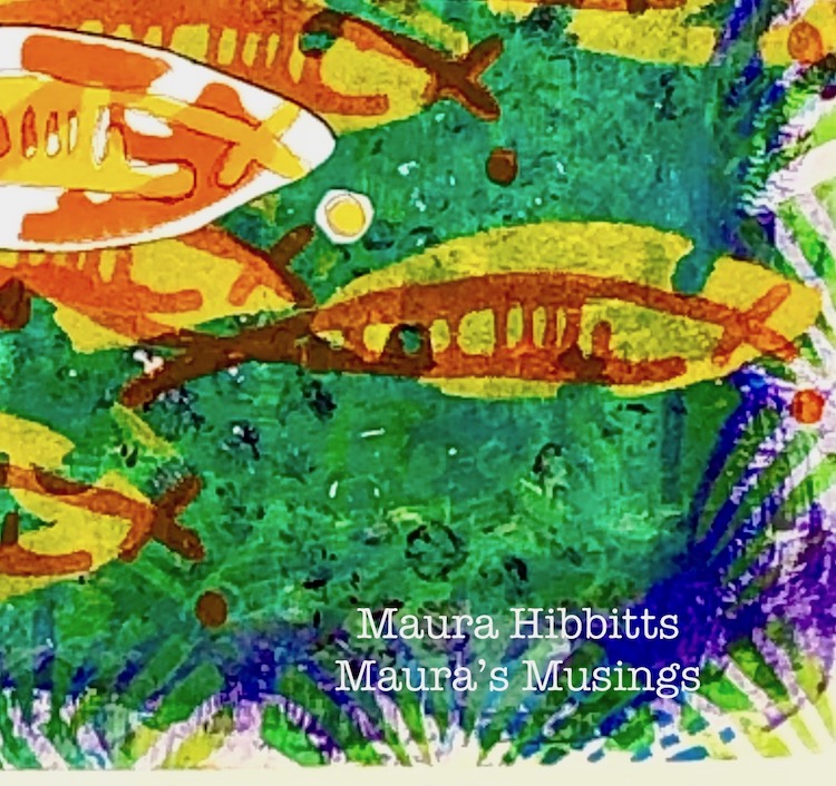
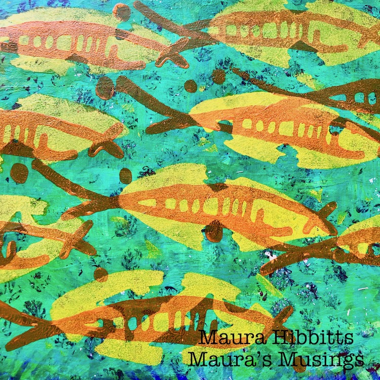
When you stop and look around in the natural world, there’s a lot of rhythm and flow going on, from the rhythm of the seasons, to the flow of the water and air. When I first saw Nathalie’s Neato Art Foamie stamp, I saw a fish, and knew I wanted to create a water scene. A school of fish is just perfect for a repeating pattern, I think.
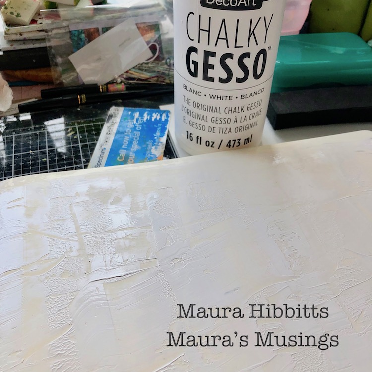
I pulled out one of my big journals with a landscape format, so my fish school could swim across the page. First step was to scrape on some chalky gesso with a key card and let it dry.
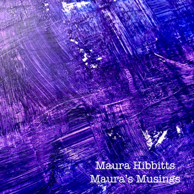
To create a dark underwater background, I painted on a mixture of Dioxazine Purple and Ultramarine Blue. Before the paint dried, I “scratched’ into it with my brush strokes.
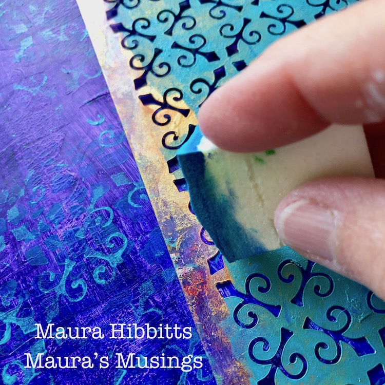
Time to begin the stenciling. First up is the Crackle stencil, sponged in with Cerulean Blue. This layer is very understated.
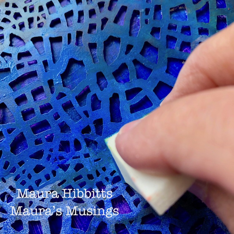
I used the New Orleans stencil with Cobalt Teal Hue and worked across the page, sponging in the design.
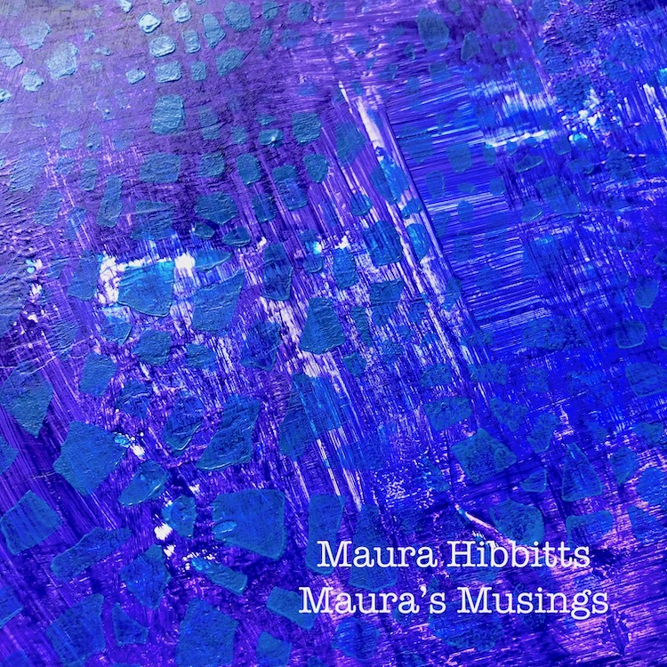
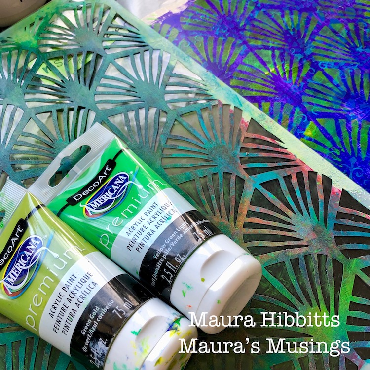
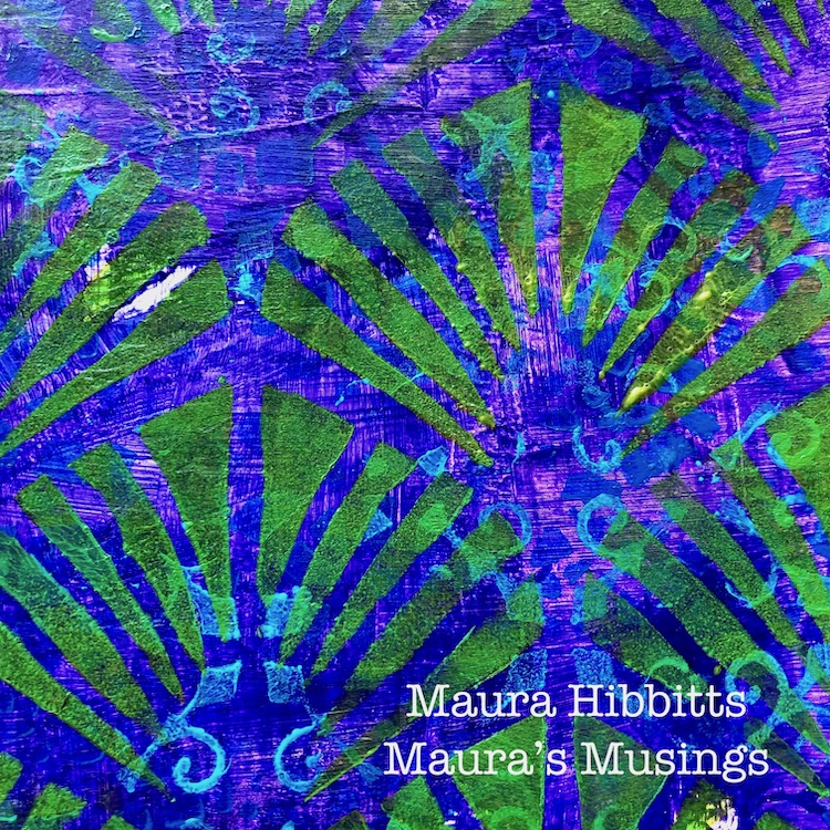
The Art Deco Wallpaper stencil with the Green Gold and Yellow Green Light paints is used in the next layer to give a hint of plants in the water.
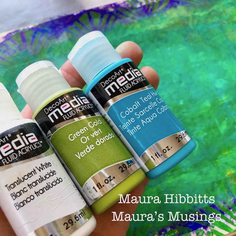
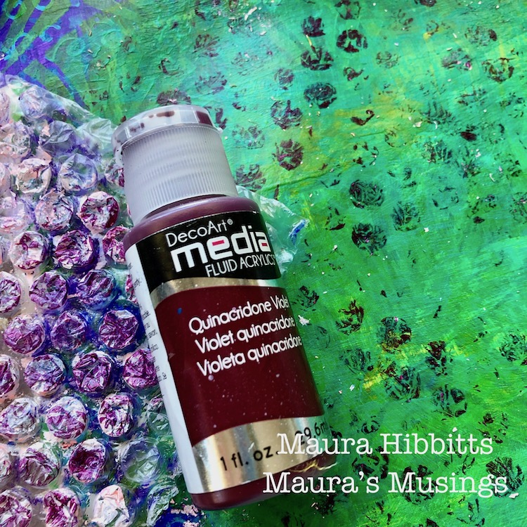
Now that my page is covered in a variety of blue, purple and green paints and designs, I decided to fade out the central area. I started by brushing on the Translucent White, then wiping that back with a baby wipe. I repeated this step with the Green Gold, and ended with the Cobalt Teal Hue.
I couldn’t resist adding some bubbles into this area with some bubble wrap and Quinacridone Violet. Some of the old paint came off too which just added some fun spots.
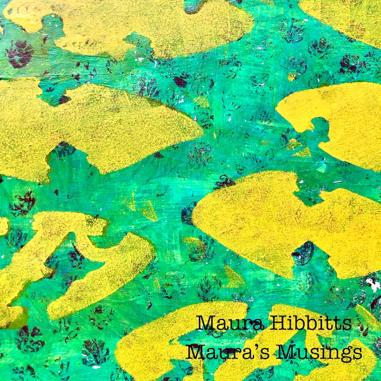
Now comes the fun part – creating the school of fish! Certain shapes in the Batik stencil just seemed to work really well as fish bodies, so I stenciled a school of them across the page with the Cadmium Yellow Hue.
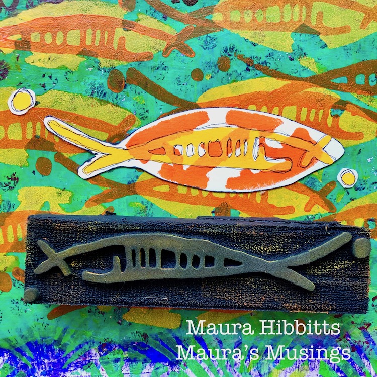
I finished up my fish by stamping the Neato Art Foamie design in Cadmium Orange over the yellow bodies. I just used my cosmetic sponge to apply the paint to the stamp.
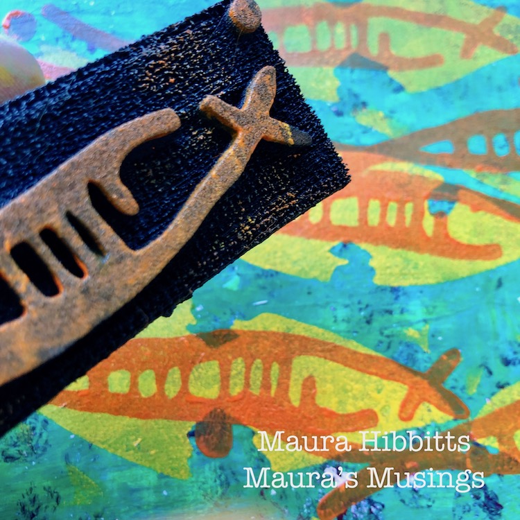
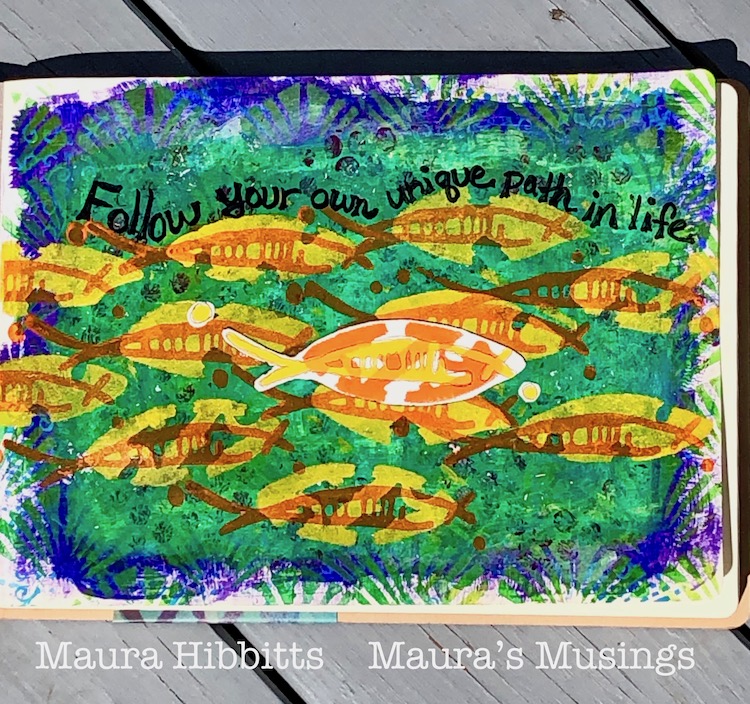
Then, because I wanted one fish to be unique and stand out, I stenciled the body in orange and stamped the Neato design in yellow onto watercolor paper. Once it was dry, I cut it out and edged it with a black sharpie, then glued it onto my page. My final step was to doodle around the Neato design with my carbon ink pen, and hand letter my thoughts across the top of the page with the Sharpie – “ Follow your own unique path in life”.
So many fun layers of color and design on my art journal page.
Feel the rhythm as the school of fish moves and flows through the water. It truly is fascinating to watch as a school of individual fish move and act as one body. I guess it could be a bit dangerous to be that fish that stands out in the crowd, but in my own life, I have always liked being unique. So, follow your own unique path in life!
Thank you Maura! I love the feeling of underwater that you created with all those layers! You can find my Stencils and my Foam Stamps in my Online Shop. Here are some of the supplies that Maura used:
Feel inspired? Working on something yourself that you’d like to share? I love to see how you interpret our monthly themes. Email me how you used my stencils and stamps with the theme and email me an image – I would love to share your projects in my next “n*Spiration From Around the Globe“.
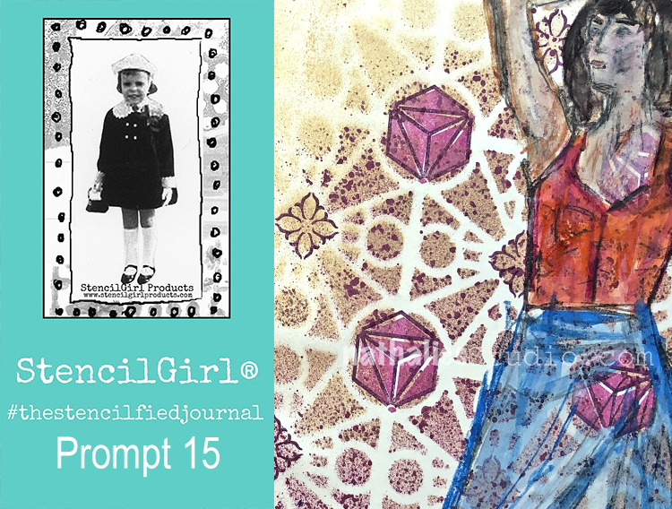
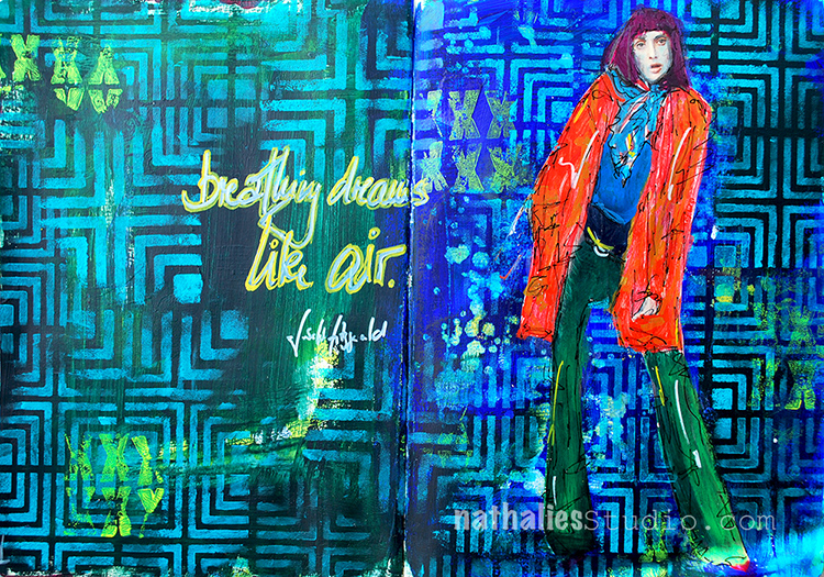
My wonderful friend Tina Walker is at it again – she invited several people to join her Stencilfied Prompts. The prompts are music related and each week she is posting a song. You can be inspired by the lyrics, the video, the album cover or anything related and the only restriction is that you have to use StencilGirl Product Stencils. Here is my take on Prompt 15
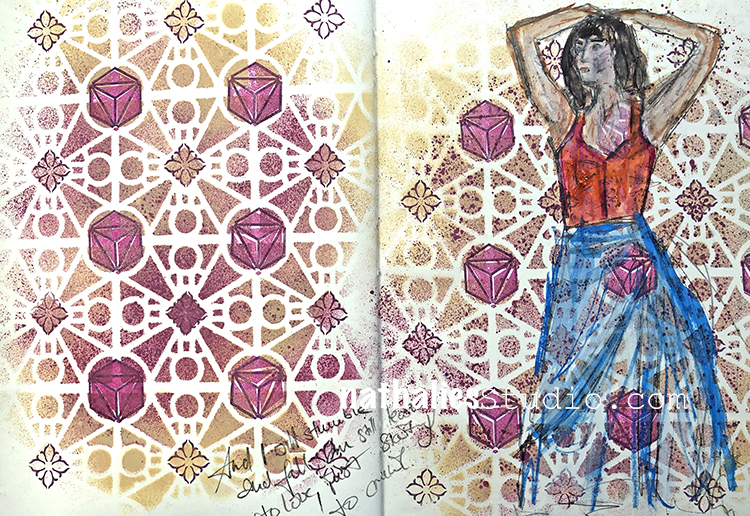
This week’s prompt was Say Something by A Great Big World & Christina Aguilera. I’ve definitely heard this song before but it’s not my typical style of music. BUT… that doesn’t mean it can’t be a jumping off point for creating :)
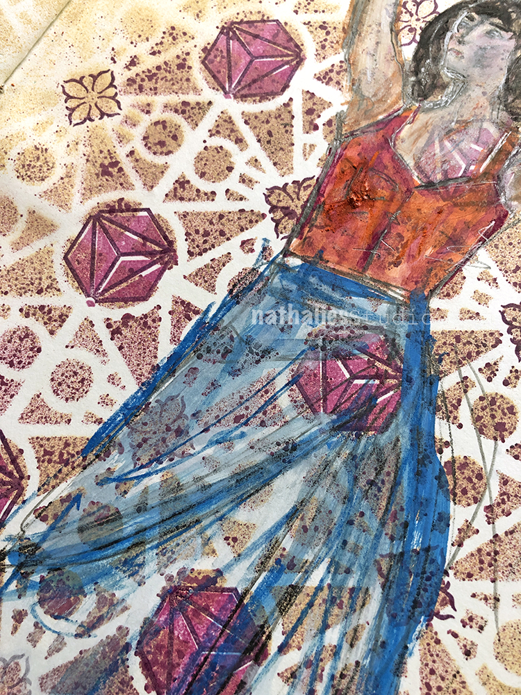
I had fun sketching the figure with pencil and Inktense blocks by Derwent – I love the transparency I created with a wet brush afterwards.
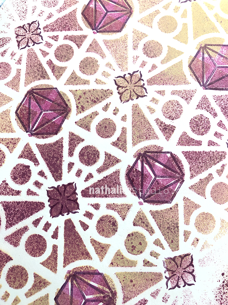
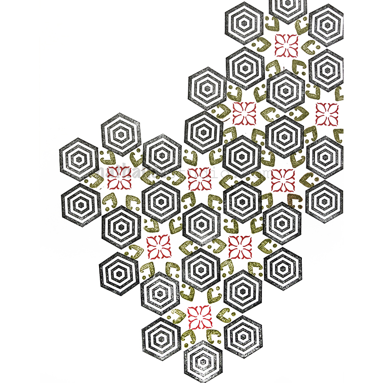
Let’s not forget about the background – I used my Buenos Aires stencil with spray paints and then added a stamp from my Small Hex set and a stamp from the Fan-fare set. I’m super happy with how they work with the stencil.
Here are the supplies I used:


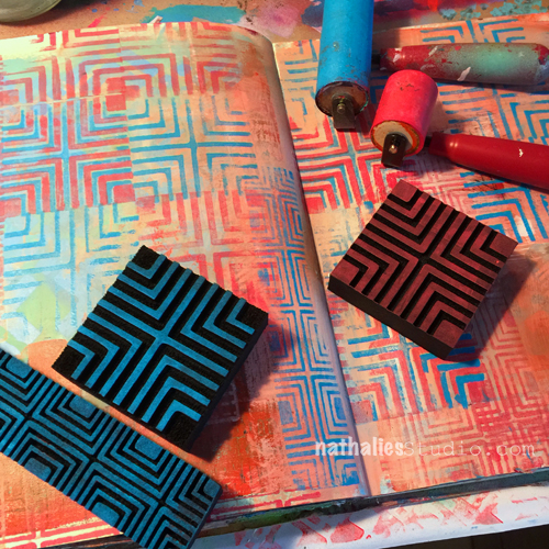
When I received my new RubberMoon Stamp Designs I couldn’t stop making samples and patterns- so I decided to record a short inspirational pattern video each day and post them on Instagram. Here is a summary video of Patterns 19-21 – I hope you enjoy :)
Nat's April Patterns from Nathalie Kalbach on Vimeo.
Here are the patterns from this video:
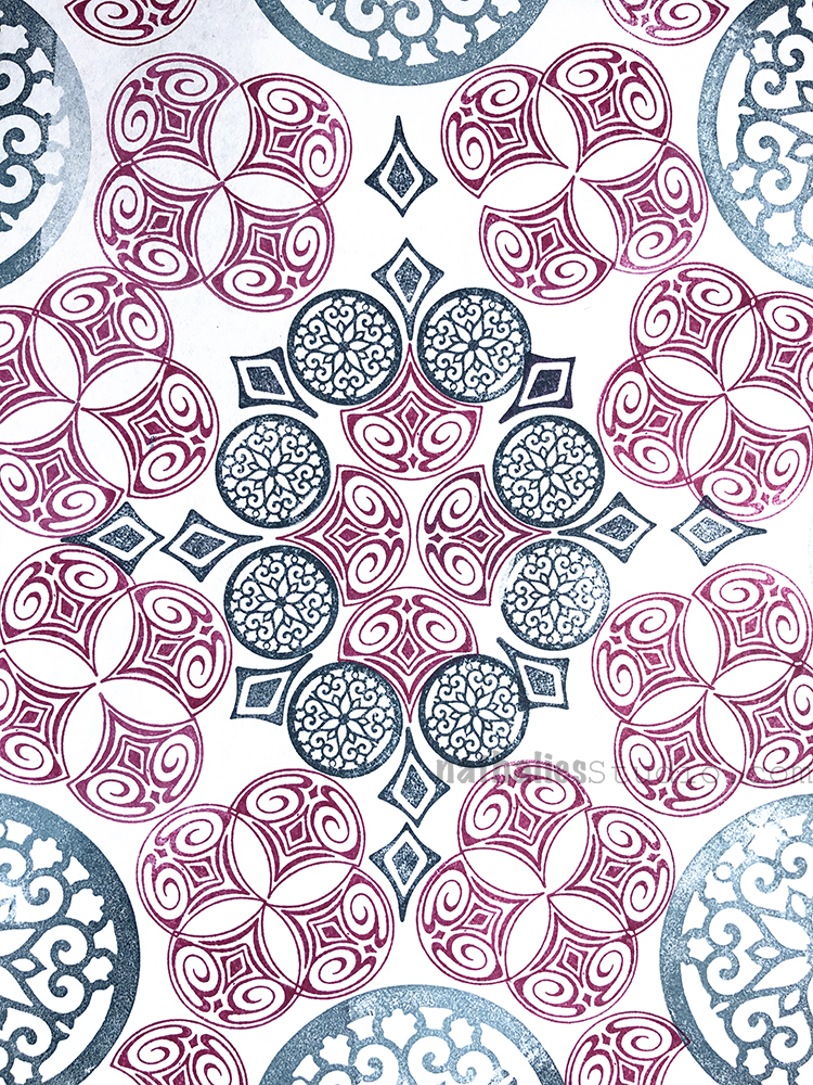
Here are the stamps I used for these patterns:

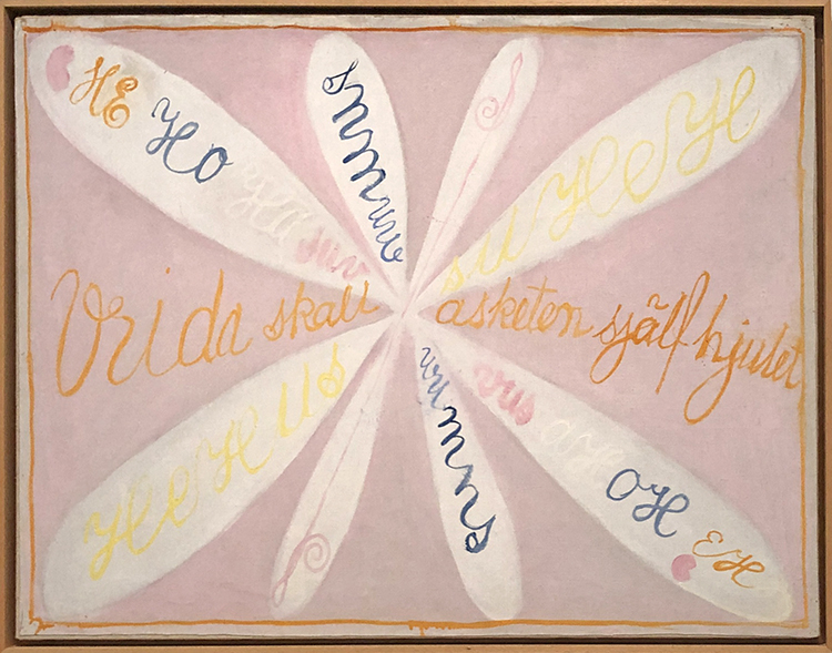
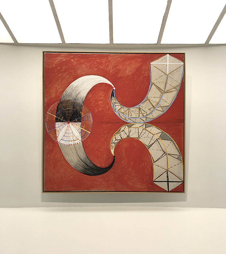
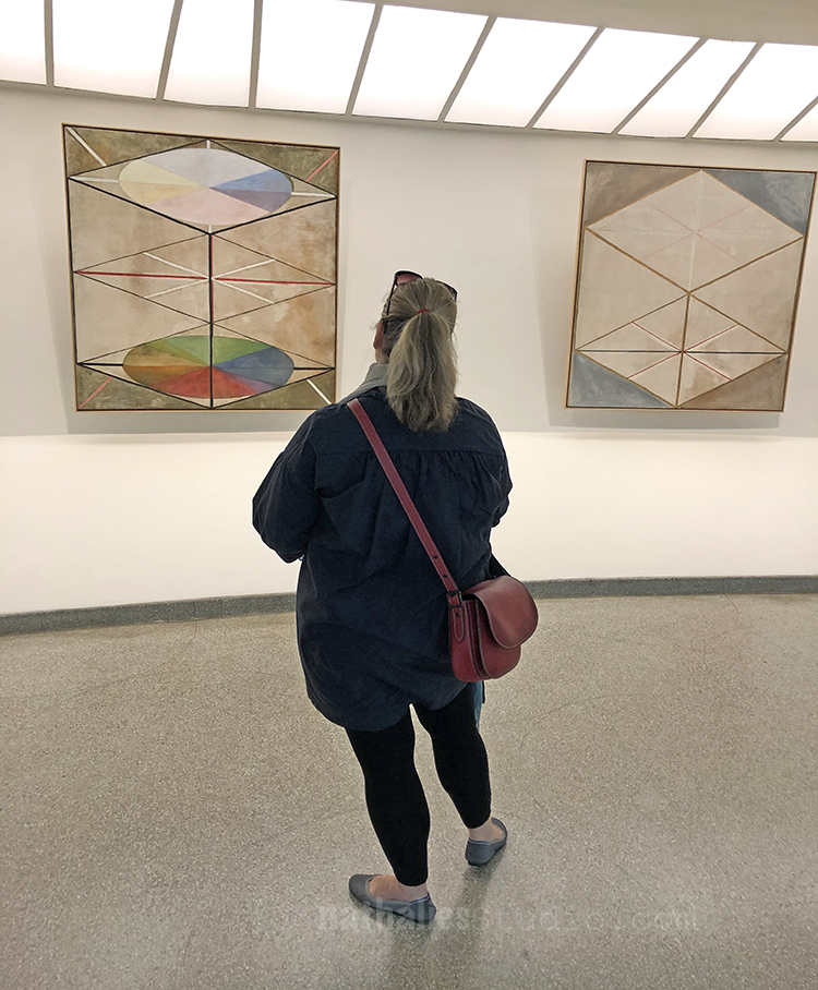
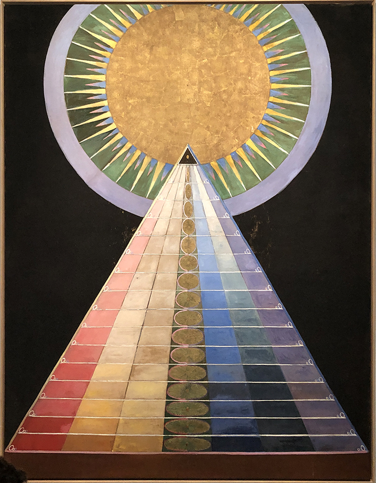
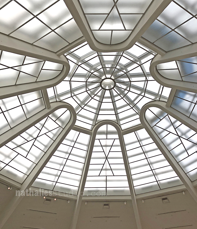
Last week Kim and I went to the Guggenheim to see the Hilma af Klint (1862-1944) “Paintings for the Future” exhibition. I had been excited to see the exhibition for a couple months now and I wasn’t disappointed.
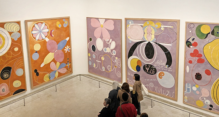
Klint radically started creating abstract paintings years before Kandinsky, Mondrian or other that are called the pioneers of abstraction would change their own artwork from representational content to abstract paintings.
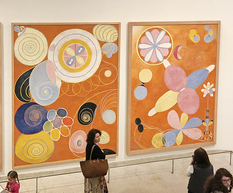
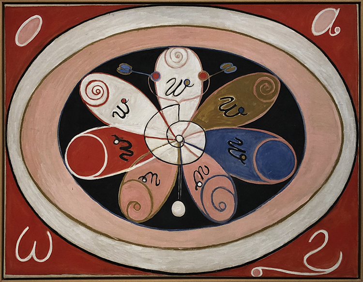
The size and colors of her early paintings are just mesmerizing and such a happy delight to see – instant feel good right in front of those.
It also struck me how immensely feminine those paintings are.
The color schemes are still muted colors but light and the forms are round and free.
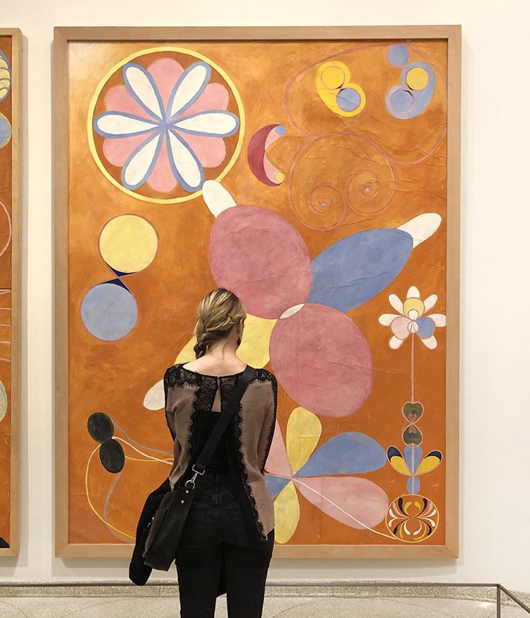
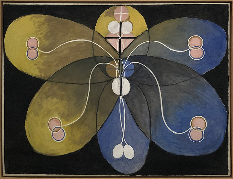
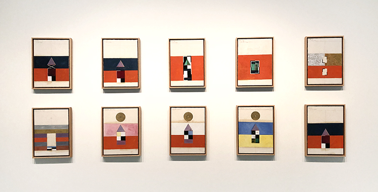
These ten earliest huge paintings of Klint go through the lifespan of humans from birth to old age.
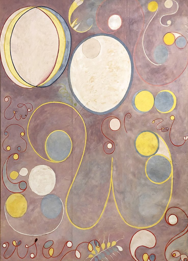
Interestingly enough Klint kept most of her groundbreaking paintings private, because she was convinced that the world was not ready yet to understand her work. In her will she stipulated that a lot of her work was not be shown for twenty years following her death. Ultimately her abstract paintings remained all but unseen until 1986 – 80 years after she painted some of her most prolific abstract paintings in 1906.
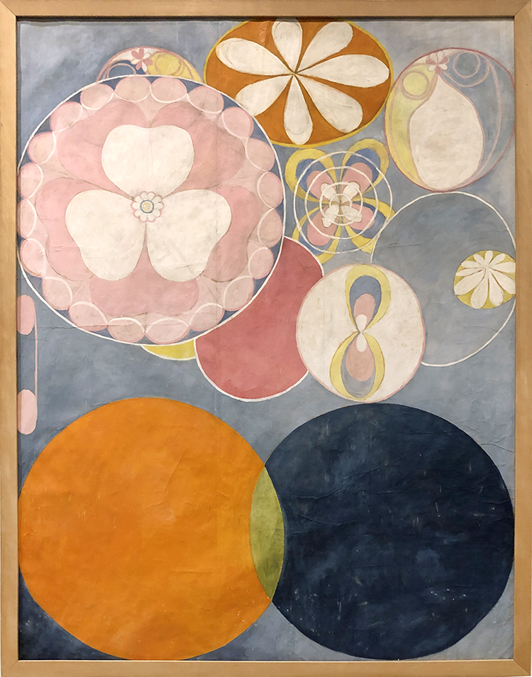
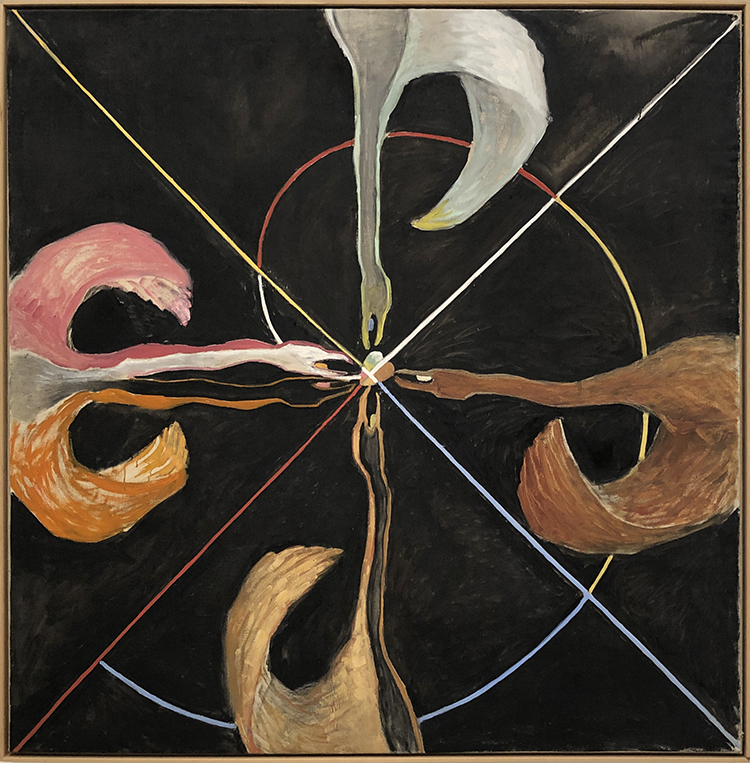
The painting above is a sample of what would be seen mostly of her work. It is just so mind blowing. Given that abstract male painters several years later caused insane outrage about their work, she was probably right that as a female artist on top, people would have not understand her art at all.
It makes you rethink art history though – it messes with our perception of the timeline of abstract art and of the mainly male key figures of this movement as well.
In 1896 Klint held regular séances with four other women. She had begun attending séances as a teenager, using them as a way to contact her younger sister, who had died young. Spiritualism was a big thing back then and the group wanted to obtain a direct access to a higher order of knowledge.
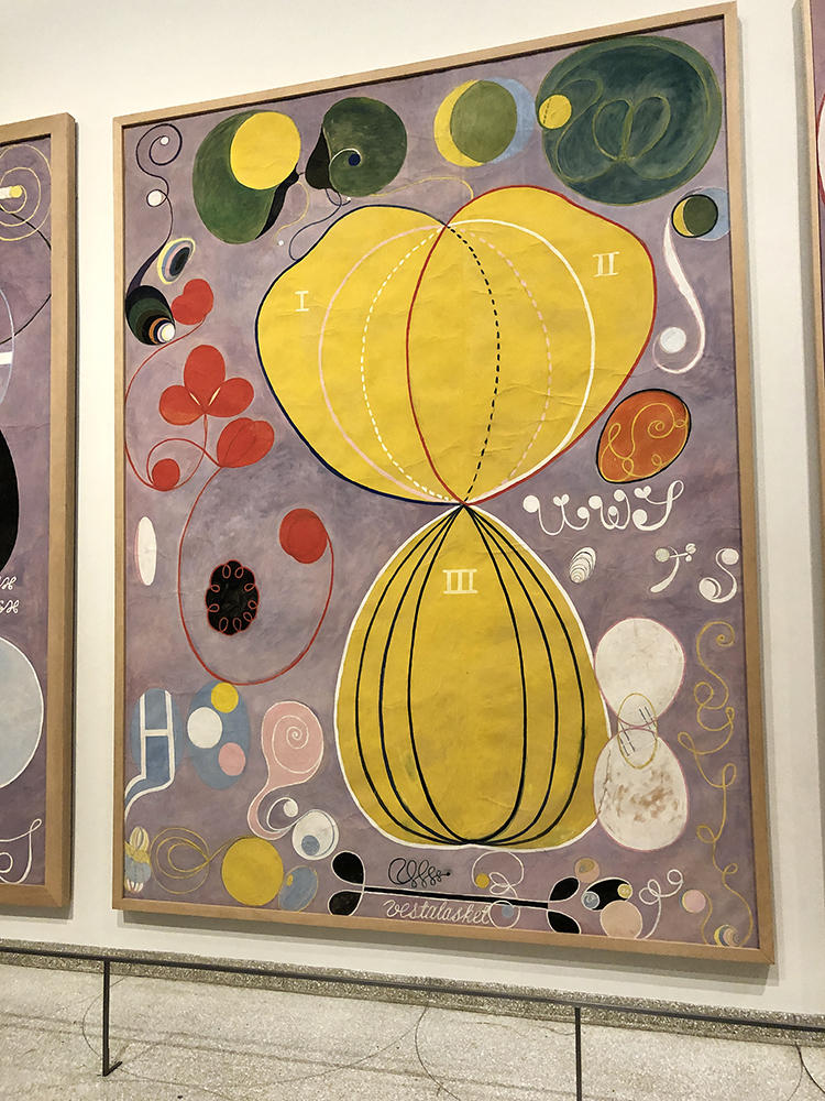
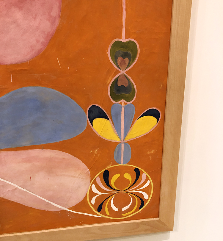
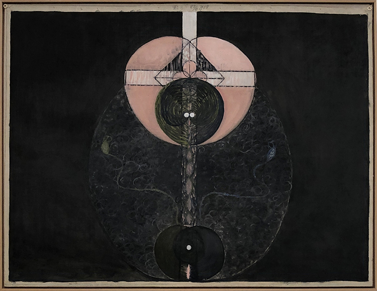
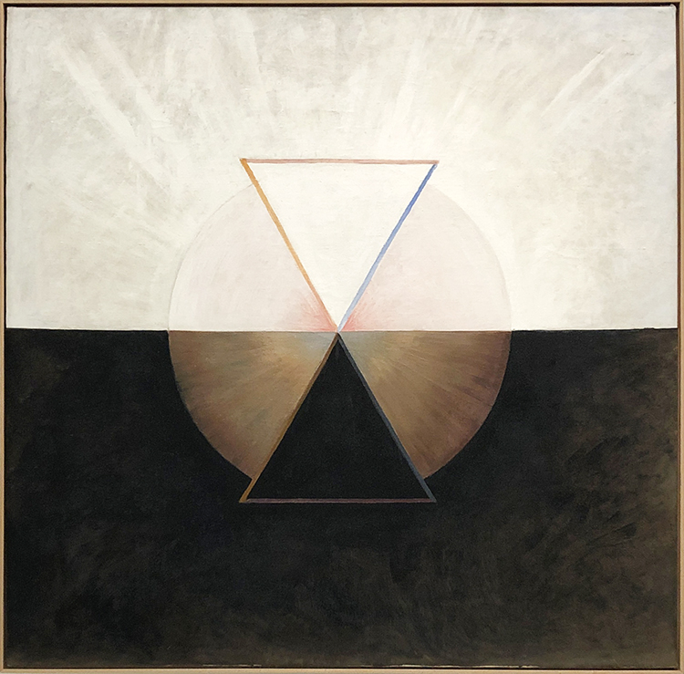
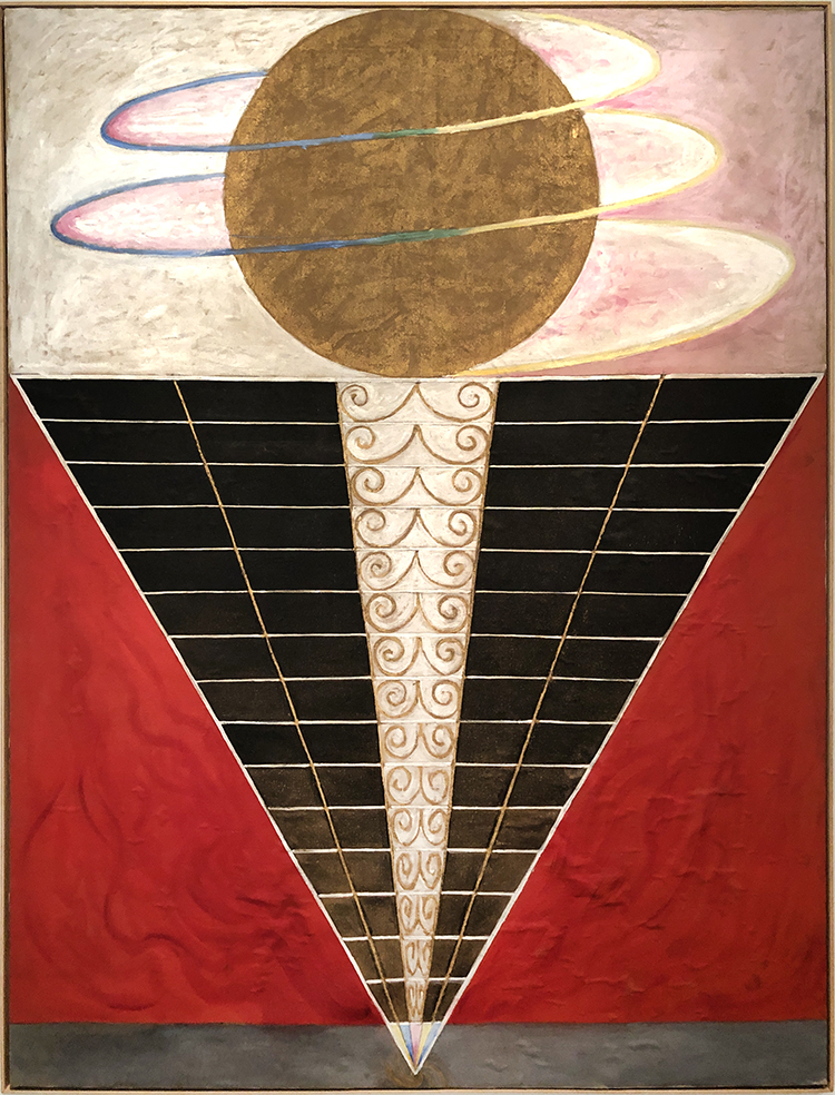
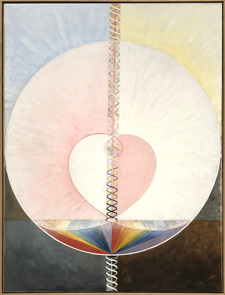
Klint worked earlier as a biological illustrator and her scientifically styled diagrams and her esoteric experiences mixed in her paintings.
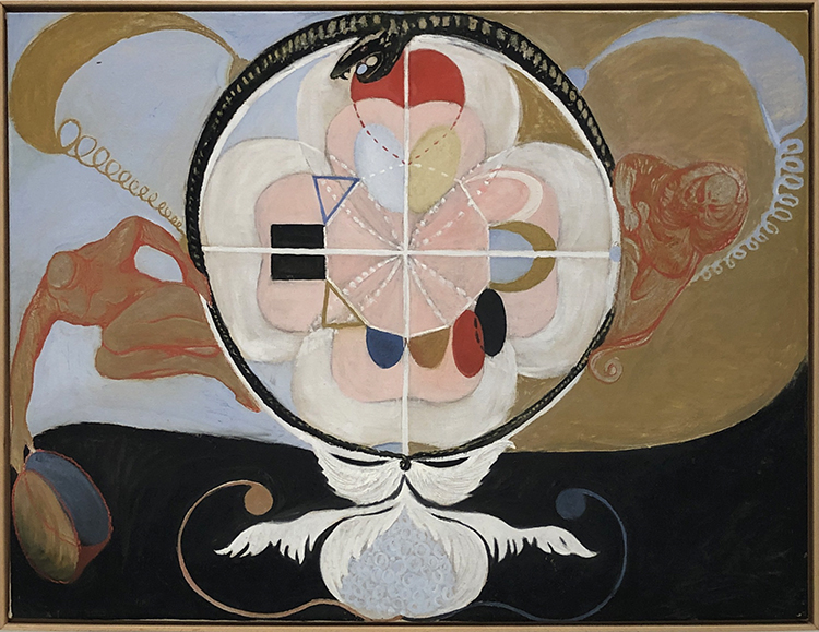
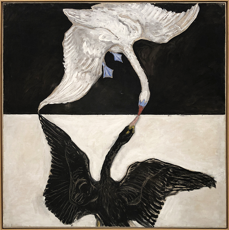
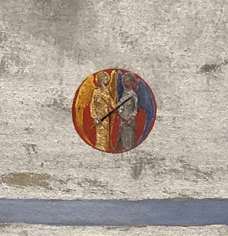
The swan represents the ethereal in many mythologies and religions and stands for completion in the alchemical tradition.
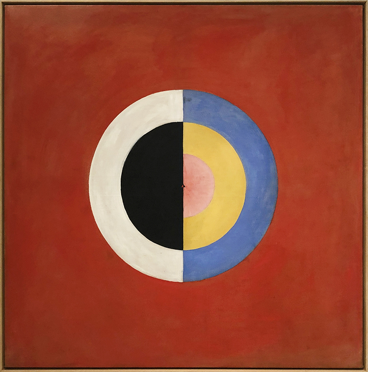
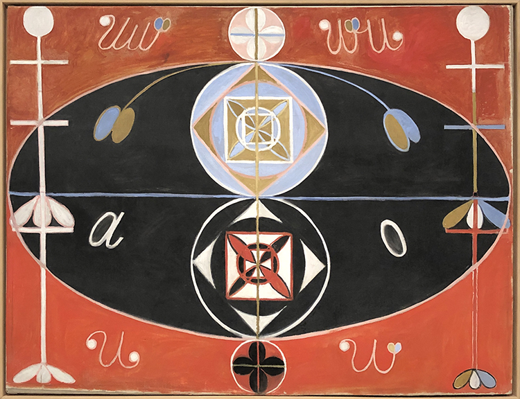
Klint often incorporated insights gleaned from color theory in her paintings. For Klint certain colors represented certain significances. Blue for example represents the female, yellow stands for male, green for the unity of the two.
In 1906 an otherworldly spiritual guide commissioned Klint to prepare a message to human kind and so she painted about 193 paintings containing the spirit of the world. Those paintings are known as the “Paintings for the Temple”
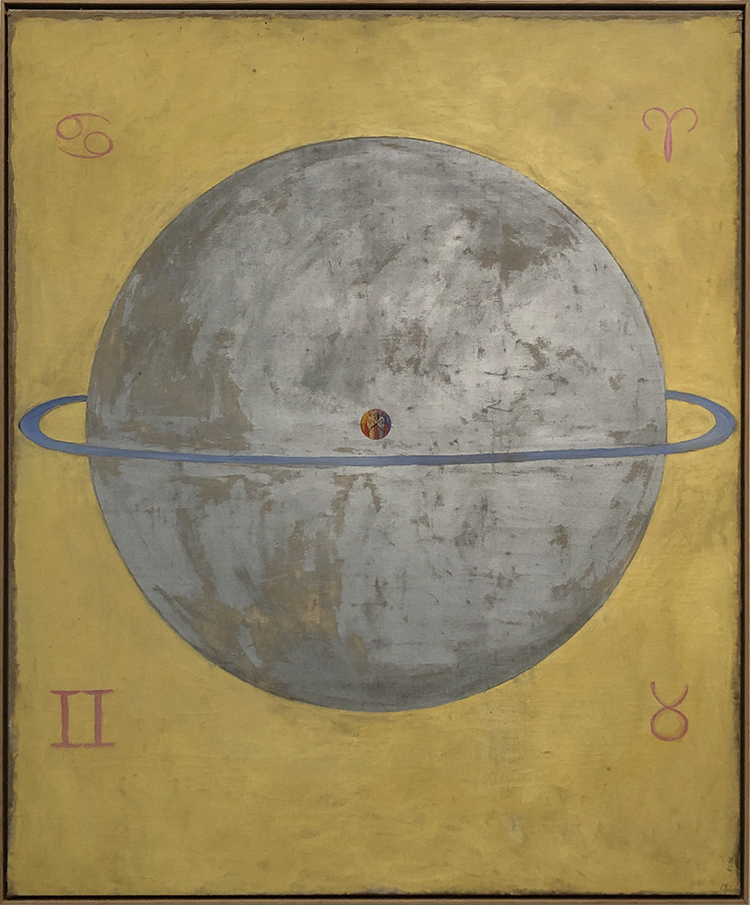
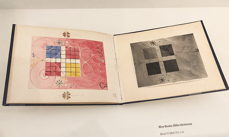
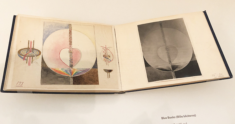
Not all of Klints work were kept secret by her. The Blue Books were a tool that Klint created to show trusted viewers her paintings. They contain black and white photos and next to them carefully rendered watercolor reproductions.
At the time she made those works, the art world was generally dismissive of work made by women and on top many critics did not take abstraction seriously.
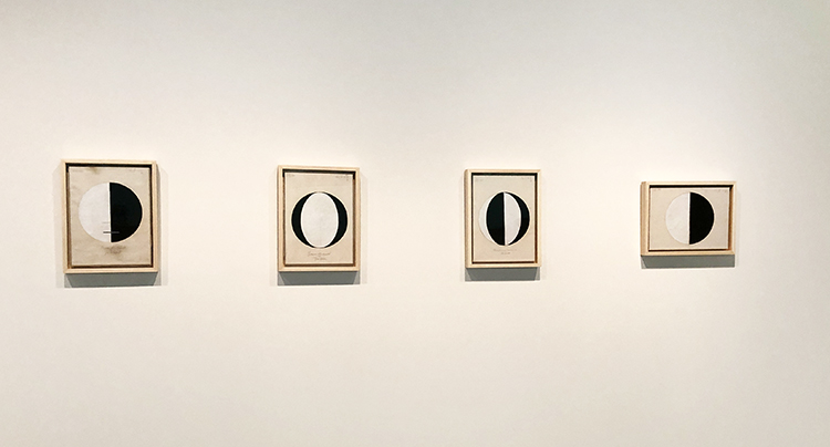
“…in 1920, she made a series of small works that begins with a single circle, half black and half white, called “Starting Picture”—the world as a balanced duality, physical and material, dark and light.
Subsequent entries in the series offer similar circles, differently divided up between black and white: one divided into four alternating slices; one with black crescents framing a white center; etc. The titles suggest they are supposed to represent different graphs of the great spiritual traditions: “The Current Standpoint of the Mahatmas,” “The Jewish Standpoint at the Birth of Jesus,” “Buddha’s Standpoint in Worldly Life,” and so on.”
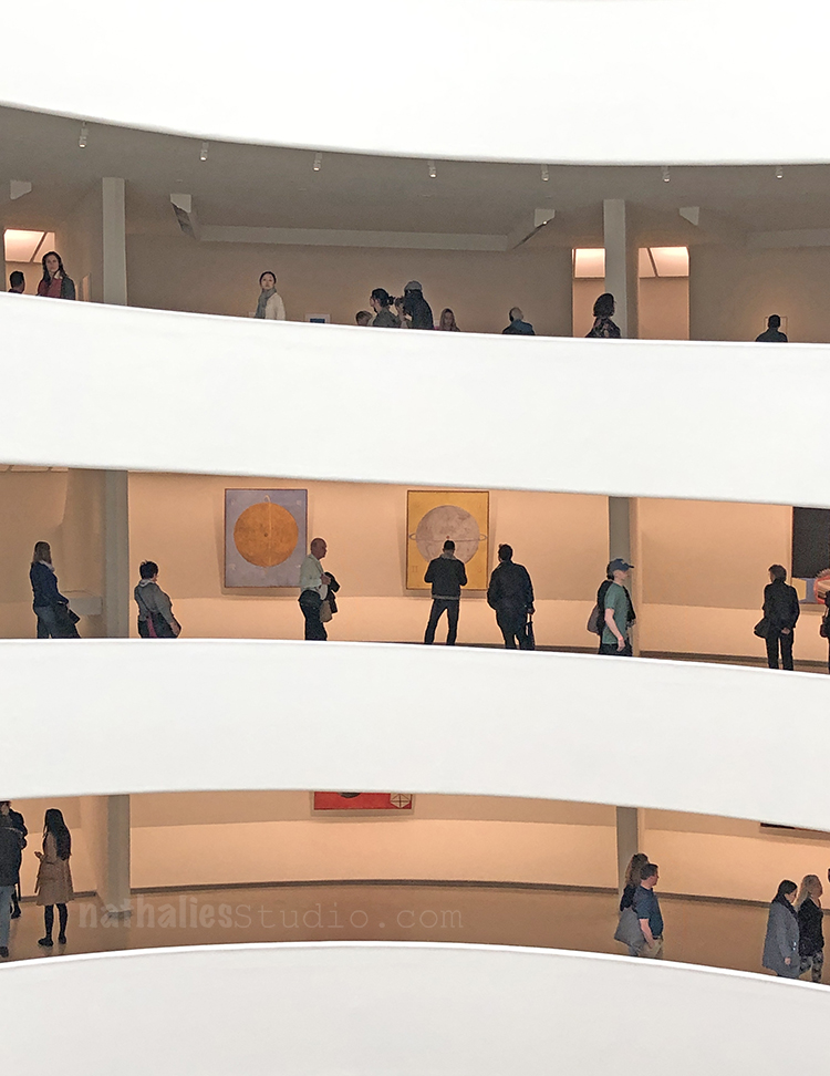
Klint made sketches for a spiraled building that would show her work ascending the spiral case to the heaven ….! “In many ways, the Guggenheim retrospective fulfills the artist’s long-buried dream.”
This was an uplifiting and thought provoking exhibition. Did I decipher her work? Nope …but …I was content and happy just looking at it and make me feel good. Nothing wrong with that …and hey …maybe that was the message all along ;)
Thanks Sue for joining! Yeah I am also very intrigued about her life!
Nathalie, thank you for this fabulous article. You’ve educated me about an artist I didn’t know.
so glad you enjoyed this!!!

A Look Back – a blog series to show you some projects and posts that you may have missed – sometimes going WAY back in the archive. I think it will be fun to revisit a few ideas that we haven’t seen for a while. I’m excited to see how a little look back might inspire something new in the future :)
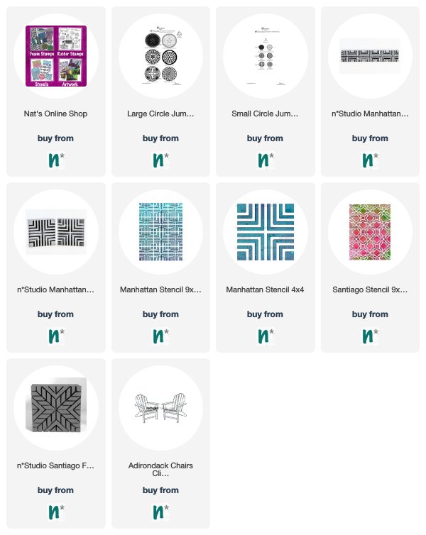
This time I’m looking at scale – and using the same patterns and designs in different scales to make magic happen in your work. Here is A Look Back at some ideas. Enjoy!
First up is using my Large Circle Jumble stamps along with my Small Circle Jumble stamps together in an art journal spread. The effect creates a depth to the background. Pretty fun way to create a little 3D environment for my Millie stamp.
From way back in 2016 I combined my Manhattan Border with my Manhattan Positive Negative foam stamps in this background. You can see in the finished art journal page here how this makes a complex but cohesive background to build on.
A year later I again used two of my Manhattan designs in different scales for another art journal background. This time it was the Manhattan 9×12 and Manhattan 4×4 stencils. I love how this gives the background more energy than if it were all just the same.
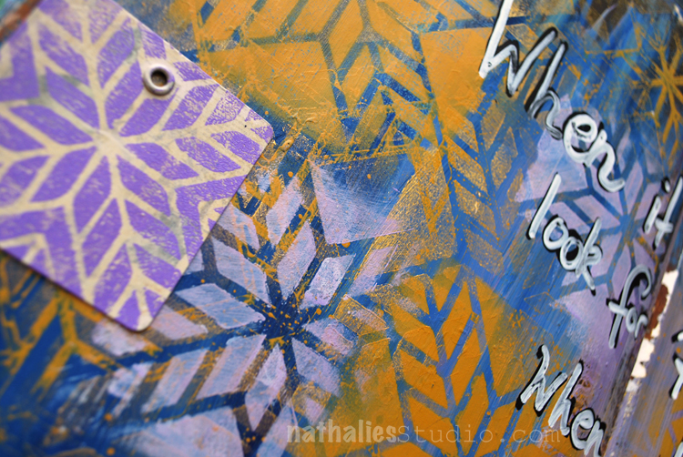
In this art journal page I combined my Santiago stencil with my Santiago foam stamp for a more subtle push and pull in the background. It shows that even a slight difference in scale can have a cool effect.
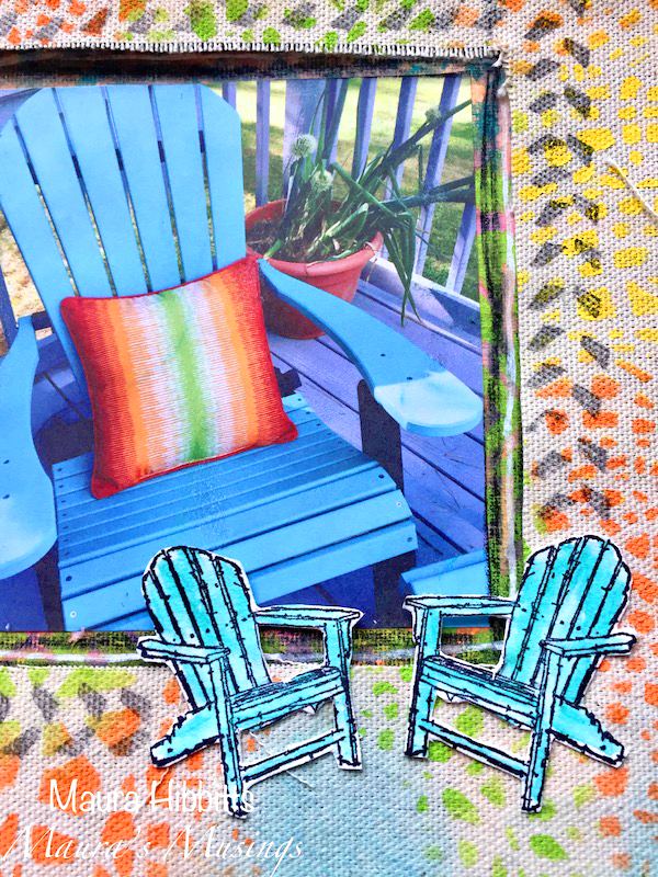
And finally, from Creative Squad member Maura Hibbitts, we have a collaged photo along with my Adirondack Chairs stamp to show how repetition in different sizes can provide emphasis for a subject matter.
I hope you enjoyed A Look Back through my archive and maybe you are inspired to try playing with scale in your artwork.
Here are some of the supplies that were used in these pieces:
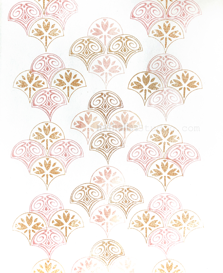
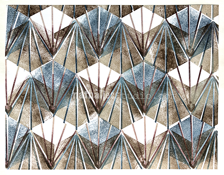
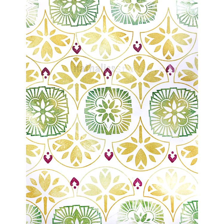
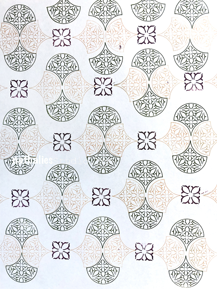
More pattern making fun with my new RubberMoon Stamp Sets . Here is a summary for Days 15-18
Nat's April Patterns from Nathalie Kalbach on Vimeo.
Here are the patterns from this video:
Here are the stamps I used for these patterns:
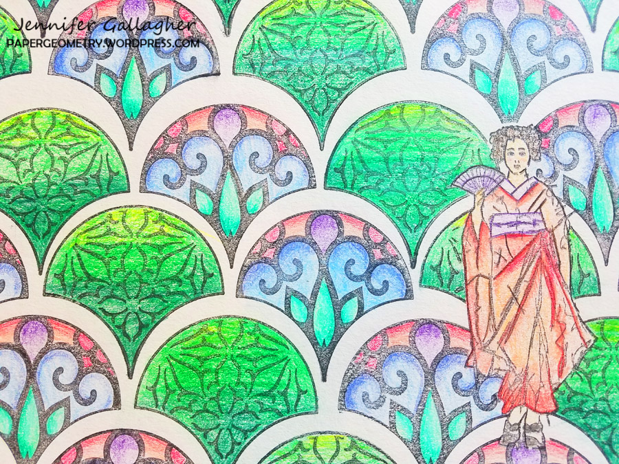
Happy Tuesday from my Creative Squad! Today we have Jennifer Gallagher sharing her method for making a custom coloring sheet using my Maiko stamp and my Fan-tastic Large stamp set. Her inspo was this month’s theme: Feel the Rhythm – We’re thinking about patterns this month and using stamps to create a rhythm of marks. Show us your sense of rhythm!
When contemplating creating patterns for this month’s creative squad post, it occurred to me how much I enjoy coloring in patterns. Long story short, I decided to create my own customized coloring sheet with Nat’s stamps. Coloring is very popular now and I totally understand why. It is a very fun and relaxing way to pass the time. Follow along with me and create your own unique coloring pages. It’s quick and easy.
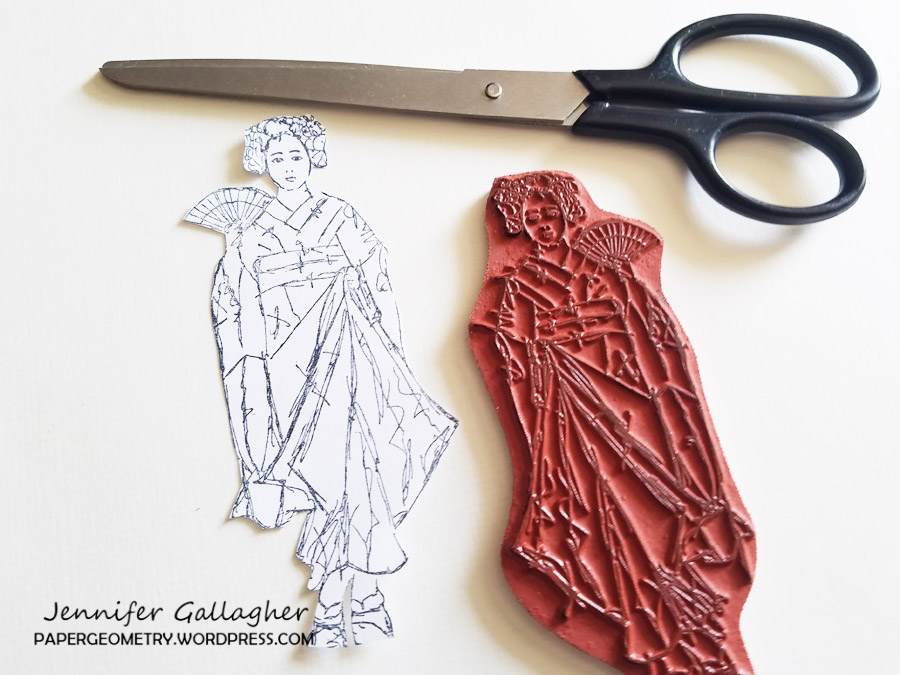
1. We are going to need a mask of Nat’s Maiko stamp. Begin by stamping the image onto a piece of white copy paper.
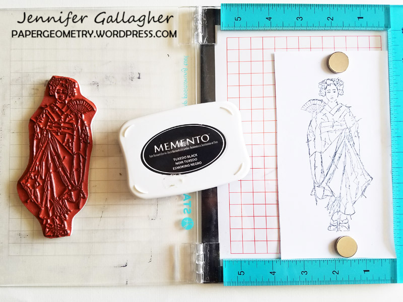
2. Cut the stamped image out.
3. Using low tack tape, place your Maiko mask down onto a 9×12 piece of drawing paper. Then using a ruler create a grid-line every three inches across the paper. This step is optional but I find it helpful.
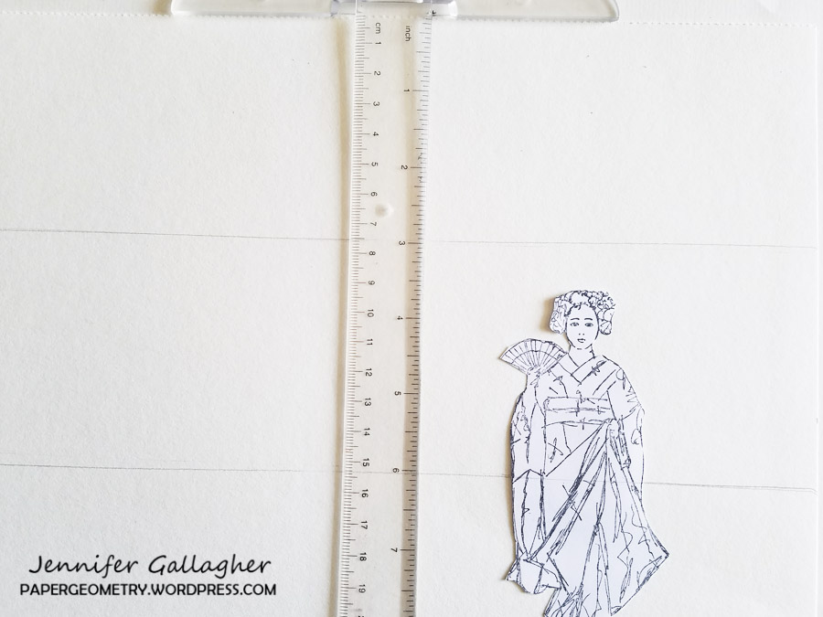
4. Choose a few stamps from Nat’s Fan-tastic Large stamp set to create a pattern.
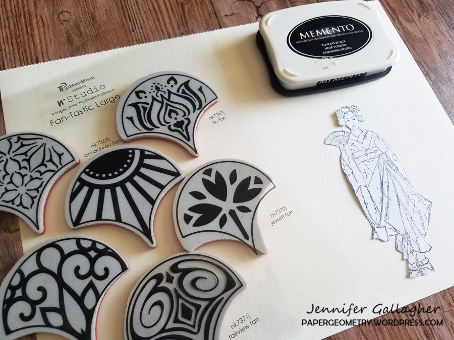
5.Stamp your pattern with a black ink like Momento Tuxedo black.
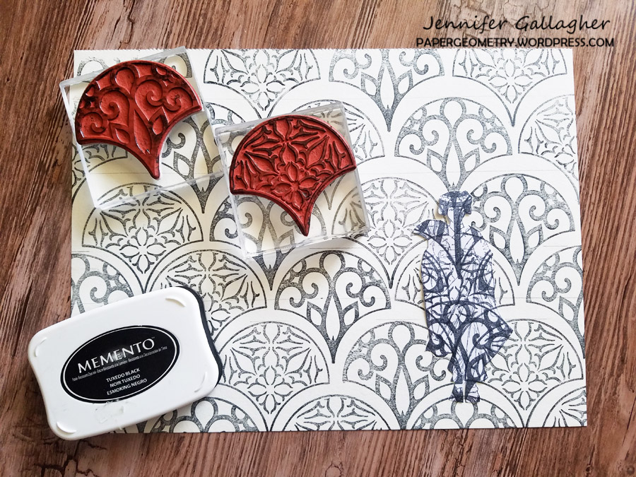
6. Lift the Maiko mask off the paper and stamp the image down in the negative space left behind.
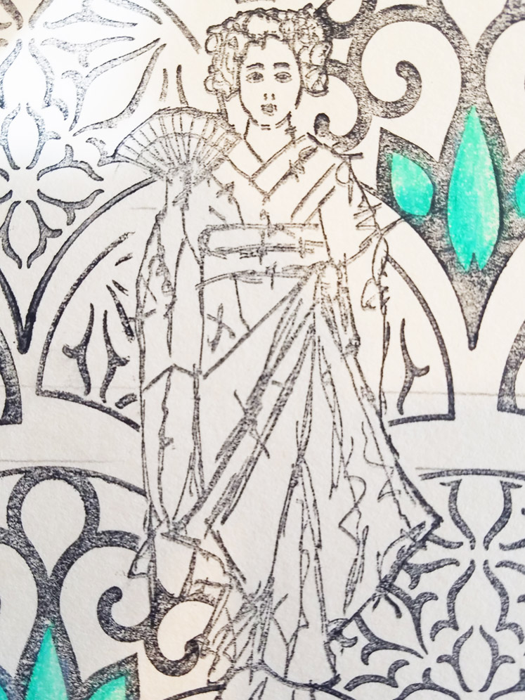
7. Now is the fun part – color your design in with your favorite colored pencils.
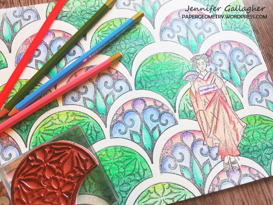
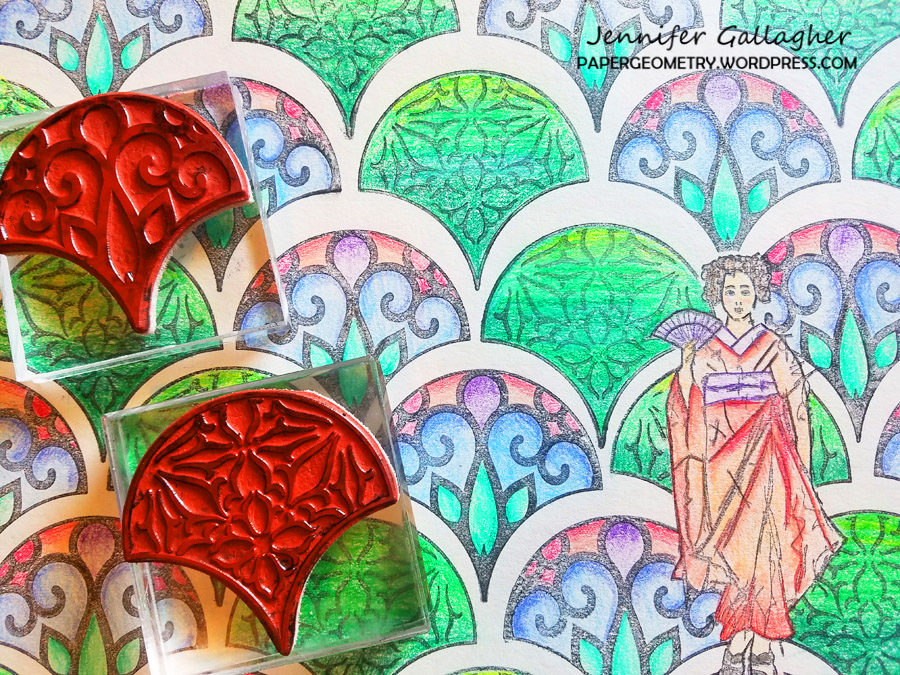
I had a blast coloring in my hand-made coloring page. I don’t know why it didn’t occur to me to make some before now. Be sure to play along each month with the creative squad and share your creations online.
Thank you Jennifer – I love how Maiko looks on that gorgeous background! You can find my rubber stamps in my online shop. Here are some of the other supplies that Jennifer used:

Feel inspired? Working on something yourself that you’d like to share? I love to see how you interpret our monthly themes. Email me how you used my stencils and stamps with the theme and email me an image – I would love to share your projects in my next “n*Spiration From Around the Globe“.
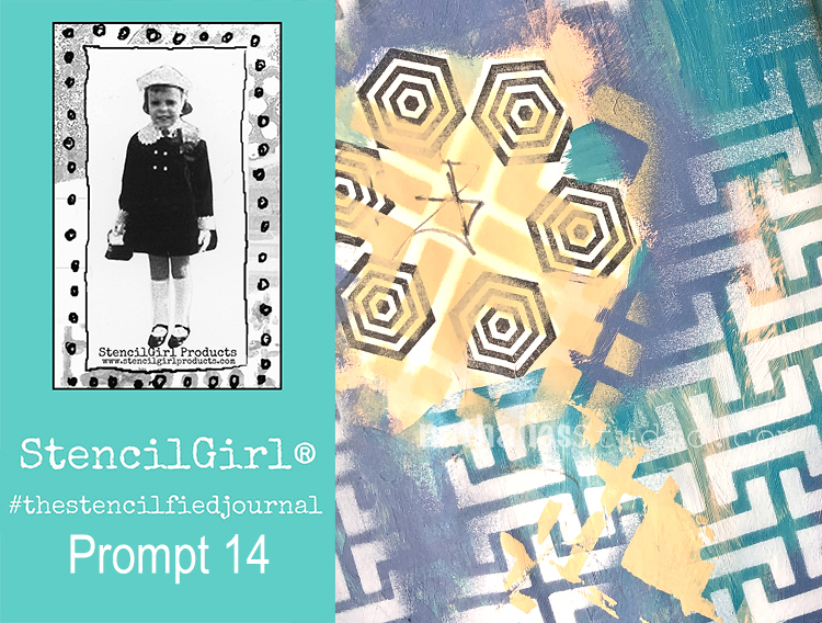
My wonderful friend Tina Walker is at it again – she invited several people to join her Stencilfied Prompts. The prompts are music related and each week she is posting a song. You can be inspired by the lyrics, the video, the album cover or anything related and the only restriction is that you have to use StencilGirl Product Stencils. Here is my take on Prompt 14
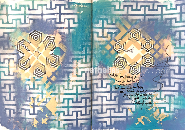
This week’s prompt was Landslide by Fleetwood Mac – a song I definitely like, especially if I’m ever in a melancholy mood.
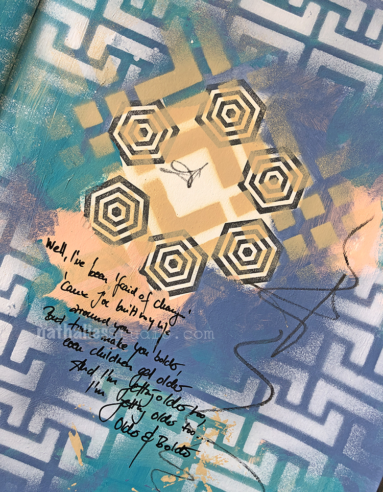
I thought it would be interesting to represent the lyrics with a bit of layered pattern, that comes and goes. I used my Hamburg stencil for the main background, along with my Chicago stencil and also stamped my Space Oddity rubber stamp from the Small Hex set.
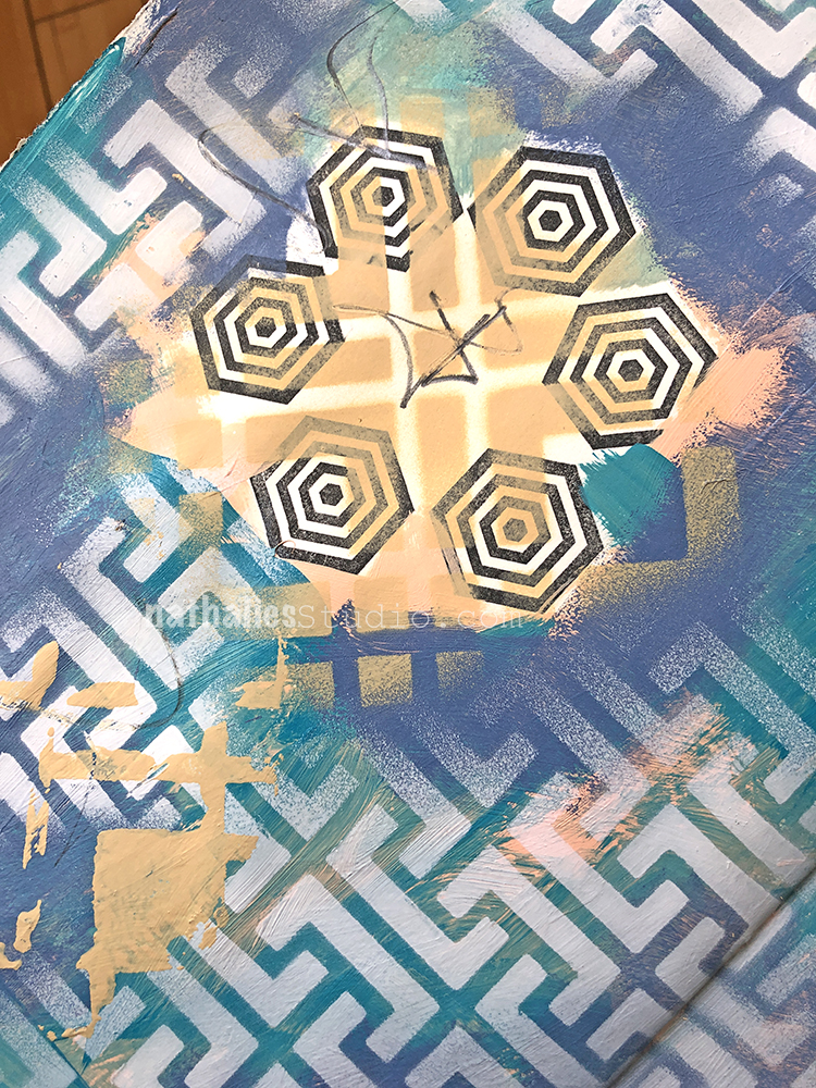
I went a bit introspective with this one, thinking about people coming and going at different points in your life, and the impact they leave on you.
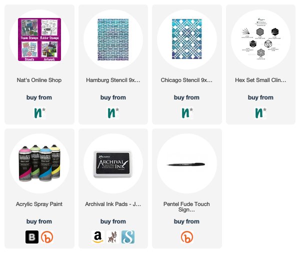
Here are the supplies I used:
It is amazing to me how intense her colors are and yet they are light pastels in many paintings.
I totally felt the different ages of the first grouping (even before you pointed it out).
I want to look for a book about her life. Kline sounds like quite the woman and painter!
Thanks Nat.
Reply