Have You Seen Anything Exciting at CHA? or … What about Surfaces/Substrates?

CHAshow

I just came back from six days at the CHA Show in Anaheim, California. CHA is the Craft and Hobby Association and holds a big Trade Show for the latest and greatest regarding Craft and Hobby every January.

The most asked question between Designers, Artists, Crafters and Educators this year was “Have you seen anything exciting at CHA where you think I should head right over to?” This wasn’t an easy question to answer. My friend Seth Apter did a great job listing the Trends to Watch and some thoughts on his blog – and I agree with everything fully .

SURFACES/Substrates: 

I personally was on the hunt for Surfaces/Substrates at CHA whenever I had a bit time between meetings, and demoing (I will post some photos of that later ;) ). As most of you know I am working with my dream paint company right now and I am always on the look out for some wonderful surfaces that I can incorporate in my artwork or in my Mixed Media Workshops.

Mixed Media is still a hot and climbing trend in the Craft and Hobby Sector and it was EVERYWHERE but it was really hard to find something that made me excited to work on regarding as a surface. Most paper crafting manufacturers seem to venture into producing paints and media that already exist. I was a bit surprised by that. Wouldn’t it would be so much more innovative and successful to come up with something unique that works with the products a paper craft company already manufactures but also supports other media? Oh well….

Here are my top 5 surface products I found by Craft Manufacturers:

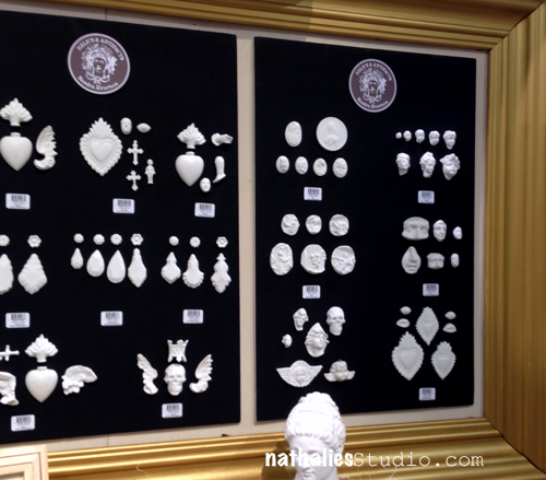
Relics and Artifacts by Susan Evertson for Prima Marketing
NatKalbachPrima


These resins excited me! They were unique and not main stream- they can be used in Mixed Media – Assemblages, Canvases but also for Scrapbooking and Card Project. For me a great idea and I love the unique designs !

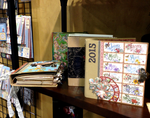
Mixed Media Albums by Graphic 45
NatKalbachGraphic45_01

Nice and sturdy cardboard albums, in different color schemes, with nice and thick paper inserts – different designs as with pockets and tabs. Graphic45 came out with some great paper lines and embellishments to go with those books to make them into calendars or recipe books- but they also can be altered and used with paints – I cannot wait to play with one and make an Mixed Media-photo-album out of one of those.

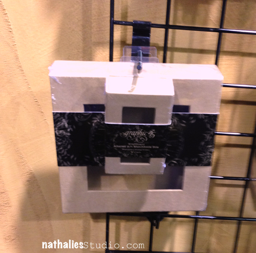
Mixed Media Boxes by Graphic 45
 

NatKalbachGraphic45_02

I know… Boxes – but- I liked those- nice quality boxes – with so many possibilities. Alter them with Scrapbooking Paper, make recipe boxes, make shadowboxes, home decor items- with photos – use them for a Mixed Media project …you see –  endless possibilities and a good fit with their already existing paper products!

Just Add Watercolors by Cosmo Cricket
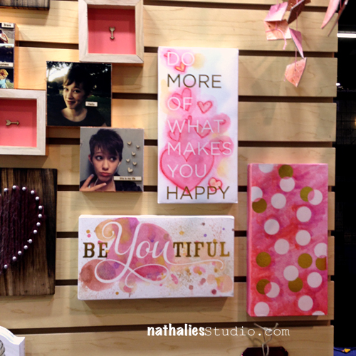
 

NatKalbachCosmo01

Cosmo Cricket did it for me this year in coming up with great surface ideas for the craft and hobby industry!! I love their Watercolor paper, cards, tags and blocks printed with gold and clear foil resist. You can not only add watercolor, but also acrylic inks and make some easy yet artsy looking cards etc. I think this is a great gateway into experimenting with Mixed Media for people that want to get a tiny bit messy but are still clean paper crafters !

Gallery Blocks by Cosmo Cricket
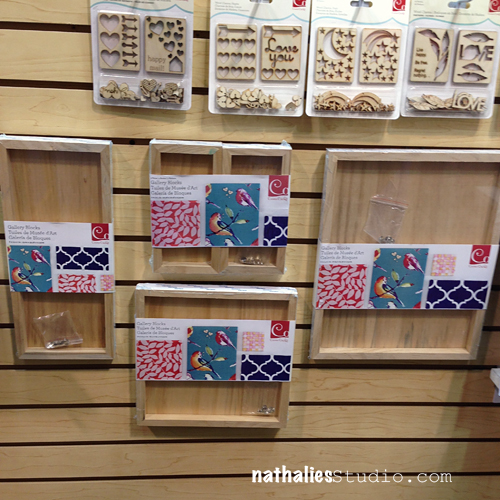
NatKalbachCosmo02

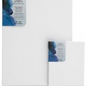
This one was my favorite! These are  canvases with a wooden back. You can use them either kind of like a shadowbox or paint on the wooden surface- which is fun too – as you will have a frame then already. BUT even cooler, if you want to wrap it in fabric, they added super strong adhesive on the edges and every block comes with thumb tacks for reinforcing the corners. this means you can add any painted fabric – duck canvas, stained and painted canvas or fabric on top of  it- in an easy peasy way. GREAT idea!!!

That was the result of my Surface and Substrate hunt . Oh wait, speaking of Mixed Media Surfaces ….looksie what I found in the Ice Resin Booth ;) That is the suitcase that Jen Cushman made for her Creative JumpStart Video- if you are signed up – you will recognize it :)
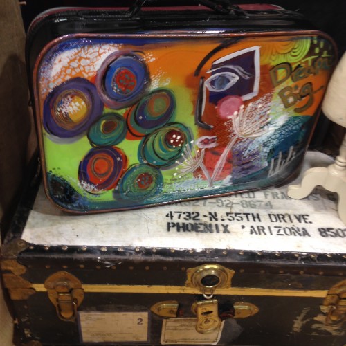
IMG_5349

If you were at CHA- let me know your thoughts- and if you weren’t let me know your thoughts about surfaces or substrates you personally would love to see !

 

Comments (10)

  • Sandra Evertson

    |

    Thank you so much for including my RELICS & ARTIFACTS resin craft blanks by Sandra Evertson/Prima Marketing Inc. in your top five picks for CHA 2015!! I’d like to invite you to the Prima Marketing Inc booth this Winter 2016 CHA, we are going to introduce an even more fabulous companion line to mix and match!! Thanks again! And hope to see you there!
    Sandra Evertson

    Reply

  • Seth

    |

    Hey Nat. Great seeing you at the show. Thanks so much for including my link in the post. And for sharing these product favorites. Somehow I missed a few of them at the show.

    Reply

  • Zandra Cudney

    |

    It was so nice to see you and Suze in front of the Prima Finnabair demo. Missed you at Art Venture this year.

    Reply

  • ljfsyd

    |

    Wasn’t there but so glad you shared …. Love the canvases w
    Itch wood back. Also would like to see uses with all the wood embellishments I saw here and in retail and some ideas.

    Reply

  • Sue Clarke

    |

    I am very interested in the mixed media albums. I tend to love Graphic 45 products. Resin relics…yeah.

    Reply

  • Kim reed

    |

    I wasn’t at CHA, but watched quite a bit of the action on YouTube. I about pooped my pants when I saw Sandra Evertson’s new line with Prima because I am already a big fan of her stamp line. However, I had no clue about that Cosmo Cricket line, so the gallery blocks are going right to my wish list. I’m looking forward to your new stamp release as well! And I totally agree with you about the paper companies invading the paint territory, they just need to get off that bandwagon already. Thanks for sharing this info!!

    Reply

  • Ursula

    |

    Hallo Nat – mein Neid ist mit dir ;)) Ich denke, ich werde mir all die neuen Dinge mal die nächsten Tage am Compi anschauen – aber das GraphicAlbum sieht schon mal seeeeeeeeehr vielversprechend aus – auch wenn ich ja nicht so der “Matscher” bin ;)) LG Ursula

    Reply

  • Laura S.

    |

    Love all your choices. The Prima Relics are too cool. Need to play with them for sure!

    Reply

  • Francine G

    |

    Hi Nathalie

    Like you I love those resin artifacts…. I just hope that I will find some? Also the Graphic 45 albums are awesome… And the canvas with wooden back what a cool idea with so many possibilities…
    I was not at CHA but I was able to follow with all the posts of the différent company…
    I appreciate your overview you’re the expert!

    Hugs

    Reply

  • jackiepn

    |

    I’m digging the relics and the gallery blocks you’ve posted! and no I was not at CHA , but home viewing from my computer “( waaahh
    I do however ADORE that luggage that Jen painted on CJS!!! And I have a huge supply of vintage ones- just asking for paint!!
    I think you need to design a cool substrate Nat!! hint hint!
    thanks for your insight! hugs xo

    Reply

Leave a comment

Mark Maker

NatKalbachMarkMaker01

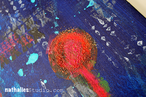
This Canvas was created for the CHA Show (Craft and Hobby Association – which has a yearly trade show in Anaheim) and where my new Stamps with Stampendous are released at the moment…I am waving from there right now.

NatKalbachMarkMaker02

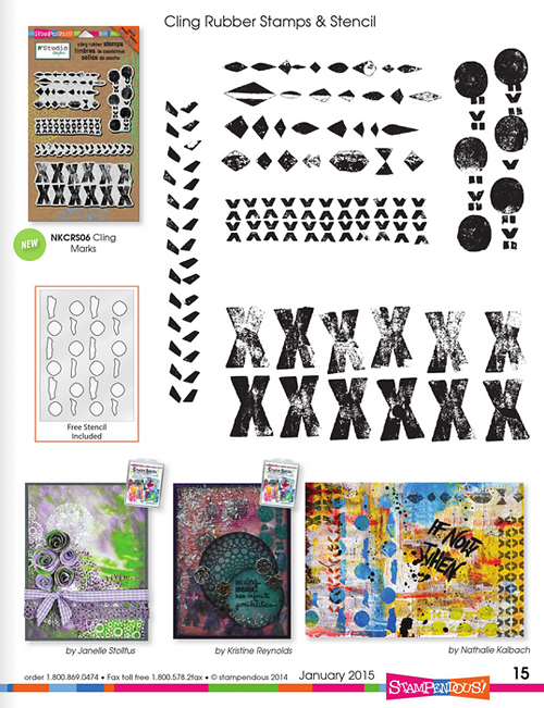
I used the Mark Maker Stamp Set with it- that also includes a stencil

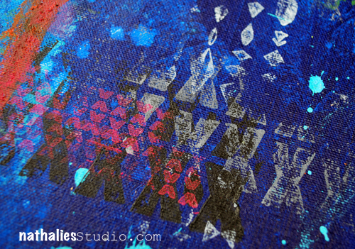
The stamps will be available soon. I used them with acrylic paint on top of the canvas – my favorite way to use stamps.

NatKalbachMarkMaker03

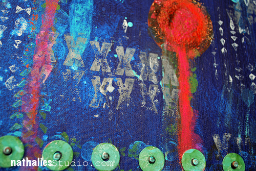
For texture I added Frantage Aged Embossing Powders and smoothed and mixed some acrylic paint over the heat embossed areas with my finger. The washers and metal pins are also heat embossed with Frantage Embossing Powder.

NatKalbachMarkMaker04

Here is a list of all the supplies I used

nSupplies


Hope you like it – have a great day!


Comments (31)

  • susan salyer

    |

    wow wonderful canvas love the layers and the wonderful goodies you used to make this happen

    Reply

  • Liz Lumsden

    |

    Wonderful fabric stamping!

    Reply

  • Autumn

    |

    What an amazing mixed media project – oh makes me want to get into some paint! ;0

    Reply

  • D.Ann C

    |

    LOVE the look and ingenuity of embossing the washers!! Warm hugs from Florida

    Reply

  • Linda on the Prairie

    |

    Nathalie, you make everything fun! These sets are so versatile.

    Reply

Leave a comment

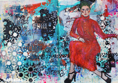
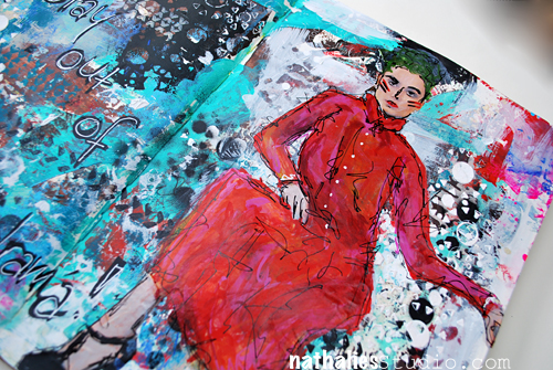
Stay Out Of The Drama or … In My Art Journal Today

Natkalbach_OutofDrama01

Some great words to live by.

Natkalbach_OutofDrama02

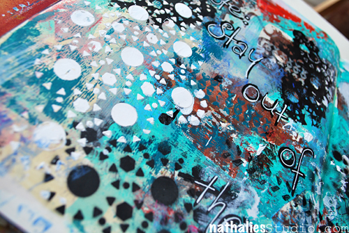
This art journal spread is one of my faves I did the past couple months – and funny enough it was one of those pages where I was just trying out my new stamps and stencils some other new stuff , and I was using up left over paints and boom – as I was layering and layering I started to really love the grunge and then I dived full force into it and embraced it.

Natkalbach_OutofDrama03

I used some left over Liquitex Super Heavy Gesso from a different project and spread it over the  Stencil in my Kaffee Klatsch Stamp Set to tie the background together.

Here are the supplies I used

nSupplies


Have a beautiful day :) 

Comments (3)

Leave a comment

99 Cent Dream

NathalieKalbach_99CentDream_01

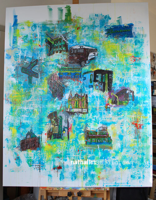
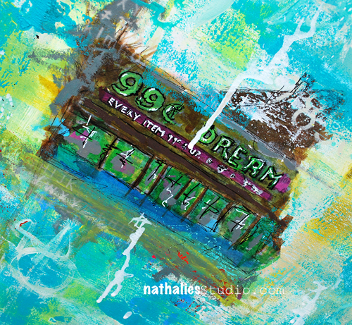
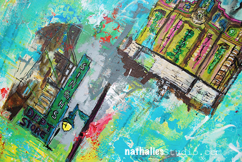
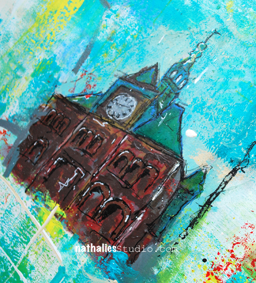
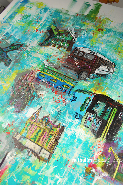
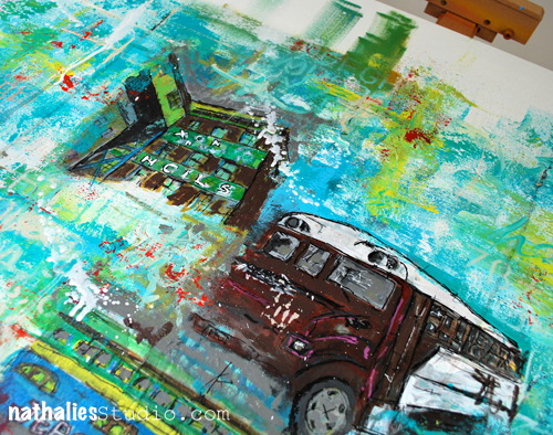
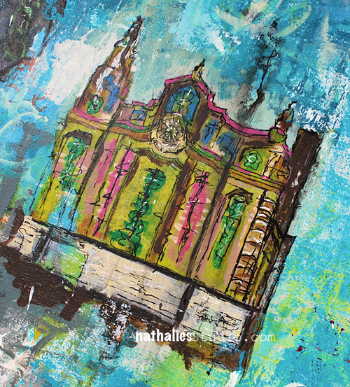
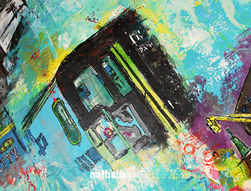
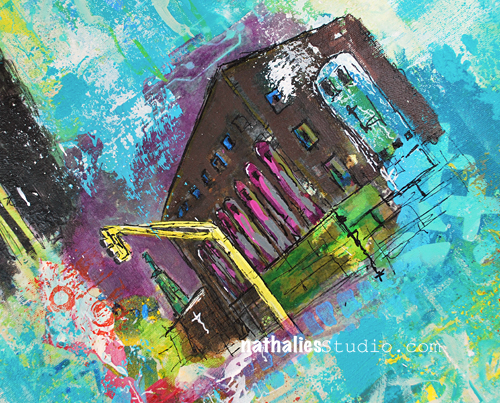
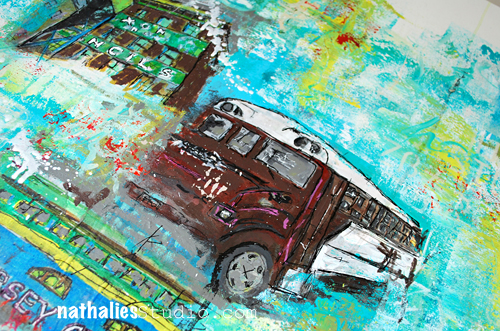
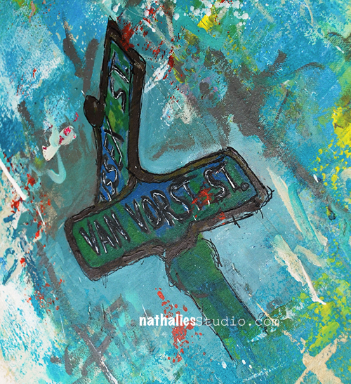
I finished my painting “99 Cent Dream” for the upcoming gentrification: The Changing Landscape of Jersey City Exhibition.

Opening is on January 10th, 2015 – 5pm-9pm at 313 Gallery, 313 Third Street, Jersey City

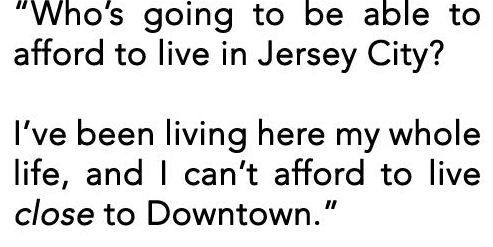
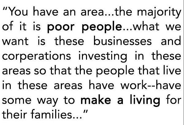
Based on recorded interviews about their thoughts regarding Jersey City/Gentrification with Jersey City people on the street, 12 artists including me, created new pieces of artwork. During the exhibition you can listen to the interviews while looking at the artwork. The Jersey Journal published an interesting article about the exhibition – you can read it here.

99 Cent Dream depicts different viewpoints of gentrification. It portraits the disconnection of neighborhoods, geographies and people in Jersey City. Using acrylic mediums, the painting embodies the many layers and dimensions of gentrification deep beneath the surface.

NathalieKalbach_99CentDream_02


NathalieKalbach_99CentDream_03

GentrificationInterview01

NathalieKalbach_99CentDream_04

NathalieKalbach_99CentDream_05

NathalieKalbach_99CentDream_06

GentrificationInterview02

NathalieKalbach_99CentDream_07

NathalieKalbach_99CentDream_08

NathalieKalbach_99CentDream_09

NathalieKalbach_99CentDream_10

NathalieKalbach_99CentDream_11

NathalieKalbach_99CentDream_12

I cannot wait to see the other artwork by the other artists. I really enjoyed working on this project. Let’s face it, I am part of the problem of gentrification here in Jersey City and yet at the same time I come from an area in my own home city in Hamburg, Germany where I have seen the stages of gentrification over many years in my neighborhood. I can see where Jersey City is heading to and I can relate to the feelings and thoughts of people effected by gentrification. Soon, I won’t be able to live here anymore either – the prizes are climbing up as J.C. is a geographically so close to Manhattan.
The interviews were thought provoking and triggered a lot of emotions and creative input, and the concept of this exhibition is great and already leads to a lot of discussions. If you are in the area- I hope you will come to see and hear the exhibition :)
Size: 46 in x 60 in – For my Europeans: that is 116 cm x 152 cm.
Medium: Liquitex Acrylic Paint HB+SB, Spray Paint, Ink, Marker, Gesso, Pouring Medium, Gel Medium; Paper on Canvas

Comments (10)

Leave a comment

Light or… In my Art Journal Today (or yesterday ;) )

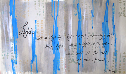
Instead of a New Year’s Resolution I, amongst many others, pick a word that I try to live by in the new year. Last year it was BOLD …this year it is LIGHT …next year it might be ITALIC… just kidding ;)

NatKalbach_Light

Light is indeed my word for this year. It is a good word for many different kinds of lights that I would like in my life. I want to take thinks more lightly, travel light, be light and not overthink everything too much, eat light, and …see the light at the end of the tunnel :) Let’s see where this goes!

NatKalbach_Light2

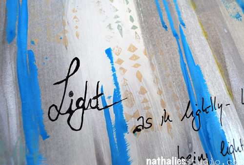
Light is also the page spread in my art journal itself and the time I spent on it. I created it very quick on December 31, 2014 – after contemplating with myself, that I a) have no time because I had to work on last minute stuff for Creative JumpStart  and b) that I have no time because I should really make myself representable for a little party I was going to. Well…Light helped- little bit of acrylic inks with a brush – little bit playing, little bit of acrylic paint on a stamp …and voila- done. And aren’t I glad I did it…it is in there…in the journal- as a good reminder until I fill the book- LOL.

nSupplies


What is your word if you have one?


Comments (6)

Leave a comment

Happy New Year 2015!

NatHappyNewYear

to all of you out there! May 2015 be filled with happiness, fun, health and loads of creativity for you!

See you in 2015 !
Comments (7)

Leave a comment

Are You Ready For Creative JumpStart 2015? – Infos etc.

Have you signed up yet for Creative JumpStart 2015?

If not- don’t miss it – it is going to be awesome and lots of Mixed Media Creative Fun! And did you know that if you signed up for Creative JumpStart 2015 that you can access the welcome page and explore a bit more about it? Here are some helpful videos for either of you
Want to hear a little bit more about Creative Jumpstart ?

JumpStarter Joe Rotella and I are are chatting about CJS: What it is, The theme 2015, How Joe feels about Creative Jumpstart, Why I ask artists AND crafters …and some more


Signed up and need help to navigate and access to Creative JumpStart?

It is easy to navigate Creative JumpStart – and you can already access the Welcome Page once you signed up (if you are unsure if you signed up already because you didn’t get the Order Confirmation (check your spam folder) – this is a great way to find out !)

Want to know how to sign up for CJS and how it works?

A little helper- as I know sometimes signing up for stuff online is a bit new to some of you


Need Help? FAQs – videos, log in etc.

If you have a question on how to log in, or about the videos etc. your best bet is to check the Need-Help Page first! Most of your questions will be probably answered there already!

So….are you ready? Or what are you waiting for? Starting January 1st  – we Jump :) 

Have a gorgeous day!

Comments (4)

Leave a comment

Winding Down: My Top Ten Art Journal Pages of 2014

It has become a tradition of mine and other blogger friends to wind down the year with some  Top “insert number”- Lists of work , posts and photos, before the year ends. It makes me go back and look at what I have done and accomplished and it also makes me dwell in memories. Too often we forget about the things we did and accomplished throughout the year- often just bashing ourselves for not fulfilling all the wonderful new year’s resolutions from last year.  Maybe this makes you wanna do it too – if so – share :)

I did a huge amount of Art Journaling Pages this year. –

In no particular order here my personal faves.

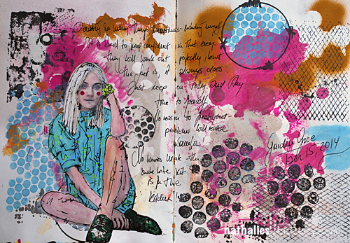
1. Snake Bite

I played more or less with my Stampendous stamp sets and stencils on this page but I do like color combination and how the journaling is part of the background design.

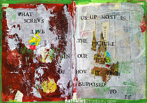
2. The Picture in Our Head

I love the quote and it actually states quite well the process I was going through while I was creating the page. I played a bit with acrylic paint skins here- and I love the out come.

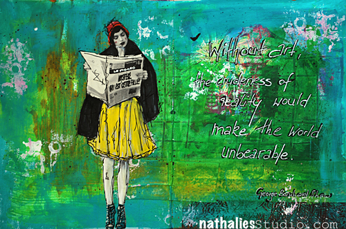
3. Without Art..

I love the texture I created on this page with gesso and paint  – some parts and areas are definitely something I want to embrace a bit more on canvas. I also like the bits of pink in the sea of green – not something I had in mind as a color combo- but it speaks to me with the yellow-  needs to be more explored :)

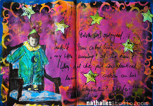
4. Melvin was Outraged

I just had fun playing with this vintage photo and making up a story – it is quite dark and actually not much going on texture wise- but still there are a lot of layers – I like it.

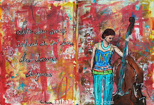
5. She became dangerous

I played with brush strokes and colors – very loosely and besides a tiny bit of stamping that is all that there is in the background- I was surprised how much I like it and how freeing this felt. Another way of creating a background I would like to explore a bit more on a bigger substrate.

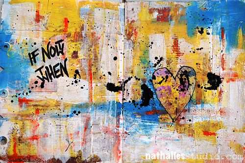
6. If Not Now

Here I played with dry and wet brush strokes and also texture- and I love the quote. I like simplicity of it …I mean…in the process- hahahaha ;)

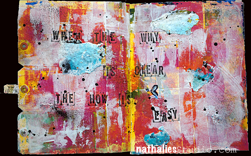
7. When the Why is Clear

Another page where I played with brush strokes and acrylic skins. I love the black acrylic paint dots – they tie everything together.

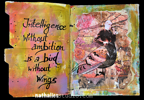
8. Intelligence

this one is a another sample of trying out a color combination which I would have not thought would really work and I totally dig it :) I like this page also because of the texture, the transfer techniques I explored and the materials I used. Again something I would like to explore more on a bigger substrate- but actually this makes me think of a shadowbox.

9. No ONE Way to Art

and yet another page with an unusual color combination for me – I also like how I used the brush to create textured elements- another element I would like to explore a bit more.

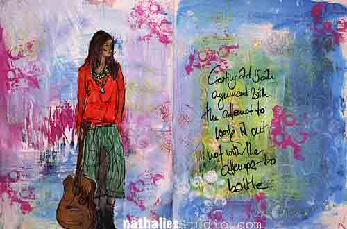
10. Not a Battle

I do like the texture and the depth I created in this page playing with the translucency of different acrylic colors – again something that I will explore more in the future.

—-

What I learned:

I really embraced art journaling as a way of creating something that doesn’t require an awful lot of time, a creative push in the morning, and trying out techniques, materials and color combinations. I used it a lot to explore things that I have seen in paintings at MoMA or other museum and that interested me. I also learned a lot about brush strokes,  and exploring different opacity/translucencies of acrylic paints.


My goal for 2015:

I want to take out some of the things I learned and explore them more on different substrates. I need to take the time to embrace the things more. I also want to play more with unusual color combinations – it felt good to step away from my usual color culprits ;)

Hope you enjoyed this little art journal journey – and …just a little heads up :) If you want to learn how I do the magazine and photo images, and also see more about how I build up Art Journal Pages– you can see and learn that in Creative JumpStart 2015 – so sign up , if you haven’t yet!


have a gorgeous day


Comments (5)

Leave a comment

Winding Down: My Top Ten Moments of 2014 in Photos

It has become a tradition of mine and other blogger friends to wind down the year with some  Top “insert number”- Lists of work , posts and photos, before the year ends. It makes me go back and look at what I have done and accomplished and it also makes me dwell in memories. Too often we forget about the things we did and accomplished throughout the year- often just bashing ourselves for not fulfilling all the wonderful new year’s resolutions from last year.  Maybe this makes you wanna do it too – if so – share :)


2014 was a year I traveled a lot for workshops, I had a couple amazing dear friends over from Europe and I had some really wonderful moments. In no particular order:

1. SNOW


NatKalbach_StrollM01

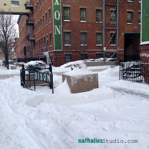
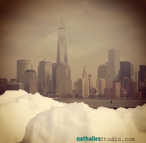
The first 3 times we had snow in 2014 I was totally excited…like a little kid. I know everyone thinks as I am from Germany , that I am used to loads of snow, but I lived in the north of Germany in Hamburg, which rather as the climate of Seattle and not a lot of snow. I do admit though  that by the 4th time as a pedestrian in a city I got a bit fed up with snow – LOL- isn’t the grass always greener on the other side ? ;)

2. Strolls through the hood with friends

NatKalbach_StrollM11

HA – another snow pictures – lol. But actually it stands for the wonderful moments I had with my friends that came over from Europe and were excited to stroll through my new neighborhood even though the City of Cities was so close by. I loved every minute with them- living in a different country makes you miss your friends a lot – I am very thankful for being able to stay in touch with my friends and see them, because I know that this is not the norm for many people that move to a new country.

3. Hikes and Walks 

NatKalbach_HK37

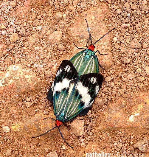
I took this photo on a hike in Hong Kong. It was a wonderful little hike I took with my husband and we stumbled across these mating butterflies. We both worked a lot this year and had many projects that kept us more busy than usual – I am happy about the moments we had just to ourselves enjoying the beauty of nature – and I hope we will be able to create some more moments in 2015 :)

4. Temple Hong Kong, China

NatKalbach_HK09

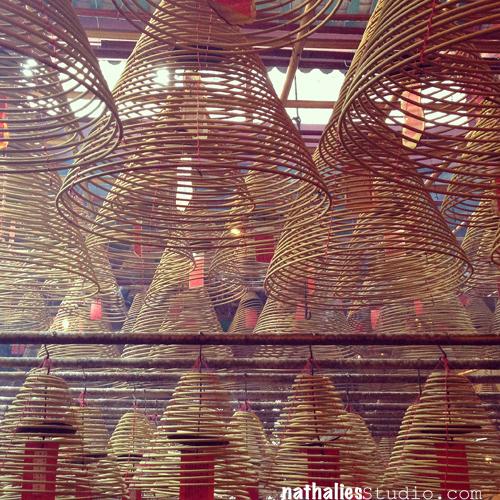
In the middle of a bustling city was this old temple – and oasis of calmness and beauty. It felt like being away from everything and I loved taking it in for a moment.

5. Batu Caves in Kuala Lumpur, Malaysia

NatKalbach_Malaysia03

This was just an breathtaking sight – several Indian Temples in a cave which you get to by walking past this huge statue, up a lot of stairs …touched by cute looking but nasty monkeys.

6. Meeting Penny and Val and their Mom

NatKalbach_ValPenny

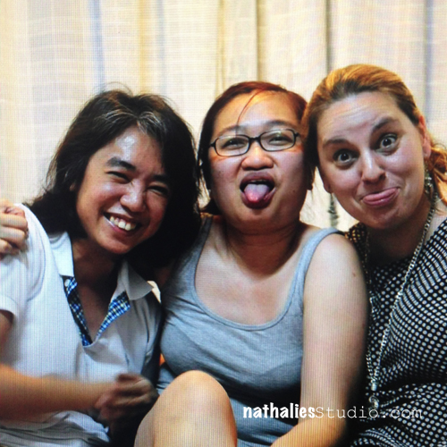
When I was invited by Val and Penny to teach in Malaysia, a lot of people were concerned that I would travel there, especially as just a couple days before the flight, the first Malaysian Airline airplane vanished. The news as always had a very special way in portraying country and people and had many people prejudiced. I am so glad I went. Penny, Val and their Mom hosted me and my husband in the most amazing way ever. I learned so much about this country, I ate the best food of my life at places I would have probably not have set my foot in if by myself (tehehehe) and I was reminded once again, that you need to open your heart and mind in order to get back a million more times. I hope some day I can have Penny and Val come and visit us and I hope they will enjoy the same hospitality in the country I live as I did in their country.

7. Studio and Outside Time

NatKalbach_StrollNov08

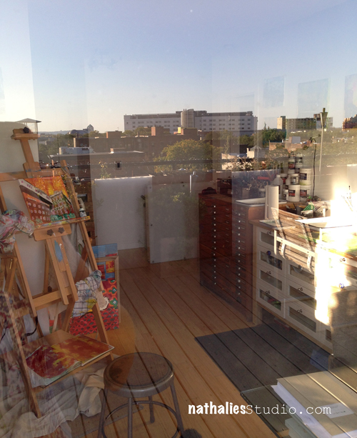
2014 I spent a lot of time in my studio and also some time outside on the deck in between. I do love the ability to get out on our deck from my studio and I love to step out and just sit there for a couple minutes, to take a break from working on my desk or on a painting.


8. Laughing like crazy

NatKalbach_FailedAttemptsFun

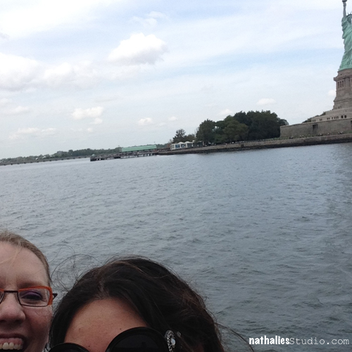
This photo , which is also going into  my “worst photos ever” category, stands for the awesome times I had with my friends where I almost peed my pants because I was laughing so hard. This Photos was a meager attempt of taking a selfie of Jenn, Julie, Birgit, me and the Statue of Liberty …as you can see…it was just an attempt …what a great carefree fun time we had.

9. At ease with myself

NatKalbach_Studio

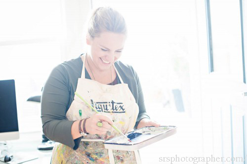
This photo taken by the amazing Sara Stadtmiller, is one of the few photos of myself that I really like. I often doubt myself and the day when Liquitex was so awesome to send a video crew and Sara to photograph I unfortunately felt very uneasy and very aware of myself. Sara had a wonderful way to make me feel calm and enjoy this day and when I look at this photo, I am reminded that at the moments I am creating, I am happy and I just don’t care about anything else around me.

10. Relax

NatKalbach_fireplace

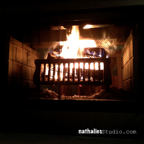
Throughout this year I forgot how to relax …the more I enjoyed the past couple weeks several evenings with my loved ones in front of the fireplace -just watching the fire, reading, talking, watching schtuff, wrapping gifts and having a nice relaxed time.

—-

2014 was pretty amazing, but balancing every aspect of my life has been hard at times. Every time something works well in one place I feel I fail in many other places. For 2015 I wish for more relaxing time, more time with family and friends, and that I take some things lighter or more lightly.

What do you wish for for 2015 for yourself?


Comments (3)

Leave a comment