
The Sustainable Souls Project is a monthly artist collaboration inspired by sustainability issues, concerns, ideas, and thoughts. Each month, they pick a sustainability topic and create awareness through art, using the monthly theme as inspiration. Projects may include art-journaling, mixed media, assemblage and more. The idea is to create awareness around Sustainability through art, one paint stroke at a time! As this is a topic close to my heart I am happy to participate this month.
This month’s theme is: Reuse, Repurpose, Recycle
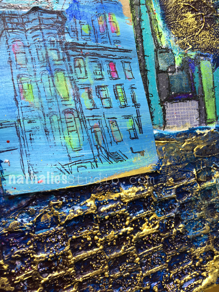
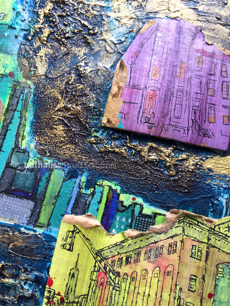
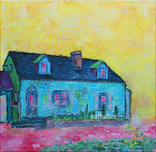
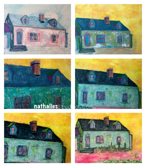
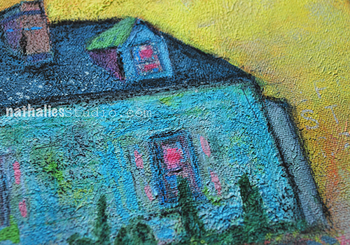
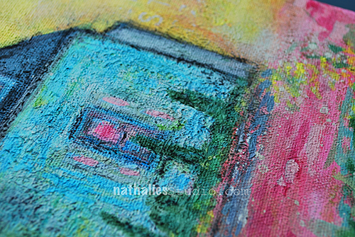
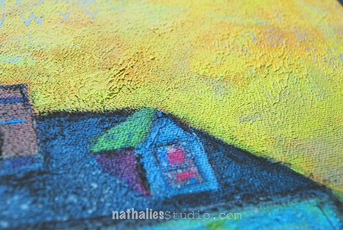
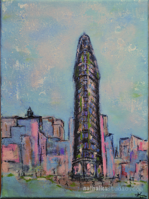
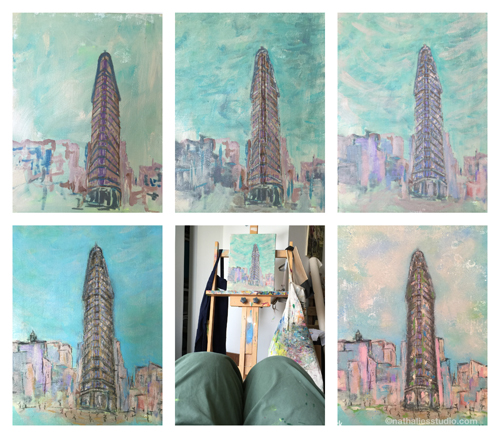
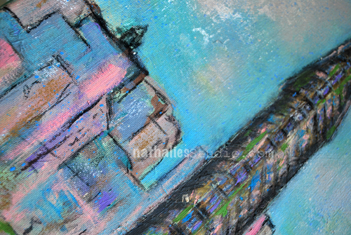
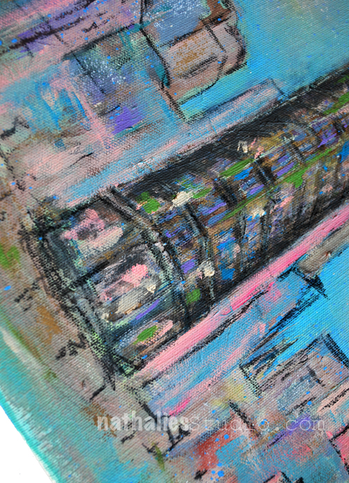
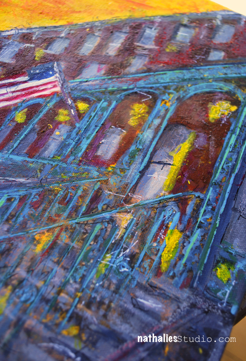
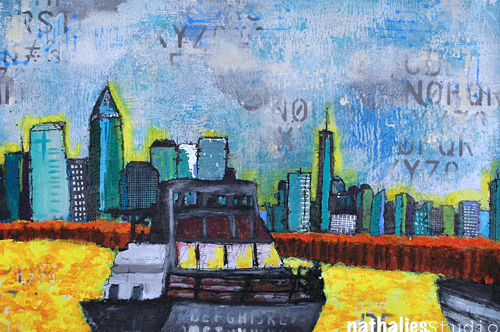
I repurposed an old canvas of mine for this theme
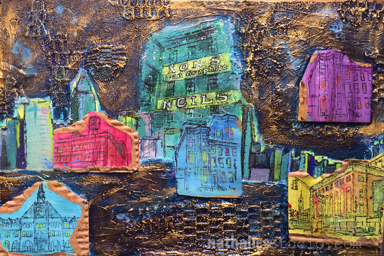
I didn’t like the acrylic painting that was originally underneath but I decided to “recycle” parts of the painting and cover other parts with trash and other texture making materials up.
My neighborhood is pretty much recycled – it was brand new and nice at some point, then people lost interest and treated it badly and now it is up and coming again. I am glad it wasn’t totally destroyed and wasted before it was discovered as love able again.
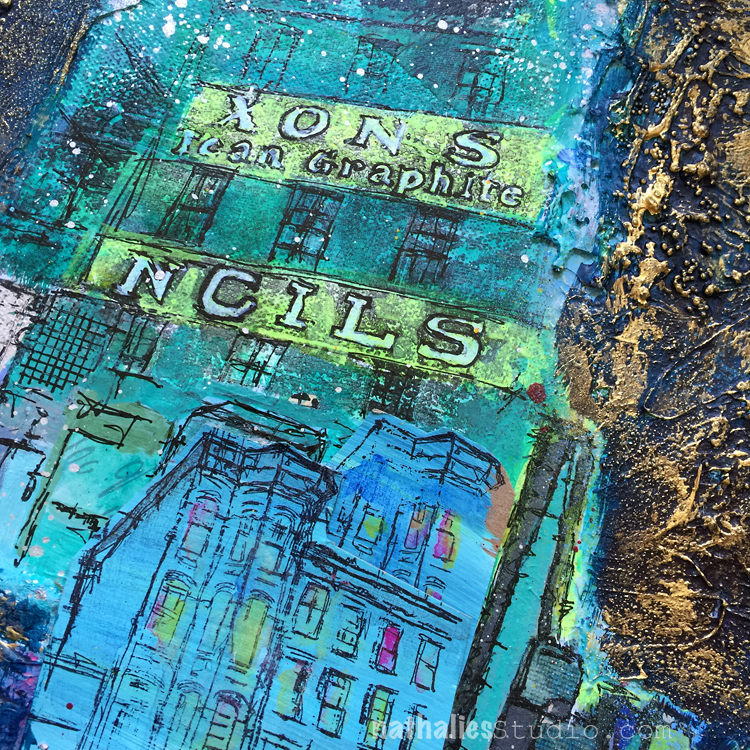
I stamped with some of my Stroll Through the Hood Stamp Sets onto painted cardboard and colored in some of the images with water color.
Can you imagine that this is how the area – about 10 minutes from my house – that is now Liberty State Park looked like pre 1976 ?

(Photo from the Archives of the Friends of Liberty State Park)
We have come a long way – and then we haven’t.
Recycling has always been a big topic during my upbringing in Germany. I learned about bringing bags to shops and not littering in the 80s in school and it has become such a norm to recycle everything, from glass – divided by brown and white glass, paper, cork, batteries, plastic garbage, compost. You are pretty much a frowned upon person if you do not recycle or do not bring bags to a shop. But then you have news and pictures like this:
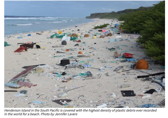
Read about garbage patches in the ocean and what happens with our plastic garbage, how long it takes to “disappear” and the effects on the ocean life.
I think we need to make more choices in what we buy and how we buy and then how we recycle/reuse/repurpose. I am not perfect myself and I am constantly catching myself not being responsible enough but here some small steps – I hope I don’t sound too preachy :
- I bring bags and boxes when I do grocery shopping -instead of having someone stuff my shopping in double- or triple layered plastic bags – hey good reason to make some handmade cool looking artsy grocery bags ;)
- I avoid buying plastic bottles – I don’t buy six packs which are held together by plastic rings – it is hard here to avoid it totally but keeping an eye open helps.
- I have a fancy water glass bottle for the gym – it looks pretty cool and I can put it in the dishwasher when I need to
- I try to buy as much at a farmer’s market or non packaged fruit and vegetables as possible – I mean – come on those bananas- they are protected already
- Make your coffee at home – put it in a nice travel mug- it is cheaper but hey- do not use those single cup plastic coffee makers – then I’d rather suggest take you travel mug and buy your coffee at a coffee place to go.
- Bring some fun silverware to work for lunch, instead of getting a pack of plastic flatware – it looks so much more classy anyway ;)
- Come on- you have a dishwasher and on a special occasion just put out the normal plates and silver flatware for a party and then throw them into the dishwasher. Or wash them by hand – nothing better then some bonding/gossiping time with a friend/spouse/sibling while doing some dishes – and if you do not wanna do that- put your kids to work …didn’t hurt us ;)
- there is so much more- but this is a good start
Ahhh- there- I got preachy…sorry…but you know what….I feel so strongly about this – it should be something we all take care of …I hope you will understand: There is only Planet A !


Comments (4)
Karen Bearse
| #
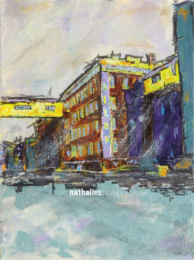
Ok so I really love this piece! Love how bright the colors look creatin contrast and movement. Love the charcoal. Especially love the bench! I dont know why but it is perfect!! Great job!!!
Reply
nathalie-kalbach
| #
Thank you so much Karen!
Reply
Denise Spillane
| #
Oh Natalie I live this. Your work is so wonderful. Love your style
Reply
nathalie-kalbach
| #
Awe- thank you so much Denise!
Reply