Blog: Painting

Winter Village – Painting

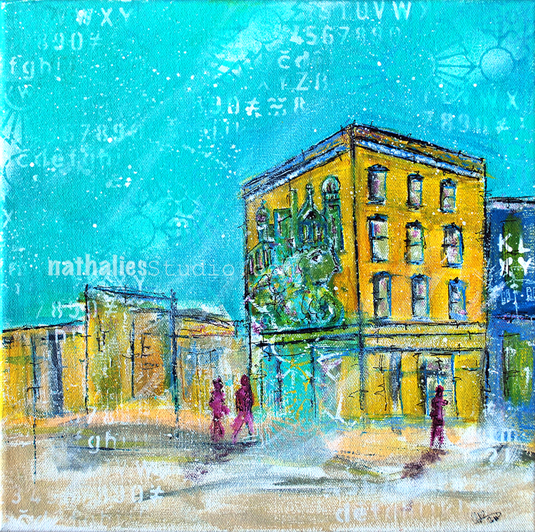
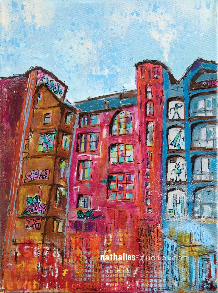
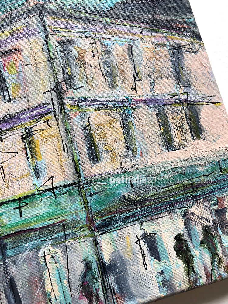
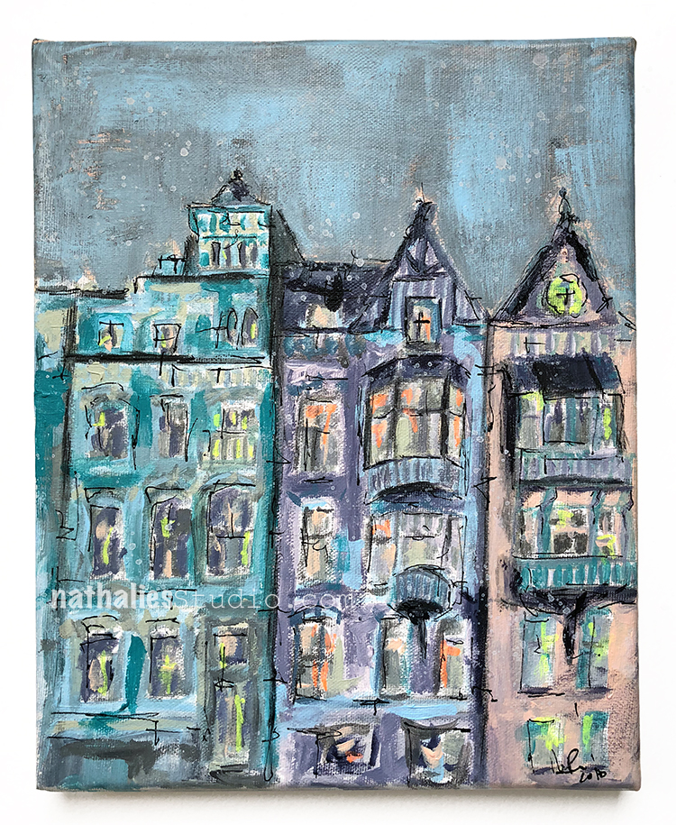
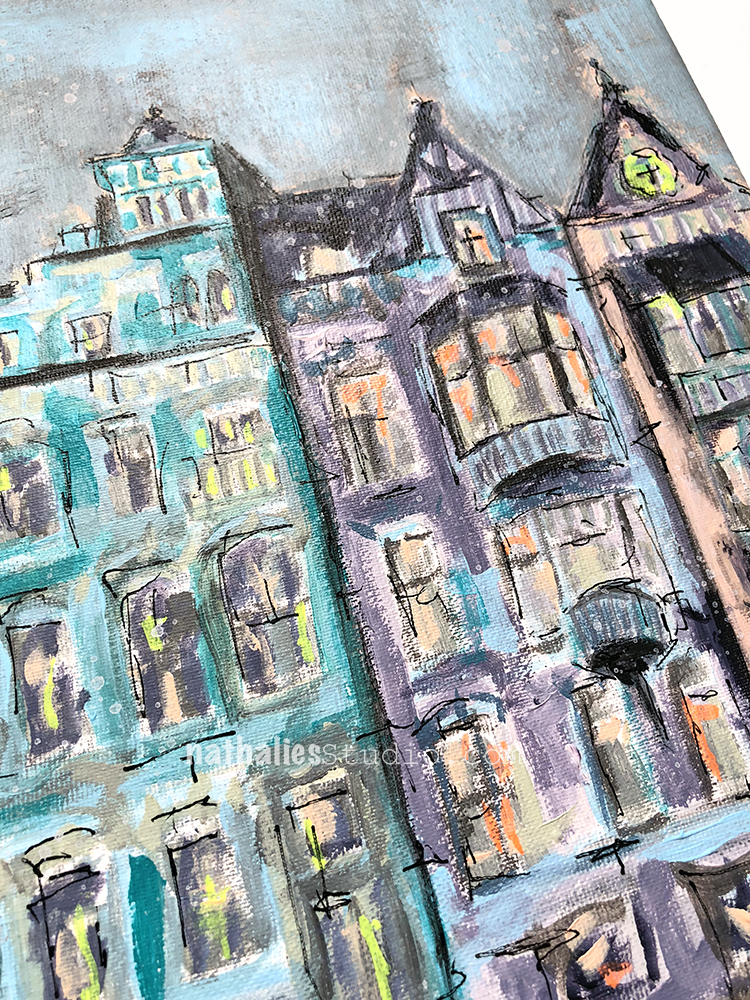
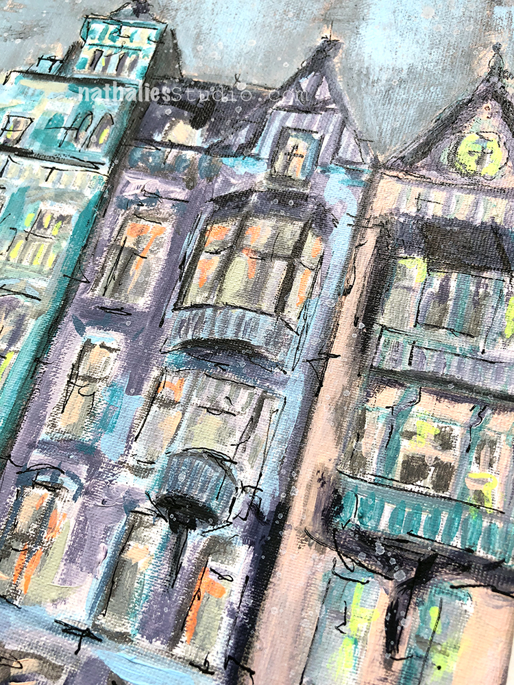
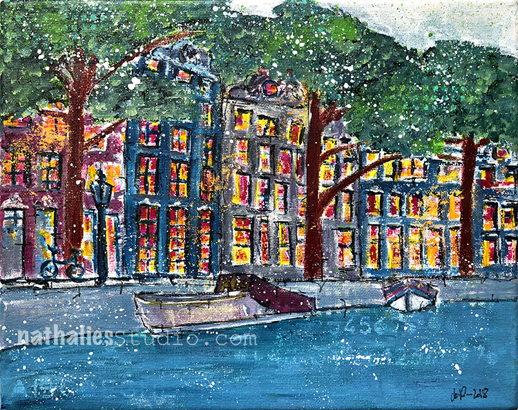
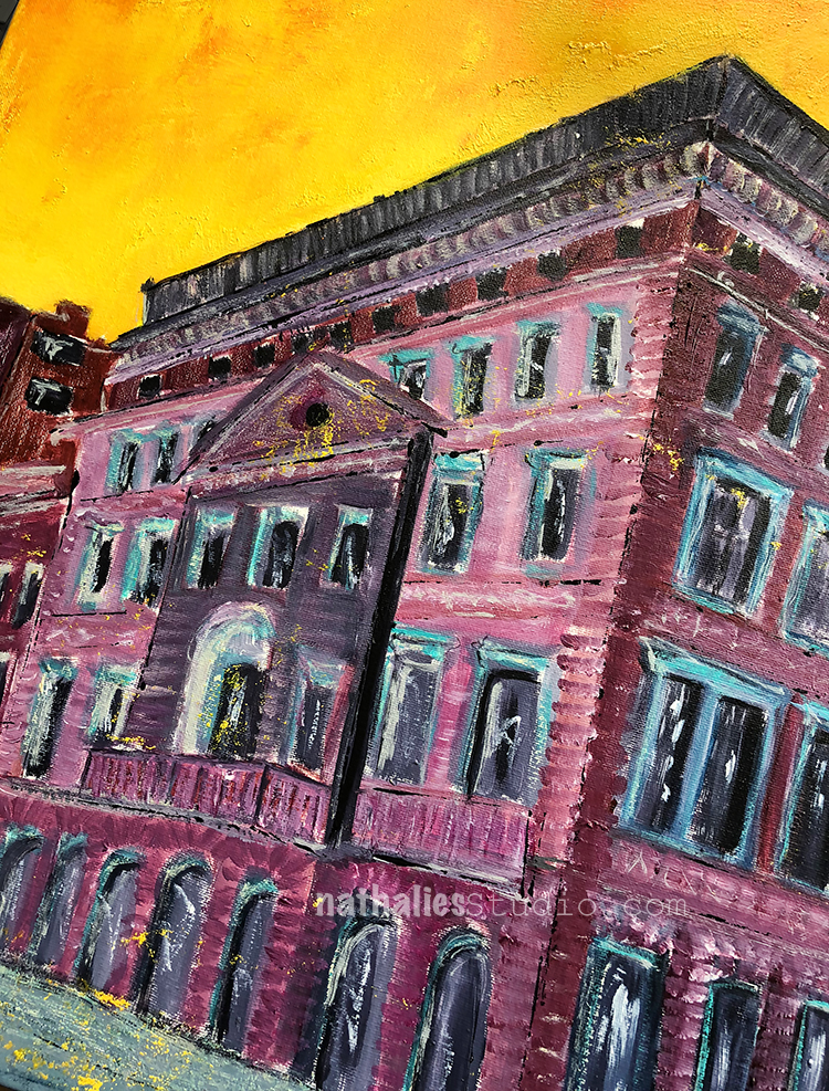
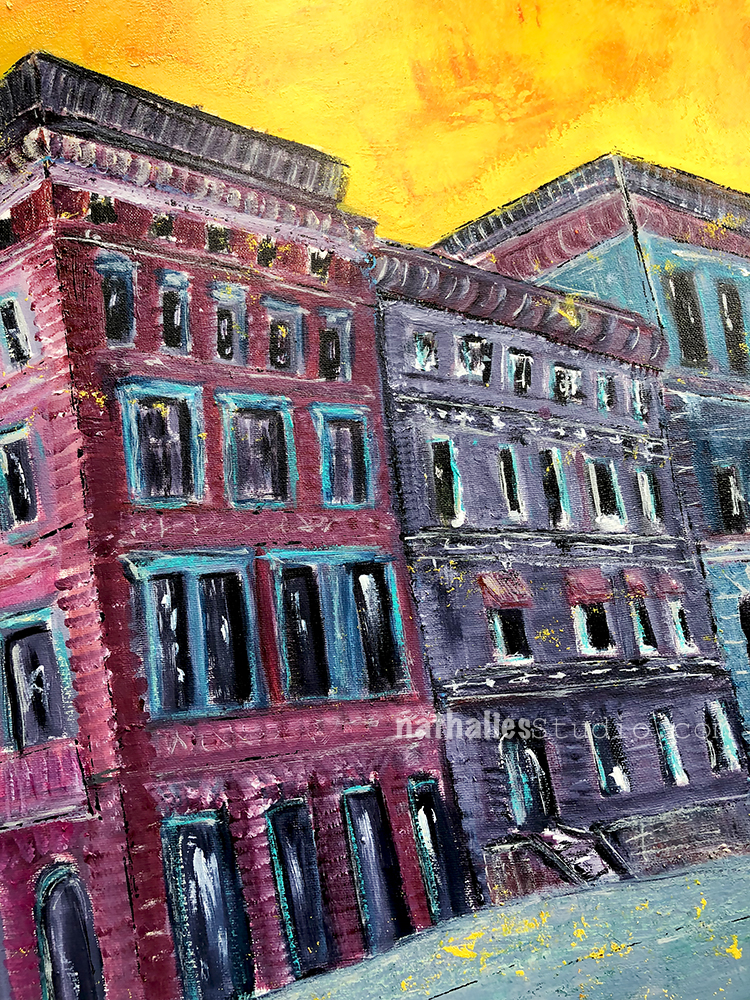
Close by my hood is an area  of Jersey City called “The Village”. It used to be Jersey City’s own Little Italy and it still has some old Italian Mom and Pop Stores and Restaurants.

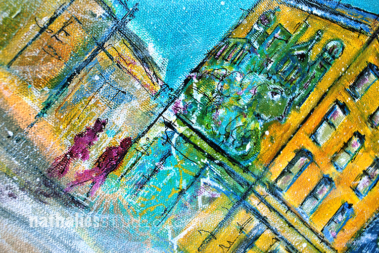
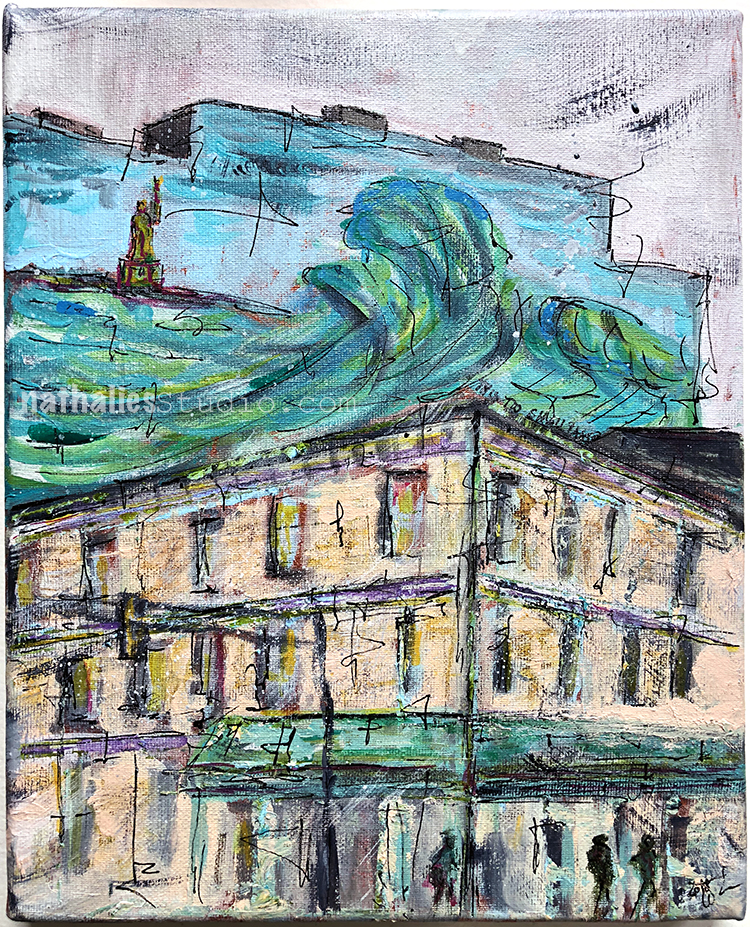
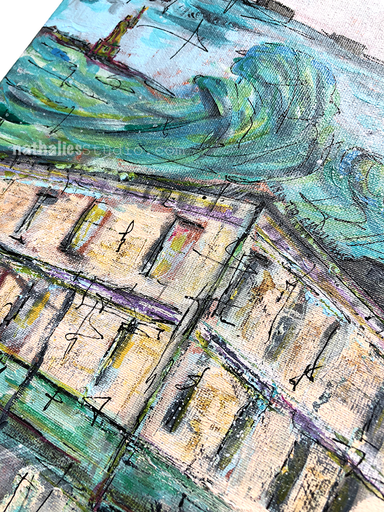
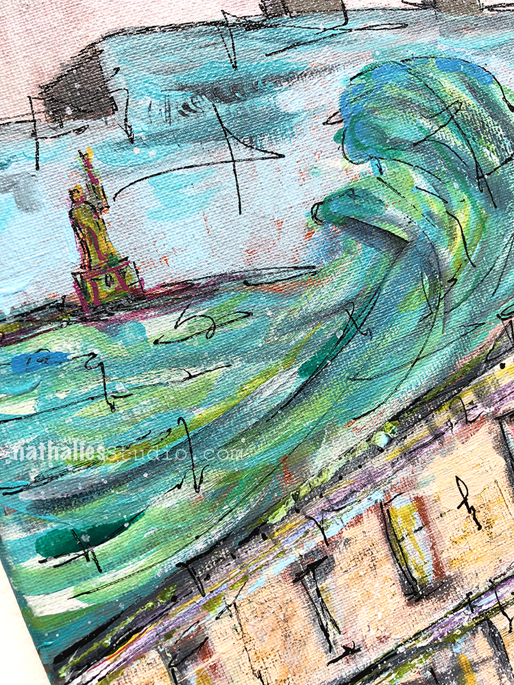
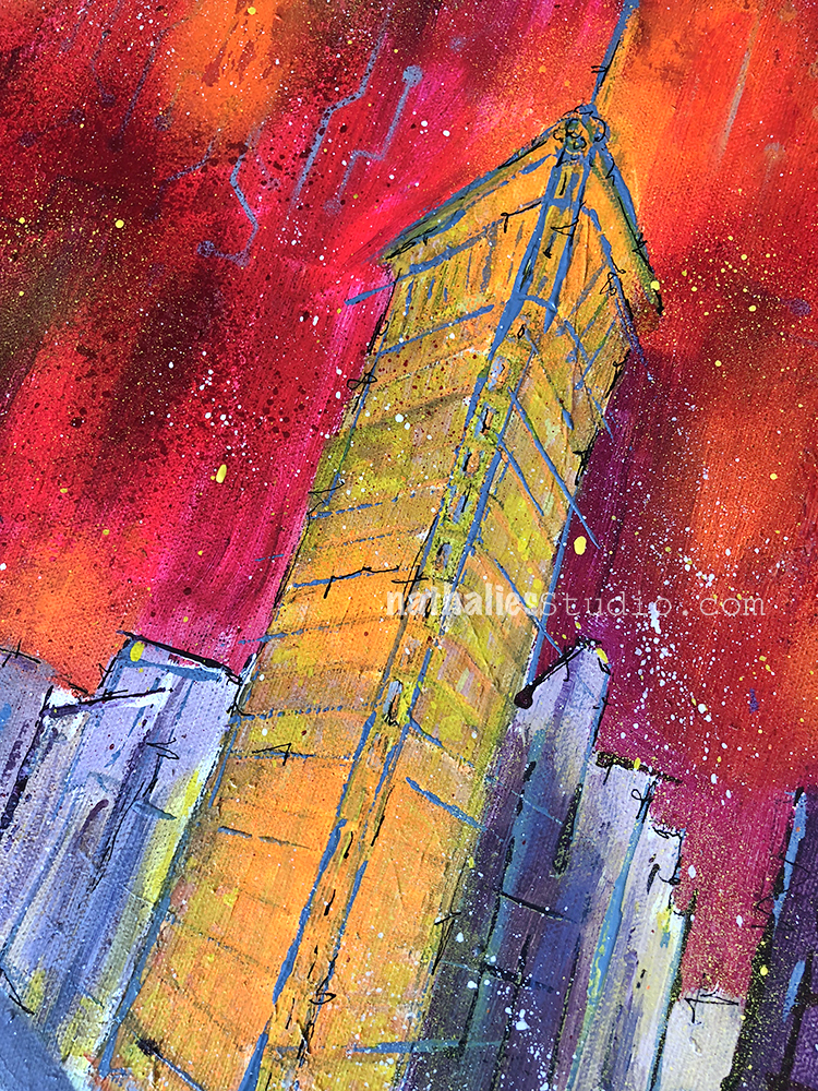
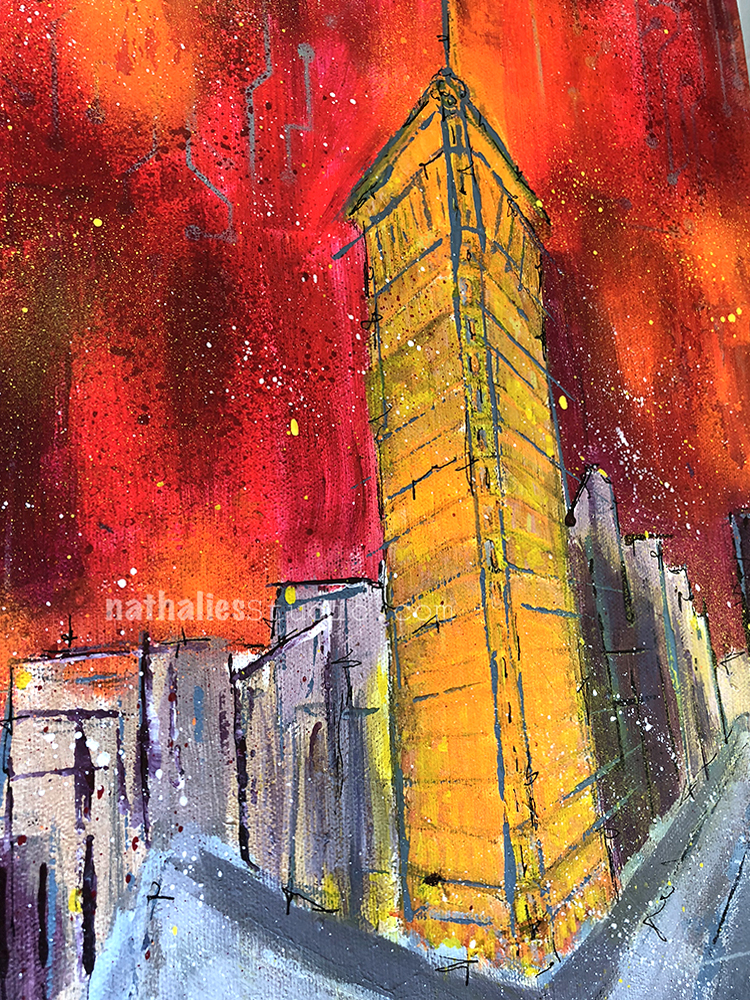
I love the mural by Beau Stanton on one of the Buildings which depicts some of the landmarks of Jersey City.

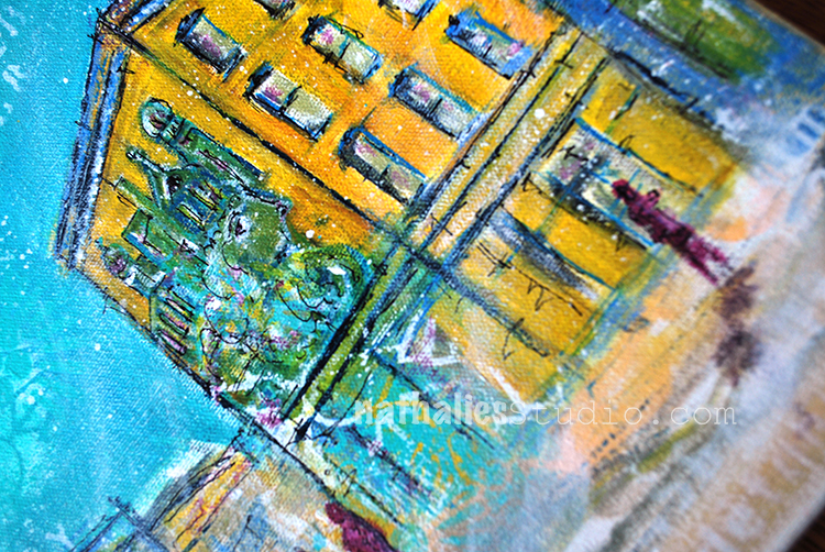
It is one of those weird things where a mural that is created with landmarks creates a landmark.

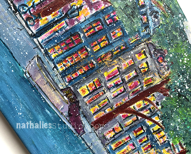
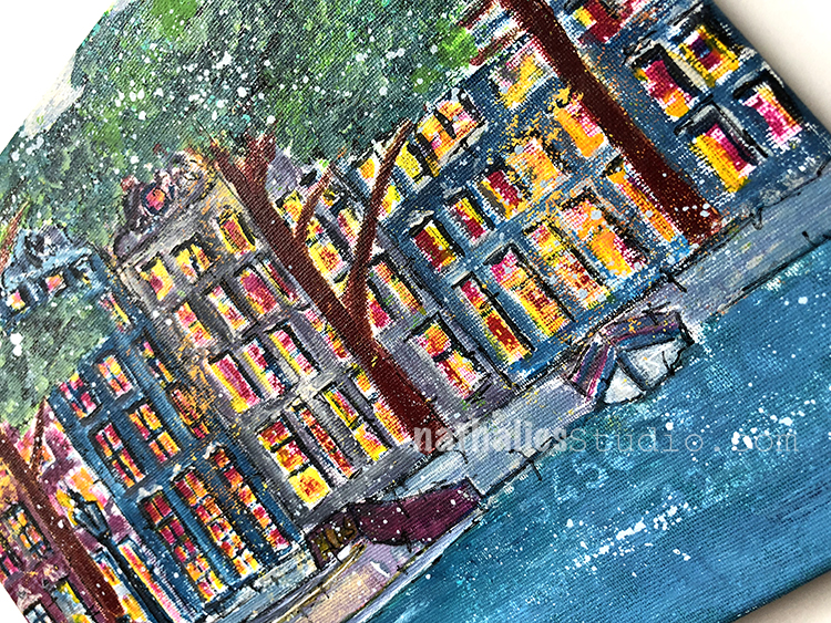
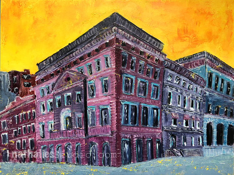
I am really into the colors I used this time – I already started another canvas with the same yellow gold sienna color for the background …let’s see :)

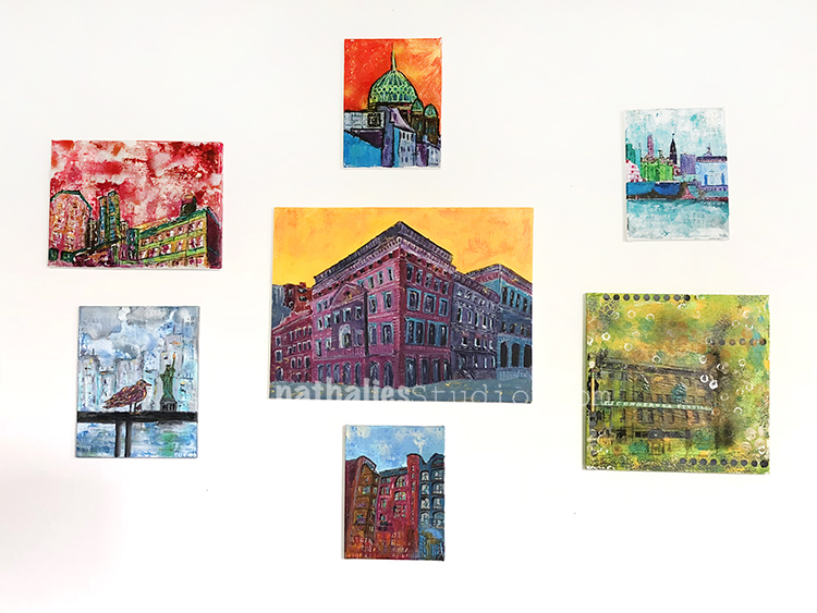
You can find this painting for sale here in my shop.

Leave a comment

Sydney Opera House Painting

2016

I was lucky to be invited twice to teach in Australia and I have fond memories of Sydney. The first time I went to Sydney we were able to get some tickets to a Herbie Hancock concert in the opera – the very last seats in the back …the sound was good..Herbie was a tiny ant- but it was pretty cool :) Australia is fascinating and a real Artful Adventure – for this painting I used an Australian Dictionary for the background, made a stamp with gum tree nuts and also used actual gum tree nuts. The painting is part of the travel chapter in my book Artful Adventures in Mixed Media. Maybe some day I will be back but until then this painting is my little Australia at home :)

Acrylic paint, ink, marker, charcoal, paper ephemera, gum tree nuts on canvas 9×12 -Available for Purchase – email me if interested .


Leave a comment

Tacheles – Mixed Media Painting

Tacheles” is a painting that is also in my book “Artful Adventures in Mixed Media”  . I used acrylic paint, acrylic ink, spray paint, and marker on canvas. It was inspired by Kunsthaus Tacheles in Berlin, a former department store built in 1907, owned by different groups and parties during WWII and East Germany, and finally from 1990 to 2012, rescued from being demolished by artists and turned into a gallery. The artists were forced to move out and the building remains empty at this time, but the histories and stories of this old building live on. My painting asks many questions: Who lived here? What happened in those building? What stories do they tell us?

It is now available for sale here.

Leave a comment

This Too Shall Pass – Painting

Just finished this painting last week. This scene is inspired by the scene upon exiting the Grove Street PATH train station in my Jersey City hood.

Tidy rows of shops and apartment buildings set the stage for a massive Shepard Fairey mural titled “The Jersey City Wave”, striking a pose above the bustle of the town.

The meaning of the subject and title is up to the viewer to decide.

I used acrylic paint, ink, marker and graphite on this 10″x8″ canvas. “This too shall pass” is available  here and would love to find a loving home.


Comments (2)

Leave a comment

Behind the Museum -Painting

I finished up this painting last week – and called it “Behind the Museum”

It depicts a quintessential streetscape in the city of Amsterdam, with it’s unmistakable architecture and one-of-a-kind beauty. On a recent trip to the city, after an afternoon spent enjoying the Rijksmuseum, I took in this lovely view while waiting for a tram. Since it was  a pretty long wait I just looked for 20 minutes at the details and contemplated about who used to live there, how the street looked like when it was built and who might live in there now.

I used acrylic paint, gouache, graphite and marker on canvas and the painting measures 10″ x 8″. It is available in the store now :)

Comments (2)

  • Sue Clarke

    |

    Nat, it just blows me away how far your art has come. From colorful scrapbook pages and cards to paintings that evoke feelings of warm neighborhoods that I want to visit! You go girl…you have the creative world by its heart strings.

    Reply

    • nathalie-kalbach

      |

      aweee- thank you so so much for your wonderful words! <3

      Reply

Leave a comment

Rondvaart – Painting

This is a small painting I made after I came back from a trip to Amsterdam.

After a canal boat tour I knew I wanted to capture the scenery.

The painting measures 10″x8″ created with acrylic paint, ink, marker and spraypaint on canvas and …it would love to find a new loving home :)

Also :) Don’t forget:

Today is the last day of our huge Summer Sizzler Birthday July 4th Happy Summer SALE! (Yep I’m celebrating a lot of stuff lol) Just use the coupon code HAPPY20 when you check out to save 20% off ALL physical products in nathaliesstudio.com/shop including rubber stamp sets, NEW ArtFoamies stamps, stencils, my book, my original paintings and prints, mugs with my artwork on them and lots more  The sale ends July 5th and quantities are limited so stop in today.

Leave a comment

Swapped – Painting

A new finished painting which I call Swapped. I was intrigued by the story of the Morton F. Plant House, located on the prestigious Fifth Avenue in NYC.

Apparently Cartier wanted the building, and Plant exchanged it in 1917 for 100 Dollars and a double stranded pearl necklace worth about 1,000,000 Dollars at the time. Then the necklace “only” made 151,000 USD in 1957 at an auction, so I guess that swap didn’t really work out. And so there is a jeweler and watch store up to this day in the building. There are quite some weird real estate exchange stories in NYC …this is certainly one of them. I imagined the building being just an “ordinary” apartment building -it is still so beautiful and one could only guess at how many necklaces would be needed for such a swap today! These are the things that went through my head when I painted Swapped.

The painting is 24″x18″ in size, acrylic paint, spray paint and marker on canvas.

It is available in the store here and meanwhile waits for a new home on my living room wall.

SaveSave

SaveSave

Leave a comment

Farewell Painting

I finished this painting last week – some of you might have seen it in some of my Facebook Live Videos.  The painting captures the iconic Flatiron building in New York City, located in the wedge created by the intersection of Fifth Ave and Broadway. I am always fascinated by the Flatiron building and it’s story.

Although it has stood strong at this busy intersection for over a century, the world around it is always in constant flux. The city weeds out the weak, and businesses and people who may once call it Home may find themselves bidding it Farewell another day.

The bold colors represent the energy of the city and the sweeping lines suggest a place where nothing stays still for long. Yet the Flatiron remains, a focal point of stability in a very busy place.

The original “Farewell Painting” is up for sale now in the store. Maybe it will find a new home :) Acrylic paint, acrylic ink, spray paint, and pencil on 12”x16” canvas.

Have a gorgeous day you all :)

SaveSave

Comments (4)

  • Sue Clarke

    |

    I love buildings that are on corners like this and have seen several in person in Boston.
    This painting is wonderful, especially the firy colors!
    I hope it finds a deserving home.

    Reply

    • nathalie-kalbach

      |

      Thank you Sue! I actually just saw one of those buildings in Amsterdam and thought it was fun because the architecture in general was so different :) Tiny rooms I guess in the corner part- LOL

      Reply

  • Janene

    |

    Whew! You scared me with the title “Farewell Painting”. I’m thinking, Nathalie is moving? She’s giving up painting? Whaaaaaaat? In all seriousness – the Flatiron building glows in contrast to the gray streets and nearby buildings — fabulous! — and I love the title now that I understand it. :-)

    Reply

    • nathalie-kalbach

      |

      Aweee- sorry to have scared you Janene- that wasn’t my intention! I am not going anywhere right now – LOL- and a new canvas is up on the easel- just thinking of what I want to paint next :)

      Reply

Leave a comment

Broken – Painting

This painting named Broken, which is part of my book Artful Adventures in Mixed Media was inspired by one of my favorite books called “A Little Life” by Hanya Yanagihara . The book is about friendship and trauma and at parts are really hard read to go through as it is emotionally very upsetting, but at the same time it is beautiful. It is one of the books that grabbed me so much that I had to go and paint after reading it.

Broken is 9×12 on Canvas using acrylic paint, media and charcoal.

I am looking forward to be inspired like this again by another book. Have you read something lately that really really made you think about the story more than usual?

Have a wonderful day

Comments (4)

  • Sue Clarke

    |

    Yes, Someone Knows My Name was incredible.

    Reply

  • stephanie

    |

    Beautiful painting

    Reply

Leave a comment