Art Journal

At 2nd Glance or … In My Art Journal Today

2ndGlance01_NatKalbach

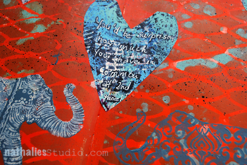
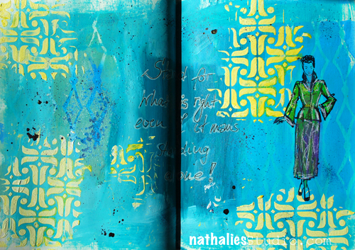
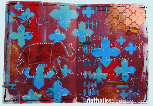
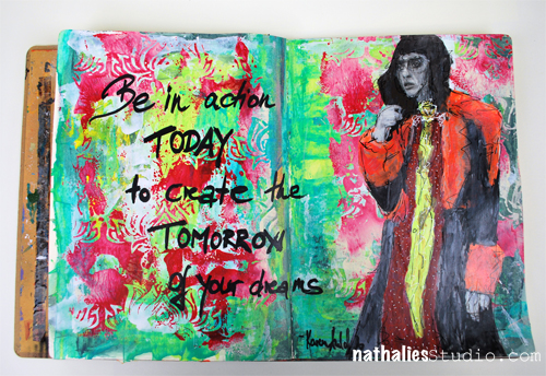
“You’d be surprised how much you have in common at 2nd glance!”

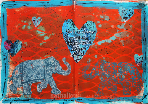
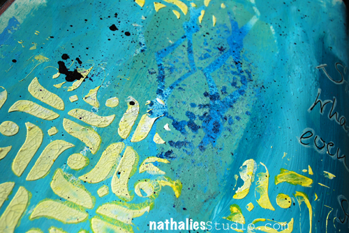
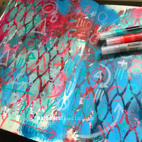
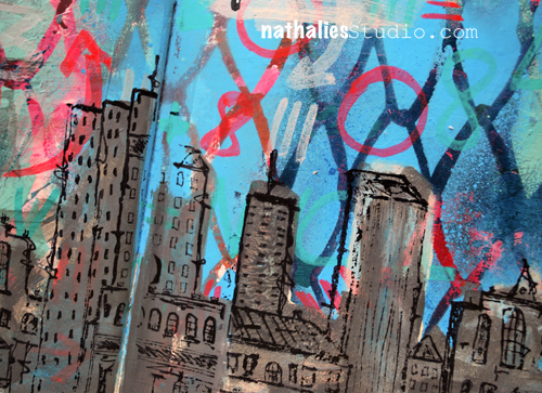
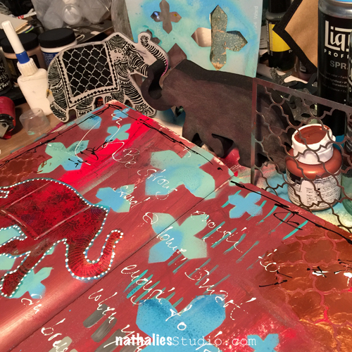
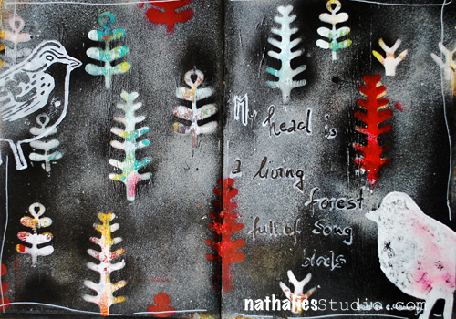
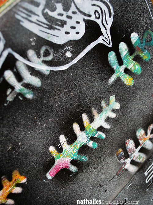
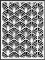
On this page I used teal acrylic spray paint over a stencil and then covered the spread with translucent orange acrylic paint taking off some of the paint while still wet to reveal the color underneath.

2ndGlance02_NatKalbach

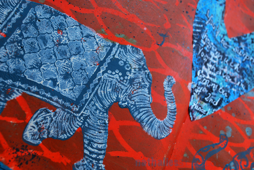
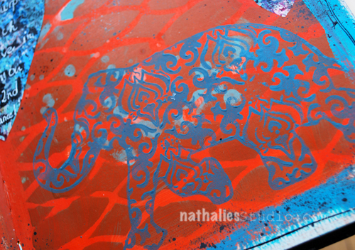
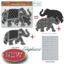
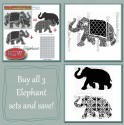
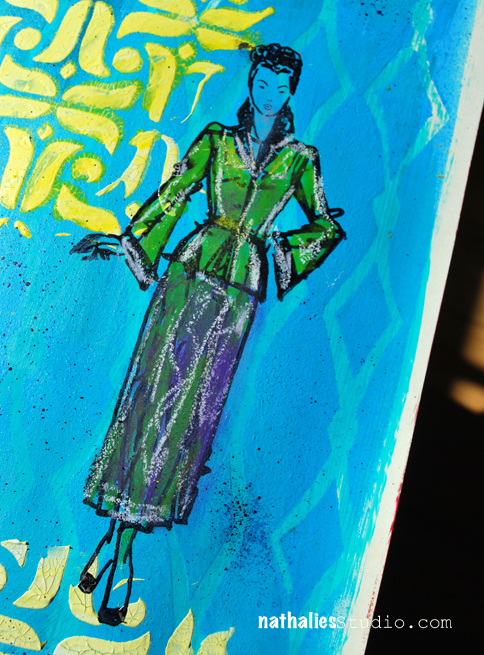
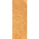
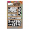
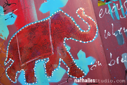
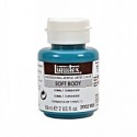
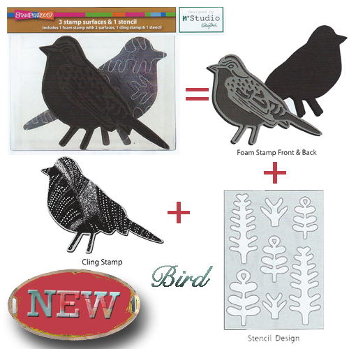
I stamped the silhouette side and the pattern side of the Elephant Foam Stamp with baltic blue acrylic paint onto the art journal spread. For the elephant rubber stamp, also in the set, I applied paint through a dauber bottle and then stamped on top of the elephant silhouette created with the foam stamp. I had mixed the paint in the dauber using 1/2 of Unbleached Titanium White Soft Body Acrylic Paint and 1/2 Titanium White Acrylic Ink. I love the texture the dauber creates but also the easy application method.

2ndGlance03_NatKalbach

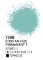
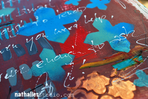
Then I painted a turquoise border -actually only to try out the new paint I had just received ;)  Next I cut heart shapes out of a sheet of deli paper which I had used to run off paint and stamps while demoing and applied them with some Matte Gel Medium.

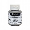
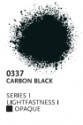
I flicked some black ink with a brush to tie the hearts into the background and added some black lines with a fine liner to the border. The fineliner is filled with a mix of 1/2 Black Carbon Acrylic Ink and Mars Black Soft Body Acrylic Paint.

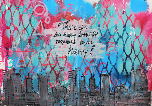
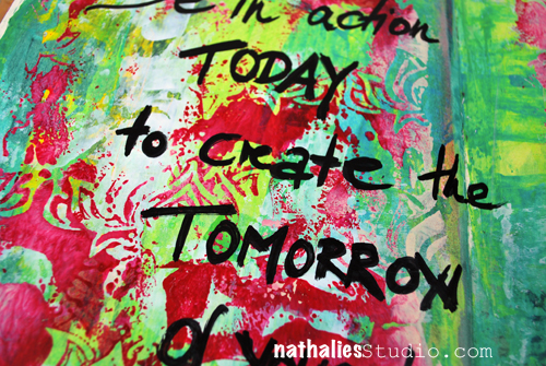
The journaling was added with a black acrylic marker overwritten with a white Signo pen – my go to pen when it comes to white journaling pens.

2ndGlance04_NatKalbach

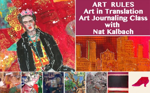
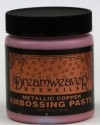
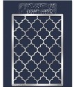
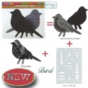
Here is a list of the supplies I used:

SuppliesCJS

Can you tell I am still obsessed with elephants? What animal do you like to use in your art?

Comments (3)

  • lorenagm07

    |

    I just picked up the elephant stamp set @ My Hearts Fancy. Can’t wait to use it. I love the color combination!
    That is a good question, I didn’t realize that I don’t use very many animals in my art but the one that I seen always go for are bees. Thanks for the inspiration!

    Reply

  • Joi@RR

    |

    GREAT COLORS – wow. What a fun page. So vibrant and unique. Love the sentiment too – hehehehe – so true!!! I’d be obsessed with elephants too if I created LUSCIOUS ones like you do Nat!!! I have used a bunch of animals in my art but strangely enough – my favorite animal, I have never used – a rooster. One of these days I am going to have to remedy that!!! I recently did a painting with Puffins in it – now THAT was a trip – they are funny creatures!!! Have a super fine week sweet girl. XX j.

    Reply

  • Delores Azary

    |

    I love elephants too! Thanks for feeding my obsession with your stencils and new stamp set! Love these pages ❤️

    Reply

Leave a comment

What’s Right or … In My Art Journal Today

WhatsRight01

“Stand for what is right even if it means standing alone!”

For this art journal spread I used my new DecoArt Media Acrylic Paints which the wonderful people of DecoArt sent me to try out. They are fluid and most of the colors in this range are transparent or translucent which makes for some nice and interesting layering effects as you can see where I played with a hand cut diamond stencil in the background.


WhatsRight02

I used my new Fashion Dame Stamp Set

Fashion Dame Stamp Set

and layered the three included stamps – the dame, her skirt and her jacket on top of each other – stamping with archival ink and then painted it in with  DecoArt Media Acrylic Paint and some Derwent ArtBars.

WhatsRight04

I also used the stencil in the stamp set and mixed white DecoArt Crackle Paste with some Primary Yellow Acrylic Paint and scraped it with a palette knife over through the stencil. I might have squealed a little bit …after a short drying time these tiny little perfect cracks started to appear and oh boy…I think this Crackle Paste and I just became buddies!

WhatsRight03

It was fun playing with new paints and a new medium! Not knowing a art medium a hundred percent frees you up to experiment and give new things a shot, it made for a great journey for this spread :)

What was the last new art medium you tried out?


SuppliesCJS


Comments (2)

  • Joi@RR

    |

    I too am playing with various DecoArt products!

    You are right – there is so much dimension on this page – just from the paints – it’s amazing. The crackle looks super too. So glad you got some time to experiment and play Nat. It’s a lovey page – especially that great looking gal you created!!! XX j.

    Reply

  • Sue Clarke

    |

    I really like how the stamp and stencil go together with such style.
    Reminds me of the dresses that you’ve shared with us over the years (that you’ve worn). I’ve actually re-discovered fine magic markers again.

    Reply

Leave a comment

Many Beautiful Reasons or … In My Art Journal Today

AJ_HappyReasons_NatKalbach_01

“There are many beautiful reasons to be happy!”

Like ….playing in your art journal :) I had a good time creating a funky grungy background and layering it up with some marker marks.

AJ_HappyReasons_NatKalbach_05

I re-explored the Stampendous Dauber Applicator which comes empty and can be filled with whatever liquid you want. They have a little foam dauber on top. I filled the bottle with part black soft body paint and some white acrylic ink to get a grey and also a more fluid paint and used the dauber to apply paint onto the Urban Scribble Foam Stamp. I love how quick this works and especially with generic colors it is an easy way to keep on hand for working with foam stamps. When done with the dauber, simply wipe off access paint from the felt and close up to prevent the felt to dry up with acrylic paint. So far this worked well :)

AJ_HappyReasons_NatKalbach_03

I stamped with the Urban Scribble rubber stamp and archival ink on top.

What made you happy today?

Here is a list of the supplies, I used for the art journal spread above.

SuppliesCJS


Comments (4)

  • Joi@RR

    |

    What a great project Nat. Love the unique background and of course…. your amazing city scape. Here is what this brought to my mind…. Your city is protected by a very sturdy, unbreakable chicken wire type fence. So it is safe – in every way. Even safe to wonder the streets – day or night. There is never anything to fear in this city because all of are like mind. There are so many reasons to be happy. It’s my version of a CREATIVE KALBACH CONCEPTION of KINDRED URBAN CONNECTIONS. Heheheheheh!!! I KNOW… I’m a silly girl but that’s what I thought!!! Hugs. j.

    Reply

    • nathalie-kalbach

      |

      Joi, you always see the coolest things- I love it!!!! loves, nat

      Reply

Leave a comment

Upcoming in March: Workshop in Oklahoma!

ArtRulesWorkshopNat

Just a short reminder that I am teaching March 4-6, 2016 – Art Rules- Art in Translation – at My Heart’s Fancy in Edmond, Oklahoma – there are still a couple seats open and it is one of the few in-person workshops I am teaching this year due to the book:

Let’s explore several master artists and get inspired by their artwork and techniques to create wonderful and unique art journal pages.Whether it be Andy Warhol’s cheating technique or Rothko’s amazing color combinations, there are many different Master Artists whose masterful skills can serve as a starting point for your own artwork.  Find out what you like and what works for you.  Learn about opacity and layering, colors, troubleshooting, mixing materials, making your own tools, creating backgrounds and patterns.  We will work with acrylic paints, inks, markers, wax bars and other paint media to create dimension and texture.  We will make the most of stencils, stamps, mono printing plates and generic tools to make our own mark.  Get ready to Rule Your Art Journal!

Class hours:
Friday, the 4th: 4 pm to 8 pm
Saturday, the 5th: 10 am to 6 pm (1 hour for lunch)
Sunday, the 6th: 10 am to 2 pm

More details and Sign-Up Information here


I am looking forward to come back to Maura’s store and see many familiar faces again and hopefully some new ones too :) It was such a blast last time!

Have a beautiful day you all!


Comments (2)

  • Jenny Petricek

    |

    Workshop sounds great! I wish so much that you could come and teach in Wisconsin!

    Reply

    • nathalie-kalbach

      |

      That would be fun Jenny! If you ever hear of a place in Wisconsin- let me know :)

      Reply

Leave a comment

More hours or …. In My Art Journal Today

AJ_MoreTime_NatKalbach01

“I still find each day too short for all the thoughts I want to think, all the walks I want to take, all the books I want to read and all the friends I want to see!” John Burroghs

Apparently I didn’t find the day too short to repeat myself but was at the same time not concentrated enough to write everything grammatically right in my art journal spread -LOL – can you spy it? Oh man, embarrassing but …oh well… here you go … the real deal;)

I played with different greens and yellow and orange acrylic paint and stamped the city shape using the pattern art of my Urban Scribble foam stamp with purple as a nice contrast to the orange. I applied the paint with a brayer to the foam stamp- goes quick and easy.

AJ_MoreTime_NatKalbach03

As you can see in the WIP (Work In Progress) Picture above I added a little border to my stencil in the set with duct tape as to prevent over spraying when using the stencil with spray paint. Here I just added paint to the surface, then placed the stencil on top and rubbed areas of paint off with a baby wipe – at other spots I stenciled through the stencil.

Urban Scribble Stamp Set

For the Journaling I used a bamboo sketching pen and black acrylic ink- I love to write with the pen …so much, that I like to double my words ;)

AJ_MoreTime_NatKalbach02

What would you do if you had more hours in the day?

Here is a list of the supplies, I used for the art journal spread above.

SuppliesCJS


Comments (2)

  • Joi@RR

    |

    No one can make a skyline look like you Nat. This is just INCREDIBLE. The background is sooo YUMMY and the colors so BRILLIANTLY FABULOUS. I LOVE LOVE LOVE this and your urban scribble. No – can’t see any mistakes at all. GORGEOUS to me. HAPPY VALENTINE’S DAY sweet Nathalie. You are dear to me. ❤❤j

    Reply

  • Kim Collister

    |

    Loved your post and your journal pages! Great Color!
    XO

    Reply

Leave a comment

Be Strong, Smart, Brave Enough or …. In my Art Journal Today

BeStrong_natKalbach01

“Be strong enough to stand alone, smart enough to know when you need help, and brave enough to ask for it”

Very true and this year I will be brave enough to ask for help when I need it…hope I will be smart enough to know when I need it ;)

BeStrong_natKalbach04

I have tried out some new supplies for this art journal spread. Well – my new Elephant Set also counts as new :) I painted the background with several soft body acrylic paints and then applied the copper acrylic paint with a brayer onto the solid Elephant Foam Stamp side. I stamped the elephant and let it dry. I cleaned the Foam Stamp with a baby wipe and later throughly cleaned it with water. I stamped with archival ink applied to the Elephant Rubber stamp on top. I added some white dots with a Fineline applicator filled with a mixture of white soft body paint and acrylic ink.

BeStrong_natKalbach02

As the Elephant has the quatrefoil blanket, I pulled out my new metal Stampendous Dreamweaver Quatrefoil Stencil for pattern repetition. I applied the Metallic Copper Dreamweaver Paste through it. Oh how yummie!!! It is shiny and beautiful and dimensional and oh so scrumptious – I might have fallen in love with the paste :) I also thought Michelle Ward’s Maltese Stencil would be a good pattern fit and spray painted with two different colors through it . For the journaling and some mark making I used again the Fineline Applicator – one filled with white and one filled with black acrylic paint+ink.

BeStrong_natKalbach03

I love the rich colors – not my usual color palette but I really liked playing with it and I think I will use it again :)

What new supplies have you tried out recently?

Here is a full list of the supplies I used:

SuppliesCJS


Comments (5)

  • sally

    |

    Please describe the “white signo pen” and its uses.

    Reply

    • nathalie-kalbach

      |

      It is a white gel pen that works wonderfully on acrylic paint.

      Reply

  • Joi@RR

    |

    Heheheh – well Nat – there is no doubt you are SMART enough – no question there but…. brave enough… when it comes to asking for help – that’s a tough type of bravery! I am not good at that either – at all. OR accepting it graciously!!!

    LOVE your journal creations. Your elephant just makes me smile every time I see him!!! And he looks so elegant – like royalty – this time. Must be that yummy dreamweaver paste!!! Your colors are so intriguing too. It’s just a really great project. LOVE IT. j.

    Reply

  • Sue Clarke

    |

    Love the texture and the copper. Not a new supply, but I’ve been using my white Signo pen all week.

    Reply

    • nathalie-kalbach

      |

      Thank you Sue! Oh I love my white Signo Pen too – never goes old :)

      Reply

Leave a comment

Song Bird or… In My Art Journal Today

NatkalbachSongbirds01

Free after E. E. Cummings “My head is a living forest full of song birds.”

I made this page based on a background that to be honest was really really bad. The colors were just awful on the spread, so I used some gesso here and there to tone it down and then I layered my new frond masks which are part of my new Bird StampSet on top of the background. You can pop the fronds out of the plastic and that gives you a stencil and masks in one :)

Bird

I then used Carbon Black and Parchment Spray Paint and sprayed over the masks, which revealed after lifting them, the really cool colors and designs. I used a brayer to layer some white paint on top of the foam stamp and the patterned and the solid side to stamp the birds onto the spread.

NatkalbachSongbirds02

An easy way to make something nice out of a really ugly beginning :) And a great way to start the day with a little art journaling warm up.

Thank you all for your wonderful comments about the new stamp sets- I am so excited! They are being shipped right now to the Brick-and-Mortar stores and they are already available at some Online Stores. I will list the stores as soon as I have an update from the Stores. I will also have them soon available on my website for you to purchase direct if you cannot buy them locally. I cannot wait to see what you are doing with them and I am also excited to share some more projects and tutorials with them soon :)

SuppliesCJS


Hope you have a wonderful day- with or without song birds in your head ;)

hugs

Comments (5)

  • colourfly

    |

    Liebe Nat, Ich finde deine neuen Stempel so supertoll…. Kann eskaum erwarten diese zu kaufen!!! Ich hoffe, dass sie auch in good old Germany zu haben sind?!
    Die Journal Seite ist super!
    Ganz liebe Grüße, Sabine

    Reply

    • nathalie-kalbach

      |

      vielen Dank Sabine! Ja- in Deutschland sollte es sie auch geben – ich poste sobald ich weiß, welcher Shop in Deutschland sie führt :) Liebe GRüße in die Heimat :)

      Reply

  • Jenny Petricek

    |

    Love this spread, Nathalie! I love the dark background and the colorful fronds that pop out in front of it!

    I appreciate that you explained the process of how you arrived at this particular background. Sometimes the most delightful surprises come from adding to and covering things that we weren’t happy with originally!

    Reply

  • gloz

    |

    Hi Nathalie, Thanks so much for leaving a comment on my blog. I am really enjoying my Creative Jumpstart 2016 and I have decided to use it as a new diet ploy for myself! I tend to nibble all night long in the winter, there-by gaining weight. But of I am doing art projects between 8 and midnight, I can’t eat at the same time!

    Reply

Leave a comment

Bada$$ery ….or In My Art Journal Today

Instead of a New Year’s Resolution I, amongst many others, pick a word that I try to live by in the new year. Last year it was light. Well…that didn’t work out too well to be honest. It was as if 2015 was Opposite Year just that I didn’t get the memo ;)

But …I have high hopes for 2016 – It is going to be an awesome year – I know it!

NatKalbachBadaW01

Now my word choice might sound harsh to some , please don’t feel offended by it – that is not the intention behind it. I have no plan on being a rude or mean person, no worries! I just feel like I have to take more action in several parts of my life, instead of waiting for others to come to me, be more firm in some ways and to some people, stop procrastinating and seize the day,  take opportunities without questioning myself too much or what others might think of me and also …just finally feel more at ease with myself. I think I can call it summed up “Badassery” – LOL

NatKalbachBadaW02

I felt pretty badassery scratching the work into wet spray paint …hahaha- see how “far” this word takes me ;) I also obscured some of my writing around my feelings and thoughts by spray painting and painting over it. I made some marks with stencils, brushes, self made foam stamps, palette knifes and dripping. I think the beautiful decayed houses and graffiti I admired in Buenos Aires last month influenced this page a lot.

NatKalbachBadaW03

Do you have a word for 2016? And did you visualize it in your journal or sketch book? Share with me if you want- I would love to see it!

Here are the supplies I used for this spread

nSupplies


Comments (10)

  • Andrene

    |

    EEK!!!! I love the elephant!! Cant wait to get it and use it with your elephant stencil which is one of my faves! All of the sets are fantastic and will definitely find a home with me!

    Reply

    • Andrene

      |

      Sorry! For some reason this posted under the wrong blog entry!

      Reply

  • Joi@RR

    |

    Heheheh – I love this post… even read it to hubby who also keeps up with you thru me Nat!!! We both were totally laughing and saying YES YES YES…. you got it… sounds GREAT – you go girl!!!!

    Loved your journal page too – it’s soooo fun.

    I don’t have a word. I have never done that before…. and I have thought and thought and thought but I just don’t have one. I have been a giver ALL my life… in fact find it hard to receive. I’m not a gracious receiver at all!!! So… I thought of the word FAVOR… because for once… it would be so fun to see something I did succeed (like to seel a painting – heheeheh) or for some tiny dream of mine related to my art to come true. But then I decided that sounded so selfish!!!!!! And I have no respect for selfish people so I threw Favor out too!!!!!!!!!!!!!!!!!!!!! I KNOW… I’m overthinking!!! Anyway – enough rambling!!!

    WE LOVE YOUR WORD….. j.

    Reply

  • michelleward

    |

    Awesome page Nathalie. And great word for you. Taken with the spirit intended. I don’t do word-for-the-year, but if I did I might swipe yours :)

    Reply

  • Donna B.

    |

    Interesting you chose that word, Nat. For many of the same reasons, I’m going to choose the word “Movement” for me — but not only for the reasons you meant, but also, my word means that I have to get out there and exercise as well. Let’s hope our words work for both of us!!

    Reply

  • Gayle

    |

    I was slow deciphering that word, then looked it up! YEAH! LOVE IT! Here’s was a great definition: “Engaging in seemingly impossible activities and achieving success in a manner that renders all onlookers completely awestruck.” Now that’s a tribe I definitely want to be a part of. All the best in living out your marvelous word.

    Reply

  • Sue Clarke

    |

    Love your word and not sure what mine will be this year.
    Leaning towards SIMPLIFY with a focus on getting rid of many physical belonging that are taking up too much space in my house and getting in the way.

    Reply

  • Denise Spillane

    |

    I love your word and your spread. Very cool. You are badass and always inspire. Happy New Tear my Badass Teacher and friend (FB). You are great.

    Reply

  • Jenny Petricek

    |

    Gritty textures and great color combo! A perfect way to ring in 2016!

    Reply

  • Kelly Belton

    |

    It ‘s a great word Nat – always empowering!

    Reply

Leave a comment

Action Today or … In My Art Journal Today

ActionToday01

My wonderful friend Karen posted her quote on her facebook page and inspired me to create this journal spread:

“Be in action today to create the tomorrow of your dreams” – Karen C. Auld. There is so much truth in this- love it!

ActionToday02

The colors were inspired by the flowers that are blooming again on my deck …it is crazy warm here for this time of the year!

actionInspo

I painted the background with different shades and tones of green and then used a spray painted stencil to create a reverse imprint on the spread. It was a quick page- but it felt good to get the hands messy and enjoy some beautiful colors.

ActionToday03

the poor girl looks a bit pale- I think she needs some action ;) I used pencils and markers as well as some other pens for her.

I will post the supply list at the end!

—– On another note! I am coming back to Sweden – Stockholm for some workshops next year – May 27-29, 2016 – woot woot!!!! —-

Check out the announcement and classes here if you are in the area – I would love to see you!!!!


I taught at this event a couple years ago and it was amazing – I am looking forward seeing some familiar and also some new faces again!

…….and here as promised the supply list for the art journal spread –

nSupplies


I wish you a gorgeous day!

Comments (1)

  • Joi@RR

    |

    What a neat project. I’m sure that my take is totally off the wall but here it is. The background is so light and airy and cheerful – so fun. But the figure is so much darker, grungy, hooded… stagnant looking. Then your sentiment…. tells me that there are opportunities and dreams to be had but only if we are not stagnant – only if we don’t lose hope… and for me… only if I dare to dream!!!!!! Great message here – thank you Nat!!! j.

    Reply

Leave a comment