Creative Squad

Vacation Mode – Maura Hibbitts


Happy Tuesday from the Creative Squad! Today we are excited to share with you a wonderful little upcycled travel bag from Maura Hibbitts. She is using my Versailles foam stamp set and my Urban Scribble stamp set (no longer available but if you’re looking for building stamps here is a good place to start) along with this month’s theme: Vacation Mode – Here in the Northern Hemisphere, we are slogging through winter with only one thing on our minds – vacation! Whether it’s Spring Break, a weekend getaway, or an hour with a good book, everyone needs an escape to Vacation Mode now and again.
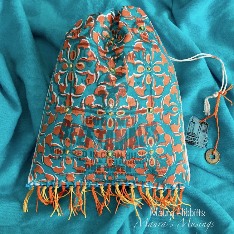

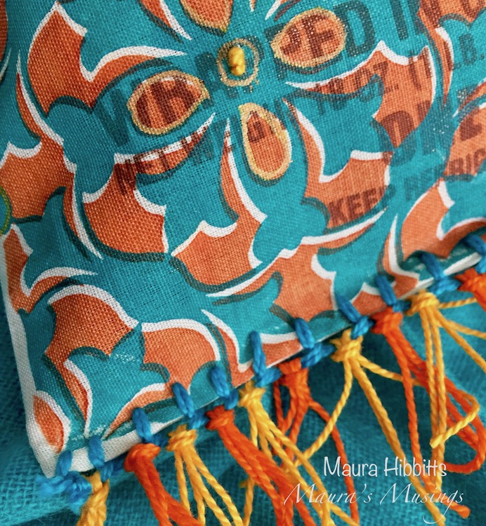
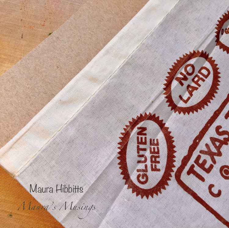
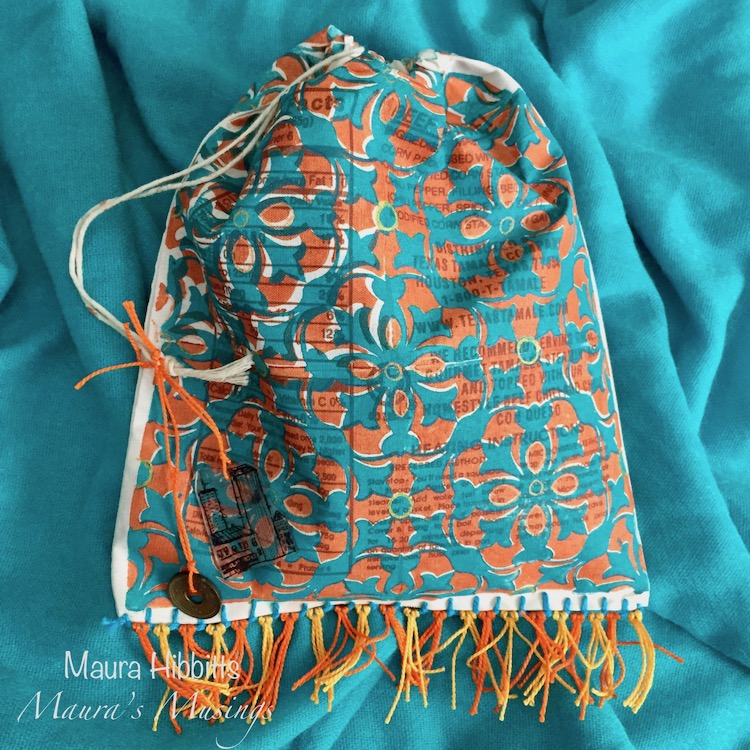
When I go on vacation, I like to take along an art project or travel journal to capture my experiences. I up cycled a small canvas bag that came filled with some yummy tamales for my project. You could use a purchased canvas bag, or sew one yourself if desired. (Mine is about 8 x 10 inches/20.5 x 25.5 cm) I like how the printing peeks through my stamped design. Now I have a fun bag I can fill with art supplies, or use to fill with found treasures on my vacation.

Start by inserting a piece of cardboard into the canvas bag. This will keep the paint from leaching through the other side.
I found the best way for me to get good paint coverage on the Versailles ArtFoamies stamps was to use my gel plate and a brayer to adhere the Quinacridone Gold paint onto the foam. You could also use a palette instead of the gel plate. Do both sides of the bag, and be sure this paint layer is completely dry.
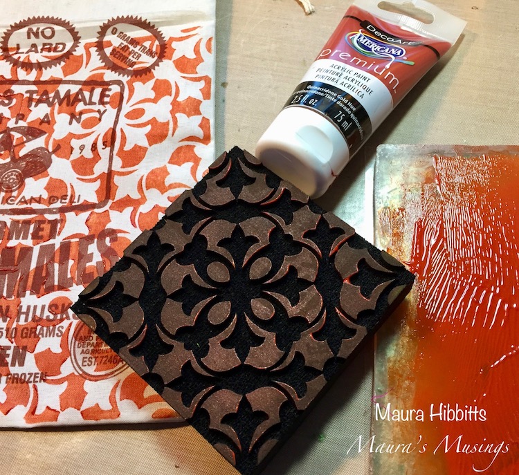
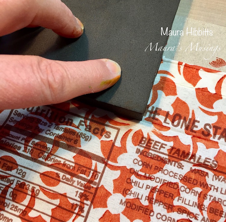
Through trial and error, I discovered I was able to match the stamped images up better if I started with the negative impression, and then stamped the positive with the Cobalt Turquoise Hue acrylic paint. Let dry. As you can see, there are a lot of imperfections in matching the images, but I’m ok with that.
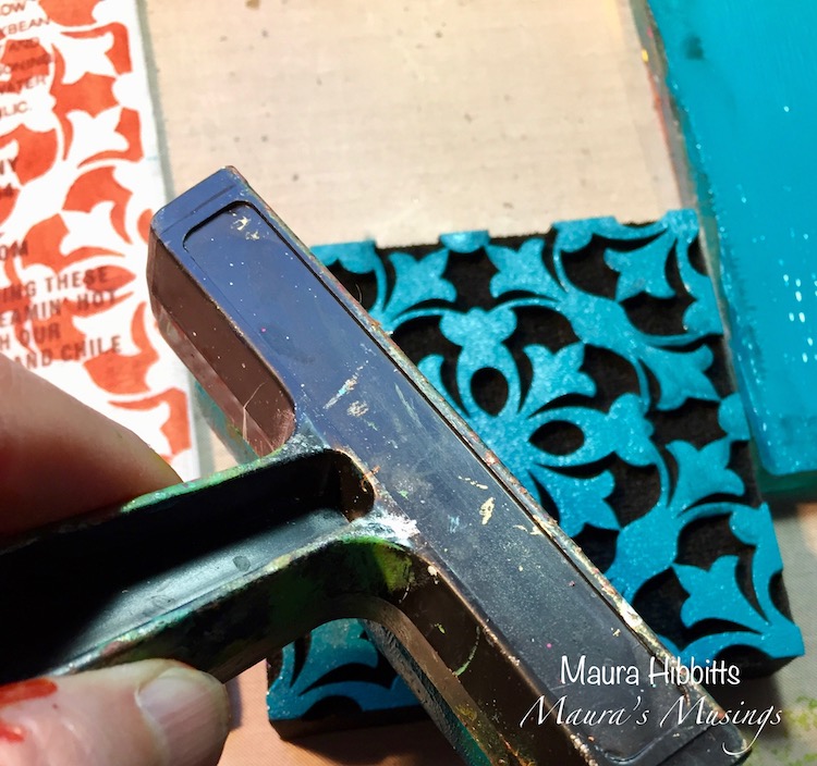
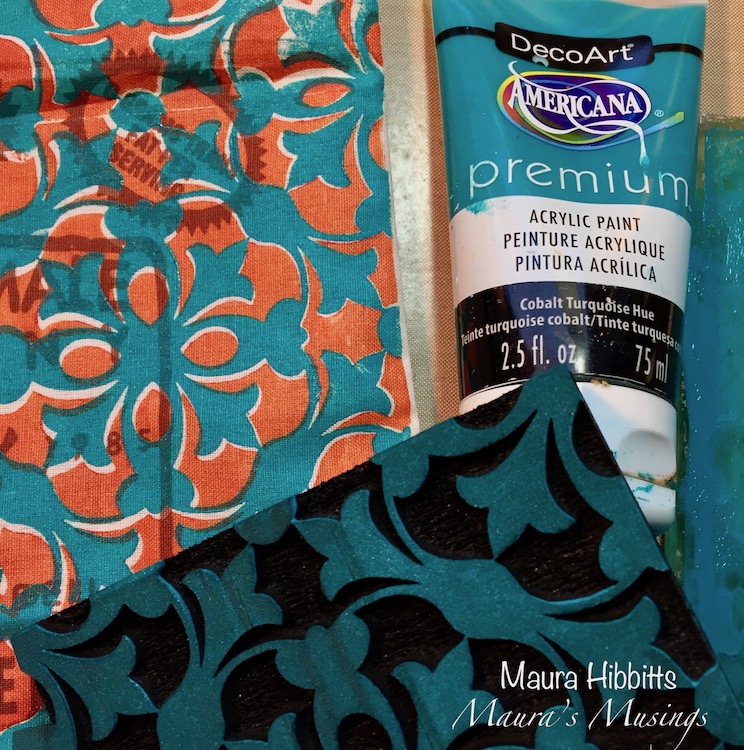
I used a gold pen, and a Posca metallic orange pen to add some doodles to the bag on both sides. I don’t plan to wash this bag, so did not worry about using washable pens, but take that into consideration if you plan to wash your bag.
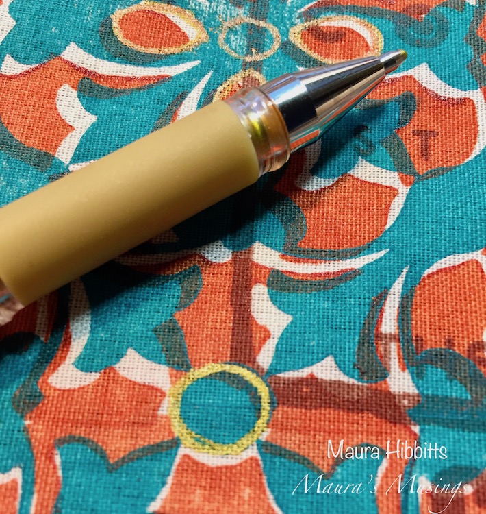
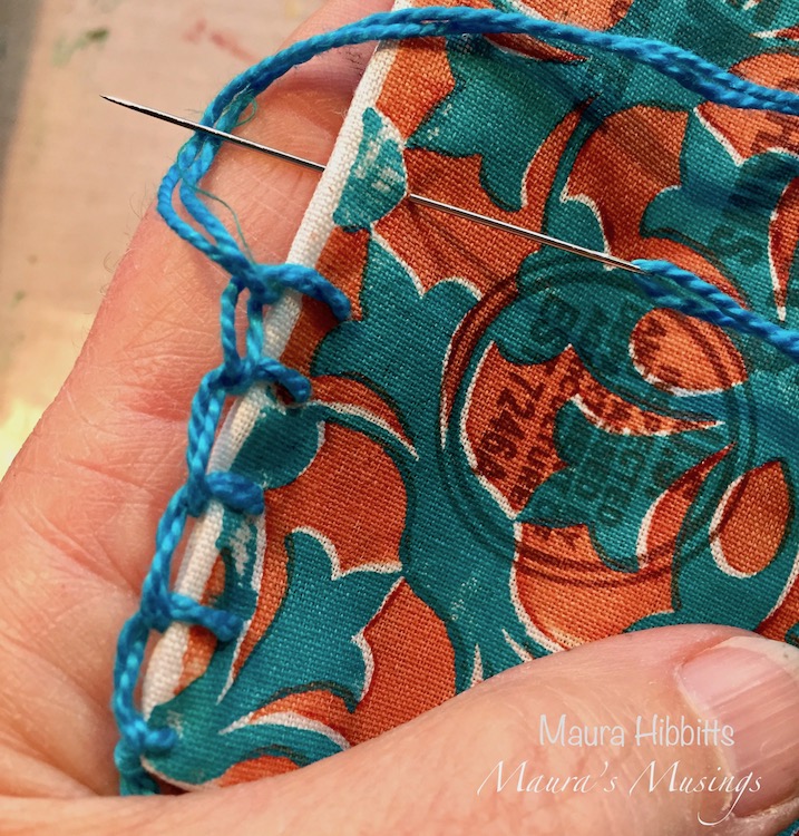
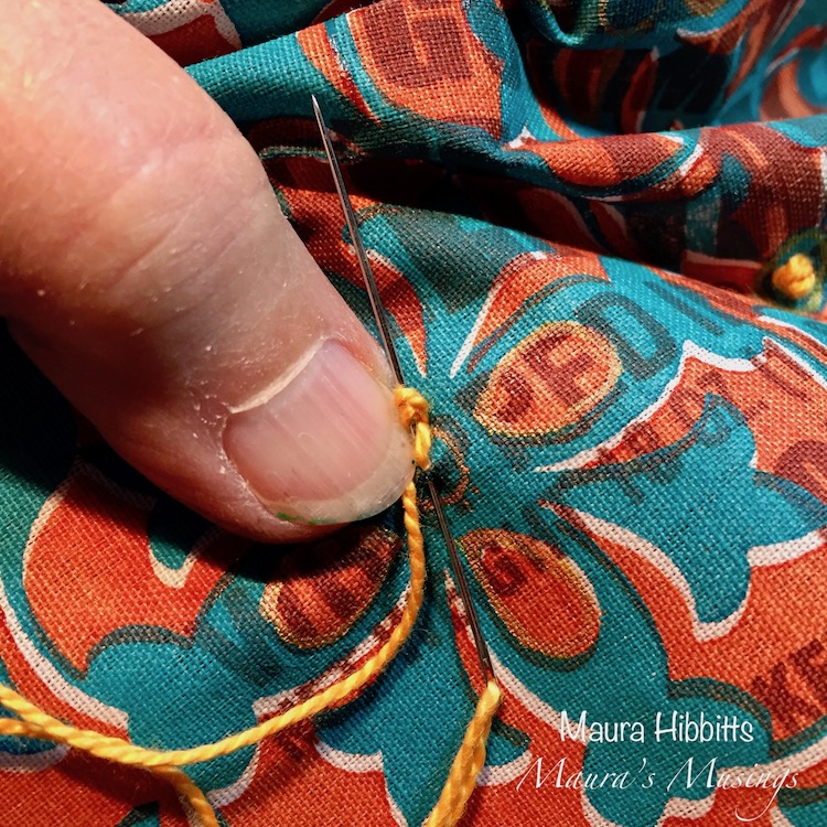
Now, it’s time to add some embroidery. I used turquoise thread and stitched the bottom of the bag with a Blanket Stitch. Next, on the front panel, I added French Knots inside the circles I’d drawn with the pens, using a yellow orange thread.
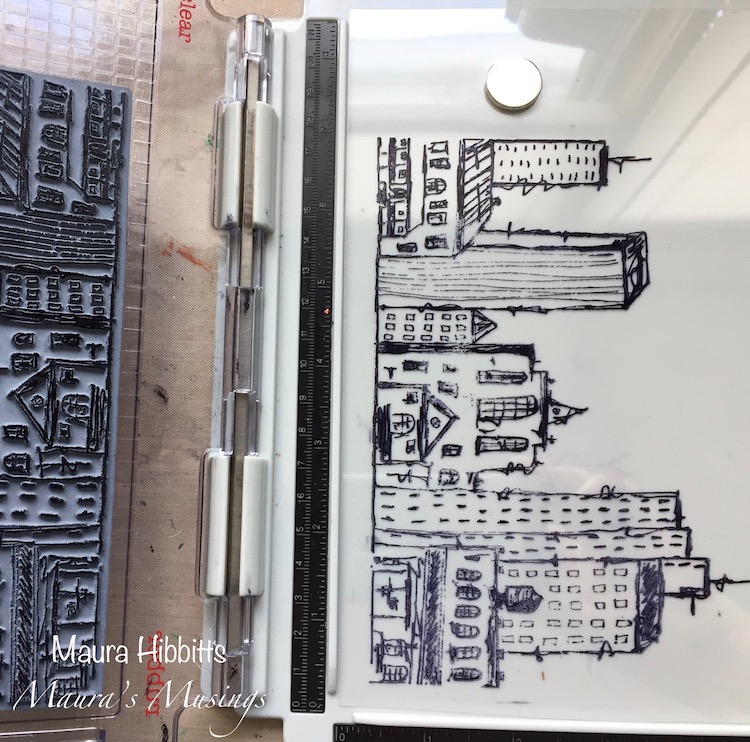
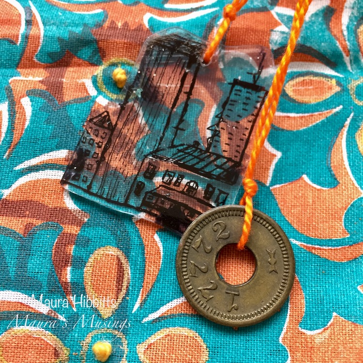
I wanted to make a charm to add to the bag, so I stamped the Urban Scribble image onto Shrink Plastic with archival black ink, and cut a section of it to use. Punch a hole into the plastic, then heat it and shrink it with your heat gun.
My final touches on the bag were to add the shrink and metal charms with embroidery thread, and tie loops of bright orange and yellow orange threads to each section of my blanket stitch at the bottom. Once I’d tied the loops on, I trimmed them to the same length. Now I just have to plan my next trip and decide what to fill my artsy travel bag with!

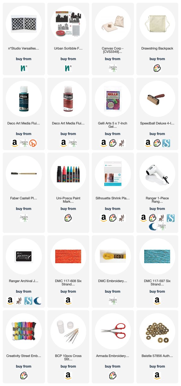
Thank you Maura! I could see using this bag for a fun evening out too! I just love the bold colors and the embroidered details – so cool!! In addition to an upcycled canvas bag (there are some possible choices in the list below) and some cardboard, Maura used the following supplies for her project :


Feel inspired? Working on something yourself that you’d like to share?  I love to see how you interpret our monthly themes. Email me how you used my stencils and stamps with the theme and email me an image – I would love to share your projects in my next  “n*Spiration From Around the Globe“.

SaveSave

Comments (1)

  • Sue Clarke

    |

    I absolutely love this Maura! The color and the tag you made are awesome.

    Reply

Leave a comment

Vacation Mode – Jennifer Gallagher


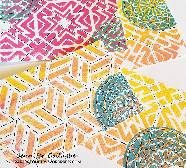
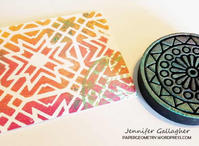
Hello from the Creative Squad! Today we have Jennifer Gallagher and her set of absolutely lovely postcards to send from your vacation destination. She is using my Toledo and Kassel stencils and my Valley Road foam stamp, along with our theme: Vacation Mode – Here in the Northern Hemisphere, we are slogging through winter with only one thing on our minds – vacation! Whether it’s Spring Break, a weekend getaway, or an hour with a good book, everyone needs an escape to Vacation Mode now and again.


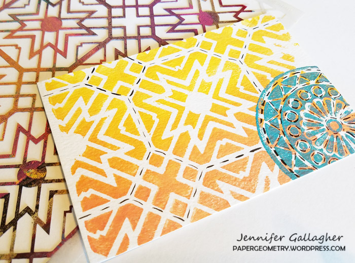
This month we are in Vacation Mode here at the Nstudio Creative Squad. What better time to beat my current winter blues than looking ahead to Summer and family vacations. I love the warm Summer sun, sand between my toes, and the salty ocean breeze. So, today I will walk you through making some adorable beach-inspired postcards to send to family and friends from any destination.

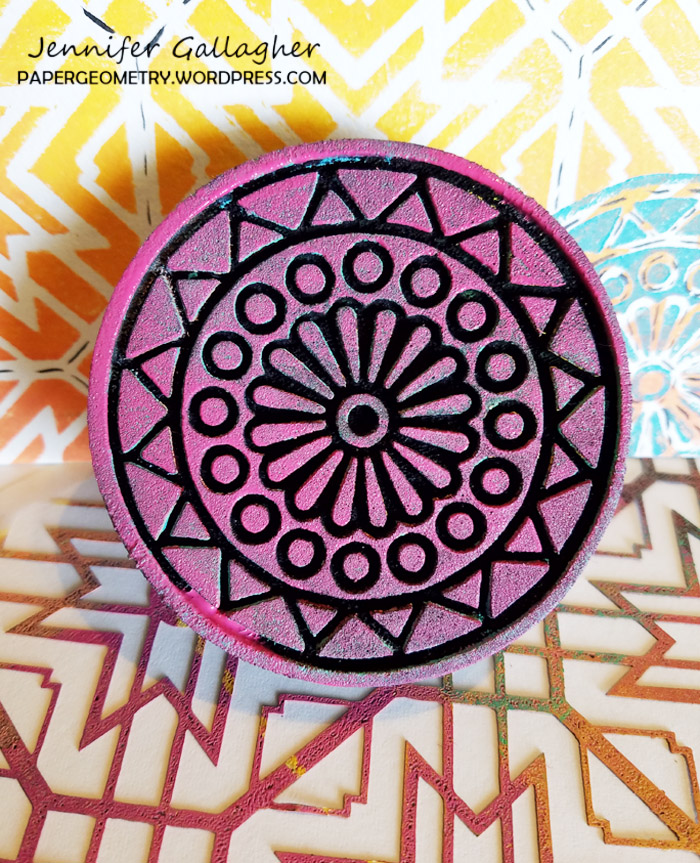
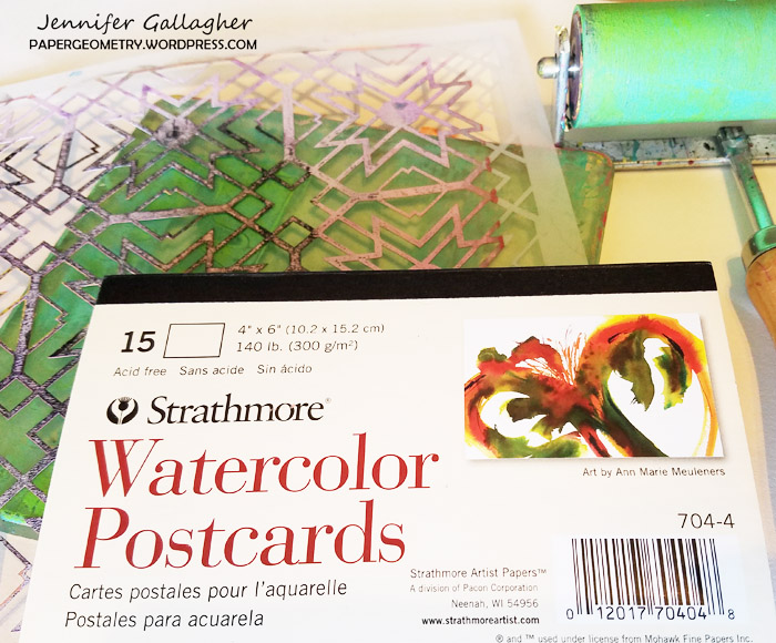
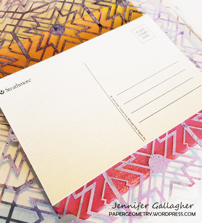
These fun postcards are quick and easy to make and you can use your favorite Nstudio stencils, stamps, and artfoamies to make them uniquely you. I used my six by six inch gelli plate, brayer, watercolor postcards, and inexpensive acrylic craft paints. To make some really standout postcards I used Nat’s Toledo stencil, Kassel stencil, and Valley Road Artfoamies.

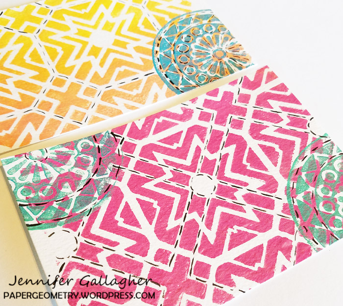
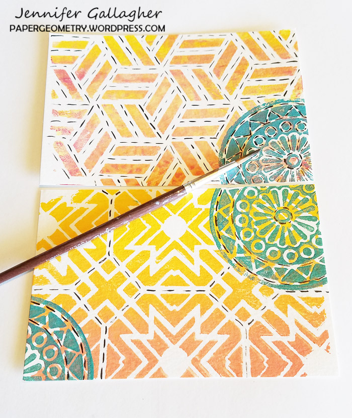
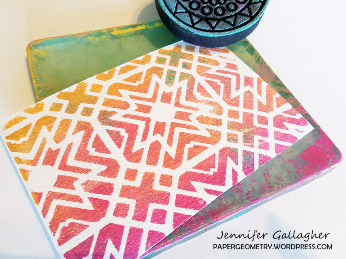
I layered my paint onto my gelli plate from light to dark in coordinating colors with my brayer. I put down my stencil and pressed my watercolor postcard down. Press firmly!

I chose complimentary colors, in this case turquoise and teal, and applied the paint to my artfoamies. I applied the design in interesting places on my postcards.

After the paint dried, I decided to add some interest with black India ink. Following the spaces between the stencil gives an interesting line for the eye to follow.

Now all that is left is to send them out. Thanks for stopping by and be sure to visit every Tuesday for the latest Creative Squad post. Enjoy!


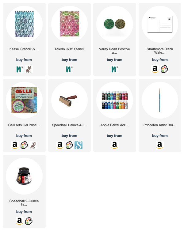
Thank you Jennifer! Those colors are sure to brighten any gloomy winter day :)  Here are some of the supplies that Jennifer used:


Feel inspired? Working on something yourself that you’d like to share?  I love to see how you interpret our monthly themes. Email me how you used my stencils and stamps with the theme and email me an image – I would love to share your projects in my next  “n*Spiration From Around the Globe“.


Join us on Thursday March 22nd at 4pm EST for my latest Kaffeeklatsch on Facebook! I’ll be chatting about all the latest and greatest here at Nathalie’s Studio. Special this time is a GIVEAWAY you will not want to miss, tales from my trip to Japan, and lots of news about exciting upcoming in-person workshops! Join us and say hi!

SaveSave

SaveSaveSaveSave

Comments (1)

  • maura

    |

    Love how you made your own postcards with the stencils and stamps, Jennifer! Cool idea and colors! Maura

    Reply

Leave a comment

Vacation Mode – Josefine Fouarge


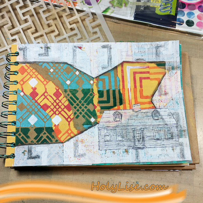
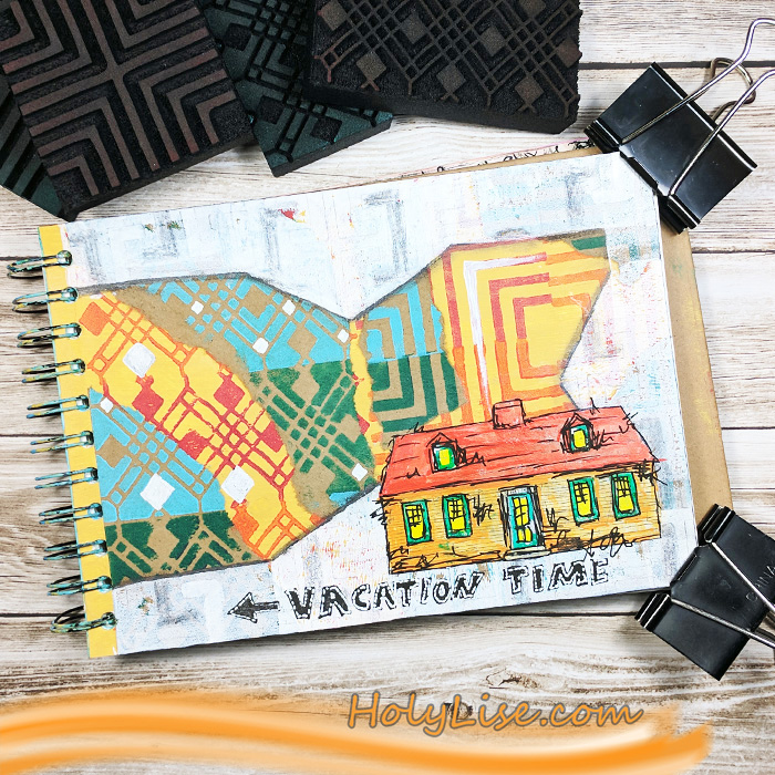
It’s time for a project from my Creative Squad! Today we have a sweet little art journal page that is filled with pattern and color, from Josefine Fouarge. She is using my Manhattan and Mini Chicago ArtFoamies, my Cape Cod stamp from the Stroll Around the Block set, and my Hamburg stencil. This month’s theme is: Vacation Mode – Here in the Northern Hemisphere, we are slogging through winter with only one thing on our minds – vacation! Whether it’s Spring Break, a weekend getaway, or an hour with a good book, everyone needs an escape to Vacation Mode now and again.


This month’s topic got me thinking. It’s been a while since I have been on a vacation and there is none in sight either. So, I decided for myself that if you can’t go on vacation, shopping is the next best thing. And trust me, I am good at that ;)

I was at one of the big box stores the other day and couldn’t pass the paint and paper aisles without grabbing a few items. To make sure that they don’t end up in a drawer unused, I incorporated them in my new art journal page.

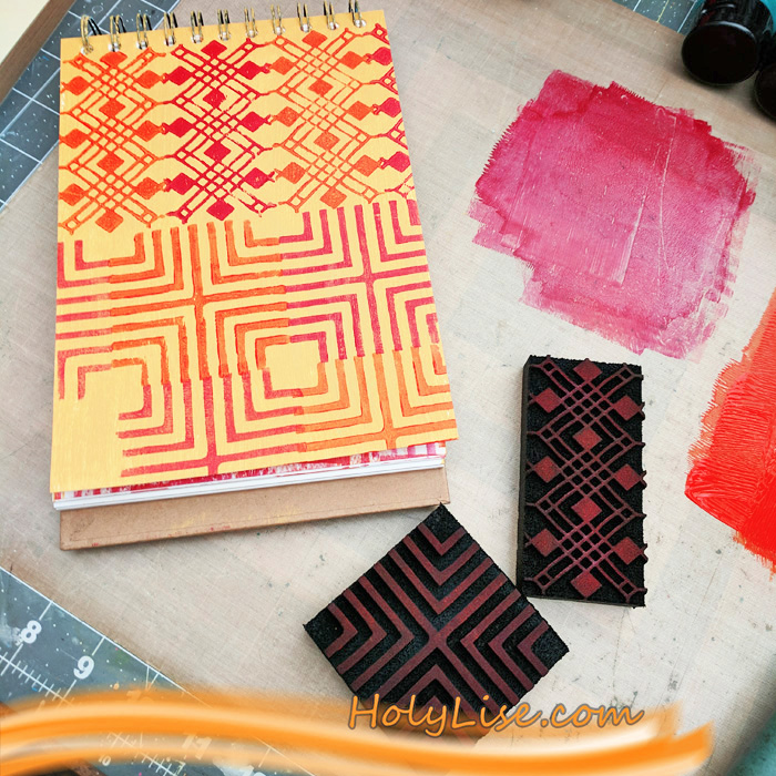
I covered my art journal page in the new Liquitex paint. Then I picked a few ArtFoamies (Mini Chicago and Manhattan) to stamp them with other shades on top. I used two different paints and alternated the colors between each stamping. Aren’t these colors just pretty? Do you understand why I couldn’t walk by them? :)

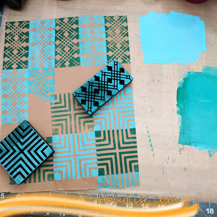
Next up, I used the new recycle paper and stamped the negative ArtFoamie in the same patterns, but with a contrasting color. Again, I alternated between two colors.

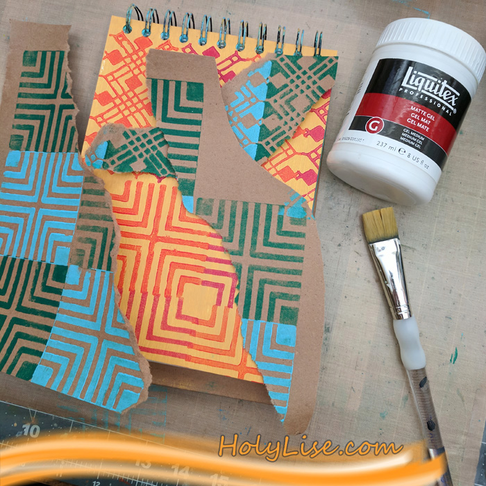
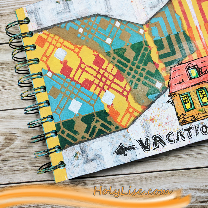
Now I ripped up the brown paper and adhered some of the scraps onto my art journal page. It was important for me that the patterns match and create the illusion all the shapes merging together.

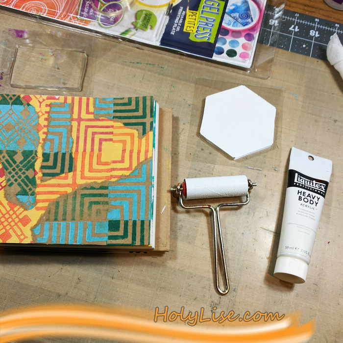
I needed a border, so I used the Gel Press petites and white acrylic paint to add one. Because the border was rather boring, I added a very light pattern to it. I did that by tracing the pattern from the Hamburg stencil with a pencil.

While I was coloring in some of the stenciled shapes with the same pencil, I thought that the colorful background needs some white as well. So I added a few white shapes.

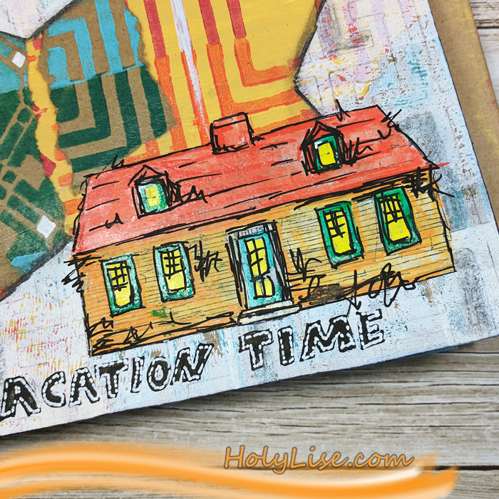
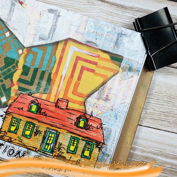
The page still was missing a focal point, but I didn’t want to stamp anything directly onto the page. Usually that doesn’t end well for me. Instead, I prefer to stamp the image (in that case the Cape Cod house from the Stroll Around the Block set) onto a piece of tissue paper. I adhered that with gel medium and colored the house with Liquitex and Montana paint pens.

To finish the page up, I added a few scribbles and some shadows. I love that the paint pens made the house look like a cartoon.

On a side note, I totally enjoyed working with the brown recycle paper. It has such a neat texture to it and added the perfect contrast for the negative/ positive foam stamps.

Thanks so much for stopping by! Don’t forget to check out all the other Creative Squad creations every Tuesday!


Thank you Josefine! I absolutely love those colors and patterns together! Here are some of the supplies that Josefine used:


Feel inspired? Working on something yourself that you’d like to share?  I love to see how you interpret our monthly themes. Email me how you used my stencils and stamps with the theme and email me an image – I would love to share your projects in my next  “n*Spiration From Around the Globe“.
SaveSave

Leave a comment

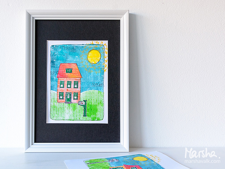
Vacation Mode – Marsha Valk


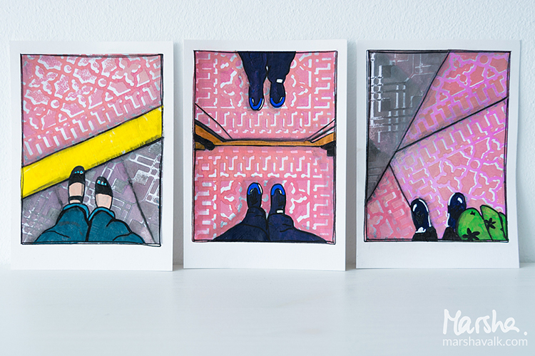
Hello from the Creative Squad and a big farewell hug to stellar squad member Marsha Valk! This will be her last post with us and we thank her so much for all the inspiring, creative, and amazing projects that she has made for us. She has been on the Creative Squad since the very beginning and has always gone above and beyond with her posts and her unique way of using my stamps and stencils. We wish her all the best as her Artful Adventure continues :) So for her last post, Marsha brings us a suite of prints celebrating patterns with my Downtown foam stamp set and my Mini Chicago foam stamp set and inspired by our theme: Vacation Mode – Here in the Northern Hemisphere, we are slogging through winter with only one thing on our minds – vacation! Whether it’s Spring Break, a weekend getaway, or an hour with a good book, everyone needs an escape to Vacation Mode now and again.


Vacation Mode to me means: Slowing down. Reading a lot. Perhaps doing some sketching (but only if I feel like it). Eating yummy food. Seeing the sights and visiting at least one museum. Enjoying the sun! It has been a while since my last vacation abroad.

Much like Nat does on her travels, when I’m on vacation I observe and photograph lots. And because many of Nat’s ArtFoamies are inspired by her travels, I thought about my last vacation and had a look at the photos I took.

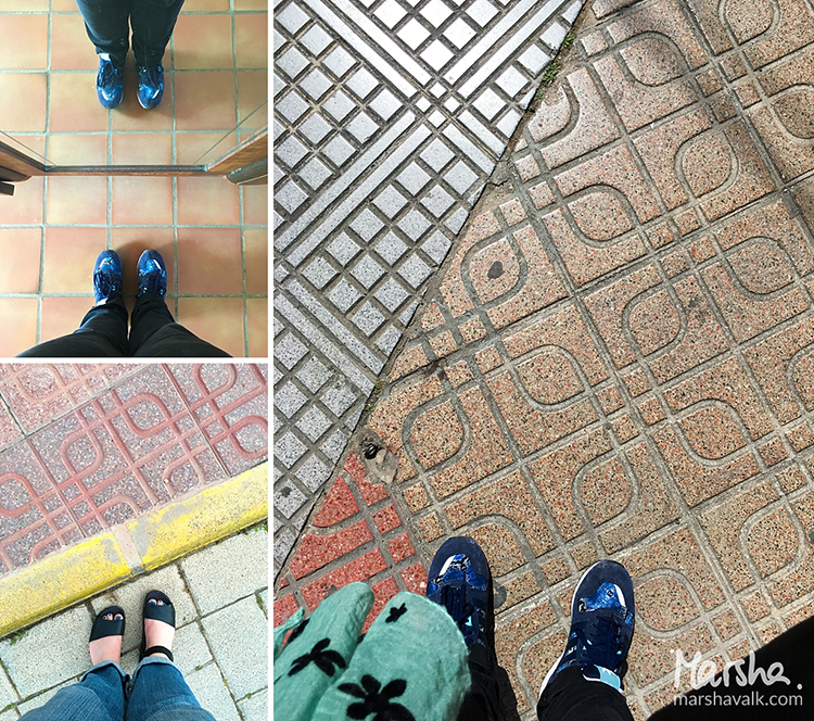
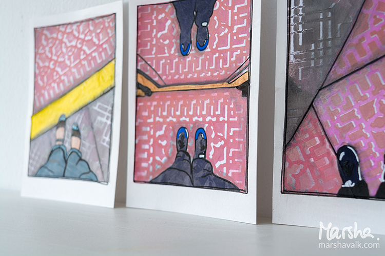
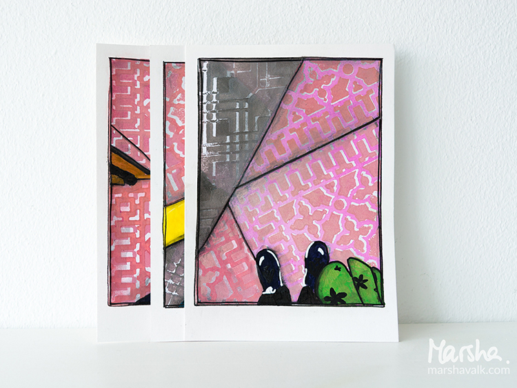
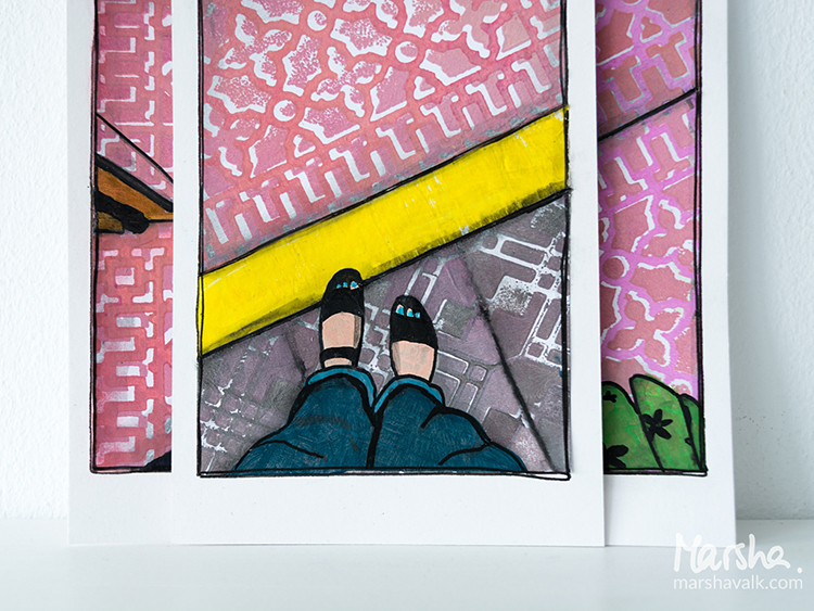
Among them I found three of my feet. I always take ‘fromwhereIstand’ / ‘Ihavethisthingwithfloors’ type photos wherever I go. In fact, I remember taking pictures of my feet in foreign places well before hashtags and even before digital photography!

Nat’s positive/negative ArtFoamies always remind me of pavement and flooring, so that’s how I came up with the idea of recreating my #fwis pictures with collage.

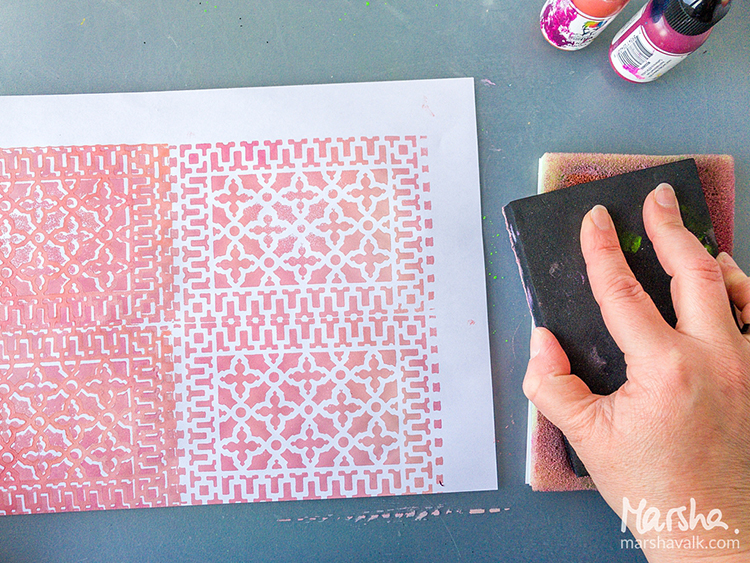
I started creating the pavement with the Downtown Positive and Negative Foam Stamp and the Mini Chicago Positive and Negative Foam Stamp Set.

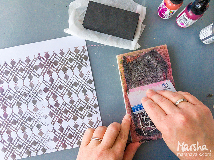
Because I’m not very fond of cleaning, I only used one Stamp Buddy and mixed my paint colours directly on there using an old plastic card.

For a lighter shade I added more white, and when I switched stamps, I added more grey. I stamped on regular printer paper because it’s nice and thin for collage.

I cleaned the ArtFoamies with a baby wipe in between stamping, and I rinsed them with water once I was done stamping altogether.

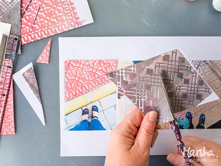
Once the prints were dry, I cut them into the shapes of the pavement in the photos, using the pictures as my guide. I adhered the shapes to heavyweight cardstock cut to 4.1” x 5.8” (A6) sized pieces.

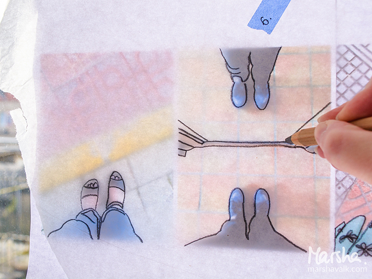
I traced my feet and any relevant details in the photographs onto tissue paper to transfer them onto the collaged pieces.

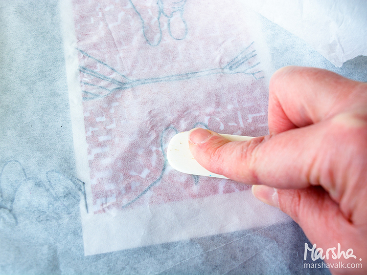
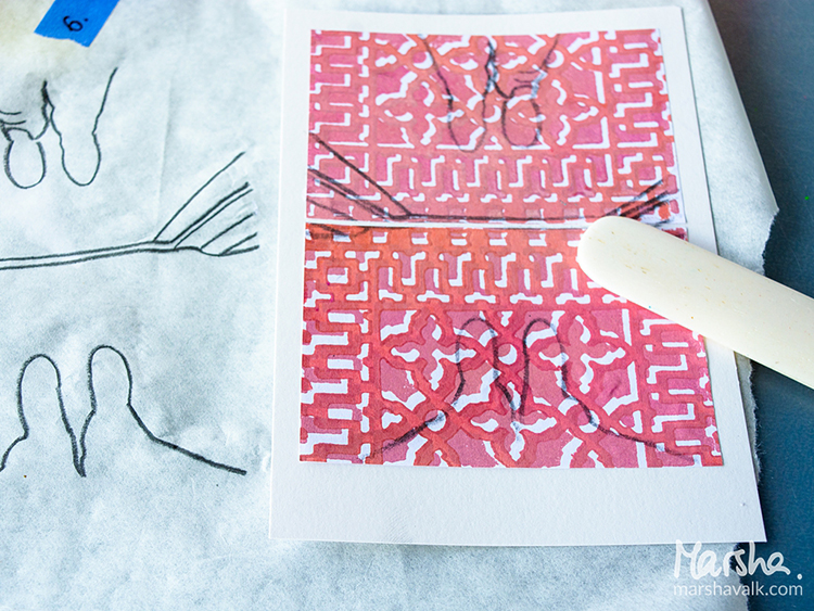
I placed the tissue paper pencil side down on top of the collage and then burnished the pencil lines with a bone folder.

Then I used acrylic paint and paint markers to colour inside of the pencil lines and pastel pencils, Stabilo All pencil and a brush pen to add some shadows and depth.


Thank you Marsha!!! These are just so cool – almost like the drawings from a comic book :) Here are some of the supplies that Marsha used:


Feel inspired? Working on something yourself that you’d like to share?  I love to see how you interpret our monthly themes. Email me how you used my stencils and stamps with the theme and email me an image – I would love to share your projects in my next  “n*Spiration From Around the Globe“.

Leave a comment

This Must Be the Place – Maura Hibbitts


Hi from the Creative Squad! This week we have a sweet 3-page art journal spread from Maura Hibbitts who shares a peek into her local scenery :) Maura uses my Toledo and Crackle stencils, my Marks stamp set, and my Adirondack Chairs stamp to set the scene, and drew inspiration from this month’s theme: This Must Be the Place –We’re all on a journey to somewhere or something. Sometimes we’re just making preparations for simple things like dinner or weekend plans. Other times we’re aiming for bigger goals, bigger places. Whether it’s a location or a state of mind, you’ll know when you get there. Where are you headed?


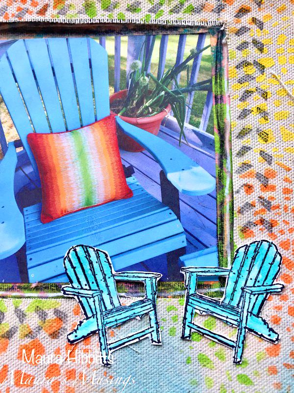
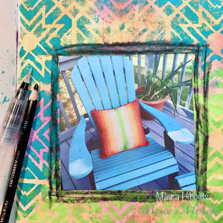
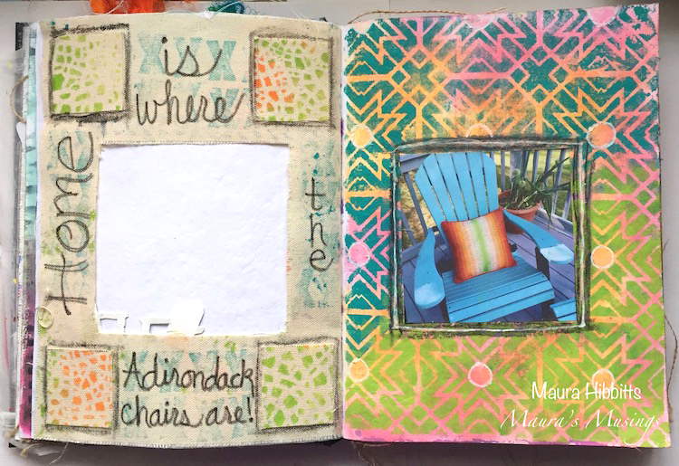
When I saw this month’s theme, I immediately thought of my Turquoise Adirondack chairs on our deck. I am so lucky to have a wonderful view in my work area looking out on our deck, and the Adirondack Mountains. I printed up a photo I had taken in summer of one of our chairs with it’s bright pillow, and used these colors as my inspiration in my art journal. I started off thinking I would create a frame for the photo, but as often happens, my Muse took me on a slightly different path with three pages instead.

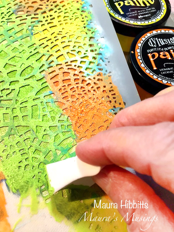
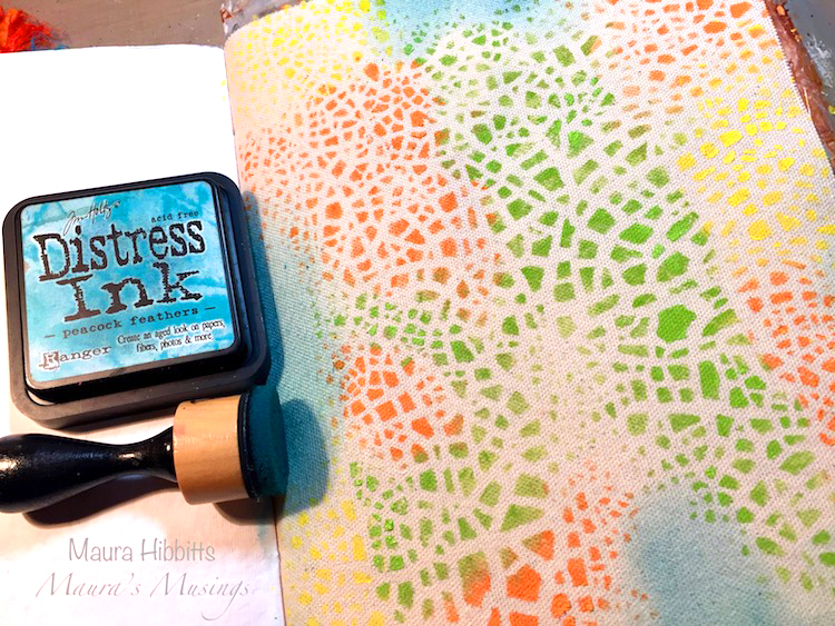
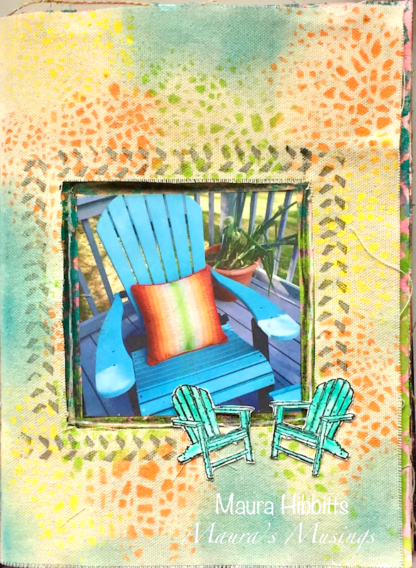
I’m using a Dina Wakley Media Journal which has a mix of pages in it, including canvas. I started by using the Crackle stencil and bright orange, yellow and green paints. I use cosmetic sponges to dab my paint into the stencil. (Tip – you can reuse these when they dry, just cut off the colored end, and you have a fresh sponge)

Next, I sponged on some Peacock Feathers Distress ink with a mini blender in the areas without a stencil design.

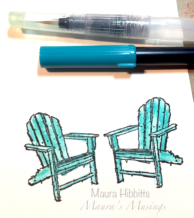
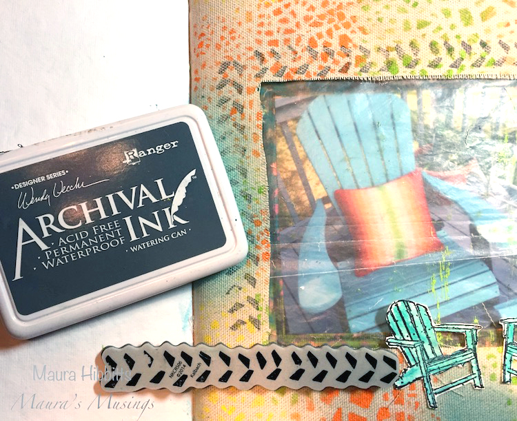
While the paint was drying on the canvas, I stamped the Adirondack Chairs onto watercolor paper, using archival ink. Once the ink was dry, I went in and added some color with a Tombow marker and went over the color with a water brush.

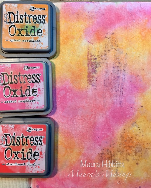
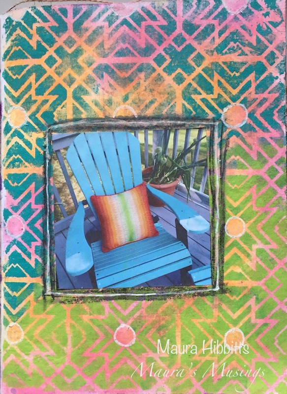
The next page in the journal was a watercolor page, and I used mini blenders and Distress Oxide inks in pink and orange to cover the background. Next, I spritzed it with water, and dabbed it dry.

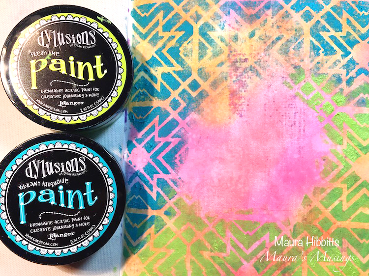
I laid the Toledo Stencil over the inked page, and using a cosmetic sponge, I dabbed on the turquoise and lime paints.

I glued the photo of my Adirondack chair onto this page, then went around it with a Stabilo graphite pencil and then a water brush to make a frame. Once that dried, I added a bit of white highlights on the page with a Posca white paint pen.

For my final steps, I went back to the canvas and cut out the center for the photo to show through. Since I had printed my photo from the computer, I used the copy paper I had cut it out from as a template for cutting, and made a few more snips as needed. On the back of the canvas, I cut the square in four and glued these to the corners, and wrote around the opening with a Pitt pen “ Home is where the Adirondack chairs are”. I used the Marks stamps and went around the frame on both sides of the canvas.

Nathalie’s Adirondack chair stamps were the perfect match to my chairs, and I had fun coloring them turquoise just like mine! When I was looking for pillows for my chairs, I found these which have wonderful contrasting colors that I took as my inspiration for the pages. Truly, home IS where my Adirondack chairs are!


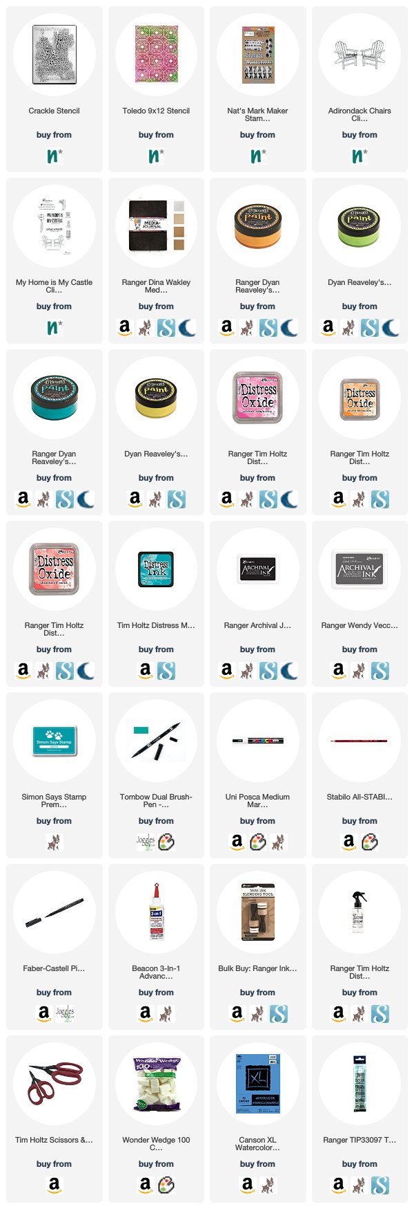
Thank you Maura! Love the idea of making window openings in my art journal! Here are some of the supplies that Maura used:


Play along with us too: I love to see how you interpret our monthly themes. Email me how you used my stencils and stamps with the theme and email me an image – I would love to share your projects in my next  “n*Spiration From Around the Globe“.
SaveSaveSaveSave

SaveSave

SaveSave

Comments (2)

  • Sue Clarke

    |

    I just love this Maura and Adirondack chairs hold a special place in my heart.
    We go on vacation by the lake and there are always these special chairs for me to sit on as I relax/read/and sip on my soy chai latte.
    Thanks for this project!

    Reply

    • maura

      |

      Thanks so much Sue! I love your story about the Adirondack Chairs. There is a big lake in our area, but it’s a few miles away from me, I know it’s out there. I love spending time in my chairs when the weather is good – summer will find me on the deck. Thanks for your sweet comment! Maura

      Reply

Leave a comment

This Must Be the Place – Jennifer Gallagher


Happy Tuesday from the Creative Squad! Today we have a beautiful and certainly inspirational art journal page from Jennifer Gallagher using my Grove Street ArtFoamies, my Kassel stencil, and my Adirondack Chairs and Numerals rubber stamps along with our monthly theme: This Must Be the Place –We’re all on a journey to somewhere or something. Sometimes we’re just making preparations for simple things like dinner or weekend plans. Other times we’re aiming for bigger goals, bigger places. Whether it’s a location or a state of mind, you’ll know when you get there. Where are you headed?


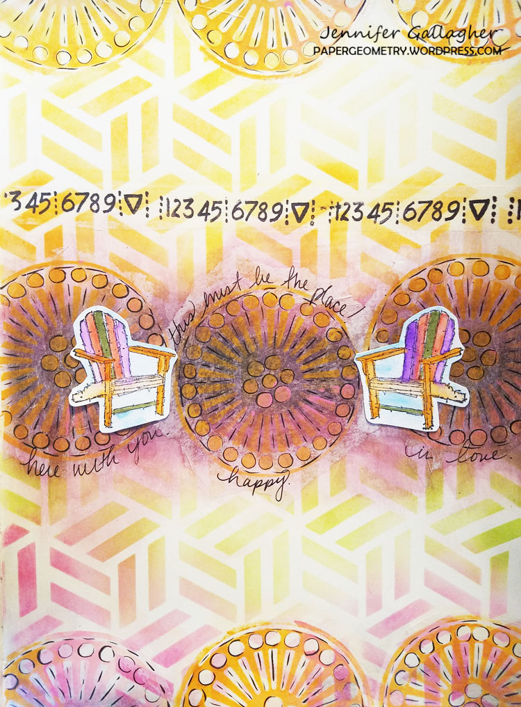
This month the Creative Squad is asking, “Where are you headed?” I am not exactly sure. I focus more on my state of mind and how I feel about my current state of being, rather than worrying over individual goals. Yes, I have goals I want to achieve, but I am more concerned with finding happiness in my personal life, family, and art than I am anything else. And so this month I am saying, “This must be the place.” There is a great amount of peace that comes with loving your life in this moment in time.

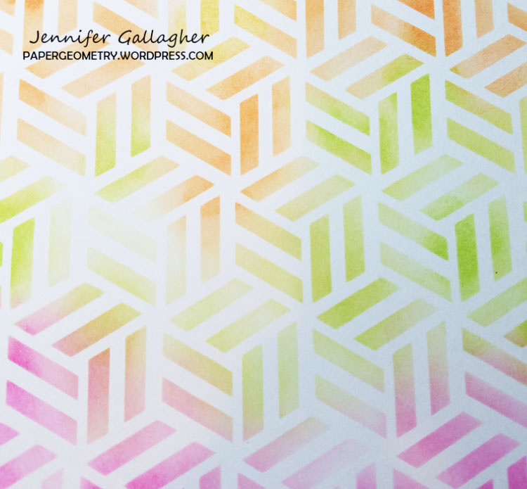
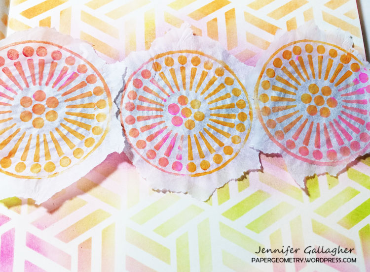
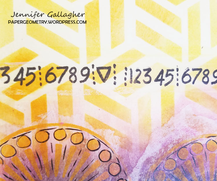
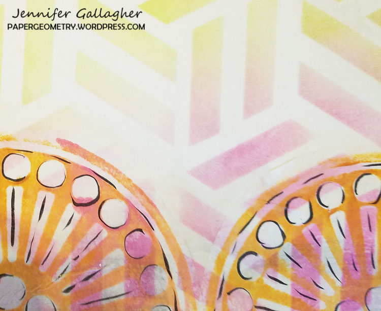
So, this month I want to share with you an entry in my art journal. I wanted this page to reflect the happiness I feel at this moment in my life. You will see this reflected in content and color. Starting off I chose Nat’s Kassel stencil. It’s the perfect design for a fun background. I went with an ink-blended background using my distress inks in twisted citron, carved pumpkin, wild honey, and picked raspberry. This is a very easy technique using your mini-blending tool.

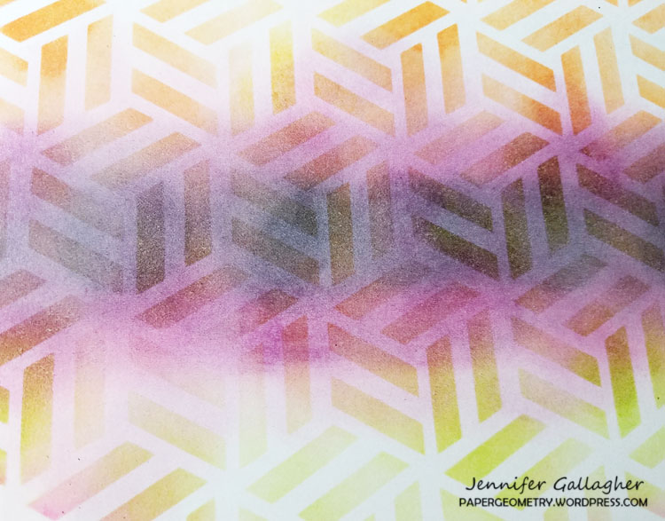
Then, using seedless preserves and black soot, I blended in a dark section in the very center of the page.

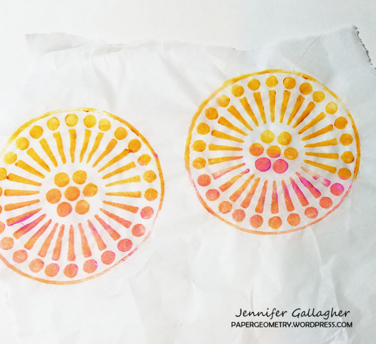
I raided some of my gift wrapping supplies and pulled out a large sheet of plain white tissue paper. I applied some heavy body acrylic paint onto my Grove Street negative and positive ArtFoamies and pressed the designs onto my tissue paper.

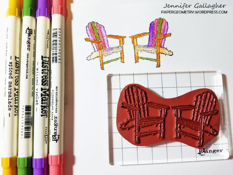
While those were drying, I stamped Nat’s Adirondack Chairs stamp onto some watercolor paper and colored it in with my distress markers.

I chose a few of my Grove Street circles to fit across the center of my page (across the dark stripe). For my journal, I only needed three. Tear or cut the excess tissue paper from around the edges so they don’t overlap. Then using matte medium, fix the circles to your page. If you prefer not to have the dark background behind these circles you can skip that earlier step.

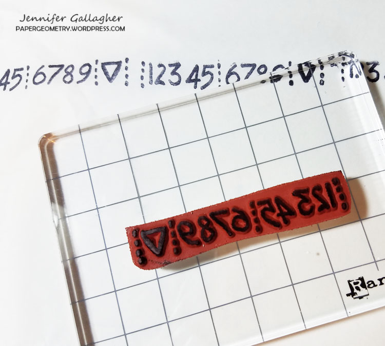
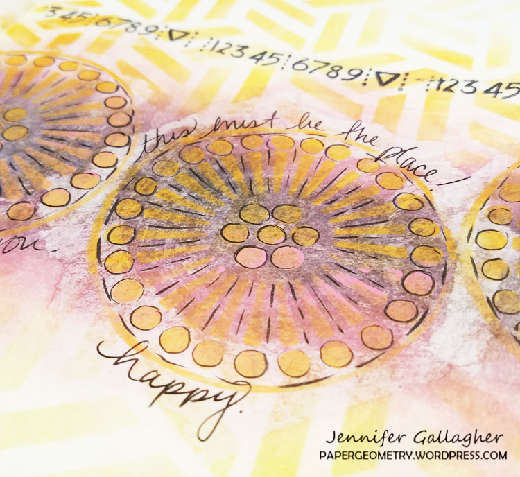
While the matte medium dries, stamp Nat’s Numerals stamp onto white tissue paper in a line.

Cut this strip out. Also, cut out some more of your grove street circles to apply to the top and bottom of the page. Use your matte medium once again to fix these down. Once the matte medium is dry, I used my Sakura gelly roll black pen to add doodling to the circles.

When I placed the stamped Adirondack image onto the page I really felt like the chairs needed to be separated. So I cut the stamped image in two. I added just a touch of handwritten journaling and glued down the chairs. I hope this page inspires you today. No matter your plans, or where you are headed, remember to enjoy your life now. Enjoy each moment.


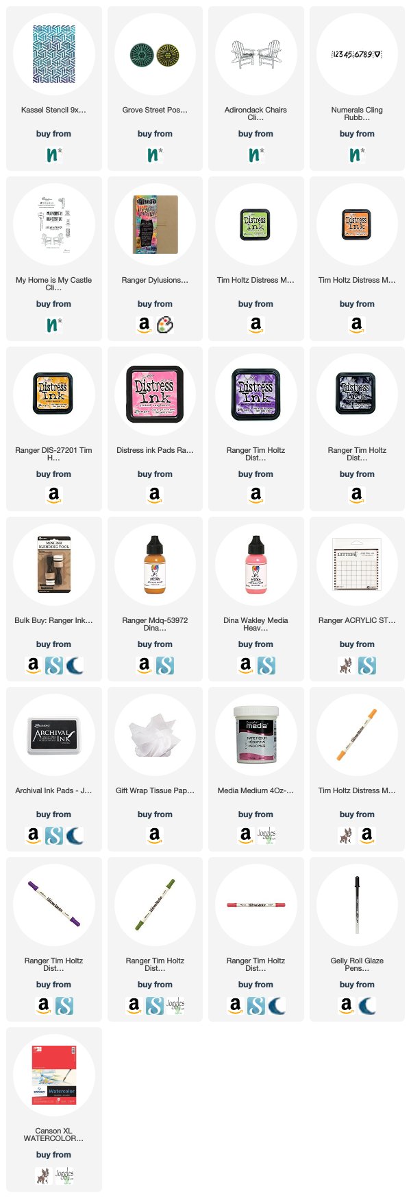
Thank you Jennifer! I love the page and the idea of focusing on the happiness that we have at this moment :) Here are some of the supplies that Jennifer used:


Play along with us too: I love to see how you interpret our monthly themes. Email me how you used my stencils and stamps with the theme and email me an image – I would love to share your projects in my next  “n*Spiration From Around the Globe“.
Leave a comment

This Must Be the Place – Josefine Fouarge


Hello from my Creative Squad! Today Josefine Fouarge is showing us how just playing around can loosen up your creativity and yield some beautiful results. Her tag uses stamps from my My Home is My Castle set, including the Adirondack Chairs and Windows and Door stamps, along with our February theme: This Must Be the Place –We’re all on a journey to somewhere or something. Sometimes we’re just making preparations for simple things like dinner or weekend plans. Other times we’re aiming for bigger goals, bigger places. Whether it’s a location or a state of mind, you’ll know when you get there. Where are you headed?


Even small pieces of art can tell a big story. I love working on tags and playing with the smaller real estate. This one was the perfect size to create some dimension without it looking too busy.

Do you want to hear the story of this tag? Then read till the end ;)

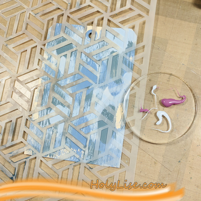
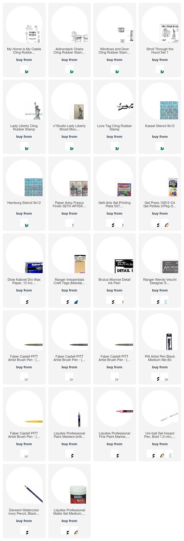
I started with a mono printed background. I used a 5×7 Gel Press and added several colors of PaperArtsy paint on top. The second layer uses the same technique, but in a slightly different way. This time I used one of the Petite Gel Press plates and added the paint through Nat’s Kassel and the Hamburg stencils. First the round one and then again with a square plate. While I was at it, I created a few more backgrounds on sandwich paper, some of them which I used for this project later on.

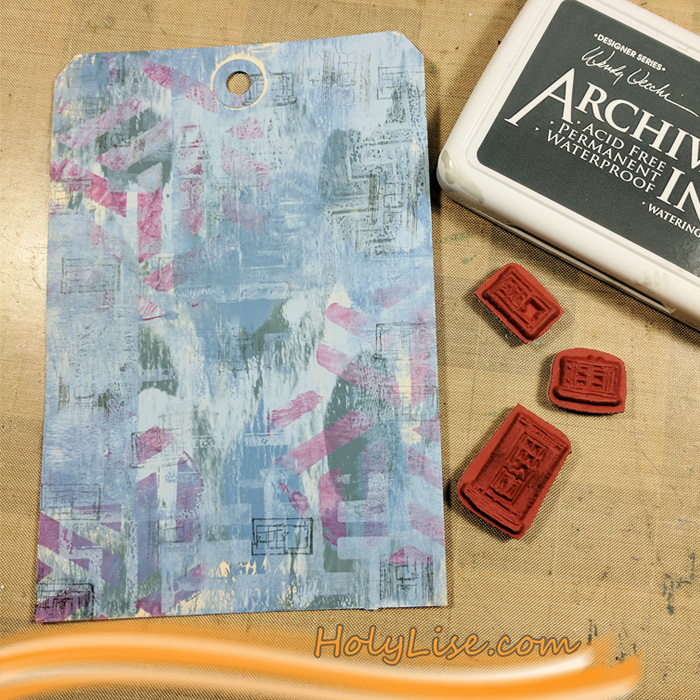
So far, I was “just playing around”. That’s what I like about mono printing – you don’t need a goal. But here I started to see what I wanted my project to look like. I was envisioning a porch with other houses and a scenery in the background. I didn’t want to stamp actual houses, so I created the idea of them by stamping the Windows and Door from the My Home is My Castle set.

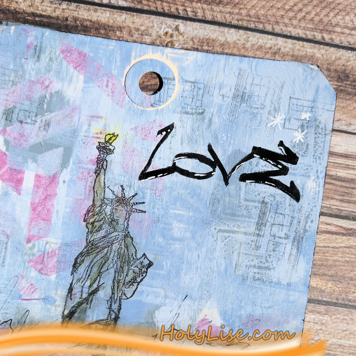
I needed something in the background though. After looking at all the houses and buildings from Nathalie’s stamp sets, I picked Lady Liberty. I stamped her with black ink and colored her lightly with Pitt pens in grey and green.

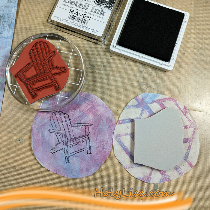
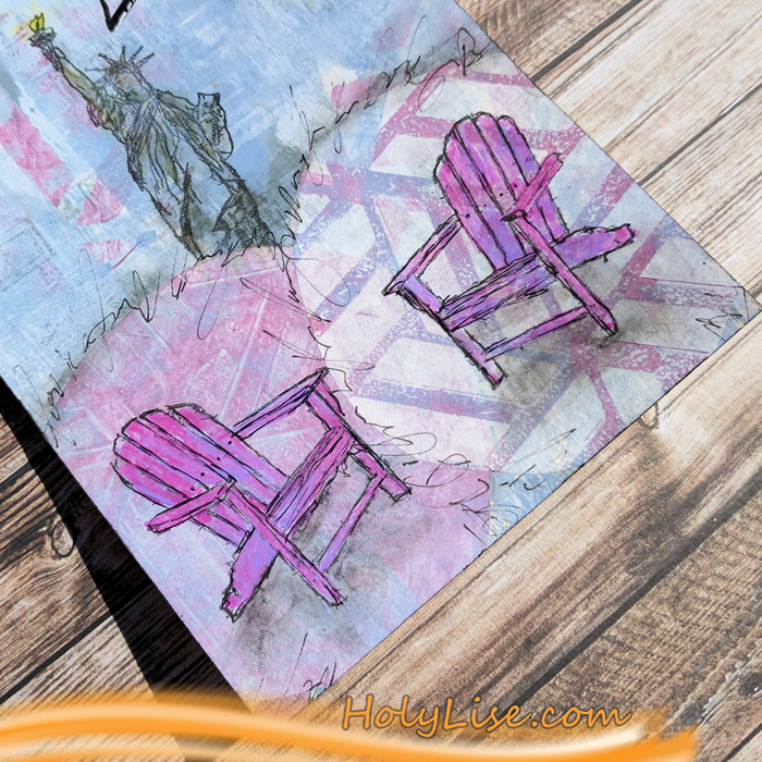
Then I cut out a few circles from the other backgrounds and stamped Nat’s Adirondack Chairs on two of them. I adhered both to the bottom of the tag and colored the chairs with Liquitex Paint pens.

I added some shadows around the chairs and the circles and scribbled a love poem from Shakespeare around the circles as well.

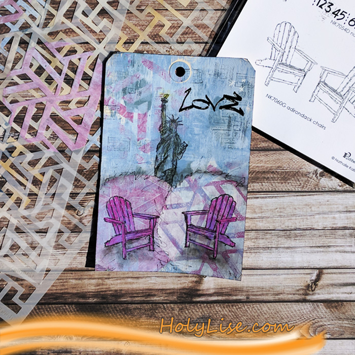
Now that I had my porch with the two Adirondack chairs I needed a sentiment. I imagined an old couple sitting on that porch, enjoying their lives together. They have seen everything they wanted and are now spending the rest of their days together, just the two of them. “This must be the place.” Yes, the Love sentiment was the perfect finishing touch.

Here is the finished project. Can you see them sitting there, smiling?

Thanks for stopping by. See you next month  :)


Thank you Josefine – your story made us feel very warm and fuzzy! Josefine used the following supplies in her project:


Play along with us too: I love to see how you interpret our monthly themes. Email me how you used my stencils and stamps with the theme and email me an image – I would love to share your projects in my next  “n*Spiration From Around the Globe“.
Follow our new Creative Squad page on Instagram @NatsCreativeSquad and see even more projects from our awesome team of artists!

Comments (7)

  • Seth

    |

    Thanks for choosing my colors here Josefine. The tag looks mighty fine!

    Reply

  • maura

    |

    Great tag and love the story you wove in to it Josefine! Maura

    Reply

  • Clavell

    |

    I love the ‘story’ you wove into this tag…very sweet and very clever!♥

    Reply

    • Josefine Fouarge

      |

      Thanks :) that’s what I imagined while creating the tag ;)

      Reply

  • Sue Clarke

    |

    LOVE these colors together Josefine!

    Reply

Leave a comment

This Must Be the Place – Marsha Valk


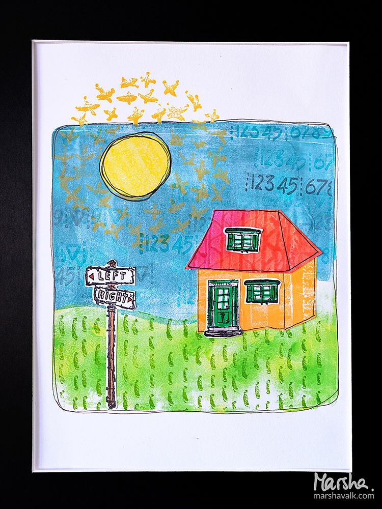
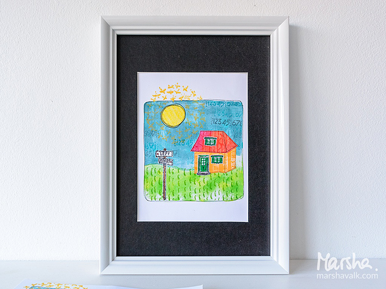
Welcome to the Creative Squad! This week Marsha Valk is sharing with us her awesome technique for creating a project based on our new theme: This Must Be the Place –We’re all on a journey to somewhere or something. Sometimes we’re just making preparations for simple things like dinner or weekend plans. Other times we’re aiming for bigger goals, bigger places. Whether it’s a location or a state of mind, you’ll know when you get there. Where are you headed? Marsha is using stamps from my My Home Is My Castle set, Embroidery set, and Cardboard set. I just love watching her in action in the video below!


I don’t know where I’m heading, but I do know how I want to feel when I get there. It could easily take a lifetime to arrive because goals and places always shift. You may think that this will be the place but it might turn out it isn’t what you thought it would be once you’re there. Or you’ve grown and evolved in the meantime, and the next place is already on the horizon.

So for this month, I decided to use supplies I want to keep in my suitcase while moving forward. Because where ever I’m headed right now I’m sure I’m going to need mono printing materials, stamps, an ink pad, a pair of scissors, glue and a black fineliner.

Watch me create this page!


Thank you Marsha! Absolutely loved watching your process and seeing all those stamps being used for all kinds of visual texture! Here are some of the supplies that Marsha used:


Play along with us too: I love to see how you interpret our monthly themes. Email me how you used my stencils and stamps with the theme and email me an image – I would love to share your projects in my next  “n*Spiration From Around the Globe“.
Follow our new Creative Squad page on Instagram @NatsCreativeSquad and see even more projects from our awesome team of artists!

SaveSave

SaveSaveSaveSave

Comments (2)

  • maura

    |

    Delightful scene, Marsha! Love the bright happy colors! Maura

    Reply

    • marshavalk

      |

      Thank you Maura! It was super fun to create!

      Reply

Leave a comment

My Home is My Castle – Maura Hibbitts


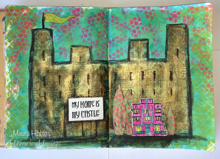
Hello from the Creative Squad! Today we are super happy to introduce to you our newest member: Maura Hibbitts! Maura is a master of colorful layers and we are so happy she will be with us to share some of her projects. Today she brings us an art journal spread with tons of yummy texture. Maura uses my Stroll Around the Block stamp set, the My Home Is My Castle cling stamp, my Santa Fe foam stamps, and my Toledo stencil. She is also working from this month’s theme: My Home is My Castle – Home means many different things depending on who you ask and where you are in the world. This month we’re thankful to have a place to call home, a place where we can rule and be King – or Queen :) – of the castle!


I am honored and excited to join you this month on the Creative Squad!

When I started thinking about this month’s theme, “My Home is my Castle”, I started to imagine a castle behind my own little house. There are so many sayings that relate to this idea, like Queen of the castle (me, I guess), or a man’s home is his castle (hubby), that I knew where I wanted to head with this. In real life, I am glad I don’t live in a huge, drafty castle that I would have to clean, as housework is a much lower priority than creative work.

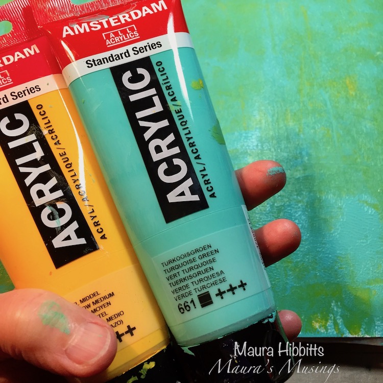
I headed to my big Dylusions art journal, and squirted on some yellow and turquoise paint and blended it together with a brush. While the paint was still wet, I closed the book and pressed the pages together. Open them up immediately and let dry to create a nice texture.

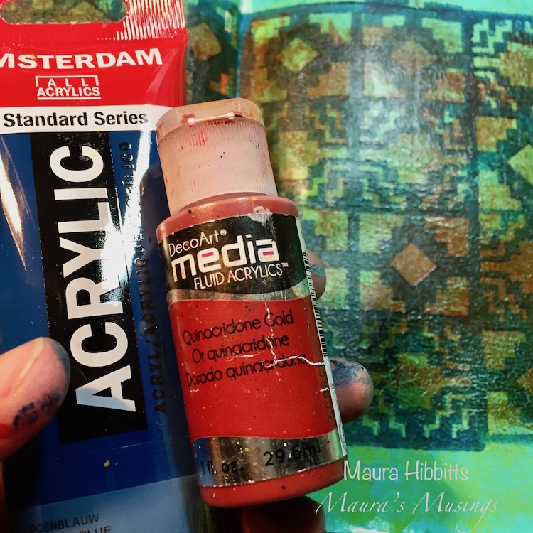
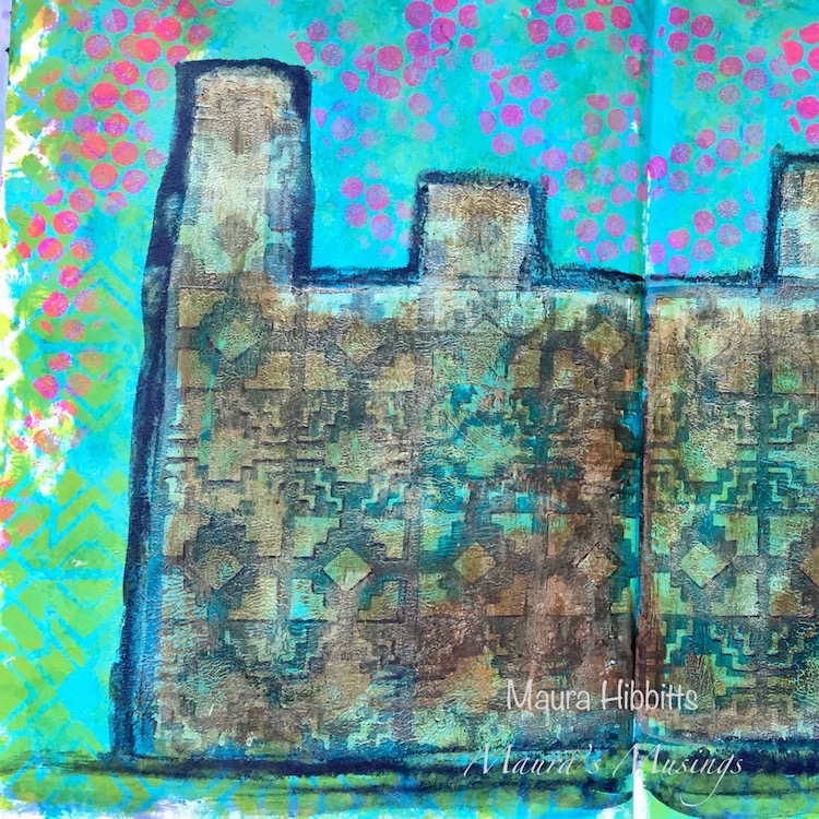
Next, I used dark blue paint with a brayer on the Art Foamies large Santa Fe stamp and stamped a repeating pattern across the pages to create the main part of the castle. Then, I used the small Santa Fe stamp to make the upper part of the castle. Once that dried, I went over the castle with Quinacridone Gold.

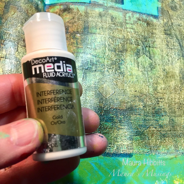
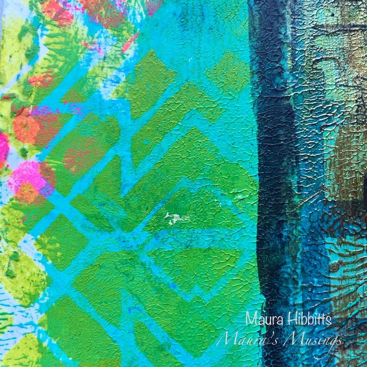
I wanted to add a bit of a dreamy quality to my castle, so added a layer of Interference Gold. I like how this brought out more of my paint texture too. I also added bright green with the Toledo stencil around the edges of my pages.

I outlined the castle with a graphite pencil and went over it with a water brush, and added in some window slits and an entrance. Using bright pink paint with the Wired stamp, I added pops of color for contrast, and also stamped some color pops onto a sheet of green card stock for later use.

Here’s a closeup of the colors and textures on the page.

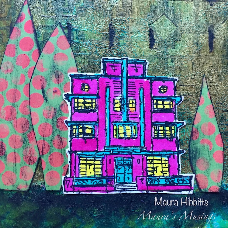
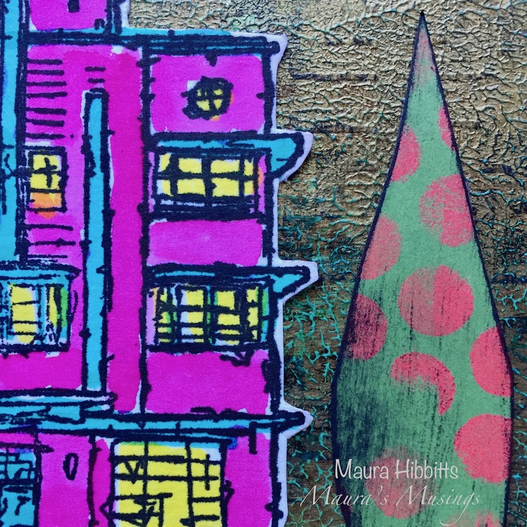
I chose Nathalie’s Art Deco home stamp for my pages, so I could use bright colors on it. I was thinking of those wonderful turquoise and pink homes in Florida (maybe because it is so darn cold here). I stamped it onto watercolor paper, added color with watercolors and markers, then fussy cut it out. I cut out a few funky trees with the paper I’d previously stenciled, and distressed them a bit with black ink.

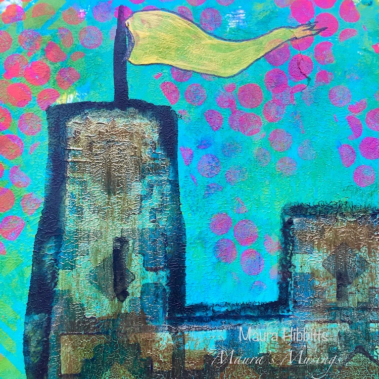
Of course, I had to add a flag flying from one of the turrets of the castle. I painted it in yellow and went around it with a black pen.

Behind each of our homes, whether an apartment or house, is the castle of our imagination. I hope you’ve been inspired by my art journal pages to create your own awesome project!


Thank you Maura! I love that cute little pink Art Deco house in front of the giant castle :) Here are the supplies that Maura used:


Play along with us too: I love to see how you interpret our monthly themes. Email me how you used my stencils and stamps with the theme and email me an image – I would love to share your projects in my next  “n*Spiration From Around the Globe“.
 

SaveSave

SaveSave

Comments (1)

  • Joi@RR

    |

    CONGRATULATIONS Maura. What a great addition Nat!!! Loved your creativity – your home/castle are WONDERFUL. Super textures too!! Xj.
    Reply

Leave a comment