A couple weeks ago Kim and I went to a lecture about Marbling Paper at Kremer Pigments in NYC. It was a great lecture by Sarah Oppenheimer and I learned a ton.
While I love the Western style of paper marbling I was totally taken by Suminagashi – which is the Japanese paper marbling technique where you basically float sumi ink on top of water.
We couldn’t try the technique ourself since it was a lecture and demo but I knew I had to try this at home.
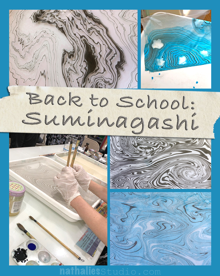
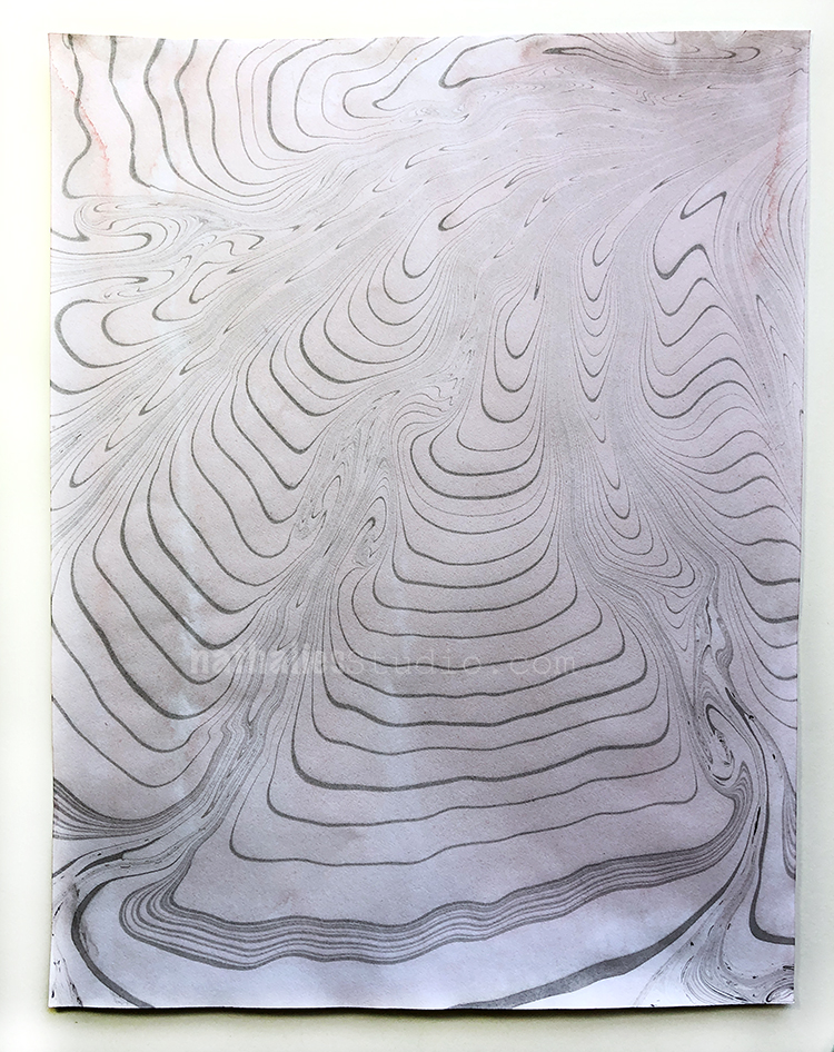
The pictures you see – starting with the one above are all from my second try. The first try was a total disaster and I didn’t take photos because basically I just used “bad words” and tried to figure out what was going on. My ink would mostly blob to the bottom of the container , the ink would just run off my paper …water everywhere- ink everywhere – you get the picture.
But ..of course I wouldn’t give up – after some digging for information of what possibly could have gone wrong and some research and reading I was ready for the second try and that was wayyyyy better.
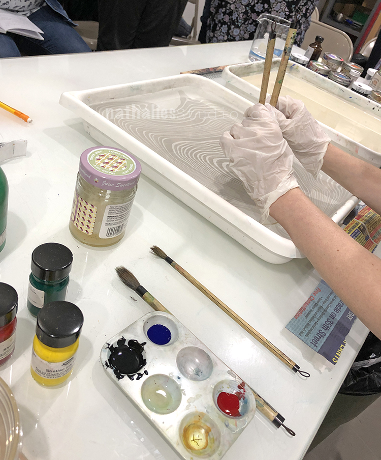
For this second trial I used Sumi Ink – which is the black ink you see in the pictures as well as some Shellac Inks by Kremer Pigments. You also need a surfactant (which can be watercolor medium, dishwash soap, a marbling surfactant, soap nut ….and it is a trial and error to see how well they work) and two or more Sumi brushes. The problems of my first trial were a mixture of wrong surfactant and also dipping the brushes way too far into the water.
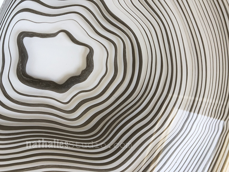
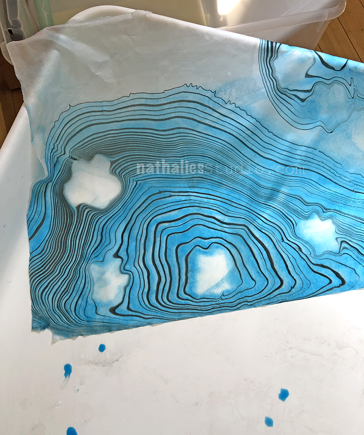
Basically you start with for example two or three brushes- here in the picture above you see a sample where I worked with three brushes . One will be dipped into the surfactant and the other ones in ink. Then you patiently dip just the very tip of the brush onto the water surface and alternate between the brushes – meaning between the colors and the surfactant.
At some point you will have tons of rings on your water surface and you can then either manipulate the “design” with some “wind” – meaning carefully blowing the surface or using a hair of your scalp to go through it. Then you lay paper -preferably washi paper on top of the surface and slowly pull it off.
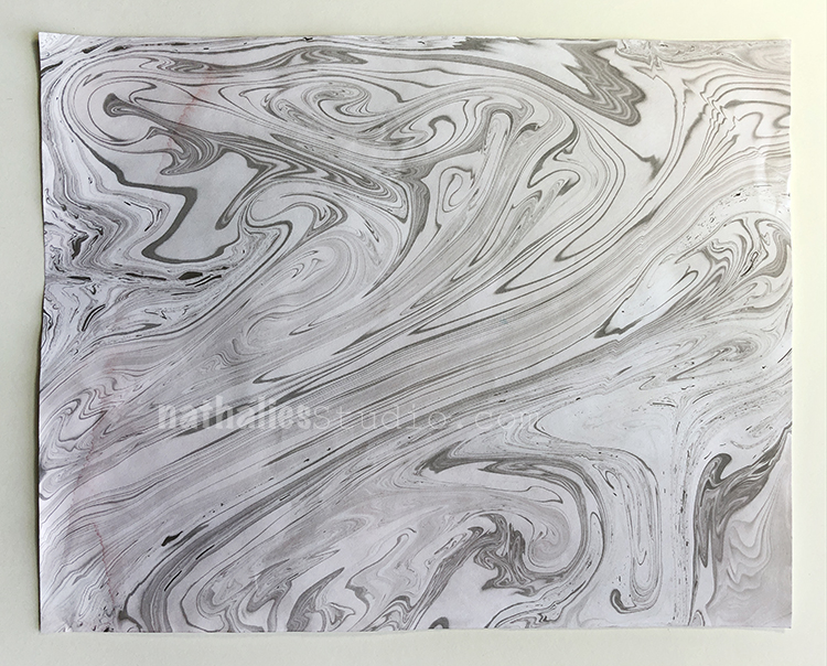
Does that sound stressful to you? LOL- not at all- all good. The washi paper as the one above was my favorite result but also the most complicated to handle. Taking it off of the water and not ripping it – not folding it and just handle it in any normal way was sooo tough – little bit of stress here …but I think next time and with more practice that will work well. Having some non-washi paper on hand definitely helped.
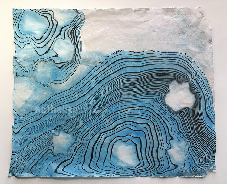
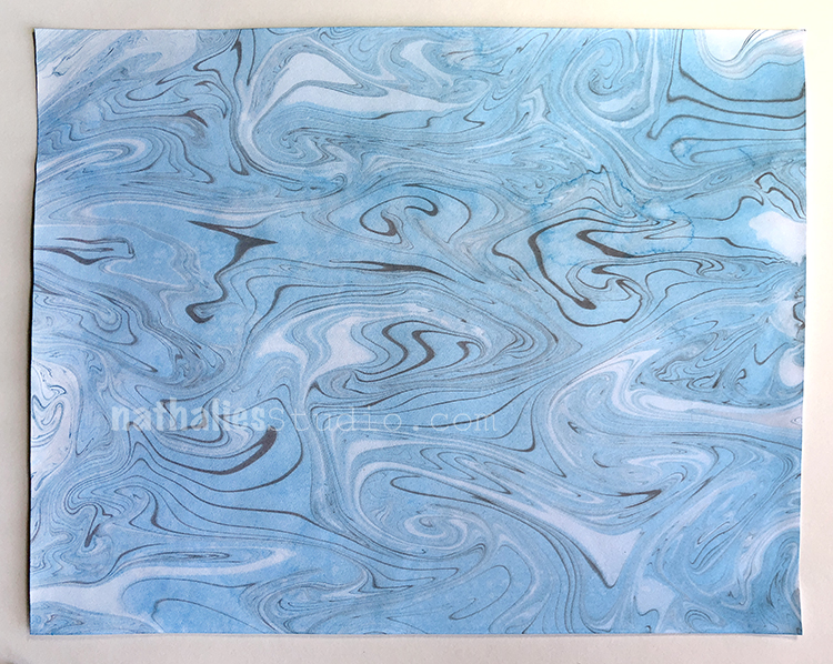
Look at the gorgeous pattern and the texture of the washi paper- I cannot wait to use this as collage paper but that will take a bit hahahah- I need to pet it a bit more before i can let go ;)
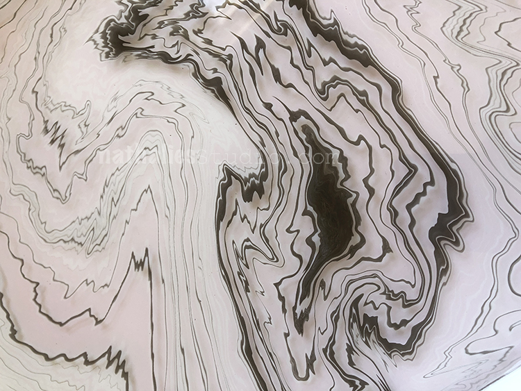
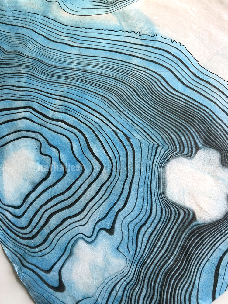
The one above was after I blew onto the surface before adding the paper on top – I love how the rings just went nuts and zig-zaggy . BTW this was done with red and black ink. The colors will always be very very washed out and muted, which is the charm of this. For me this creates so many opportunities to incorporate the paper into my artwork without being overpowering.
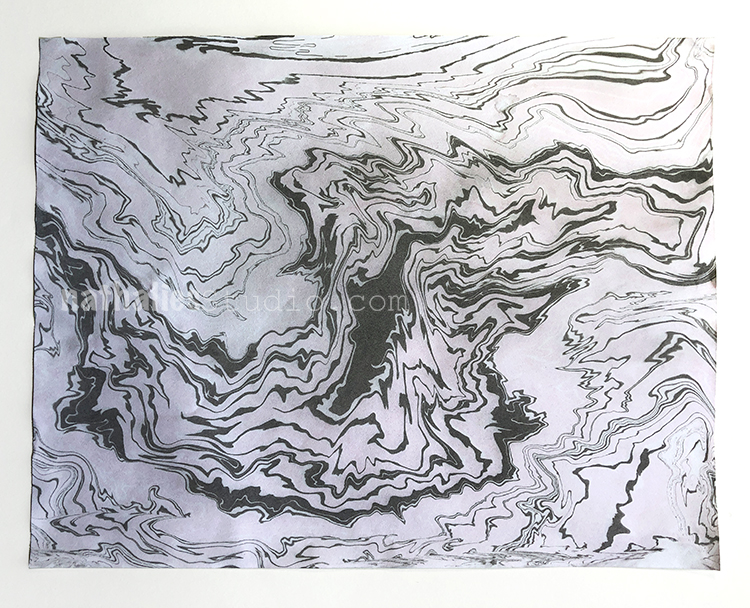
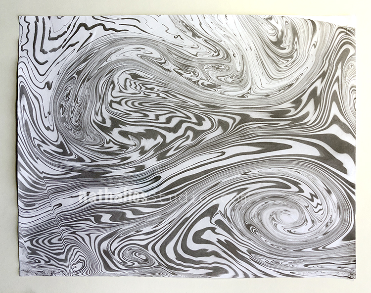
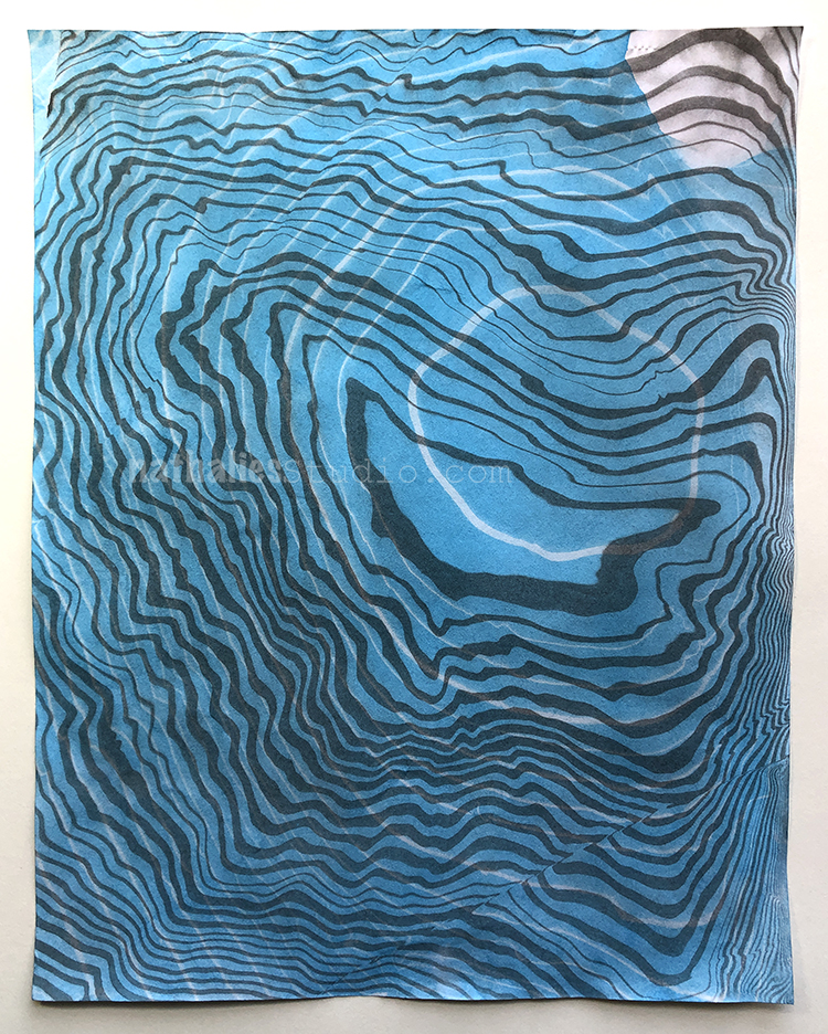
For this one above I used a hair of mine and swirled it through. Apparently the oil on your hair makes sure that the rings won’t get interrupted as it would if you would use something else like a comb – but don’t quote me on this- I haven’t tried a ton yet because I first wanted to get a feel of how things work …without having the ink coming off the paper or just sitting in the bottom of the tray.
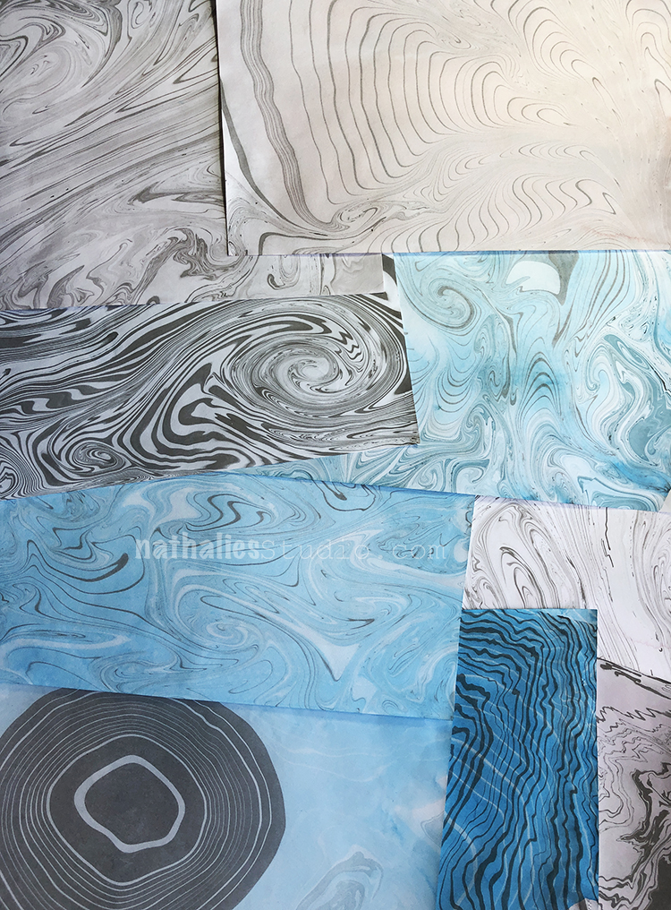
It was so much fun and I love the couple papers I made with my first sitting. I could have done way more papers but the problem was basically space – next time I def. have to set myself a bit better up – close to the sink and also with some better space for the paper to dry.
I would also love to try some other colors and actually also different inks- for example also acrylic inks. I am not sure if it will work but hey – that doesn’t stop me ;)
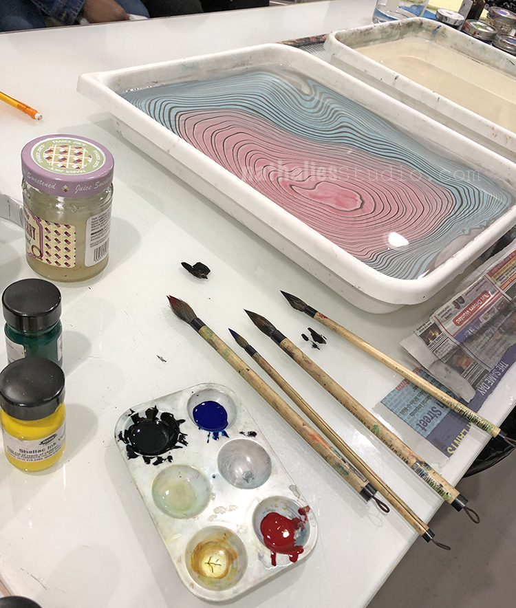
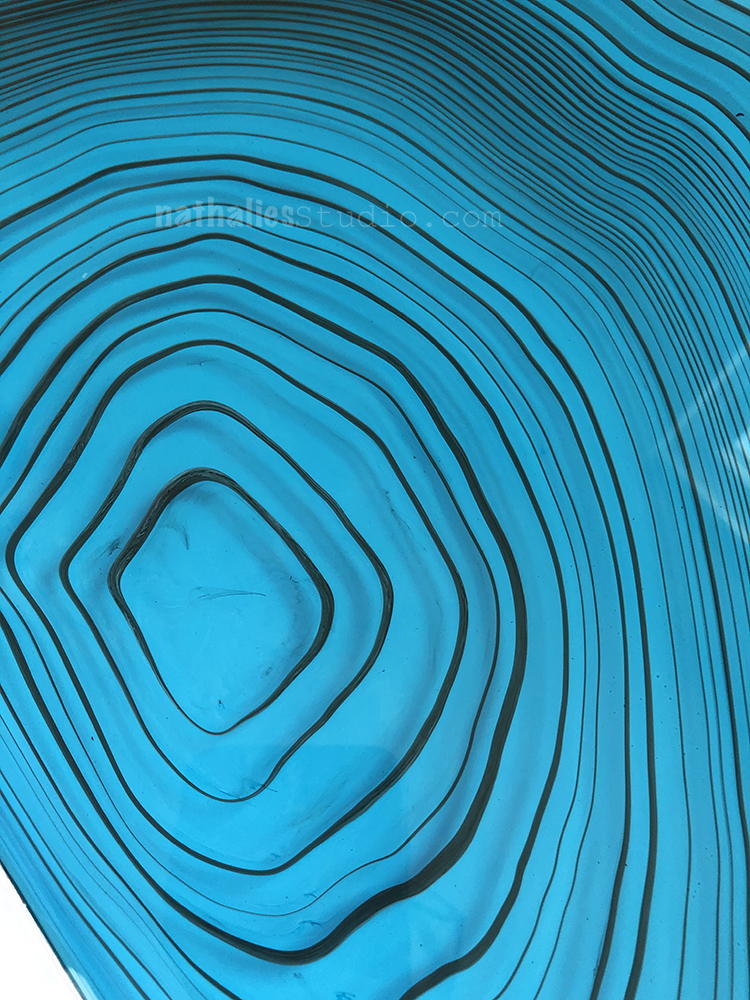
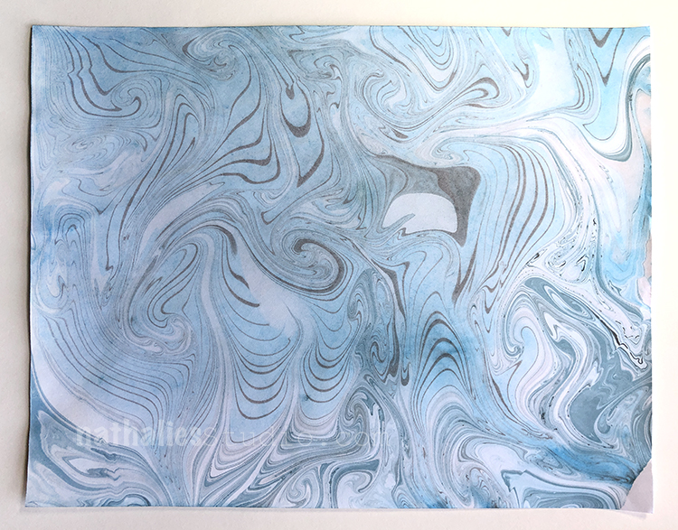
The blue came out quite nice
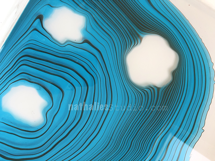
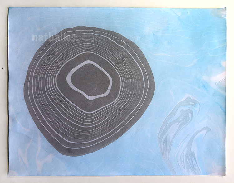
And then this one – I pulled the blue ones on the top and then instead of cleaning and skimming the water right away I added some black ink with surfactant and then printed again – I love the result.
The one on top is a layered print – first I printed black and white and then blue and white on top . I love it- but have to practice this also a bit more to get some better prints.
And there you go – a pile of paper that I love. I cannot wait to do this again. If you want to try it yourself find different videos about Suminagashi – and start maybe with a small container and dishwasher soap and see if it works – It seems to be quite a trial and error if you do not want to dive right away in the “traditional right way” but I have to say – I enjoy that journey because that gives me the possibility to adjust to my own needs and to what I have.
I cannot wait to show you some art journal spreads I used them for.
Do you like those prints and how could you see yourself using them?
Nathalie, this is so cool. Did you do some journaling with them? Also did you ever try acrylic inks. I just saw this post recently and am intrigued. I have tried marveled paper but never this.
I love that you have documented your experiences so well. I would love to see an update . Surely you’ve had lots of practice since . Where did you get those lovely white trays that you are working in.. seems so much better than the clear plastic bins that I have been using…
Nat, I loved your papers.. I have done suminigashi before and here are some suggestions: PAPER-Masa and Canson’s Mi Tientes work well. You can get both at Dick Blick. To dry your paper try blotting your print (don’t rub, blot) with paper towels with no pattern on it like Viva or blotter paper. Your print will dry in about 15 minutes if you blot it first. INK-acrylic inks will not work with plain water. You must use a thickened water like for regular marbling and you must put a mordant on the paper to make it stick. You can use printer’s ink or India ink but you will need to thin it with a dispersant. A good source for Sumi ink in colors is a small kit you can get either at Dick Blick or Amazon. Search for Suminagashi and the kit should appear. Blick also has a nice tutorial on their web site. Hope these tips help and have fun with suminagashi.
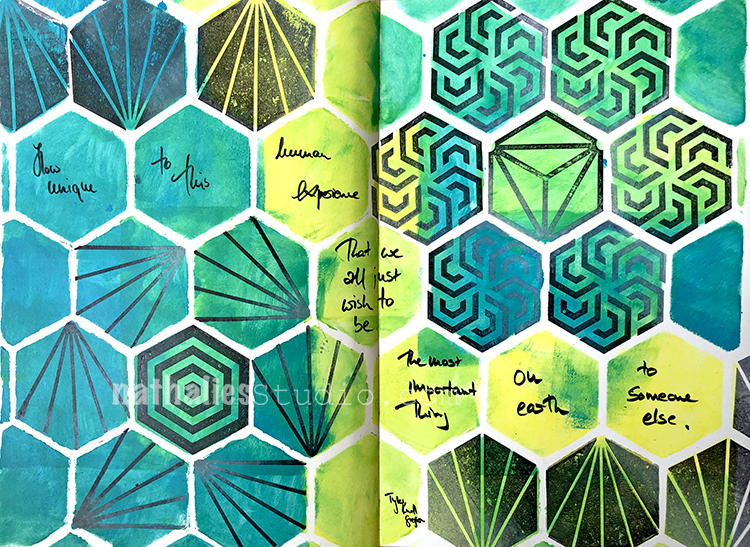
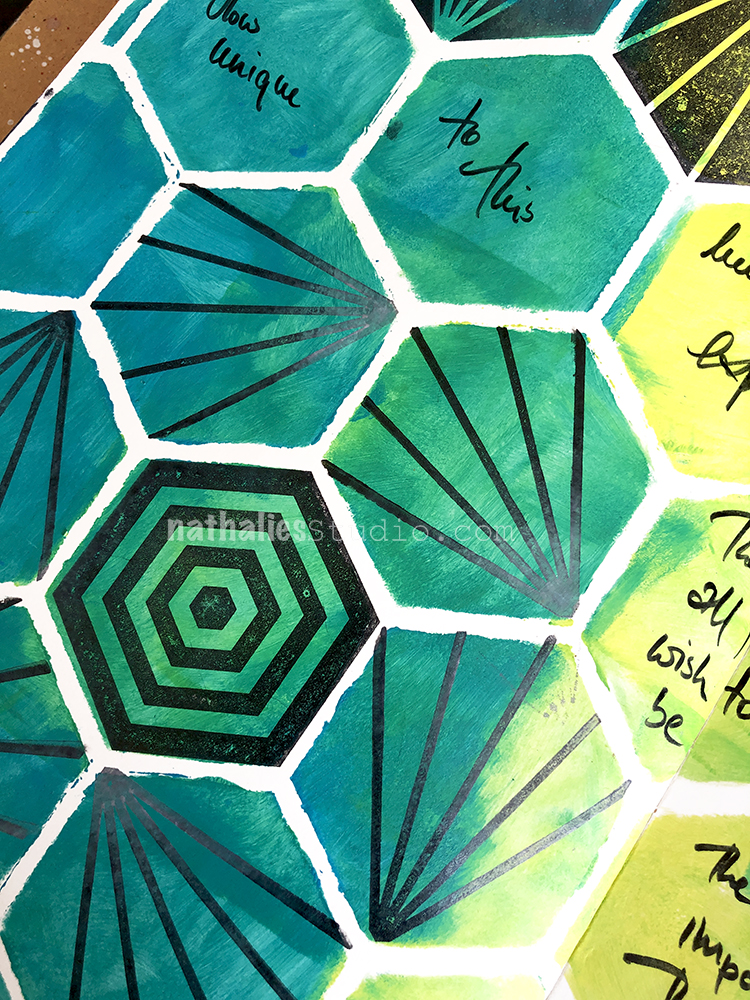
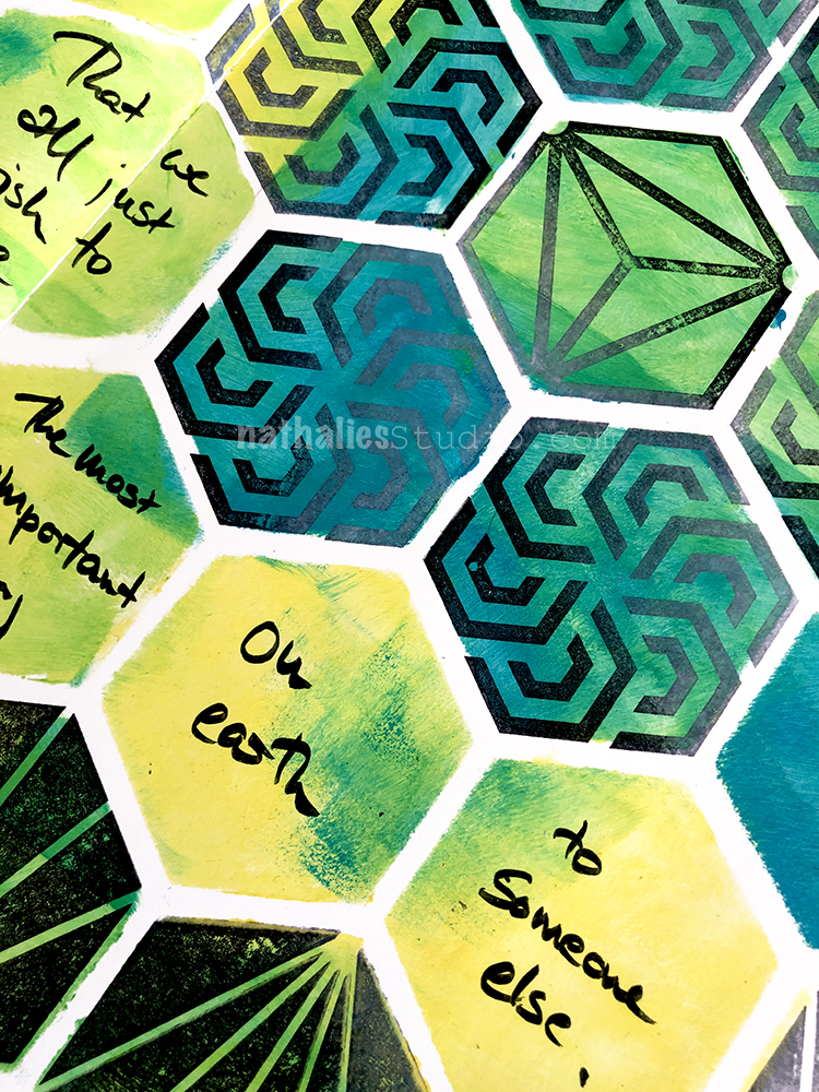
Hello from my Creative Squad! Today we have a post from Marsha Valk and she takes us on a journey into the mind of an artist – to show us how a theme can prompt a thoughtful art journal page. She is using my Hex Large set, Fan-fare, and Hex Small rubber stamps and this month’s theme: Hex Marks the Spot –In the days of pirates and lost treasure, a map would lead you to gold and jewels. Today we treasure all sorts of things – our family, friends, experiences, meaningful objects, accomplishments, etc. Think about what you treasure and how you found your way there.
This month’s prompt made me intensely sad. Somehow to me, to treasure something is like trying to prevent sand from slipping through your fingers.
Change is constant. People disappear from your life, things break, or an event can make you see things in a completely different light. Even you change.
I truly realized this during my scrapbooking years: as soon as I scrapped about something precious, things changed, broke, got lost, went away or something happened that just changed everything. I’m not even kidding. I’m not saying I jinxed things by scrapbooking about them, but documenting everything did make me painfully aware of all of the changes and losses.
I’m not sure why the prompt made me steer down memory lane via the sad route. Maybe it’s because our neighbours are moving house, perhaps it’s because last week two huge trees that have dominated my view for twenty years were cut down or maybe it’s PMS… Things you treasure disappear all the time, and there is nothing you can do about that.
Good thing I know the perfect remedy for sad moods. It’s called ‘art journaling’. ;-)
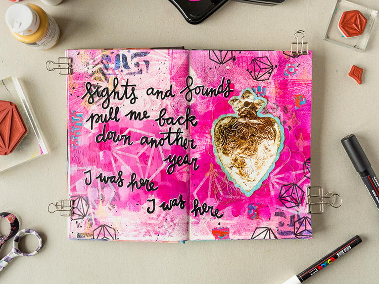
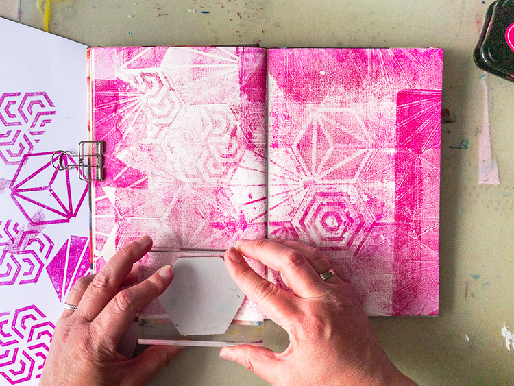
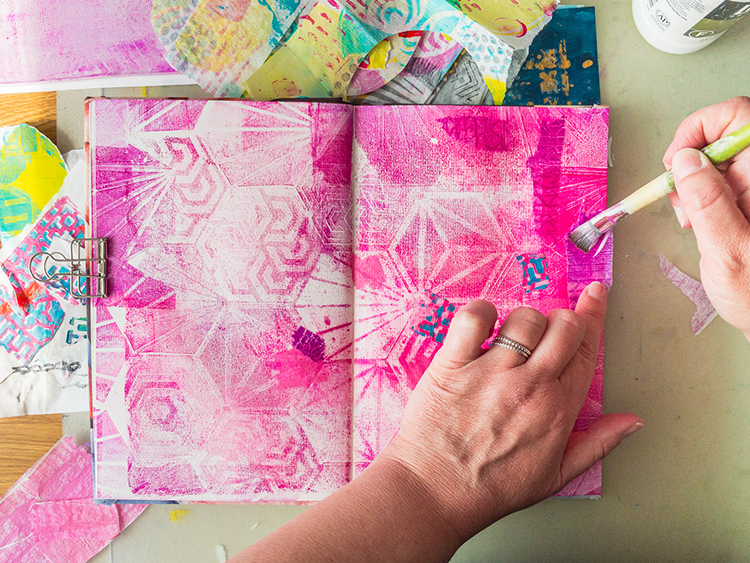
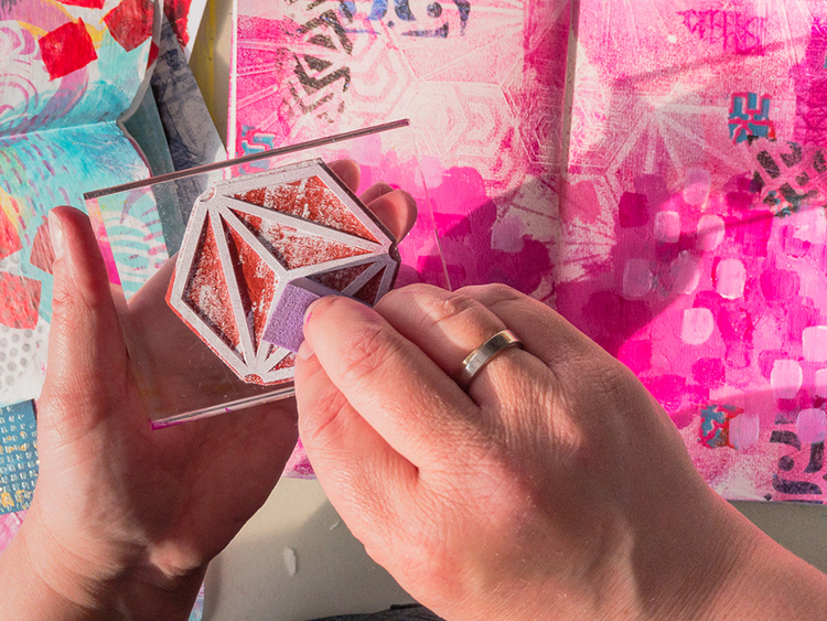
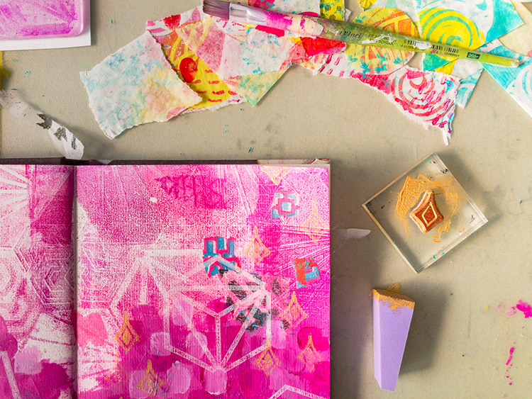
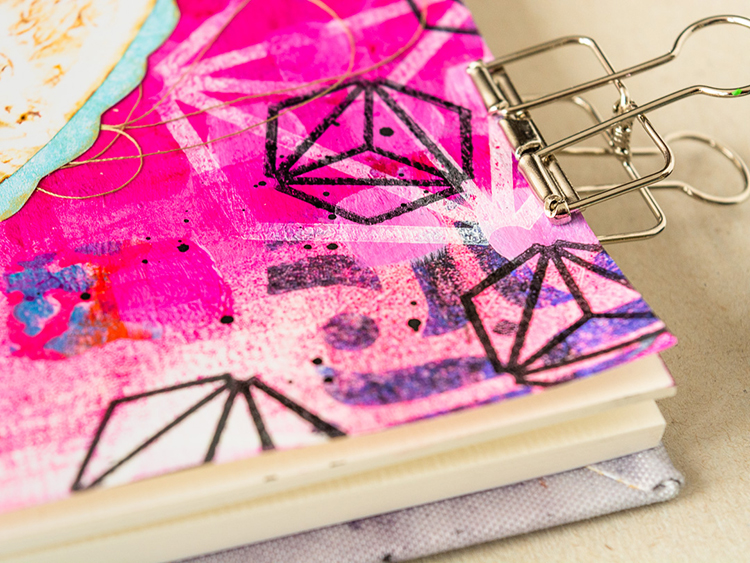
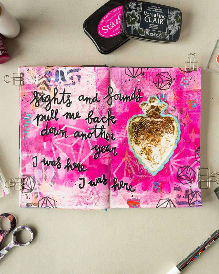
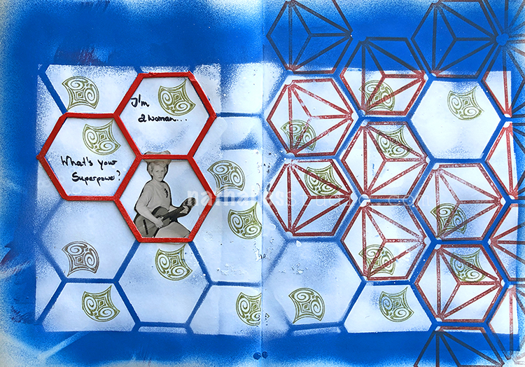
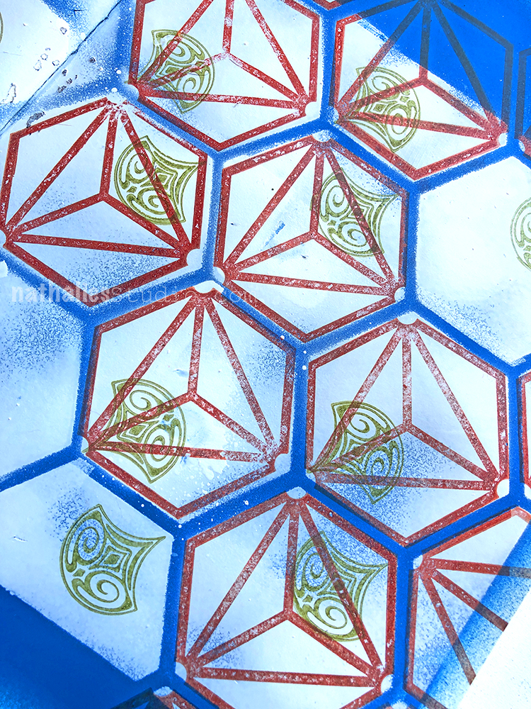
For the background, I applied StazOn to my gel printing plate. Then I used Nat’s Hex Set Large stamp set to make marks in the ink. I pulled a print directly into my journal and used the leftover ink on the plate and a few stamped hexes to fill any of the remaining white spots.
Next, I browsed through my folder of scraps leftover from previous projects using Nat’s products and I pasted some of them to my page with Matte Medium.
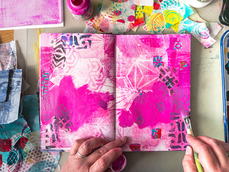
Then I randomly applied magenta and white paint with a brush.
I stamped on top with the Diamond Hex Positive and white paint, and I also added a couple of diamond shapes from the Fan-fare set in gold paint, because what’s a treasure without gold!
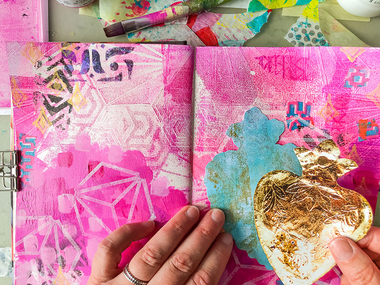
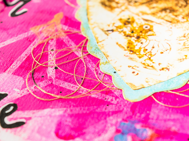
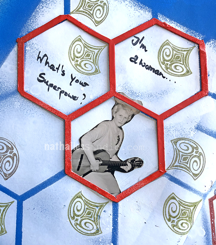
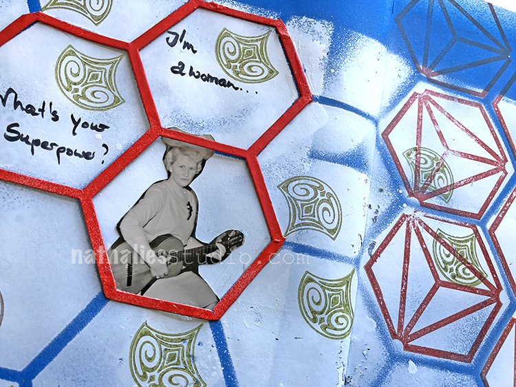
I remembered that I had also had a cutout of a gold heart in my collage stash, so I pasted that to a painted scrap of paper that I cut to the shape of the heart.
I tucked some sewing thread under the heart before adhering it.
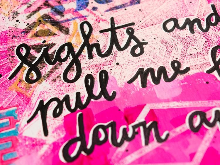
Then I wrote part of the lyrics to ‘Gold Dust’ by Tori Amos on the page, added black splatter and pulled the page spread together by stamping a couple of small Diamond Hex Positives in black ink.
Thank you Marsha! What a beautiful page and love that you used your art journaling to help work through all that. You can find all of my rubber stamps in my online shop. In addition to the gold heart collage element and the sewing thread, here are some of the other supplies Marsha used:
Feel inspired? Working on something yourself that you’d like to share? I love to see how you interpret our monthly themes. Email me how you used my stencils and stamps with the theme and email me an image – I would love to share your projects in my next “n*Spiration From Around the Globe“.
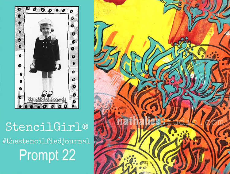
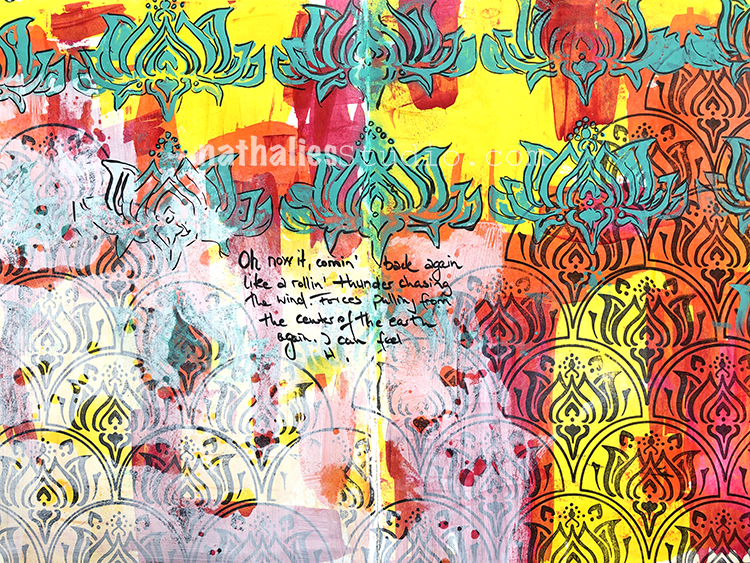
My wonderful friend Tina Walker is at it again – she invited several people to join her Stencilfied Prompts. The prompts are music related and each week she is posting a song. You can be inspired by the lyrics, the video, the album cover or anything related and the only restriction is that you have to use StencilGirl Product Stencils. Here is my take on Prompt 22
This time the song was Lightening Crashes by Live – a grunge classic you could say. And although it is a bit of a bummer, I chose some lyrics and went for powerful colors and a vibrant spread.
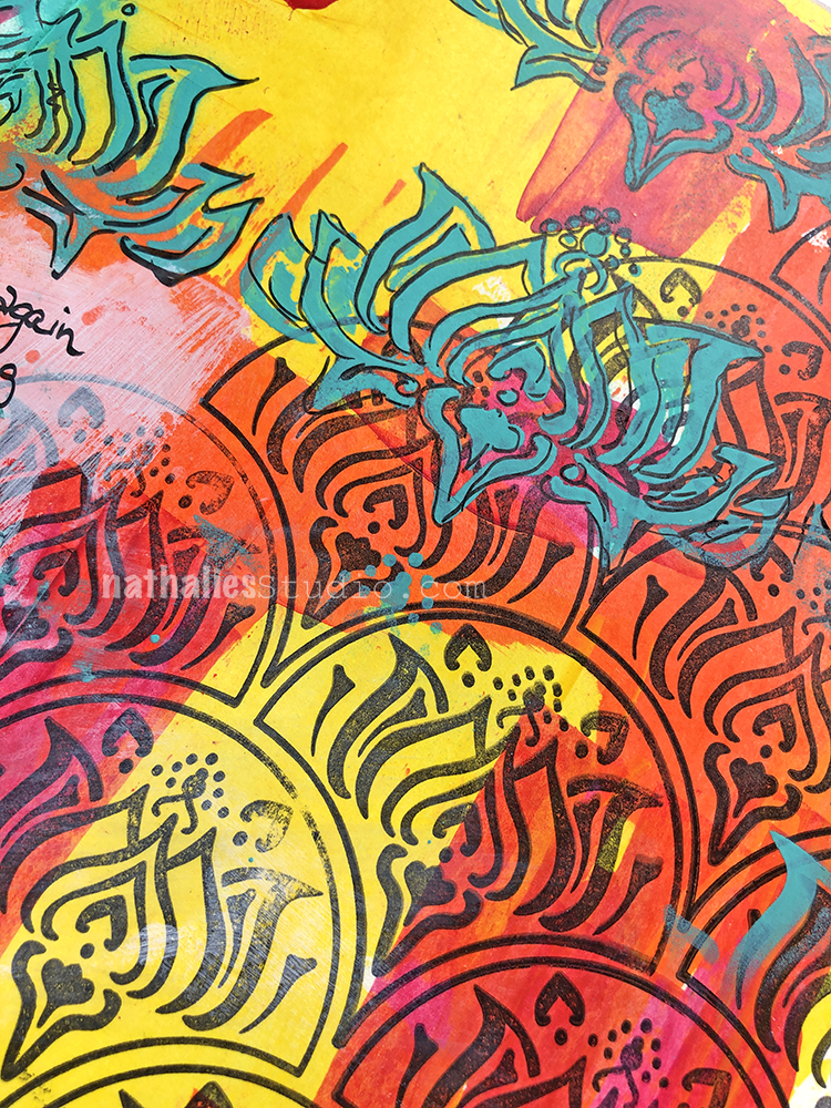
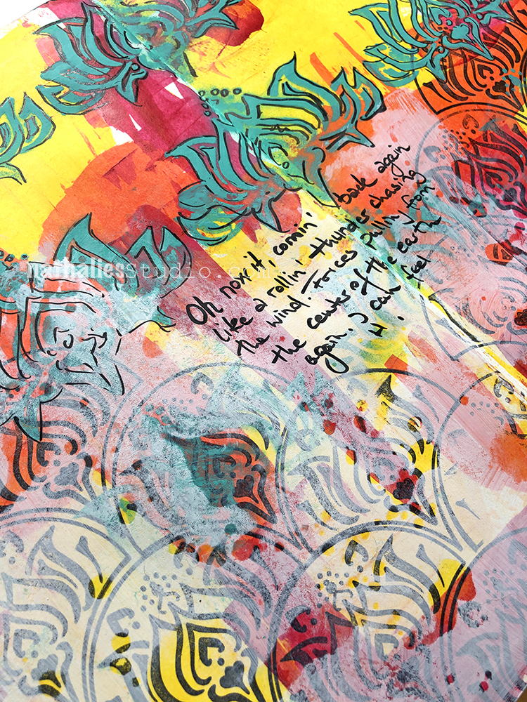
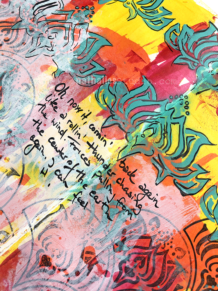
I used my Lily Wallpaper stencil – one I designed years ago now but still love so much. I used spray paint, acrylic paint, and a fude pen. I paired it with the coordinating design – the Lily Fan stamp from my Fan-tastic Large stamp set. Mixing the same motifs together in different forms creates some nice unity.
It’s a pretty intense background (“like a rollin’ thunder”?) so I toned it down some with gesso.
And the lyrics found their spot in the center of it all ;)
Here are some of the supplies I used:
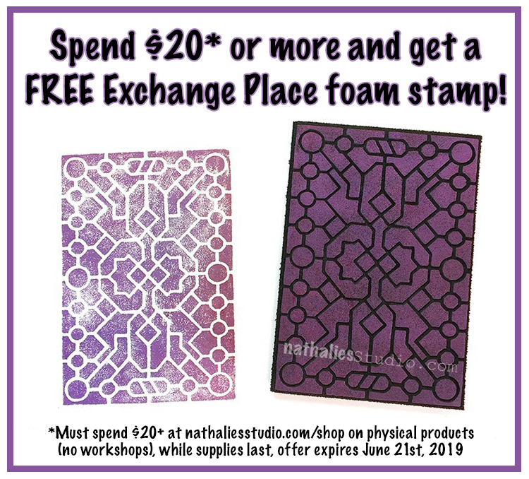
And I have a special deal going on now through Friday, June 21st: spend $20 or more in physical products in my online shop, and receive a FREE Exchange Place foam stamp. This is a value of $9.50. Offer available while supplies last.
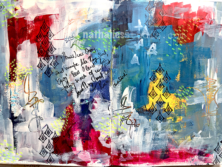
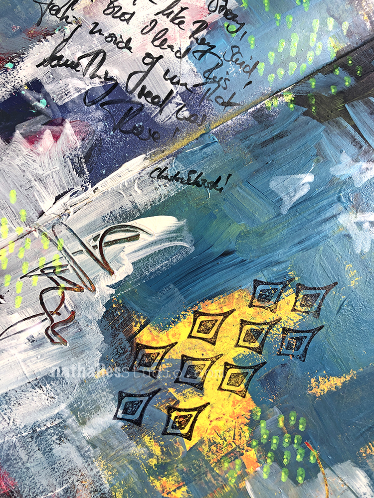
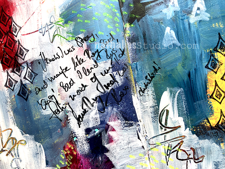
“I knew I was strong, and maybe like they said, “crazy.” But I had this feeling inside of me that something real was there.” – Charles Bukowski
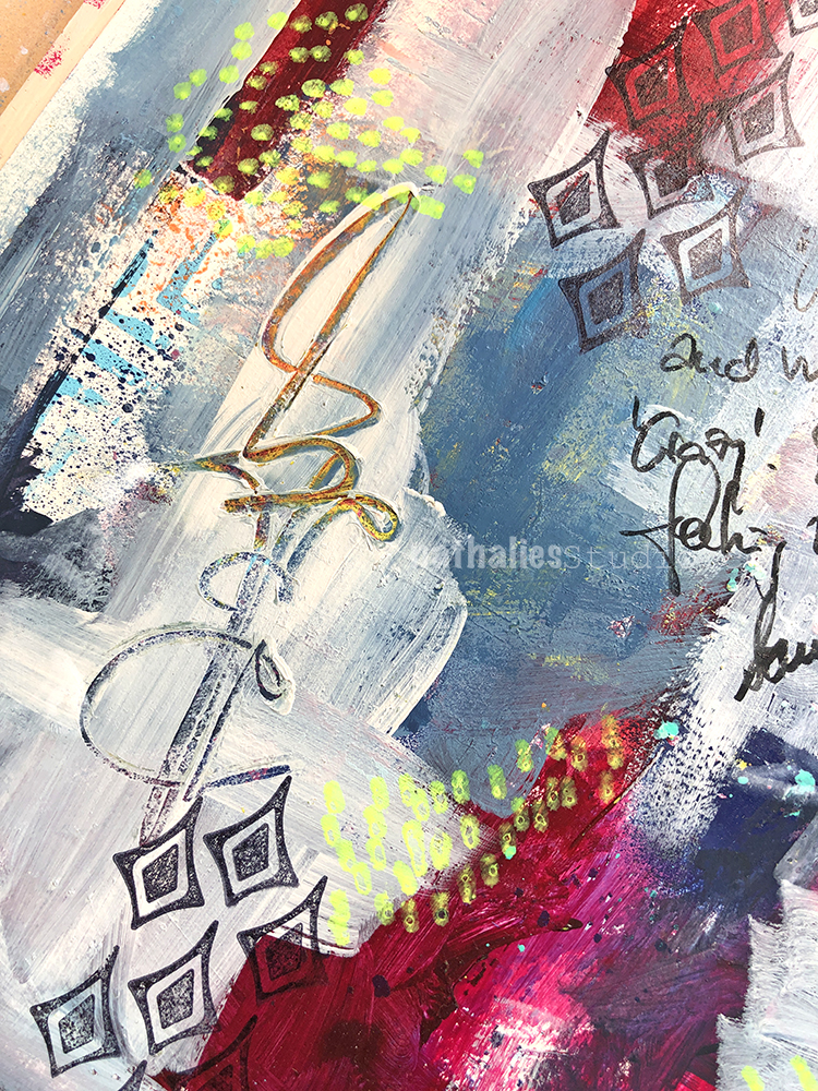
I built up over an existing background using colorful acrylic paint and gesso and stamped with one of the Fanfare stamps. I’m digging the pops of brighter colors showing through here and there. I used acrylic markers for some mark making.
A great quote from an author I was just reminded of the other day. Maybe time to revisit again since I haven’t since I was a teenager.
And I scratched into the gesso for some more marks, revealing previous layers.
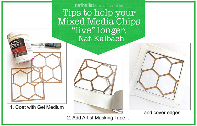
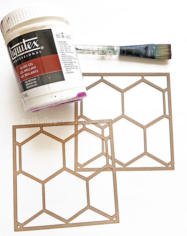
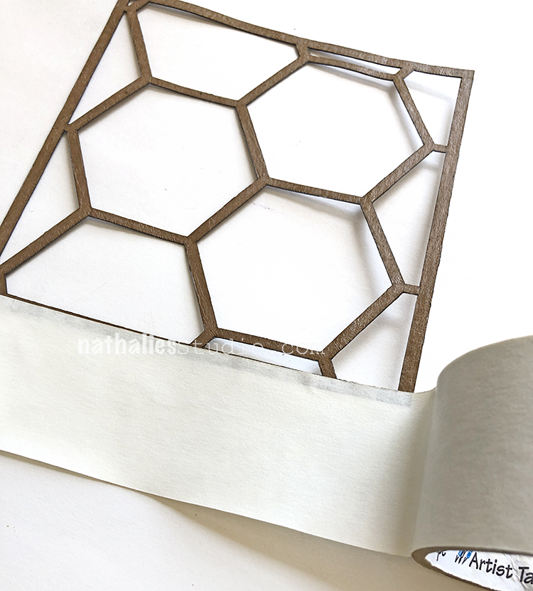
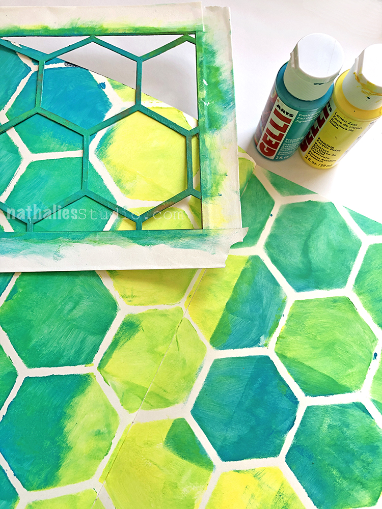
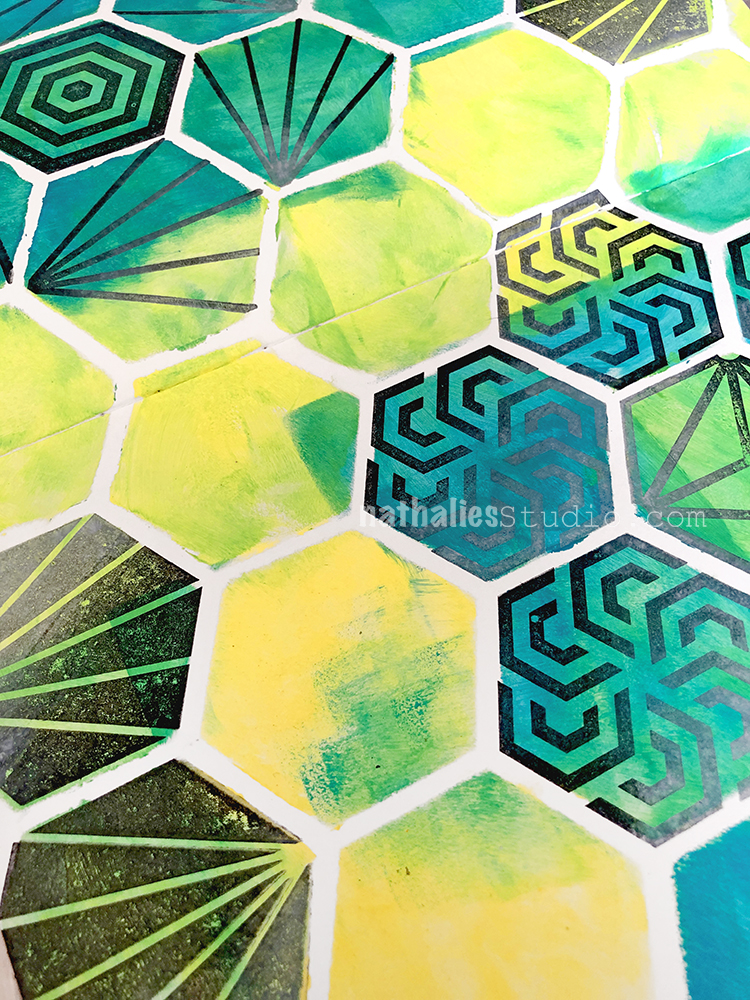
I used my Hexastencil Mixed Media Chip to create the hex pattern and then filled in with the Diamond Hex rubber stamp from the Hex Set Large and the Fairview rubber stamp from the FANtastic Small set.
I had a photo of my Aunt Margot from a party (I had so many from the party and was sorting through them recently – such cool images) and just thought it was a perfect fit for the quote and the hex space. Then I trimmed up one of the Hexastencil chips, and applied it with gel medium.
I’m glad I found a way to incorporate the dear photo, in a meaningful way to keep.
Aunt Margot…how nice to see her again on a page.
I must say that I have always enjoyed your stories about her and the warm memories that it makes me feel for/with you.
Hope you’re enjoying this summer weather Nat!
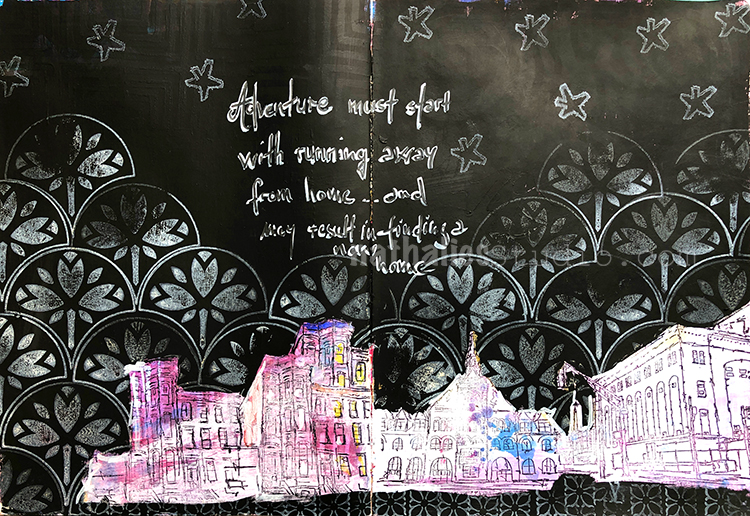
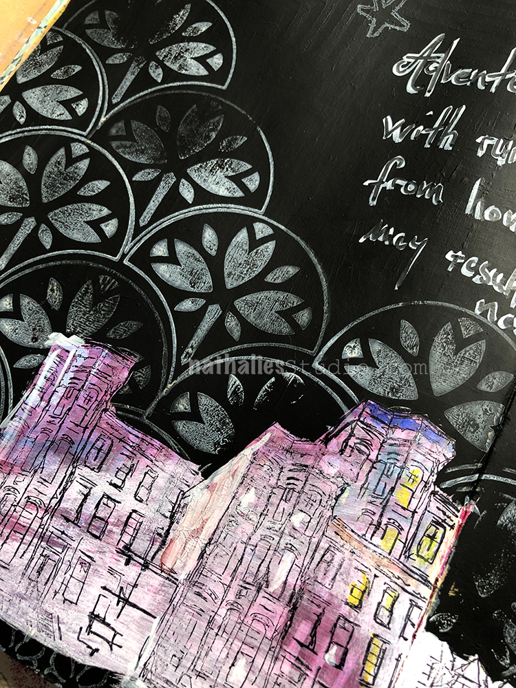
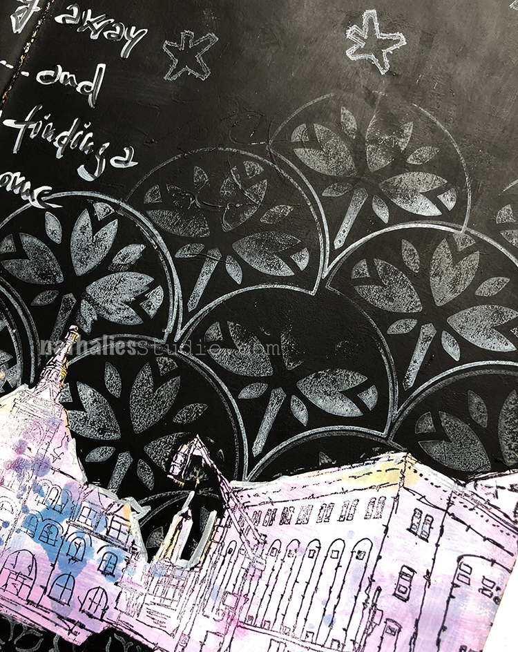
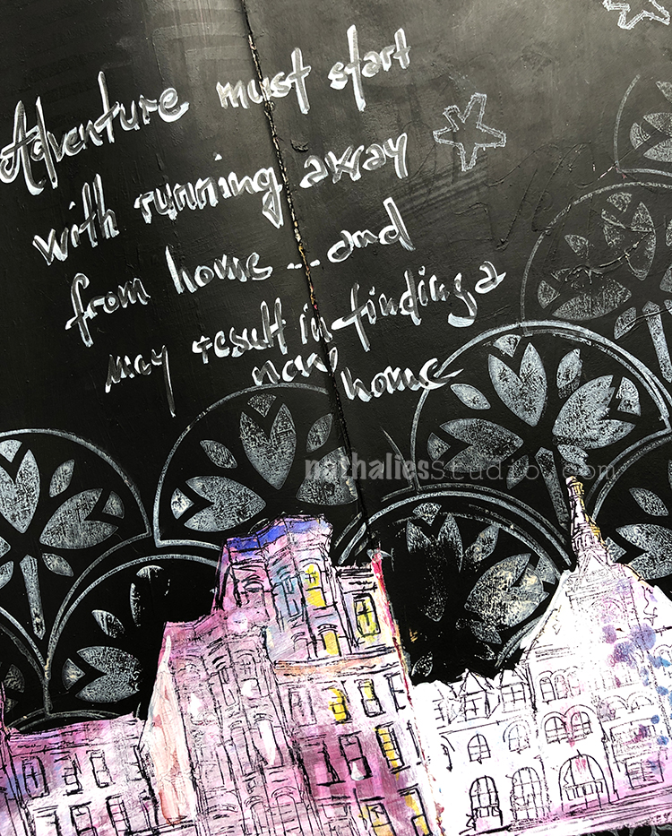
As the background was a bit much for me and didn’t really speak to me, I actually painted everything but the area of the city scape with black gesso and stamped part of it with the Jewett Fan from the Fan-tastic Large rubber stamp set.
My night sky was complete with a few Star Tag stamps and my quote. I’m living this adventure right now :)
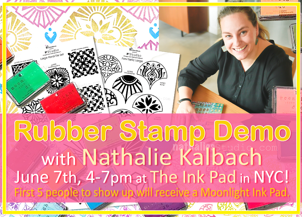
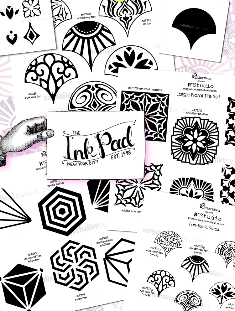
Join me Friday June 7th from 4-7pm at The Ink Pad in NYC! I’m super excited to be able to drop into this amazing store – right in the heart of New York City and so close to my own hood.
And The Ink Pad is making the event even more fun: The first 5 people to show up will receive a Moonlight Ink Pad.
I’ll be demoing my new rubber stamp sets. Maybe there will be some pattern demos and layering demos. I learned so much about these stamps just by playing with them myself. Join me and see for yourself.
The Ink Pad is located at 37 7th Ave, between 12th and 13th Streets. Drop in and say Hi! :)
Nathalie, this is so cool. Did you do some journaling with them? Also did you ever try acrylic inks. I just saw this post recently and am intrigued. I have tried marveled paper but never this.
Reply