Creative Squad

Creative Squad: Primary Colors – Riikka Kovasin

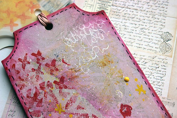
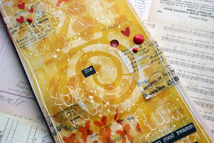
Hello from my Creative Squad! Today we have a post and video from Riikka Kovasin who is sharing a trio of cheeky tags using my Batik stencil, Triple Play foam stamps, and Love Knots rubber stamp along with our theme this month: Primary Colors: Red, Blue, and Yellow it’s your time to shine. Let’s get back to the basics of color and light and play with primary colors. It’s elementary my friend! This month we are also pleased to be partnering with Grafix who supplied the squad with some cool products to try out. Read on:

Maverick

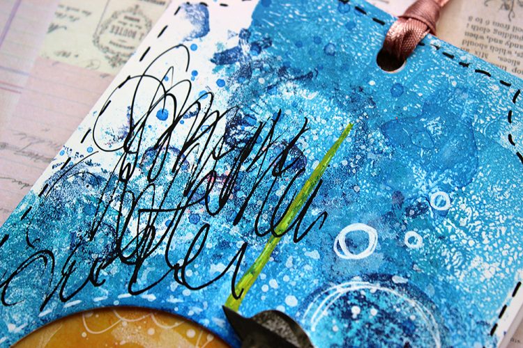
Hi there all! It’s Riikka here today to share my take on the monthly theme of Primaries! This month we also got some lovely products to play with from Grafix. I used all three we were given and threw in one more from my own stash!
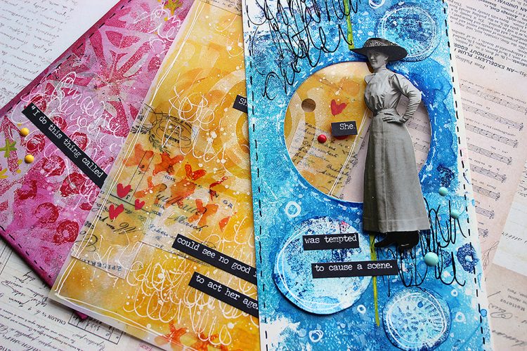
I feel like I must be honest with you. After seeing all the cool stuff you can do with Grafix products, especially by Tania Ahmed, I sourced some supplies through internet and ordered them. But then when they arrived, I had some deadlines closing in and I just put them aside with the thought “Need to play soon”. Then that pile moved to another place in my craft room and finally they went up on a shelf. So, while I have had some craft plastic in my craft room for months now, I’m so grateful for this theme and collaboration as it finally pushed me to take the stuff from the shelf and use it and fall in love all over again!

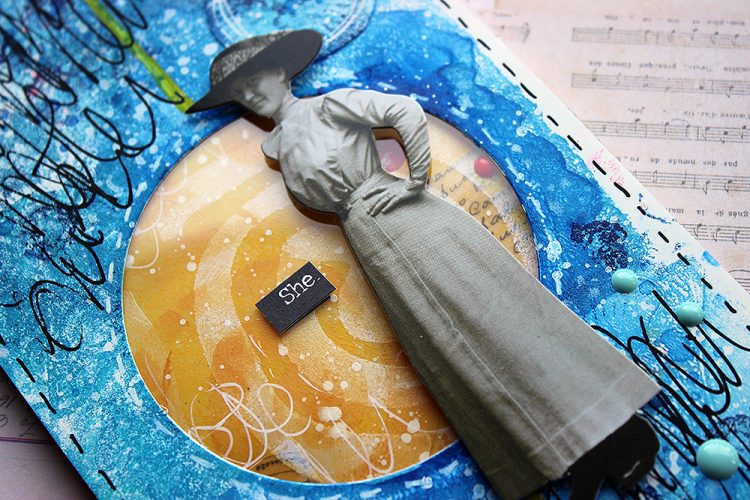
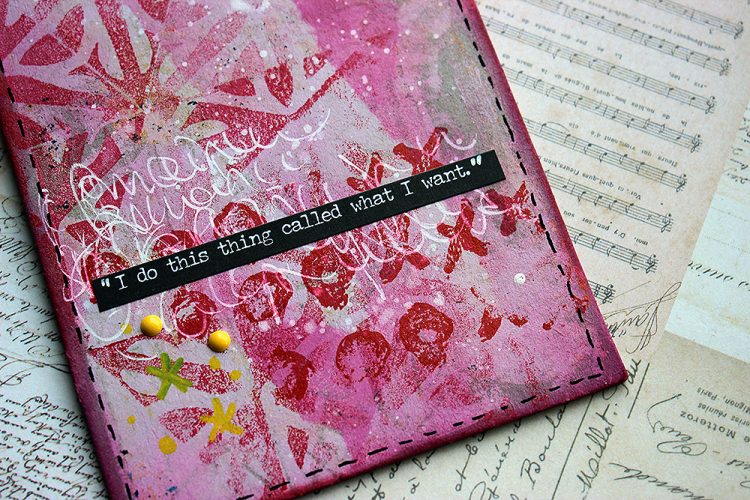
As before, I recorded a little process video while working with the Grafix products and primaries. As you can see from the pictures already, the project has blue and yellow and there’s red, too but not the same way as the other two. It’s because somehow I feel intimidated by red, especially in large surfaces. It’s such a vibrant, energetic color that I feel I can’t cope with it, I can’t harness it. So, instead of doing a red base and patterns, I started with a pink base and added red on top! More manageable!

I was amazed how well the craft plastic handled all the mediums I threw at it. Especially I loved using watercolor on top of the acrylic layer, it felt so soothing and rewarding. Another discovery was that I couldn’t rip the Double Tack Mounting Film. I was planning on ripping the vellum apart for the collage layer on the yellow tag, but it proved to be impossible. The Mounting Film was so sturdy that it wouldn’t rip! But still it’s so thin that it doesn’t add any bulk.
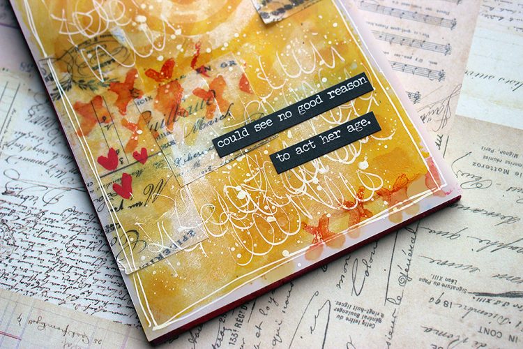
I kept the embellishments in the tags quite minimal. This shows the background better and also gives the whole thing a story book feel as all the texts connect. I guess this idea came to me while cutting the openings to reveal the layers underneath. The holes get smaller between the layers and that reminded me of a children’s book by Tove Jansson. It’s called “The book about Moomin, Mymble and Little My”. It’s the first picture book drawn and written by Tove Jansson, published in the 50s. The original title was “Hur gick det sen?” as Tove was a Swedish speaking Finn. Throughout the book there’s holes where you can have a sneak peek to the following spread. The holes get smaller and smaller in the course of the story and the last hole is so small that Moomins can’t fit through it and are thus captured in the book. The book has vibrant illustrations in Tove’s unique style. If you haven’t seen it, I recommend taking a look! Perfect inspiration for solid color surfaces and primaries! Here’s a link to Moomin site to get you going.
Thank you so much for stopping by today! I really enjoyed my first go with the Grafix products and can’t wait to play some more!
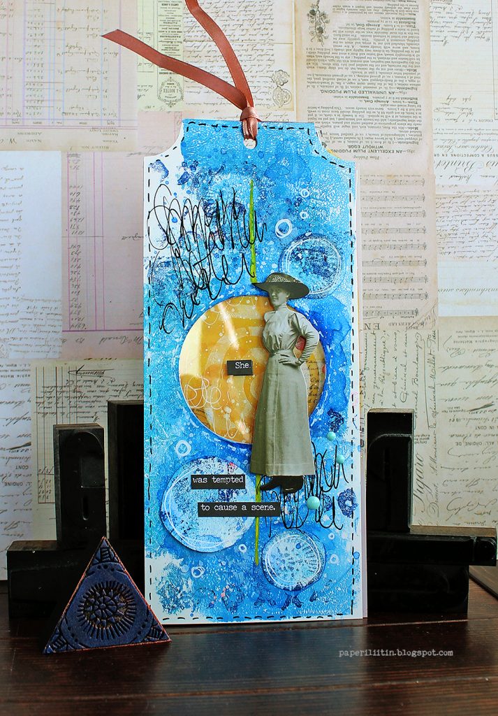
Thank you Riikka – just love the gorgeous layers you were able to build and learning the inspiration behind the project!

Give it a try: you can find all my Rubber Stamps , Foam Stamps, and my Stencils in my Online Shop and here are some of the supplies Riikka used:

Follow Nat’s Creative Squad on Instagram too: Each week we post projects, ideas, and inspiration for mixed media art.

Comments (1)

  • Sue Clarke

    |

    Riikka, awesome texture, colors and the expression about the woman shown are so delightful!

    Reply

Leave a comment

Creative Squad: Primary Colors – Maura Hibbitts

Hello from my Creative Squad! Today we have a really thoughtful card project from Maura Hibbitts that explores some pretty important ideas along with our theme this month: Primary Colors: Red, Blue, and Yellow it’s your time to shine. Let’s get back to the basics of color and light and play with primary colors. It’s elementary my friend! This month we are also pleased to be partnering with Grafix who supplied the squad with some cool products to try out. Read on:

Oddly enough, I don’t reach for just primary colors that often, I think I must like them better blended together to make green, purple, orange, and the myriad of colors they create. So, I find it a bit of a challenge to just focus on primary colors, but I did…with just a touch of blending (I couldn’t help myself, lol). I’m also using Grafix products for the first time, and they are wonderful! I tried out a number of mediums and they worked beautifully.
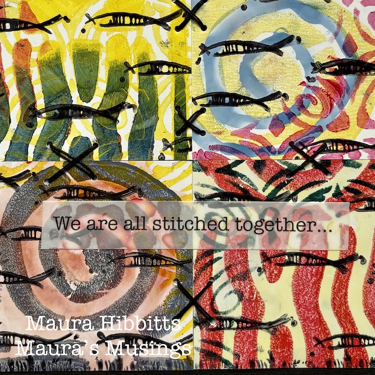
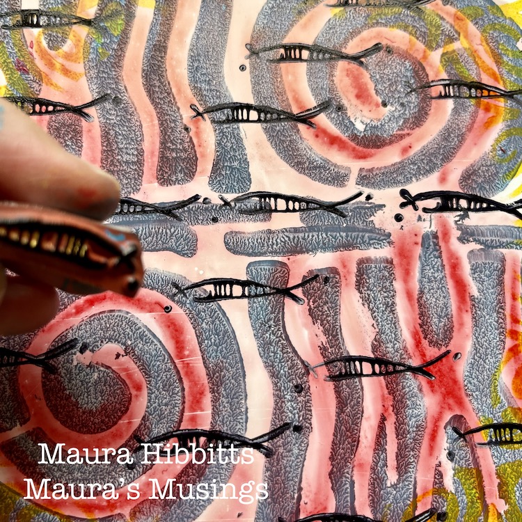
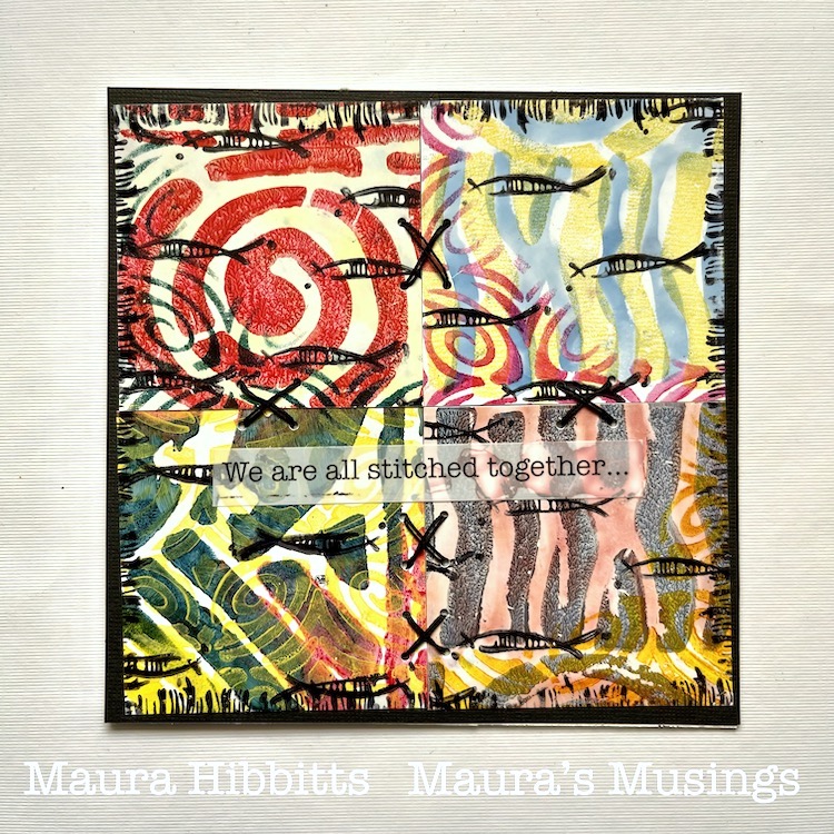
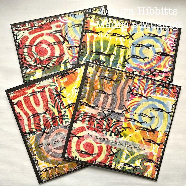
I started creating, thinking of the ocean and my longing to go there again. I was also thinking about my friends in education and the upcoming end to a very challenging year. Somehow this translated into the schools of fish I stamped on the cards. But then, I thought about how everything is interconnected on our planet, from the fish in different oceans, to the people of different lands, and I added some stitches. It’s inter-esting how our creative process can begin with a simple thought, yet end up very complex by the time we finish.

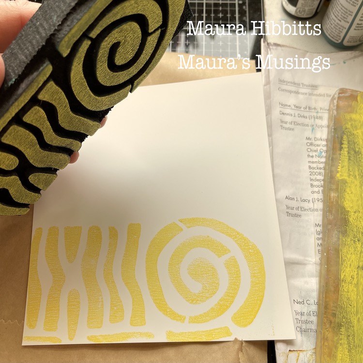
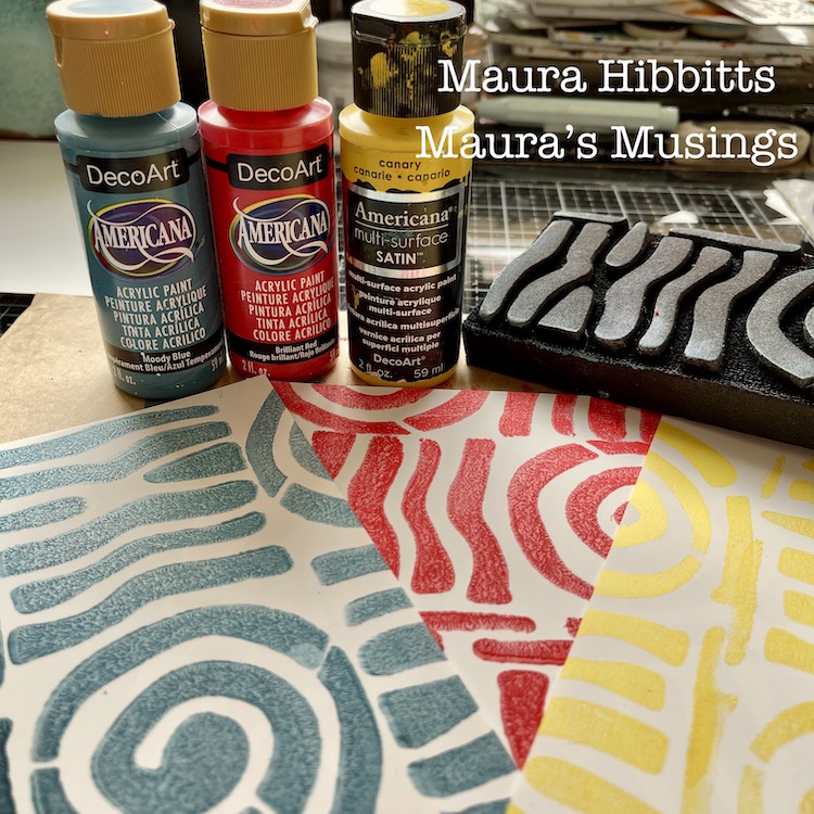
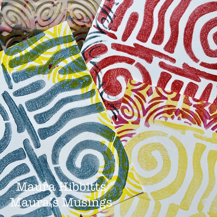
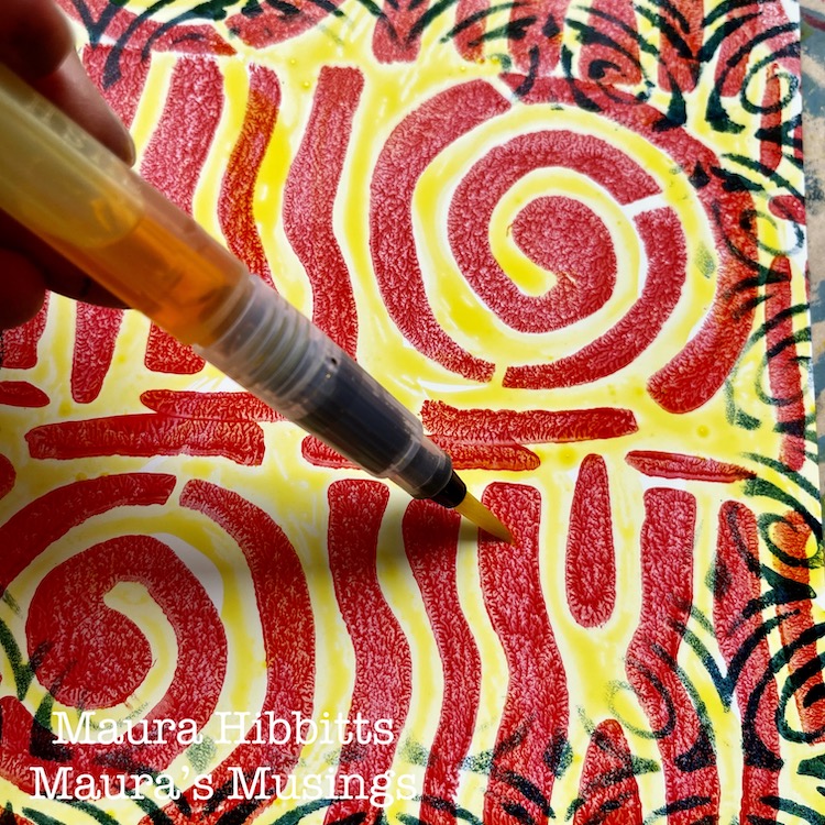
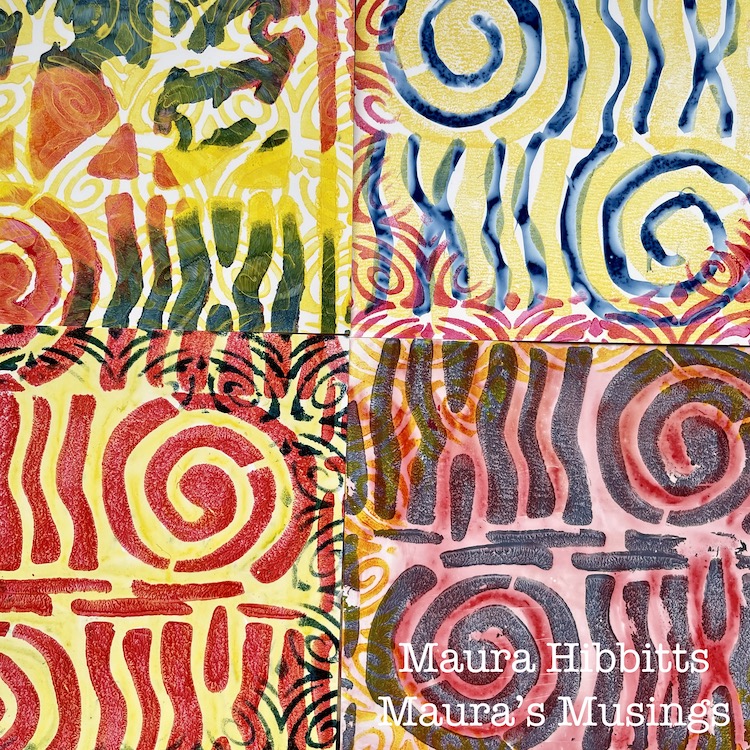
I started my project by cutting the 12 x 12 sheet of Grafix Craft Plastic into four sec-tions. (6 x 6), then stamped three of them with a single paint color of yellow, red, or blue with Nat’s ArtFoamie Batik 2 stamp. I find it easy to roll out some paint on a gel plate, and press the ArtFoamie into that, to get a clean image.

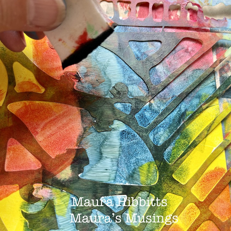
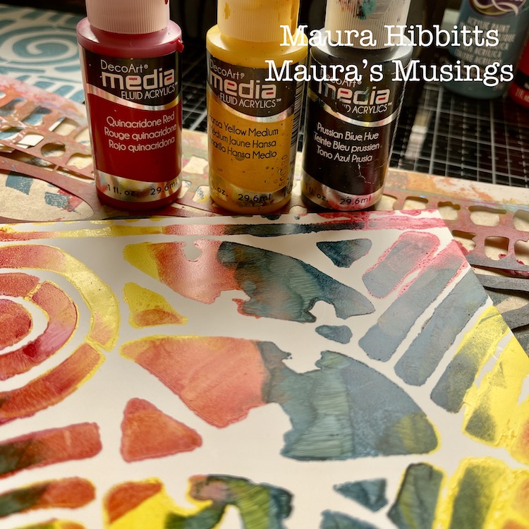
For the fourth section, I decided to use the Batik stencil (a favorite!), fluid acrylics in red, yellow, and blue, and dab in the color with a cosmetic sponge. I couldn’t resist a bit of blending here.

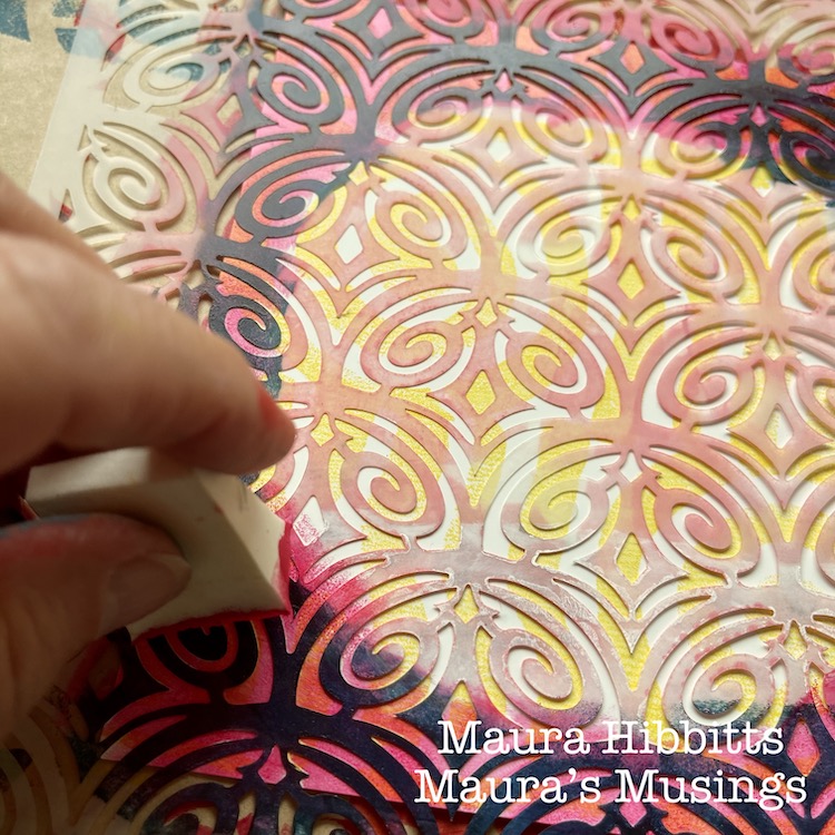
Next, I decided to go around each stamped piece with a contrasting color, using the Art Deco Fairview stencil. I just added the design around the edges, and left a circular open area on the plastic.

I found that acrylic paint works beautifully with the Grafix plastic, so I thought, why not try watercolor next? I painted watercolor onto each section with blue, red or yellow.

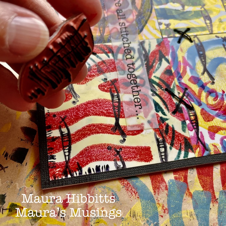
To create my “schools of fish”, I used the Neato rubber stamp with black archival ink, and repeatedly stamped the image across the pages.

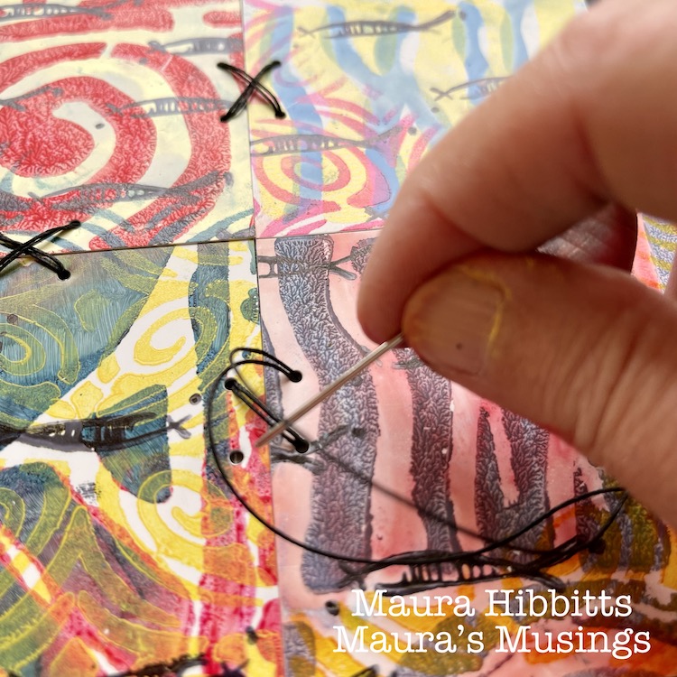
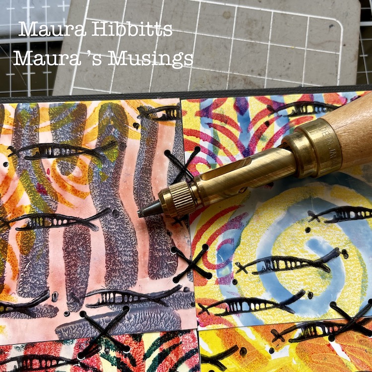
Then, I cut each section into fourths, just slightly smaller than 3” squares. I adhered four different squares to a backing. I cut a 12 x 12 black card stock into fourths for this base. Next, I punched holes to do some stitching, using a Japanese screw punch (or you could use an awl). I stitched X’s with heavy black thread onto the cards, tucking the ends onto the back and holding them in place with scotch tape.

To finish the card design, I framed it using the edge of the Far Out rubber stamp and black ink. I stamped the partial image around all edges.

As I was working, I started thinking of how we are all connected, and came up with the quote to put on my cards “We are all stitched together…” I typed up my words, and printed them onto the Grafix Computer Matte film using an inkjet printer. I adhered these to the card fronts using a clear adhesive, so the design underneath would be visible.

Then, the final step was to adhere my card tops. I cut 12 x 12 card stock in half, scored it and folded it into a 6 x 6 card. One reason I decided to not work directly on the card itself was the stitching. It shows through the back, and by doing it separately, I end up with a nice, neat card. Hint: remember, if you mail square cards, the postage is a bit higher…or you can put it into a kraft mailer.

It’s the common threads that pull us all together, like color – yes, primary colors too, which are connected to all colors. Other threads that bind us are music, art, words, friendships, family, and so many more. Remember, we are all stitched together…

I wish you joy in searching for the stitches and threads in your life, Maura


Thank you Maura – loved how you shared your thought process along with such clear step by step instructions. These cards are so meaningful AND beautiful!!!

Give it a try: you can find all my Rubber Stamps , Foam Stamps, and my Stencils in my Online Shop and here are some of the supplies Maura used:

Leave a comment

April ArtFoamies Challenge – Day 15, 16 & 17

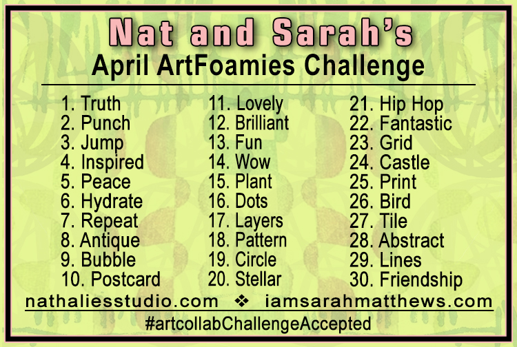
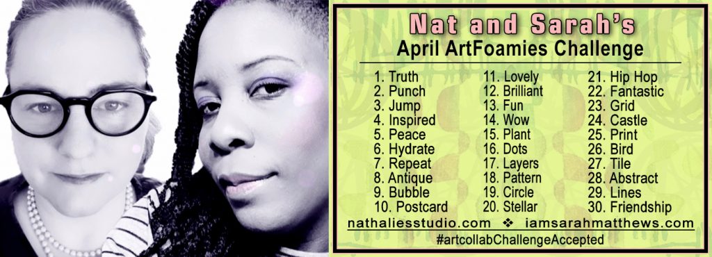
Are you playing along with Nat and Sarah’s April ArtFoamies Challenge ? You can follow along on my Instagram feed daily with videos and photos, and I post updates here on the blog too from time to time throughout the month. Today I’m recapping 15, 16, and 17. Enjoy!

Day 15 – Plant – I love plants but unfortunately I am a really bad plant owner …so maybe printing a plant inspired pattern is a better idea ;) While my Jazzed and Groovy ArtFoamies were not designed with a plant pattern in mind- they definitely can stand in for that and I love the outcome. Wohoo for easy maintenance plants ;)


Here is a look at Day 15:


April 16 – Dots – Grove Street Positive and Negative Stamp is going to show off its dots today and since the Grove Street Path Station in Jersey City def. Is a route to get to Broadway… the Broadway Fan stamp made an appearance as well. I felt it needed a little bit of extra red omph, so for good measure I threw in one of my Rubber Stamps called Valley Road …because you know… sometimes you gotta change your plans.


And here is a look at Day 16:


April 17 – Layers – I love using the same patterned stamps but in different sizes, like my Batik 3 and Mini Batik 3 and then my Batik 4 and Mini Batik 4 – this was fun to stamp …and yes, the ledger is barely visible but it still adds to the whole. Keeping every ledger page pristine is overrated because why even bother stamping into it if you do. #myledgermyrules


Here are some looks at April 17:

Follow along with the challenge on instagram  and post your artwork too with the hashtag #artcollabChallengeAccepted

Everyone approaches Challenges differently. This ArtFoamies Challenge that Sarah Matthews and I came up with has had me thinking about how I want to approach it. In the past my Foam Stamplifier Challenge #foamstamplifierchallenge I used all kinds of different media, so I didn’t want to repeat myself. I also thought about how Sarah usually uses ArtFoamies with ink pads, while I use acrylic paints and the first parameter became clear: I will only use ink pads for the challenge. The other challenge is that I purchased an old ledger journal and I want to turn it into a pattern book. I usually make my own pattern books by binding loose printed papers into a book. This method has the advantage that if a print doesn’t turn out too great it can be discarded. By printing directly into this 125 year old ledger I have no out. So using my foam stamp designs to create patterns into a ledger book with ink pads is my challenge for this month.

Here are some of the supplies I used:

Play along with us and our daily prompts:

Leave a comment

April ArtFoamies Challenge – Day 10 & 11

We’re recapping Day 10 and Day 11 of Nat and Sarah’s April ArtFoamies Challenge today! You can follow along on my Instagram daily with videos and photos, and I will post updates here on the blog too from time to time throughout the month. 

April 10: Postcard – My Signals stamp reminds me of a morse code like pattern, and just screamed to be used for this prompt – I mean after all a postcard is a signal …of love, of hey I am here. And it made me also think that at the time of the ledger so many postcards were sent out. I love old postcards. Anyway I used three different colors to layer up the stamp to make a nice textured pattern background and I really like it. This one def wants to be used in an art journal and then used with something else. That is why I also love making pattern books: they are a great way to have a reference if you want a jumping off point for an art journal spread or design.


Here is a look at the April 10 page:


And then April 11: Lovely – I thought a kind of abstract Batik xoxo pattern would be great for this theme. So I used my Batik 1 in large and my Batik 2 in small for this pattern, layering up the Batik 1 on top of 2 – I mean you cannot have enough hugs and kisses, no? So here is my lovely pattern for you my friends- hugs and kisses!


Here is a look at the April 11 page:

Follow along with the challenge on instagram  and post your artwork too with the hashtag #artcollabChallengeAccepted

Everyone approaches Challenges differently. This ArtFoamies Challenge that Sarah Matthews and I came up with has had me thinking about how I want to approach it. In the past my Foam Stamplifier Challenge #foamstamplifierchallenge I used all kinds of different media, so I didn’t want to repeat myself. I also thought about how Sarah usually uses ArtFoamies with ink pads, while I use acrylic paints and the first parameter became clear: I will only use ink pads for the challenge. The other challenge is that I purchased an old ledger journal and I want to turn it into a pattern book. I usually make my own pattern books by binding loose printed papers into a book. This method has the advantage that if a print doesn’t turn out too great it can be discarded. By printing directly into this 125 year old ledger I have no out. So using my foam stamp designs to create patterns into a ledger book with ink pads is my challenge for this month.

Here are some of the supplies I used:

Leave a comment

A Look Back – Cool Stuff You May Have Missed 23 – Batik Stencil

A Look Back – This time I’m looking at some things I’ve done with my Batik Stencil over the years. Art journaling, mixed media on canvas, and a throwback to a Creative Squad alum too just to categorize a few! Read on and I hope you try some of these project ideas :)

A Look Back is a blog series to show you some projects and posts that you may have missed – sometimes going WAY back in the archive. I think it will be fun to revisit a few ideas that we haven’t seen for a while. I’m excited to see how a little look back might inspire something new in the future :)


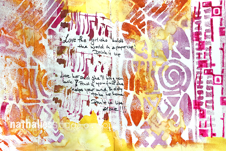
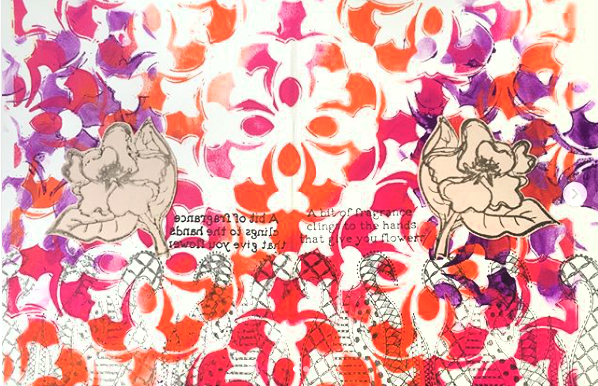
Going back to one of my 2014 art journals and I was layering up a couple stencils for my background – including my Batik (of course) and my What’s the Point. I’m still digging the colors in this spread – check out the original post here.


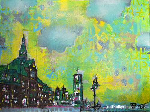
Kinda keeping with that palette, here’s a painting I did in 2016 called State of the Union, a scene from the old train station in Liberty State Park and a rather outdated Jersey City skyline lol – lots more buildings back there these days. I used the Batik stencil for a pretty unexpected design element in the sky. Read more here.


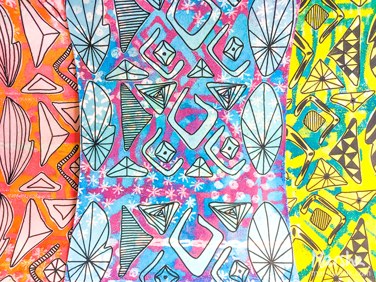
From Creative Squad Alum Marsha Valk in 2017, some faux batik papers using my Batik stencil, Batik Foam Stamps, and embossing powder. Check out her video of the technique here.


In 2019 I joined Tina Walker for her Stencilfied Journal and here was a page that I created using my Batik stencil, Far Out foam stamp, and Mid Century Squared foam stamp, along with some song lyrics. Read more here.


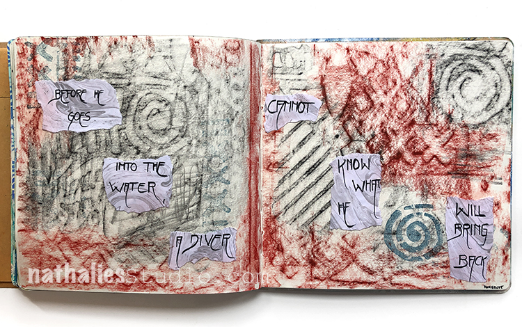
Finally, I just love sharing this fun way to use a stencil – lay it under your art journal page and take a rubbing! Check out my post here from the Stencilbop Challenge in 2019.


I hope you enjoyed this look back and are inspired to try a few of these ideas using your mixed media supplies.

Here are some of the supplies we used:

Leave a comment

Wild and Free – Nicole Watson

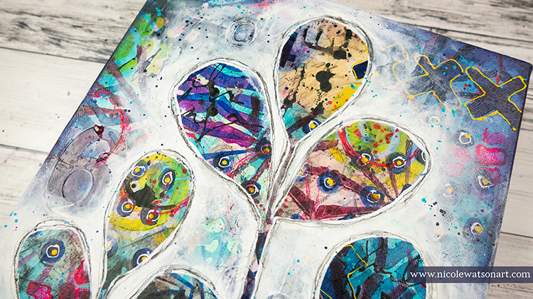
Hello from my Creative Squad! Today we are going a bit wild with Nicole Watson and her reductive style painting using my Batik and Beacon stencils. Check out her video below, inspired by this month’s theme: Wild and Free – After so many months of careful living, it’s time to go Wild and Free… In our Art! Go a little crazy in there and live it up with bright colors, exuberant mark making, bold colors – however you want to go a bit bananas. It’s time to let loose!


Warning! Before you begin this project, know that it might get a little ugly, and you might want to give up and gesso over the entire canvas.

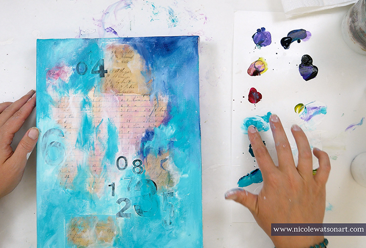
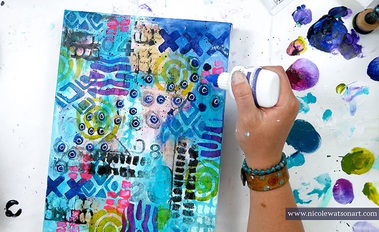
I thought I had the perfect idea for this month’s challenge of wild and crazy using only two of Nathalie’s products. So, confidently, I prepped a canvas, added some ephemera, and well… it got a little messy and the ephemera bubbled, so I threw it down to grab another canvas. The next canvas started a little better, but after all my crazy layers of ephemera, stencils, stickers, drips and scribbles, I went to bed extremely worried that I would not be able to recover. My canvas was looking like bad ‘80s fabric.

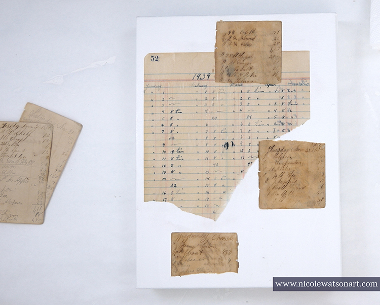
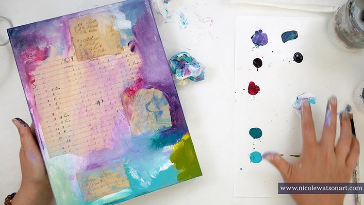
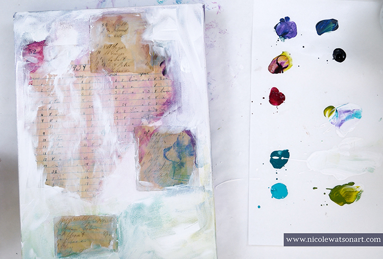
Spoiler: I recovered, barely! My project began by picking up a 9×12 canvas and gessoing it. This is total personal preference here. Even though the canvas is pre-gessoed, I still like to add a layer or two to prep it. Then, I stuck a ledger page and a couple handwritten note pages on with matte medium. Bravely, I broke the white blank canvas with color.

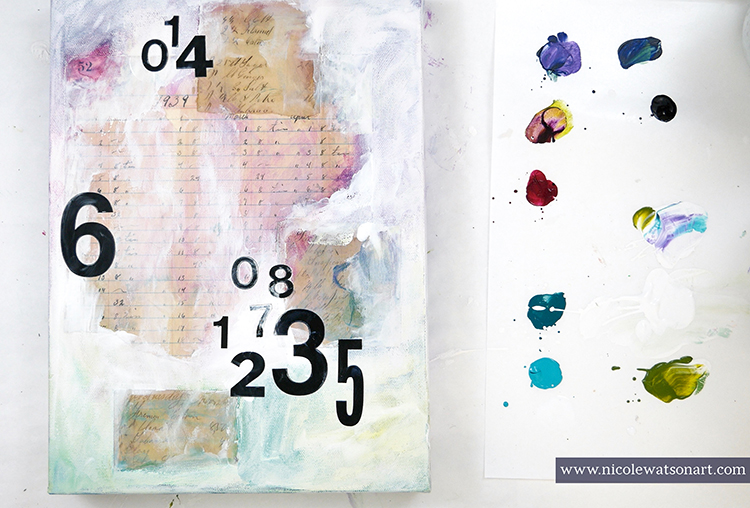
My next steps were to create layer upon layer upon layer. First with some number stickers and more paint.

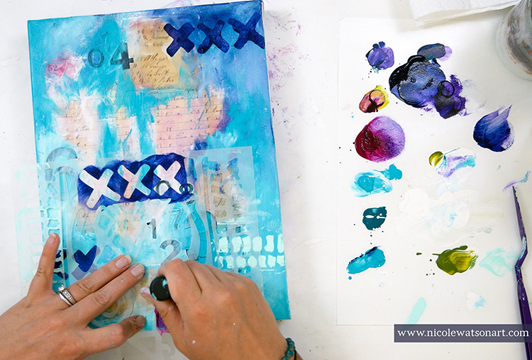
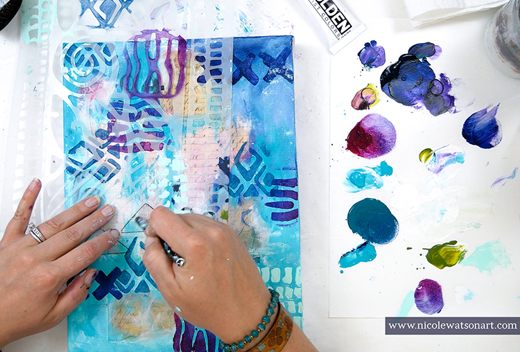
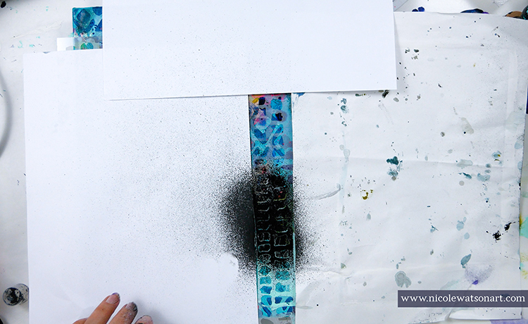
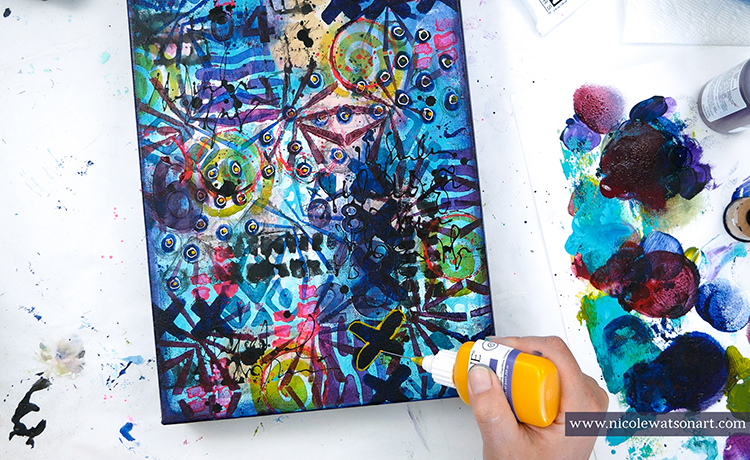
Then, I used Nathalie’s Batik stencil as it was perfect for this task. I was able to isolate parts to use each design separately with different colors and techniques from a sponge applicator, palette knife, tracing, spray, and even my fingers! All these layers created chaos in the background.

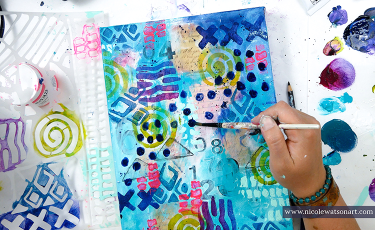
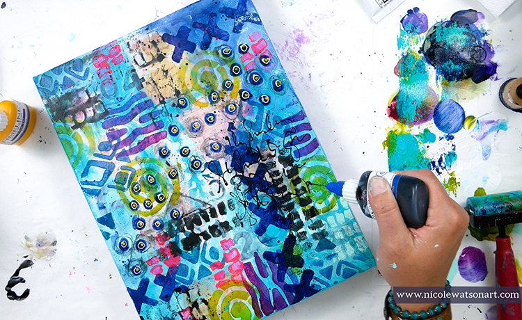
Besides the stencil, I also made some circles that I doodled around, splatters, ink drops, and scribbled some words.

This is where the canvas started looking a bit concerning. I left it to dry hoping to rescue it the next day with fresh eyes.

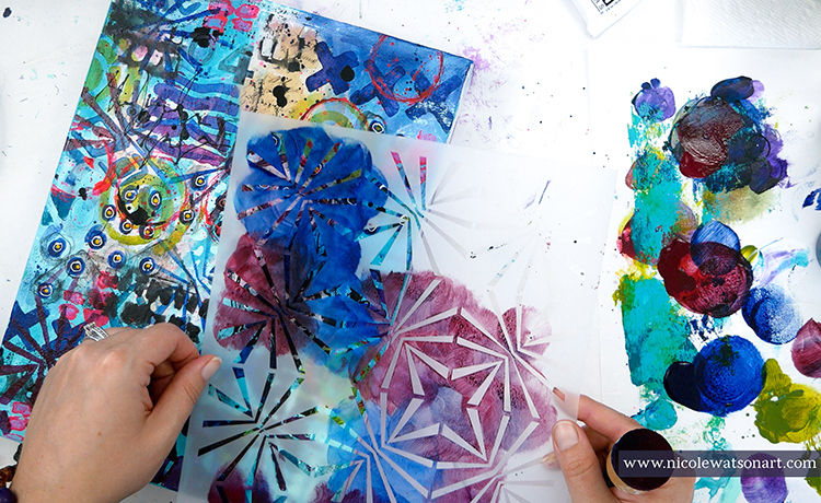
After my morning walk and coffee, I returned to my studio. I picked up Nat’s Beacon stencil as my second item. The piece needed some more delicate shapes between the larger ones. Using a foam applicator, I randomly placed blues and reds in the stencil around the canvas. This stencil helped to unite the other shapes. Finally, I grabbed a fineline bottle that had yellow inside from another project and outlined the X shapes for added dimension.

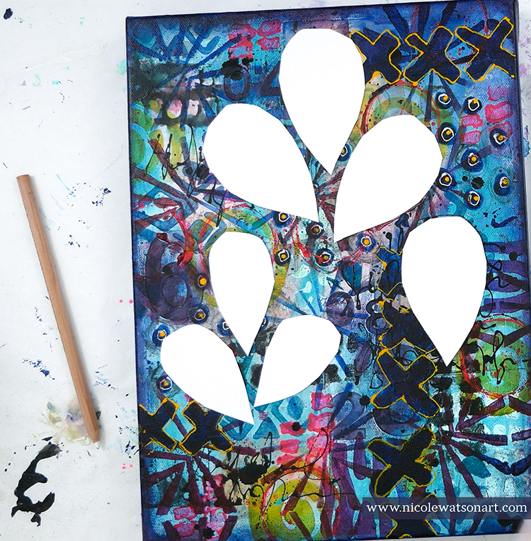
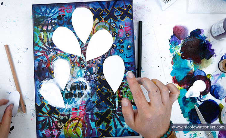
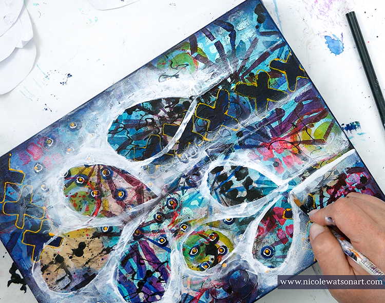
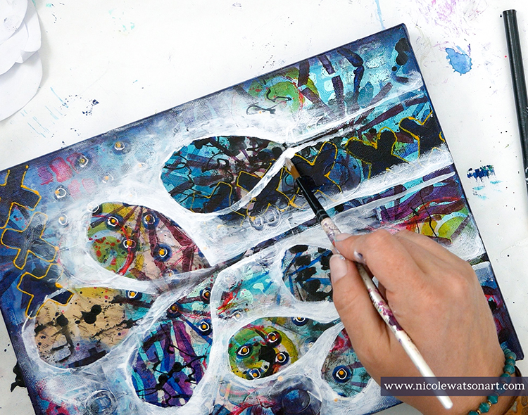
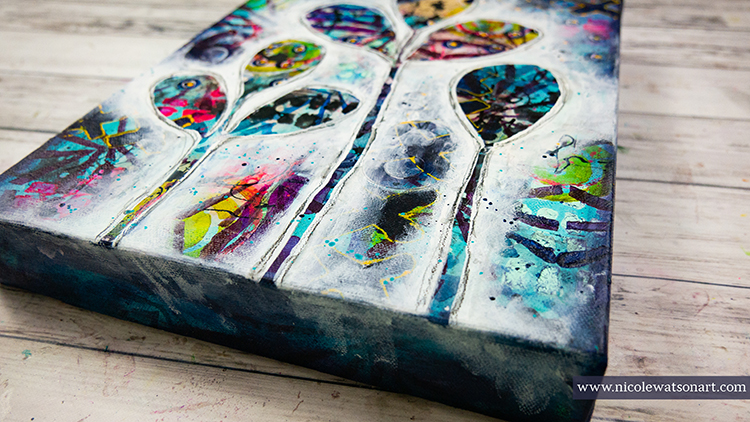
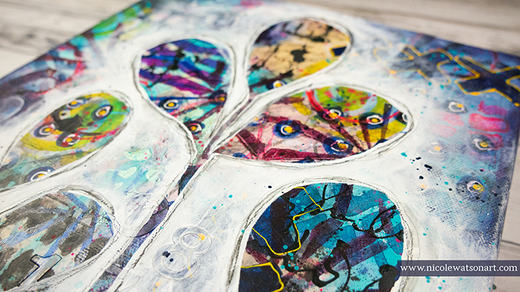
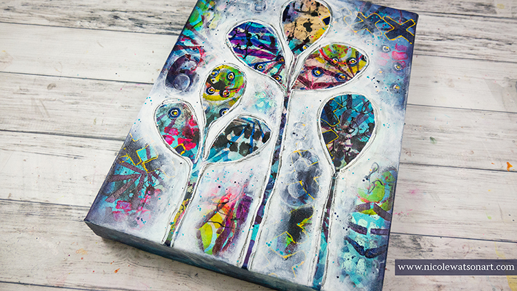
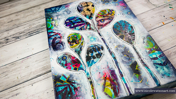
With the crazy canvas ready, I began my last step. I wanted to draw the leaf shapes I use a lot in my artwork and isolate them with some gesso. Usually I am able to do this with charcoal pencil. I like to use charcoal because it wipes off so easily. I tried with black and white charcoal, but it just wasn’t working enough to tame the chaos. So, I cut out leaf shapes form paper and used those as a mask to begin the gesso. 

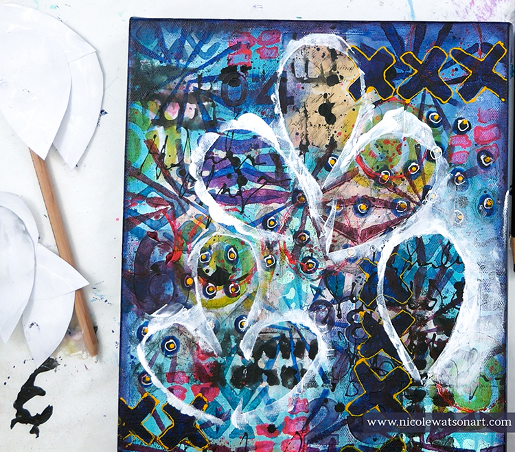
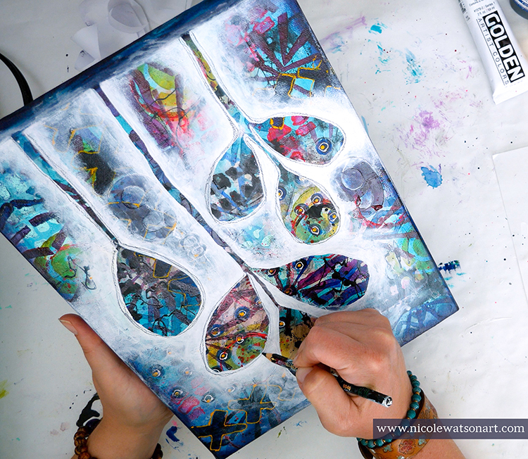
Using a paintbrush and my fingers, I spread gesso around my leaves and stems to isolate them from the crazy background. The process of watching the leaves pop and come to life was so enjoyable!

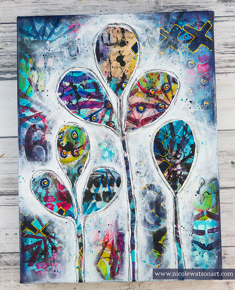
When they were finished, I spattered some paint on the white and outlined the leaves with my stabilo pencils.

This was such a fun canvas to make….even if it was a little stressful! Beginning with the ephemera layer and ending with adding the leaf, there were over 25 different layers to bring my leaf shapes to life.


Thank you Nicole for sharing your process! It can sometimes be hard to know what to do when a piece gets a bit out of control and you have given us some great ideas on how to resolve that.

Give it a try: you can find all my Stencils in my Online Shop and in addition to some ephemera and printer paper, here are some of the other supplies Nicole used:

Play along with our monthly themes and weekly projects! Working on something yourself that you’d like to share?  Email me how you used my stencils and stamps with the theme and email me an image – I would love to share your projects in my next  “n*Spiration From Around the Globe“.

Leave a comment

Inspired by my Creative Squad

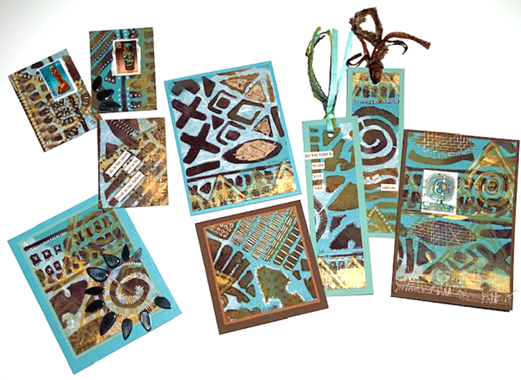
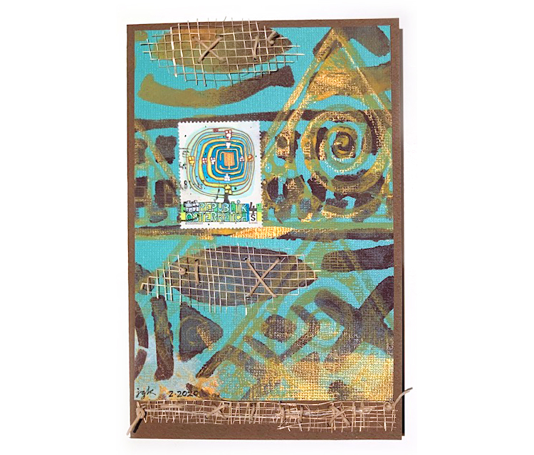
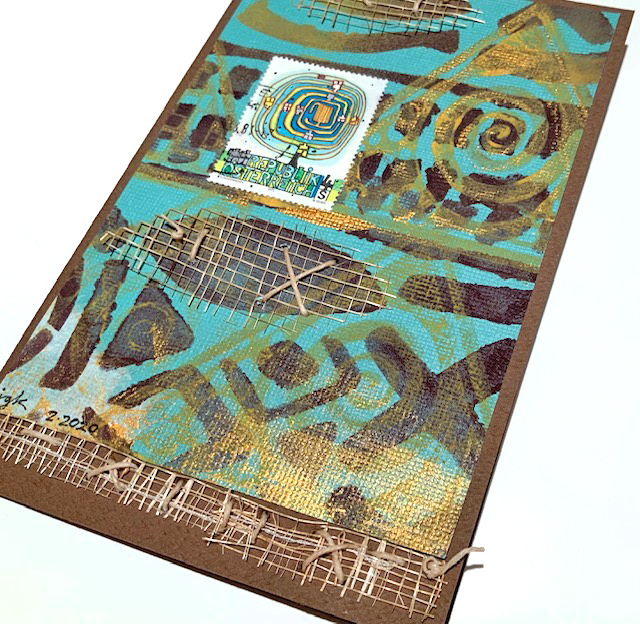
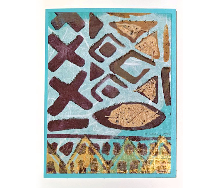
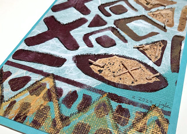
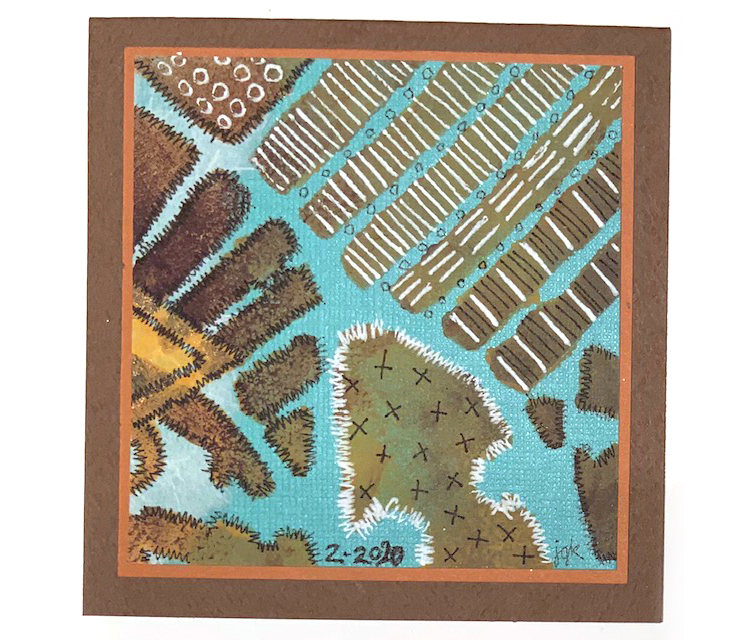
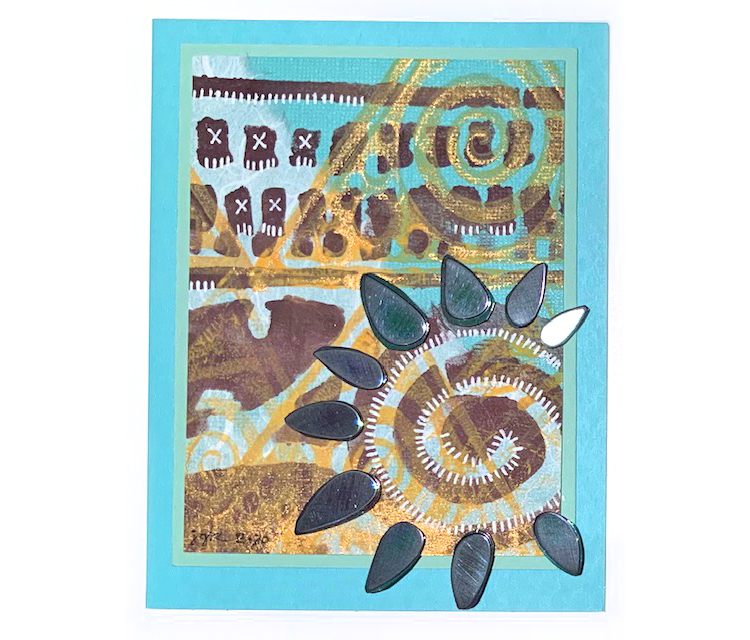
We have some very yummy creations from Creative Squad member Judi Kauffman to share with you today: cards, ATCs, and bookmarks! You know I love the brown and teal color combination – makes me happy. And there are so many other touches in these that catch my eye too: the handmade paper for texture and visual interest underneath the stenciling (so cool), the mesh she put in there (again- soo cool!), and the white mark making. 

Where did these projects originate? When Judi planned her 2020 calendar project her goal was to use each month’s page for other projects. What you see above was made with the January page!

So here we go from Judi: 2 bookmarks, 3 ATCs, and 4 cards for you today.

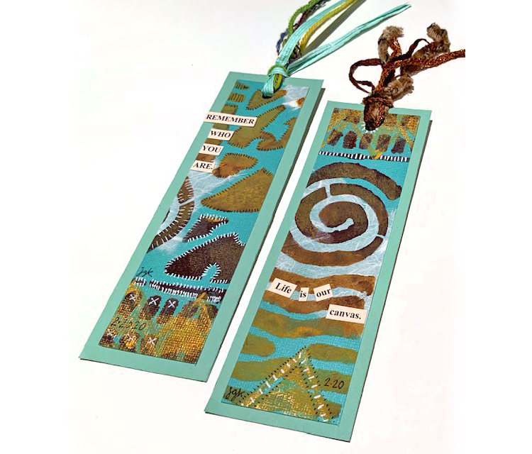
Bookmarks with stitching and some of my artfoamies stamps.

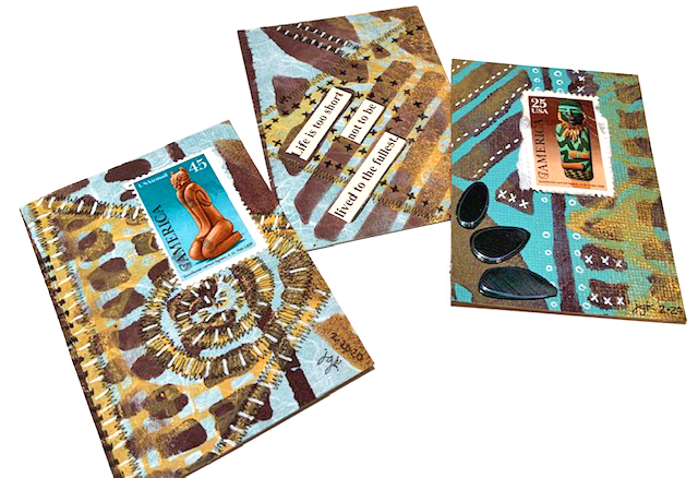
ATCs with postal stamps, my batik design, and lots of excellent markmaking.

More Batik pattern, mesh fabric, and postage stamps on a card…

Batik pattern, stitched elements, and handmade paper on this card…

A square card with lots of wonderful stitching…

And a card with some embellishments that makes me think of sunshine :)

Thank you so much for sharing Judi!!! 

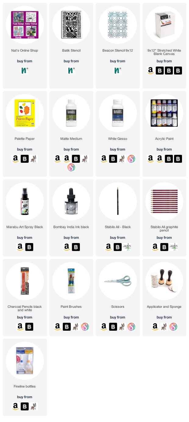
Here are some of the supplies that Judi used:

Leave a comment

The Stencilfied Journal – Prompt 19

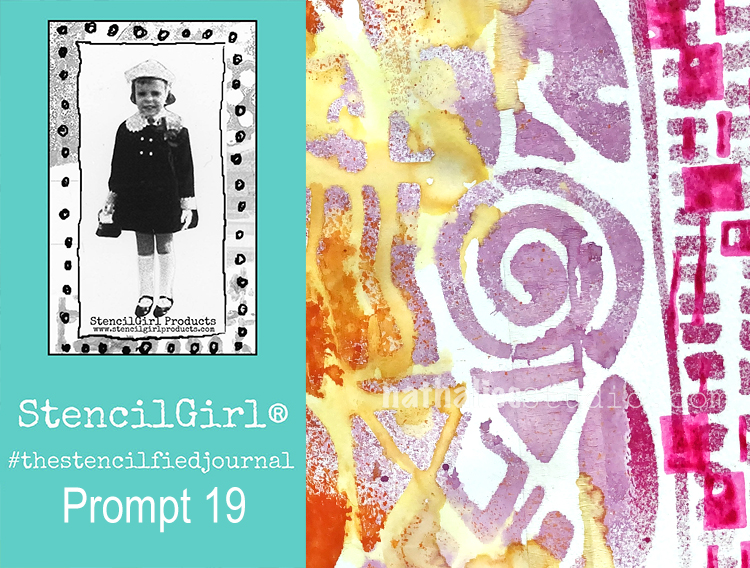
My wonderful friend Tina Walker is at it again – she invited several people to join her Stencilfied Prompts. The prompts are music related and each week she is posting a song. You can be inspired by the lyrics, the video, the album cover or anything related and the only restriction is that you have to use StencilGirl Product Stencils. Here is my take on Prompt 19

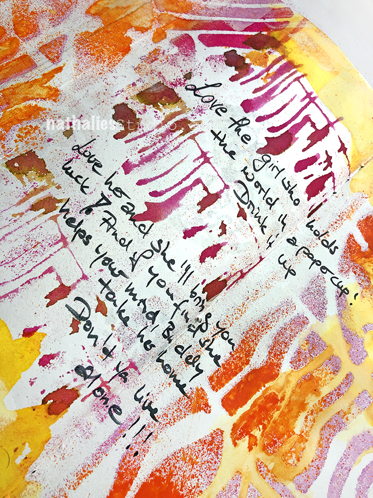
This week’s prompt was Danny’s Song by Loggins and Messina which I had never heard before. It’s a pretty uplifting song about love so I was inspired to make a bright and happy page.

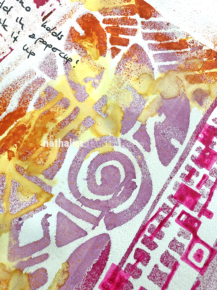
I used my Batik stencil with spray paint – one of my favorite stencils that is an “oldy but a goody.”

I wrote out some of the lyrics with a Fude pen and also added my Far Out and Mid Century Squared foam stamps with watercolor and spray paints.

Here are some of the supplies I used:


Leave a comment

Inspiration from Around the Globe – November 2018

Ready for some inspiration? Today we have some projects from around the globe. It’s always fun to see how you’re using my stamps and stencils and I am so happy to share some examples today. So let me know if you’re doing something cool with my products, tag me on social media, and you might see yours on the next Inspiration from Around the Globe!


First we have Addi Mahajan from India using my Versailles stencil as a background in her vibrant art journal page.

Linda Edkins Wyatt from the US is using my Broadway foam stamp on this index card composition for a bold focal point.

And here is Karen D’Angelo from the US using my Amsterdam stencil for some unifying all-over pattern.

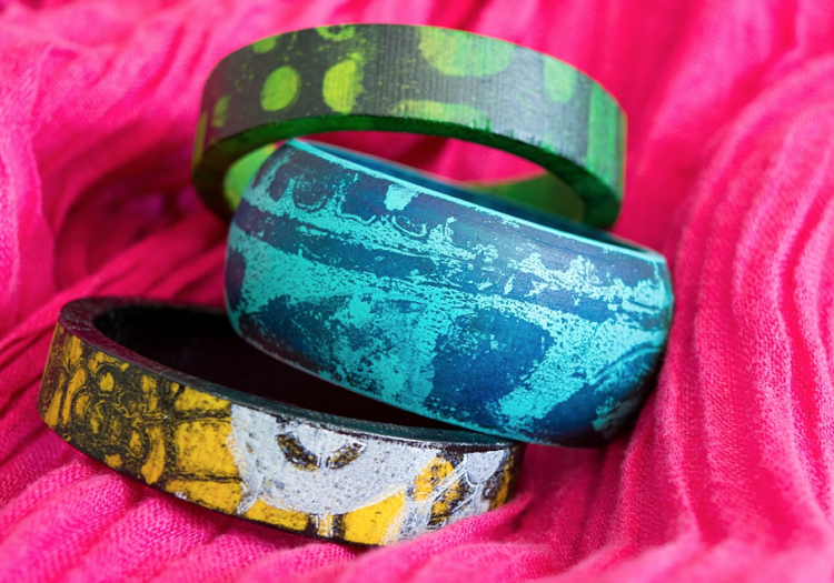
And Marsha Valk, a Creative Squad alumni from the Netherlands, and a funky blue bangle bracelet she decorated using my Batik stencil.

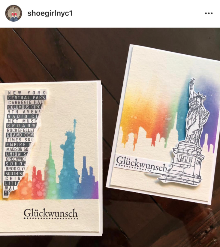
And finally, my friend Liz from Germany who made a card with my Lady Liberty stamp. Love it!


If you’re working on something fun with my stamps or stencils, be sure to tag me and share! I’d love to see! You can find all my stencils, rubber stamps, and foam stamps in my Online Shop. Here are some of the supplies used in this post:


Leave a comment