Nat

Hello from my Creative Squad! Today we have a cute project from Maura Hibbits for all you chefs out there (or maybe hat enthusiasts???)! She is using my Park Blvd stencil and my Solid Fan and Fantastic Large rubber stamps, along with this month’s theme: Food for Thought – Let’s take a lighthearted look at food! While the culinary world has become an art and a science in terms of preparation and presentation, sometimes it is the simplest foods that bring us the most joy. Simple fare or elaborate family traditions, we all have our favorite foods. What is yours?
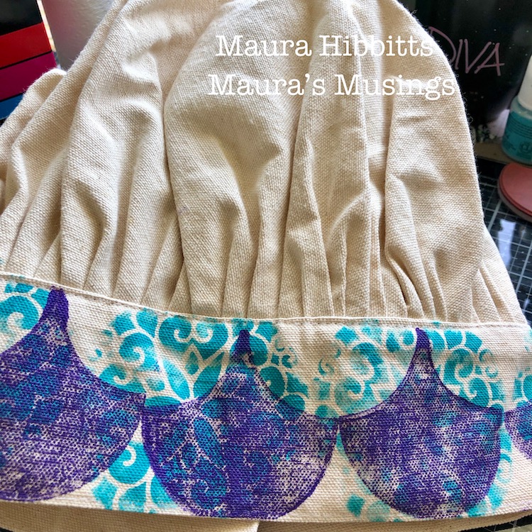
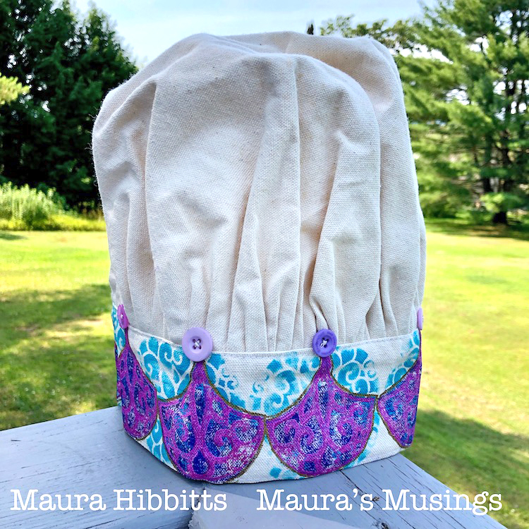
Do you have a King or Queen of the kitchen at your house? Anyone who loves to cook? Why not create a crown themed chef’s hat for them? One of my sisters loves to cook, and loves the color purple which got my muse thinking. I found a canvas chef hat in my stash, and purple made me think of royalty, hence the crown reference.
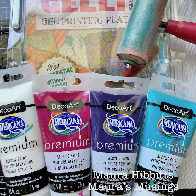
I started with simple materials for my project, chef hat, stencil, stamps, and paints. Of course, this could easily be done on a canvas bag too.
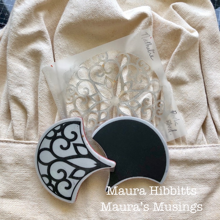
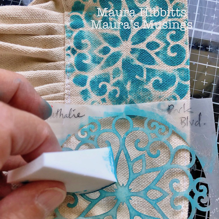
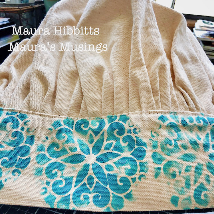
My first step was to stencil around the headband portion of the hat with Nat’s Park Blvd stencil. I used a cosmetic sponge with the Cobalt Teal Hue acrylic paint and dabbed lightly. In retrospect, I would have waited to do this step until after I did the fans, which would have made the placement better. I also would have lightened the blue. Oh, the things we learn as we go!
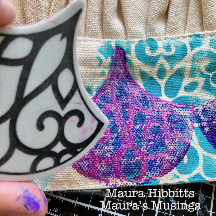
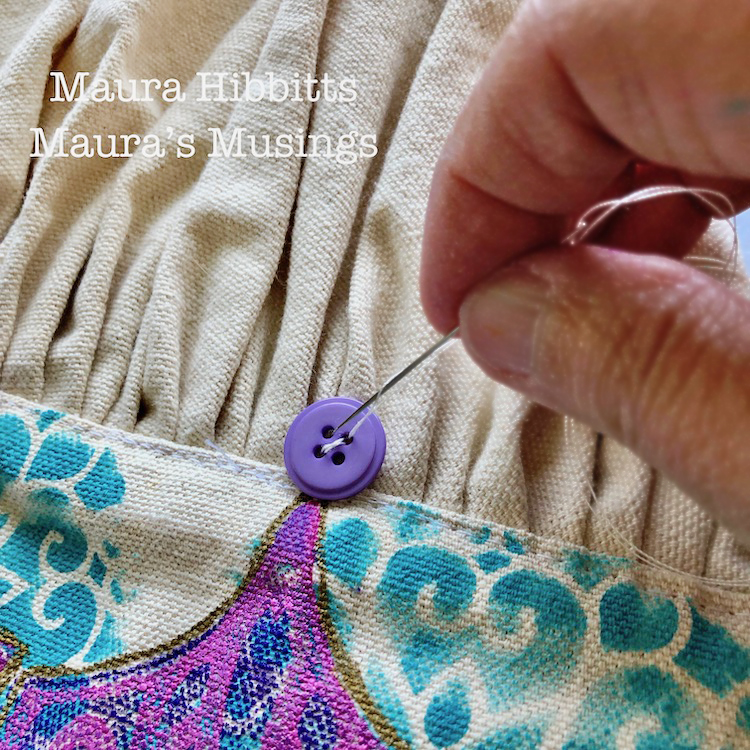
I blended the Dioxazine Purple and Translucent White on the gel plate with the brayer, then used this as a stamping base for the Solid Fan. I found I had to repeat the paint stamping onto the hat two to three times in order to get it dark enough.
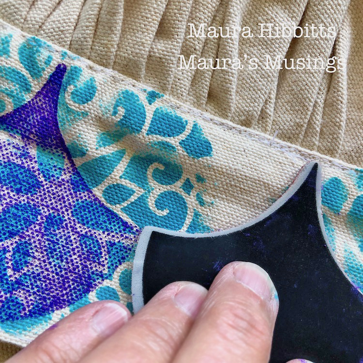
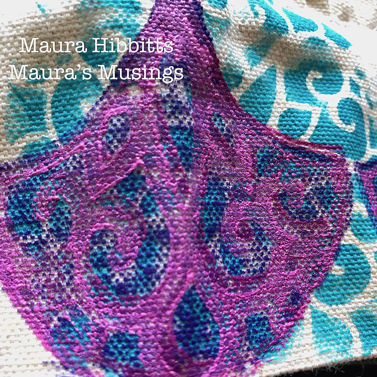
Next, I blended Quinacridone Magenta and Translucent White on the gel plate, and stamped into this with the large Park Avenue Fan to transfer it to the hat. I stamped this design on top of the solid fans around the brim. Then, I decided there wasn’t enough contrast, so mixed a second blend using more white, and re-stamped the design. If you look closely you can see a shadow effect.
To create a royal feel to the chef’s hat, I outlined the fans with a gold acrylic paint pen.
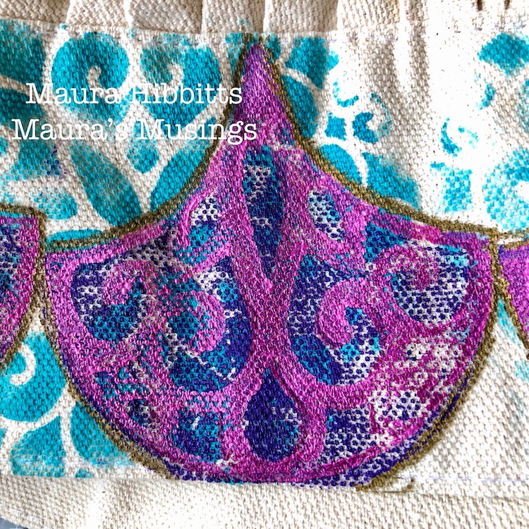
Then, I figured a “crown” needs jewels, so sewed a purple button to the top of each fan.
Time for the “foodie” shot, so I am modeling the Royal Chef Hat.
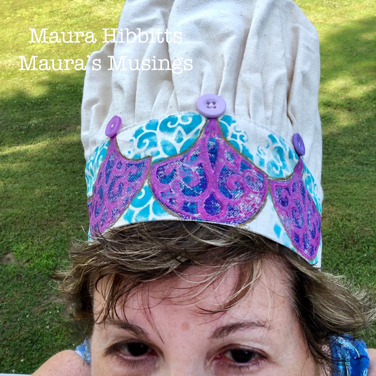
I can’t wait to see my sister’s reaction when I hand her the Royal Chef Hat in honor of her love of cooking and creating. I think it’s a good thing she enjoys wearing hats, even weird ones that look like a dragon or jester, lol. Time to honor the Queen of the Kitchen!
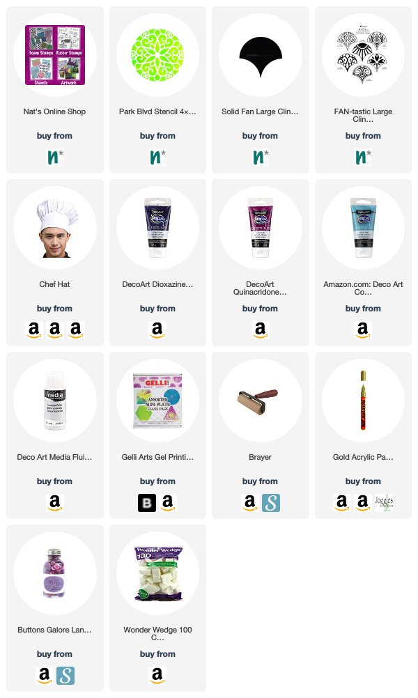
Thank you Maura – I love the idea of donning one of these in the kitchen :) You can find all of my Rubber Stamps and my Stencils in my online shop. Here are some of the supplies Maura used:
If you are working on something yourself that you’d like to share, please do! I love to see how you interpret our monthly themes. Email me how you used my stencils and stamps with the theme and email me an image – I would love to share your projects in my next “n*Spiration From Around the Globe“.
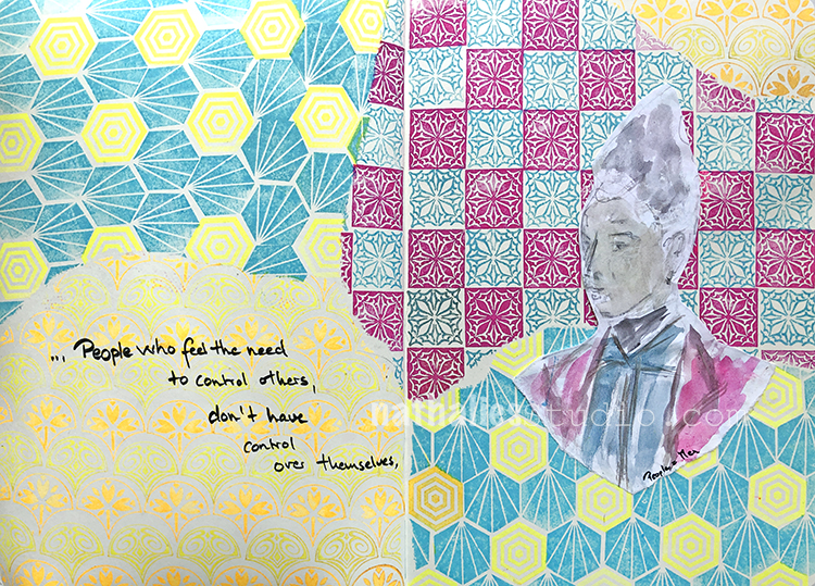
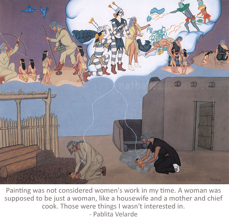
“People who feel the need to control others, don’t have control over themselves.”
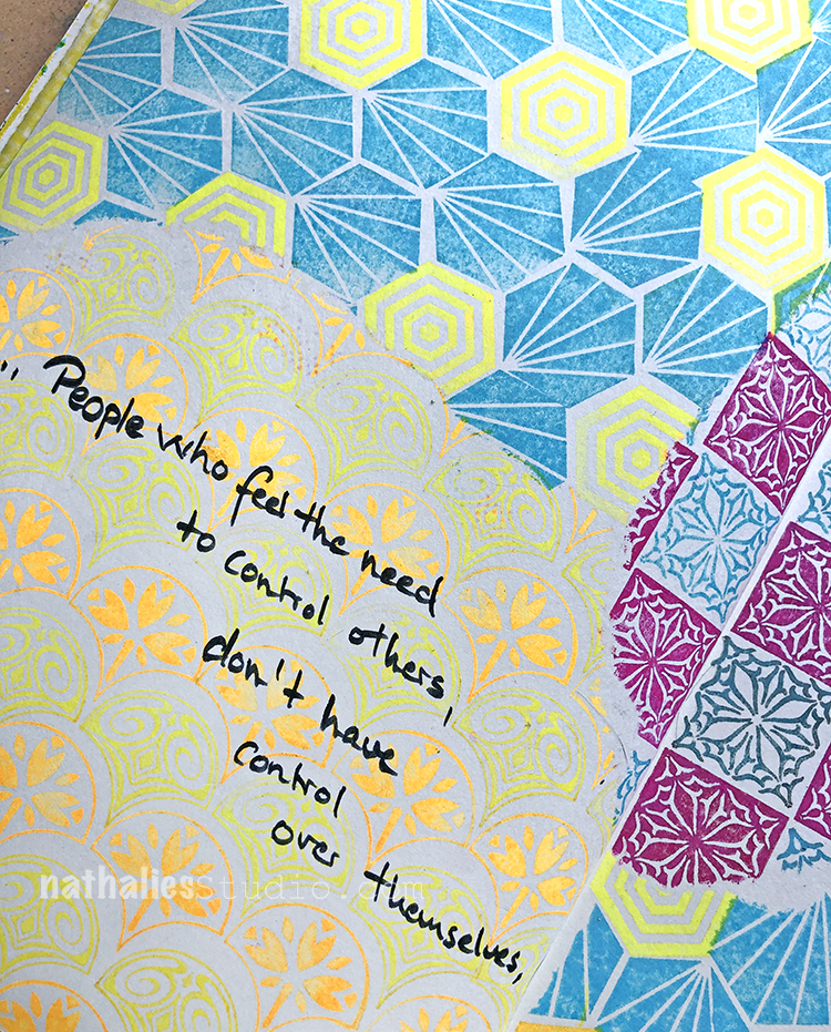
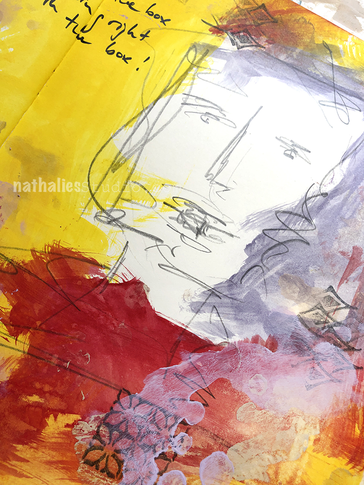
I tore some paper to cover up areas and stamped with my FANtastic Small, Hex Set Small, and Floral Tile Small sets so that the patterns came together. I used MoonGlo ink pads. Love the very bright and indeed glowing colors of those ink pads.
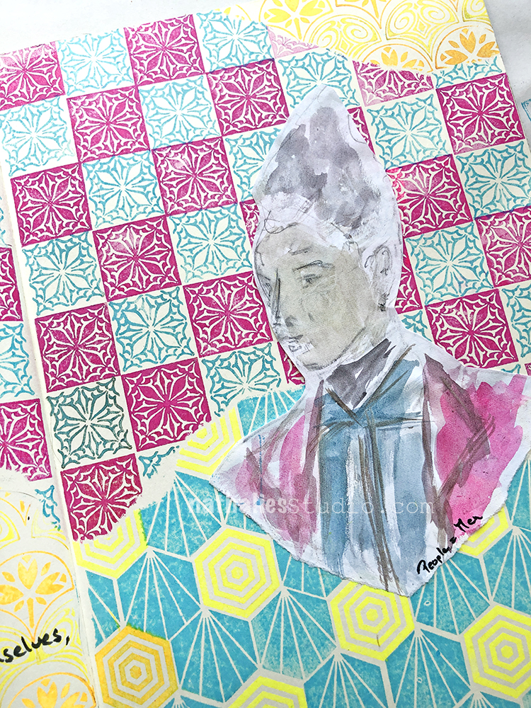
I used water colors for my figure and chose similar colors to help all the elements come together on the page.
Here are some of the supplies that I used:
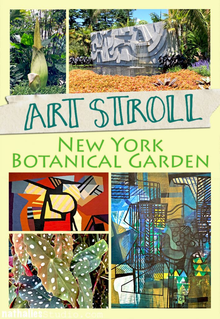
A couple weeks ago Kim and I decided to take a little trip to the Botanical Garden in New York City to see the Roberto Burle Marx Exhibition. It was such a treat – even though going that far uptown is quite a hike.
One thing that the visit reminded me instantly of is what an amazing artist nature is and how inspirational it is to go to a Botanical Garden.
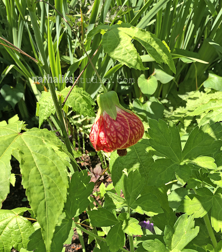
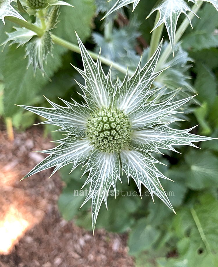
From Flowers that look like something from a fairy tale
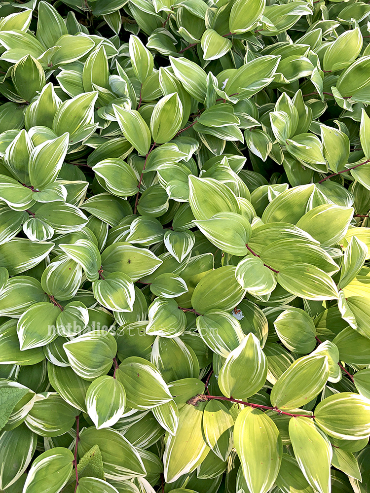
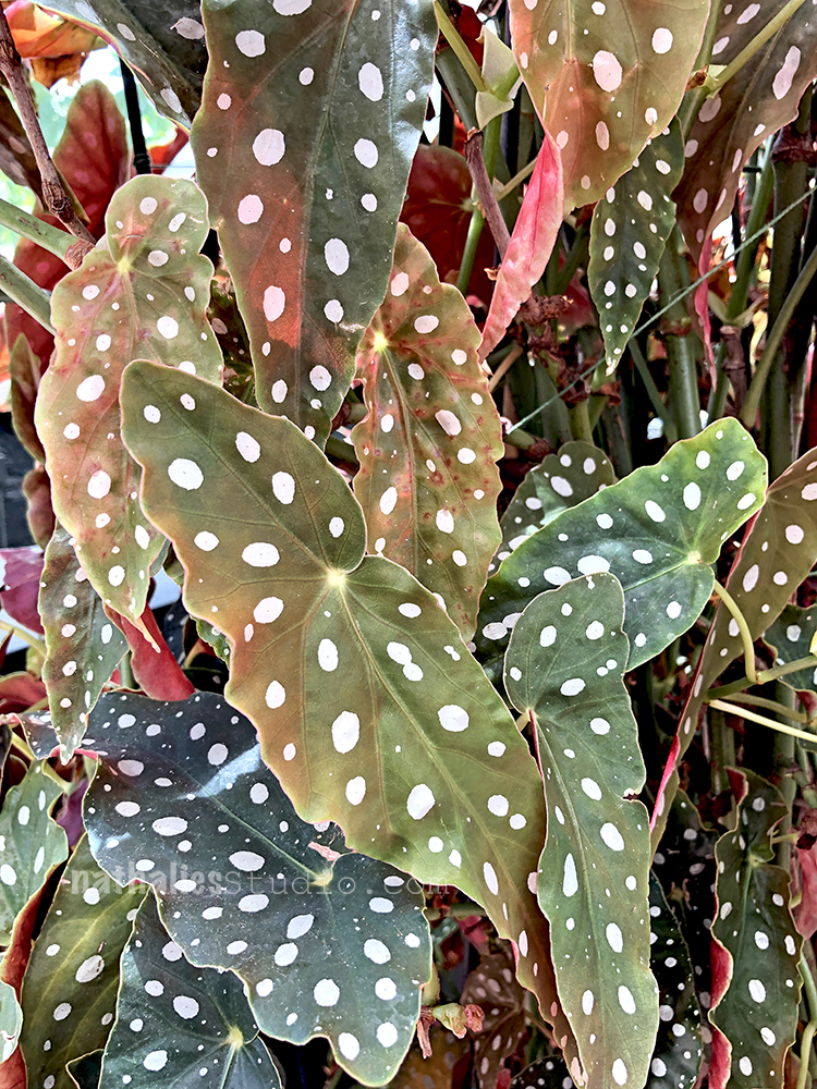
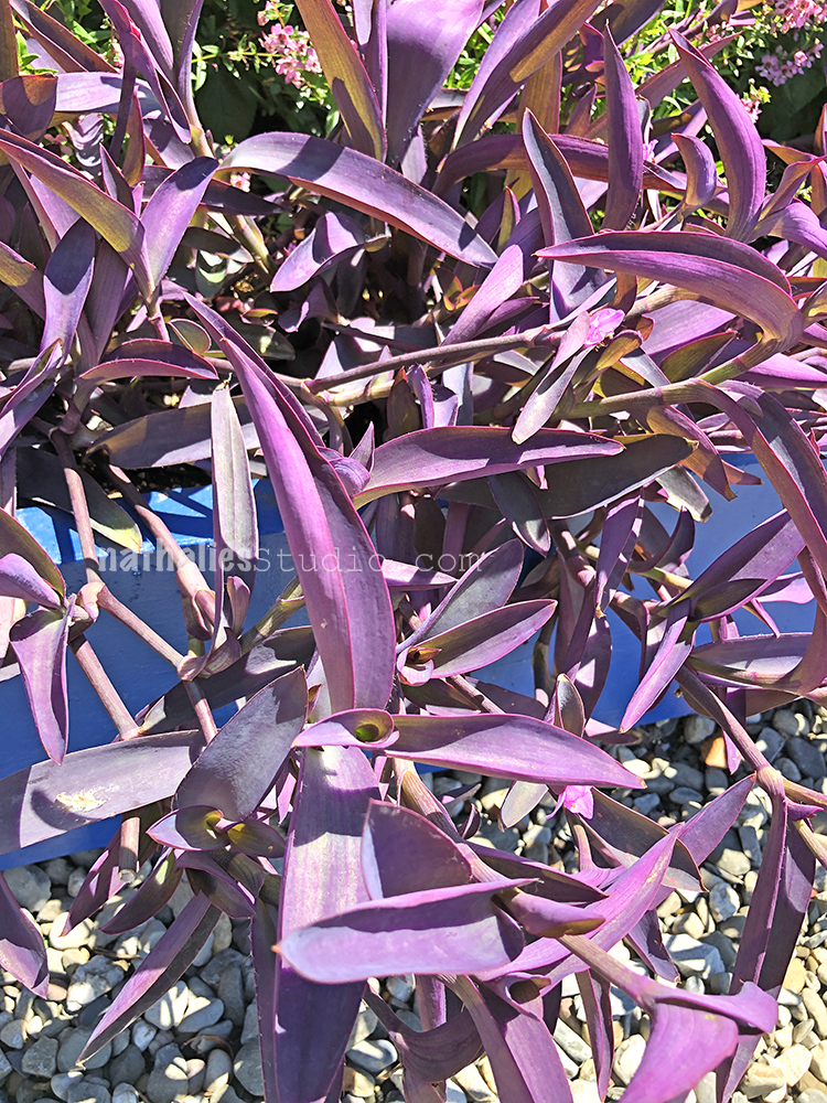
To plants with leaves that look as if they were painted on.
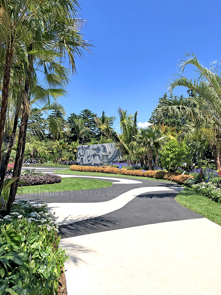
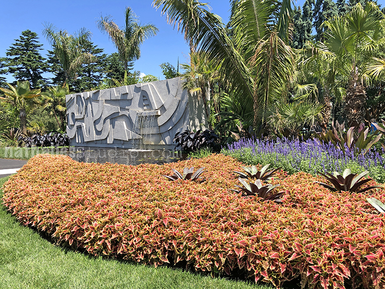
We loved the Garden part of the Roberto Burle Marx exhibition a lot – gorgeous pattern on the pavement- beautiful plants with tons of patterns, texture and lines. As he said: “A garden is a complex of aesthetic and plastic intentions; and the plant is, to a landscape artist, not only a plant – rare, unusual, ordinary or doomed to disappearance – but it is also a color, a shape, a volume or an arabesque in itself”
Made me appreciate plants that I usually do not really think of wanting to have
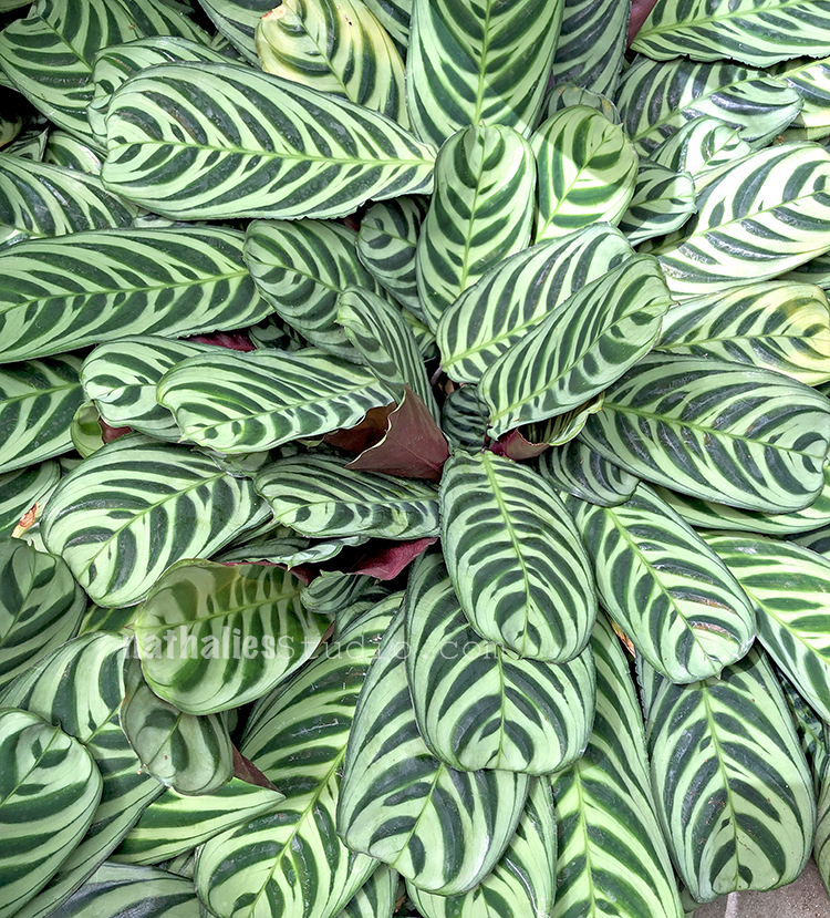
Another amazing plant with awesome leaves! “One might think of a plant as a brush stroke, as a single stitch of embroidery; but one must never forget that it is a living thing. ” Roberto Burle Marx in a 1962 lecture.
Looking into the water in front of the fountain.
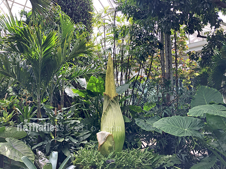
We also happened to come a day too early to see the “Corpse Plant” open.It rareley blooms and only for about 1-2 days. It was a coincidence that we went right when it was going to bloom as we had planned the trip for quite some while but it was cool to see this amazing plant right before it opened. We were spared of the insane smell it releases when it opens (hence the name) but fear not …the ride home at 94 F on the NYC subway probably was worse when the Corpse Flower smell hahahah ;)
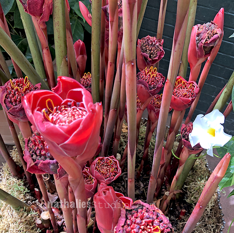
This is some kind of ginger – isn’t this insanly cool? I love ginger and this makes me love it even more .
Let me sneak in another awesome plant …and nope we did not go into the Botanical Garden with a white paint brush LOL –
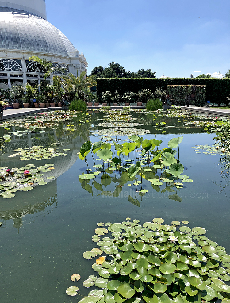
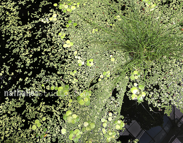
Water plants- where is the frog. I am always fascinated by water plants must be all the stories and fairy tales too.
Look at the color !!!
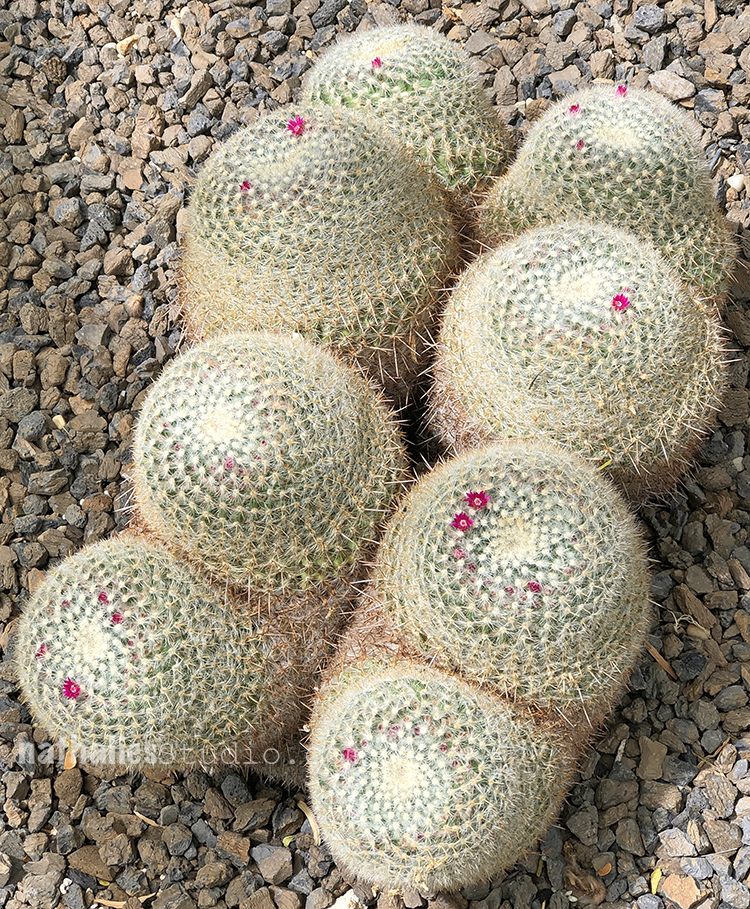
And these cacti – it is so funny to me that these delicate flowers are blooming out of this really prickly sturdy thing.
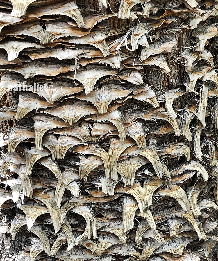
Palm tree pattern and texture
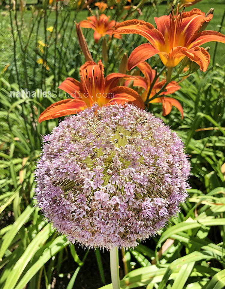
And a giant allium – I need one of those for our garden .
Inside the Library we found this beautiful glass on the floor
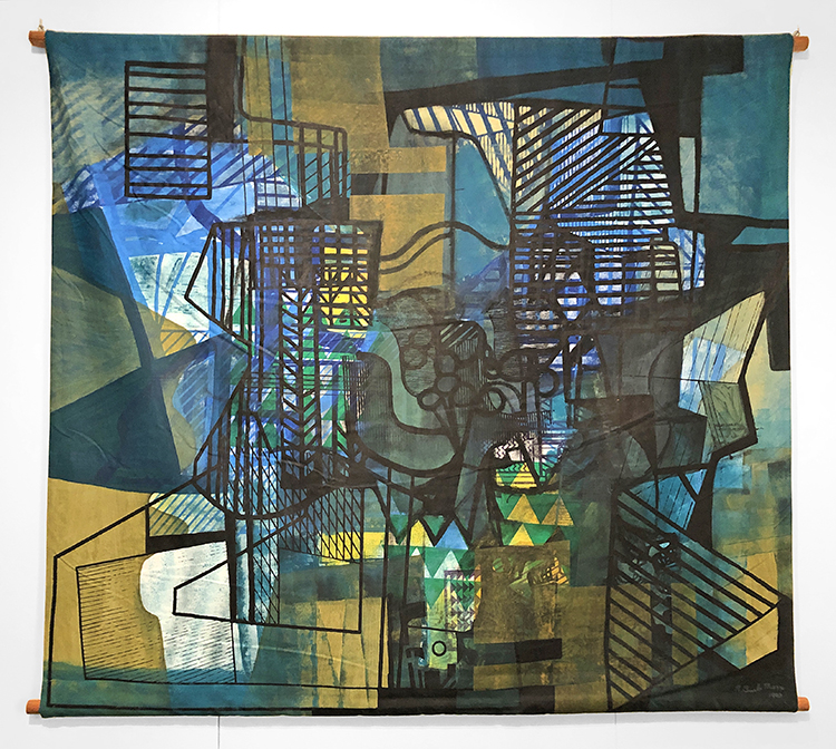
And then enjoyed some gorgeous paintings – the one above on fabric by Roberto Burle Marx.
I found it fascinating to look at his paintings after walking through the garden and seeing pictures of his gardens.
“If I do gardens, I don’t want to paint; if I do paintings I don’t want to do woodcuts; if I do prints from woodcuts, I don’t want to do lithography. Each specialty calls for its own technique and medium of expression…I will not do a painting that is a garden. Without a doubt painting and and all sorts of artistic issues have influenced my whole concept of art. I have always sought to avoid being restricted by formulas…” Roberto Burle Marx 1973
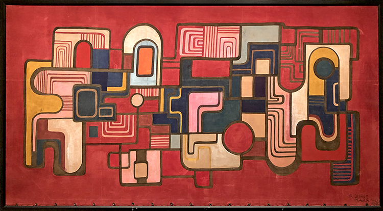
I love the shapes and colors and some of them look like gardens or landscape to me
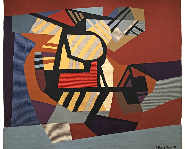
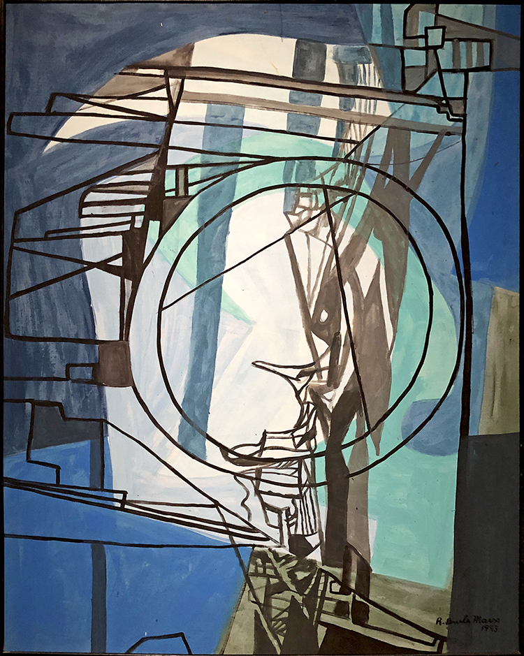
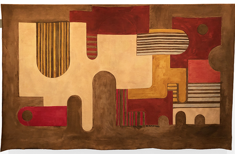
Here is a tapestry by him – also pretty amazing.
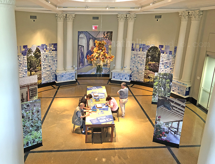
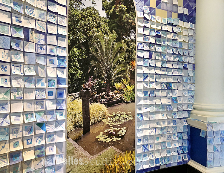
Another favorite part of the exhibition was the interactive tile making – based on Marx’ tiles some tile post-its were provided along with different blue colored pencils.
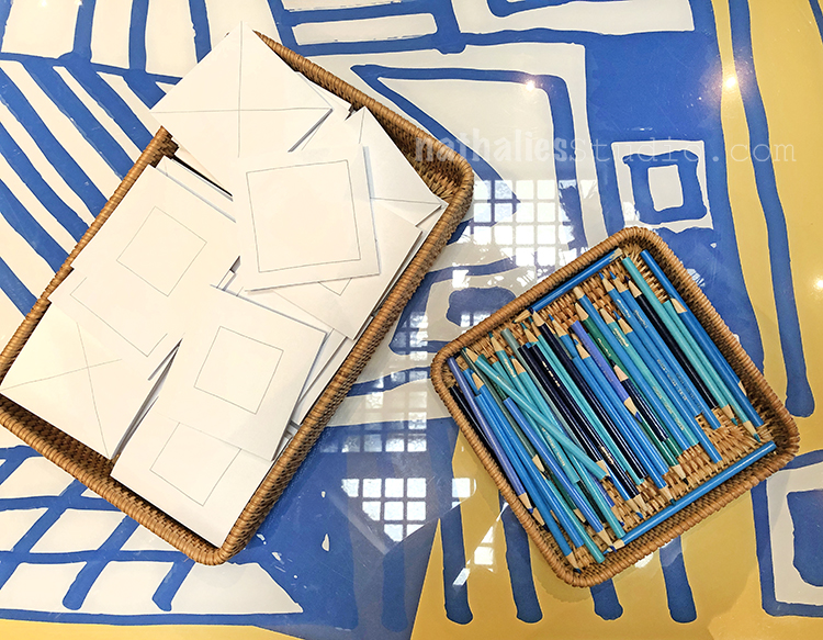
After painting the visitors were encouraged to place them on the wall – it was so beautiful – and fun to see this post-it tile wall.
A wonderful exhibition with an awesome mixture of nature and art. If you have a chance to go – it was so worth the trip!
Nat, I totally enjoyed this post this morning! Thanks.
These are gorgeous photos…beautiful exhibition! Thanks you.
A Look Back – a blog series to show you some projects and posts that you may have missed – sometimes going WAY back in the archive. I think it will be fun to revisit a few ideas that we haven’t seen for a while. I’m excited to see how a little look back might inspire something new in the future :)
This time I’m looking at some stenciling ideas from my blog archives – projects and techniques that make the most of your beloved stencils. Here’s a look back. Enjoy!
This was a cool page I did back in 2013 with my Circuit stencil. I sprayed my stencil with black spraypaint and while it was still wet I flipped it over and rolled it with a brayer. Voila! Reverse printed stencil magic :)
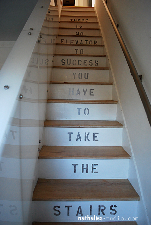
This was a stencil project I did on my staircase when we moved into our apartment in 2013 – and funny enough, now we need to paint over white again as we are moving to our new home soon :) It was a neat idea to personalize the risers of the stairs with a message, but it could be also nice to do a pattern stencil like my Amsterdam or maybe Van Vorst…. Hmmm thinking about decorating ideas lol
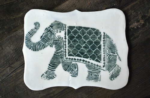
Back in this 2014 post a friend surprised me with a piece of handmade pottery, glazed with my Elephant March stencil on it! I am still thrilled with this and love how many different types of artists can use my stencils for amazingly creative things.
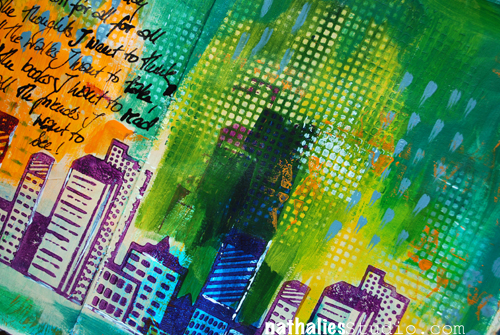
In this 2016 art journal page I used a stencil and a baby wipe to remove paint and create a pattern. This is so easy to do and it lets you use your stencils in yet another way.
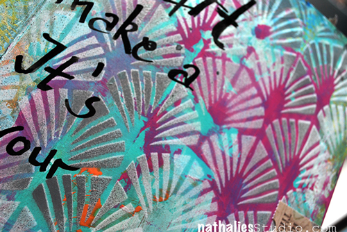
And finally when you have a really crazy colorful background that needs some toning down and unification, I go for a stencil. Here I used my Art Deco Wallpaper stencil and some gray and white paint to bring this 2014 art journal page together.
I hope you enjoyed A Look Back through my archive and maybe you are inspired to try some different things with stencils.
Here are some of the supplies that were used in these pieces:

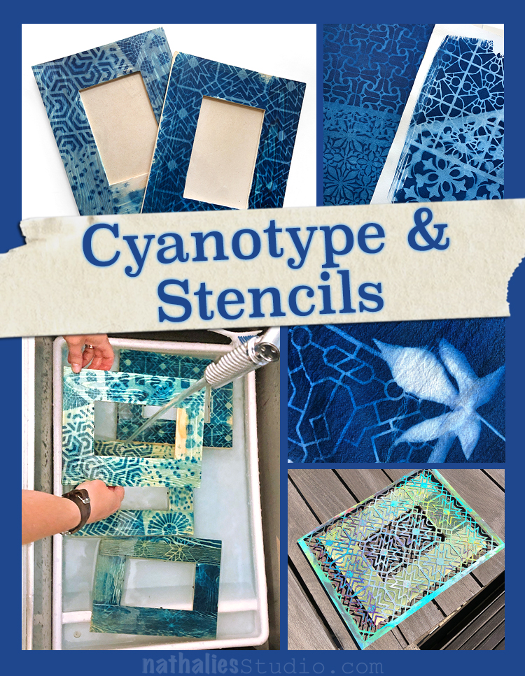
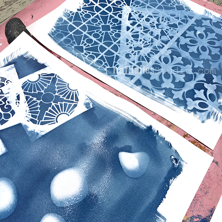
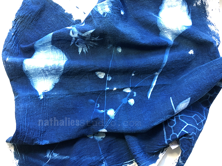
This was such an interesting and exciting play date with Kim – so excited to share it with you today! I have wanted to try cyanotype (aka Sun Printing) for a long time and we finally did. Now this did require some prep ahead of time, and it definitely is an active process, but the results are very cool.
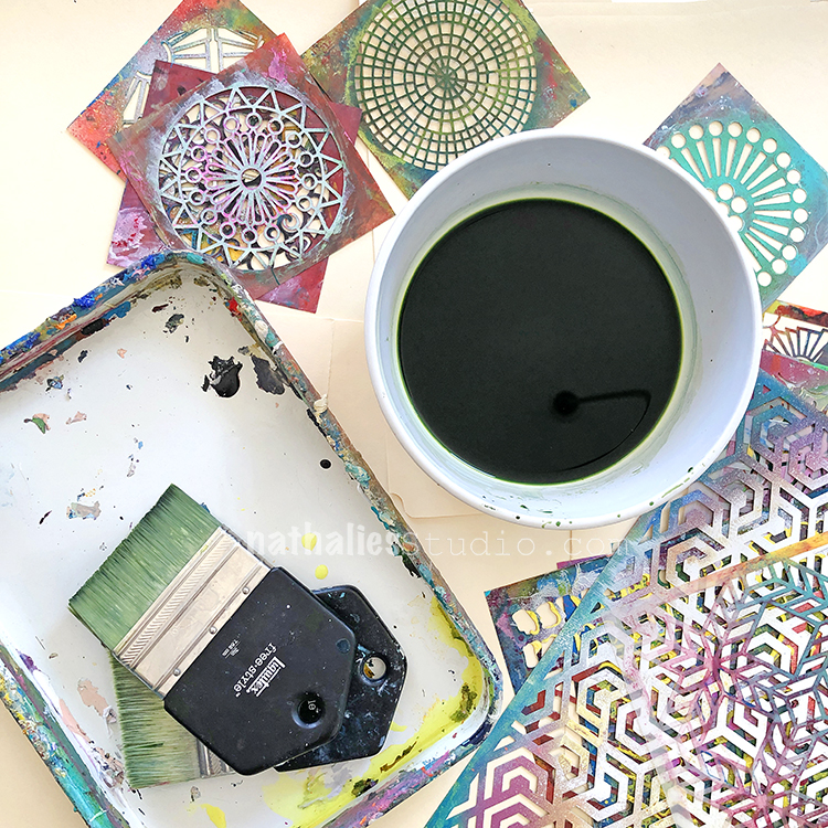
I purchased a cyanotype kit on amazon (link below) that was a 2 part mixture. You can find the chemicals a lot of places, just be sure to follow the directions on the packaging. My kit required some prep 24 hours before we did the actual “printing”. As for supplies, we used the cyanotype kit, large paddle brushes, gunked up stencils (YES – this is one argument for not cleaning them lol), and a surface to print on. We chose wood frames, some fabric, and watercolor paper. Following the directions of our kit, we painted the surface with the mixture in a dimly lit room and let them dry. Ours worked best when we allowed them to fully dry.
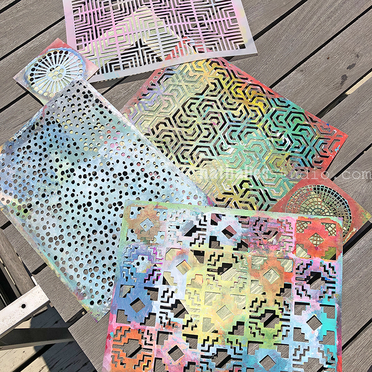
Then it is time to head outside on a nice sunny day. We first did the frames. Here you can see 2 frames covered with an array of stencils. If it is windy you will need to weigh the stencils down.
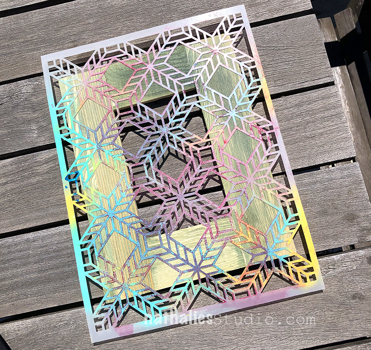
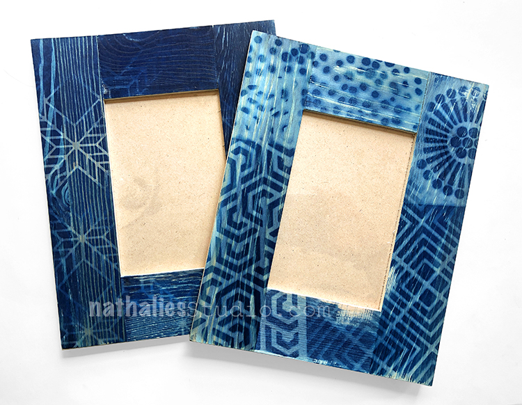
Here is my Santiago stencil on the frame, catching the sunlight. Our mixture was a greenish yellow when it went on and slowly turned to a bronze color when it had been exposed to enough light.
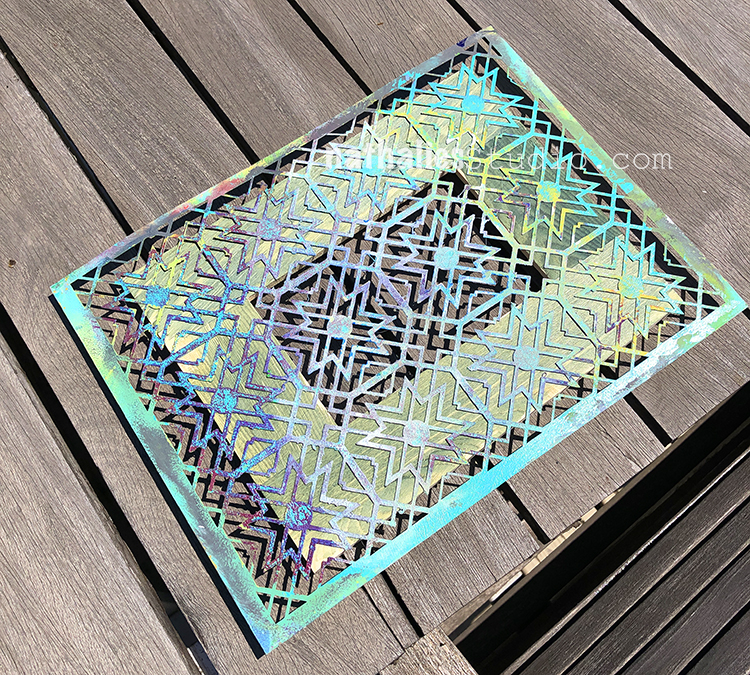
And here is my Toledo stencil on a frame.
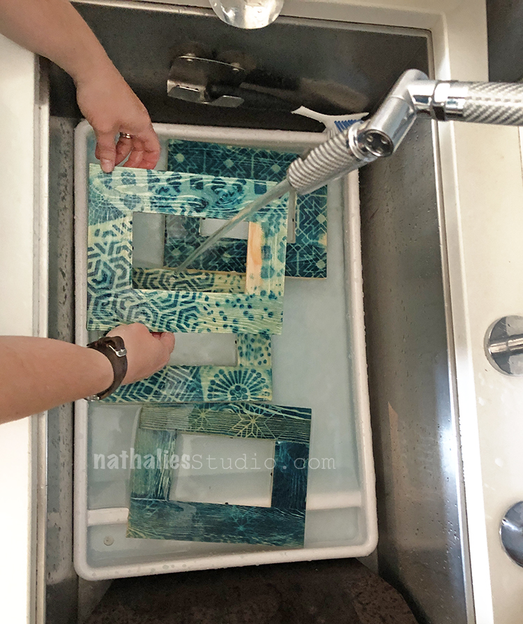
When they have exposed enough, you race them inside and rinse them until the water turns clear. The covered areas will wash away to reveal the wood color and the areas exposed to sunlight will begin to turn a beautiful blue.
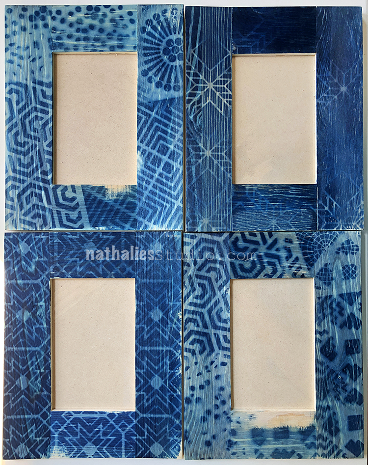
Over the next few hours they will cure to full color and look just gorgeous!
Stencils with thicker lines worked a bit better and we learned that it is safer to weigh the stencil down in case wind picks up.
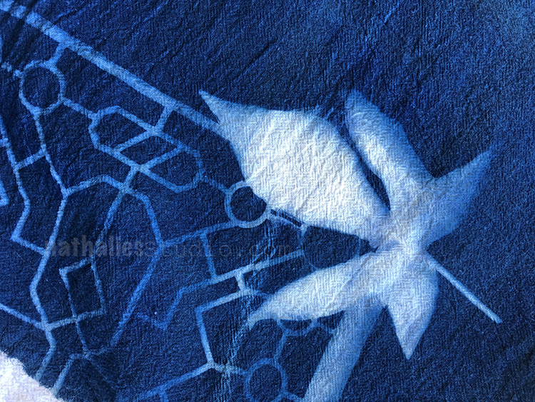
I just love the variety you can get and it all just works together because of that wonderful blue.
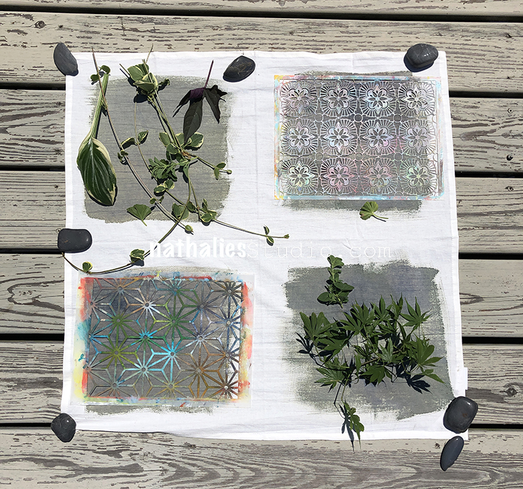
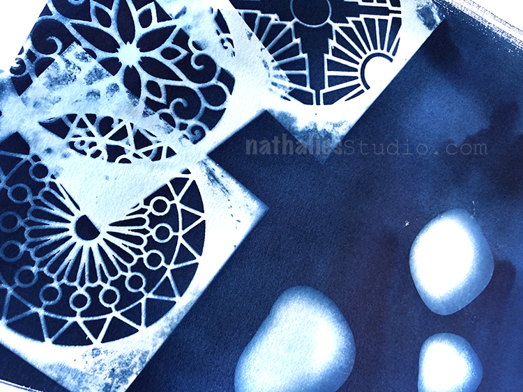
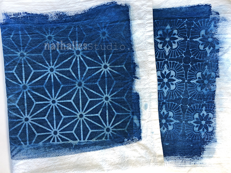
We also tried fabric with stencils (Hamilton and Star Struck here) and leaves. Weigh everything down and try to find flat leaves so you get defined edges. The fabric and paper exposure was really quick – so have a plan and all your stencils and objects ready to immediately put down on the fabric when you bring it outside.
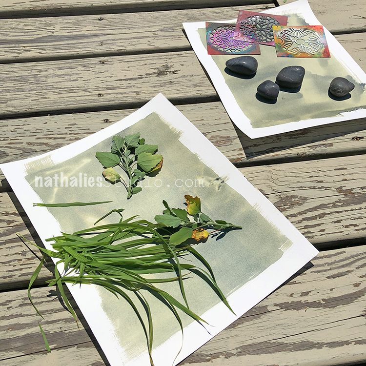
Here is some paper with leaves and grass – all of these blew in the wind very easily so we did not get a good print here. I would put rocks on them next time. The top paper had some stencils and rocks. Setting up multiple papers at once was a bit hectic as they started changing very fast. Make a plan, have plenty of extra material (stencils, leaves, rocks, etc) and expect to just roll with it.
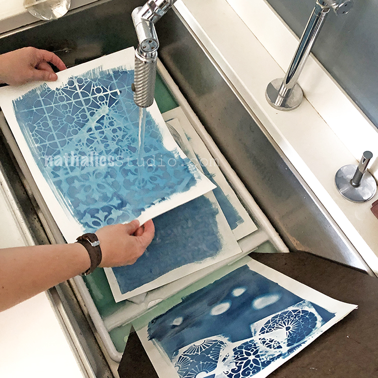
The paper process was the same – rinse immediately after bringing inside. Here you see a print I made with my Buenos Aires and Versailles stencils getting a rinse.
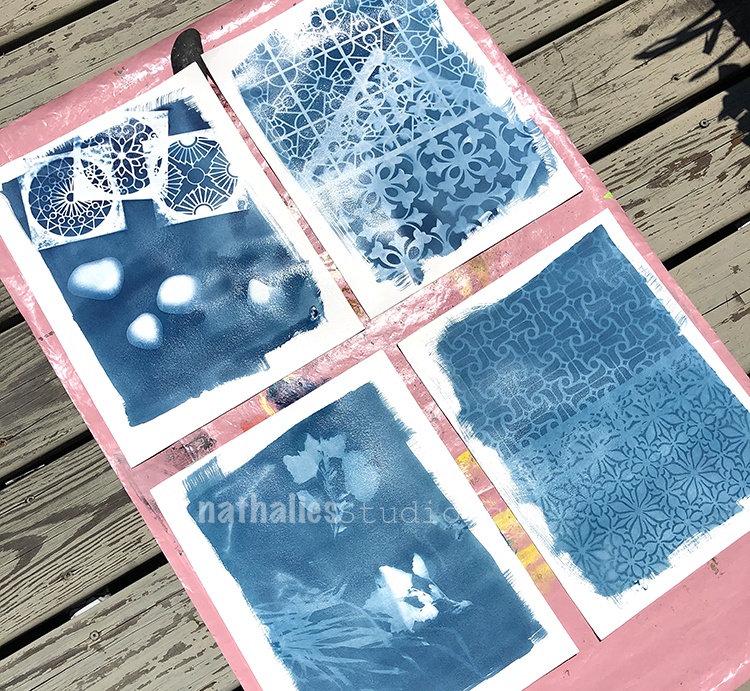
We let them dry in the sun and you can see some interesting results.
Definitely something to play around with here.
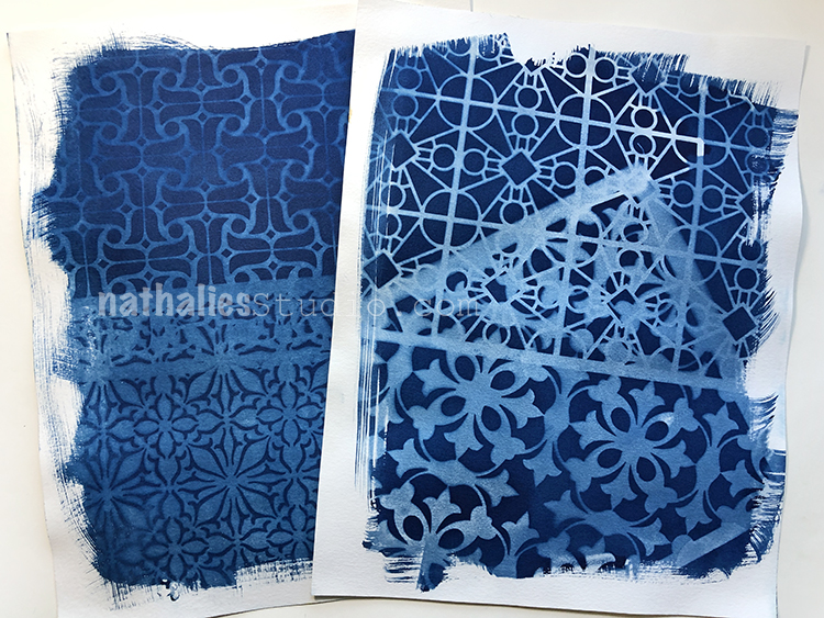
After a bit, the blue really came out.
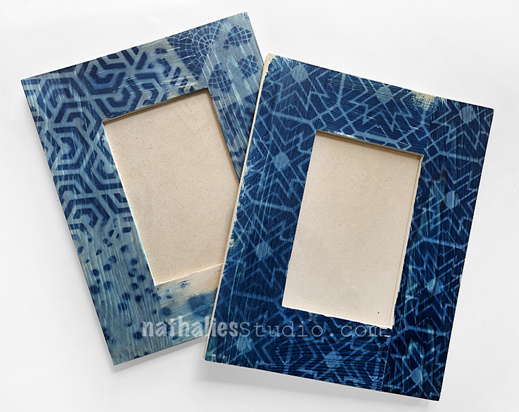
My Valley Road, Park Blvd, and Broadway stencils came out very crisp.
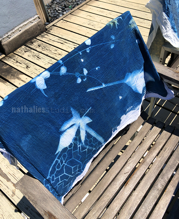
We rinsed and dried the fabric as well. Here you see some leaves, vines, and a peek of my Exchange Place stencil in the corner.
These were pretty unplanned compositions. It is worth getting familiar with the process and just playing at first. Kim and I are planning a second play date now that we know how it works and then we can better prepare for what we make in the end.
Regardless, it was really awesome to see the potential and beauty of cyanotype printing.
We are imagining all sorts of fabric and clothing projects :)
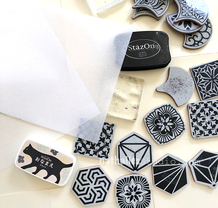
Another variation we did: stamping with my new rubber stamp sets and black stazon ink onto transparency film.
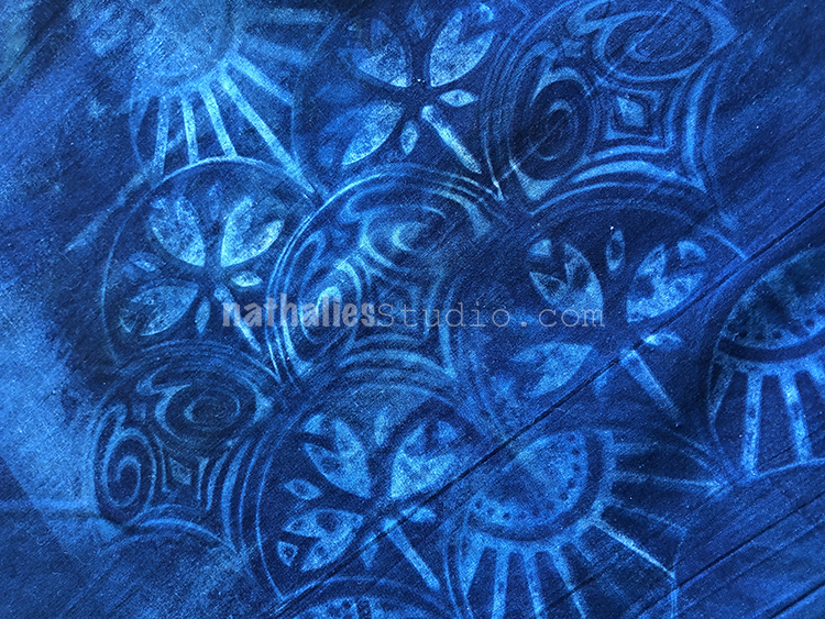
I stamped the film with my Fantastic Large stamps and then put it on top of a treated pillowcase… It blew off several times in the breeze hence the “double vision” look to the print.
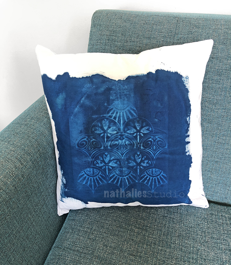
But still a really cool idea for future cyano projects!
So as you can see there is so much potential to using this medium with your stamps and stencils. We are just getting started and will definitely share future adventures with you as well. Don’t be intimidated by the process – it isn’t that hard and the results can be sooooooo nice and surprising some times. I hope you give it a try!
Here are some of the supplies that we used:
Love these! One tip is to place picture frame glass on top of the leaves/stencils/transparency/etc to hold everything down and in place.
These turned out so cool! I love the blue!
Thank you so much Rae- it was a ton of fun!
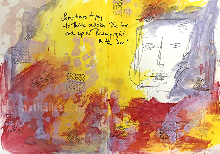
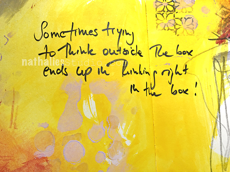
“Sometimes trying to think outside the box ends up in thinking right in the box!”
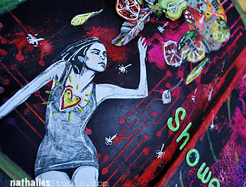
I began this page by sketching a figure… but sometimes what you don’t know is how an art journal spread came together- see me fighting off my cat and spilled ink – and then just deciding to live with it on a weird Monday afternoon in this video:
Although it was fun to have Pretzel’s paw make a cameo, arting with your cat can be tricky. I don’t recommend it lol
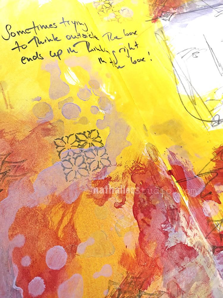
But I do recommend just going with what happens when you are working. The spilled ink and all! Actually to bring my page together I used my Paint Splat Mixed Media Chip as a stencil (very fitting with my messy process that day). And I added a stamp from the Fanfare set too.
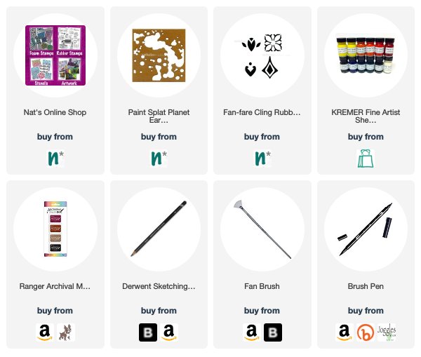
Here are some of the supplies I used:
Hello everyone – time for a post from my Creative Squad! Today we have Jennifer Gallagher and her upcycled candy box turned recipe box and cards using my Fantastic Large stamps and my Buenos Aires stencil. This month’s theme is Food for Thought – Let’s take a lighthearted look at food! While the culinary world has become an art and a science in terms of preparation and presentation, sometimes it is the simplest foods that bring us the most joy. Simple fare or elaborate family traditions, we all have our favorite foods. What is yours?
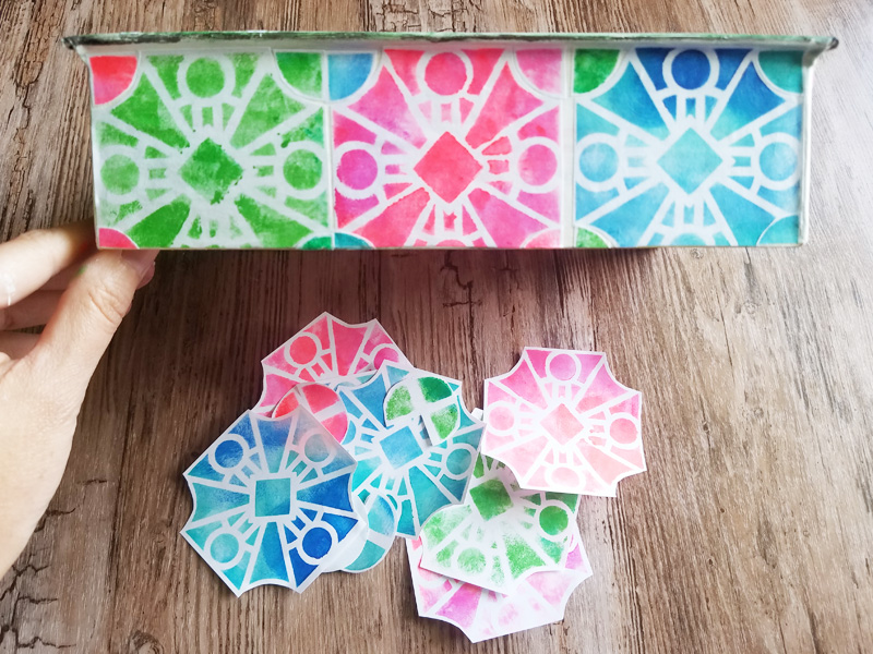
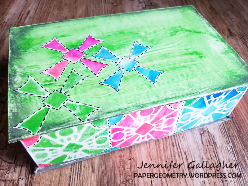
This month we are discussing food for thought. Well, I am a southern girl. We take our food and our traditions very seriously. So when I received this month’s prompt, I instantly thought of family dinners, holiday celebrations, and those recipes that get handed down from person to person. This month, I am sharing with you a fun way to recycle a candy box into a recipe box. Let’s get started.
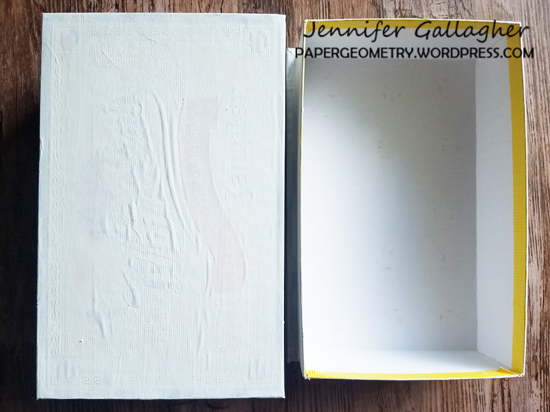
I had been holding on to a candy box left from Valentine’s Day for a while now. I knew I could turn it into something fabulous. I started by applying a coat of white gesso to the box. (It ended up needing two coats.)
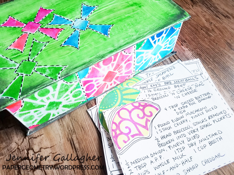
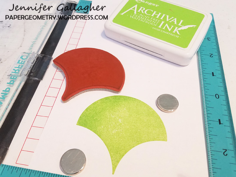
While the gesso dried, I created a series of papers to use for collage. Using just basic computer copy paper, I stenciled acrylic paint through Nat’s Buenos Aires stencil with a mini blending tool.
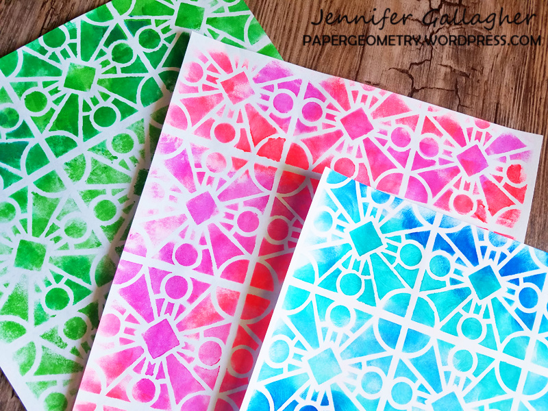
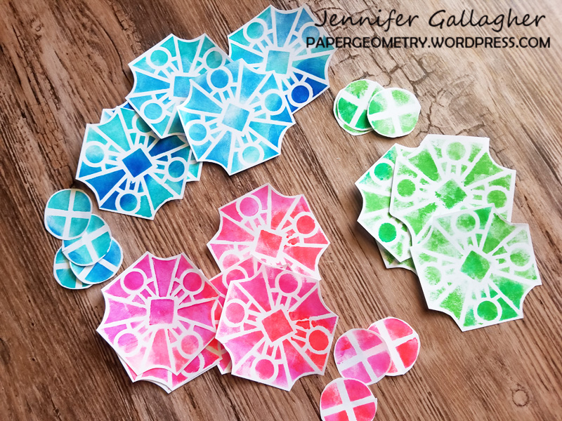
Next, I cut some shapes out of the stenciled paper. This is one of my favorite ways to push my stencils and stamps to get more out of them.
Using matte medium and a small brush, I glued down the cut out shapes in a pattern that was pleasing to me. I followed this pattern around the entire side of the box.
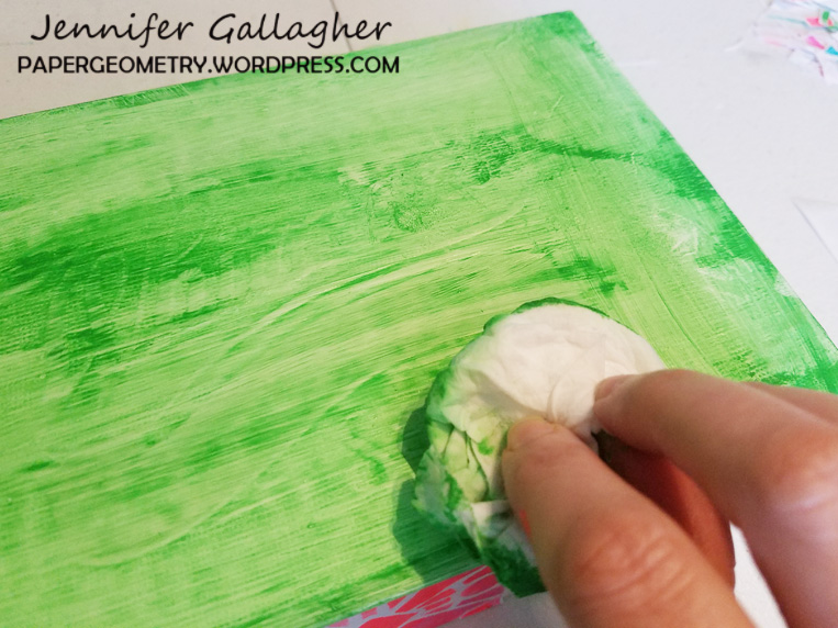
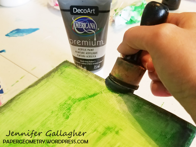
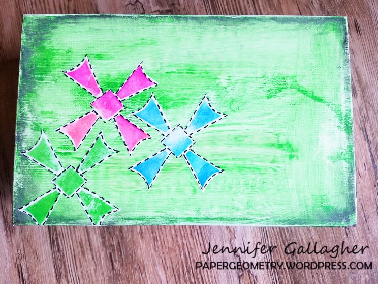
I painted the top of the box green. Once it was about half way dry, I dabbed the paint with a baby wipe to give the top texture and a distressed look. Then I dabbed a little dark grey acrylic paint along the edges of the top of the box.
I cut out three more shapes from the painted paper and glued them to the top of the box. I added doodles around the designs with a black posca pen. I liked it so much I did the same around the sides.
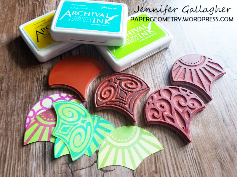
Now we need recipe cards. I started by stamping the Solid Fan in one color onto copy paper and then stamping another color in the Fantastic Large designs over that. I used archival inks for this process. I cut each one out, modified it slightly with scissors, and glued it to my blank 4×6 inch recipe card. I added a little doodling with a black pen and wrote in my recipes.
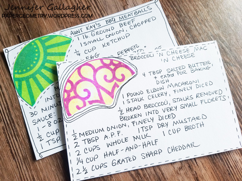
Saving our traditions to pass down to others is very important. I have so many cherished recipes that not only help me keep those traditions alive, but remind me of people that have passed and good times that are now memories. I hope you have enjoyed this tutorial. Remember, play along with us and share your creations!
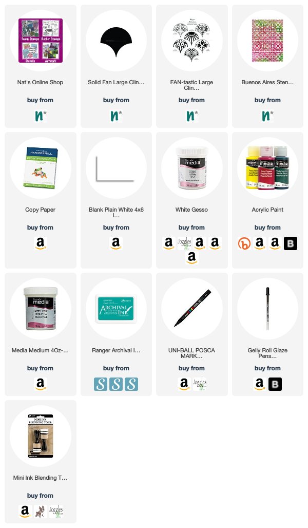
Thank you Jennifer! I love how you cut up the stencil design to pull out some cool shapes. You can find all of my Rubber Stamps and my Stencils in my online shop. In addition to a candy box, here are some of the other supplies Jennifer used:
If you are working on something yourself that you’d like to share, please do! I love to see how you interpret our monthly themes. Email me how you used my stencils and stamps with the theme and email me an image – I would love to share your projects in my next “n*Spiration From Around the Globe“.
thanks Nat for the refreshing walk through the gardens…isn’t nature soo inspiring…the patterns…colours…textures…love it all…
Reply