Warm Wishes – Maura Hibbitts


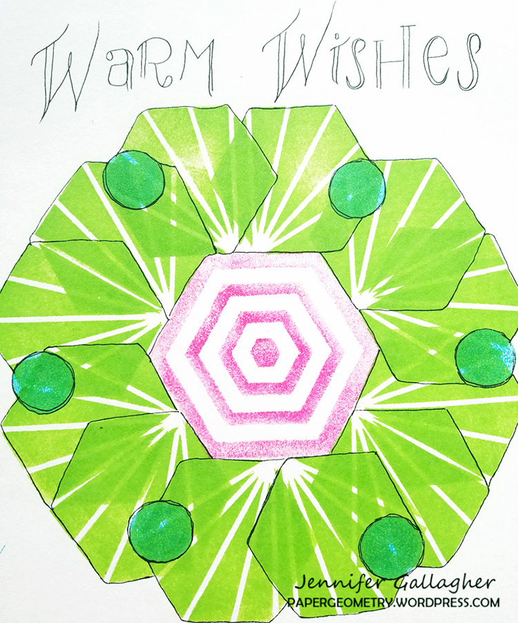
Happy Holidays from the Creative Squad and Maura Hibbitts! Today Maura brings us a wonderfully charming seasonal project just in case you need a last minute ornament or gift tag idea. She uses my Park Blvd 4×4, Toledo 9×12, and Toledo 4×4 stencils and my Diamond Hex, Antique Tile, and my Van Vorst foam stamps to bring us a project that will surely warm you up this season :) The theme this month is: Warm Wishes – For many cultures around the world, December is a holiday season filled with celebrations and good cheer. The Creative Squad is taking this month to send Warm Wishes to all our readers!


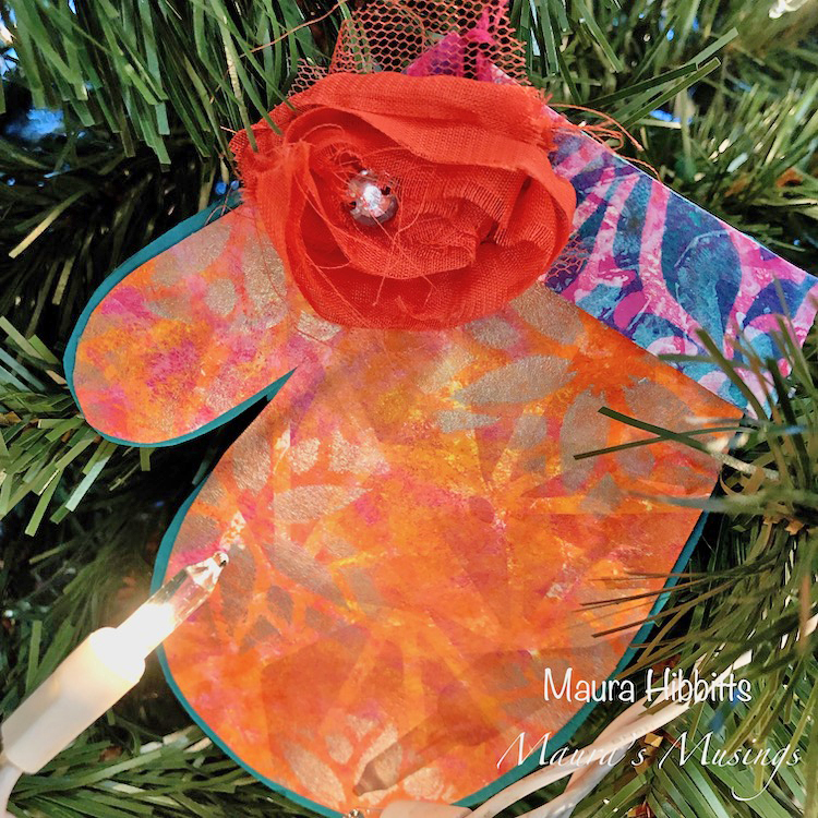
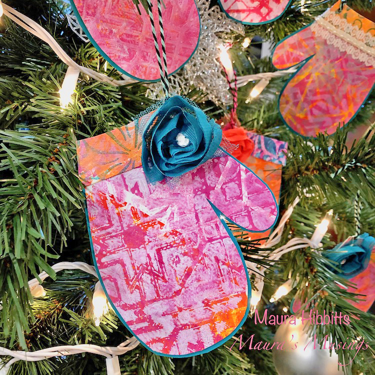
Tis the season, right? Winter has arrived on the calendar, we’ve celebrated the Winter Solstice, and tomorrow is Christmas for all who celebrate. Happy Solstice! Merry Christmas! Happy New Year! My winter started early this year in November with snow and cold, so staying warm is a priority. I headed for warm colors in my project and sketched out a mitten pattern to use as I rarely head outdoors these days without my mittens or gloves.

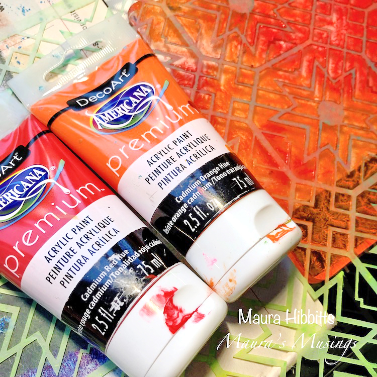
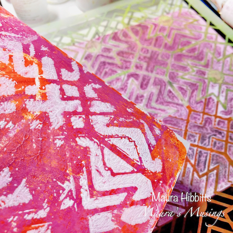
I have a small workspace, so my 6 x 6 gel plate works well with many projects. I started with a mix of Cadmium Red Hue and Cadmium Orange Hue and blended them on the plate with the brayer. I laid the large Toledo stencil on the gel plate and pressed my watercolor paper onto it for one print, lifted the stencil to print another, then printed again on the gel plate without the stencil.

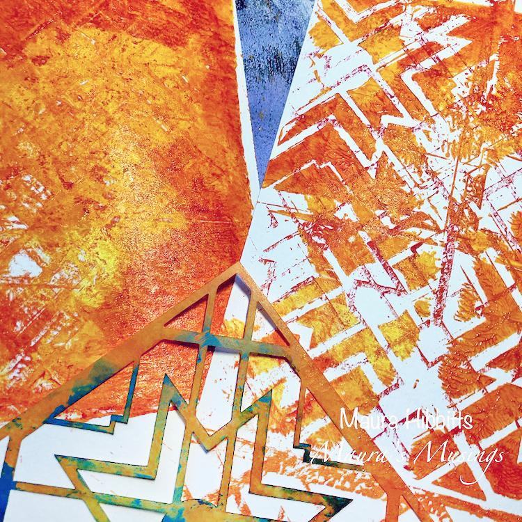
Next, I blended Diarylide Yellow, Cadmium Yellow Hue, and Primary Yellow on the gel plate with the brayer, and used the Toledo Small stencil on the plate. I printed the next layer of color and design onto my sheets.

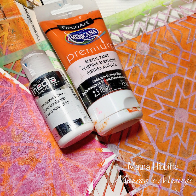
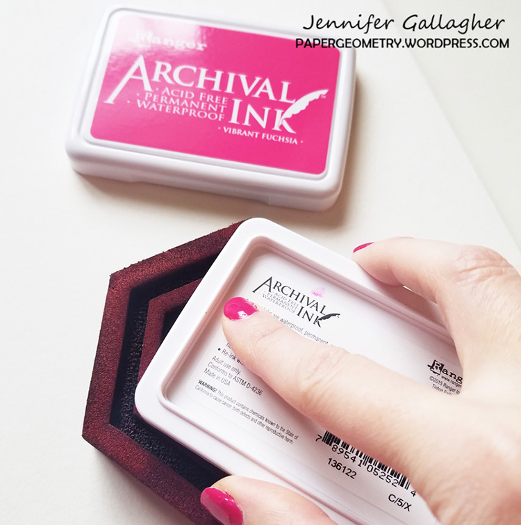
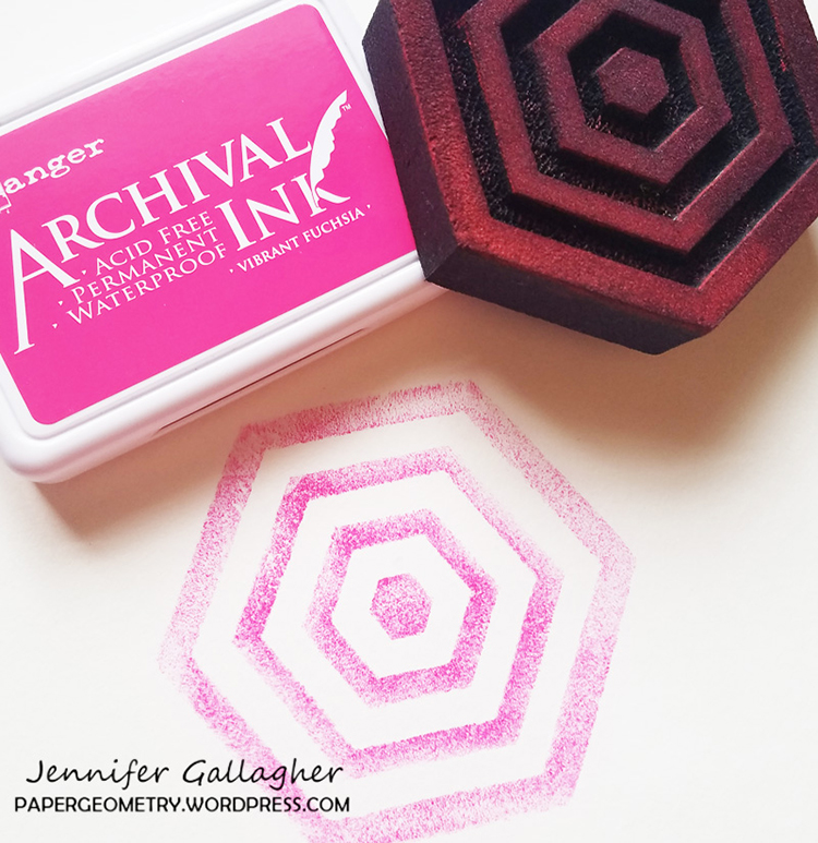
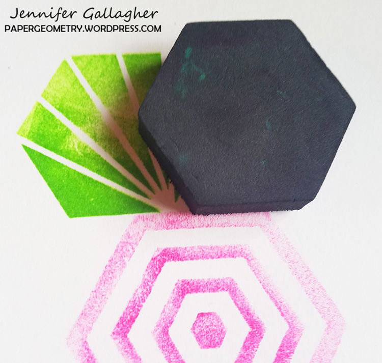
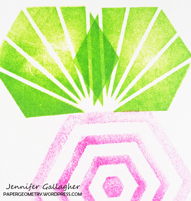
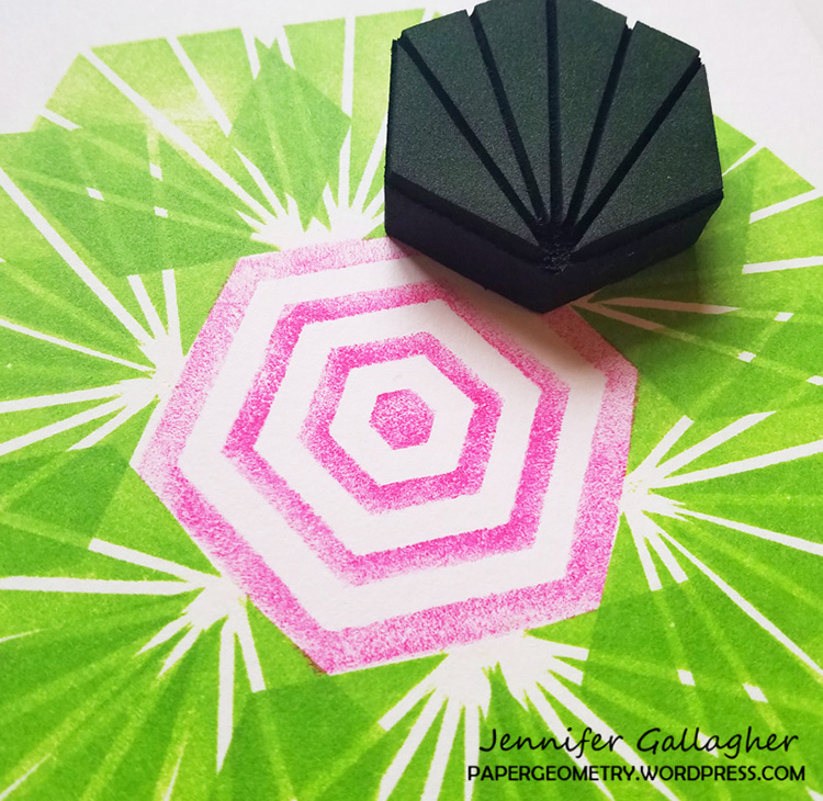
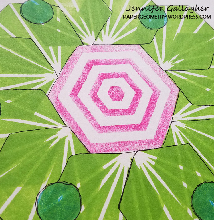
Time to add another bright, warm layer to my papers with a blend of Translucent White and Quinacridone Magenta. Once again, I used the gel plate and brayer to blend, and then stamped the Diamond Hex stamp into the paint, then on to my papers.

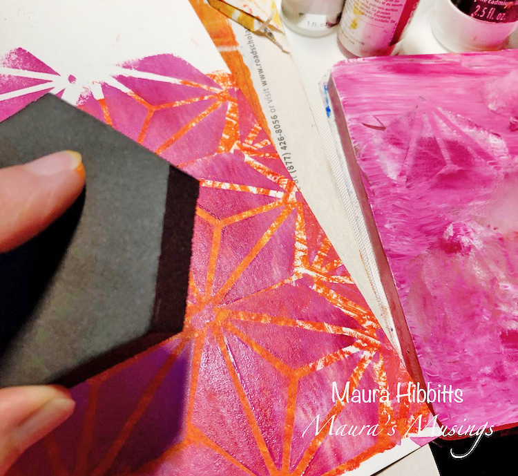
As you can guess, I like to build up layers, so went in for another one using the Translucent White and Quinacridone Magenta on the gel plate, then laid the large Toledo stencil down on it again. This time, I randomly pressed some areas of the paper into the paint.

I repeated the previous step with Translucent White and Cadmium Orange Hue.

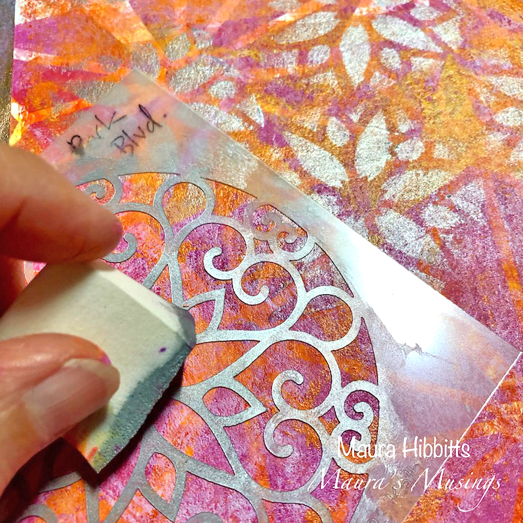
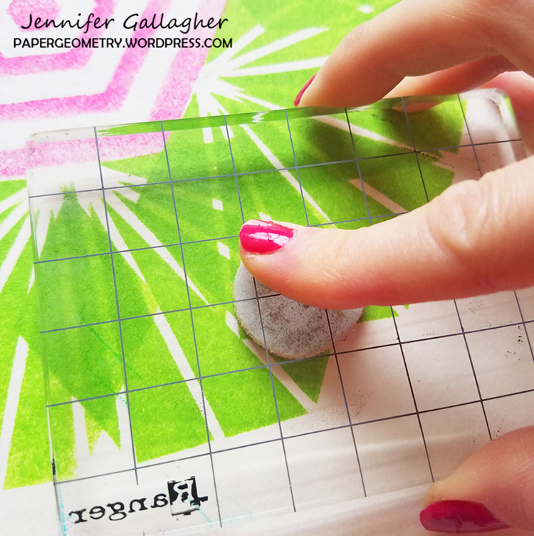
I decided to add some shimmer to my papers with the Park Boulevard stencil and Shimmering Silver paint. I used a sponge and dabbed the center of the stencil (it reminded me of a flower or snowflake) randomly over my papers.

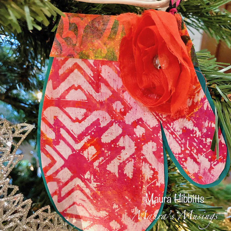
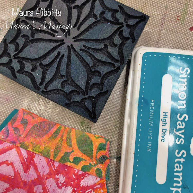
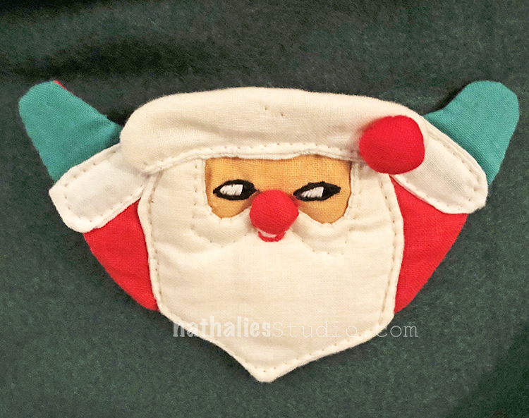
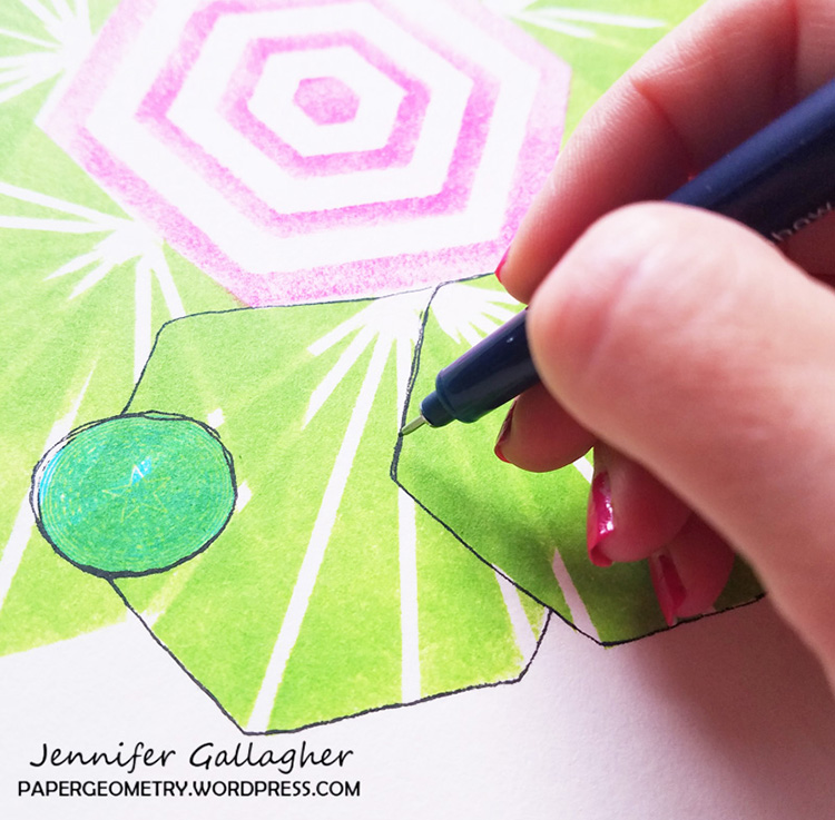
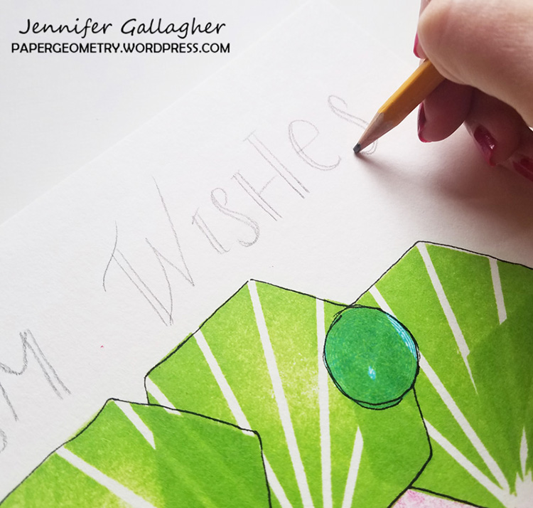
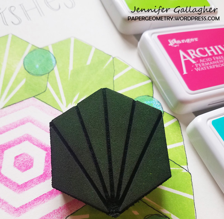
Now that my papers are created, it is time to cut out my mittens. I sketched my mitten onto scrap paper and used this to cut my mittens. Then I used a slightly larger mitten shape to cut out my background with the Peacock Teal card stock. I cut a cuff for each mitten and stamped another design onto the cuffs with the Antique Tile and VanVorst stamps and blue ink.

I adhered the patterned mitten to the teal card stock, added the cuff and decorated with ribbons. Then I punched a hole and tied on some bakers twine to hang these. They can be used as tags on a gift or ornaments for the tree.

Stay warm this winter with warm colors and mittens! Peace and Joy! – Maura


Seasons greetings to you Maura and thank you for this definitely super cute holiday idea! Maura used the following supplies:


Feel inspired? Working on something yourself that you’d like to share?  I love to see how you interpret our monthly themes. Email me how you used my stencils and stamps with the theme and email me an image – I would love to share your projects in my next  “n*Spiration From Around the Globe“.

Leave a comment

Creative JumpStart Interviews with John, Andrea C, and James

Here is a batch of interviews from some of this year’s newbie Creative JumpStart Artists :)

“Jumping with” is an interview series that I like to do to showcase some of the CJS artists. Each year we always have some new faces or folks that I haven’t spoken with in a while and it’s a fun way for us to get to know the artists a little more before January. Grab a cup of coffee, sit back, relax and enjoy a few interviews with some very talented people.

You can learn more about John here:

nstudiowebsitesocialmediablognstudiowebsitesocialmediainstagram

You can learn more about Andrea here:

nstudiowebsitesocialmediablog nstudiowebsitesocialmediablog nstudiowebsitesocialmediafacebooknstudiowebsitesocialmediainstagramnstudiowebsitesocialmediayoutubenstudiowebsitesocialmediatwitternstudiowebsitesocialmediapinterest

You can learn more about James here:

nstudiowebsitesocialmediablognstudiowebsitesocialmediafacebooknstudiowebsitesocialmediainstagramnstudiowebsitesocialmediayoutube

Early Bird pricing for Creative JumpStart 2019 is available NOW. The workshop begins on January 1st but you can sign up now for just $50 today:

Leave a comment

Whimsical Collages

A month ago I taught a really fun Whimsical Collage Class together with my friend Julie Fei-Fan Balzer in the UK and I realized I haven’t really shown my samples for the workshop yet.

0

It was fun to work in a series, with the same colors and materials and also techniques. Here are some pictures of the workshop for Art Workshops in Coventry – I love what our students created.

Leave a comment

Winter Village – Painting

Close by my hood is an area  of Jersey City called “The Village”. It used to be Jersey City’s own Little Italy and it still has some old Italian Mom and Pop Stores and Restaurants.

I love the mural by Beau Stanton on one of the Buildings which depicts some of the landmarks of Jersey City.

It is one of those weird things where a mural that is created with landmarks creates a landmark.

I am really into the colors I used this time – I already started another canvas with the same yellow gold sienna color for the background …let’s see :)

You can find this painting for sale here in my shop.

Leave a comment

Stroll Through the Hood – December 2018

Phew what a month ! I love December with all it’s craziness – but a Stroll through the hood always helps me a bit to cope with this busy time. Strolls through my hood get me out of my studio, they help me unstuck and often I get inspired by what I see and to get new ideas to create something. It is part of my philosophy about Artful Adventures in Mixed Media – which is the subject of my book. Here are some photos that I gathered in the last couple weeks.

I have to sneak in a picture of Bobby Pretzel looking at our new ornament – A Pretzel LOL

A fun Saturday selling my prints, ornaments, mugs and original artwork at the Holiday Market here in the city.

We brought those handmade candles over from Japan and I love how they look on the mid-century candle holder I found at my friend’s booth at the market.

speaking of Christmas decoration – my aunt made these napkin rings in the 60s and they crack me up so much. I pinned them to the christmas tree skirt this year and I am in love. My Friend Sandra said they look evil – I think Santa looks mischievous LOL.

Funny Mural Kim and I saw when we were in the city.

A new cafe opened and I love their tin ceiling – can I just lay on the floor while I sip my coffee?

More gorgeous details to see while house hunting – that fireplace- OMG- I love everything about it! The pattern, the carving, the ironwork , the color!

this really cool old stove – a model from 1939-1945 – and yes – I looked it up hahahaha – I love it! I am swooning of a new kitchen themed stamp set- LOL

I also loved this window – look at those colors and the pattern- so cool!

Speaking of house hunting we saw soooooo many houses, didn’t get houses, almost got houses, gave up on houses …but I learned so much with every single one. Like the Victorian way of A/C and keeping the houses cool and little things about the neighborhoods – I love it and so I started a sketch book about the houses we really loved and what I learned and found out.

I also went to my friend’s baby shower – and since part of the family is Peruvian this table decoration made me so happy. I kept it and will paint it for an ornament! Llama fun!

I hope you have a gorgeous week and don’t forget to breathe and step out for a minute!!! Loves!

Comments (2)

  • Janene

    |

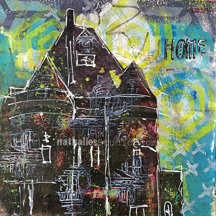
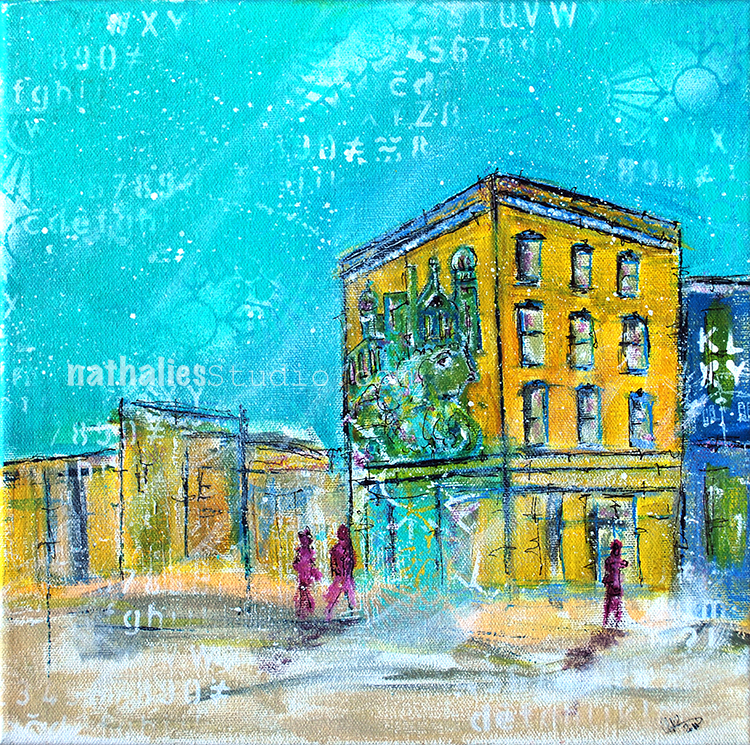
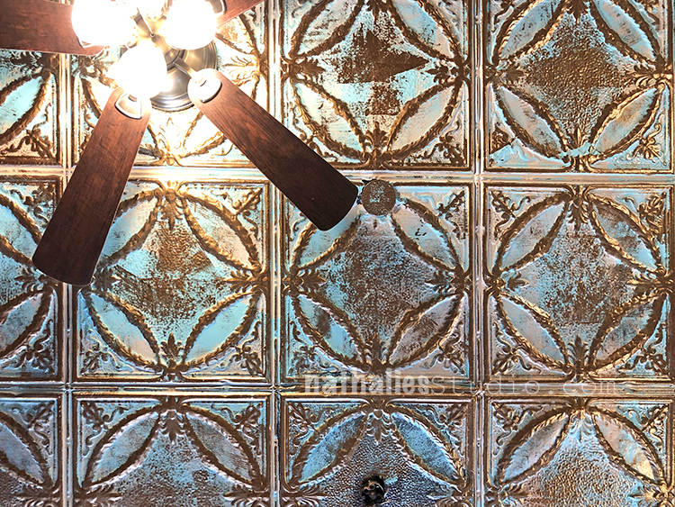
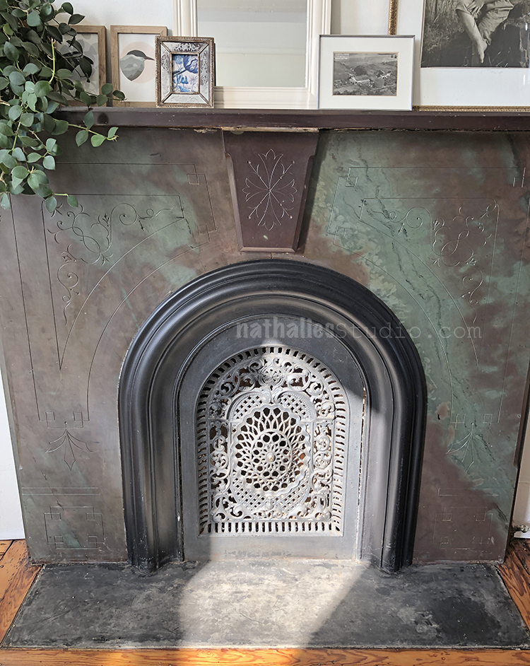
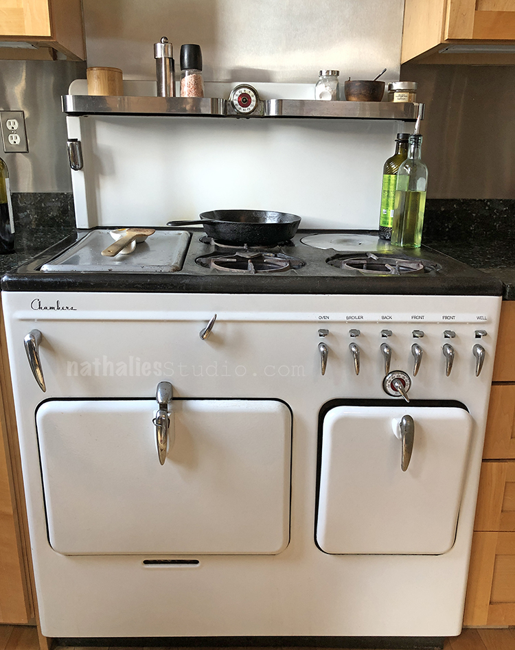
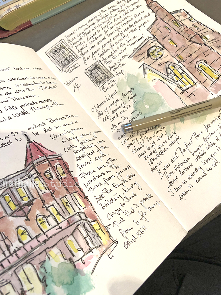
    I love your “Strolls through the ‘Hood”. You’re lucky to live in an area where older architecture still exists, and that the residents appreciate it enough to retain it. It kills me to look at the real estate section of the Washington Post on Saturdays, when they often feature an old downtown row house that’s been renovated on the inside to the point where it’s unrecognizable as an older, vintage building. The outside and the inside don’t match or even compliment each other, to my taste anyway. But I guess that’s why they make chocolate and vanilla ice cream, right? Everyone likes something different. :-)

    Reply

    • nathalie-kalbach

      |

      Yeah – there are some gems but we have also seen some really sad “updating” where a house was totally turned into a horrible characterless box and exactly what you say, happened. You see the house from the outside and you are excited and then you go in and just think WHY? But yes you are right, everyone like something different. I don’t want to live in a house that is exactly decked out in the style of 200 years ago – but I do want to keep a lot of the architectural elements that make the house special and visibly old. I think that is part of the charm.

      Reply

Leave a comment

Creative JumpStart Interviews with Marlene, Tina, and Autour

Are you ready for more interviews from this year’s Creative JumpStart Artists?

“Jumping with” is an interview series that I like to do to showcase some of the CJS artists. Each year we always have some new faces or folks that I haven’t spoken with in a while and it’s a fun way for us to get to know the artists a little more before January. Grab a cup of coffee, sit back, relax and enjoy a few interviews with some very talented people.

You can learn more about Marlene here:

nstudiowebsitesocialmediablognstudiowebsitesocialmediafacebooknstudiowebsitesocialmediainstagramnstudiowebsitesocialmediayoutubenstudiowebsitesocialmediapinterest

You can learn more about Autour here:

nstudiowebsitesocialmediablognstudiowebsitesocialmediafacebooknstudiowebsitesocialmediainstagram

You can learn more about Tina here:


Don’t forget to take advantage of Early Bird pricing for Creative JumpStart 2019. The workshop begins on January 1st but you can sign up now for just $50:

Leave a comment

Warm Wishes – Jennifer Gallagher


Tis the season for some Warm Wishes from my Creative Squad. Today we have a holiday art journal spread from Jennifer Gallagher that transforms my Clam Hex and Space Oddity stamps into a non-traditional wreath design. Jennifer was inspired by our theme: Warm Wishes – For many cultures around the world, December is a holiday season filled with celebrations and good cheer. The Creative Squad is taking this month to send Warm Wishes to all our readers!


This month the creative squad is creating projects that celebrate this festive time of year. We are sending you all our warmest wishes! I love to think outside of the box with our creative squad prompts. So, when I sat down to contemplate warm wishes and holidays, I was immediately transported to somewhere tropical for some literal “warm” holiday wishes. I hope you enjoy my non-traditional and somewhat tropical take on a holiday wreath for a spread in my art journal.

I began in my canson mixed-media journal. I placed a small pencil mark in the center of my page as a guide. Then I inked my space oddity foam stamp with vibrant fuchsia archival ink. Next, I pressed the foam stamp into the center of my page, pressing with even pressure. This striped design mimics a fun candy cane pattern. Here is where we begin with a non-traditional use of color. Instead of the normal red and white, this pink and white will feel a lot more modern and tropical.

I used the mini clam hex foam to create my faux tropical leaves around the center of my wreath. I inked up the foam stamp with vivid chartreuse archival ink and pressed the stamp down in an exact pattern that I repeated all the way around.

Next, I wanted to add some ornament balls all around the wreath. Nat’s Small Circle Jumble rubber stamp set was the perfect thing. I chose the circle drive negative stamp and inked it up with garden patina archival ink. I stamped the ornaments all over the wreath.

I used my tombow mono drawing pens to add a little detail around each ornament and leaf.

Lastly, in pencil I sketched out a little fun hand-lettered sentiment. Once I settled on the design, I drew over it with my drawing pens and erased the pencil marks.

It has been another wonderful year working with Nat, Kim, and the gals from the Creative Squad. I hope you have enjoyed my work this year and have been inspired. I am sending you warm wishes for a wonderful holiday season and a happy new year.


Thank you Jennifer and we thank you for a great year of inspiring projects and of course we wish you a restful holiday season and happy new year too :) Here are some of the supplies that Jennifer used:


Feel inspired? Working on something yourself that you’d like to share?  I love to see how you interpret our monthly themes. Email me how you used my stencils and stamps with the theme and email me an image – I would love to share your projects in my next  “n*Spiration From Around the Globe“.

Leave a comment

At the Corner of Good and Bad – Art Journal

I had a lot of fun with this spread. I carved a big stamp of a building close by here in Jersey City with a mural by Shepard Fairey and used it for bags I made for the holiday market. But then of course I also wanted to use it in my journal.

I printed on a page that I had previously used as a “clean up” page and then painted over the tamped images with acrylic paints.

I added some hand drawn imagery and some of my Stamps as well

I love the contrast of very clean and fine line stamps and then the bold hand carved stamp. And all the texture – actual and optical that I created with brushstrokes, and spray paints.

That was fun :)

Here are some of the supplies besides Acrylic Paints I used for this spread:


Leave a comment

Art Stroll: Andy Warhol at the Whitney, NYC

Last week Kim and I took a day off and for our annual Christmas Party at the n*Studio we decided to go into the city to visit the Andy Warhol Exhibition at the Whitney and have a nice lunch afterwards. It was a wonderful day!

Warhol began his series of Flower paintings in 1964. He used an image of four hibiscus flowers from a magazine and, with the help of assistants, silkscreened it across more than five hundred individual canvases, methodically producing paintings in different sizes and seemingly endless color combinations.

“In the mid-1960s Warhol employed carpenters to construct numerous plywood boxes identical in size and shape to supermarket cartons. The finished sculptures were virtually indistinguishable from their cardboard supermarket counterparts. Warhol first exhibited these at the Stable Gallery in 1964, cramming the space with stacked boxes that recalled a cramped grocery warehouse. He invited collectors to buy them by the stack, and, though they did not sell well, the boxes caused controversy. In reference to his boxes, Warhol later said that he “wanted something ordinary,” and it was this mundane, commercial subject matter that infuriated the critics. The perfectly blank “machine-made” look of Warhol’s boxes contrasted sharply with the gestural brushstrokes of abstract expressionist paintings.”

Would you buy one? (if money was no obstacle)

Sorry- it was so crowded it was hard to take any pictures LOL – but this was too iconic to let it just go …

Loved seeing his gold leafed shoes – the detail are actually quite fascinating on those

Love his sketches the most

The early stages of his work and concepts.

I love seeing the early work that shows where things were going -stencils, marks, people, lines …

In embracing the image of the Coca-Cola bottle as fine art, Warhol opened up the possibility of linking the worlds of commercial and fine art.

Death and Desaster- depicting magazine and newspaper headlines in oversized images.

“Warhol’s depiction of Superman is based on a drawing by Kurt Schaffenberger from the comic Superman’s Girl Friend Lois Lane (April 1961). Warhol’s decision to use Superman as a subject may offer a biting commentary on the heroic machismo associated with Abstract Expressionist “action” painting, or a queer reading of the Man of Steel, or both. Warhol displayed Superman and four other paintings shortly after they were made in a window display at the Bonwit Teller department store (below), where he and many other artists produced window displays.”

“Warhol based this composition on a small advertisement for a plastic surgeon that ran in the National Enquirer in early April 1961, which he had enlarged and projected in order to trace it onto the surface of the canvas-a precursor to the silkscreen technique he pioneered the following year. The work was first exhibited in the window of Bonwit Teller, the Fifth-Avenue department store, in early April 1961 as part of a display that included five other early paintings by the artist.”


Loved this – I had just used this very same image in a class for image transfers and seeing this silk printed with a similar effect in a big size was quite cool.

Well – another iconic one

“Warhol was as captivated by the lives of the ordinary as he was the rich and famous. This work was created from the Newsweek article, “Two Tuna Sandwiches,” about two Detroit mothers, neighbors who ate tuna sandwiches while they watched their children play and, two days later, the women died. The two housewives died via poisoning from tainted tuna. It shows how harmless consumerism can lead to accidental death. Warhol explored the brief and tragic fame bestowed on people after violent and unexpected termination of life.”

“Warhol chose the image of Mao—then the Chairman of the Chinese Communist Party—after reading news coverage of President Richard Nixon’s trip to the People’s Republic of China in February 1972. An unprecedented act of Cold War diplomacy, Nixon’s trip marked the first visit by a sitting American president to the nation, which at the time was considered an enemy of the state.”

When I went to the Andy Warhol museum in Pittsburgh I was fascinated by the collaborative works Warhol made with Jean-Michel Basquiat. “According to Basquiat, Warhol would begin the paintings with “something very concrete, like a newspaper headline or product logo, and then I would sort of deface it.” Depending on the work, this process could continue for two or three rounds, until a balance was reached between Warhol’s hand-painted images and Basquiat’s abstract gestures, text, numbers, and pictographs. ”

“Unlike in his other portraits, Warhol did not name the subjects of this series. They were not, however, truly anonymous. Marsha P. Johnson (bottom right), for example, had been a key player in the Stonewall rebellion that sparked the struggle for LGBTQ rights and, like Wilhelmina Ross, was a member of the performance group the Hot Peaches. In recent years, research into the other sitters’ identities has allowed their names to be instated. Warhol’s portrait of Marsha P. Johnson captures the confidence, warmth, and charm that made her a beloved member of New York’s queer community. Johnson was a pioneering trans-rights activist: she participated in the 1969 Stonewall uprising and later, with her friend and fellow trans activist Sylvia Rivera, founded Street Transvestite Action Revolutionaries (STAR), a political organization that advocated for the rights of queer and trans people and sex workers, particularly those who were homeless or incarcerated.”

What are the symbols of a country? Thought provoking? Was he political?


“For a series of still lifes begun in 1975, Warhol worked with assistants to make theatrically lit studio photographs of a variety of objects, such as a skull or a hammer and sickle, positioning them to cast shadows so dramatic that they took on identities of their own. In the years that followed, he created a number of paintings based on these photographs. It was through these investigations into photography—a medium most commonly associated with accurate representation—that Warhol was able to make works that read more overtly as abstraction. Beginning in 1978, he made a radical shift and did away with the objects entirely, producing an expansive series of more than one hundred paintings focused only on shadows, which he titled just that: Shadows. In these works Warhol freed himself from his Pop subjects by experimenting with something close to pure abstraction. Yet he never completely divorced himself from his sources, maintaining his connection to the everyday world while still playing with the problem of how images generate meaning.”


I love what someone said that there is no “supreme court of art and he experimented with the boundaries of art is” It is a great exhibition – I would def. go again but in the new year and during the week again as it the museum was stuffed even early at 10am when we went.

I hope you enjoyed the is little Art Stroll! Hope to take you on another one soon :)

Comments (2)

  • linda-faber

    |

    I loved the Warhol stroll (sounds like a new dance step). A story to share: In the 70’s, I was a docent at the UM campus museum (The Lowe) in Miami and we showed a fabulous Warhol exhibit of his portrait series with some of the advertising pieces as well. The gift shop had a small # of verified signed tomato soup cans. My friend was the director’s assistant and she got first crack at buying one to add to her beautiful art collection. It sat on top of her refrigerator for years…..until one day she noticed that it was leaking!! Sigh. Impermanent art because the acid in the tomato soup rusted the bottom of the can. Shoulda bought the catalog instead.

    Reply

    • nathalie-kalbach

      |

      Linda, what a fun story ! LOL – I wonder if she kept it emptied out? hahah- shoulda bought the catalog instead made me really laugh. Thank you for sharing !

      Reply

Leave a comment