I Believe Her – Art Journal

“She was powerful not because she wasn’t scared but because she went on so strongly, despite the fear”

Sometimes my art journaling is indeed influenced by current events and it is therapeutic.

The day I created this journal spread I was gutted, and sad and I still am.

Today, tomorrow and the day after tomorrow to all the women and men out there that endured something like this : I Believe You!

Leave a comment

True Blue – Maura Hibbitts


Hello my friends and welcome to a post from Maura Hibbitts from my Creative Squad! She is sharing with us a set of gorgeous holiday cards that she printed using her gelli plate and my new Hamilton stencil and some stamps from my Large Circle Jumble and Small Circle Jumble sets. This month’s theme is: True Blue – Blue is the color of honesty and serenity. It’s calming and has even been shown to promote healing. It reminds us of the water and the sky. Let’s slow things down this month and bask in the tranquility of the color blue.


There are so many blues around to inspire us to create with them. Think about the many variations of blue in the sky, from a clear sunny day, to a dark and stormy one. Think about all the blues in the water – oceans, rivers, ponds, and glaciers. Then, there are all the blues in textiles, paints, jewelry, flowers,  rocks (turquoise, bluestone…), and even trees, like the blue spruce. When you begin to think about all the places you observe blue, you truly realize it is all around you!

I decided to make a set of blue holiday cards, and pulled out my small 6 x 6 gelli plate to work with. To begin, I added a few squirts of the DecoArt Premium paint in Cobalt Teal Hue and Ultramarine Blue and blended it with my small brayer. Then, I laid the Hamilton Stencil down on the plate and pressed my watercolor paper down onto it.

I lifted the stencil, and pressed the paper down onto the plate to get my second print (which I love!).

I repeated the process, this time using the fluid acrylics in Cobalt Teal Hue and Ultramarine Blue. I was curious to see the difference in the prints using the heavy body and fluid acrylics.

I set the backgrounds aside to dry, and prepared for stamping. I mixed Ice Blue Dazzling Metallic and Electric Blue Neon paints on the gelli plate with my brayer. The gelli plate makes a great surface that allows the stamp to easily pick up the paint to make a good impression. I used the large Broadway circle and topper, and the small Broadway circle to stamp out the designs on watercolor paper.

I decided to add a wash to the large circle designs, and added a bit of water to the Cobalt Teal Hue fluid acrylic and washed over the stamped areas using a  large flat brush.

Next up, another layer, this time spritzing on Turquoise Shimmering Mister over the large circles.

The final step before assembling the cards was to add some highlights with a silver pen.

I cut a piece of navy cardstock to go behind each background, and layered the elements on top, popping them up a bit with foam tape. Then, I added a small glue dot behind the topper and attached some embroidery thread.

Time to package them up and tie them with a pretty blue ribbon!

I love the many variations of blue I got by just using a couple of colors and blending them, and now I have a lovely set of six holiday cards. Thanks for joining me!


Thank you Maura – these are so beautiful and what a lovely mix of blues! You can find all my stencils and stamps in my Online Shop. Here are some of the other supplies that Maura used:


Feel inspired? Working on something yourself that you’d like to share?  I love to see how you interpret our monthly themes. Email me how you used my stencils and stamps with the theme and email me an image – I would love to share your projects in my next  “n*Spiration From Around the Globe“.

Comments (3)

  • Jo - Let's Art Journal

    |

    Wow, what a beautiful card! I love the colours and the textured background that you created is amazing ?. Creative wishes! J ? x

    Reply

  • Sue Clarke

    |

    Gorgeous cards Maura!
    I just love holiday cards that feature colors other than red and green.

    Reply

  • Maxi Moon

    |

    So cool!!! We love what you did with Nathalie’s circle stamps. They are so versatile!

    Reply

Leave a comment

Art Stroll: Kunsthalle Hamburg Part 2

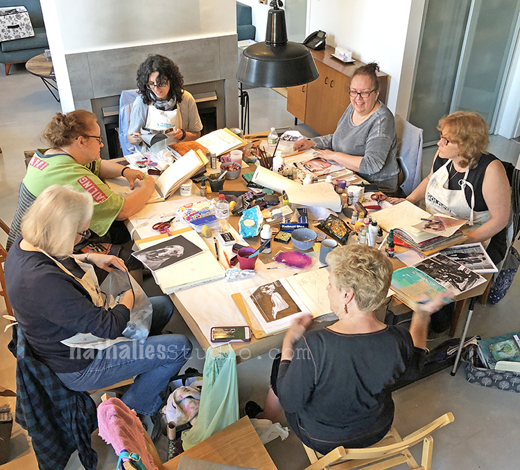
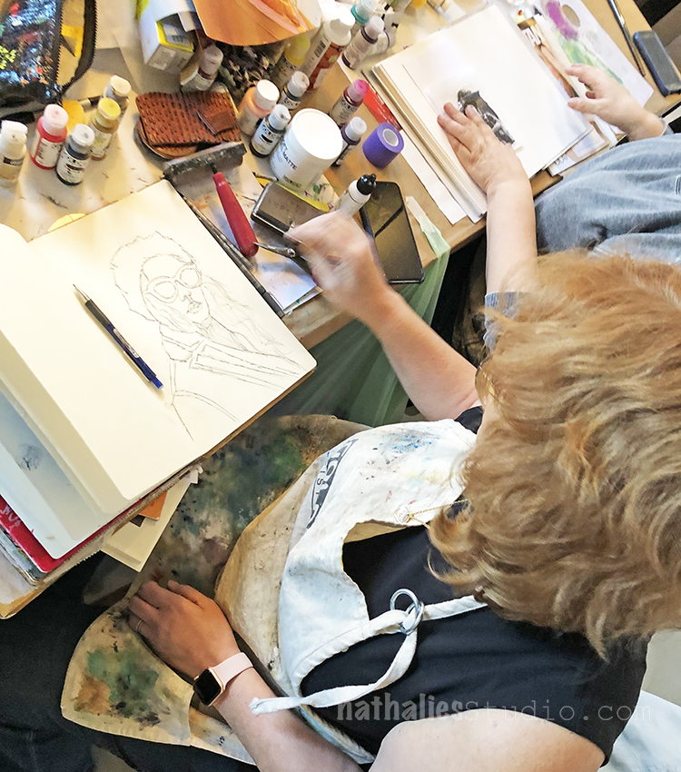
Last month while going to Germany to teach a workshop I spent a day at the Hamburger Kunsthalle. I loved revisiting the Permanent Collection and see some of my favorites again :)

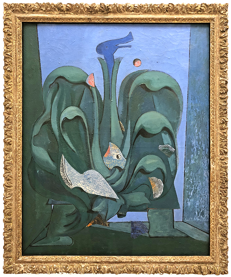
Max Ernst, Menschliche Figur (Human Figure)  1930 – oil on canvas

I love this painting the shapes the shadows and that you can see the human figure – it is funny and I often smile when I see Max Ernst work.

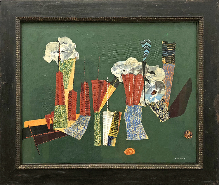
Max Ernst, Grätenblumen (fishbone flowers) – 1928 – oil on canvas

This is one of my favorite paintings ….like Ever :) Because I remember how excited I was the first time I saw it – the dimensions, the structure, the visual and actual texture and how I couldn’t wait to go home and replicate the look. It was early on in my adventures as a self taught artist and to this day I feel this painting is like a old friend sparking something in me. Yes …I never said I am not a weirdo – hahaha

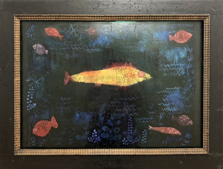
Paul Klee, Der Goldfisch (The Goldfish), 1925 – Oil and watercolor on paper on cardboard

Another painting that excited me early on – the sgraffito the colors …when I walked into the gallery I almost yelled out “hey fishy” ..but then …the reserved Hamburgers are a bit more suspicious of people bursting out when maybe New Yorkers are – LOL

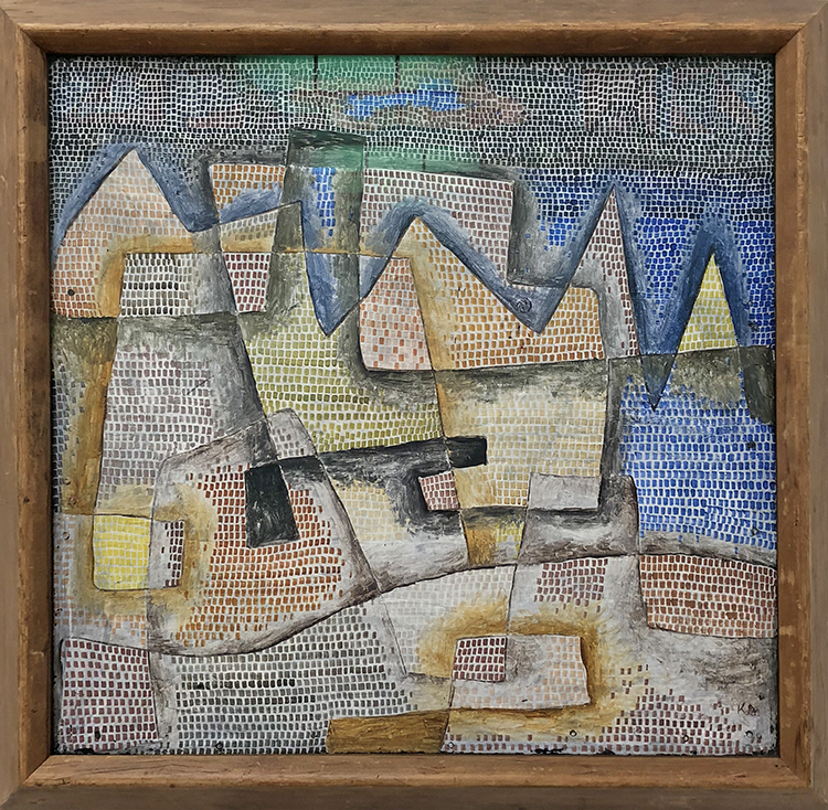
Paul Klee, Felsige Küste (Rocky Coast) – 1931 – oil on plywood

Love the usage of plywood and the little rectangles – actually it makes me want to do something with the same small pattern but different colors coming together to form a landscape …

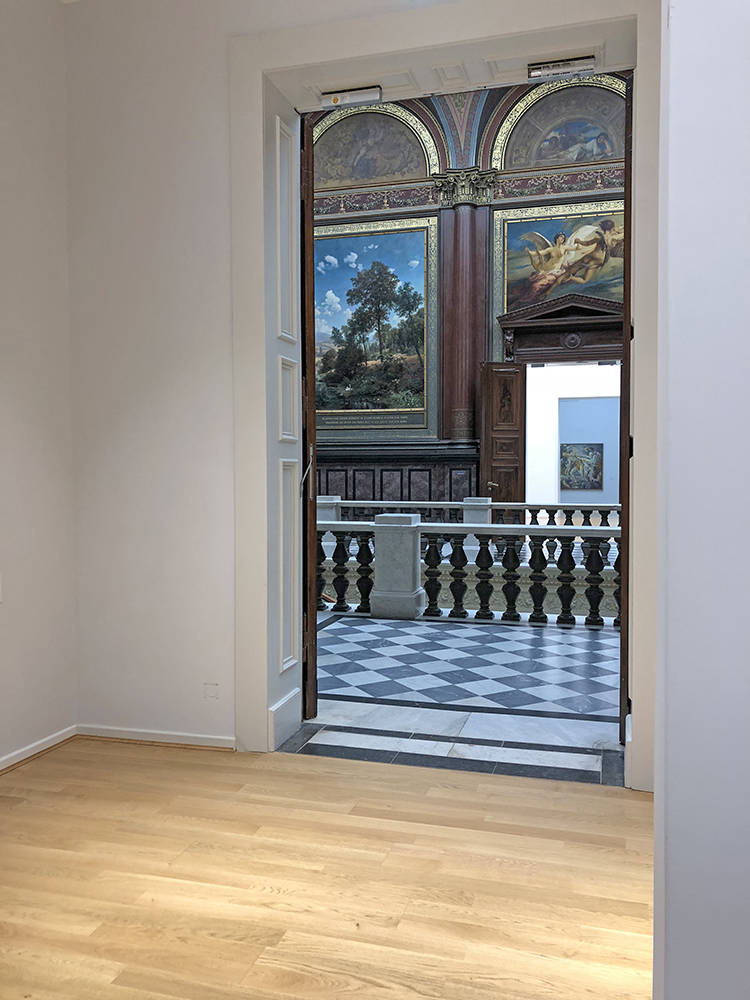
btw – the glimpse out of the galleries into the main hall always is a treat :)

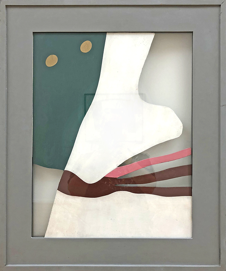
Hans Arp, Augen-Nase-Schnurrbart (Eyes, Nose and Moustache) after 1928 – oil on cardboard- artist’s frame

I love the cut shapes and the colors – and reading the title makes me laugh – another outburst tehehehe

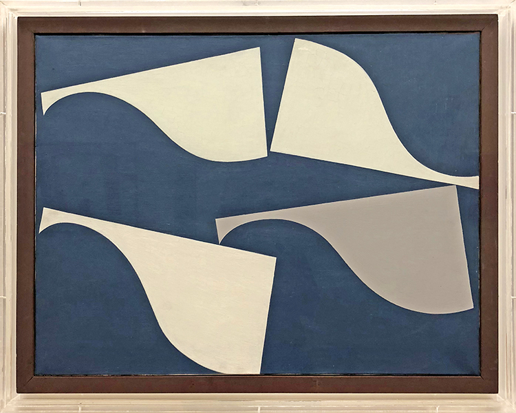
Sophie Taeuber-Arp, Wehende Formen (Floating Forms) 1935 – Oil on canvas – artist’s canvas

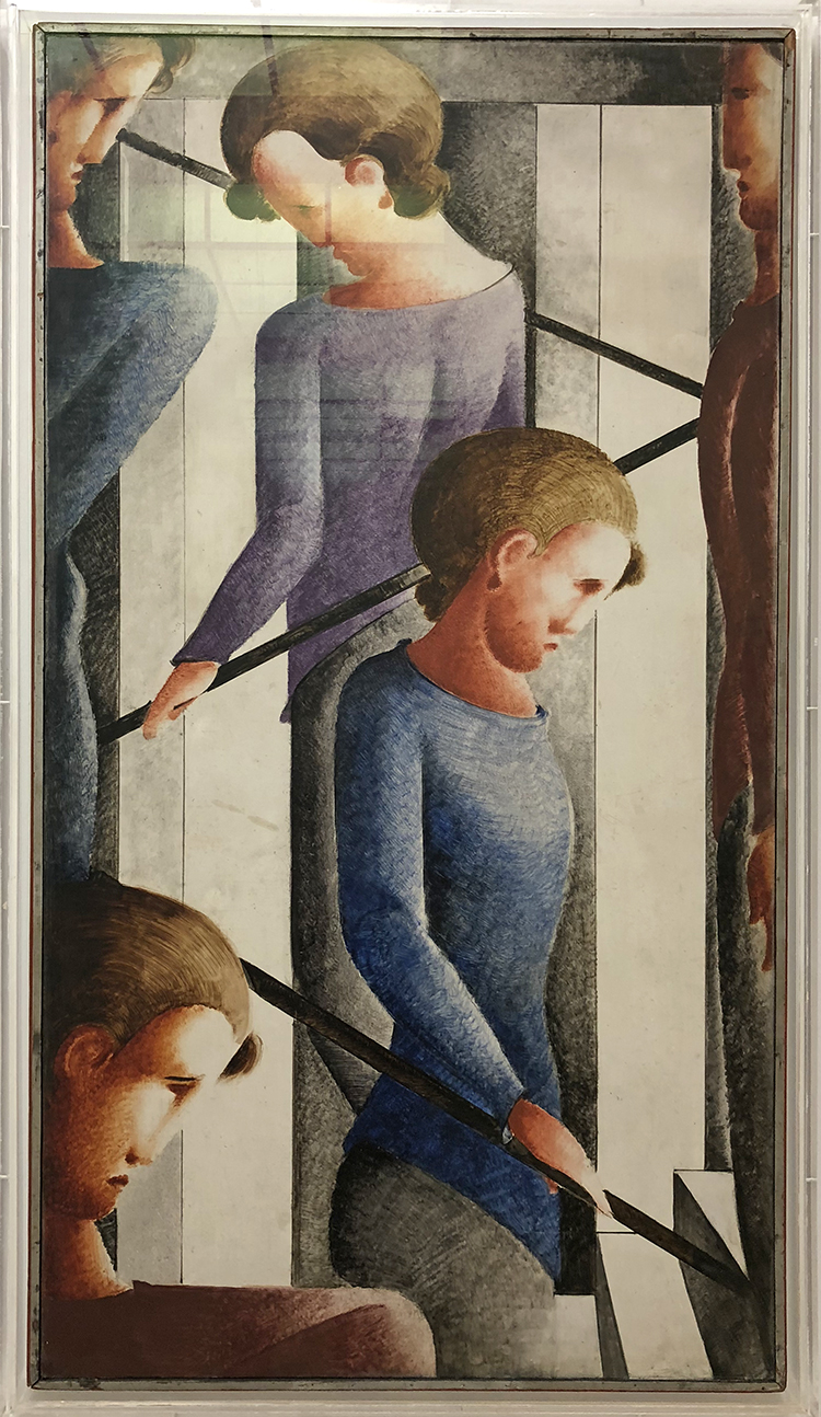
Oskar Schlemmer, Treppenszene (Stairway scene) 1932 – Oil on fabric on plywood – artist’s frame

This painting makes me want to see the Bauhaus Stairway Painting of his from the same year hanging at MoMA in NYC together with this. Apparently- and I didn’t know this before writing this post – there is some controversy as to how the painting got to be at MoMA.

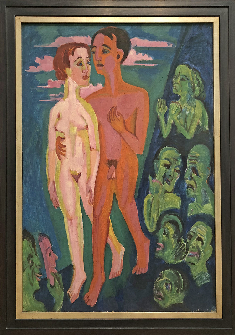
Ernst Ludwig Kirchner – Das Paar vor den Menschen (Two Against The World), 1924 – oil on canvas

I am always fascinated by Kirchner’s paintings- they glow , they are radiant and encapsulate you when you stand in front of them  it is a physical experience.

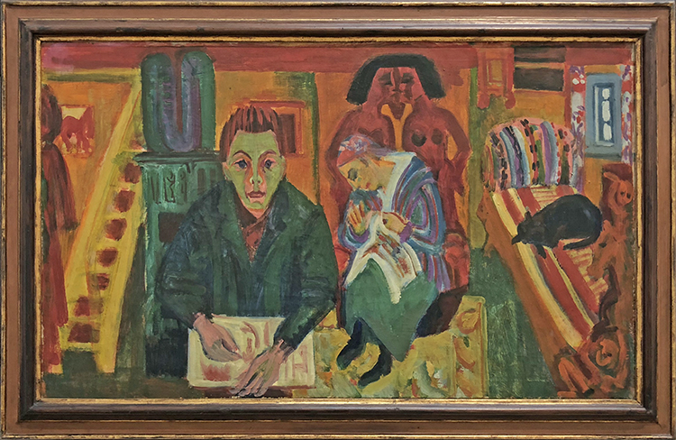
Ernst Ludwig Kirchner – Das Wohnzimmer (The Living Room) – 1923 – Oil on canvas, artist’s frame

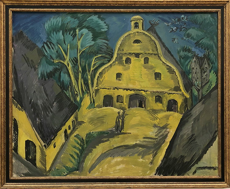
Ernst Ludwig Kirchner, Gut Staberhof (Staberhof Countryseat), 1913  oil on canvas

Love this so much the colors, the shapes …swoon

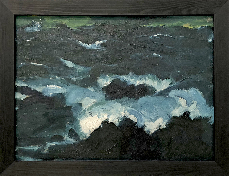
Emil Nolde, Das Meer VI (The Sea VI), 1915 – oil on canvas

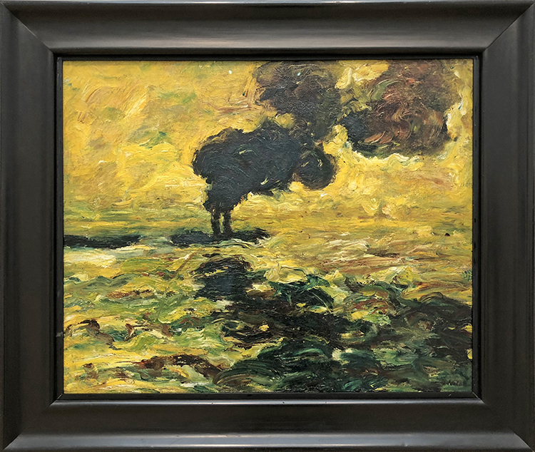
Emil Nolde, Schlepper auf der Elbe (Tugboat on the Elbe) – 1910 – oil on canvas

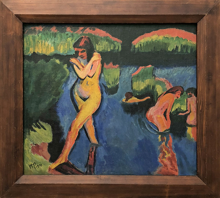
Max Pechstein, Am Seeufer (On the Banks fo the Lake), 1910

All those paintings make me want to use crazy acidic colors …maybe my love for those colors comes from those artists which I remember being fascinated by in art lessons in school.

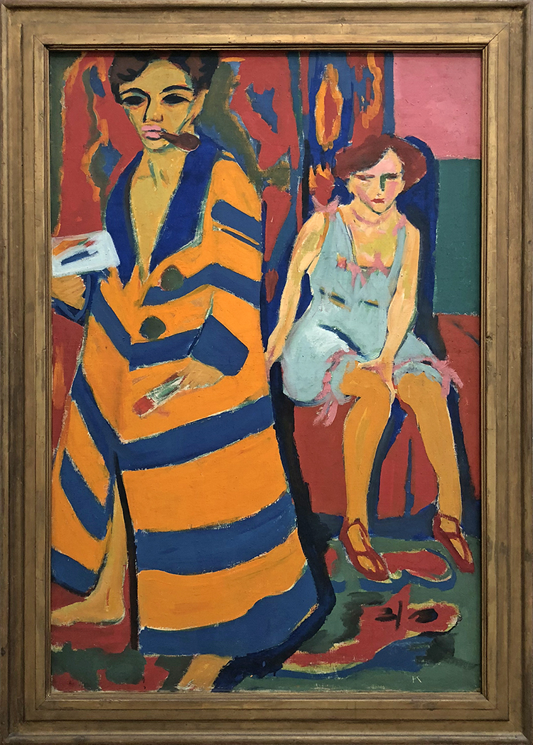
Ernst Ludwig Kirchner, Maler und Modell (Painter and Model) – 1910- oil on canvas

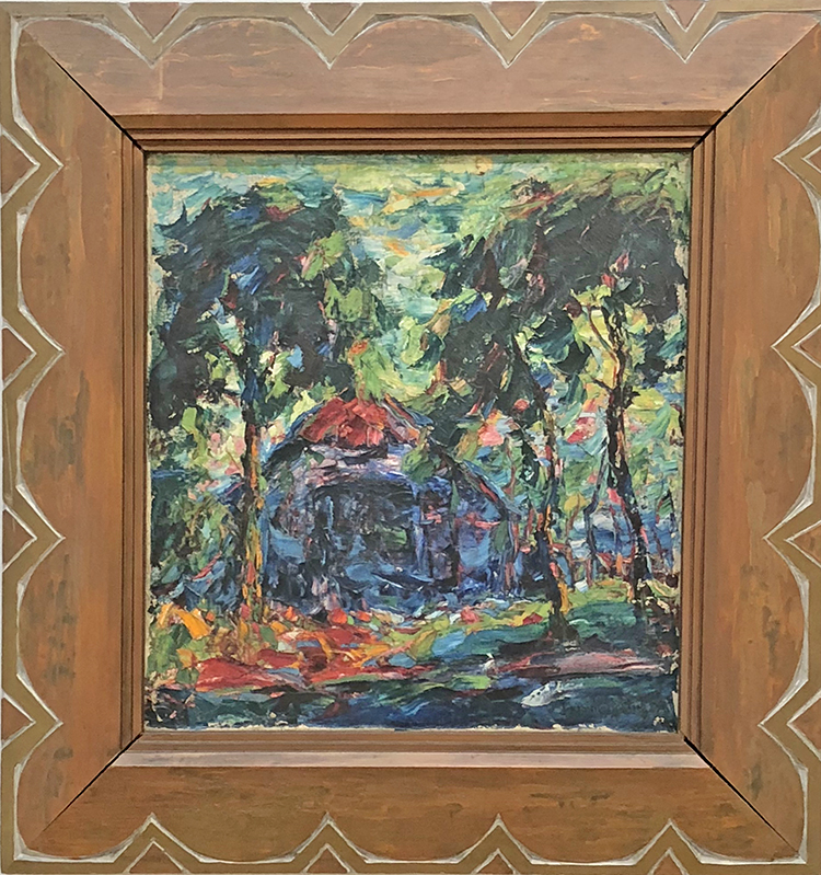
Karl Schmidt-Rottluff, Das blaue Haus (The Blue House) . 1907 – Oil on canvas – artist’s frame

A gorgeous vibrant painting – with such a beautiful frame. The photo really doesn’t do this beautifully textured impasto painting justice but nonetheless I wanted to show it.

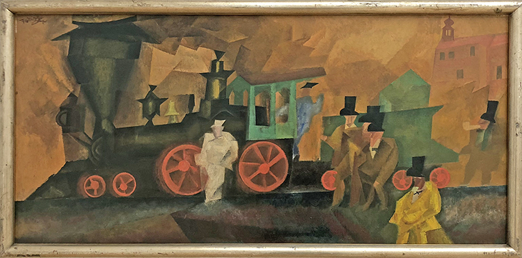
Lyonel Feininger, alte Lokomotive (Old American Locomotive), 1910-1924 – oil on canvas

Loving those figures and the background!

If you think I went home after this …Nope – I couldn’t say bye to Kunsthalle (probably the reason why after 5 years living in the U.S. I am still a member there- LOL.

Another part of this Art Stroll is coming soon- I hope you enjoyed this one.
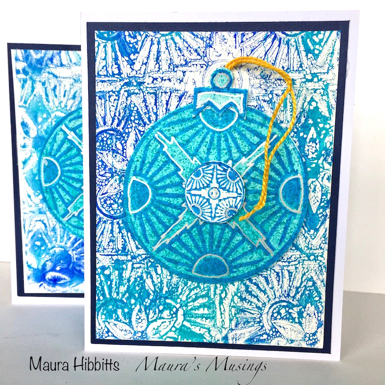
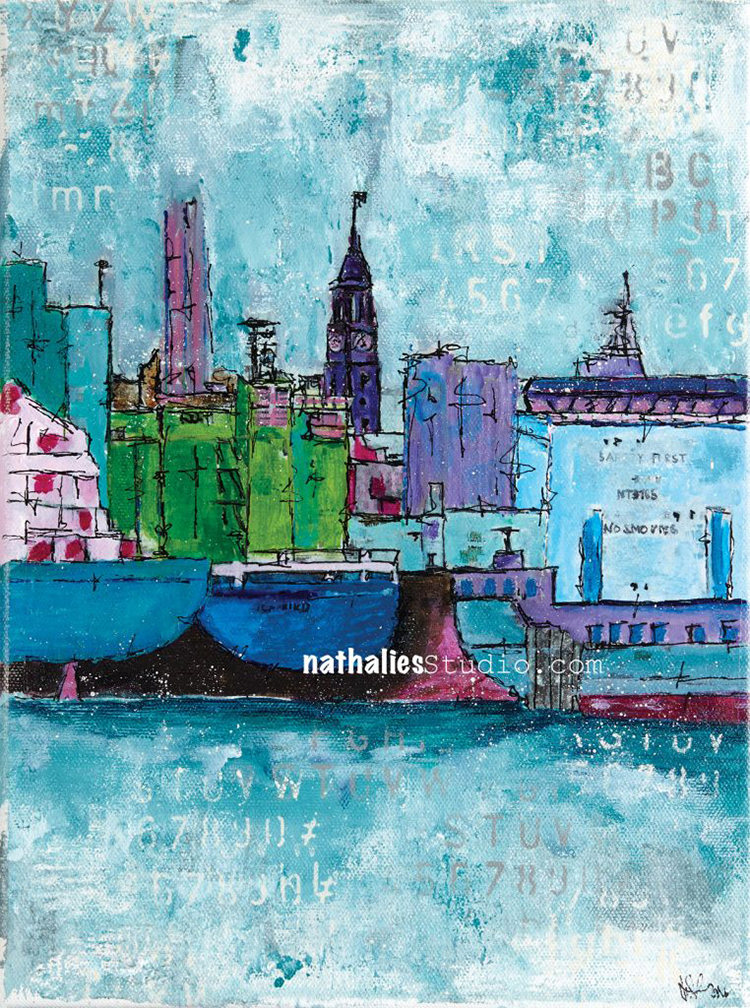
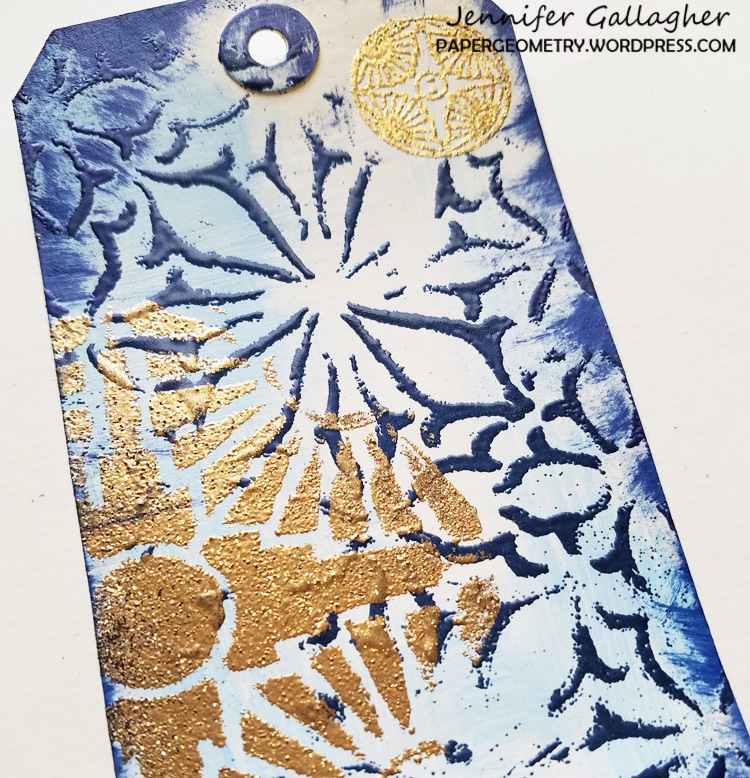
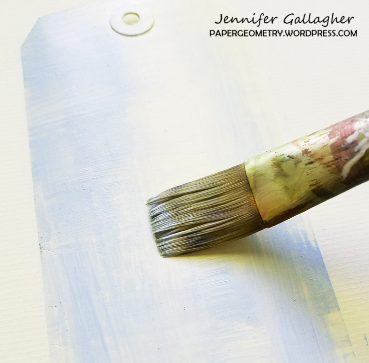
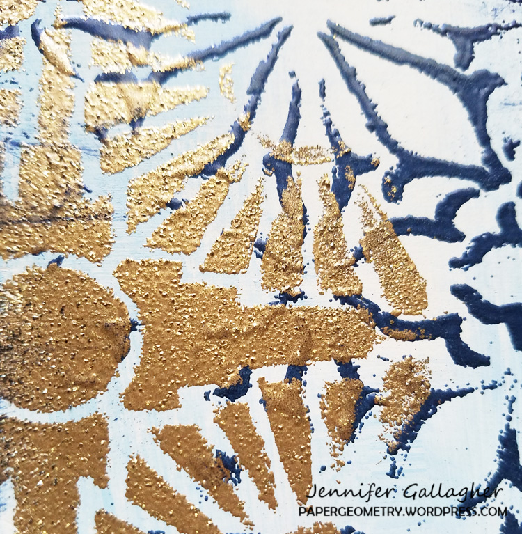
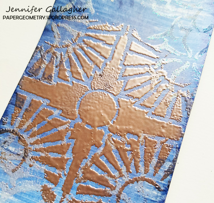
Comments (2)

  • Sue Clarke

    |

    I just love Rocky Coast and would be happy to hang it in my living room if the museum no longer has room for it.

    Reply

    • nathalie-kalbach

      |

      LOL- me too! Actually I will take any of those if they have no longer room for them hahahaha

      Reply

Leave a comment

All That Glitters is Not Gold – Art Journal

Something to remember ! :)

Painted the background with white and gold gesso and stenciled on top


in red using my Park Blvd Stencil. In order to make the design pop more I  layered the stencil back on top after the paint dried and traced the pattern inside the openings.

Love the red and gold although I am not really big fan of gold – like say with jewelry etc.

Here are some of the supplies I used for this spread:


Leave a comment

Workshop Photos of Transfer, Trace, Transform

Last Saturday I hosted my workshop Transfer, Trace, Transform at home and I loved having a wonderful intimate group of 6 talented Ladies coming from Maryland, Connecticut and New York.

The dining room area was transformed into a workshop area

It was so wonderful seeing how the workshop techniques came to alive

And slowly a creative mess was made :)

It is really super fun to teach a small group

Loved seeing all the transfer techniques in their art journals

We covered quite bit of techniques

and here are some more pages

and pattern fun !

Nothing better than a colorful Saturday

There was a lot of swooning over James Dean …I mean …of course

and after a pizza break and the tiniest cupcakes you have every eaten

things got pretty elaborate

So much fun! Cannot wait for the next workshop at home!

Probably coming up in Spring or Summer . I am taking a bit of a break next year from traveling and teaching in person to take care of some “projects”  :)  but I am teaching right now a fun BYO – Built Your Own Art Journal– online and more online workshops are to come to come.

Comments (10)

  • Joanne Howard

    |

    I spy Janene and Kate! You must have had a fun day! Would love to come up sometime as well! Looking forward to next year! We are so lucky to have some talented folks within driving distance!

    Reply

  • Sue Clarke

    |

    Loved seeing what folks created with these new techniques!
    How fun to be a part of a workshop at your house Nat.
    Did the cat and kitten get involved?

    Reply

    • nathalie-kalbach

      |

      Niles came down for a bit- he is a social cat- Bobby Pretzel is funny enough a bit shy of people and was kind of hiding on the staircase but was spied once in a while :)

      Reply

  • Linda Wyatt

    |

    Next time I’m coming even if my sore shoulder says no??

    Reply

    • nathalie-kalbach

      |

      Would so love to see you! Some of the Transfer techniques are a bit hard on the shoulder though – but next time we do somethign else :)

      Reply

  • Janene

    |

    I had a FABULOUS time spending the day with you and my fellow art journalers! I learned so many fun transfer techniques. Count me “IN” the next time you offer a class in your studio. Thanks for the wonderful experience!

    Reply

    • nathalie-kalbach

      |

      It was so wonderful to see you again Janene!!! Thank you so much for coming!!!

      Reply

  • Barbara Murphy

    |

    Thanks for posting the pics, Nat. Such a fun weekend, and great group of ladies. I can’t wait to come back again, as long as James Dean shows up. I plan to have lots of fun with your tracing technique, and I’ll probably see you in those on-line workshops. And, what a loveley hostess you are.

    Reply

    • nathalie-kalbach

      |

      Thank you so much for coming Barbara!!! I had a wonderful time with you – and you are an awesome guest <3

      Reply

Leave a comment

Hamburg Harbor – Painting

“Hamburg Harbor” was inspired by many bike rides around the harbor in Hamburg, Germany, my former home before moving to the US. This cityscape includes the addition of the huge ships that would come into the harbor – floating buildings that would add to an ever-changing skyline.

“Hamburg Harbor”  measures 9″ x 12″ – acrylic paint, acrylic ink, and spray paint on canvas and is available for sale.

Leave a comment

Artist Quote of the Week – Jean- Michel Basquiat

Comments (1)

  • Janene

    |

    I love Basquiat’s work. There’s a lot of passion and intensity in that painting.

    There is something about the way spray paint behaves that is just so amazing. I keep going back to the lower left-hand side of this painting, where the white spray and black spray intersect. There are drips, thick spots, thin spots, round spots, wispy over-spray and the straight lines have rounded edges. Stencils can do similar things, but you can’t really recreate the exact effect with anything other than spray paint.

    Reply

Leave a comment

True Blue – Jennifer Gallagher


Hello from my Creative Squad! Today we have some gorgeous tags from Jennifer Gallagher that show just how well stencils work with embossing powder. Jennifer is using my new Van Vorst and Broadway stencils and my Small Circle Jumble rubber stamp set. This month’s theme is: True Blue – Blue is the color of honesty and serenity. It’s calming and has even been shown to promote healing. It reminds us of the water and the sky. Let’s slow things down this month and bask in the tranquility of the color blue.


Blue is one of my favorite colors so I was very excited to see that the creative squad would be focusing our creations on it this month. The color blue makes me think of cold weather, snowy mountain scenes and holiday time with family. These quick and easy tags would be perfect for holiday gift tags.

Begin by brushing on a thin layer of light blue paint and white paint onto your tag with a dry brush. We want to get a distressed look so try not to apply too much paint. Leaving areas unpainted will also add to the interest and texture of the tag.

Next, place your Van Vorst stencil down onto your tag and press the perfect medium through the stencil.

Sprinkle the navy embossing powder over the perfect medium. Use a small soft bristled brush to knock off any areas you do not want the embossing powder or to clean up any mistakes. Apply heat from your heat tool to melt the powder and set it. Let it cool.

Lay the 4×4 inch Broadway stencil on the tag and repeat the same process with gold tinsel embossing powder. Then stamp the coordinating small Broadway stamp from Nat’s Small Circle Jumble stamp set with perfect medium in the top corner of your tag. Emboss it in gold tinsel as well.

Lastly, take your cobalt stamping pad and edge around your tag, smearing a bit of ink from the edge onto the tag. This will add additional interest and texture.

I created a second tag switching up the colors a bit. I painted the tag with real navy, embossed Van Vorst with bridal tinsel embossing powder, and embossed Broadway with rose gold embossing powder.

I hope you find these tips useful for creating your own beautiful holiday tags. You can also change up your background color and embossing powders to create non-holiday versions. Have fun and be sure to share your projects with us.


Thank you Jennifer – I just love how that gold embossed pattern looks! You can find all my stencils and stamps in my Online Shop. Here are some of the other supplies that Jennifer used:


Feel inspired? Working on something yourself that you’d like to share?  I love to see how you interpret our monthly themes. Email me how you used my stencils and stamps with the theme and email me an image – I would love to share your projects in my next  “n*Spiration From Around the Globe“.

Leave a comment