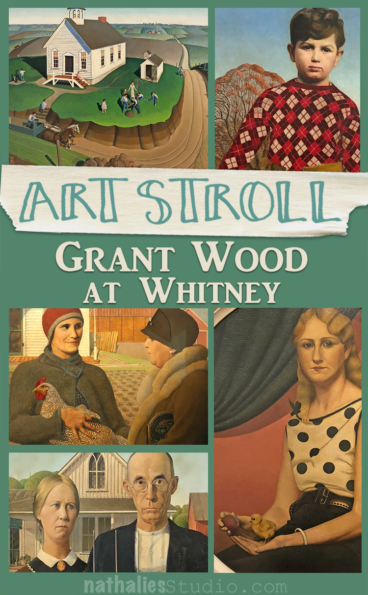
A couple weeks ago I went to see Grant Wood: American Gothic and Other Fables at the Whitney Museum.
To be honest besides American Gothic I wasn’t very familiar with his work and I was curious about the show.
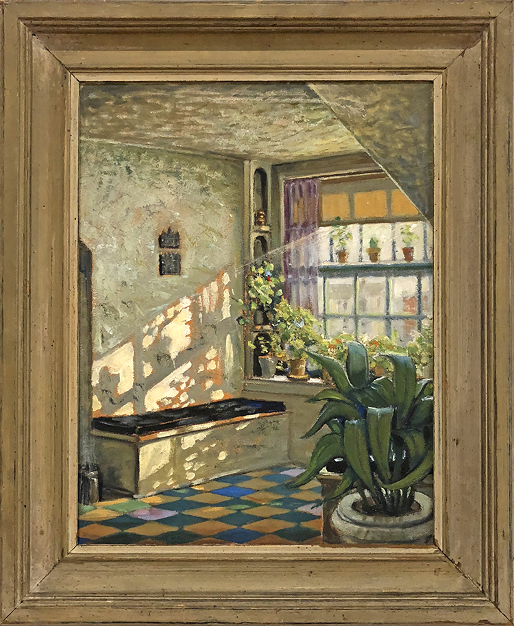
Sunlit Studio, ca. 1925-26, oil on composition board
The exhibition started with his earlier work and then went to the first portraits.
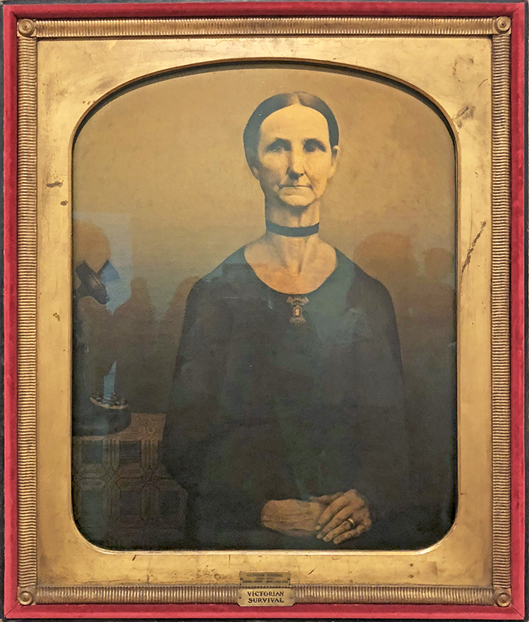
Victorian Survival, 1931 – Oil on composition board
With it’s rounded edges, elaborate frame, and sepia tones, Victorian Survial purposely resembles the late 19th century tintype of Wood’s great aunt on which this work is modeled. With her stiff upright pose and tightly combed hair, the sitter’s old fashioned demeanor contrasts sharply with the modern technology of the rotary dial phone. Wood’s ambiguous symbolism inspires many interpretations. To some the contrast between the figure and the telephone is a humorous commentary on the trope of the gossipy spinster, while to others it has been interpreted as a clash between Victorian insularity and modernity.
Whatever it means…it made me smile
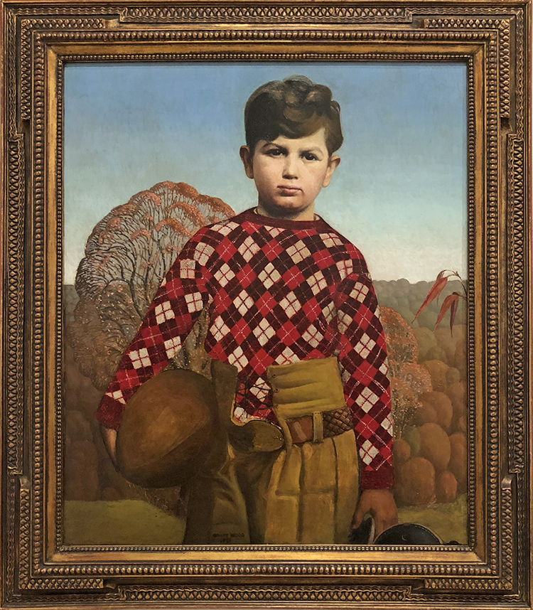
Plaid Sweater, 1931. Oil on composition board
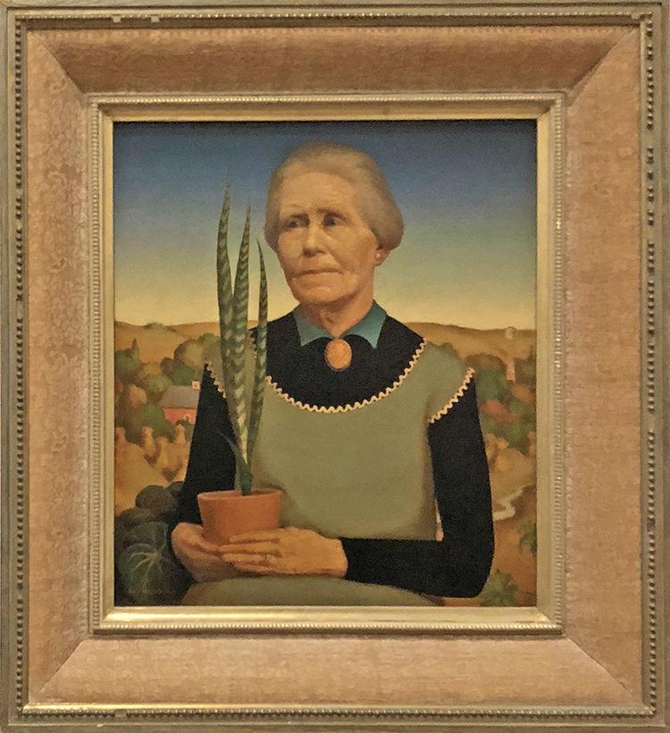
Woman with Plants, 1929 – Oil on composition board
Wood used his mother as the model for this portrait. Taking his cue form the practice in Northern Renaissance art of depicting portrait subjects against a landscape background with symbolic objects, Wood presented his figure holding a sansevieria plant, known for its ability to survive under the most inhospitable growing conditions, in front of a backdrop of rolling Iowa hills.
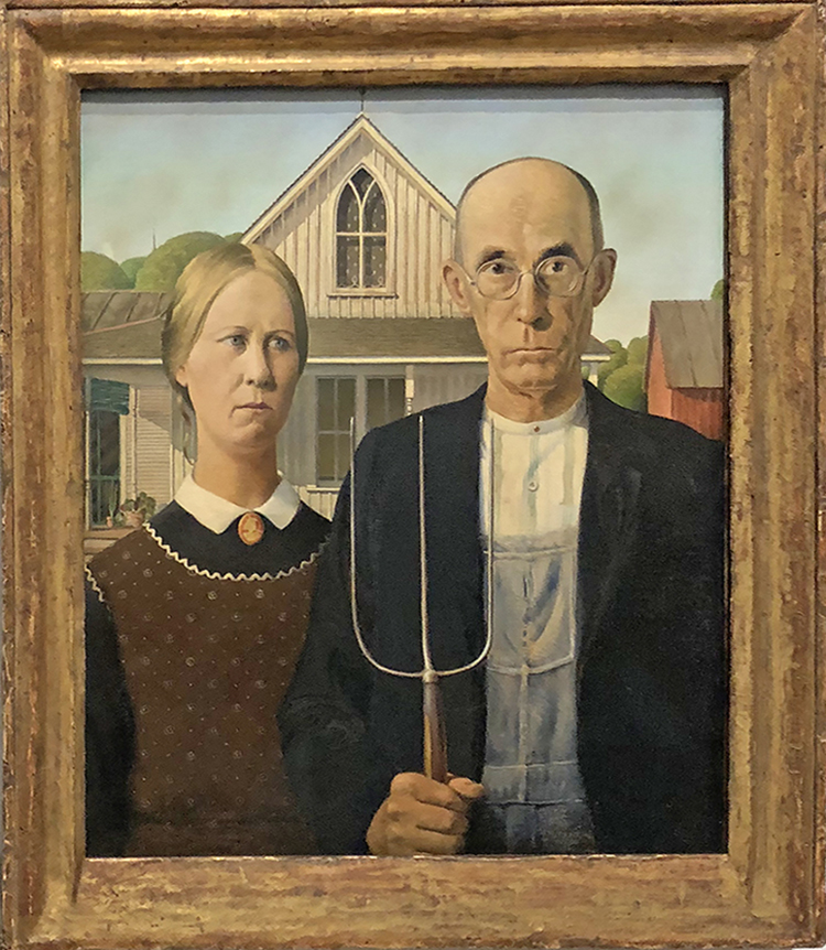
American Gothic- we all know that one :)
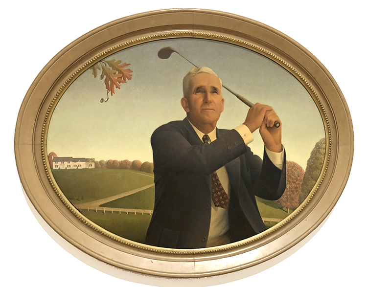
The American Golfer, 1940 – Oil on board
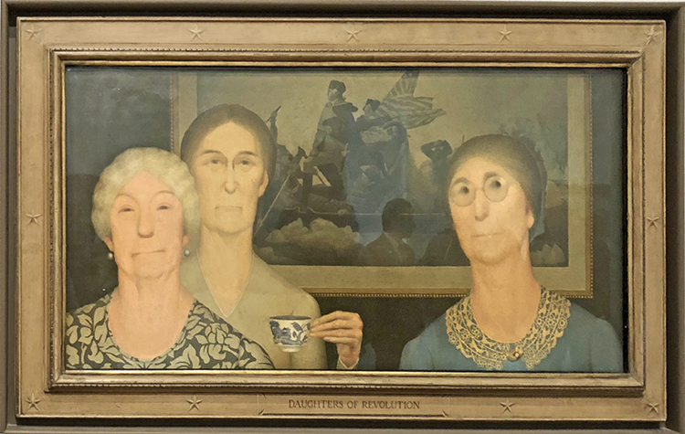
Daughter’s of Revolution, 1932, Oil on composition board
In this painting Wood aimed to ridicule the Daughters of the American Revolution for their claims of nobility based on ancestry, which he saw as antithetical in their celebration of democracy. The artist painted three of the group members in front of a reproduction of Emanuel Leutze’s painting of General George Washington crossing the Delaware River, contrasting the future president’s dynamism and bravery with the Daughter’s stiff poses, contemptuous expressions, and the inconsequential action of raising a teacup. New York critics celebrated the painting’s biting satire when it premiered at the Whitney Biennial in 1932, with one calling it “as delicious as it is wicked” but it was met by protests from various DAR chapters that deemed it un-American.
mhh- why a chicken and a peach (?) – see I did not read up on this …what is your interpretation?
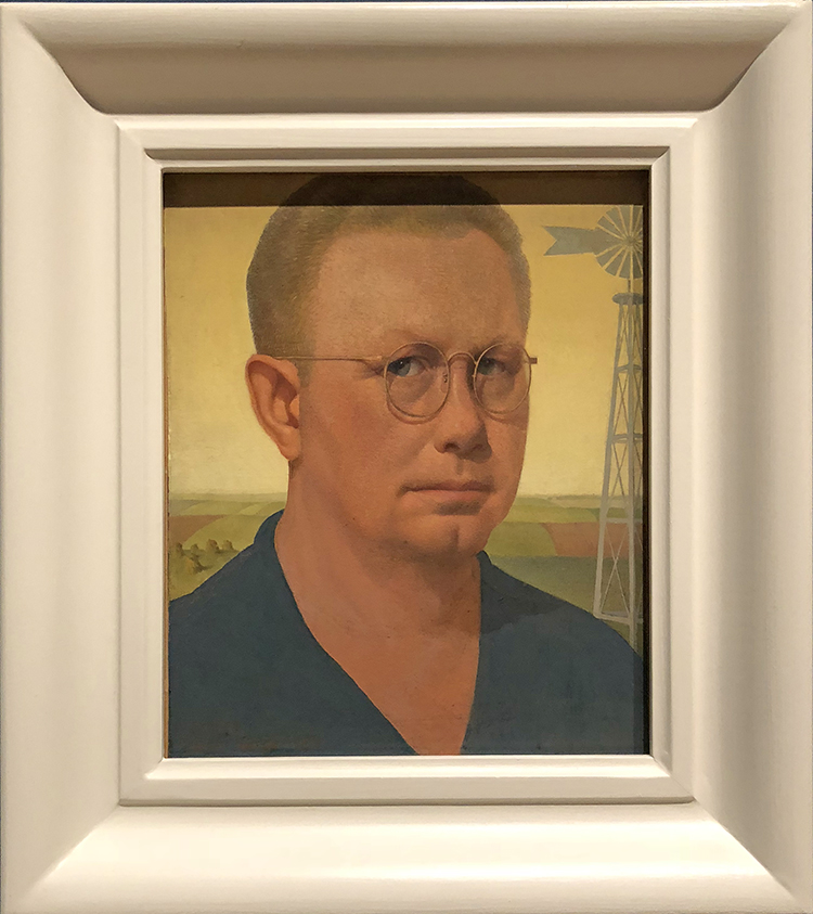
Self-Portrait- 1932
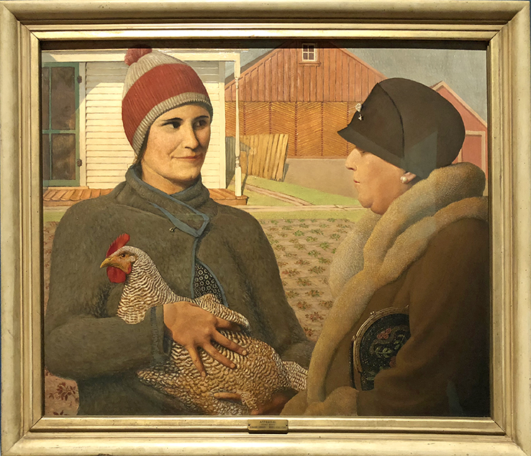
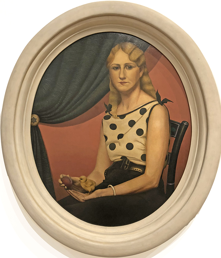
Appraisal, 1931 – Oil on Composition Board
I love this painting the difference between the rich lady and the lady from the farm, the look – the clothing – with little hints- a security pin on the jacket on the left, a brooch pin on the hat of the lady on the right. One holding a hen, one holding a handbag.
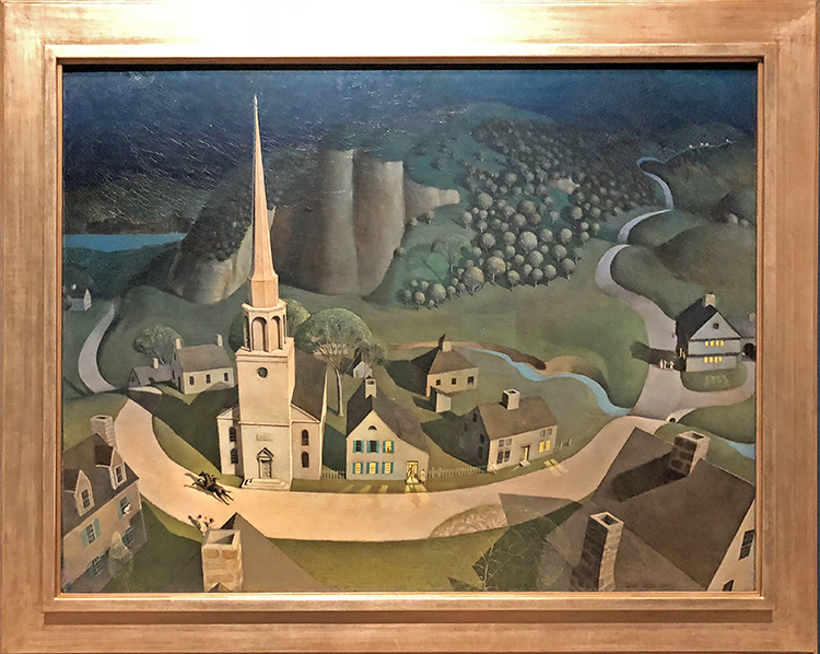
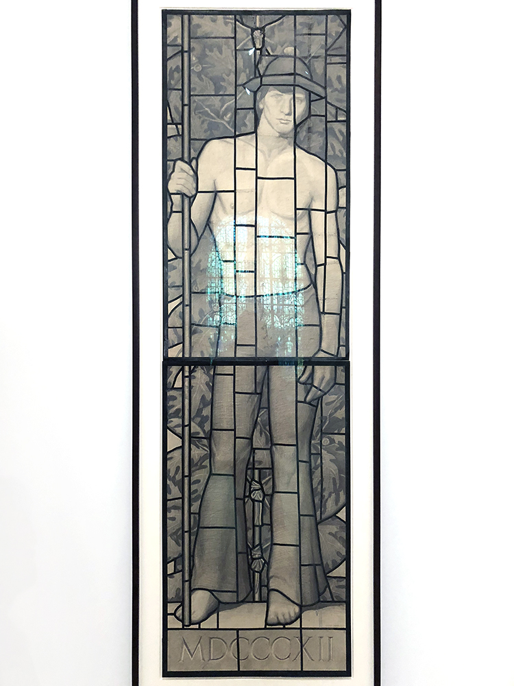
The Midnight Ride of Paul Revere, 1931 – Oil on composition board
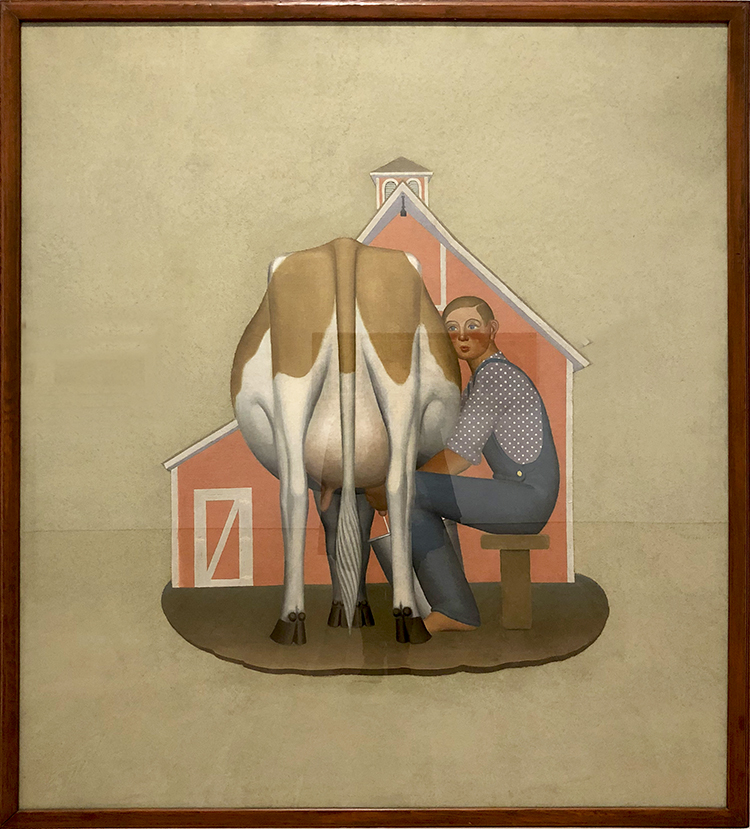
Boy Milking Cow, 1932 – Oil on canvas, cut out and mounted on fiberboard
Very iconic yet so different form this portraits in the beginning
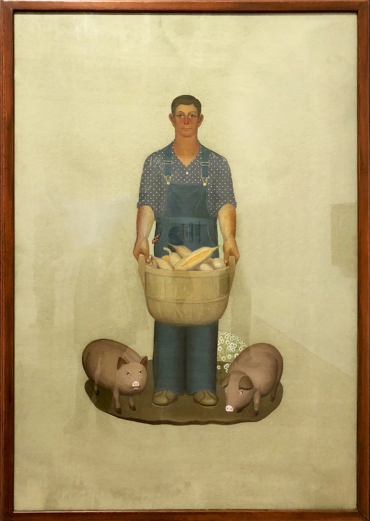
Grant Wood’s Farmer With Pigs and Corn (1932)
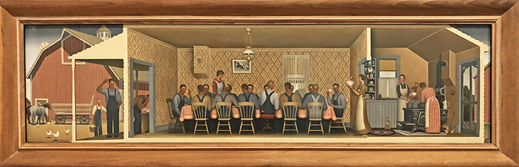
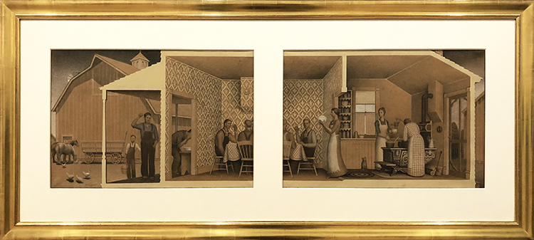
on the top and button are Studies for “Dinner with Threshers”, 1933 – Graphite pencil, opaque watercolor, and colored pencil on paper
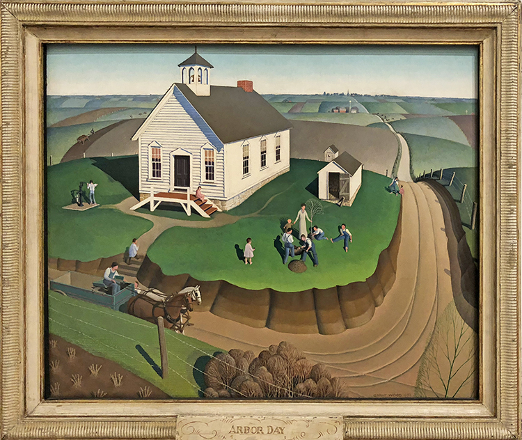
Arbor Day, 1932 – Oil on composition board

January, 1940-41 – Oil on composition board
I actually really love this painting. It is one of the last paintings Wood created before his untimely death from liver cancer, January has a decidedly nostalgic cast. According to the artist, the painting was “deeply rooted in the memories of my early childhood on an Iowa farm. . . . it is a land of plenty here which seems to rest, rather than suffer, under the cold.”
It was an interesting exhibitions, and good to learn that Grant Wood was much more than just American Gothic. Some of the portrait paintings where truly fun and interesting it makes you wonder how to decipher the symbolism in them. Hope you enjoyed this Art Stroll.


Comments (4)
Kristin Williams
| #
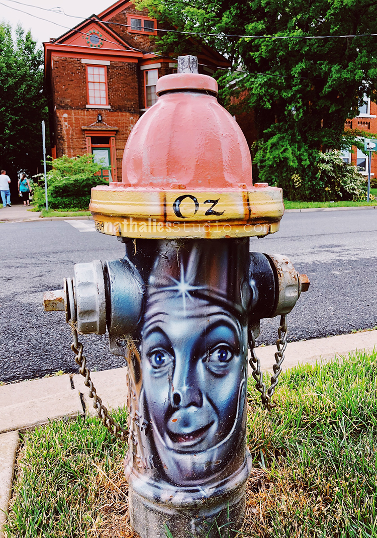
Loved seeing Paducah through your eyes! Come back, soon! xoxoxo K
Reply
nathalie-kalbach
| #
thank you so much for having me!!!
Reply
Kathy
| #
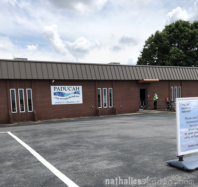
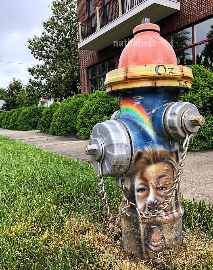
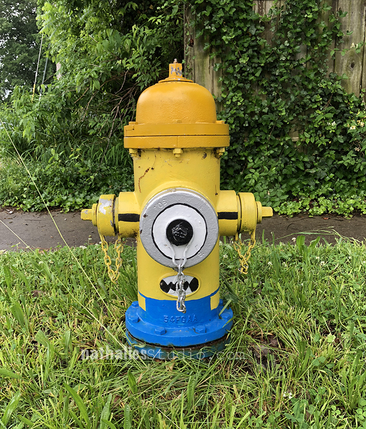
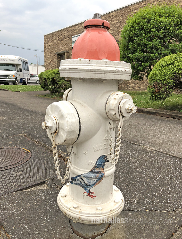
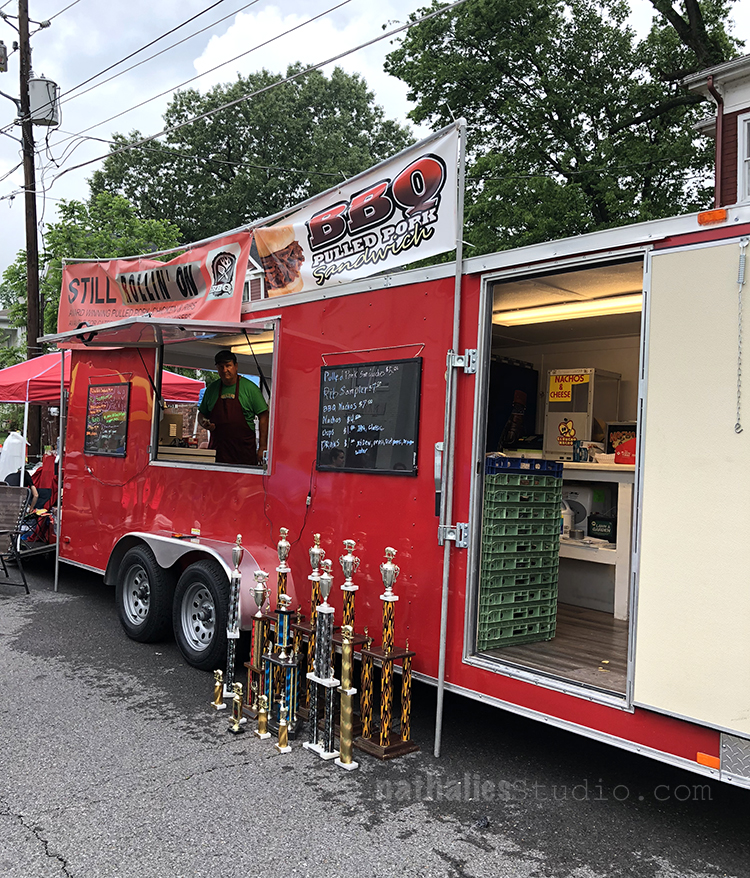
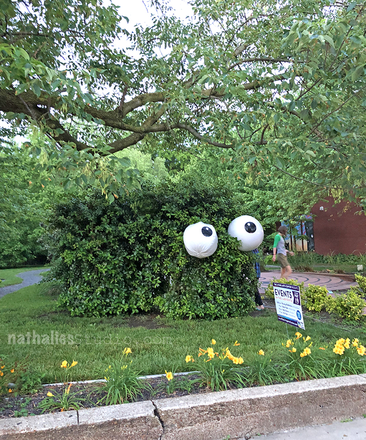
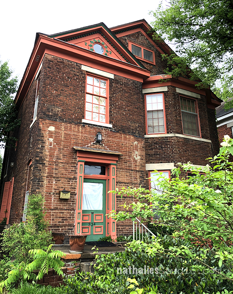
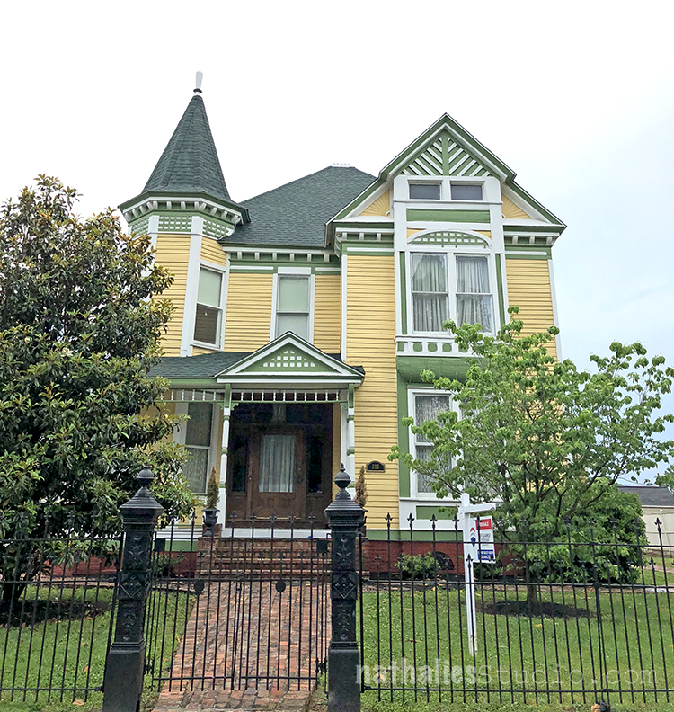
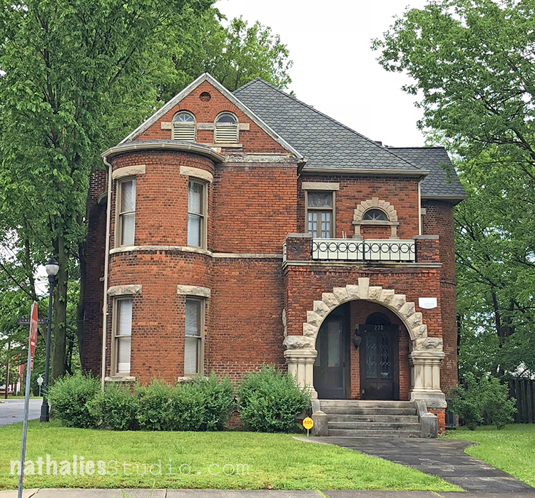
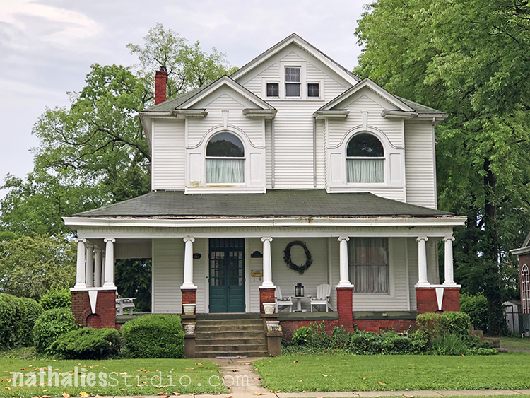
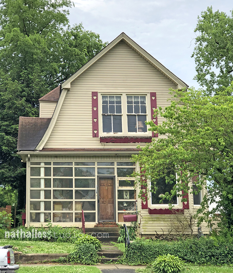
Love the photos capturing the charm of Paducah.
Reply
nathalie-kalbach
| #
thank you so much Kathy!!
Reply