Blog: Acrylic paint

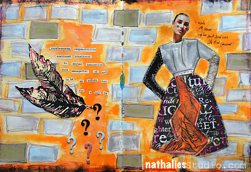
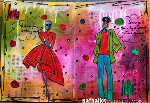
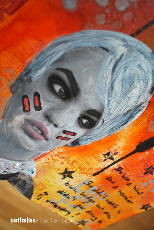
It Made Sense to Her…Art Journal

makessense01


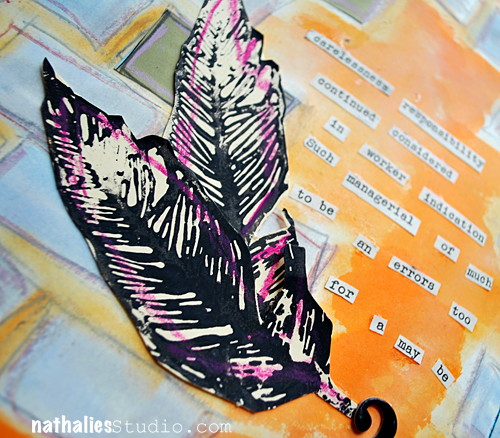
Carelessness responsibility

continued considered

in worker indication

such managerial of much

to be an errors too

for a may be.

makessense02


Supplies: PanPastel, Ranger Dylusions, Ranger Distress Paints, Derwent Artbars, Derwent Sketching Pencils, Posca Markers, Prima Engraver Collection Paper, Louise Nelson Stamp, Heidi Swapp Chipboard Alphas, old book and magazine snippets.

Wishing you a wonderful creative day!

Nat


Comments (9)

  • Gunvor

    |

    Love the colours and the composition

    Reply

  • Barb

    |

    Awesome colurs. Love her outfit. At least the words make sense to you and to whoever they are aimed towards!!!

    Reply

  • pearlmaple

    |

    luscious layers of happy colours, art journals are a great place for exploring

    Reply

  • Sue Clarke

    |

    Love the colors and the feathers.

    Reply

  • Robyn W

    |

    hmmm….reading your words, I immediately thought…please explain :)
    then i read your title….hope you are ok ????

    Reply

    • Nathalie Kalbach

      |

      LOL- totally ok ;) No worries Robyn. It is as the title says and it is a little play with collage.

      Reply

  • hollysimoni

    |

    Love this Nat! lots of great layers and colors.

    Reply

  • mjmarmo

    |

    Gorgeous colors!~

    Reply

  • Clare

    |

    fab, i really love the background. x

    Reply

Leave a comment

Art Mesa Mixed Media Event – Madrid 2013 – June 29

ArtMesa


Wooohoooo!!! This is the 3rd Art Mesa that Cuchy and I have in Madrid on June 2013. You can find the Art Mesa Blog with all the Details here.

The last two years we had a wonderful time with our students- the hotel is beautiful and we had lot’s of privacy in hour huge workshop room with the private terrace, the weather was awesome, the workshops were fun – It was just the best!

Again we will teach each one workshop:

SEASON CANVAS

29.06.2012 –  10.00 hs. – 14.00 hs.
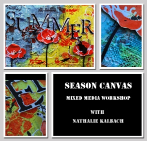
Season Canvas

En este taller con Nathalie Kalbach, crearás un increíble y único lienzo que será un maravilloso objeto de decoración.

Aprende cómo crear dimension y textura con papel tissue, objetos de uso diario, pintura acrílica, encaje, arpillera y gesso

Aprende como sacar una textura interesante y llamativa con pintura acrílica y tintas acrílicas. Añade algunas técnicas de estampación sobre todo ello.

Iremos añadiendo muchas capas y dimensión para hacer un lienzo de primavera, verano, otoño o invierno… como quieras. Todas las técnicas pueden aplicarse fácilmente en futuros proyectos.

In this Workshop with Nathalie Kalbach, you will create a stunning and unique canvas that will be a wonderful home décor item.

Learn how to create dimension and texture with tissue paper, items of daily life, acrylic paint, lace, burlap, and gesso.

Learn how to reveal the interesting and eye catching texture with acrylic paints and acrylic inks and add some fun stamping techniques on top.

We will be adding lots of layers and dimension to make this a spring, summer, fall or winter canvas… just as you like. All the techniques can easily be applied to future projects.


TALLER M. CARMEN SÁNCHEZ “CUCHY”

QUERIDO DIARIO / DEAR DIARY 

29.06.2012 – 16,00 hs. – 20,00 hs.

DearDiaryWorkshop

En este taller con Cuchy, crearemos un diario desde cero, con una base de encuadernación japonesa.

Un proyecto delicado al que “contar” nuestros pensamientos más secretos.

Personalizaremos nuestro diario creando distintas texturas con gesso, pasta y sellos. Añadiremos color con barras de tinta y profundidad con grafito, para acabar decorándolo con papel, foil y utee.

Una mezcla de técnicas y elementos que estimularán nuestra creatividad.

¡Te esperamos!

In this workshop with Cuchy, you will create a personal diary from scratch, using a japanese bookbinding technique.

A delicate project to which “tell” your secret thoughts

You will customize your diary creating textures with gesso, paste and stamps, adding colours with ink blocks and depth with graphite, and embellishing with paper, foil and utee.

A mixture of techniques and elements which will encourage your creativity.


We hope to see you at Art Mesa :)
wkia8g


Have a gorgeous day

Nat

Comments (5)
  • Eeva Hall

    |

    Any plans to come here this year?? Waiting for one secret teacher to be revealed in october and something else in august…please let it be you :-)

    Reply

  • Cecilia

    |

    I’ll be there again, I can not miss it!!!!

    Reply

  • Sue Clarke

    |

    I really need to win the lottery so that I can spend my time flying from country to country attending your workshops Nat.

    Reply

  • mjmarmo

    |

    THese look like wonderful workshops!

    Reply

Leave a comment

n*Lab Tales – Today featuring Ranger Tim Holtz Distress Paints

nlablogo


Some of you know this sign already – n*Lab Tales are just a little summary of my experiments with a certain products that are either new or new to me. When I get something new I need to take it apart and examine it in all kind of different ways in order to be able to make it my own and add it to my stash.  Sometimes I take it even further and integrate the product into my workshops. n*Lab tales are not tutorials -just basic narratives of what I found out, how I used it and what I liked/disliked. It is little peek into my n*Studio life.

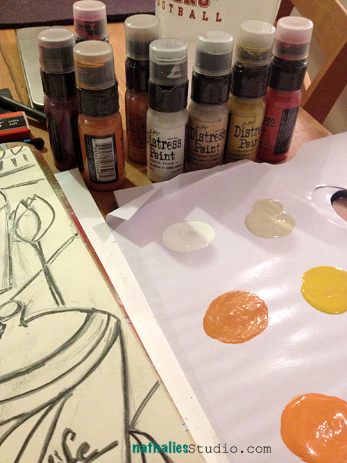
DistressPaint01

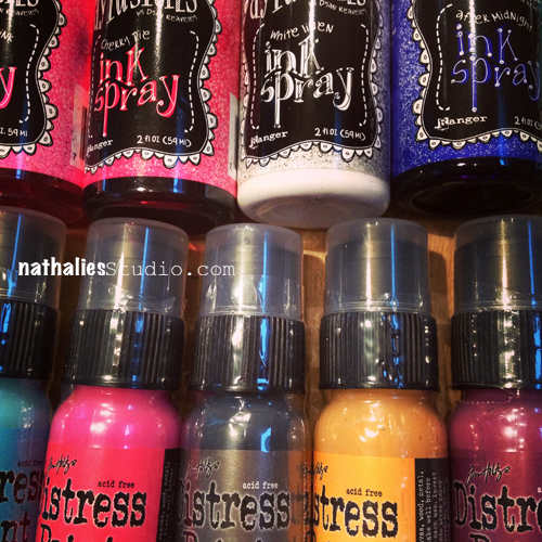
I got the new Ranger Dylusions’ Colors -six there is- and there is not secret I really love these Ink Sprays – and there was no surprise I loved the new ones too. The new White Linen btw- is awesome – I will show a little spot where I used it.

What was totally new was the new Distress Paints by Ranger and I was told they are unlike any other paint product out there. AHA…mmmhhh – really? LOL- sorry Ranger, I love your products- but I am like that- I need to know for sure plus everything paint makes me excited to try. So let me first give you the known gist of the Distress Paints – 24 colors,  fluid water-based acrylic paints, reactive with water and coming with a dabber.

I will admit – that the description at first did not knock me out of my shoes- because I know fluid acrylic paints, acrylic paints are water-based and react with water – so what is the big deal besides that the colors are appealing if you are already familiar with and you love the other Distress Products from Ranger, which I do.

DistressPaint02

So…with a bit of a MEH-approach (I am honest) I started experimenting with those paints. I actually almost thought they would be more a Gouache like paint- until I realized “nope- they are permanent, once dried”. So what I started doing was just playing with them in my art journal. Seeing how they are with different brushes, how I can control them , how they react when I mix them dry and wet with a brush.

BelleAJ01


This is when I started to like the paint already quite a bit. I liked how you can work them and that they are actually VERY controllable although so fluid. I also like the very long opening time of the colors on the palette/ranger mat. I like that the mixing and blending is nice in a wet on wet technique- while it is very opaque on a wet on dry technique. I also love the matte still very vibrant appearance the matte finish by the way perfect for art journals as they help with the “sticking” problem. I also like this chalky like effect.

DistressPaint03

Next I played and experimented a bit with the reaction to other water-based products while wet. I liked the marbling effect. Here you see the Broken China Distress Paint mixed with some Dirty Martini Dylusions Ink Spray. It takes  a bit practicing on when to mix those for the best and still vibrant result, as you want to avoid the matte Distress Paint mixing too much into the nice vibrant Dylusions Ink Spray…so that it is not just a matte finish in the end- but it is doable and fun. Love it.

DistressPaint04

I started playing with different paper surfaces. On the top you see ripped and very rough paper and on the bottom very smooth paper from Dyan’s Dylusions’ Journal. What I found was that the rougher the surface -like the torn paper- the faster the paint dries. It was almost impossible without wetting with water to work the paint on rough paper, while it was without water super easy and nice (even with your hands a fun thing) on smooth paper. Well once you know that – all is good and you can work with that knowledge – plus you can use it for more visible texture as the rough paper parts getting darker of course :)

FoodGroup01


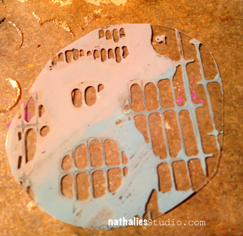
here you see the whole page- the background was just playing and trying things- I used a lot of the Dylusions Ink Sprays with the background too to see the results with the dried Distress Paints, and then as you can see the white that is the new Dylusions White Linen – love it. I also used Dyans new Couture stamps- I had fun- as you can tell ;) I worked a bit more with Wendy Vecchi’s new Golden Embossing Paste – yum. I also tried a bit stenciling with the Distress Paint Dabber but the paint is definitely too fluid for crisp results with stencils, so you would still need a cosmetic sponge or similar to apply the paint in a thinner matter – or maybe I need to practice more ;).

DistressPaint05


And then came the part that made me like super exciting. Stamping! Indeed a very nice paint to be able to stamp with ruber stamps- and super easy to apply because the dabber and you can also add different colors- and you can then stamp directly on Transparencies (remember that one Creative Jumpstart video I did? ;) ) – LOOOOVEEEE. But wait there is more….

DistressPaint06


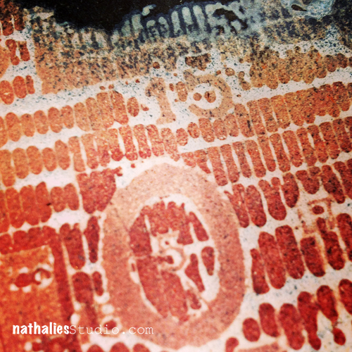
This made my heart pitter patter – The resist results with the paints. I used here Picket Fence and Weathered Wood Distress Paints and stamped with my favorite Stampers Anonymous Stamp. Then I sprayed with Black Marble and Squeezed Orange Dylusions Ink Sprays and also applied some Distress Inks – I think – Spiced Marmelade and Fired Brick over it. I loooooveee how this came out. That was one of my highlights, as yes – you can do resists with all acrylic paints- but this so far- had the best result for me.

So before I show you another art journal page- my favorite features of the Ranger Distress Paints:

  • Resist Results 
  • Matte but yet vibrant finish – perfect for art journals
  • Capability of applying to plastic and metal
  • Dabber cap – in the hope it won’t dry out
  • Possibility to use it with my rubber stamps
  • Color Range – love the colors and wonderful to mix with other Ranger Paint Products
  • Texture when dried – more visible texture than tactile
  • Opacity when applied over dried areas

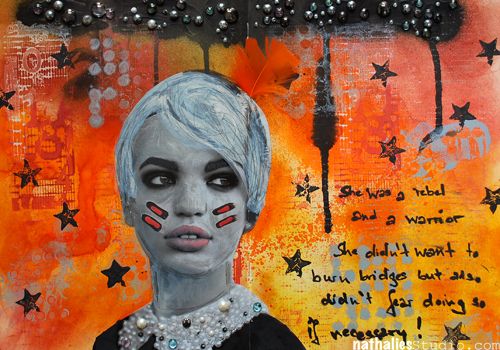
Warrior01


supplies by Ranger: 
Distress Paints
Distress Inks
Distress Stains
Dylusions Ink Sprays
Dylusions Stencils
Inkssentials Glue Stick
Inkssentials Mini Mister
Other: 
Pearls, Stampers Anonymous Stamps, Derwent Sketching Pencils

Warrior02

I will definitely use those in my stash and I see them also in future classes as I have some more ideas to use them with techniques already  ;)

Have a gorgeous day

Nat

Related Links:

n*Lab Tales- Derwent Artbars

n*Lab Tales – Letraset Promarkers with Letraset Airbrush System

n*Lab Tales- Ice Resin

Comments (22)

  • Michaela "Micki" Harper

    |

    Hi Nat,
    Ok, so just to make sure I read right (I’ve got the flu and been in bed – still in bed) once these paints dry I can add other media on top and the paints will not reactivate or smear like the Distress Inks or the Spray Inks, right? Ohhhhh for mixed media that’ll be awesome…. :-). Loved your experiements.

    Reply

    • Nathalie Kalbach

      |

      Hi Micki,
      yep- it is permanent once dried :)
      hugs
      nat

      Reply

  • andrenesmith

    |

    Thanks for the in-depth review! I got my distress paints yesterday and immediately had to try them out. Made a card with 3 blues sprayed with water and added sea salt. Worked great!! Here’s a link to the card…..

    C&S2 Day 8

    Reply

  • Lisa Flaherty

    |

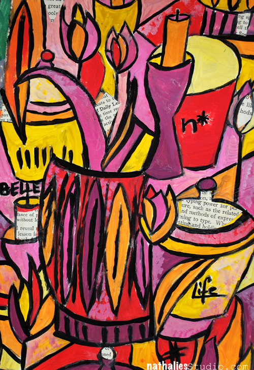
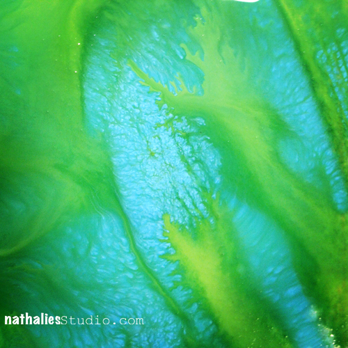
    Great review! I assumed that the Distress Paints were unique only in their color line. I LOVE the painted still lifes you’ve done, the one near the top of this post with the collage of book text, and the other blue and green one of your art supplies posted to Instagram.

    Reply

  • Sue Clarke

    |

    These are on my “to get” list and now I will try several colors since I liked the results you got in your art journal. I am TOTALLY in love with the Dylusions ink sprays already!

    Reply

  • rains

    |

    I’ve been so curious about these paints, even after watching TIm Holtz play with them on a video. Thank you so much for this thorough report! Just what I’d been craving. I will definitely get some, and will watch your other “Lab tales”.

    Reply

  • Rob

    |

    Thanks Nat for your report, I was pretty reticent to try them because I still have the last range of Paint Dabbers with dried up tops. But now I’m tempted after reading your report.

    Reply

    • Nathalie Kalbach

      |

      Rob- I hope they won’t dry – that of course I cannot say yet. I know though what you mean …

      Reply

  • Milagros

    |

    Gracias por compartir tus experimentos, preciosos resultados.
    abrazos

    Reply

  • mjmarmo

    |

    Wow – amazing results!

    Reply

  • Kathy P

    |

    Thanks, Nat, for that very throrough and honest evaluation of these new fun paints. Sounds like I need some in my stash! And will be looking for that class…..!

    Reply

  • Carrie

    |

    Thank you for sharing your experiments! I was curious to see what people other than Tim would do with them. They’re really exciting to me, because I love the Distress colors but wanted something more permanent for some applications, so it’s good to see that they live up to the excitement! Love what you’ve done with them :)

    Reply

  • Betty

    |

    Thanks Nathalie
    I did not know if I need the dabbers I am not a fan of the normal paint dabbers they never work when I need them.
    So maybe I must try these.

    Reply

  • Nadège

    |

    Love love love, everything!

    Reply

  • isisimaginings

    |

    Thank you for doing such comprehensive testing, the paints sound great & I must have the white Dylusions spray. Your pages are gorgeous, I especially like the second one.

    Reply

  • butterfly

    |

    Fantastic to hear such a detailed and comprehensive breakdown of different techniques with the paints. Mine are still on the way, definitely looking forward to some play time!!
    Alison x

    Reply

  • Gunvor

    |

    Thanks for sharing!

    Reply

  • Michelle Hernandez (@willieburgscrap)

    |

    I had no idea Dylusions was coming out with a white- I have so many white sprays and I love them ALL! Into my shopping cart that goes! I also love the vibrancy of the new Distress daubers- I’m not big into brown edges and the red, turquoise and yellow colors look nice and bright. Thanks for this write up- I’m still a little hesitant to buy lots of new paints since some of my old ones have dried out but this is my year of multi media experiments so I’ll just get one of each and completely used them up before I buy all the colors I like to use. Pinning this column!!!

    Reply

  • Djam

    |

    love it!!

    Reply

  • zoegakatten

    |

    Oh, I was thinking the same thing as you when reading about Distress Paints…! I don’t know if I should be happy or not so happy, reading that they have lots of good qualities. ;) I probably will have to try them, and I’ve been wanting to try the Dylusions for quite some time too. I love what you created while trying the supplies out Nat!

    Reply

  • Martha Richardson

    |

    Thanks for sharing your results…I loved them when I saw them at CHA but just wasn’t sure. You have convinced me I must have them!

    Reply

Leave a comment

My Favorite Mixed Media Essentials: 3. Markers & Pens

I wouldn’t necessarily say that Pens and Markers come at third place- but I would say that this is what I get the most questions about “What kind of marker/pen do you use on your projects with x? And so I will talk about my favorite ones now :)

If you missed the other posts in this series – you can catch up here 

I would say these are my top seven- always go to pens and markers.

What I always keep in mind when I use pens and markers is:

  • There is a right pen or marker for every surface
  • Make sure your paint media- all media on your surface is completely dry before you start writing on it…otherwise you ruin your pen.
  • Avoid the “fat” areas – meaning those areas – that you treated with oily and waxy paint media when you use felt markers or acrylic markers in general.
  • Be careful when you use an oil based marker or pen over water-soluble surfaces. Oftentimes the medium underneath reacts and the oil based marker bleeds into it. If that is what you want…you are good to go ;)

Which pens and markers I use:

This pen is awesome – that is why I have it…well…kidding aside – LOL. This permanent marker can be used on all kinds of surfaces including glass and acrylic and CD’s. I write with it on paper, as long as it is smooth paper, otherwise it tends to bleed. I use it because I love how it writes. When I write something on a transparency– I use it- it is the best on transparencies. I use it on smooth acrylic surfaces – it works like a charm. Not so good to use on textured surfaces- you ruin your pen…and believe me…hehehehe- I tried ;)  It comes with different tip sizes and it has an eraser in the back for the slick surfaces.

This is an ink pencil and when you write with it or make marks, they are pretty prominent as the pencil itself is highly pigmented and firm. You can also use water on it and then wash the pigments out. Once it is dried…it is permanent! YES…you heard right. As I lack the impressive Julie-Fei-Fan-Balzer-handpainted-brush-title-ing – I use this pencil to highly fake this ;) I write with the pencil in a what I think artsyfartsy way my title and then use water and a small brush and just go over it so it looks more like a brush painted title. Of course…as the description has given it away already, you should not use wet media on top of it without intention…you will activate and smear your writing otherwise.

A classic white gel pen. I love how fluidly the ink comes out. It is for me the best white pen I have tried. It covers black perfectly – which means it covers all colors and it is amazing with most surfaces – unless it is the super scratchy one. Gets ruined very quick if you use it on “fat” surfaces or not “dry” surfaces. I used to be able to find refills at my local office supply store which was actually making this a bargain and made me happy for eco-friendly reasons. I need to check out where I can find them now.

This is a soft  water soluble graphite stick and I love this for sketching or mostly making marks into painted dried and wet surfaces. Well- if the surface is wet you make texture and need to clean the tip of the stick right away with a dry towel. It is paper wrapped and you can take the wrapper off as you use it.

These are my secret weapons…LOL. You could say…the Dumbledores under the Markers ;) . The Posca water based paint marker has in the size of 0.9-1.3 mm a bullet shape tip and I tend to love this as I find myself writing easily with this. I love how the paint comes flowing out and I can use it – as well as the Molotow marker on tricky surfaces…well set aside super waxy or oily surfaces of course. On acrylic paint it looks shiny – I love it! I am not a fan though of the white Posca Marker – it doesn’t cover the way I would like it.

The Molotow Marker is a bit pricier, but it can be also refilled and I would say it can be used on even trickier surfaces than the Posca Marker…you can write on the most uneven stoney surfaces with it, without ruining the tip right away and you can use it for outdoor projects too. Ahem..if you think of Molotow Graffiti Spray Paints you might get why this marker is so good with struggling surfaces ;) . The white Molotow Marker is better than the white Posca Marker.

Both markers are awesome as you can use them also on fabric and wood and they do not bleed. The colors are intense and highly pigmented, they don’t fade too quick….I love love love them. I have markers of both companies for YEARS and they are still good to go and not dried out.  If you ever want to make me happy with a present… DEAR FAMILY ….just give me a package of one of those :)

This marker is fun- I don’t have it that long but it makes me smile and I love to use it on large-scale projects to write my own title or for bigger marks. It has this very wide angled tip which makes it easy to use it for calligraphy like writing in a graffiti style ;) And hey…who can resist a marker that says: “waterproof on almost every material. recap after use and be on the run!” and is manufactured by a company called ON THE RUN.

nSupplies

I hope you liked this post- let me know what you think. Next up is ….mmh surprise ;)

huge hugs

Nat

Comments (9)

  • Graciela Oyarzu

    |

    I love Posca! I don’t know if I could get Molotov in my country (Argentina). The white one. Thank you so much for all the information. Its very useful for me.

    Reply

  • kim t

    |

    I’m always struggling with what to use as I am so new at this, very helpful and informative! Thanks for this post!

    Reply

  • scrappegal

    |

    LOVE this post!!! Have writyten down my favourites! :D

    Reply

  • marjiekemper

    |

    Thanks for this… very helpful to have so many pens reviewed in one place.

    Reply

  • M. Carmen - Cuchy

    |

    Helpful and very interesting. That huge calligraffity ..mmmmmmm

    Reply

  • Louise

    |

    This is cool thank you so very much for sharen this :)

    Reply

  • Deborah Pierro

    |

    Hi Nat–Thanks for all of the very helpful information on the pens and marking items you like. You gave very thorough explanations of how they work, like the great art teacher you are. Writing and marking tools are very important to mixed media artists. I really like the Sharpie markers and use them a lot.

    Reply

  • Sue Clarke

    |

    My Signo white pen is my friend. Julie got me hooked on those years ago!
    Never heard of the Posca or Molotow but will have to give a look for them around here. Of course, Amazon does deliver to NH.

    Reply

  • mjmarmo

    |

    Great info!

    Reply

Leave a comment

My Favorite Mixed Media Essentials: 1. Acrylic Paints

Hands down my all time Mixed Media Essential is Acrylic Paint.

I had a very intense acrylic paint phase a couple of years ago and then I guess I needed a break and neglected those beauties for spray paints for a while. But I am so glad I came back to them!

What I love about Acrylic Paints is:

  • they are fast drying
  • generally cheap – or at least long-lasting even if it is a bit more pricey
  • they have a plastic like surface (due to the plastic polymer emulsion)
  • they can be thinned with water and that could make them almost look like water-color in some cases
  • they are permanent once dried
  • they cover surfaces if opaque
  • you can use other paint media on top of acrylic paints
  • you can use some fun media with them for amazing backgrounds and textures
  • you can create amazing backgrounds and texture with solely acrylic paints

Here are some examples:

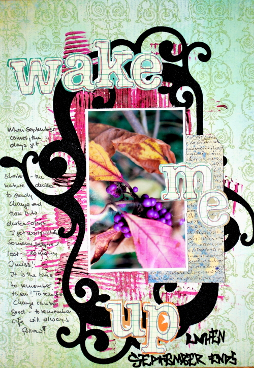
beautiful easy background – that can be also used for a scrapbooking layout:

background and texture with acrylic paints:

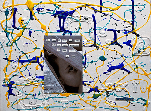
background and texture using other media and cheap supplies:

texture creating on a scrapbooking layout:

creating some fun handmade embellishments and use it for some accents on a layout:

using them with other acrylic media

using it on difficult surface – like acrylic pages of a minialbum

using acrylic paint to make embellishments your own

Pretty amazing what you can do with acrylic paints, isn’t it? And there is way more!!! So yes – just because of it’s versatility it knocks me off my socks and is my all time favorite essential :)

Which acrylic paints I use:

Here comes a saying that I learned when studying law : “It depends” – LOL. Nice one, huh?

Well, I used a lot of acrylic paints. And over the last couple years I learned what I like and what I do not like.What I like, doesn’t have to be necessary what you like.  so just take it as my thoughts and my preferences, ok?

  • So first of all let’s state that I like good quality artist paints. Because I learned over the years that especially when working in an art journal for example that they aren’t that tacky as a lot of the cheaper non artist ones.
  • I also love good quality artist paints because the color shift between wet and dry is not that high. I love to see how my work might look like when it is dry while I’m still working with my paints. I had many disappointments in the past where I was thinking a nice bright red was rocking my socks and then it was dry and a dark bloody mess as the paint shifted a lot when it dried.
  • Highly pigmented colors go a longer way and they are usually also more beautiful. They also can be buffed for a great glossy finish- which for me also is mostly true for more expensive artist paints.
  • I love texture and I love to create texture with paints – so I prefer thicker colors – I can also just thin them down if I want – and so I am a big Lover of Liquitex Heavy Body Acrylic Paints. I also like Winsor & Newton especially when it comes to their translucent acrylic paints. A good bargain and a very good quality are alos the Liquitex Basic Acrylic Paints.

nSupplies

I hope you liked this post- let me know what you think. Next up is Gesso.

huge hugs

Nat

——————————————————————————–

If you want to learn more about acrylic paints- check out my Über*Media Acrylic Paint Online Workshop

Comments (4)

  • scrappegal

    |

    Lovely inspiration projects you are showing! Thanks for sharing!

    Reply

  • Sue Clarke

    |

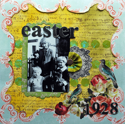
    Easter 1928 is such an elegant LO Nat.
    Thanks for the paint info. I believe that you were the first to inspire me to even try using paint on a LO. Tons of fun and extra special in my art journal. I love the Liquitex tubes since they come in small sizes which are good for travel.

    Reply

  • Jessica Sporn

    |

    I used to favor watercolor over everything else but have fallen in love with acrylic paint — especially since discovering Golden Fluid acrylics. xo

    Reply

  • mjmarmo

    |

    Love the many ways you use the paint!

    Reply

Leave a comment

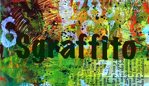
Sgraffito or Make Your Mark Video

Sgraffito is an art term describing a technique used e.g in plaster, pottery, glass or paint. Basically one or several layers of the medium are revealed by scratching into the top surface. The term comes from the Italian word sgraffiare and means to scratch. Not sure if that will help me with my next Italian vacation but hey… you never know ;)

Now why is that something that might interest me? It is cool because you can create TEXTURE- yum yum! Do you need to have more reasons?

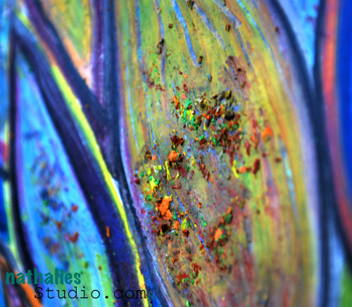
You actually saw some stuff already where I used the sgraffito technique- like on this piece from a post here playing with the Derwent Artbars. I used a tool that Derwent especially made for this, called the scraper.

But there is more…Scratching into still wet acrylic paint – Texture heaven. You can use all kinds of tools for it – like a plastic fork, the end of your brush, palette knifes…ah there are many many possibilities.

It is fun to add some sgraffito marks to your backgrounds or art journal pages – Let’s do a quick background video – I have a list of all supplies used below :) :

I love to use Liquitex Heavy Body Paint with the Sgraffito techniques, because they are – as the name might give it away ;) – heavy bodied paint.

I already have something in mind where I will use this background as a foundation – you will see it soon.

And if you want to learn more about acrylic paint techniques and a LOT of background techniques with them…

well….;) I can recommend my Über*Media Acrylic Paint Workshop. You don’t have to have Heavy Body Acrylic Paints….but I will show you how you can overcome that problem of having none anyway so you can still do sgraffito. But hey- Sgraffito is only one of more than a 100 techniques in that workshop :)

I just love Acrylic Paint :)

nSupplies

Hope you enjoyed the little video :)

Nat

Comments (24)

  • windinn

    |

    What fun to watch this, and wonderful results. That background ROCKS!

    Reply

  • Connie Permenter

    |

    Wonderful Techinques and I am going to purchase some of those Liquidtex Heavybody paints … Could you tell the the colors you used ? Thanks so much for sharing!

    Reply

  • Denise

    |

    Great technique, even better your use of color. Thank you

    Reply

  • Jo Murray

    |

    WOW!!!! That is gorgeous…. how could you possibly improve it?

    Reply

  • pamplamoussejuice

    |

    Background?! I would have been done with it after all that! I think it looks fabulous all by itself!

    Reply

  • ajsartjournal

    |

    Great video Nathalie, thanks for sharing.
    AJ

    Reply

  • Lisa crofts

    |

    what a fabulous video. Nathalie I love the look of all the liquetex paint and tools. I “need” that splatter brush too.

    Reply

  • Daniela

    |

    Danke für den tollen Artikel – und den Tipp mit dem kostenlosen Muster :-)
    LG Danny

    Reply

  • Lisa Flaherty

    |

    What a great technique, Nat! I love the possibilities of the different things you could use to scratch through the paint. The printed tissue paper layer adds nice depth to your wonderfully colored and textured piece! Also, I wanted to tell you how I much I enjoy your videos. Your fun, whimsical nature comes through in the production. Also, how amazingly clear the close-ups of your work are! What is the video camera that you use? Can’t wait to see more!

    Reply

    • nathalie-kalbach

      |

      Lisa, I use a Logitech Camera Vision Pro – it is a really good camera- I like it a lot.

      Reply

  • jjsobeyj

    |

    Well, now I need to go look for one of those splatter brushes – that made me all kinds of happy watching that! (I’ve tried with regular brushes, and wasn’t that excited about the effect)

    Reply

  • kittybg

    |

    I went to a WS on Friday and we did sgrafitto with Golden Open acrylics. If you like sgrafitto, you’ll love Golden Open. (No, Golden doesn’t pay me :D Also, I prefer liquids better because I need my acrylics to dry quickly and open takes a whole day.)
    Bye, Kitty

    Reply

    • nathalie-kalbach

      |

      Interesting :) I do know Golden Open Acrylics – but I feel the effect that I want to archive texture wise is more beautiful and more me with the Liquitex Heavy Body. And I do use all kinds of acrylic paints too ;) They do dry quick- but that is then when you can use a Retarder to mix in for longer opening time. I guess every artist has their own loves ;) Thanks for your comment, Kitty
      nat

      Reply

  • Dottie

    |

    Love this piece!! The colors and the texture are wonderful and fun. Need some heavy bodied acrylic paints. Thanks again for sharing you expertise.

    Reply

  • Bev W.

    |

    I’m in acrylic heaven:) Thanks for the vid Nat!! Your such an inspiration!

    Reply

  • Irma

    |

    Danke für den Link! Ich habe die Probe einfach mal angefordert und hoffe jetzt ganz dolle, dass ich zu den Glücklichen gehöre…
    Sonnige Grüße – Irma

    Reply

  • Jan B

    |

    Gah! I just LOVE your videos, love watching you work. Amazing piece! (I’m loving your Acrylics class by the way…working through at my own pace and having fun playing with paint and color.) You’re SO inspiring! :)

    Reply

  • Anne Porretta

    |

    This looks like so much fun! I have lots of acrylic paint but not heavy body. Off to the store and off to creativity. Thanks for great post, Nathalie!

    Reply

  • france papillon

    |

    i’m in love. once more! girl your productivity amazes me!!!
    one question: what surface are you working on? doesn’t seem to be paper…

    off to get inky!!!

    Reply

    • nathalie-kalbach

      |

      I used a paper block for acrylic and gouache painting with 250g. It is block made for the art supply store in my hood. I love that it is still thin enough that you can use it in an artjournal- but total sturdy and it is adhered on all four sides to the block- so you have to cut it off, which prevents wrapping. Not sure which real paper company stands behind it.

      Reply

Leave a comment