Blog: Art Journal

Dare to Be Different or Blog Hop with Catherine Scanlon

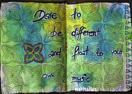
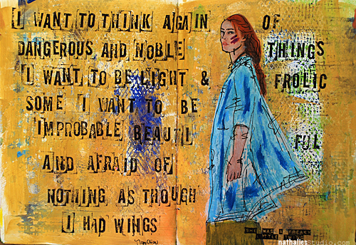
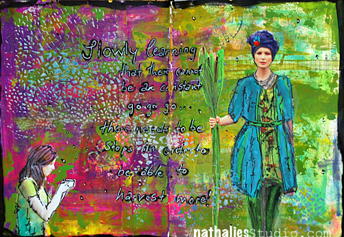
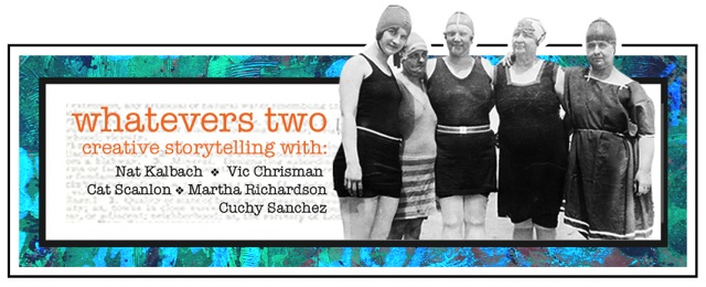
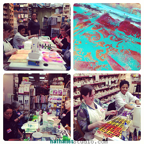
Today I am playing along with some other wonderful designers in a blog hop with my friend’s Catherine Scanlon’s Stamps. I am so proud of her for having her own designs out and I loved playing with them in my art journal.

NatKalbach_Daretobediff01


You can see all of her fabulous stamp, stencil and die cut designs in the AGW Catalogue here

Catherine Scanlon Designs SNEAK Peak


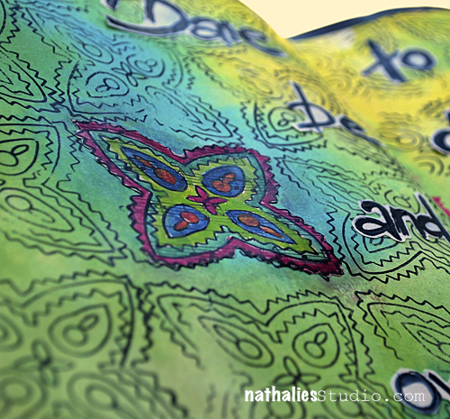
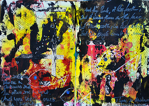
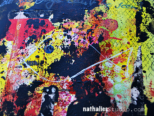
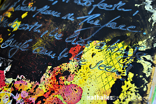
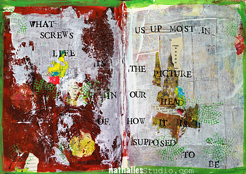
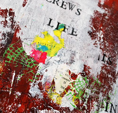
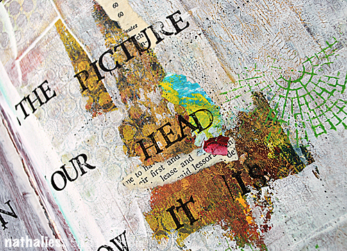
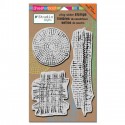
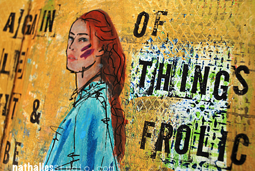
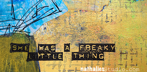
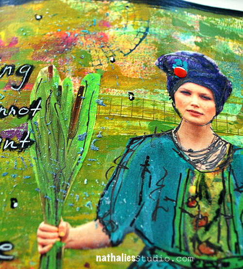
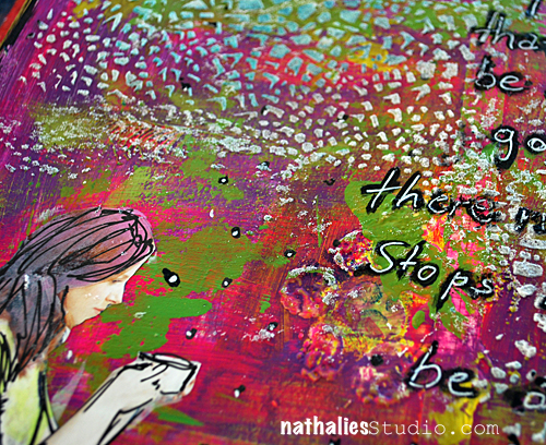
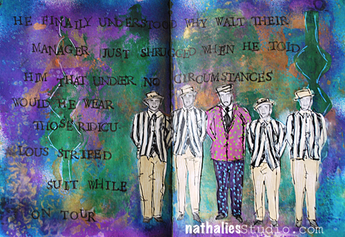
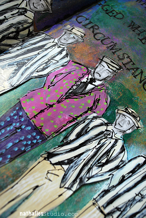
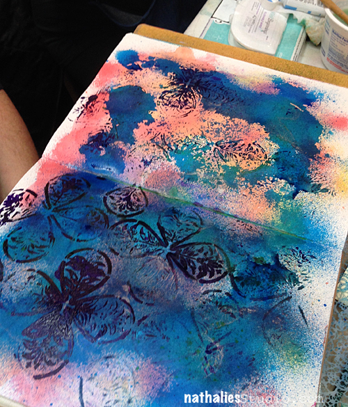
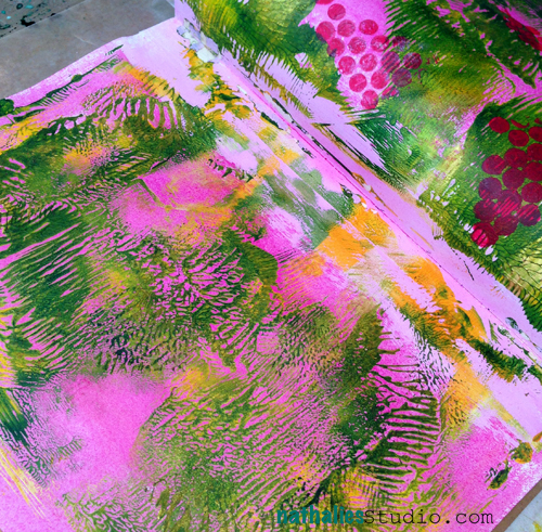
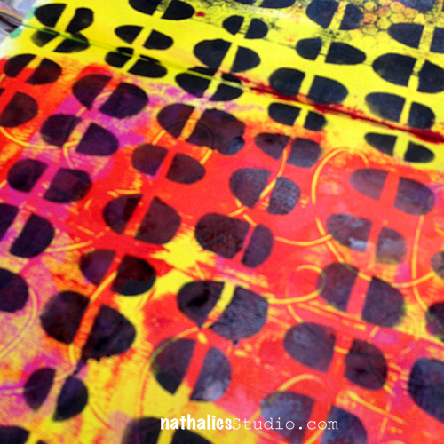
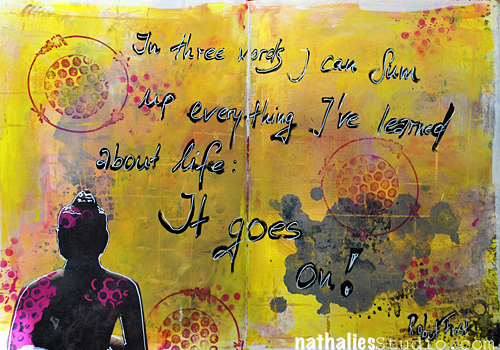
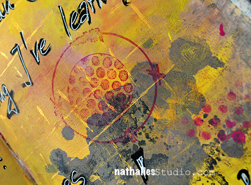
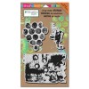
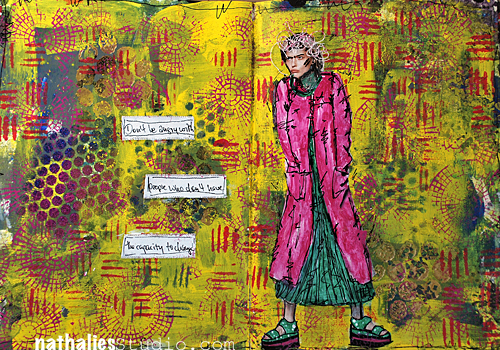
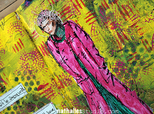
I used her Annie Paisley Stamp for the background and I loved coloring it in on a piece of music sheet to make one design stand out going along with my sentiment. I also used the Clara Paisley stamp on the right hand side as a nice playful border.

NatKalbach_Daretobediff02


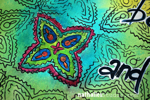
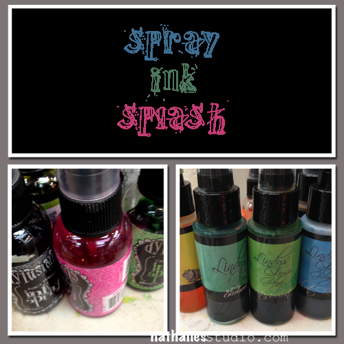
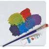
The background was spray painted and I colored in the music sheet after stamping with Derwent Inktense Blocks.

NatKalbach_Daretobediff03


Cat also has two wonderful prices to give away on her blog so make sure to hop along here and check out the other projects that were created with her stamps today:

Thank you so much for stopping by and have an amazing day!

Nat

LogoBlogSignature

Comments (16)

  • Laura Strack

    |

    Love this art journal page, Nat. Love the intensity of the colors and the stamp design is so fun! Great Hop. Thanks for sharing your mad skills!

    Reply

  • Carol

    |

    Seriously, I don’t know what to say about your artwork other than incredible. I’m in awe of your use of colors and look forward to seeing your next piece of artwork.

    Reply

  • Helen Markee

    |

    I love your colors and the use of the paisley stamp. Thanks for the inspiration

    Reply

  • jean marmo

    |

    Wow – love the color and how you used the stamps!

    Reply

  • Kathie

    |

    hi nat! love the colorful art journal page that you created. thanks so much for sharing! its been fun being a part of this blog hop with you. cheers!

    Reply

  • Amante del Papel

    |

    is an amazon page!! love the colors

    Reply

  • Kathy P

    |

    Love the look you have achieved by coloring in just ONE of these cute stamp designs! Great pages!

    Reply

  • Vicki Chrisman

    |

    Beautiful, colorful design as always from you Miss Nat! Love the saying too! Very Cool!

    Reply

  • Sarah lynch

    |

    Really cool background effect & love the stamp!

    Reply

  • Martha Richardson

    |

    Fabulous journal page Nat…the colors and GREAT QUOTE! Love the repetition of the stamps.

    Reply

  • Shirley

    |

    Love the colorful pages! Cat’s stamps are a great addition in black. I just love a bit of black in any project. Thank you for sharing!

    Reply

  • Jackie N

    |

    Beautiful Nat! And you always – dare to be different! thats one of the traits of you that I adore!

    Reply

  • Catherine

    |

    What a great and colorful journal page. I didn’t notice at first how you added the stamped border on the right, but its super sweet surprise ! I love how you layered the stamps on top of my favorite colors! Thank you Nat for playing along, and for your friendship over the years, it’s been a long time!

    Reply

  • Denise Spillane

    |

    Hi Nat, love your journal pages. Nice design and my fave colors. Fun hop

    Reply

  • Jennie Atkinson

    |

    What fabulous colours and I love the way the background music paper just peeps through here and there. A stunning page! I am so thrilled to be part of this blog hop with you all x

    Reply

Leave a comment

And The Shark, It Has Teeth or… Art Journal Page

NatKalbach_AndTheShark01


And the shark, it has teeth,

and it wears them in the face.

And Macheath, he has a knife, but the knife cannot be seen.

Then are some, who are in darkness

and others are in light.

And you see the ones in brightness.

those in darkness drop from sight.

– Bertholt Brecht –

NatKalbach_AndTheShark02


I let my inner grunge out with this art journal page- loved it :)

NatKalbach_AndTheShark03


nSupplies


Have a wonderful day

hugs

Nat

LogoBlogSignature


Comments (2)

  • Amante del Papel

    |

    I love black and yellow, this combo is awesome!

    Reply

  • Sue Clarke

    |

    I don’t usually like that much black but this is great and of course goes with the quote. I would have to say that you took a “bite” out of this art journal page. Have a relaxing weekend Nat.

    Reply

Leave a comment

The Picture in Our Head … Art Journal Page

NatKalbach_PictureInTheHead01


What screws us up most in life…it’s the picture in our head of how it is supposed to be

-unknown source-

NatKalbach_PictureInTheHead02


This is so true- in so many ways! When you create art or in your every day life.

NatKalbach_PictureInTheHead03


Loving the colors and texture here -gesso – such a great medium to cover parts up and make everything more interesting. Love me some Gesso :)

nSupplies


Wishing you a wonderful day…with our without a picture in your head ;)

Nat

LogoBlogSignature


Comments (4)

  • Jackie PN

    |

    Isn’t that the truth?!!! Started along time ago when TV told us this is how real life is….
    now it’s hard to unlearn that! Great post Nat!

    Reply

  • Sue Clarke

    |

    This quote could be my mantra for goodness sake.
    I get my idea of what life “should” be and get disappointed when it’s not.
    I continue to work on gracefully accepting what life “is” and embracing that and forgetting the preconceived notions that my mind had issued.

    Reply

  • Nurse Ratchet

    |

    Love this piece, Nat..truer words were never spoken!!

    Reply

  • Amante del Papel

    |

    Fantastic AJ!

    Reply

Leave a comment

I Want To Think …Art Journal Page

NatKalbach_IWantToThink01


“I want to think again of dangerous and noble things.

I want to be light & frolicsome.

I want to be improbable beautiful and afraid of nothing

as though

I had wings. ”

Mary Oliver

NatKalbach_IWantToThink02


I do love this quote a lot – it resonated with me . And…the perfect page to add this beautiful stamp too :)

NatKalbach_IWantToThink03


Here is a list of what I used for this spread

nSupplies


Have wings today :)

Nat

LogoBlogSignature

Comments (2)

  • Sue Clarke

    |

    I really like the blue peeking through the yellow.
    Nice spring colors.

    Reply

  • Jackie N

    |

    Nat- I was going to tell you how I liked your page…and when i got to the last post and saw the final words- well, I love your page You make me smile! “)

    Reply

Leave a comment

Slowly Learning … or Art Journal Page

NatKalbach_SlowlyLearning01


“Slowly learning that there cannot be a constant go go go….

there needs to be stops in order to be able to harvest more!”

NatKalbach_SlowlyLearning02


An art journal is a good source for reminding yourself on some things….I might have to revisit LOL. If you have been in one of my recent classes you have seen the beginning of many of my art pages – I often demo in my art journal certain techniques and then turn those pages later into a finished spread. I should do a before and after picture session to show you :)

NatKalbach_SlowlyLearning03


Love the color combo here – green, dark purple, pink and yellow.

nSupplies


what is your favorite color combination lately?

Have a great day

Nat

LogoBlogSignature

Comments (4)

  • Amante del Papel

    |

    Fantastic page!

    Reply

  • Jackie N

    |

    Nat, what a fabulous spread! I absolute love the message and your color combo is out of this world Delish!! Thanks for bringing it home! Hugs

    Reply

  • Sue Clarke

    |

    That crackle stencil is on my wish list at Stencil Girl. Love the texture that it gives. I’ve been using a lime green, purple and golden rod color combo a bit here.

    Reply

Leave a comment

He Finally Understood …or The Whatevers

the WHATEVERS 2 A

Are you ready for the next photo of the Second Round of Whatevers? If you missed what the Whatevers is all about or want to see all the past photos and takes…check it out here.

Click here to see what CatVickiMartha and Cuchy made out of the photo and which story they tell.

Here is my take on this month’s photo:

NatKalbach_FinallyUnderstood01


He finally understood why Walt their manager just shrugged when he old him that under no circumstances would he wear this ridiculous striped suit while on tour.

NatKalbach_FinallyUnderstood02


I would say Walt really likes patterns- huh? LOL.

And here is the photo of this month’s Whatever for you:

NatKalbach_Whatevers9

 Loading InLinkz ...

Here is how it works

  • Vicki, Cat, Cuchy (Carmen), Martha and I and I have made a one-year commitment to each other and picked twelve photos with Whatevers whom we will give a story.
  • Every month – if possible always on the 15th –  each of us will do a post with an individual story that goes along for us with the same photo.
  • If you want you can play along and we will have the photo for you to download and show us your version of The Whatevers. The photo will be posted at the end of our blogposts- not on Facebook!
  • There is no rules to the story itself- it can be funny, sad, uplifting, breathtaking- WHATEVER
  • There is no rules on the length or the form of the story– it can be a short sentence, an essay, a poem or a soap opera – WHATEVER
  • There is no rules on the artform you choose – it can be a scrapbook layout, an altered art project, an artjournal page – WHATEVER
  • Here is a rule though: if you take the photo you have to link back to us and show us your story.
  • These pictures are from our personal stash and are for personal use for you only! If you want to use them for a publication whether a book or magazine in print or digital form please ask for permission!
  • If you want to participate we’ll have a linky list for each Whatever Post.
  • You can also join our The Whatevers -Facebook Page


Two Button


Here is what I used for the art journal spread:


thank you :)

Nat

LogoBlogSignature

Comments (5)

  • cuchy

    |

    The dots make the difference.

    Reply

  • Vicki Chrisman

    |

    How fun! Love the page AND the story! :)

    Reply

  • Sue Clarke

    |

    Fun story and colors for these men.

    Reply

  • Cat

    |

    Of course, the patterns might be better than the stripes, LOL.

    Reply

  • Martha Richardson

    |

    That’s funny Nat…I wouldn’t be caught dead in that get-up either ;)

    Reply

Leave a comment

Artvergnugen: Spray Ink Splash at The Ink Pad Photos

NatkalbachWSInkPad_Artvergnugen


This friday I had the pleasure of teaching another Artvergnugen Workshop at The Ink Pad in New York City. Artvergnugen is an ongoing Evening Art Journaling Class – once a month I teach with a different medium or tool and it is loads of fun. This Friday it was all about:

NatKalbach_AVMarch02


The Dylusions and Lindy’s Stamp Gang were both equally loved- since they are different but both are very vibrant and beautiful it was fun to explore the different techniques and applications you can use them for in an art journal. I do love them both a lot – for different reasons  :)

NatKalbach_AVMarch03


I must say I love the ongoing concept of the Artvergnugen Class at The Ink Pad – it is a good challenge for me, because I constantly have to adjust to a new medium, it is very technique based and I do have people that have been in the last class but some are new and cannot just pick up at pages from the last Artvergnugen class.

NatKalbach_AVMarch04


Nice ghosting here, Diane …

NatKalbach_AVMarch05


and yummie abstract backgrounds that are a perfect base for an art journal page – love it!

NatKalbach_AVMarch06


I love those girls- they all love to experiment…and get their hands messy ;)

NatKalbach_AVMarch07


Plus I come out every time inspired by a color combination I have to use in my next project :) Green, Yellow and Pink..oh yes!

NatKalbach_AVMarch08


Lot’s of stencils used

NatKalbach_AVMarch09


and smiling faces :) – I cannot wait to see how Karen will finish up this page …

NatKalbach_AVMarch10


Awesome page by Cheiron picking up a page from last week and continuing with the new techniques- love it!

NatKalbach_AVMarch01


The next Artvergnugen class will be about: Stencil Madness on April 25. There is a waiting list for this date. The May and June dates and themes will come out soon – Artvergnugen…it is what makes your journal a piece of art :)

If you could attend an Artvergnugen class by me…which medium or tool would you like to play with? We had Stamps, Mono printing and Spray Paints so far :)

Have a gorgeous day

Nat

LogoBlogSignature

Comments (3)

  • whyducks

    |

    Oh what lucky ladies and what beautiful work.

    Reply

  • Sue Clarke

    |

    I see the stones divided stencil which I just bought yesterday.
    I would want to play with Silks and Pan Pastels. I tried one color of Silks at a crop yesterday and can’t wait to play some more with them.

    Reply

  • Nurse Ratchet

    |

    Once a month, taking a class with Nat seems like heaven on earth,to me! Have a fantabulous time ladies!!

    Reply

Leave a comment

It goes on …Or Art Journal Page

NatKalbach_ItGoesOn01


I do love this quote by Robert Frost:

In three words, I can sum up everything I’ve learned about life:

It goes on!

NatKalbach_ItGoesOn02

In my head I do know that…I just wish I would remember to feel that way every time something stupid happens ;) I think it is interesting though that oftentimes I set my heart on something, be disappointed when it doesn’t work out and then in retrospective I look at it as “oh good thing that didn’t happen!” I am a very positive thinking person but boy do I pout and scull if things do not work out- LOL.

Are you the same or are you good in shrugging obstacles in life off?

nSupplies


Have a gorgeous day

Nat

LogoBlogSignature


Comments (6)

  • Sue Abell

    |

    Hi Nat, love reading your blog & seeing your work. You crack me up sometimes! Especially today where in your list of items used you included your finger! Too funny! Hope you are enjoying living here in the states now. I hope to someday make it to NY & meet you & Julie. If you ever want to come visit Florida I would be happy to have you stay at my house! I live in Cape Coral which is next to Ft. Myers which is on the FL west coast south of Orlando.

    Reply

  • Nurse Ratchet

    |

    Dahlink….do you mean pout and scowl?? This may be my new mantra…Life goes on ….not pout and scowl!!

    Reply

  • Amante del Papel

    |

    I love the yellow color, this one of my favorites pages!

    Reply

  • Michelle Salazar

    |

    THose words are so true and I to forget and throw a fit now and then that life is not going the way I want it to be. Then I have to remind myself that I am here to serve and that he knows better then me where my life is suppose to go and when I really look to see what is happening it is an amazing day and I am in an amazing place!

    Reply

  • Sue Clarke

    |

    I expect things to be a certain way and when they’re not I get disappointed. I pout for a bit but then realize that everything happens for a reason and life will indeed go on. Lovely quote to use on an art journal page Nat. I especially like the pink in the lower left corner as it brings “hope” to the page.

    Reply

Leave a comment

Don’t Be Angry … or Art Journal Page

NatKalbach_Dontbeangry01


I might have gone insane with the background- but I love it …and somehow it comes all together with the image and quote :)

NatKalbach_Dontbeangry02


I might also long for spring…hence the colors! :) I promise – as soon as the weather gets better I stop pouting…I look like my art journal girl – LOL

Here are the stamps and supplies I used:

nSupplies


Have a beautiful day

Nat

LogoBlogSignature

Comments (5)

  • jackie

    |

    I love it- even with your pouty face!

    Reply

  • Gypsy Chaos

    |

    Nice. I love the saying. It is so hard not to become furious with people who simply refuse to acknowledge, let alone accept, that today’s world is not the same as decades past. But the anger served no good purpose. Well if you have very low blood pressure, then it helps.

    What do you think of the Liquitex paint markers? I just saw them for the first time last week. I’m intrigued.

    Reply

  • ddhurlbut

    |

    Love the energy of this page! And I am feeling your pain about this endlessly miserable Winter. On the bright side, you were able to express it on the page and that is GREAT! If we chant loud enough, “come on SPRING!” maybe it’ll get here sooner.

    Peace,
    Donna

    Reply

  • Sue Clarke

    |

    I love this page. It screams anger! The red and the stamped images are just perfect for the page.

    Reply

  • Ruth L

    |

    Gorgeous spread!

    Reply

Leave a comment