Blog: Manhattan Stencil

The Stencilfied Journal – Prompt 9

My wonderful friend Tina Walker is at it again – she invited several people to join her Stencilfied Prompts. The prompts are music related and each week she is posting a song. You can be inspired by the lyrics, the video, the album cover or anything related and the only restriction is that you have to use StencilGirl Product Stencils. Here is my take on Prompt 9:

This week’s prompt was Hotel California by The Eagles. I had fun playing with my Manhattan Stencil on a small gelli plate – using the plate to stamp into the art journal.

I sketched the figure over the background and then painted him partly in with Inktense Blocks- I love how the stenciled areas areas creating a pattern and texture for the clothes.

Here are the supplies I used for this prompt:


Leave a comment

Inspiration from Around the Globe – August 2018

Ready for some inspiration? Today we have some projects from around the globe. It’s always fun to see how you’re using my stamps and stencils and I am so happy to share some examples today. So let me know if you’re doing something cool with my products, and you might see yours on the next Inspiration from Around the Globe!


First up is a beautiful wall hanging from one of our former Creative Squad members Gwen Lafleur, from the US. She is using my Manhattan stencil for the blue background pattern on this funky design!

Next is Barbaree King also from the US with a cool mixed media postcard using my Grove Street foam stamp on the left in pink.

From the UK we have a pop of color from Colleen Melody, using some stamps from my Marks stamp set in red here.

From the US we have a neat mixed media index card from Cathy B who has created a nifty wedding scene using my Mailbox, US Flag, and Main Station stamps, all from the fun Stroll Through the Hood 2 set :)

And finally we have some pages from Jade Sutton in the US who is using my Manhattan foam stamps to create a bold background to unify her spread.


If you’re working on something fun with my stamps or stencils, be sure to tag me and share! I’d love to see! Here are some of the supplies used in this post:


SaveSave

SaveSave

Leave a comment

Endless Summer – Josefine Fouarge


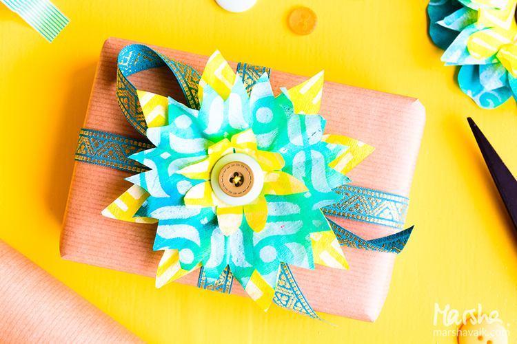
Hello my friends and hope you are enjoying your summer (if you are in our hemisphere I guess lol, otherwise Happy Winter!). Today we have a post from Josefine Fouarge from the Creative Squad, sharing with us some absolutely gorgeous cards using my stencils and the happiest summer colors. This month the squad is using the theme:  Endless Summer – The days are long, the sun is shining, the air is soft… it must be summer! Let’s take a stroll down memory lane and save a summertime memory forever.


Summer has started, it’s official. We are having the first days with over 100 degrees in California, so I spend a lot of time in my pool. When we bought our house, we fell in love with the pool. It is plastered with a variety of blue tiles which shine amazingly when the sun hits them. The colors of the pool were my inspiration for this month’s theme – Endless Summer. But as always, I started with those colors and then couldn’t stop.

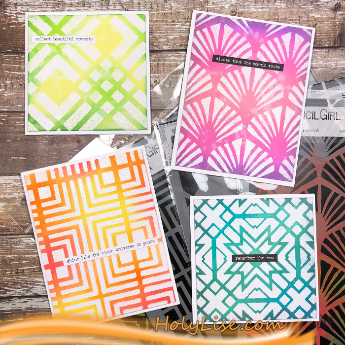
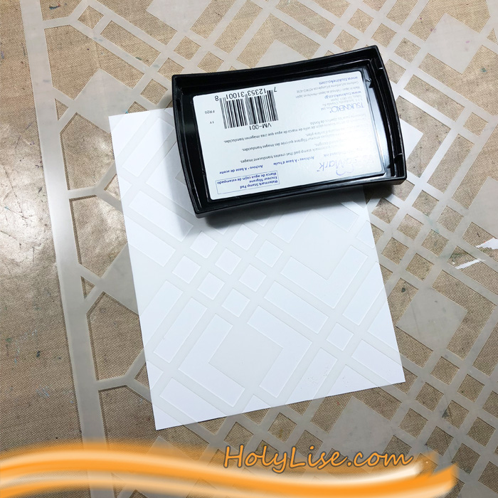
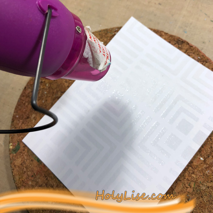
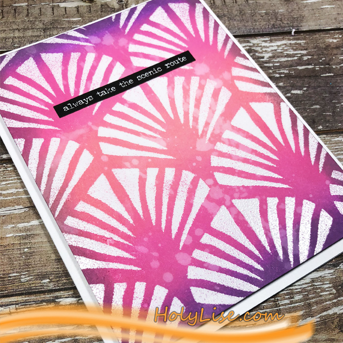
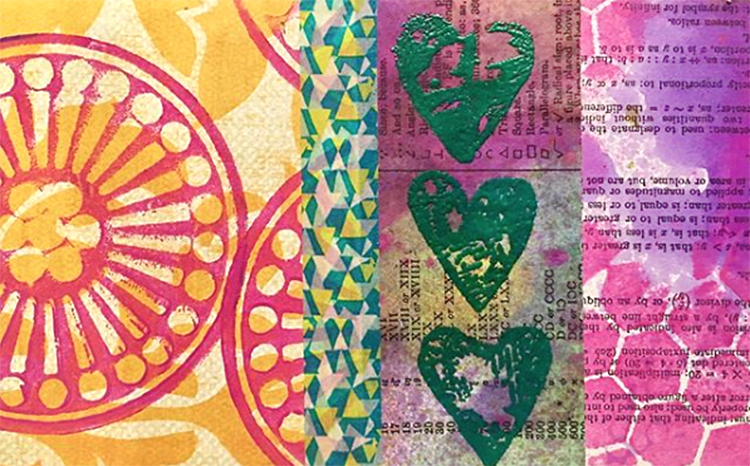
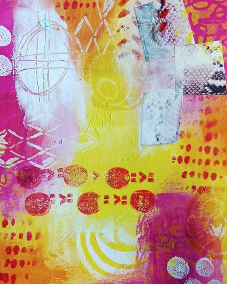
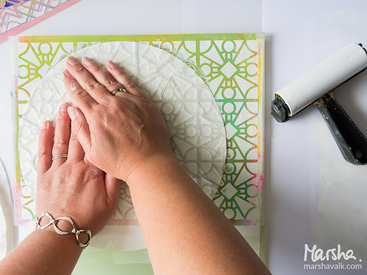
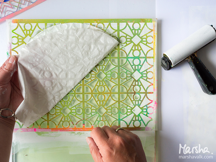
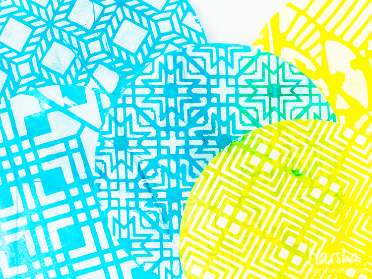
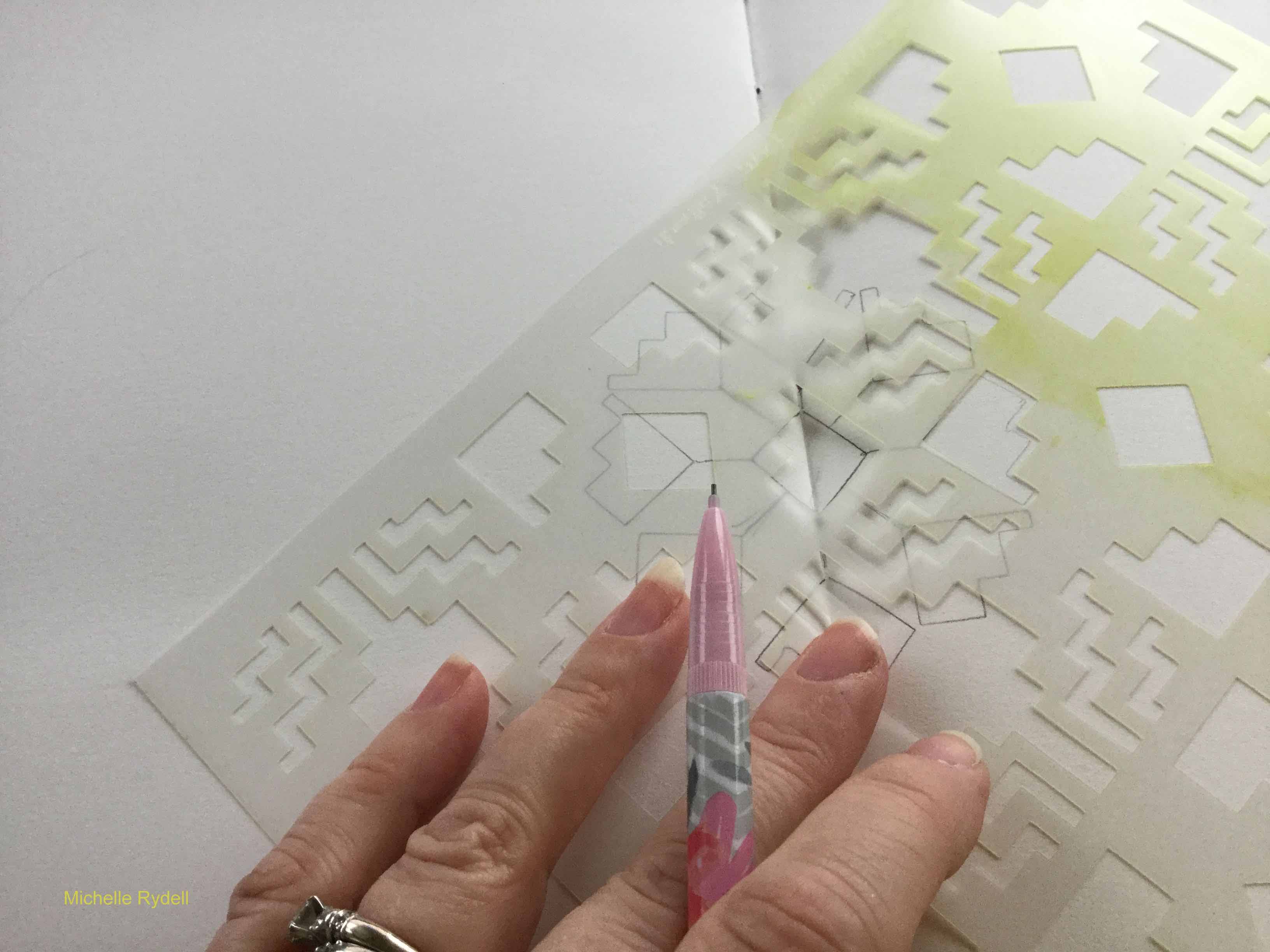
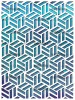
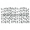
But let’s start at the beginning. I decided to create a few greeting cards. I haven’t done a lot of ink blending lately, so that’s the technique I went for. It all started with picking 4 stencil designs and then heat embossing the patterns with clear embossing powder. For that, I placed the stencil onto a 4 ¼ x 5 ½ piece of card stock, dapped the Versamark ink pad through the stencil, added the powder and heat set it. I did that with the Manhattan, Chicago, Toledo and Art Deco stencils.

My original plan was to use the same blue shades of Distress Inks and Oxides for the cards (which were inspired by our pool), but after the first card I changed my mind and went all over the rainbow.

I always started with the lightest color, inked the background up and then switched to the second color. I went over the same areas a couple of times to get a bright color.

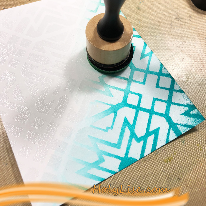
When I added the second color, I always went back to the first color and blended over it.

At last, I added the darkest color. Usually, I didn’t ink up the darkest color too much to not overpower the cards with it.

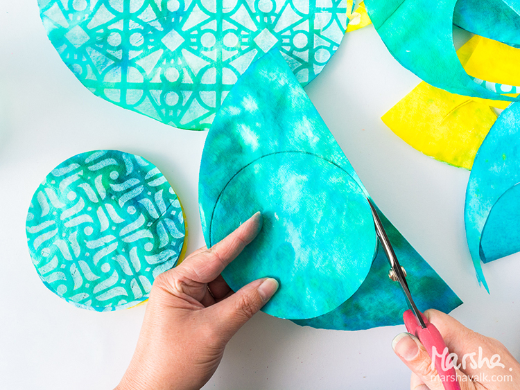
At the end, I cut two of the panels into 4 x 4 squares and adhered them onto a 4 ¼ x 8 ½ card base. The other two are cut to 4 x 5 ¼ and adhered to a 4 ¼ x 8 ½ card base. I also added one sentiment sticker to all of the cards.

Here are all 4 cards with the colors I used:

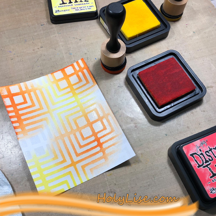
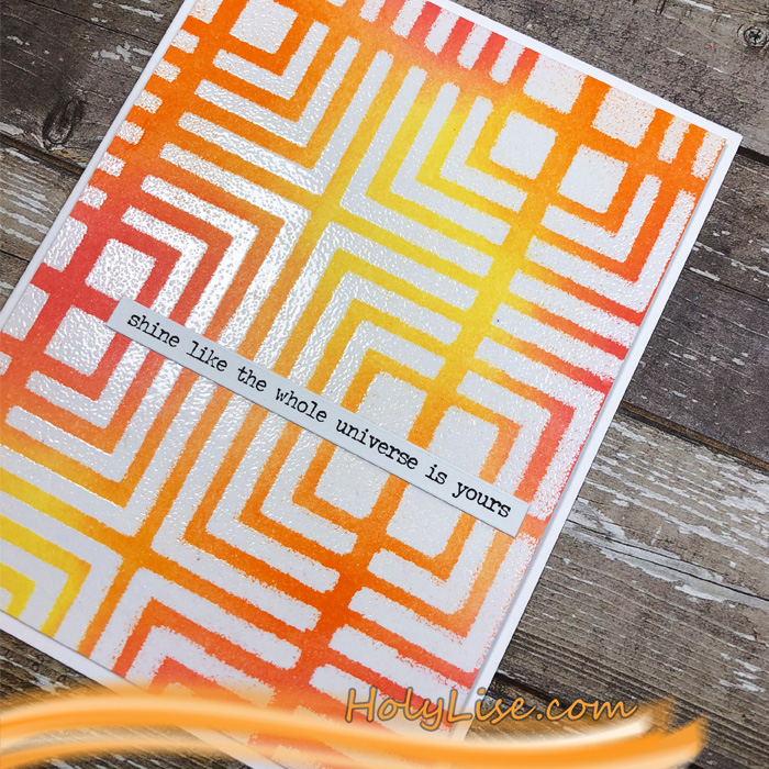
Manhattan stencil with Distress Ink in Squeezed Lemonade, Carved Pumpkin, Abandoned Coral

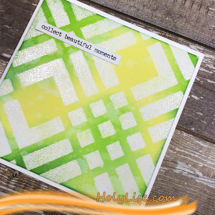
Chicago with Distress Oxide in Squeezed Lemonade and Distress Ink in Twisted Citron and Mowed Lawn

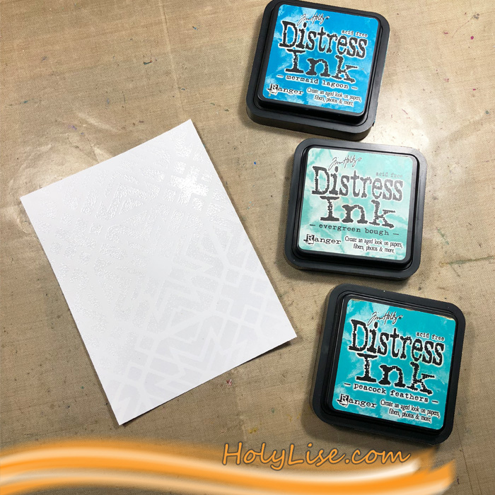
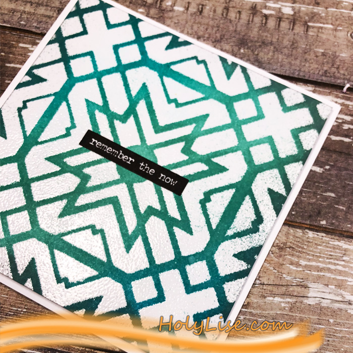
Toledo with Distress Ink in Peacock Feathers, Evergreen Bough, Mermaid Lagoon

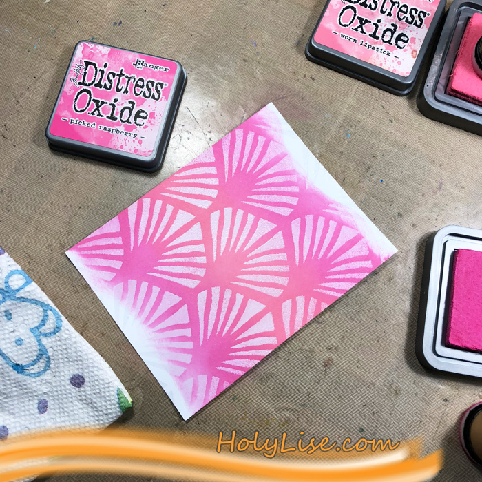
Art Deco with Distress Oxide in Worn Lipstick, Picked Raspberry, Wilted Violet

I hope that these colors got you into a summer mood, at least a little ;)

Thanks for stopping by and don’t forget to come back every Tuesday for more inspiration from the Creative Squad.


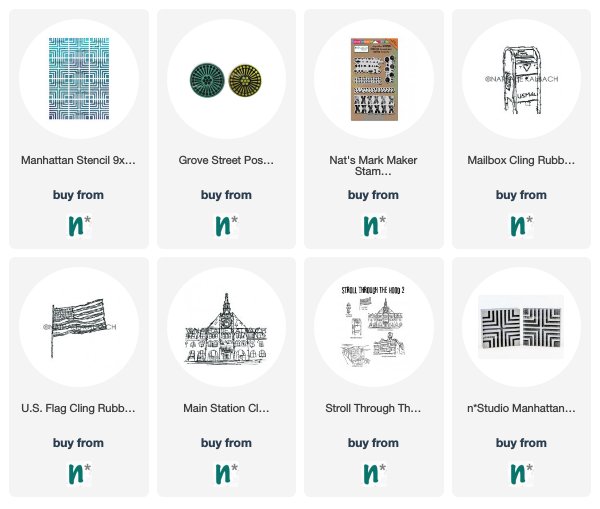
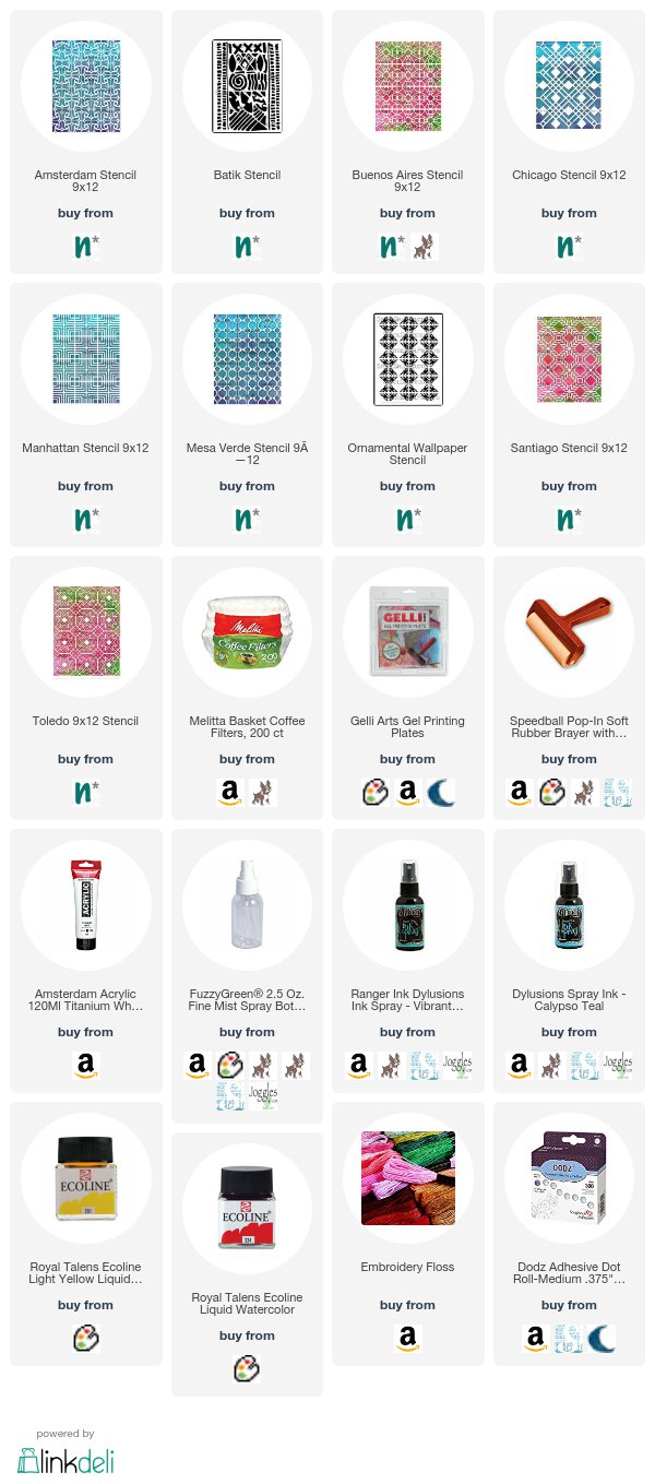
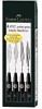
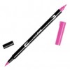
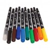
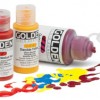
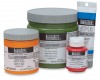
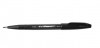
Thank you Josefine! I love how that embossing sets off those lovely colors. Here are some of the supplies that Josefine used:


Did we inspire you? Working on something yourself that you’d like to share?  I love to see how you interpret our monthly themes. Email me how you used my stencils and stamps with the theme and email me an image – I would love to share your projects in my next  “n*Spiration From Around the Globe“.

Leave a comment

Reduce, Reuse, Recycle with Marsha Valk


Hello again from the Creative Squad! Today we have a gorgeous gift wrapping project from Marsha Valk that is sure to send you running to your kitchen for some coffee filters :) Marsha used a whole slew of my stencils on this one (so be sure to check the materials list at the bottom) to rock the theme: Reduce, Reuse, Recycle – Let’s do Mother Earth a favor this month and use what we already have.  Maybe we’ll dip into our stash of leftovers from other creative projects or maybe we’ll repurpose something unexpected.  This month we’re thinking about how artmaking can impact the environment and we’re trying to make our footprint just a little bit smaller.


Reduce, Reuse, Recycle – that’s a topic that has been on my mind a lot lately. I have a lot of different craft supplies. I like to donate any excess supplies I have, but I still have plenty left that I’m reluctant to get rid of because I don’t want to waste it and it may come in handy someday…

The upside to this is that I’m never short on stuff when it comes to gift wrapping!

Paper flowers make fun and easy gift toppers, so I for this month’s prompt I decided to make coffee filter flowers.

I’ve shared how to create similar flowers on the Gelli Arts® blog before:

Using brand new (bleached) coffee filters for a craft project probably isn’t the greenest choice you can make. If you are looking for an environmentally friendlier option, you can recycle used coffee filters.

Unfortunately I don’t have access to a coffee maker that uses filters like these, so I haven’t tested it for you, but I believe you can rinse and dry them. They will be stained, but that will actually add interest to the paper (and the flowers).

Step 1: Monoprint a couple of coffee filters with your Gelli Arts® printing plate using stencils and (white) acrylic paint. Here I’m using Nat’s Buenos Aires stencil.

Step 2: Stain the monoprinted coffee filters with spray inks.

Wet the coffee filter with a spray bottle of water before you spray on the spray ink. The water will help the spray ink spread across the coffee filter, this one has Nat’s Toledo stencil pattern on it.

You can stack the coffee filters you want to have the same colour while spraying. Each new filter will absorb the excess ink from the already sprayed ones!

Leave the coffee filters to dry completely.

Step 3: Cut two smaller circles out of each coffee filter. I folded each coffee filter in half and used a jar to trace a circle shape onto them to get a uniform size.

Step 4: Fold the circles into eighths (or more) and cut leaf shapes. Make sure to cut some larger and some smaller.

Step 5: Unfold the coffee filter flowers and stack two or three on top of each other. Secure them by sewing one or two buttons in the middle of each stacked flower.

Fluff the petals until you are happy with the result.

Step 6: Use a glue dot or double-sided tape to adhere the flowers to your gifts!


I love this Marsha – such a great way to dress up a gift! In addition to buttons and ribbon, Marsha used the following supplies (some are affiliate links):


Play along with us too: I love to see how you interpret our monthly themes. Email me how you used my stencils and stamps with the theme and email me an image – I would love to share your projects in my next  “n*Spiration From Around the Globe“.

Leave a comment

Live Like It’s Spring – Michelle Rydell

Hello from the Creative Squad! The monthly theme is Live Like it’s Spring – Springtime is when Mother Nature kicks it into high gear. It’s the time to wake up and approach life with renewed energy.  Let’s join Mother Nature in this reawakening and create some things in the Spirit of Spring! Today Michelle Rydell is playing with different parts of my stencils  to celebrate spring with a gorgeous mandala. Check out her nifty beautiful idea to use stencils!


When I heard that the theme for this month was about springtime, the first thing I thought of was flowers! Then I took out my Wanderlust stencils to see what I could see. I love looking deeply into Nat’s stencil patterns, because you can see so many patterns within patterns. This time, what I saw was a cute little tulip within the Santa Fe Stencil. Do you see it too?

That gave me the idea to create a springtime mandala with the little tulips as a starting point. I’m creating this spread on watercolor paper in a 9” x 12” journal. The guideline I’m setting for myself is to only use bits and pieces from the following Wanderlust stencils: Santa Fe, New Orleans, and Manhattan. Here’s the step-by-step…

I started with the basic diamond shape (from the Santa Fe) in the middle, tracing it with pencil in the middle of the page. Then I drew a line straight out from each point and side of the diamond. Then added a “tulip” at the end of each line…

From there I just started building outward with various shapes from the stencils; first tracing with pencil, then going over it with pen, once I knew I liked the way it looked.

When I reached this point, I started to see the center of a giant daisy emerging! I found a quote that felt perfect to tie the mandala in with springtime. I drew a circle around the mandala, leaving a little room to add the quote to the inside of the circle. In case it’s hard to read, here’s what it says…

“There is something infinitely healing in the repeated refrains of nature – the assurance that dawn comes after night, and spring after winter.” ~ Rachel Carson

Then I drew the petals, to complete the flower…

Colored it in with tombow markers…

And cut the shape of the flower out, so you can see the journal page before and after behind it.


Wow – I love how all those different parts of the stencils created something new and beautiful – stunning, Michelle! She used these supplies – some links are affiliate links:


Play along with us! I love to see how you interpret our monthly themes. Email me how you used my stencils and stamps with the theme and email me an image – I would love to share your projects in my “n*Spiration From Around the Globe“.

Comments (2)

  • Sue Clarke

    |

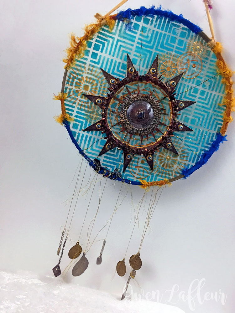
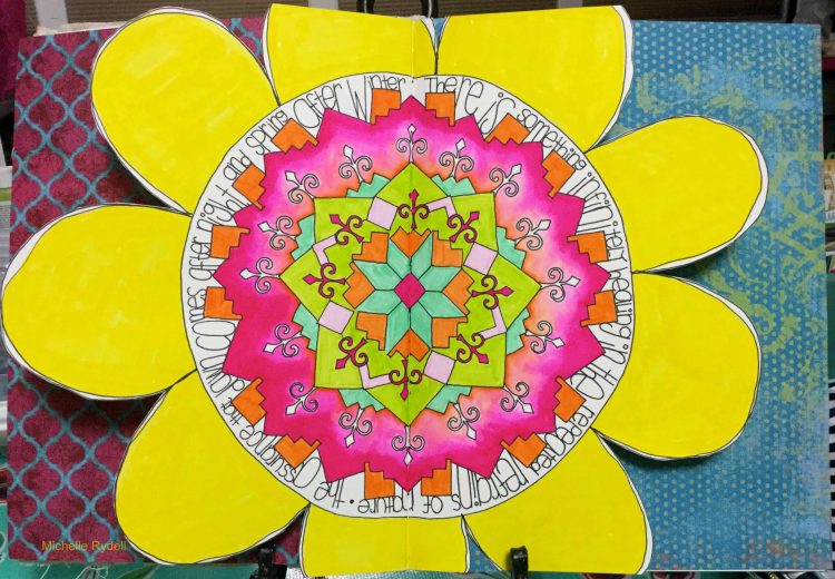
    It’s amazing how a crafty person can create such beauty while using different pieces of this stencil.
    Thanks for the ideas Michelle as I tend to create “in the box”.

    Reply

  • Julie Tucker

    |

    This is gorgeous! LOVING how you assembled that flower!!!!!!!!!!!

    Reply

Leave a comment

Taking a deep Breath – Art Journal Spread

“I took a deep breath and listened to the old bray of my heart. I AM I AM I AM” – Sylvia Plath

I love this quote so much – it made me somehow happy and silly pink ;)

For this spread I wanted to play with visual juxtaposition a bit:

For the background I added to some areas a wash with watercolors in a grey tone and pink. I love how the watercolor has a soft look, while the later applied acrylic paint is more textured.

I used different stamps and stencils- mainly my Kassel stencil with some left over paint from a different spread on top dabbed onto the page, as well as the Manhattan Stencil through which I applied some pink paint with a cosmetic sponge.

I stamped with the Versailles Foam Stamps here and there to give it a bit of  a feminine touch – also to break with the very linear and geometric patterns of the Kassel and Manhattan stencil.

I added some marks with the Satin Doll and Running  Stamps and Archival Ink. I added also some hand made marks – I always love the play with “perfectly” repeating marks and handmade marks.

To make sure the journaling doesn’t get lost in the background I applied some Unbleached Titanium acrylic paint with my finger – big enough to write with the Fude pen on top.

I really like how this page turned out – I think I will play a bit more with this concept.

Here is a list of the supplies I used – some links are affliliate links


Have a gorgeous day !!!

Comments (6)

  • Sherry Canino

    |

    I love it !!! And the quote ❤❤❤

    Reply

  • sherri scott

    |

    Nat, nice girly, gilrly page with all that texture and pink

    Reply

    • nathalie-kalbach

      |

      LOL- yeah isn’t it ;) Have a wonderful weekend Sherri!

      Reply

  • Torsa Saha

    |

    Stunning!! Can’t wait to meet you ?

    Reply

    • nathalie-kalbach

      |

      Thank you so much Torsa! Looking forward meeting you too! :)

      Reply

Leave a comment