nathalie-kalbach

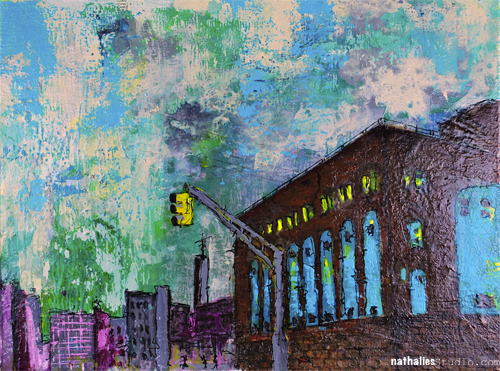
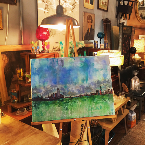
Gloomy – Mixed Media Painting

NatKalbach_Gloomy01

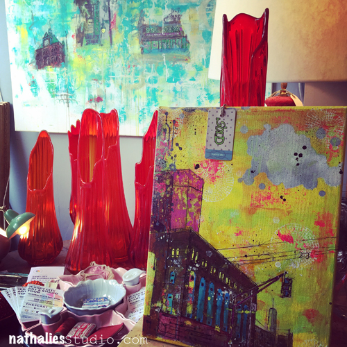
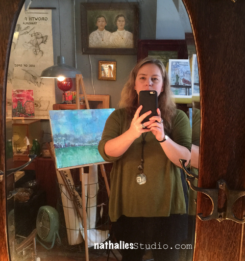
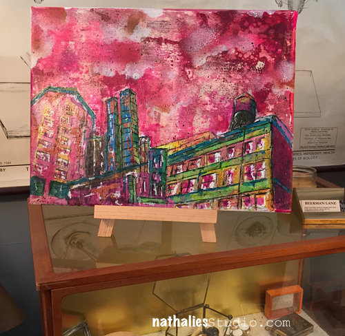
This painting was part of the Jersey City Art & Studio Tour 2015. I called it Gloomy and it shows the Powerhouse in Jersey City- and it now belongs to Lori – hopefully it makes her happy and not gloomy ;)

NatKalbach_Gloomy02

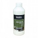
It was hard to photograph as it has a glass like effect on top due to the Pouring Medium I treated it in the end with.

NatKalbach_Gloomy03

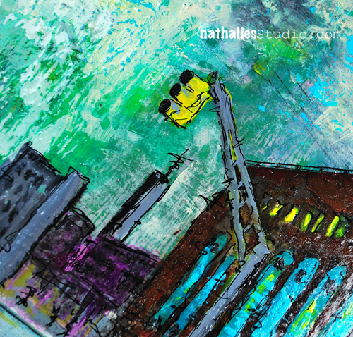
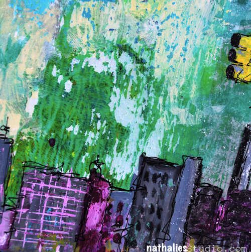
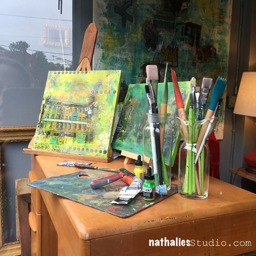
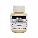
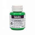
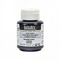
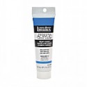
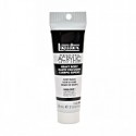
Lot’s of texture work – and I found a new way to create texture with Liquitex Heavy Body Paint and Spray Paint – getting a peeled effect- oh yumminess :)

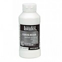
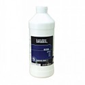
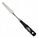
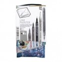
Here is what I used for those of you who want to know


Leave a comment

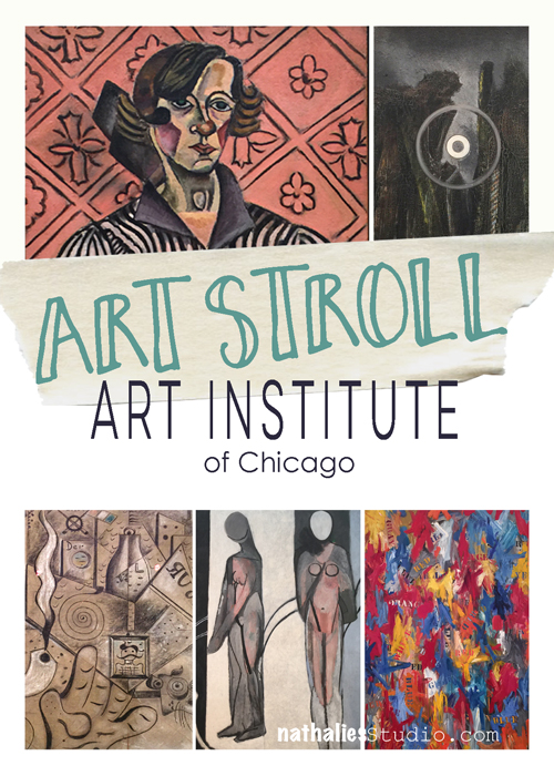
Art Stroll: The Art Institute of Chicago

ArtStrollAIChicago

Disclaimer: This post includes artwork with abstract or not so abstract nudity – it is not called Sodom and Gomorrah – it is called ART . If you have a problem with art, all I can say ” so sorry for you!” . Don’t email me to complain, don’t visit my blog anymore because I might post things like this again and, farewell!

A couple of weeks ago I met two of my old friends in Chicago for a girl’s weekend. It was wonderful and a long due time together. And not only did I get to spend time with good friends …we also sneaked an Art Stroll in and went to the Art Institute of Chicago. I had visited the Art Institute a couple years ago but somehow forgot that the museum is mooohasive. So here is just a couple of the things that I was able to see and that caught my eyes :)
Artstroll_NK01

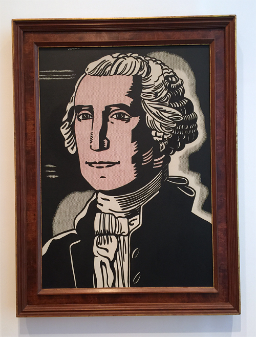
Roy Lichtenstein, George Washington- 1962 – an early Lichtenstein  – I love seeing how he developed from there.
Artstroll_NK02

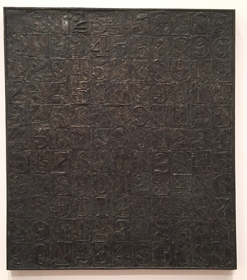
Jasper Johns, Numbers – 2005 – the texture makes me swoon – and I love that Jasper Johns repeated his known design in white bronze. He says “I like to repeat an image in another medium to observe the play between the two”
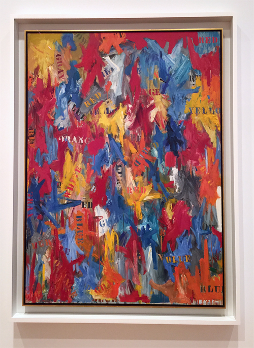
Artstroll_NK03

Another Jasper Johns – False Start – 1959 – which I have only seen in books so far – stunning!
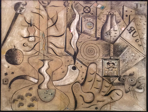
Artstroll_NK06

Joan Miró, The Kerosine Lamp – 1924 – love the lines and the little clues and marks
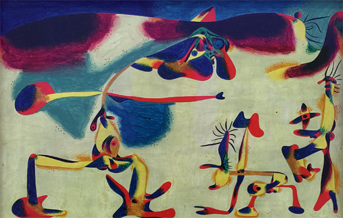
Artstroll_NK07

This Miró – Two Personages in Love with a Woman – 1936 – made me smile !
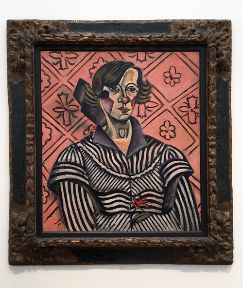
Artstroll_NK15

And another Miró – Portrait of Juanita Obrador – 1918 – all three paintings not in chronological order here- are so different and it is interesting to see how Miró changed his style throughout the years.
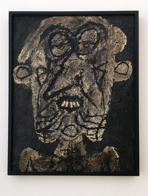
Artstroll_NK08

Ohhh Jean Dubuffet – you make me happy! It is as if his visual idea of “Supervielle, Large Banner Portrait” – 1945 – was processed through his body and then came unrefined through his hands onto this canvas !
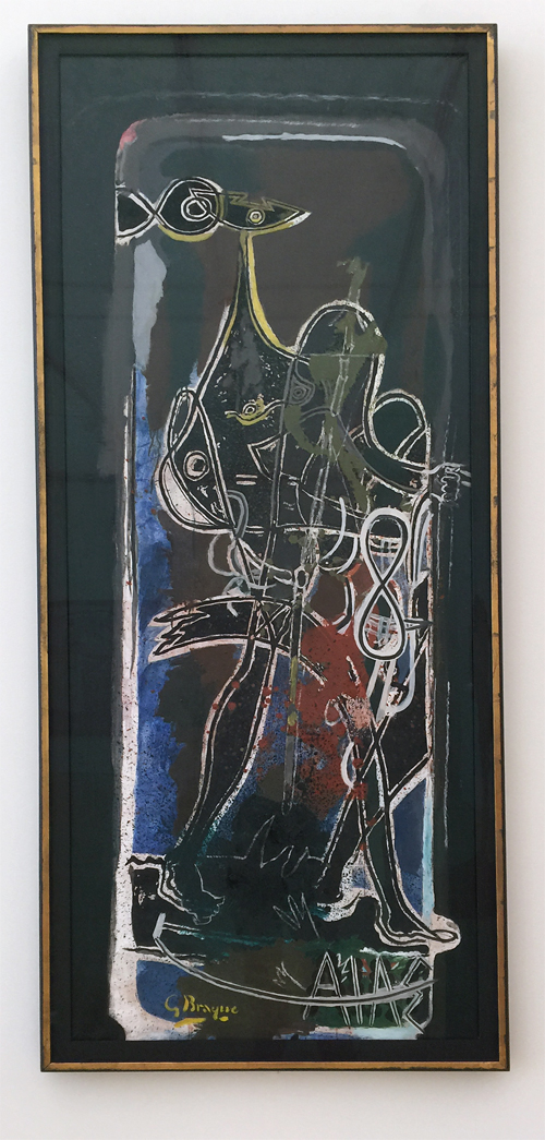
Artstroll_NK09

Georges Braque, Ajax – 1949-1954 – I love the int of color, the line work and the figure. It is a painting I would have not associated with him.
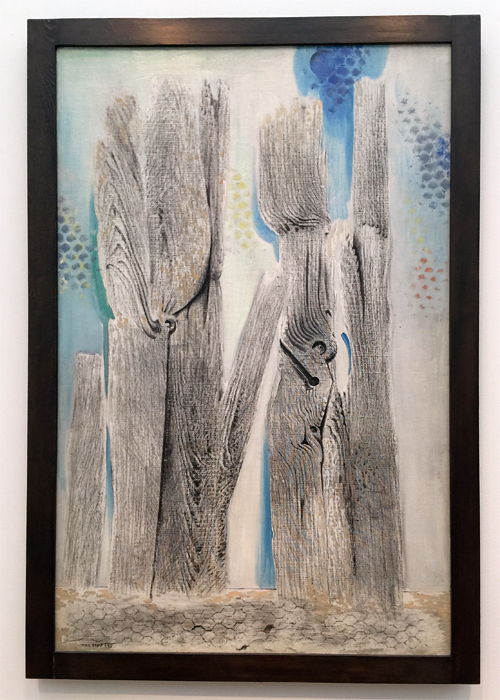
Artstroll_NK11

I am always excited when I see a Max Ernst Painting- his texture work is just unreal ! This appears 3 dimensional but is all painted – The Blue Forest , 1925.
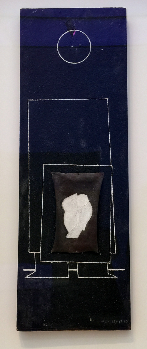
Artstroll_NK12

And this painting by Max Ernst made me smile  – well more the title actually – Human Figure with Two Birds – 1925 and 1929 .
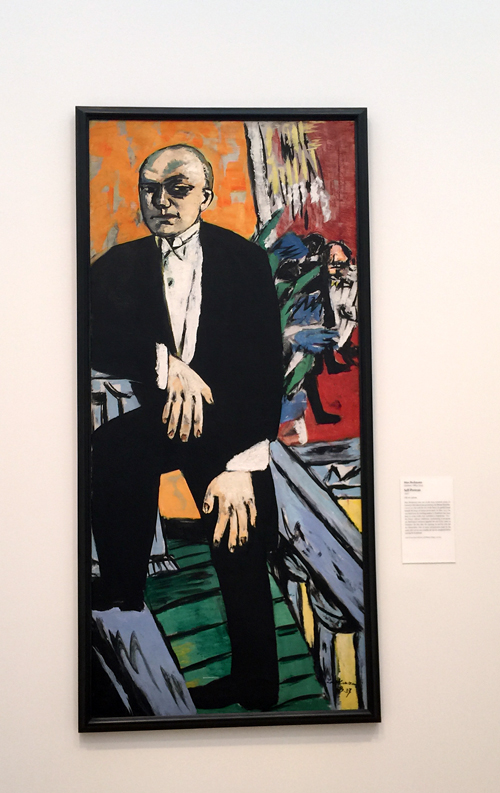
Artstroll_NK13

Max Beckmann – Self Portrait – 1937 – I am always fascinated by Max Beckmann’s hands.
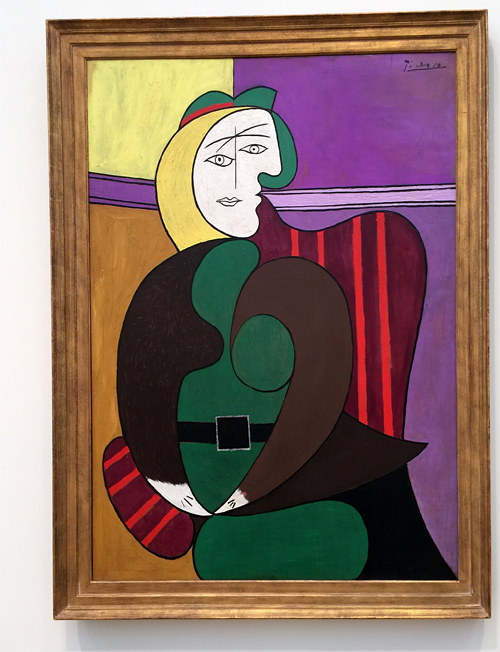
Artstroll_NK14

Pablo Picasso – The Red Armchair – 1931 – Love the colors and it totally reminded me of his “Girl before a Mirror” painting at MoMA – alas – no wonder – it is the same mistress Marie Therese in both paintings.

I also took a peak at the Hiratsuka Un’ichi Print Exhibition
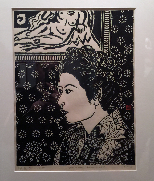
HiratsukuUnichi01_natKalbach

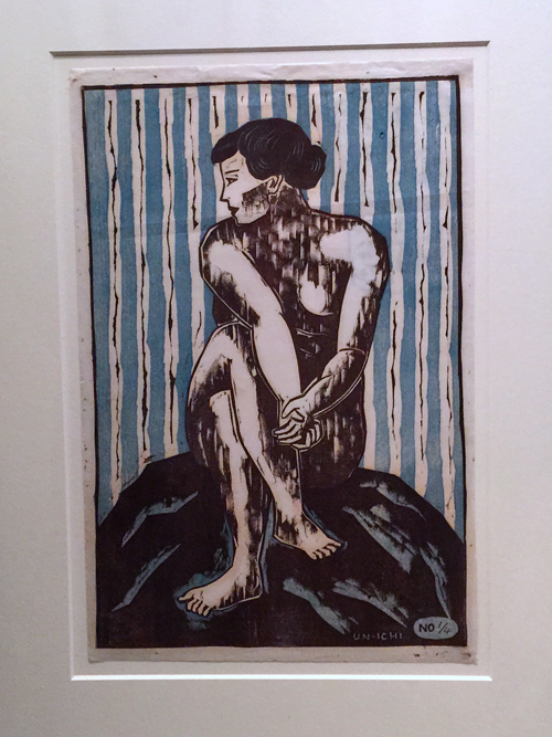
Girl with Calico Patterned Background -1948 – Woodblock Print. The details-the patterns – swoon!
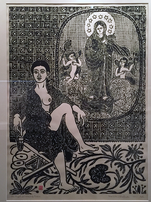
HiratsukuUnichi02_natKalbach

Angel Dreaming Room – 1971 – Woodblock Print.

HiratsukuUnichi03_natKalbach

Kingfisher – 1928 – Woodcut Print

HiratsukuUnichi04_natKalbach

I did not take note of the name of this one -but I love it so much – I had to include it.
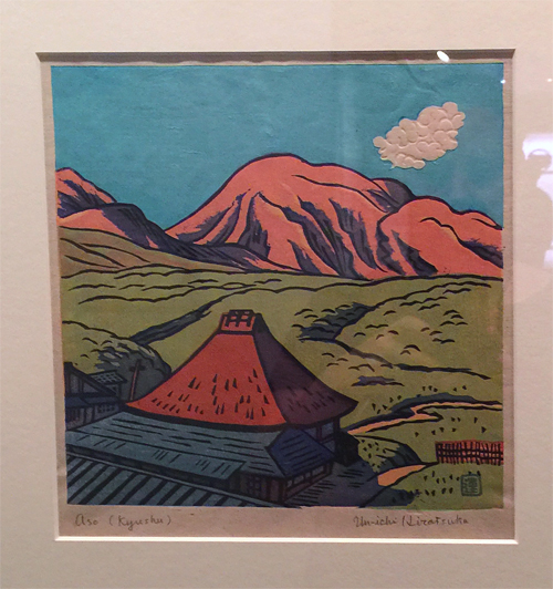
HiratsukuUnichi05_natKalbach

Mount Aso in Kyushu, 1935 – Color woodblock print – amazing – look a the cloud- it has texture and all those different colors – beautiful!

That was it from the Art Institute in Chicago Art Stroll. I really enjoyed being there – I saw so much more but it was such an overload – I hope to come back soon and revisit some areas more leisurely. Hope you enjoyed the stroll! More coming soon :)

Comments (4)

  • Barb J

    |

    Thanks for sharing these priceless pieces of art.

    Reply

  • Gayle

    |

    I absolutely love your disclaimer!

    Reply

    • nathalie-kalbach

      |

      :) Thanks Gayle- unfortunately it has become necessary due to emails or comments regarding showing art containing nudity or swear words

      Reply

Leave a comment

Art Tapas – Bite Sized Tips for the Mixed Media Artist – Tip #5 Fat Over Lean

Art Tapas are short videos (1- 3 mins) that will give some practical tips or advice about anything that is related to tools, art supplies or processes and any Mixed Media or Hobby Artist might appreciate. Lots of times these reflect some mistakes that I made along my journey, so to speak, things that I learned the hard way and sometimes they are just some things that I would have loved to have known when I actually started in Mixed Media.

Fat Over Lean Rule

Art Tapas – Bite Sized Tips for the Mixed Media Artist – #5 Fat over Lean from Nathalie Kalbach on Vimeo.

I hope you enjoyed this Art Tapa –  and if you have questions that you would love to have answered in some of the Art Tapas videos- let me know and I might just cook one up for you to nibble on :)
Happy Creating !

Comments (8)

  • Kasia Krzyminska

    |

    Love all of your Art Tapas Nathalie. Everything seems so easy with your explanation. Can’t wait for the next one :)
    Reply

  • anisey

    |

    Hi Nathalie,
    First, I love your work. To further comment on this fat over lean thing, It really does apply mostly if not exclusively to the use of oil media. Oil takes much longer to dry and cure. It tends to float over, until the surrounding elements allow the oil to settle and dry. Any media that prevents the drying process will only make the oil float on the top layer for a longer time. Like humidity. Oil and water don’t mix, because oil will always float to the surface. That’s why we always apply any acrylic or inks before the oil paint layer. Oil always goes last. Thanks again for a great post!

    Reply

  • Gunvor

    |

    Another great tapa – Thanks you! I really love them and am so greatful that you share your knowledge this way. Plus now I know why my alcohol ink pen was ruined …

    Reply

    • nathalie-kalbach

      |

      Glad that helps Gunvor – sorry about your alcohol ink pen – maybe you can buy a replacement nib. Some companies offer those – that way you won’t have to buy a new pen!

      Reply

  • Rebecca Buchanan

    |

    Another great tapa–thanks so much. This was all new info for me. Thank you for being so generous!!!

    Reply

  • Kathy P

    |

    Great tips again today, Nat. Although I could not get this video to load….it kept stopping and stopping! But I hung in to the end! TFS!

    Reply

    • nathalie-kalbach

      |

      Thanks Kathy. This is a problem that has to do with your connection at that time. You need to outwait the buffering of the video – indicated by the grey bar in the video. Best way is to hit play and then stop right away and wait until the entire video is buffered- that way you can play it without the stops in between. Sorry it was a chunky day :(

      Reply

Leave a comment

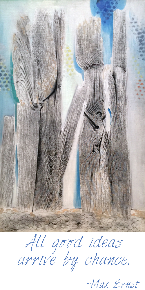
Artist Quote of the Week – Max Ernst

MaxErnstQuoteNatKalbach

Comments (1)

  • Gayle

    |

    Thank you so much sharing your artwork and also your tours of art museums. It’s a real privilege to have a personal virtual tour guide! You’ve certainly expanded my art education.

    Reply

Leave a comment

Recap of the Jersey City Art & Studio Tour 2015

JCAST06_NatKalbach

At the beginning of this month the Jersey City Art & Studio Tour 2015with over 1000 Artists and 200+ Art Events took place. It is an amazing event and a token of how many amazingly creative and talented artists live in this city.

JCAST13_NatKalbach

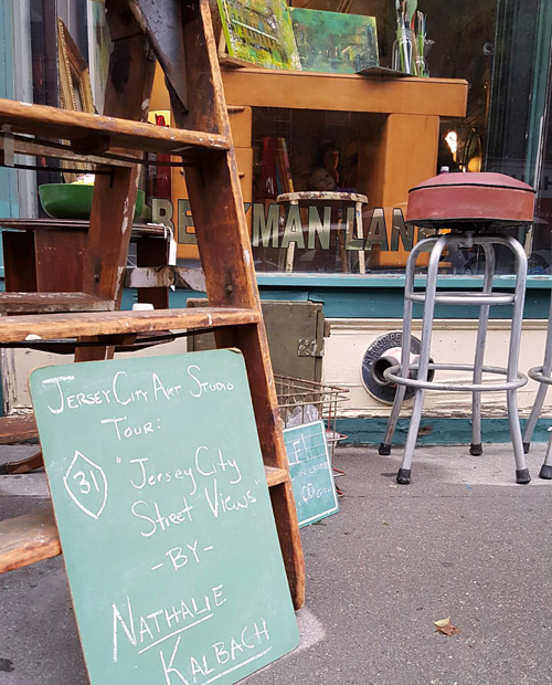
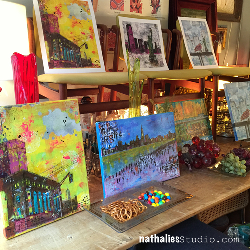
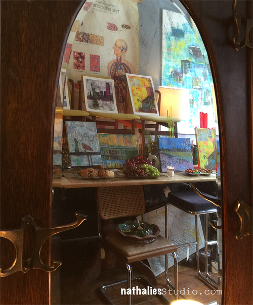
This year my artwork was shown in my friend’s Lori and Julia’s Interior Decoration Studio and Antique & Home Goods shop : Beekman Lane . I love this shop and have bought many wonderful pieces in there plus …it has become a sort of a neighborhood living room and a lot of new friends I made since I am living in Jersey City, I made in this shop.

JCAST12_NatKalbach

We loved how well my artwork and the goodies at Beekman Lane looked together and we had a wonderful time meeting a lot of people during the 2 day show.

JCAST04_NatKalbach

It was wonderful to talk to people about the artwork, what they see or how they feel about it and also about living in Jersey City.

JCAST01_NatKalbach

Selling a couple of my favorite pieces and knowing that they go to loving homes and interesting people was amazing too. It is kind of like giving up your children (well ok…that might be exaggerating but …mhhh- you get the idea ;) )

JCAST05_NatKalbach

I think this mirror-bench should be called selfie bench ;)

JCAST02_NatKalbach

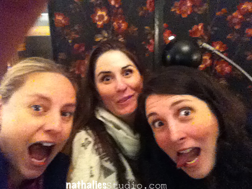
The star of the show was definitely Winnie <3

JCAST03_NatKalbach

We had too much fun as you can see: The photo below makes me laugh senseless ;)

JCAST07_NatKalbach

99 Cent Dream found a great display place in the shop too , I love how it looks on the grey wall.

JCAST11_NatKalbach


JCAST08_NatKalbach

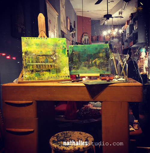
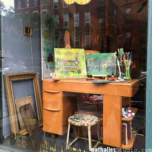
We also had fun decorating the window with artwork on a beautiful art deco Wakefield desk.

JCAST09_NatKalbach

JCAST10_NatKalbach

Chicpea JC wrote a great recap of the event, having a lot of her contributors out on the streets to check out the different art locations and artists. I was stoked that Erin came by and chatted with me and wrote a little bit about my artwork in the blogpost.

And because it was all so much fun and we had such a great time …Beekman Lane and I decided we will be part of ARTober JC – Downtown and have the show open on October Thursday 29 and Friday 30th from 2pm – 8pm. Come by if you are in the area to see some art, some fun decoration and antique stuff, chat with us and snack and have a drink :)
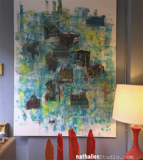
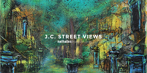
JCStreetViewsNatKalbach

Comments (9)
  • Carmen

    |

    Hi Nathalie,
    I came across your work through another artist’s blog and have enjoyed your videos and great tips. I live in the UK but used to live in Hoboken,NJ. and would also show my work during the Open Studio Tours. i am a mixed media artist as well. When I am over next time I would love to see your work in person. Thanks for all your great advice and good luck with your work.
    Carmen

    Reply

  • michelle ward

    |

    Congrats Nathalie! Everything looks fabulous – you, your art, and your displays. I’m sorry to have missed it. Now that I’ve been to Jersey City I’m hoping to back for your next event!

    Reply

  • cheiron

    |

    Hey Nat, sorry I missed it. We were celebrating my husbands bday that weekend, but I will definitely swing by and check it out on the 29th or 30th after work. I will need some art for our new apartment! Looks like a great event.

    Reply

  • Barb J

    |

    Outstanding art work and a cozy and warm shop. TFS

    Reply

    • nathalie-kalbach

      |

      Thank you Barb and yes the shop is super warm and cozy! Thanks for coming by!

      Reply

  • Deborah A. Pierro

    |

    Hi Nat–I really love your cityscapes and street scenes. Keep on creating them because they’re very unique and interesting.

    Reply

  • Sue Clarke

    |

    99 Cent Dream is just cool to look at and hanging on a wall would be best (like over a couch or desk where one could gaze at it often).

    Reply

    • nathalie-kalbach

      |

      thank you Sue -I would love to see that painting over a couch :) It is really big and has a very sad spot in our house – the only wall that can fit it.

      Reply

Leave a comment

I could do that …Or An Art Curator Explains Why You Couldn’t

natkalbachIcoulddothat

A couple weeks ago I posted on my n*Studio Facebook page this video by the Art Assignment/PBS about an art curator explaining why she thinks, saying “I could do that” when standing in front of some art work, is actually not right. This caused a lively discussion on my page which I really enjoyed and therefore I thought I should share it on my blog again and see what you are thinking about this:

What do you think? Is Art simply the merit of “the artist thought about it first”? or do you agree what this topic is so much more complex?

I never liked hearing “I could Do That” even though I sometimes do not understand a piece of art in an exhibition and is maybe only getting a shoulder shrug from me. For me the art work needs to provoke emotions, wether they are good or bad and yes…I can be a silly person just being insanely happy by seeing beautiful colors and texture – a Pollock might make me smile senseless while others cannot understand why this is called art ;) . What I often times don’t get are contemporary installations – …but I have never said “Oh, I could do that”. The more I learn about the background of the art work or the artist or the context in which the piece was created – the time, the material etc, the more I might be able to appreciate the work, even if it doesn’t speak to me. I thought the Curators’ example of Felix Gonzalez-Torres “Perfect Lovers” was a wonderful way to explain her point.  I find it often inspiring for my own work to find more information about art work or the artist and sometimes art work that I couldn’t appreciate years earlier does becomes way more interesting or even speaks to me later, while other artwork I loved earlier just becomes boring or not that important to me anymore.  As I change, my taste for art work changes. I know some people got really upset about this topic and I think it is because art is often times forced on us in such an elitist way. I always think- Screw you – Art is for the masses and not for just a handful of folks ;) Anyway, I could ramble on- but I would love to hear your thoughts :)

Comments (7)

  • Rebecca Buchanan

    |

    Nathalie, I am just getting around to reading this post and watching the video and am really glad I did. This video has made me want to be more curious about any art I view in the future, especially if I’m perhaps having trouble appreciating it. The only time I’ve ever entertained the thought, “I could do that,” is when it is something I want to do. Of course there are many things I want to do that I don’t believe I could do or even want to try myself, but if I really love a work and it is in a medium that I work in or want to work in, the thought is more of an inspirational type thought, like ‘I could try that.’ I too bristle when I overhear or have someone with me who makes that statement in a way that is dismissive of the work. After watching this video, I can now see that I may have been too quick in assuming I don’t appreciate something when perhaps there is more of a story behind it that I would find interesting if I took the time to find out about it. Very though provoking–thanks so much for sharing!

    Reply

  • Cindy Connell

    |

    Hey Nat!
    I watched this video when you first posted it and again now. I gave me a lot to think about. I am not formally trained in art and could not connect famous names and their work to save my life. I do have an appreciation for many different styles of art though. I did learn though about the detail in pieces like Piet Mondrian’s Composition Red Yellow and Blue. Like other I may have been tempted to reproduce it… but not with acrylic paint on canvas. Understanding how something is made usually gets my appreciation over anything else. Like you and others though… I like what I like!
    Cindy Connell

    Reply

    • nathalie-kalbach

      |

      I totally can see how the “how it is made” point gets you intrigued- I am the same way :) For example a year ago or so there was an exhibition at MoMA – Robert Gobert – https://www.moma.org/visit/calendar/exhibitions/1495  – it was interesting but I do have to admit it wasn’t really for me – although it provoked feelings- if sometimes negative. – but I could totally appreciate his way of creating is art – that was actually pretty compelling. I wouldn’t have know that if I hadn’t had a class that was connected with this exhibition and it made me see it in a different light – and maybe some time I can appreciate it even more.

      Reply

  • Deborah A. Pierro

    |

    Thanks for the video, Nat. I learned a lot from it about how each of us, as an artist, brings something to our work that is uniquely ours. I now have an understanding, and more perspective, about other artists’ motivations and ideas that go into their works.

    Reply

  • Sue Clarke

    |

    I enjoyed that video and love the questions that she poses.
    I have heard folks saying “I could do that” and my response (in my head), is so do it.
    I do find that if I know more about the artist I often appreciate the piece more.

    Reply

    • nathalie-kalbach

      |

      That is so true Sue, I feel the same- the more I can connect or understand the artist the more I can connect or appreciate the artwork.

      Reply

Leave a comment

Listen, Smile …or In My Art Journal Today

Disclaimer: This post includes an art journal page with a swear word – I know….OMG!  Please …get over it, it is called personal expression . If you have a problem with that or art, you might be better off looking at something else . Don’t email me to complain, don’t visit my blog anymore because I might post things like this again and, farewell!

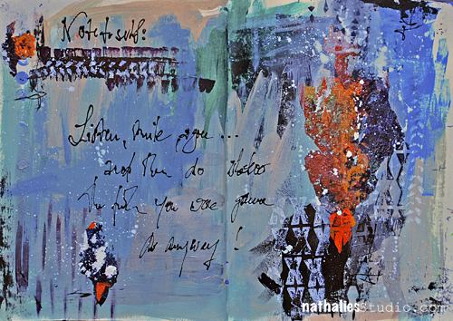
ListenSmile_NatKalbach01

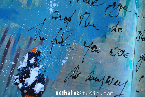
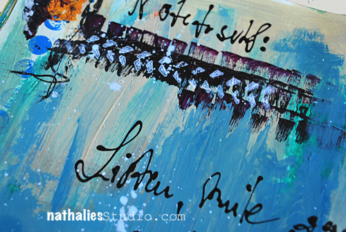
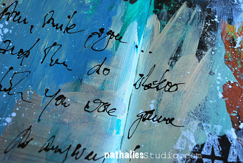
“Note to self: Listen, smile, agree…and then do whatever the **** you were gonna do anyway! ”

Sometimes an art journal is a the best way to get some grumpy feelings out …and this was just the right thing for me to write down at the situation I was in. So there, I felt better right away :)

ListenSmile_NatKalbach02

But besides that I was dumping my grumpiness onto this art journal spread – I had a pretty fun time painting :) I had used some colors, mixing and brushing them on and also doing some marks with my brush.

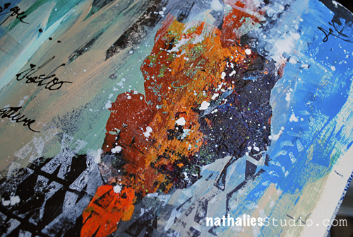
ListenSmile_NatKalbach03

The white splatters were done with a fan brush and white Liquitex Acrylic Ink.

ListenSmile_NatKalbach04

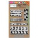
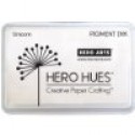
For the stamping I used my Stampendous Mark Maker Set and the Hero Arts Ink Pad – I love the chalky look of it and how it gives a nice layered look.

ListenSmile_NatKalbach05

For the journaling I use a Fineline Applicator filled with a mixture of Liquitex acrylic ink and soft body paint.

ListenSmile_NatKalbach06

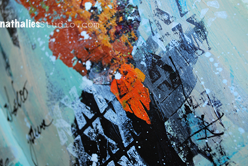
The orange-purple-brown texture pieces are actually acrylic skins which I applied with Matte Medium – I love using those in  my art journal.

Here is a list of all the supplies I used

nSupplies


Comments (7)

  • D.Ann C

    |

    Loving the colors that fit your mood, especially how the orange pops like a fire from within! Coming here from FL via Stampendous : )

    Reply

  • Carla Harrell

    |

    I am so f***ing excited to see an artist use ‘foul language’ in their art!! LOVE IT, ALL OF IT!!

    Reply

  • Barb J

    |

    Freedom of expression is what makes art work. I like what you have done with the colors and stamps on this page.

    Reply

  • Gayle

    |

    This made my day! Loved the disclaimer and your great freedom of expression that also carries over in your art. So liberating!

    Reply

  • Jean

    |

    Love the sentiment (and the art as well)!

    Reply

  • Lydia

    |

    It’s GORGEOUS! And make art however you want :)

    Reply

  • Sue Clarke

    |

    Love the texture and your words don’t bother me. LOL

    Reply

Leave a comment