Nice to Meet You! with Jennifer Gallagher

It’s time to get to know an artist with… Nice to Meet You! Today I’d like to introduce you to the inspiring art and story of my Creative Squad member Jennifer Gallagher! Jennifer has been creating for us for several months now and is a master of clean beautiful colors and fresh patterns and layers. Read on to hear her story:


Please introduce yourself to our readers and tell us where you live:

My name is Jennifer Gallagher and I’m a wife, mother to two boys, and an artist. I teach fine art courses for children and adult art journaling classes in my local community. I live in Scott Depot, West Virginia. It’s a small town surrounded by the natural beauty of the mountain state.

How do you make time to be creative?

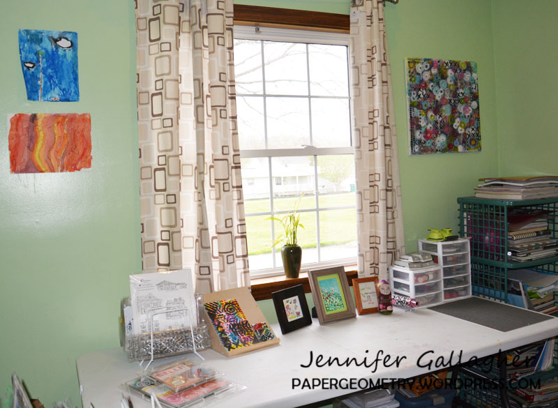
I look for opportunities to spend time in my studio when the rest of my family is busy. My kids are teenagers now and are involved in activities with sports and friends which allows me to have more creative time. I take advantage of every moment.

What are some of your favorite n*Studio stamps / stencils? 

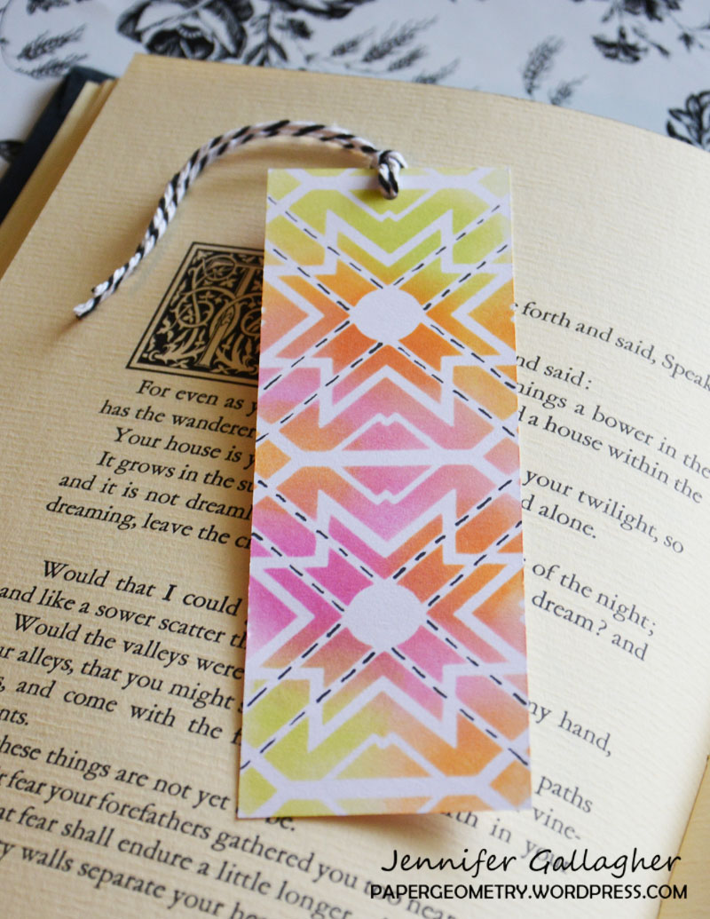
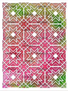
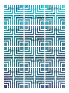
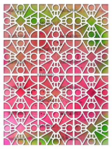
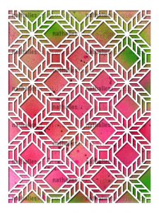
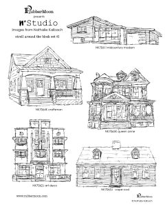
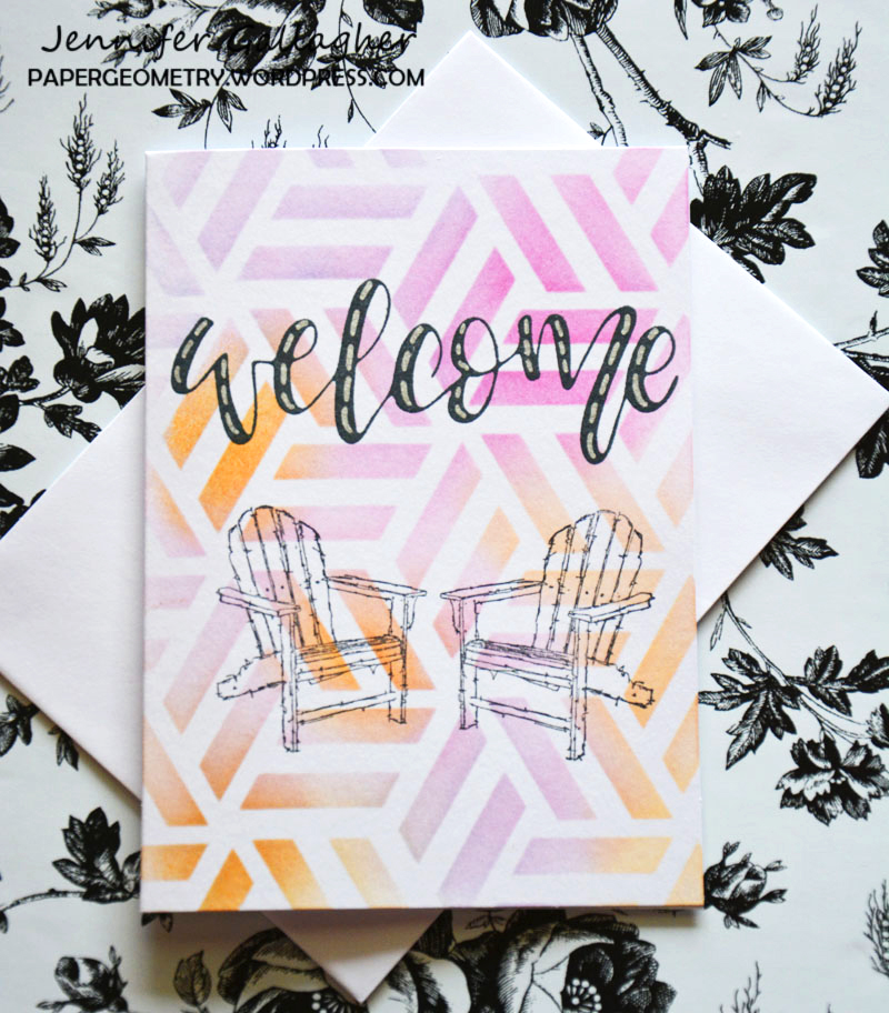
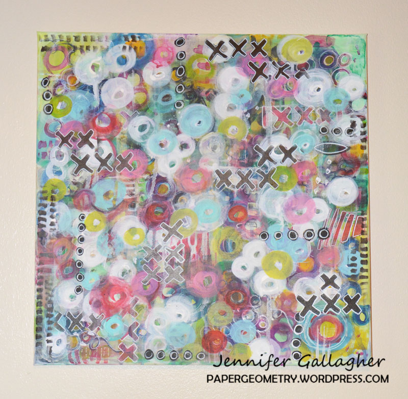
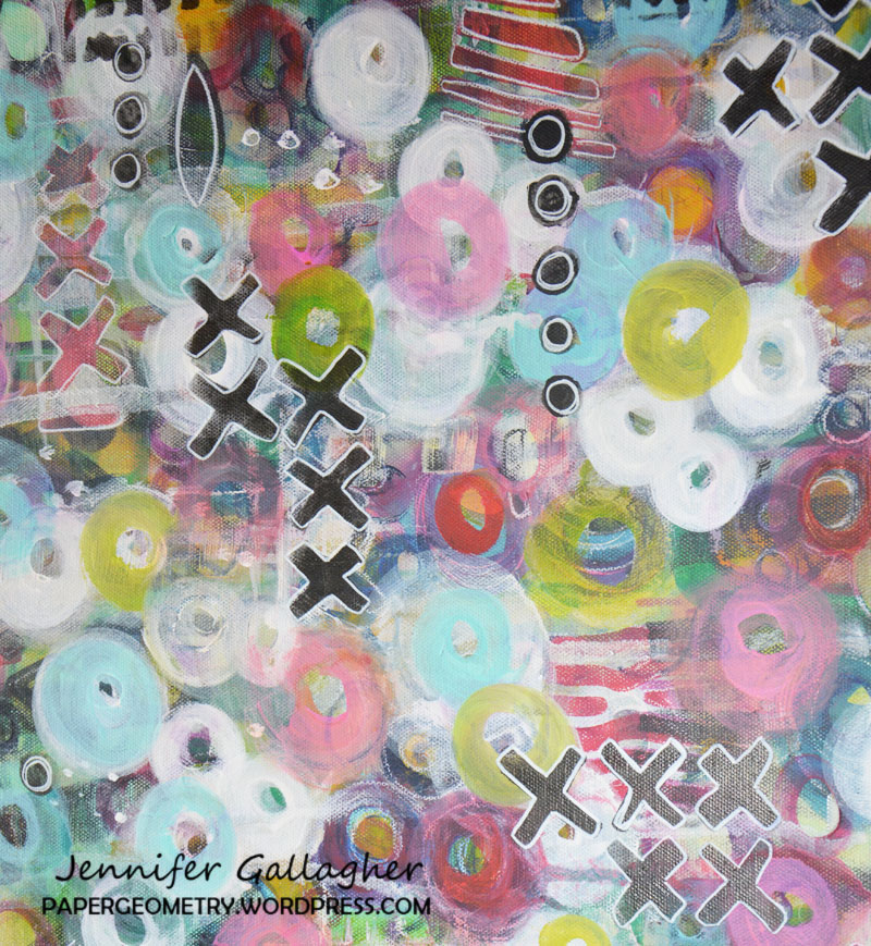
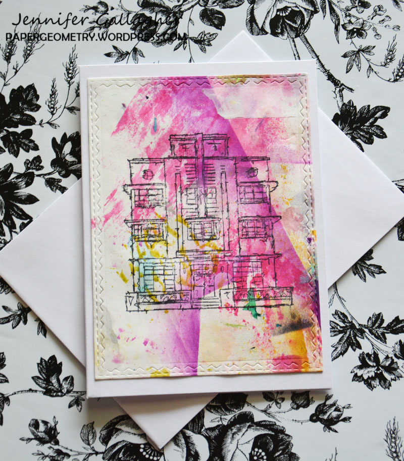
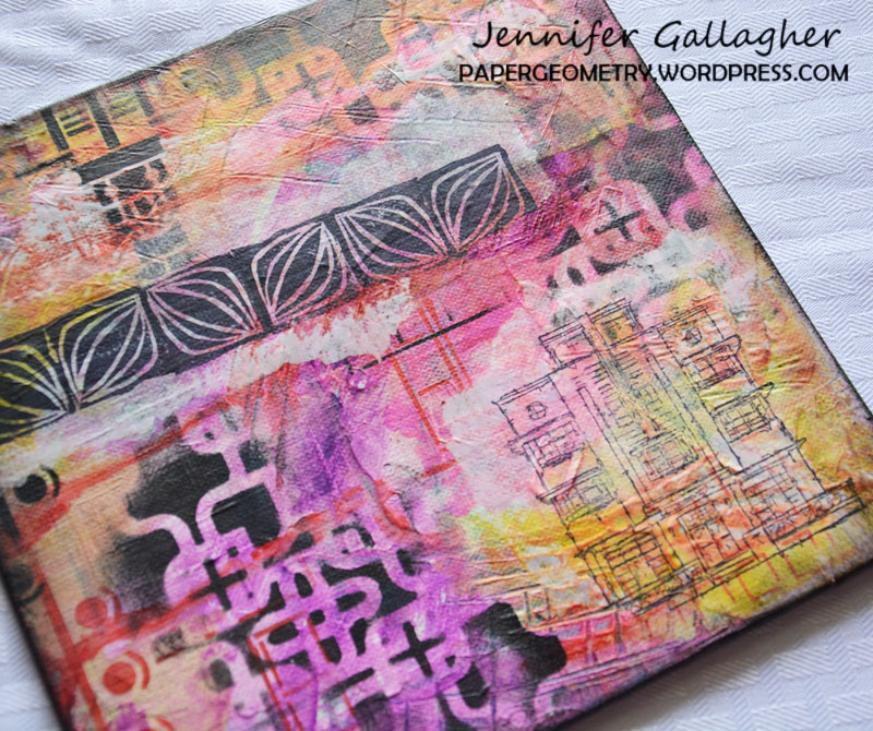
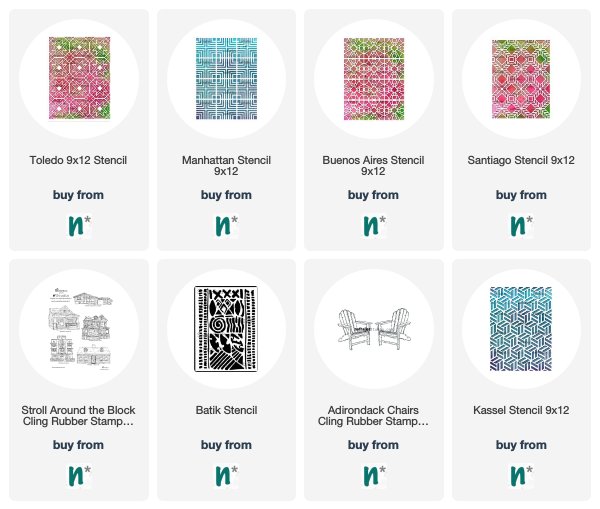
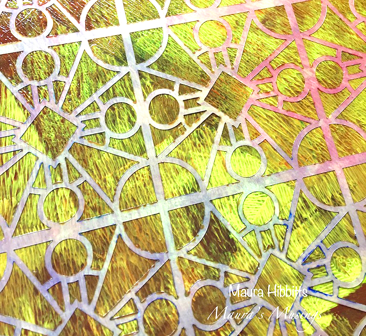
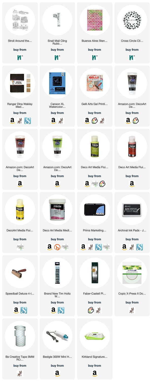
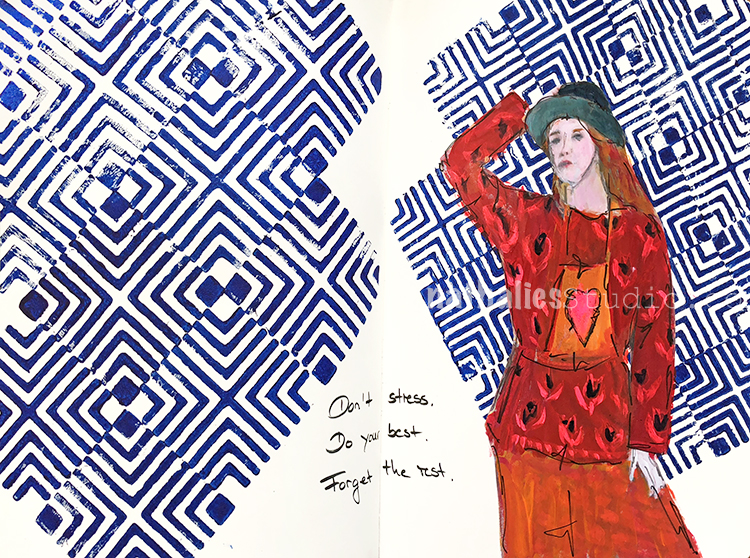
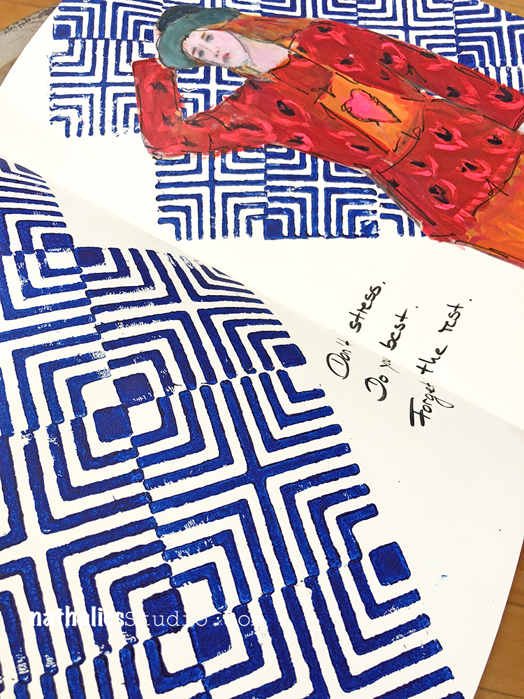
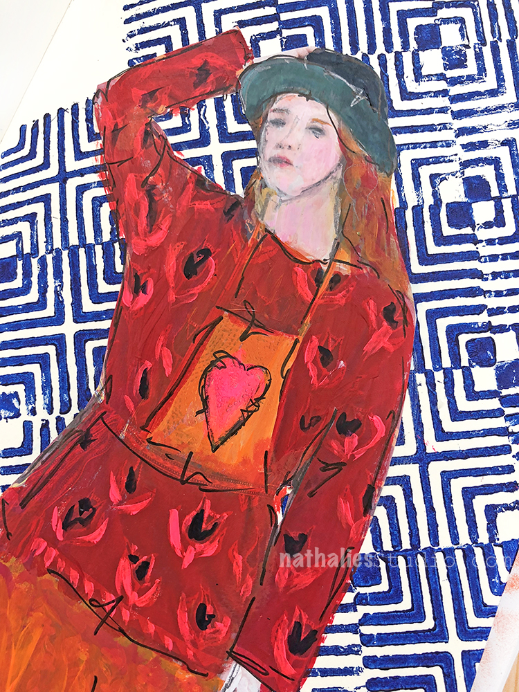
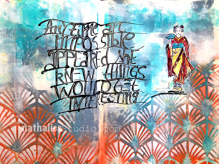
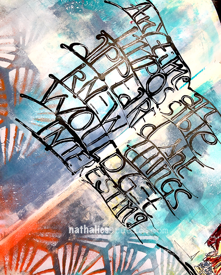
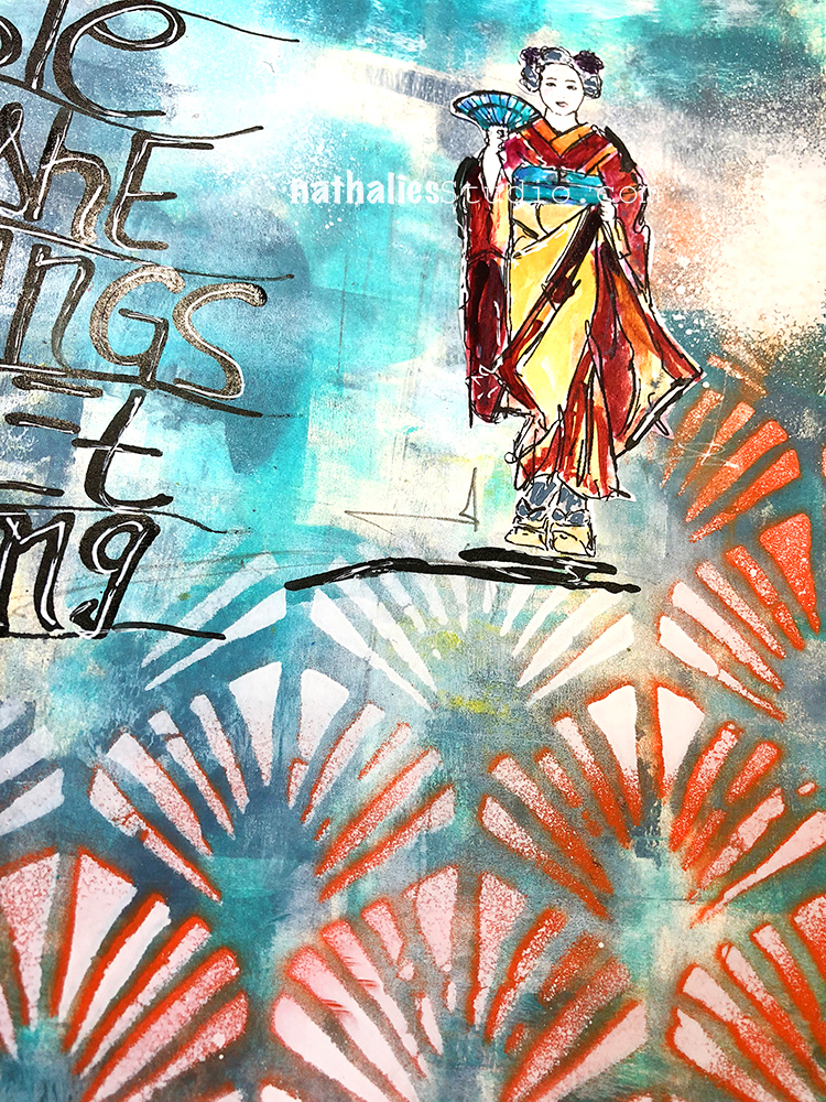
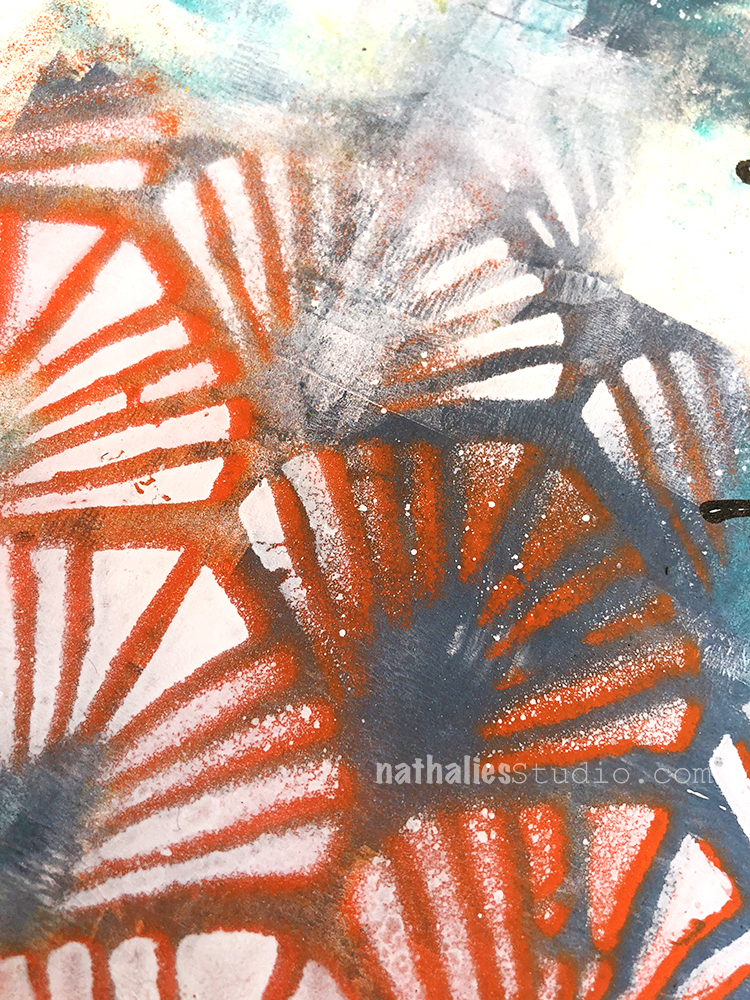
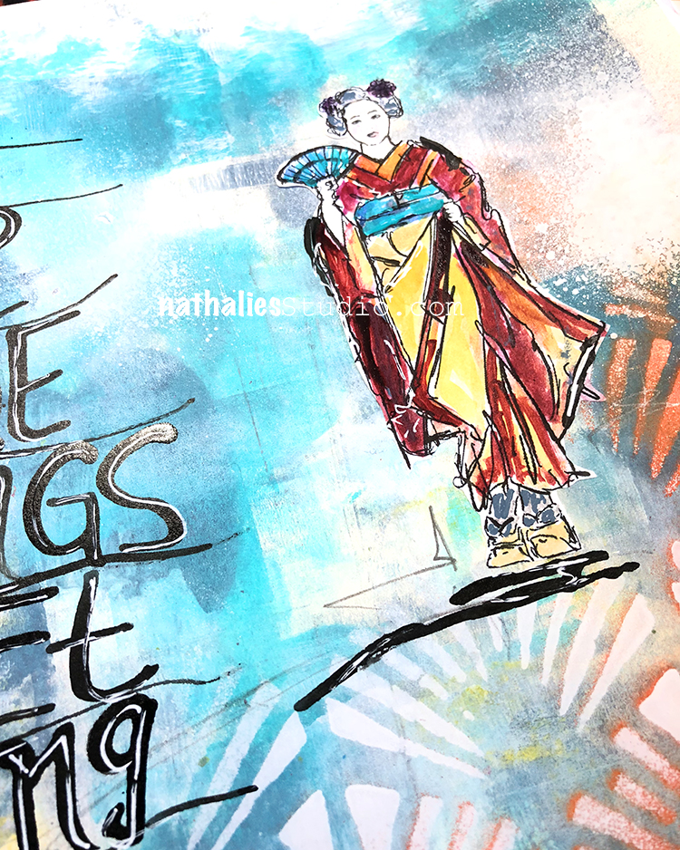
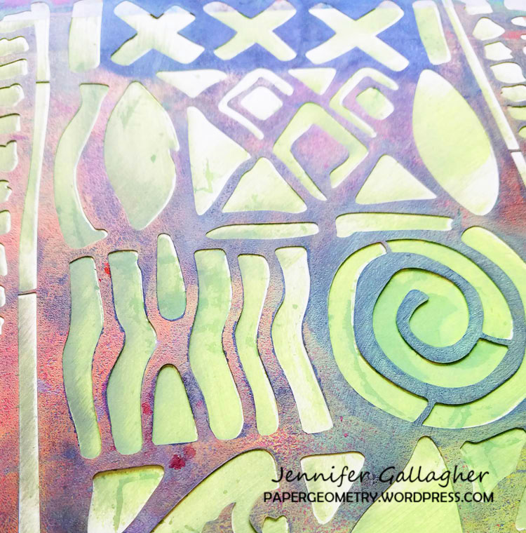
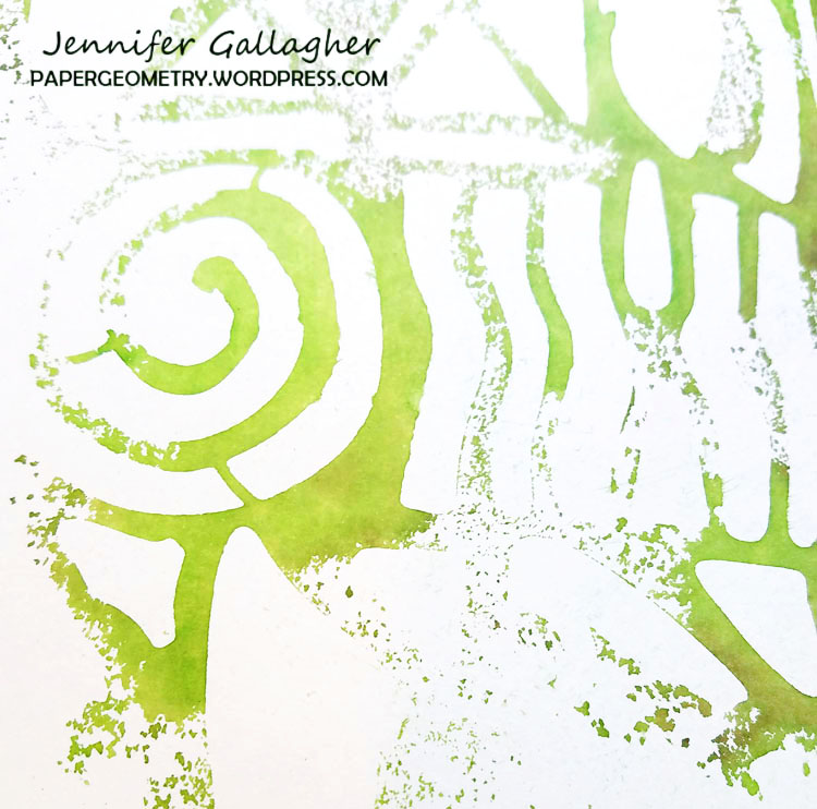
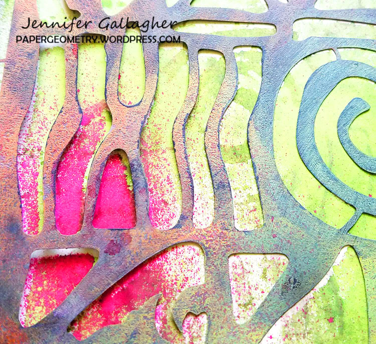
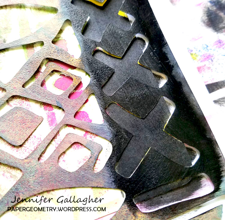
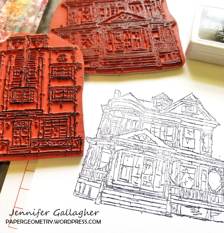
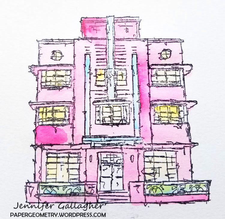
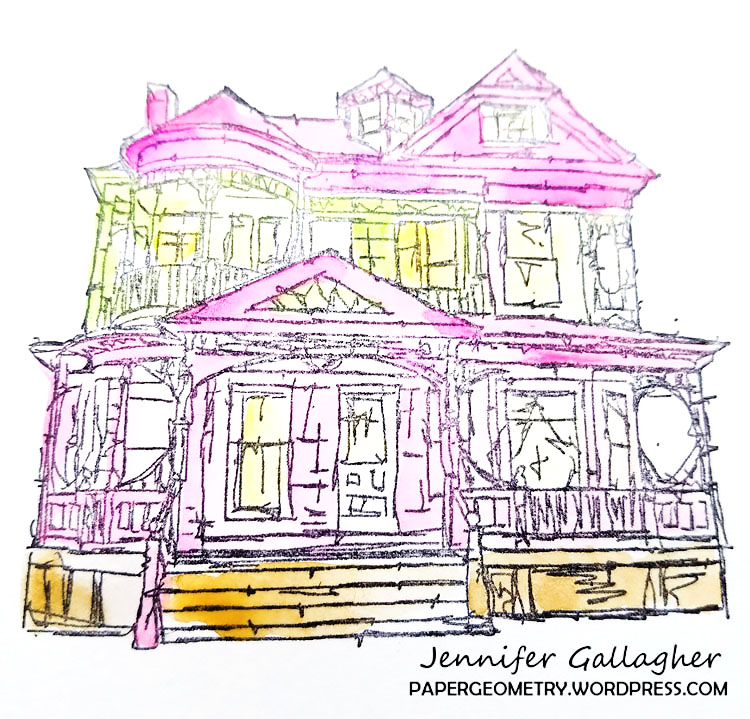
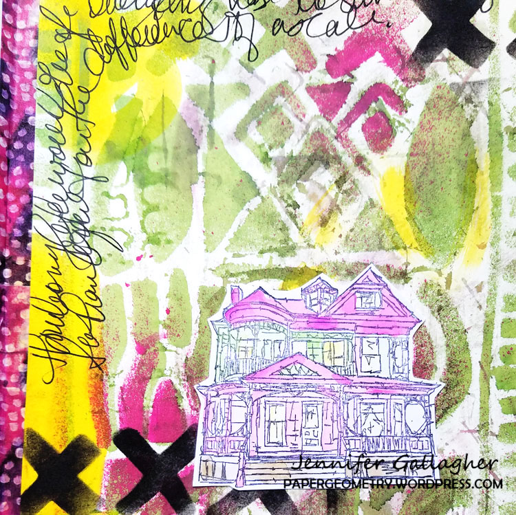
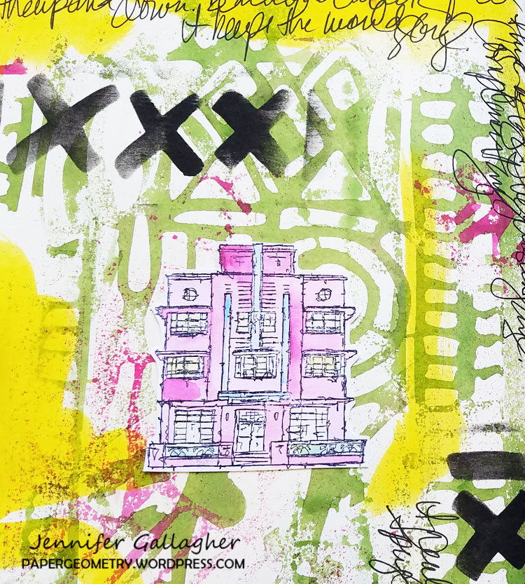
It’s hard to pick favorites! I love the geometric flair Nat’s products have. My must-have stencils include Toledo, Manhattan, Buenos Aires and Santiago. I cannot get enough of the artistic style of Nat’s rubber stamps. I love the Stroll Around the Block series, especially the Art Deco house.

Toledo Stencil
Manhattan Stencil
Buenos Aires Stencil
Santiago Stencil
Stroll Around the Block


How do you love to use them?

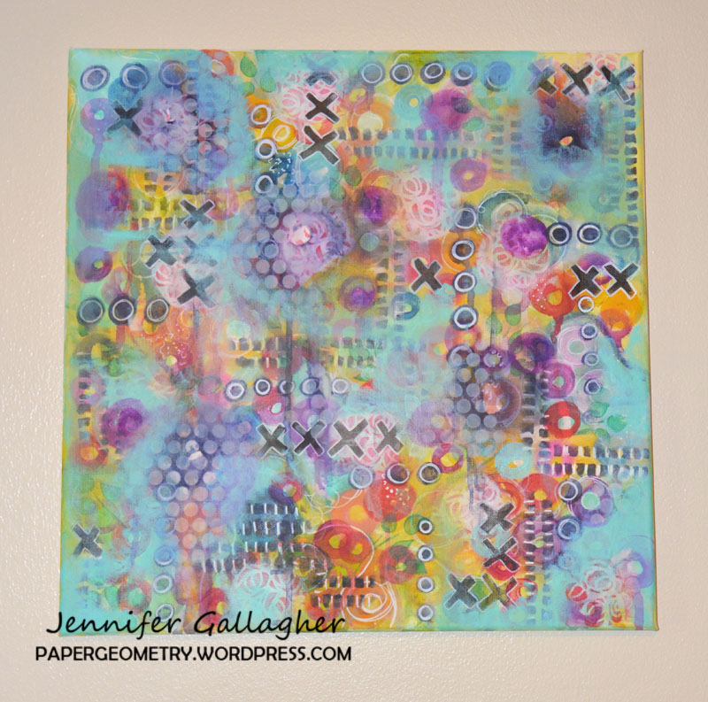
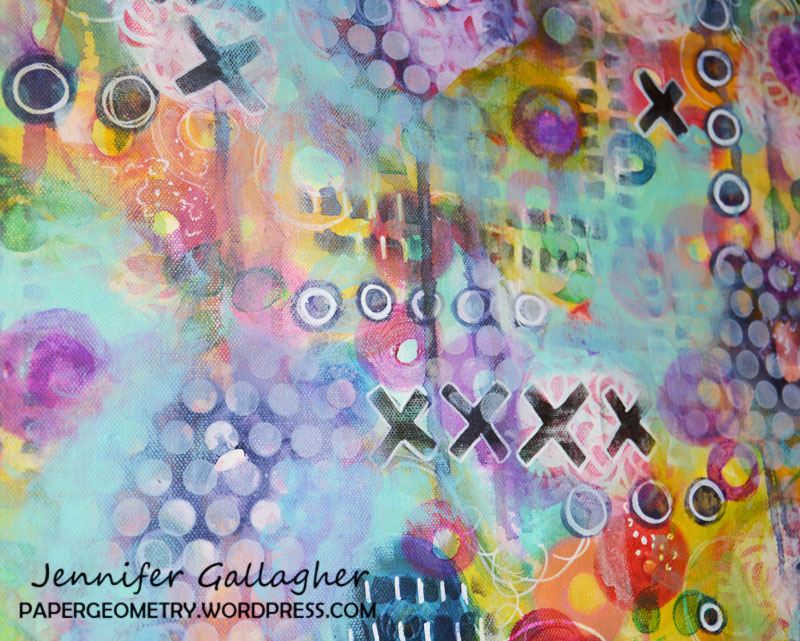
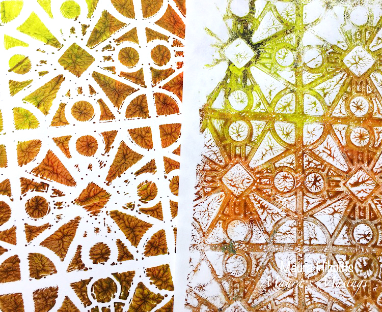
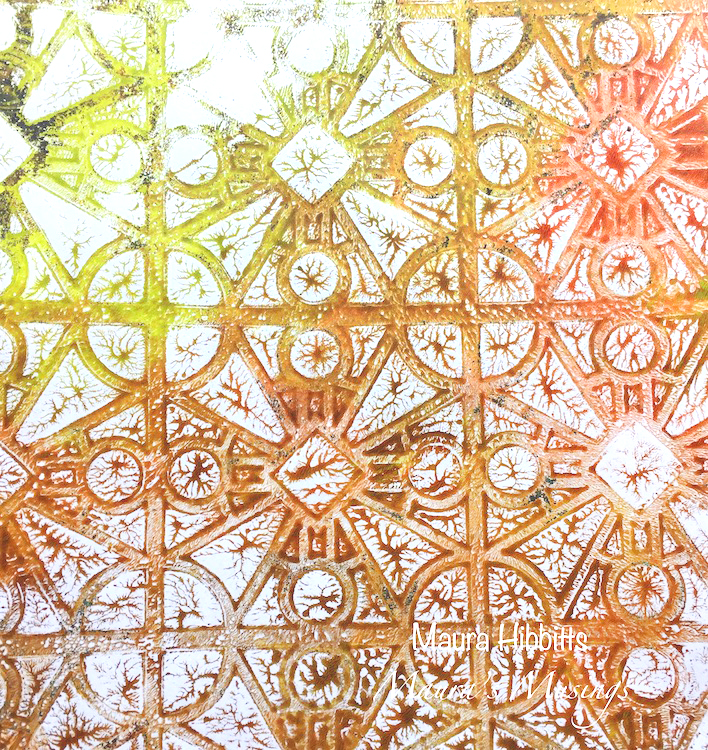
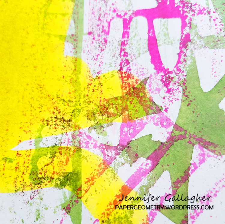
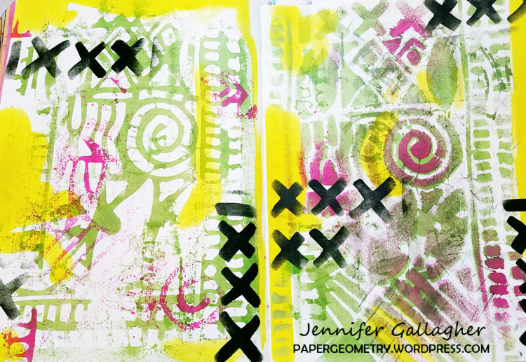
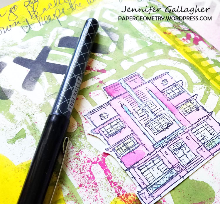
I use my n*Studio products in many ways. One of my favorites is to create stunning pates in my art journal. I also use Nat’s stencils religiously when I am gelli-printing and painting canvases.

What is your favorite medium to work in?

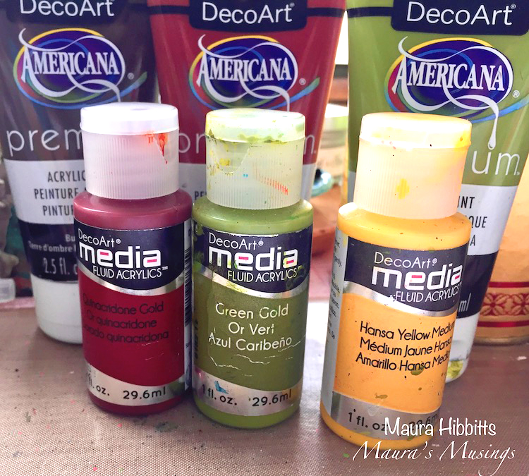
Since I consider myself a mixed-media artist, I don’t have one absolute favorite. I try to combine inks, acrylics, paper, and watercolor in almost all of my pieces. I definitely couldn’t live without my inks.


What inspires you to be creative?

Part of my desire to be creative is just a natural part of who I am. I am also very inspired by other artists. I live in a rural community, so social media has become a vital part of my connection with other artists and finding new inspiration.

Do you have a favorite artist?

I love the work of Kandinsky. I also find Albert Oehlen and Willem de Kooning to be wonderful.

How did you get into art-making?

My earliest creative memories include drawing outfits for my barbie dolls and stitching small items like handkerchiefs from scraps of ribbon and cloth. As a teenager, I focused my time on drawing and fashion design. My love of fashion led to me to study design and textiles in college and my progression from fashion into the visual arts has been natural.

In three words, how does art-making make you feel?

Centered
Connected
Fulfilled

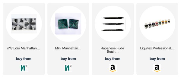
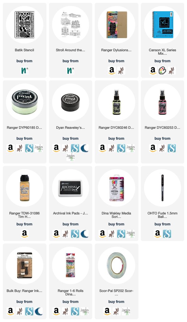
Thank you Jennifer! To read more of these inspiring interviews, just click HERE! And if you’d like to try out some of the projects that Jennifer has shown, here are some of the supplies that she used:


Leave a comment

Inside Outside – Maura Hibbitts


Happy Wednesday my friends! Today we have a post from Creative Squad member Maura Hibbitts to brighten your day. Maura is using my Stroll Around the Block, Snail mail, and Cross Circle stamps and my Buenos Aires stencil to create a lovely art journal page that definitely has me thinking “Home Sweet Home”! The theme this month is Inside Outside – Inside can be cozy and warm. Outside is about fresh air and freedom. Are you a homebody or do you suffer from cabin fever? We’re creating with these opposites in mind.


I have long been an admirer of the Arts and Crafts Movement, the pottery, wallpaper, furniture, and love the Craftsman style homes. The outside details of Nathalie’s Craftsman house stamp make for a delightful little cottage, one I would love to live in. I do have several pieces of furniture inside my home made in this style, that we enjoy every day, and I can foresee passing these on in the family, they are so sturdy and well made.

I started with my gel plate and squirted on a bit of burnt umber, green gold, and quinacridone gold with my heavy body paints, then used the brayer to blend them out a bit. Next, I laid the Buenos Aires stencil down onto the plate and pressed a sheet of copy paper over it, then lifted the stencil. Be sure to clean the stencil right away and not leave it too long on a sheet of paper. (I learned the hard way that they will stick together. If that happens, just soak the stencil in water.)

I pulled two prints from my gel press to use in my project. The print on the left made from laying the paper down on the stencil and paint, and the one on the right is the second pull directly from the plate.

I tore the edges of my print, and adhered it onto a kraft page in my Dina Wakley Media Journal with matte medium. Once dry, I brushed on several transparent colors, then wiped them away in some areas with a baby wipe. I used Hansa Yellow Medium, Quinacridone Gold and Green Gold for this layer.

While that was drying, I stamped the house and mailbox on watercolor paper, and colored them with Prima watercolors and a water brush. Once they dried, I cut them out.

I used my other print to cut out part of the stencil to layer and create my sun, and the stone pathway to the house. I added a bit of doodled lines, and watercolor to the stones.

When I first looked at the Cross Circle stamp, I saw flying birds, so I used part of the stamp to add some birds to the page.

The house, sun and mailbox are attached with foam tape. I also scribbled a bit around the house, mailbox, and stone path, and wrote Take the Path Home onto my page as this seemed appropriate. After all, I know my home always calls me back, especially if I’ve been away for a while.


Thank you Maura! I love the little scene you’ve created and so cool that you interpreted my Cross Circle stamp as a flock of birds – I love that idea! Here are some of the supplies that Maura used in her art journal:


Do you feel inspired to create now? Are you working on something yourself that you’d like to share?  I love to see how you interpret our monthly themes. Email me how you used my stencils and stamps with the theme and send me an image – I would love to share your projects in my next  “n*Spiration From Around the Globe“.

Comments (1)

  • Sue Clarke

    |

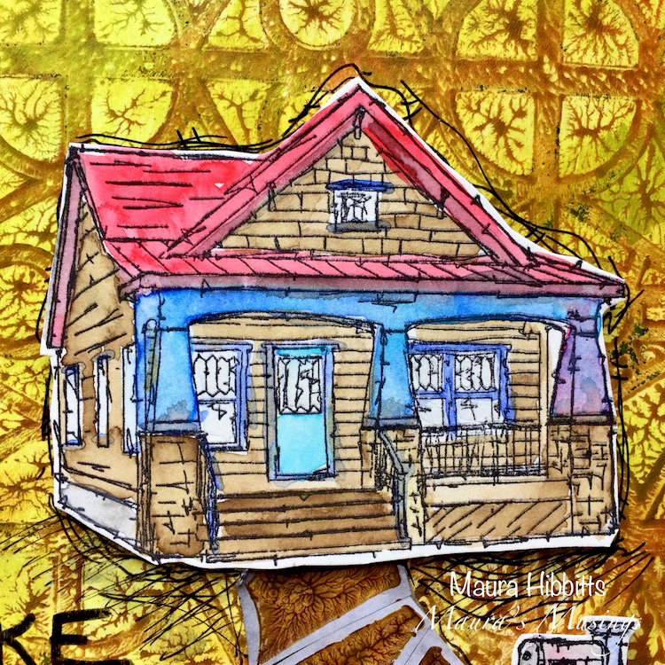
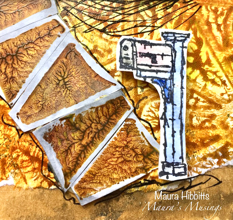
    I would love to vacation in the house you created Maura.
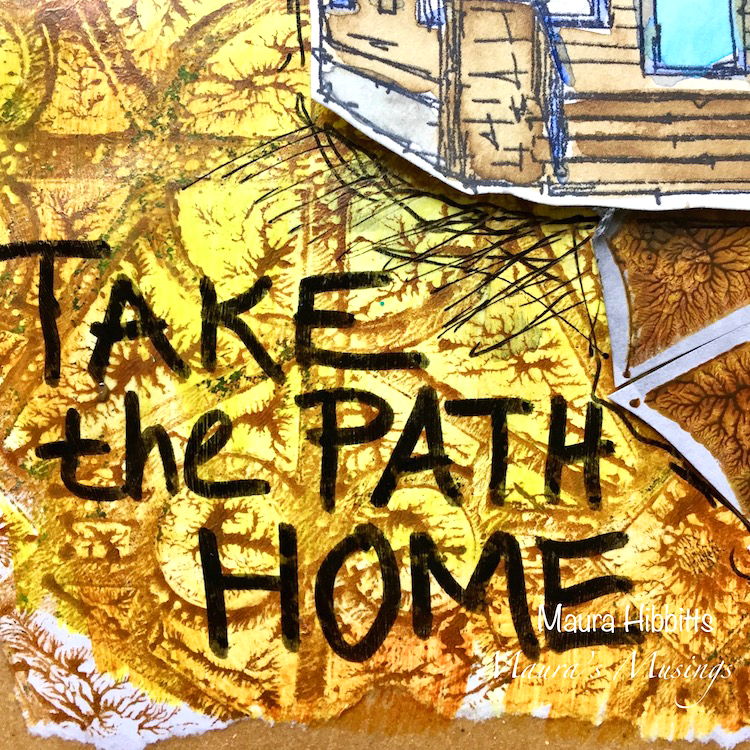
    The path is my favorite part of the design.

    Reply

Leave a comment

Art Journal Summer School Online Workshop!

It’s time for Art Journal Summer School! How about some creative fun for your artsy summer?

Join me and 12 other awesome teachers for a 10 week online workshop to keep you art journaling this summer. I love the whole idea of this workshop because it is designed to fit in your busy summer schedule – no big commitments here! There will be 21 fun, short downloadable videos and 1 e-book, and all of the teachers will be using similar materials that can fit in a small travel bag, so you can take us with you, wherever summer takes YOU!

Enroll TODAY! Sign up by May 31st, 2018 for Early Bird Pricing. Class begins July 1st.

Here are the teachers:

Summer is a great time to get inspired by new activities, adventures, vacations, family time and whatever else you have planned. You can add Art Journal Summer School to the mix for some fun learning and make sure you stay creative even if you’re at the beach or on your back porch.

For all the details, teacher bios, and everything you need to know about Art Journal Summer School, please click HERE.

I hope you join us this summer!


Leave a comment

Farewell Painting

I finished this painting last week – some of you might have seen it in some of my Facebook Live Videos.  The painting captures the iconic Flatiron building in New York City, located in the wedge created by the intersection of Fifth Ave and Broadway. I am always fascinated by the Flatiron building and it’s story.

Although it has stood strong at this busy intersection for over a century, the world around it is always in constant flux. The city weeds out the weak, and businesses and people who may once call it Home may find themselves bidding it Farewell another day.

The bold colors represent the energy of the city and the sweeping lines suggest a place where nothing stays still for long. Yet the Flatiron remains, a focal point of stability in a very busy place.

The original “Farewell Painting” is up for sale now in the store. Maybe it will find a new home :) Acrylic paint, acrylic ink, spray paint, and pencil on 12”x16” canvas.

Have a gorgeous day you all :)

SaveSave

Comments (4)

  • Sue Clarke

    |

    I love buildings that are on corners like this and have seen several in person in Boston.
    This painting is wonderful, especially the firy colors!
    I hope it finds a deserving home.

    Reply

    • nathalie-kalbach

      |

      Thank you Sue! I actually just saw one of those buildings in Amsterdam and thought it was fun because the architecture in general was so different :) Tiny rooms I guess in the corner part- LOL

      Reply

  • Janene

    |

    Whew! You scared me with the title “Farewell Painting”. I’m thinking, Nathalie is moving? She’s giving up painting? Whaaaaaaat? In all seriousness – the Flatiron building glows in contrast to the gray streets and nearby buildings — fabulous! — and I love the title now that I understand it. :-)

    Reply

    • nathalie-kalbach

      |

      Aweee- sorry to have scared you Janene- that wasn’t my intention! I am not going anywhere right now – LOL- and a new canvas is up on the easel- just thinking of what I want to paint next :)

      Reply

Leave a comment

Forget the rest – Art Journal

“Don’t stress. Do your best. Forget the rest.” A good mantra …I will do my best but not stress to remember- LOL

I kept the background simple by stamping alternating the positive and negative Manhattan Foam Stamp on the left- and then doing the same on the right with the Mini Manhattan version. It is fun to not only use the two stamps in the sets on top of each other or each on their own, but to also create fun pattern by using them alternating and in different directions.


I painted over a lady from a catalogue with acrylic paint in red and orange for some pop and added the journaling with a Fude Pen – quick and easy yet fun to create. I am in this weird mode of trying more ways to do less with more breathing space in my art journals – maybe a part of my reorganizing, purging urge right now.

Here is what I used for this spread:


Leave a comment

It’s getting interesting – Art Journal

“Anytime an impossible appeared she knew things would get interesting. ”

I pretty much feel that way- LOL – and sometimes that is a struggle. Like oh wait- that is a hard way and then I go ” oh …let’s go that path”

I wrote the journaling using black ink and a bamboo sketching pen, going over it again with a white signo pen later.

The Maiko is a little sketch I did, I cut it out and then painted inside. The background in blue was created by rolling out thin a think layer of teal and blue  as well as white acrylic paint with a brayer.

Using my Art Deco Wallpaper Stencil I sprayed over with some orange first and then moved the stencil slightly and sprayed over with white again to get more dimension but also to knock the orange back a bit.

And that was it- it was a fun and fast page …not impossible- LOL- but maybe still interesting ;)

Here are the tools and supplies I used for the spread:


Leave a comment

Art Stroll: American Museum of Natural History, NYC

A couple weeks a friend and I went to the American Museum of Natural History. It was the first time in 17 years I was back there and I really enjoyed it. Now …I know that is going to be a question for some … “Wait…an Art Stroll there? But is it Art?” …Welllllllll….let’s think about it LOL

I loved the subway art when you get out of the subway station at the museum – lot’s of mosaics of different animals- here a beautiful bird.

Love the gorgeous windows …that would be a really cool stencil, don’t you think?

“The dioramas at the American Natural History Museum, when they were first built, were an opportunity for people to see a world that most didn’t get to travel to,”

I also think they are beautiful artistic interpretations of landscape painting.


The explanation about Japanese woodblock printing was amazing  – I really enjoyed all the little displays about crafts and arts in different countries.

In Japanese tradition there is a recognition of a spiritual quality in all materials, which must not be negated. Therefore each wood block for the printing process is used from both sides for each stage in a progression of the print. The use of only one side would deny the wood its total efficacy.

I loved seeing the different stages of the print- for this art form. …or is it a craft form ….well…what do you think?

gorgeous pieces of hand made containers and dishes

kids toys

and even drawings as explanations of certain pieces in the museum as well

Gorgeous sculptures – some of them actually not the real deal but remakes- but I would only know when reading the signs


and beautiful patterns

gorgeous pottery …anyone thinking of Picasso here? Why is his pottery art ..but this is craft?

gorgeous earrings …well ….maybe a bit tough to wear for me …but look at the inlay!

These two llamas were some of my favorites!

It was different and fascinating …and I know it is for some a far fetch to call some of the pieces art …but hey …it is an interesting ongoing question and if it is inspiring to me – then there you go…it is an art stroll. That’s all that counts…for me on my blog anyway – LOL  – but what do you think?


Comments (6)

  • Sue Clarke

    |

    Yes, those windows would make a terrific stencil!
    The blue block painting with the birds caught my eye right away.
    It’s all art to me.

    Reply

  • ARHuelsenbeck

    |

    Thanks, Nathalie! I love going to the museum with you.

    Reply

  • Janis Loehr

    |

    Thanks Nathalie… very much enjoyed this stroll and your comments. Art isn’t just on paper of course. Three dimensional art. The word “craft” doesn’t get the respect it deserves. Thanks again!

    Reply

    • nathalie-kalbach

      |

      I agree Janis – craft has this weird connotation of being less worthy …It is so interesting why that is.

      Reply

Leave a comment

Inside Outside – Jennifer Gallagher


Hello my friends from the Creative Squad! Today we have a boldly patterned and colorful art journal page from Jennifer Gallagher. She uses my Batik stencil for some awesome background patterns and my Stroll Around the Block stamp set for the houses. This month’s inspiration was our theme:  Inside Outside – Inside can be cozy and warm. Outside is about fresh air and freedom. Are you a homebody or do you suffer from cabin fever? We’re creating with these opposites in mind.


This month we are creating with opposites in mind. I immediately thought of positive and negative and wanted to play with this idea through stenciling. I went straight to my Dylusions large journal to create a fun art journal spread. Nat’s Batik stencil is one of my favorites and the bold designs would be perfect for the play on positive and negative space. On the right hand side page, I laid my stencil down and painted with Dylusions Mushy Peas, leaving some parts of the design not painted. I then filled in those spots with the matching Dylusions Ink Spray in Mushy Peas. This is where the fun starts. There will be a lot of ink left on the stencil. Carefully turn the stencil over and press it down on the left hand page. This will leave the opposite, yet complementary, design of your stencil. Do this technique multiple times until you are satisfied with the left hand page.


I knew I wanted to add another color and decided to go with a complementary color choice. Red is the complement to green but this always makes me think of Christmas. I tend to avoid this direct combination in my art. I decided to go with a deep pink and peony blush was just perfect. I sprayed my peony blush ink spray through the stencil on the right page and then pressed the leftover ink onto the page on the left. Repeating the process the same as before.

At this point I added a third color for a visual pop. Yellow is always great for this, so I used my Distress Stain in mustard seed. And no page in my art journal is complete without a little black paint. The ‘x’ design on Nat’s Batik stencil makes a cool design detail.

I stamped up a few of Nat’s rubber stamps from her Stroll Around the Block Set and finally, keeping the theme of opposites in mine, I settled on the Art Deco stamp and the Queen Anne stamp. I colored them with my Dina Wakley Media scribble sticks.

I cut out the stamped images and placed them on my pages with scor-tape. I added journaling on both pages with my fude ball pen and ran a stripe of Dina Wakley Media washi tape down the center of where the pages meet. I hope you have enjoyed this page. Be sure to play along with the Creative Squad each month and share your creations with us.


Thank you Jennifer! I love all the different elements you pulled out of my Batik stencil for that gorgeous background! Here are some of the supplies that Jennifer used:


Feel inspired? Working on something yourself that you’d like to share?  I love to see how you interpret our monthly themes. Email me how you used my stencils and stamps with the theme and email me an image – I would love to share your projects in my next  “n*Spiration From Around the Globe“.

Comments (2)

  • maura

    |

    Love how you’ve layered the Batik stencil, Jennifer! It’s one of my faves too. Your pink houses are so fun! Maura

    Reply

  • Sue Clarke

    |

    Thanks Jennifer…you’ve inspired me to play in my art journal!

    Reply

Leave a comment