A Weekend of Fun – May Workshops in Kentucky

I’ll be teaching two workshops May 18th, 19th-20th at Ephemera Paducah – the day-long Mono Print Painting class and the 2-day Artful Adventures in Art Journaling class.

This is going to be a super fun weekend of creativity – truly an Artful Adventure :) Also this weekend in the cute town of Paducah is their big Arts and Music Festival so you will be creating and learning during the day and then you can enjoy the festivities at night around town. It is a great time to plan a weekend getaway with lots to enjoy in Paducah.

Here is the registration link and info about signing up for both workshops to save $$$!

Mono Print Painting: Friday, May 18th: 9am – 5pm (Lunch, drinks, and snacks included!)

Join me with you gelli plate for a day long class in Mono Print Painting. We will dive into the basics of mixed media mono printing first and I will introduce you to the Mono Print Painting technique inspired by H.N. Werkman. I will show you different ways on how to create elaborate and layered mono printed paintings using self made tools as well as stamps and stencils. I will share with you my thinking process on developing the technique and how we you can put your own personal spin on it, so that you can take your art to a whole different level.

Artful Adventures in Art Journaling: Saturday-Sunday, May 19th-20th: 9am – 4:30pm (Lunch, drinks, and snacks included both days!)

Let’s go on an Artful Adventure together and explore all the different ways to find inspiration for our Art Journaling!

Pack your bags with the basics for this 2-day adventure. We’ll explore color theory and ways to master composition with the Principles of Art. As our journey begins we’ll meet some of the great artists of the world and see how their style and methods can inspire our own creations. Then as we travel together we’ll spend some time exploring transfer techniques, collage and layering processes, and ways to create both visual and actual texture. All along the way, we’ll be gathering inspiration from the sights we see and the people we meet. We’ll pull everything together when we reach our destination – the pages of our Art Journal!

So join us for this weekend of creating art, learning, and enjoying a special event all in Paducah, Kentucky!

Leave a comment

Art Stroll: Joseph Cornell at the Met, NYC

A couple weeks ago I went to the Met and one of the exhibitions I enjoyed in this art mecca was a small exhibition “Birds of Feather” Joseph Cornell’s Homage to Juan Gris. I loved this exhibition because it is about an Art Stroll – which was inspirational and turned into some beautiful art!

In 1953 Joseph Cornell saw Juan Gris’s painting below at an exhibition

“The Man at the Cafe” , 1914 by Juan Gris – oil on canvas with newspaper collage.

This painting captured Cornell’s imagination and he created 18 glass fronted boxes, two collages and one sand tray over the following thirteen years in homage to Gris. Here are just a few of the boxes:


“Josette; Juan Gris #5” ca. 1959-60

This ox is named for Josette Herpin, Gris’s companion. In 1959 Cornell dreamed of a blue cockatoo and explained in his diary that “Josette came to life” . Cornell knew of her two portraits by Gris, where she sits in a black armchair the contour of which mimic the projected shadows of Cornell’s first cockatoos. He was likely inspired by the blue hues of her bust-length portrait. for the colored silhouette in this box.

Untitled (Juan Gris Series, Black Cockatoo Silhuette) ca. 1959-60

Cornell’s interest in cut-and-pasted paper was a direct response to Gris’s collages.

The artist lined his cockatoo boxes with pages from 19th century French texts, which he found in Manhattan book stalls. The photo below is actually the back of one of the boxes -I love this!


Other elements that characterize the Gris boxes are fragments of floral wallpaper, marbleized paper, and commercial labels.


I love Cornell’s boxes- makes me really want to do more assemblage again. I also loved seeing the original inspiration and then so many different versions on how he spun the inspiration. The first box shown here still has some traces of the inspiration  – but only if you know about the piece by Gris – but you would not know with the other ones without knowing about the story. Fascinating, don’t you think?

Hope you enjoyed this art stroll- see you soon for another one :)


Comments (2)

  • Sue Clarke

    |

    Pretty cool that Cornell was so inspired after seeing Gris’ art.
    I can see that they would be fun to view, but I have to say that it makes me ask the question:
    Why is that in a museum more than anything else that has been created?
    Interesting what is determined to be “worthy of a museum” art versus anything that someone around me might create.
    Just saying.
    I tend to enjoy art that makes me question it and evaluate just what the artist was trying to get across.
    Just my thoughts.
    Enjoy your weekend and thanks for sharing Nat.

    Reply

    • nathalie-kalbach

      |

      It is a good question- love it. I think you always have to see art also in context of art history. Joseph Cornell was a pioneer in using found objects to create 3D art and create assemblage pieces. Taking what once was used and beautiful and then regarded as garbage to create something new was still a pretty new concept and he was taking it a step further from Collage. He inspired many influential artists with his work like Robert Rauschenberg and Andy Warhol. What you see other artists doing today is what sprung from those roots. I think it is easy to forget how new and shocking some things were at certain times. But he who was a pioneer and inspired so many people after him, was also inspired of course by other artists- in this case by Gris who was part of the Cubism movement which again was CRAZY back then (and sometimes even for some people today) That is what fascinates me. I also think that those photos cannot convey the magic of his boxes – they are little wonder boxes. I love that you asked this question – I wonder myself with other art pieces a lot – but the greatest task is trying to find the answer or try to understand – wether it will be satisfying or not – it opens the world and makes us receptive to learn so much about so many things. That is what makes those Art Strolls besides the instant inspiration through color, texture, subject etc. so valuable for me.

      Reply

Leave a comment

Don’t Judge – Art Journal

“Do not judge my story by the chapter you walked in on ”

Love the quote. So true!

For this art journal spread I combined a sketch of the flat iron building with some of my urban building stamps. I painted parts of them in the same color to make them look more cohesive.

For the collaged woman, I used a print of one of my paintings -unfortunately I chose a too dark print and the lines of my sketch get a bit lost here. I stamped on top of deli paper and mounted it on the print. I like the look. but again – I need to use light ink on dark backgrounds in order to make this work :)

Here are some of the supplies I used for this spread:


Leave a comment

Ready for Spring Sneakers – DIY

I am telling you, I am longing for spring!

I painted two pairs of plain white sneakers a couple weeks ago with basically the same colors but different designs.

I removed the shoe laces and taped off the rims of the soles and then started painting. I used acrylic paint and ink and I dipped the brush instead of into water into Flow Aid between every paint application.

The Flow Aid serves two purposes, it makes the acrylic paints react more like watercolor and it also keeps the canvas of the shoes soft.

Since the are painted with acrylic paint, the paint is permanent, so there is no further step for setting the paint needed. It was easy to paint on the shoes- and I have to say the Keds fabric was also nice because the paint didn’t bleed crazily and I felt I was in control (and no I am not affiliated with Keds nor did they sponsor this post :) )

For the second pair I used the same colors but since they are a different design, I chose a different flower design as well.

I personally like the second pair better, while Kim likes the first pair better, and so those shall be hers when I get them back (they were for an assignement) :)

It was actually less difficult when I thought it would be – I was a bit intimidated starting to paint on those pristine white sneakers but then I just kept on going. I figured worse case scenario I will paint them over with a really dark color and stencil white on them- LOL. Which pair of spring sneakers do you like better, the first one or the second one?

Spring can come now – I am ready :)

Here is what I used to paint those sneakers:


Comments (2)

  • Sue Clarke

    |

    The first pair yell SPRING at me but the second pair are more my style to actually wear.
    Looks like fun and yes, worse case you go dark (purple perhaps) and then add some white.

    Reply

    • nathalie-kalbach

      |

      Oh I like the idea of dark purple and white! Great idea!

      Reply

Leave a comment

This Must Be the Place – Maura Hibbitts


Hi from the Creative Squad! This week we have a sweet 3-page art journal spread from Maura Hibbitts who shares a peek into her local scenery :) Maura uses my Toledo and Crackle stencils, my Marks stamp set, and my Adirondack Chairs stamp to set the scene, and drew inspiration from this month’s theme: This Must Be the Place –We’re all on a journey to somewhere or something. Sometimes we’re just making preparations for simple things like dinner or weekend plans. Other times we’re aiming for bigger goals, bigger places. Whether it’s a location or a state of mind, you’ll know when you get there. Where are you headed?


When I saw this month’s theme, I immediately thought of my Turquoise Adirondack chairs on our deck. I am so lucky to have a wonderful view in my work area looking out on our deck, and the Adirondack Mountains. I printed up a photo I had taken in summer of one of our chairs with it’s bright pillow, and used these colors as my inspiration in my art journal. I started off thinking I would create a frame for the photo, but as often happens, my Muse took me on a slightly different path with three pages instead.

I’m using a Dina Wakley Media Journal which has a mix of pages in it, including canvas. I started by using the Crackle stencil and bright orange, yellow and green paints. I use cosmetic sponges to dab my paint into the stencil. (Tip – you can reuse these when they dry, just cut off the colored end, and you have a fresh sponge)

Next, I sponged on some Peacock Feathers Distress ink with a mini blender in the areas without a stencil design.

While the paint was drying on the canvas, I stamped the Adirondack Chairs onto watercolor paper, using archival ink. Once the ink was dry, I went in and added some color with a Tombow marker and went over the color with a water brush.

The next page in the journal was a watercolor page, and I used mini blenders and Distress Oxide inks in pink and orange to cover the background. Next, I spritzed it with water, and dabbed it dry.

I laid the Toledo Stencil over the inked page, and using a cosmetic sponge, I dabbed on the turquoise and lime paints.

I glued the photo of my Adirondack chair onto this page, then went around it with a Stabilo graphite pencil and then a water brush to make a frame. Once that dried, I added a bit of white highlights on the page with a Posca white paint pen.

For my final steps, I went back to the canvas and cut out the center for the photo to show through. Since I had printed my photo from the computer, I used the copy paper I had cut it out from as a template for cutting, and made a few more snips as needed. On the back of the canvas, I cut the square in four and glued these to the corners, and wrote around the opening with a Pitt pen “ Home is where the Adirondack chairs are”. I used the Marks stamps and went around the frame on both sides of the canvas.

Nathalie’s Adirondack chair stamps were the perfect match to my chairs, and I had fun coloring them turquoise just like mine! When I was looking for pillows for my chairs, I found these which have wonderful contrasting colors that I took as my inspiration for the pages. Truly, home IS where my Adirondack chairs are!


Thank you Maura! Love the idea of making window openings in my art journal! Here are some of the supplies that Maura used:


Play along with us too: I love to see how you interpret our monthly themes. Email me how you used my stencils and stamps with the theme and email me an image – I would love to share your projects in my next  “n*Spiration From Around the Globe“.

SaveSaveSaveSave

SaveSave

SaveSave

Comments (2)

  • Sue Clarke

    |

    I just love this Maura and Adirondack chairs hold a special place in my heart.
    We go on vacation by the lake and there are always these special chairs for me to sit on as I relax/read/and sip on my soy chai latte.
    Thanks for this project!

    Reply

    • maura

      |

      Thanks so much Sue! I love your story about the Adirondack Chairs. There is a big lake in our area, but it’s a few miles away from me, I know it’s out there. I love spending time in my chairs when the weather is good – summer will find me on the deck. Thanks for your sweet comment! Maura

      Reply

Leave a comment

Art Stroll: David Hockney at The Met, NYC

A couple weeks ago I went to the David Hockney exhibition at the Met. I was super excited about it because I have show some of his work in some of my classes as an inspiration to the students. His use of color is fascinating.

I loved seeing his early work- it was so different!

Loved the different materials he used. Lots of texture which is changing soon.

“The Cha-Cha That was danced in the Early Hours of 24th March” 1961

While at the Royal College of Art, Hockney went to a party where one of his fellow students danced the cha-cha for him.

“Rocky Mountains and tired Indians” 1965

What made me laugh out loud was that apparently the American Indians referenced in the title were “tired” because he needed to explain the presence of the chair, which he had only added as a compositional prop. That is hilarious, don’t you think? LOL

Already in the next paintings you can see his use of colors becoming more bold but also that he is tarting to paint more flat.

Love the different swimming pool paintings. His most famous painting “The Splash” was impossible to look at – there were sooo many people in front of it, it was insane.

Love this painting of Mount Fuji.

His people are always a bit weird to me- so lifeless and stiff …

I love the one below

It totally reminds me of a Matisse painting- the window, the iron work of the balcony…

And then below super fascinating

a photo collage – you could think it is a painting from afar, but nope-. He played with those photo collages for 4 years to do something else and exciting and this is his final one.

And then look at these colors and how bright and fun the next paintings are!

I love the details here and how he added texture here. The perspective is so cool!

And then again he changed …

“Colorado River” 1998 – Oil on canvas

I love how he painted this on different panels. The colors are so intense and it felt magnificent just as the view he depicted.

And then his recent work -paintings of his terrace view.

I love those so so much!!!

with the final one below which has this really cool shape !

This was a great exhibition. It was fascinating to see his work change so much throughout his live but I was mostly inspired by Hockney’s use of color. If you have a chance to see Hockney’s work in person – go and see it. You feel the color !

Comments (4)

  • stephanie

    |

    Hi Nat – how fab! I am still inspired by his work from my class with you last spring. I’d love to see it in person.

    Reply

    • nathalie-kalbach

      |

      awe- so glad you liked that! I hope you will have a chance to see his work in person- the colors are just incredible and my photos do not do them justice of course!

      Reply

  • Sue Clarke

    |

    I am usually a person who loves color and his is nice, but the first one is my favorite one (I think that it speaks to my past depressions).
    The people are flat, especially the woman in the pink bathrobe.
    Quite the change in style…thanks for sharing.

    Reply

    • nathalie-kalbach

      |

      Yeah the flatness of his work is interesting – the figures he painted in the sixties and seventies are so emotionless too I feel -it is a bit eerie :)

      Reply

Leave a comment

If you Stumble… Art Journal

“If you stumble, make it part of the dance”. I feel I do this a lot, especially when I create – it is freeing ;)

I had so much fun with this spread. For an assignment I had to paint a floral watercolor painting and I had tons of drafts and I felt it would be a good idea to use them up.

So I made the watercolor paper part of a collage for my art journal. I  sketched the lower part of a body with some ink and stamped over with some of my Stroll Through the Hood and Stroll around the Block stamps. I actually like those pants- LOL. In the 80s you would have not gotten into such pants but now I might reconsider ;) Would you wear them?

The watercolor paper collage is a bit too sturdy for the journal but I can live with that. It felt good to use those drafts up elsewhere instead of just throwing them into the bin.

I also painted some flowers directly onto the paper using acrylic paints and inks and Flow Aid to give it a watercolor effect.

For the journaling I started out writing with graphite and then went over it with a small brush and black ink. It is a great way to do brush lettering even though it is cheated – I can live with that ;) I really liked this- need to repeat, maybe a dress?


Comments (2)

  • Deb

    |

    Really liked this journal layout. Such a different style and different color palette for you. Liked the open white space on this particular layout. Overall a fun and refreshing layout. I like the pants too! Who knows maybe it will be all the rage. Natalie K clothes.

    Reply

    • nathalie-kalbach

      |

      thank you so much Deb! Ha that would be fun to have a fashion line :)

      Reply

Leave a comment

Back to School: Drypoint Etching at JCAS

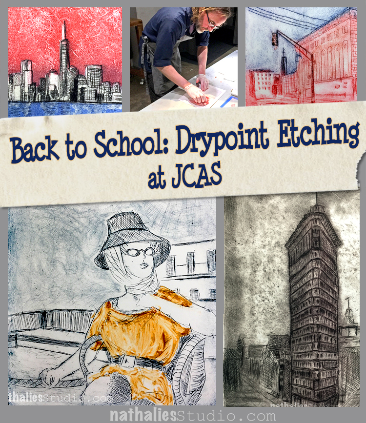
This winter I took a drypoint etching class with Bruno Nadalin, a fellow Jersey City artist at the Jersey City Art School. I have taken a Linocut Class with him before and he is an amazing teacher, so I knew it would be good. And I wasn’t disappointed. The class with 6 x 3hour lessons  was AWESOME.

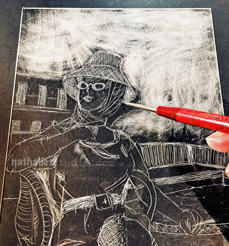
In this class we did drypoint on acetate/plexi plates. Using a sharp needle and/or other tools you scratch an image into the plate. The plate above is the one I did in the first lesson after we practiced with some different applications and tools

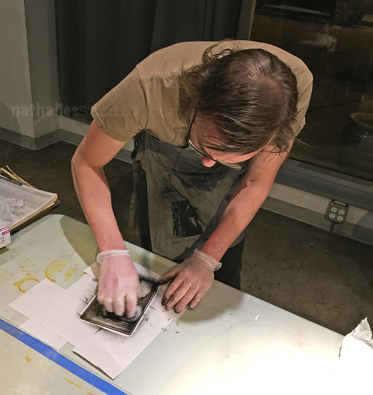
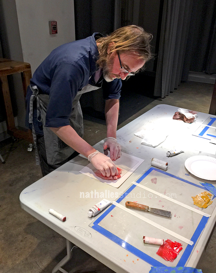
The plate then is getting inked up and then the ink is wiped off again – the ink remains in the creases of your etching and that is where the magic happens.

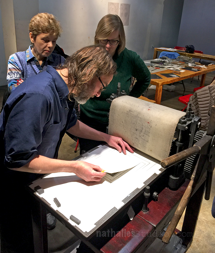
Here is Bruno putting a sample onto the printing press at the JCAS.

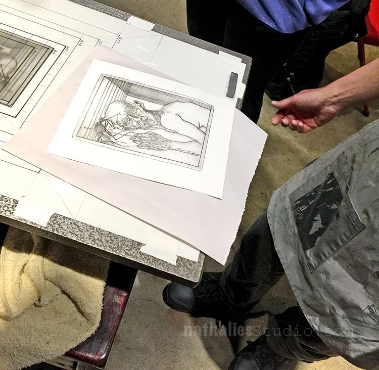
and here is his amazing sample coming out of the press!

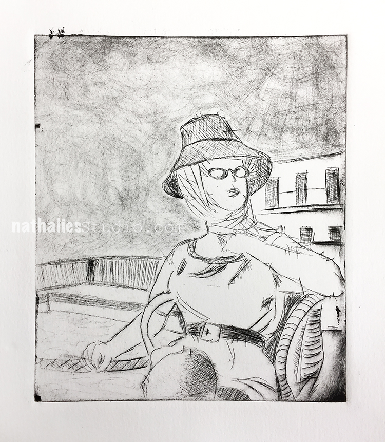
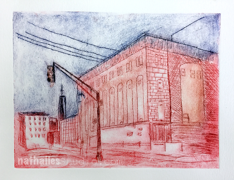
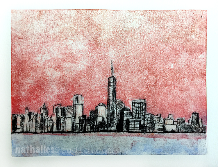
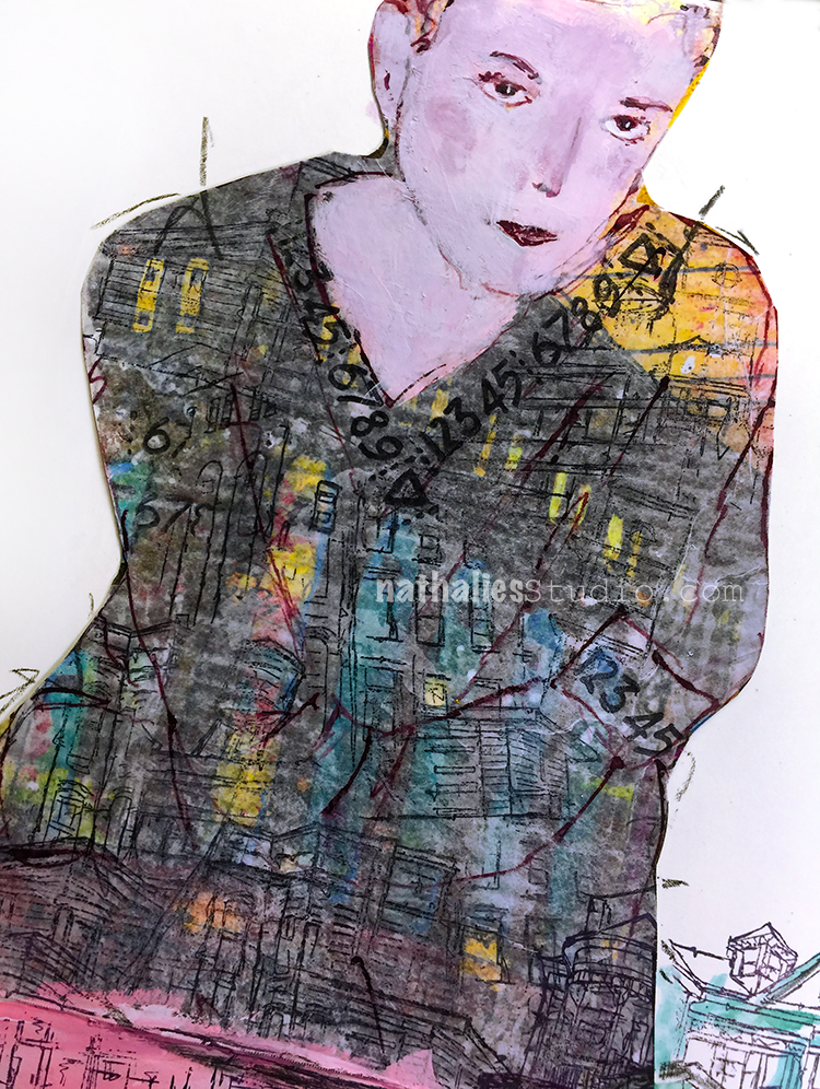
Above is the very first print I did with that plate.

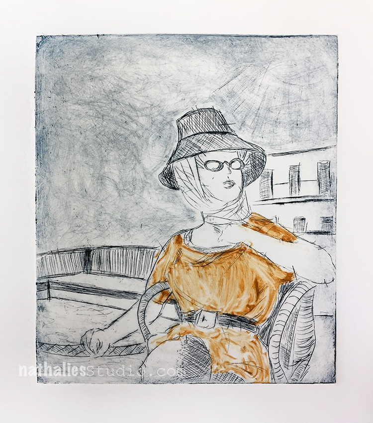
For the second one I applied a bit of color to the jumper.

In the second lesson, Bruno showed us how to make multicolor prints with the technique called a la poupee.

And below is his sample

I started with a new plate which I had prepared at home- see I just couldn’t stop scratching at home- LOL

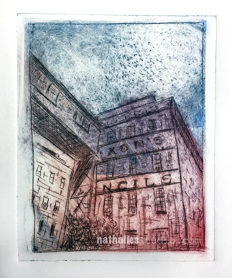
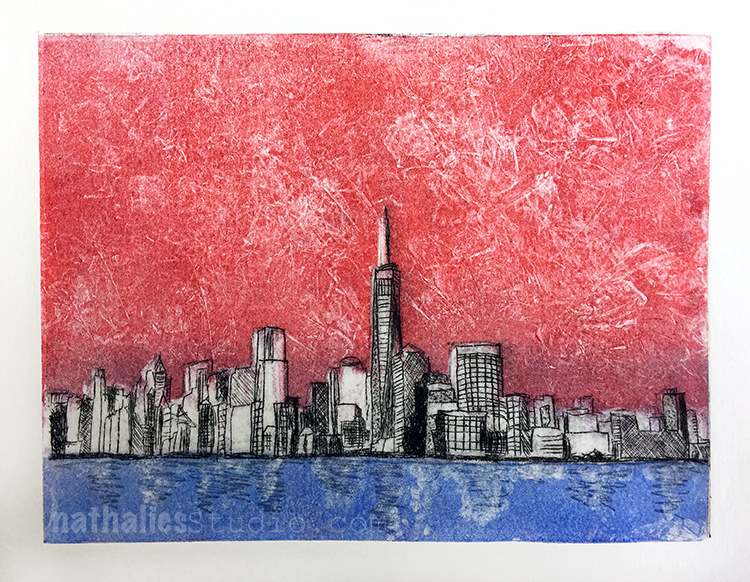
And here is the second one with the powerhouse – some of you might recognize this building :)

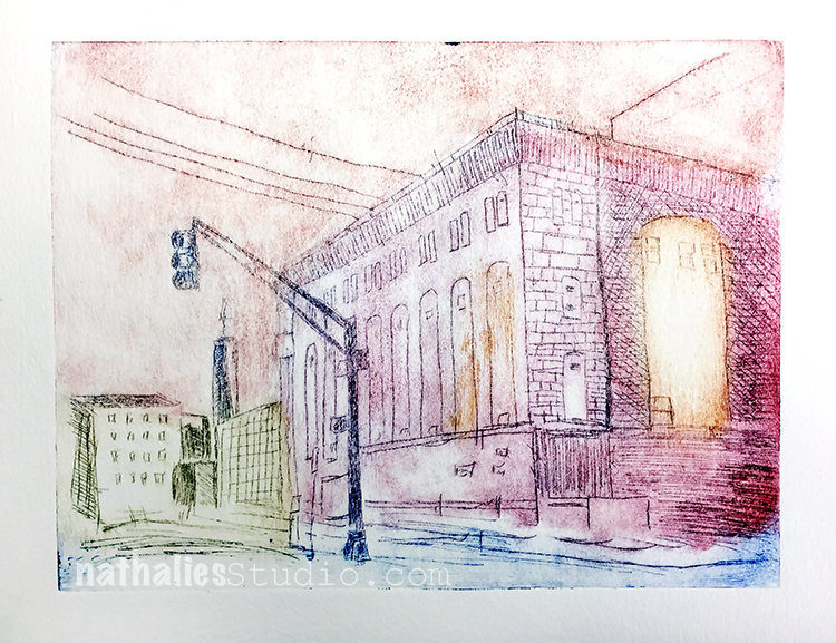
The third print came out the way I envisioned – I really love it. As Bruno says it is all in the wiping. Making the plates is actually not the work load, it is inking those plates up and then wiping them down again that makes up most of the technique and time.

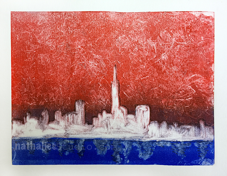
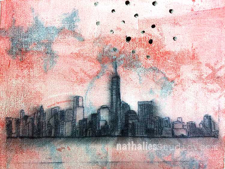
The print above was an experiment. I did some mono prints at home with Akua Inks which I always wanted to try out on a gel plate and I used this interesting paper which I had gotten at a convention many years ago. It is made out of plastic but feels like cloth. I printed on top of the mono print and I really like the outcome.

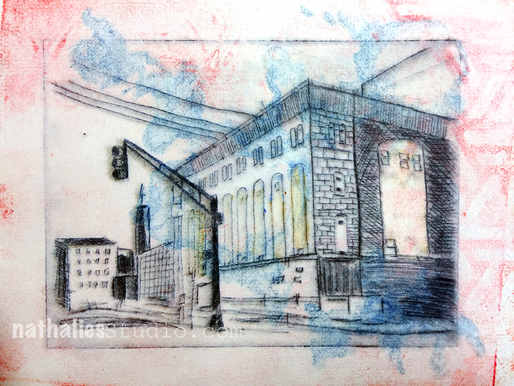
Here is a another plate I made in different stages – a part of the factory building I live in.

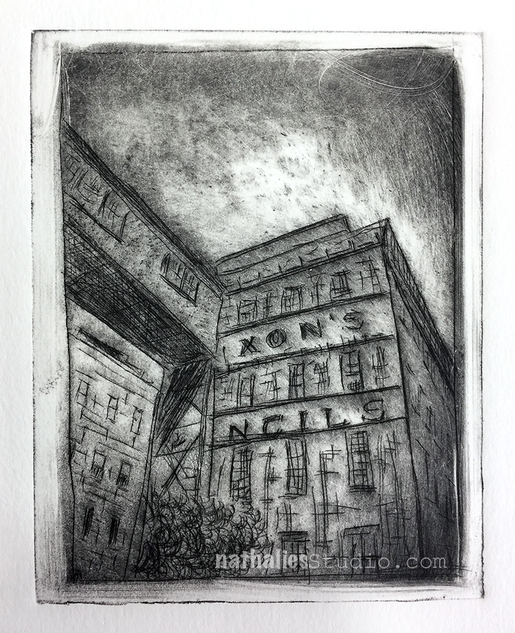
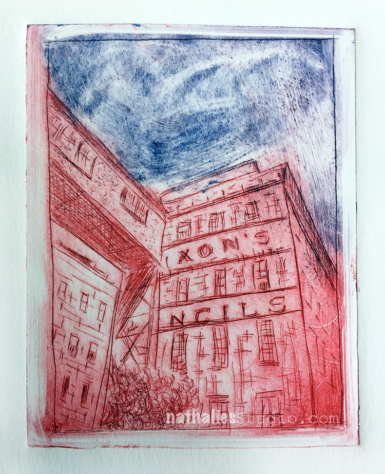
Isn’t it cool how different the images look and the mood they convey based on the inking? So cool to experiment with that.

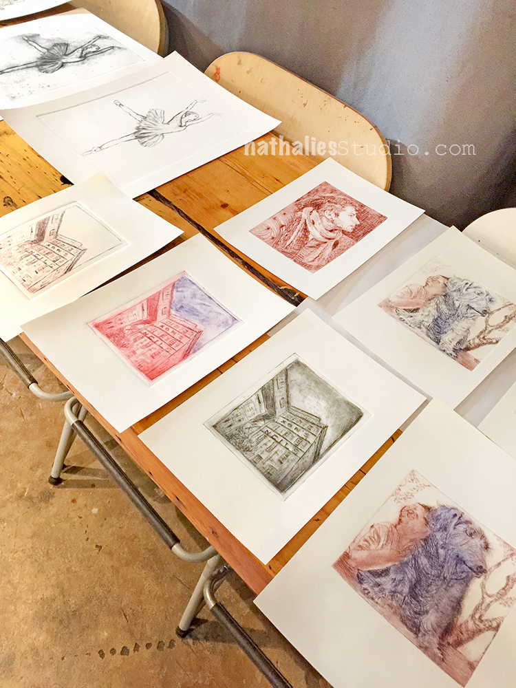
Here are a couple prints from the students in the class.

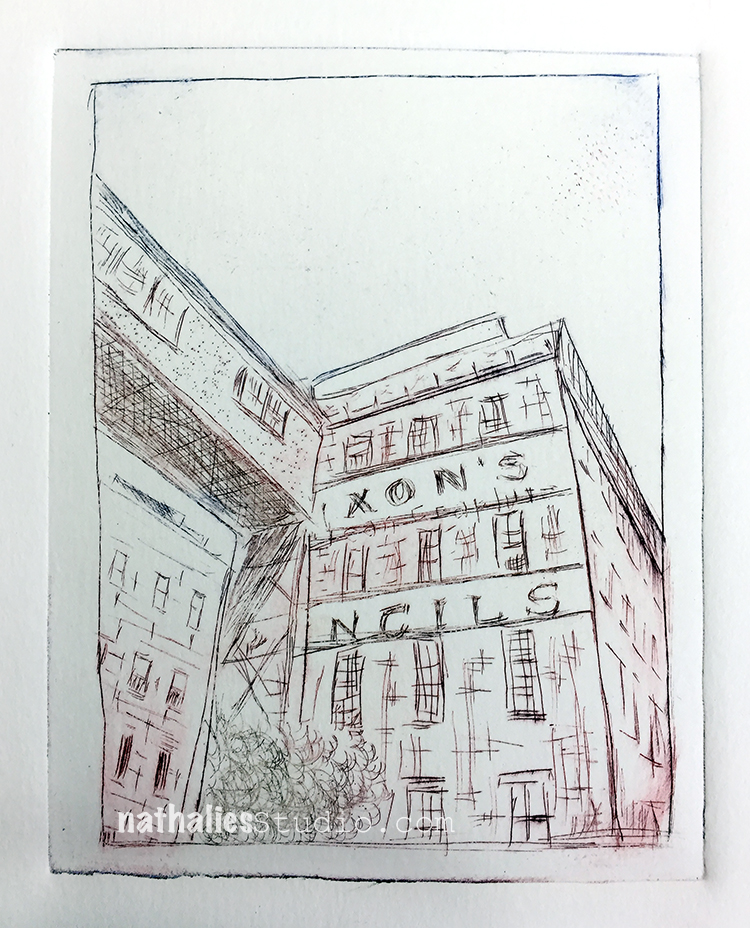
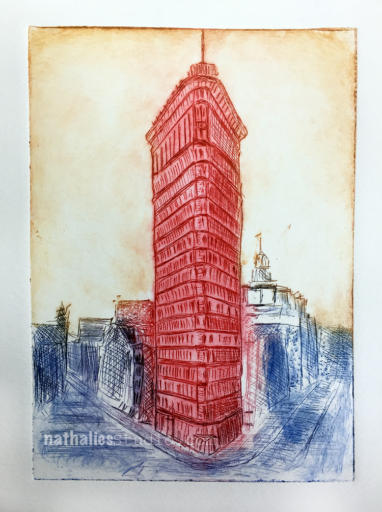
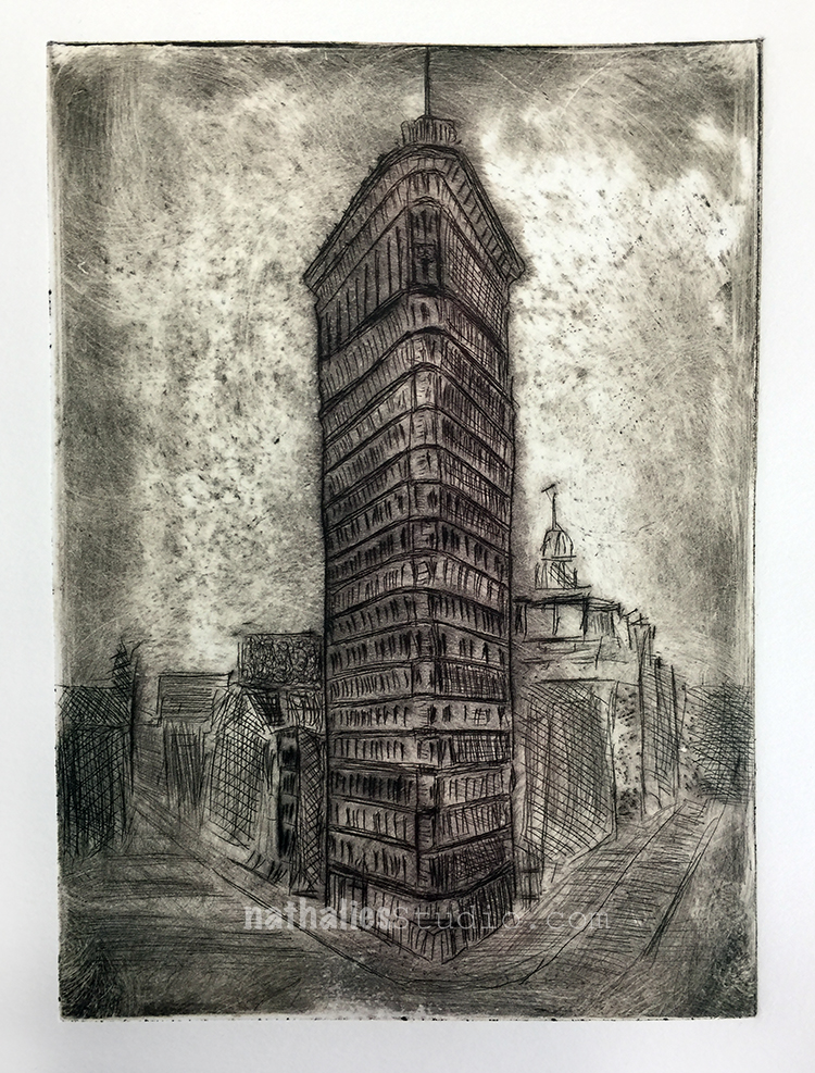
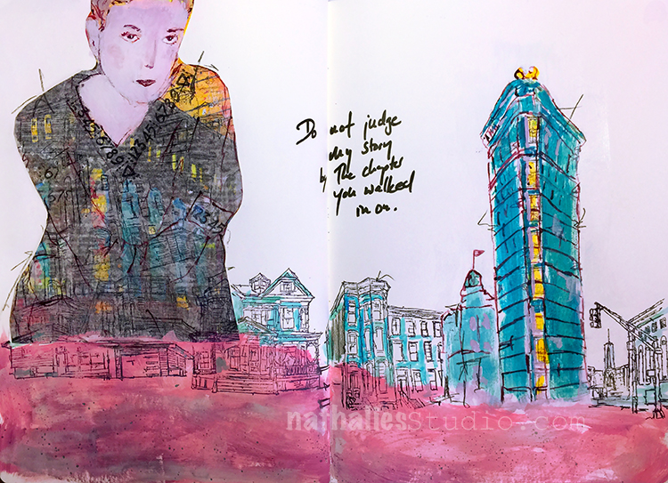
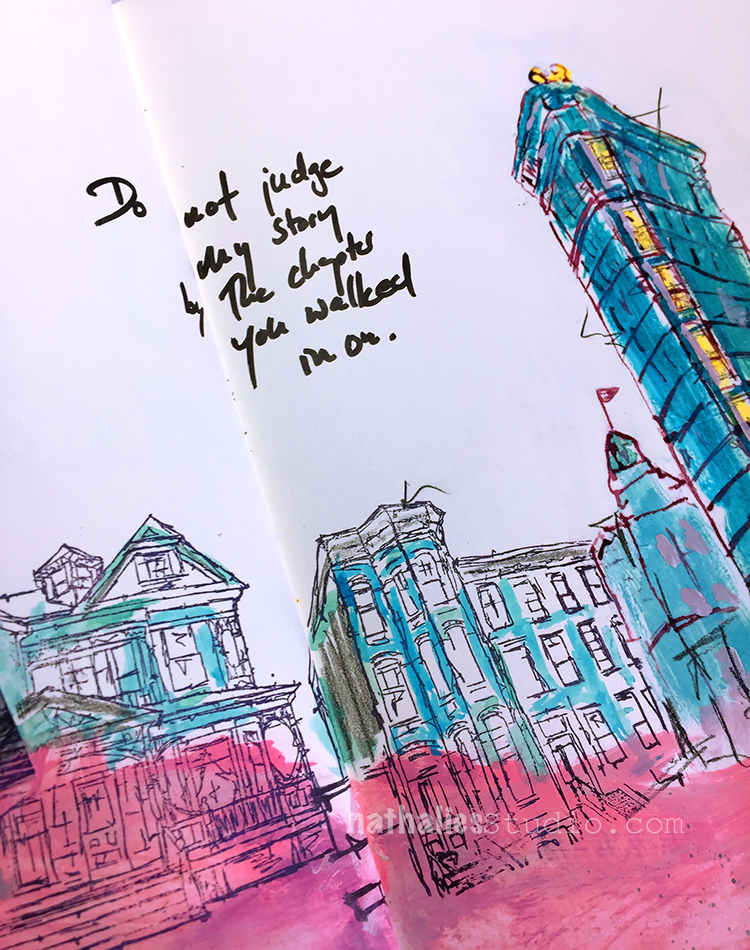
I don’t want to bore you , but here are a couple more- the Flatiron Building – as you know it is a reoccurring image in my work, so of course I had to make a plate with it as well.

And then some prints from the last lesson where we did some two plate printing. Basically you create a mono type and then print on top of it – there are different ways to approach this of course.

First one above as you can see I didn’t wipe that well – but I still love how the colors came out

Here I had way too much ink on the first plate so I didn’t print the second plate on top, but I actually love it as it is. I kept it and might do something else to it later – I will see.

Here is the second try – less ink now- basically the ghost print of plate one and now with the second plate printed on top.

Another one – I like that one a lot.

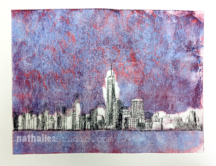
And last but not least one where I used once again one of those mono prints I did at home – the cloth-like paper had the ink of the skyline bleed a bit – I love this.

What I learned in this class:

  • It was first a bit hard for me to think I would not be able to do this all the time at home without a printing press but then that made me more focused and prepared for the lessons
  • The application of the ink and the wiping was a technique and whole process on it’s own and what a fascinating one it is
  • I loved the different ways one plate could be treated for different prints
  • I love the little time span where you just don’t know what is coming out of your press – when you lift up your print and see what happened. It reminded me of going to the photolab to finally get the vacation photos and seeing them for the first time.
  • There are art forms you just cannot get away with not being clean and organized …clean your space, clean your hands, clean the plates, clean the press …so much cleaning. LOL
  • I loved combining mono types with this class
  • There is only a certain amount of prints you can use the plates, and then that is it forever

What I take away for the future:

  • JCAS has print parties where you can use the printing press for a small fee- I def. will make up some new plates and join in the future to make some more prints
  • A way to take some of the mono prints on the gelli plate further – I want to explore this more
  • I enjoyed taking a class even though it was sometimes tough to go for 3 hours after a whole day of work- I need to do this more often again
  • I loved the pace of the class, I think I sometimes pack too much in my own classes and forget that it is also great for the students to just explore what they learned for a bit. Of course that is easier to do when you have a class that spans over several weeks but I def. look for a way to think about this in my multi-day-classes.


If you are in the area, I highly recommend taking a class with Bruno Nadalin or a class at the Jersey City Art School– it is a great place and they offer a lot of fun and different workshops and art events.
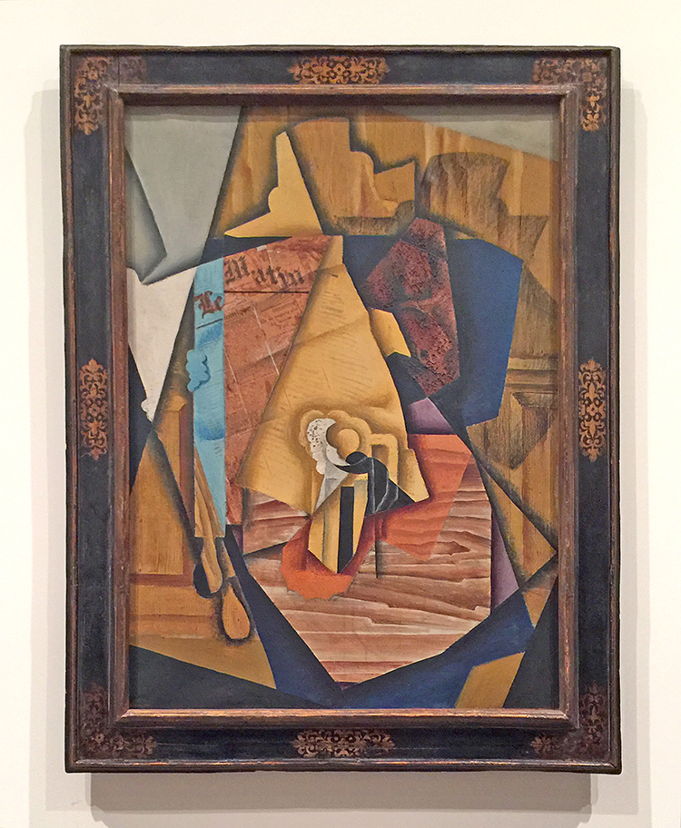
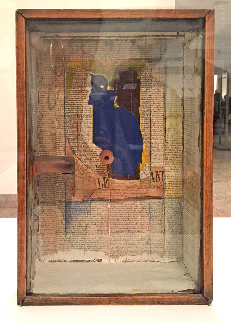
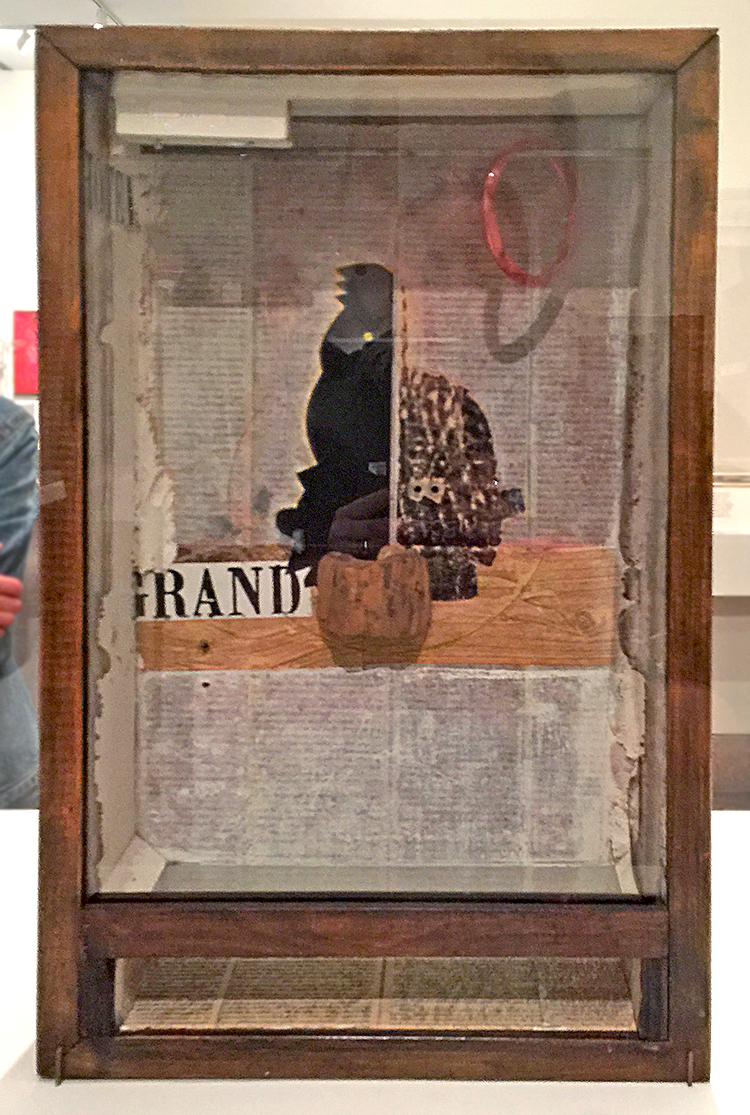
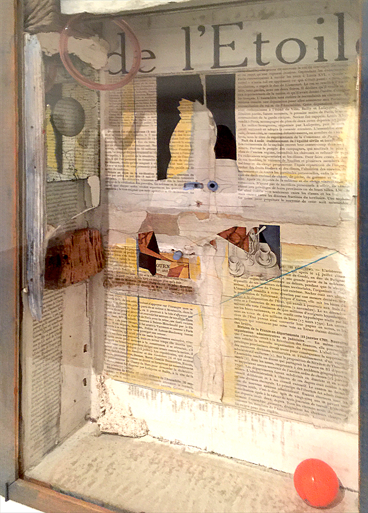
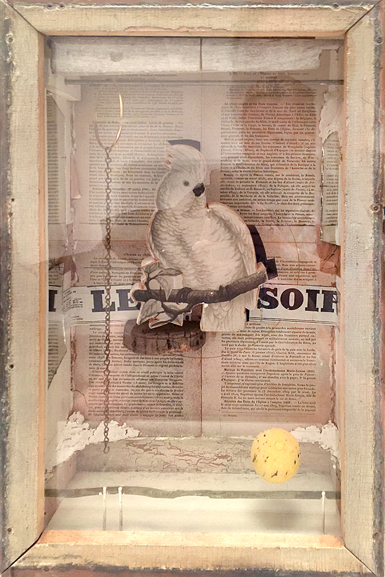
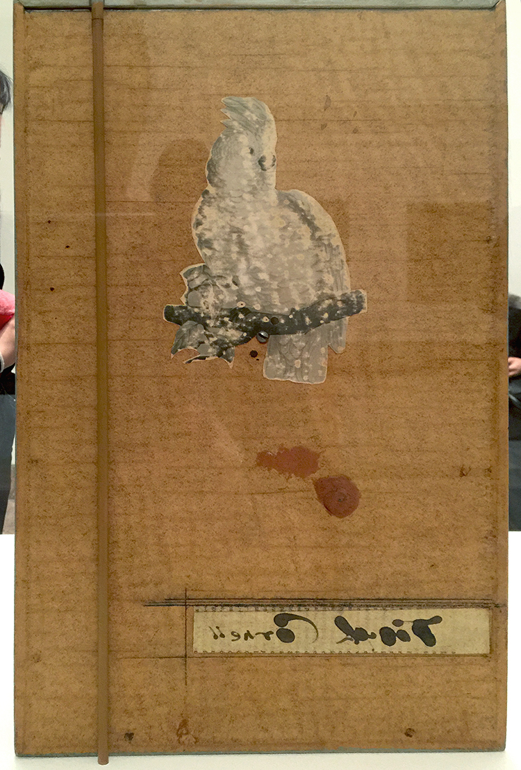
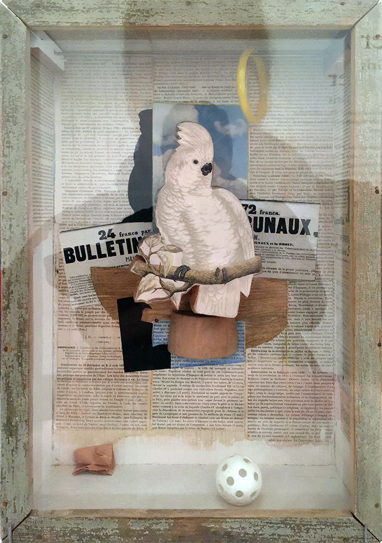
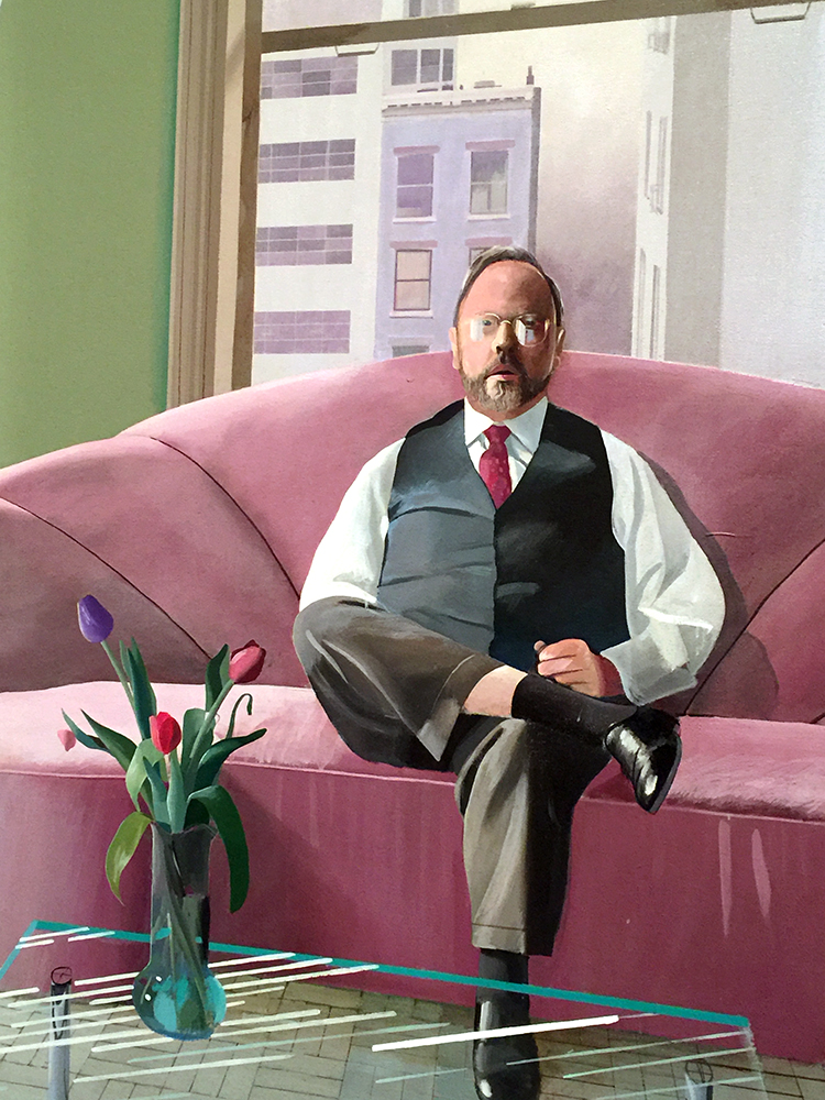
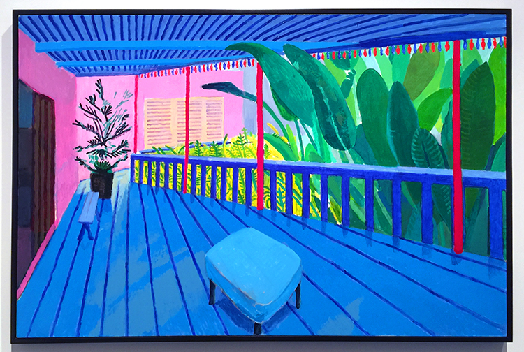
 

Comments (5)

  • Jill McDowell

    |

    Nat, love seeing your class and your prints. They look awesome. I know what you mean about wiping the plates. It takes a long time to get to know them. And keeping clean is definitely an issue. But it’s so worth it when you pick up the felts, see that lovely embossing on the back, and then reveal the print. Glad you had a good time. I’ve signed up for the spring Printmaking class at Creative Arts Workshop in New Haven. It’s addictive. ?

    Reply

  • Bruno

    |

    I’m so happy you enjoyed the class, Nathalie! It was great having you as a student again :)
    I really like reading your thoughts on your work. I find I often move so fast through things I don’t take the time to reflect on what I’ve done, so it’s good to be reminded about how important that is. I also like your 4th observation about the time span when you’re waiting for the print to be revealed. That little surprise is what makes it fun!

    Reply

    • nathalie-kalbach

      |

      It was fantastic- you are really an amazing artist and teacher! It is always a huge booster in inspiration for me to take a class with you and I learn so much – plus you are the most patient person even when we are super messy and can’t stop giggling about a la poupee ;) Cannot wait for a new class with you in the future.

      Reply

  • Clavell

    |

    These are incredible!…fascinating! I hope some of these find themselves FRAMED and HUNG on your walls! They are wonderful pieces of art! ♥

    Reply

    • nathalie-kalbach

      |

      Awe thank you Clavell! Yeah- I started matting some of them and some of my friends are already in line for some- so I am super stoked that they are finding some nice homes :)

      Reply

Leave a comment