Nat

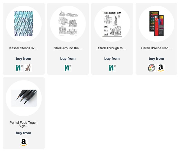
It’s time for a project from my Creative Squad! Today we have a sweet little art journal page that is filled with pattern and color, from Josefine Fouarge. She is using my Manhattan and Mini Chicago ArtFoamies, my Cape Cod stamp from the Stroll Around the Block set, and my Hamburg stencil. This month’s theme is: Vacation Mode – Here in the Northern Hemisphere, we are slogging through winter with only one thing on our minds – vacation! Whether it’s Spring Break, a weekend getaway, or an hour with a good book, everyone needs an escape to Vacation Mode now and again.
This month’s topic got me thinking. It’s been a while since I have been on a vacation and there is none in sight either. So, I decided for myself that if you can’t go on vacation, shopping is the next best thing. And trust me, I am good at that ;)
I was at one of the big box stores the other day and couldn’t pass the paint and paper aisles without grabbing a few items. To make sure that they don’t end up in a drawer unused, I incorporated them in my new art journal page.
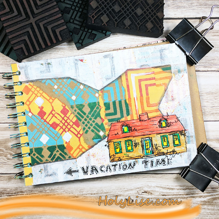
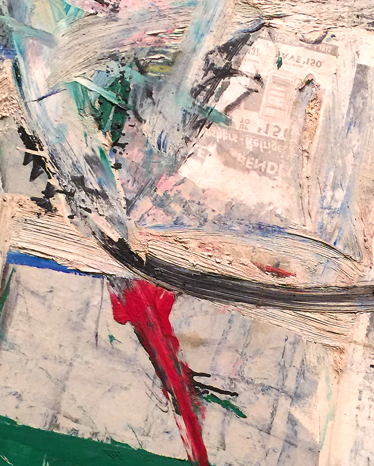
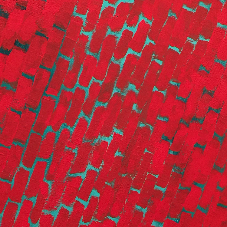
I covered my art journal page in the new Liquitex paint. Then I picked a few ArtFoamies (Mini Chicago and Manhattan) to stamp them with other shades on top. I used two different paints and alternated the colors between each stamping. Aren’t these colors just pretty? Do you understand why I couldn’t walk by them? :)
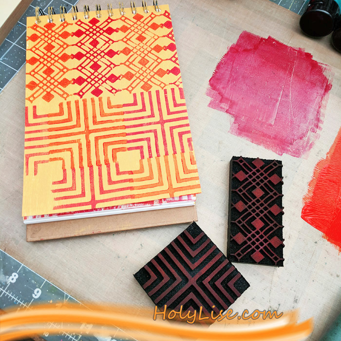
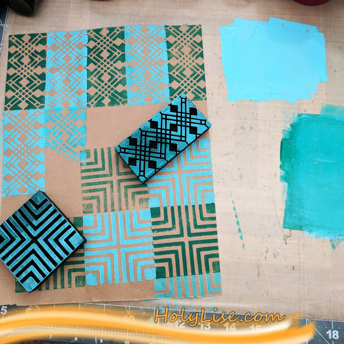
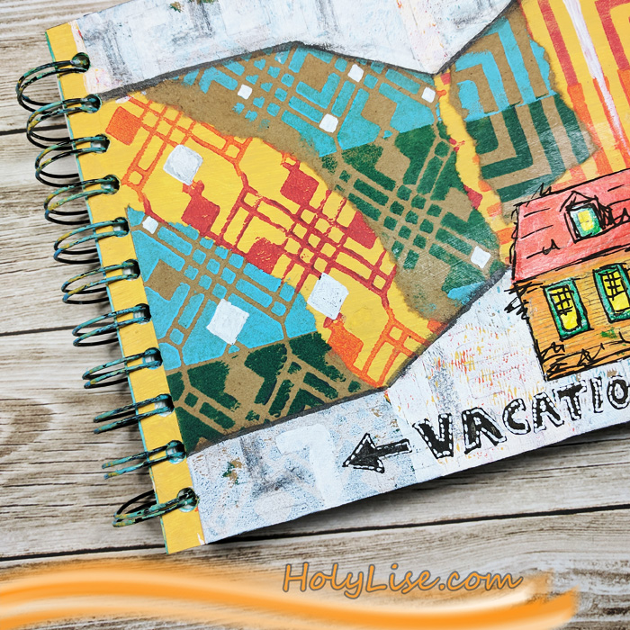
Next up, I used the new recycle paper and stamped the negative ArtFoamie in the same patterns, but with a contrasting color. Again, I alternated between two colors.
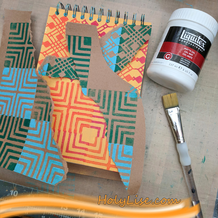
Now I ripped up the brown paper and adhered some of the scraps onto my art journal page. It was important for me that the patterns match and create the illusion all the shapes merging together.
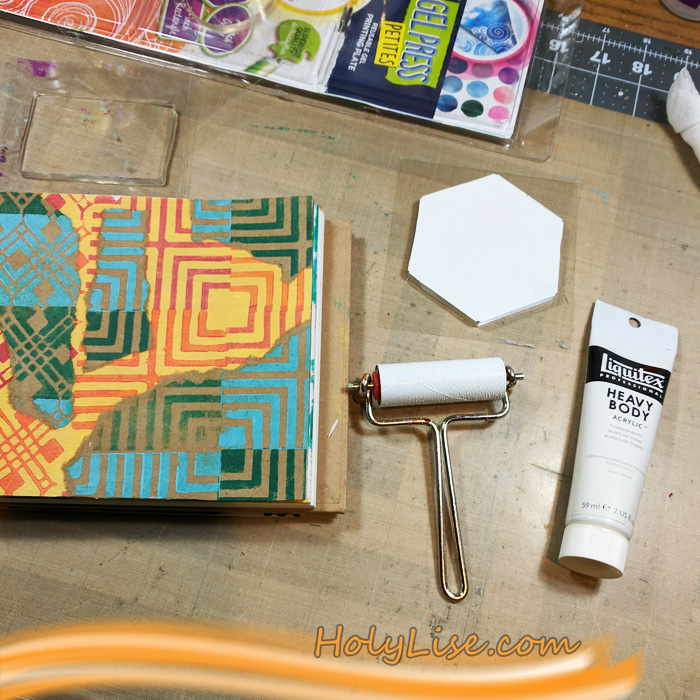
I needed a border, so I used the Gel Press petites and white acrylic paint to add one. Because the border was rather boring, I added a very light pattern to it. I did that by tracing the pattern from the Hamburg stencil with a pencil.
While I was coloring in some of the stenciled shapes with the same pencil, I thought that the colorful background needs some white as well. So I added a few white shapes.
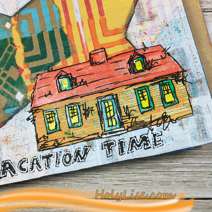
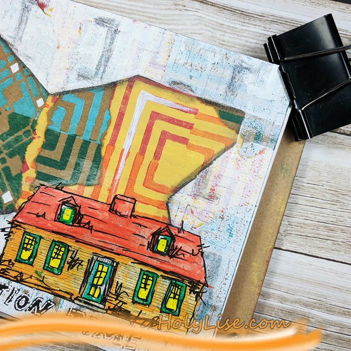
The page still was missing a focal point, but I didn’t want to stamp anything directly onto the page. Usually that doesn’t end well for me. Instead, I prefer to stamp the image (in that case the Cape Cod house from the Stroll Around the Block set) onto a piece of tissue paper. I adhered that with gel medium and colored the house with Liquitex and Montana paint pens.
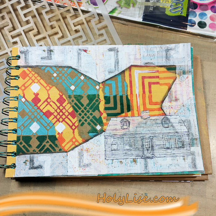
To finish the page up, I added a few scribbles and some shadows. I love that the paint pens made the house look like a cartoon.
On a side note, I totally enjoyed working with the brown recycle paper. It has such a neat texture to it and added the perfect contrast for the negative/ positive foam stamps.
Thanks so much for stopping by! Don’t forget to check out all the other Creative Squad creations every Tuesday!
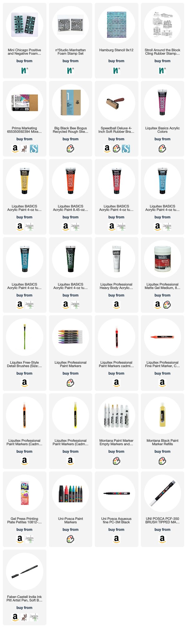
Thank you Josefine! I absolutely love those colors and patterns together! Here are some of the supplies that Josefine used:

Feel inspired? Working on something yourself that you’d like to share? I love to see how you interpret our monthly themes. Email me how you used my stencils and stamps with the theme and email me an image – I would love to share your projects in my next “n*Spiration From Around the Globe“.
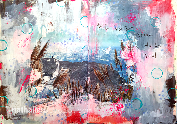
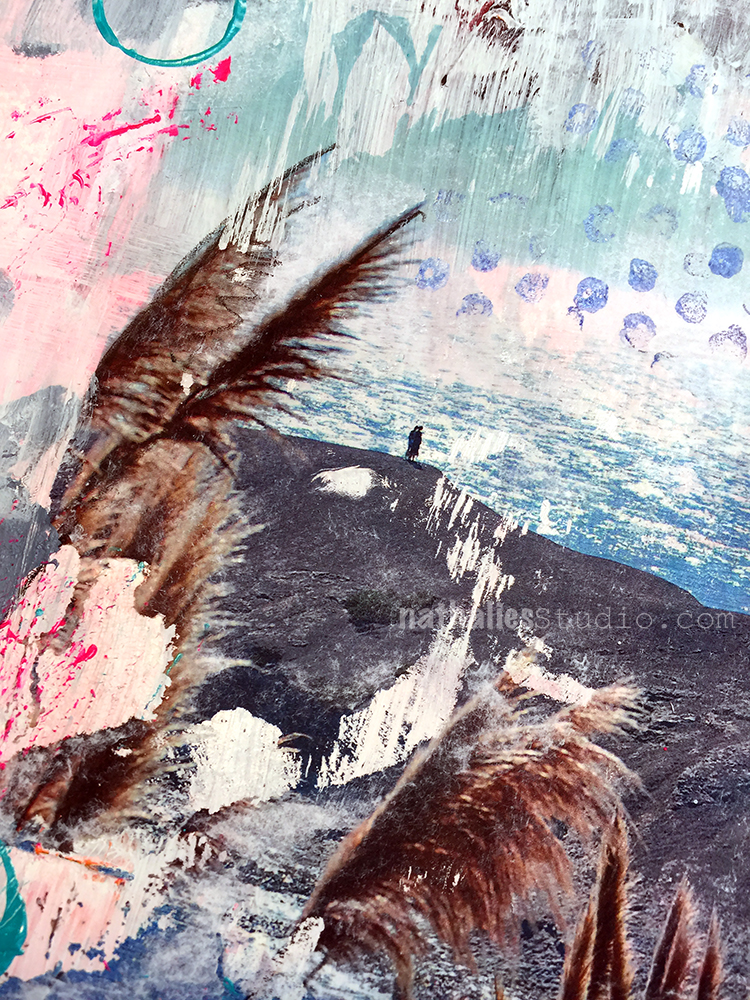
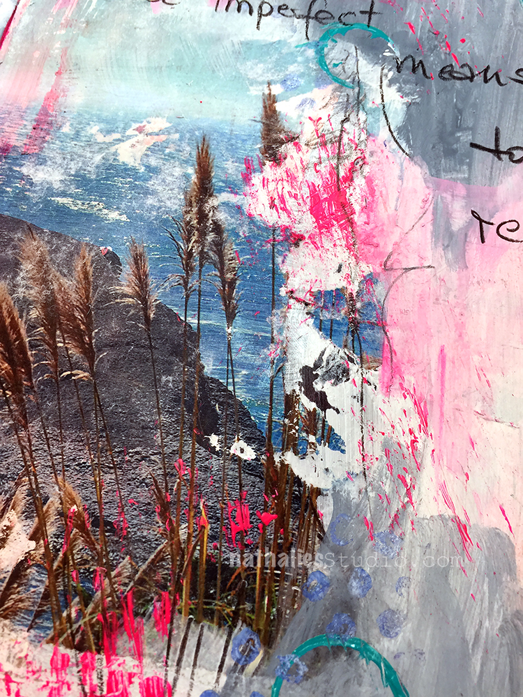
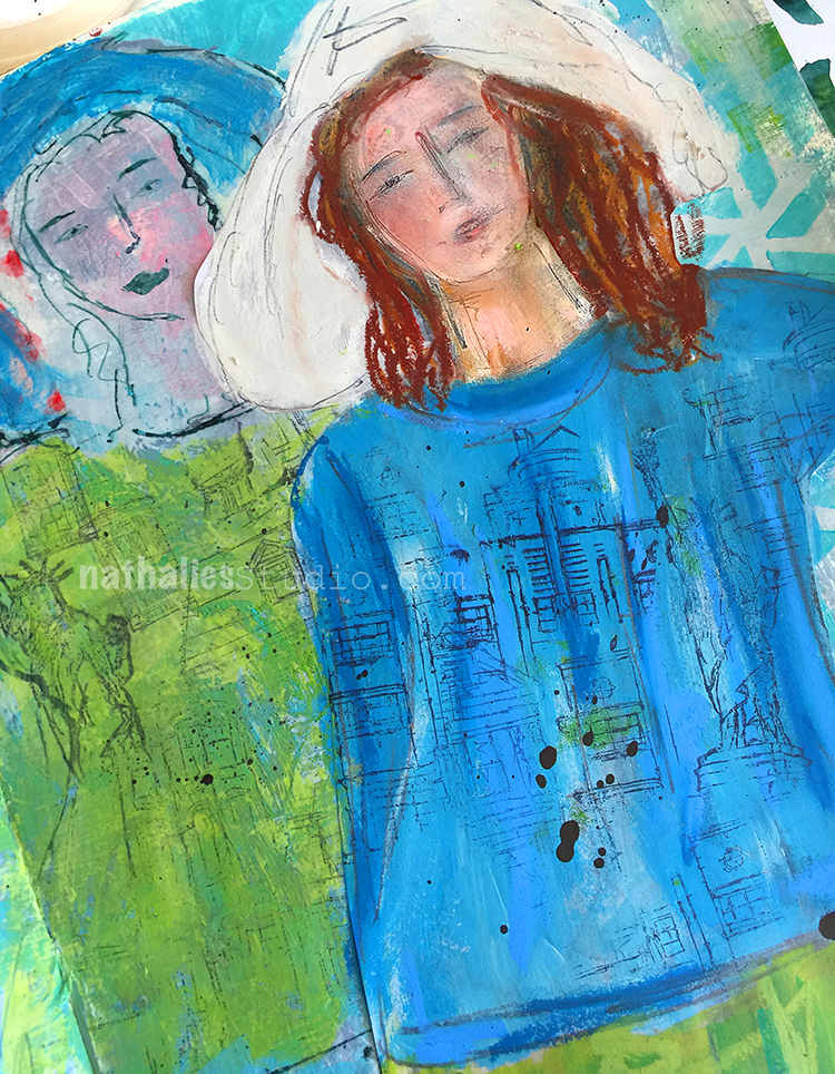
“To be imperfect means to be real” – I thought it was a perfect quote for a spread featuring an image transfer :)
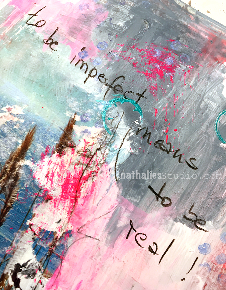
I love how imperfect image transfers look and how they can lead to a grungy and interesting page. I wrote the journaling with a soft pencil as I felt that would fit best with the overall look.
I added some stamping with my Grannies stamp and also stamped some circles with a lid and made some marks with a stiff brush.
Here are some of the supplies I used for this spread
thank you Sue!!
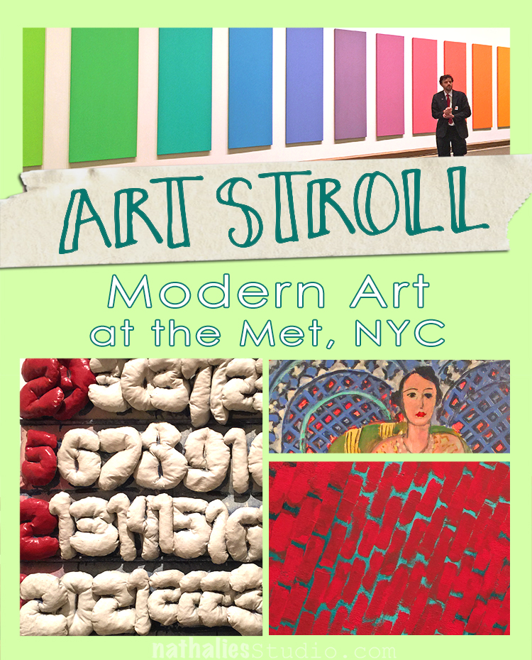
Loved strolling a bit around to see some of the Modern Art displayed at the Met a couple weeks ago while I was there. I just recently saw a documentary about one of my favorite illustrators Christoph Niemann – follow his instagram feed, it is brilliant and makes me laugh! – and he said that “experiencing art is the gateway drug”. I agree – and here is some of fine substance ;)
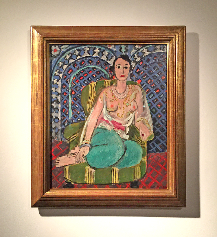
Henri Matisse, Seated Odalisque, 1926
I have said so much about my love for Matisse’s pattern play …there …once again …swoon
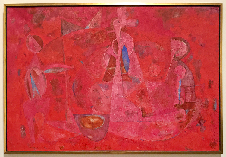
Rufino Tamayo, Children’s Games, 1959
Love looking at this and discovering the shapes and scene.
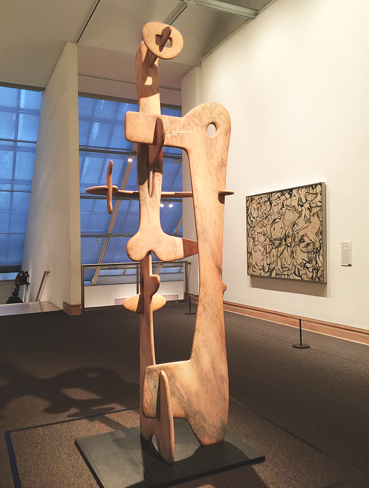
Kouros, Isamu Noguchi, 1945 – Marble
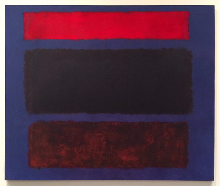
Marc Rothko, No 16, 1960
Color inspiration anyone? Love it!
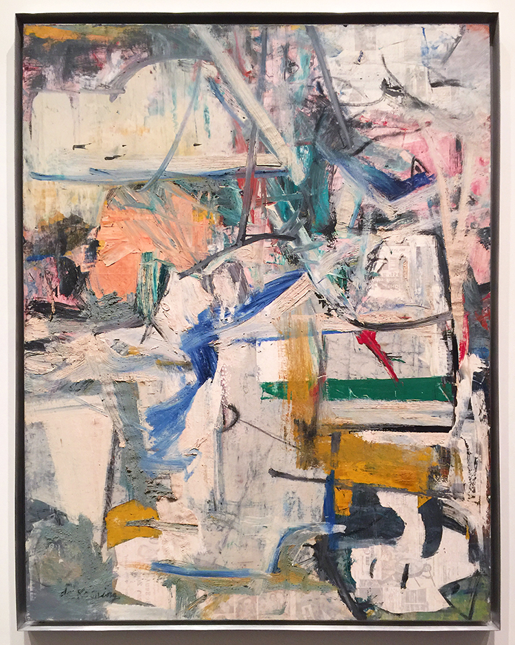
Willem de Kooning, Easter Monday, 1955-56
Texture Galore and collage elements – swoon
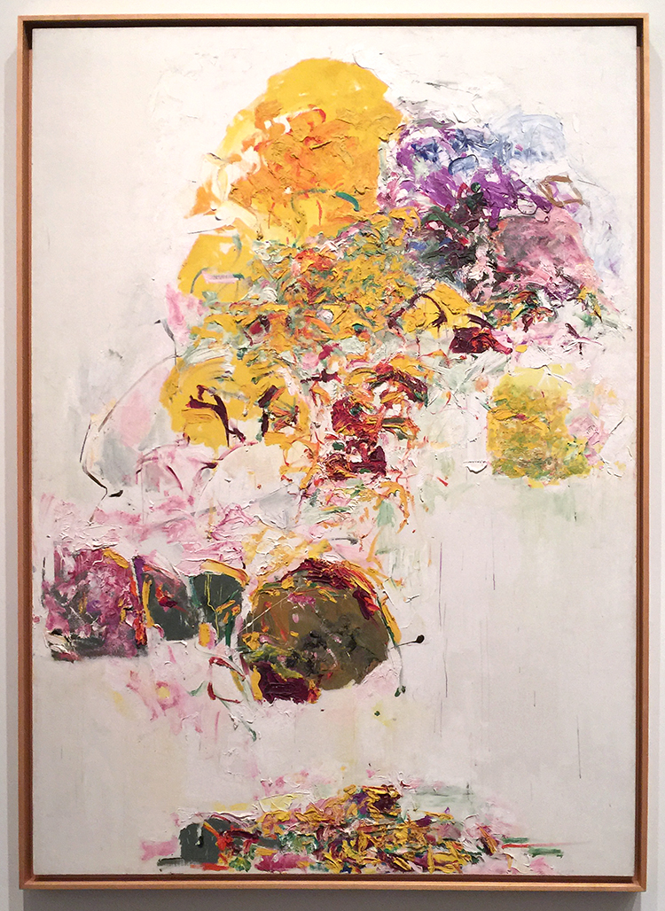
Joan Mitchell, Sunflower, 1969
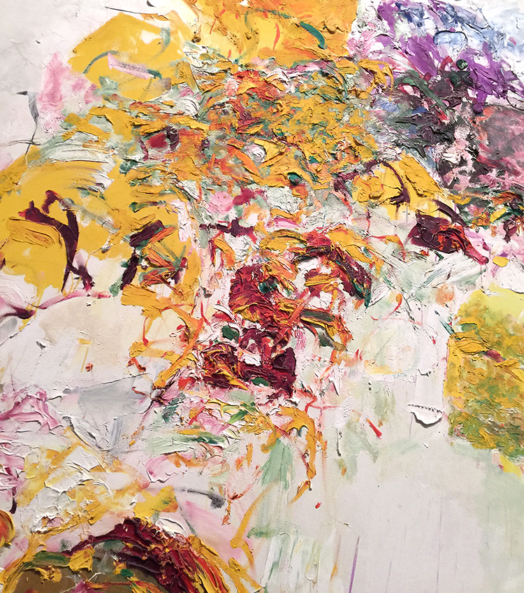
I love the texture rich and voluminous flower painting – so gorgeous!
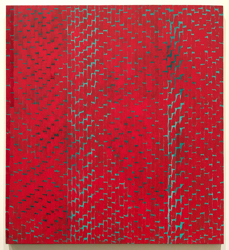
Alma Thomas, Red Roses Sonata, 1972 – Acrylic on canvas
This was so intriguing ! Speaking of making colors sing!
“Creative art is for all time and is therefore independent of time. It is of all ages, of every land, and if by this we mean the creative spirit in man which produces a picture or a statue is common to the whole civilized world, independent of age, race and nationality; the statement may stand unchallenged.”
-Alma Thomas, 1970
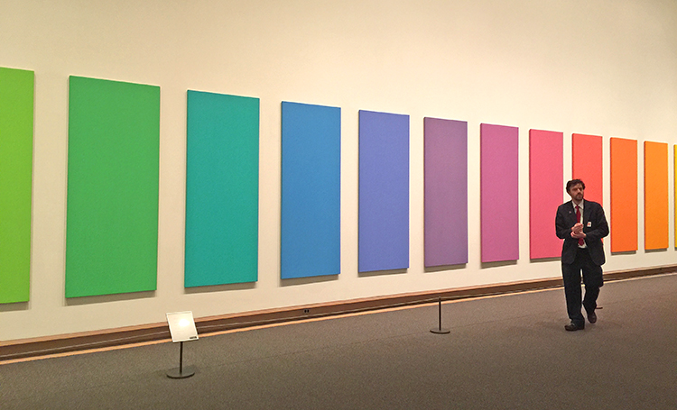
Spectrum V, Ellsworth Kelly, 1969
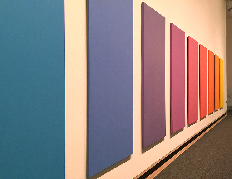
LOVE!
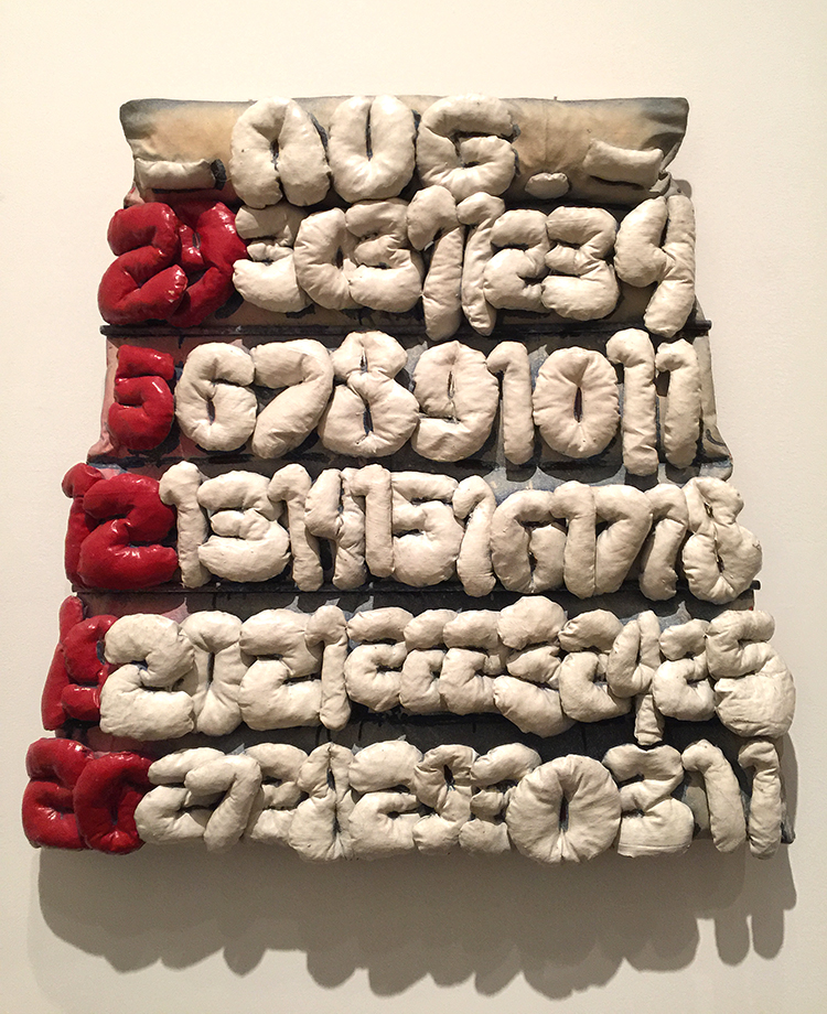
Claes Oldenburg, Soft Calendar for the Month of August, 1962
Canvas filled with shredded foam rubber, painted with Liquitex and enamel – I thought that was interesting – painted with “Liquitex” . But then I remembered that Liquitex was the first water-based acrylic paint created in 1955 – the name deriving from liquid texture hence the name of the company later. I have never seen a painting stating the material instead of acrylic paint with Liquitex – I guess having worked with them made me stumble upon this.
Jim Dine, Two Palettes, 1963
Oil, acrylic, enamel and charcoal on primed canvas
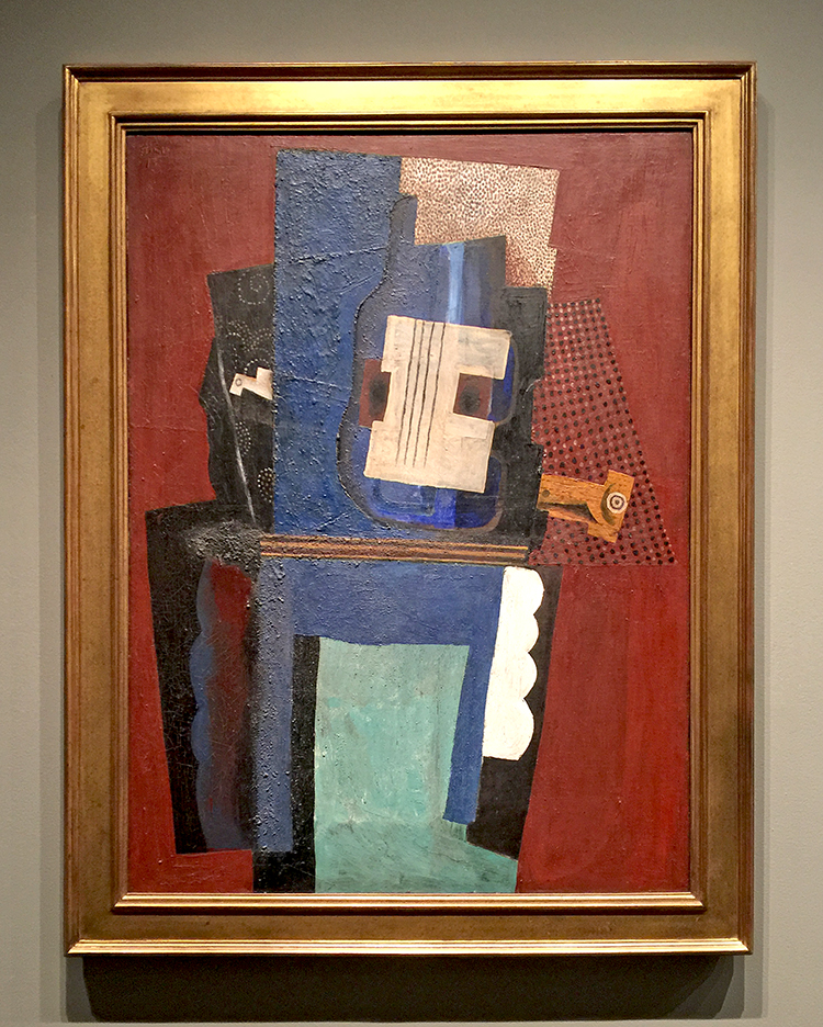
Pablo Picasso, Guitar and Clarinet on a Mantelpiece, 1915
It was especially great to see this painting as I was reading Matisse and Picasso: The Story of their Rivalry and Friendship and this painting plays a little “story” in the book. The book is interesting btw but not extremely great.
I love the Met but it is just such a hike to get there and it is always so crowded. Strolling through the Modern Art Galleries at the end fo the visit was a wonderful way to catch some breath after an insanely crowded stroll through the Hockney and Cornell exhibition. The next art stroll will probably come from a Museum in Japan …we will see ;) I hope you will join me!
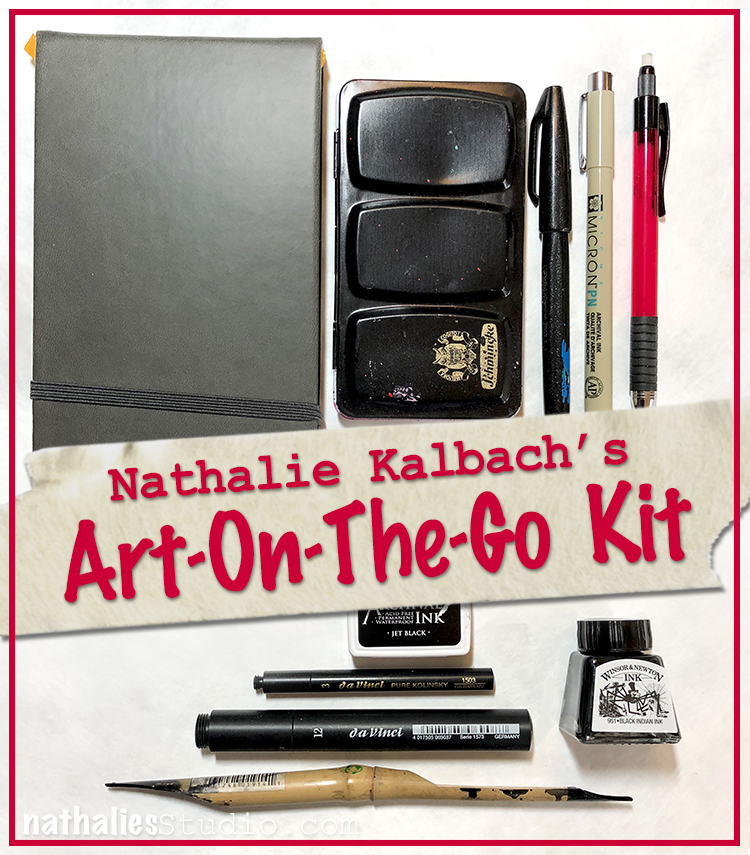
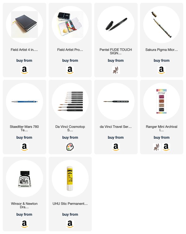
I am so excited, because I am going to Japan and I thought I would bring a little Art-On-The-Go Kit and I hope I will be doing a lot of sketching, and that I will also write a bit about my adventures. We will see how much I used it when I am back ;) But I thought I would share with you what I packed.
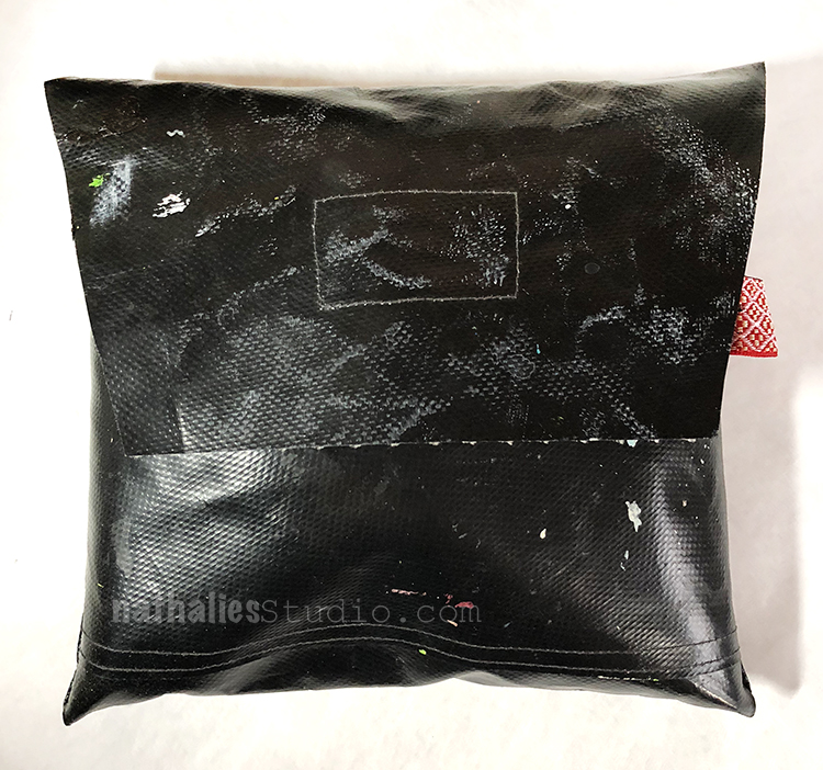
The bag was a gift from a friend many years ago and I use it a lot- some of you might have seen it in as part of my bags I bring supplies with me to workshops. The bag is waterproof and is made from one of those old maps the used to used in school – anyone remember those being carried in with a stand by the teacher? Here is what it is packed with
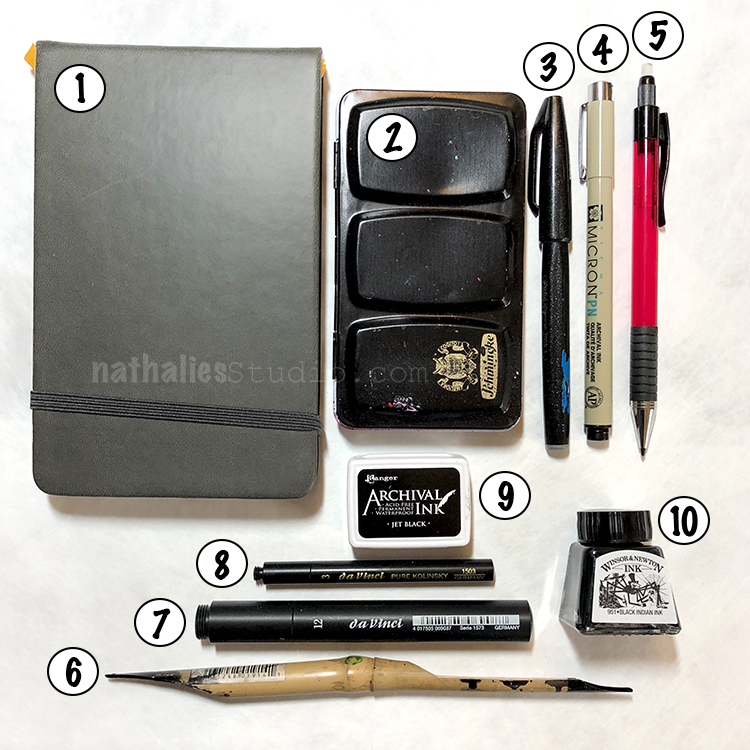
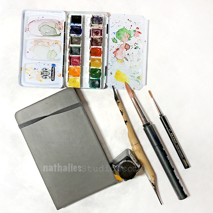
Here is a little glimpse at my colors in my watercolor set and the travel brushes being screwed together. Now cross your fingers I am a good girl and use all items while traveling ;) I will share of course share with you
Lucky you! Have a great time. Can’t wait to see your posts.
thank you Stephanie- photos are coming soon!
Have fun in Japan.
I’ve never seen travel brushes…super compact.
I love FUDE pens and order them in bulk on Amazon.
I agree- cannot have enough fude pens :)
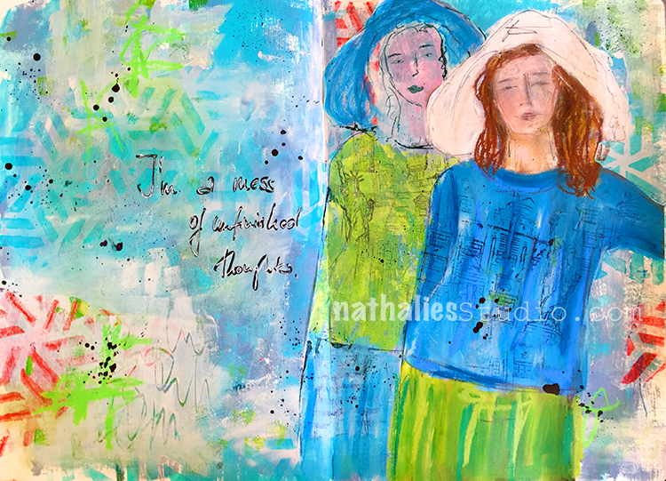
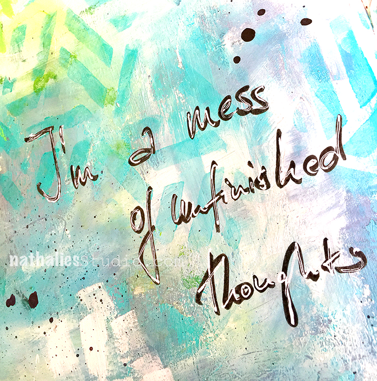
I am a mess of unfinished thoughts -oh so true ;)
The back girl is sketched out on deli paper and painted with acrylic paint, while the front one is cut out from a magazine and I just painted with Neopastels on top of it.
I used my Kassel stencil directly on the background but also used some deli paper where the stencil appeared after I had used it with my gel plate to do monoprints.
To tie the deli paper a bit more together with the background I painted partly over it and the background and then scratched some marks into the wet paint. I like the grungy feel of this.
Here are some of the supplies that I used besides various acrylic paints and inks:
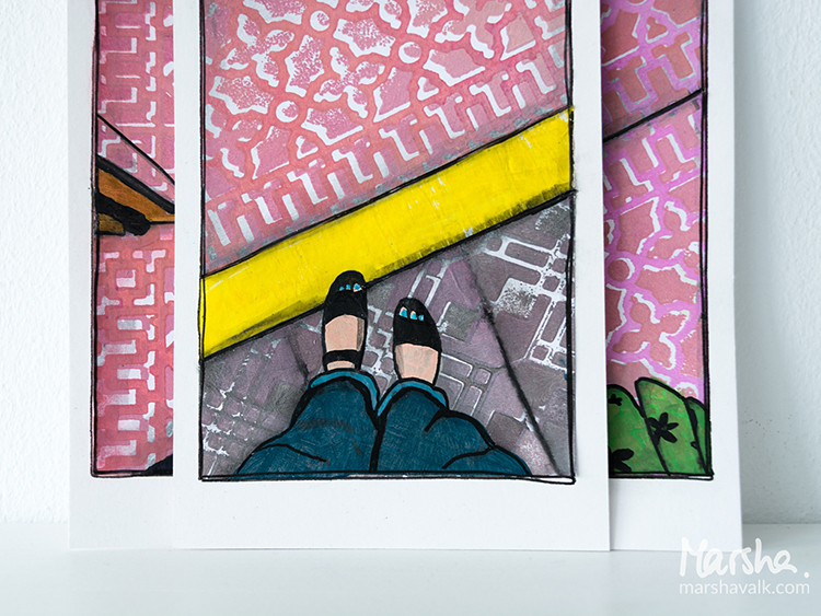
Hello from the Creative Squad and a big farewell hug to stellar squad member Marsha Valk! This will be her last post with us and we thank her so much for all the inspiring, creative, and amazing projects that she has made for us. She has been on the Creative Squad since the very beginning and has always gone above and beyond with her posts and her unique way of using my stamps and stencils. We wish her all the best as her Artful Adventure continues :) So for her last post, Marsha brings us a suite of prints celebrating patterns with my Downtown foam stamp set and my Mini Chicago foam stamp set and inspired by our theme: Vacation Mode – Here in the Northern Hemisphere, we are slogging through winter with only one thing on our minds – vacation! Whether it’s Spring Break, a weekend getaway, or an hour with a good book, everyone needs an escape to Vacation Mode now and again.
Vacation Mode to me means: Slowing down. Reading a lot. Perhaps doing some sketching (but only if I feel like it). Eating yummy food. Seeing the sights and visiting at least one museum. Enjoying the sun! It has been a while since my last vacation abroad.
Much like Nat does on her travels, when I’m on vacation I observe and photograph lots. And because many of Nat’s ArtFoamies are inspired by her travels, I thought about my last vacation and had a look at the photos I took.
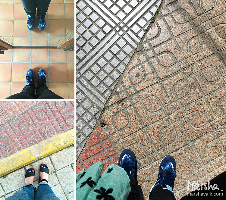
Among them I found three of my feet. I always take ‘fromwhereIstand’ / ‘Ihavethisthingwithfloors’ type photos wherever I go. In fact, I remember taking pictures of my feet in foreign places well before hashtags and even before digital photography!
Nat’s positive/negative ArtFoamies always remind me of pavement and flooring, so that’s how I came up with the idea of recreating my #fwis pictures with collage.
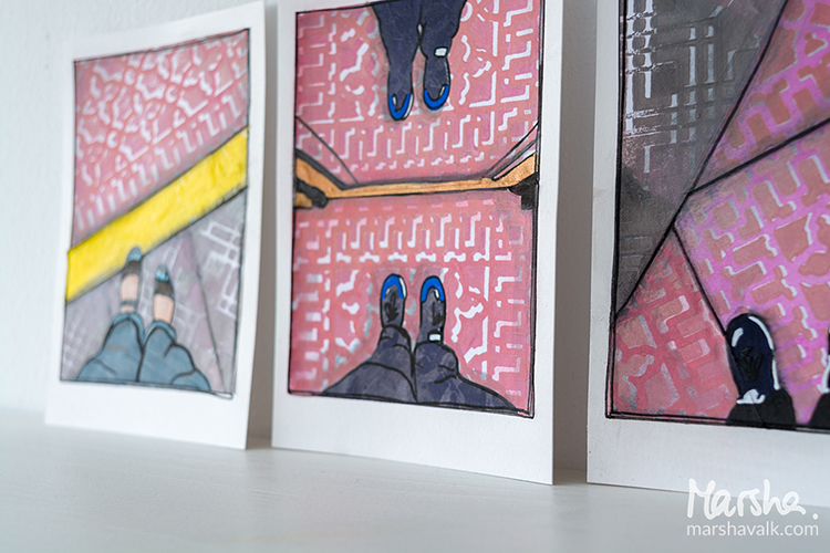
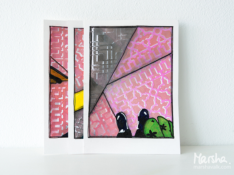
I started creating the pavement with the Downtown Positive and Negative Foam Stamp and the Mini Chicago Positive and Negative Foam Stamp Set.
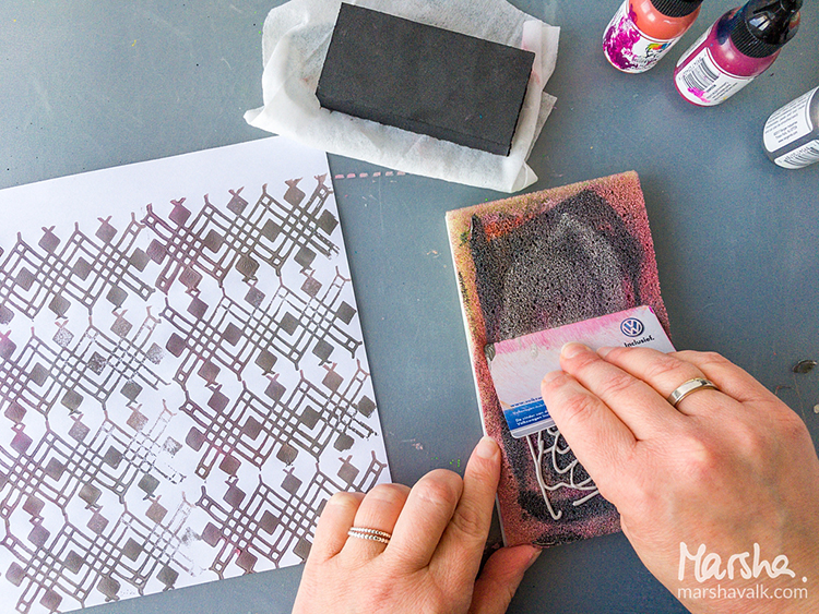
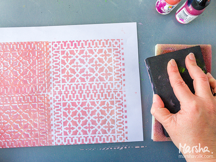
Because I’m not very fond of cleaning, I only used one Stamp Buddy and mixed my paint colours directly on there using an old plastic card.
For a lighter shade I added more white, and when I switched stamps, I added more grey. I stamped on regular printer paper because it’s nice and thin for collage.
I cleaned the ArtFoamies with a baby wipe in between stamping, and I rinsed them with water once I was done stamping altogether.
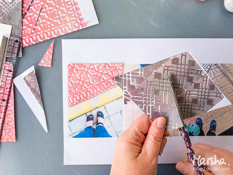
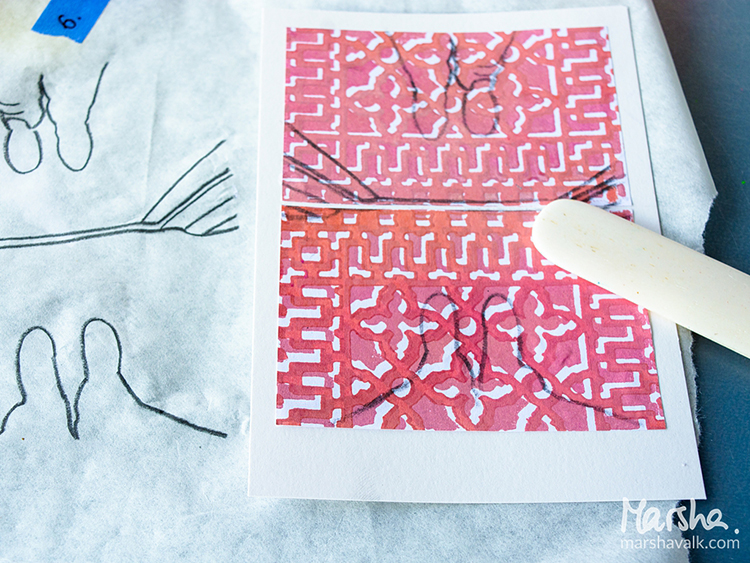
Once the prints were dry, I cut them into the shapes of the pavement in the photos, using the pictures as my guide. I adhered the shapes to heavyweight cardstock cut to 4.1” x 5.8” (A6) sized pieces.
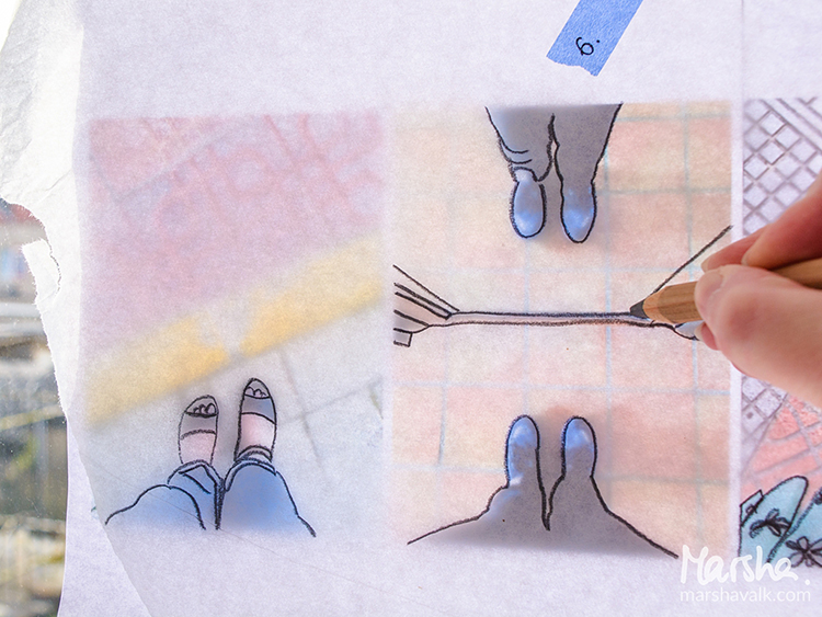
I traced my feet and any relevant details in the photographs onto tissue paper to transfer them onto the collaged pieces.
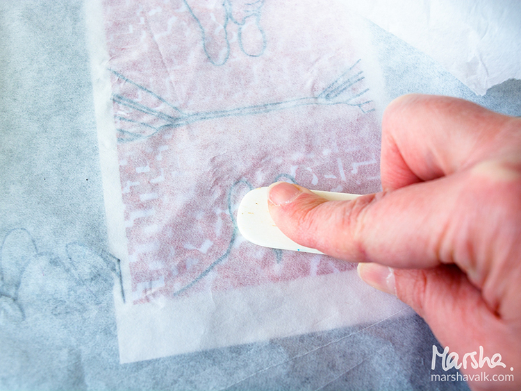
I placed the tissue paper pencil side down on top of the collage and then burnished the pencil lines with a bone folder.
Then I used acrylic paint and paint markers to colour inside of the pencil lines and pastel pencils, Stabilo All pencil and a brush pen to add some shadows and depth.
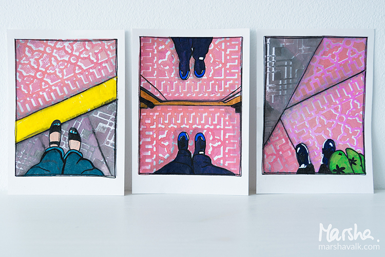
Thank you Marsha!!! These are just so cool – almost like the drawings from a comic book :) Here are some of the supplies that Marsha used:
Feel inspired? Working on something yourself that you’d like to share? I love to see how you interpret our monthly themes. Email me how you used my stencils and stamps with the theme and email me an image – I would love to share your projects in my next “n*Spiration From Around the Globe“.
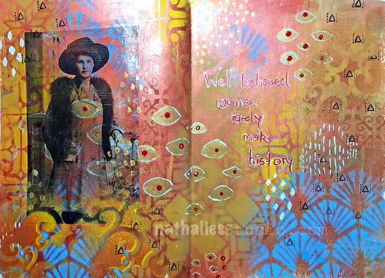
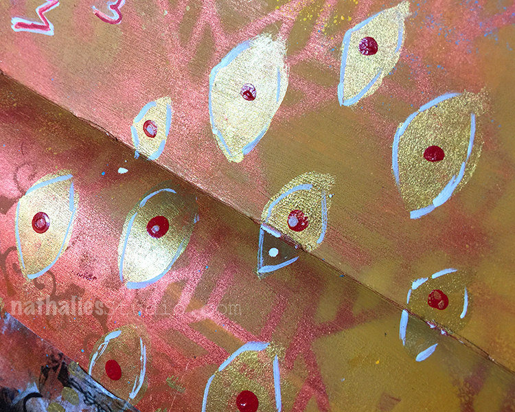
This is another Art Journal spread using my great grandmother’s photo as an indirect image transfer. I love how the transparency of the image let’s the background come through.
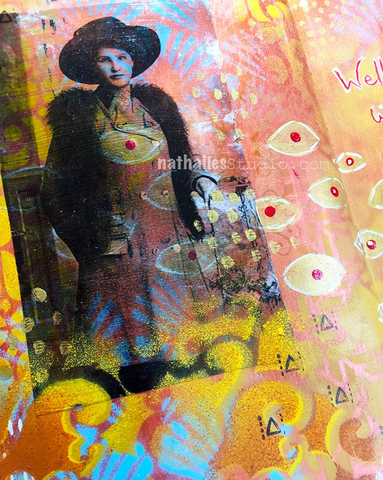
Inspired by Klimt I added hand painted and also stenciled patterns with acrylic paint and acrylic spray paint. I also inked up just part of my Numerals stamp as I thought the triangle would make a great pattern stamp
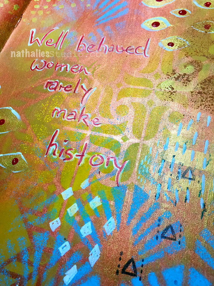
I love how this came out and I wonder if my great grandmother actually liked Klimt – she for sure liked fashion – I have a nice stash of photos of her and she always liked to dress up.
I will post soon how I do indirect image transfers – they are fun and especially work with photos that have bigger areas of white so you have a clear area that works well with the background.
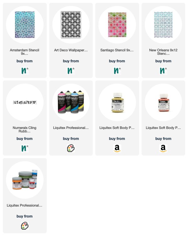
Here are some of the supplies I used for this spread
Love LOVE Love this…colors, photos and quote!
Thank you so much Sue!
LOVE!
Reply