Blog: Art Journal

Workshops at Pratt Institute CCPS – April 2015

PrattInstituteCatalogue


I am super excited to teach two day classes at Pratt Institute CCPS in NYC on the Manhattan Campus in April.

ArtJournaling101

Sunday April 19,   9.30 am – 4.30 pm

artjournaling101

MixedMediaCanvas

Sunday April 26,  1pm – 4 pm

MixedMediaCanvasCat

Find the whole Spring catalogue for Pratt CCPS here

You can sign up at Pratt here

I hope some of you can and will join me – that would be awesome!


Comments (5)

  • Marjie Kemper

    |

    That’s awesome, Nat! What a great venue, and you can introduce art journaling to a whole new crowd. Go, girl!

    Reply

  • sunmoongal

    |

    Wow this is great. Congrats on these classes at Pratt. Super cool. Wish I was there!

    Reply

    • nathalie-kalbach

      |

      Thank you Denise – oh that would be cool to have you there!

      Reply

  • michelle

    |

    WHAT?? This. is . AWESOME!!! Congrats! Killing it in the big city girl! I wish I was there because I would SO sign up!

    Reply

    • nathalie-kalbach

      |

      Thank you so much Michelle! Too bad you are not living in the City anymore!!

      Reply

Leave a comment

Stay Out Of The Drama or … In My Art Journal Today

Natkalbach_OutofDrama01

Some great words to live by.

Natkalbach_OutofDrama02

This art journal spread is one of my faves I did the past couple months – and funny enough it was one of those pages where I was just trying out my new stamps and stencils some other new stuff , and I was using up left over paints and boom – as I was layering and layering I started to really love the grunge and then I dived full force into it and embraced it.

Natkalbach_OutofDrama03

I used some left over Liquitex Super Heavy Gesso from a different project and spread it over the  Stencil in my Kaffee Klatsch Stamp Set to tie the background together.

Here are the supplies I used

nSupplies


Have a beautiful day :) 

Comments (3)

  • andrene

    |

    I love all of the layers and the colors you chose. You are one of the few that can load a page up with that many colors and designs and keep it cohesive, clear and so artistic. Great job!!

    Reply

  • Sue Clarke

    |

    Nice texture and colors. I am “behind” on CJS since I’m waiting for the speakers for our new computer to be hooked up. I’m looking forward to catching up!

    Reply

Leave a comment

Light or… In my Art Journal Today (or yesterday ;) )

Instead of a New Year’s Resolution I, amongst many others, pick a word that I try to live by in the new year. Last year it was BOLD …this year it is LIGHT …next year it might be ITALIC… just kidding ;)

NatKalbach_Light

Light is indeed my word for this year. It is a good word for many different kinds of lights that I would like in my life. I want to take thinks more lightly, travel light, be light and not overthink everything too much, eat light, and …see the light at the end of the tunnel :) Let’s see where this goes!

NatKalbach_Light2

Light is also the page spread in my art journal itself and the time I spent on it. I created it very quick on December 31, 2014 – after contemplating with myself, that I a) have no time because I had to work on last minute stuff for Creative JumpStart  and b) that I have no time because I should really make myself representable for a little party I was going to. Well…Light helped- little bit of acrylic inks with a brush – little bit playing, little bit of acrylic paint on a stamp …and voila- done. And aren’t I glad I did it…it is in there…in the journal- as a good reminder until I fill the book- LOL.

nSupplies


What is your word if you have one?


Comments (6)

  • ljfsyd

    |

    Powerful work of art. Our work reflects our thoughts, our environment. This is where our inspiration comes from and rightly should. What you have created reflects the dilemma in Jersey City, as in many cities within this country………

    Reply

  • Laura

    |

    I have never “taken on a word” in this manner before but going to try it out this year so mine is ” reframe” . :)

    Reply

  • emperessenigma

    |

    Mine is ‘grow’ as in expand my mind, learn new things. Reach and stretch myself out to share with others.

    Reply

  • kristabellerichman

    |

    Mine is “rhythm.” It came to me while listening to Tam’s meditation on day 1, as in a need to pay attention to the natural rhythms and flow of everything this year.

    Reply

  • cabramofsky

    |

    Mine is focus, for this year I am retiring and embarking on an art career.

    Reply

  • nurse-ratchet

    |

    Fab pages ,Nat. I am embracing “imperfection” this year!

    Reply

Leave a comment

Winding Down: My Top Ten Art Journal Pages of 2014

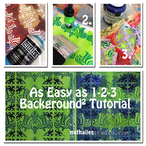
It has become a tradition of mine and other blogger friends to wind down the year with some  Top “insert number”- Lists of work , posts and photos, before the year ends. It makes me go back and look at what I have done and accomplished and it also makes me dwell in memories. Too often we forget about the things we did and accomplished throughout the year- often just bashing ourselves for not fulfilling all the wonderful new year’s resolutions from last year.  Maybe this makes you wanna do it too – if so – share :)

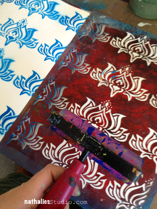
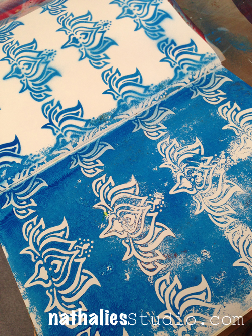
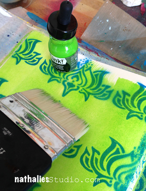
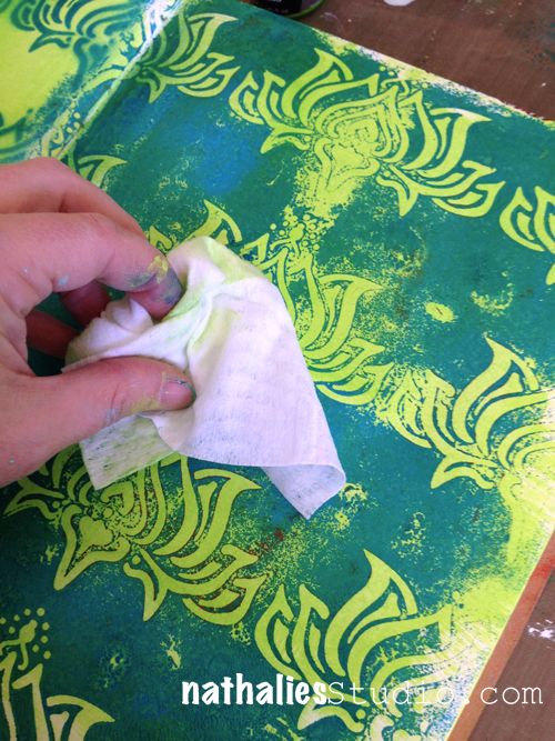
I did a huge amount of Art Journaling Pages this year. –

In no particular order here my personal faves.
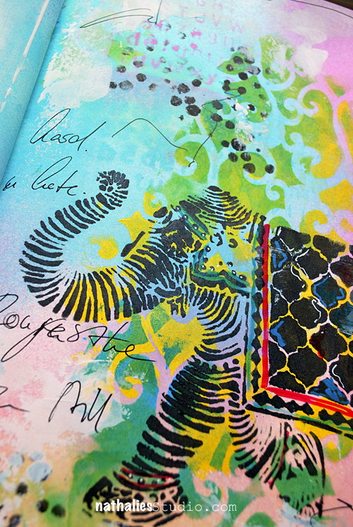
1. Snake Bite

I played more or less with my Stampendous stamp sets and stencils on this page but I do like color combination and how the journaling is part of the background design.

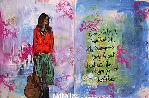
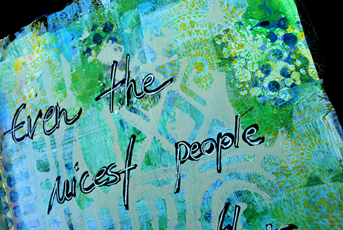
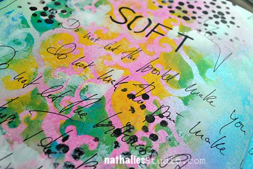
2. The Picture in Our Head

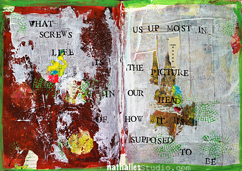
I love the quote and it actually states quite well the process I was going through while I was creating the page. I played a bit with acrylic paint skins here- and I love the out come.
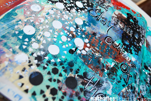
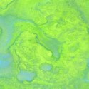
3. Without Art..

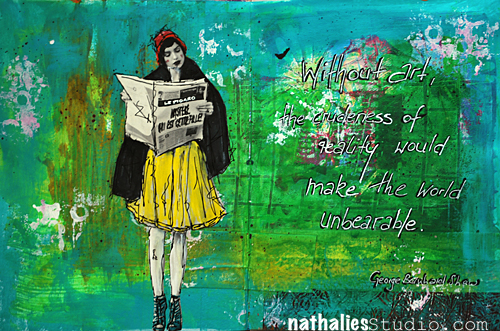
I love the texture I created on this page with gesso and paint  – some parts and areas are definitely something I want to embrace a bit more on canvas. I also like the bits of pink in the sea of green – not something I had in mind as a color combo- but it speaks to me with the yellow-  needs to be more explored :)

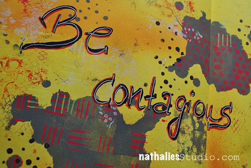
4. Melvin was Outraged

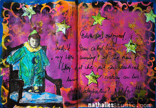
I just had fun playing with this vintage photo and making up a story – it is quite dark and actually not much going on texture wise- but still there are a lot of layers – I like it.

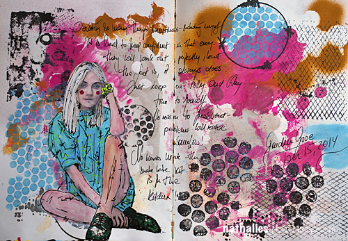
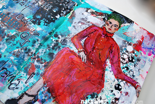
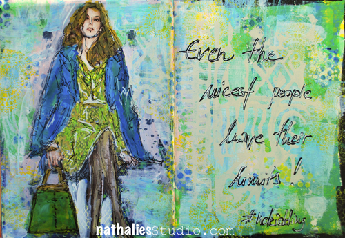
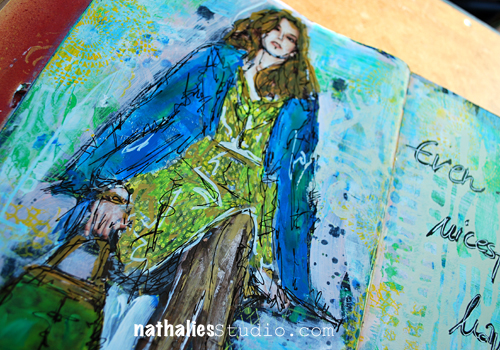
5. She became dangerous

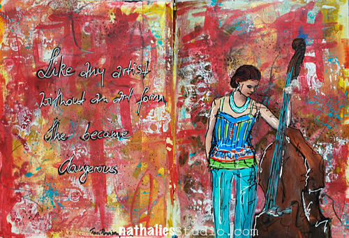
I played with brush strokes and colors – very loosely and besides a tiny bit of stamping that is all that there is in the background- I was surprised how much I like it and how freeing this felt. Another way of creating a background I would like to explore a bit more on a bigger substrate.

6. If Not Now

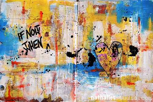
Here I played with dry and wet brush strokes and also texture- and I love the quote. I like simplicity of it …I mean…in the process- hahahaha ;)

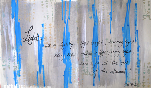
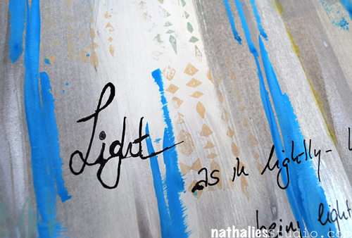
7. When the Why is Clear

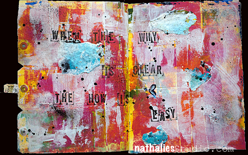
Another page where I played with brush strokes and acrylic skins. I love the black acrylic paint dots – they tie everything together.
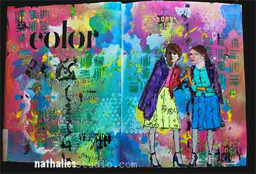
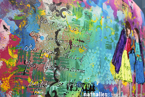
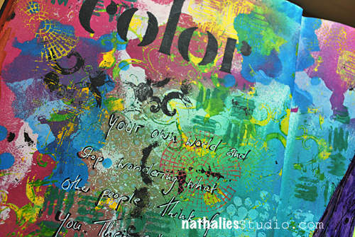
8. Intelligence

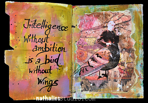
this one is a another sample of trying out a color combination which I would have not thought would really work and I totally dig it :) I like this page also because of the texture, the transfer techniques I explored and the materials I used. Again something I would like to explore more on a bigger substrate- but actually this makes me think of a shadowbox.

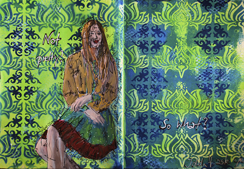
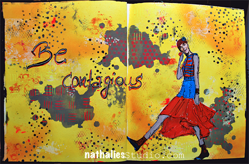
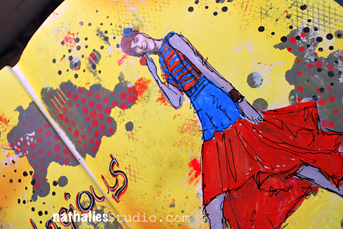
9. No ONE Way to Art

and yet another page with an unusual color combination for me – I also like how I used the brush to create textured elements- another element I would like to explore a bit more.
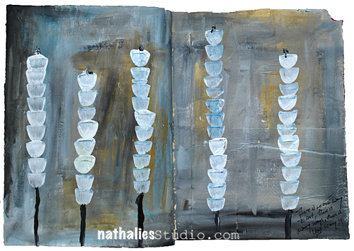
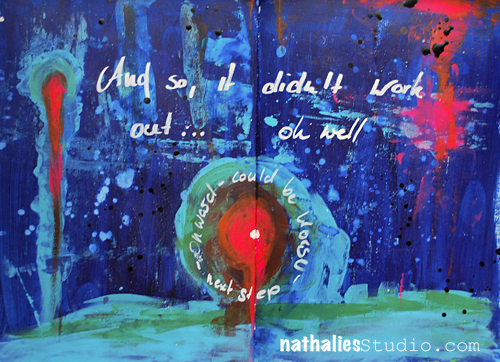
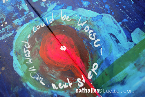
10. Not a Battle

I do like the texture and the depth I created in this page playing with the translucency of different acrylic colors – again something that I will explore more in the future.

—-

What I learned:

I really embraced art journaling as a way of creating something that doesn’t require an awful lot of time, a creative push in the morning, and trying out techniques, materials and color combinations. I used it a lot to explore things that I have seen in paintings at MoMA or other museum and that interested me. I also learned a lot about brush strokes,  and exploring different opacity/translucencies of acrylic paints.


My goal for 2015:

I want to take out some of the things I learned and explore them more on different substrates. I need to take the time to embrace the things more. I also want to play more with unusual color combinations – it felt good to step away from my usual color culprits ;)

Hope you enjoyed this little art journal journey – and …just a little heads up :) If you want to learn how I do the magazine and photo images, and also see more about how I build up Art Journal Pages– you can see and learn that in Creative JumpStart 2015 – so sign up , if you haven’t yet!


have a gorgeous day


Comments (5)

  • maura

    |

    Love the variety of pages, colors, images…I agree, art journals are great for playing with ideas! Fun to see your creative resolutions!

    Reply

  • Marianne Johansson

    |

    Love all your journals, in different ways!
    Wishing you a fabolous creative New Year!
    Hugs!

    Reply

  • Susan Schultheis

    |

    Love your fave art journal creations. Did you hand draw all the girls on these pages? If not, where do you find these girls. They do not seem to be the usual ones you find in mags? It wouldn’t surprise me if you drew them yourself because you are such a great artist, but just in case I could use your inspiration, I could not hand draw much of anything.
    Thanks for your response. Sue

    Reply

  • Sue Clarke

    |

    No ONE Way to Art just grabs me!

    Reply

  • Seth

    |

    Wonderful grouping of journal spreads Natalie. A varied selection that all have your signature style.

    Reply

Leave a comment

No Kidding or … In my Art Journal Today

HA- you thought I do nothing else than working for Creative JumpStart and CHA at the moment, right? Well…yes …you are right, but hey- look I had time for a tiny bit of art journaling – it is a good outlet :)


NatKalbachNoKidding01

Journaling: Even the nicest people have their limits! #nokidding

NatKalbachNoKidding02

Playing with Liquitex acrylic paints, spray paints and markers. The background was already kind of done as a demo page during a workshop- I added a couple of my new stamp images- can you spy them and spray painted over my Batik Stencil.

NatKalbachNoKidding03

Here is a list of the supplies I used:

nSupplies


Have a gorgeous day!

Nat

Comments (1)

Leave a comment

Oh Well… … or In My Art Journal Today

NatKalbach_OhWell01

Back from Germany – what a fun but way too short trip. I took a short moment to play a bit in my art journal – such a great way to deal with things that sometimes are not the most pleasant ones.

Onward!

NatKalbach_OhWell03

For this spread I really loved playing with this color combination.

NatKalbach_CC03

Here is what I used:

nSupplies


have a wonderful week!

Comments (4)

  • Sue Clarke

    |

    Can’t say that I would have thought to mix those colors together but they go nicely. Reminds me of Starry Night. Glad that you made it home safely Nat.

    Reply

  • Madeline Rains

    |

    This is truly one of my favorite of your pages ever (and I’ve been coming here for years) I love the color combo and the emotion behind it is really powerful with that focal image. Love it!

    Reply

  • jackiepn

    |

    Welcome home and hope your trip and time spent were wonderful! xo

    Reply

Leave a comment

As Easy as 1-2-3 Background² Art Journal Page

NatKalbach_NotPretty

A couple days ago I showed a tutorial on how to create an easy background in your art journal 

NatKalbach_Easy123Background

and I promised to show what I would do with the result later. I just added a bit of stamping over both pages to tie it together, added the image , painted it with markers and then added the journaling. It was a quick but liberating art journal spread.

Here are the supplies that I used after I created the initial background:

nSupplies


I hope you liked seeing the transition :) Have a wonderful day


Leave a comment

As Easy as 1-2-3 Background² Tutorial

NatKalbach_Easy123Background

Today I am showing you how to make a background- actually two different backgrounds – for an art journal spread as easy as you count to 3…or almost as easy ;)

NatKalbach_Easy123Background01

Picking my art journal, my Lily Wallpaper Stencil and Liquitex Spray Paint I start by spraying over the stencil over the left spread of my art journal.

NatKalbach_Easy123Background02

Using the paint on the stencil for a negative imprint, I simply flip the stencil over to the right side and brayer over the back of my stencil

NatKalbach_Easy123Background03

You can use the flip over step of course on a total different spread- because essentially these are actually two different background starters with the same techniques and materials. But I like to work in a double spread on my art journal and I like it when the sides are similar – like here in pattern, but still have  some interesting differences.

NatKalbach_Easy123Background04

Using a big brush I spread a thin layer of Acrylic Ink over the spread. I love how the effect  – on the left side the lilly design is more bound in

NatKalbach_Easy123Background05

while on the right, by taking some of the ink off with a baby wipe, the blue spray paint color pops even more.

NatKalbach_Easy123Background06

I picked the same blue as a Soft Body Acrylic Paint as I used as a Spray Paint (Phthalocyanine Blue (Green Shade) for the next step. Layering my Ornament Stencil over the empty spaces of my Lily Background I stenciled single ornaments in.

NatKalbach_Easy123Background07

And done is/are my background(s)

NatKalbach_Easy123Background08

Here is the background 1 …and

NatKalbach_Easy123Background09

Easy, wasn’t it? I will show you in a couple days, what I actually did in my art journal with these two backgrounds.

Here is a complete list of the supplies I used

nSupplies


Have an amazing day


Comments (6)

  • Christy Tremblay

    |

    REALLY Cool!!!
    I am going to have to try this. Thank you for sharing and the nice pictures!

    Reply

  • sécotine La Petite Française

    |

    thanks so much for sharing your amazing work!!! love to play with the transparences of liquid acrylic paint!

    Reply

  • Sue Clarke

    |

    Sweet and you make it look so easy.

    Reply

  • Jani Franck

    |

    I love how the layering works – gorgeous technique, thanks for sharing :)

    Reply

Leave a comment

Lindy’s Stamp Gang Guest Design Projects

In September I was a featured guest designer for Lindy’s Stamp Gang – and here are the samples I made using the Lindy’s Stamp Gang Spray Inks for their blog.

NatKalbach_LSG_Elephant01

My favorite way to use Lindy’s Stamp Gang Spray Inks is in conjunction with Liquitex Acrylic Paints. I just love how the two working together make the colors pop.

I used some acrylic paint colors with some of my StencilGirl Products designs for a background.

NatKalbach_LGS_Process02

Once dried I sprayed the different colors of the Under The Boardwalk Set over it and blended the colors using a paper towel.
NatKalbach_LSG_Elephant02
For the finish I wrote some journaling and stenciled a bit more on top using Lindy’s Stamp Gang Spray Inks but also some acrylic paint.
One of my favorite features about Lindy’s Sprays is that they are permanent once dried and that you can actually spread some gesso or other paint media on top of the colored surface without deactivating the spray ink.
NatKalbach_LSG_Elephant03
 I also love to use my Stampendous Stamps and templates with acrylic paint and start layering those up on the surface.
NatKalbach_LGS_BeContagious01
For Be Contagious I used some of the templates in my stamp sets with acrylic paint and then sprayed with Lindy’s Stamp Gang Spray Inks over it-
NatKalbach_LGS_BeContagious02
I love how it makes the background pop.
NatKalbach_LGS_BeContagious03
 In my Color Art Journal Spread I went a bit crazy- you can tell I love colors.
NatKalbach_LSG_Color01
 I alternated acrylic paints and Lindy’s Spray Inks with my Stampendous Stamps and Templates.
NatKalbach_LSG_Color02
I love how I was able to use so many different colors and it didn’t turn muddy.
NatKalbach_LSG_Color03
I had lot’s of fun playing with Spray Inks and Acrylic Paints :)
nSupplies


have a colorful day :)

Comments (2)

Leave a comment