Blog: Art Journal

NOT a Battle … or In My Art Journal Today

NatKalbach_NotABattle01

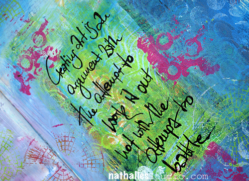
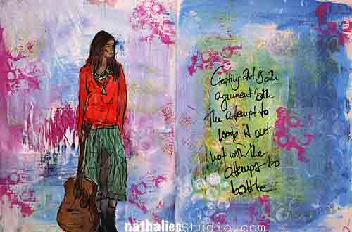
Creating art is an argument with the attempt to work it out, not with the attempt to battle. (smarty pants Nat)

This is my view on creating art and using art media  .

NatKalbach_NotABattle02

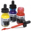
Lot’s of soft color layering and stamping -Journaling written with Bamboo Sketching Pen and Acrylic Ink.  I like how this turned out.

here is what I used:

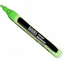
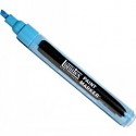
nSupplies


Hope you have no battles today :)

Comments (3)

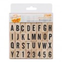
  • Stampendous Stamps

    |

    Nathalie, this is just gorgeous! The colors are so vibrant and yet calming! Love your quote for the day, good advice for all! Thanks for sharing with your terrific stamps you designed for us!

    Reply

    • nathalie-kalbach

      |

      awee- thank you so much! I love my stamps – thank you for making my dream possible :)

      Reply

  • Jackie P Neal

    |

    Beautiful spread Nat! xo

    Reply

Leave a comment

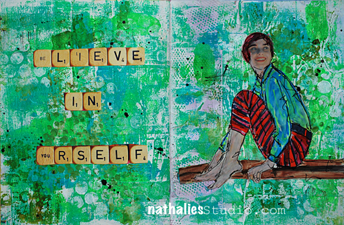
Believe in Yourself … or In My Art Journal Today

NatKalbach_BelieveInYourself01

The one thing that gets in the way once in a while- I think we all have a good fair to deal with this :) If not- kudos to you – LOL


NatKalbach_BelieveInYourself03

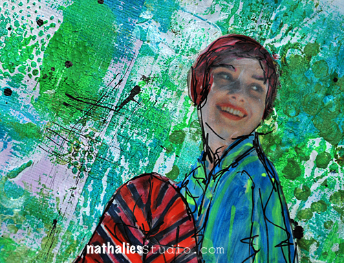
Lot’s of texture with Gesso on the background – then scraped lightly some Soft Body Acrylic Paint over it to have white peek through and also to reveal the texture more. Stamped and Stenciled with Soft Body Paints and then played a bit with markers :) Fun – easy and a good way to have a short creative session on an otherwise busy computer day . Not all projects you do need to be super elaborate – allow yourself to just play for a couple minutes.

Here is what I used

nSupplies


Have an amazing day today!


Comments (5)

  • rockmelon

    |

    yep, i agree, self belief can sometimes be tidal, waxing and waning…

    Reply

  • Sue Clarke

    |

    Nat, did you use real Scrabble tiles? It’s hard to tell on this pic.

    Reply

    • nathalie-kalbach

      |

      Hi Sue, no those are actually out of a magazine- but you could def use real ones from an old discarded game for other projects. I fear they would be a bit to thick in dimension for an art journal.

      Reply

  • Laura S

    |

    After seeing your gorgeous textured page, I’m going to go break out the acrylics and my new Liquitex markers, right now! Have a fun Sunday :)

    Reply

    • nathalie-kalbach

      |

      woohooo- so cool!!! hope you had a fun time. Have a great start into the week!

      Reply

Leave a comment

Loved Stars Too Fondly … or In My Art Journal Today

NatKalbach_LovedStarsFondly01

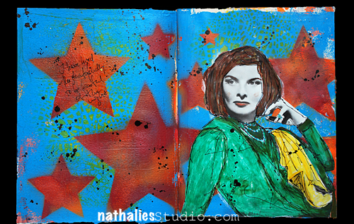
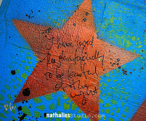
I have loved the stars too fondly to be fearful of the night. – Sarah Williams

NatKalbach_LovedStarsFondly02

Lot’s of texture in the background, some stenciling in the background, then using a star stencil with a conrasting color. Loved adding some black splatters :)

Here are the supplies I used:

nSupplies


Wishing you an amazing day


Comments (4)

  • Laura S

    |

    Hello Nat! Love this page and the boldness of the red stars.

    Reply

  • Sue Clarke

    |

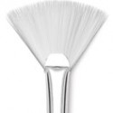
    I also like the black splatters Nat. Do you use the fan brush to make them?

    Reply

    • nathalie-kalbach

      |

      Hi Sue, those were made with the Liquitex Splatter Tool – totally forgot to list it. I usually use black Acrylic ink to make them.

      Reply

Leave a comment

Sometimes you learn … or In My Art Journal Today

NatKalbach_YouLearn01

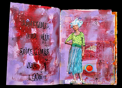
Sometimes you win, sometimes you learn

– isn’t that the truth ? – LOL

NatKalbach_YouLearn02

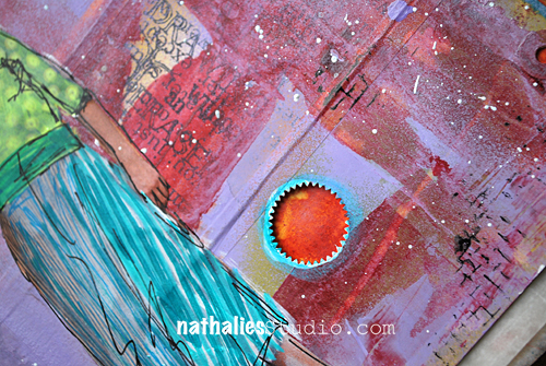
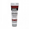
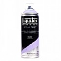
I painted the collaged background with Alizarin Crimson Hue Permanent acrylic paint, then spray painted over with Light Violet.

NatKalbach_CC02

Not a color combo that is usually in my repertoire but I liked how it turned out and added a couple white sprinkles too it.

NatKalbach_YouLearn03

Here is what I used:

nSupplies


Does this color combination speak to you? :) 

Have a wonderful day


Comments (3)

  • Sue Clarke

    |

    I like the color combo on your page. I wouldn’t have thought to use those colors together. I do use the purple and red together a bunch. Have a delightful day Nat.

    Reply

  • Madeline Rains

    |

    you know, I would never have thought it would but it really speaks to me because your page is so good. love it.

    Reply

  • muriel

    |

    I wouldn’t have dared this colour combo but it’s really great. Your journaling reminds me of a journal page I did at the beginning of the summer which said:”Sometimes you fail.” But I remember not feeling negative about the failure; it was sort of “I failed, yes, but life goes on.”

    Reply

Leave a comment

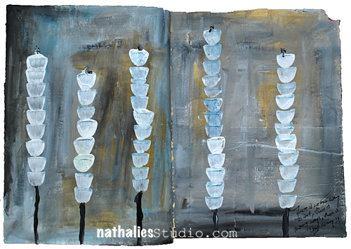
No ONE Way to Art … or In My Art Journal Today

NatKalbach_YourWAY01

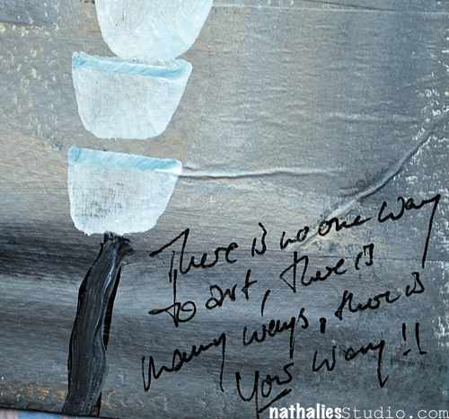
There is no one way to art, there is many ways, there is YOUR way!

NatKalbach_YourWAY02

I was experimenting a bit with a different color combination here and I really like the outcome.

NatKalbach_CC01

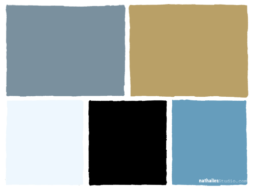
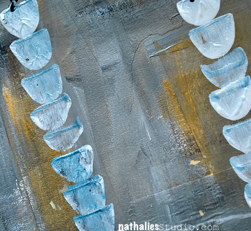
I used Liquitex Soft Body Paints: Titanium White and Mars Black to mix a grey, and mixed the Bright Blue with the Titanium White to mix a lighter blue. I also added Iridescent Bright Gold to the page. I love how it came out.

NatKalbach_YourWAY03

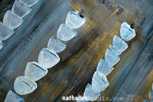
I did sculpt the plants a bit with the brush – most of the background texture however comes from the masking tape that was layered to the paper.

NatKalbach_YourWAY04

Here is the supply list

nSupplies


I am using grey a lot lately- is that a color that you often use?

Nat

Comments (12)

  • Lisa Flaherty

    |

    I bet this is really striking in real life with that gold iridescence! Great color combo and texture. I love grey. I wear it all the time, but don’t find myself creating with it too often. That needs to change!

    Reply

    • nathalie-kalbach

      |

      Glad I made you think about using grey in your creative projects ;) have a wonderful week!

      Reply

  • Kim

    |

    Love the handling of the background! Now you have to go check out the Cy Twombly piece on display in the Morgan Library: Treatise on the Veil. It’s 33 feet of delicately worked gray. And when you’re finished taking in all the gray, they have a lovely sun drenched cafe area :)

    Reply

    • nathalie-kalbach

      |

      Awesome tip- Kim! I will put this down as a NYC on the bucket list must :) have a great day!

      Reply

  • nathalie-kalbach

    |

    sounds like you like grey a lot- I am sure it will find it’s way soon on a layout too :))) thank you for leaving a comment, nat

    Reply

  • Miae

    |

    Just breezing through blogs and this totally caught my eye! I’m so attracted to the background colors with the pops of white….do I use grey? Not very much on my layouts but I love it elsewhere. My whole livingroom is painted a warm grey against white….yum!

    Reply

  • Sue Clarke

    |

    This page is so different for you and I love it.
    I never use grey and I love these colors together.
    Thanks for the reminder to try something completely different!

    Reply

  • Laura S

    |

    I too thought you were using a stencil. I love how this page turned out!! It’s really beautiful. I love the colors especially that pop of gold. I am going to have to play with this palette!! I think you need to lay this one down on canvas :)

    Reply

    • nathalie-kalbach

      |

      mmmhhhh- on canvas- that is a really good idea I think I will try this soon. Thanks for triggering that idea, Laura ;)

      Reply

  • muriel

    |

    Aaah, love love love! At first I thought you’d been using a stencil for your plants! The colour combo is so great! I hardly ever use grey or if I do I often end covering it with more intense colours. I’m sure you had a great time doing this.

    Reply

    • nathalie-kalbach

      |

      Thanks muriel– LOL- nope no stencils used. And yes, as you I usually tend to be drawn to the more intense colors- but this was fun!

      Reply

Leave a comment

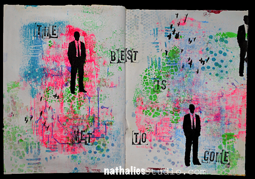
The Best Is Yet To Come … or In My Art Journal Today

NatKalbach_BestToCome01

The best is yet to come – Frank Sinatra

I truly believe in that ..do you ?

NatKalbach_BestToCome02

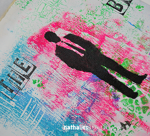
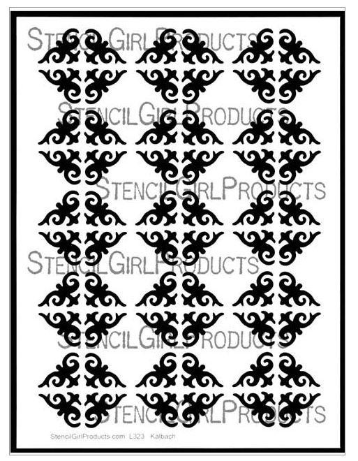
This page is actually kind of a cheater page. I love just rubbing the extra paint that I have on my stencils onto a blank page – creating a negative stencil image.Sometimes I paint over parts of it later or do other things with it. But I really loved the colors and how this looked on this spread- so I left as is and just stamped and stenciled in black on top.

Here are the supplies I used- some of the stencils are actually part of the stamp sets for Stampendous

nSupplies


Have the best day today :)

Comments (3)

  • Denise Spillane

    |

    Love it and believe it! Reminds me of the song I think it was Frank Sinatra, wish I was in another of your classes.

    Reply

    • nathalie-kalbach

      |

      Actually that is where the quote came from- forgot to mention that. Thanks Denise for the reminder :)

      Reply

  • Sue Clarke

    |

    I think that believing the best is yet to come puts one in the frame of mind to experience just that! Have a lovely day Nat.

    Reply

Leave a comment

Think … or In My Art Journal Today

NatKalbach_Think01

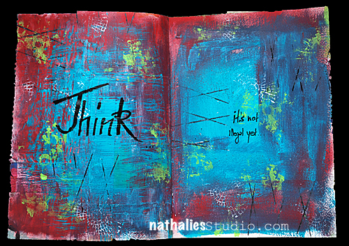
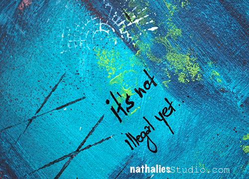
Think! It is not illegal yet…

I would like this as a T-Shirt- LOL

NatKalbach_Think02

Lot’s  of texture and sgraffito with Liquitex Heavy Body Paints accompanied with some stamping on this  spread. An easy and fast page but nonetheless a lot of fun.

NatKalbach_Think03

Here are the supplies I used to create this art journal spread

nSupplies


Hope you have a wonderful day today

Comments (2)

  • Laura S

    |

    This would make a great T-Shirt. Agreed!! It would be darling with jeans, red scarf and black boots. Love the colors.

    Reply

Leave a comment

Ornament Wallpaper – NEW STENCIL

OrnamentStencil

Here is the last one of my new five Stencils I released with StencilGirl Products. This 9x 12” Ornament Wallpaper Stencil –  was also inspired by my workshop travels to China and Malaysia in 2014 where I saw ornamental patterns in all kinds of shapes and forms in temples, wall decor and paintings.
Nat_donthate01

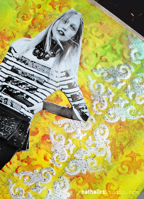
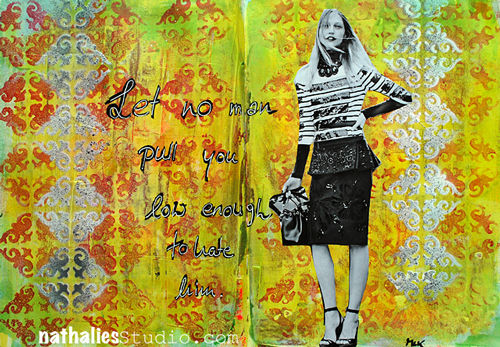
For this art journal spread I used Liquitex Spray Paint over the Ornament Stencil, when I let it dry and used some Liquitx Acrylic Inks over the background. I love how it makes the colors pop.
Nat_donthate02
Once that was dry I used again spray paint and this time only stenciled a band of a couple of the ornaments on each side of the art journal spread.
I will show a couple more projects using the new stencils- also how you can use them together for some new designs :)
Hope you like this one too.
Here is a list of supplies used:
nSupplies


Wishing you a wonderful and creative day!
Comments (2)

Leave a comment

Lilly Wallpaper – New Stencil

LillyWallpaperStencil

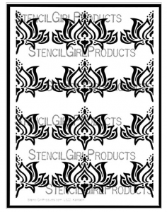
Here is another of my new Stencils I designed for StencilGirl Products. This 9x 12” Stencil is called Lilly Wallpaper Stencil-. This design was inspired by my workshop travels to China and Malaysia earlier this year. I saw Lilly’s in all kinds of shapes and forms in buddha statues, wall decor and paintings – I loved it.


Kalbach_Lillyq1

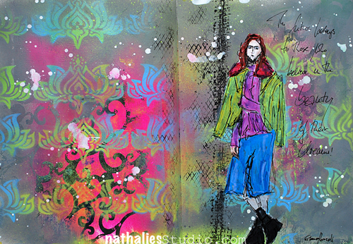
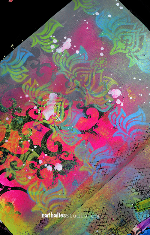
For this art journal spread I prepared the background using different colors of Liquitex Spray Paint over my Arabesque Stencil . Then I used Neutral Grey Spray Paint and sprayed a loose frame around the spread.

Kalbach_Lillyq2

Then I layered the Lilly Wallpaper on top and sprayed with two different colors over for a layered Lilly look.

Hope you like my new Lilly Wallpaper Stencil- more projects using it to come soon.

Here is a complete supply list:

nSupplies


Have an most amazing day!
Comments (2)

  • Sue Clarke

    |

    I really must try those spray paints. They are not cheap and I’m trying to decide which colors to start with…another nice stencil Nat.

    Reply

Leave a comment