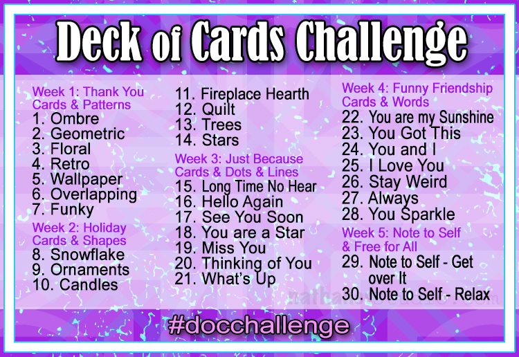
Today I am recapping Day 10 and 11 of my Deck of Cards Challenge that is running all month long on Instagram. Join us for some fun and relaxing card making!
Here is an overview of Prompts10 and 11:
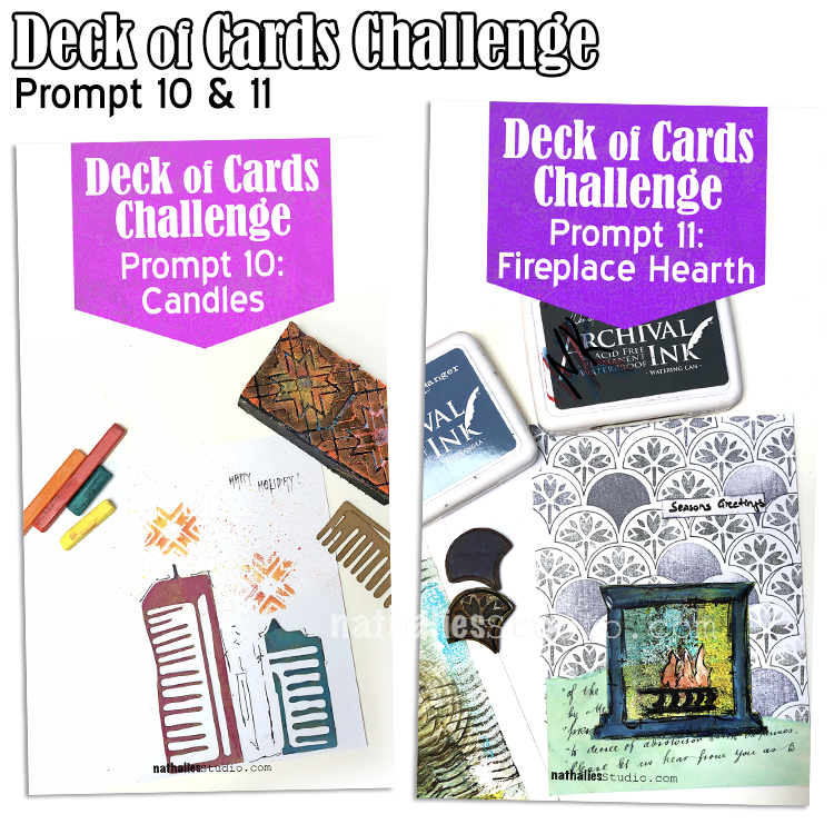
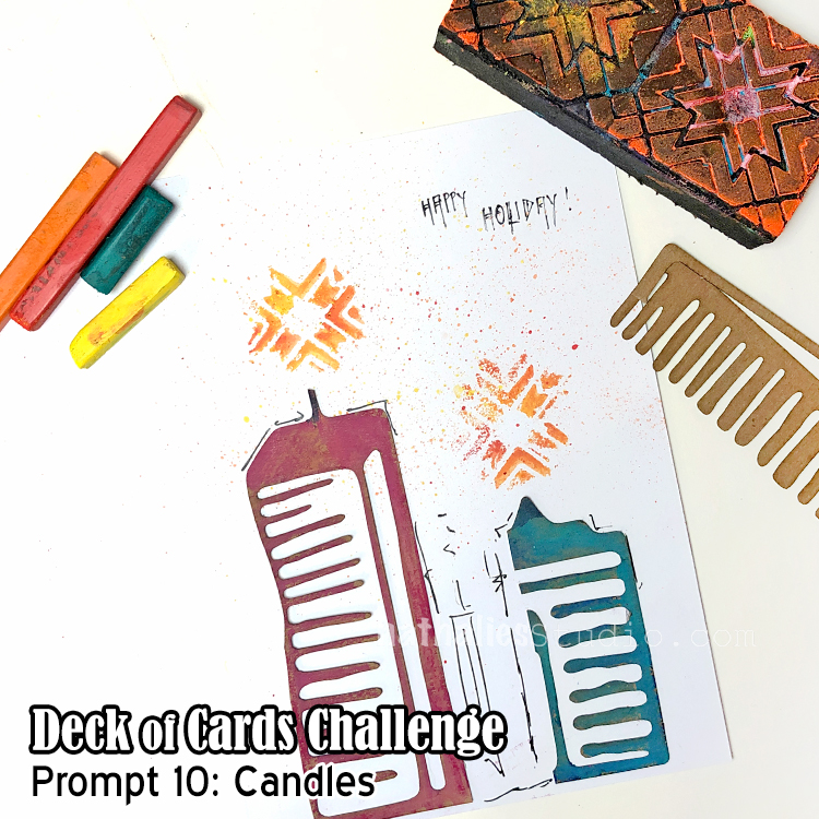
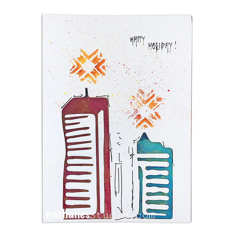
Day 10 – Candles
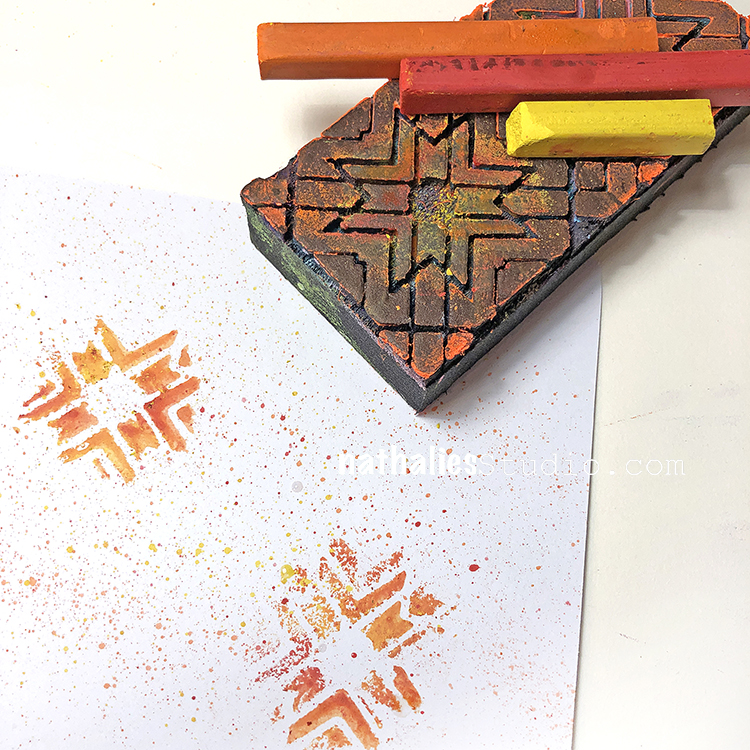
Here we are making a card for the Deck of Cards Challenge that is all about bringing light to the holidays. I used Derwent inktense blocks and rubbed those on my Mixed Media Chips and then with a wet brush diluted them. I rubbed some on the top later – undesolved it has more texture.
For my Toledo foam stamp I also used the blocks and just rubbed them on the area I wanted to stamp for the “flame” – then I used a wet brush to activate and stamped. I also loaded up some inktense on a wet brush and flicked some droplets around on the card. Hope you give some of these inktense block techniques a try too!
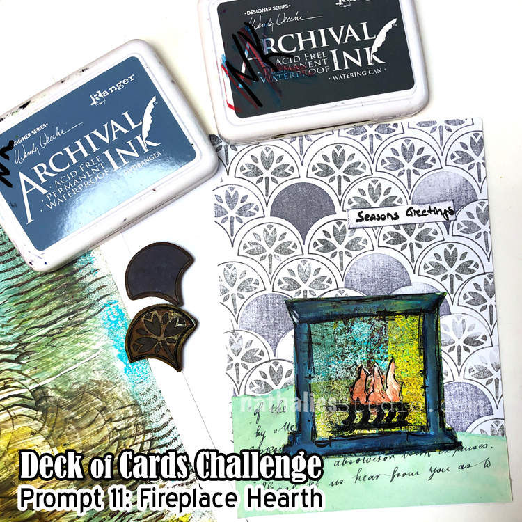
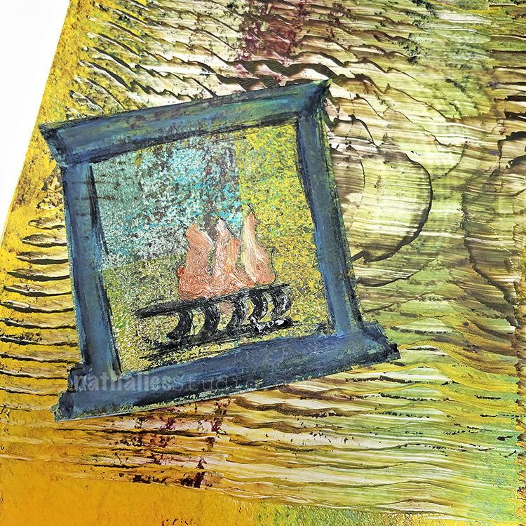
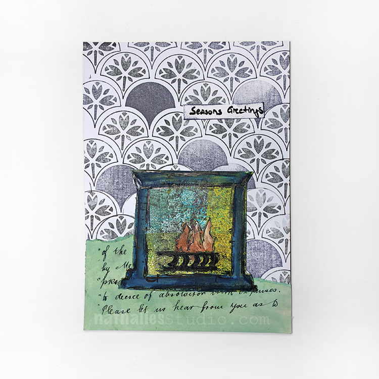
Day 11 – Fireplace Hearth
Today we are gathering around the hearth – something my family loves to do as soon as it gets cold outside.
I used some monoprinted collage paper I had in my stash for the fireplace and added some elements on top to create the warm and cozy scene.
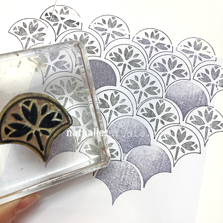
For the wallpaper-esque background I stamped my Jewett Fantastic rubber stamp and the Solid Fan stamp. The old letter piece at the bottom is inked up with some green Oxide distress ink. Where do you gather when it is time to wish Seasons Greetings?
Tune in for more card making fun and I hope you share what you are working on using #docchallenge
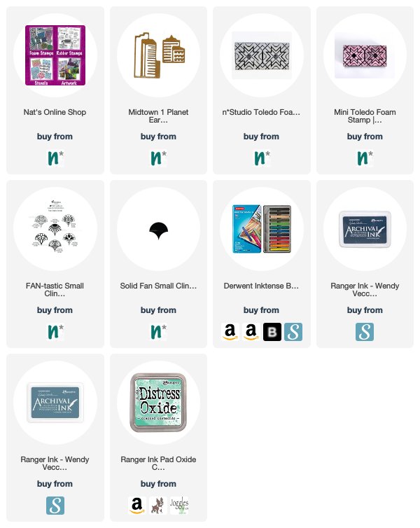
Here are some of the supplies that I used in these prompts:
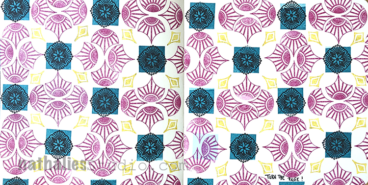
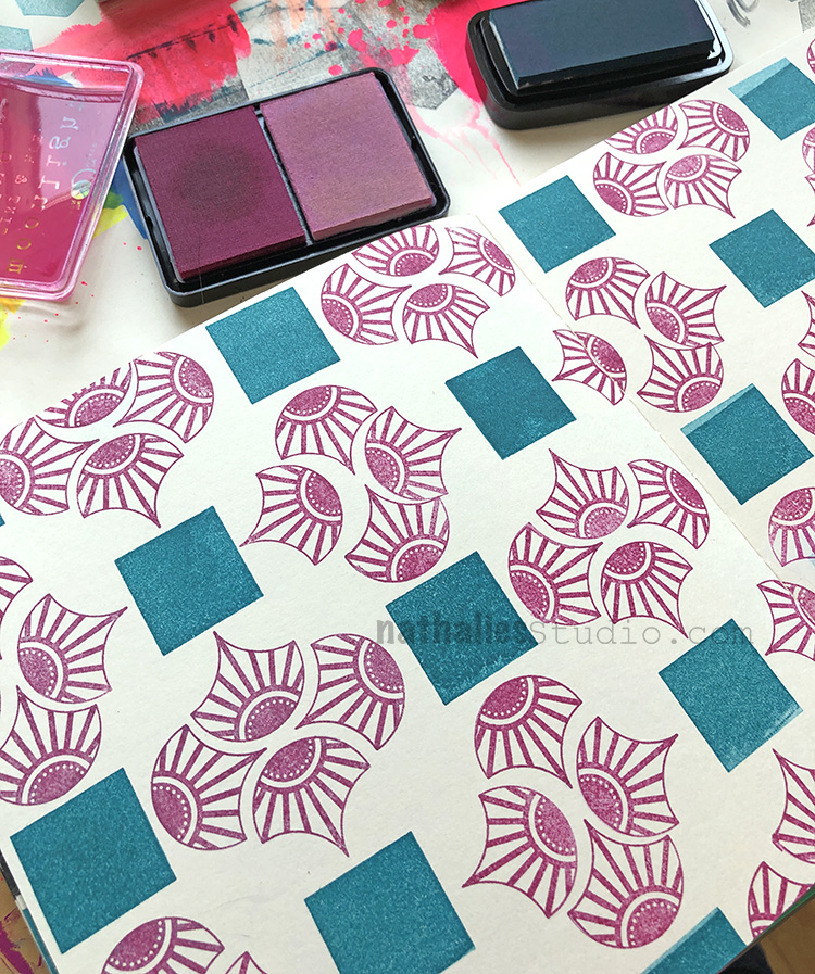
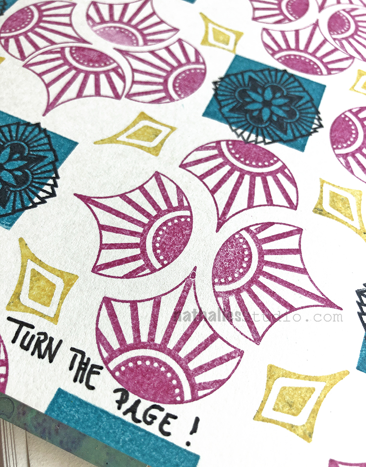
“Turn the Page!” – Sometimes it is time to move on to the next adventure in life :)
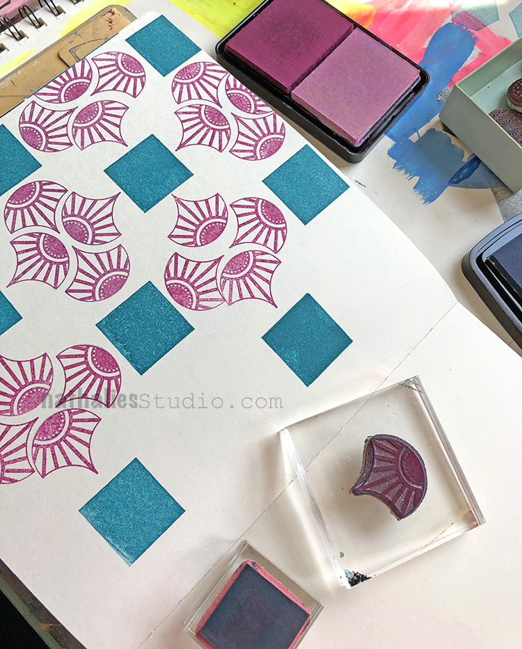
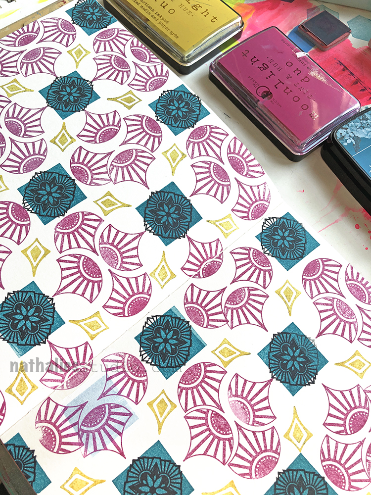
For this art journal spread I built up a patterned background using some of my rubber stamps and a happy selection of ink pad colors. I started with my Fantastic Small and Solid Square Small stamps…
I alternated the direction of the fans as I went and filled the page.
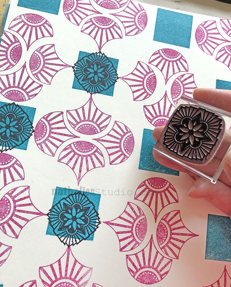
Next I added one of the Hamilton stamps from the Floral Tile Small set…
And the finishing touch on the pattern was one of the Fanfare stamps – these are perfect for giving a pattern those little elements that bring it together.
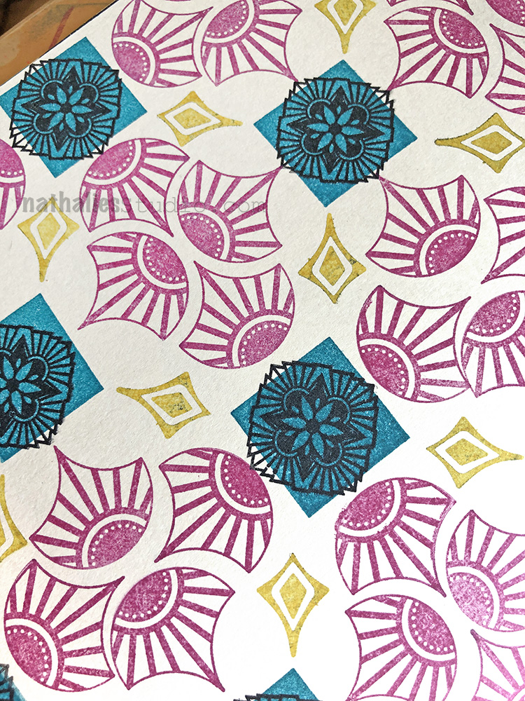
Look at that lovely pattern! Well….
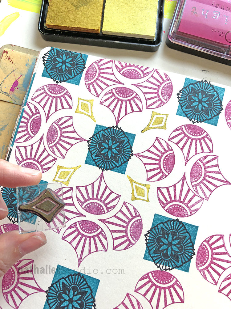
Oops. Can you spot the mistake? That’s what happens when you set your stamping block down the wrong way on your nice art journal background and it leaves a little ghost square. Oh well, it happens.
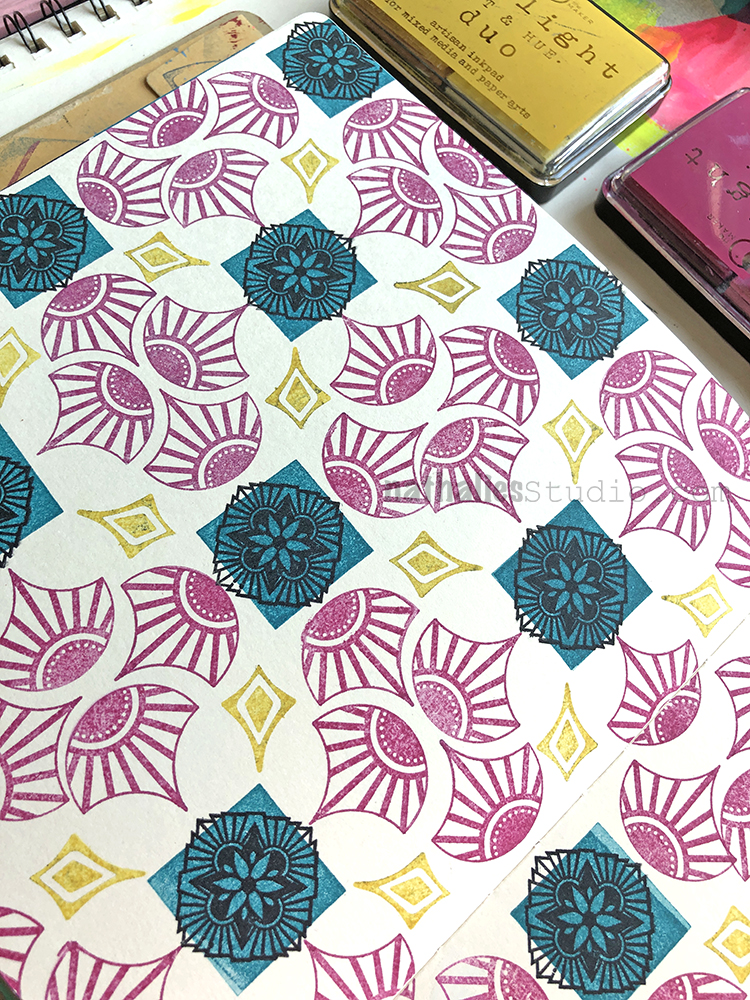
Time to focus on the positive :)
…Knowing we can always “Turn the page” in the end and start anew.
I love the pattern and the colors you used Nat. I never get stamps on the paper the way I want to. It is better when I stamp on a mouse pad or something like that but I’m just never satisfied with the final product. Yes, I see your creative “mistake”. ;-)
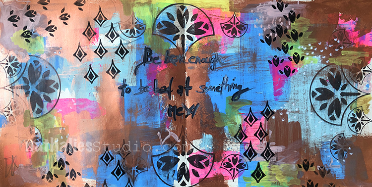
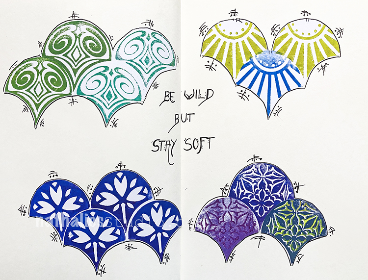
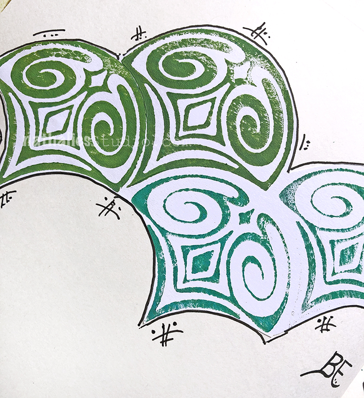
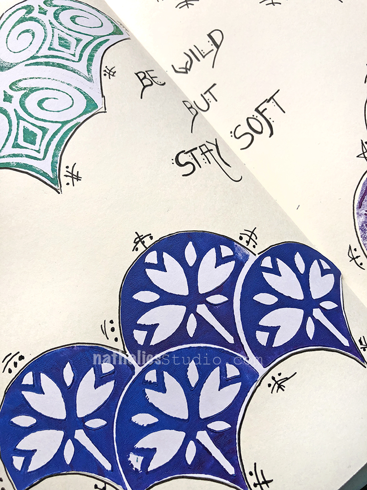
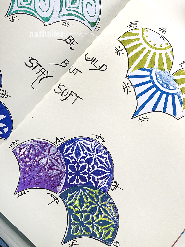
“Be bad enough to be bad at something new.” – This quote totally makes me wanna just go for it when trying something new. Who cares?!
This one is all about yummy layers. I started with a thin layer of Holbein gouache, and stamped with my Fanfare and Fantastic Small and Large rubber stamps.
Then I dry brushed the copper paint (I made the paint in this class) over parts of it after stamping, added some markmaking and journaling with markers.
I love the play back and forth with all the layers.
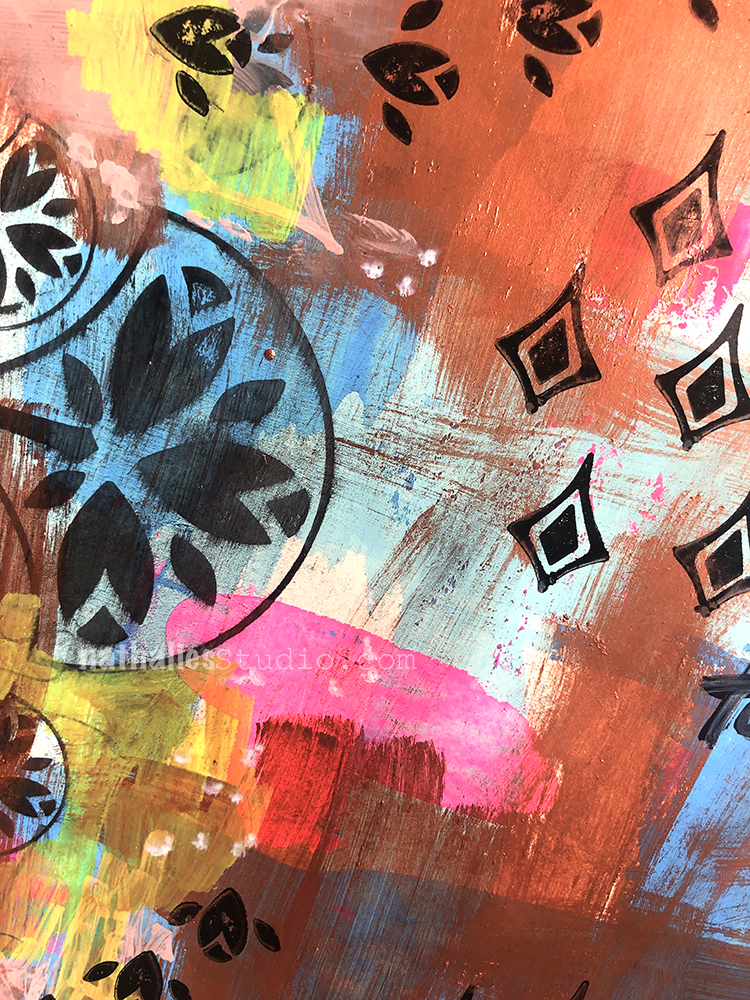
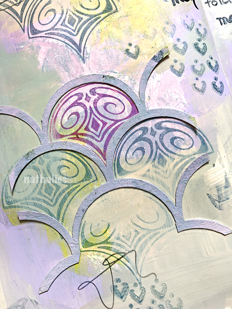
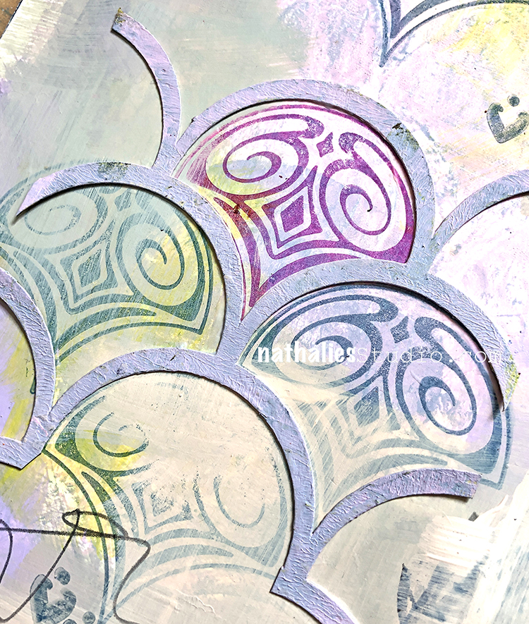
For this spread I stamped out my new fan foam stamps with acrylic paint onto some white paper, cut them out, and collaged them into my art journal. Here is my Fairview Fan Positive Negative stamps.
And here is one of the stamps from the Jewett Fan Positive Negative pair. I went back into these elements with a bit of dots and marks using the new Winsor Newton fineliner pens – which I am super impressed with btw and links are below for them if you are also a fan of good fineliners :)
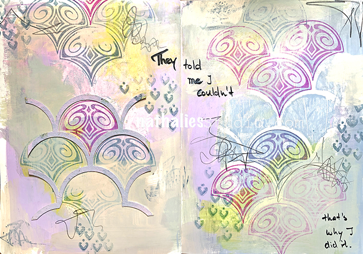
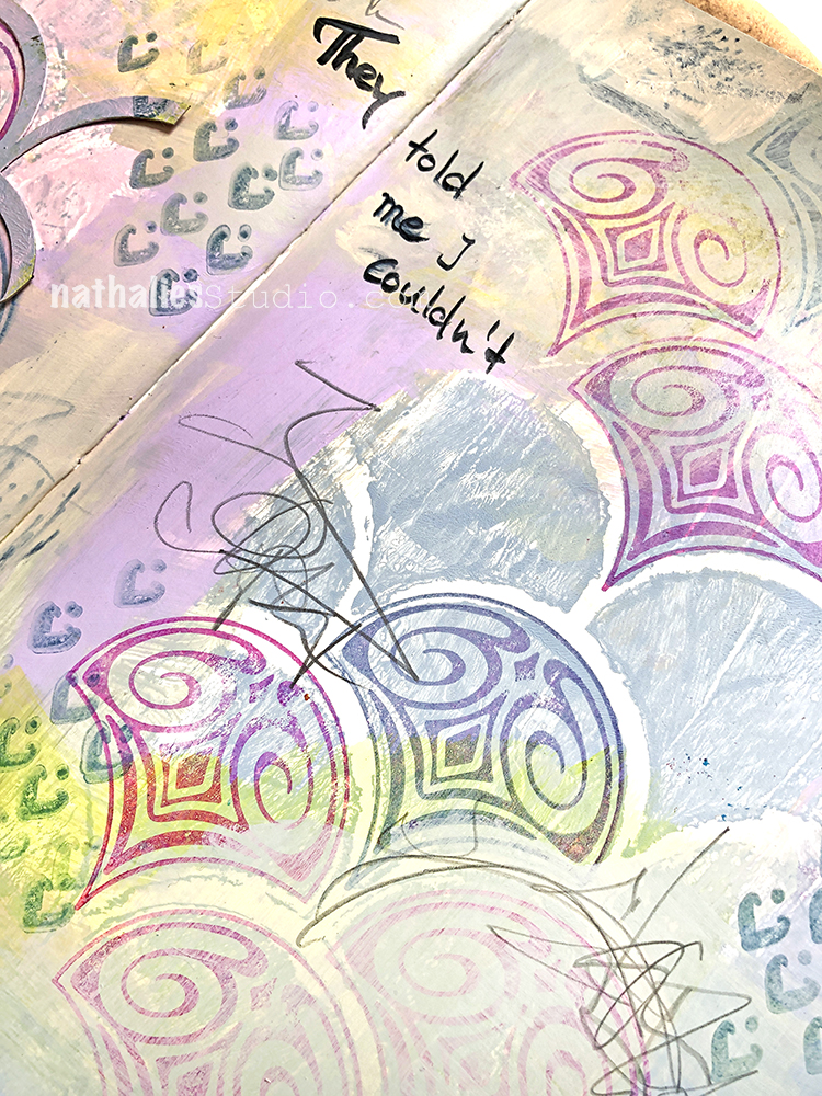
In this case, you shouldn’t really show stuff on social media you are not happy about and so that’s why I do it hahahaha. Because it is all part of the process …the good , the ugly and the in between.
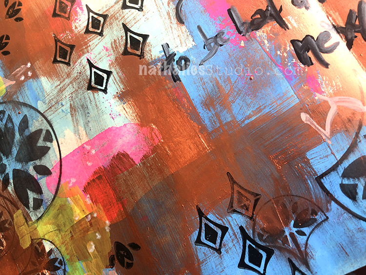
I added paint and stamped with my FANtastic Large rubber stamp set and my Fanfare stamp set.
At the end I took matte medium and adhered part of the mixed media chip right into it all, framing the stamped fans and giving a bit of texture to the page.
There are elements of the page that I really like – like the monoprinted area and the chipboard as well as the muted stamping but then there are others that I DO NOT LIKE. Basically the colors are totally out of my comfort zone and the very rigid pattern of the chipboard and the stamps was competing with the messiness of other areas. Sometimes that works but here for me it didn’t . It was fun to play though …and sometimes just showing up and doing something creative is ok too …
at first i thought this was a guest post because these are not your colors, Nathalie. great job going waaay out of your comfort zone. i like bold, jewel-toned colors … mostly blues and violets and i can stretch to add reds and greens. you inspire me to go create with pastels and all shades of yellow and orange, thank you!
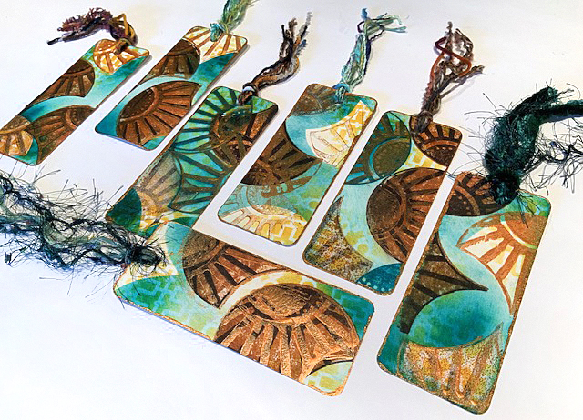
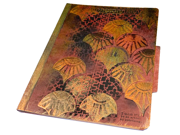
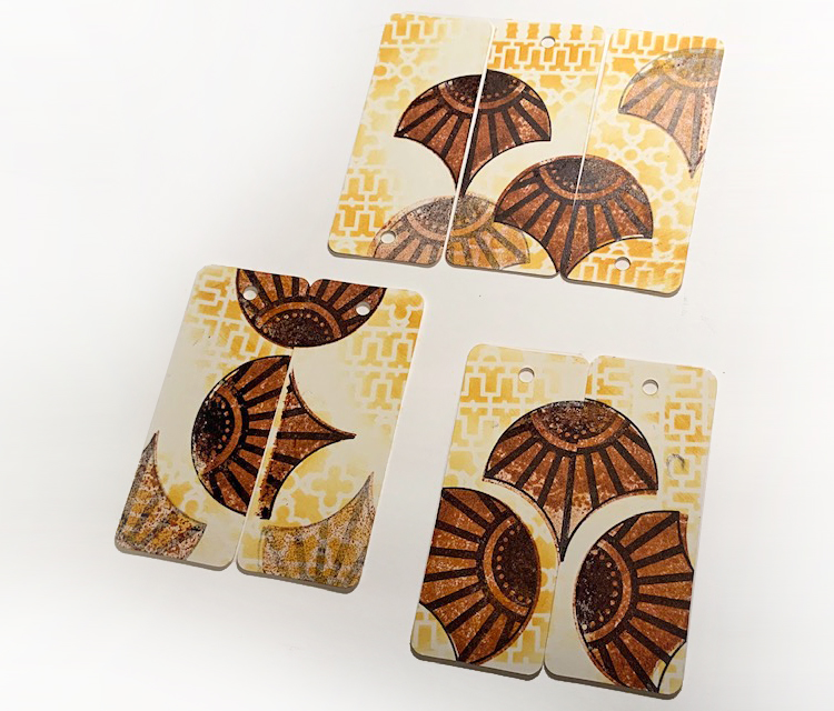
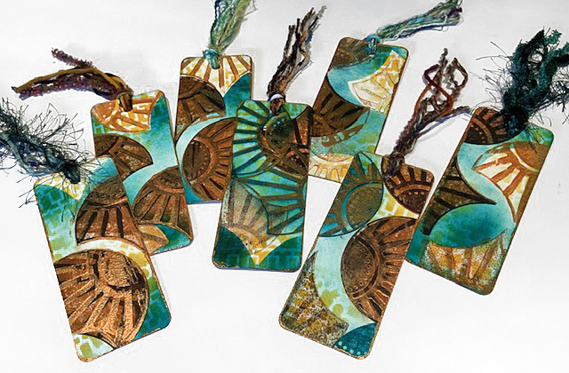
Hello from my Creative Squad! Today we have a post from Judi Kauffman. You can learn more about Judi from our Nice to Meet You blog post featuring her creative story and artwork. This time Judi is sharing some upcycled folders and some new bookmarks that she creates using my Downtown Stencil and my FANtastic Large and Solid Fan rubber stamps. This month’s theme is: Food for Thought – Let’s take a lighthearted look at food! While the culinary world has become an art and a science in terms of preparation and presentation, sometimes it is the simplest foods that bring us the most joy. Simple fare or elaborate family traditions, we all have our favorite foods. What is yours?
Food for Thought is such a great theme. I asked a neighbor, age 8, what it meant to her and she said it was about reading because reading is food for your brain! Out of the mouths of babes, right?
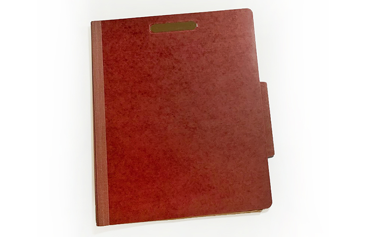
I’d been considering recipe cards and a mixed media spoon doll, but her comment took me in a different direction: Bookmarks and a folder for storing newspaper articles, drawings cartoons, clippings from magazines! Of course the bookmarks could be tucked into recipe books, making it easy to find favorites, and the folder could be used for recipes, but I think if I went that route I’d use lighter, brighter (more ‘appetizing’) colors.
Instructions for Folder:
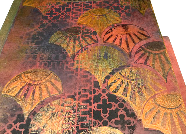
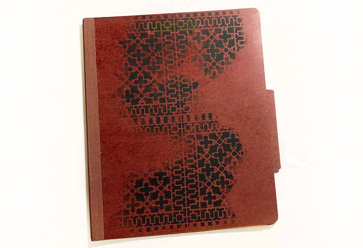
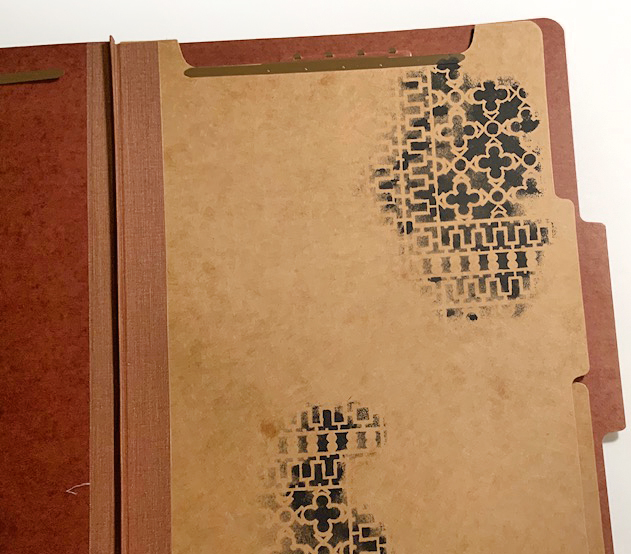
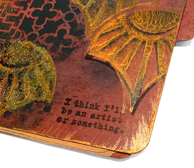
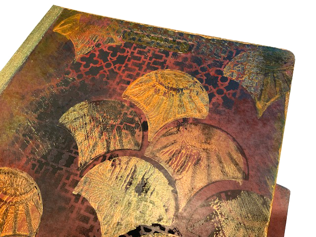
1. Using black acrylic paint, randomly add portions of the 9×12 Downtown stencil to the front and inside flaps of the folder.
2. Using copper metallic acrylic paint and black permanent ink, stamp Solid Fan and Broadway Fan onto the cover and inside flaps of the folder.
3. Using a stiff brush, add copper paint to the left side and all edges of the folder, and randomly on top of the stamped and stenciled areas.
4. Using a craft sponge, add teal ink here and there, masking some of the fans to add color around the shapes.
Instructions for Bookmarks:
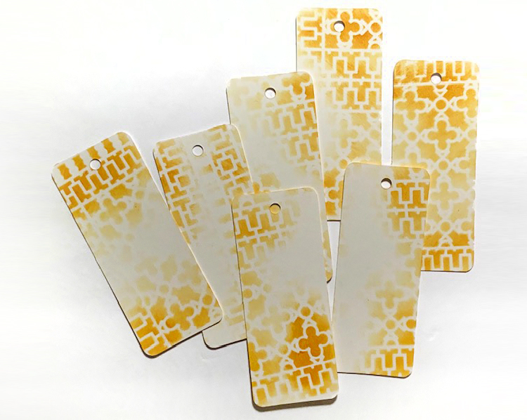
1. Using a light butterscotch ink, randomly stencil portions of the 9×12 Downtown stencil onto a batch of bookmarks.
2. Using ginger and black inks, randomly stamp Solid Fan and Broadway Fan onto the bookmarks.
3. Using teal ink followed by copper metallic acrylic paint, stamp Broadway fan on top of inks from step 2. Allow to dry.
4. Stamp a fan, cut it out to use for a mask, and use teal ink to smudge around some of the fans for contrast and to create a mottled background.
5. Add copper paint around the edges of each bookmark. Allow to dry.
6. Add fibers to the hole at the top of each bookmark.
Thank you Judi! I love this take on our monthly theme! You can find all of my Rubber Stamps and my Stencils in my online shop. Here are some of the supplies Judi used:
If you are working on something yourself that you’d like to share, please do! I would love to share your projects in my next “n*Spiration From Around the Globe“.
And TODAY is the last day to buy Creative JumpStart 2019 (the one that was released back in January of this year) so if you haven’t yet you can sign up here. It is an amazing lineup of artists, full of inspiring and fun content, and you have until November 15th to download all the videos.
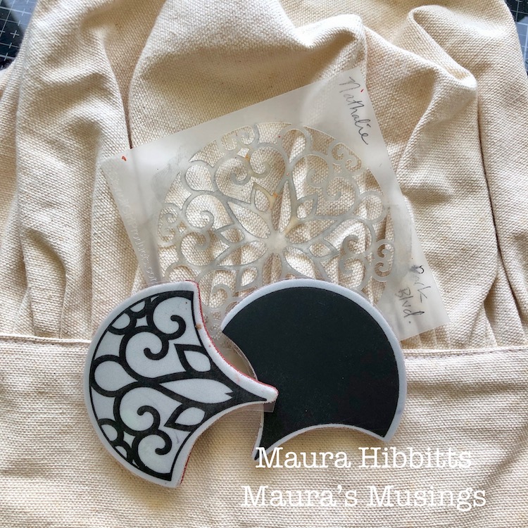
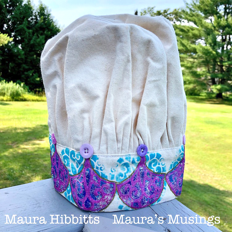
Hello from my Creative Squad! Today we have a cute project from Maura Hibbits for all you chefs out there (or maybe hat enthusiasts???)! She is using my Park Blvd stencil and my Solid Fan and Fantastic Large rubber stamps, along with this month’s theme: Food for Thought – Let’s take a lighthearted look at food! While the culinary world has become an art and a science in terms of preparation and presentation, sometimes it is the simplest foods that bring us the most joy. Simple fare or elaborate family traditions, we all have our favorite foods. What is yours?
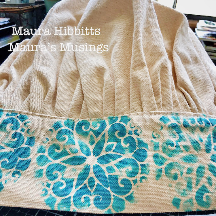
Do you have a King or Queen of the kitchen at your house? Anyone who loves to cook? Why not create a crown themed chef’s hat for them? One of my sisters loves to cook, and loves the color purple which got my muse thinking. I found a canvas chef hat in my stash, and purple made me think of royalty, hence the crown reference.
I started with simple materials for my project, chef hat, stencil, stamps, and paints. Of course, this could easily be done on a canvas bag too.
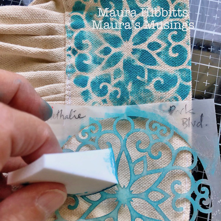
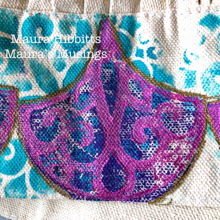
My first step was to stencil around the headband portion of the hat with Nat’s Park Blvd stencil. I used a cosmetic sponge with the Cobalt Teal Hue acrylic paint and dabbed lightly. In retrospect, I would have waited to do this step until after I did the fans, which would have made the placement better. I also would have lightened the blue. Oh, the things we learn as we go!
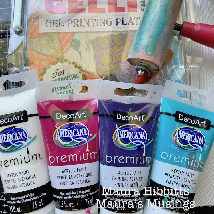
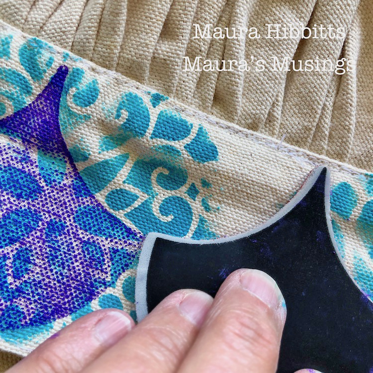
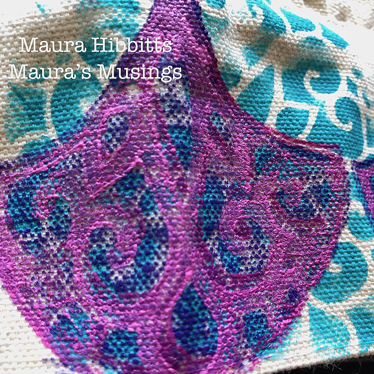
I blended the Dioxazine Purple and Translucent White on the gel plate with the brayer, then used this as a stamping base for the Solid Fan. I found I had to repeat the paint stamping onto the hat two to three times in order to get it dark enough.
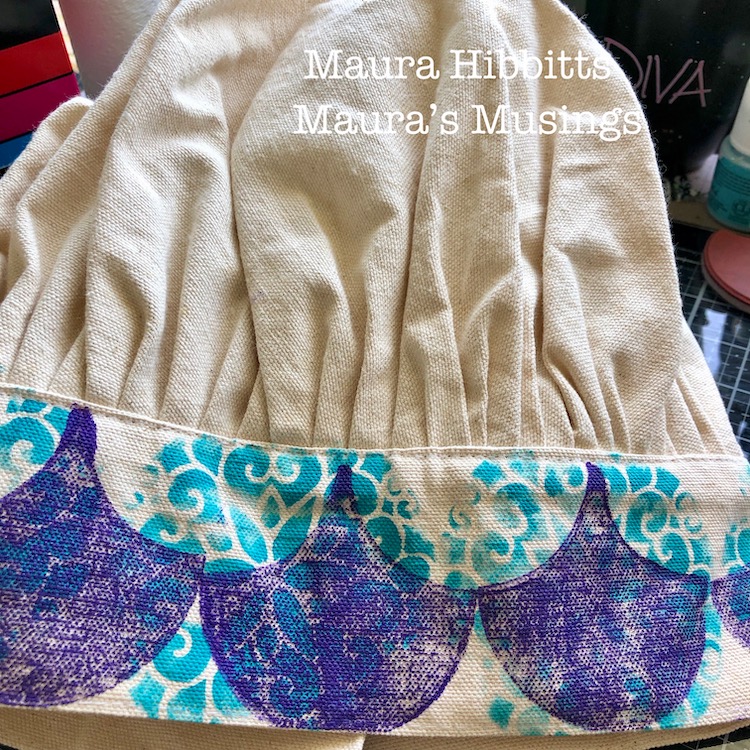
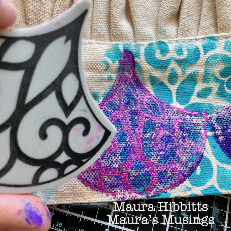
Next, I blended Quinacridone Magenta and Translucent White on the gel plate, and stamped into this with the large Park Avenue Fan to transfer it to the hat. I stamped this design on top of the solid fans around the brim. Then, I decided there wasn’t enough contrast, so mixed a second blend using more white, and re-stamped the design. If you look closely you can see a shadow effect.
To create a royal feel to the chef’s hat, I outlined the fans with a gold acrylic paint pen.
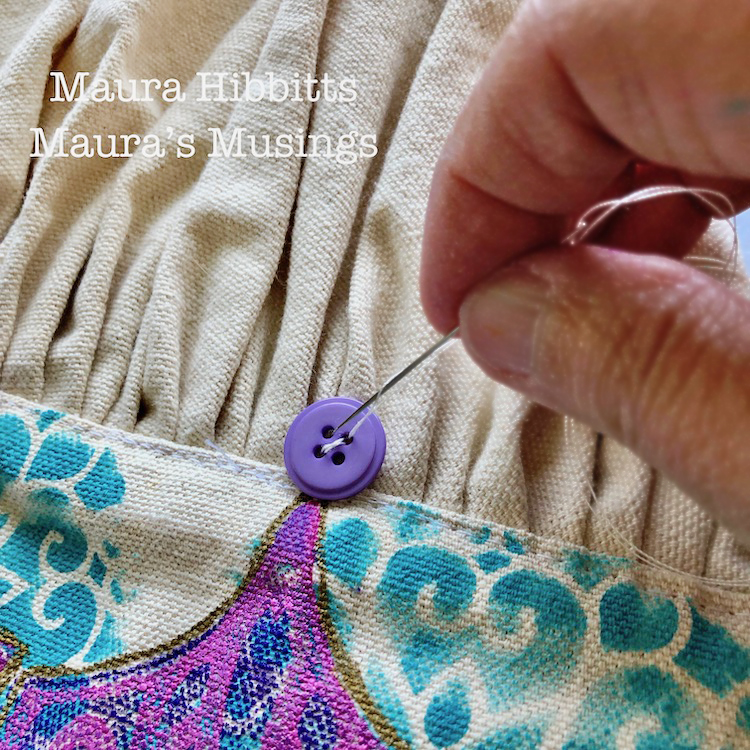
Then, I figured a “crown” needs jewels, so sewed a purple button to the top of each fan.
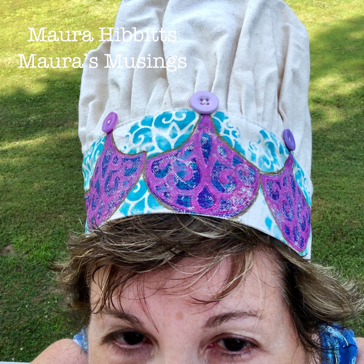
Time for the “foodie” shot, so I am modeling the Royal Chef Hat.
I can’t wait to see my sister’s reaction when I hand her the Royal Chef Hat in honor of her love of cooking and creating. I think it’s a good thing she enjoys wearing hats, even weird ones that look like a dragon or jester, lol. Time to honor the Queen of the Kitchen!
Thank you Maura – I love the idea of donning one of these in the kitchen :) You can find all of my Rubber Stamps and my Stencils in my online shop. Here are some of the supplies Maura used:
If you are working on something yourself that you’d like to share, please do! I love to see how you interpret our monthly themes. Email me how you used my stencils and stamps with the theme and email me an image – I would love to share your projects in my next “n*Spiration From Around the Globe“.
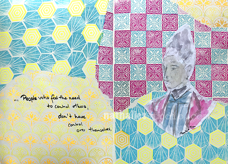
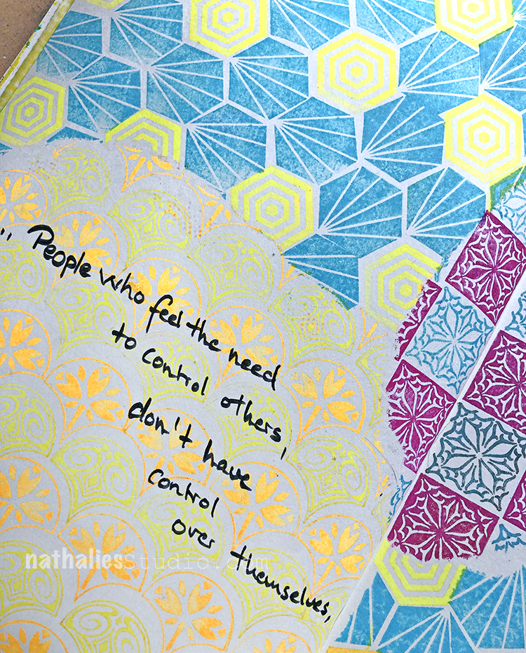
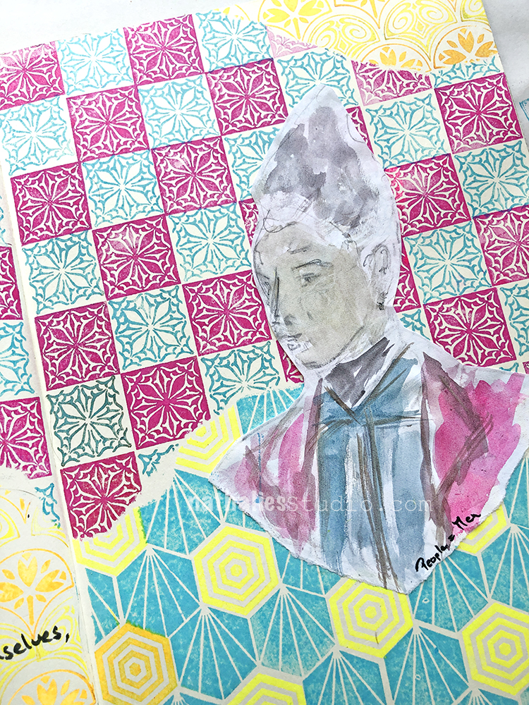
“People who feel the need to control others, don’t have control over themselves.”
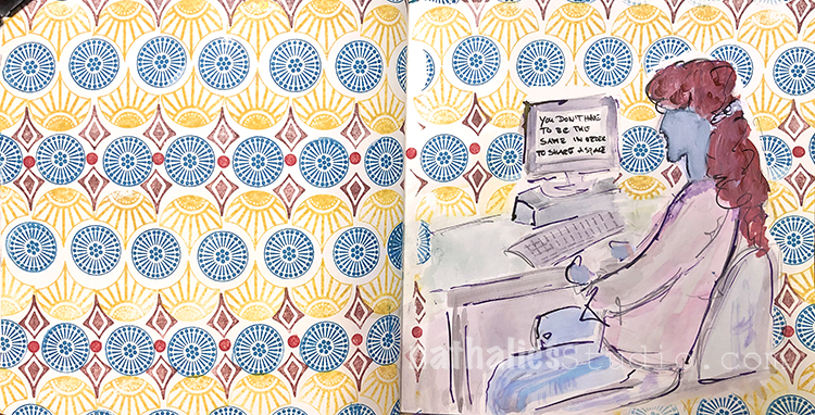
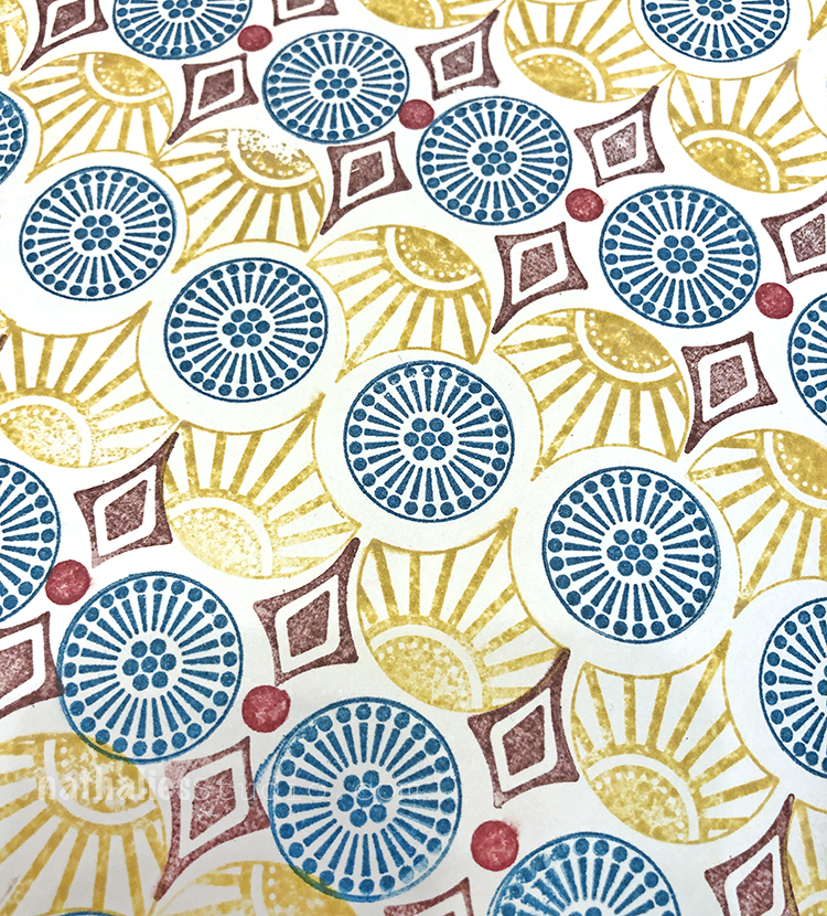
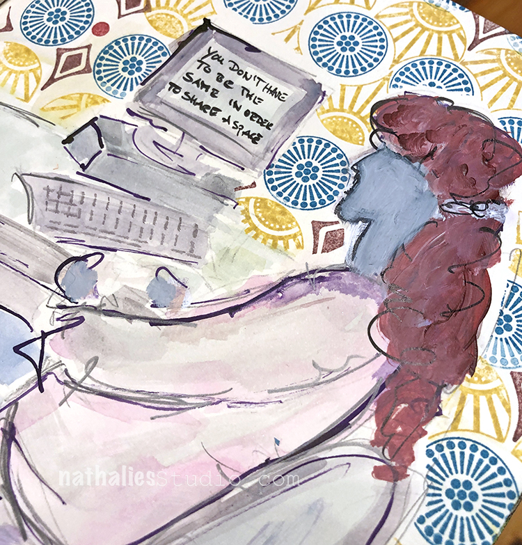
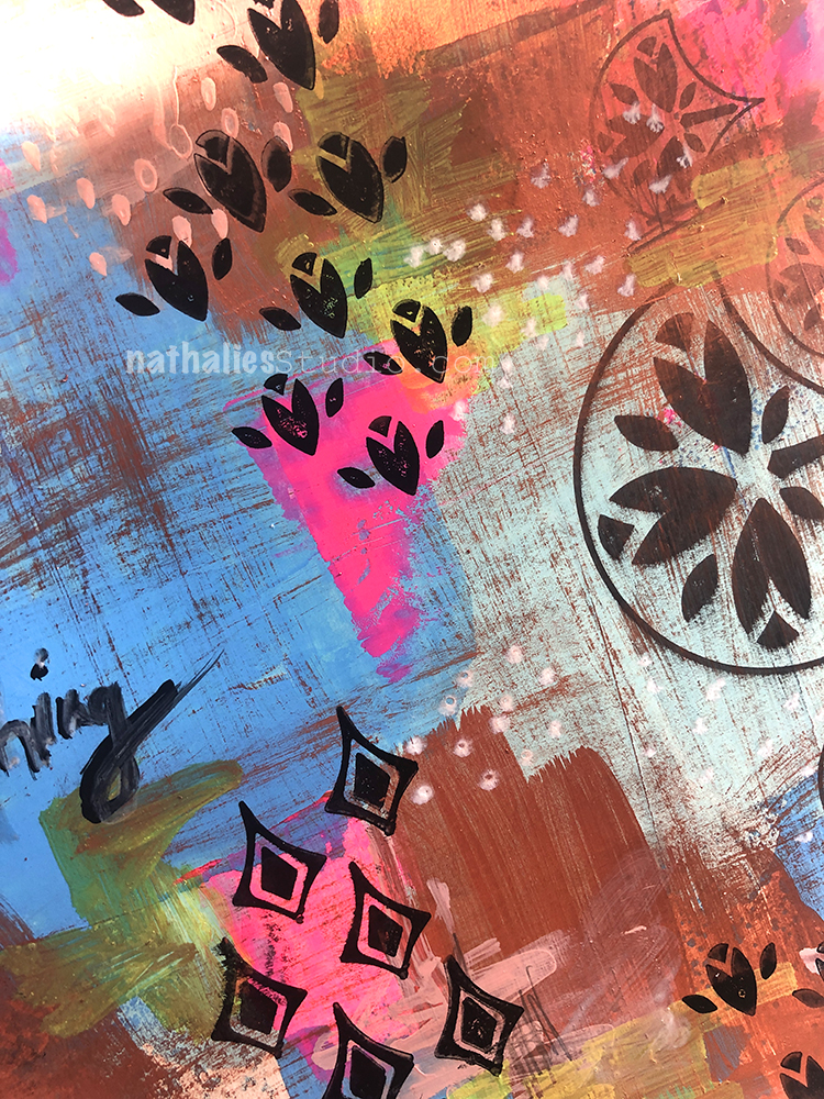
I tore some paper to cover up areas and stamped with my FANtastic Small, Hex Set Small, and Floral Tile Small sets so that the patterns came together. I used MoonGlo ink pads. Love the very bright and indeed glowing colors of those ink pads.
I used water colors for my figure and chose similar colors to help all the elements come together on the page.


I love the pattern and the colors you used Nat. I never get stamps on the paper the way I want to. It is better when I stamp on a mouse pad or something like that but I’m just never satisfied with the final product. Yes, I see your creative “mistake”. ;-)
Reply